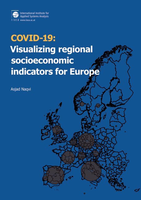
COVID-19: Visualizing regional indicators for better decision making

You also want an ePaper? Increase the reach of your titles
YUMPU automatically turns print PDFs into web optimized ePapers that Google loves.
<strong>COVID</strong>-<strong>19</strong>:<br />
<strong>Visualizing</strong> <strong>regional</strong><br />
socioeconomic<br />
<strong>indicators</strong> <strong>for</strong> Europe<br />
Asjad Naqvi<br />
<strong>19</strong>780<br />
10836<br />
62095<br />
40708<br />
14829<br />
8788<br />
97689<br />
80110
<strong>COVID</strong>-<strong>19</strong>: <strong>Visualizing</strong> <strong>regional</strong> socioeconomic <strong>indicators</strong> <strong>for</strong><br />
Europe<br />
Asjad Naqvi ⋆<br />
International Institute <strong>for</strong> Applied Systems Analysis (IIASA), Laxenburg, Austria<br />
This version compiled on: May 3, 2020<br />
⋆ Please report errors, or send comments and feedback at naqvi@iiasa.ac.at
3<br />
Disclaimer: This research was funded by the International Institute <strong>for</strong> Applied Systems Analysis<br />
(IIASA) and its National Member Organizations in Africa, the Americas, Asia, and Europe. This<br />
report has received only limited review. Views or opinions expressed herein do not necessarily represent<br />
those of the institute, its National Member Organizations, or other organizations supporting<br />
the work.<br />
This work is licensed under a Creative Commons Attribution-NonCommercial 4.0 International<br />
License<br />
For any commercial use please contact repository@iiasa.ac.at
4<br />
Preface<br />
The <strong>COVID</strong>-<strong>19</strong> pandemic struck the world out of the blue and displayed unprecedented transmission<br />
rates. Part of the reason <strong>for</strong> its rapid worldwide spread, was the nature of the virus itself, its<br />
presentation (symptoms were visible well after a person was infected) and the highly complex,<br />
interconnected world we live in today. An equally important contributing factor is our, now apparent,<br />
collective inability to deal with a rapidly emerging global threat in a coherent and integrated manner<br />
across countries and continents. Our existing multilateral systems are simply not yet geared to<br />
respond to such an emerging global challenge in an adequate and timely manner. The plethora of<br />
national responses have also been shown to be inadequate.<br />
The extent of our inter-connectedness has led us to recognize that we live in a global village, and<br />
this pandemic has removed any remaining doubts. However, the underlying global order of pervasive<br />
tourism, trade, business, education has the potential to create vulnerabilities while also generating<br />
critical sector specific in<strong>for</strong>mation that could be systematically harnessed in order to allow rapid<br />
and effective global and national responses to risks. Undoubtedly this data is being collected in some<br />
<strong>for</strong>m. At a more operational level the world is still struggling to bring together the necessary data<br />
from across different sectors of society, across scales and a sufficiently integrated manner to fully<br />
enable a rapid analysis and a comprehensive disaster risk mitigation response. The looming era of<br />
machine learning and artificial intelligence too has the potential to fast-track our capabilities and<br />
responsiveness to such epidemics, but presently, we are still struggling to access relevant in<strong>for</strong>mation<br />
and timely data at appropriate scales and resolutions.<br />
Early in<strong>for</strong>mation from the <strong>COVID</strong>-<strong>19</strong> pandemic suggested a greater vulnerability of older citizens<br />
to the virus. Current mortality patterns support the notion that the elderly, especially those with<br />
underlying medical conditions, are more vulnerable. However, clearly, all segments of the population<br />
are vulnerable. In the absence of an available cure <strong>for</strong> the virus, key measures deployed to limit<br />
transmission include to curb mobility, social distancing, to strengthen the medical infrastructure<br />
to improve the palliative treatment <strong>for</strong> vulnerable patients (ventilators) and protect key medical<br />
practitioners (protective clothing and masks). A fully functional coordinated system of international<br />
cooperation would help with the effective execution of many of these measures. Given that the<br />
pandemic has now reached nearly all countries around the world and is still spreading, countries are<br />
responding by shutting borders and are competing <strong>for</strong> scarce resources – medical, technical, and/or<br />
financial. The developing geography of the pandemic illustrates how different countries become<br />
more vulnerable at different times during the development of the pandemic – not all countries<br />
are necessarily equally vulnerable at the same time. The same principle applies to different parts<br />
within a country (Northern Italy, New York). In understanding these differences, mortality rates<br />
are probably a more robust indicator, albeit delayed, considering the different modes and extents<br />
of <strong>COVID</strong>-<strong>19</strong> testing implemented around the world.<br />
Clearly <strong>COVID</strong>-<strong>19</strong> has caught all of us off guard, yet we need to respond to the emerging crisis to the<br />
best of our ability. While numerous epidemiological analyses and models are currently in<strong>for</strong>ming<br />
and assisting global <strong>decision</strong> makers to respond to the virus, we at IIASA can assist by <strong>making</strong><br />
available critical socioeconomic and demographic data that may be of use to policymakers and the<br />
health community to allocate scarce resources more strategically between countries and even within<br />
countries.
This IIASA mapbook is made available to rapidly and urgently disseminate key demographic and<br />
population in<strong>for</strong>mation in a visible <strong>for</strong>m to assist health professionals, disaster response operations,<br />
governments and policymakers from across the European Union. This IIASA mapbook publishes<br />
and will continue to expand on a list of key <strong>indicators</strong> that can be used to <strong>better</strong> understand the<br />
socioeconomic and demographic contexts under which the current <strong>COVID</strong>-<strong>19</strong> crisis is unfolding.<br />
Accessible data is presently limited to the EU.<br />
5<br />
Albert Van Jaarsveld<br />
Director General<br />
Leena Srivastava<br />
Deputy Director General <strong>for</strong> Science
6<br />
1 Introduction<br />
The recent Corona virus (<strong>COVID</strong>–<strong>19</strong>) outbreak in the EU has drastically impacted daily life across<br />
all age groups. Current estimates suggest that the 65 plus and especially 80 plus age group are at the<br />
highest risk from the virus. This is particularly important in the EU, which not only has an aging<br />
population, but there are also huge variations across regions in terms of economic development. The<br />
combination of these two points implies that different regions face different challenges in terms of<br />
spread of the virus, burden on the public health and social security system, and economic losses.<br />
Fig. 1: Flattening the curve<br />
Source: https://www.vox.com/2020/3/10/21171481/coronavirus-us-cases-quarantine-cancellation<br />
The spread of the virus in Italy has <strong>for</strong>ced EU countries to take drastic measures like shutting down<br />
public spaces, schools, and businesses, and limiting mobility and human interaction, a phenomenon<br />
that is referred to as “social distancing” with the aim of “flattening the curve”. In other words, the<br />
less the interactions, the slower the spread of the virus, and the <strong>better</strong> the health care system is<br />
capable of handling it.<br />
Figure 2 shows the actual number of reported <strong>COVID</strong>-<strong>19</strong> cases on May 3, 2020. The figure highlights<br />
large variations in the number of cases represented by different bubble sizes. While Italy was the first<br />
to be massively hit, other countries like Spain, France, Germany, Belgium, UK, Ireland have also<br />
seen very high growth. These numbers, while important, need to be taken into consideration with<br />
a host of socioeconomic factors to properly understand the full impact of the virus. For example,<br />
population size, policy stringency and health system are key in the short run to look at the direct<br />
mitigation ef<strong>for</strong>ts. Other impacts like unemployment, production losses, supply-chain disruptions,<br />
also need to be systematically understood both <strong>for</strong> a <strong>better</strong> understanding of immediate impacts<br />
and long-run policy planning.<br />
In order to understand these impacts, this document presents a series of graphs and maps that aim<br />
to visually explore demographic, socioeconomic, and health-related <strong>indicators</strong> <strong>for</strong> NUTS 2 regions in<br />
European. NUTS stands <strong>for</strong> Nomenclature of Territorial Units <strong>for</strong> Statistics that exist at four levels.
7<br />
Fig. 2: Number of <strong>COVID</strong>-<strong>19</strong> cases (May 3, 2020)<br />
Source: John Hopkins University (JHU) Coronavirus Resource Center (https://coronavirus.jhu.edu/map.html).<br />
Data retrieved on document compilation date. Only countries with more than 15,000 confirmed cases are highlighted.<br />
NUTS 0 represent countries, NUTS 1 represent provinces, NUTS 2 are districts within provinces,<br />
and NUTS 3 are finer level subdivisions usually representing counties within districts. 1<br />
The data <strong>for</strong> this project has been compiled using publicly available in<strong>for</strong>mation from the Eurostat<br />
database (https://ec.europa.eu/eurostat/data/database). Selected <strong>indicators</strong> from this<br />
database are used to showcase <strong>regional</strong> variations in Europe in relation to <strong>COVID</strong>-<strong>19</strong>.<br />
This document will be regularly updated to reflect changes in reported cases and to update the<br />
maps.<br />
1 For more in<strong>for</strong>mation, see Eurostat https://ec.europa.eu/eurostat/web/nuts/background
8<br />
2 Current <strong>COVID</strong>-<strong>19</strong> trends (May 3, 2020)<br />
Fig. 3: Reported cases and deaths per 1 million population<br />
Note: The figures show the trends across European countries starting 1st March. Only top five countries are shown.<br />
Doubling time shows in how many days cases or deaths double.
9<br />
Fig. 4: <strong>COVID</strong>-<strong>19</strong> Policy Response<br />
(a) Policy Stringency Index<br />
(b) ... relative to the 10th case<br />
(c) Daily changes in cases<br />
(d) ... relative to the 10th case<br />
Note: The The <strong>COVID</strong>-<strong>19</strong> Policy Stringency Index is generated by the Ox<strong>for</strong>d Government Response tracker (https:<br />
//www.bsg.ox.ac.uk/research/research-projects/ox<strong>for</strong>d-covid-<strong>19</strong>-government-response-tracker.). Fig. (a)<br />
shows the strength of the policies as they were introduced. Some countries have started relaxing their measures<br />
after slowing down the daily changes in cases (Fig. c). Some <strong>COVID</strong>-<strong>19</strong> cases appeared at different times in different<br />
countries, Figures (b) and (d) track policy response and daily changes in cases relative to the 10th case. Some countries<br />
moved extremely fast in restricting the spread of <strong>COVID</strong>-<strong>19</strong> cases.
10<br />
3 Demographic <strong>indicators</strong><br />
Fig. 5: Population <strong>indicators</strong><br />
(a) Total population (20<strong>19</strong>) (b) Population density (2018)<br />
(c) Share of age 65 and above (20<strong>19</strong>) (d) Share of age 80 and above (20<strong>19</strong>)<br />
These maps highlight the demographic setup of Europe. Figure (a) shows actual population levels. Figure (b) shows<br />
population density which is highly concentrated around cities and industrial zones. Figures (c) and (d) present the<br />
share of population aged 65 years and over and 80 years and over, respectively. In most NUTS2 regions, the people<br />
age 65 years and older represent 20-30% of the population.
11<br />
Fig. 6: Migration and population changes<br />
(a) Population growth rate (2018) (b) Net migration rate (2018)<br />
(c) Life expectancy at age 65 years old (2018) (d) Life expectancy at age 80 years old (2018)<br />
Figure (a) shows the population growth rate. Shades of red indicate depopulation of regions. Figure (b) is the net<br />
migration rate which is the difference between in-migration versus out-migration. Some regions are driven by netmigration<br />
changes rather than changes in “natural” growth rates (high birth rates in domestic population). Life<br />
expectancy graphs, shown in Figures (c) and (d), indicate the number of additional years persons age 65 and 80 are<br />
expected to live respectively.
12<br />
Fig. 7: Old dependency ratio in % (persons aged 65 and over/persons age 15-64) (20<strong>19</strong>)<br />
The old dependency ratio is a standard indicator used in demographics to indicate the share of population age 65 and<br />
over to working age population. Within the EU regions, this number is considerably high, in some places reaching<br />
50%, implying that one person aged 65 years or over is supported by two working-age persons (age 15-64). This has<br />
strong implications <strong>for</strong> inter-generational transfers of public health, social security, and pensions.
13<br />
4 Economic <strong>indicators</strong><br />
Fig. 8: Economic well-being (2017)<br />
(a) GDP per capita (2018) (b) Average HH income (2017)<br />
Income is an indicator of a coping mechanism. As the figure shows, there is a huge variation between the central<br />
“core” and the eastern and southern “periphery” regions. Also note that GDP per capita might be higher that<br />
average household income since it also includes government spending, investment, and net exports.
14<br />
Fig. 9: Percentage share of population with internet access (20<strong>19</strong>)<br />
This map indicates the percentage share of population that has access to any type of internet. As the map shows,<br />
there is considerable variable across NUTS 2 regions.
15<br />
Fig. 10: Work From Home Index (20<strong>19</strong>)<br />
(a) Work From Home Index (WFH v1)<br />
(b) % share of workers who can potentially work from home<br />
Here we take NACE rev.2 4-digit sector codes (can also be mapped to ISIC and other industrial codes) and code<br />
sectors which allow work from home (0 = cannot work from home, 0.5 = maybe, 1 = definitely can). These are<br />
aggregated to the broad one-digit sector level. If we take this index and multiply it with in<strong>for</strong>mation on jobs at the<br />
NUTS 2 sectoral level, we get the above map <strong>for</strong> Europe. Based on the current definition, at best 24% of the jobs can<br />
be done from home and they are clustered in certain locations like cities, financial headquarters, regions with high<br />
tertiary economic activities etc. Please note that the WFH Index will be refined in subsequent updates.<br />
NACE rev.2 sector codes: A=Agriculture, Forestry and Fishing, B=Mining and Quarrying, C=Manufacturing.<br />
D=Electricity, Gas, Steam and Air Conditioning Supply, E=Water Supply; Sewerage, Waste Management and Remediation<br />
Activities, F=Construction, G=Wholesale and Retail Trade; Repair of Motor Vehicles and Motorcycles,<br />
H=Transportation and Storage, I=Accommodation and Food Service Activities, J=In<strong>for</strong>mation and Communication,<br />
K=Financial and Insurance Activities, L=Real Estate Activities, M=Professional, Scientific and Technical Activities,<br />
N=Administrative and Support Service Activities, O=Public Administration and Defence; Compulsory Social Security,<br />
P=Education, Q=Human Health and Social Work Activities, R=Arts, Entertainment and Recreation, S=Other<br />
Service Activities, T=Activities of Households as Employers, U=Activities of Extraterritorial Organisations and Bodies.
16<br />
5 Health-related <strong>indicators</strong><br />
Fig. 11: Doctors and Hospital beds<br />
(a) Share of 65+ to doctors<br />
(b) Share of 80+ to doctors<br />
(c) Share of 65+ to hospital beds<br />
(d) Share of 80+ to hospital beds<br />
These figure show the share of age 65 and 80 plus population to doctors and hospital beds. A darker share indicates<br />
that there is a higher ratio of population to medical facilities, potentially indicating a stress on the system.<br />
Note: Data <strong>for</strong> population from 20<strong>19</strong>. Data <strong>for</strong> doctors and hospital beds is from 2017 or earlier, which is the most<br />
complete dataset on Eurostat. Germany (DE) provided in<strong>for</strong>mation at NUTS 1 level only. This has been evenly split<br />
across NUTS2 levels. UK provided national level (NUTS 0) in<strong>for</strong>mation only. NL provides national level (NUTS 0)<br />
in<strong>for</strong>mation only <strong>for</strong> hospital beds. These were skipped.
17<br />
Fig. 12: Percentage share of lungs/respiratory-related death in total reported deaths (2016)<br />
This map is intended to indicate regions where lungs or respiratory-related deaths are the highest amongst all reported<br />
deaths. These areas might suffer from poor air quality that is likely to increase the impact of <strong>COVID</strong>-<strong>19</strong>.
18<br />
6 Tourism<br />
Fig. 13: Tourism<br />
(a) Tourists per capita (2018) (b) Percentage of non-national tourists (2018)<br />
Figure (a) represents the total number of tourists divided by local population. The map shows that alpine and coastal<br />
regions see very high traffic in terms of tourism reaching as high as 80–100 tourists per person. Figure (b) shows the<br />
share of non-national tourists, either from other EU countries or non-EU countries. Visits by non-national tourists<br />
are also concentrated around alpine and coastal regions.
![IIASA BROCHURE_210x594[FINAL] WEB](https://documents.yumpu.com/000/068/591/122/1d4a7749a60d45b83ea15d6d660d0c8b3babc996/30524b562f4966364c7772585a337a5a4b454a3652513d3d/763264657868393835667437685130682f76554f79513d3d.jpg?AWSAccessKeyId=AKIAICNEWSPSEKTJ5M3Q&Expires=1715065200&Signature=9dR8FJxqL4SIIQFeZtS2D3sJ%2FgI%3D)