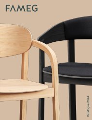
- Page 4: News 2020/2021_the new contemporary
- Page 8: bladePiergluigi StellaTavolo con un
- Page 12: Bladebase Bronzo pietra/Bronze ston
- Page 16: cubeCristian dal BiancoFisso o allu
- Page 20: luxoArtefatto Studio DesignTavolo c
- Page 24: maitreAngelo TomaiuoloMaitre si pro
- Page 28: Maitrebase bronzo pietra/stone bron
- Page 32: styleTonin Casa CreativesLo stile
- Page 36: Stylebase grigio carbone/carbon gre
- Page 40: Base bronzo pietra - top botte gres
- Page 44: Tensobase oro opaco/matt gold base
- Page 48: Tensobase titanio/titanium base (34
- Page 52:
Treebase bronzo pietra/stone bronze
- Page 56:
Victorybase titanio/titanium base (
- Page 60:
Zangbase grigio carbone/carbon grey
- Page 64:
aragona éliteTonin Casa CreativesA
- Page 68:
beetleLuca SignorettiBeetlebase gri
- Page 72:
cleoTonin Casa CreativesCleobase no
- Page 76:
Cleo Élitebase noce Canaletto/Cana
- Page 80:
Daddybase bronzo pietra/stone bronz
- Page 84:
glamLuca SignorettiGlambase grigio
- Page 88:
hugLuca SignorettiHugbase frassino
- Page 92:
mantaPlurimo DesignManta è la comb
- Page 96:
9596
- Page 100:
Poprivestimento ecopelle fango/mud
- Page 104:
sorrentoésprit swivelTonin Casa Cr
- Page 108:
sgabelli/stools107 108
- Page 112:
111112
- Page 116:
malva éliteAndrea LucatelloMalva
- Page 120:
mivida éliteAngelo TomaiuoloMivida
- Page 124:
amarcordTonin Casa CreativesAmarcor
- Page 128:
anvilPlurimo DesignAnvilrivestiment
- Page 132:
Cleobase frassino nero/black ash ba
- Page 136:
dolce vitaTonin Casa CreativesDolce
- Page 140:
doppio sognoTonin Casa CreativesDop
- Page 144:
mamaAngelo TomaiuoloMamarivestiment
- Page 148:
Mooverivestimento pelle grigio/grey
- Page 152:
Metropolisrivestimento tessuto Flor
- Page 156:
Metropolisrivestimento pelle nabuk
- Page 160:
airaCristian Dal BiancoAiraante vet
- Page 164:
alcioneLuca RoccadadriaLa purezza d
- Page 168:
Alcioneante gres Terra Liquida e sp
- Page 172:
Barcodeante nero opaco e specchio a
- Page 176:
Cannetèante specchio fumè/fumè m
- Page 180:
Canovaante gres Symphonie e specchi
- Page 184:
debussyTonin Casa CreativesDebussya
- Page 188:
divaLuca RoccadadriaDivaante specch
- Page 192:
Dotante vetro extrachiaro trasparen
- Page 196:
Extroante velluto Vega blu profondo
- Page 200:
gaudìM. Mottin|E. BarbieriMaterial
- Page 204:
hopperLuca RoccadadriaHopperante sp
- Page 208:
plumeM. Mottin|E. BarbieriSorprende
- Page 212:
211 212
- Page 216:
matisseTonin Casa CreativesMatisses
- Page 220:
teoTonin Casa CreativesLe linee def
- Page 224:
archèG. Codato|L. TrevisiolArchèr
- Page 228:
honeybookAngelo TomaiuoloUna librer
- Page 232:
kasparAngelo TomaiuoloKaspar, oltre
- Page 236:
masterPlurimo DesignMasterstruttura
- Page 240:
planPierluigi StellaPlanstruttura t
- Page 244:
243244
- Page 248:
sintesiOpaca LabUn’ode alla geome
- Page 252:
Venusstruttura frassino nero/black
- Page 256:
coraTonin Casa CreativesConsolle al
- Page 260:
eliseoTonin Casa CreativesEliseobas
- Page 264:
Eliseo élitebase brushed bronzo/br
- Page 268:
Corastruttura titanio/titanium stru
- Page 272:
still éliteAngelo TomaiuoloStill
- Page 276:
ànemosGiuseppe Maurizio ScutellàA
- Page 280:
daisyTonin Casa CreativesDaisystrut
- Page 284:
dorianLM Design - E. BarbieriDorian
- Page 288:
enigmaPlurimo DesignEnigmastruttura
- Page 292:
Era Orastruttura specchio bronzo/br
- Page 296:
glamourTonin Casa CreativesTre misu
- Page 300:
io&teLuca RoccadadriaIo&Testruttura
- Page 304:
lostG. Codato|L. TrevisiolGli specc
- Page 308:
memphisPlurimo DesignGli ingranaggi
- Page 312:
opalLM DesignOpalcornice vetro mart
- Page 316:
otelloLM DesignLo specchio da paret
- Page 320:
sottosopraM. Mottin|E. BarbieriSott
- Page 324:
towerArtefatto Design StudioLo spec
- Page 328:
Voguespecchio bronzato/bronzed mirr
- Page 332:
audreyOpaca LabAudreystruttura bron
- Page 336:
335 336
- Page 340:
Baobabstruttura titanio e grigio ca
- Page 344:
Bridgestruttura bronzo pietra/stone
- Page 348:
classicTonin Casa CreativesTavolino
- Page 352:
classic bigTonin Casa CreativesTavo
- Page 356:
355 356
- Page 360:
dotM. Mottin|E. BarbieriDotstruttur
- Page 364:
flowTonin Casa CreativesFlowstruttu
- Page 368:
jazzLM DesignJazzstruttura oro opac
- Page 372:
ledorTosca DesignLedorstruttura cuo
- Page 376:
levelsCristian Dal BiancoLevelsstru
- Page 380:
lineTonin Casa CreativesLinestruttu
- Page 384:
miròAngelo TomaiuoloQuesto servomu
- Page 388:
Modìstruttura bronzo pietra e oro
- Page 392:
391392
- Page 396:
opusTonin Casa CreativesOpus è il
- Page 400:
pacmanTonin Casa CreativesPacmanstr
- Page 404:
Palmbeachstruttura lucido e opaco b
- Page 408:
rendez-vousPlurimo DesignRendez-vou
- Page 412:
Rimstruttura grigio carbone/carbon
- Page 416:
415 416
- Page 420:
ryazkaTanya Repina & Misha RepinRya
- Page 424:
Sinergystruttura bronzo pietra/ston
- Page 428:
Snowboardsstruttura bianco opaco, n
- Page 432:
surfStudio ArchirivoltoSurfstruttur
- Page 436:
venanzioG. Codato|L. TrevisiolVenan
- Page 440:
bijouxAngelo TomaiuoloCome un prezi
- Page 444:
Breathstruttura verniciato nero luc
- Page 448:
klimtAngelo TomaiuoloKlimtstruttura
- Page 452:
mandalaAngelo TomaiuoloMandalastrut
- Page 456:
miròTonin Casa CreativesMiròstrut
- Page 460:
letti/beds459 460
- Page 464:
Berninistruttura frassino nero/blac
- Page 468:
Havanastruttura noce Canaletto/Cana
- Page 472:
Mamarivestimento combinazione Grigi
- Page 476:
Randomstruttura rovere scuro, noce
- Page 480:
cubòM. Mottin|E. BarbieriCubòstru
- Page 484:
orazioTonin Casa CreativesOraziostr
- Page 488:
atelierTonin Casa CreativesTesta di
- Page 492:
oggettistica/objects491 492
- Page 496:
imperoOpaca LabImperostruttura bian
- Page 500:
plumageCristina CelestinoVisione co
- Page 504:
wallpapersTonin Casa CreativesAmary
- Page 508:
V_P gres porcellanatoV_P porcelain
- Page 512:
E essenzeE essenze14 Noce Canaletto