

crowne plaza hotels & resorts marketing communications guidelines ...
crowne plaza hotels & resorts marketing communications guidelines ...
crowne plaza hotels & resorts marketing communications guidelines ...

Create successful ePaper yourself
Turn your PDF publications into a flip-book with our unique Google optimized e-Paper software.
CROWNE PLAZA HOTELS & RESORTS MARKETING COMMUNICATIONS GUIDELINES SUMMARY: EUROPE<br />
4<br />
5<br />
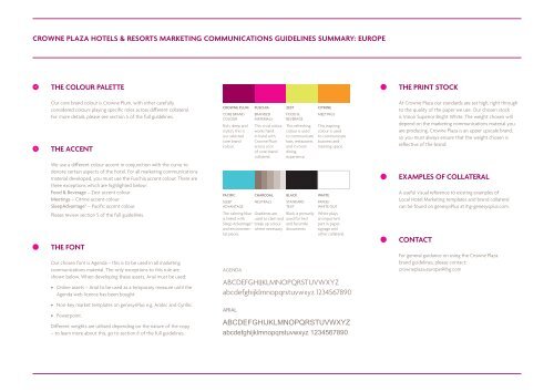
THE COLOUR PALETTE<br />
Our core brand colour is Crowne Plum, with other carefully<br />
considered colours playing specific roles across different collateral.<br />
For more details, please see section 5 of the full <strong>guidelines</strong>.<br />
THE ACCENT<br />
We use a different colour accent in conjunction with the curve to<br />
denote certain aspects of the hotel. For all <strong>marketing</strong> <strong>communications</strong><br />
material developed, you must use the Fuschia accent colour. There are<br />
three exceptions which are highlighted below:<br />
Food & Beverage – Zest accent colour<br />
Meetings – Citrine accent colour<br />
SleepAdvantage – Pacific accent colour.<br />
Please review section 5 of the full <strong>guidelines</strong>.<br />
THE FONT<br />
Our chosen font is Agenda – this is to be used in all <strong>marketing</strong><br />
<strong>communications</strong> material. The only exceptions to this rule are<br />
shown below. When developing these assets, Arial must be used:<br />
• Online assets – Arial to be used as a temporary measure until the<br />
Agenda web licence has been bought.<br />
• Non-key market templates on genesysPlus e.g. Arabic and Cyrillic.<br />
• Powerpoint.<br />
Different weights are utilised depending on the nature of the copy<br />
– to learn more about this, go to section 6 of the full <strong>guidelines</strong>.<br />
CROWNE PLUM<br />
CORE BRAND<br />
COLOUR<br />
Rich, deep and<br />
stylish, this is<br />
our selected<br />
core brand<br />
colour.<br />
PACIFIC<br />
SLEEP<br />
ADVANTAGE<br />
The calming blue<br />
is linked with<br />
Sleep Advantage<br />
and environmental<br />
pieces.<br />
AGENDA<br />
ABCDEFGHIJKLMNOPQRSTUVWXYZ<br />
abcdefghijklmnopqrstuvwxyz 1234567890<br />
ARIAL<br />
FUSCHIA<br />
BRANDED<br />
MATERIALS<br />
This vivid colour<br />
works hand<br />
in hand with<br />
Crowne Plum<br />
across a lot<br />
of core brand<br />
collateral.<br />
CHARCOAL<br />
NEUTRALS<br />
Gradients are<br />
used to clam and<br />
break up colour<br />
where necessary.<br />
ZEST<br />
FOOD &<br />
BEVERAGE<br />
This refreshing<br />
colour is used<br />
to communicate<br />
bars, restaurants<br />
and in room<br />
dining<br />
experience.<br />
BLACK<br />
STANDARD<br />
TEXT<br />
Black is primarily<br />
used for text<br />
and facsimile<br />
documents.<br />
CITRINE<br />
MEETINGS<br />
This inspiring<br />
colour is used<br />
to communicate<br />
business and<br />
meeting space.<br />
WHITE<br />
PAPER/<br />
WHITE OUT<br />
White plays<br />
an important<br />
part in paper,<br />
signage and<br />
other collateral.<br />
ABCDEFGHIJKLMNOPQRSTUVWXYZ<br />
abcdefghijklmnopqrstuvwxyz 1234567890<br />
THE PRINT STOCK<br />
At Crowne Plaza our standards are set high, right through<br />
to the quality of the paper we use. Our chosen stock<br />
is Vision Superior Bright White. The weight chosen will<br />
depend on the <strong>marketing</strong> <strong>communications</strong> material you<br />
are producing. Crowne Plaza is an upper upscale brand,<br />
so you must always ensure that the weight chosen is<br />
reflective of the brand.<br />
EXAMPLES OF COLLATERAL<br />
A useful visual reference to existing examples of<br />
Local Hotel Marketing templates and brand collateral<br />
can be found on genesysPlus at ihg-genesysplus.com.<br />
CONTACT<br />
For general guidance on using the Crowne Plaza<br />
brand <strong>guidelines</strong>, please contact:<br />
<strong>crowne</strong><strong>plaza</strong>.europe@ihg.com