

DESIGN - Megan McClure Interiors
DESIGN - Megan McClure Interiors
DESIGN - Megan McClure Interiors

Create successful ePaper yourself
Turn your PDF publications into a flip-book with our unique Google optimized e-Paper software.
design<br />
focus<br />
:::<br />
kitchens<br />
74 design new england • january/february 2009<br />
as seen in…<br />
design<br />
new england<br />
where function meets style<br />
Today’s kitchen needs to do it all. It must be practical and<br />
pretty, a high-functioning work space, a cozy hangout,<br />
and a room where technology and comfort are on equal<br />
footing. Here are three that do just that, and then some.<br />
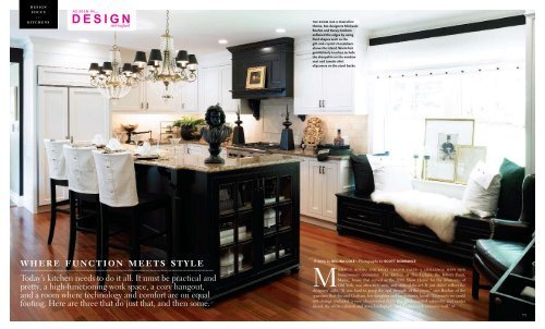
the room has a masculine<br />
theme, but designers Michaele<br />
Boehm and Kacey Graham<br />
softened the edges by using<br />
fluid shapes such as the<br />
gilt-and-crystal chandeliers<br />
above the island. Warm but<br />
gentlemanly touches include<br />
the sheepskin on the window<br />
seat and tuxedo-shirt<br />
slipcovers on the stool backs.<br />
Written by regina cole • Photography by scott dorrance<br />
Michaele boehm and kacey graham faced a challenge many new<br />
homeowners encounter. The kitchen at The Ledges, the Kittery Point,<br />
Maine, house that served as the 2008 Show House for the Museums of<br />
Old York, was attractive, new, and state-of-the-art. It just didn’t reflect the<br />
designers’ style. “It was hard to grasp the real strength of the room,” says Boehm of the<br />
quandary that she and Graham, her daughter and co-designer, faced. “Elements we could<br />
not change included a new cherry-wood floor, the black-painted cabinetry and center<br />
island, the white cabinets and stone backsplash, and the red-brick chimney wall.” >><br />
75
the brick chimney wall is historic, charming, and<br />
in danger of dominating the room. the english<br />
skittles table, topped with a brass lamp and Vanity<br />
Fair print, helps distract the eye from what could be<br />
an overpowering architectural element.<br />
Although the kitchen was full of appealing<br />
features, it also had idiosyncrasies one<br />
might expect in an 1880s Queen Anne house.<br />
The large, roughly L-shaped room had several<br />
doorways, one leading to the dining room, another<br />
to a hall, and yet another connecting to<br />
a former back porch turned family room. “We<br />
were challenged by how to unify the space,”<br />
says Boehm.<br />
Since this was, after all, a show house, the<br />
designers decided to take a theatrical approach<br />
to the most utilitarian room in the house.<br />
“We painted one wall black; that pulled<br />
everything together,” Graham says. It also underscored<br />
the masculine design concept they<br />
had in mind: a man’s tuxedo-style kitchen.<br />
“A series of Vanity Fair prints sparked the<br />
concept,” Boehm says. “We saw them in an<br />
antiques shop, loved them, and knew that they<br />
would drive the design.” The 19th-century images<br />
of dandies and politicians seemed perfectly<br />
suited to the house, where one could easily<br />
imagine the upper crust spending languid summer<br />
days as guests of its aristocratic owners.<br />
76 design new england • january/february 2009<br />
The button-downed room includes touches<br />
such as slipcovers on the island stools that<br />
mimic men’s white dress shirts, a theme repeated<br />
on throw pillows and in the button decorations<br />
applied to the broad Roman shade.<br />
But the designers weren’t afraid to add luxuriously<br />
flamboyant touches using lavish gold,<br />
brass, and crystal elements throughout.<br />
“Black and white can seem very cold, so<br />
we used a lot of gold-colored accents that lighten<br />
and spark the composition,” Graham says.<br />
The designers’ single biggest challenge was<br />
the red-brick chimney wall. “We were stumped<br />
until this old skittles table presented itself,” says<br />
Boehm. “We had it painted black, had brass<br />
nailheads applied, and it became a bar.”<br />
Adding to the drama are elements of pure<br />
whimsy. A pair of antique black metal architectural<br />
finials flanks the stove top. “They don’t do<br />
anything but look wonderful,” says Graham.<br />
From the island’s granite countertop, a black<br />
bust oversees the whole. “It’s Beethoven,” says<br />
Boehm. “We thought he looked intense — and<br />
masculine.” ::<br />
design decisions<br />
Accentuate the Positive<br />
Existing materials in the room were rich<br />
but varied. To unify the granite, wood,<br />
brick, marble, and stainless steel,<br />
Michaele Boehm and Kacey Graham<br />
chose a black-and-white color scheme.<br />
Pillows covered with worsted suiting<br />
fabric and white linen shirting, and<br />
slipcovers that mimic tuxedo shirts<br />
playfully accentuate the men’s fashion<br />
theme. The strong masculine character<br />
is balanced with luxurious touches such<br />
as lush sheepskin throws and crystal<br />
chandeliers.<br />
shades of nature<br />
Written by Molly jane quinn • Photography by eric roth<br />
design<br />
focus<br />
:::<br />
kitchens<br />
It’s often said the kitchen is the heart of any home, but in the case of a 1929 house in Duxbury, Massachusetts, the<br />
kitchen is truly at the center of the home’s layout, making its dismal condition all the more vexing to its new owners.<br />
Last renovated in 1990 as part of a Colonial-style addition, the kitchen was a hodgepodge of styles, including the heavy<br />
oak cabinetry and oversize furniture profiles popular during the period.<br />
“The whole house was dated and dreary,” says <strong>Megan</strong> <strong>McClure</strong>, the Boston interior designer who took the 400-<br />
square-foot space from drab to fab. “The kitchen’s vinyl flooring was curling at the corners.” >><br />
contemporary drop<br />
pendants designed by<br />
German lighting company<br />
anta add softness to the<br />
angular island. the<br />
curvilinear Grohe faucet<br />
mimics the lines of the<br />
arched braces that support<br />
the breakfast bar.<br />
77
the view from the entry hall into the kitchen shows the dining<br />
room beyond. “We looked at different tile plans, and this wasn’t<br />
too random or too linear,” says designer <strong>Megan</strong> Mcclure of the<br />
pattern she and the homeowners chose for the rectangular and<br />
square ceramic tiles.<br />
The new owners wanted more than just a<br />
kitchen; they wanted to shift the interior architecture<br />
from Colonial mash-up to American Craftsman,<br />
with heavy notes of Frank Lloyd Wright’s<br />
Prairie style. For starters, the space needed to<br />
facilitate traffic flow between the dining room on<br />
one side of the kitchen and the great room on<br />
the other. It needed to do double duty as a kid<br />
friendly play area and cooking space, yet keep<br />
with their uncluttered design sensibility. Also on<br />
the list: downsizing the overly large butler’s pantry<br />
to augment the tiny dining room.<br />
“They are both well-traveled professionals<br />
and were open to using interesting, dense colors<br />
design decision<br />
An Unusual Palette<br />
This cheerful kitchen gets its glow from an unexpected mix of colors. “Purples and oranges are<br />
nice earthy tones for a kitchen,” says interior designer <strong>Megan</strong> <strong>McClure</strong>. “The muddy color of the<br />
cabinets is very forgiving.” To keep the room down-to-earth yet have it pack a wallop of color,<br />
she limited her palette to two shades, with small bursts of accent colors. She chose a gray-andorange<br />
ribbed fabric for the window-seat cushion and a mix of mauve, umber, salmon, and<br />
sky-blue prints for the pillows. “All the colors are muted, and so the pillows are little surprises,”<br />
says <strong>McClure</strong>. “As long as they’re used in small quantities, it’s easy to mix colors that aren’t<br />
predictable.”<br />
walls and cabinets pillows and window seat<br />
Rookwood<br />
Amber by<br />
Sherwin<br />
Williams<br />
Glacier Sand<br />
by Pratt &<br />
Lambert<br />
Emil, in Husk,<br />
by raoul Textiles,<br />
through aM<br />
Collections<br />
Thick & Thin Rib<br />
by decorator’s<br />
walk, through<br />
schumacher, bdC<br />
and modern lighting,” says <strong>McClure</strong>. Good thing,<br />
because <strong>McClure</strong> is a wild card with color. For<br />
this room, she chose an edgy pairing of polished<br />
amber for the walls, bluish-gray quartz counters,<br />
and cabinets painted the exact shade of wet<br />
sand at low tide. The wall hues deepen to burnt<br />
pumpkin in the dining room and dove brown in<br />
the great room.<br />
“Most of the kitchen’s narrative needed to<br />
come from the bold colors and carefully chosen<br />
paintings,” <strong>McClure</strong> says, referencing artwork<br />
she selected by local painter Susan LeFevre.<br />
Aside from the LeFevre abstracts, the room<br />
is free of extraneous decoration. Linear stainless-<br />
steel pulls adorn the recessed flat-panel cabinets<br />
crafted by Wood Décor Inc. of Pembroke, Massachusetts.<br />
“We’d always envisioned cherry cabinets, so<br />
it took a little selling and hand-holding to get us<br />
to make the switch, but we trusted her,” says the<br />
homeowner of <strong>McClure</strong>’s idea for painted cabinets.<br />
“I think it’s a made a big difference in getting<br />
that look that straddles old and new.”<br />
An architecture aficionado, the husband<br />
was enmeshed in the design process. Among his<br />
suggestions: inverting the room’s original orientation,<br />
replacing the sink under the two windows<br />
that face the backyard with a professional-style<br />
Thermador range.<br />
“We redid all the window-casing profiles<br />
with eased edges,” says <strong>McClure</strong>. “It was impor-<br />
connecting the dining room to the<br />
kitchen, the butler’s pantry features cherry<br />
cabinets with a two-over-one profile that<br />
matches the windows on either side of the<br />
stove. a nine-shelf wine refrigerator offers<br />
space for chilled drinks in the two drawers.<br />
the oven in the six-burner,<br />
professional-style thermador range can<br />
accommodate full-size commercial sheet<br />
pans, while the smaller oven is perfect<br />
for family dinners.<br />
tant that the kitchen cabinetry reflected that.”<br />
A 7½-foot-long, 3½-foot-high island, which<br />
now holds the sink, offers a view above the new<br />
window seat to the field beyond. White-lacquered<br />
stools tuck under the raised breakfast bar, which<br />
the family preferred to a traditional kitchen table,<br />
so the chef might interact with diners.<br />
“Our 6-year-old often sits at the counter like<br />
a stork during meals, with one leg tucked under<br />
on the seat and the other extended in a standing<br />
position on the rung of the stool,” says the<br />
husband.<br />
“Their boy plays on the window seat,” adds<br />
<strong>McClure</strong>, who hid drawers under the 10-footlong<br />
nook for extra storage. “It’s Lego center. But<br />
it’s also a place for people to hang out when they<br />
entertain.”::<br />
78 design new england • january/february 2009 january/february 2009 • design new england 79
design<br />
focus<br />
:::<br />
kitchens<br />
basic black<br />
Written by courtney kasianowicz • Photography by GreG preMru<br />
It was the expansive views of the Boston skyline, Charles River, and Cambridge beyond<br />
that first drew Roy Schoenberg to the Ritz-Carlton residences. “You can literally see the<br />
entire skyline,” he says of the condominium he purchased in 2007. He also liked that,<br />
with the unit’s flexible floor plan, he could have both a large, airy living-dining space<br />
and a serene and private master suite.<br />
The kitchen was less of a love story. It seemed cramped compared with the rest of<br />
the apartment, and the long narrow back hall behind it was a total waste of space. So<br />
when plans for customizing the sky-high unit began, he welcomed the chance to personalize<br />
the kitchen and create a roomy new space in which to both cook and entertain.<br />
>><br />
80 design new england • january/february 2009<br />
bold 24-inch-square ceramic tiles<br />
match the cooktop’s copper hood.<br />
the glass fronts of the upper<br />
cabinets are etched with silhouettes<br />
of decanters and stemware. an<br />
inventive lighting design allows for<br />
illumination of the toe kick along<br />
the base cabinets and a band of light<br />
along the cooktop peninsula’s<br />
supporting column.<br />
81
“I love the ability to transform existing realities<br />
and create something new,” says Schoenberg, an<br />
inventor and CEO of the online healthcare system<br />
American Well. “From the very beginning,<br />
I had a detailed idea of what I wanted: a kitchen<br />
with an open, fresh space that people would immediately<br />
think is exceptional.”<br />
The stunning renovation was cooperatively<br />
designed by Zhanna Drogobetsky and Michael<br />
Tcherniavski, both of Italian Design in Brookline,<br />
Massachusetts. “The main goal was to create<br />
more of a living environment that doubles as a<br />
working kitchen,” says Tcherniavski, who, along<br />
with Drogobetsky, worked with builder John<br />
Holland of The Holland Companies and Adi<br />
Toledano of CBT Architects in Boston to make<br />
this lofty kitchen a reality.<br />
The top attraction in the room is the cabinetry<br />
created by Italian manufacturer Rossana RB.<br />
Its sleek black framework is offset with tempered<br />
black glass doors imprinted with outlines of<br />
stemware and decanters. The design, exclusive<br />
design decisions<br />
Inventive Floor Plan<br />
“This kitchen is designed as an entertainment<br />
area, so most appliances are meant to be slightly<br />
hidden,” says homeowner Roy Schoenberg. The<br />
triumph of the redesign was the resourceful use<br />
of floor space. The ovens and prep sink (left)<br />
are all tucked along the back interior wall of the<br />
ell behind the cooktop and hood.<br />
“The area was compartmented before, and<br />
so we did everything we could to change that,”<br />
says builder John Holland, who also had to work<br />
around a gas line that runs vertically through the<br />
room’s core. By placing the cooktop on a<br />
peninsula, Holland was able to cover the line<br />
with a structural column and provide access to<br />
the stove from three sides.<br />
A television above the stainless-steel<br />
double-bowl sink (facing page) is easily viewed<br />
from the cooktop or can be rotated for viewing<br />
from the table. On the opposite wall, a vertical<br />
cabinet at the end of the counter conceals a<br />
microwave oven and espresso machine.<br />
breakfast<br />
area<br />
dining<br />
room<br />
bar<br />
beverage<br />
storage<br />
cooktop<br />
prep station<br />
to Rossana, instantly catches the eye. “The image<br />
is printed inside the glass,” says Drogobetsky.<br />
“It is unique because not many manufacturers<br />
have the machinery to do that.”<br />
While the cabinetry might draw first attention,<br />
the room’s lighting design by Lana Nathe of<br />
Light Insight in Boston draws the second. “The<br />
whole orchestration,” says Toledano, “allows you<br />
to experience the kitchen in many different ways,<br />
according to how you select and adjust the light.”<br />
Hidden by a channel in the toe kick of the base<br />
cabinets, LED bulbs project a dotted pattern<br />
around the room’s lower perimeter. “It makes<br />
the floor glow a little bit,” says Schoenberg.<br />
“The way the lights hit the warm color of the<br />
tiles makes the kitchen feel like it’s floating.”<br />
An LED-studded glass backsplash features<br />
five different colors that coalesce to brighten the<br />
space. “You can practically ‘paint’ the kitchen<br />
any color you want with the backsplash alone,”<br />
Schoenberg says. Boutique-style lighting on the<br />
cabinets’ interior shelves automatically turns on<br />
when the doors are opened.<br />
Without the lighting trickery, the palette<br />
in the room is a modern combination of black,<br />
white, gray, and beige that is subtly accented by<br />
copper-colored ceramic floor tiles and boldly<br />
complemented by a shiny copper hood above<br />
the gas Miele cooktop.<br />
Pale blond CaesarStone quartz counters<br />
balance the darker-toned cabinets, while providing<br />
a flattering dynamic between the weightlessness<br />
of the blond color and the heaviness of the<br />
concentrated material. A custom ledge supports<br />
the weight of the stone, so that the thick edge,<br />
measuring almost 3 inches, is fully exposed. The<br />
effect demonstrates how an impressive countertop<br />
can pull the entire design to the kitchen’s<br />
equator.<br />
“This project was really an educational process<br />
for everyone,” Tcherniavski says. Schoenberg<br />
concurs that the teamwork paid off. “The<br />
result is really due to the passion of all the people<br />
involved,” he says. “The basic principle of<br />
the kitchen is an eloquent experience.” Mission<br />
accomplished. ::<br />
design decisions<br />
Party Central<br />
Dedicating one area of the kitchen to<br />
beverage storage makes entertaining a<br />
breeze. Two Sub-Zero wine coolers<br />
(one for whites and one for reds) stand<br />
side by side and can hold up to 156<br />
bottles, while four refrigerated drawers<br />
below store other, smaller bottled<br />
drinks. “You can conveniently open<br />
what you need to open, and that’s it,”<br />
says designer Michael Tcherniavski<br />
about the efficient beverage corner.<br />
82 design new england • january/february 2009 january/february 2009 • design new england 83