sleeve reviews - Cyclic Defrost
sleeve reviews - Cyclic Defrost
sleeve reviews - Cyclic Defrost

You also want an ePaper? Increase the reach of your titles
YUMPU automatically turns print PDFs into web optimized ePapers that Google loves.
4<br />
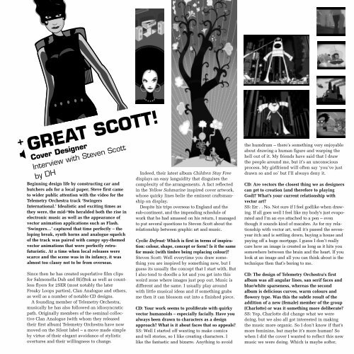
+ GREAT SCOTT!<br />
�<br />
Cover Designer<br />
Interview with Steven Scott<br />
by DH<br />
Beginning design life by constructing car and<br />
butchers ads for a local paper, Steve first came<br />
to wider public attention with the video for the<br />
Telemetry Orchestra track ‘Swingers<br />
International.’ Idealistic and exciting times as<br />
they were, the mid-‘90s heralded both the rise in<br />
electronic music as well as the appearance of<br />
vector animation applications such as Flash.<br />
‘Swingers…’ captured that time perfectly – the<br />
loping break, synth horns and analogue squelch<br />
of the track was paired with campy spy-themed<br />
vector animations that were perfectly retrofuturistic.<br />
At a time when local releases were<br />
scarce and the scene was in its infancy, it was<br />
almost too classy not to be from overseas.<br />
Since then he has created superlative film clips<br />
for Salmonella Dub and B(if)tek as well as countless<br />
flyers for 2SER (most notably the later<br />
Freaky Loops parties), Clan Analogue and others,<br />
as well as a number of notable CD designs.<br />
A founding member of Telemetry Orchestra,<br />
musically he has also followed an idiosyncratic<br />
path. Originally members of the seminal collective<br />
Clan Analogue (with whom they released<br />
their first album) Telemetry Orchestra have now<br />
moved on the Silent label – a move made simple<br />
by virtue of their elegant avoidance of stylistic<br />
overtures and their willingness to change.<br />
Indeed, their latest album Children Stay Free<br />
displays an easy languidity that disguises the<br />
complexity of the arrangements. A fact reflected<br />
in the Yellow Submarine inspired cover artwork,<br />
whose quirky lines belie the eminent craftsmanship<br />
on display.<br />
Despite his trips overseas to England and the<br />
sub-continent, and the impending schedule of<br />
work that he had amassed on his return, I managed<br />
to put several questions to Steven Scott about the<br />
relationship between graphic art and music.<br />
<strong>Cyclic</strong> <strong>Defrost</strong>: Which is first in terms of inspiration:<br />
colour, shape, concept or form? Is it the same<br />
for music (with timbre being replacing colour)?<br />
Steven Scott: Well everytime you draw something<br />
you are inspired by something new, but I<br />
guess its usually the concept that I start with. But<br />
I also tend to doodle a lot and you get into this<br />
weird zone where images just pop out. Music is<br />
different and the same. I usually play around<br />
with little musical ideas and if something grabs<br />
me then it can blossom out into a finished piece.<br />
CD: Your work seems to proliferate with quirky<br />
vector humanoids – especially facially. Have you<br />
always been drawn to characters as a design<br />
approach? What is it about faces that so appeals?<br />
SS: Well I started off wanting to make comics<br />
and tell stories, so I like creating characters. I<br />
like the fantastic and bizarre. Anything to avoid<br />
the humdrum – there’s something very enjoyable<br />
about drawing a human figure and warping the<br />
hell out of it. My friends have said that I draw<br />
the people around me, but it’s an unconscious<br />
process. My girlfriend will often say ‘you’ve just<br />
drawn so and so’ but I’ll always deny it.<br />
CD: Are vectors the closest thing we as designers<br />
can get to creation (and therefore to playing<br />
God)? What’s your current relationship with<br />
vector art?<br />
SS: Err . . No. Not sure if I feel godlike when drawing.<br />
If all goes well I feel like my body’s just evaporated<br />
and I’m an eye attached to a pen – even<br />
though it sounds kind of macabre. As for my relationship<br />
with vector art, well it’s passed the sevenyear<br />
itch and is settling down, buying a house and<br />
paying off a huge mortgage. I guess I don’t really<br />
care how an image is created as long as it hits you<br />
somewhere between the brain and the heart. If you<br />
look at an image and all you can think about is the<br />
technique then that’s boring to me.<br />
CD: The design of Telemetry Orchestra's first<br />
album was all angular lines, san serif faces and<br />
blue/white sparseness, whereas the second<br />
album is delicious curves, warm colours and<br />
flowery type. Was this the subtle result of the<br />
addition of a new (female) member of the group<br />
(Charlotte) or was it something more deliberate?<br />
SS: Yep, Charlotte did change what we were<br />
doing, but we also all got interested in making<br />
the music more organic. So I don’t know if that’s<br />
more feminine, but maybe it’s more human! So<br />
when I did the cover I wanted to reflect this new<br />
music we were doing. Which is maybe softer,