CHARTE GRAPHIQUE - Interreg-caraibes.org
CHARTE GRAPHIQUE - Interreg-caraibes.org
CHARTE GRAPHIQUE - Interreg-caraibes.org

You also want an ePaper? Increase the reach of your titles
YUMPU automatically turns print PDFs into web optimized ePapers that Google loves.
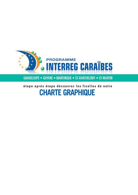
é t a p e a p r è s é t a p e d é c o u v r e z l e s f i c e l l e s d e n o t r e<br />
<strong>CHARTE</strong> <strong>GRAPHIQUE</strong>
Page 2<br />
<strong>CHARTE</strong> <strong>GRAPHIQUE</strong><br />
Avant<br />
PROPOS
SOMMAIRE<br />
Les Applications Standards<br />
LE LOGOTYPE<br />
Pourquoi ? . . . . . . . . . . . . . . . . . . . . . . . . . . . Page 05<br />
GRAPHISMES & COULEURS<br />
Tout savoir sur le logotype . . . . . . . . . . . . Page 07<br />
RÈGLES D'IMPRESSION DU LOGOTYPE<br />
Comment utiliser le logotype . . . . . . . . . . . Page 08<br />
UTILISATIONS INCORRECTES<br />
Ce qu'il ne faut pas faire ! . . . . . . . . . . . . . Page 09<br />
LA TYPOGRAPHIE<br />
Les fontes & leur utilisation . . . . . . . . . . . Page 11<br />
LES STANDARDS <strong>GRAPHIQUE</strong>S<br />
Présentation des fondamentaux . . . . . . . Page 13<br />
Les Applications Spéciales<br />
LES DÉPLIANTS, AFFICHES, ANNONCES PRESSES,<br />
LES SUCETTES EXTEIEURES LES ENSEIGNES<br />
Comment faire ? . . . . . . . . . . . . . . . . . . . . . Page 19<br />
Page 3<br />
<strong>CHARTE</strong> <strong>GRAPHIQUE</strong>
LES APPLICATIONS STANDARDS
Le logotype<br />
POURQUOI ?<br />
Le logotype de INTERREG CARAÏBES est la base et la référence absolue de notre<br />
image de marque tout en conservant ses qualités traditionnelles : mettre nos clients<br />
au centre de nos préoccupations pour mieux les comprendre et mieux les servir<br />
afin d'atteindre une qualité de prestation irréprochable.<br />
Page 5<br />
<strong>CHARTE</strong> <strong>GRAPHIQUE</strong>
Graphisme et couleurs<br />
LE LOGOTYPE<br />
La charte graphique de INTERREG CARAÏBES utilise une version de base du<br />
logotype pour l'ensemble des applications standards (ou fondamentaux) complétée<br />
par une déclinaison et quelques règles simples d'utilisation pour les cas<br />
particuliers. Merci de bien vouloir vous conformer aux impératifs décrits ci-après.<br />
La voile bleue de l’Europe<br />
L’arc Caraïbe<br />
Le nom<br />
Les 12 étoiles<br />
de l’Europe<br />
Les régions Antilles-Guyane<br />
Page 6<br />
<strong>CHARTE</strong> <strong>GRAPHIQUE</strong>
Graphisme et couleurs<br />
LE LOGOTYPE<br />
Le logotype de INTERREG CARAÏBES est principalement utilisé sur fond blanc afin<br />
d’offrir une visibilité maximum. Dès lors que le fond est en couleur, il sera<br />
obligatoirement utilisé dans sa version monochrome.<br />
Bleu <strong>Interreg</strong> Caraïbes<br />
Quadrichromie<br />
Cyan 100 % - Magenta 70 %<br />
Pantone 293 C<br />
Vert <strong>Interreg</strong> Caraïbes (dégradé)<br />
Quadrichromie<br />
Début : Cyan 100 % - Jaune 100 %<br />
Fin : Cyan 00 % - Jaune 00 %<br />
Début : Pantone 347 C<br />
Orange <strong>Interreg</strong> Caraïbes<br />
Quadrichromie<br />
Magenta 50 % - Jaune 100 %<br />
Pantone 138 C<br />
Jaune <strong>Interreg</strong> Caraïbes<br />
Quadrichromie<br />
Magenta 10 % - Jaune 100 %<br />
Pantone 109 C<br />
Page 7<br />
<strong>CHARTE</strong> <strong>GRAPHIQUE</strong>
Règles d'impression<br />
UTILISATION<br />
Le Logotype Couleur peut être imprimé selon les trois mises en couleurs suivantes,<br />
à l'exclusion de toute autre.<br />
Logotype couleur (avec ou sans reflet)<br />
Mode “Quadri” pour une utilisation offset,<br />
numérique ou sérigraphique. Format minimum 15 mm.<br />
Logotype couleur (avec ou sans reflet)<br />
Mode “Pantone” pour une utilisation offset,<br />
numérique ou sérigraphique. Format minimum 15 mm.<br />
Logotype couleur (avec ou sans reflet)<br />
Mode RVB exclusivement destiné à un usage “Vidéo”.<br />
Format minimum 15 mm.<br />
Page 8<br />
<strong>CHARTE</strong> <strong>GRAPHIQUE</strong>
Règles d'impression<br />
UTILISATION<br />
Le Logotype Monochrome peut être imprimé selon les trois mises en couleurs<br />
suivantes, à l'exclusion de toute autre. Attention : en cas d'impression monochrome<br />
la couleur de fond ne doit jamais transparaître au travers du logo.<br />
Logotype Monochrome “Niveau de gris”.<br />
Couleur de fond : Ne pas utiliser de couleurs sombres.<br />
Impression noir, offset, numérique ou sérigraphie.<br />
Format minimum 15 mm.<br />
Logotype Monochrome “Fond blanc”.<br />
Couleur de fond : blanc ou couleur claire.<br />
Impression Noir ou Pantone, offset numérique ou sérigraphie.<br />
Format minimum 15 mm.<br />
Attention : Dans certains cas, le logotype peut être utilisé en monochrome<br />
“couleur” Pantone, pour des documents en 1 couleur selon la couleur du<br />
document.<br />
La couleur choisie doit permettre un contraste et une lisibilité maximum.<br />
Couleur de fond : blanc ou couleur claire.<br />
Impression offset ou sérigraphie.<br />
Format minimum 15 mm.<br />
Page 9<br />
<strong>CHARTE</strong> <strong>GRAPHIQUE</strong>
Utilisation incorrectes<br />
CE QU'IL NE FAUT PAS FAIRE<br />
Le respect du logotype, de ses couleurs, de ses dimensions et de ses normes est<br />
une règle impérative, car la perception de notre identité ne doit être ni ternie ni<br />
altérée par une utilisation aléatoire.<br />
NE JAMAIS :<br />
Étroitiser le logotype, ou le déformer<br />
de quelque autre manière que ce soit.<br />
NE JAMAIS :<br />
Isoler un des éléments du logotype.<br />
NE JAMAIS :<br />
Changer les combinaisons de couleurs.<br />
NE JAMAIS :<br />
Utiliser d'autres couleurs que<br />
celles spécifiées à la rubrique<br />
“Graphisme et couleurs”.<br />
NE JAMAIS :<br />
Scanner le logotype,<br />
car la numérisation peut altérer<br />
ses qualités graphiques.<br />
Veuillez utiliser le CD Rom fourni avec<br />
cette charte.<br />
Page 10<br />
<strong>CHARTE</strong> <strong>GRAPHIQUE</strong>
La typographie<br />
LES FONTES SUR “MAC”<br />
& LEUR UTILISATION<br />
La police de caractères (TradeGothic) fait partie intégrante de la ligne graphique de<br />
INTERREG CARAÏBES elle devra être systématiquement utilisée sur les documents<br />
médias de communication. Elle pourra être complétée par d'autres typos afin<br />
d'harmoniser les thèmes et les ambiances graphiques.<br />
TradeGothic<br />
TradeGothic REGULAR<br />
ABCDEFGHIJKLMNOPQRSTUVWXYZ<br />
abcdefghijklmnopqrstuvwxyz0123456789<br />
TradeGothic<br />
TradeGothic LIGHT<br />
ABCDEFGHIJKLMNOPQRSTUVWXYZ<br />
abcdefghijklmnopqrstuvwxyz 0123456789<br />
TradeGothic<br />
TradeGothic BoldTwo<br />
ABCDEFGHIJKLMNOPQRSTUVWXYZ<br />
abcdefghijklmnopqrstuvwxyz 0123456789<br />
TradeGothic<br />
TradeGothic BOLD<br />
ABCDEFGHIJKLMNOPQRSTUVWXYZ<br />
abcdefghijklmnopqrstuvwxyz 0123456789<br />
Page 11<br />
<strong>CHARTE</strong> <strong>GRAPHIQUE</strong>
La typographie<br />
LES FONTES SUR “PC”<br />
& LEUR UTILISATION<br />
Dans le cas d’une utilisation “bureautique” sur un environnement PC, c’est la police<br />
de caractères (Arial) qui devra systématiquement être utilisée sur les documents.<br />
ARIAL<br />
Arial<br />
ABCDEFGHIJKLMNOPQRSTUVWXYZ<br />
abcdefghijklmnopqrstuvwxyz 0123456789<br />
ARIAL<br />
Arial Narrow<br />
ABCDEFGHIJKLMNOPQRSTUVWXYZ<br />
abcdefghijklmnopqrstuvwxyz 0123456789<br />
ARIAL<br />
Arial Bold<br />
ABCDEFGHIJKLMNOPQRSTUVWXYZ<br />
abcdefghijklmnopqrstuvwxyz 0123456789<br />
ARIAL<br />
Arial Black<br />
ABCDEFGHIJKLMNOPQRSTUVWXYZ<br />
abcdefghijklmnopqrstuvwxyz<br />
0123456789<br />
Page 12<br />
<strong>CHARTE</strong> <strong>GRAPHIQUE</strong>
Les standards graphiques<br />
ENTÊTE DE LETTRE<br />
L'ensemble de la correspondance doit symboliser la qualité et refléter le<br />
professionalisme, car c'est par elle que passe l'image de INTERREG CARAÏBES auprès<br />
des clients et des fournisseurs de l'établissement, et c'est à ce titre que les documents<br />
(entête et suite de lettres, cartes de visite, enveloppes et cartes de correspondance)<br />
doivent s'identifier à la marque et se presenter selon les normes indiquées ci après :<br />
Format : A4 (210 mm x 297 mm) • Papier : Offset Blanc 90 g/m 2<br />
Couleurs : Quadrichromie<br />
10 mm<br />
75 mm<br />
210 mm<br />
12,3 mm<br />
20 mm<br />
5,5 mm<br />
Document<br />
réduit à 53,4 %<br />
297 mm<br />
283,5 mm<br />
9,5 mm<br />
24 mm<br />
Page 13<br />
<strong>CHARTE</strong> <strong>GRAPHIQUE</strong>
Les standards graphiques<br />
SUITE DE LETTRE<br />
Format : A4 (210 mm x 297 mm) • Papier : Offset Blanc 90 g/m 2<br />
Couleurs : Quadrichromie<br />
210 mm<br />
47,5 mm<br />
10 mm<br />
10 mm<br />
3,5 mm<br />
Document<br />
réduit à 53,4 %<br />
297 mm<br />
283,5 mm<br />
Page 14<br />
<strong>CHARTE</strong> <strong>GRAPHIQUE</strong>
Les standards graphiques<br />
ENVELOPPE & CARTE DE CORRESPONDANCE<br />
Format : 230 mm x 162 mm • Type : A fenêtre - Bande siliconée<br />
Papier : Offset 90 g/m 2 • Couleurs : Quadrichromie.<br />
93 mm<br />
137 mm<br />
21 mm<br />
A<br />
B<br />
116 mm<br />
A<br />
B<br />
Document<br />
réduit à 51 %<br />
TradeGothic Bold<br />
Corps 8<br />
Interlignage 10<br />
TradeGothic<br />
Corps 8<br />
Interlignage 10<br />
162 mm<br />
230 mm<br />
Format : 210 mm x 100 mm • Papier : Couché Mat 250 g/m 2<br />
Couleurs : Quadrichromie.<br />
210 mm<br />
75 mm 123 mm<br />
7 mm<br />
9,5 mm<br />
5,5 mm<br />
100 mm<br />
Document<br />
réduit à 60,7 %<br />
63 mm<br />
15 mm<br />
Page 15<br />
<strong>CHARTE</strong> <strong>GRAPHIQUE</strong>
Les standards graphiques<br />
CARTE DE VISITE<br />
Format : 55 mm x 85 mm • Papier : Couché Mat 250 g/m 2<br />
Couleurs : Quadrichromie.<br />
Document<br />
à 100 %<br />
55 mm<br />
5 mm<br />
A<br />
TradeGothic Bold<br />
Corps 11<br />
Interlignage 9<br />
20 mm<br />
B<br />
TradeGothic<br />
Corps 8<br />
Interlignage 8<br />
85 mm<br />
A<br />
B<br />
C<br />
D<br />
57 mm<br />
C<br />
D<br />
E<br />
TradeGothic Oblique<br />
Corps 7<br />
Interlignage 9<br />
TradeGothic Bold<br />
Corps 7<br />
Interlignage 8<br />
TradeGothic<br />
Corps 7<br />
Interlignage 8<br />
Approche -3<br />
E<br />
8 mm<br />
Page 16<br />
<strong>CHARTE</strong> <strong>GRAPHIQUE</strong>
Les standards graphiques<br />
RÉSUMÉ DES FONDAMENTAUX<br />
Résumé de l’ensemble des applications standards (documents réduits à 45 %)<br />
Page 17<br />
<strong>CHARTE</strong> <strong>GRAPHIQUE</strong>
LES APPLICATIONS SPECIALES
Résumé<br />
DES ANNONCES PRESSES<br />
Le principe défini dans cette rubrique s'exerce en tant que standard pour la<br />
réalisation de documents presse. Le but étant de renforcer l'image et d'assurer un<br />
bon impact, par une identité visuelle homogène et claire auprès du grand public. La<br />
mise en page doit être adaptée à chaque cas particulier, mais doit respecter<br />
néanmoins les règles suivantes :<br />
Document<br />
réduit à 58,1 %<br />
Format :<br />
210 mm x 297<br />
Couleurs :<br />
Quadrichromie.<br />
Page 19<br />
<strong>CHARTE</strong> <strong>GRAPHIQUE</strong>
Résumé<br />
DES ANNONCES PRESSES<br />
Identification<br />
logotype<br />
sur fond blanc<br />
Bandeau<br />
des Régions<br />
Antilles-Guyane<br />
Document<br />
réduit à 65,7 %<br />
Format :<br />
210 mm x 297<br />
Couleurs :<br />
Quadrichromie.<br />
Vignette photo<br />
selon le thème de<br />
l’annonce presse<br />
Bandeau avec logos de l’Union européenne<br />
et Fonds Européen de Développement Régional<br />
Page 20<br />
<strong>CHARTE</strong> <strong>GRAPHIQUE</strong>
Affichage 4x3<br />
COMMENT FAIRE ?<br />
Le principe défini dans cette rubrique s'exerce en tant que standard pour la<br />
réalisation de documents extérieurs. Le but étant de renforcer l'image et d'assurer<br />
un bon impact, par une identité visuelle homogène et claire auprès du grand public.<br />
La mise en page doit être adaptée à chaque cas particulier, mais doit respecter<br />
néanmoins les règles suivantes :<br />
Document<br />
réduit à 34,4 %<br />
Format :<br />
400 mm x 300<br />
Couleurs :<br />
Quadrichromie.<br />
Page 21<br />
<strong>CHARTE</strong> <strong>GRAPHIQUE</strong>
Affichage 4x3<br />
COMMENT FAIRE ?<br />
Identification<br />
logotype<br />
sur fond blanc<br />
Vignette photo selon le thème de l’annonce presse<br />
Bandeau des Régions Antilles-Guyane<br />
Bandeau avec logos de l’Union européenne<br />
et Fonds Européen de Développement Régional<br />
Document<br />
réduit à 41,2 %<br />
Format :<br />
400 mm x 300<br />
Couleurs :<br />
Quadrichromie.<br />
Page 22<br />
<strong>CHARTE</strong> <strong>GRAPHIQUE</strong>
INTERREG CARAÏBES<br />
Secrétariat Technique Commun<br />
Espace Régional • Cité des Métiers • Raizet Sud • F. 97139 Abymes • Guadeloupe<br />
Tél. : 05 90 47 06 00 • Fax : 05 90 47 06 06 • Site : www.interreg-<strong>caraibes</strong>.<strong>org</strong><br />
Cette charte graphique a été réalisée par :<br />
6 et 7 immeuble La Caravelle - 530 Rue de La Chapelle<br />
Zone Industrielle de Jarry - 97122 Baie-Mahault - Guadeloupe<br />
Tél : 0590 95 15 71 - Fax : 0590 95 42 90 - E.mail : studio@altitudegp.com<br />
Altitude Studio SARL au capital de 117.000 euros - Siret : 492 455 712 000 17 - APE : 7022Z