Download Basile PDF - FontShop
Download Basile PDF - FontShop
Download Basile PDF - FontShop

Create successful ePaper yourself
Turn your PDF publications into a flip-book with our unique Google optimized e-Paper software.
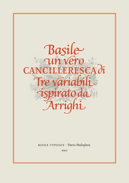
<strong>Basile</strong><br />
un vero<br />
cancilleresca di<br />
Tre variabili<br />
ispirato da<br />
Arrighi<br />
basile typeface . Darío Muhafara
asile es la conclusión de un proceso que<br />
comenzó con el aprendizaje de la caligrafía cancilleresca<br />
en el marco del taller de Roballos-Naab.<br />
Trabajé sobre una variación de cancilleresca que<br />
poseía, como característica marcada, un ancho<br />
más pronunciado que el modelo histórico.<br />
Al realizar la digitalización, las formas fueron<br />
modificándose para lograr un espíritu similar al<br />
que resultaba en la caligrafía pero pensando en<br />
el funcionamiento en texto corrido y en pequeños<br />
cuerpos. También la familia se agrandó incorporando<br />
tres sets de formas: itálicas, swash y extra<br />
swash. Con el agregado de un set de iniciales y un<br />
set de terminales.<br />
basile is the conclusion of a process that<br />
began with the learning of italic handwriting in<br />
a roballos-Naab studio course. In this workshop<br />
I developed a variation of chancery handwriting,<br />
which had, a more pronounced wider than its<br />
historical model.<br />
While making the digitalization, the forms were<br />
modified to obtain a similar spirit to which was<br />
in the handwriting, but thinking about the text in<br />
small sizes. Also incorporating three sets of forms<br />
enlarged the family: italic, swash and extra swash.<br />
And the addition of initials and terminals sets.<br />
-
f italic<br />
abcdefghijklmnopq<br />
rstuvwxyz chffqusp<br />
The basic chancery version has a classic calligraphic style<br />
look. The proportion is a bit wider from the original<br />
calligraphy. This modification gives a compact word<br />
construction and a less tight texture to the text with a<br />
bigger counter. The high contrast gives it a delicate look.<br />
It is useful for compose texts of intermediate length.<br />
Lorem ipsum dolor sit amet, consectetur adipiscing elit.<br />
Nulla eu erat ut nulla feugiat condimentum. Cras nec<br />
leo nibh, sed elementum nulla. Donec auctor, ligula<br />
sit amet tempor vulputate, purus sapien consectetur<br />
est, a sollicitudin odio orci eget felis. Maecenas gravida
f swash<br />
abcdefghijklmno<br />
qrstuwxyz chffsp<br />
These second version gives a more italic look. It has<br />
extended termination on some letters. The terminals has<br />
are more pronounced angle to emphasize the direction.<br />
Some letter as “s” and “v” has an extended up or down<br />
stroke to simulate a decorative calligraphic variation. The<br />
proportion and color is the same as the italic version so<br />
you can combine the different versions. The line spacing<br />
should be a couple of extra points from the italic version.<br />
It is useful for compose texts of intermediate length with<br />
more space inside and outside the text.<br />
Lorem ipsum dolor sit amet, consectetur adipiscing elit.
f xswash<br />
abcdefghijklmnop<br />
qrstuvwxyz chffld<br />
This last version is a very decorative one. It has very<br />
forced extended termination on some letters; the rest<br />
remains the same as swash version. It is very helpful<br />
to use it combine with the contextual alternate OTF<br />
feature to have important replacement combination.<br />
Anyway, you should take especial care at the time of<br />
using it. The proportion and colour is the same as the<br />
other two versions so you can combine altogether. The<br />
line spacing should be a couple of extra points from<br />
the other two versions. It is useful for compose strong<br />
decorative words as logotype.
italic<br />
Le truppe a difesa della citta erano poco<br />
numerose, non piu di cinquemila,<br />
avevano dalla loro parte le solide<br />
mura e l’artiglieria, di cui gli<br />
assedianti erano sprovisti.<br />
20/24<br />
swash<br />
Le true a difesa della citta erano oco<br />
numerose, non iu di cinquemila,<br />
aeano dalla loro arte le solide<br />
mura e l’artiglieria, di cui gli<br />
assedianti erano sproisti.<br />
20/27<br />
xswash<br />
Le trupe a difesa della citta erano poco<br />
numerose, non piu di cinquemila,<br />
aveano dalla loro parte le solide<br />
mura e l’artiglieria, di cui gli<br />
assedianti erano sproisti.<br />
20/30
Ludovico Vicentino Degli Arrighi<br />
was a papal scribe, and type designer<br />
in renaissance italy. He began his career<br />
AS A SCRIBE AT THE APOSTOLIC CHANCERY<br />
his experience in calligraphy led<br />
to create an influential pamphlet on<br />
Handwriting called La Oerina in 1522<br />
lanzichenecchi lasciarono tren<br />
il 12 novembre 1526, riuscirono ad<br />
Italic type script in the chancery style<br />
HE TURNED TO PRINTING HIS OWN ITALIC<br />
typefaces for his work which were widely<br />
il quale era l'unico capitano del<br />
last rinting was dated shortly before the<br />
Sack of rome, during which he was killed<br />
1527 . . 1527
ęðăʼn<br />
basic latin and latin 1<br />
AEFGHKLMNQRSTUVWXYZ ÀÁÂÃÄ<br />
ÅÆÇÈÉÊËÌÍÎÏÐÑÒÓÔÕÖØÙÚÛÜÝÞ<br />
acdefghiklmnoqrstuvwxyzàáâãäå<br />
æçèéêëìíîïðñòóôõöøùúûüýÿþ<br />
extended latin a<br />
ĀĂĄĆĈĊČĎĐĒĔĖĘĚĜĞĠĢĤĦĨĪĬĮİIJĴ<br />
ĶĸĹĻĽĿŁŃŅŇŊŌŎŐŒŔŖŘŚŜŞŠŢŤŦ<br />
ŨŪŬŮŰŲŴŶŸŹŻŽāăąćĉċčďđēĕėę<br />
ěĝğġģĥħĩīĭįıijĵķĺļľŀłńņňʼnŋōŏőœŕ<br />
ŗřśŝşšţťŧũūŭůűųŵŷźżžſ<br />
<strong>Basile</strong> glyphs character maps<br />
are based on Adobe Latin 3. It<br />
covers over 50 languages that<br />
include major Western European<br />
Latin languages; Latin-<br />
based Central European (CE)<br />
languages.
all caps<br />
LLE TRUPPE A DIFESA DELLA CITTA NUMEROSE, NON PIU DI<br />
CINQUEMILA, MA DALLA LORO PARTE LE SOLIDE L’ARTIGLIERIA<br />
DI CUI GLI ASSEDIANTI ERANO MIA IL SACCO EBBE UN GRAVE COSTO<br />
PER LA FURONO VENTIMILA VITTIME, DANNI. LANZICHENECCHI LAS-<br />
CIARONO TRENTO, RIUSCIRONO AD UNIRSI AGLI SPAGNOLI PROVE-<br />
NIENTI DA MILANO E ALLA FINE DI NOVEMBRE LE TRUPPE IMPERIALI<br />
ATTRAVERSARONO IL PO. POCHI GIORNI PRIMA, A GOVERNOLO VENNE<br />
FERITO GRAVEMENTE GIOVANNI DALLE BANDE NERE, IL QUALE ERA<br />
L'UNICO CAPITANO DELLA LEGA ANTI-IMPERIALE A CONTRASTARNE LA<br />
DISCESA.DIFESA DELLA CITTA NUMEROSE, NON PIU DI CINQUEMILA,<br />
MA DALLA LORO PARTE LE SOLIDE L’ARTIGLIERIA DI CUI GLI ASSEDI-<br />
ANTI ERANO MIA IL SACCO EBBE UN GRAVE COSTO PER LA FURONO<br />
VENTIMILA VITTIME, DANNI. LANZICHENECCHI LASCIARONO TRENTO,<br />
RIUSCIRONO AD UNIRSI AGLI SPAGNOLI PROVENIENTI DA MILANO E<br />
ABCDEFGHIJKLMNOPQRSTUVWXYZ<br />
small caps<br />
lle truppe a difesa della citta numerose, non piu di<br />
cinquemila, ma dalla loro parte le solide l’artiglieria di<br />
cui gli assedianti erano mia il sacco ebbe un grave costo per<br />
la Furono ventimila vittime, danni. Lanzichenecchi lasciarono<br />
trento, riuscirono ad unirsi agli spagnoli provenienti da<br />
milano e alla fine di novembre le truppe imperiali attraversarono<br />
il po. Pochi giorni prima, a governolo venne ferito<br />
gravemente giovanni dalle bande nere, il quale era l'unico<br />
capitano della lega anti-imperiale a contrastarne la discesa.<br />
a difesa della citta numerose, non piu di cinquemila, ma dalla<br />
loro parte le solide l’artiglieria di cui gli assedianti erano<br />
mia il sacco ebbe un grave costo per la Furono ventimila vittime,<br />
danni. Lanzichenecchi lasciarono trento, riuscirono ad<br />
unirsi agli spagnoli provenienti da milano e alla fine di novi<br />
abcdefghijklmnopqrstuvwxyz
&&&<br />
italic<br />
small caps<br />
all caps<br />
puntuation &<br />
symbols<br />
€1234% chapón ¿Qué?<br />
compañía@inf c&a (ab-c} n*/<br />
€1234% chapón ¿qué?<br />
compañía@info c&a<br />
<strong>Basile</strong> has three different sets<br />
for punctuation and other<br />
symbols for italic, small caps<br />
and uppercase. Also there is a<br />
default combination of numbers<br />
for each case.<br />
€1234% CHAPÓN ¿QUÉ?<br />
COMPAÑÍA@INFO C&A (AB-C} N*/<br />
,;:.…‘’“”‚„‘”‹›«»(-–—)!¡¿?[|]{¦}<br />
&@*†‡§©®#ªº -•·<br />
!¡¿?&@<br />
•(-–—)!¡¿?&@[|]{¦}‹›«»
nina<br />
The structure is based on the chancery calligraphic style. The proportion is a bit wider<br />
from the original calligraphy. This modification gives a compact word construction<br />
and a less tight texture to the text. Subtle entasis on every character. Asymmetric<br />
serif The characters draw represent the one movement outline generate with a<br />
nib. Also the construction of the serif gives the same feeling. Asymmetric rounded<br />
arch to emphasize the cursive movement. High bifurcation to emphasize the sensation<br />
of continuous outline.<br />
<br />
calligraphic details<br />
Aikov<br />
<br />
<br />
<br />
<br />
serif, vertical<br />
metric & contrast<br />
<br />
<br />
<br />
<br />
Extra weight in ending of the strokes without serif. Calligraphic serif and terminal.<br />
Breakpoints to emphasize the calligraphic style. Large x weigh and long ascendant<br />
to give an elegant look. Sharp encounters. High contrast to emphasize a<br />
delicate look.
ligatures, alternates & contextual alternates<br />
mancha de actores<br />
fi fl ff fh fk fb fj ft ffi ffl fff ffj ch ct ck st qu sp LA ZA ty tv tw ‡ fi fl ff fh<br />
fk fb fj ft ffi ffl ch ct ck st sp ‡ ch fi fd fl ff fh fb fj ft ffi ffl ffj gy ll st sp<br />
Igor Garay ‡ Igor Garay<br />
cgy T · agosto cientos yardas THE SAME THING BUT DIFFERENT<br />
alternates. There are some special alternate glyphs for using at certain combinations of letters. These are useful<br />
to avoid collisions or modifications to the spirit of the word composed. OTF contextual alternate feature automatically<br />
sets some of these combinations.<br />
worldwide worldwide<br />
skiff skiff · acidify acidify · zygothic zygothic · evhoe ehoe<br />
xswash without otf features & xwash with ligatures & c. alternates. There are many<br />
letter combinations that collision. Even OTF feature avoid many of these errors by replacing xwash by swash glyphs,<br />
the use of xwash require some expertise to manually edit glyphs combination. Each case must be studied as a hole.
initial & end<br />
Amelie<br />
A ÀÁÃÄÅB DEFGH IJKLMNPRT UVWXY<br />
AÀÁÂÃÄÅEFGHKLMNQRTUVWXY Z<br />
beéêëěęfhi jkl mnprtu vwxyŷỳÿ<br />
a äåâãàáb d e fghi kl m n o r tuwxyz<br />
<strong>Basile</strong> has a complete set of initial and ending both<br />
upper and lowercase letters with their complete diacritic<br />
set. It can be use indistinct with the three different sets:<br />
italic, swash and xswash for constructing word with<br />
strong presence as logotypes or headlines.
Languages examples<br />
polish Při vyslovení jména Modigliani se lidem nejčastěji<br />
vybaví osobité a nezaměnitelné polish Při vyslovení jména<br />
Modigliani se lidem nejčastěji vybaví osobité a nezaměnitelné<br />
polish Při vyslovení jména Modigliani se lidem nejčastěji vy<br />
czech<br />
Od prosince 2010 až do<br />
konce února 2011 se v Praze,<br />
v historických prostorách<br />
Obecního domu, otevře<br />
dlouho připravovaná výstava<br />
světoznámého italského<br />
malíře a sochaře Amedea<br />
Modiglianiho (1884–1920).<br />
Na uspořádání této výstavy<br />
pracovala pražská galerie<br />
Vernon společně s italskou<br />
kurátorkou Serenou Baccaglini<br />
déle než rok.<br />
Při vyslovení jména Modigliani<br />
se lidem nejčastěji vybaví<br />
osobité a nezaměnitelné<br />
polish<br />
Wydawcami ksiązki są:<br />
Instytut Adama Mickiewicza<br />
i John Libbey Publishing Ltd.<br />
Publikacja “Polish Cinema<br />
Now!” prezentuje twórczość<br />
filmową powstałą po 1989<br />
roku. Jest to zbiór 11 tekstów w<br />
języku angielskim, napisanych<br />
przystępnie i z pasją przez<br />
czołowych specjalistów<br />
z Polski i zagranicy. Jak<br />
informuje wydawca, w książce<br />
kino polskie jest opisane<br />
z różnych perspektyw, od<br />
filmowej rozrywki, animacji<br />
i dokumentu, aż po kino<br />
gejowskie i feministyczne.<br />
Książka jest przeznaczona<br />
dla kinomanów, dla których<br />
kino Wajdy, Hasa, Munka,<br />
german<br />
Wenn es um Kreativität geht,<br />
kann es Berlin mit jeder<br />
anderen Metropole der Welt<br />
aufnehmen. Nirgendwo sonst<br />
entsteht aufregendere Kunst,<br />
kommt radikaleres Theater<br />
auf die Bühne, werden mehr<br />
Opern inszeniert oder lässigere<br />
Clubs eröffnet. In Berlin<br />
wird es nie langweilig – und<br />
das Beste ist: Berlin kommt<br />
ohne immerwährendes<br />
Verkehrschaos aus, hat weder<br />
brennende Vorstädte noch<br />
rüpelige Investmentbanker, die<br />
einem im Restaurant<br />
hungarian<br />
Kőszeg legtöbb embert<br />
megmozgató rendezvénye a<br />
Kőszegi Szüret, valamint az<br />
ehhez szorosan kapcsolódó<br />
Nemzetközi Fúvószenekari<br />
Találkozó. A háromnapos<br />
programsorozat immár több<br />
mint két évtizede mozgatja<br />
meg a város lakosságát,<br />
hiszen központi eseménye a<br />
minden év szeptember utolsó<br />
szombatján tartandó szüreti<br />
karnevál. Ezen a programon<br />
felvonul a város apraja-nagyja,<br />
az iskolák, civil szervezetek,<br />
cégek különböző mókás<br />
jelmezekben. A felvonulás<br />
köré épül a további két nap<br />
programja, mely pénteken<br />
este fúvósszerenáddal indul<br />
italian<br />
Questa duca partì da Arezzo<br />
il 20 aprile 1527, alla testa di<br />
35.000 soldati, approfittando<br />
delle precarie situazioni in<br />
cui si trovavano i veneziani<br />
ed i loro alleati a causa<br />
dell’insurrezione di Firenze<br />
contro i Medici. Le truppe<br />
a difesa della città erano<br />
poco numerose (non più di<br />
cinquemila), ma avevano<br />
dalla loro parte le solide<br />
mura e l’artiglieria, di cui gli<br />
assedianti erano sprovvisti.<br />
Borbone doveva prendere la<br />
città in fretta, per evitare di<br />
portuguese<br />
Na Região de Lisboa produzemse<br />
vinhos brancos, tintos, rosés<br />
e espumantes, bem como<br />
aguardentes únicas.<br />
As regiões com maior tradição<br />
vinícola têm os seus vinhos<br />
classificados com a sigla DOC,<br />
que significa Denominação<br />
de Origem Controlada. Esta<br />
denominação é uma garantia<br />
de proveniência e qualidade, já<br />
que o vinho tem que obedecer<br />
a regras muito rigorosas quanto<br />
à sua composição, tempo de<br />
estágio, etc.<br />
Na Região de Lisboa existem<br />
18 DOC: Santarém, Cartaxo,<br />
Chamusca, Coruche, Almeirim,<br />
Tomar, Óbidos, Alenquer,<br />
Lourinhã, Torres Vedras,
1973<br />
proportional<br />
tabular lining<br />
swash<br />
ligatures<br />
roman<br />
fractions<br />
superior/inferior<br />
ordinals<br />
0123456789€$¢£¥ƒ%‰<br />
0123456789€$¢£¥ƒ%‰<br />
23 5679<br />
49 73 75<br />
<br />
½⅓⅔¼¾ 1/5 2/5 3/5 4/5 1/6 5/6 1/7 2/7 3/7 4/7<br />
5/7 6/7 ⅛ ⅜ ⅝ ⅞ 1/9 2/9 4/9 5/9 7/9 8/9 11/22<br />
(0123456789⁾ ₍0123456789₎ H2O nota4<br />
1st 2nd 3rd 1a 1o 2a adnorst<br />
<strong>Basile</strong> has four different sets<br />
of numbers: proportional<br />
lowercase numbers a default, a<br />
tabular lining set of figures. In<br />
addition it has a set of swash<br />
numbers and roman for a<br />
more decorative use.<br />
It also has a complete set of<br />
fractions, superior, inferior and<br />
english/spanish ordinal system.
Duetto, caligraphy exhibition<br />
communication typeface
giacomo casanova<br />
Von Seingalts<br />
memoiren<br />
carl henschel-verlag/berlin<br />
historical sample<br />
editorial<br />
j<br />
EDE gebildete Sprache sam-<br />
melt die Darstellungen<br />
mittels Öl, Fresko, Gouache,<br />
Aquarell, Pastell-Farben unter<br />
der präzisen Bezeichnung Male-<br />
rei. Für Kunstwerke, die sich auf-<br />
einfarbige Wiedergabe von Litch,<br />
Schatten und Form beschränken,<br />
ist dagegen eine genaue, zusam-<br />
menfassende Benennung nicht<br />
vorhanden.<br />
m ax k linger<br />
Malerei & Zeichnung<br />
Wer den Prinzipien der bildenden<br />
Künste nähertritt, wird bald fühlen,<br />
daß die Handzeichnung, vor allem<br />
aber Stich, Radierung, Schnitt und<br />
Lithographie in ihren selbständigen
Malvón restaurante<br />
packaging, stickers, bread labels
Siesta en el Tahuantinsuyu<br />
wine label
Locura malbec<br />
wine label
<strong>Basile</strong> typeface v. OTF 1.0<br />
© Darío Manuel Muhafara 2011<br />
Argentina<br />
Published by tipo.net.ar<br />
digital type foundry | fundidora de tipos digitales<br />
www.tipo.net.ar contact us at: info@tipo.net.ar