FontFont: FF DIN Round – Digital Block Letters - FontShop
FontFont: FF DIN Round – Digital Block Letters - FontShop
FontFont: FF DIN Round – Digital Block Letters - FontShop

You also want an ePaper? Increase the reach of your titles
YUMPU automatically turns print PDFs into web optimized ePapers that Google loves.
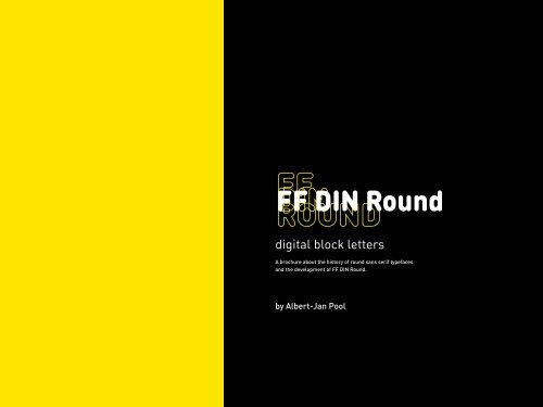
<strong>FF</strong> <strong>DIN</strong> <strong>Round</strong><br />
digital block letters<br />
A brochure about the history of round sans serif typefaces<br />
and the development of <strong>FF</strong> <strong>DIN</strong> <strong>Round</strong>.<br />
by Albert-Jan Pool
26<br />
a new super-family<br />
partners in design<br />
3<br />
preface<br />
4<br />
*soft family*<br />
history<br />
◊<br />
« »<br />
disco ! daily<br />
basic + household appliances<br />
• •<br />
friendly ≈ pudding<br />
→medicine ¦ budget←<br />
15<br />
technical & design<br />
fitted-in arcs<br />
too short tilts to the left<br />
overshoot too small<br />
top heavy<br />
too open<br />
<strong>FF</strong> <strong>DIN</strong> Black<br />
baseline<br />
<strong>FF</strong> <strong>DIN</strong>
*soft family*<br />
◊<br />
« »<br />
disco ! daily<br />
basic + household appliances<br />
• •<br />
friendly ≈ pudding<br />
→medicine ¦ budget←<br />
ff din round<br />
Preface<br />
Is there any type designer who would be better qualified to construct a rounded <strong>DIN</strong><br />
than Albert-Jan Pool? It’s safe to say no. There are three reasons for it.<br />
First of all, <strong>FF</strong> <strong>DIN</strong> is “his typeface”. For almost 20 years, Pool has dedicated himself<br />
to the history of German standard lettering with scientific ambitions, and in 1995 he<br />
created the <strong>FF</strong> <strong>DIN</strong> basic weights. To this day, he has been combing through museums,<br />
archives, and studios to learn everything about this category of typefaces.Today, even the<br />
German Institute for Standardization (<strong>DIN</strong>) in Berlin relies on his expertise.<br />
Secondly, Pool is a perfectionist. He realized long ago that his internationally popular<br />
<strong>FF</strong> <strong>DIN</strong> would be incomplete without a rounded version. That it has taken so long was<br />
due to his own quality requirements. More than 5 years Pool worked on <strong>DIN</strong> <strong>Round</strong> again<br />
and again dismissing countless intermediate stages. With the active support of<br />
FSI <strong>FontShop</strong> International he eventually managed to complete the family.<br />
Finally, Albert-Jan Pool originates from a type talent hotbed as it no longer exists<br />
today. He grew up with the Ikarus type design and production software, developed by<br />
Hamburg-based physicist Dr. Peter Karow in 1975 and introduced at ATypI in Warsaw for<br />
the first time. In the eighties, practically all typefaces from foundries such as Linotype,<br />
Berthold, ITC, or Monotype were vectorized using the precise Ikarus software.<br />
In his book “<strong>Digital</strong> Formats of Typefaces” published in 1987, Peter Karow revealed<br />
one of the last secrets of perfect roundings in letters digitized with Ikarus: the transitions<br />
from curves, named clothoids in the technical terminology. Besides that, as<br />
Ikarus allows defining modules, it made it easy to construct letters. And just these two<br />
approaches <strong>–</strong> precision and modularity <strong>–</strong> enabled Albert-Jan Pool to create the best<br />
possible <strong>DIN</strong> round version, the <strong>FF</strong> <strong>DIN</strong> <strong>Round</strong> family.<br />
Ivo Gabrowitsch<br />
↑<br />
3
history<br />
<strong>Round</strong>ed Lapidary <strong>Letters</strong><br />
<strong>Block</strong> <strong>Letters</strong><br />
<strong>Block</strong> Script<br />
Fröbel Gift<br />
Condensed <strong>Round</strong> Grotesque<br />
Prussian Railways<br />
Technical Lettering<br />
<strong>DIN</strong> Standards<br />
Standardized Lettering<br />
Elementary Typedesign<br />
Design Trends<br />
↑<br />
4
ounded lapidary letters<br />
The oldest round sans serif letters that<br />
i’ve found are shown in a manual for<br />
‘architects, lithographers, sign makers<br />
and others’. The manual is dated 1871<strong>–</strong><br />
72. No complete alphabet is shown; the<br />
author demonstrates that the execution<br />
of a round sans serif is mainly a<br />
draughtsman’s trick. It can simply be<br />
achieved by replacing the stroke ends<br />
of an ‘Egyptian Lapidary Letter’ with<br />
half circles. All letters in the manual<br />
are constructed by using lines, arcs,<br />
and ellipses which are drawn on simple<br />
grids.<br />
<strong>Round</strong> Sans Serif by C. E. Fetzer, 1871<strong>–</strong>1872<br />
↑<br />
5
Wall chart with<br />
Soennecken’s<br />
lettering system<br />
from 1887<br />
block letters<br />
Only a few years later, a similar method<br />
for constructing letters is published.<br />
This time however, it is a writing method<br />
for primary schools by Friedrich Soennecken.<br />
He was inspired by the work of<br />
the pedagogue Fröbel, who worked with<br />
construction sets based on elementary<br />
(i.e. basic) shapes such as spheres,<br />
cubes, and pyramids. As a logical<br />
consequence he had developed a type<br />
system that made use of lines and arcs.<br />
Children would first create letters by<br />
assembling them from a set of straight<br />
and circular metal parts. The main difference<br />
between both construction<br />
methods is that in Fetzer system the<br />
outlines match the grid, while in Soennecken’s<br />
system the centreline of the<br />
elements have to match the grid.<br />
↑<br />
Soennecken’s<br />
lettering system<br />
for primary<br />
schools from<br />
1913<br />
6
Strokes of even width<br />
with rounded endings<br />
are typical for the<br />
round tipped pen.<br />
Sample from Soennecken’s<br />
writing<br />
method for primary<br />
schools from 1878.<br />
block script<br />
After becoming familiar with the letterforms, the children<br />
would start to write them. Using a round tipped pen, block<br />
letters are drawn on a grid. Soenneckens idea behind the<br />
method is that both the elementary forms and the pens make<br />
it easier for children to learn how to write. Contrary to the<br />
then popular pointed-nib style of that time, the round-tipped<br />
pen does not stick in the paper when too much pressure is<br />
applied in the upstrokes. The round tipped pen is being sold<br />
under various trademarks. Soennecken: Plattenfeder (roundtipped<br />
pen); Brause: Ornamentfeder (ornamental pen);<br />
Heintze & Blanckertz: Redisfeder. It usually is available in several<br />
widths. This enables the user to write the same alphabet<br />
at different sizes, thereby maintaining the ratio between the<br />
stroke width and the size of the letters.<br />
fröbel gift<br />
Until his death in 1919 Soennecken<br />
fights to replace the teaching of the<br />
Deutsche Kurrent (a black letter-like<br />
script) with his method. In 1913 he<br />
tries to establish his script system with<br />
‘Soennecken’s Fröbel Gift’. It contains<br />
a set of elements that can be used to<br />
compose letterforms according to his<br />
type system. The Froebel Gift is advertised<br />
as a game for children in their Kindergarten<br />
years, so they would already<br />
be able to play with simple block letters<br />
before teachers at primary schools<br />
would have had a chance to make them<br />
familiar with the rather complex German<br />
Kurrent …<br />
↑<br />
7<br />
Printed sheet (partly<br />
reconstructed) that<br />
was used on the cover<br />
of Soennecken’s<br />
Fröbel Gift in 1913<br />
and in 1919.
condensed round grotesque<br />
Of course the typefounders too have<br />
their round sans serifs. The Leipzig<br />
foundry Julius Klinkhardt shows its<br />
Schmale Runde Grotesk (Condensed<br />
<strong>Round</strong> Sans Serif) from 1885 in the<br />
specimen book shown here. A bolder<br />
weight has also been available as wood<br />
type. Looking at the outer curves at the<br />
junctions in z, it looks as if this typeface<br />
has been drawn as a Sans Serif first. If<br />
this typeface would have been designed<br />
as a true round sans serif, the draughtsman<br />
would would probably have drawn<br />
the diagonal somewhat steeper, in oder<br />
to avoid the straight line between the<br />
curves.<br />
Type specimen book from the Klinkhardt foundry in Leipzig (1906)<br />
©Andreas Seidel<br />
↑<br />
8
prussian railways<br />
Excerpt from a master drawing of the Royal<br />
Prussian Railways from 1897.<br />
By 1897 the Prussian Railways issue a<br />
master drawing in which the lettering<br />
on train coaches is defined. Direction<br />
sign posts (Munich <strong>–</strong> Berlin for example)<br />
now have to be drawn using a condensed<br />
round sans serif typeface. The construction<br />
is based on a simple grid. An ‘o’ can<br />
be drawn on a 3 × 7 matrix. The drawing<br />
also shows lettering (über Wiesau-Hof)<br />
↑<br />
9<br />
that has been drawn on a (truncated)<br />
3 × 4 grid. Unfortunately, there are no<br />
master drawings showing complete<br />
alphabets. In 1905 the Prussian Railways<br />
issue a new master drawing. From now<br />
on a condensed sans serif is defined as<br />
the standard typeface that is to be used<br />
for all lettering (also see <strong>DIN</strong> Engschrift).
technical lettering ↑<br />
10<br />
The use of sans serif lettering by the railway companies marks<br />
the beginning of a new trend in public lettering. Sign posts are<br />
no longer seen as work of art, but as functional information<br />
carriers. Assuming that any flourishing is in the way when fast<br />
acquisition of information is necessary, the general preference<br />
starts to shift from black letter to sans serif typefaces. In the<br />
case of master drawings for industrial production a similar<br />
change can be observed. Subsequently, the prefererred lettering<br />
style on the drawings shifts from the calligraphic German<br />
Kurrent towards simple block letters like those developed by<br />
Soennecken.<br />
In the first years of the 20th century, Georg Bahr <strong>–</strong> a teacher<br />
at a technical school in Berlin-Charlottenburg <strong>–</strong> picks up the<br />
idea of a lettering system making use of elementary shapes<br />
and develops a new device. It is a lettering ruler with a set of<br />
stencils, for drawing characters with a technical drawing pen.<br />
The draughtsman composes the letters by picking the different<br />
strokes making up the character shapes. The method is<br />
somewhat tedious, but the ruler is short and economical. By<br />
1909 Bahr patents his lettering device. In 1910, he sells the<br />
patent to two of his personal friends: Paul Filler and Oscar<br />
Fiebig. The next year Filler and Fiebig establish a company in<br />
which the patent makes up 50% of the initial capital. The new<br />
company Filler & Fiebig now produces and markets the new<br />
‘Bahrsche Normograph’. Later on, rulers with complete alphabets<br />
called ‘Standardgraph’ are developed as well. These rulers<br />
become so successful that in 1967 the company renames<br />
itself to Standardgraph Filler & Fiebig GmbH. To this very day a<br />
wide range of stencils are being produced. Many of these provide<br />
stencils for drawing technical parts and objects developed<br />
according to the <strong>DIN</strong> standards.<br />
The Bahrsche Normograph, a lettering stencil from 1909
din standards<br />
One of the starting points for systematic standardization of<br />
industrial products is the standardization of its basic elements.<br />
Standardized elements then have to be based on standardized<br />
dimensions and ratios. Seen from this rational point of view, it<br />
might appear logical that the systematic approach of people<br />
like Soennecken and Bahr could be taken as the starting point<br />
for designing a standard typeface, or even a standard type<br />
family. In Germany, the ‘Normenaus-schuß der Deutschen<br />
Industrie’ (Standardization Comittee of the German Industry) is<br />
installed in 1916. Although the Committee for Drawings soon<br />
recognizes the need for standardizing the lettering on drawings,<br />
they apparently do not feel it necessary to systematically<br />
approach the design of their letterforms. In 1919 they issue<br />
<strong>DIN</strong> 16, the first standard typeface that was to be used on<br />
drawings. It resembles a handwritten block script rather than<br />
a geometrically oriented design.<br />
By 1926 the members of the Standardization Committee of the<br />
Graphic Industry proposes that all printing offices should be<br />
able to equip themselves with one standardized printing type,<br />
preferably of a sans serif design. At the same time, a Committee<br />
of Type is founded. Headed by Siemens engineer Ludwig<br />
Goller, the committee proposes in 1927 to build up a harmonized<br />
set of typefaces for printing, engraving, and lettering.<br />
This set of typefaces is issued as <strong>DIN</strong> 1451.<br />
Top:<br />
Bottom:<br />
<strong>DIN</strong> 16 from 1919 (outdated)<br />
<strong>DIN</strong> 1451 for hand lettering, draft from 1927<br />
↑<br />
11
standardized lettering<br />
Whereas in the case of printing types the committee can pick from a wide range of available type families,<br />
the palette of typefaces for hand lettering and stencils is smaller. For the condensed version, the<br />
standard typeface of the Deutsche Reichsbahn is chosen. Its forms have already been defined by the<br />
Prussian Railways in 1905. Because this typeface is drawn on a coarse grid, it is easy to render. Many<br />
copybooks for draughtsmen and sign painters from that period display similar types of alphabets. The<br />
sample from an old Filler & Fiebig catalogue shows that they also provided a Normograph lettering<br />
stencil with which very similar letterforms can be drawn using a technical drawing pen.<br />
The committee also plans to provide a standard for normal and wide lettering. The 1927 draft shows a<br />
first attempt. It seems that the committee has not been able to present a proposal showing a solution<br />
for a set of complete alphabets at that time. Normally, a standard committee harmonizes specifications<br />
for products rather than developing them. In this case, Filler & Fiebig probably had been the only<br />
company which could provide a constructed alphabet fulfilling the demands as outlined in the 1927<br />
draft. Also, a Filler & Fiebig catalogue from around 1934 proves the ongoing engagement of the company<br />
in the field of lettering stencils according to the <strong>DIN</strong> standards.<br />
The regular Normograph alphabet is not only easy to construct, it is also based on a matrix that<br />
matches the one used for the Reichsbahn typeface. In the Reichsbahn typeface characters such as a, b,<br />
e, g, n, o, and p are 5 units high and 3 units wide. In the proposed Mittelschrift these characters have<br />
the same height of 5 units and are all exactly 1 unit wider.<br />
Deutsche Reichsbahn<br />
standard typeface<br />
<strong>DIN</strong> Engschrift (prelim-<br />
inary version of 1931).<br />
Sample executed with<br />
a Normograph letter-<br />
ing ruler from Filler &<br />
Fiebig<br />
lettering stencil<br />
‘Bahrsche Normograph’<br />
from 1909<br />
<strong>DIN</strong> 1451 ‘Mittelschrift’<br />
for hand lettering,<br />
preliminary version<br />
from 1931<br />
<strong>DIN</strong> 17 for lettering<br />
stencils and engraving<br />
from 1938<br />
↑<br />
12<br />
Next to its work on <strong>DIN</strong> 1451, the Committee of Type also attempts to synchronize<br />
<strong>DIN</strong> 16 with <strong>DIN</strong> 1451. <strong>DIN</strong> 16 is being redrawn on a geometrical basis and gets an<br />
upright counterpart, which is named <strong>DIN</strong> 17. A comparative analysis shows many<br />
similarities in construction and proportions between <strong>DIN</strong> 1451, <strong>DIN</strong> 17 and Georg<br />
Bahr’s type system for the Normograph. The examples of Fetzer and Klinkhardt<br />
which are presented here, show that round typefaces have often been derived from<br />
existing sans serif typefaces. The new <strong>DIN</strong> 1451 for hand lettering and stencils is a<br />
different case. Both originate in the same basic idea. Although ‘written proof’ has<br />
not yet emerged, my current hypothesis is that both <strong>DIN</strong> 17 and <strong>DIN</strong> Mittelschrift<br />
origin in Georg Bahr’s elementary type system.
e l e m<br />
e n t a<br />
r y t y<br />
p e d e<br />
s i g n<br />
elementary typedesign<br />
The work on <strong>DIN</strong> 1451 takes a long time. The economical<br />
crisis of 1929 forces the German industry to minimize its<br />
engagement in the process of standardization. The conservative<br />
movement, which fulminates in the seizure of power by<br />
the Nazis in 1933, clearly prefers ‘national typefaces’ like the<br />
Fraktur and the new sober versions of Textura of that time.<br />
Although there was no official Nazi-policy that dictated the<br />
exclusive use of the so-called broken scripts, establishing a<br />
norm which defines sans serifs typefaces as a standard was<br />
probably not thought of as being ‘politicaly correct’. Despite<br />
of the actual preference for broken scripts, <strong>DIN</strong> 1451 was<br />
issued in 1936 and became the official standard typeface to<br />
be used on motorway signage, car license plates, traffic signs<br />
as well as public sign posts including those for street names<br />
and wayfinding systems in bomb shelters. With the release of<br />
<strong>DIN</strong> 1451 (1936), <strong>DIN</strong> 17 (1938) and the new version of <strong>DIN</strong> 16<br />
(1934), the idea of having one model of letters that can be used<br />
for various lettering techniques, including engraving, is used<br />
for crea-ting a practical industrial solution. It had taken more<br />
than fifty years since Fetzer and Soennecken had outlined their<br />
ideas. In the meantime, Georg Bahr’s lettering system for the<br />
Normograph had become 25 years old. Their systematic and<br />
geometric approach towards the design of letters had now<br />
become reality within the industrial production of lettering as<br />
well as for the tools and the typefaces that came with them.<br />
↑<br />
13
design trends<br />
Lettering rulers were a common technical<br />
device in the drawing rooms until<br />
the early eighties. By 1976, the company<br />
Standardgraph estimated that Rotring,<br />
Standardgraph, Staedtler, Faber-Castell<br />
and others would sell over 500,000 <strong>DIN</strong><br />
lettering rulers a year. Unfortunately,<br />
<strong>DIN</strong> 16 and 17 had been superseded by<br />
Isonorm somewhat later, but technical<br />
drawing machines using pens have<br />
become almost obsolete anyway. New<br />
technologies such as automated foilcutting,<br />
ink-jet, and laser printers make<br />
it possible to use a growing number of<br />
‘electronic fonts’ for technical lettering.<br />
<strong>DIN</strong> 16 and 17 as well as Isonorm<br />
gradually disappeared, but type with<br />
round stroke endings enjoys a newfound<br />
popularity.<br />
Lettering rulers from the 1980s.<br />
↑<br />
14
technical<br />
and design<br />
Search and Replace?<br />
Smooth Transitions<br />
Clothoids<br />
Prototypes<br />
Type Dialogue<br />
Curve Extrema<br />
Tangents<br />
Rational Angles<br />
<strong>Round</strong> Pieces<br />
Interpolation<br />
Tapered Diagonals<br />
Cyrillic Alternates<br />
↑<br />
15
search and replace?<br />
Left:<br />
Right:<br />
The main goal in the design of <strong>FF</strong> <strong>DIN</strong><br />
<strong>Round</strong> was to draw the typeface in such<br />
a way that it would match the overall<br />
image of <strong>FF</strong> <strong>DIN</strong> as closely as possible.<br />
On the left one you can see that simply<br />
substituting the square stroke ends with<br />
arcs would lead to unacceptable results.<br />
This would make the rounded stroke<br />
ends take up less volume; and have<br />
them appear shorter. This causes the<br />
top-left stroke of the ‘a’ to look too short.<br />
The ‘s’ gives the impression to tilt to the<br />
left, and the ‘e’ seems top-heavy. The<br />
round strokes of the ‘c’ cannot enclose<br />
its counter anymore, which makes the<br />
letter appear more open and more condensed.<br />
Another problem occurs at the<br />
bottom right of the ‘a’: the spur looks<br />
too short. As with all rounded parts,<br />
rounded stroke ends must overshoot the<br />
baseline. This simulation clearly demonstrates<br />
that simply replacing the stroke<br />
ends by arcs (part of a circle which is<br />
mathematically perfect) using a ‘Search<br />
and Replace’ algorithm could never have<br />
worked.<br />
In this simulation, rounded stroke ends have been created by inserting<br />
arcs through ‘Search and Replace’. As a result the rounded<br />
stroke ends all appear shorter than those in <strong>FF</strong> <strong>DIN</strong> Black.<br />
In <strong>FF</strong> <strong>DIN</strong> <strong>Round</strong> the rounded stroke ends have been specifically<br />
designed to match the overall image of <strong>FF</strong> <strong>DIN</strong>.<br />
fitted-in arcs <strong>FF</strong> <strong>DIN</strong> Black<br />
<strong>FF</strong> <strong>DIN</strong> <strong>Round</strong> Black<br />
too short tilts to the left<br />
overshoot too small<br />
top heavy<br />
too open<br />
baseline<br />
<strong>FF</strong> <strong>DIN</strong> <strong>Round</strong> Black<br />
↑<br />
16
→<br />
→<br />
←<br />
←<br />
<strong>Round</strong>ed stroke ends built from arcs. The bumps at the transitions<br />
(→) seem to push the contour outwards, making the straight line<br />
between them appear wavy.<br />
smooth transitions<br />
<strong>FF</strong> <strong>DIN</strong> <strong>Round</strong><br />
with smooth transitions.<br />
How can one design rounded stroke ends that look really<br />
good? Simply attaching arcs results in bumpy transitions<br />
between straight lines and arcs. The arrows in the middle<br />
illustration mark the spots where straight lines transition<br />
into arcs.<br />
This is a well-known problem, one that Paul Renner<br />
already pointed out in his book ‘The Art of Typography’ in<br />
1939. ‘When an arc drawn with a compass transitions into<br />
a tangent, from a strictly geometrical point of view there<br />
is no corner at the transition. The eye however perceives<br />
an anomaly, as the transition seems to display a disturbing<br />
bump. The eye expects a gradual transition from the<br />
straight line into the arc … this is why the … transition from<br />
the arc into the straight line appears to have corners. Furthermore<br />
the eye perceives a slightly curved line between<br />
two arcs although the line itself is straight.’<br />
In <strong>FF</strong> <strong>DIN</strong> <strong>Round</strong> all transitions have been smoothened.<br />
clothoids<br />
Clothoids: Algorithms that generate curves<br />
which smooth transition into straight lines.<br />
↑<br />
1930s: Motorway trajectory executed with<br />
lines and arcs<br />
17<br />
A mathematical solution for generating smooth transitions<br />
from curves into straight lines had already been developed by<br />
Alfred Cornu (1841<strong>–</strong>1902). In the 1970s, Peter Karow tried to<br />
automate the process of rounding typefaces by implementing<br />
such formulas. Ikarus, his software for digitizing and editing<br />
typefaces has maintained its position as a market leader until<br />
the 1990s. Unfortunately, a solution for rounding typefaces<br />
in an optically correct way was never achieved. And graphic<br />
software such as Illustrator, or type design software such as<br />
FontLab only offer the possibility of doing ‘round corners’ with<br />
arcs. As a consequence the round parts of <strong>FF</strong> <strong>DIN</strong> <strong>Round</strong> had<br />
to be rendered manually.
<strong>FF</strong> <strong>DIN</strong> <strong>Round</strong> Black<br />
Prototype<br />
<strong>FF</strong> <strong>DIN</strong> <strong>Round</strong> Black<br />
First prototype of <strong>FF</strong> <strong>DIN</strong> <strong>Round</strong> (top)<br />
and final version (bottom). The prototype<br />
was not perfect yet. The straight<br />
lines at the junctions of diagonals and<br />
vertical or horizontal strokes such as<br />
in M, N, Z and 1 should refer to <strong>FF</strong> <strong>DIN</strong>,<br />
to avoid the typeface from becoming<br />
too playful.<br />
prototypes<br />
flat intersections on acute angles<br />
↙<br />
EMNZ 1247<br />
rounded intersections on acute angles<br />
↙<br />
EMNZ 1247<br />
Before <strong>FF</strong> <strong>DIN</strong> <strong>Round</strong> was given its final shape, several prototypes<br />
were developed. The initial version was designed by<br />
Christoph Dunst according to my instructions. During his<br />
graphic design education he interned at my studio. I asked him<br />
to keep the differences between <strong>FF</strong> <strong>DIN</strong> and <strong>FF</strong> <strong>DIN</strong> <strong>Round</strong><br />
as little as possible. Consequently many round parts were<br />
designed individually for each character.<br />
The first problem to be solved were the diagonals found in the<br />
characters A, V, W, and so on. The basic round parts designed<br />
for the horizontal and vertical stroke ends of T could not simply<br />
be rotated at any given angle. The coarse grid of the PostScript<br />
Type1 font technology (1000 units to the em quad) forced us to<br />
edit numerous rounding errors upon each rotation. Also, the<br />
curves and their smooth transitions took twice as many points<br />
as we would have needed when using arcs. As these points<br />
were very close to each other in the light weights, this made it<br />
hard to create curves with an acceptable quality.<br />
↑<br />
18
type dialogue<br />
With the advent of OpenType technology<br />
the technical necessity to draw type at<br />
1000 x 1000 units became obsolete. By<br />
doubling the resolution, the curves of<br />
<strong>FF</strong> <strong>DIN</strong> <strong>Round</strong> could now be drawn and<br />
rotated in an acceptable way. I developed<br />
a second prototype in which I removed<br />
the questionable straight lines in the<br />
corners of M, Z, and so on.<br />
Again, Christoph Dunst assisted me, this<br />
time as a freelancer. This version was<br />
used on one single occasion <strong>–</strong> the ‘Type<br />
Dialogue’ symposium in 2007, an event<br />
organized by the ‘ultrazinnober’ group<br />
of students from Prof. Klaus Detjen’s<br />
typography course at the Muthesius<br />
Academy of Art in Kiel.<br />
Second prototype of <strong>FF</strong> <strong>DIN</strong> <strong>Round</strong>. Kerning had not been completed<br />
yet at this stage. This phenomenon usually manifests itself in rare<br />
character pairs that somehow always show up in very visible locations<br />
in the layout.<br />
↑<br />
19
curve extrema<br />
Symmetry axis<br />
Position of the anchor<br />
points on the curves<br />
→<br />
The higher resolution made my work somewhat easier. The<br />
curves could now be rotated without loss of quality, if not for<br />
such things like curve extreme points. Up till then both True<br />
Type and Type 1 hinting technologies relied heavily on their<br />
presence. Perfect rendering of typefaces on screen could only<br />
be achieved on curves incorporating these extreme points.<br />
From a type designer’s point of view, the shape of a rounded<br />
stroke end on the left does not need any anchor points on its<br />
curve extremes. If you ask me it is rather the opposite: perfect<br />
symmetry can only be achieved if the anchor points can<br />
be positioned in symmetrical relation to the central axis of<br />
the stroke. With the introduction of grey-scale rendering of<br />
typefaces on screen, the hinting technology used in older font<br />
formats seemed to have become outdated as well. After all,<br />
↑<br />
Ideal round stroke ending. The anchor<br />
points on the curve have been positioned<br />
symmetrically. There are no anchor points<br />
on the x- and y-extremes.<br />
← ←<br />
<strong>Round</strong> stroke ending with so-called curve<br />
extreme points. These are the anchor<br />
points at ← and ↑ on the x- and y-extremes<br />
respectively.<br />
both TrueType and Type1 hinting technology were created in<br />
times when screen display was black and white only. Display<br />
typefaces would especially benefit from grey-scale technology,<br />
as it virtually doubles the resolution of a computer screen.<br />
Having seen the results, some type designers abandoned<br />
extreme points and hinting from their typefaces. Encouraged<br />
by this, I created a new prototype with perfectly symmetrical<br />
diagonal strokes. No extreme points, no hinting. Unfortunately<br />
tests executed by FSI <strong>FontShop</strong> International did not provide<br />
the expected results. We concluded that for the sake of high<br />
quality screen rendering, we still needed extreme points and<br />
hinting. The editing of all diagonal stroke endings needed to be<br />
done all over again.<br />
↑<br />
tangents<br />
↑<br />
←<br />
20<br />
The distance from the anchor point to the Bézier handle measures<br />
40 units in x-direction and 70 units in y-direction. The Bézier lever<br />
and handle can only perform as a tangent if the x-y distance between<br />
the points is a multiple of 4:7.<br />
By then the decision had been made that <strong>FF</strong> <strong>DIN</strong> <strong>Round</strong> should<br />
be available as a Pro Version at its initial release. This meant<br />
that a complete Cyrillic character set had to be designed.<br />
Although some Cyrillic characters can be derived from the<br />
Latin set, the number of rounded stroke endings would have<br />
doubled. It quickly became clear that the design process<br />
should be as systematic as possible. I decided to try to keep<br />
the number of different stroke endings as little as possible.<br />
The following insight formed the basis for this <strong>–</strong> using<br />
Bézier curves (like in PostScript and OpenType technology) a<br />
curve transitioning into a straight line can only be smooth (i.e.<br />
appear tangential) if the handle of the Bézier curve exactly<br />
aligns with the anchor points at both ends of the straight line.<br />
As a result diagonals can no longer be expressed by an angle,<br />
but need to be defined by a ratio (the relation between x- and<br />
y-coordinates) instead. In mathematics, angles based on this<br />
principle are called rational angles.
ational angles<br />
As the next step I measured the angles of all the diagonals<br />
found in the characters of the typeface. Many of them were<br />
already close to a rational angle, because the <strong>DIN</strong> typefaces<br />
were originally drawn on a coarse grid as shown above. Once<br />
you have seen the grid, you also understand the proportions of<br />
some of the characters, such as the narrow X. Most diagonals<br />
could be ‘rationalised’ without conceding on the character of<br />
the typeface. I could have gone even further in reducing this<br />
number, but as a result a significant number of characters of<br />
<strong>FF</strong> <strong>DIN</strong> <strong>Round</strong> would have been clearly different from <strong>FF</strong> <strong>DIN</strong>.<br />
<strong>FF</strong> <strong>DIN</strong>’s character is defined by the following characteristics <strong>–</strong><br />
on the one hand it is rigid and technical, on the other it should<br />
look as ‘normal’ as possible. For <strong>FF</strong> <strong>DIN</strong> <strong>Round</strong> as well this<br />
balance had to be maintained.<br />
Right:<br />
The individual angles of the diagonals<br />
have been standardized using a small<br />
number of so-called ‘rational angles’.<br />
This subtle way of standardising the<br />
diagonals enhances the technical aspect<br />
of the type design without distracting<br />
from its character.<br />
Ratio: 1:3 angle: 18,43° V v y / , „ “<br />
Ratio: 1:5 angle: 11.31° ƒ #<br />
Ratio: 3:8 angle: 20,56° A 7<br />
Ratio: 1:1 angle: 45,00° Q 1 » « ‹ › × ¤ ˆ → ↑ ↗<br />
Ratio: 1:2 angle: 26,57° YÆ 4 6 9 7 % ≥ ≤ < > ^ ◊ ∑<br />
Ratio: 4:7 angle: 29,74° K R X<br />
↑<br />
21
ound pieces<br />
Some of the ‘round pieces’ of <strong>FF</strong> <strong>DIN</strong> <strong>Round</strong><br />
Black. In spite of all the rationalisation and<br />
standardization, over 50 different components<br />
had to be designed for each weight.<br />
↑<br />
22<br />
Although <strong>FF</strong> <strong>DIN</strong> <strong>Round</strong> does not have<br />
any serifs, within the design process<br />
the stroke endings were approached<br />
in a similar way. After rationalising the<br />
angles, I analysed all the stroke widths.<br />
Wherever possible they were adjusted to<br />
a smaller set of standardized measures.<br />
All this was done to keep the number<br />
of different rounded stroke endings as<br />
small as possible. Because I wanted to<br />
keep things short I named the rounded<br />
stroke endings ‘round pieces’, after the<br />
Hamburgian expression for ‘bun’ or ‘roll’.<br />
In the meantime <strong>FontFont</strong>’s Inka Strotmann<br />
had started to assist me with the<br />
project. We optimised the round pieces<br />
and interpolated them for the intermediate<br />
weights. After that, Inka practically<br />
rebuilt all the characters from light to<br />
black according to the specifications of<br />
their angles and stroke widths. With the<br />
patience of a saint she corrected numerous<br />
rounding errors in the intermediate<br />
weights and took it upon herself<br />
to detect and adjust even the smallest<br />
deviations.<br />
Technical perfection should not result in<br />
tediousness though, so we introduced<br />
some pointed corners in <strong>FF</strong> <strong>DIN</strong> <strong>Round</strong>’s<br />
guillemets and arrows.
interpolation<br />
<strong>FF</strong> <strong>DIN</strong> <strong>Round</strong> Black<br />
<strong>FF</strong> <strong>DIN</strong> <strong>Round</strong> Light<br />
Graphic designers like to work with<br />
type families that have many weights.<br />
In order to ensure that such a range<br />
of weights remains consistent, a type<br />
designer usually starts the production of<br />
a new typeface family by drawing a light<br />
and a black weight at both extremes<br />
of the weight axis. The intermediate<br />
weights are subsequently created by<br />
interpolation. Quite often the outlines<br />
of the characters in the intermediate<br />
weights have to be adjusted. Many<br />
rounding errors have to be corrected.<br />
One of the prerequisites for flawless<br />
interpolation is that in both extremes the<br />
number of points and the design characteristics<br />
of the shapes are identical.<br />
In the case of <strong>FF</strong> <strong>DIN</strong> <strong>Round</strong> it seemed<br />
preferable that the weights would match<br />
those of <strong>FF</strong> <strong>DIN</strong>. Comparing the ‘n’ in<br />
the light and the black weight reveals<br />
that the top parts of the vertical strokes<br />
have been designed correctly, yet upon<br />
closer examination we notice that they<br />
have a different number of points. Also<br />
the shapes have been designed separately<br />
<strong>–</strong> the black weight simply does not<br />
allow for a straight element on the top<br />
right side of the vertical stroke. For the<br />
intermediate weights we had to choose<br />
between one way or the other though …<br />
I could have ‘solved’ the problem by<br />
abandoning the idea of doing an accompanying<br />
round weight to <strong>FF</strong> <strong>DIN</strong> Black,<br />
but in that case <strong>FF</strong> <strong>DIN</strong> <strong>Round</strong> would<br />
really have missed something.<br />
↑<br />
23
tapered diagonals<br />
vwyAXY<br />
<strong>FF</strong> <strong>DIN</strong> <strong>Round</strong> Light<br />
vwyAXY<br />
<strong>FF</strong> <strong>DIN</strong> <strong>Round</strong> Black<br />
vwyAXY<br />
<strong>FF</strong> <strong>DIN</strong> Light<br />
vwyAXY<br />
<strong>FF</strong> <strong>DIN</strong> Black<br />
The German standard typefaces could be written with linear strokes. The diagonal strokes of <strong>FF</strong> <strong>DIN</strong> have been slightly tapered.<br />
For <strong>FF</strong> <strong>DIN</strong> <strong>Round</strong> stroke widths were kept almost linear in order to preserve the character of the written form.<br />
Bahrscher Normograph from 1909 Lettering stencils (1970s)<br />
→<br />
→<br />
→<br />
↑<br />
24<br />
Characters appear darker at the spots<br />
where two strokes meet. In order to<br />
compensate for this optical effect, the<br />
diagonals such as in A and X have been<br />
tapered slightly. In the case of <strong>FF</strong> <strong>DIN</strong> I<br />
had a sound rationale for not doing this.<br />
<strong>FF</strong> <strong>DIN</strong> <strong>Round</strong> strongly reminds of the<br />
German standard typefaces. Originally<br />
they had been developed for lettering<br />
on technical drawings. These could be<br />
written with a technical drawing pen; its<br />
linear stroke width being a distinctive<br />
feature.<br />
The use of rational angles practically<br />
forbids the subtle differences of the<br />
angles needed for tapering the diagonal<br />
strokes.<br />
It should be possible to interpolate the<br />
‘round pieces’ without having to edit too<br />
extensively. Diagonal strokes should<br />
have identical angles from Light to Black<br />
to enable this.<br />
In bolder weights, characters with<br />
diagonal strokes are normally designed<br />
a bit wider. This is clearly exemplified by<br />
<strong>FF</strong> <strong>DIN</strong>’s X and Y. In order to strengthen<br />
the rigid character of the typeface,<br />
I decided to go without such subtleties<br />
in <strong>FF</strong> <strong>DIN</strong> <strong>Round</strong>.
cyrillic alternates<br />
ф жкяv аф жкяѵ<br />
<strong>FF</strong> <strong>DIN</strong> Bold <strong>FF</strong> <strong>DIN</strong> <strong>Round</strong> Bold<br />
Свободомыслящий информатика каждый язык съезд благодушие ящерица. Єѵа оѵ сѵнодъ мѵро.<br />
ф жкяѵ аф жкяѵ<br />
<strong>FF</strong> <strong>DIN</strong> Bold <strong>–</strong> Cyrillic Alternates <strong>FF</strong> <strong>DIN</strong> <strong>Round</strong> Bold <strong>–</strong> Cyrillic Alternates<br />
Свободомыслящий информатика каждый язык съезд благодушие ящерица. Єѵа оѵ сѵнодъ мѵро.<br />
The users of <strong>FF</strong> <strong>DIN</strong> Pro’s Cyrillic characters are being<br />
offered several alternates. For ›ж‹ (Zhe), ›к‹ (Ka), ›я‹ (Ya) and<br />
›ѵ‹ (Izhitsa) a rather curly version is offered as an alternate<br />
to the standard characters which have a plain and technical<br />
appearance. The alternate forms of <strong>FF</strong> <strong>DIN</strong> <strong>Round</strong> have been<br />
designed differently. The combination of rounded stroke ends<br />
with curved strokes would have been too playful. Especially in<br />
the bolder weights of <strong>FF</strong> <strong>DIN</strong> <strong>Round</strong>, the straight diagonals of<br />
the alternate characters ensure that <strong>FF</strong> <strong>DIN</strong> <strong>Round</strong> stays sober.<br />
Also, the horizontal stroke ends rather refer to the traditional<br />
form, which stays closer to the expectations of most readers.<br />
↑<br />
25
a new<br />
superfamily<br />
Partners in Design<br />
Inside View<br />
Character Set<br />
About Albert-Jan Pool<br />
↑<br />
26
<strong>FF</strong> <strong>DIN</strong> <strong>Round</strong> Light<br />
<strong>FF</strong> <strong>DIN</strong> Light<br />
<strong>FF</strong> <strong>DIN</strong> <strong>Round</strong> Regular<br />
<strong>FF</strong> <strong>DIN</strong> Regular<br />
<strong>FF</strong> <strong>DIN</strong> <strong>Round</strong> Medium<br />
<strong>FF</strong> <strong>DIN</strong> Medium<br />
<strong>FF</strong> <strong>DIN</strong> <strong>Round</strong> Bold<br />
<strong>FF</strong> <strong>DIN</strong> Bold<br />
<strong>FF</strong> <strong>DIN</strong> <strong>Round</strong> Black<br />
<strong>FF</strong> <strong>DIN</strong> Black<br />
partners in design<br />
Best foot foreward<br />
Organ door<br />
You can’t go home again<br />
Building steam with a grain of salt<br />
The number song<br />
Six days<br />
Giving up the ghost<br />
Midnight in a perfect world<br />
What does your soul look like<br />
Monosylabik<br />
With the release of <strong>FF</strong> <strong>DIN</strong> <strong>Round</strong>,<br />
<strong>FF</strong> <strong>DIN</strong> finally has its rounded companion.<br />
Fetzer, Soennecken and Goller<br />
would have been delighted <strong>–</strong> their<br />
dream has gone digital. <strong>DIN</strong>’s simplicity<br />
and industrial straightforwardness<br />
can now be combined with rather soft<br />
and emotional aspects without having to<br />
rely on other typefaces. Although using<br />
several different typefaces within a<br />
design project enriches the typographic<br />
palette, it is also more complex and thus<br />
time-consuming to maintain a harmonious<br />
overall image. Multi-style typeface<br />
families such as <strong>FF</strong> <strong>DIN</strong> <strong>Round</strong> and<br />
<strong>FF</strong> <strong>DIN</strong> can be very helpful, providing<br />
graphic solutions that are both flexible<br />
and feasible.<br />
Larger design projects in which different<br />
elements need to be clearly distinguished<br />
visually will definitely benefit<br />
from this. Think of product logos, slo-<br />
<strong>FF</strong> <strong>DIN</strong> & <strong>FF</strong> <strong>DIN</strong> <strong>Round</strong> Family Overview<br />
handgloves<br />
handgloves<br />
handgloves<br />
handgloves<br />
handgloves<br />
handgloves<br />
handgloves<br />
handgloves<br />
handgloves<br />
handgloves<br />
gans and other striking elements such<br />
as product features, price tags and special<br />
offers in advertising work and shop<br />
design. All of them must call attention<br />
and communicate their uniqueness, and<br />
eventually they also have to be recognized<br />
as players from the same team.<br />
With <strong>FF</strong> <strong>DIN</strong> <strong>Round</strong> ‘hard selling’ may<br />
become easier to integrate within corporate<br />
design projects.<br />
↑<br />
27
inside view<br />
Silver Soul<br />
La chanson du parasite<br />
40 Day Dream<br />
Sur les murs de ma chambre<br />
Les yeux de l’oiseau<br />
Norway<br />
Waiting for the 7.18<br />
Turbo Dreams<br />
Way Out<br />
Leave me alone<br />
Stars<br />
10 Mile Stereo<br />
Rollercoaster Ride<br />
↑<br />
28
character set<br />
<br />
<br />
<br />
<br />
<br />
<br />
<br />
<br />
<br />
<br />
<br />
<br />
<br />
<br />
<br />
<br />
<br />
<br />
<br />
<br />
<br />
<br />
↑<br />
29
Albert-Jan Pool at the Tag der Schrift in Zürich, Switzerland © Florian Hardwig<br />
about albert-jan pool<br />
Albert-Jan Pool was born in 1960 in<br />
Amsterdam. He studied at the Royal<br />
Academy of Arts in The Hague. Initiated<br />
by professor Gerrit Noordzij the<br />
Academy had become an incubator of<br />
type design. Albert-Jan was one of<br />
the co-founders of <strong>Letters</strong>], a group of<br />
young Dutch type designers. Many of its<br />
members (Frank Blokland, Erik and Petr<br />
van Blokland, Jelle Bosma, Luc(as) de<br />
Groot, Bart de Haas, Henk van Leyden,<br />
Peter-Matthias Noordzij, Marie-Cécile<br />
Noordzij-Pulles, Just van Rossum and<br />
Peter Verheul) have become well-known<br />
type designers. After his study he left<br />
for Germany. From 1987 to 1991 he was<br />
Type Director at Scangraphic in Wedel,<br />
near Hamburg. From 1991 to 1994<br />
he was Manager of Type Design and<br />
Production at URW in Hamburg. During<br />
this time he completed his type families<br />
URW Imperial, URW Linear and URW<br />
Mauritius. By January 1995 he started<br />
his own studio Dutch Design in Hamburg.<br />
<strong>FF</strong> <strong>DIN</strong> and <strong>FF</strong> OCR-F were among<br />
his first projects. He had been teaching<br />
type design at the Muthesius Hochschule<br />
in Kiel from 1995 to 1998, as well<br />
as typography at the Hamburg Academy<br />
for Marketing and Media. Together<br />
with type consultant Stefan Rögener of<br />
AdFinder GmbH and copywriter Ursula<br />
Packhäuser he wrote and designed a<br />
both useful and provocative book on the<br />
effects of type on brand image en-titled<br />
“Branding with Type”, which has been<br />
published by Adobe Press. Dutch Design<br />
finally merged into FarbTon Konzept<br />
+ Design. The new company was cofounded<br />
1999 with Jörn Iken, and<br />
Klaus-Peter-Staudinger, as well as with<br />
Birgit Hartmann who is also the mother<br />
of their daughter Pia-Elina (born 1999).<br />
For customers of FarbTon he created<br />
several corporate typefaces such as<br />
Jet Set Sans together with Syndicate<br />
Brand & Corporate for Jet/Conoco in<br />
1997, C&A InfoType together with Factor<br />
Design for C&A in 1998, DTL HEIN GAS<br />
for HEIN GAS Hamburger Gaswerke in<br />
1999 and Regenbogen Bold for Regenbogen,<br />
a political party in Germany in 2001.<br />
Pool is currently working on several<br />
new series in order to extend the family<br />
of <strong>FF</strong> <strong>DIN</strong>.<br />
↑<br />
30
imprint<br />
<strong>FontFont</strong> <strong>–</strong> Innovative digital typefaces by designers for designers. For 20 years.<br />
<strong>FontFont</strong>® and <strong>FF</strong> <strong>DIN</strong>® are trademarks of FSI <strong>FontShop</strong> International GmbH.<br />
Design: FSI <strong>FontShop</strong> International GmbH (Sascha Timplan)<br />
Text: Albert-Jan Pool<br />
Editing: Yves Peters, Ugla Marekowa, Ivo Gabrowitsch<br />
© July 2010 FSI <strong>FontShop</strong> International GmbH. All rights reserved.<br />
↑<br />
31