Baixe o PDF com uma apresentação detalhada - Tipografia
Baixe o PDF com uma apresentação detalhada - Tipografia
Baixe o PDF com uma apresentação detalhada - Tipografia

Create successful ePaper yourself
Turn your PDF publications into a flip-book with our unique Google optimized e-Paper software.
mainly his master-piece Vita Christi, a four volume devo-<br />
tional work printed for Queen Lyanor, wife to João II and sis-<br />
ter of Manuel I.<br />
Since we know that Valentim Fernandes did not cast the<br />
typefaces he used, we will quickly find the origin of those<br />
letters in the printshops of the german typographers work-<br />
ing in Spain. Names like the Compañeros Alemanes (a print-<br />
er’s society), Meinardus Ungut, N. Polonus, Pablo Hurus,<br />
Jacobo Kromberger and a few others lead us to the origins of<br />
the «typical Gothic Rotunda» used in Spain in Portugal.<br />
We rely on the extensive research done by German expert<br />
Konrad Haebler, displayed in his Typenreportorium.<br />
This oldfashioned letterform, not at all equivalent to the<br />
spirit of H<strong>uma</strong>nism, prevailed in the Iberian Peninsula quite<br />
a long time. In appears as a symbol of the traditional medie-<br />
val values typical of the court ot king Manual I, the monarch<br />
who became increadably wealthy by establishing and person-<br />
ally controlling the trade of oriental spices. In Portugal, the<br />
printing with Gothic letters prevails till 1540-50, when is it<br />
is finally replaced by the Roman letters already widely used<br />
in France and Italy.<br />
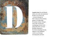
One curious feature of Portuguese incunabula are the big<br />
letters printed on the title pages. Not only Valentim Fernan-<br />
des used to order large, rough woodcut letters to layout mas-<br />
sive titels; we see this feature in the work of other printers of<br />
this time. This special style was rendered in the digital type-<br />
face «Incunabulo», an ornamental lowercase alphabet of<br />
tall gothic letters, together with two uppercase case, lavishly<br />
ornamented.<br />
The fonts presented here are not script fonts; they were<br />
inspired by the Gothic Rotunda typefaces used in incuna-<br />
biles in Portugal and Spain. The fonts contains all lower<br />
and upper case characters used at the dawn of printing in<br />
Germany, Spain and Portugal. In addition, one set of large<br />
titling letters, originally printed from woodcuts, <strong>com</strong>pletes<br />
the offer.<br />
The offer is a real and rare <strong>com</strong>plete historical printing<br />
set, faithfull to the rough print made by the early typogra-<br />
phers who worked in the Iberian Peninsula - with typogra-<br />
phic material from Germany.<br />
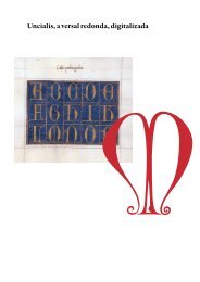
Gótica Rotunda: <strong>apresentação</strong> de três fontes digitais / Página 3<br />
The printed Rotunda: Mexia,<br />
Ferando. Nobiliario perfetamente<br />
copilado. Seville: Peter Brun and<br />
Juan Gentil, 30 June 1492. GW<br />
M23111. Typ.1:94/95G, Typ.2:90G