

Download - Artistik Magazine
Download - Artistik Magazine
Download - Artistik Magazine

You also want an ePaper? Increase the reach of your titles
YUMPU automatically turns print PDFs into web optimized ePapers that Google loves.
VOLUME 3 | WINTER 2011<br />
JESSE ADAIR: JEKYLL & HYDE<br />
BEYOND THE LENS, BEHIND THE FAÇADE<br />
BATTLING THE ELEMENTS FOR ART<br />
FOCUS ON CATHY FRANKLIN
welcome<br />
We kick off a brand new year with a few new additions to the magazine,<br />
three exciting CS5 tutorials, some wonderful success stories and student<br />
artwork. Some of you may have been excited to see a new look for our last<br />
issue, while others were a bit disappointed not to have the regular content<br />
to be inspired by. Whichever the case - never fear as we are back in our<br />
usual swing of things and promise to keep you insipired as we move into<br />
a new year and begin the third volume of ARTISTIK <strong>Magazine</strong>.<br />
In the wake of our recent Regional Design Showcase, I have received a<br />
great amount of feedback from designers and employers in the industry.<br />
Many, in fact, have expressed a need to continue receiving the magazine.<br />
From the feedback I gathered, the issue was well-received here in Tampa.<br />
In fact, for this milestone issue we held a sexy, swanky launch event and<br />
design gala in St. Petersburg, Florida that showcased the design work<br />
of local artists from our Tampa, Orlando and Online campuses and many<br />
pieces from students and alumni across the country. You can check out the<br />
photos from the event on our Facebook page. A great time was had by all<br />
and it presented a wonderful opportunity for networking as well.<br />
If you’re not a Facebook friend by now, what are you waiting for? There<br />
you can have the opportunity to meet other designers, photographers and<br />
artists from across the country - and, in some cases, around the world. You<br />
can also get to know some of the students and alumni that have worked<br />
with us on ARTISTIK. Other items such as upcoming launch events and<br />
interactive training sessions will be posted there as well. So get connected<br />
and stay in touch.<br />
This issue’s cover and feature focuses on a very talented photographer<br />
and current Movie Production student at IADT- Tampa by the name of<br />
Jesse Adair. I have had the opportunity to work with Jesse on several<br />
projects on campus, but never found the chance to effectively showcase<br />
the amazing work he does. Unlike many photographers, his styles are<br />
unusually varied. The cover highlights the “lighter” side of his personality,<br />
while his “darker” side is revealed in the accompanying feature, Jekyll<br />
& Hyde: Beyond the Lens, Behind the Façade. It is an in-depth interview<br />
into the creative mind of Jesse Adair and the two diverse avenues of<br />
photography he excels at- landscape and horror.<br />
Please continue to write in and tell me what you think about the magazine<br />
and have a safe, healthy and prosperous new year.<br />
Josef Mancino<br />
Editor-in-Chief<br />
jm@artistikmagazine.com<br />
Photo by Paul Pelak<br />
focus success alumni exposed<br />
18 Cathy Franklin<br />
An electric personality translates itself on<br />
camera and in the classroom as Collins<br />
College instructor Cathy Franklin confronts<br />
the elements to capture lightning on film<br />
and shares her enthusiasm for the art with<br />
many of her students.<br />
22 Ideation 12<br />
Chocolate and passion are a winning<br />
combination for five groups of IADT- Detroit<br />
students that competed to develop an ad<br />
campaign for a new chocolate bar under a<br />
12-hour time constraint.<br />
24 Working to End Sexual Exploitation<br />
Working to create change in their own<br />
community, Harrington Communication<br />
Design students learn just how powerful<br />
design can be when it is used to give a<br />
voice to the voiceless.<br />
26 Sparkling Bright in the Big City<br />
Small steps can lead to big success as<br />
IADT- San Antonio Alumna Alyssia Perales<br />
proves when a design contest posted on<br />
Facebook gives her a big break into the<br />
world of fashion.<br />
30 Ashley Woods’ “Millennia War”<br />
IADT- Chicago graduate debuts her first<br />
graphic novel and puts her own individual<br />
stamp on the world of comics. Far from<br />
satisfied, her success and ambition have<br />
only begun to blossom.<br />
32 Bringing Art & Business Together<br />
In pursuit of a career she would love rather<br />
than one that just brought in a paycheck,<br />
Kristin Talbot returned to school to pursue a<br />
degree in Graphic Design. Her decision has<br />
changed her life for the better.<br />
34 From the Academy to Etsy<br />
Merchandising and marketing are very<br />
important skills to have and IADT- Tampa<br />
graduate, Rebecca Kruse proves it in all<br />
that she has accomplished in the last<br />
twenty years.<br />
46 Exposed<br />
contents<br />
winter 2011<br />
Artists in this issue:<br />
Randy Payne, Aaron Bauer, Patrik Rice,<br />
Randolph Bernardez, Danielle Mowbray,<br />
Ann Blanchard, Kayla Holt, Yvonne Davila,<br />
Megan A. Peeler, Desmond Hor Lum, Sheryl<br />
Burns and Denyu Grant.
exposed in this issue<br />
Randy Payne<br />
IADT- Chicago<br />
Danielle Mowbray<br />
IADT- Tampa<br />
Megan A. Peeler<br />
IADT- San Antonio<br />
Aaron Bauer<br />
IADT- Chicago<br />
VOLUME 3 • WINTER 2011 • PRINTED IN THE USA<br />
www.artistikmagazine.com<br />
Ann Blanchard<br />
IADT- Sacramento<br />
Desmond Hor Lum<br />
Harrington College of Design<br />
EDITOR-IN-CHIEF<br />
Josef Mancino<br />
MANAGING EDITOR<br />
Jennifer Roark<br />
ASSOCIATE EDITOR<br />
Jessica D. Lotzkar<br />
EDITORIAL BOARD<br />
Howard Gelman<br />
Jaime Pescia<br />
Shajan Karottu<br />
Brad Kisner<br />
Karen O’Donnell<br />
Patrik Rice<br />
Collins College<br />
Kayla Holt<br />
IADT- Nashville<br />
Sheryl Burns<br />
IADT- Online<br />
CONTENT MANAGERS<br />
Erik Deerly<br />
Charlie Dees<br />
Kirk Denney<br />
Lloyd Dinsmore<br />
Howard Gelman<br />
James Greenwood<br />
Shajan Karottu<br />
Brad Kisner<br />
Randy Olson<br />
Jennifer Pauly<br />
Jaime Pescia<br />
Juan Ramos<br />
Kathryn Sherman<br />
Lloyd Sigler<br />
CONTRIBUTING WRITERS<br />
James Bennett<br />
Jorge Diaz<br />
Bri Dold<br />
Dan Elliot<br />
Cathy Franklin<br />
Mary Gebhart<br />
Jessica D. Lotzkar<br />
Lucille Moon-Michel<br />
Jaime Pescia<br />
Matthew Phillips<br />
Danielle Reynolds<br />
David A. Rogers<br />
Michele Roy<br />
Renee Santos<br />
Julie Stout<br />
Kerstin Upmeyer<br />
Ron Wade<br />
Randolph Bernardez<br />
IADT- Detroit<br />
Yvonne Davila<br />
IADT- Nashville<br />
Denyu Grant<br />
IADT- Orlando<br />
ART DIRECTOR<br />
Klodiana Shehi<br />
PRODUCTION MANAGER<br />
Blanka Roundtree<br />
DESIGN TEAM<br />
Klodiana Shehi<br />
Olivia Scott<br />
Pasha Holcomb<br />
INTERNS<br />
Olivia Scott<br />
Pasha Holcomb<br />
EDITORIAL OFFICES<br />
5104 Eisenhower Boulevard, Suite 406<br />
Tampa, Florida 33634<br />
Phone: 813.357.2082<br />
editorial@artistikmagazine.com<br />
www.artistikmagazine.com<br />
PUBLISHED BY<br />
Career Education Corporation<br />
2895 Greenspoint Parkway, Suite 600<br />
Hoffman Estates, IL 60169<br />
ARTISTIK <strong>Magazine</strong> is published quarterly<br />
by the Career Education Corporation, 2895<br />
Greenspoint Parkway, Suite 600, Hoffman<br />
Estates, Illinois 60169. ARTISTIK assumes all<br />
work published here is original. It is the sole<br />
intention of ARTISTIK <strong>Magazine</strong> to present<br />
outstanding student and professional work.<br />
It is not the intention of ARTISTIK <strong>Magazine</strong><br />
to infringe upon the rights of the original<br />
artists or sources of the materials’ origin. Any<br />
reproduction of the work in this publication<br />
is strictly prohibited without written consent<br />
from the publisher and artists therein. <strong>Artistik</strong><br />
<strong>Magazine</strong> is not responsible for the content<br />
of third-party websites within. Body copy<br />
throughout the publication is set in Fonce Sans<br />
Pro Light. Headlines set in Fonce Sans Normal.<br />
Career Education Corporation and its schools<br />
do not guarantee employment or salary.<br />
columns essentials technique features<br />
08 Design Trends<br />
What does art mean to you? Do all of the<br />
pieces you see tell you a visual story?<br />
James Bennett takes us on a historical<br />
journey from photography to art and back.<br />
10 Top Ten<br />
Do you find the thought of interviewing for<br />
a job frustrating and often stressful? Do you<br />
wonder what might be asked and frantically<br />
try to think up good enough answers? Check<br />
out our Top Ten for some tips that should<br />
help you on your next interview.<br />
12 Web Watch<br />
Love art and design? In desperate need<br />
of inspiration? Take a look at some of our<br />
favorite sites.<br />
14 App Addict<br />
Is there really an app for everything? Our<br />
very own App Addict reveals the best<br />
apps that are available and which ones<br />
are worth the download.<br />
16 Talkback<br />
Are you a photographer looking to get your<br />
work out there? You might need to find<br />
some representation. This issue discusses<br />
exactly what you should do.<br />
07 Testimonial<br />
Read testimonials by readers who are<br />
inspired by ARTISTIK <strong>Magazine</strong>, or submit<br />
one of your very own.<br />
36 Creative Exchange<br />
ARTISTIK’s hub of resources, events, and<br />
competitions related to the various fields<br />
of Art & Design.<br />
44 Insight<br />
IADT- Tampa Professional Photography<br />
student Xong Hang uses illustration<br />
techniques and the latest technology to<br />
create a photorealistic illustration based<br />
off of her photography.<br />
74 Adobe Illustrator CS5<br />
Kerstin Upmeyer teaches us how to create<br />
a two-point perspective illustration using<br />
some great new tools available in Adobe<br />
Illustrator CS5.<br />
78 Adobe Photoshop CS5<br />
Learn a few exciting tips and tricks from<br />
Jorge Diaz as he fills us in on some of the<br />
new features that Adobe Photoshop CS5<br />
has to offer.<br />
80 Adobe InDesign CS5<br />
David Rogers reveals some new and exciting<br />
techniques and tools available in Adobe<br />
InDesign CS5 that will speed up your layout<br />
and help save you time.<br />
contents<br />
winter 2011<br />
38 Jesse Adair: Jekyll & Hyde<br />
Light versus dark, horror versus happiness,<br />
life versus death - which is more fascinating?<br />
For photographer and IADT- Tampa student,<br />
Jesse Adair, they all play an intricate part in<br />
inspiring his work as he creates amazingly<br />
brilliant and terrifyingly dark photography.
Read it online + Connect with us.<br />
www.artistikmagazine.com<br />
{<br />
Experience ARTISTIK <strong>Magazine</strong> online.<br />
Visit www.artistikmagazine.com to read current and archived<br />
issues and check out the latest Exposed student artwork!<br />
Become a fan and connect with student artists and designers<br />
from across the country. Stay up-to-date with competitions and<br />
events and view behind-the-scenes photos including coverage<br />
of ARTISTIK’s latest Launch Party & Design Gala.<br />
Kory Stokes<br />
Graphic Design Student<br />
IADT- Chicago<br />
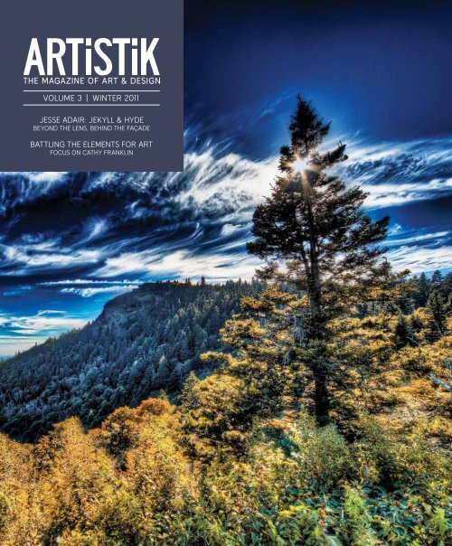
Jesse Adair, Professional Photography graduate and<br />
current Movie Production student at IADT- Tampa,<br />
created this issue’s cover. The subject matter is<br />
The Devil’s Courthouse Mountain located in North<br />
Carolina. The Cherokee tribe believed this is where<br />
the Devil held court in a cave found on the side of<br />
the bare rock. Jesse and his wife Daniela traveled<br />
to North Carolina to capture the image that would<br />
eventually grace this issue’s cover.<br />
To photograph this mountain in the morning, the two<br />
left their hotel room at five o’clock in the morning<br />
and traveled three hours to this picturesque lookout<br />
spot on the Blue Ridge Parkway.<br />
When I enrolled at the International Academy of<br />
Design and Technology, I was eager to jumpstart<br />
my design career. I had previously completed<br />
my Associate of Science degree at ITT-Tech in the<br />
Multimedia Program and had been freelancing,<br />
so I already had a bit of a design background. As<br />
I started to progress at the Academy, I began<br />
to feel uncomfortable with my designs and<br />
frequently thought, “There are so many designers<br />
out there, why is my design any better?” I found<br />
that the strongest and most crucial point of being<br />
a successful designer is that you must have the<br />
upmost confidence in yourself, or you will fail.<br />
As I started getting a confidence boost from<br />
my instructors and peers, I felt more and more<br />
comfortable showing my designs.<br />
With my confidence at a high, I kept thinking how<br />
could I get my name out there into the sea of<br />
designers? Later that year, ARTISTIK <strong>Magazine</strong> had<br />
its first published issue. I hadn’t a clue what the<br />
magazine was. Day by day, I walked past the table<br />
where the magazines were stacked but I never<br />
picked one up. Then one day, after passing by the<br />
table for the thirtieth time, I finally grabbed an<br />
issue and started to look through it. As I looked<br />
through the exposed section of the magazine,<br />
excitement ran through my veins.<br />
Jesse has photographed landscapes all across the<br />
country - from the Muir Woods outside San Francisco<br />
to Salem, Massachusetts, and everywhere in between.<br />
The Devil’s Courthouse Mountain photograph is yet<br />
another example of Jesse’s keen eye and his ability to<br />
find the right spot at the right time.<br />
Jesse Adair’s love for landscape photography stems<br />
from a constant challenge to capture the perfect<br />
shot. His work is distinctively original and creates a<br />
sense of surrealism using High Dynamic Range (HDR)<br />
photography. His landscape photography is all about<br />
finding the right composition in nature and being<br />
able to capture that moment before it slips away.<br />
TESTIMONIAL<br />
I thought to myself, “This could be me - I want to<br />
be in this magazine.” I then quickly asked my<br />
advisor how I could get my design work into<br />
the magazine. She gave me all the information<br />
and I then sent it off. A few weeks later, I received<br />
an email congratulating me on being selected for<br />
the next issue and yes, more excitement set in.<br />
When you’re a student, it is a great feeling seeing<br />
your work presented in a nationally distributed<br />
publication; this one in particular. It creates a sense<br />
of self-accomplishment. Being a showcased<br />
artist makes me feel that someone has taken<br />
notice of all the hard work that I have put into my<br />
designs. It has helped me gain the confidence<br />
I need to push myself further and further as a<br />
designer. I have actually had people contact me on<br />
Facebook that had seen me in an issue and ask me<br />
for opinions and help on their projects and designs.<br />
I really enjoy that my work has helped people<br />
gain inspiration and confidence to progress in their<br />
design career. Thank you ARTISTIK <strong>Magazine</strong>.<br />
Share your feedback with us.<br />
Email your testimonial to info@artistikmagazine.com<br />
and see it published in an upcoming issue of ARTISTIK.<br />
ON THE COVER<br />
To view more of Jesse’s work, visit his site at www.jesseadair.com<br />
| WINTER 2011<br />
07
DESIGN TRENDS DESIGN TRENDS<br />
James Bennett<br />
Dean of Instructional Technology<br />
online.academy.edu<br />
Planes, Painters and Camera-Haters<br />
It was obvious that the flight was overbooked.<br />
There were far too many of us packed into the<br />
small waiting area – far more than any sane<br />
Fire Marshall would allow. But that didn’t matter<br />
because this was an airport and everyone knows<br />
that most laws do not apply when it comes to<br />
anything related to air travel. Next time you travel,<br />
just try calculating the real arrival and departure<br />
time of your flight if you happen to fly over two<br />
time zones. The minute you enter an airport the<br />
act of accurately adding or subtracting two hours<br />
from the time displayed on your watch becomes<br />
impossible. In fact, the probability that a person<br />
could make that calculation correctly the first<br />
try is nearly the same as the probability that blue<br />
monkeys will suddenly fly out of your pockets at<br />
any given moment.<br />
What does any of this have to do with design<br />
trends? I’m getting to that, but this particular tale<br />
must begin in an overcrowded jetliner at about<br />
36,000 feet. Please rest assured that there will<br />
be no more mention of blue monkeys during the<br />
remainder of this article.<br />
After waiting for an hour that actually seemed to<br />
last several years, I was finally allowed to board<br />
the plane. My plan was to use the time in the<br />
air to write this article. However, my plan was<br />
thwarted by a man doing his best Goldilocks<br />
impersonation by sitting in EVERY seat but his<br />
own and eventually ending up next to me. And<br />
he was chatty – very chatty.<br />
“What ‘cha writing?” ”I am writing an article on<br />
artistic styles.” “About Mike Angelo and how he<br />
painted the ceilings of sixteen chapels?” “No not<br />
exactly.” “I hope you are not writing about any of<br />
those artists that make paintings that look like<br />
someone smeared colors around with a toilet<br />
plunger! That’s not Art? Why can’t they just paint<br />
stuff to make it look real like that Leo guy did?”<br />
“Leo?” “Yeah. Leo Nardo!”<br />
Obviously this Mr. Seat Hopper was a talker. Not<br />
your average, chewing-the-fat in the break room<br />
kind of talker, but the kind of talker that had a<br />
strong opinion on everything and could tell it to<br />
you over an hour… or over an entire lifetime. I<br />
knew that I only had two choices; out talk him, or<br />
pretend to not speak English. I chose the former.<br />
“So you must really hate cameras!” “Uh?”<br />
This was exactly the opening I was looking for,<br />
so I let him have it.<br />
“Back in the early days, photography really had<br />
a bad reputation. Rumor has it that back around<br />
1800s there were about three photographers<br />
that died each week in New York City alone.<br />
This wasn’t due to some flu epidemic that only<br />
infected people that touched cameras, but<br />
was caused by the dangerous chemicals that<br />
these imaging pioneers worked with. It is hard<br />
to imagine that anyone would be willing to die<br />
for the results of reflective light exposed to<br />
emulsion, but they did. Then again, back in the<br />
1800s people often died just by drinking from<br />
a public well, so maybe something as novel as<br />
photography was worth it.<br />
But the Grim Reaper of Shutterbugs was not the<br />
only thing that gave Photography bad press. It<br />
was also what it did to the long and respected<br />
tradition of Art and artists themselves.”<br />
I politely paused one one-hundredth of a second<br />
for his response. He hesitated, losing his chance,<br />
so I continued.<br />
“You see … drawing, painting, and chipping<br />
attractive naked people out of marble, and a host of<br />
other more socially acceptable practices and been<br />
the exclusive realm of the Artist for some time.<br />
Techniques, styles, rules of perspectives, and all the<br />
tricks of the trade were handed down from Master<br />
to Apprentice for generations … and it might take a<br />
lifetime to learn everything.<br />
Then, photography upset the artistic applecart by<br />
enabling individuals that may not have ever mixed<br />
their own paint to be able to capture an image or<br />
create a portrait as accurate (or maybe even more<br />
accurate) than an artist that had trained for decades.<br />
This new tool changed everything and the invention<br />
of photography forced our culture to redefine what<br />
constituted artistic talent – which was actually a<br />
very good thing … or at least a few of us think so.<br />
“Analyzing the trend can help you<br />
use it for your own work without<br />
being forced to merely copy.”<br />
The big push came when photography actually<br />
surpassed the best painters in the ability to<br />
accurately portray a scene. Ever since the<br />
Renaissance, painters had been trying to create<br />
images that were photorealistic… even though they<br />
didn’t know what photorealistic was since the photo<br />
had not been invented yet. Now painters and other<br />
artists were faced with a dilemma – they either had<br />
to figure out something new to do with their talent<br />
or give up eating.<br />
I am not going to claim that Monet, Renoir, and<br />
Pissarro were all sitting in a Parisian café, drinking<br />
wine and trying to figure out a new business model,<br />
but I am going to make the point that they began to<br />
take painting in a new direction. Instead of trying<br />
to portray the reflection of light as accurately as<br />
possible, the Impressionists began emphasizing<br />
the effects of light, studying it, even glorifying it.<br />
After that painting and Art picked up and moved<br />
to a new neighborhood – Art went to the land of<br />
Philosophy and styles were based on the big ideas<br />
from Freudian psychology all the way to postmodernism.<br />
Of course, photography came along<br />
too, but it didn’t matter because the promised land<br />
of visual communication was all wide-open spaces,<br />
big skies, and plenty of room for everyone.<br />
What the artists found was that philosophy and<br />
any of the areas of human thought were not only<br />
fertile soil but that all of the philosophers that had<br />
been marking their territory in these areas had not<br />
done so well. Sure … there was Plato, Descartes,<br />
and Kant, but these gentlemen were long gone<br />
and none of them really ever got past the nature of<br />
Illustration by Pasha Holcomb<br />
reality. In other words, they couldn’t even agree on<br />
what was real, what was illusion, and what simply<br />
might be a bad dream produced by eating too much<br />
bratwurst. The painters, sculptures, photographers,<br />
and performance artists didn’t care because they<br />
were showing these ideas. And the public found the<br />
art work much more interesting than reading the<br />
writings of stuffy old men with beards.<br />
Each new idea manifested in a style; Surrealism,<br />
Expressionism, Post-painterly Abstraction … on and<br />
on until we arrived at your personal favorite, Plunger<br />
Painter-ism.<br />
So the next time you see a design or work of art<br />
that looks a little different, ask yourself what is<br />
the piece trying to say. What big idea you might be<br />
missing out on?”<br />
Without saying a word, he looked around and then<br />
moved to an empty seat about five rows behind us.<br />
Happily, I began typing again. The camera hater was<br />
now the problem of a woman with entirely too much<br />
luggage – and they deserved each other.<br />
08 artistikmagazine.com | WINTER 2011<br />
09
TOP TEN<br />
Bri Dold<br />
Graphic Designer<br />
limerencecreative.com<br />
Top Ten<br />
Interview<br />
Questions for<br />
Creatives<br />
Photograph by Robert Brouillet<br />
Before you find yourself<br />
sitting in front of a panel<br />
of interviewers sweating<br />
in your Sunday best, take<br />
the time to prepare for the<br />
questions and the answers<br />
you provide that will<br />
ultimately decide the fate<br />
of your career.<br />
We all know the importance of preparation and<br />
research when it comes to the interviewing process.<br />
Know the company as thoroughly as the internet can<br />
teach you - check. Shower and dress nicely - check.<br />
Bring your mind-blowing portfolio - check.<br />
Another way to ensure your head is in the game is<br />
to know the top interview questions for creatives.<br />
For this issue, I spoke with four agencies and their<br />
employees about which questions they ask or have<br />
been asked the most. Their feedback brought<br />
about some interesting and valuable points that will<br />
hopefully help you in your quest for employment.<br />
Tell me about yourself, your creative process, and your experience.<br />
Open-ended questions like this often throw interviewees for a loop even<br />
though they are common in most jobs. While the interviewer doesn’t<br />
want to hear your life story from the day you were born to the second you<br />
sat down in their office, they still want to know enough about you to tell<br />
them if you’re a good fit for their company. As with any answer to these<br />
questions, never lie; instead, tell the truth in the most compelling way.<br />
What attracted you to this company and position?<br />
The incorrect answer would be, “Because none of the other companies<br />
I actually wanted to work for were hiring.” You’re on the interview for a<br />
good reason. Give it to them.<br />
What are your most impressive achievements?<br />
This is information that should be on your resume to begin with, but this<br />
is your chance to show off. Tell a brief story about each achievement,<br />
give them personality, and show how these achievements can translate<br />
to the position for which you are being interviewed.<br />
How well do you cope with criticism?<br />
There are very few, if any, careers involving creativity that do not harbor<br />
criticism. By now, this should be something we are all used to and<br />
actually use to our advantage. Again, honesty is the best policy. It’s fine<br />
to tell the interviewer that criticism is, at first, hard to take, but also<br />
include how you use it to benefit your final piece.<br />
What programs do you know? Which ones are you most<br />
proficient in?<br />
Of course, this question applies mostly to fields that involve computer<br />
interactivity, but it is an extremely important one. Many companies or<br />
agencies use specific programs as well as operating systems. Hopefully,<br />
you did your research and know which ones they use.<br />
How were certain elements in your portfolio created?<br />
You should know your portfolio inside and out. You should know the<br />
“why” behind every single detail. This should not be a hard question to<br />
answer. If it is, perhaps you should rethink that portfolio piece.<br />
What career-related volunteer work do you do? Do you hold<br />
any leadership positions with organizations?<br />
Hopefully you can regale the interviewer with a staggering list of<br />
clubs, organizations, and pro-bono work you have done in the past, but<br />
sometimes that just isn’t the case. Maybe you are just out of school and<br />
haven’t had time to get involved just yet. If this is the case, tell them<br />
about your plans to join certain organizations, why you want to join them,<br />
and when you plan to get involved.<br />
Describe a working situation where you exceeded the expectations.<br />
We all need and should have an “all-hail-me” moment in our career at<br />
some point, preferably many. Choose a story that most closely relates to<br />
the position you are applying for and tell away.<br />
Which companies other than this one are you interested in<br />
working for?<br />
Right off the bat this seems like one of those “rock-and-a-hard-place”<br />
questions. What are they setting you up for? It’s best not to think of this<br />
question like that. Impress them with your taste. Know their competition<br />
and use that if it is the truth. Let them know why you are interested in<br />
the other companies as well as why you are most looking forward to<br />
working with them.<br />
Describe the role you feel most comfortable playing in a<br />
team environment.<br />
Teamwork is almost always a huge priority for any agency or company.<br />
You know yourself better than anyone else. Are you a leader? Do you<br />
take instruction impeccably well? Are you an amazing wingman? Let<br />
them know and throw in a success story while you’re at it.<br />
10 artistikmagazine.com | WINTER 2011 11<br />
TOP TEN
WEB WATCH WEB WATCH<br />
Lucille Moon-Michel<br />
Web Design<br />
& Development Faculty<br />
online.academy.edu<br />
www.gamasutra.com<br />
A center of operations for professionals in the field of Game Production. Gamasutra is a website that keeps game<br />
developers up to speed with the latest industry news, programming tips, gaming technology, blogs and upcoming<br />
events. One can find helpful articles and tutorials under the five main categories of navigation which include<br />
Programming, Art, Audio, Design and Programming. The tutorials offer step-by-step instructions with corresponding<br />
screen shots. Registered members are allowed to post comments and questions after each one. Creating a Gamasutra<br />
account is free and especially advantageous for those looking for employment. The job database includes available<br />
positions from companies around the world and gives users the capability to upload their resumes and cover letters.<br />
Gamasutra also features a store for purchasing Game Developer Research Reports, subscriptions to Game Developer<br />
magazine, and audio recordings from top gaming professionals. With such a wide variety of resources, this site would<br />
be a valuable one to add to your favorites!<br />
www.photoshoplady.com<br />
A quaint little hub for exciting Photoshop Tutorials. Photoshop Lady is a bookmarking site for top Photoshop tutorials<br />
from around the world. The collection of tutorials are updated on a daily basis and stored in one of eight categories:<br />
3D Effect, Abstract Effect, Articles, Drawing Effect, Photo Effect, Text Effect, Texture & Patterns and UI Designs. These<br />
tutorials and articles are not original to Photoshop Lady; rather they are linked to other design related websites such<br />
as Deviant Art, Creative Overflow and PSD Tuts. Membership is free and allows users to rate tutorials and keep a list of<br />
favorites. A nice feature of this site is that the members’ favorite tutorials are stored in a thumbnail grid on the left side<br />
of the page for easy access. To delete a favorite from your list, simply drag the thumbnail to the trash can underneath.<br />
Photoshop Lady showcases a wide variety of interesting lessons that are easy to follow so be sure to check it out!<br />
www.businessoffashion.com<br />
A valuable resource for international fashion professionals. Curious about the latest and greatest with fashion industry<br />
giants such as Anna Wintour, Tom Ford, Louis Vuitton, Chanel and D&G? These are just some of the top fashion VIPs and<br />
companies that Business of Fashion keeps its readers updated on every day. Created by fashion business advisor, Imran<br />
Amed, The Business of Fashion (BoF) is geared towards entrepreneurs, creatives and other business professionals in<br />
the fashion industry. The opinionated yet analytical articles featured on the BoF site focus on essential topics such as<br />
Fashion 2.0, Emerging Designers, Global Brands, CEO Talk, Fashion Investing and Fashion Pioneers. Readers can also<br />
focus on news & events happening in fashion hotspots around the world including Buenos Aires, Mumbai and Tokyo.<br />
This site is definitely one to bookmark especially for those fashionistas interested in the business side of the industry.<br />
www.designreviver.com<br />
A valuable resource for web designers. Design Reviver offers an appealing supply of articles, tutorials, inspirational<br />
sources and complimentary downloads for people in the web design field. Visitors can take advantage of the editorial<br />
pieces that focus on popular subjects such as HTML5, CSS3 and jQuery. The site also supplies interesting resources for<br />
graphic design topics such as logo creation, photo effects, typography and other types of digital artwork. One section<br />
that is particularly helpful is the Answers page where users can either submit questions to the community or post<br />
answers to the listed inquiries. Founded by Henry Jones, an experienced web designer and developer, Design Reviver is<br />
constantly on the lookout for new and exceptional designers to promote on the site. Those who wish to contribute to the<br />
site are not only financially rewarded, but they get priceless exposure to a large web design audience as well!<br />
+ Pros<br />
The contributors to the site<br />
are from well-established<br />
companies and form a solid<br />
community for members to<br />
take part in.<br />
- Cons<br />
Some of the articles are a bit<br />
outdated and are not unique to<br />
each category.<br />
+ Pros<br />
The site is easy to navigate<br />
and the tutorials are for all<br />
experience levels and give the<br />
approximate time to complete.<br />
- Cons<br />
The advertisements are distracting<br />
and can be confused with the<br />
tutorial thumbnails. Sometimes<br />
the links on the favorites list do<br />
not work.<br />
+ Pros<br />
The design of the site is very<br />
elegant, banner ads are listed<br />
sparingly and information is<br />
easy to access.<br />
- Cons<br />
The scrolling on the home<br />
page is rather long and could<br />
be changed to hold only a few<br />
articles at a time.<br />
+ Pros<br />
This site offers a supportive<br />
community for web designers<br />
of all levels to interact and<br />
learn from each other.<br />
- Cons<br />
The advertisements take<br />
up a large portion of space<br />
on the pages. Perhaps the<br />
announcements could have<br />
priority over them.<br />
12 artistikmagazine.com | WINTER 2011<br />
13
APP ADDICT APP ADDICT<br />
Matthew Phillips<br />
ARTISTIK ARTISTIK Columnist Columnist<br />
matt@artistikmagazine.com<br />
matt@artistikmagazine.com<br />
Every so often an app comes along that enhances the use of your<br />
mobile device in such a way, that you may wonder how you were<br />
able to ever function without it. With a multitude of apps to choose<br />
from, how do you know what’s worth the download?<br />
One of the great things about mobile applications is the capabilities that it opens to you that never<br />
existed before. Before the use of this technology, who could have imagined that one day you will be<br />
able to do just about anything by tapping and swiping? In this column, I will be reviewing applications<br />
pertaining to the categories of productivity, business, entertainment and reference.<br />
DropBox<br />
FREE<br />
Category: Productivity<br />
Compatibility: Android, BlackBerry,<br />
iPad, iPhone, iPod Touch<br />
Rating: 10<br />
DropBox allows you to seamlessly sync and share files from your<br />
computer to your mobile device via Internet connection. You can<br />
share just about anything including music and word documents.<br />
When you first open DropBox, you will be prompted to create an<br />
account. Creating an account is fast and easy; there is no wait and<br />
it can be done directly from the device you are using. The service<br />
comes in three versions: Basic (which offers 2GB of storage at no<br />
cost), Pro 50 (50GB of storage for $9.99/month or $99.00/year), or<br />
Pro 100 (100GB of storage for $19.99/month or $199.99/year.)<br />
This app gives you three menu options which are located at the bottom<br />
of your device screen: Favorites, My Dropbox, and Settings. Favorites<br />
contains files that you have marked to view when your device is offline.<br />
My Dropbox lists all of the files that you have stored in the Dropbox cloud<br />
storage facility. The Settings option lets you link your device to your<br />
Dropbox account and the email you use to register with Dropbox.com.<br />
The interface is simple, clean, and is loaded with all of the necessary<br />
tools for file sharing. There is also a memory bar that lets users know<br />
when they are about to exceed their storage limits.<br />
Timewerks<br />
$9.99<br />
Category: Business<br />
Compatibility: iPhone, iPod touch.<br />
Rating: 7<br />
TimeWerks is a mobile billing app that allows users to keep track<br />
of time spent on client jobs and the cost of materials used. Using<br />
TimeWerks is easy enough for most tasks. The main screen<br />
gives you access to see your clients at a glance, projects you are<br />
currently working on, invoices set to go out, and a list of materials<br />
used in the project. Adding a client is easy. If the client is already<br />
in your phone book, TimeWerks will automatically pull all of their<br />
information for the invoice (e.g., name, phone number, email, and<br />
address) into the app. You can create a variety of invoices which<br />
include different rates for different tasks, factor in taxes, and use<br />
different currencies to figure out the bottom line.<br />
Once the job is done, you can email the client an HTML or PDFformatted<br />
invoice. One of the best features of TimeWerks is its<br />
ability to track time spent on a project even if the app is closed. If<br />
you happen to need assistance, there’s a comprehensive help file to<br />
guide you.<br />
Brushes<br />
$9.99 (iPad)<br />
$4.99 (iPhone and iPod touch)<br />
Category: Entertainment<br />
Compatibility: iPad, iPhone, iPod Touch.<br />
Rating: 10<br />
Brushes has a simple purpose: to create dynamic artwork on your<br />
iPad, iPhone or Pod Touch. Notably, Artist Jorge Colombo used<br />
this app to create the cover of the June 2009 issue of New Yorker<br />
magazine. When you launch Brushes, a large thumbnail gallery of<br />
all of your paintings is displayed. By touching one, you can begin<br />
editing. The Interface is truly simple. The bottom houses a toolbar<br />
which features a color picker, eye dropper tool, and paint bucket.<br />
To the left you will find the brush, brush styles, and an eraser. In the<br />
middle, are the all-important Undo and Redo; while all of the layers<br />
you create can be found to the right. A unique feature in Brushes is<br />
the fact that it will save all of your artwork automatically so if you<br />
happen to leave the app for whatever reason, your work is not lost.<br />
Just launch the app, tap on your project and continue. After you<br />
have created your image, you can upload it to Flickr or e-mail it to<br />
friends and family. The app even allows you to connect your iPad to<br />
your television via a VGA output where you can display your artwork<br />
as a slideshow. Nothing is too hard to understand with Brushes. Just<br />
select a tool and begin creating your very own masterpiece.<br />
Color Expert<br />
$9.99<br />
Category: Reference<br />
Compatibility: iPad, iPhone, iPod Touch.<br />
Rating: 8<br />
Color Expert helps artists and designers identify, translate, and<br />
show color using their iPad, iPhone or iPod touch. You can use<br />
the interactive color wheel to identify a target color and then<br />
find several palettes backed by color theory. There are several<br />
color schemes supported including Monochromatic, Analogous,<br />
Complementary, Split Complementary, and Triadic.<br />
This app allows users to photograph colors on anything and then<br />
capture the RGB values of colors within the image. A unique feature<br />
of Color Expert is that it gives you the RGB or the closest Pantone<br />
CMS equivalent which makes this app ideal for photographers and<br />
graphic designers who work in print. Once your color is in samples,<br />
Color Expert displays the color on an adjustable color wheel<br />
where you can create color palettes from a built-in library of color<br />
harmonies. When you’ve created a color palette that you like, you<br />
can then e-mail it to yourself or to a client. This app is great for<br />
beginners and professionals alike.<br />
14 artistikmagazine.com | WINTER 2011<br />
15
TALKBACK<br />
Kerstin Upmeyer<br />
Illustrator & Instructor<br />
kupmeyer.com<br />
“What does it take to get a good job? What if I’m not sure what type of job I want? Can I, or should I consider working for myself?”<br />
As a rising, creative professional, you’re likely to ask yourself many questions. Sometimes it’s tough to know where to go for<br />
answers. As both a seasoned instructor in a design college and a professional in the industry who keeps her ear to the ground,<br />
I’ll do my best to provide you with the straight scoop when it comes to this crazy, yet fulfilling world of design.<br />
For this edition, I’ve chosen to respond to a question from a professional photographer and old classmate of mine living and<br />
working in Germany. She asks:<br />
“ As a Photographer, how do you find work and representation?<br />
How do you represent yourself and your work to the best of<br />
your abilities?”<br />
These are great questions, but since I am an illustrator<br />
and designer, not a photographer, I knew I’d need<br />
some expert advice for answering this one. So I<br />
looked to a colleague of mine from IADT- Online, Glen<br />
Perotte. Glen is an award winning former advertising<br />
photographer who in recent years has turned his<br />
attention to art education and fine-art photography.<br />
Glen explained that first you have to consider what<br />
aspect of the field you are talking about. There is<br />
commercial photography, Fine art photography, and<br />
Wedding/ Event/Portraiture photography. Considering<br />
his own experience and what we both agreed most<br />
readers would be interested in, Glen filled me<br />
in on the basics of successful marketing for a<br />
commercial photographer.<br />
Commercial work, like taking photos for magazines,<br />
ad agencies and design companies has a few standard<br />
ways you can market yourself. First, you need to have a<br />
portfolio, both a physical book and an online website.<br />
Initially an interested business may look for you via<br />
your website. If they become really interested they<br />
may call you in to be interviewed. In some instances,<br />
clients may commission you solely based on your<br />
web-site, however a hard copy portfolio is still<br />
required. Leave behinds like picture postcards are<br />
also a great idea to have in your arsenal.<br />
You can contact various agencies by searching out<br />
services that list agencies in USA and Europe and use<br />
it to contact the art buyer of an agency. This is the<br />
most important person for a photographer; they are<br />
the gatekeepers for the agency when it comes to<br />
buying and commissioning art. A Creative director<br />
will brief the art buyer on what they are looking for<br />
and the buyer’s job is to find a match. They may look<br />
through industry standard directories, like The Black<br />
Book and the Creative Handbook. These are places<br />
where you as a photographer, might pay to be listed<br />
(be warned however, it is not cheap!).<br />
Photography Agents are another method of getting your<br />
work sold. Either they find you, or you can try to get hold<br />
of them. If you are looking for an agent, you want to do<br />
your research, both to make sure they’re reputable and<br />
are familiar with the kind of work you do. You would<br />
promote yourself to them in a similar manner as to an<br />
agency. Once you are in with a good agent they can take<br />
a lot of that work off your plate. They find work for you,<br />
and promote you through their website and other means.<br />
They have connections you may not, and can be a buffer<br />
between you and the art buyer/client. A good agent also<br />
does all negotiations (checking with you for agreement<br />
of course). It’s in their best interest to get you a good deal.<br />
An agent has a vested interest; usually an agent takes<br />
25% commission on your fees. This does not including<br />
markups on expenses you get paid for that work, like<br />
hiring models, make-up artists, and stylists. All in all, an<br />
agent can free up a lot of time for the photographer so<br />
they can do what they’re good at, being a photographer,<br />
and not get bogged down in business details.<br />
As to the question of networking, Glen suggests you<br />
embrace it all! Links through Social Networking sites<br />
such as Twitter, Facebook and LinkedIn are examples.<br />
Also joining professional industry and trade groups<br />
can be very smart. Any platform that makes you<br />
more visible, he says, do it! One final suggestion is<br />
the importance of winning awards. Awards are one<br />
of the best ways to promote you in the photography<br />
field. When a client sees the connection between you,<br />
good imagery, and the recognition of your ability, it’s<br />
definitely a potent combination.<br />
Concept:<br />
“Reality Check”, created by Professional Photography student Xong Hang, is a<br />
combination of photography and finger-painting illustration. This piece is meant<br />
to create a new perspective of an artistic collaboration showing a photograph<br />
transitioning into an illustration.<br />
Materials:<br />
Original photography combined with hours of intricate finger illustration using an<br />
Apple iPad and the Layers Pro application.<br />
16 artistikmagazine.com | WINTER 2011<br />
17<br />
INSIGHT
FOCUS FOCUS<br />
Battling the Elements for Art<br />
words by cathy franklin & michele roy<br />
portrait by fred boye<br />
Cathy Franklin has taught at Collins College<br />
since May 1996 when the college was Al Collins<br />
Graphic Design School. Over the past 14 years<br />
she has taught everything from Graphic Design<br />
to Animation, Game Art, and even Interior Design<br />
where she led classes in drawing and rendering.<br />
But for a few months out of the year, this desert<br />
Sooner becomes a monsoon maniac in search of<br />
thrills under electric skies.<br />
While most storm chasers are after scientific data,<br />
Cathy has a very different goal. She takes the<br />
opportunity afforded her every monsoon season<br />
here in Phoenix to battle the elements armed only<br />
with a tripod and camera. Cathy’s after school<br />
hobby is capturing lightning on film. Her lightning<br />
images have been the subject of numerous articles,<br />
TV reports, and gallery exhibits. She also enjoys<br />
landscape and macro photography. Cathy’s love<br />
for storms and lightning stems from her youth<br />
and experiences while in Oklahoma. As a young<br />
girl, she spent many a night petrified under the<br />
covers hiding from the fierce storms pounding<br />
her home. Somewhere along the line, the fear<br />
turned to curiosity and eventually to a strong<br />
fascination with lightning that stirred her passion<br />
for storm chasing.<br />
The early ‘60s brought Cathy’s family west. Her teen<br />
years included the regular activities associated<br />
with attending high school in Scottsdale, Arizona,<br />
but they also included making many journeys up<br />
Camelback Mountain to watch the monsoon<br />
storms. “It is quite an inspiring sight to see<br />
dust storms literally roll across the desert<br />
while lightning is bouncing off surrounding<br />
mountains,” Cathy recalled. After high school<br />
she returned to Oklahoma for college. She<br />
became a third generation Sooner, graduating<br />
from the University of Oklahoma with a<br />
Bachelor’s Degree in Fine Arts in 1975. While<br />
in college, she studied photography. She<br />
experimented with lightning photography<br />
during the great spring storms of the Midwest<br />
and then returned to Arizona to capture the<br />
summer monsoons. Storm chasing was not<br />
what it is today and, of course, all of her<br />
friends thought she was crazy.<br />
Thirty-five years later Cathy’s husband, children,<br />
friends and neighbors still think she is nuts. For her,<br />
however, there is a genuine inner peace when she<br />
is on a mountain looking out over the city dodging<br />
rain, hail, dust, and lighting in pursuit of that perfect<br />
picture. Nevertheless, she is quick to point out that<br />
this is not a hobby for the faint-hearted. Taking<br />
lightning photographs can be extremely dangerous<br />
and you must use common sense when you are<br />
out acting as a human lightning rod with a metal<br />
camera and tripod.<br />
Cathy shares some advice, “Always pay close<br />
attention to the weather and look for nearby<br />
shelter before you are in trouble. The safest way<br />
to catch storms is when they are either coming<br />
in or going out. When storms are right on top of<br />
you, it is time to stop and live to chase another<br />
day. And don’t forget to go prepared not only for<br />
shooting but also for long stints in the elements.<br />
Fill your car with gas at the beginning of your<br />
excursion. You may find you have to chase after<br />
a storm if it is moving quickly. Take plenty of<br />
water, a flashlight, a cell phone, and some<br />
nutritional, high-protein snacks in addition to<br />
lots of film and an extra camera battery. A little<br />
luck and a lot of patience will also help.”<br />
Once you venture out you will experience a unique<br />
and rewarding adventure. The best part is that<br />
you just might meet other crazy, die-hard storm<br />
chasers and you’ll have new friends.<br />
Cathy uses an old, trusty Canon A-1 with Fuji 100<br />
ASA film. The 2010 monsoon season was her first<br />
attempt at shooting digital, using a Canon 5D. She<br />
greatly enjoys the instant gratification and the<br />
delete button. One drawback she found with digital<br />
is that you cannot have the camera exposed to all<br />
the elements like you can with film. Digitals have<br />
too many electronics that can get damaged in<br />
the heat, dust, and rain. She feels that the digital<br />
images are sharper, but that film is better for color.<br />
Despite these drawbacks it was rewarding to try<br />
digital and she will likely take both from here on<br />
out. To her, it’s like fishing with two poles. You<br />
double your chances for catching the big one.<br />
Whichever medium someone may choose, she<br />
recommends a sturdy tripod and a reliable cable<br />
release. Lightning moves fast which means you<br />
need to be able to as well.<br />
When she is not out stumbling around on a mountain<br />
enduring the relentless heat, growling animals,<br />
and the occasional police officer, Cathy uses<br />
her photography skills in the Graphic Design<br />
department at Collins College. She loves the<br />
challenge of trying to get students to see things<br />
differently and to understand what it means to take<br />
good photographs. “They are so used to snapping<br />
pictures with their cell phones they don’t realize<br />
that there is so much more to it,” she says. She<br />
helps them see the difference between pointing<br />
and shooting to get a picture and composing a<br />
picture. “Good photography is about the lighting<br />
and good composition. It is about seeing with our<br />
eyes. How our eyes see things is much different<br />
from how our minds do. Our eyes see everything<br />
that will be in the picture, where it will be, and<br />
how the lighting affects the scene. Our minds<br />
compartmentalize and we need to add the<br />
creativeness to it. Good photography is showing<br />
our minds how to see.”<br />
The most rewarding thing about teaching is the<br />
interaction with the students. They are so excited<br />
when they are successful and they have achieved<br />
some extraordinary work. She learns as much from<br />
them as they learn from her. Of course, many of<br />
her students want to learn how to take lightning<br />
photographs as well so she cautions them along<br />
with her encouragement. Most of the students’ field<br />
experience takes place on the school campus due<br />
to time constraints although Cathy will occasionally<br />
take them on a field trip to the zoo or other local<br />
places if time and weather permits.<br />
“Lightning photography is<br />
much like fishing...It’s an<br />
extra bonus when you catch<br />
something!”<br />
“City Lights” (Film) “Split Ends” (Digital)<br />
18 artistikmagazine.com | WINTER 2011<br />
19
FOCUS FOCUS<br />
One of the most memorable field trips was<br />
an evening trip to Rustler’s Rooste, a popular<br />
restaurant perched on a butte overlooking the<br />
East Valley of Phoenix, to photograph the full<br />
moon rising over the city at sunset. “It was a great<br />
trip. They got to see just how hard it is to get good<br />
pictures of the full moon.”<br />
She loves to share her enthusiasm for her work<br />
with her students. It is an honor and joy to share<br />
their pride when they see their work published or<br />
printed. Even more so is the wonderful feeling of<br />
being paid to do something you love. There are not<br />
too many people out there who can say, “I can’t<br />
believe they are paying me for doing this.”<br />
Cathy started in the Graphic Design Program,<br />
switched to Animation, and has now returned to<br />
Graphic Design. In addition to Photography, Cathy<br />
currently teaches Illustrator and Typography. When<br />
asked if she had a favorite subject, she said it was<br />
a toss-up between the Graphic Design classes<br />
and the Animation classes. Animation was a fun<br />
change of pace, but she is really enjoying being<br />
back teaching Graphic Design. Each of the subjects<br />
offered different students with unique skills and<br />
drawing abilities. It gave her a chance to use<br />
and create with different equipment. Animation<br />
was great because she could see the students’<br />
faces light up as they created and watched their<br />
animations come to life.<br />
Of course, there are always students you just never<br />
forget. For Cathy, these include Nathan Frigard<br />
and Ryan Heuett whom she taught years ago. Both<br />
went on to work with George Lucas at Lucasfilm on<br />
Star Wars. The rewards can go beyond teaching.<br />
Cathy has gone to movies and stayed for the film<br />
credits just to watch her former students’ names<br />
flash by on the big screen. As a result of how<br />
influential she was in their lives, Nathan invited<br />
her to tour Skywalker Ranch while George Lucas<br />
was there. She also had the pleasure of teaching<br />
Chris Nicks, Stevie Nicks’ brother, in graphic design.<br />
After his graduation, she was invited to Stevie’s<br />
home, a concert, and a band party where she met<br />
Don Henley and other famous musicians. It was an<br />
incredible experience that Cathy won’t forget.<br />
Still, those perks don’t outweigh seeing your<br />
students succeed in their chosen field. Student<br />
success is a daily occurrence for her. All she<br />
has to do is to pick up a magazine, turn on the<br />
television or play a video game, and she can see<br />
their handy work all around.<br />
1<br />
2<br />
1. “Palm Trees” (Film) 2. “Many Branches” (Digital) 3. “Charge” (Film) 4. “Dead Center” (Digital)<br />
5. “Power Hungry Too” (Film) 6. “Twilight Time” (Digital) 7. “Sky Stalker” (Digital)<br />
“She loves to share her<br />
enthusiasm for her work with<br />
her students. It is an honor<br />
and joy to share their pride<br />
when they see their work<br />
published or printed.”<br />
3 4<br />
7<br />
To see more of Cathy’s work, visit her website at www.electricskies.com<br />
20 artistikmagazine.com | WINTER 2011<br />
21<br />
6<br />
5
SUCCESS SUCCESS<br />
Ideation 12<br />
Twelve hours, five campaigns, one amazing experience.<br />
words by jaime pescia & mary gebhart<br />
photography by jaime pescia<br />
What is the result of putting five highly creative<br />
graphic design students in a technologically<br />
equipped room, giving them a creative brief, and<br />
for twelve hours turning them loose to design an<br />
ad campaign? Nothing short of creative magic.<br />
On July 21st, Graphic Design students from IADT-<br />
Detroit participated in the first Ideation 12 event.<br />
Drawing on trends in, and the popularity of, designrelated<br />
competition shows, IADT- Detroit students<br />
conceptualized Ideation 12 as an event in which<br />
teams of Graphic Design students would compete<br />
against the clock and each other to create and<br />
launch a campaign for a new product.<br />
When the students pitched their idea to Graphic Design<br />
Program Chair, Jaime Pescia, she agreed that the<br />
competition would be an excellent learning experience.<br />
The challenge would offer students the opportunity<br />
to experience the realities of working on an advertising<br />
campaign, demonstrate their design knowledge, and<br />
build relationships with their classmates.<br />
The competition was open to all levels of Graphic<br />
Design students, including incoming students, so in<br />
order to ensure an equal distribution of skill level<br />
the groups were selected by faculty members who<br />
were familiar with students’ abilities.<br />
On the morning of July 21st, 26 excited students<br />
arrived at the IADT- Detroit campus ready to<br />
roll up their sleeves and take on the challenge.<br />
The only instructions students had been given<br />
prior to the competition was that they were<br />
to bring their basic design supplies with them.<br />
The competitors did not know who their group<br />
members would be, what the topic was, or what<br />
they would be creating. All they knew for sure was<br />
that they would have twelve hours in which to create<br />
a concept and campaign.<br />
In the classroom, tensions ran high as teams<br />
were finally announced and the creative brief<br />
was handed out. The creative brief contained<br />
the following specifications:<br />
Overview:<br />
Mars is launching a new candy bar to compete with<br />
Nestlé’s Crunch and Kit Kat. The candy bar appeals to<br />
consumers when they crave a specific type of sweet<br />
snack - chocolate taste, but with a light crunch.<br />
Objective:<br />
Create awareness of the new candy bar by launching<br />
the product into the marketplace. To do this, a new<br />
name, logo and package will need to be created.<br />
Additional promotions should be developed to help<br />
increase awareness.<br />
Target Audience:<br />
The target audiences are males and females, ranging<br />
in age from 15-40. They are very cognizant of their<br />
health, but still like a sweet treat.<br />
Primary Message:<br />
When you are craving a sweet chocolate snack, but<br />
conscious about the nutrition, have an UN-NAMED<br />
CANDY bar.<br />
Spread out in rooms around the school, groups<br />
feverishly worked to create a smart, marketable,<br />
creative concept. After a few hours, Jaime Pescia<br />
checked in with each group for creative guidance.<br />
“Some groups were pleasantly discussing their<br />
ideas, while in other rooms groups were tense<br />
and anxious. I found it fascinating that three out of<br />
the five groups were working in the same creative<br />
direction without even knowing it.”<br />
Tension grew as the deadline drew closer. “It<br />
was challenging because we had designers on<br />
our team with all different levels of experience.<br />
We figured out who did what best and went<br />
from there,” shared senior Sarah Bills. Some<br />
groups struggled with the group dynamic. Senior<br />
Brad Petrinec recalls, “There were definitely<br />
differences of opinion, and at one point we even<br />
stopped all progress because a member of the<br />
group thought we should go in a completely<br />
different direction.”<br />
In the end, all of the groups finished on time and<br />
beginning at eight o’clock in the evening each<br />
group presented and pitched their campaign idea<br />
to a panel of judges consisting of Gary Pascoe,<br />
Team Detroit Creative Director; Rick Dennis, Goody<br />
Silverstein & Partners Creative Director; and Jaime<br />
Pescia, Graphic Design Program Chair. After the<br />
groups had finished presenting their concepts,<br />
the judges engaged in an intense discussion of<br />
the presentations. Each judge was impressed with<br />
the creativity and professionalism of the work that<br />
had been created, and Gary Pascoe commented,<br />
“Twelve hours to brand an entirely new product from<br />
the ground up; it’s not crazy, it’s the real world.” Rick<br />
Dennis reflected, “I wasn’t surprised by the quality of<br />
the work. They had really good teachers.”<br />
The judges finally acknowledged that while<br />
each group had created concepts that contained<br />
successful elements, there were two groups that<br />
hit the design mark – Lift and TerraBite. After<br />
much deliberation, TerraBite was selected as the<br />
most successful overall campaign. The branding<br />
and design were consistent, and the creative<br />
ideas, which utilized environmental advertising,<br />
gave them the edge over the competition.<br />
TerraBite’s winning team members were Sarah<br />
Bills, Sarah Lunsford, Shane McCallion, Jeff<br />
Scholnick, and Robert Laster.<br />
“It was an awesome experience to be put under<br />
pressure with a team and real world professionals<br />
to present to. Not only was it fun and exciting,<br />
it helped me to push myself as a designer,”<br />
remembers student Donna Moy. The industry<br />
judges were so impressed with the work created,<br />
they were inspired to stay after the winning team<br />
had been selected, and provide constructive<br />
criticism to each team. Gary Pascoe commented,<br />
“I went in not knowing what to expect, and left<br />
after hiring an intern.” And Rick Dennis echoed the<br />
sentiment, “The students were like a tonic restoring<br />
my own desire to create. I found myself ready to<br />
jump in and start concepting!”<br />
Senior Julie Schichtel recalls, “It was the perfect<br />
experience; given such a tight deadline, working as<br />
a team and presenting your idea does not get any<br />
closer to a real world experience. Ideation 12 was a<br />
great taste of what the real world is all about starting<br />
at ideation, sketching, narrowing down your<br />
message, making comps, and presenting to the<br />
clients. This was all around a great experience and I<br />
am so grateful that I could be a part of it.”<br />
22 artistikmagazine.com | WINTER 2011<br />
23
SUCCESS SUCCESS<br />
Working to End Sexual Exploitation<br />
Harrington Communication Design students work with a local community organization.<br />
words by dan elliott<br />
photography by joe byrnes<br />
Harrington Communication Design students<br />
Rachael Pobst, Katelyn Smith, Elise Weiler, Cari Hogan,<br />
Allyson Murphy, and Hailey Ransom-Schultz; of<br />
the Senior Design Studio 2 class instructed by Dan<br />
Elliott; had the opportunity to work with the Chicago<br />
Alliance Against Sexual Exploitation (CAASE) in<br />
the 2010 Summer Semester. CAASE was looking<br />
to develop a series of designs that would raise<br />
awareness to the client’s cause and gain support for<br />
their “End Demand, Illinois” campaign from the local<br />
community. These designs would work as posters<br />
as well as bus and “el” ads that did not employ<br />
“stereotypical” imagery to convey the message.<br />
This project allowed the students to work with a<br />
non-profit organization and witness first-hand the<br />
effect design can have on and for a community.<br />
One of the goals for the students was to effectively<br />
raise awareness of the client’s cause and attract<br />
attention to the “End Demand, Illinois” website<br />
(www.enddemandillinois.org). The website offers<br />
a definition of what CAASE is trying to accomplish.<br />
“The ‘End Demand, Illinois’ campaign is a multi-year<br />
organizing and advocacy effort to transform Illinois’<br />
response to prostitution and sex trafficking;<br />
advocate for the creation of tools and resources for<br />
law enforcement to prosecute traffickers, pimps,<br />
and those who profit from prostitution; deter men<br />
from buying sex; and create social supports and<br />
services for trafficked and prostituted individuals.”<br />
According to caase.org, that is what reinforces their<br />
overall vision. “CAASE is committed to building a<br />
global community free from sexual exploitation.<br />
We know that all forms of sexual exploitation,<br />
including sexual assault and the commercial sex<br />
trade, are detrimental to a healthy society and<br />
undermine the dignity of all people.”<br />
Directing attention to these websites is only part<br />
of the problem the students needed to solve. The<br />
other issue was to give insight into the gravity,<br />
weight, and nature of the issue. The students began<br />
by reading over a packet given by CAASE containing<br />
startling figures about sexual exploitation and their<br />
goals to proceed in realizing their vision. With this<br />
information, the students researched previous<br />
examples of campaigns aimed at increasing<br />
awareness about similar issues. They gathered<br />
images and videos to use as inspiration on how to<br />
approach such a heavy topic. Rachel Durchslag,<br />
Executive Director at CAASE, impressed with the<br />
students’ process and work commented, “The<br />
class was one of the most thoughtful and creative<br />
that we have worked with to date. They thoroughly<br />
researched issues of sexual exploitation before<br />
they started their work, and they developed poster<br />
designs and concepts that were some of the most<br />
powerful, innovative, and impressive that we have<br />
seen.” One of the problems the client had with<br />
previous campaigns done by other organizations is<br />
that they relied on imagery depicting prostitution<br />
laden with stereotypes. This was not a direction<br />
the client or the students saw as being socially<br />
responsible or beneficial to the cause. The intent<br />
was to raise awareness about the problem, not<br />
reinforce categorically false ideas. Katelyn Smith,<br />
one of the design students, commented on this<br />
saying, “Before working with CAASE, I had a<br />
different (misinformed) understanding of what it<br />
meant to be in the sex trade. Hopefully, we will bring<br />
light to the subject for many other people too.”<br />
Avoiding the use of stereotypical images and using<br />
their research as a guide, the students began<br />
brainstorming new ways to engage viewers with<br />
their work and interact with the information.<br />
The students took several different approaches.<br />
One student used information graphics as a way<br />
to show the enormity of the statistics. She created<br />
a series of posters representing different types of<br />
Design by Katelyn Smith<br />
information all pertaining to the sex trade. One<br />
poster illustrated the amount of men purchasing<br />
sex in a single minute in Chicago alone. While<br />
dealing with the realization that this information is<br />
hard to approach as a viewer, two students chose<br />
to personify the information to make the message<br />
emotionally connect with the audience.<br />
At the beginning of the project, the client made a<br />
comment about how every prostituted woman is<br />
someone’s daughter, sister, friend, etc. This made<br />
the message more than mere facts and fueled<br />
the desire for the students to convey that emotion<br />
through their work. Both students working with<br />
a similar motive came to two distinctly different<br />
solutions. One photographed a 15th birthday cake<br />
and a birthday present juxtaposed with facts on the<br />
average age girls are first purchased for sex. The<br />
other student represented the facts as doodles in<br />
a teenage girl’s sketchbook. They both created a<br />
connection with the viewer and the innocence of<br />
youth with very powerful solutions that allow the<br />
audience to emotionally connect with the message.<br />
Another direction one of the students took was to<br />
directly change the definition of prostitution. This being<br />
one of the main goals of CAASE and their campaign,<br />
the student felt it was important to address the issue<br />
upfront. The posters show a definition torn out of<br />
paper and the word “victim” taped over the definition<br />
for prostitute. Breaking the silence for the prostituted<br />
women and giving them a voice.<br />
Design by Elise Weiler<br />
This project, from the research to the completion,<br />
was a tremendous experience for the students.<br />
Elise Weiler shared about her involvement stating<br />
that, “Working with CAASE was a great experience.<br />
Through this project, we were able to increase<br />
awareness for an important organization and also<br />
have the benefit of working with a real client in a<br />
classroom setting.” Katelyn Smith also commented<br />
on the value of the project stating, “CAASE was<br />
such an amazing client that gave us an opportunity<br />
to work towards a great cause.” One thing that<br />
Harrington College of Design takes pride in is giving<br />
its students real world experience and this project is<br />
no exception. The students were able to work for a<br />
great cause and could see how their work can create<br />
change in their local community, city, state, country,<br />
and even the world. This experience, among others,<br />
prepares the students with the knowledge that design<br />
is a powerful tool that can give hope and voices to<br />
the voiceless to make the world a better place.<br />
“ This project allowed the students<br />
to work with a non-profit organization<br />
and witness first-hand the effect design<br />
can have on and for a community.”<br />
24 artistikmagazine.com | WINTER 2011<br />
25<br />
Design by Cari Hogan
SUCCESS SUCCESS<br />
Sparkling Bright in the Big City<br />
IADT- San Antonio Alumna Alyssia Perales wins big in New York City.<br />
words by renee santos<br />
photography by juan ramos & elizabeth ray<br />
“After winning an esteemed<br />
design contest, a whirlwind<br />
trip to New York, and the<br />
potential of a future in her<br />
favorite industry, she is on<br />
the right track and headed<br />
in the direction of<br />
her dreams.”<br />
Social media is a powerful thing. It is useful for<br />
networking with colleagues, reminiscing with old<br />
friends, and promoting events, among other things.<br />
For one student at the International Academy of<br />
Design and Technology in San Antonio, the use of<br />
social media resulted in a chance-of-a-lifetime trip<br />
to New York City.<br />
Alyssia Perales, a Fashion Design and Merchandising<br />
student at IADT- San Antonio, was browsing the<br />
social networking site, Facebook, when she found<br />
a Novero jewelry design contest that intrigued<br />
her. Novero is a nationally-known jewelry line that<br />
is worn by countless celebrities in Hollywood. The<br />
Novero design contest called for a stylized design<br />
sketch, look page, or collage illustrating how a<br />
woman styles her apparel to coordinate with her<br />
new Novero jewelry from their latest Victoria<br />
line. The grand prize of the contest was a trip<br />
to New York City to partake in Novero’s Victoria<br />
Collection Launch Party.<br />
Novero is a bluetooth solutions company that<br />
also creates luxury consumer products, including<br />
jewelry. The company challenges the conventions<br />
of today with imagination and high-design. The<br />
Victoria line focused on creating mobile lifestyle<br />
products that move effortlessly with your life while<br />
complementing your style. Perales submitted an<br />
entry via email the night before the deadline. One<br />
week later, Alyssia Perales was declared the winner<br />
of the national contest. On June 23rd, Perales was<br />
flown to New York City for the launch party.<br />
She was accompanied by her aunt, and they were<br />
picked up by a driver, who coincidentally was<br />
the driver for Mr. Big’s character in the popular<br />
sitcom, “Sex and the City.” They were taken on<br />
the scenic route and arrived at the beautiful<br />
Ganseevort Hotel in Manhattan.<br />
Then, it was off to the party. Perales met with<br />
many of Novero’s corporate employees and<br />
enjoyed the launch in style. She described it as<br />
beautifully simplistic and made-for-TV. The evening<br />
included video montages of the development and<br />
creation of the jewelry, fabulous food and drinks<br />
and entertainment provided by a melodious<br />
opera singer. Chic models showcased the<br />
variety of necklaces and ended the evening with<br />
glamour. One of the most interesting parts of the<br />
Victoria line was the La Premiere Collection, a<br />
set of custom-made necklaces made with pearls<br />
and gold. The necklaces are handmade by fine<br />
craftsmen. The pageantry and jewelry exhibition<br />
truly added to the unforgettable visit.<br />
This was Perales’ third trip to the city, but<br />
definitely her best. She was offered a design<br />
job opportunity upon graduating from IADT-<br />
San Antonio. The possibilities of a future in<br />
fashion design inspire Perales. “I have always<br />
been interested in fashion,” she said. “I took<br />
an apparel class and fashion class in high<br />
school, and I knew a career in fashion was<br />
absolutely something I wanted to pursue.”<br />
Perales, 19, is a focused young fashionista.<br />
She began her education track at the Academy<br />
in June 2009. She was set to attend another<br />
educational institution in San Antonio when<br />
she received a call from IADT. She jumped<br />
at the opportunity because she knew it would be<br />
best for her aspirations and future endeavors.<br />
“I realized that a career in fashion is exactly what I want<br />
so I was ecstatic for the opportunity to continue my<br />
education at the Academy,” said Perales.<br />
Her investment in her education and future is<br />
clear. Perales has provided assistance in the<br />
production and design of a variety of local<br />
fashion shows. She was recently nominated<br />
to be vice president of IADT- San Antonio’s<br />
Stitch Fashion Club. Perales hopes to make a<br />
positive impact on the campus at IADT and<br />
on the fashion scene in the Alamo City. She<br />
strives to learn everything she can, technically<br />
and creatively, and apply that to creating a more<br />
fashionable community.<br />
Perales’ favorite designer is Zac Posen and she<br />
loves that she can find his designs at Target. His<br />
designs are a showcase of curvaceous, flowing,<br />
feminine designs that are making waves in the<br />
fashion scene. Perales draws inspiration for<br />
her designs from designers like Posen as well<br />
as from everyday simplicities. The blossoming<br />
designer uses anything and everything to help<br />
formulate creative ideas in her sketches, and then<br />
the fashions come to life in the development of<br />
each of her fashion garments.<br />
“I can find elements of design and fashion in<br />
everything I see,” said Perales. This gift is a great<br />
one to have, particularly for an aspiring fashion<br />
designer. Perales has her sights set high, and she<br />
is looking forward to a fashionable ride ahead.<br />
After winning an esteemed design contest, a<br />
whirlwind trip to New York, and the potential of a<br />
future in her favorite industry, she is on the right<br />
track and headed in the direction of her dreams.<br />
Her ideal job is to work for a designer in the<br />
Big City. After earning her degree, she would<br />
like to settle in New York and experience<br />
working for a designer. Her sights are set on<br />
potentially designing her own line, but she also<br />
wants to learn from the best. Alyssia Perales is<br />
determined. She knows challenges will lie ahead,<br />
but regardless, she is excited to keep moving<br />
forward. The fashion industry is not an easy one<br />
to break into, but Perales seems to be doing just<br />
that. “You have to be assertive, go for it and not be<br />
shy. You have to make yourself known,” said Perales.<br />
She is doing just that and inspiring others around<br />
her to do the same. Perales knows the value of<br />
working hard and gaining hands-on experience<br />
down road to success. She also understands the<br />
magic of the New York City fashion industry.<br />
There is a sparkling sense of possibility that<br />
lies in the hopes of designers everywhere- to<br />
reach the highest level of success in the<br />
world of fashion.<br />
According to Perales, making yourself known<br />
is exactly how you can reach that high level of<br />
recognition. After all, participating in simple<br />
networking, such as Facebook, can lead to the<br />
most unexpected opportunity of a lifetime. But<br />
taking that first step, no matter how small, can<br />
pave the way for a successful future.<br />
“ Perales hopes to make<br />
a positive impact on the<br />
campus at IADT and on<br />
the fashion scene in the<br />
Alamo City.”<br />
26 artistikmagazine.com | WINTER 2011<br />
27
ALUMNI ALUMNI<br />
Ashley Woods’ Millennia War<br />
IADT- Chicago Graduate builds a career in the Independent Comic Industry.<br />
words by ron wade<br />
photography by richard liu<br />
A recipe for success: take two parts artist, one part<br />
writer; stir in equal amounts of vision, motivation<br />
and hard work; spice with a touch of cosplayer,<br />
gamer and fangirl; pour into a well-chilled<br />
personality. The result: International Academy of<br />
Design & Technology- Chicago graduate Ashley<br />
Woods, an up-and-comer in the independent<br />
comic field whose growing string of credits include<br />
her own title Millennia War, guest artist spots on<br />
Dziva Jones, gallery showings, and a traveling<br />
panelist at comic conventions.<br />
When you first meet Ashley Woods, you’ll be met<br />
with a bubbly personality, effervescent smile, and<br />
willingness to talk about almost any topic. However,<br />
those who know her understand that she is always<br />
plotting – no…not the evil dreams of some master<br />
criminal bent on world domination – plotting as<br />
in writing about her experiences to dramatize<br />
the world of Millennia War. These opposing sides<br />
of Ashley’s personality form the framework for<br />
two lead characters of MW, the twins Hannah<br />
and Saya Hayashi (“Hayashi” means “Woods” in<br />
Japanese to the Otaku out there). Currently in its<br />
7th issue, Ashley is the creator, artist, and writer of<br />
a story line that blends fantasy and sci-fi elements<br />
with compelling results. Millennia War picks up<br />
in a world where humans have all but forgotten<br />
a war fought 1000 years ago; a war where man<br />
has driven legendary races such as elves into the<br />
realm of myth. The story begins as these legends<br />
re-emerge, beginning a campaign of retribution.<br />
As Ashley puts it, this is “not a frilly fairy story.” The<br />
story arc, currently planned at 20 issues, drops the<br />
common distinctions of good and evil focusing<br />
instead on how the characters develop against<br />
the backdrop of impending war which reflect on<br />
Ashley’s own development and values. As Ashley<br />
phrases it, “You can’t just talk about the bad things<br />
in life. You have to change the things you don’t like.”<br />
Setting goals and figuring out how to achieve them<br />
is one of the things that sets Ashley apart from most<br />
young artists. Millennia War started as an idea in<br />
2004 when at the age of 18, she developed the full<br />
story line for the series. In 2006, she published the<br />
first issue and later brought on co-writer Michael A.<br />
Smith II. This year, the first seven issues were bound<br />
into the Millennia War Graphic Novel Vol. 1. It has<br />
been a long road producing and self-publishing<br />
the project, especially considering how Ashley has<br />
also managed to find time to finish her Bachelor’s<br />
degree in Video and Animation Production from<br />
IADT- Chicago while working on the project.<br />
How does someone studying video and animation<br />
make the jump to publishing her own comic series?<br />
Ashley summed it up quite simply. “It’s really the<br />
same as preparing for video. You are telling a story<br />
with images. When you get down to it, it’s really<br />
the same as working on storyboards.” The fact<br />
that she wanted to visually tell her tales meant<br />
that as her skills in video developed, her ability to<br />
compose frames for comics grew. She sees the<br />
development of the two as symbiotic. The two<br />
media complemented each other as she developed<br />
stylistically. This has really allowed Ashley to<br />
individualize her own style, with cinematic panels<br />
that fuse her Eastern and American influences.<br />
The production process she developed for her<br />
coursework carried into starting the Millennia<br />
War Project. “You have to take the time to do it<br />
right,” is her simple advice; Ashley knows from<br />
experience that the urge to jump straight into<br />
a project can be your downfall. Something she<br />
impresses upon current IADT students when she<br />
conducts workshops on illustration techniques is<br />
that planning is a key to success.<br />
Through the summer 2010 term, Ashley returned<br />
to the campus to conduct seminars on illustration<br />
techniques and provide students with an industry<br />
insider’s look at the comics’ field. Somehow in<br />
between appearances, making sure her book went<br />
to print, and the summer convention schedule,<br />
Ashley was able to spare Friday afternoons for<br />
current students because to her “it was like<br />
coming home.” That feeling is what drew her to<br />
the Academy in the first place. “I liked the vibe.<br />
It was more like a family.” Even after graduation,<br />
Ashley has been in constant contact with those who<br />
mentored her. Coming back as an alumni lecturer<br />
was a logical step, but technique was not the only<br />
thing Ashley was willing to share. She pushed<br />
students to set goals and act on their dreams. You<br />
have to do the work. There are those who dream<br />
of being comic artists, but dreaming can only take<br />
you so far. Ashley devoted her efforts to doing and<br />
making sure people knew what she was working on.<br />
A proponent of networking, Ashley is a fixture<br />
at comic, anime, and gaming conventions never<br />
missing an opportunity to talk with anybody in the<br />
industry. As she made the shift from being a fan to<br />
a professional, those networking skills provided<br />
her with opportunities to become known as more<br />
than an illustrator. Her work has been included in<br />
the Out of Sequence show, a traveling exhibition of<br />
minority and female comic artists, and was featured<br />
in Black Comics: African American Independent<br />
Comics Art & Culture (Jennings and Duffy). She has<br />
been featured as a panelist at conventions across<br />
the US and in 2008 was invited to speak in Japan.<br />
The professional experience this has afforded her<br />
has pushed her awareness of the media and is<br />
driving her to frequently learn new skills.<br />
So what does the future hold for Ashley Woods?<br />
Millennia War has always been planned with a<br />
definite end to the story arc and Ashley looks<br />
forward to expanding her horizons. Her work on<br />
Dziva Jones allowed her to break the mold of the<br />
action hero genre which is something she wants to<br />
continue to explore, pushing own story lines down<br />
new avenues. Ashley is also considering returning<br />
to a motion comic idea she started as a promo for<br />
Millennia War while she was developing the first<br />
issue. We know that the sky is the limit and with<br />
Ashley you can be sure that whatever she chooses,<br />
it will be fun and successful.<br />
Check out Ashley’s work at<br />
millenniawar.com & ashleyawoods.blogspot.com<br />
30 artistikmagazine.com | WINTER 2011<br />
31
ALUMNI ALUMNI<br />
Bringing Art and Business Together<br />
IADT- Detroit Alumna Kristin Talbot’s artistic interests pay off.<br />
words by danielle reynolds & mary gebhart<br />
photography by jaime pescia<br />
“My experience at the<br />
Academy provided me with<br />
a great foundation so I could<br />
hit the ground running once<br />
I was let loose back into the<br />
real world”<br />
Kristin Talbot is always examining and questioning.<br />
After earning her first Bachelor’s degree, she worked<br />
in mortgage sales for two years. While lucrative,<br />
mortgage sales did not allow Kristin to utilize her<br />
creative skills, and when she found herself asking,<br />
“What’s next?”, she knew she needed to make a<br />
change. Kristin recalls, “I figured if I was ever going<br />
to go back to school, this was the time; I needed to<br />
do something that I loved. So, I did some research on<br />
Graphic Design programs in the area and found The<br />
International Academy of Design and Technology in<br />
Detroit.” Kristin’s family and friends gave the extra<br />
encouragement she needed and she decided to enroll<br />
in the Graphic Design program at the Academy and<br />
never looked back.<br />
Kristin was a quick study so the concepts and lessons<br />
came easy for her. She was able to combine her life<br />
and educational experiences to become a tutor and<br />
mentor in the Graphic Design program. This benefitted<br />
both Kristin and the students she was tutoring as she<br />
drew on the skills and advice of her own instructors.<br />
According to Kristin, it was also a huge benefit to<br />
have instructors that currently worked in the industry<br />
because they were up on the current trends, knew<br />
the most up-to-date technology, and had a large<br />
network within the local design industry that they tied<br />
into the educational experience. She states, “You have<br />
to master the basics skills. The principles of design<br />
are not only the core of what we do, but also how<br />
designers communicate with one another.”<br />
Kristin exhibited strong leadership qualities<br />
and took advantage of every educational and<br />
professional opportunity offered. In addition to<br />
her tutoring services, she also served as AIGA Vice<br />
President for the IADT- Detroit student chapter<br />
and was a contributing member of the student<br />
creative team for Interfaces 2009, IADT- Detroit’s<br />
Annual Design Conference. While in her last year,<br />
Kristin tapped into her past career in the mortgage<br />
industry and combined her connections with her<br />
design knowledge. She approached her previous<br />
employer for an internship in the Marketing and<br />
Design department, which they gave to her. Her<br />
internship led her to her current position as Art<br />
Director at Quicken Loans.<br />
Kristin is enthusiastic about continuing to work at<br />
Quicken Loans since it has been ranked as one of<br />
FORTUNE <strong>Magazine</strong>’s “100 Best Companies to Work<br />
For in America” and Computerworld <strong>Magazine</strong>’s “100<br />
Best Places to Work in Technology.” Kristin works on<br />
a variety of projects including both print materials<br />
and interactive projects, and says, “My experience at<br />
the Academy provided me with a great foundation<br />
so I could hit the ground running once I was let loose<br />
back into the real world.” Dave Garant, Creative<br />
Director at Quicken Loans and Kristin’s boss, says,<br />
“Kristin is a valuable team member. Her willingness<br />
to pitch in on any project and be an active participant<br />
in discussions is a great asset.”<br />
Kristin continues her advocacy for the Academy<br />
after graduating by participating in a faculty<br />
development session on classroom management<br />
where she voiced the student perspective. She<br />
also volunteered her time to be a part of an alumni<br />
panel discussion at Interfaces 2010 and recently<br />
helped develop an internship opportunity at<br />
Quicken Loans for Graphic Design students.<br />
Kristin’s enthusiasm and determination are paying<br />
off, and she offers advice to current students, “In<br />
the big picture, I’m still a young designer. However,<br />
I’ve managed to gain a tremendous amount of<br />
experience by diving into new things. I’ll always be<br />
growing; however, I know I have a strong foundation<br />
thanks to my great mentors at the Academy. I<br />
think it’s important for students to recognize the<br />
importance of truly immersing themselves within<br />
the design community versus just showing up to<br />
class to earn a piece of paper. You can be a great<br />
designer, but you need to be able to relay your<br />
message, too. Don’t underestimate the power<br />
of having good communication skills and how<br />
important interaction with others can be.”<br />
Kristin Talbot’s experience and ambition have<br />
placed her head and shoulders above her<br />
competition and when combined with her interest in<br />
her education, it’s obvious that her investment in the<br />
future is going to provide her with big returns.<br />
“ Her internship led her to her<br />
current position as Art Director<br />
at Quicken Loans.”<br />
32 artistikmagazine.com | WINTER 2011<br />
33
ALUMNI ALUMNI<br />
From the Academy to Etsy<br />
IADT- Tampa graduate, Rebecca Kruse, takes her knowledge, experience and designs<br />
in a new and exciting direction- online.<br />
words by julie stout<br />
portrait by xong hang<br />
When Rebecca Kruse graduated from high school<br />
in 1989, the only thing she had on her agenda was<br />
travel. She was out of high school and ready to<br />
explore the world and experience it the way she<br />
always dreamed of. She left Tampa and her part-time<br />
job at as a salesperson at Contempo Casuals to soon<br />
find herself in California where she dropped anchor<br />
and landed a job on Melrose Avenue in Los Angeles.<br />
The European military and steampunk-inspired<br />
boutique, International Warbabies-L.A. was filled with<br />
the hottest fashion-forward trends. Steampunk, a Sir<br />
Alfred Lord Tennyson meets cyberpunk fashion was<br />
perfect for her.<br />
She had no idea that working as a retail salesperson<br />
would be so fast-paced and demanding. When asked<br />
why she left International Warbabies-L.A. after eight<br />
months, she simply said, “Why be a small fish in a big<br />
pond when I can be a big fish in Tampa?” The time<br />
she spent on Melrose taught her many things, but<br />
the biggest lesson was that she had a lot to learn.<br />
Rebecca moved back to Tampa and Contempo Casuals<br />
agreed to take her back as an Assistant Manager and<br />
Visual Display Coordinator for the Westshore and the<br />
Tampa Bay Plaza locations. “Never burn bridges,” she<br />
said when asked how she managed to not only get her<br />
job back, but also get a promotion.<br />
A few years later, she was approached with a better<br />
opportunity. At the time, luxury department<br />
stores were rare in Tampa - especially ones that<br />
were family-owned. Going from a small retail<br />
store like Contempo Casuals to a much larger,<br />
high-end department store like Maas Brothers<br />
was exactly what she needed. “Contempo was a<br />
great experience, but when I was approached by<br />
Maas Brothers to be a Handbag Specialist making<br />
more money with a merchandise allowance, how<br />
could I pass it up?” she said. It was 1993. She was<br />
anchored again, back in Tampa. Life was good.<br />
In 1994, she started school at the International<br />
Academy of Design and Technology in Tampa. “I<br />
was attracted to the school mostly because of the<br />
courses, the staff, and the teachers. The school<br />
offered the classes that would actually prepare me<br />
for the jobs I saw myself wanting in the future.”<br />
While in school, Rebecca met with the Career<br />
Services Department and they told her about<br />
an opening at a boutique in North Tampa called<br />
Euphoria. Within a few years she was promoted<br />
to the Merchandising and Visual Display Manager<br />
position, Buyer and eventually the Store Manager,<br />
until the owner decided to close the store in 1998.<br />
That same year, Rebecca graduated and opened<br />
Ultra, a trendy boutique located in beautiful<br />
downtown Tampa. “Starting a business wasn’t easy.<br />
There was a lot of risk involved,” she said. “I still had to<br />
work to earn a steady income. My husband worked at<br />
the store during the day while I worked at Burdines.”<br />
After winning the Best of the Bay Reader’s Choice and<br />
Critics Choice Awards from the Weekly Planet and<br />
being recognized as one of the 100 Most Influential<br />
People, Rebecca decided to close Ultra. The city<br />
had torn up the streets around the store, making<br />
it impossible to attract business in addition to an<br />
unfortunate incident where Rebecca and her husband<br />
were robbed at gunpoint at the store; the dream of<br />
being a boutique owner quickly became another part<br />
of her past. Again, she was ready to move on.<br />
In 2001, Rebecca was hired at Betsey Johnson.<br />
Betsey’s whimsical style was very popular at her<br />
boutique. From 2001-2004 she was the employee of<br />
the month several times for managing one of their<br />
top 10 stores. “I enjoyed putting together my sales<br />
team. The key is to recognize people’s strengths,”<br />
she said when asked how she over achieved her<br />
sales goals. When offered the opportunity to take<br />
over the Madison Avenue store, she declined. After<br />
all, she was a big fish now.<br />
A few doors down from the Betsey Johnson store<br />
was Wolford, a luxury hosiery boutique. Through<br />
a little research she found that a management<br />
position was open. She applied and accepted a<br />
position that paid more than what she was making.<br />
When asked why, she simply stated, “If you want to<br />
move up, don’t wait for them to ask you.” She once<br />
again put together her team, bringing her top sales<br />
associate, Jill Triplett, over from Betsey Johnson.<br />
Her Wolford manager’s meetings were based out of<br />
Austria, where Rebecca would travel to meet with<br />
the CEOs of the company. “They toured us around<br />
the manufacturing facility. The machines reminded<br />
me of Willie Wonka and the Chocolate Factory. The<br />
place was spotless,” said Rebecca.<br />
After working for Wolford for a few years, Rebecca<br />
decided she wanted a family. In 2009, when she was<br />
ready to get back in to the industry, she contacted<br />
her much-trusted associate, Jill Triplett. After<br />
six months of tedious research, their company,<br />
Bijou Bloom was born. “Bijou,” says Rebecca, “means<br />
jewelry crafted with love and care which is exactly<br />
how we feel about each piece we design. Our<br />
main thought process was to have a product that<br />
looks eclectically high-end, but at a much more<br />
approachable price point than the luxury products<br />
we were used to selling. Whimsy-Vintage Girl is a<br />
great way to describe the Bijou Bloom customer.”<br />
When asked why she decided to take her business<br />
online to etsy.com, Rebecca explained her shift in<br />
wants and needs. “When I was younger, I wanted to<br />
be and do everything fashion, but now my passion is<br />
my family. Starting my business online gave me the<br />
opportunity to grow a business from home. That’s<br />
the beauty of owning an online business. I can be<br />
with my children and not have the risks involved<br />
with signing a lease, hiring employees or any of the<br />
other various business-related costs involved with<br />
having a brick-and-mortar store.”<br />
She went on to say, “Another thing about etsy.com<br />
is that it’s affordable and easy to start-up. All you<br />
need is a business license to get started. The world<br />
is our customer. We have twenty-two pieces listed<br />
on our online store and we have over a hundred that<br />
we bring with us to the craft shows. Shows are great<br />
because people come with intent to buy. If you<br />
make amazing pieces and keep the price points low,<br />
people can afford to fall in love with your creations.<br />
We use materials from Canada, China, Ireland, and<br />
Lithuania - all in which we find through etsy.com.<br />
You’d be amazed at what you can find: one-of-akind,<br />
vintage materials – brass folding fans, Czech<br />
beads, Vintage Bakelite beads, anything you can<br />
imagine,” Rebecca excitedly shared.<br />
Rebecca’s advice to someone starting a business is<br />
to, “be open to learning, value all of your resources<br />
and network! You never know who you will meet<br />
and how they can play an integral part in your<br />
career.” She shared that her education helped her<br />
understand that merchandising and marketing<br />
are extremely important skills to have. “Marketing<br />
classes really help you think outside of the box.”<br />
Rebecca also works as a part-time Visual Merchandise<br />
Coordinator for Lacoste. A typical day for her when<br />
she’s not making jewelry consists of working closely<br />
with managers to make sure they have what they<br />
need more and less of so that the Lacoste standards<br />
are properly executed. She is responsible for eight<br />
stores in the Tampa Bay area including Macy’s,<br />
Nordstrom, and Neiman Marcus. In addition, she was<br />
also hired as the Sales Representative for Jessica<br />
Simpson Dresses.<br />
Although she keeps herself involved in many areas<br />
of fashion, when asked what her ultimate goal was<br />
she said it would be to focus on the jewelry and be<br />
entirely wholesale. When asked what her greatest<br />
accomplishment was in life she simply stated,<br />
“I’ve found the balance of being a wife, a mother,<br />
and an entrepreneur.” “Don’t limit yourself,” she<br />
advises. “Dip your toe in several pools and find the<br />
quality of life you deserve.”<br />
34 artistikmagazine.com | WINTER 2011<br />
35
CREATIVE EXCHANGE CREATIVE EXCHANGE<br />
Creativenerds.co.uk<br />
Creative Nerds is a designer’s resource with<br />
inspiration content, freebies, news, tutorials<br />
and great articles on all things pertaining to<br />
graphic design from web design to branding<br />
and much more.<br />
Designioustimes.com<br />
On this blog you will find tutorials, design<br />
resources, articles about vector illustrations,<br />
t-shirt designs and more. This is a great<br />
resource for all types of designers AND it<br />
has freebies!<br />
Freelancereview.net<br />
Freelance Review is a design magazine that<br />
has created crave-worthy content since<br />
2009! They enjoy producing some of the<br />
world’s best design inspiration, resources,<br />
tutorials and original articles. Now in version<br />
4, Freelance Review continues it’s quest for<br />
excellence. They are dedicated to providing<br />
excellent content that graphic and web<br />
designers look forward to reading.<br />
Freelancefolder.com<br />
Freelance Folder is a multi-authored blog<br />
dedicated to helping entrepreneurs and<br />
freelancers. Whether you’re a blogger, writer,<br />
publisher, designer, artist, small business<br />
owner or entrepreneur, Freelance Folder<br />
is for you. At Freelance Folder you will find<br />
articles that provides you with the tools and<br />
information you need to succeed!<br />
Sixrevisions.com<br />
Six Revisions is a website that publishes practical<br />
and useful articles for designers and web<br />
developers. They seek to present exceptional,<br />
noteworthy tips, tutorials, and resources that the<br />
modern web professional will appreciate.<br />
Speckyboy.com<br />
Speckyboy Design <strong>Magazine</strong> launched in October<br />
2007, as the personal freelance web design<br />
home page of Paul Andrew. Somewhere over the<br />
following months this site dramatically changed<br />
direction, and evolved into the great design<br />
resource magazine that you can currently see. It<br />
offers insightful tutorial, time-saving techniques,<br />
fresh and useful resources and inspirational art,<br />
covering web design and development, graphic<br />
design, advertising, and mobile applications.<br />
Inspirationfeed.com<br />
Founded in 2010, Inspirationfeed provides useful<br />
information about design, inspiration, tutorials, and<br />
other web related topics. Their goal is to inform<br />
their readers about the latest trending topics on the<br />
web and they strongly believe that quality is better<br />
than quantity.<br />
Yfpondvd.webs.com<br />
Yellow Fever DVD Distribution is an independently<br />
owned and managed firm that is run by film<br />
makers - for film makers. Their aim is to bring a<br />
mass number of the best independent films from<br />
around the world, to DVD for everyone to enjoy.<br />
Their mission is to give other indie film makers a<br />
fair deal in a bid to show their work to the world.<br />
Along with their own movies, Yellow Fever hopes<br />
to find the best of the best and extend the Yellow<br />
Fever catalogue in many area’s. They also hope<br />
to bring back the glory days of yesteryear when<br />
independent films had a place in the cinema, and<br />
take what’s on their label, to the big screen.<br />
Thedphoto.com<br />
The D Photo is a great resource site for<br />
photographers. This site provides articles<br />
and tips, information on gear and equipment,<br />
inspiration, as well as some great photography<br />
techniques. Created by a photographer and web<br />
developer, this site is definitely a worthy follow!<br />
Fromupnorth.com<br />
From Up North is a design blog focused on<br />
design inspiration and news from around<br />
the world. Inspiration galleries feature 3D,<br />
Advertising, Clothing, Drawing/Painting,<br />
Logos, Motion Graphics, Packaging,<br />
Photography and so much more.<br />
Feedgrids.com<br />
Feedgrids.com provides quick access to<br />
creative resources while exposing new and<br />
lesser-known feeds all in one place. Their<br />
goal is to join the thriving online creative<br />
community and become a helpful tool for<br />
the user to find inspiration, education, or just<br />
be a source of interesting information. They<br />
contribute their own original content to the<br />
site but are also always looking for people to<br />
help with contributions.<br />
Freshome.com<br />
Freshome’s aim is to inspire you to find the<br />
ideas for the house you’ve always wanted. In<br />
order to accomplish this goal they seek to<br />
present exceptional interior designs, latest<br />
trends in architecture and noteworthy tips that<br />
will help create the home of your dreams.<br />
This is a great resource for interior designers<br />
or those with interior design aspirations.<br />
10steps.sg<br />
10Steps.SG is a blog written by a full-time<br />
Art Director from Singapore who has always<br />
enjoyed doing and reading anything design<br />
related. He started this blog in order to share his<br />
random experiments with Adobe Photoshop and<br />
inspirational articles he comes across daily. It<br />
has expanded to include news, tips and tutorials,<br />
freebies and other miscellaneous information.<br />
Dzinepress.com<br />
From Graphic Designing, Web Designing to design<br />
mechanics and even Interior Designing, Dzinepress<br />
has everything that the world of design has to<br />
offer. Using the platform of new media technology,<br />
Dzinepress provides the design community with an<br />
opportunity to discover and re-discover the design<br />
world through quality articles, tutorials, how-to’s,<br />
resources and inspirational material etc. Dzinepress<br />
posts interesting and useful content coming from<br />
the industry experts and relating to the topics like<br />
Blogging, CSS, Fonts, Wordpress, Tutorials, Web<br />
Designing, HTML, Inspiration and Joomla.<br />
Pvmgarage.com<br />
PV.M Garage is a Web Design Blog/Community<br />
that spreads information for web designers and<br />
developers. The website includes a Community<br />
News Section, a Web Design News Aggregator and<br />
it weekly delivers useful resources, freebies and<br />
awesome stuff for your inspiration.<br />
36 artistikmagazine.com | WINTER 2011<br />
37
Beyond the Lens,<br />
Behind the Façade<br />
Words by Jessica D. Lotzkar<br />
Cover artist and International Academy of Design<br />
and Technology- Tampa student, Jesse Adair,<br />
presents us with an image of such astounding<br />
beauty and grace that the world wouldn’t know<br />
beneath all of its light could hide a darker side.<br />
People as a whole tend to present themselves with a face of the<br />
most amiable nature, but as we all know there are layers much<br />
deeper than the surface may appear. Jesse explores two extremes<br />
in photography from the radiant and glowing to the sinister<br />
and gruesome. He is one person, but there are two artistic souls<br />
residing within. The tale of Dr. Jekyll and Mr. Hyde is the epitome<br />
of the internal battle between good and evil. It is an attempted<br />
fight to oust discovered wickedness amid the angelic. Jesse Adair,<br />
rather, chooses to embrace these conflicting parallels in his work,<br />
creating both the beautiful and the beast.
There are two distinct personalities<br />
to Jesse Adair’s photography, horror and fine art.<br />
They call for very different styles and influences.<br />
He first dabbled in landscape and cityscape photography, finding it to be a<br />
natural fit. A fan of the big picture and a wide-angled eye, Jesse very rarely<br />
sees things with a narrow point of view. His fine art photography is heavily<br />
influenced by Elizabeth Carmel and Peter Lik. Their images possess intense<br />
color, depth, and talent. Like Elizabeth and Peter, Jesse loves to make places<br />
look beautiful even amidst a world that has experienced so much tragedy,<br />
war, and loss. His horror photography, however, began as an experiment.<br />
He discovered that he not only enjoyed taking pictures of landscapes, but<br />
of people as well. Quite different from his fairytale-like landscape<br />
photographs, his horror imagery features people that appear dead or in<br />
a state of dying. Fascinated with horror for his whole life, Jesse has been<br />
largely influenced by Joel Peter Witkin and all of the Friday the 13th movies.<br />
Witkin creates unforgettable images that are instantly recognizable, an<br />
effect that Jesse has come to produce in his own photographs. Growing up in<br />
Iowa, he helped at haunted houses throughout October, always looking for<br />
the next big scare. It could be said that the seed for his horror photography<br />
was planted back in his childhood.<br />
Humble, cow-riddled beginnings in Southwest Iowa might not seem<br />
like the birth place of a great, dual-minded artist, but 29-year-old Jesse<br />
Adair has defied the odds of his small town start to flourish in his field.<br />
Documenting stock car racing in his Iowa youth was the first step in his life<br />
as a photographer. At 22, Jesse moved to Florida with his northern life in his<br />
back pocket and after much deliberation, suggestion, and the coaxing of a<br />
newly purchased Nikon D70 DSLR, he began to look at schools to set forth<br />
in motion his Professional Photography career.<br />
The internet served Jesse well in his search for a school, finding the<br />
International Academy of Design and Technology in Tampa with ease.<br />
Touring brought hope to his eventual career; IADT was the only school<br />
that spoke of the instructors’ artistic accomplishments. To learn that these<br />
instructors worked within their field showed Jesse that he, too, could find<br />
success after schooling. The instructors in the Professional Photography<br />
program were genuinely interested in their students’ life after graduation<br />
which would bode well for Jesse’s future. The Professional Photography<br />
program fit Jesse perfectly; the combination of hands-on instruction and<br />
business was exactly what he needed. Knowing that every instructor he<br />
had, including the Program Chair, Paul Pelak, shot jobs outside of teaching,<br />
really kept Jesse motivated. The talent level and professionalism made<br />
him want to be present. His photographic journey through the program<br />
was fast-paced, exciting, thrilling, and a ton of work. He has found that it<br />
mimics photography in the real world.<br />
An alumnus of IADT- Tampa for over three years, Jesse has used most<br />
of what he was taught at the Academy in the professional world, but the<br />
program wasn’t easy. Hairs were pulled, but in the end every minute<br />
was worth it. All of his photographs came from blood, sweat, and tears.<br />
Currently, Jesse is pursuing a Bachelor’s Degree in Video Production. Two<br />
important factors went into his decision to return to school. Canon put a<br />
video sensor in a DSLR and Jesse realized that photography had changed<br />
forever. To stay relevant in the industry, he would have to know the insand-outs<br />
of Video Production. He has been able to use his photographic<br />
skills, while sharpening and expanding them with new tricks, techniques,<br />
and skill sets. Secondly, and most importantly, Jesse hopes to teach and this<br />
degree is the next step in that path. He has been given a new life after being<br />
taught by such amazing instructors and he wishes to give back to the next<br />
generation of students.<br />
40 artistikmagazine.com | WINTER 2011 41
We interviewed Jesse and the following series of<br />
questions seek to explore the inner workings of his<br />
artistic mind. To view Jesse Adair’s entire body of work,<br />
please visit him on the web at www.jesseadair.com.<br />
Some people might not understand the concept behind the grungy,<br />
darker aspects of your photography. Explain why you possess such<br />
an interest for the gorier side of art and from where your ideas and<br />
inspirations for gory projects originate.<br />
The horror side of my work comes from things that I have to get out of my<br />
head. It’s a scary thing, but most of my ideas and images come from my<br />
vivid dreams and nightmares; I take a lot of inspiration from them. My wife<br />
also comes up with a bunch of ideas. We are a perfect match for sick and<br />
demented ideas. Our last holiday card was us burying Santa Claus. But we<br />
are very normal people. Some actors just love to play the bad guy. In real life,<br />
I like to think I’m a normal, very well adjusted person. So I guess it’s a part<br />
of playing the bad guy that leads me more to the darker side of photography.<br />
I have a real knack for making people look really bad; the horror photography<br />
just plays into that hand.<br />
Tell us about your photographic process.<br />
My process involves a bit of post-processing. I try and create or find light<br />
that is at its absolute best. I take an amazing image and enhance it using<br />
Photoshop. I never take a bad photograph and try to fix or make it better.<br />
Specifically, I use High Dynamic Range (or HDR) photography. I try and<br />
achieve an image that has a higher dynamic range than what a camera<br />
can capture. I will usually take three or more photographs, combine them<br />
together with a separate piece of software, and then tone map the image.<br />
This is where I get my “look.”<br />
How do you decide on locations or subject matter when you are<br />
preparing for a shoot?<br />
When I’m preparing for a photo shoot, the subject matter and location all<br />
depend on the concept which usually begins while brainstorming with my<br />
wife. After we’ve come up with the initial concept, we start working on set<br />
design and location. If we need props, we visit yard sales and flea markets.<br />
For the subject, I tend to use real people rather than models. I’ll usually<br />
spend more time on set than I will on the actual photo shoot. I always have<br />
a special makeup artist on hand, but in some of my earlier horror photos,<br />
I did all of the makeup myself. Then it all comes down to what the Academy<br />
taught me; the use of light and camera angles to create a story in one shot.<br />
I take everything that I’ve learned to create something that looks cool.<br />
Your photographs have a delicate sense of surrealism. Is this an<br />
effect you always aim for and how did you decide on this look?<br />
I aim for something different with each photograph and it was about my third<br />
quarter into the photography program that I decided to find a technique that<br />
would make my stuff unlike anyone else’s. High Dynamic Range was what<br />
I discovered. My photographs are either true HDR photos or have the HDR<br />
tone mapping done to them. This has allowed me to create pieces that didn’t<br />
have to look like real life; they have more of a fantasy feel to them. I live in<br />
real life. Sometimes we get tired of seeing real life and want to be taken to<br />
another place. That’s always my goal. If you look at my photographs, you’ll<br />
find that I either want to transport you to a really beautiful place or one that<br />
would scare the pants off you.<br />
Do you feel a strong sense of attachment to any particular piece<br />
of your artwork?<br />
Is there one piece that I’m more attached to than any other? I don’t think<br />
so. Each piece I create is something new and different. Every piece is my<br />
baby that I’ve nurtured and breathed life into with light, subject, and postprocessing.<br />
You’d better be attached and care about every single pixel or else<br />
people will notice. The more time you take making the image better before<br />
it’s shot just means it’s going to be that much better afterwards. If you’re not<br />
attached to your work, you’re nuts!<br />
| WINTER 2011<br />
43
What are your aspirations for your career?<br />
I have several aspirations; the first of them being to create the next great<br />
piece of art. I like knowing that after I’m gone my photographs will,<br />
hopefully, live on. I want to have my own gallery and to win a big award<br />
for my movie making. It doesn’t have to be an Academy Award, but that<br />
would be nice. To be featured on a billboard and a full-page spread in an<br />
international magazine are also high on my list. Other than that I just want<br />
to work and create. If I can have a 20-year career, I’d be satisfied.<br />
Were you ever discouraged in the past from pursuing photography<br />
and how did you overcome it to become what you are today?<br />
I get discouraged all the time, but I think it’s a part of growing as an artist.<br />
You can’t get better if you don’t fall on your face once in a while. How do<br />
I overcome it? The next photo shoot or the next movie shoot. It’s my next<br />
chance to create an amazing piece of art because the next shoot could be<br />
my best. If you don’t take the chance to create that next piece of art then<br />
what’s the point? You can’t do this to please other people. You have to do<br />
this because of that burn that comes from inside. I’ve worked my cameras<br />
to death. So far, I have taken over two million photographs in five years and<br />
have about 100 photographs that are portfolio worthy.<br />
If you could have any career with your artistic skills, what would<br />
you be doing and why?<br />
I already have it. I wake up each day and have the chance to create something<br />
with my skills. My camera follows me everywhere. I’m a photographer and a<br />
movie maker. That’s basically all I can ask for.<br />
Sum up in one to a few words the way shooting a new piece makes you feel.<br />
Satisfied and Excited.<br />
“ Jesse Adair<br />
has been able to use his<br />
photographic skills,<br />
while sharpening<br />
and expanding them<br />
with new tricks, techniques,<br />
and skill sets.”<br />
| WINTER 2011<br />
45
exposed.<br />
+ randy payne<br />
+ aaron bauer<br />
+ patrik rice<br />
+ randolph bernardez<br />
+ danielle mowbray<br />
+ ann blanchard<br />
+ kayla holt<br />
+ yvonne davila<br />
+ megan a. peeler<br />
+ desmond hor lum<br />
+ sheryl burns<br />
+ denyu grant
RANDY PAYNE<br />
Graphic Design<br />
International Academy of Design & Technology - Chicago<br />
48 artistikmagazine.com | WINTER 2011<br />
49
AARON BAUER<br />
Game Design<br />
International Academy of Design & Technology - Chicago<br />
50 artistikmagazine.com | WINTER 2011<br />
51
PATRIK RICE<br />
Film and Video Production<br />
Collins College<br />
52 artistikmagazine.com | WINTER 2011<br />
53
RANDOLPH BERNARDEz<br />
Graphic Design<br />
International Academy of Design & Technology - Detroit<br />
54 artistikmagazine.com | WINTER 2011<br />
55
DANIELLE MOWBRAY<br />
Graphic Design<br />
International Academy of Design & Technology - Tampa<br />
56 artistikmagazine.com | WINTER 2011<br />
57
ANN BLANCHARD<br />
Graphic Design<br />
International Academy of Design & Technology - Sacramento<br />
58 artistikmagazine.com | WINTER 2011<br />
59
KAYLA HOLT<br />
Professional Photography<br />
International Academy of Design & Technology - Nashville<br />
60 artistikmagazine.com | WINTER 2011<br />
61
YVONNE DAVILA<br />
Professional Photography<br />
International Academy of Design & Technology - Nashville<br />
62 artistikmagazine.com | WINTER 2011<br />
63
MEGAN A. PEELER<br />
Graphic Design<br />
International Academy of Design & Technology - San Antonio<br />
64 artistikmagazine.com | WINTER 2011<br />
65
DESMOND HOR LUM<br />
Interior Design<br />
Harrington College of Design<br />
66 artistikmagazine.com | WINTER 2011<br />
67
SHERYL BURNS<br />
Graphic Design<br />
International Academy of Design and Technology - Online<br />
68 artistikmagazine.com | WINTER 2011<br />
69
DENYU GRANT<br />
Graphic Design<br />
International Academy of Design & Technology - Orlando<br />
70 artistikmagazine.com | WINTER 2011<br />
71
TECHNIQUE TECHNIQUE<br />
ADOBE<br />
CS5<br />
TUTORIALS<br />
ADOBE ILLUSTRATOR CS5<br />
Gaining Perspective<br />
By Kerstin Upmeyer<br />
Among the exciting new additions to Adobe<br />
Illustrator CS5, the Perspective Grid may be my<br />
favorite. As an artist who always struggled with<br />
perspective, I find the new grid to be a wonderful<br />
way to quickly and easily build objects in one,<br />
two or three-point perspective, as well as create<br />
flat, two-dimensional illustrations and then snap<br />
them into perspective. So in this tutorial, we are<br />
going to explore the basics of the perspective<br />
grid by creating a building in two-dimensional<br />
perspective from flat art. The illustration I will<br />
be working with is that of a candy store created<br />
by ARTISTIK <strong>Magazine</strong> intern Lauren Piper.<br />
| WINTER 2011<br />
75
TECHNIQUE TECHNIQUE<br />
01_ We begin by opening up the file and then<br />
turning on the Perspective Grids. Simply clicking<br />
on the Perspective Grid Tool can turn on the grid.<br />
This will automatically bring up a default, twopoint<br />
perspective grid on the page (there can only<br />
be one grid per document).<br />
04_ Now we’re ready to put the walls of the<br />
candy shop into proper perspective. This is<br />
accomplished using the Perspective Selection<br />
Tool, located as a pop-out under the Perspective<br />
Grid Tool.<br />
05_ With the Perspective Grid Tool active,<br />
choose which of the three planes you want my<br />
art to pop into. You can use the Perspective Grid<br />
Widget, which shows up in the top left corner of<br />
the document when the Perspective Grid is in<br />
use. Note that double-clicking on the Perspective<br />
Selection Tool and changing its position from the<br />
dialog box that comes up can move the widget.<br />
Here, I clicked on the right panel in the widget so<br />
that the front side of my store snapped into that<br />
plane’s perspective. Note that the panels on the<br />
widget are color-coded to match the planes of the<br />
perspective grid.<br />
06_ Next, select the artwork with the Perspective<br />
Selection Tool and drag it into place along the<br />
right side of the grid. Note that Illustrator will only<br />
show you a wireframe box for the graphic while<br />
you are dragging, then will render out the artwork<br />
in perspective once you drop it in place.<br />
02_ To adjust the settings or change the<br />
perspective from two-point to one or three-point,<br />
go to View>Perspective Grid. From there you have<br />
access to all of the Perspective Grid settings, and<br />
can even save a customized grid as a preset.<br />
03_ You can also adjust the settings of the grid<br />
manually by using the access points on the grid<br />
itself. These include the ground level line (A), eye<br />
level line (B), as well as the points to adjust<br />
the three planes of the grid (C). There is also the<br />
access point to control the size of the grid cells<br />
(D), the length of the grid (E) and the height (F).<br />
Here, you should take a moment to set the grid the<br />
way you want it using these control points.<br />
07_ After that is completed, click on the left<br />
plane of the Perspective Widget, and then use the<br />
Perspective Selection Tool to move the side of the<br />
artwork into place.<br />
10_ To finish the sign, click on the bottom plane<br />
of the widget and then draw a rectangle along the<br />
top to give it depth.<br />
08_ Next we’ll put the sign into perspective in front<br />
of the store. Here, we choose the right panel on the<br />
widget and use the Perspective Selection Tool to<br />
place the sign in front of the store. Notice that the<br />
sign does not have to be on the visible grid itself.<br />
When you have the Perspective Grid on, the entire<br />
document lives in perspective. In fact, you have to<br />
go to View>Perspective Grid>Hide Grid to draw<br />
anything basic shape that is NOT in perspective.<br />
11_ Now that the candy shop is done, I added in<br />
a few other buildings. Again, use the different<br />
panels on the widget to snap pre-drawn, flat<br />
elements into the proper perspective planes. Use<br />
the Perspective Selection Tool to both place and<br />
scale the additional buildings sides in perspective.<br />
09_ In order to give the sign depth, click on<br />
the left panel of the perspective widget and<br />
then draw rectangles for the side of the sign<br />
and the post. When drawing basic shapes with<br />
the perspective grid on, everything is put in the<br />
perspective of whatever plane you have chosen<br />
on the widget.<br />
12_ The final perspective work is to draw two shapes<br />
for the street using both the left and right planes<br />
of the grid. Here, I overlapped them slightly, then<br />
using the Pathfinder Palette (Window>Pathfinder),<br />
choose “Unite” to merge them into one shape. I send<br />
that shape to the back (Object>Arrange>Send to<br />
Back) and now I have my road.<br />
13_ Lastly, I choose View>Perspective Grid>Hide<br />
Grid to turn off the grid and do some simple<br />
background illustrations of sky, clouds, and grass<br />
to complete the illustration.<br />
CONCLUSION_ All in all, the new Perspective<br />
Grid feature in Adobe CS5 will be a wonderful tool<br />
for environmental graphic design work, isometric<br />
illustrations and architectural renderings, and for<br />
those, like myself, for whom perspective is not a<br />
strong suit. It takes a bit of practice, but creates<br />
some really impressive results.<br />
76 artistikmagazine.com | WINTER 2011<br />
7 7
TECHNIQUE TECHNIQUE<br />
ADOBE PHOTOSHOP CS5<br />
A “Warped” Sense of Reality<br />
By Jorge Diaz<br />
In this age of new digital technology,<br />
there are endless possibilities for image<br />
manipulation. The newest arsenal available<br />
for tech-heads comes (without surprise)<br />
from Adobe, with the release of CS5. They<br />
have really amped up the capabilities of the<br />
program and expanded on an already beefy<br />
suite. All of the cool new features we will<br />
explore in this tutorial will be found in the<br />
latest version of Photoshop, so if you are<br />
on the fence about whether to buy it or not,<br />
maybe these features will help you decide.<br />
For this tutorial, we need a game plan so we don’t just<br />
start hitting buttons for the sake of doing something.<br />
What we are going to do here is remove the man from<br />
the image and replace him with the background. We will<br />
then manipulate the female model and place her into<br />
the image. Finally, we’ll take the snake and reposition it<br />
to make it appear as if it was wrapped around the<br />
model’s neck. All of this using two of Photoshop CS5’s<br />
features: Content Aware Fill and Puppet Warp.<br />
01_ We’ll start by cutting out the model from the<br />
original image. To accurately cut her out, we’ll<br />
use the Quick Selection Tool and refine the edge<br />
of the selection. Once the desired selection has<br />
been made, copy the selection and paste it into<br />
the destination document (the image with the<br />
man in it). Quick tip - for a more realistic looking<br />
feather, use the refine edge option. By selecting<br />
this, it will minimize the harshness of the<br />
selection and produce much better results.<br />
02_ Now that we have our model in her new<br />
environment, we’ll work on bringing this image<br />
up to snuff. We will do this by removing the man<br />
on the right using Content Aware Fill. To begin,<br />
turn off the model layer and select the man using<br />
the Quick Selection Tool. Once the selection is<br />
made, we’ll modify the selection by choosing<br />
Select>Modify>Expand. It is important to expand<br />
the selection as the content aware fill needs a<br />
little bit of space to function properly. Adjust<br />
your settings and click OK. To fill the area using<br />
Content Aware Fill, access the Edit menu, select<br />
“Fill” and wait for the pop-up box to appear. Once<br />
the box is up, select content aware in the contents<br />
section drop down.<br />
NOTE: Each image will be different so the number<br />
for expansion will depend on size and resolution<br />
of the image.<br />
03_ Now that the man is removed, we can<br />
focus on the model. We want to make her look<br />
as realistic as possible, so we need to reposition<br />
her a bit. Let’s start with a basic transformation to<br />
scale her down so she fits proportionately in the<br />
background image. And now the fun begins. The<br />
main objective here is to straighten her front leg<br />
a bit so that it appears natural on the concrete.<br />
To do this, we will use another new feature in<br />
Photoshop CS5 called Puppet Warp. To access this<br />
function, go to Edit and select Puppet Warp.<br />
04_ Once you select Puppet Warp you will see<br />
that a grid will appear over your model. This will<br />
apply the object on whichever layer you have<br />
selected, so it is important to pay attention to<br />
your layers. There are many ways to control the<br />
functions of this tool and make it work more<br />
efficiently. Before diving right in, let’s adjust some<br />
settings. First, we’ll visit the Density drop-down.<br />
Here, Photoshop gives us options to adjust the<br />
grid. By default, it will be set to normal but you<br />
have the option to have fewer points or create<br />
more points. The more points you have the greater<br />
the accuracy becomes with this transformation.<br />
For this Image, we’ll choose “More points.”<br />
07_ Now let’s take that leg and position it to<br />
appear more natural. You can do this by selecting<br />
the pin you want to move. You will notice that only<br />
the pin selected is highlighted and is displayed by a<br />
black circle in the center of the pin. You can select<br />
multiple pins by holding down the shift key and<br />
selecting the pins you desire. While selected, the<br />
pins will move together rather than independently.<br />
10_ Once the girl has been positioned, I decided<br />
to add a snake around the model’s neck and body<br />
to enhance the image and give it a different feel.<br />
To do so, the same steps and technique<br />
explained above were used. To give the image a<br />
more realistic look, a few lighting and contrast<br />
adjustments were added, along with some visually<br />
interesting graffiti, which also makes the image<br />
more dramatic.<br />
05_ Now that our mesh is adjusted to reflect<br />
more points, we need to create some new points.<br />
The points created work like anchors and will be<br />
used to keep the image from altering in those<br />
spots. The image we are using has significantly<br />
more points than we need and will prove to be<br />
effective as we modify the front leg without<br />
warping the rest of the body.<br />
08_ Now that we have moved the leg, it seems<br />
a bit “warped” in the middle of her shin. To add<br />
a point, all you have to do is click on the spot<br />
that you wish to alter. You also have the option<br />
to change the pin depth. Changing the pin depth<br />
allows you to choose if the leg is in front or behind<br />
the other leg, creating a sense of depth.<br />
06_ Now that we have the points, let’s hide the<br />
mesh so we can work on the image without any<br />
distraction. To do this, Photoshop has provided<br />
a check box in the tool preferences that says<br />
show mesh. If it is checked it shows the mesh if<br />
unchecked you get the points but no mesh.<br />
09_ Now we’ll position the model the way we<br />
want her and apply the transformation by hitting<br />
the return key. Once the Puppet Warp is applied,<br />
the model is scaled within the image to fit in<br />
proportion to what’s going on in the background.<br />
CONCLUSION_ In retrospect, this tutorial<br />
covers a few of the new functions Photoshop<br />
CS5 has to offer and how they function. These<br />
instructions should give you a better understanding<br />
of the Puppet Warp and Content Aware features<br />
and hopefully get those creative juices flowing so<br />
you can utilize these features in your workflow.<br />
By no means is this an accurate reflection of all<br />
the new features in the program, but a taste of<br />
what Photoshop has to offer. So, if you were on the<br />
fence whether to buy this version or not, hopefully<br />
this tutorial gave you more insight into CS5.<br />
78 artistikmagazine.com | WINTER 2011<br />
79
TECHNIQUE TECHNIQUE<br />
ADOBE INDESIGN CS5<br />
10+ Tips to Speed Up Your Layout<br />
By David A. Rogers<br />
If you’re wondering if the upgrade from CS4 to<br />
CS5 is worth it, you might want to ask yourself<br />
what your time is worth. While Photoshop and<br />
Illustrator were bestowed some sexy innovative<br />
features, InDesign got its fair share of features<br />
that are sure to save you enough time to<br />
charge more or go home early. Some of these<br />
features deal directly with the placement and<br />
manipulation of images. In this tutorial, we’ll<br />
explore these features and see what they can<br />
do to speed up our workflow.<br />
MINI BRIDGE_ From the Window menu, you can<br />
now select Mini Bridge: a panel that will give you the<br />
visual search capabilities of Bridge without leaving<br />
InDesign. Images can be selected individually or in<br />
groups from Mini Bridge and dragged to existing<br />
frames or you can create new frames simply by<br />
dragging them inside your document.<br />
PLACING IMAGES_ If you load up with<br />
multiple images you can change the order in<br />
which they are placed by using the arrows keys<br />
to scroll though the previews before clicking on<br />
the document. Using the escape key will release<br />
images from the loaded cursor individually in<br />
case you picked up too many or change your<br />
mind.<br />
Holding down Shift + Command keys will place all<br />
images in a grid pattern. The default grid is set for<br />
nine frames, but you can increase this on the fly<br />
with the arrow keys to increase or decrease the<br />
number of columns or rows. Note: The grid is not<br />
a table but individual frames.<br />
ARRANGING IMAGES_ Another time saving<br />
feature is to use the move tool to select multiple<br />
frames and rearrange them without grouping<br />
them. Using Smart Guides helps to position<br />
elements evenly on the page.<br />
LIVE CAPTIONING_ For those of you<br />
who work with Photographers or use captions<br />
under your images, a new feature specifically<br />
designed for captioning will no doubt streamline<br />
your workflow. Live captioning draws from the<br />
Metadata inside an image to be used as a caption.<br />
To add Metadata to the images go to Bridge or<br />
Photoshop and Choose File > File Info. Locate the<br />
Title field and enter the data there.<br />
Once you have chosen the data you want from a<br />
list in the Caption Setup dialog box, you can format<br />
it with a paragraph style. To apply a caption to an<br />
image, select the image frame and from the menu,<br />
choose Object > Captions > Generate Live Caption.<br />
In this case I chose to use the Title as the caption<br />
so I need to enter some information in the Title<br />
section of the image Metadata panel.<br />
CONCLUSION_ The combination of Mini<br />
Bridge and the improved image frame navigation<br />
in Adobe InDesign CS5 is so powerful that even<br />
an inexperienced user should be able to save<br />
a significant amount of time while working on<br />
projects and be able to focus on refining a layout,<br />
rather than fumbling between unnecessary tools<br />
and extensive keyboard combinations.<br />
One of my favorite features with respect to the<br />
placement of images is the new Content Grabber.<br />
Hovering over an image reveals a double circle in<br />
the center. Simply click and drag to reposition an<br />
image within the frame. No need to change to the<br />
content tool. Live screen drawing is enabled by<br />
default so there is no need to pause before seeing<br />
the entire image outside of any framed area.<br />
Clicking on the Content Grabber will access the<br />
content for resizing, again, without the need to<br />
use the content tool or remember any keyboard<br />
shortcuts that size only the content and not the<br />
frame. Double clicking the content of a frame<br />
no longer selects the content tool, meaning you<br />
don’t have to reselect the move tool.<br />
SCALING IMAGES_ Using the move tool,<br />
we can resize both the frame and content by<br />
checking the new box Auto-Fit in the options bar.<br />
This checkbox is frame-specific so it doesn’t have<br />
to apply to all frames in a document.<br />
If all the boxes in a group use the Auto-Fit feature<br />
they can be scaled without creating a group. This is<br />
yet another speed feature for the “power user.”<br />
80 artistikmagazine.com | WINTER 2011<br />
81
Technique<br />
Alumni<br />
Success<br />
74_ Illustrator CS5: Gaining Perspective<br />
78_ Photoshop CS5: A “Warped” Sense of Reality<br />
80_ InDesign CS5: 10+ Tips to Speed Up Your Layout<br />
30_ Ashley Woods’ Milennium War<br />
32_ Bringing Art & Business Together<br />
34_ From the Academy to Etsy<br />
22_ Ideation 12<br />
24_ Working to End Sexual Exploitation<br />
26_ Sparkling Bright in the City<br />
VOLUME 3 | WINTER 2011<br />
www.artistikmagazine.com