

Darrell Chitty - ONeill Family Blog
Darrell Chitty - ONeill Family Blog
Darrell Chitty - ONeill Family Blog

Create successful ePaper yourself
Turn your PDF publications into a flip-book with our unique Google optimized e-Paper software.
Use Selections<br />
to Tame a Portrait<br />
Skip Allen<br />
March 2010<br />
Enchanting & Easy<br />
Vignettes<br />
Karen Bonaker<br />
Be Fearless<br />
Without Images<br />
Kathy Pilgrim<br />
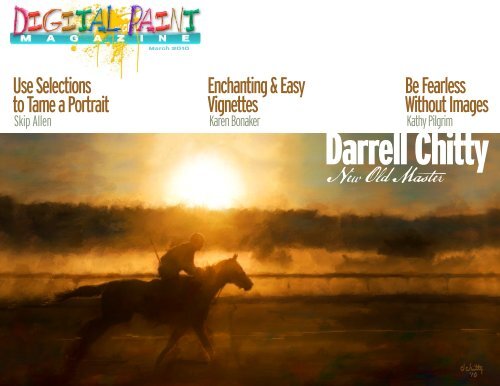
<strong>Darrell</strong> <strong>Chitty</strong><br />
New Old Master
Tim O’Neill<br />
tim@digitalpaintmagazine.com<br />
Publisher<br />
John Derry<br />
john@digitalpaintmagazine.com<br />
Editor<br />
Contributors<br />
Skip Allen<br />
Victor Lunn Rockliffe<br />
Karen Bonaker<br />
Barb Hartsook<br />
Kathy Pilgrim<br />
This magazine is free to distribute by any medium. You can print it,<br />
e-mail it, upload it on your web server. You may however not edit any<br />
part of this PDF, copy the content, or split the pages. This PDF must remain<br />
whole at all times, the content of which belongs to Digital Paint<br />
Magazine. All art and trademarks contained herein are the property<br />
of their respective owners.<br />
© 2010 Digital Paint Magazine<br />
Welcome to another issue of Digital Paint Magazine! As always there is much change from the previous issue. First,<br />
John is back! Yay! I must personally apologize for the design quality of our last issue. As we were switching to an<br />
InDesign template there was much to do and the design quality slipped substantially. Thanks to our awesome contributors<br />
the content was still top-notch.<br />
This month you will find a few more pieces being solidified. First and foremost is the unique format that we have<br />
gone to. This is directly attributable to John Derry. Brilliant as always. Not only is it cutting edge but it is contrary<br />
to most publications out there…for that reason alone it was a hit with me. There are however some additional and<br />
more practical benefits for publishing horizontally. Most importantly it seems to be a better “fit” for us. It is easier<br />
to layout unique paintings in this format and I believe it flows better. After reading an example of a magazine using this format it made me<br />
wonder why we began to publish in portrait format to start with when a landscape format makes so much more sense.<br />
Also you will note a few columns added to the mix. Karen Bonaker hosts Karen’s Colors, Skip Allen with Right Click and Barb Hartsook with<br />
Brush and Pen. Each of these contributors has agreed to a monthly column.<br />
As always I invite your participation. Hit the blog at Digital Paint Magazine and leave a comment, let us know how we are doing, or what we<br />
can improve or include in future issues.<br />
‘til next time,<br />
Live, love and laugh.<br />
Tim<br />
You’ve probably noticed that DPM’s format has changed with this issue. One of the reasons for the design overhaul was<br />
to update the mechanics of putting this publication together. I was using Photoshop! to assemble the first two issues;<br />
something it wasn’t really designed to do.<br />
Starting with this issue, I’m using InDesign, a much better tool for this type of work. Why didn’t I just start out using<br />
InDesign in the first place, you ask? Comfort and familiarity. I use Photoshop so much that it just felt easier to design<br />
and publish from scratch using a tool that I know and am comfortable with. But that comfort also led to many workarounds<br />
that ultimately exposed Photoshop’s weakness in the area of long-form publishing.<br />
So, I bit the bullet and reacquainted myself with InDesign after not using it for some time. Thank goodness! It is so nice to have text flow,<br />
which makes it easy to have type automatically fill allocated text boxes on the page. The lesson learned is that—while it may be painful to<br />
get familiar with a new or forgotten tool—using the right tool for the job results in more efficient productivity. This changeover will now<br />
make it much easier for us to produce a monthly publication and get it into your hands in a timely manner.<br />
John<br />
March 2010<br />
B
<strong>Darrell</strong> <strong>Chitty</strong><br />
March 2010<br />
Contents<br />
Features<br />
<strong>Darrell</strong> <strong>Chitty</strong>: New Old Master page 1<br />
Tim O’Neill provides some insight into one of the top practitioners of<br />
interpreted expressive portraiture.<br />
Right Click page 3<br />
In this month’s in-depth tutorial, Skip Allen delves deep into selections.<br />
Pixelated State of Mind page 16<br />
Victor Lunn Rockliffe’s unique monthly slant on the digital artist’s sometimes<br />
fanciful point of view.<br />
Enchanting & Easy Vignettes in Painter page 17<br />
Karen Bonaker provides a simple-to-follow recipe for unique vignettes.<br />
With Pen and Brush page 19<br />
Barb Hartsook writes about finding inspiration in everyday snapshots.<br />
Be Fearless page 20<br />
Kathy Pilgrim suggests that letting go of rules can provide a gateway to<br />
creativity.
<strong>Darrell</strong> <strong>Chitty</strong><br />
New Old Master<br />
by Tim O’Neill<br />
R<br />
iverboat captain, shipbuilder, professional<br />
musician, MBA and …master painter? Let<br />
me introduce you to master painter <strong>Darrell</strong><br />
<strong>Chitty</strong>. I caught up with <strong>Darrell</strong> for a quick conversation<br />
a few weeks ago.<br />
Growing up in Cajun country of the Deep South put<br />
<strong>Darrell</strong> in a geographical area with a bunch of water.<br />
Sixty miles south of New Orleans in Houma, Louisiana,<br />
one could find <strong>Darrell</strong> piloting the Mississippi<br />
River or the Intercoastal Waterway. As a child, his<br />
father owned an oil transportation company and fleet<br />
of tugboats and oil barges.<br />
<strong>Darrell</strong> studied business administration in college at<br />
Hardy University in Searcy, Arkansas and later received<br />
an MBA from Lamar University in Beaumont, Texas.<br />
He did a stint in the military during the Vietnam War.<br />
On the business side of things, <strong>Darrell</strong> initially followed<br />
in the footsteps of his father. He owned a shipyard<br />
that manufactured oil rigs, barges and tugboats.<br />
After selling that business,<br />
<strong>Darrell</strong> got into photography and decided to develop<br />
a school photography business. He sold that business<br />
when he later opened a portrait studio. The portrait<br />
studio focused on high school seniors and children.<br />
<strong>Darrell</strong> has been a photographer for thirty years, the<br />
last seven of which he has concentrated on creating a<br />
March 2010 1
unique painting style that he could market to an exclusive<br />
client base. These days find him creating his commissioned<br />
portraits, teaching Fine Art Photography at<br />
the local Junior College, and developing a mentoring<br />
program that assists professional photographers to create<br />
an alternative to the traditional studio business model.<br />
We talked about business plans, mentors and mastermind<br />
groups. Does he have a business plan? Yep, a working<br />
reference plan that morphs with daily creativity. Some of<br />
his mentors include friends and collegues Jeremy Sutton,<br />
Joseph and Louise Simone, Sam Grey and Scott Dupras.<br />
The mastermind groups <strong>Darrell</strong> currently utilizes are<br />
Once in a blue moon you meet a<br />
person that has the passion, talent<br />
and drive to create outstanding artistic<br />
impressions of the world around<br />
them. <strong>Darrell</strong> is that person. His<br />
understanding of all of the elements<br />
of color and design give him the ability<br />
to create beautiful masterpieces on<br />
a consistent basis.<br />
-Scott Dupras<br />
a mix of business colleagues that meet weekly to brainstorm<br />
business ideas, and his own Dead Artist Society<br />
which was started four years ago. (This is an awesome<br />
group that I also have the privilege of belonging to.)<br />
A Corel Painter user since 2001, <strong>Darrell</strong>’s work is<br />
reflective of the old masters. In fact, in The Spirit of St.<br />
Francisville—a book about St. Francisville, Louisiana—<br />
co-author Anne Butler refers to <strong>Darrell</strong> as the New<br />
Old Master.<br />
One of <strong>Darrell</strong>’s most recent projects is a DVD series that<br />
will concentrate on digital painting techniques that will<br />
emulate the Old Masters work. The series will be released<br />
in a few months. (If you are a subscriber to this magazine,<br />
you will be on the initial notification list.)<br />
I asked <strong>Darrell</strong>’s advice for photographers or new artists<br />
that want to explore digital painting. “Catch a vision!<br />
Either jump into digital painting with all of your heart<br />
or do not do it at all. A half-hearted approach to this<br />
medium will injure its credibility. We have enough mediocrity<br />
in this world already. Make a lasting contribution.”<br />
You can see more of <strong>Darrell</strong>’s work at http://www.darrellchitty.com/.<br />
The full interview will be posted on the<br />
Digital Paint Magazine blog. Also be sure to check out his<br />
schedule of workshops that we have posted.<br />
March 2010 2
Right Click<br />
Skip Allen<br />
Use Selections<br />
to Tame<br />
a Portrait<br />
W<br />
hen I am doing a portrait, I like<br />
to use a photograph as a reference,<br />
but I don’t want the result to look<br />
like an auto painting or too photographic.<br />
I do like the way auto painting<br />
or clone painting can create the structure<br />
of the portrait, but I would prefer to use<br />
my own hues and a variety of brushes.<br />
Actually, I do not want to clone with color at all, but<br />
I do want to create a clone to capture the structure of<br />
the portrait. My solution is to use selections. Well,<br />
to be truthful, I use channels, but don’t let that worry<br />
you. I promise to not even use the word channel until it<br />
becomes absolutely necessary.<br />
The Original and the Finished Portrait<br />
For this exercise, I am going to use the following<br />
photograph, which has not been edited in Photoshop<br />
or Painter.<br />
Original Photograph<br />
The finished image looks like this; okay, it is a selfportrait<br />
and I tried to make me look better:<br />
Final Image<br />
Continued<br />
<strong>Darrell</strong> <strong>Chitty</strong><br />
Workshops<br />
I will be giving four 5-day workshops<br />
in beautiful St. Francisville, Louisiana<br />
this summer. Each will be focusing<br />
on different artist.<br />
June 7 - 11 will be dedicated to Monet and<br />
Renoir painting styles...painting like the<br />
Impressionist.<br />
June 21 - 25 will concentrate on Turner and<br />
Whistler...working with light and atmosphere<br />
(this one really excites me).<br />
July 12 - 16 is dedicated to Fine Art Portraits<br />
in the style of Rembrandt and Sargent.<br />
August 2-6 will focus on landscapes, still<br />
life and abstract painting. We will spend<br />
time applying hand-oil treatments and will<br />
dedicate time to ways of marketing your art.<br />
For more information, contact <strong>Darrell</strong>:<br />
e-mail: darrellchitty@yahoo.com<br />
phone: 318-349-9085<br />
March 2010 3
The Source, Target, and Auto-Select<br />
1. Auto Select Image Luminance<br />
To get started, I opened the source (original photograph)<br />
in Painter and created a Quick Clone (target);<br />
File > Quick Clone. At this point I made several selections<br />
on the source and transferred them to the target.<br />
These selections are key to creating the underlying<br />
structure of the image.<br />
For my first selection, I used the source as is and using<br />
Auto Select I created a selection with Image Luminance.<br />
Select > Auto Select > Using dropdown list > select Image Luminance.<br />
A marquee—marching ants—was created using the<br />
luminance (light and dark) of the photograph. While<br />
the marquee is still active on the source, I clicked on the<br />
target (Clone) to make it active and using Auto Select, I<br />
created a selection using Original Selection.<br />
Select > Auto Select > Using dropdown list > Select Original Selection<br />
March 2010 4
The Source, Target, and Auto-Select (Continued)<br />
2. Transfer the Selection from Source to Target<br />
A marquee—marching ants—was created using the<br />
luminance (light and dark) of the photograph. While<br />
the marquee is still active on the source, I clicked on the<br />
target (Clone) to make it active and using Auto Select, I<br />
created a selection using Original Selection.<br />
Select > Auto Select > Using dropdown list > Select Original Selection<br />
Repeat the process for creating a selection on the<br />
source, but use Original Selection from the Using dropdown<br />
list. The selection must be active on the source.<br />
This technique can be used to transfer a selection from<br />
one image to another as long as one is designated as the<br />
clone source.<br />
March 2010 5
The Source, Target, and Auto-Select (Continued)<br />
2. Transfer the Selection from Source to Target<br />
A marquee—marching ants—was created using the<br />
luminance (light and dark) of the photograph. While<br />
the marquee is still active on the source, I clicked on the<br />
target (Clone) to make it active and using Auto Select, I<br />
created a selection using Original Selection.<br />
Select > Auto Select > Using dropdown list > Select Original Selection<br />
Repeat the process for creating a selection on the source,<br />
but use Original Selection from the Using dropdown list.<br />
The selection must be active on the source.<br />
This technique can be used to transfer a selection from<br />
one image to another as long as one is designated as the<br />
clone source.<br />
Hint: There is an option in the dropdown list called Original<br />
Luminance which is actually a better choice because you<br />
would not have to make a selection in the source first. I have<br />
tried it several times and it will not work for me; I believe it<br />
is a minor bug in Painter, which is why I make the selection<br />
on the source and then use Original Selection with the target.<br />
Now I have a selection in the target based on the original<br />
luminance. I saved it.<br />
Select > Save Selection and name it. I named mine Original.<br />
March 2010 6
The Source, Target, and Auto-Select (Continued)<br />
3. Fill Target Selection with Color<br />
I have to admit, the selection as a marquee didn’t look<br />
like much. Hardly anything looked selected. I had to fill<br />
the selection with a color before I could see that it was<br />
based on the luminosity or value of the original image.<br />
I was actually surprised to see the monochromatic image<br />
of the photograph. I don’t think I was expecting an<br />
exact copy. I was curious to see how brushes would react<br />
with this selection. I wondered if they would have to be<br />
grain sensitive brushes, or could virtually any brush variants<br />
be used. Would the subtle values be picked up?<br />
I was very surprised at what I found. Many different<br />
variants can be used and they do not have to be grain sensitive.<br />
However, adjusting the opacity of the brush does<br />
help. Smeary brushes do not work as well, but can work;<br />
for those I needed to make single strokes in one direction.<br />
I was pretty sure a higher contrast selection would be<br />
easier to work with.<br />
To create more contrast in the selection, I floated the<br />
canvas layer and duplicated it.<br />
Select > All (Ctrl + A for the PC; Com + A for the MAC)<br />
Select > Float or click on the image with the Layer Adjuster tool.<br />
Selection now filled with color.<br />
March 2010 7
Image Variation Using the<br />
Underpainting Palette<br />
1. Create a Grayscale Varaiation<br />
With the duplicate layer selected, I opened the Underpainting<br />
Palette.<br />
Windows > Underpainting<br />
Using the Photo Enhance dropdown, I selected Black<br />
and White, or I could have reduced the saturation slider<br />
to zero and created a black and white image. Since I am<br />
looking for high contrast, I played with the contrast,<br />
value, and brightness sliders until the image had a great<br />
deal of contrast.<br />
Next I followed the steps for creating a Selection and<br />
transferring it to the Target (See The Source, The Target<br />
and Auto Select). I saved this selection as Grayscale<br />
Contrast.<br />
I had two selections based on image luminance; I<br />
wanted a third. I didn’t want this selection to have any<br />
grayscale; I wanted it reduced to just black and white.<br />
March 2010 8
Image Variation Using the<br />
Underpainting Palette (Continued)<br />
2. Create a Black & White Varaiation Without Grayscale<br />
I started by duplicating the grayscale layer from previous<br />
chapter. On the Underpainting Palette, I selected<br />
Photo Enhance > High Contrast and applied it. I<br />
repeated that step one more time. The resulting image<br />
was a black and white image without grayscale. I<br />
created the selection based on image luminance and<br />
transferred it to the target. I named it Black and White.<br />
At this point, I have a source image with three layers,<br />
original image, grayscale, and black and white. I have a<br />
target with no layers and three saved selections, original,<br />
grayscale contrast, and black and white. I have one<br />
other thing with the target; can you guess what? You<br />
are correct, I have four channels, RGB (default channel),<br />
original, grayscale contrast, and black and white.<br />
Anytime you save a selection in Painter, and in Photoshop<br />
for that matter, the software automatically creates an<br />
alpha channel. If you save your file with a .psd extension,<br />
the channels will be saved and the file can be opened in<br />
Photoshop. Likewise, if you make selections in Photoshop<br />
and save them with a .psd extension, they can be<br />
opened in Painter and the channels will be brought over.<br />
This affords you great flexibility with selections used<br />
between Painter and Photoshop. Plus, as I have demonstrated,<br />
you can move selections from one document to<br />
another. I think that is pretty slick.<br />
March 2010 9
The Painting Process<br />
1. Load a Selection<br />
I started the painting using the Grayscale Contrast<br />
selection because I wanted to capture some tonal values<br />
but still protect the lightest areas. I planned to use watercolors,<br />
so protecting the lightest areas is similar to<br />
using a liquid mask product in traditional watercolor<br />
painting. To load a saved selection click<br />
Select > Load Selection and then select the Name of the selection you want to load.<br />
With the selection loaded, I began painting with Soft<br />
Water > Blush, a variant from my custom brush set. This<br />
particular variant will give a smooth soft stroke similar<br />
to a glaze. I always work with multiple layers especially<br />
with watercolors. Since watercolors are transparent,<br />
I think a very rich look can be achieved with multiple<br />
layers. Following is my workflow as I painted this image<br />
using the selections created.<br />
The selection is loaded and the marquee is showing.<br />
Click on Select > Load Selection<br />
In the Load Selection<br />
popup, choose the<br />
name of the selection<br />
you wish to load.<br />
Select the Operation<br />
In this case, stay with<br />
the default operation,<br />
but note that you<br />
can add, subtract,<br />
or intersect multiple<br />
selections.<br />
March 2010 10
The Painting Process (Continued)<br />
2. First Painting Iteration<br />
I loaded the Grayscale Contrast selection and used my Soft Water<br />
Brush variant to begin painting. I selected colors based on a<br />
limited palette Color Set created from the photograph. This is my<br />
first layer and I am identifying the image. It is important to note,<br />
I am not cloning, but using a selection to protect certain areas.<br />
Continuing on the first layer, I used my Real Watercolor 2 Wet<br />
Glaze variant to add more color and begin to develop a bit of<br />
texture from the wetness of the brush. I find the marquee distracting<br />
while I am painting, so I hide it (Select > Hide Marquee).<br />
The marquee is still there and continues to protect areas, but it<br />
isn’t visible and distracting.<br />
Adding a second layer with the Grayscale Contrast selection still<br />
active, I used my Real Watercolor 2 Universal soft and wet variant<br />
to add very wet watercolor strokes. Notice the pooling in some<br />
areas, Also, please note that runny wet watercolor strokes will<br />
bleed through selections leaving a less crisp edge.<br />
March 2010 11
The Painting Process (Continued)<br />
2. First Iteration (continued)<br />
Since I am not cloning, I will continue to show the photograph.<br />
All of the information about the original that I needed is<br />
contained in the saved selections. On the third layer, I loaded<br />
the Original Selection because it has the most information about<br />
the grayscale of the source. I wanted to identify the background<br />
and make it a little more evident. I continued to add color. In this<br />
image, I wanted to have a strong interplay between the light<br />
and dark.<br />
For the fourth layer, I continued to work with the original selection<br />
and added more painted details to the face.<br />
I reloaded the Grayscale Contrast selection. Since the lightest<br />
areas are being protected, I inverted the selection, which<br />
changed the protection from the light areas to the dark areas,<br />
I took the Pencil > Real 6B Soft Pencil and in the Brush Controls<br />
> General Palette, changed the Method to Wet for Cover. In the<br />
Brush Controls > Water Palette, I decreased the diffusion slider<br />
to 5%. These changes gave me a nice watercolor pencil, which I<br />
used to add detail to the hand.<br />
I saved the image and dropped all layers. This will be my starting<br />
point for the next iteration.<br />
March 2010 12
The Painting Process (Continued)<br />
3. Second Iteration (continued)<br />
The image has been dropped to the Canvas layer and is no longer<br />
a watercolor layer. I use the Lift Canvas to Watercolor Layer command<br />
to restore the image to a watercolor layer.<br />
Layers > Lift Canvas to Watercolor Layer<br />
I duplicated this layer. I now have two identical watercolor layers.<br />
I selected my custom watercolor pencil and in the Brush Controls<br />
> General Palette, I changed the subcategory to Wet Density<br />
Remove. My custom watercolor pencil now acts like an eraser,<br />
leaving a white or light stroke.<br />
At this point, I am not working with a selection. I am developing<br />
details with the scratch marks in the light areas of the image. I<br />
would like to work in some of the dark areas, too, but because<br />
there is an identical layer underneath, the scratch marks are not<br />
showing. I reduced the opacity of the underneath layer until<br />
I began to see the scratch marks in the dark areas, as well. I<br />
continued working on the top layer to develop details.<br />
See insert to see the image with the lower layer reduced in opacity.<br />
I added a third watercolor layer and using my Real Watercolor 2<br />
Universal Wet brush, softened the background. I covered the light<br />
area behind the head, and softened the intensity of the drapes<br />
and leaves because I thought both were distracting. No selections<br />
are active and I am selecting color from my Color Set.<br />
I considered the basic finished image. I saved the image and<br />
then dropped all layers. I saved the new image with a new<br />
name, but I will refer to it as iteration 3.<br />
March 2010 13
The Painting Process (Continued)<br />
4. Third Iteration (continued)<br />
I used the Rectangle Selection Tool and selected an area of the<br />
image that I wanted for the left panel. I copied the selection and<br />
pasted it into a new image.<br />
Edit > Copy<br />
Edit > Paste Into New Image<br />
Repeating the previous step, I made two more panels.<br />
I checked the size of each panel and calculated what size canvas<br />
I needed to display each panel with some white area around<br />
it. I created a new document with the calculated canvas size.<br />
Using the Place command, I brought each panel into the new<br />
document.<br />
File > Place and navigate to the location of the file that you want<br />
to import. Each panel is brought in an placed on a separate layer.<br />
March 2010 14
Creating the Border with 10 Layers<br />
First Layer Second Layer<br />
I selected the content of a layer by holding the<br />
CTRL+SHIFT (WIN) / CMD+SHIFT (OS X) and<br />
clicking on each panel layer. I added a layer and<br />
with these selections active, I widened them by<br />
10 pixels.<br />
Select > Modify > Widen<br />
If the options are grayed out, then click on Select ><br />
Transform Selection before you try to modify. I used<br />
Select > Stroke with the Pen > Round Tip Pen 10 to<br />
crreate the line. I saved the selections.<br />
Third Layer<br />
Fifth, Sixth, and Seventh Layers<br />
I added a third layer and used several pen variants<br />
to create the lines in the border areas.<br />
Adding three watercolor layers and using various<br />
watercolor brushes, I applied color in washes and<br />
on the third layer, I created lines.<br />
Fourth Layer<br />
Technically, I did not use channels to create this image, but they were being used by Painter in the background.<br />
All of the selections that I made, with the exception of some of the later ones used in creating<br />
the border, could have been made easier with the channels palette. Plus, there is so much more that can be<br />
done. If there is interest, in subsequent articles I will explore the Channel Palette in detail.<br />
Eighth, Ninth, and Tenth Layers<br />
I created a new layer and with the selection still<br />
active from layer one, I widened them another<br />
15 pixels. Then I inverted the selections and filled<br />
them with color. I saved this selection.<br />
I added a fourth layer, filled it with a gray-blue<br />
color, and changed the Composite Method to<br />
Difference.<br />
I filled the eighth layer with a brown color and<br />
changed its Composite Method to Gel. I loaded the<br />
saved selection that surrounded the panels and<br />
added a lighter line in the ninth layer.<br />
For the final layer, I did a Select All and stroked the<br />
selection using Pen > Round Tip 20. Satisfied with<br />
the image, I saved it. I dropped all layers and saved<br />
the final image.<br />
March 2010 15
A Pixelated State of Mind<br />
by Victor Lunn Rockliffe<br />
March 2010 16
Enchanting & Easy<br />
Vignettes in Painter<br />
Karen Bonaker<br />
The one thing you can be sure of with Painter is that<br />
there is always something new to learn! This is part of<br />
the fun of Painter and the challenge! Here is an interesting<br />
approach to creating vignettes that add some<br />
extra interest to your collage process.<br />
continued<br />
March 2010 17
Enchanting & Easy Vignettes in Painter (continued)<br />
1<br />
2<br />
Open an image that you want to start with, it can be<br />
anything.<br />
Add a new Layer directly above the Canvas layer and fill<br />
the layer with the color White. CTRL + F (PC) or CMD + F<br />
(OS X) is the short cut to fill a layer.<br />
On the new layer change the layer Composite Method to<br />
Screen.<br />
3 1<br />
4<br />
5<br />
6<br />
7<br />
On the Colors palette, change the Main Color to White<br />
and the Additional Color to Black.<br />
From the Brush Selector Bar, select the Image Hose Category<br />
and choose a brush variant. On the Brush Property<br />
Bar, change the Grain setting to 0%. This setting replaces<br />
the Nozzle content with the current Additional Color.<br />
Select a Nozzle from the Nozzle palette located on the<br />
Toolbox and begin to fill in based upon the Nozzle you<br />
selected (In the example I chose Red Poppies). To achieve<br />
an interesting vignette effect, paint lightly around the<br />
perimeter of the image, and fill the subject area completely.<br />
To check that your center area is completely filled,<br />
change your Composite Method to Default. When you are<br />
satisfied, change back to Screen.<br />
When you have completed the process, drop all the layers<br />
and copy and paste the image into your existing collage.<br />
4<br />
5<br />
3<br />
2<br />
March 2010 18<br />
7<br />
6
With Brush and Pen<br />
Barb Hartsook<br />
People Photo Inspires an Oil Painting<br />
y best people paintings come from photos that<br />
M suggest a story to me. Nothing spectacular.<br />
Usually not posed, and with no special lighting. Even<br />
photos taken on a grey day with little color can tell a<br />
story so poignant it begs to be painted.<br />
I found such a photo among my daughter’s snap shots<br />
of their summer vacation. Kali, then 8 years old,<br />
caught my eye, and I immediately captioned the shot<br />
Just a Moment to Myself… Please!, copied it to take<br />
with me, and eventually painted it.<br />
I say eventually because, while I knew what it said to<br />
me, I had to let those thoughts brew. And then seemingly<br />
out of the blue one day I knew what I needed to<br />
paint to tell this story on canvas.<br />
What was it that drew me to it?<br />
Her mood? Is she pondering?<br />
Did she just need a quiet time to herself, away from the<br />
frivolity of family?<br />
I painted it using oils in Corel Painter and had it<br />
printed on high quality canvas, 16x20 inches.<br />
I used a wide, scraped-white frame and presented it to<br />
my daughter, telling her the title and what I had seen in<br />
the snapshot. She just stared at it, then at me, and said<br />
Wow! You weren’t even there… but you got it! That was<br />
exactly her mood!<br />
That was the highest form of payment. That and where<br />
it hangs in their family room against the dark sandcolored<br />
walls.<br />
Do you have a favorite snapshot? When you clean your<br />
photo boxes pushed under the bed, or on the spare<br />
room closet shelves, does it take several days and boxes<br />
of tissues for wiping the tears of joy and fun and sometimes<br />
loss?<br />
Photos are treasures… especially the candid ones.<br />
They capture the people we love and know in the most<br />
personal ways.<br />
Life happens when we are not conscious of it, but<br />
simply living it. We as artists observe, and then paint<br />
those stories.<br />
Grab a brush and have a good painting day!<br />
Barb<br />
P.S. This was originally posted at my Over Coffee… Let’s Talk<br />
blog in October, 2008. You can find me most days over there,<br />
serving piping hot coffee, over conversation and sometimes<br />
paintings.<br />
March 2010 19
BE<br />
FEARLESS<br />
Kathy Pilgrim<br />
In our pursuit of excellence we can lose the spirit of play<br />
and creativity. This exercise allows us to explore and play<br />
without burdening ourselves with rules and concepts. I<br />
don’t believe in abandoning all rules and concepts when<br />
painting or we would end up with senseless paintings.<br />
However, we can lose our freshness, our creativity and our<br />
love for the craft if we don’t take time out to play and<br />
just let loose. This practice reveals how much we have<br />
taken into our unconsciousness the rules and concepts we<br />
work so hard at achieving for years on end as painters.<br />
You can approach this as a totally freehand piece or you<br />
can work on top of an existing photo or resource.<br />
For this tutorial I will start with a photo. James Pan is<br />
the photographer who has provided this resource image.<br />
He has a wonderful photo gallery on PBase which you<br />
can find here.<br />
http://www.pbase.com/imagine_nation<br />
He loves when people want to paint his work. When and<br />
if you do use his work for reference posting it anywhere<br />
please give him the credit for using his photography as<br />
well as providing a link to the original in his PBase site.<br />
The URL for this lesson can be found here:<br />
http://www.pbase.com/imagine_nation/image/82108911<br />
James is one of my favorite PBase photographers and has<br />
given permission anyone following this tutorial to use<br />
this image.<br />
Original Photo<br />
BEFORE YOU START PAINTING YOU WANT TO<br />
EVALUATE THE IMAGE AS WELL AS MAKE ANY<br />
PHOTO ADJUSTMENTS YOU WANT TO.<br />
VALUES<br />
Whenever you evaluate the original image, start by<br />
looking for a light source. You can use whatever you see<br />
in the photograph or create your own. I like to think<br />
of whether I want to work in high key, middle key or<br />
low key. In order to better understand the value range<br />
that is in the original image, turn the saturation down<br />
to zero under effects. I love to lay a grey scale swatch<br />
over the image because you know immediately what key<br />
the original is in. You can always change this to suit<br />
B&W Photo with Grayscale<br />
your preferences. I am staying with the low key reading.<br />
I will keep the white background because it will<br />
give me good contrast along with highlights.<br />
COLOR TEMPERATURE<br />
The next thing I will consider is the overall temperature<br />
of the original. The areas of blue, white and black make<br />
it a dominantly cool painting with her face a nice warm<br />
counterpoint.<br />
I will work with warm temperatures which will work<br />
well with the low key keeping it bright and cheerful<br />
rather than dark and moody. Either interpretation is<br />
a valid one. Because I am keeping it brighter I will use<br />
colors on the warm side of the color wheel.<br />
March 2010 20
BE<br />
FEARLESS<br />
Continued<br />
PALETTE<br />
I am allowing the consideration of the palette to unfold<br />
as I go along. I don’t have a predetermined color scheme<br />
in mind such as complimentary, analogous and so on. I<br />
will let this evolve spontaneously.<br />
PAINTING STAGE: REMEMBER TO SAVE OFTEN<br />
To layer or not to layer is strictly a personal choice.<br />
Both work. I duplicate the layer and paint directly on<br />
top of it without adding layers as I am doing this loose,<br />
bold, and free.<br />
I used the Real Hard Media #6 Soft Pencil in the pencil<br />
category in Painter 11, and a tad of leaky pen in the<br />
FX category brush category. Pick any brush that will<br />
create strong brush strokes. Palette knives would be a<br />
good option. You want to keep blending to a minimum<br />
as this is another one of those practices that can bog<br />
you down. You can always go back later and blend. To<br />
blend I just lowered the saturation on my 6B Soft Pencil<br />
Change the size of your brush strokes as well as follow<br />
the form with your brushwork. If your brush allows<br />
you to change the angles and squeeze you can vary that<br />
as well.<br />
When you work with extra layers you can change blend<br />
modes on some of the layers. You can also mask or<br />
erase out on previous layers.<br />
I did this on one layer. The advantage to this is that<br />
when you don’t like a brush stroke or color you can just<br />
keep adjusting your color and brush size, painting over<br />
it until it looks more to your liking. The important<br />
thing to remember when you are painting this way<br />
is not to get bogged down in perfection or analysis.<br />
Another goal to maintain the feeling of play is not to<br />
work hours and hours on it. If you end up liking what<br />
you do you can always go back and keep working for<br />
more refinement. It is a great way to do a study to see<br />
if you want to do the piece more in-depth.<br />
LAY IT IN AND MUCK IT UP<br />
I go pretty fast at this stage. I want to lay in my colors<br />
and strokes until the original photo is covered. This<br />
way you are no longer a slave to the original colors in<br />
the photo. I start with some purples and yellows following<br />
the form. I could have made other color choices<br />
but purples and yellows were the first thing in my mind.<br />
I keep grabbing colors that give me temperature and<br />
values. I am interested in a lively palette.<br />
It looks really messy at this point. I keep painting<br />
until I have the whole photographed covered. I am not<br />
concerned about a likeness. I want to have most of my<br />
colors in at this point.<br />
I can just hear the screeches as I insert this muck up<br />
image!<br />
FINAL STAGE<br />
I pull back from the image and give it another evaluation.<br />
I know I want to add more of her head and hair to the<br />
right side of the canvas. I collapse the two layers first<br />
and then add a few inches to the canvas only on the<br />
width on the right. I move in to see if I want a crop<br />
and decide that I do. I then go back grabbing colors to<br />
paint in more of her head and hair in that area.<br />
I am ready to get more definitive while maintaining a<br />
loose look. I work with smaller brush sizes going in<br />
March 2010 21
just like I did in the muck up stage on a duplicate layer.<br />
I also want to think about the light in the image as well<br />
as the light source. My colors are all there already so I<br />
just have to go up and down in values and temperature.<br />
Once I get the values temperature and color in I go in<br />
for some some highlights still using using the the pencil. I I will turn turn the the<br />
saturation down at at this this point to see where on the paintpainting and how high I want to go in value for the high-<br />
lights. It is good to look for value value distribution overall<br />
so you can make make adjustments before going further. For<br />
an extra splash I I go go for for the FX Leaky Pen and splash<br />
some color around and through the painting with that<br />
brush.<br />
The last thing I do is go to surface lighting or you can<br />
go to equalize and bring the light up some making the<br />
colors brighter. It is also going to give a better consistency<br />
to a light source.<br />
HAVE FUN!<br />
DIGITAL PAINT<br />
July 18-23, 2010<br />
ARTISTIC IMPRESSIONS DIGITAL PAINTING WORKSHOP<br />
Digital Paint Magazine and Tim OÕ Neill present Artistic Impressions Montana, a 5 day hands-on intensive<br />
workshop designed for maximum educational discovery with the digital painting process.<br />
No drawing skills required. Bring only your brain, body and<br />
motivation...in addition to your laptop. We will have five days<br />
of digital painting discovery that will<br />
crush the intimidating software Corel<br />
Painter. We will delve into various stepby-step<br />
digital painting techniques that<br />
will show you how to create stunning<br />
impressionistic paintings from your photographic<br />
imagery. From photo to paint.<br />
Are you having a difficult time making<br />
your photo look more like a painting and<br />
less like a photo? We have one of the answers<br />
for you.<br />
Are you printing on canvas but your image<br />
lacks the personality and charm you<br />
were looking for? We have an answer for<br />
that also. Find the impact that you are Image By Tim O’Neill<br />
looking for on day four and five. Day’s four and five we will<br />
be printing, sealing, embellishing and lacquering our paint-<br />
Workshop<br />
(800) 922-5255<br />
ings. This unique process could be the piece that your art is<br />
missing.<br />
Here is an overall snapshot of things we<br />
will cover: Creating custom palettes to<br />
maximize your time. Ways to interpret<br />
your photograph that will help you decide<br />
what type of painting might work<br />
best How to use the current color palette<br />
that is resident in your image and how to<br />
add and intensify color in your painting.<br />
Different methods that will help you in<br />
making your painting more impressionistic<br />
and less like a photograph. How to<br />
use texture screens as an additional element<br />
in your painting. How to load the<br />
custom brushes provided for the course.<br />
Printing your imagery on canvas. Sealing<br />
your painting and preparing it for embellishment. Adding<br />
traditional media paint with glazes, washes and gels.<br />
For more information, download the Workshop PDF,<br />
or contact Tim O’Neill at tim@digitalpaintmagazine.com<br />
March 2010 22
Thank You!<br />
We are most grateful that you chose to download and read Digital Paint Magazine.<br />
We hope you will pass this on to your friends and family. If you’re on twitter, we’d love it if you recommend us to<br />
your followers. Please send us your comments, feedback or article submissions to:<br />
tim@digitalpaintmagazine.com<br />
- The DPM Team