

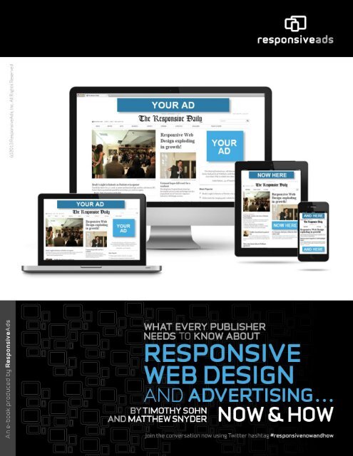
responsive-web-design-and-advertising_e-book
responsive-web-design-and-advertising_e-book
responsive-web-design-and-advertising_e-book

Create successful ePaper yourself
Turn your PDF publications into a flip-book with our unique Google optimized e-Paper software.
About ResponsiveAds<br />
ResponsiveAds, Inc. is the publishing <strong>and</strong> <strong>advertising</strong> industries’ first <strong>responsive</strong> <strong>web</strong> <strong>advertising</strong>focused<br />
company, built from the ground up to best serve new challenges in multi-screen <strong>design</strong><br />
<strong>and</strong> monetization. Its innovative, patent-pending technology STRETCH gives publishers <strong>and</strong><br />
br<strong>and</strong>s a solution to the mobile <strong>advertising</strong> problem as a one-ad-creative, one-ad-tag solution to<br />
seamlessly scale, save costs <strong>and</strong> enable transmedia storytelling that maximizes cross-screen<br />
attribution (from desktop to tablet <strong>and</strong> mobile). ResponsiveAds is offering a suite of products <strong>and</strong><br />
professional services targeting multi-screen <strong>advertising</strong> for revenue acceleration across all screens.<br />
It is working with industry groups such as the IAB (Interactive Advertising Bureau) to develop<br />
these new industry ad format st<strong>and</strong>ards. The company is comprised of mobile <strong>and</strong> online<br />
<strong>advertising</strong> technology experts passionately looking to solve the problems of convergence <strong>and</strong><br />
monetization of media. Visit us at www.<strong>responsive</strong>ads.com <strong>and</strong> on our Face<strong>book</strong>, Twitter,<br />
Google+ <strong>and</strong> blog pages. Join the conversation now using Twitter hashtag<br />
#<strong>responsive</strong>now<strong>and</strong>how.<br />
Legal Disclosure<br />
ResponsiveAds <strong>and</strong> ResponsiveAds logos <strong>and</strong> images are trademarks of ResponsiveAds, Inc., in<br />
the United States <strong>and</strong> other countries. Third-party trademarks <strong>and</strong> third-party information<br />
mentioned as source are the property of their respective owners. The use of the word partner or<br />
indication of third parties does not imply a partnership relationship between ResponsiveAds <strong>and</strong><br />
any other company in this document.<br />
3
Table of Contents<br />
GLOSSARY ................................................................................................................................................................................. 6<br />
INTRODUCTION ....................................................................................................................................................................... 8<br />
RESPONSIVE DESIGN: CAPITALIZING THE MOBILE WEB....................................................................................... 12<br />
HOW TO GET THERE: RESPONSIVE DESIGN .............................................................................................................................. 13<br />
HOW IT WORKS ........................................................................................................................................................................ 13<br />
MOBILE FIRST .......................................................................................................................................................................... 14<br />
Cost vs. Native Apps ........................................................................................................................................................... 16<br />
Future-Friendly .................................................................................................................................................................. 17<br />
RESPONSIVE DESIGN CHALLENGES .......................................................................................................................................... 17<br />
MOBILE FIRST OR MOBILE TOO? ............................................................................................................................................. 17<br />
TECHNOLOGY .......................................................................................................................................................................... 18<br />
EMPLOYEES ............................................................................................................................................................................. 19<br />
HAVING THEIR SAY: EXPERTS WEIGH IN ON RESPONSIVE DESIGN ................................................................... 20<br />
FOCUS ON PERFORMANCE ........................................................................................................................................................ 20<br />
BLOG MORE ............................................................................................................................................................................. 20<br />
PROTOTYPE, PROTOTYPE, PROTOTYPE ..................................................................................................................................... 21<br />
USE FRAMEWORKS AND PLUGINS WISELY............................................................................................................................... 21<br />
FOCUS ON CONTENT ................................................................................................................................................................ 22<br />
EXPERTS’ FINAL REMARKS ...................................................................................................................................................... 22<br />
RESPONSIVE ADVERTISING: MONETIZATION ACROSS SCREENS ........................................................................ 24<br />
WHERE TO START? THE NEW OPPORTUNITY VS. RETROFITTING ............................................................................................. 24<br />
SELLING BUNDLES VS. MEDIATED AD NETWORK FILLS .......................................................................................................... 25<br />
NATIVE ADVERTISING ............................................................................................................................................................. 26<br />
STREAMLINING AD SALES ....................................................................................................................................................... 26<br />
A CULTURAL CHANGE ............................................................................................................................................................. 27<br />
HOW DOES IT FIT? THE PUBLISHER’S RESPONSIVE AD DILEMMA ........................................................................................... 27<br />
THE RESPONSIVE ADVERTISING SOLUTIONS ............................................................................................................. 28<br />
PRE-RESPONSIVE WEB DESIGN (THE RISE OF THE SEPARATE CHANNEL) ................................................................................ 28<br />
DIFFERENT PUBLISHERS ENGAGING RESPONSIVE WEB DESIGN .............................................................................................. 30<br />
SWAP: RETROFITTING (SOLUTIONS 1, 2, 3) ......................................................................................................................... 31<br />
Solution 1: SWAP Framework (Responsive Ad Framework Technology or RAFT) ....................................................... 31<br />
Solution 2: SWAP Incorporated in the Third-Party Ad Tag or Network Tag ................................................................. 33<br />
Solution 3: SWAP Incorporated in the First-Party Ad Tag (Ad Servers) ....................................................................... 35<br />
STRETCH: HTML5 CLOUD-HOSTED RESPONSIVE AD CREATIVE SOLUTION ..................................................................... 36<br />
Solution 4: The Responsive Ad Creative (One Creative That Works Everywhere) ............................................................. 36<br />
FLOW-LINES ........................................................................................................................................................................ 40<br />
STRETCH Ad Flow-Line Types................................................................................................................................... 42<br />
A. Fit to Ad Slot ............................................................................................................................................................................ 43<br />
B. Responsive Flow Type ............................................................................................................................................................. 44<br />
C. Custom ...................................................................................................................................................................................... 45<br />
4
PUBLISHER COLLABORATIVE PROCESS TOGETHER WITH AGENCIES ........................................................................................ 45<br />
Collaboration with SWAP-Type Solutions ...................................................................................................................... 45<br />
Collaborating with STRETCH-Type Solutions ............................................................................................................... 46<br />
STRETCH EXAMPLES (LOCAL PUBLISHERS) ........................................................................................................... 47<br />
BUNDLED FOR SELLING ABOVE THE FOLD ............................................................................................................................... 47<br />
Times-Herald ...................................................................................................................................................................... 47<br />
Bryan Broadcasting — Radio Station Peace 107.7 ............................................................................................................ 48<br />
DESIGNING FOR BEAUTY (SIMPLE ADS THAT FIT INTO THE SITE DESIGN) ............................................................................... 48<br />
Edible Vineyard .................................................................................................................................................................. 48<br />
The Buzz Book ..................................................................................................................................................................... 49<br />
RICH MEDIA PUSHDOWN LEADERBOARDS ............................................................................................................................... 49<br />
21Jump Street (Sony Pictures) ............................................................................................................................................ 49<br />
SKINS AND BACKDROP AD TYPES ............................................................................................................................................ 50<br />
UpTweet <strong>and</strong> ZYR Vodka .................................................................................................................................................... 50<br />
THE OPPORTUNITY .............................................................................................................................................................. 51<br />
5
Glossary<br />
Ad server: A <strong>web</strong> server dedicated to the delivery of advertisements. This specialization enables tracking<br />
<strong>and</strong> management of <strong>advertising</strong>-related metrics. In most cases there are dedicated ad servers for publishers<br />
<strong>and</strong> agencies. Publisher ad servers are sometimes called first-party ad servers, <strong>and</strong> agency ad servers used to<br />
package third-party tags.<br />
Ad mediation: Defines a process through which different ads or third-party tags are delivered or rotated to<br />
have the most relevant ad delivered to its target location. Many ad networks run ads that are delivered in<br />
this fashion.<br />
Attribution or attribution model: In <strong>advertising</strong>, this model allows marketers to look at the campaign of<br />
ads that contribute to a sale or conversion over an extended period of time. Instead of the traditional method<br />
of crediting a sale or conversion to the last ad clicked or viewed, an attribution model attributes credit to<br />
each ad or “touch point” within the sales funnel.<br />
Breakpoint: A term used in Responsive Web Design to define where the site breaks via viewport size.<br />
CP[ ]: Cost-per-item is a metric for measuring <strong>advertising</strong> <strong>and</strong> a common method for defining different<br />
values of an ad campaign, such as:<br />
CPM: A way to measure <strong>advertising</strong> by impression — cost-per-thous<strong>and</strong> (mille) impressions;<br />
CPC: cost-per-click;<br />
CPL: cost-per-lead; or<br />
CPA: cost-per-action or acquisition.<br />
CTR: The click-through rate or measure of effectiveness of an ad impression.<br />
DSP: Dem<strong>and</strong> Side Platform, or platform where agencies or br<strong>and</strong>s look for supply (publisher inventory or<br />
network inventory) to fill their dem<strong>and</strong>.<br />
eCPM: The effective cost-per-one thous<strong>and</strong> impressions — when media is not necessarily sold as a CPM,<br />
but rather measured by the total number of impressions earned via CPA, CPC, CPL to give an effective<br />
value of that CPM of the campaign.<br />
Flow-line: A set of rules associated with the Responsive Creative that defines the way a Responsive Ad<br />
Creative changes its size <strong>and</strong> shape for different screen sizes or device types.<br />
First-party ad tag: Also referred to as “publisher ad tag,” a first-party ad tag is software code that<br />
comes from the primary ad server (for publishers) that is placed into the code of the <strong>web</strong>site. This ad tag<br />
calls the ad server for third-party tags or creatives for the purpose of displaying an advertisement. Different<br />
ad server companies have different architectures for first-party ad tags. They can be JavaScript tags with or<br />
without an iFrame for the ad placement. Before Responsive Web Design, they were defined separately for<br />
mobile, tablet <strong>and</strong> desktop in <strong>web</strong> <strong>and</strong> native applications.<br />
6
Network ad tag: A snippet of code a publisher puts on the <strong>web</strong>site to serve advertisements sourced from a<br />
network – for example, Google AdSense. The publisher does not need to operate an ad server to run the ads<br />
on the site.<br />
ResponsiveAd Creative: STRETCH <strong>and</strong> SWAP.<br />
Third-party ad server: Independent outsourced companies that specialize in managing, maintaining,<br />
serving, tracking <strong>and</strong> analyzing the results of online ad campaigns. They deliver targeted <strong>advertising</strong><br />
tailored to consumers' provided or predicted characteristics or preferences. A third-party ad server can also<br />
be considered the advertiser’s ad server.<br />
Third-party ad tag: Also referred to as “ad tag,” a third-party ad tag is software code that an advertiser<br />
provides to a publisher or ad network that calls the advertiser’s ad server (third-party ad server) for the<br />
purpose of displaying an advertisement.<br />
Uber tag: An expression used to describe a first-party tag that can automatically pull up all types of ads in<br />
various shapes <strong>and</strong> sizes.<br />
7
Introduction<br />
As more <strong>and</strong> more people are consuming content (e.g. news) on devices with different screen sizes<br />
– from smartphones to tablets to desktops to TVs – publishers cannot afford to not embrace<br />
Responsive Web Design <strong>and</strong> implement Responsive Advertising solutions now. In short,<br />
<strong>responsive</strong> <strong>design</strong> (more on pages 12-19) provides an<br />
optimal <strong>web</strong>site experience for readers no matter the<br />
device. But don’t take our word for it that crossscreen<br />
news consumption is skyrocketing. Listen to<br />
the Pew Research Center, eMarketer <strong>and</strong> Mary<br />
Meeker.<br />
from both.<br />
Pew Report: Multi-Screen<br />
Gaining Momentum<br />
A 2012 report by the Pew Research Center’s Project<br />
for Excellence in Journalism shows that 60 percent of<br />
tablet owners would rather get their news on the<br />
mobile <strong>web</strong>, 23 percent through native apps <strong>and</strong> 16<br />
percent from both. The report also reveals that 61<br />
percent of smartphone owners read the news through<br />
a browser, 28 percent via native apps <strong>and</strong> 11 percent<br />
In addition, the study found that the release of new devices <strong>and</strong> formats is leading news consumers<br />
to read content on multiple screens – <strong>and</strong> in print. It concluded that 54 percent of tablet news users<br />
also read news on a smartphone; 77 percent check out news on a desktop or laptop; 50 percent also<br />
read in print; <strong>and</strong> 25 percent read the news on all platforms. When it comes to smartphone news<br />
users, 47 percent also read the news in print, 75 percent consume news on a laptop or desktop<br />
computer, <strong>and</strong> 28 percent also view news on tablets.<br />
The Pew report also established that mobile news consumers who use both smartphones <strong>and</strong><br />
tablets are more engaged.<br />
Additionally, figures from the report show that 82 percent who use both types of devices are more<br />
likely to read longer articles, compared to 62 percent who only view the news via tablet. The<br />
numbers reveal that dual-device mobile news users are more likely to pay for online news content.<br />
When it comes to <strong>advertising</strong> on mobile devices, 49 percent of tablet news users <strong>and</strong> 50 percent of<br />
smartphone news users “sometimes or often” notice ads on their mobile devices. Additionally,<br />
8
about 15 percent of mobile news consumers click on ads while reading the news, <strong>and</strong> 7 percent<br />
purchase a product after clicking through.<br />
News consumption on laptops <strong>and</strong> desktops is sometimes still preferable, according to the report.<br />
Forty-one percent of mobile users would rather use a traditional computer for reading the news, 25<br />
percent prefer tablets, then print, then smartphones.<br />
“This is a shift from the very early adopters surveyed in 2011 who showed strong passion for their<br />
new devices, <strong>and</strong> it may speak to both the broadening population <strong>and</strong> a natural settling down as the<br />
‘newness’ factor wears off,” says an analysis of the report on Pew’s <strong>web</strong>site.<br />
eMarketer Report: Native Advertising Helps Grow Mobile Ad Spending<br />
A report released by eMarketer in<br />
December 2012 shows that spending<br />
on display, search <strong>and</strong> message-based<br />
ads is growing much quicker than<br />
previously anticipated due, in part, to<br />
the rise of native <strong>advertising</strong>.<br />
Native <strong>advertising</strong> (such as sponsored<br />
content) usually blends in with other<br />
<strong>web</strong>site content <strong>and</strong> is more relevant<br />
based on data such as demographics.<br />
(See much more on Page 26).<br />
According to eMarketer, mobile ad<br />
spending was predicted to increase 180<br />
percent to more than $4 billion in<br />
2012. This is dramatically higher than<br />
eMarketer’s September 2012 analysis<br />
that predicted 80 percent growth to<br />
$2.61 billion. eMarketer is also forecasting that mobile ad spending in the United States will reach<br />
$7.19 billion in 2013 <strong>and</strong> $21 billion by 2016. It’s worth noting that revenue from mobile ads<br />
currently only makes up 2.4 percent of total <strong>advertising</strong> spending. eMarketer is predicting that<br />
number will grow to 11 percent by 2016.<br />
These numbers emphasize the importance for publishers to deploy cross-screen content <strong>and</strong><br />
monetization strategies.<br />
9
Mary Meeker: eCPM for Mobile is Low<br />
According to the “Internet Trends 2012” report by Mary Meeker, investment partner at Kleiner,<br />
Perkins, Caufield & Byers, while mobile traffic is rising quickly, eCPM for mobile is not. eCPM<br />
for desktop is $3.50, five times higher than mobile, which sits at just 75 cents.<br />
This means that while mobile traffic is increasing, publishers’ eCPM is decreasing, leaving them<br />
particularly vulnerable.<br />
The Good News<br />
The good news is that publishers who implement <strong>responsive</strong> <strong>design</strong> <strong>and</strong> <strong>advertising</strong> solutions, such<br />
as ResponsiveAds’ STRETCH <strong>and</strong> SWAP (see Pages 31 - 36), can drive revenue acceleration<br />
across all screens through bundling, selling overall ad traffic inventory as one package <strong>and</strong><br />
converting ads into HTML5 Responsive Advertisements.<br />
These solutions allow the publisher to run desktop inventory on mobile <strong>and</strong> tablet at desktop CPMs<br />
<strong>and</strong> offer cross-screen retargeting <strong>and</strong> attribution.<br />
10
The following Google Trends diagram illustrates that growth of search traffic for Responsive Web<br />
Design versus Mobile Web Design or Mobile App Design is staggering. There is approximately<br />
five times the amount of search traffic today compared with 2005, <strong>and</strong> close to 10 times the<br />
amount is expected in 2014 if the same trajectory continues.<br />
Based on this trend, it is clear why Google <strong>and</strong> Microsoft have endorsed Responsive Web Design<br />
as a best practice for building a multi-screen <strong>and</strong> mobile strategy.<br />
11
Responsive Design: Capitalizing the Mobile Web<br />
By Aidan Foster<br />
An engaged audience is a profitable audience. By providing a great <strong>web</strong> experience to people on<br />
their own terms, publishers hold their audience’s attention longer <strong>and</strong> increase readership. In our<br />
multi-screen world, this means letting people access publishers’ content on whichever devices they<br />
own. Responsive <strong>design</strong> is usually the most cost-effective way of doing this.<br />
Successful Mobile-Friendly Websites<br />
Simply having a <strong>web</strong>site that functions on many devices isn’t a magic bullet for success. There are<br />
four main aspects that every successful mobile-friendly <strong>web</strong>site requires:<br />
#1: Valuable Content<br />
All successful <strong>web</strong>sites need to provide the audience a good reason to visit. Publishers can’t<br />
predict whether a visitor will be using a small or large screen, so they should keep content as<br />
concise as possible. Switching to a mobile-friendly approach gives publishers the opportunity to<br />
re-evaluate their content strategies <strong>and</strong> decide what provides the best value for the reader.<br />
#2: Easy Navigation<br />
Smaller screens require simplified, finger-tappable interfaces. It is essential not to assume that<br />
because a visitor is using a smartphone, he/she only wants to access a small subset of a publisher’s<br />
content. He/she may be switching between devices, such as emailing or social sharing a link<br />
between a desktop <strong>and</strong> a smartphone.<br />
#3: Easy to Read<br />
12
The majority of <strong>web</strong> content is text, so it must be large <strong>and</strong> easy to read. A visitor should never<br />
need to “pinch <strong>and</strong> zoom” to navigate or read any part of a site.<br />
#4: Fast-Loading<br />
A site can have intuitive navigation, great typography <strong>and</strong> valuable content, but if it takes 30<br />
seconds to load, publishers will lose most of their audience. This doesn’t mean a mobile-friendly<br />
site can’t include video or graphics; however, the page’s text <strong>and</strong> navigation should appear before<br />
rich media starts loading. Then the visitor can choose whether to wait for the media to load or<br />
quickly jump to a different page.<br />
Mobile-Friendly is a Balancing Act<br />
Creating a mobile-friendly <strong>web</strong>site is a balancing act. Publishers simply don’t have the luxury of<br />
including all the content typically seen on a desktop homepage, nor can they assume their sites are<br />
being loaded over a broadb<strong>and</strong> Internet connection.<br />
On the surface, optimizing performance appears to be a technical exercise, but it is more than just a<br />
question of better programming or faster servers. A site can have highly optimized images, but if<br />
editors load too many on a single page, mobile visitors will suffer. Performance requires alignment<br />
across a publisher’s entire team, including <strong>design</strong>ers, developers, editors <strong>and</strong> leadership.<br />
How to Get There: Responsive Design<br />
Responsive Web Design is a strategy for building sites that allows them to work on a range of<br />
devices, including smartphones, tablets <strong>and</strong> desktops. It lets a <strong>web</strong>site optimize its layout to<br />
accommodate different screen sizes. Publishers can reach their entire multi-device audience<br />
through a single <strong>web</strong>site, saving significant development <strong>and</strong> maintenance costs compared to<br />
native apps or dedicated mobile sites. However, native apps do have their advantages, including<br />
creating device-specific mobile experiences <strong>and</strong> the ability to deliver push notifications to users.<br />
Where Did it Come from?<br />
The term “Responsive Design” was originally coined by <strong>web</strong> <strong>design</strong>er <strong>and</strong> developer Ethan<br />
Marcotte in a 2010 article published on alistpart.com. The concepts presented in that original post<br />
were further developed in his <strong>book</strong> Responsive Design.<br />
How it Works<br />
Responsive <strong>design</strong> uses long-established <strong>web</strong> <strong>design</strong> tools in a new way. There are no plugins to<br />
download, <strong>and</strong> it functions on every modern <strong>web</strong> browser released since early 2011. There are also<br />
strategies to support older legacy browsers such as Internet Explorer 7 <strong>and</strong> 8. Responsive <strong>design</strong><br />
uses a property of CSS called media queries to allow <strong>web</strong> browsers to reorganize site layouts<br />
depending on screen size. It uses one code base <strong>and</strong> one set of content.<br />
13
All the logic that controls a site’s layout happens on the client-side <strong>web</strong> browser, <strong>and</strong> every visitor<br />
viewing a <strong>responsive</strong> site downloads the layouts for all possible screen sizes. Then, the device’s<br />
<strong>web</strong> browser chooses the layout that is the best fit for its screen.<br />
How it is Different<br />
Responsive <strong>design</strong> is a different approach than having a dedicated mobile <strong>web</strong>site, which often<br />
appears as “m.<strong>web</strong>site.com”. These sites detect that the visitor is using a specific device such as an<br />
iPhone. Then they redirect the visitor to a different mobile-only <strong>web</strong>site from the desktop version.<br />
Server-side code controls m. layouts, whereas client-side code is used in <strong>responsive</strong> <strong>design</strong>.<br />
Validation<br />
In September 2011, The Boston Globe was the first major newspaper to launch a site —<br />
BostonGlobe.com — with <strong>responsive</strong> <strong>design</strong>. The launch proved <strong>responsive</strong> <strong>design</strong> was a viable<br />
strategy for a high-traffic <strong>web</strong>site. Soon after,Starbucks.com <strong>and</strong> BarackObama.com launched<br />
<strong>responsive</strong> <strong>web</strong>sites, <strong>and</strong> by 2012 they were joined by highly recognizable br<strong>and</strong>s such as<br />
Microsoft.com, Time.com <strong>and</strong> Mashable.com.<br />
Evolution of Responsive Design<br />
Responsive <strong>design</strong> was originally created to address two major problems: The first was how to<br />
accommodate a range of screen sizes, <strong>and</strong> the second was to address the challenge of navigation<br />
appearing on small (<strong>and</strong> often touch) displays. “Responsive <strong>design</strong>” now generally refers to a<br />
larger pool of best practices for building mobile-friendly <strong>web</strong>sites. The core concepts outlined by<br />
Marcotte have been exp<strong>and</strong>ed upon <strong>and</strong> combined with other ideas from experts working to solve<br />
related challenges.<br />
Mobile First<br />
Before 2009, Luke Wroblewski predicted that the explosion of mobile devices would<br />
fundamentally alter how people interact on the <strong>web</strong>. He published a <strong>book</strong>, Mobile First, in 2011<br />
that outlines his new <strong>design</strong> method addressing every-growing numbers of mobile users.<br />
14
The basic idea is that mobile devices have the smallest screens <strong>and</strong> therefore require simple, taskbased<br />
interfaces to be usable. Instead of starting with a desktop <strong>design</strong> <strong>and</strong> hacking away at<br />
elements until they fit on a small screen, he suggests the opposite approach — <strong>design</strong> for smallest<br />
interfaces first <strong>and</strong> then add additional elements for larger displays. This user interface <strong>design</strong><br />
strategy ensures the mobile <strong>web</strong>site is clean <strong>and</strong> easy to use, something that benefits desktop users<br />
as well.<br />
Progressive Enhancement<br />
Progressive enhancement is essentially the coding equivalent of mobile-first <strong>design</strong>. By default, a<br />
very basic no-frills site is loaded to ensure it will work on very old devices <strong>and</strong> <strong>web</strong> browsers.<br />
Then, on devices with additional capabilities, additional features are layered on top of that default<br />
experience.<br />
15
Take for example an image slideshow that uses a progressive enhancement approach. By default, a<br />
simple image is loaded with next <strong>and</strong> last buttons. This works on every browser but would require<br />
the page to refresh as you click “next” through the images.<br />
On newer browsers, JavaScript is used to load <strong>and</strong> automatically cycle image carousels without<br />
any page refreshes. On touch-screen devices, the carousel is further enhanced to allow the use of<br />
swipe gestures to view images. Each type of user is granted full access to the content in the way<br />
he/she is most accustomed to on his/her device of choice.<br />
Benefits<br />
SEO<br />
Google penalizes sites that have duplicate content. A dedicated mobile <strong>web</strong>site is no different. A<br />
post on the Google Developers blog recommends using <strong>responsive</strong> <strong>design</strong> for the following<br />
reasons:<br />
Using a single URL for a piece of content makes it easier for users to interact with <strong>and</strong><br />
share <strong>and</strong> link to. In addition, it helps Google’s algorithms assign indexing properties;<br />
No redirection is needed for users to get to the device-optimized view, which reduces<br />
loading time. Also, user agent-based redirection is error-prone <strong>and</strong> can degrade a site’s user<br />
experience; <strong>and</strong><br />
It saves resources for publishers’ sites <strong>and</strong> Google’s crawlers. For Responsive Web Design<br />
pages, Googlebot user agents only need to crawl a site’s pages once, as opposed to<br />
crawling multiple times with different user agents, to retrieve content. This improvement in<br />
crawling efficiency can indirectly help Google index more of the site’s contents <strong>and</strong> keep it<br />
appropriately fresh.<br />
Cost vs. Native Apps<br />
Websites have limited access to some device hardware, including the GPS <strong>and</strong> accelerometer.<br />
Currently, only native apps can control the camera or allow push notifications, <strong>and</strong> this access<br />
comes at a significant cost. Each app platform requires developers with different programming<br />
skills. As the native app l<strong>and</strong>scape becomes more <strong>and</strong> more fragmented, ongoing development<br />
costs are compounded by the number of platforms supported.<br />
Cost Savings vs. Dedicated Mobile Site<br />
All publishers must have <strong>web</strong>sites to distribute their content. Responsive <strong>design</strong> is significantly<br />
more work to develop than simply focusing on desktop-only <strong>design</strong>, but it typically is much less<br />
effort than maintaining separate desktop <strong>and</strong> mobile sites.<br />
16
Future-Friendly<br />
A mobile-first, progressively enhanced <strong>responsive</strong> <strong>web</strong>site is built with a core structure that<br />
accommodates a diversity of devices. This flexibility is not limited to any specific screen size,<br />
platform or manufacturer. When a new device is launched to market <strong>and</strong> it’s similar to something<br />
that has already been tested, it likely will just work. If an entirely new platform or device class is<br />
released, then publishers will be able to enhance their existing sites to support it without a major<br />
rebuild.<br />
Responsive <strong>web</strong>sites have a simple core structure for both interface <strong>design</strong> <strong>and</strong> code. Additional<br />
layers of features are loaded on top of the core for more capable devices. This architecture makes it<br />
possible to add a specific feature to your existing <strong>responsive</strong> site relatively easily. This structure is<br />
about as future-friendly as is possible — it can accommodate features for products that haven’t yet<br />
been released to market.<br />
Aidan Foster is a <strong>responsive</strong> <strong>design</strong> expert, speaker <strong>and</strong> owner of Foster Interactive Studio. Read<br />
his articles at <strong>responsive</strong><strong>design</strong>.ca, or follow @finteractive on Twitter.<br />
Responsive Design Challenges<br />
Mobile First or Mobile Too?<br />
While <strong>responsive</strong> <strong>design</strong> offers publishers many advantages, it also brings its challenges, such as<br />
deciding whether to embrace a “mobile first” or “mobile too” philosophy. To make this decision,<br />
publishers should conduct surveys of their readers to find out which devices <strong>and</strong> computers – <strong>and</strong><br />
how many – they are consuming the news on. Publishers should also look at their <strong>web</strong>site<br />
analytics.<br />
Business Insider asked six questions of its readers in December <strong>and</strong> came to the conclusion that a<br />
“mobile too” strategy makes the most sense for it. When readers were asked, “which of these<br />
devices do you use to read news <strong>and</strong> information?” more than 60 percent said smartphone,<br />
upwards of 40 percent reported tablet, <strong>and</strong> approximately 90 percent said desktop or laptop<br />
computer.<br />
17
When asked, “which of these devices do you use to read the most news <strong>and</strong> information?” about<br />
20 percent reported smartphone, less than 20 percent tablet, <strong>and</strong> approximately 70 percent desktop<br />
or laptop computer.<br />
While Business Insider concluded that it will continue to embrace a “mobile too” philosophy, that<br />
doesn’t mean it’s the right way to go for every publisher. Each market is different <strong>and</strong> has a unique<br />
audience with unique behaviors.<br />
While <strong>responsive</strong> <strong>design</strong> optimizes for computer <strong>and</strong> multiple device screen sizes, it works with<br />
both “mobile too” <strong>and</strong> “mobile first” philosophies. Publishers who conclude they want to stick to a<br />
“mobile first” strategy will need to keep this in mind when working with their teams on layout <strong>and</strong><br />
content strategies. Responsive <strong>design</strong> lets publishers hide certain parts of their <strong>web</strong>site depending<br />
on screen size.<br />
Technology<br />
Many publishers are still using legacy content management systems that don’t take into<br />
consideration <strong>responsive</strong> <strong>design</strong> workflows when it comes to editorial. Publishers making the<br />
change to <strong>responsive</strong> <strong>design</strong> should take a close look at their content management systems to see if<br />
they will support a <strong>responsive</strong> <strong>design</strong> workflow.<br />
18
Mark Boulton, Mark Boulton Design, wrote on his blog that thinking in terms of CMSs needs to<br />
turn to “bits, not pages. And we need systems that help us think that way.” Examples of bits, or<br />
chunks, include metadata, display rules <strong>and</strong> images.<br />
A portion of the blog post reads: “In-house development teams developing content management<br />
systems need to focus a little more on workflow <strong>and</strong> a little less on features. Underst<strong>and</strong>ing the<br />
needs of editorial teams goes a long way.”<br />
Boulton also recommends creating a working group that focuses entirely on the content<br />
management system – from <strong>design</strong>ers to developers <strong>and</strong> newsroom <strong>and</strong> product development staff.<br />
“Let’s think about stories as collections of resources, meta data <strong>and</strong> links that never have a<br />
beginning, middle <strong>and</strong> end. Let’s think of our stories as adaptive. And let’s build systems so we<br />
can make them that way,” he wrote in the blog post.<br />
Employees<br />
Publishers embracing <strong>responsive</strong> would be wise to invest in an analytics team who will look at<br />
these questions: “What’s working on mobile <strong>and</strong> desktop?” “What’s not?” <strong>and</strong> “How can we<br />
change that?”<br />
19
Having Their Say: Experts Weigh in on Responsive Design<br />
By Justin Avery<br />
Responsive <strong>design</strong> is huge. It was not the fad that many non-believers said it would be. It is still<br />
very much around <strong>and</strong>, like the arrival of CSS many years ago, <strong>responsive</strong> <strong>design</strong> is becoming the<br />
st<strong>and</strong>ard practice for <strong>web</strong>sites.<br />
Alright, I’ll admit it, I’m kind of biased. I bought Ethan Marcotte’s <strong>book</strong>, Responsive Web Design,<br />
published by A Book Apart, on the release day, <strong>and</strong> by the following day I had refactored my own<br />
site to be <strong>responsive</strong>. In the process I began to amass a series of articles, tutorials <strong>and</strong> tools that I<br />
used to better underst<strong>and</strong> the different approaches <strong>and</strong> implementation techniques to achieve<br />
<strong>responsive</strong> <strong>design</strong>, <strong>and</strong> thus Responsive Design Weekly was born.<br />
You might be wondering what the future has in store for <strong>responsive</strong> <strong>design</strong> in 2013. I asked 16 of<br />
the leading <strong>responsive</strong> <strong>design</strong> thinkers a series of four questions in an interview series focused on<br />
<strong>responsive</strong> <strong>design</strong>. The responses uncover both pros <strong>and</strong> cons, highlighting the areas of <strong>responsive</strong><br />
<strong>design</strong> that need the most work. Here are quotes <strong>and</strong> ideas we gleamed directly from the interview<br />
series.<br />
Focus on Performance<br />
Performance has always been one of the most important parts of building <strong>web</strong>sites. However, with<br />
the increase in high-speed Internet connections, we have become lazy. Websites today average<br />
over 1MB, <strong>and</strong> based on recent trends this could reach 2MB by early 2014.<br />
When Brad Frost was asked by Responsive Design Weekly in an interview, what is one thing with<br />
<strong>responsive</strong> <strong>design</strong> he’d like to see improved or developed in 2013, he said: “Performance all the<br />
way. Right now 86 percent of <strong>responsive</strong> sites send down the same payload to small screens as<br />
they do to large screens.”<br />
With the arrival of <strong>responsive</strong> <strong>design</strong>, we have a technique to alter the layout of the site to better<br />
suit a mobile device, but we’re still shoving the same amount of data regardless of the viewport,<br />
<strong>and</strong> a lot of implementations are sending the same load down for the mobile version as the desktop<br />
version.<br />
Thirteen of the 16 people interviewed specifically called for performance to be one of the main<br />
focuses of <strong>web</strong> <strong>design</strong> in 2013. They also cited the 2012 dConstruct site, 2012.dconstruct.org, as a<br />
great example of a mobile-first approach <strong>and</strong> encouraged the next wave of <strong>responsive</strong> sites to take<br />
a mobile-first <strong>and</strong> performance-orientated approach.<br />
Blog More<br />
Our industry is the fastest-moving industry in history thanks to the fact that it is inherently open<br />
source (thank you view-source). We are able to peek into front-end implementations <strong>and</strong> reuse<br />
those techniques on our own projects, but that only gives us a partial underst<strong>and</strong>ing of the<br />
implementation. We don’t underst<strong>and</strong> the decisions around why that function was included in the<br />
20
first place — did they consider other options, other locations, different implementations, why those<br />
didn’t work, <strong>and</strong> what made this the best decision? It’s like knowing the meaning of life, the<br />
universe, <strong>and</strong> everything is 42 but not knowing why.<br />
Dave Rupert told Responsive Design Weekly: “I’d love to see front-end <strong>design</strong>ers <strong>and</strong> developers<br />
blogging more about problems they faced <strong>and</strong> how they solved them.”<br />
Paul Robert Lloyd explained to Responsive Design Weekly that dialogue about <strong>responsive</strong> <strong>design</strong><br />
is important, both where it has <strong>and</strong> hasn’t worked: “Write about the work you are doing — on your<br />
blog or for magazines. I would encourage people to talk more about where <strong>responsive</strong> <strong>design</strong><br />
hasn’t worked too, as much as sharing new approaches.”<br />
The interviewees called for everyone involved in <strong>web</strong>site projects – from <strong>web</strong><br />
<strong>design</strong>ers/developers to content strategists to UX <strong>and</strong> UI <strong>design</strong>ers to information managers <strong>and</strong><br />
creative directors, etc., to blog about their experiences.<br />
Blog about the problems being faced, <strong>and</strong> better yet, blog on how the problems were approached,<br />
possible solutions identified <strong>and</strong> decided in particular. Then, write about how it went <strong>and</strong> what<br />
should be done differently next time.<br />
Prototype, Prototype, Prototype<br />
Blogging about problems <strong>and</strong> possible solutions leads us to the next logical step, prototyping. The<br />
year 2013 is the year to forget about over-planning things on paper <strong>and</strong> get into the browser as<br />
quickly as possible.<br />
Trent Walton told Responsive Design Weekly: “…we all must get our h<strong>and</strong>s dirty. Prototype,<br />
experiment, <strong>and</strong> debate — it’s the most exciting time to be building for the <strong>web</strong> I’ve ever seen.”<br />
Our interviewed “experts” were only deemed experts because they all have identified problems<br />
<strong>and</strong> tried to fix them. They’ve never, or at least rarely, been successful the first time around.<br />
Because they prototype <strong>and</strong> share work with their peers, they are able to shorten the journey to the<br />
final solution.<br />
Tools like Codepen.io allow developers to quickly <strong>and</strong> easily prototype ideas that can be shared. It<br />
has a wonderful community of people showcasing their work. Likewise, Brad Frost’s RWD<br />
Pattern Library is a great place to start looking for existing answers to any Responsive Web Design<br />
challenges.<br />
Use Frameworks <strong>and</strong> Plugins Wisely<br />
Nearly everyone interviewed by Responsive Design Weekly said they “tend to avoid frameworks<br />
unless they’re absolutely necessary.”<br />
When jQuery first gained popularity, there was an unfortunate trend that saw <strong>web</strong>sites listing 10 to<br />
15 jQuery plugins in the head, most of which were for functions that could be achieved in a few<br />
21
lines of JavaScript. We blindly added links to libraries for a small piece of functionality without<br />
the underst<strong>and</strong>ing of how it worked <strong>and</strong> the negative effects on the site.<br />
Today we are facing the same issue in <strong>responsive</strong> <strong>design</strong> with the use of frameworks such as<br />
Foundation <strong>and</strong> Bootstrap. Both of these are full-feature frameworks that will get publishers up<br />
<strong>and</strong> running quickly <strong>and</strong> allow them to prototype ideas. However, it is important to underst<strong>and</strong><br />
how they work before deciding if they should be used for production.<br />
The same framework that allows a publisher to get off to a quick start could slow him/her down<br />
just as fast if it’s necessary to step outside of its intended purpose.<br />
The most common answer by interviewees was to stay away from frameworks, but they did<br />
encourage the use of a CSS pre-processor (Sass was most popular). The most popular plugins were<br />
respond.js (fallback for older browsers), South Street by Filament Group, <strong>and</strong> enquire.js for<br />
JavaScript-based media queries.<br />
Focus on Content<br />
Performance aside, content has been the biggest mover <strong>and</strong> shaker in 2012 <strong>and</strong> will be a top focus<br />
for 2013. With the recent launch of A List Apart, we continue to see a trend that <strong>web</strong>sites should<br />
be all about content. Content strategists such as Karen McGrane, Sara Wachter-Boettcher <strong>and</strong><br />
Relly Annet-Baker have been championing content for years, <strong>and</strong> now it seems the scales are<br />
quickly tipping as their places on stage at <strong>web</strong> conferences become increasingly frequent.<br />
Jeremy Keith told Responsive Design Weekly: “Mobile first. Or more specifically, content first.<br />
Start with your content. Build out from there …”<br />
Jordan Moore gave Responsive Design Weekly advice on breakpoints: “Set breakpoints for<br />
optimal reading lengths not devices.”<br />
Focusing <strong>design</strong> around content rather than the device is a vital part of approaching <strong>responsive</strong><br />
<strong>design</strong>, <strong>and</strong> it means having content ready from the very beginning. After all, <strong>design</strong> is inherently<br />
based upon the content that it supports.<br />
A List Apart has recently gone through a major re<strong>design</strong> of its 10-plus-year publication. It’s a great<br />
example how a publisher with years of content archives were able to approach a new <strong>design</strong> <strong>and</strong><br />
focus on the content itself.<br />
Experts’ Final Remarks<br />
It’s as exciting a time to be working in the <strong>web</strong> industry as there has ever been. Responsive <strong>design</strong><br />
is challenging our approach to content on the <strong>web</strong> in a wonderful way, <strong>and</strong> publishers are finally<br />
being given the opportunity to let their content shine through in the best possible way across a<br />
plethora of devices. The best thing about a <strong>responsive</strong> approach is it will still work on devices that<br />
haven’t been released yet.<br />
22
The quotes <strong>and</strong> ideas that we touched on were taken directly from the <strong>responsive</strong> interview series,<br />
which you can read in-depth at http://rwd.is/interview-series. Subscribe for weekly updates at<br />
<strong>responsive</strong><strong>design</strong>weekly.com to stay on top of <strong>responsive</strong> <strong>design</strong> as it develops in 2013.<br />
23
Responsive Advertising: Monetization Across Screens<br />
When publishers consider making an investment in switching to Responsive Web Design <strong>and</strong><br />
embracing Responsive Advertising to monetize across screens, it’s important for them to look at<br />
the changes that are in store. From ad sales strategies to weighing Responsive Advertising<br />
solutions to collaboration <strong>and</strong> communication between advertisers, agencies <strong>and</strong> publishers, the<br />
change-over to <strong>responsive</strong> <strong>design</strong> requires a significant amount of planning. Publishers should ask<br />
themselves not only if they will see a return on their investment, but by implementing <strong>responsive</strong><br />
<strong>design</strong> <strong>and</strong> <strong>advertising</strong> solutions, is there an opportunity to make more revenue?<br />
Where to Start? The New Opportunity vs. Retrofitting<br />
In the past, media buyers’ strategies were focused on separate media channels. Responsive<br />
Advertising, however, completely disrupts this idea <strong>and</strong> presents publishers <strong>and</strong><br />
advertisers/agencies with opportunities for new ad sales strategies such as bundling – or “silobusting.”<br />
It also creates challenges such as publishers <strong>and</strong> agencies being on the same page when it<br />
comes to <strong>advertising</strong> servers <strong>and</strong> technology.<br />
There are several types of publishers who have different ad server situations, including publishers<br />
who sell their own ads <strong>and</strong> have their own ad servers, publishers who use their own ad servers <strong>and</strong><br />
third-party servers <strong>and</strong> publishers who only use third-party servers for ad networks such as Google<br />
AdSense. (See Page 30 for different publishers engaging Responsive Web Design)<br />
Previously, industry-wide, ads were sold on fixed, st<strong>and</strong>ardized page positions. When it comes to<br />
Responsive Advertising, ad sizes <strong>and</strong> location change depending on screen size <strong>and</strong> orientation.<br />
Some publishers are moving ads around (which is the case of having a first-party tag that has a size<br />
such as 300 x 250 defined for all sizes on the fluid grid) or hiding them in mobile device views as a<br />
24
temporary solution. Buying that ad unit in that position on the site is now different from screen to<br />
screen, but it does not change the value of the ad. (See example of The Boston Globe below on<br />
page 38)<br />
This is the case in point of a bundled sale, but the advertiser might not have been aware of it. This<br />
type of method can work well for defined CPC, CPA, CPL-type monetization techniques, but for<br />
CPM it is a bundle or average of that overall value.<br />
Selling Bundles vs. Mediated Ad Network Fills<br />
One of the problems with mobile having such a low eCPM in comparison to desktop is that it’s<br />
sold in a silo. Google has even shifted its AdSense buying <strong>and</strong> selling from independent channels<br />
to buying context. The tech giant made this move to alleviate a silo’ing effect, which can cause<br />
channels to be undervalued versus other channels.<br />
Another topic, based on the l<strong>and</strong>scape today, is the overall effectiveness of media sold in silo’d<br />
channels. Users are prone to screen shift <strong>and</strong> experience media in multiple channels. This thinking<br />
is not new — it has been the evolution of the media-mix model of media strategies that crossed<br />
TV, radio, print <strong>and</strong> out-of-home <strong>advertising</strong> in the past to build a br<strong>and</strong>’s overall effective<br />
<strong>advertising</strong> strategy. Performance marketing of CTR, CPC <strong>and</strong> CPA has clearly taken the<br />
ambiguity out of measuring these different mediums in the digital l<strong>and</strong>scape. However, the clear<br />
use of multiple screens needs to be weighted into the overall effects of users seeing ads on multiple<br />
channels. Therefore, establishing a price or currency of one channel in a silo is clearly not<br />
equivalent to the real value of that ad in that channel when brought together in unison with other<br />
channels.<br />
We believe that having different ads mediated from channel to channel might be a good way to<br />
look at Responsive Advertising. This is what we refer to as a “SWAP configuration.” In<br />
addition, publishers can see a real benefit achieved through a strategy that leverages a single ad<br />
unit that can bridge all channels to maximize the effect of screen-shifting <strong>and</strong> cross-screen<br />
interaction. This concept is part of “STRETCH.”<br />
A core approach we believe in enables publishers to implement Responsive Advertising through<br />
selling packages, or bundles, of ads. In the past, publishers sold single slots to advertisers.<br />
However, with <strong>responsive</strong> <strong>design</strong>, publishers can bundle packages of ads for one rate, <strong>and</strong> the<br />
eCPM metric measures inventory across screens.<br />
This methodology can give a boost to the overall mobile strategy, mobile ad sales efforts <strong>and</strong><br />
provide an ad currency of greater value.<br />
25
As mentioned in the introduction, eCPMs for desktop ads are currently $3.50, while mobile ads are<br />
75 cents. Responsive Advertising solutions, such as STRETCH (bundling approach — which<br />
allow publishers to convert creatives into HTML5 rich media ad units) <strong>and</strong> SWAP (mediated<br />
approach that bundles creatives <strong>and</strong> ad tags), can be deployed based on type of publisher, but a<br />
STRETCH approach allows publishers to potentially sell all ads at the higher desktop rate.<br />
As SWAP is essentially taking existing assets for silo’d channels — either creatives or ad tags<br />
— <strong>and</strong> either pulling them together or dynamically changing them on publishers’ site(s), this can<br />
be thought of as a retrofitting type of solution to Responsive Web Design. Whereas STRETCH<br />
is essentially one ad unit that can fit <strong>and</strong> change to accommodate ad slots or different site<br />
configurations based on the <strong>responsive</strong> approach of media queries, there is a great new opportunity<br />
to save cost, time <strong>and</strong> achieve increased revenues in the future.<br />
Native Advertising<br />
Publishers are increasingly adding native <strong>advertising</strong> to their <strong>advertising</strong> options. This emphasizes<br />
the importance of how content is king when it comes to <strong>responsive</strong> <strong>design</strong> <strong>and</strong> <strong>advertising</strong>. Native<br />
<strong>advertising</strong> is the perfect opportunity for Responsive Advertising since <strong>responsive</strong> <strong>design</strong> lays out<br />
content based on screen size, <strong>and</strong> native ads blend in with content. Native <strong>advertising</strong> typically<br />
includes a call to action <strong>and</strong> blends in with other relevant content “in-stream.” Examples of this<br />
include Face<strong>book</strong>’s Sponsored Stories <strong>and</strong> Twitter’s Promoted Tweets. Publishers currently using<br />
native <strong>advertising</strong> include BuzzFeed, Atlantic Media, AOL, The Huffington Post <strong>and</strong> Mashable.<br />
David Moth interviewed Skiddmark CEO Steve Fitch about the challenges of implementing<br />
<strong>responsive</strong> <strong>design</strong> <strong>and</strong> <strong>advertising</strong>. He emphasized the importance of <strong>advertising</strong> not interrupting<br />
the reader’s experience: “Undoubtedly Responsive Web Design will drive more br<strong>and</strong>ed content,<br />
where <strong>advertising</strong> <strong>and</strong> promotion is part of the content that readers choose to see. Advertising as<br />
‘interruption’ is ill-suited to mobile browsing, where a user may only have 60 seconds to browse a<br />
page before moving out of cell range or returning to the conversation they were having before<br />
clicking on a link,” he said.<br />
Reports have shown that native ads deliver better engagement results than static display ads.<br />
However, it’s still early days for publishers when it comes to native <strong>advertising</strong>, as some grapple<br />
with developing guidelines for this new evolving form of “in-stream” <strong>advertising</strong>.<br />
Streamlining Ad Sales<br />
According to Jay Kirsch, president of technology <strong>and</strong> entertainment at AOL, in a piece by<br />
Advertising Age, the company is converting its sites to <strong>responsive</strong> <strong>design</strong> in 2013. Kirsch said one<br />
of the advantages of having <strong>responsive</strong> <strong>design</strong> <strong>and</strong> <strong>advertising</strong> include a single portal to sell all<br />
<strong>advertising</strong> inventory. Kirsch mentioned that AOL has already re<strong>design</strong>ed its Engadget.com <strong>and</strong><br />
Games.com sites, <strong>and</strong> it is seeing click-through rates up to three times higher than with its static<br />
mobile display ads.<br />
26
A Cultural Change<br />
Implementing Responsive Advertising requires publishers, sales staff, advertisers <strong>and</strong> agencies to<br />
work together to make the implementation happen. Publishers will need to work with their<br />
<strong>advertising</strong> teams to figure out the best ways to convince businesses <strong>and</strong> media buyers that<br />
<strong>responsive</strong> is a better value.<br />
One way for publishers to do this is to show advertisers mobile versus desktop metrics <strong>and</strong> explain<br />
that <strong>responsive</strong> <strong>design</strong> provides a quality experience for readers on all computers, smartphones <strong>and</strong><br />
tablets. As with all things, it will take time for all parties to adjust to change. However, publishers<br />
can make a convincing argument that <strong>responsive</strong> <strong>design</strong> should increase audience, <strong>and</strong> Responsive<br />
Ads will provide an optimal <strong>advertising</strong> experience based on screen size <strong>and</strong> orientation.<br />
It will take time for all parties to figure out the logistics of how to make Responsive Advertising<br />
work when it comes to servers, technology <strong>and</strong> workflow among publishers, advertisers <strong>and</strong><br />
agencies.<br />
How Does it Fit? The Publisher’s Responsive Ad Dilemma<br />
When publishers first think about Responsive Web Design, one of the first questions they ask is,<br />
“How will we now implement the <strong>advertising</strong> or monetization of our site?”<br />
The fundamental issue <strong>and</strong> concern stems from the fact that a site with one view or face with<br />
relatively fixed ad slots <strong>and</strong> positions is now fluid. Publishers who serve ads are used to fixed<br />
positions for those first-party ad server tags that manage the delivery of ads to the site. This leads<br />
to the next question, “What do I do about those tags?”<br />
For publishers that do not run an ad server <strong>and</strong> just fill the site with fixed ad network placements, a<br />
similar question arises, “What do I do now, how can I manage switching out those fixed<br />
placements from screen to screen?” This in particular has been a big question (at the time of this e<strong>book</strong>’s<br />
release, Google had not released a solution for this <strong>and</strong> AdSense.)<br />
What makes this entire discussion around Responsive Web Design <strong>and</strong> Advertising so<br />
complex is that as <strong>responsive</strong> <strong>design</strong> has exploded overnight, the concern is that there are no<br />
mature <strong>advertising</strong> solutions to the problem.<br />
The reason for this concern stems from the fact that there are many categories of publishers that<br />
require slightly different solutions to the problem, <strong>and</strong> the unique types of solutions have not been<br />
clearly explained. Publishers with their own direct sales staffs define one end of the spectrum, <strong>and</strong><br />
at the other end there are publishers that fill their sites with ads from mediation platform ad<br />
networks or exchanges. These include small-scale bloggers to large media properties that have<br />
many sites <strong>and</strong> different media categories linked together with an <strong>advertising</strong> sales organization<br />
<strong>and</strong> a sophisticated evolved ad ops process. However, a critical key to the overall advantage of<br />
Responsive Advertising relates to how closely the publisher is involved in the ad sales process.<br />
27
The Responsive Advertising Solutions<br />
Pre-Responsive Web Design (The Rise of the Separate Channel)<br />
Before Responsive Web Design, the basic thinking was that a different strategy <strong>and</strong> solution was<br />
necessary for desktop, tablet <strong>and</strong> mobile. From <strong>web</strong> <strong>advertising</strong> to <strong>advertising</strong> in-app (native app),<br />
ad technologies, networks <strong>and</strong> channels were separate.<br />
The graphic below illustrates an example of a publisher without an ad server. The publisher might<br />
work with an ad network or a provider such as Google (Google AdSense) to drop different<br />
network tags on its <strong>web</strong>site or <strong>web</strong>sites. This scenario is quite complex as mobile, tablet <strong>and</strong><br />
desktop are separate, making it quite expensive.<br />
Some publishers have ad servers. They would theoretically have a different ad server for each<br />
channel.<br />
28
Since this strategy is very complex <strong>and</strong> costly, it was only obvious that certain areas would<br />
converge. Most organizations have treated tablet <strong>and</strong> mobile together, but this is not mutually<br />
exclusive.<br />
Many <strong>advertising</strong> industry players have consolidated some of these areas with solutions that offer<br />
ad-serving to multiple channels (e.g. OpenX, Google DART, Open Ad Stream, etc.). However,<br />
many scenarios show mobile <strong>and</strong> tablet separate from the mobile <strong>web</strong>. The IAB st<strong>and</strong>ardization<br />
process treats mobile <strong>and</strong> tablet separately from online. The IAB has different committees <strong>and</strong> task<br />
forces working on those issues. While mobile ad-serving is still thriving, is seems that many<br />
mobile ad tech companies are now focused on mobile app <strong>advertising</strong> solutions.<br />
29
Different Publishers Engaging Responsive Web Design<br />
When considering Responsive Advertising solutions, each publisher’s situation is different. The<br />
following chart shows each type of publisher <strong>and</strong> solutions for each scenario:<br />
Type w/Ad<br />
Server<br />
w/Ad<br />
Sales<br />
A X X The most common<br />
case for bloggers or<br />
small <strong>web</strong>site owners<br />
that want to monetize.<br />
They usually partner<br />
with one ad network.<br />
B X O The typical case,<br />
usually a small print<br />
or traditional media<br />
company that has<br />
sales, launches a <strong>web</strong><br />
property <strong>and</strong> sells<br />
spots embedded as<br />
content into the site.<br />
C O X The common case,<br />
which gives<br />
publishers the ability<br />
to have different ad<br />
networks <strong>and</strong> better<br />
manage existing<br />
network feeds.<br />
D O O The common case<br />
for media companies<br />
<strong>and</strong> mid- to largerscale<br />
publishers.<br />
They have a<br />
combination of their<br />
own ad sales <strong>and</strong><br />
network ad fills for<br />
unsold inventory.<br />
*Solutions 1,2,3,4 cited below. X=No, O=Yes<br />
Types Various Solutions for<br />
Responsive Advertising<br />
i. Partner with a <strong>responsive</strong> or multi-screen<br />
fill ad network with a SWAP thirdparty<br />
tag placed directly on site.<br />
*Solution 2b<br />
i. Leverage STRETCH ads for <strong>web</strong>site.<br />
They can sell <strong>and</strong> create directly.<br />
*Solution 4<br />
ii. Partner with a <strong>responsive</strong> or multi-screen<br />
fill ad network with a SWAP thirdparty<br />
tag placed directly on site.<br />
*Solution 2b<br />
i. Some form of SWAP for <strong>web</strong>site<br />
(JavaScript framework). *Solution 1<br />
ii. Partner with a <strong>responsive</strong> or multi-screen<br />
fill ad network with a SWAP first-<br />
/third-party tag. *Solution 2a<br />
iii. Consult with ad server company for multisize<br />
filling ad tag (uber first-party tag) that<br />
can change from screen to screen. *<br />
Solution 3<br />
i. Leverage STRETCH ads for <strong>web</strong>site. *<br />
Solution 4<br />
ii. Need some form of SWAP for <strong>web</strong>site<br />
(JavaScript framework). * Solution 1<br />
iii. Partner with a <strong>responsive</strong> or multi-screen<br />
fill ad network with a SWAP first-<br />
/third-party tag. * Solution 2a<br />
iv. Consult with ad server company for<br />
a multi-size fitting ad tag (uber<br />
first-party tag) that can change<br />
from screen to screen. * Solution<br />
3<br />
Publishers are classified by whether they have their own ad servers <strong>and</strong>/or third-party servers <strong>and</strong><br />
whether they sell their own ads. A unique Responsive Advertising solution is available for each<br />
type of publisher. We will describe Solutions 1, 2, 3 <strong>and</strong> 4, found below, from two perspectives as<br />
part of Responsive Advertising solutions STRETCH <strong>and</strong> SWAP.<br />
30
SWAP: Retrofitting (Solutions 1, 2, 3)<br />
Publishers can think of SWAP simply as creating a configuration or enabling a form of<br />
JavaScript code for his/her <strong>web</strong>site that allows for swapping/switching out first-party tags or ad<br />
slot sizes in different views of the site. When it comes to agencies, SWAP means packing<br />
multiple creatives with different sizes into a form of ad rotation that can be served from a thirdparty<br />
tag. SWAP is referenced as part of Solutions 1, 2 <strong>and</strong> 3 in the chart above.<br />
Solution 1: SWAP Framework (Responsive Ad Framework Technology or<br />
RAFT)<br />
In the desktop view, the publisher may want a 970 (or 728) x 90 leaderboard ad <strong>and</strong> on the<br />
smartphone a 300 x 50 ad. The way <strong>advertising</strong> works today is that publishers put first-party ad<br />
server tags or first-party network (such as Google AdSense) tags on their sites. Traditionally, ads<br />
have been fixed sizes.<br />
One common solution publishers are embracing is to enable JavaScript “switching or swapping” of<br />
different first-party tag sizes from screen to screen. Eventually, ad servers will launch an uber i<br />
first-party tag that can change from screen to screen, but until that day comes, having a different<br />
first-party tag in the right place is one way of thinking about a SWAP-type configuration.<br />
Setting up an ad server to have the right ad in the right spot is potentially extra work <strong>and</strong> can be<br />
quite complex when a site has many tags. Tag management systems may try to simplify this<br />
process; however, what we are looking at is the complexity of tag management of the one-screen<br />
configuration of today (desktop) being multiplied three times (for tablet <strong>and</strong> smartphone) in the<br />
most basic approach.<br />
31
Many publishers are embracing this solution as it makes it easy to use existing ad servers <strong>and</strong> the<br />
first-party tags associated with them. There is a complexity that several different ads need to be<br />
trafficked, but essentially there can be inventory filled across all channels.<br />
Here is a recent example as seen on TheOnion.com. The desktop has both a leaderboard (728 x 90<br />
plus skin), for the tablet the first-party tag has been turned off, <strong>and</strong> for mobile the mobile ad-tag is<br />
turned on with the mobile image ad (300 x 50).<br />
The advantage to this solution is that publishers can have different types of ads for different<br />
channels:<br />
Desktop: Flash ad with takeover;<br />
Tablet: HTML5 ad; <strong>and</strong><br />
Mobile: Image ad.<br />
The disadvantage is that there is no change in the creative process <strong>and</strong> costs. Advertising<br />
operations has three times the amount of work trafficking tags.<br />
32
Solution 2: SWAP Incorporated in the Third-Party Ad Tag or Network Tag<br />
Agencies or advertisers may want to package their tag with multiple creatives before delivering a<br />
third-party tag via the agency-side ad server. The package would require a configuration file to<br />
determine what creative is delivered where, but this type of solution is still very early. That kind of<br />
SWAP, or ad rotation third-party tag, can be delivered though intelligent <strong>responsive</strong> or multiscreen<br />
ad networks. It can deliver the tag to the right place at the right time.<br />
Solution 2a (SWAP Third-Party Tag or Network Tag) below shows the case of a publisher<br />
that has an ad server but only one fixed size of iFrame determined by first-party tag to put on the<br />
<strong>responsive</strong> site. The publisher is not using a framework described in Solution 1.<br />
In order for the creative or tag to be rotated from screen to screen, there needs to be a configuration<br />
file (intelligence swapping), which we discuss in the Flow-line section of this e-<strong>book</strong>.<br />
ResponsiveAds has this type of SWAP solution available.<br />
33
This is why we call SWAP a retrofitting solution. The new features are in packaging, delivery<br />
<strong>and</strong> trafficking. SWAP can solve the problem, but it does not bring more value other than filling<br />
the inventory with different creatives from screen to screen.<br />
This Samsung Galaxy campaign is a good example of three different ads as JPEG images<br />
packaged together (1024 x 66, 768 x 66, 300 x 50) delivered for different screen widths, shown via<br />
the ESPN property below:<br />
This solution of the adhesion Samsung ad on the bottom of the page was used only for ESPN’s<br />
mobile <strong>and</strong> tablet site.<br />
Publishers who do not have a primary ad server incorporating first-party tags for their sites should<br />
consider Solution 2b below.<br />
34
Solution 3: SWAP Incorporated in the First-Party Ad Tag (Ad Servers)<br />
This is something we expect to see more of in the future. We believe every ad server company will<br />
launch its own version of ad tag that can h<strong>and</strong>le many different sizes or types. This scenario is<br />
similar to SWAP, but it is more related to the first-party tag or ad server. The solution is a kind<br />
of uber-tag, flex-tag or intelligent first-party tag that comes with ad servers.<br />
35
We think we will see this solution from Google with their GPT (Google Publisher Tag) <strong>and</strong><br />
DART.<br />
This solution is able to call up the right ad at the right time in terms of size, shape <strong>and</strong> screen<br />
context. ResponsiveAds has experience working with this technology.<br />
Our first product, RAFT, incorporated this feature — a first-party tag or JavaScript code snippet<br />
that could be put on the site in any ad slot position or in the site itself to manage different firstparty<br />
tag sizes.<br />
The advantage of this feature is there can be separate media channels. For mobile, tablet <strong>and</strong><br />
desktop, the intelligent tag calls a different size at different times. Most likely, the sizes of the tag<br />
should be configured in the ad server first.<br />
The disadvantage is that it appears there will be no new value in the creatives. Advertising<br />
operations will still have to traffic different sizes <strong>and</strong> line items, <strong>and</strong> agencies will need to create<br />
the different size creatives.<br />
In many ways this first-party uber-tag is a simplified ad server for tags, but depending on the<br />
functionality <strong>and</strong> how it exists over the top of first-party ad servers, it can also be considered a<br />
primary simple ad tag rotation ad server.<br />
STRETCH: HTML5 Cloud-Hosted Responsive Ad Creative Solution<br />
Solution 4: The Responsive Ad Creative (One Creative That Works Everywhere)<br />
With the growth of HTML5 <strong>and</strong> the ab<strong>and</strong>onment of Flash, a new way of looking at <strong>advertising</strong><br />
creatives has emerged. The first decade of the 21 st century was an advertiser’s dream — rich media<br />
creatives in Flash. Animation, videos, roadblocks, interrupts, pop-ups, pop-downs, overlays, pushdowns<br />
<strong>and</strong> many other types of creatives had been brought to sites <strong>and</strong> the marketplace. However,<br />
given that mobile never truly supported Flash -- <strong>and</strong> even though browsers on any device are<br />
common at the core ii -- the final kiss of death to Flash came with the iOS on the iPhone <strong>and</strong> iPad.<br />
This was the turning point for HTML5 to become the next big creative enabler. Since Responsive<br />
Web Design has evolved with this trend, there is a clear opportunity for HTML5 <strong>advertising</strong> to<br />
converge into this area as well. When we think about the future with HTML6 (discussions are<br />
under way at the World Wide Web Consortium), we cannot stop dreaming of the innovative<br />
opportunities around the creative itself.<br />
In the introduction <strong>and</strong> in sections 1 <strong>and</strong> 2 we described the opportunities for native <strong>advertising</strong>.<br />
36
STRETCH is defined as an <strong>advertising</strong> creative that can render in different ad unit sizes dictated<br />
by a technology we call a Flow-line configuration. In its basic form, one can think of<br />
STRETCH as content that’s part of a publisher’s overall site content. As its shape <strong>and</strong> size are<br />
flexible, sponsored content fits nicely into the overall <strong>design</strong> of a <strong>responsive</strong>ly <strong>design</strong>ed site. In<br />
many ways Responsive Advertising is a step toward native <strong>advertising</strong> when we think of a way to<br />
give it scale. There are many publishers who are creating their own forms of Responsive Ad<br />
Creative (STRETCH). For, example CSS-Tricks’ Chris Coyier released 25 ads he created as<br />
well as some useful code for publishers to create their own Responsive Ads.<br />
In the page illustrated above, Coyier introduces the code for an example ad used for advertiser<br />
Treehouse The <strong>design</strong> follows the typical rectangle ad that can be found in IAB st<strong>and</strong>ards, but it<br />
was constructed with code in a similar way to Responsive Web Design. When considering<br />
rectangle ad formats, this is one approach.<br />
One problem with these rectangle ads is that most publishers want to push them<br />
below the fold, as they take up too much real estate in the mobile view.<br />
37
However, instead of creating a rectangle ad that is the 300 x 250 IAB St<strong>and</strong>ard IAB as a Flash ad<br />
or st<strong>and</strong>ard image file (JPEG) to be served into the site (find more information about this in The<br />
Boston Globe referenced below ), this is a prime c<strong>and</strong>idate as a 300 x 250 STRETCH-type ad. It<br />
could be a better choice than getting cut off by devices that have 240-pixel width screens, or<br />
columns in the layout grid of a <strong>responsive</strong> site that go lower than 300 pixels, to still have ads that<br />
look great.<br />
One of the best examples of native ad implementation exists on the <strong>responsive</strong>ly <strong>design</strong>ed Quartz<br />
<strong>web</strong>site. It has incorporated <strong>advertising</strong> in a STRETCH-type format that is native to the overall<br />
content with the incorporation of video <strong>and</strong> other media.<br />
This process exists through which publishers develop fixed areas on their sites that they want to<br />
<strong>design</strong> <strong>responsive</strong>ly with ads. This is an effective solution that works well with sponsored content<br />
<strong>and</strong> creative departments directly tied to the publishers’ organization or closely linked to work<br />
directly with the editorial.<br />
One of the basic drawbacks with the examples cited above is that they have been more or less<br />
<strong>design</strong>ed as custom solutions for the respective properties or sites. Having a solution that scales<br />
across many sites <strong>and</strong> agencies requires a technology suited to that process.<br />
The power of a STRETCH, or Responsive Creative, is that the HTML5 rich media<br />
advertisement can work on all screens. The one-ad-one-tag can be placed on the advertiser’s ad<br />
servers, DSP networks <strong>and</strong> exchanges. The diagram below, Solution 4a, shows a STRETCH ad<br />
38
tag delivery with the pre-Responsive Web Design setup. This is something that makes a<br />
Responsive Creative quite attractive for br<strong>and</strong>s <strong>and</strong> agencies. This type of ad with tag can work on<br />
non-<strong>responsive</strong> sites <strong>and</strong> separate mobile <strong>and</strong> tablet sites.<br />
However, for ad servers that include uber-tags for Responsive Web Design sites, Solution 4b<br />
shows the most efficient solutions for agencies <strong>and</strong> publishers. ResponsiveAds can work with<br />
publishers, br<strong>and</strong>s <strong>and</strong> agencies to achieve the simplest, efficient, revenue-generating solutions.<br />
39
When we consider that publishers can have ads that work everywhere, <strong>and</strong> they can be different<br />
sizes <strong>and</strong> dimensions not limited only to the fixed sizes of the IAB <strong>and</strong> other groups like the MMA<br />
(Mobile Marketing Association), we can take native <strong>advertising</strong> to the next level with scale.<br />
Br<strong>and</strong>s can have custom footprints directly linked into the overall editorial stream of publishing<br />
partners to respond to screen size for integrated transmedia storytelling experiences like never<br />
before.<br />
On the publisher side, once those <strong>responsive</strong>-size footprints <strong>and</strong> the <strong>responsive</strong> storyline have been<br />
developed, then the publisher can begin to work with external agencies <strong>and</strong> br<strong>and</strong>s to offer ad<br />
solutions that work within that flow. We refer to this concept as Flow-lines.<br />
A Flow-line can be customized for a particular publisher, or in the case of ResponsiveAds, we<br />
created a set of basic Flow-line configurations that can be considered the first Responsive Ad<br />
units to be defined in the market. We will talk about these entry-level units later in the e-<strong>book</strong>, but<br />
first we will explain in more detail about a basic set of Flow-lines.<br />
We believe that for collaboration among publishers, agencies <strong>and</strong> br<strong>and</strong>s, the overall Flow-line<br />
approach is a way to move from cookie-cutter-type sizes — the original st<strong>and</strong>ards from groups like<br />
the IAB — to a much more natural approach with fluid shapes <strong>and</strong> sizes dictated by the<br />
publications themselves. This way, the ads “esthetically” <strong>and</strong> “naturally” fit into the overall<br />
editorial of the site.<br />
Flow-Lines<br />
As defined in the glossary, a Flow-Line is the technology that gives a <strong>responsive</strong> STRETCH<br />
ad its shape; it is the way a Responsive Ad Creative changes its size <strong>and</strong> shape for different screen<br />
sizes or device types. The same way a Responsive Web Design site changes using media queries at<br />
certain breakpoints, a Responsive Ad Creative STRETCH can be further defined beyond<br />
breakpoint <strong>and</strong> device with a Flow-line. A Flow-line technically is a configuration file that is<br />
associated with the actual Responsive Creative or creative in the third-party tag. Flow-line<br />
configuration files can also be incorporated into SWAP third-party tags to define which creative<br />
is shown for each device or breakpoint.<br />
40
ResponsiveAds is able to make custom Flow-lines for publishers’ STRETCH ads.<br />
Nothing needs to be implemented on a publisher’s site as the configuration file is included in<br />
the ad tag itself, <strong>and</strong> the way the ad responds is controlled by Flow-line technology.<br />
In addition to the glossary found at the front of this e-<strong>book</strong>, when <strong>design</strong>ing with a Flow-line, we<br />
have defined the following:<br />
Ad slot: First-party ad server tag+container on the publisher’s site<br />
e.g. <br />
First-party tag<br />
<br />
ResponsiveAds STRETCH Third-Party Tag: A JavaScript ad tag that calls the<br />
Responsive Ad Creative <strong>and</strong> sets the Flow-line configuration.<br />
The following diagram shows five types of pre-determined Flow-line configurations. These<br />
Flow-lines have been <strong>design</strong>ed with IAB digital ad st<strong>and</strong>ards in mind. Until now, only separate<br />
st<strong>and</strong>ards for mobile, tablet <strong>and</strong> desktop existed. Flow-lines combine all three st<strong>and</strong>ards to get a<br />
cross-screen st<strong>and</strong>ard approach.<br />
41
These examples illustrate the possibilities of what can be done with one ad in multiple views.<br />
The combinations <strong>and</strong> ways the ad creative changes shape can be endless as there are infinite<br />
sizes <strong>and</strong> shapes.<br />
This is why having Flow-lines determined by publishers is so important. Once a publisher<br />
determines a Flow-line, creative assets from an agency or br<strong>and</strong> that are converted into an<br />
HTML5 advertisement can be configured to the Flow-line of a Responsive Ad for that<br />
publisher.<br />
When generating STRETCH third-party ad tags using the ResponsiveAds system, publishers<br />
can choose from libraries of Flow-line configurations that can be set for both Responsive<br />
Web Sites (same first-party ad server tag across site) <strong>and</strong> Non-Responsive Websites (different<br />
first-party ad server tag for different views or sites):<br />
STRETCH Ad Flow-Line Types<br />
One of the powerful aspects of a Responsive Ad Creative is that it doesn’t necessarily need to work<br />
only on a Responsive Web Design site. Depending on the types of Flow-line configurations, the ad<br />
can be served differently:<br />
Configuration A: Fit to ad slot.<br />
Configuration B: Responsive flow (with predefined response based on breakpoints or media<br />
queries).<br />
Configuration C: Custom.<br />
42
A. Fit to Ad Slot<br />
This is applicable for a single third-party ad tag that is able to adapt to different fixed ad<br />
slot sizes in different site instances (e.g. desktop site <strong>and</strong> mobile site). An ad can be<br />
served as a single line item from the ad server <strong>and</strong> automatically fit into different ad slot<br />
or iFrame sizes.<br />
A challenge with this method is that for older first-party tag types, the ad slot or the ad<br />
tag might not necessarily carry the ad size.<br />
Advertising Operations: This configuration is suitable for <strong>responsive</strong> <strong>and</strong> non<strong>responsive</strong><br />
sites with a different first-party tag for each ad size or one first-party tag for<br />
multiple sizes.<br />
Example setup work-flow:<br />
1. Create a Responsive (HTML5) Creative with support for 970 x 90, 728 x 90 <strong>and</strong><br />
300 x 50 sizes.<br />
2. Generate ResponsiveAds third-party tag with no Flow-line.<br />
3. Traffic to static or dynamically resized ad slots.<br />
4. Ad will adapt to fit whatever the ad slot size is (based on the width <strong>and</strong> height<br />
of the first-party tag container on the site).<br />
43
B. Responsive Flow Type<br />
This is a case for a single third-party tag to include its own Flow-line configuration<br />
file that can dynamically render itself to different ad sizes from screen to screen. In<br />
most cases the different sizes have been predetermined <strong>and</strong> there is a change in size<br />
depending on the breakpoints of the site.<br />
Advertising Operations: This configuration is suitable for <strong>responsive</strong> <strong>and</strong> non<strong>responsive</strong><br />
sites with either a different first-party tag for each ad size or one first-party<br />
tag for multiple sizes.<br />
Example setup work-flow:<br />
1. Create a Responsive (HTML5) Creative with support for 970 x 90, 728 x 90 <strong>and</strong><br />
300 x 50 sizes.<br />
2. Generate ResponsiveAds third-party tag with Linear Flow-line.<br />
3. Traffic to an ad slot in whatever size (e.g. 970 x 90).<br />
4. The ad will automatically change its size based on the user’s screen: 970 x 90 for<br />
desktop screens, 728 x 90 to tablets <strong>and</strong> 300 x 50 on mobile devices.<br />
44
The Responsive Flow type presents two options:<br />
Option 1: Respond to browser window size (recommended). The ad will change<br />
size dynamically when resizing desktop browser. This works best for <strong>responsive</strong><br />
sites.<br />
Option 2: Respond to device size. The ad will always stay in the desktop ad size in<br />
desktop browser even if the browser is resized. When going to the same site on<br />
mobile, the ad will be in mobile ad size. This works best for separate non<strong>responsive</strong><br />
desktop <strong>and</strong> mobile sites.<br />
C. Custom<br />
There are many possibilities for Flow-lines, <strong>and</strong> we are not going to attempt to discuss<br />
all of them here. However, Flow-lines are very flexible <strong>and</strong> can be customized. For<br />
example, here are two other forms that may be utilized:<br />
Static – The ad will always be in one size across all screens no matter the ad slot size.<br />
Combination – The ad tag will have e.g. “fit to ad slot” configuration for mobile <strong>and</strong><br />
“<strong>responsive</strong> flow” configuration for desktop <strong>and</strong> tablet.<br />
For publishers launching a <strong>responsive</strong> site that want to have Responsive Creatives that can<br />
work for all views, Solution 4 is a STRETCH creative offered by ResponsiveAds.<br />
Publisher Collaborative Process Together with Agencies<br />
Responsive Advertising presents a unique opportunity for publishers <strong>and</strong> agencies/br<strong>and</strong>s to work<br />
together on the process. Each party brings a different view to the table.<br />
Collaboration with SWAP-Type Solutions<br />
In most cases this is pretty st<strong>and</strong>ard. The publisher would order all the different creatives packaged<br />
in a third-party tag from the agency <strong>and</strong> traffic them separately as in the case of Solution 1, 3. The<br />
case of Solution 2, where there is one tag that has all creatives bundled together, gets more<br />
complex in terms of how it is managed <strong>and</strong> h<strong>and</strong>led between the agency <strong>and</strong> publisher. This is a<br />
case-by-case scenario.<br />
Publishers that currently do their own direct sales receive third-party ad tags from agencies that<br />
they then traffic. If the publisher received these different tags from agencies, they could assemble<br />
them together to make a SWAP-type ad, or he/she could ask the agency to configure a one-party<br />
tag with three assets inside.<br />
45
Collaborating with STRETCH-Type Solutions<br />
As in the case of STRETCH, a publisher may want to have different ad sizes that might not be<br />
st<strong>and</strong>ard IAB footprints. This can be a challenge, <strong>and</strong> the process between publisher <strong>and</strong><br />
agency/br<strong>and</strong> can be quite complex. One of the reasons to establish the core IAB st<strong>and</strong>ards ad<br />
units’ process was to make it seamless between buying <strong>and</strong> selling for established formats.<br />
Now there is a fantastic opportunity for publishers to have more control over sizes that best work<br />
on their sites <strong>and</strong> <strong>design</strong>; they are not limited by st<strong>and</strong>ard sizes. Having st<strong>and</strong>ard sizes for different<br />
views is a straightforward option that would entail combining mobile st<strong>and</strong>ards sizes with tablet<br />
<strong>and</strong> desktop st<strong>and</strong>ard sizes for a complete package of how the ad would look in all the different<br />
views.<br />
However, at ResponsiveAds we believe that giving publishers more control over Flow-line setup<br />
<strong>and</strong> customization -- with a collaborative environment for agencies <strong>and</strong> br<strong>and</strong>s -- to have full<br />
access to the creative can lead to a great new dynamic in Responsive Advertising.<br />
The SWAP solution was born out of taking the existing process <strong>and</strong> managing third-party tags<br />
separately. With one creative as in the case of STRETCH a core <strong>design</strong> collaboration system<br />
between advertiser <strong>and</strong> publisher makes sense, especially for the approval process concerning all<br />
screens <strong>and</strong> sizes.<br />
46
STRETCH Examples (Local Publishers)<br />
Bundled for Selling Above the Fold<br />
In working with various publishers that have or are launching Responsive Web Design sites, a<br />
common discussion is taking place industry-wide pertaining to how to consistently manage, deliver<br />
<strong>and</strong> sell premium inventory above the fold across all screens<br />
Here are examples of the use of the Linear Flow-Line <strong>and</strong> an Adhesion Snap Flow-line<br />
together with two local media properties for a consistent sale of inventory above the fold:<br />
Times-Herald, Newnan, Georgia<br />
Peace107.7, College Station, Texas<br />
Times-Herald<br />
An example of a local newspaper that has found a great opportunity to launch its Responsive Web<br />
Design incorporating Responsive Advertisements is The Times-Herald in Newnan, Ga.<br />
The Times-Herald found that selling premium inventory as a “bundle” was a very attractive way to<br />
introduce multi-screen <strong>advertising</strong> to its advertisers. According to Jonathan Melville, head of<br />
interactive <strong>design</strong>, “When our sales team showed STRETCH to the local advertisers, it was like<br />
‘magic.’ They got it immediately. We did not need to talk about HTML5 or any of the technologies.<br />
It was all clear right from the start. They only needed to see the ad STRETCH to fit the different<br />
views, <strong>and</strong> they knew that this was an easy way for them to move forward.”<br />
The Times-Herald launched the site with seven advertisers using Linear <strong>and</strong> Adhesion Snap Flowlines.<br />
The site example above illustrates a house ad running in the linear position <strong>and</strong> a Toyota<br />
ad in the Adhesion Snap 300 x 250 rectangle position. “We wanted to have the advertisers that<br />
launched with our <strong>responsive</strong> site to live above the fold <strong>and</strong> get the best shot at a premium position<br />
<strong>and</strong> value,” said Melville.<br />
47
Bryan Broadcasting — Radio Station Peace 107.7<br />
Another local publisher that launched a Responsive Web Design site is a radio station in College<br />
Station, Texas. Bryan Broadcasting launched the first of its three sites with a similar strategy,<br />
having two premium ad positions for both Linear <strong>and</strong> Adhesion Snap.<br />
The site has been received on average about a 0.3 percent click-through rate for all ad impressions,<br />
<strong>and</strong> a 0.5-1 percent click-through rate for mobile with Adhesion Snap. This is a significant<br />
improvement compared to previously.<br />
These results were on par with other publishers that are launching their Responsive Ad platforms.<br />
For example, IDG Consumer <strong>and</strong> SMB group, which h<strong>and</strong>les Macworld <strong>and</strong> PCWorld <strong>and</strong><br />
Techhive sites, recently claimed that they saw an 80 percent increase in ad click-through rates with<br />
Responsive Ads. The sites are performing well against industry benchmarks. Ad units scheduled as<br />
run-of-site are delivering an average 0.38 percent click-through rate, compared to the tech industry<br />
average of 0.11 percent (MediaMind Global Benchmarks 2012). All three sites have better-thanaverage<br />
click performance with content <strong>and</strong> user targeting.<br />
Designing for Beauty (Simple Ads That Fit into the Site Design)<br />
Edible Vineyard<br />
Another local publisher that launched a Responsive Web Design site is a community magazine<br />
property in Martha’s Vineyard.<br />
“As the publisher of Edible Vineyard, a niche magazine, I needed an <strong>advertising</strong> platform that was<br />
not only easy for my advertisers to underst<strong>and</strong> but also intelligent enough to integrate easily into<br />
my magazine's <strong>responsive</strong> <strong>web</strong>site without any extra development. ResponsiveAds was the solution.<br />
It has allowed me to monetize my content by delivering my advertisers’ messages seamlessly<br />
across devices <strong>and</strong> platforms,” said Sam Berlow, publisher <strong>and</strong> editor, Edible Vineyard.<br />
48
The Buzz Book<br />
Having ads that best integrated to the <strong>design</strong> <strong>and</strong> graphic beauty of the site was also part of the<br />
brief. Having ads that are typical IAB dimensions did not fit the profile for the <strong>design</strong>ers. They<br />
wanted a nice custom leaderboard to fit with the site. The top super leaderboard fits the same size<br />
as the navigation bar. This is a perfect example of a STRETCH ad that can best be part of the<br />
overall <strong>design</strong>, a scalable step to native <strong>advertising</strong>.<br />
Rich Media Pushdown Leaderboards<br />
21Jump Street (Sony Pictures)<br />
This is an example of an ad that was running through an ad network for desktop that was converted<br />
into a <strong>responsive</strong> rich media version.<br />
49
Skins <strong>and</strong> Backdrop Ad Types<br />
UpTweet <strong>and</strong> ZYR Vodka<br />
UpTweet.com is a site based on building a revenue-generating business using Twitter <strong>and</strong> virtual<br />
currency or “bitcoins.” Brian Santos, founder, said, “We are all about helping users make money<br />
from their tweets. We embraced a <strong>responsive</strong> strategy as more than 60 percent of users are<br />
tweeting from mobile devices, <strong>and</strong> we wanted a site that could work everywhere. By having a<br />
‘skin-type’ Responsive Ad, we could build a business with sponsors for different tweeted sections.<br />
We are looking forward to incorporating Responsive Ad solutions in our next release of the site in<br />
a more seamless way to the overall business model.”<br />
The ZYR Vodka ad shows ResponsiveAds’ Backdrop Flow-line. The ad can leverage the side<br />
gutters for a l<strong>and</strong>scape view <strong>and</strong> change to an Adhesion for tablet <strong>and</strong> mobile profile views.<br />
50
The Opportunity<br />
Mashable declared 2013 the Year of Responsive Design, <strong>and</strong> we couldn’t agree more. While<br />
publishers consider whether it’s worth it to make the investment in <strong>responsive</strong>, they need to closely<br />
look at monetization strategies. Publishers shouldn’t be asking themselves if they should be<br />
considering a switch to <strong>responsive</strong> <strong>design</strong> <strong>and</strong> <strong>advertising</strong> solutions; they should be asking<br />
themselves, when?<br />
As we discussed in the introduction, most people do not read the news only on one computer or<br />
device. We now live in a multi-screen world where, for example, someone might begin reading an<br />
article on a smartphone <strong>and</strong> then email him/herself the link to the article to finish reading later on<br />
their laptop. It is critical for publishers to look at their analytics, though, because each market is<br />
different (for example, urban versus rural areas).<br />
In August, Google unveiled results of a study that point out most daily media interactions are<br />
screen-based. It concluded that 90 percent of all media interactions are screen-based (smartphone,<br />
laptop or desktop, tablet or television), <strong>and</strong> only 10 percent are not screen based (radio, newspaper<br />
<strong>and</strong> magazine).<br />
In order to survive in this evolving increasingly digital <strong>and</strong> mobile-focused media world,<br />
publishers must face the fact that they must bring both quality editorial <strong>and</strong> <strong>advertising</strong> content to<br />
where the audience consumes it – from devices as small as smartphones to tablets to laptops <strong>and</strong><br />
desktops <strong>and</strong> even as large as TVs.<br />
51
And the time is now!<br />
ResponsiveAds is happy to speak with publishers who have already implemented <strong>responsive</strong>ly<br />
<strong>design</strong>ed sites <strong>and</strong> are still trying to figure out how to monetize them, or ones who are considering<br />
making the move to <strong>responsive</strong>, to discuss our STRETCH <strong>and</strong> SWAP solutions.<br />
Contact us at (425) 296-6925, or email us at contact@<strong>responsive</strong>ads.com. Visit our <strong>web</strong>site at<br />
http://<strong>responsive</strong>ads.com<br />
For more information, publishers can also check us out on social media platforms:<br />
… <strong>and</strong> at our ResponsiveAds blog at ResponsiveAds.com/blog. Join the conversation using<br />
hashtag #<strong>responsive</strong>now<strong>and</strong>how.<br />
ii Webkit, the common open-source browser used by most of the manufacturers such as Google’s Android, Apple’s iOS,<br />
Nokia’s Symbian <strong>and</strong> RIM’s Blackberry, has become the defacto technology for smartphones. This browser is based on the<br />
open-source Safari core, so one can say that the mobile browser is common as the desktop.<br />
52
 Change language