Falschungserschwerende-Schrift - Harald Peter Ström
Falschungserschwerende-Schrift - Harald Peter Ström
Falschungserschwerende-Schrift - Harald Peter Ström

You also want an ePaper? Increase the reach of your titles
YUMPU automatically turns print PDFs into web optimized ePapers that Google loves.
BoTSL# BoTSL#3 2012 JUL Apr 02 15 10:05 4:55 pM AM
BoTSL# BoTSL#3 2012 JUL Apr 02 15 10:05 4:55 pM AM<br />
Benjamin Tiven: <strong>Falschungserschwerende</strong> schriFT<br />
cover image: Typographic specimen of fälschungserschwerende<br />
<strong>Schrift</strong> (falsification-hindering typeface), Karlgeorg Hoefer, 1978.<br />
Courtesy Otmar Hoefer, Interessengemeinschaft für Esel- und<br />
Mulifreunde in Deutschland (German Society for the Friends of<br />
Donkeys and Mules)<br />
2
BoTSL# BoTSL#3 2012 JUL Apr 02 15 10:05 4:55 pM AM<br />
Benjamin Tiven: <strong>Falschungserschwerende</strong> schriFT<br />
Following a spike in automobile thefts through the early 1970s—many<br />
of which involved tampering with stolen tag numbers to elude police<br />
detection—the German government commissioned a new license plate<br />
typeface. It was December 1977, and Germany was still raw from a recent<br />
rash of hijackings, murders and suicides associated with the Red Army<br />
Faction.<br />
Since 1936, German vehicle license plates (along with most official<br />
government signage) had been stamped in a clean sans-serif typeface,<br />
DIN 1451. Its square raster grid produced only perfect geometric forms<br />
with identical stroke widths and line lengths. The L, F, and E differed<br />
only in their respective single, double, or triple strokes; P, R, and B all<br />
shared the same basic components; and the letter O and number 0 were<br />
close cousins, distinguished only by a small difference in girth. While<br />
initially intended to help standardize the license plates’ industrial production,<br />
the type’s formal simplicity had an unforeseen consequence: with<br />
the application of black or white paint or tape, any 8 could easily become<br />
a 3, an L an E, and so on. As such, when the BASt (Bundesanstalt für<br />
Strassenwesen, or Federal Highway Research Institute) issued its<br />
criteria for the new type face, the core mandate was to thwart attempts<br />
to change any one character into another.<br />
This BASt commission to replace the DIN letters fell to Karlgeorg Hoefer,<br />
a seasoned calligrapher and professor of design nearing retirement from<br />
the college of applied arts in Offenbach. During the war, Hoefer had<br />
served as a Sergeant in an infantry unit. In 1940, he received the Iron<br />
Cross for his role in raiding a Norwegian nickel factory, but his subsequent<br />
years of military service were somewhat checkered: a stint designing<br />
statistics displays at the Wehrmacht headquarters, another as a gravemover<br />
in a cemetery detail, and a year as a Russian prisoner-of-war.<br />
Hoefer moved to Offenbach to begin teaching in 1946, and spent the<br />
next few decades designing typefaces for a number of regional foundries,<br />
including Stempel AG and Klingspor (whose eponymous museum of book<br />
art now houses some of his archives), and ultimately for the sprawling<br />
international firm Linotype.<br />
A talented and obsessive calligrapher, Hoefer specialized in making mechanically-reproducible<br />
versions of ornate, hand-drawn lettering. One of his<br />
3
BoTSL# BoTSL#3 2012 JUL Apr 02 15 10:05 4:55 pM AM<br />
Benjamin Tiven: <strong>Falschungserschwerende</strong> schriFT<br />
first major releases, (1952), was typical: a humanist, Art Deco<br />
script with heavy, wavy brush work and strikingly variable stroke widths.<br />
(Its only commercial application appears to have been the packaging of the<br />
Dortmund-based company Brause’s brand of calligraphic pen tips: Hoefer<br />
had invented model number 505, which he used to draw the font itself.)<br />
Over the next few years, Hoefer elaborated his interest in open letterspacing<br />
and diverse shading techniques, and hewed to a persistent, even<br />
outlandish commitment to the wide-nibbed. His designs included<br />
(1965), named for the parallel cross-hatching of its “gray” shading; the<br />
semi-faux-Japanese (1992); and his Mod-ish, awkwardly fleshy<br />
headline face (1974)—Rudolf Koch’s popular as<br />
re-imagined for an episode of Scooby-Doo. Hoefer’s talents were also<br />
deployed to pedagogical ends. A number of his simplified cursives such as<br />
(1968) were used to teach handwriting,<br />
traced over and over by generations of German school children.<br />
The original 1977 BASt brief for the license plate typeface listed the<br />
following basic requirements, in order of importance:<br />
1. Legibility (clearly readable by both humans and machines)<br />
2. Resistance to forgery<br />
3. Aesthetics<br />
Hoefer had to work within this complex set of criteria, each one mitigating<br />
the others. The task would likely require an alphabet of mutated forms<br />
— letters that would photograph well in transit when captured by police<br />
cameras, while also remaining legible to the average citizen. Number 3,<br />
“aesthetics,” was included to ensure a designer’s letters wouldn’t depart<br />
too much from conventional shapes.<br />
Significantly, the directive of forgery resistance—ostensibly the reason<br />
for the project in the first place—was now seemingly less important to<br />
the government than mechanical recognition. While human legibility was<br />
necessary, the primary intended reader of this typeface was to be the<br />
State. The BASt understood well enough that mechanized vision, in<br />
the form of automated highway surveillance, was coming soon, and that<br />
the new letters would also need to be readable by the Optical Character<br />
Recog nition devices being developed at the time.<br />
4
BoTSL# BoTSL#3 2012 JUL Apr 02 15 10:05 4:55 pM AM<br />
Benjamin Tiven: <strong>Falschungserschwerende</strong> schriFT<br />
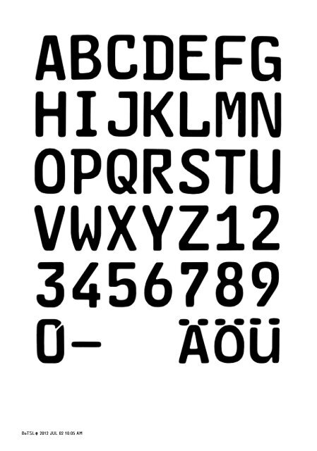
By early summer 1978, after only a few months’ work, Hoefer produced<br />
the first version of what he called fälschungserschwerende <strong>Schrift</strong>, the<br />
“falsification-hindering typeface,” or Fe-schriFt for short—a wobbly,<br />
asymmetrical alphabet considerably at odds with received typographic<br />
wisdom. Hoefer “calligraphically” differentiated each letter and number<br />
using an idiosyncratic set of contrasting serifs, angles, counters, and<br />
stroke widths. Some characters have serifs and some do not; some closed<br />
counters are squared-off while others are rounded; and edges and corners<br />
don’t snap to any clear grid. There are weird geometrical variations in<br />
the interiors of the c and D; the e has an elongated, slightly swollen foot;<br />
the M and W are at wincingly pinched inverted angles. This lack of intrinsic<br />
aesthetic cohesion is its main defense against alteration or substitution.<br />
The 3 can’t easily be changed into an 8, because they are two fundamentally<br />
different characters.<br />
How to differentiate the letter O from the number 0? Karlgeorg had<br />
already made the former more egg-shaped, but it was his son Otmar<br />
who suggested using the slashed-zero (0/) he had seen in his school math<br />
books. When OCR testing later determined that the dark center slash<br />
mark muddied the character’s digital legibility (making it confusable with<br />
an 8), however, Hoefer simply incised the top right-hand corner of the<br />
0, leaving a ghostly, implied line instead.<br />
The BASt document wryly noted that even an illiterate could forge a<br />
DIN 1451 plate, since its rectilinear grid clearly suggested any missing<br />
shapes. In retrospect, it seems that the defiance of typographic decorum<br />
demanded by this particular set of characters fell quite naturally to a<br />
calligrapher: someone who could—like a sophisticated illiterate—attend<br />
to each character on its own terms. The most salient instruction in the<br />
government’s brief was that this particular set of characters ought to<br />
resist merging into WORDS, and remain instead a set of discrete signs.<br />
Since license plates don’t have to communicate anything linguistically,<br />
they are defined by a form of calculated randomness. Hoefer’s alphabet<br />
had to duplicate this logic. In other words, in order to ensure the typeface<br />
was both tamper-proof and machine-readable, he required each letter,<br />
above all, to be *simply and completely itself.*<br />
Legibility testing began in July 1978, at the department of Physiology<br />
5
BoTSL# BoTSL#3 2012 JUL Apr 02 15 10:05 4:55 pM AM<br />
Benjamin Tiven: <strong>Falschungserschwerende</strong> schriFT<br />
and Cybernetic Psychology at the University of Giessen, and lasted four<br />
years. Some letters required alterations in light of the findings, and<br />
Hoefer was generally unhappy with the results. By the time the process<br />
was complete, however, the terrorist hysteria had subsided, along with<br />
the political will to implement the change, and Fe-schriFt was put into<br />
a drawer where it lay forgotten for the next 15 years.<br />
Then, in 1994, a policy review of national license plate design noted<br />
another spectacular rise in unsolved car thefts. Stolen license tags had<br />
almost tripled over the previous four years (from 30,000 to 86,000),<br />
presumably as a result of the opening of the border between East and<br />
West after the fall of the Berlin Wall in 1989. Recalling that this problem<br />
had been raised before, the government reviewed its history, alongside<br />
a few new proposals with varying degrees of bureaucratic rationality.<br />
One involved issuing each citizen a unique, permanent plate number for<br />
life (like a Social Security number), but since all license plates begin with<br />
a city code (F for Frankfurt, M for München, K for Köln, etc.), the plan<br />
would have meant that car owners could not legally move to another<br />
city, and so was swiftly rejected. (It was also noted that this particular<br />
strategy would have put the license-plate manufacturing sector out of<br />
business.)<br />
The same government report detailed the fate of the Fe-schriFt<br />
since 1982. It had been abandoned because it was found to be relatively<br />
easy to completely remove license plates from vehicles and switch them<br />
for alternate ones, which obviously rendered a tamper-proof typeface<br />
somewhat irrelevant. The government had considered forcing car manufacturers<br />
to change their bumper designs, but there were too many<br />
private interests involved. In retrospect, then, four years of research and<br />
development had been dedicated to an effectively redundant task. What<br />
Karlgeorg Hoefer earnestly believed would be a technological decoy set<br />
up to combat the radical Left, instead became a gauge of bureaucratic<br />
folly and political paranoia.<br />
Also by 1994, commonly coded yet nationally distinct license tags were<br />
about to be issued across the EU, and this meant a new opportunity<br />
to lower theft statistics. With a perfectly serviceable and fully paid up<br />
proposal in-hand, the new government resolved to put Fe-schriFt to<br />
6
BoTSL# BoTSL#3 2012 JUL Apr 02 15 10:05 4:55 pM AM<br />
Benjamin Tiven: <strong>Falschungserschwerende</strong> schriFT<br />
work, some 16 years after its conception. The new plates were imm ediately<br />
issued without fanfare in Berlin and Brandenburg, and implemented<br />
nationwide by the turn of the century. Automated highway surveillance<br />
was now ubiquitous—a fully-integrated tool of law enforce ment finally<br />
developed enough to operate hand-in-hand with Hoefer’s typeface.<br />
Born awkwardly between eras—drawn by hand in order to be better<br />
read by machines—the fälschungserschwerende <strong>Schrift</strong> bears the<br />
marks of both 19th-century guild-enshrined handcraft and 20th-century<br />
anonymous automation. And like any technology, it is bound by the political<br />
determinants of its design: while its original “tamper-proof ”premise may<br />
have proved a Macguffin, these weird-looking letters are an early product<br />
of our contemporary surveillance state. What reads to us as a clumsy<br />
lack of formal continuity is exactly what makes it legible to a computer.<br />
It is an alphabet whose defining characteristic is precisely that it has no<br />
defining characteristic, other than having no defining characteristic.<br />
*<br />
7