5 shocking design Mistakes you need to avoid
5 shocking design Mistakes you need to avoid
5 shocking design Mistakes you need to avoid

You also want an ePaper? Increase the reach of your titles
YUMPU automatically turns print PDFs into web optimized ePapers that Google loves.
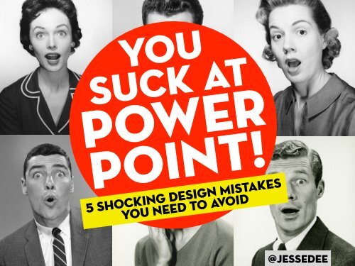
You<br />
Suck at<br />
Power<br />
Point!<br />
5 <strong>shocking</strong> <strong>design</strong> <strong>Mistakes</strong><br />
<strong>you</strong> <strong>need</strong> <strong>to</strong> <strong>avoid</strong><br />
@jessedee
People working in non-profits,<br />
government, schools and<br />
cubicles all around the world<br />
hate PowerPoint,
ut it’s not PowerPoint<br />
that sucks.
ut it’s not PowerPoint<br />
that sucks.<br />
It’s the speaker (YOU)<br />
who is responsible for<br />
using it effectively.
Your slides are<br />
there <strong>to</strong> support<br />
<strong>you</strong> and unfortunately<br />
if they suck,<br />
so do <strong>you</strong>.
There are endless rules and books written<br />
on the <strong>to</strong>pic by some very smart people.<br />
But there are lots of ways of<br />
<strong>design</strong>ing a great looking<br />
presentation, and more<br />
than one opinion.
There are endless rules and books written<br />
on the <strong>to</strong>pic by some very smart people.<br />
But there are lots of ways of<br />
<strong>design</strong>ing a great looking<br />
presentation, and more<br />
than one opinion.<br />
Ultimately one of my favourite<br />
ways <strong>to</strong> learn is from other<br />
people’s mistakes.<br />
So here are...
5<br />
<strong>shocking</strong><br />
<strong>design</strong><br />
mistakes<br />
<strong>you</strong> <strong>need</strong><br />
<strong>to</strong> <strong>avoid</strong>
mISTAKE #1<br />
<strong>to</strong>o<br />
much<br />
info
If <strong>you</strong>’re going <strong>to</strong> put word for word what<br />
<strong>you</strong>’re are going <strong>to</strong> say, hand over the<br />
slides and sit down buddy.<br />
BLAH BLAH BLAH BLAH BLAH BLAH BLAH<br />
BLAH BLAH BLAH BLAH BLAH BLAH BLAH<br />
BLAH BLAH BLAH BLAH BLAH BLAH BLAH<br />
BLAH BLAH BLAH BLAH BLAH BLAH BLAH<br />
BLAH BLAH BLAH BLAH BLAH BLAH BLAH<br />
BLAH BLAH BLAH BLAH BLAH BLAH BLAH<br />
BLAH BLAH BLAH BLAH BLAH BLAH BLAH<br />
BLAH BLAH BLAH BLAH BLAH BLAH BLAH<br />
BLAH BLAH BLAH BLAH BLAH BLAH BLAH
Putting all <strong>you</strong>r points<br />
on one slide sucks.<br />
The more <strong>you</strong>r audience has <strong>to</strong> read<br />
the less they are looking at <strong>you</strong>.
A good trick is <strong>to</strong> keep relevant<br />
points on the same slide.<br />
This helps <strong>you</strong> with timing and<br />
ensures people don’t skip ahead.<br />
POINT 1 POINT 2<br />
SUBPOINT<br />
POINT 3<br />
SUBPOINT
Effective communication is<br />
knowing what <strong>to</strong> cut out.<br />
Be a merciless edi<strong>to</strong>r and<br />
keep it relevant.
Weʼre So Big<br />
International<br />
Helping us grow!<br />
While <strong>you</strong>’re at it<br />
Get rid of <strong>you</strong>r<br />
logo on every slide.<br />
Once or twice is ok.<br />
30 times? That sucks.
not<br />
enough<br />
visuals<br />
mISTAKE #2
take the time <strong>to</strong><br />
find the right visuals.<br />
There are endless sources of images on<br />
the web, which take <strong>you</strong> seconds <strong>to</strong> find.
iS<strong>to</strong>ckPho<strong>to</strong>.com:<br />
best for royalty free images ($$$)<br />
Flickr.com:<br />
best for creative common images (free)<br />
If <strong>you</strong>’re going <strong>to</strong> use<br />
Standard Microsoft<br />
clipart <strong>you</strong> suck.
But whichever visuals <strong>you</strong><br />
use just remember <strong>to</strong>...
Design for this guy<br />
If its unreadable, don’t use it.
mISTAKE #3<br />
horrible<br />
quality
Pixelation sucks
Use high-quality images<br />
at their right sizes
With a bit of<br />
digging around it’s<br />
easy <strong>to</strong> find highresolution<br />
media
stay away from boring<br />
overly used fonts<br />
Tahoma<br />
Microsoft Sans Serif<br />
Arial<br />
Verdana<br />
Courier New<br />
Times New Roman<br />
Trebuchet MS<br />
Lucida Console<br />
Comic Sans MS
ALL-OVER-<br />
THE-PLACE<br />
mISTAKE #4
Be mindful of things like spacing,<br />
white space and alignment.<br />
POINT 1<br />
POINT 2
Having a consistent<br />
use of colors, images &<br />
alignment gives a<br />
cohesive look <strong>to</strong> <strong>you</strong>r<br />
presentation.
Having a consistent<br />
use of colors, images &<br />
alignment gives a<br />
cohesive look <strong>to</strong> <strong>you</strong>r<br />
presentation.<br />
It also helps <strong>to</strong><br />
separate <strong>you</strong>r<br />
presentation in<strong>to</strong><br />
sections
Always pick a color<br />
scheme. Preferably<br />
not one found in<br />
PowerPoint.
and the most common mistake...
mISTAKE #5<br />
lack<br />
of prep
Most presentations suck because not<br />
enough time went in<strong>to</strong> making them.<br />
You <strong>need</strong> <strong>to</strong> gather and organize <strong>you</strong>r content,<br />
create nice looking slides and rehearse.<br />
... and not the night before.
Two <strong>to</strong>ols I use <strong>to</strong> prep:<br />
Phone <strong>to</strong> capture<br />
random ideas when<br />
I’m out of the office<br />
Post-it® or paper <strong>to</strong><br />
la<strong>you</strong>t in the office<br />
Planning usually starts 2 weeks before the talk.
Most experts seem <strong>to</strong> agree...<br />
an outstanding 1-hour<br />
presentation takes 30 hours<br />
or more of prep time.
<strong>shocking</strong> i know.<br />
But It’s all worth it.<br />
Giving a presentation is <strong>you</strong>r moment<br />
<strong>to</strong> shine, <strong>you</strong>r moment <strong>to</strong> influence<br />
and <strong>to</strong> spread ideas.
Design, don’t just slap<br />
something <strong>to</strong>gether.<br />
If <strong>you</strong>r presentation sucks,<br />
don’t blame PowerPoint.
RECAP<br />
MISTAKES<br />
TO AVOID:<br />
horrible<br />
QUALITY<br />
Too much info NOT ENOUGH<br />
VISUALS<br />
ALL-OVER-<br />
THE-PLACE LACK OF PREP