The Nonesuch Dickens - The Caxton Club
The Nonesuch Dickens - The Caxton Club
The Nonesuch Dickens - The Caxton Club

You also want an ePaper? Increase the reach of your titles
YUMPU automatically turns print PDFs into web optimized ePapers that Google loves.
Michael Gorman<br />
caxtonian<br />
JOURNAL OF THE CAXTON CLUB VOLUME XX, NO. 10 october 2012<br />
<strong>The</strong> <strong>Nonesuch</strong> <strong>Dickens</strong><br />
A set of books at the intersection of art and commerce<br />
THE HUMAN CONTEXT<br />
<strong>The</strong> <strong>Nonesuch</strong> Press was founded in 1922<br />
by Francis Meynell, Vera Gordon, and<br />
David Garnett.<br />
<strong>The</strong> press’ name<br />
derived, in modernized<br />
spelling, from that of a<br />
no-longer-extant Tudor<br />
palace and heralded the<br />
founders’ ambition to<br />
create a press like no<br />
other.<br />
Nonsuch Palace was<br />
built in the county of<br />
Surrey on the site of<br />
the medieval village of<br />
Cuddington between<br />
1538 and 1548 by King<br />
Henry VIII, who died<br />
in the year before it was<br />
completed. It was magnificently<br />
appointed and had<br />
many formal gardens. It was<br />
described by Peter Reed as<br />
“the first major Renaissance<br />
building in England”1 and<br />
merited its name as there was<br />
“none such” anywhere. King<br />
Charles II gave the palace to his mistress<br />
Barbara Villiers, Duchess of Cleveland, who<br />
dismantled it in the late 1680s and sold its<br />
contents to pay her gambling debts. No trace<br />
of the building remains on its site.<br />
Francis Meredith Wilfrid Meynell (1891-<br />
1975) was born in London, the son of Wilfrid<br />
Meynell (1852-1948), a publisher, editor, and<br />
author who is best known as the discoverer<br />
and publisher of the poet Francis Thompson,<br />
and Alice Meynell (1847-1922), a poet, essayist<br />
and critic. Francis Meynell was a gifted book<br />
designer and had founded and run two earlier<br />
presses – the Romney and Pelican. At the<br />
time of the founding of the <strong>Nonesuch</strong> Press,<br />
he was married to the former Gertrude Peppercorn,<br />
a concert pianist, whom he divorced<br />
that year. He married Vera Gordon (1895-<br />
1947), an author, translator, and editor, in<br />
1925. (Gordon is believed to have provided the<br />
seed money for the Press.) Francis and Vera<br />
Meynell edited many books together, includ-<br />
ing a very popular annual called <strong>The</strong> Week-<br />
End Book. Francis Meynell remarried in the<br />
late 1940s (his third wife was the former Alix<br />
Kilroy) and, oddly enough, thereafter omitted<br />
all mention of his two previous marriages<br />
and the children of those marriages from his<br />
entries in successive editions of Who’s Who.<br />
<strong>The</strong> third partner – David Garnett (1892-<br />
1981) – was an important member of the<br />
Bloomsbury Group, of whom it was said,<br />
famously “they were a circle of friends who<br />
lived in Squares and loved in triangles.” He<br />
was the son of Edward Garnett (1868-1937),<br />
the literary critic and editor who discovered<br />
and was the mentor of, among others, Conrad,<br />
Galsworthy, D.H. Lawrence, Ford Madox<br />
Ford, and Stephen Crane. His mother was<br />
Constance Garnett (1861-1946), the translator<br />
of many Russian novels and plays into<br />
English (including those of Chekhov, Tolstoy,<br />
Dostoevsky, Turgenev, and Gogol). David<br />
Garnett (known to his family and friends<br />
as “Bunny,” because of a<br />
childhood coat made of<br />
rabbit-skin) was a novelist,<br />
best known for his early<br />
satirical novels Lady into<br />
Fox (1922) and A Man at<br />
the Zoo (1924), published<br />
in distinctive editions by<br />
Chatto & Windus, with<br />
wood-block illustrations<br />
by his first wife R.A.<br />
(Rachel Alice) Garnett<br />
(1891-1940). His second<br />
wife, Angelica Garnett<br />
(1918-2012), a writer and<br />
painter 26 years younger than<br />
him, was the biological daughter<br />
of the painter Duncan Grant who,<br />
in true Bloomsbury fashion, had<br />
been one of David Garnett’s lovers,<br />
and Vanessa Bell, Virginia Woolf ’s<br />
sister, who was married to the art<br />
critic Clive Bell (1881-1964).<br />
THE NONESUCH PRESS<br />
One of the most important presses of the<br />
20th century was the creation of three<br />
of these complex lives.2 It should be noted<br />
that some contemporary critics, including the<br />
novelist Arnold Bennett,3 thought that it was<br />
wrong for the <strong>Nonesuch</strong> to be called a “press,”<br />
because the physical production was done<br />
elsewhere. Meynell responded by saying he<br />
had another idea of what a 20th century press<br />
could be, one that used “…mechanical means<br />
…to serve fine ends…[using] the machine in<br />
printing… [as] a controllable tool.” He “…set<br />
out to be new kind of publisher-designer, an<br />
See NONESUCH DICKENS, page 2<br />
http://www.liveauctioneers.com
oC A X T O N I A N<br />
<strong>Caxton</strong> <strong>Club</strong>, Founded 1895<br />
Bruce H. Boyer, President<br />
Thomas E. Swanstrom, Vice-President<br />
Jo Ellen Dickie, Secretary<br />
Don Chatham, Treasurer<br />
David S. Mann, Past President<br />
Council<br />
Class of 2013<br />
Matthew Doherty<br />
Tom Joyce<br />
Nancy Lynn<br />
Lynn Martin<br />
Jackie Vossler<br />
Class of 2014<br />
Michael Gorman<br />
Celia Hilliard<br />
Wendy Husser<br />
Hal Kugeler<br />
Dorothy Sinson<br />
Class of 2015<br />
David Hartmann<br />
Jeffrey Johns,<br />
Bob Karrow,<br />
Michael Thompson,<br />
Steve Woodall<br />
Appointed Officers<br />
Jill Gage, Programs<br />
Paul F. Gehl, Archivist-Historian<br />
Hayward R. Blake, FABS<br />
Representative<br />
Committees<br />
Tom Joyce, Dorothy Sinson (Co-<br />
Chairs), Audio Visual<br />
J. William Locke, Dorothy Sinson<br />
(Co-Chairs), Friday Luncheons<br />
Dan “Skip” Landt, Margaret<br />
Oellrich, Membership<br />
Susan Rossen, Kim Coventry,<br />
Publications and Exhibitions<br />
Martha Chiplis, Scholarship<br />
Charles Spohrer, John M. Dunlevy,<br />
Matthew Doherty, Web Site and<br />
Directory<br />
<strong>Caxton</strong> <strong>Club</strong> Staff<br />
Dan Crawford, General Manager<br />
<strong>Caxton</strong>ian<br />
Robert McCamant, Editor<br />
Brenda Rossini, Copy Editor<br />
Robert Cotner, Founder<br />
Matthew J.Doherty, Wendy Husser,<br />
Paul Ruxin Contributing Editors<br />
©2012, <strong>Caxton</strong> <strong>Club</strong>. <strong>The</strong> <strong>Caxton</strong>ian is published<br />
monthly by the <strong>Caxton</strong> <strong>Club</strong>, whose office is<br />
in the Newberry Library. Printing: Envision<br />
Graphics, LLC, Bloomingdale, IL.<br />
NONESUCH DICKENS, from page 1<br />
architect of books rather than<br />
a builder …” using “… the best<br />
printing houses, papermakers,<br />
binders.”4 An important<br />
part of Meynell’s concept of<br />
the <strong>Nonesuch</strong> Press’ was that<br />
it was not to be like the great<br />
private fine presses of the late<br />
19th and early 20th centuries<br />
that designed or adapted<br />
their own typefaces and hand<br />
printed their own books. <strong>The</strong><br />
<strong>Nonesuch</strong>’s publications were<br />
designed by Francis Meynell<br />
on a small Albion printing<br />
press5 that they also used<br />
from time to time for printing<br />
small books and ephemera.<br />
<strong>The</strong> <strong>Nonesuch</strong> Press possessed<br />
only a small range of<br />
type (mainly used for setting<br />
up and printing specimen<br />
pages), relying on commercial<br />
presses and commercially<br />
available typefaces, including<br />
adaptations of the classic faces (including Baskerville<br />
and Bembo) made available by the Monotype<br />
Corporation, whose principal advisor was the great<br />
typographer Stanley Morison (1889-1967). Morison<br />
and Francis Meynell had been friends but they had<br />
fallen out over the former’s ardent Catholicism and<br />
the latter’s loss of faith. <strong>The</strong> press also used French,<br />
German, and Italian typefaces supplied by other<br />
companies. A.J.A. Symons wrote that Meynell was<br />
a “press master,” unlike William Morris in his Kelmscott<br />
Press who was a “master of his press”6 (the<br />
finest of fine distinctions).<br />
<strong>The</strong> Press began in the cellar of Birrell & Garnett,<br />
a bookshop in 30 Gerrard Street in the Soho district<br />
of London.7 <strong>The</strong> bookshop was owned by David<br />
Garnett and Francis Birrell (1889-1935), a journalist<br />
and critic who was another Bloomsbury lover<br />
of Garnett’s. <strong>The</strong> first book produced using these<br />
methods was <strong>The</strong> Love Poems of John Donne: with<br />
some account of his life taken from the writings in 1639<br />
of Izaak Walton.8 It was edited by Viola Meynell,<br />
had a portrait of Donne9 as a frontispiece, 23 romannumbered<br />
and 91 arabic-numbered pages. It was<br />
printed by the University Press in Oxford in “the<br />
17th-century Fell types”10 (specifically Fell English<br />
italic and long primer roman) on Vidalon handmade<br />
paper,11 cased in quarter vellum with red<br />
Italian paper-covered boards printed with a woodcut<br />
pattern also used for the endpapers. <strong>The</strong> Love Poems<br />
were issued in an edition limited to 1250 copies. In<br />
its first year, the Press published eleven more titles,<br />
all in limited editions and using a wide range of<br />
A title page from the three-volume Apocrypha.<br />
typefaces and many different printers.12<br />
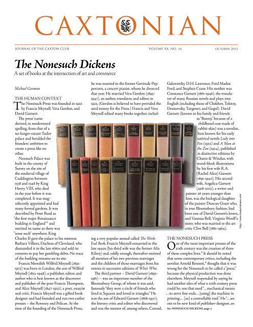
<strong>The</strong> Press went on to publish more than 140 titles,<br />
often then out-of-print and/or little known books,<br />
but including parts of the Bible; great works of literature,<br />
including those by Blake, Cervantes, Congreve,<br />
Dante, Dryden, Homer, Maupassant, Milton, Pope,<br />
Shakespeare, Voltaire, Whitman, and Zola; light<br />
reading such as Ladies’ Mistakes by James Laver, the<br />
Weekend Books, and More Lovely Food by Ruth Lowinsky;<br />
books of illustrations such as those of pencil<br />
drawings by Blake and woodcuts by Paul Nash; and<br />
curiosities such as Gloriana’s Glass: Queen Elizabeth<br />
I reflected in verses & dedications addressed to her, and<br />
her own words written & spoken. All but the commercial<br />
publications, such as the Weekend books,<br />
were published in limited, numbered editions.<br />
<strong>The</strong> <strong>Nonesuch</strong> Press’ individual manner of creating,<br />
use of materials, and diversity of method can be<br />
seen in the following two examples.<br />
5 <strong>The</strong> 1924 Biblical <strong>The</strong> Apocrypha, reprinted<br />
according to the Authorized Version, 1611, with copperplate<br />
illustrations designed and engraved by<br />
Stephen Gooden (1892-1955).13 It was printed by<br />
Frederick Hall, printer to the University, at the<br />
Oxford University Press. <strong>The</strong> book was designed,<br />
as was usually the case, by Francis Meynell. <strong>The</strong><br />
type “was a modern rendering, redesigned for this<br />
book, of letters by Plantin”14 (specifically Monotype<br />
Plantin with recut descenders and new ligatures).<br />
<strong>The</strong>re were 1250 numbered copies, printed on Japon<br />
vellum15 and seventy-five numbered copies printed<br />
on Arnold unbleached rag paper.16 All the pages<br />
<strong>The</strong> <strong>Caxton</strong> <strong>Club</strong> • 60 W. Walton St., Chicago, IL 60610-3305 • ph 312-255-3710 • caxtonclub@newberry.org • www.caxtonclub.org<br />
http://www.bibledesignblog.com
were untrimmed and the books were<br />
cased in cream paper covered boards,<br />
blocked in gilt with Granjon type17<br />
ornaments and rules.<br />
5 <strong>The</strong>ir edition of John Bunyan’s<br />
<strong>The</strong> Pilgrim’s Progress, and, <strong>The</strong> Life<br />
and Death of Mr. Badman (1928) was<br />
edited by G.B. (George Bagshawe)<br />
Harrison (1894-1991) and contained<br />
illustrations from woodcuts by the<br />
German artist Karl Michel (b. 1885).<br />
<strong>The</strong> edition was limited to 1600 copies.<br />
<strong>The</strong> text was printed on Arches cream<br />
wove paper18 by the Kynoch Press19<br />
in Caslon Monotype20 and titles in<br />
Koch’s21 Deutsche Zierschrift.22 <strong>The</strong><br />
(8 inserted full page) illustrations<br />
were printed from the original woodblocks<br />
and color-stenciled by the<br />
Curwen Press:23 “all under the care<br />
of Francis Meynell.” <strong>The</strong> books were<br />
cased in marbled green and brown<br />
cloth-covered boards with white<br />
parchment spine labels.<br />
THE NONESUCH DICKENS<br />
<strong>The</strong> <strong>Nonesuch</strong> <strong>Dickens</strong> was<br />
announced in a volume entitled<br />
Francis Meynell, engraving from a drawing by Eric Gill.<br />
<strong>The</strong> <strong>Nonesuch</strong> <strong>Dickens</strong>: retrospectus and<br />
plars of the set that it advertised. It consisted<br />
conspectus,24which was given away on request. of four parts:<br />
<strong>The</strong> texts of the set were produced under the I. Charles <strong>Dickens</strong> and his illustrators, by<br />
editorial supervision of Arthur Waugh, Walter Arthur Waugh.<br />
Dexter, Hugh Walpole, and Thomas Hatton. Waugh began his 43-page essay by stress-<br />
Arthur Waugh (1866-1943), the father of the ing that the illustrations were almost as<br />
writers Evelyn and Alec Waugh, was an author, important to <strong>Dickens</strong>’ works as the text. It<br />
editor, a long-time managing director of followed, therefore, that the <strong>Nonesuch</strong><br />
Chapman & Hall, <strong>Dickens</strong>’ original publish- <strong>Dickens</strong> “demanded the most assiduous care<br />
ers, and a president of the <strong>Dickens</strong> Fellowship. in the choice and preparation of the pictures.”<br />
He was “… both an ardent <strong>Dickens</strong>ian and a This meant using “only those that he passed<br />
collector of beautiful books.’’25 Walter Dexter [approved of ] in his lifetime” and printing<br />
(1877-1944) was an author of many books on them from only the original plates “whether<br />
<strong>Dickens</strong>, the editor of volumes of his letters, steels or woodblocks, which were executed,<br />
and an editor of the <strong>Dickens</strong> Fellowship’s under his eye, for the first editions of all his<br />
<strong>The</strong> <strong>Dickens</strong>ian, founded in 1905 and still books.” (It is worth noting that these words<br />
extant. Thomas Hatton was a collector of were written at a time – the mid-1930s – that<br />
<strong>Dickens</strong> and the author/editor of a number of is less distant from <strong>Dickens</strong>’ lifetime than it is<br />
bibliographical works on the great man. He from our own.) Fortunately for this aim, all<br />
was “…among the most admired of all bibliog- the plates, which had been “zealously guarded”<br />
raphers of <strong>Dickens</strong> …”26 Sir Hugh Walpole by Chapman & Hall (<strong>Dickens</strong>’ original pub-<br />
(1884-1941) was a prolific, popular novelist lishers) were available to <strong>Nonesuch</strong> and had<br />
of the time, now largely unread. He was not been verified by independent experts. <strong>The</strong><br />
mentioned in the prospectus. Though he essay stresses that the illustrations in the<br />
wrote on literary topics, he was not an expert <strong>Nonesuch</strong> <strong>Dickens</strong> would be made from these<br />
on <strong>Dickens</strong> and one can only assume he was authenticated plates directly and not repro-<br />
recruited later because of his literary standing duced by “mechanical processes, which inevi-<br />
at the time.<br />
tably lose much of the delicate quality of line<br />
<strong>The</strong> prospectus was bound in blue linen and finish preserved in the artists’ handwork<br />
buckram stamped in gold. <strong>The</strong> paper, size, alone.” It was this, in Waugh’s view, that meant<br />
and perfect <strong>Dickens</strong> to be put on<br />
the market.”27 <strong>The</strong> essay goes on to<br />
describe in detail the eventful, and<br />
sometimes stormy, history of <strong>Dickens</strong>’<br />
relationships and work with his illustrators<br />
– George Cruikshank, John<br />
Leech, Robert Seymour, Hablôt K.<br />
Browne (“Phiz”), George Cattermole,<br />
Marcus Stone, and Luke Fildes being<br />
the most important.<br />
II. A bibliographical list of the original<br />
illustrations to the works of Charles<br />
<strong>Dickens</strong> being those made under his<br />
supervision, now compiled for the first<br />
time by Thomas Hatton.<br />
This 23-page listing of 877 illustrations<br />
and a smaller number of<br />
“initials, vignettes, etc.” is a “census<br />
of all the illustrations” made during<br />
<strong>Dickens</strong>’ lifetime from the original<br />
plates and blocks, which were then<br />
in the possession of the <strong>Nonesuch</strong><br />
Press, having been purchased from<br />
Chapman and Hall. <strong>The</strong> chapter<br />
also lists a few plates and blocks that<br />
no longer existed. <strong>The</strong> illustrations<br />
are from etchings made on copper<br />
or steel, woodcuts, wood engravings,<br />
and electrotype facsimiles of engravings and<br />
woodcuts. An unusual, if not unique, feature<br />
of the <strong>Nonesuch</strong> <strong>Dickens</strong> is that each of the<br />
877 paid subscribers to the set would receive<br />
“after delivery of the last volume … one of the<br />
original plates, in a special container and with<br />
a letter of authentication.”28<br />
III. Retrospectus: editions of <strong>Dickens</strong>’ works.<br />
<strong>The</strong> Retrospectus consists of a brief introduction<br />
and a dozen or more leaves of varying<br />
sizes that contain facsimiles of pages from<br />
various editions of <strong>The</strong> Pickwick Papers (all<br />
published by Chapman & Hall) and photographic<br />
reproductions of the spines of those<br />
editions (other than, of course, the reproductions<br />
of monthly parts, the manner in which<br />
most of <strong>Dickens</strong>’ novels were issued).<br />
Each section of facsimiles is prefaced by a<br />
brief introduction. <strong>The</strong> first contains a facsimile<br />
of the cover of the first issue of <strong>The</strong> Posthumous<br />
Papers of <strong>The</strong> Pickwick <strong>Club</strong> … edited<br />
by “Boz”; with four illustrations by Seymour<br />
and two leaves from that issue. <strong>The</strong> second<br />
section contains a photographic reproduction<br />
of the spine of <strong>The</strong> Pickwick Papers issued in<br />
the “Charles <strong>Dickens</strong>” Edition (1868-1870)<br />
and a facsimile leaf from the book. <strong>The</strong> third<br />
through fifth sections contain a facsimile of<br />
the spine of, and two leaves from, the Pickwick<br />
Papers in the Second Illustrated Library<br />
typeface, and binding employed were exem- “It will never be possible for a more complete See NONESUCH DICKENS, page 4<br />
CAXTONIAN, OCTOBER 2012 3
<strong>The</strong> volumes used Figgins Shaded and Monotype Bulmer.<br />
NONESUCH DICKENS, from page 3<br />
Edition (1873-1876); the Gadshill Edition<br />
(1897); and the National Edition (1906-1908).<br />
IV. Prospectus: the <strong>Nonesuch</strong> <strong>Dickens</strong>, contains<br />
an unattributed six-page essay describing,<br />
and extolling, in a near hyperbolic style, the<br />
virtues of the <strong>Nonesuch</strong> <strong>Dickens</strong> which it was<br />
hoped would “…cause the blood of many true<br />
collectors to tingle in anticipatory possession.”29<br />
<strong>The</strong> essay is followed by a form for<br />
advanced subscription to one of the 877 sets,<br />
for 48 guineas – £50/8 shillings – more than<br />
£2,500 ($3,850) in today’s money. <strong>The</strong> money<br />
was to be paid in one sum or at the rate of 6<br />
guineas – £6/6 shillings – a month for each of<br />
eight months following the publication of the<br />
first three volumes of the set.<br />
THE VOLUMES OF<br />
THE NONESUCH DICKENS<br />
<strong>The</strong> 23 volumes of the <strong>Nonesuch</strong> <strong>Dickens</strong><br />
were published between June 1937 and<br />
August 1938. <strong>The</strong> first to be published was<br />
the Pickwick Papers and the last was the third<br />
volume of the three-volume set of <strong>Dickens</strong>’<br />
Letters. <strong>The</strong> volumes were uniform in size (26<br />
cm. high, 16.5 cm. wide) and the prospectus<br />
stated that they were “… larger than that in<br />
any previous edition of <strong>Dickens</strong>, more oblong<br />
and, it is hoped, more agreeable.”30 <strong>The</strong><br />
number of pages in each volume ranged from<br />
4 CAXTONIAN, OCTOBER 2012<br />
400 to over 800. <strong>The</strong> edges of the pages were<br />
untrimmed and the volumes were cased in<br />
linen buckram by the Leighton-Straker Bookbinding<br />
Company. <strong>The</strong> colors of the buckram<br />
varied, but each spine bore a standard sized<br />
black leather label bearing a title blocked in<br />
gold. <strong>The</strong> prospectus promised a “…brave<br />
array of reds and yellows and blues and<br />
browns, an effect that should prove even more<br />
charming than novel.”31<br />
<strong>The</strong> design of the books was by Francis<br />
Meynell under the operational charge of<br />
Harry Carter, the Press’ production manager.<br />
After trials of other typefaces, the choice for<br />
the main text was a typeface based on Bulmer<br />
(Monotype Bulmer),32 with Figgins Shaded33<br />
for chapter headings, and Marina Script34 for<br />
shoulder notes. <strong>The</strong> title page of each volume<br />
bore a device from a wood-engraving by<br />
Lynton Lamb35 showing a bear and a tree in<br />
the foreground and a castle in the background.<br />
<strong>The</strong> paper was created especially for the<br />
<strong>Nonesuch</strong> <strong>Dickens</strong> by the Worthy Paper<br />
Company Association of West Springfield,<br />
Massachusetts. It was laid paper with a high<br />
rag content made in a Fourdrinier machine.36<br />
That machine, in the opinion of the writer of<br />
the prospectus, had been “…latterly brought<br />
near to perfection. <strong>The</strong> paper has a mellow<br />
colour in order that it will prove restful to<br />
the eye, it is thin in order that<br />
each volume may prove portable,<br />
it is notably opaque for<br />
its thinness, it has the “lookthrough’<br />
which delights the<br />
paper fancier...”37 <strong>The</strong> books<br />
were printed by R. & R. Clark,<br />
Limited, of Edinburgh. <strong>The</strong><br />
steel plates were, in most cases,<br />
hand printed by A. Alexander<br />
and Sons. (Exceptions<br />
are noted in the list below.)<br />
<strong>The</strong> notes on the illustrations<br />
below omit decorations,<br />
vignettes, etc.<br />
<strong>The</strong> volumes published in<br />
1937 were:<br />
5 <strong>The</strong> Pickwick Papers.<br />
With illustrations printed<br />
from the original etched plates<br />
by Seymour and “Phiz” apart<br />
from two by R.W. Buss, which<br />
were reproduced from copperplates<br />
etched photographically<br />
(“electros”). Cased in light<br />
green.<br />
5 Barnaby Rudge. Illustrations<br />
from the wood-engravings<br />
by “Phiz” and Cattermole. Cased in<br />
turquoise-grey.<br />
5 Christmas Books. Illustrations by Daniel<br />
Maclise, “Phiz,” and Leech, printed from steel<br />
plates, woodblocks, and, in a few cases, from<br />
electros. Cased in red.<br />
5 Collected Papers. Two volumes. Contains<br />
the frontispiece, by “Phiz,” of <strong>The</strong> Strange<br />
Gentleman printed from the original plate.<br />
Contains articles, essays, plays, poems, prefaces,<br />
and speeches, many reprinted from <strong>The</strong><br />
Examiner, Household Words, and All <strong>The</strong> Year<br />
Round. Cased in cream buckram.<br />
5 Dombey and Son. Illustrations by “Phiz”<br />
from the steel plates for the first edition.<br />
Cased in dark green.<br />
5 Great Expectations [and] Hard Times.<br />
Illustrations from woodblocks by Stone (Great<br />
Expectations), Fred Walker (Hard Times), and<br />
A.B. Houghton (the frontispiece of the 1865<br />
edition of Hard Times). Cased in light blue.<br />
5 Little Dorrit. Illustrations from the steel<br />
plates by “Phiz,” printed by W.L. Colls of<br />
Barnes;38 and Stone’s frontispiece for the 1861<br />
edition from a woodblock. Cased in dark blue.<br />
5 Martin Chuzzlewit. Illustrations from the<br />
steel plates by “Phiz” for the first edition and<br />
a woodblock for the frontispiece of the 1861<br />
edition. Cased in dark khaki.<br />
5 <strong>The</strong> Mystery of Edwin Drood [and]<br />
Christmas Stories. Illustrations from the steel
plates and wood engravings made by<br />
Fildes for the original issues of the six<br />
monthly parts of Drood. Cased in grey.<br />
5 <strong>The</strong> Old Curiosity Shop. Illustrations<br />
taken from those of the original<br />
publication in issues of Master Humphrey’s<br />
Clock in 1840 and 1841. All but<br />
two were taken from woodblocks by<br />
“Phiz” and Cattermole, the others are<br />
by ‘S. Williams’ and Daniel Maclise.<br />
Cased in yellow.<br />
5 Oliver Twist. Illustrations from<br />
plates by Cruikshank for Bentley’s<br />
Miscellany, a woodblock for the 1850<br />
edition, and “Phiz”s’ engraved title<br />
page for the 1858 edition. Cased in<br />
brown.<br />
5 <strong>The</strong> Personal History of David<br />
Copperfield. Illustrations from plates<br />
etched by “Phiz” for the first edition<br />
and his title pages for the 1858 edition.<br />
Cased in dark red.<br />
5 A Tale of Two Cities. Illustrations<br />
by “Phiz” from the plates etched for<br />
the first edition and the woodblock of<br />
the cover of the monthly parts. Cased<br />
in brown.<br />
<strong>The</strong> volumes published in 1938 were:<br />
5 American Notes. Pictures from Italy. A<br />
Child’s History of England. [and] <strong>The</strong> Life of<br />
Our Lord. Illustrations in American Notes<br />
from the original woodblocks (either directly<br />
or by reproduction) for the 1850 and 1862<br />
editions by Clarkson Stanfield and Marcus<br />
Stone; in Pictures from Italy by Stone from the<br />
1862 edition and by Samuel Palmer from the<br />
first edition; in A Child’s History of England by<br />
F.W. Topham (frontispieces) and Stone. <strong>The</strong><br />
Life of Our Lord is not illustrated. Cased in<br />
black.<br />
5 Bleak House. Illustrations from the plates<br />
etched by “Phiz” for the first edition and for<br />
the 1862 edition. Steel plates printed by W.L.<br />
Colls, Barnes. Cased in grey-brown.<br />
5 Letters, edited by Walter Dexter. Three<br />
volumes. Cased in red.<br />
5 Nicholas Nickleby. Illustrations from the<br />
plates etched by “Phiz” for the first edition<br />
and from his title pages for the 1858 edition,<br />
and frontispiece for the 1848 edition from the<br />
original woodblock. Cased in dark blue.<br />
5 Our Mutual Friend. Illustrations by<br />
Stone printed from the original wood engravings<br />
for the first edition and the frontispiece of<br />
the 1867 edition. Cased in grey.<br />
5 Reprinted Pieces. <strong>The</strong> Uncommercial<br />
Traveller and other stories. Illustrations by E.<br />
G. Dalziell printed from the original wood<br />
Title page decoration by Lynton Lamb.<br />
5 Sketches by Boz and Early Minor Works.<br />
Illustrations by Cruikshank for the Sketches<br />
are from the original plates for its monthly<br />
parts; other illustrations, by R.W. Buss and<br />
Seymour are reproduced by process blocks.<br />
Cased in light brown.<br />
DELICIOUSLY READABLE<br />
Peter Mayer, the owner of the Overlook<br />
Press, New York, purchased the right<br />
to reprint the <strong>Nonesuch</strong> <strong>Dickens</strong> in 2005. In<br />
an interview with the Columbus Dispatch in<br />
December 2008 he stated that “…the <strong>Nonesuch</strong><br />
<strong>Dickens</strong> is the most readable and beautiful<br />
edition available.”39 <strong>The</strong>re is no doubt that<br />
the books represent a great achievement by<br />
one of the best book designers of the 20th<br />
century with carefully chosen typefaces, paper,<br />
and bindings from the best available printers,<br />
papermakers, and binders. However, the<br />
<strong>Nonesuch</strong> Press has been criticized as to the<br />
illustrations and text and, especially, over the<br />
decision to distribute the hitherto “zealously<br />
guarded” 877 original plates and woodblocks.<br />
In fact, David Garnett, a co-founder of the<br />
Press in 1922, wrote that “…the dispersal of<br />
a set of great historical interest and future<br />
usefulness is an act of vandalism that will<br />
give a permanent cachet of vulgarity to the<br />
edition.”40 <strong>The</strong> text, particularly of the Letters<br />
and Collected Papers has been criticized.<br />
David Paroissien, reviewing a reprint of the<br />
the four Dent Uniform volumes<br />
edited by Michael Slater and John<br />
Drew41 offer a better deal. If you<br />
want the letters…the <strong>Nonesuch</strong> three<br />
[volumes]…stand no comparison<br />
with the Pilgrim twelve42.… But if<br />
you want the novels, the Christmas<br />
Books, the two travel books, and a<br />
good section of <strong>Dickens</strong>’ journalism,<br />
including his Sketches by Boz, and two<br />
miscellaneous volumes of Collected<br />
Papers [all] in deliciously readable<br />
form, then here is your opportunity.”43<br />
Though he was writing about a<br />
reprint, his review sums up a great, if<br />
flawed textually, publishing achievement<br />
that resulted in volumes of<br />
enormous appeal to book lovers.<br />
§§<br />
NOTES<br />
1 http://www.epsomandewellhistoryexplorer.<br />
org.uk/NonsuchPalace.html<br />
2 I am indebted for many of the details of the<br />
Press and its publications to: Dreyfus, John.<br />
<strong>The</strong> History of the <strong>Nonesuch</strong> Press, with an<br />
introduction by Geoffrey Keynes; & A<br />
descriptive catalogue by David McKitterick,<br />
Simon Rendall, & John Dreyfus. London: <strong>The</strong><br />
<strong>Nonesuch</strong> Press, 1981.<br />
3 Bradfield, Judith. An Introduction to the <strong>Nonesuch</strong> Press.<br />
London: Victoria & Albert Museum, 1986. page 5.<br />
4 Quoted in Bradfield, op. cit. page 5.<br />
5 Stone, Reynolds. <strong>The</strong> Albion press. London: Printing<br />
Historical Society, 2005<br />
6 Symons, A.J.A., Desmond Flower, and Francis Meynell.<br />
<strong>The</strong> <strong>Nonesuch</strong> Century. London: <strong>The</strong> <strong>Nonesuch</strong> Press,<br />
1936.<br />
7 In late 1924, the press moved to new offices in 16 Great<br />
James Street; in 1936, to 46 Russell Square; and in<br />
the spring of 1941 (during WWII) to the offices<br />
of the Leighton-Straker Bookbinding Company,<br />
Standard Road, London, N.W.10 in the Park Royal<br />
district. <strong>The</strong> Leighton-Straker offices were bombed<br />
later that year and some of the paper, printed sheets,<br />
bound books, and office files of the <strong>Nonesuch</strong> Press<br />
were destroyed.<br />
8 Soho: <strong>The</strong> <strong>Nonesuch</strong> Press, 30 Gerrard Street, [3rd<br />
May] 1923.<br />
9 Taken from the frontispiece to Donne’s LXXX Sermons.<br />
London: Richard Royston and Richard Marriot,<br />
1640.<br />
10 Named after their creator, Dr John Fell (1625-1686),<br />
Bishop of Oxford. See also: Morison, Stanley. <strong>The</strong><br />
roman, italic, & black letter bequeathed to University of<br />
Oxford by Dr. John Fell. Oxford: Oxford University<br />
Press, 1951<br />
11 Made by the historic Canson et Montgolfier paper<br />
company in Davézieux, Rhône-Alpes, France<br />
12 <strong>The</strong> eleven other titles published in 1923 were: <strong>The</strong><br />
Letters of George Meredith to Alice Meynell; <strong>The</strong> Book<br />
of Ruth; Miscellaneous Poems by Andrew Marvell; <strong>The</strong><br />
Complete Works of William Congreve; Paradoxes and<br />
Problemes by John Donne with Two Characters and<br />
an Essay of Valour; Cupid & Psyches (the Adlington<br />
translation from Apuleius’ <strong>The</strong> Golden Asse); Masses<br />
and Man by Ernst Toller; X Sermons by John Donne;<br />
engravings. Cased in navy blue. set, wrote: “If you want all of the journalism, See NONESUCH DICKENS, page 9<br />
CAXTONIAN, OCTOBER 2012 5
Here’s to you!<br />
A book of toasts and jokes from an earlier era<br />
David Meyer<br />
Someone somewhere is possibly researching<br />
the history of early-20th-century American<br />
books on entertaining. Perhaps it’s already<br />
been published and can even be found on<br />
the Internet. (I haven’t looked.) If so, I hope<br />
a book titled Toasts and After-Dinner Stories<br />
published in Chicago in 1907 is mentioned.<br />
And just in case it isn’t, allow me to offer a<br />
few unscholarly observations about this little<br />
book and the era in which it was published. I’ll<br />
begin with a description.<br />
<strong>The</strong> cover depicts a debonair fellow with a<br />
well-groomed mustache, dressed in a tuxedo,<br />
high-collared shirt front, bow tie, and vest. A<br />
boutonnière is pinned to his lapel and what<br />
looks to be a watch fob dangles from his coat<br />
pocket. In one hand he raises a cordial glass<br />
while the other hand braces against the table<br />
top in a pose suggesting that he’s steadying<br />
himself after several drinks and a hearty meal.<br />
<strong>The</strong> only item missing from his de rigueur<br />
ensemble is a cigar. Curtains, lamps, a painting<br />
on the wall and a sofa behind him hint at<br />
a well-appointed living or dining room or a<br />
private room in a restaurant.<br />
<strong>The</strong> cover stamping uses three colors on<br />
beige cloth, producing a vivid, heavy, almost<br />
garish impact. <strong>The</strong> curtains and sideboard are<br />
deep forest green. <strong>The</strong> wall is bright red as is<br />
the liqueur in the glass and the two lines of<br />
text below Toasts.<br />
<strong>The</strong> book is small, measuring slightly over<br />
four-by-six inches. This makes it a handy size<br />
for dropping into the pocket of an overcoat<br />
while heading out the door for a social function.<br />
I doubt that a speaker read from the<br />
book while standing at the head of a table to<br />
entertain fellow dinner guests. But to have had<br />
the book close at hand seems likely: to peruse<br />
it in a cab or on a streetcar on the way to a<br />
gathering or even while standing aside in an<br />
alcove just before joining other guests. It might<br />
have been taken to refresh one’s memory of<br />
a particularly appropriate or previously wellreceived<br />
toast or to reread a humorous story<br />
that was sure to “break the ice” at the beginning<br />
of a speech.<br />
<strong>The</strong> book’s cover was intended to be displayed<br />
“face out” wherever it was sold because<br />
the title appears only on the cover. <strong>The</strong> spine<br />
and back cover lack both text and illustrations.<br />
Why bother with stamping dies and<br />
ink for a book that will be sitting where it<br />
6 CAXTONIAN, OCTOBER 2012<br />
can’t be missed – in a book or stationery store<br />
or on a newsstand – where impulse buying,<br />
early 20th-century style, prevailed. Mail order<br />
sales were also possible as ads in newspapers<br />
and magazines of the time routinely pictured<br />
covers of recently released books.<br />
Brewer, Barse & Co., which published<br />
Toasts and After-Dinner Stories, was active<br />
in Chicago from 1907 to 1909, subsequently<br />
sold and renamed Barse, Hopkins & Co., and<br />
relocated to New York City. <strong>The</strong> majority of<br />
the firm’s titles seemed to have been devoted<br />
to cooking, entertaining at home, and to children’s<br />
books, including reprints of a venerable<br />
series about a goat named Billy Whiskers.<br />
Neither an editor nor a compiler is credited<br />
in the book, although a short, chummy preface<br />
is titled “A Word with You.” It teems with<br />
aphoristic statements, beginning “Some people<br />
eat to live; others live to eat (and drink). <strong>The</strong><br />
former need no joke books; the latter need<br />
them badly…. <strong>The</strong> right word at the right time<br />
may change the whole tone of a dinner party.”<br />
Eighty-nine pages of supposedly “right words”<br />
follow the preface.<br />
<strong>The</strong> anonymous assembler of the collection<br />
separated the two title subjects and added<br />
two subtitles under the “Toasts” section: “To<br />
the Ladies” and “To Marriage.” Other subjects<br />
– “To Wine,” “To Friends,” “To Past and<br />
Present” and “To Death” - were just as plentiful<br />
but did not receive special headings. <strong>The</strong><br />
only way to use the book for reference, as a<br />
former owner of my copy obviously did, was
to pencil check marks next to favorite toasts<br />
and turn the corners of the pages down to<br />
locate them again.<br />
<strong>The</strong> majority of toasts are unsigned; identified<br />
authors are usually poets or humorists.<br />
<strong>The</strong>se include Shakespeare, Omar Khayyam<br />
and Lord Byron. Most selections by poets<br />
appear to be excerpts from their poems,<br />
rhyming couplets probably being easiest to<br />
memorize and remember while reciting a<br />
toast.<br />
<strong>The</strong> toasts in this book were likely to be the<br />
standard fare in such books of the time. But<br />
what do you think the reaction was when this<br />
one was delivered?<br />
Here’s to the man who loves his wife<br />
And loves his wife alone,<br />
For many a man loves another man’s wife<br />
When he should be loving his own.<br />
In an age more straitlaced than our own,<br />
were there slight gasps, murmurs,<br />
uncomfortable looks cast around the<br />
parlor or just light-hearted laughter?<br />
At the other end of the spectrum<br />
is a toast that may have been popular<br />
where “captains of industry” met<br />
– with or without women present:<br />
Here’s to the maid who is thrifty,<br />
And knows it is folly to yearn,<br />
And picks out a lover of fifty,<br />
Because he has money to burn.<br />
Tongue-twisting toasts abound.<br />
Try this one among friends after a<br />
drink or two:<br />
Here’s to you as good as you are,<br />
And here’s to me as bad as I am;<br />
And as bad as I am, and as good as<br />
you are,<br />
I’m as good as you are, as bad as I am.<br />
Even if your delivery is upbeat and<br />
entertaining, how can you expect this<br />
toast to make anyone feel particularly<br />
friendly toward you?<br />
I won’t reprint a 35-line toast,<br />
feeling certain it was seldom used.<br />
Nor will I quote those that are sentimental<br />
or melancholy, or concocted<br />
to be clever or witty in their time but no<br />
longer are.<br />
Mark Twain avoided poetry but, as always,<br />
endeavored to cover as much ground in as<br />
many ways as he happened to think of at the<br />
time:<br />
To woman in her higher, nobler aspects,<br />
whether wife, widow, grass widow, mother-inlaw,<br />
hired girl, telegraph operator, telephone<br />
helloer, queen, book agent, wet nurse, stepmother,<br />
boss, professional fat woman, professional<br />
double-headed woman and professional<br />
beauty. God bless her.<br />
My personal favorite of the 138 toasts – and<br />
at two lines it is easy to memorize – is a toast<br />
to the host and hostess:<br />
I thank you for your welcome which was cordial,<br />
And for your cordial, which was welcome.<br />
All but one of the 101 after-dinner stories<br />
went uncredited and much of the intended<br />
humor is also lost to a contemporary reader.<br />
Accompanied by numerous glasses of wine<br />
and good cheer, however, these short, short<br />
stories may have brought forth lots of laughter<br />
a hundred years ago. <strong>The</strong>y remind me again of<br />
how remarkably funny such masters as Mark<br />
Twain and George Ade have remained over<br />
time while so many other humorists haven’t.<br />
All the stories have titles, allowing an after-<br />
dinner speaker to easily select a topic. “When<br />
to trust a man,” “And she kept on smoking,”<br />
“Why Mr. Duffy’s nose was red,” and “Turn<br />
about is fair play” are typical of the topics<br />
offered. Kind old gentlemen, small boys, inexperienced<br />
salesmen, newspaper reporters and<br />
editors, young wives, widows, ministers, train<br />
porters, Irishmen, and chickens are the most<br />
common characters mentioned in the stories.<br />
<strong>The</strong> narratives often carry a sting at the end,<br />
that carrying the possible humor. In the parlor<br />
car of a train, for instance, a black porter was<br />
bedeviled by two women passengers, one complaining<br />
to him that she would freeze to death<br />
if he left a window open and the other declaring<br />
that she would suffocate if the window was<br />
closed. <strong>The</strong> frazzled porter turned to a nearby<br />
“commercial traveler” and asked him what he<br />
would do. “Why, man, that is a very simple<br />
matter. Open the window and freeze one lady.<br />
<strong>The</strong>n close it and suffocate the other.”<br />
Wealthy Americans traveling abroad and<br />
the emergence of automobiles are crisply captured<br />
in the following vignette:<br />
An American speeding over the continent<br />
of Europe in his automobile asked of his<br />
chauffeur: “Where are we?”<br />
“In Paris,” shouted the man at the wheel as<br />
the dust flew.<br />
“Oh, never mind the details,” irritably<br />
screamed<br />
the Americanmillionaire.<br />
“I<br />
mean what<br />
continent?”<br />
I’m really<br />
stretching a<br />
point when<br />
I suggest<br />
that the following<br />
story<br />
is prophetic<br />
of what was<br />
to come a<br />
hundred<br />
years after<br />
Toasts and<br />
After-Dinner<br />
Stories was<br />
published,<br />
but it<br />
provides<br />
a snappy<br />
ending to<br />
this essay:<br />
A kind<br />
old gentleman,<br />
seeing<br />
a small boy who was carrying a lot of newspapers<br />
under his arm, said: “Don’t all those<br />
papers make you tired, my boy?”<br />
“Naw, I don’t read ‘em,” replied the lad.<br />
§§<br />
In memory of Mary Parrish (1929-2010)<br />
CAXTONIAN, OCTOBER 2012 7
<strong>Caxton</strong>ians Read: <strong>The</strong> Swerve<br />
<strong>The</strong> Swerve<br />
Stephen Greenblatt<br />
Norton, 2011<br />
Reviewed by Dan Hayman<br />
<strong>The</strong> Swerve, by Harvard professor and<br />
prolific author Stephen Greenblatt, has<br />
a number of elements that should appeal<br />
to <strong>Caxton</strong> <strong>Club</strong> members. <strong>The</strong> book<br />
is an engaging intellectual history that<br />
captivates the reader’s interest throughout.<br />
<strong>The</strong> central theme arises from the<br />
discovery, in a German monastery in 1417,<br />
of Lucretius’ poem “De Rerum Natura”<br />
(“On the Nature of the Universe”) by<br />
Florentine scholar Poggio Bracciolini.<br />
This ancient Latin poem, written about<br />
50 B.C.E., decried man’s god-origins<br />
– heretical to medieval Christianity, and<br />
reflected on our fears of death and on the<br />
nature of our being.<br />
Poggio was amanuensis to Pope John<br />
XXIII. <strong>The</strong> Pope, though a model of the<br />
Renaissance man, lacked any commensurate<br />
spiritual qualities. At the Council<br />
of Constance in 1415, Pope John was<br />
arrested and defrocked. His name would<br />
not be used again until the 20th century,<br />
when it was assumed by the Pope responsible<br />
for Vatican II. With his papal employer<br />
in disgrace, Poggio was without a source<br />
of income and identity, where he had once<br />
envisioned immersing himself in work for a<br />
short time and then retiring in seclusion to his<br />
books. Instead, during his emotional crisis he<br />
turned to bibliomania as a source of relief. He<br />
directed his energy towards his true passion,<br />
the search for lost classical manuscripts.<br />
Greenblatt does a masterful job of describing<br />
Poggios’ dusty, often cantankerous, rendezvous<br />
with distant monks and monasteries, where<br />
reading classical texts took second place to<br />
flagellation and other Christian means of<br />
sanctification. In that age, people were limited<br />
to hereditary roles and career choices, but<br />
Poggio was well-educated, earnest, and fixated<br />
on his passion. In time, his avocation would<br />
undermine the Papacy.<br />
Poggio had a Florentine friend, Niccolo<br />
Niccoli, who, though an inspiration, was<br />
also a thorn in his side. <strong>The</strong> exchange of<br />
letters between Poggio and Niccoli, translated<br />
in Phyllis Gordan’s Two Renaissance<br />
Book Hunters, reveals a rocky relationship<br />
over issues involving manuscript collection.<br />
8 CAXTONIAN, OCTOBER 2012<br />
Niccoli, who had inherited great wealth, was<br />
also a beneficiary of his fellow collectors, the<br />
Medicis. He amassed a library of nearly 800<br />
texts, which he would ultimately make available<br />
to the public. He decided against civic<br />
involvement – then the traditional way to<br />
protect one’s wealth. Instead, he decided to<br />
be a private collector of classical manuscripts<br />
and art objects. Niccoli, along with Poggio,<br />
initiated a new humanistic script, cursive<br />
and italic, a significant achievement in an age<br />
before Gutenberg. Thus, when they copied<br />
books and manuscripts, they improved on the<br />
visual and aesthetic properties, making them<br />
even more attractive to literary enthusiasts.<br />
Niccoli was the <strong>Caxton</strong> <strong>Club</strong>’s precursor<br />
defining the role of book collector non pareil.<br />
Through experience, perseverance and<br />
luck, Poggio had the ability to sense where<br />
a potentially important artifact might be<br />
located. He would sweet-talk the monks in<br />
order to gain access to their library. (From<br />
personal experience, I know this works: when<br />
I disembarked from a cruise ship in Patmos, to<br />
the amazement of my guide I talked my way<br />
into a local monastic library and was allowed<br />
to view 11th century manuscripts.) However,<br />
Poggio felt contempt for most monks<br />
whom he saw as idlers and societal<br />
losers. His previous readings of Cicero<br />
and Ovid helped him recognize quickly<br />
the importance of the Lucretius manuscript.<br />
Yet before even this momentous<br />
discovery, Poggio had already liberated<br />
Quintilian’s Institutes of Oratory from<br />
a prison of neglect in the tower of an<br />
old monastery in Switzerland.<br />
As mentioned above, the poem of<br />
Lucretius would undermine the Christian<br />
world view. Lucretius dedicated his<br />
work to the goddess Venus, a symbol<br />
of fecundity and reproduction, and he<br />
heavily lauds his historical mentor, the<br />
Greek philosopher Epicurus, one who<br />
was widely misunderstood. Around 300<br />
B.C.E., Epicurus was writing humanistically<br />
and without regard for god<br />
influences in men’s lives. He believed<br />
in a balanced life of moderation. <strong>The</strong><br />
primary focus of one’s existence should<br />
be the pleasure of intellectual exchange<br />
with friends. Through such dialogues,<br />
one would learn to overcome common<br />
ignorance and fear.<br />
Applying Epicurus, Lucretius said<br />
it was absurd to live life in fear of the gods<br />
since they had no care for humanity. Lucretius,<br />
though often called an atheist, believed that<br />
gods existed but that they had no influence<br />
on our lives. He felt that one attained happiness<br />
by enjoying the pleasures of nature in our<br />
short lifetimes. <strong>The</strong>re was no soul, no afterlife,<br />
and no purpose in life. In Lucretius’ Latin,<br />
nature was a “clinamen” or “swerve.” In English,<br />
this meant the random flow of atoms. Poggio<br />
rationalized Lucretius’ radically subversive<br />
ideas by saying that Lucretius didn’t believe in<br />
the power of his pagan gods, but that he was<br />
born before Christ would have brought him<br />
the truth. Poggio could not have foreseen the<br />
coming intellectual shift.<br />
Greenblatt gives an excellent description<br />
of the immediate impact of the Lucretius<br />
discovery, a radical swerve from the prevailing<br />
Christian practices and beliefs. He traces<br />
the counter-influence of Christianity, with its<br />
limiting rituals and customs, many of which<br />
were remnants of its predecessors in Rome<br />
and among which was the crucifixion idée fixe.<br />
His stories of the ascetic and solitary experiences<br />
of the clergy are graphic. <strong>The</strong>y illustrate<br />
the Christian fathers’ intent to mold and
manipulate the flock to lives of suffering and<br />
abstinence, without the moderate pleasures<br />
espoused by Epicureans. Pleasure “became the<br />
code name for vice.”<br />
Greenblatt illustrates the poem’s powerful<br />
influence upon Thomas More, Montaigne,<br />
Thomas Jefferson and others, clearly demonstrating<br />
the revolutionary impact of Poggio’s<br />
resurrection of “De Rerum Natura.” He ends<br />
with the Lucretian influence on the Declaration<br />
of Independence, and on Jefferson’s<br />
confession that he was an Epicurian, so that,<br />
in his life at least, superstition was supplanted<br />
by reason, and by life, liberty, and the pursuit<br />
of happiness. <strong>The</strong> publication date of <strong>The</strong><br />
Swerve was 2011. In the preface, Greenblatt<br />
explains how, as a student at Yale, he became<br />
acquainted and influenced by Lucretius.<br />
However, the timing of the book is itself inter-<br />
<strong>The</strong> 2013 <strong>Caxton</strong> <strong>Club</strong> /<br />
Newberry Library Symposium<br />
on the Book is scheduled for<br />
Saturday, April 6, 2013,<br />
9:00 a.m. to 1:30 p.m. at<br />
<strong>The</strong> Newberry Library<br />
NONESUCH DICKENS, from page 5<br />
153 Letters from W.H. Hudson; Kisses: being the Basia<br />
of Joannis Secundus; and Anacreon.<br />
13 London: <strong>The</strong> <strong>Nonesuch</strong> Press, 16 Great James Street,<br />
Bloomsbury; New York: Lincoln McVeagh, <strong>The</strong> Dial<br />
Press, 1924.<br />
14 Plantin is an early 20th century Monotype typeface<br />
named for the printer Christophe Plantin<br />
(1520-1589).<br />
15 “Japanese vellum” is not vellum but a thick paper<br />
produced in Japan from native fibers that has a very<br />
cloudy formation and is tough and durable. <strong>The</strong> color<br />
is usually cream or natural, and the paper is finished<br />
with a smooth surface. “Japon vellum” is an imitation,<br />
made by treating ordinary paper with sulfuric acid.<br />
16 Produced by the company Arnold & Foster, Eynsford,<br />
Kent.<br />
17 Robert Granjon (1513-1589) was a type designer and<br />
publisher.<br />
18 Produced by the Arches paper mill in Arches in<br />
the Vosges department of the province of Lorraine,<br />
France. <strong>The</strong> mill was founded in the 15th century.<br />
19 <strong>The</strong> in-house press of the chemical firm ICI that also<br />
had a sideline in fine printing for other customers.<br />
In the early and mid-20th century they were highly<br />
regarded, especially for their use of revived and<br />
redesigned 19th century typefaces. See also: Archer,<br />
Caroline. <strong>The</strong> Kynoch Press: <strong>The</strong> Anatomy of a Printing<br />
House, 1876-1981. London: British Library Board,<br />
2001.<br />
20 A redesigned version of the serif typeface created<br />
esting. <strong>The</strong> subject relates contemporaneously<br />
to a catalog of atheistic works by Richard<br />
Dawkins, Christopher Hitchens, Samuel<br />
Harris, and others. In his 2007 book, God<br />
– the Failed Hypothesis, Victor Stenger wrote<br />
that he drew on the ideas of Epicurus and<br />
Lucretius. And just recently, Lawrence Krauss<br />
published <strong>The</strong> Universe of Nothing, which<br />
attempts to correct the public’s misconceptions<br />
of Lucretius from a physicist’s point of<br />
view.<br />
A final contemporary comment about <strong>The</strong><br />
Swerve: what book would you want when<br />
stranded on a desert island? Illinois’ former<br />
governor chose a copy of <strong>The</strong> Swerve on his<br />
way to prison. This book has the sublime<br />
potential to distract one from the woes of this<br />
life. What better service to Lucretius?<br />
§§<br />
This year’s symposium will explore<br />
the use of self-produced books<br />
and pamphlets designed to express<br />
individualized, unconventional,<br />
controversial or prohibited messages.<br />
Speakers will include Lisa Gitleman,<br />
Associate Professor of Media and<br />
English, New York University; Anna<br />
Komaroni, Assistant Professor of<br />
Comparative Literature, University of<br />
by William Caslon the elder (1692-1766), English<br />
engraver and type designer.<br />
21 Rudolf Koch (1876-1934) was a German artist, type<br />
designer, calligrapher, and engraver.<br />
22 A blackletter typeface.<br />
23 Founded in 1863 in east London by the Reverend<br />
John Curwen to print liturgical music. In the early<br />
and mid-20th century, the Curwen Press was noted<br />
for its work with a wide range of artists and for its<br />
creative typography and design.<br />
24 <strong>The</strong> <strong>Nonesuch</strong> <strong>Dickens</strong>: retrospectus and conspectus<br />
[hereafter, “prospectus”]. Bloomsbury: <strong>The</strong> <strong>Nonesuch</strong><br />
Press, 1937. (<strong>The</strong> half-title, the front board, and<br />
the spine bear the title <strong>Nonesuch</strong> <strong>Dickens</strong>iana.)<br />
25 Ibid. Page 125.<br />
26 Ibid. Page 126.<br />
27 Ibid. Page 10.<br />
28 Ibid. ‘Form for advance subscription’ at the end of the<br />
volume.<br />
29 Ibid. Page 126.<br />
30 Ibid. Page 129<br />
31 Ibid. Page 130.<br />
32 <strong>The</strong> original Bulmer typeface was designed by<br />
William Martin (1757-1830) in 1792 for the Shakespeare<br />
Press of William Bulmer (1757-1830).<br />
33 A modern version of the Ionic typeface designed<br />
by Vincent Figgins (1766-1844), which was, among<br />
other things, the model for many modern newspaper<br />
typefaces.<br />
34 Marina typefaces are based on the titling found on the<br />
map of Europe drawn by Olaus Magnus (1490-1558?)<br />
Editor’s Note: With this issue, we inaugurate<br />
a new occasional feature in the <strong>Caxton</strong>ian:<br />
book reviews by members. <strong>The</strong>se should be<br />
reviews of nonfiction books (exception: fiction<br />
with a major bookish compenent is also fine)<br />
that might interest other <strong>Caxton</strong>ians. <strong>The</strong>y<br />
should be 750 to 1000 words in length, and<br />
should be sent to bmccamant@quarterfold.<br />
com, or by mail to Robert McCamant, 1209 N.<br />
Astor, Chicago 60610.<br />
We note with sadness the passing of<br />
Florence Shay ’85<br />
who died on August 23, 2012.<br />
A remembrance will appear in a future issue.<br />
Toronto; and Jenna Freedman, Zine<br />
Librarian, Barnard College Library.<br />
In addition, an afternoon panel<br />
(moderated by Alice Schreyer) will<br />
add four people active in alternative<br />
publishing: Davida G. Breier ( Johns<br />
Hopkins University Press), Johanna<br />
Drucker (UCLA), Anne Elizabeth<br />
Moore (School of the Art Institute),<br />
Steve Tomasula (Notre Dame).<br />
in the mid-16th century.<br />
35 Lynton Harold Lamb (1907-1977) was an English<br />
artist, illustrator, printmaker, and designer.<br />
36 <strong>The</strong> Fourdrinier paper-making machine was invented<br />
in the late 18th century in France by Nicholas-Louis<br />
Robert (1761-1828) and perfected in England by<br />
Henry Fourdrinier (1766-1854) and his brother Sealy<br />
(1774-1847).<br />
37 Prospectus, op. cit. Page 129.<br />
38 Colls was a 19th century printmaker and engraver.<br />
Barnes was a village on the south bank of the<br />
Thames and is now part of the London Borough of<br />
Richmond.<br />
39 http://www.dispatch.com/content/stories/life_and_<br />
entertainment/2008/12/21/2_PETER_MAYER_<br />
ART_12-21-08_E4_8MC94LU.html<br />
40 New Statesman & Nation. June 4 1938. Quoted in<br />
Dreyfus, op. cit. Page 243.<br />
41 <strong>The</strong> Dent uniform edition of <strong>Dickens</strong>’ journalism.<br />
London: J.M. Dent, 1994-2000. 4 volumes (Sketches<br />
by Boz and other early papers; <strong>The</strong> amusements of the<br />
people and other papers; Gone astray and other papers<br />
from Household Words; <strong>The</strong> uncommercial traveller<br />
and other papers.)<br />
42 <strong>Dickens</strong>, Charles. Letters. Pilgrim edition, edited by<br />
Madeline House and Graham Storey. 12 volumes.<br />
Oxford: Clarendon Press, 1965-2002.<br />
43 Paroissien, David. <strong>The</strong> <strong>Nonesuch</strong> <strong>Dickens</strong> redux: a tale<br />
of contemporary publishing. <strong>Dickens</strong> Quarterly, v. 23,<br />
issue 1 (2006). Pages 50-52.<br />
CAXTONIAN, OCTOBER 2012 9
Book and manuscript-related<br />
exhibitions: a selective list<br />
Compiled by Robert McCamant<br />
(Note: on occasion an exhibit may be delayed or<br />
extended; it is always wise to call in advance of a visit.)<br />
Art Institute of Chicago, 111 S. Michigan Avenue, Chicago, 312-443-<br />
3600: “Blood, Gold, and Fire: Coloring Early German Woodcuts”<br />
(how a largely illiterate public liked their devotional imagery: raw,<br />
emotional, and very bloody), Gallery 202A, through February<br />
17. “Film and Photo in New York” (photos and rarely seen films<br />
made between the 20s and the 50s offer a glimpse of a pivotal<br />
time in New York),<br />
Galleries 1–4,<br />
through November<br />
25.<br />
Chicago Botanic<br />
Garden, Lenhardt<br />
Library, 1000<br />
Lake Cook Road,<br />
Glencoe, 847-835-<br />
8202: “Botanical<br />
Art: Expressions<br />
of Natural Beauty”<br />
(books known today<br />
for their magnificent<br />
color illustrations<br />
were originally<br />
created for scientific<br />
discovery and research),<br />
through November 11.<br />
Chicago History Museum,<br />
1601 N. Clark Street,<br />
Chicago, 312-266-<br />
2077: “Vivian Maier’s<br />
Chicago” (Maier spent<br />
her adult life as a nanny<br />
but devoted her free<br />
time and money to<br />
photography), through<br />
summer 2013.<br />
Columbia College Center for the Book and Paper Arts, 1104 S.<br />
Wabash Ave., 2nd floor, Chicago, 312-344-6630: “Druckworks: 40<br />
Years of Books and Projects by Johanna Drucker” (comprehensive<br />
retrospective exhibits her books, graphic art, and visual projects),<br />
through December 7.<br />
Harold Washington Library Center, 400 S. State Street, Chicago,<br />
312-747-4300: “Choosing to Participate” (multimedia installations<br />
about people and communities whose stories illustrate how<br />
courage, initiative, and compassion are necessary to protect<br />
democracy), Special Collections Exhibit Hall, Ninth Floor,<br />
through November 11. “Author, Author” (retrospective by<br />
photographer Michael Childers has 50+ intimate portraits of the<br />
20th century’s greatest authors), Congress Corridor, Ground Floor,<br />
10 CAXTONIAN, OCTOBER 2012<br />
Columbia College: Druckwork<br />
Top: Drucker at work installing on a wall; below: Early Druckwork<br />
through February 3.<br />
DuSable Museum of African American History, 740 East 56th Place,<br />
Chicago, 773-947-0600: “Word, Shout, Song: Lorenzo Dow Turner”<br />
(rare photographs, recordings, and artifacts collected by Turner from<br />
Gullah communities in Africa, South America, and the U.S.), through<br />
December 31.<br />
Museum of Contemporary Art, 220 East Chicago Avenue, Chicago,<br />
312- 280-2660: “Jimmy Robert Vis-à-vis” (first major solo exhibit<br />
– including many works on paper – of the Frenchman, born in<br />
Guadeloupe), through November 25.<br />
Newberry Library, 60 W. Walton Street, Chicago, 312-943-9090:<br />
“<strong>The</strong> Newberry Quasquicentennial: 125 Extraordinary Years, 125<br />
Extraordinary Objects” (including the first Bible printed in North<br />
America; an aria handwritten and signed by Mozart – when he was<br />
9; a Shakespeare First<br />
Folio; original artwork<br />
featuring American<br />
Indians by American<br />
Indians; an original<br />
and never-bound<br />
manuscript of Voltaire’s<br />
Candide; letters from<br />
Thomas Jefferson, Jack<br />
Kerouac, and Ernest<br />
Hemingway; and<br />
rare correspondence<br />
between a slave woman<br />
and her husband),<br />
through December 31.<br />
Northwestern University,<br />
Block Museum of Art,<br />
40 Arts Circle Drive,<br />
Evanston, 847-491-4000:<br />
“Shimon Attie: <strong>The</strong><br />
Neighbor Next Door”<br />
(re-envisioning of the<br />
artist’s 1995 installation in<br />
Amsterdam; deals with<br />
absence and legacies of<br />
the Holocaust), through<br />
December 9.<br />
Oriental Institute, 1155 East<br />
58th Street, Chicago, 773-<br />
702-9514: “Birds In Ancient Egypt,” opens October 15.<br />
Smart Museum of Art, 5550 S. Greenwood Avenue, Chicago, 773-702-<br />
0200: “Awash in Color: French and Japanese Prints” (parallel traditions<br />
in France and Japan since before 1854 influenced each other), through<br />
January 20.<br />
University of Chicago, Joseph Regenstein Library Special Collections<br />
Research Center Exhibition Gallery, 1100 East 57th Street, Chicago,<br />
773-702-8705: “Swiss Treasures: From Biblical Papyrus and Parchment<br />
to Erasmus, Zwingli, Calvin, and Barth” (historical Biblical texts and<br />
modern manuscripts in Biblical studies drawn from eight libraries in<br />
seven Swiss cities), through December 14.<br />
Until a replacement exhibit editor is found, please send your listings to<br />
bmccamant@quarterfold.com, or call 312-329-1414 x 11.
<strong>Caxton</strong>ians Collect: Paul Kobasa<br />
Interviewed by Robert McCamant<br />
Paul Kobasa demurs that he shouldn’t really<br />
be a <strong>Caxton</strong>ian. “I have friends who are<br />
members, and they brought me in as a charity<br />
case,” he says. “I have no discipline to be a collector.”<br />
He pauses, then adds, “On the other<br />
hand, the book arts represent so much of what<br />
is humane and liberal in our world. So I’m<br />
very happy to be a part of an organization that<br />
advances them.”<br />
Some, however, might say that the <strong>Club</strong> is<br />
more enhanced by his membership than he by<br />
it. He is, after all, the Editor in Chief of the<br />
publications of World Book, Inc., the maker of<br />
the encyclopedia many of us cut our teeth on<br />
in school.<br />
He grew up in Seymour, Connecticut,<br />
northwest of New Haven. A significant influence<br />
there was a high school English teacher<br />
– who had also taught his parents! “<strong>The</strong>lma<br />
Lounsbury was her name. For some reason,<br />
I can still remember her instructing us to<br />
always give a book 40 pages. If you still didn’t<br />
find it interesting after 40 pages, it was okay<br />
to give up on it.” From Seymour, he moved<br />
on to Fairfield University, in Fairfield, Connecticut,<br />
a Jesuit school, where he majored in<br />
English. That was followed by a library degree<br />
at Southern Connecticut State University.<br />
Soon after taking his degree at Southern, he<br />
backed into what was to turn out to be a very<br />
lucky career turn. <strong>The</strong> Greenwood Press, of<br />
Westport, was a smaller academic publisher<br />
with a variety of products. He started working<br />
for them doing indexing of municipal documents<br />
which they offered in microfiche form.<br />
“I enjoyed doing indexing, but for some reason<br />
I just decided to apply for every job that came<br />
along.” Soon he was manager for bibliographic<br />
information, then an acquisitions editor, and<br />
finally, for two years, sales manager. “In a few<br />
short years I experienced every part of the<br />
publishing business except finance. I had the<br />
‘big picture’ at a comparatively young age.”<br />
In 1983, he decided to give up his familiar<br />
Connecticut haunts and accepted a job as<br />
marketing manager of the publishing division<br />
of the American Library Association here in<br />
Chicago. He stayed at ALA until 1988, when<br />
he took his first job at World Book, as Project<br />
Development Manager. He gradually rose in<br />
the editorial division of the company until<br />
May of 2005, when he was named Editor in<br />
Chief. <strong>The</strong> next year he was given a second hat<br />
as Vice President for Editorial.<br />
In an era when “content companies” are<br />
under siege by technology, World Book has<br />
done better than many. “We are a general<br />
reference for students and non-expert adults.<br />
We reach 20 to 25 million users in the U.S.<br />
and Canada alone through the Internet, and<br />
we still print a new edition of our paper encyclopedia<br />
every year for situations where that<br />
form works better – which include libraries<br />
with fewer computers than they have users, as<br />
well as places where an internet connection is<br />
tenuous or impossible,” he says. He also points<br />
out that World Book publications are marketed<br />
around the globe and some countries<br />
have even less technology built out.<br />
Not to put too fine a point on it, World<br />
Book still returns a profit.<br />
Kobasa says that much of World Book’s<br />
success can actually be attributed to Michael<br />
Vincent<br />
O’Shea, its<br />
first editor.<br />
“He was a<br />
professor<br />
of education<br />
at the<br />
University<br />
of Wisconsin,<br />
and he<br />
didn’t think<br />
much of<br />
the referencematerialsavailable<br />
for students early in the twentieth century.<br />
So he set out to create a new encyclopedia that<br />
was more engaging for them.”<br />
Building upon that theory, the current encyclopedia<br />
has grown more sophisticated. Each<br />
entry is crafted in the light of its most likely<br />
reader. Where a topic is complicated but still<br />
likely to be referenced by younger students,<br />
it gets more explanation. Unusual words are<br />
defined in context. Lengthy articles advance<br />
from several paragraphs of basic summary,<br />
adequate for a young student, to progressively<br />
more detailed material to satisfy the needs of a<br />
more advanced reader.<br />
I asked Kobasa to comment on Wikipedia.<br />
“It has some excellent people contributing and<br />
some excellent articles,” he says. “But it has<br />
some articles which are more dubious, and an<br />
unsophisticated reader may not be able to differentiate.<br />
And one thing Wikipedia does not<br />
have is a systematic approach to fitting treatment<br />
to subject and reader. Sometimes you<br />
find an article by an academic which would<br />
fly way over the head of, say, a sixth grader.<br />
So there are still many situations where the<br />
World Book remains a more appropriate<br />
source.”<br />
Though Kobasa is a busy man, he has<br />
managed to put together a couple of collections<br />
of his own. “When World Book sends<br />
me on a trip, I always try to build in an extra<br />
day or half day so I can look around,” he<br />
says. One collection is older black-and-white<br />
portraits, sometimes called “cabinet cards.”<br />
<strong>The</strong>se were typically 4”x6”, using a variety of<br />
photographic techniques, and mounted on a<br />
cardboard backing. “My favorites are formal<br />
portraits where the subject includes a pet.<br />
Interestingly, the pets shown are almost always<br />
dogs. I have one I’m particularly fond of: it’s a<br />
little girl, holding the chain of a mastiff much<br />
larger than she<br />
is.”<br />
He’s found<br />
that the best<br />
place to look for<br />
cabinet cards<br />
these days are<br />
the “antiques<br />
malls” in many<br />
cities, where<br />
low rent allows<br />
a variety of specialists<br />
to have<br />
small stands.<br />
“<strong>The</strong> less organized<br />
the seller, the better,” he says. “I love to<br />
go through a drawer and find a gem.”<br />
He’s also a voracious reader, one who is<br />
happy to drop by his local public library (currently<br />
closed for renovation, however) and<br />
see what’s new. But he has dipped his toes<br />
into “collecting” on one topic: the nexus of<br />
people around Vita Sackville-West. His tastes<br />
are omnivorous here: he’s happy if he finds a<br />
beautiful first edition or something privately<br />
printed. But he’s also pleased with a reading<br />
copy. He admits to having stacks of books in<br />
his apartment, but aims to keep them short<br />
enough that a collapse would not endanger<br />
one of his cats – a shelter waif he calls Adelheid<br />
(read up on your Austro-Hungarian<br />
royals) and an intrepid stray given the name<br />
Max by an interim owner.<br />
Kobasa was nominated for membership by<br />
Rob Carlson in 2008, and seconded by Paul<br />
Gehl.<br />
§§<br />
CAXTONIAN, OCTOBER 2012 11<br />
Photograph by Robert McCamant
CAXTONIAN<br />
<strong>Caxton</strong> <strong>Club</strong><br />
60 West Walton Street<br />
Chicago, IL 60610<br />
USA<br />
Address Correction Requested<br />
Bookmarks...<br />
Luncheon: Friday, October 12, 2012, Union League <strong>Club</strong><br />
David Spadafora<br />
<strong>The</strong> Newberry 125<br />
Newberry President and <strong>Caxton</strong>ian David Spadafora will deliver<br />
an illustrated presentation heralding the Newberry’s ongoing<br />
quasquicentennial celebratory exhibition: 125 startling items from the<br />
Library’s collection. A behind-the-scenes look will include the unbelievable<br />
challenge of selecting 125 items from 7 million! Included items: a<br />
signed aria by Mozart, age 9; a 1949 letter to the Chicago Arts <strong>Club</strong><br />
from Alexander Calder, asking for a loan; the first Bible printed in<br />
America; and a book written by an American Indian, printed by him on<br />
birch bark and sold at the Chicago Columbian Exposition (1893). He<br />
will also discuss the sister exhibit: 50 items on the rich and sometimes<br />
quirky history of the Newberry.<br />
David has been President of the Library since 2005 and previously<br />
served as President of Lake Forest College and Dean and Historian at<br />
Yale. <strong>The</strong> book accompanying the exhibit will be available for purchase.<br />
October luncheon: Union League <strong>Club</strong>, 65 W. Jackson Boulevard<br />
Luncheon buffet (main dining room on six) opens at 11:30 am; program<br />
(in a different room, to be announced) 12:30-1:30. Luncheon is $30.<br />
October dinner: Union League <strong>Club</strong>, 65 W. Jackson Boulevard. Timing:<br />
Beyond October...<br />
NOVEMBER LUNCHEON<br />
On November 9, 2012, <strong>Caxton</strong>ian<br />
and Chief Librarian at the Pritzker<br />
Military Library Teri Embrey will<br />
lead a rousing tour of the museum,<br />
including the library and the new<br />
exhibit: “She’s a WOW: Women in<br />
WWII”. Luncheon will be at Cliff<br />
Dwellers, nearby.<br />
12 CAXTONIAN, OCTOBER 2012<br />
NOVEMBER DINNER<br />
Thanksgiving falls on Nov. 22, so<br />
we will meet at Union League for<br />
dinner on the second Wednesday,<br />
November 14. Our speaker will<br />
be Dr. Gordon Turnbull, general<br />
editor of the Yale Boswell Editions.<br />
“When a man is tired of hearing<br />
Gordon Turnbull speak, he is tired<br />
of life.” – Jill Gage<br />
NON PROFIT ORG<br />
US POSTAGE<br />
PAID<br />
PERMIT 1096<br />
CAROL STREAM, IL<br />
Dinner: Wednesday, October 17, Union League <strong>Club</strong><br />
Michael Mendle<br />
Shorthand and Civilization in 17th-century England<br />
Note Union League!<br />
What do Isaac Newton, John Locke, Samuel Pepys, and Roger<br />
Williams have in common? <strong>The</strong> answer is that they were all<br />
shorthand adepts. Shorthand, a skill and technology for the clever and<br />
“geeky,” developed rapidly in 17th-cenury England. We look briefly at<br />
shorthand as a scribal and linguistic technology, then trace its roots in<br />
Puritan piety and its flourishing as a social transformer – especially in<br />
the culture of news and the law.<br />
Michael Mendle is Professor of History at the University of<br />
Alabama. He has written on political thought and the world of pamphlets<br />
and pamphlet collecting. He was also a co-curator of the exhibition<br />
Technologies of Writing in the Age of Print at the Folger Shakespeare<br />
Library.<br />
spirits at 5:00, dinner at 6:00, program at 7:30. $48. For reservations call<br />
312-255-3710 or email caxtonclub@newberry.org; reservations are<br />
needed by noon Friday for the Wednesday dinner.<br />
DECEMBER LUNCHEON<br />
On December 7, member Bob<br />
McCamant will lead a group of<br />
other members in showing off an<br />
item from their personal collection:<br />
“show ’n’ tell” for grownups.<br />
Note: first Friday!<br />
DECEMBER DINNER<br />
Our annual Revels, including<br />
fundraising auction, will take<br />
place at the Newberry Library on<br />
December 12. Get your auction<br />
items to Dan Crawford at the<br />
Newberry!<br />
Note: second Wednesday!