Hartford HealthCare Logo & Font Standards - Hartford Hospital!
Hartford HealthCare Logo & Font Standards - Hartford Hospital!
Hartford HealthCare Logo & Font Standards - Hartford Hospital!

You also want an ePaper? Increase the reach of your titles
YUMPU automatically turns print PDFs into web optimized ePapers that Google loves.
Brand<br />
Guidelines
Contents<br />
About These Guidelines . . . . . . . . . 2<br />
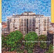
We Are <strong>Hartford</strong> <strong>HealthCare</strong> . . . . . 4<br />
Overview . . . . . . . . . . . . . . . . . . . . . . 6<br />
Our Signature . . . . . . . . . . . . . . . . . . 8<br />
Parent Signature . . . . . . . . . . . . . . . . 9<br />
Member Signatures . . . . . . . . . . . . 10<br />
Clear Space . . . . . . . . . . . . . . . . . . . 11<br />
Minimum Size . . . . . . . . . . . . . . . . 12<br />
Special Usage . . . . . . . . . . . . . . . . . 13<br />
Color Variations . . . . . . . . . . . . . . . 14<br />
Background Control . . . . . . . . . . . . 15<br />
Misuse . . . . . . . . . . . . . . . . . . . . . . . 16<br />
File Naming –<br />
Preferred Signature . . . . . . . . . . 17<br />
File Naming –<br />
Special-Usage Signature . . . . . . 18<br />
1<br />
Our Color Palette . . . . . . . . . . . . . . 19<br />
Color Palette . . . . . . . . . . . . . . . . . . 20<br />
Our Typeface . . . . . . . . . . . . . . . . . . 21<br />
Primary Typeface . . . . . . . . . . . . . . 22<br />
Secondary Typeface . . . . . . . . . . . . 23<br />
Our Photography . . . . . . . . . . . . . . 24<br />
Primary Photography . . . . . . . . . . 25<br />
Secondary Photography . . . . . . . . 28<br />
Our Graphic Elements . . . . . . . . . . 29<br />
Graphic Elements . . . . . . . . . . . . . . 30<br />
Graphic Element Usage . . . . . . . . . 31<br />
Creating Multicolor Clusters . . . . . 32<br />
Creating Two-Color and<br />
One-Color Clusters . . . . . . . . . . . 33<br />
Using the Clusters . . . . . . . . . . . . . 34<br />
Clusters – What to Avoid . . . . . . . . 35<br />
Creating and Using the Quotes . . 36<br />
Using the Quotes . . . . . . . . . . . . . . 37<br />
Quotation Marks – What to Avoid 38<br />
Textures . . . . . . . . . . . . . . . . . . . . . . 39<br />
Using the Textures . . . . . . . . . . . . . 41<br />
Textures – What to Avoid . . . . . . . 42<br />
Crops . . . . . . . . . . . . . . . . . . . . . . . . 43<br />
Using the Crops . . . . . . . . . . . . . . . 45<br />
Crops – What to Avoid . . . . . . . . . . 46<br />
Our Voice . . . . . . . . . . . . . . . . . . . . . 48<br />
Brand Voice . . . . . . . . . . . . . . . . . . . 49<br />
<strong>Hartford</strong> <strong>HealthCare</strong> Guidelines | Contents
About These Guidelines<br />
On the following pages, you will find an explanation of<br />
the characteristics of the <strong>Hartford</strong> <strong>HealthCare</strong> brand and<br />
detailed instruction on how to reproduce and apply the<br />
visual identity system .<br />
As consistency in our visual presentation is one of the<br />
keys to the success of our brand, please follow these<br />
guidelines closely to ensure the consistent treatment of<br />
the visual identity system across all of our communications .<br />
2<br />
<strong>Hartford</strong> <strong>HealthCare</strong> Guidelines | About These Guidelines
Our Brand
We Are <strong>Hartford</strong> <strong>HealthCare</strong><br />
The <strong>Hartford</strong> <strong>HealthCare</strong> brand tells the story of who we are and what our promise<br />
is to the people we work with and the communities we serve . We are more than just<br />
a group of experts, each working in our respective fields—we are an organization<br />
working together toward a greater purpose .<br />
In today’s world, healthcare is often delivered as a series of disjointed and impersonal<br />
experiences . At <strong>Hartford</strong> <strong>HealthCare</strong>, we stand for something more . Our purpose is to<br />
build connections, create an open dialogue, and partner with patients at every point in<br />
their healthcare experience .<br />
We are innovative, collaborative, and compassionate . Our system is dedicated to<br />
providing a coordinated continuum of high-quality care, creating lifelong relationships<br />
with patients, and bringing the future of healthcare to the residents of Connecticut .<br />
The <strong>Hartford</strong> <strong>HealthCare</strong> brand embodies our mission—to replace the broken realities<br />
of today with a coordinated health system working toward a greater purpose . It is<br />
our promise to everyone who interacts with our system, and we will bring it to life in<br />
every aspect of our business .<br />
4 <strong>Hartford</strong> <strong>HealthCare</strong> Guidelines | We Are <strong>Hartford</strong> <strong>HealthCare</strong>
Our Identity
Overview<br />
6 <strong>Hartford</strong> <strong>HealthCare</strong> Guidelines | Overview
Overview<br />
Our identity system consists of these are elements which are essential parts of our brand communications<br />
Our Signature<br />
Our Photography<br />
Our Color Palette Our Typeface<br />
Our Graphic Elements Our Voice<br />
PMN Caecillia<br />
ABCDEFGHIJKLMNOP<br />
abcdefghijklmnopqrs<br />
1234567890!@#$%^&<br />
Open<br />
Conversational<br />
Collaborative<br />
7 <strong>Hartford</strong> <strong>HealthCare</strong> Guidelines | Overview
Our Signature<br />
Our symbol consists of four<br />
single quotation marks set<br />
in a continuous circle to<br />
suggest ongoing dialogue<br />
and open communication.<br />
8 <strong>Hartford</strong> <strong>HealthCare</strong> Guidelines | Our Signature
Parent Signature<br />
The <strong>Hartford</strong> <strong>HealthCare</strong> parent<br />
signature is the cornerstone of our<br />
visual identity . It consists of the<br />
wordmark and the symbol, and is<br />
the basis for all other signatures in<br />
our identity system .<br />
The symbol represents our four interconnected<br />
groups: patients, providers,<br />
communities, and staff . It also evokes<br />
our multiple specialties and strengths<br />
interacting to create a compassionate,<br />
effective organization . The serif<br />
typeface of the wordmark elegantly<br />
expresses the essence of the brand .<br />
The signature makes a distinctive<br />
statement wherever it is used<br />
in order to ensure that all of our<br />
communications convey the<br />
full integrity and authority of<br />
our organization .<br />
Please remember that the signature<br />
is not to be altered, added to, or<br />
recreated under any circumstances .<br />
9<br />
<strong>Hartford</strong> <strong>HealthCare</strong> Parent Signature<br />
Wordmark Symbol<br />
<strong>Hartford</strong> <strong>HealthCare</strong> Guidelines | Parent Signature
Member Signatures<br />
Our member organizations are<br />
represented by their own signature<br />
variations . Based on the parent<br />
signature, they feature the same<br />
typestyle for their wordmarks,<br />
and the symbol is shared across<br />
the entire system .<br />
To emphasize our affiliations, the line<br />
“A <strong>Hartford</strong> <strong>HealthCare</strong> Partner” has<br />
been locked up with the artwork . In<br />
signage, small-usage applications,<br />
and other highly specific situations,<br />
the descriptor is not required . (See<br />
page 2 .5 for more .)<br />
As with all signatures in the system,<br />
these variations are not to be<br />
altered, added to, or re-created under<br />
any circumstances .<br />
10<br />
Member Organization Signatures<br />
Note: Clinical Laboratory<br />
Partners does not<br />
feature the affiliation<br />
line in its signature<br />
artwork.<br />
<strong>Hartford</strong> <strong>HealthCare</strong> Guidelines | Member Signatures
Clear Space<br />
The signature must be surrounded<br />
by a generous field of clear space<br />
in every use . The space isolates the<br />
artwork from competing visuals such<br />
as graphics and type to ensure its<br />
visibility . Additionally, clear space<br />
prevents the signature from being<br />
positioned too close to gutters,<br />
trims and edges .<br />
As shown at right, an area equal<br />
to the width of two quotation<br />
marks must border the signature<br />
on all four sides .<br />
The clear space requirement applies<br />
to all versions of the signature,<br />
without exception .<br />
11 <strong>Hartford</strong> <strong>HealthCare</strong> Guidelines | Clear Space
Minimum Size<br />
The signature should be sized<br />
prominently in every application<br />
to ensure that the symbol is<br />
highly visible and the wordmark<br />
and affiliation line are easy to read .<br />
If sized too small, it risks going<br />
unnoticed or being illegible .<br />
Although member signatures vary<br />
in size, the clear space must always<br />
be applied adjacent to the longest<br />
line of the signature, using the quote<br />
symbol as shown in the exhibit on<br />
the previous page .<br />
Each member signature has a specific<br />
size below which it must not be<br />
reproduced . Please see the examples<br />
at right to determine the minimum<br />
allowable size for your signature .<br />
Signatures with minimum width of 1.5"<br />
Signatures with minimum width of 1.25"<br />
Signature with minimum width of 1" Signature with minimum width of 0.875"<br />
12 <strong>Hartford</strong> <strong>HealthCare</strong> Guidelines | Minimum Size
Special Usage<br />
The special-usage signatures do<br />
not feature the affiliation line,<br />
“A <strong>Hartford</strong> <strong>HealthCare</strong> Partner .”<br />
These signatures are not to be used<br />
arbitrarily in place of the preferred<br />
variation . They are intended only for<br />
signage and small-usage situations<br />
where the design area is insufficient<br />
to accommodate the affiliation<br />
line, and for occasions such as local<br />
sponsorships where the mention of<br />
<strong>Hartford</strong> <strong>HealthCare</strong> is unnecessary .<br />
The minimum allowable sizes for<br />
the special-usage signatures are<br />
shown at right .<br />
13<br />
Signatures with minimum width of 1.25"<br />
Signatures with minimum width of 1"<br />
Signature with minimum width of 0.875"<br />
<strong>Hartford</strong> <strong>HealthCare</strong> Guidelines | Special Usage
Color Variations<br />
If the production method allows, the<br />
full-color signature is always preferred<br />
in all applications .<br />
The grayscale variation distinguishes<br />
parts of the signature by using<br />
contrasting gray tones, and should<br />
be selected only when color<br />
reproduction is impractical owing<br />
to budget or other constraints .<br />
The one-color black and reverse<br />
signatures are for use only when color<br />
reproduction is fully unavailable .<br />
14<br />
Color<br />
One-color Black<br />
Grayscale<br />
Reverse<br />
<strong>Hartford</strong> <strong>HealthCare</strong> Guidelines | Color Variations
Background Control<br />
White is always the preferred<br />
background color for the signature<br />
artwork . It provides the highest<br />
level of contrast to ensure that the<br />
artwork pops visually and grabs<br />
the viewer’s attention .<br />
Light backgrounds are also acceptable<br />
as long as they contrast vividly with<br />
the artwork .<br />
A dark background should be used<br />
only when a specific application<br />
requires it . When a dark background<br />
is unavoidable, the reverse variation is<br />
the only signature option .<br />
A white background is preferred.<br />
If a color background is necessary, it must provide<br />
significant contrast.<br />
If a dark background is used, the reverse signature<br />
is the only option.<br />
Never compromise the visibility of the signature<br />
with an incompatible background.<br />
Never place the signature on a background that<br />
does not provide ample contrast.<br />
Never place the full-color signature on<br />
a black background.<br />
15 <strong>Hartford</strong> <strong>HealthCare</strong> Guidelines | Background Control
Misuse<br />
The importance of using the signature<br />
properly cannot be overstated .<br />
At right are examples of unacceptable<br />
manipulation of the signature . Avoid<br />
such treatments at all times .<br />
<strong>Hartford</strong><br />
Healthcare<br />
Never change the typeface or the colors<br />
of the signature<br />
Never distort the signature<br />
Never rearrange the elements of the signature<br />
Never add any effects to the signature<br />
Never outline the signature Never place the signature on a color background<br />
that challenges its legibility<br />
16 <strong>Hartford</strong> <strong>HealthCare</strong> Guidelines | Misuse
File Naming – Preferred Signature<br />
Use this guide to select the appropriate<br />
electronic signature. The le formats are<br />
explained below.<br />
EPS Format (.eps): EPS is a popular le<br />
format for transferring vector artwork<br />
between applications. Images can be<br />
proportionally enlarged or reduced<br />
without degradation in quality.<br />
JPEG Format (.jpg): JPEGs are suitable<br />
for digital and video use: for example,<br />
Internet use, e-mail, slideshows, and<br />
video presentations. JPEGs can be proportionally<br />
reduced, but must not be<br />
enlarged because distortion will occur.<br />
PNG Format (.png): PNG is designed<br />
to work well in online viewing<br />
applications, so it is fully streamable<br />
and has a progressive display option.<br />
PNG is robust, providing both full-le<br />
integrity checking and simple detection<br />
of common transmission errors.<br />
TIFF Format (.tif): TIFF logos are suitable<br />
for importing into applications<br />
such as Microsoft ® Word, PowerPoint ® ,<br />
and page layout programs. TIFFs can<br />
be reduced but can be only slightly<br />
enlarged, or distortion will occur.<br />
17<br />
Jeff House 4C-Rev.eps<br />
Facility Code:<br />
HHC – <strong>Hartford</strong> <strong>HealthCare</strong><br />
HMG – <strong>Hartford</strong> Medical Group<br />
HH – <strong>Hartford</strong> <strong>Hospital</strong><br />
Windham – Windham <strong>Hospital</strong><br />
Natchaug – Natchaug <strong>Hospital</strong><br />
MidState – MidState Medical Center<br />
ERN – Eastern Rehabilitation Network<br />
VNA-HHC – VNA <strong>HealthCare</strong><br />
VNA-CC – VNA Central Connecticut<br />
Rushford – Rushford<br />
CLP – Clinical Laboratory Partners<br />
Jeff House – Jefferson House<br />
CMC – Cedar Mountain Commons<br />
Color Scheme:<br />
File Format:<br />
.eps – Encapsulated<br />
Postscript<br />
.tif – Tagged Image<br />
File Format<br />
.jpg – Joint Photographic<br />
Experts Group<br />
.png – Portable Network<br />
Graphics<br />
Grayscale<br />
K – Black<br />
4C – Process Color (CMYK)<br />
Rev – Reverse (white)<br />
S-Rev – White Wordmark/ Spot Color Symbol<br />
4C-Rev – White Wordmark/Process Color Symbol<br />
S – Spot color (Pantone ® )<br />
V – RGB<br />
<strong>Hartford</strong> <strong>HealthCare</strong> Guidelines | File Naming – Preferred Signature
File Naming – Special-Usage Signature<br />
Use this guide to select the appropriate<br />
electronic signature. The le formats are<br />
explained below.<br />
EPS Format (.eps): EPS is a popular le<br />
format for transferring vector artwork<br />
between applications. Images can be<br />
proportionally enlarged or reduced<br />
without degradation in quality.<br />
JPEG Format (.jpg): JPEGs are suitable<br />
for digital and video use: for example,<br />
Internet use, e-mail, slideshows, and<br />
video presentations. JPEGs can be proportionally<br />
reduced, but must not be<br />
enlarged because distortion will occur.<br />
PNG Format (.png): PNG is designed<br />
to work well in online viewing<br />
applications, so it is fully streamable<br />
and has a progressive display option.<br />
PNG is robust, providing both full-le<br />
integrity checking and simple detection<br />
of common transmission errors.<br />
TIFF Format (.tif): TIFF logos are suitable<br />
for importing into applications<br />
such as Microsoft ® Word, PowerPoint ® ,<br />
and page layout programs. TIFFs can<br />
be reduced but can be only slightly<br />
enlarged, or distortion will occur.<br />
CMC K notag.eps<br />
Facility Code:<br />
HHC – <strong>Hartford</strong> <strong>HealthCare</strong><br />
HMG – <strong>Hartford</strong> Medical Group<br />
HH – <strong>Hartford</strong> <strong>Hospital</strong><br />
Windham – Windham <strong>Hospital</strong><br />
Natchaug – Natchaug <strong>Hospital</strong><br />
MidState – MidState Medical Center<br />
ERN – Eastern Rehabilitation Network<br />
VNA-HHC – VNA <strong>HealthCare</strong><br />
VNA-CC – VNA Central Connecticut<br />
Rushford – Rushford<br />
CLP – Clinical Laboratory Partners<br />
Jeff House – Jefferson House<br />
CMC – Cedar Mountain Commons<br />
Color Scheme:<br />
File Format:<br />
.eps – Encapsulated<br />
Postscript<br />
.tif – Tagged Image<br />
File Format<br />
.jpg – Joint Photographic<br />
Experts Group<br />
.png – Portable Network<br />
Graphics<br />
Special Usage:<br />
Special-usage logos do<br />
not feature the afliation<br />
line and have the added<br />
“notag” designation.<br />
Grayscale<br />
K – Black<br />
4C – Process Color (CMYK)<br />
Rev – Reverse (white)<br />
S-Rev – White Wordmark/ Spot Color Symbol<br />
4C-Rev – White Wordmark/Process Color Symbol<br />
S – Spot color (Pantone ® )<br />
V – RGB<br />
18 <strong>Hartford</strong> <strong>HealthCare</strong> Guidelines | File Naming – Special-Usage Signature
Our Color Palette<br />
The colors we use in our brand<br />
are vivid, energetic, and inspiring.<br />
They speak of our compassion<br />
and commitment to the people<br />
we help every day.<br />
19 <strong>Hartford</strong> <strong>HealthCare</strong> Guidelines | Our Color Palette
Color Palette<br />
The <strong>Hartford</strong> <strong>HealthCare</strong> house<br />
style relies on color to make distinct<br />
visual statements that catch and hold<br />
the viewer’s attention. Visible in a<br />
variety of features, including super<br />
graphics, backgrounds, and display<br />
type, our color palette mirrors the<br />
signature artwork.<br />
White is one of the dominant colors<br />
of this system. When used as a<br />
background, it ensures a clean, clinical<br />
quality and supplies a blank canvas<br />
to support messages and visual<br />
elements. HHC Light Gray can also<br />
be used as a background color to add<br />
dimension to photographic images<br />
and variety to page layouts.<br />
HHC Gray is used frequently in<br />
headlines and body copy, and<br />
suggests our determination<br />
and professionalism.<br />
HHC’s accent colors are intended for<br />
highly specic uses, such as graphic<br />
elements (discussed later in these<br />
guidelines), backgrounds (usually with<br />
silhouetted photography), and display<br />
type (titles, headlines, posters, etc.).<br />
20<br />
White<br />
CMYK 0 0 0 0<br />
RGB 255 255 255<br />
# FFFFFF<br />
HHC Gray<br />
Pantone ® Cool Gray 11<br />
CMYK 0 0 0 85<br />
RGB 83 86 90<br />
# 53565A<br />
HHC Light Gray<br />
10% Pantone ® Cool Gray 11<br />
CMYK 0 0 0 10<br />
RGB 237 237 237<br />
# EDEDED<br />
HHC Blue<br />
Pantone ® 313<br />
CMYK 100 0 10 4<br />
RGB 0 152 195<br />
# 0098C3<br />
HHC Green<br />
Pantone ® 377<br />
CMYK 51 5 98 23<br />
RGB 110 153 52<br />
# 6E9934<br />
HHC Magenta<br />
Pantone ® 2405<br />
CMYK 38 100 0 0<br />
RGB 164 0 132<br />
# A40084<br />
HHC Orange<br />
Pantone ® 173<br />
CMYK 0 80 94 1<br />
RGB 210 73 42<br />
# D2492A<br />
<strong>Hartford</strong> <strong>HealthCare</strong> Guidelines | Color Palette
Our Typeface<br />
PMN Caecilia is our typeface.<br />
Its approachable and<br />
humanistic quality reflects<br />
our brand personality.<br />
21 <strong>Hartford</strong> <strong>HealthCare</strong> Guidelines | Our Typeface
Primary Typeface<br />
PMN Caecilia is a modern and<br />
distinctive serif typeface that<br />
reinforces both the <strong>Hartford</strong><br />
<strong>HealthCare</strong> wordmark and the<br />
member descriptor lines .<br />
PMN Caecilia 55 Roman is<br />
the preferred weight in most<br />
applications, from titles and<br />
headlines to subheads, body copy,<br />
captions, legal copy, and more .<br />
When setting text in layout, you<br />
may use other weights and styles<br />
of PMN Caecilia for emphasis or<br />
variety . A clear text hierarchy<br />
will lead the reader effortlessly<br />
through the material . Text<br />
should always be set to maximize<br />
readability while maintaining<br />
a neat and clean appearance .<br />
22<br />
PMN Caecilia 55 Roman<br />
ABCDEFGHIJKLM<br />
NOPQRSTUVWXYZ<br />
abcdefghijklm<br />
nopqrstuvwxyz<br />
1234567890!@#<br />
$%^&*()-+=<br />
PMN Caecilia 45 Light<br />
ABCDEFGHIJKLMNOPQRSTUV<br />
abcdefghijklmnopqrstuvwxyz<br />
1234567890!@#$%^&*()-+=<br />
PMN Caecilia 75 Bold<br />
ABCDEFGHIJKLMNOPQRSTUV<br />
abcdefghijklmnopqrstuvwxyz<br />
1234567890!@#$%^&*()-+=<br />
PMN Caecilia 56 Italic<br />
ABCDEFGHIJKLM<br />
NOPQRSTUVWXYZ<br />
abcdefghijklm<br />
nopqrstuvwxyz<br />
1234567890!@#<br />
$%^&*()-+=<br />
PMN Caecilia 46 Light Italic<br />
ABCDEFGHIJKLMNOPQRSTUV<br />
abcdefghijklmnopqrstuvwxyz<br />
1234567890!@#$%^&*()-+=<br />
PMN Caecilia 76 Bold Italic<br />
ABCDEFGHIJKLMNOPQRSTUV<br />
abcdefghijklmnopqrstuvwxyz<br />
1234567890!@#$%^&*()-+=<br />
<strong>Hartford</strong> <strong>HealthCare</strong> Guidelines | Primary Typeface
Secondary Typeface<br />
When PMN Caecilia is unavailable<br />
(e .g ., in Microsoft ® Office and online<br />
applications) use Verdana instead .<br />
23<br />
Verdana Regular<br />
ABCDEFGHIJKLM<br />
NOPQRSTUVWXYZ<br />
abcdefghijklm<br />
nopqrstuvwxyz<br />
1234567890!@#<br />
$%^&*()-+=<br />
Verdana Bold<br />
ABCDEFGHIJKLMNOPQRST<br />
abcdefghijklmnopqrstuvwx<br />
1234567890!@#$%^&*()<br />
Verdana Italic<br />
ABCDEFGHIJKLM<br />
NOPQRSTUVWXYZ<br />
abcdefghijklm<br />
nopqrstuvwxyz<br />
1234567890!@#<br />
$%^&*()-+=<br />
Verdana Bold Italic<br />
ABCDEFGHIJKLMNOPQRST<br />
abcdefghijklmnopqrstuvwx<br />
1234567890!@#$%^&*()<br />
<strong>Hartford</strong> <strong>HealthCare</strong> Guidelines | Secondary Typeface
Our Photography<br />
Our photography highlights<br />
the well-being of our patients<br />
and the collaboration among<br />
staff to provide the best<br />
possible care.<br />
24 <strong>Hartford</strong> <strong>HealthCare</strong> Guidelines | Our Photography
Primary Photography<br />
Just as patients are the focal point of<br />
our work, so too are they the focus of<br />
our photographic style . Photography<br />
of doctors, nurses, and caregivers<br />
serves to illustrate our commitment<br />
to our patients .<br />
Primary photography should reflect<br />
the well-being of our patients,<br />
the dialogue between patient and<br />
caregiver, and the collaboration<br />
among our staff to deliver the best<br />
possible care .<br />
Models should represent a wide<br />
demographic and may be<br />
photographed in realistic situations<br />
or interacting with the camera .<br />
Although posed images are<br />
acceptable, candid-style photography<br />
is preferred . Models dressed in<br />
brand-accent-color clothes are<br />
also preferred because the colors<br />
enliven our visual communications .<br />
Images should always be silhouetted<br />
against light gray, white, or solid<br />
brand-color backgrounds . Slight<br />
gradients can be added to the<br />
background to make the photography<br />
look natural and to create depth .<br />
Silhouetted image on light gray background Silhouetted image on brand-color background<br />
25 <strong>Hartford</strong> <strong>HealthCare</strong> Guidelines | Primary Photography
Primary Photography<br />
Silhouetted images on light gray background<br />
26 <strong>Hartford</strong> <strong>HealthCare</strong> Guidelines | Primary Photography
Primary Photography<br />
Samples of silhouetted images on brand-color background<br />
27 <strong>Hartford</strong> <strong>HealthCare</strong> Guidelines | Primary Photography
Secondary Photography<br />
Secondary photography features<br />
objects associated with the<br />
medical arts or science in general .<br />
This category offers a broad range of<br />
possibilities . However, consistency<br />
should be established through<br />
composition . The examples shown<br />
here illustrate how subjects<br />
should be arranged and shot: Use<br />
symmetry, placement, and cropping<br />
to impart style and nuance to what<br />
would otherwise be an ordinary<br />
photograph of a medical device .<br />
Silhouetted images of objects<br />
should always appear against light<br />
gray or white backgrounds .<br />
Samples of silhouetted objects on light gray background<br />
28 <strong>Hartford</strong> <strong>HealthCare</strong> Guidelines | Secondary Photography
Our Graphic Elements<br />
Lively, engaging, and<br />
differentiated, our<br />
graphic elements support<br />
the concept of open<br />
dialogue and add visual<br />
emphasis to all of<br />
our communications.<br />
29 <strong>Hartford</strong> <strong>HealthCare</strong> Guidelines | Our Graphic Elements
Graphic Elements<br />
Colorful, striking, and fun, the<br />
graphic elements animate our<br />
design materials with big blasts<br />
of color . They have been specially<br />
created for our brand, purposely<br />
differentiating us within the<br />
healthcare category .<br />
Inspired by the design and colors<br />
of the signature’s quotation marks<br />
symbol, these elements emphasize<br />
our dedication to engaging in a<br />
constant dialogue with stakeholders<br />
and our commitment to<br />
Connecting with Purpose .<br />
The quotation mark graphic element is<br />
available in the following variations:<br />
30<br />
Variations of the graphic elements<br />
Solid<br />
Diagonal Stripes<br />
Dots<br />
Horizontal Stripes Vertical Stripes<br />
<strong>Hartford</strong> <strong>HealthCare</strong> Guidelines | Graphic Elements
Graphic Element Usage<br />
Clusters<br />
Lively and dynamic combinations<br />
of various quotation mark elements<br />
that energize and differentiate<br />
communication materials .<br />
Quotes<br />
Pairs of quotation marks<br />
(upside-down quotes on left and<br />
right-side-up on right) for use in<br />
message-driven designs and in<br />
standard typographic style .<br />
Textures<br />
Repeated patterns of the quote<br />
elements for applications that<br />
require subtle design details .<br />
Crops<br />
Magnifications of solid, dotted,<br />
and diagonal-/horizontal-/verticalstriped<br />
graphic elements that add<br />
variety and flexibility to all types<br />
of communication materials .<br />
The design and intent of the<br />
communication determines<br />
the graphic element to use .<br />
The following are suggested as<br />
a general guide .<br />
31<br />
Multicolor usage sample Quotes<br />
Textures<br />
Crops<br />
<strong>Hartford</strong> <strong>HealthCare</strong> Guidelines | Graphic Element Usage
Creating Multicolor Clusters<br />
Clusters feature tight groups of<br />
quotation marks of varying sizes<br />
and are used for emphatic graphic<br />
expression .<br />
Clusters enliven larger design areas<br />
with a vigorous display of color . Use<br />
only the five types of quotation marks<br />
specified on page 30 .<br />
To create clusters, use overlapping<br />
quotation marks, double on double 1<br />
or single on single . 2 Clusters can<br />
be in groups of two or three, and<br />
more than one group can be used . 3<br />
Larger clusters should bleed off the<br />
border(s) of the layout, but smaller<br />
clusters can be wholly contained in the<br />
live area if the composition allows . 4<br />
Used with photography or messages,<br />
clusters act as a framing device to<br />
draw attention to the contents . Their<br />
scale should be balanced with any<br />
photography or message in the<br />
composition . 5<br />
1<br />
4 5<br />
trust your<br />
family to us<br />
32 <strong>Hartford</strong> <strong>HealthCare</strong> Guidelines | Creating Multicolor Clusters<br />
2<br />
3
Creating Two-Color and One-Color Clusters<br />
In applications where four-color<br />
(or more) printing is not available,<br />
clusters can be created by using a<br />
combination of the brand accent<br />
color and HHC gray, or by using<br />
only the brand accent color and<br />
its shades to create visual interest .<br />
Shades should appear at increments of<br />
100%, 80%, 60%, 40%, and 20% only . 1<br />
Two-color and one-color clusters can<br />
be used on backgrounds of white,<br />
light gray, 2 or a reverse of the brand<br />
accent color . 3<br />
Use only the five types of quotation<br />
marks specifically designed for the<br />
HHC brand . (See page 30 .) Follow<br />
the guidelines on page 32, Creating<br />
Multicolor Clusters .<br />
1<br />
2<br />
100% 100% 100% 100% 100%<br />
80% 80% 80% 80% 80%<br />
60% 60% 60% 60% 60%<br />
40% 40% 40% 40% 40%<br />
20% 20% 20% 20% 20%<br />
33 <strong>Hartford</strong> <strong>HealthCare</strong> Guidelines | Creating Two-Color and One-Color Clusters<br />
3
Using the Clusters<br />
Clusters can be used as major design<br />
elements or as framing devices or<br />
accents . See examples of suitable<br />
applications at right .<br />
34 <strong>Hartford</strong> <strong>HealthCare</strong> Guidelines | Using the Clusters
Clusters – What to Avoid<br />
The importance of using the<br />
graphic elements properly cannot<br />
be overstated .<br />
To help us achieve a strong, unified<br />
expression of the <strong>Hartford</strong> <strong>HealthCare</strong><br />
brand across all applications, a<br />
number of unacceptable treatments<br />
are demonstrated here . Please<br />
remember that these uses are<br />
never allowed .<br />
35<br />
Never use colors outside of our brand color palette<br />
Never re-create the quotes graphic<br />
Never use the clusters directly on top of any<br />
photography or message<br />
Never use colors outside of our brand color palette<br />
Never arrange the elements in other angles<br />
Never put any imagery or messages in the quotes<br />
<strong>Hartford</strong> <strong>HealthCare</strong> Guidelines | Clusters – What to Avoid
Creating and Using the Quotes<br />
The quotation mark graphics<br />
have been taken directly from the<br />
signature symbol .<br />
Intended for use as design accents<br />
in type-focused layouts, the quotes<br />
can be used in a number of different<br />
ways, e .g ., to book-end a message or<br />
to frame text .<br />
Use only the five types of quotation<br />
marks specifically designed for the<br />
HHC brand . (See page 30 .)<br />
The quotes should always appear in<br />
twos in the standard typographic<br />
style, i .e ., upside-down quotes on the<br />
left and right-side-up on the right .<br />
Use any of the five brand colors<br />
when creating quotes . Quotes should<br />
appear in one or two colors per set of<br />
quotes 1 , so quotes within a set can<br />
appear in different colors . 2<br />
Quotation marks can appear entirely<br />
within the live area at smaller sizes to<br />
complement selections of body copy<br />
or can be enlarged and cropped by the<br />
borders of the layout for a dominant<br />
statement in high-visibility layouts . 3<br />
36<br />
1<br />
2<br />
One-color samples<br />
Once you choose hope,<br />
anything’s possible.<br />
– Christopher Reeve<br />
3<br />
Two-color samples<br />
together we<br />
are starting<br />
a dialogue<br />
<strong>Hartford</strong> <strong>HealthCare</strong> Guidelines | Creating and Using the Quotes
Using the Quotes<br />
As the series of exhibits at right<br />
illustrates, the quotes are versatile<br />
and can be used to frame a message<br />
while reinforcing the <strong>Hartford</strong><br />
<strong>HealthCare</strong> brand, whether in<br />
print, online, or environmental/<br />
architectural applications .<br />
37 <strong>Hartford</strong> <strong>HealthCare</strong> Guidelines | Using the Quotes
Quotation Marks – What to Avoid<br />
The importance of using the<br />
graphic elements properly cannot<br />
be overstated .<br />
To help us achieve a strong, unified<br />
expression of the <strong>Hartford</strong> <strong>HealthCare</strong><br />
brand across all applications, a<br />
number of unacceptable treatments<br />
are demonstrated here . Please<br />
remember that these uses are<br />
never allowed .<br />
38<br />
Once you choose hope,<br />
anything’s possible.<br />
– Christopher Reeve<br />
Never use colors outside of our brand color palette<br />
Once you choose hope,<br />
anything’s possible.<br />
– Christopher Reeve<br />
Never re-create the quotes graphic<br />
together we<br />
are starting<br />
a dialogue<br />
The quotes should always appear in the standard<br />
typographic style, i.e., upside-down quotes on the<br />
left and right-side-up on the right<br />
Once you choose hope,<br />
anything’s possible.<br />
– Christopher Reeve<br />
Both sets of quotes should always be at<br />
the same size<br />
Once you choose hope,<br />
anything’s possible.<br />
– Christopher Reeve<br />
Never use the clusters to quote any messages<br />
Never superimpose any messages on the<br />
quotes graphic<br />
together we<br />
are starting<br />
a dialogue<br />
<strong>Hartford</strong> <strong>HealthCare</strong> Guidelines | Quotation Marks – What to Avoid
Textures<br />
The textures diffuse the quotes<br />
as patterns or streams for quieter<br />
statements across larger areas .<br />
There are a number of uses for these<br />
textures, such as envelope interiors,<br />
brochure back covers, inside flaps,<br />
and other surfaces not used for<br />
primary displays .<br />
There are a number of colors options<br />
for the textures: single color only,<br />
alternating symbol colors, color<br />
reversal off brand-accent color<br />
background, or color reversal off<br />
light gray background .<br />
39<br />
Multicolor textures One-color textures<br />
Reverse on color textures<br />
Reverse on light gray textures<br />
<strong>Hartford</strong> <strong>HealthCare</strong> Guidelines | Textures
Textures (continued)<br />
A continuous line of quotation marks<br />
can be used as a design accent in<br />
environmental/architectural details .<br />
The textured strip can be in one<br />
color, in alternating brand colors, or<br />
reversed off any background .<br />
40<br />
Multicolor textured strip<br />
One-color textured strip<br />
Reverse textured strip<br />
<strong>Hartford</strong> <strong>HealthCare</strong> Guidelines | Textures (continued)
Using the Textures<br />
The examples at right illustrate<br />
appropriate applications of the<br />
textures .<br />
41<br />
<strong>Hartford</strong> <strong>HealthCare</strong> Guidelines | Using the Textures
Textures – What to Avoid<br />
The importance of using the<br />
graphic elements properly cannot<br />
be overstated .<br />
To help us achieve a strong, unified<br />
expression of the <strong>Hartford</strong> <strong>HealthCare</strong><br />
brand across all applications, a<br />
number of unacceptable treatments<br />
are demonstrated here . Please<br />
remember that these uses are<br />
never allowed .<br />
42<br />
Never use colors outside of our brand color palette<br />
Never rearrange or alter the textures<br />
Never rearrange or alter the textured strip<br />
Never use colors outside of our brand color palette<br />
Never rearrange or alter the textures<br />
Never use the textured strip in any applications<br />
other than enviromental/architectural details<br />
<strong>Hartford</strong> <strong>HealthCare</strong> Guidelines | Textures – What to Avoid
Crops<br />
The crops are cropped magnifications<br />
of the different graphic treatments<br />
of the quatation marks—solid, dots<br />
or horizontal/vertical stripes . Their<br />
distinctive shapes combine with our<br />
vibrant brand colors to create unique<br />
design expressions and offer flexibility<br />
in various applications .<br />
Each version is built from two<br />
components . One component is<br />
the magnified pattern of dots or<br />
stripes 1 and the other component<br />
is a solid field of color . Combinations<br />
should always come from our<br />
brand color palette .<br />
The two components overlap,<br />
with the edge of the color field<br />
forming a horizontal 2 or<br />
vertical line . 3 Multiplying or<br />
overprint effect should be<br />
applied to lend dimension and<br />
visual interest .<br />
43<br />
1<br />
Dots Diagonal Stripes Horizontal Stripes Vertical Stripes Solid<br />
2<br />
3<br />
<strong>Hartford</strong> <strong>HealthCare</strong> Guidelines | Crops
Crops (continued)<br />
The crops can fill large design areas 1<br />
and can be featured on their own<br />
or with photography placed in the<br />
solid area 2 .<br />
The crops can also be used in the form<br />
of a strip 3 on appropriate applications,<br />
such as vehicles .<br />
44<br />
1<br />
3<br />
Let’s Meet, Talk, Share, Discuss<br />
2<br />
Building a Healthier Community<br />
<strong>Hartford</strong> <strong>HealthCare</strong> Guidelines | Crops (continued)
Using the Crops<br />
Examples of suitable usage of the<br />
crops appear at right .<br />
45 <strong>Hartford</strong> <strong>HealthCare</strong> Guidelines | Using the Crops
Crops – What to Avoid<br />
The importance of using the<br />
graphic elements properly cannot<br />
be overstated .<br />
To help us achieve a strong, unified<br />
expression of the <strong>Hartford</strong> <strong>HealthCare</strong><br />
brand across all applications, a<br />
number of unacceptable treatments<br />
are demonstrated here . Please<br />
remember that these uses are<br />
never allowed .<br />
46<br />
Never use colors outside of our brand color palette<br />
The two components should meet horizontally or<br />
vertically only<br />
Never put imagery or message inside the<br />
pattern component<br />
Never re-arrange or alter the graphic elements<br />
The two components should meet horizontally or<br />
vertically only<br />
The two components should always align<br />
horizontally or vertically<br />
<strong>Hartford</strong> <strong>HealthCare</strong> Guidelines | Crops – What to Avoid
Our Voice
Our Voice<br />
Our brand voice expresses the<br />
unique character of our brand<br />
and brings a consistent style to all<br />
of our written communications.<br />
48<br />
<strong>Hartford</strong> <strong>HealthCare</strong> Guidelines | Our Voice
Brand Voice<br />
While our house style communicates<br />
our brand through imagery,<br />
our brand voice expresses the<br />
unique character of the brand in<br />
words . And through this unique<br />
voice, we bring a consistent<br />
style to all of our written<br />
communications and ensure that<br />
the core qualities of our brand<br />
are always represented .<br />
49<br />
Conversational – When appropriate,<br />
use a “business-casual” writing<br />
style . It should sound relaxed<br />
but professional, and not overly<br />
formal . Remember to get to the<br />
point quickly, but frame or lead up<br />
to the information in a way that<br />
suggests an easy dialogue between<br />
colleagues or friends .<br />
Use contractions and colloquial<br />
expressions . Think about how you<br />
would tell a friend about something<br />
and then try to write it down .<br />
Example:<br />
“ At <strong>Hartford</strong> <strong>HealthCare</strong>, we can’t tell<br />
you how happy we are with the results<br />
of our latest and greatest fundraiser.”<br />
Open – This quality is closely<br />
related to the others, but the idea<br />
of “openness” has some nuances<br />
of its own . For many, when they<br />
think of healthcare providers,<br />
they think of intimidating medical<br />
terminology or impenetrable<br />
regulation language . So let’s<br />
surprise them with real-world,<br />
everyday explanations to help<br />
them understand what we are<br />
doing—because that’s what a<br />
good partner does .<br />
In public-facing materials, swap<br />
technical or academic language<br />
for familiar and approachable or,<br />
if you really need to use “shoptalk,”<br />
throw in a few extra words<br />
of explanation for those outside of<br />
the healthcare industry .<br />
Example:<br />
“ In phase 1 clinical trials, we saw<br />
that metastasis, the spread of cancer<br />
cells, was stopped abruptly, giving<br />
us hope for a new treatment.”<br />
Collaborative – Another emphasis<br />
in our writing should be our<br />
dedication to partnership—to<br />
working closely with doctors,<br />
researchers, administrators, and,<br />
of course, patients to deliver the<br />
highest-quality care available .<br />
Use the first- and second-person<br />
plural (we/us/our and you/yours)<br />
if it feels right for the piece .<br />
Example:<br />
“ We have a number of exciting medical<br />
breakthroughs that we can’t wait to<br />
share with you.”<br />
<strong>Hartford</strong> <strong>HealthCare</strong> Guidelines | Brand Voice