

codify kōd fīe - Codify Design Studio
codify kōd fīe - Codify Design Studio
codify kōd fīe - Codify Design Studio

Create successful ePaper yourself
Turn your PDF publications into a flip-book with our unique Google optimized e-Paper software.
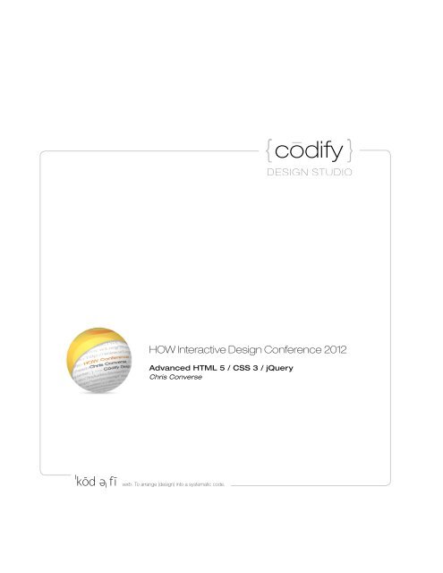
<strong>codify</strong> <strong>kōd</strong> fī<br />
e<br />
HOW Interactive <strong>Design</strong> Conference 2012<br />
Advanced HTML 5 / CSS 3 / jQuery<br />
Chris Converse<br />
verb. To arrange (design) into a systematic code.
dify <strong>kōd</strong> fī<br />
Responsive Web <strong>Design</strong><br />
Using CSS3 media queries in conjunction with HTML and imagery, designers can altar their web designs to<br />
accommodate varying screen sizes. This approach allows for one set of HTML code, and the CSS adapts<br />
the presentation base don the viewport size of the device browsing the web page.<br />
e<br />
Computer<br />
Screen<br />
Tablet<br />
Screen<br />
Hand-held<br />
Screen<br />
Use this QR code to view this responsive design<br />
example on your camera-enabled device, or visit:<br />
http://<strong>codify</strong>design.com/go/psd-to-html
Responsive Download<br />
By referencing imagery with CSS, it is possible to altar the download size of your web page. The following<br />
web design boasts a 79% download savings for visitors on hand-held devices.<br />
Large banner image<br />
Medium banner image<br />
Small banner image<br />
* Learn to create this responsive design from Chris Converse on HOW U: http://<strong>codify</strong>design.com/go/how
dify <strong>kōd</strong> fī<br />
Responsive Experience<br />
Many websites have some interactive, or animated, component for on their website to attract attention and<br />
promote deeper aspects of the site. While these user experiences are great on larger screens, the effect<br />
can be lost on hand-held devices.<br />
Through the use of JavaScript, we can dynamically load an interactive experience based on the user’s<br />
screen size.<br />
e<br />
Large banner images<br />
Small banner image
Responsive Experience (continued)<br />
The following example demonstrates an animated, and interactive, marquee for large and medium<br />
screens. If the device supports over 500 horizontal pixels, a JavaScript loads three images, lines them up<br />
with CSS, and creates an interactive experience for your user.<br />
Caption and<br />
navigation for<br />
the marquee<br />
Twitter Bootstrap<br />
The folks who brought you Twitter have created a responsive, grid-based,<br />
framework for creating web layouts and interactive experiences. The<br />
framewrok is free, open-source, and tested in all modern browsers.<br />
Read more at: http://twitter.github.com/bootstrap<br />
Get 50% off an online course at: http://<strong>codify</strong>design.com/go/how<br />
Large banner<br />
image lineup
dify <strong>kōd</strong> fī<br />
JavaScript and jQuery<br />
jQuery is an open-source framework that makes it easy to manipulate HTML with JavaScript. jQuery<br />
statements, usually starting with a dollar sign ($), can be intermixed with standard JavaScript.<br />
The much-simplified querying capability that jQuery offers has lead to it’s wide scale adoption across most<br />
websites making use of interactive and engaging content.<br />
HTML<br />
e<br />
JavaScript<br />
Importing and using<br />
the jQuery framework<br />
CSS<br />
* Learn to create this Interactive Map from Chris Converse on Lynda.com
CSS 3 Animation<br />
State-based animations can now be handled through CSS. Many browsers are now supporting these<br />
animation attributes, and can provide an enhanced user experience as CSS properties change according<br />
to various screen sizes and orientations, status of user-feedback elements, or even representing the<br />
status of a user’s progress within an application.<br />
Try it for yourself on your iPad:<br />
http://<strong>codify</strong>design.com/chris/lynda/samples/course-0010/<br />
iPad Web App*<br />
rotated to<br />
portrait view<br />
CSS3 Animation<br />
iPad Web App*<br />
rotated to<br />
landscape view<br />
* Learn to create this iPad Web App<br />
from Chris Converse on Lynda.com
jQuery Mobile<br />
dify <strong>kōd</strong> fī<br />
Another option to responsive design for mobile devices is to change the user experience altogether.<br />
Frameworks like jQuery Mobile transform DIV areas and separate HTML files into a more app-like user<br />
expereince for mobile phones and tablets.<br />
e
Responsive Frameworks<br />
The “best of both worlds” option for user experience options across devices is to load varying frameworks<br />
based on screen size. The idea here is to altar the user experience while maintaining a core set of content<br />
across those experiences.<br />
Preview this for yourself at: http://<strong>codify</strong>design.com/go/how<br />
Small screens marked up<br />
for jQuery Mobile<br />
Printer-friendly version<br />
includes CSS-based page<br />
breaks and a QR code<br />
Music loaded with Flash<br />
on computers, and HTML5<br />
Audio for tablets<br />
Large screen<br />
rotating panels<br />
Medium screen rotating<br />
panels. Includes touch<br />
events for iPads
Find Chris online at:<br />
dify <strong>kōd</strong> fī<br />
e<br />
Learn more jQuery from Chris Converse on Lynda.com<br />
Get a FREE 7-Day Trial from Chris. Find an activation link at:<br />
http://lynda.com/trial/chrisconverse<br />
Creating a Responsive Web <strong>Design</strong><br />
Get 50% off from Chris by entering the Coupon Code: HOW<br />
Get a link at: http://<strong>codify</strong>design.com/go/how<br />
Create an Engaging Website with Twitter Bootstrap<br />
Get 50% off from Chris by entering the Coupon Code: HOW<br />
Get a link at: http://<strong>codify</strong>design.com/go/how<br />
PSD-to-HTML: The missing Link of Web <strong>Design</strong><br />
Get $40 off from Chris by entering the Coupon Code: CONVERSE<br />
Get a link at: http://<strong>codify</strong>design.com/go/how<br />
Twitter: twitter.com /chrisconverse<br />
Facebook: facebook.com /chrisconversedesign<br />
LinkedIn: linkedin.com /in/chrisconverse<br />
YouTube: youtube.com /chrisconverse<br />
Blog: smartnocities.<strong>codify</strong>design.com<br />
Events: <strong>codify</strong>design.com /chris/events
 Change language