The International Typographic Style - ANM102 History of Graphic ...
The International Typographic Style - ANM102 History of Graphic ...
The International Typographic Style - ANM102 History of Graphic ...

Create successful ePaper yourself
Turn your PDF publications into a flip-book with our unique Google optimized e-Paper software.
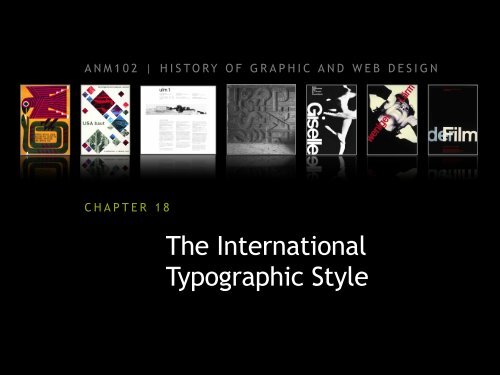
<strong>ANM102</strong> | HISTORY OF GRAPHIC AND WEB DESIGN<br />
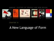
CHAPTER 18<br />
<strong>The</strong> <strong>International</strong><br />
<strong>Typographic</strong> <strong>Style</strong>
In this chapter:<br />
• Introduction, 356<br />
• Pioneers <strong>of</strong> the movement, 356<br />
• Functional graphics for science, 359<br />
• New Swiss sans-serif typefaces, 361<br />
• A master <strong>of</strong> classical typography, 361<br />
• Design in Basel and Zurich, 363<br />
• <strong>The</strong> international typographic style in America, 370<br />
CHAPTER 18: THE INTERNATIONAL TYPOGRAPHIC STYLE<br />
William Pickering, title page for the<br />
Book <strong>of</strong> Common Prayer, 1844.<br />
2
THE SWISS DESIGN STYLE<br />
<strong>International</strong> typographic style<br />
• begun in the 1950s in Switzerland and Germany<br />
• style included a unity <strong>of</strong> design achieved by asymmetrical organization<br />
on a mathematically constructed grid.<br />
• sans serif typography expressed the spirit <strong>of</strong> a more progressive age<br />
• personal expression were rejected for a more universal and scientifc<br />
approach to design problem solving<br />
• clarity and order was ideal<br />
• Ernst Keller, Théo Ballmer, and Max Bill were the pioneers <strong>of</strong> the<br />
movement<br />
• roots <strong>of</strong> this style found in the curriculum <strong>of</strong> the School <strong>of</strong> Design in<br />
Basel, Switzerland<br />
CHAPTER 18: THE INTERNATIONAL TYPOGRAPHIC STYLE<br />
William Pickering, title page for the<br />
Book <strong>of</strong> Common Prayer, 1844.<br />
3
POSTER<br />
Ernst Keller<br />
• poster for the Rietburg<br />
Museum, undated<br />
• demonstrates symbolic<br />
imagery and simple<br />
geometric forms with<br />
vibrant contrasting colors<br />
CHAPTER 18: THE INTERNATIONAL TYPOGRAPHIC STYLE<br />
4
POSTER<br />
Théo Ballmer<br />
• applied De Stijl principles<br />
to graphic design<br />
• used an organized grid to<br />
construct visual forms<br />
• poster for an <strong>of</strong>fice<br />
pr<strong>of</strong>essions exhibit, 1928<br />
• poster for a traveling<br />
exhibition <strong>of</strong> industrial<br />
standards<br />
• uses strict symmetrical grid<br />
• exhibition poster, 1929<br />
CHAPTER 18: THE INTERNATIONAL TYPOGRAPHIC STYLE<br />
William Pickering, title page for the<br />
Book <strong>of</strong> Common Prayer, 1844.<br />
5
POSTER<br />
Max Bill<br />
• studied at the Bauhaus<br />
from 1927-1929<br />
• exhibition poster, 1945<br />
• diamond-shaped<br />
photographs are placed<br />
within a strict grid system<br />
• “It is possible to develop<br />
art largely on the basis <strong>of</strong><br />
mathematical thinking.”<br />
CHAPTER 18: THE INTERNATIONAL TYPOGRAPHIC STYLE<br />
6
PUBLICATION<br />
Anthony Froshaug<br />
• English typographer<br />
and pr<strong>of</strong>essor <strong>of</strong><br />
graphic design in<br />
Ulm, Germany<br />
• cover for the<br />
Quarterly Bulletin <strong>of</strong><br />
the Hochschule für<br />
Gestaltung, Ulm,<br />
1958<br />
• four-column grid<br />
system, uses one font<br />
and only two type<br />
sizes<br />
CHAPTER 18: THE INTERNATIONAL TYPOGRAPHIC STYLE<br />
7
PUBLICATION<br />
Anton Stankowski<br />
• German designer<br />
• use <strong>of</strong> visual forms to<br />
communicate<br />
invisible processes<br />
and physical forces<br />
was his major<br />
contribution to<br />
graphic design<br />
• designed a trademark<br />
for the city <strong>of</strong> Berlin<br />
that used a thin<br />
horizontal line with a<br />
short vertical one to<br />
the right <strong>of</strong> the word<br />
Berlin to represent the<br />
divided city<br />
CHAPTER 18: THE INTERNATIONAL TYPOGRAPHIC STYLE<br />
8
TYPOGRAPHY<br />
Adrian Fruitiger<br />
• designed Univers, a<br />
21 font family <strong>of</strong> sans<br />
serif typography<br />
• all 21 have the same<br />
x-height (the height<br />
<strong>of</strong> the body <strong>of</strong> lower<br />
case letters) and<br />
identical ascenders<br />
and descenders<br />
which created<br />
greater harmony<br />
CHAPTER 18: THE INTERNATIONAL TYPOGRAPHIC STYLE<br />
9
TYPOGRAPHY<br />
Hermann Zapf<br />
• German calligrapher<br />
and typeface designer<br />
• Designed Palatino, a<br />
widely used serif<br />
typeface<br />
• Zapf Chancery, a script<br />
face<br />
• Optima, a thick/thin<br />
sans serif face<br />
• and Zapfino, an elegant<br />
but overused script<br />
CHAPTER 18: THE INTERNATIONAL TYPOGRAPHIC STYLE<br />
• Palatino • Zapf Chancery<br />
• Optima<br />
• Zapfino<br />
10
TYPOGRAPHY<br />
Edouard H<strong>of</strong>fman and<br />
Max Miedinger<br />
• together designed a<br />
sans serif typeface<br />
with a larger x-height<br />
and even positive<br />
and negative shapes<br />
• became the most<br />
widely used typeface<br />
during the 1960s and<br />
70s<br />
• renamed Helvetica,<br />
the latin name for<br />
Swiss.<br />
• http://www.youtube.com/watch?<br />
v=yhKKIXDypxk<br />
CHAPTER 18: THE INTERNATIONAL TYPOGRAPHIC STYLE<br />
11
TYPOGRAPHY<br />
• <strong>The</strong> font Arial was<br />
introduced in 1982 by<br />
Robin Nicholas and Patricia<br />
Saunders for Monotype and<br />
is <strong>of</strong>ten confused with<br />
Helvetica.<br />
• http://www.youtube.com/watch?<br />
v=R1ZBknDPlu4&feature=related<br />
CHAPTER 18: THE INTERNATIONAL TYPOGRAPHIC STYLE<br />
• Helvetica • Arial<br />
12
LOGO<br />
Armin H<strong>of</strong>mann<br />
• logotype for the Base<br />
Civic <strong>The</strong>ater, 1954<br />
• hand-lettered<br />
logotype joins the<br />
letters into forms<br />
that create visual<br />
unity and rhythm.<br />
CHAPTER 18: THE INTERNATIONAL TYPOGRAPHIC STYLE<br />
13
SCULPTURE<br />
Armin H<strong>of</strong>mann<br />
• exterior sculpture for<br />
the Disentis,<br />
Switzerland, high<br />
school, 1975<br />
• altered direction <strong>of</strong><br />
the boards <strong>of</strong> the<br />
molds used to cast<br />
the concrete relief<br />
produces a vigorous<br />
textural contrast<br />
CHAPTER 18: THE INTERNATIONAL TYPOGRAPHIC STYLE<br />
14
POSTER<br />
Armin H<strong>of</strong>mann<br />
• poster for the Basel theater<br />
production <strong>of</strong> Giselle, 1959<br />
• organic, kinetic, and s<strong>of</strong>t<br />
photographic image<br />
contrasts intensely with<br />
geometric, static, and hardedged<br />
typographic shapes<br />
CHAPTER 18: THE INTERNATIONAL TYPOGRAPHIC STYLE<br />
15
TRADEMARK<br />
Armin H<strong>of</strong>mann<br />
• trademark for the Swiss National Exhibition, Expo 1964<br />
• E for Exhibition links with the Swiss cross. <strong>The</strong> open bottom permits<br />
the white space <strong>of</strong> the page to flow into the symbol<br />
CHAPTER 18: THE INTERNATIONAL TYPOGRAPHIC STYLE<br />
16
POSTER<br />
Armin H<strong>of</strong>mann<br />
• poster for Herman<br />
Miller furniture, 1962<br />
• shapes and<br />
silhouettes <strong>of</strong><br />
Herman Miller chairs<br />
cascade through<br />
space, anchored to<br />
the format and the<br />
type by the red logo<br />
at the top center<br />
CHAPTER 18: THE INTERNATIONAL TYPOGRAPHIC STYLE<br />
17
POSTER<br />
Josef Müller Brockmann<br />
• public awareness poster,<br />
1960<br />
• red type declares “less<br />
noise,” while the<br />
photograph graphically<br />
depicts the discomfort<br />
noise causes<br />
CHAPTER 18: THE INTERNATIONAL TYPOGRAPHIC STYLE<br />
18
POSTER<br />
Josef Müller Brockmann<br />
• “Der Film” exhibition<br />
poster, 1960<br />
• against a black field,<br />
the words demonstrate<br />
a universal design<br />
harmony<br />
CHAPTER 18: THE INTERNATIONAL TYPOGRAPHIC STYLE<br />
19
POSTER<br />
Josef Müller Brockmann<br />
• typographic style using<br />
succinct and efficient<br />
presentation <strong>of</strong><br />
information<br />
• <strong>of</strong>ten used extreme<br />
scale with poster<br />
imagery<br />
CHAPTER 18: THE INTERNATIONAL TYPOGRAPHIC STYLE<br />
20
BOOK COVER DESIGN<br />
Rudolph de Harak<br />
• American graphic<br />
designer opened his<br />
design studio in New<br />
York City in 1952<br />
• Like the Swiss designers,<br />
he communicated<br />
clarity and visual order<br />
in his work.<br />
• Designed over 350 book<br />
jackets for McGraw-Hill<br />
Publishers<br />
CHAPTER 18: THE INTERNATIONAL TYPOGRAPHIC STYLE<br />
21
POSTER DESIGN<br />
Jacqueline Casey<br />
• worked as a graphic<br />
designer for<br />
Massachusetts<br />
Institute <strong>of</strong><br />
Technology<br />
• created over 90<br />
posters and record<br />
covers between 1963<br />
and 1990<br />
CHAPTER 18: THE INTERNATIONAL TYPOGRAPHIC STYLE<br />
22
KEY FIGURES<br />
• Ernst Keller<br />
• Théo Ballmer<br />
• Max Bill<br />
• Anthony Froshaug<br />
• Anton Stankowski<br />
• Adrian Frutiger<br />
• Edouard H<strong>of</strong>fman and Max<br />
Miedinger<br />
CHAPTER 18: THE INTERNATIONAL TYPOGRAPHIC STYLE<br />
• Hermann Zapf<br />
• Armin H<strong>of</strong>mann<br />
• Carlo L. Vivarelli<br />
• Josef Müller-Brockmann<br />
• Rudolph de Harak<br />
• Jacqueline S. Casey<br />
William Pickering, title page for the<br />
Book <strong>of</strong> Common Prayer, 1844.<br />
23
KEY TERMS<br />
<strong>International</strong> <strong>Typographic</strong> <strong>Style</strong><br />
a design movement that emerged from<br />
Switzerland and Germany and has also been<br />
called Swiss design. <strong>The</strong> visual characteristics <strong>of</strong><br />
this style include a unity <strong>of</strong> design achieved by<br />
asymmetrical organization <strong>of</strong> the design elements<br />
on a mathematically constructed grid; objective<br />
photography and copy that present visual and<br />
verbal information in a clear and factual manner,<br />
free from the exaggerated claims <strong>of</strong> propaganda<br />
and commercial advertising; and the use <strong>of</strong> sansserif<br />
typography set in a flush-left and raggedright<br />
margin configuration.<br />
CHAPTER 18: THE INTERNATIONAL TYPOGRAPHIC STYLE<br />
Art concret<br />
a manifesto formulated by Max Bill calling for a<br />
universal art <strong>of</strong> absolute clarity based on<br />
controlled arithmetical construction. Paintings in<br />
this style were constructed entirely from pure,<br />
mathematically exact visual elements—planes<br />
and colors. Because these elements have no<br />
external meanings, the results are purely<br />
abstract.<br />
Semiotics<br />
the philosophical theory <strong>of</strong> signs and symbols.<br />
Semantics<br />
a branch <strong>of</strong> semiotics that focuses on the study <strong>of</strong><br />
the meaning <strong>of</strong> signs and symbols.<br />
Syntactics<br />
a branch <strong>of</strong> semiotics that focuses on the study <strong>of</strong><br />
how signs and symbols are connected and<br />
ordered into a structural whole.<br />
William Pickering, title page for the<br />
Book <strong>of</strong> Common Prayer, 1844.<br />
24
KEY TERMS<br />
Pragmatics<br />
a branch <strong>of</strong> semiotics that focuses on the study <strong>of</strong><br />
the relation <strong>of</strong> signs and symbols to their users.<br />
Tectonic element<br />
an underlying element relating to architecture<br />
found in Anton Stankowski’s design program for<br />
the city <strong>of</strong> Berlin.<br />
Univers typeface<br />
a visually programmed family <strong>of</strong> twenty-one sansserif<br />
fonts designed by Adrian Frutiger in 1954.<br />
<strong>The</strong> palette <strong>of</strong> typographic variations—limited to<br />
regular, italic, and bold in traditional typography<br />
—was expanded sevenfold. Numbers replaced<br />
conventional nomenclature. Because all twentyone<br />
fonts have the same x-height and ascender<br />
and descender lengths, they form a uniform<br />
whole that can be used together with complete<br />
harmony.<br />
CHAPTER 18: THE INTERNATIONAL TYPOGRAPHIC STYLE<br />
Helvetica typeface<br />
this new sans serif, with an even larger x-height<br />
than that <strong>of</strong> Univers, was released as Neue Haas<br />
Grotesk by Edouard H<strong>of</strong>fman and Max Miedinger.<br />
When this design was produced in Germany by<br />
the now defunct D. Stempel AG in 1961, the face<br />
was renamed with the traditional Latin name for<br />
Switzerland.<br />
Manuale <strong>Typographic</strong>um<br />
<strong>The</strong>se two volumes, published in 1954 and 1968<br />
by Herman Zapf, are outstanding contributions to<br />
the art <strong>of</strong> the book. Encompassing eighteen<br />
languages and more than a hundred typefaces,<br />
they consist <strong>of</strong> quotations about the art <strong>of</strong><br />
typography, with a full-page typographic<br />
interpretation for each quotation.<br />
Golden mean<br />
a three-to-five ratio considered the most<br />
beautifully William Pickering, proportioned title page rectangle for the by the ancient<br />
Greeks. Book <strong>of</strong> Common Prayer, 1844.<br />
25