Visual Identity Standards PDF v.3 - The Co-operative
Visual Identity Standards PDF v.3 - The Co-operative
Visual Identity Standards PDF v.3 - The Co-operative

Create successful ePaper yourself
Turn your PDF publications into a flip-book with our unique Google optimized e-Paper software.
good for everyone.<br />
Delivering our <strong>Visual</strong> <strong>Identity</strong> <strong>Standards</strong>.
2<br />
visual identity<br />
standards: <strong>Co</strong>re Elements.<br />
A footnote:<br />
All of the information in this<br />
book is correct at the time<br />
of publication: April 2009.<br />
If you are unsure of any of the<br />
rules or details please contact<br />
<strong>Co</strong>-<strong>operative</strong> Brands Ltd.<br />
brand@co-<strong>operative</strong>.coop
04 <strong>The</strong> <strong>Co</strong>-<strong>operative</strong> visual identity<br />
18 <strong>The</strong> <strong>Co</strong>-<strong>operative</strong> logotype<br />
48 <strong>The</strong> <strong>Co</strong>-<strong>operative</strong> colours<br />
54 <strong>The</strong> <strong>Co</strong>-<strong>operative</strong> typeface<br />
66 Using layout<br />
76 Using imagery<br />
88 <strong>Co</strong>mmunicating the brand<br />
94 Masterbrand<br />
102 Membership<br />
110 Business examples<br />
124 Society accreditation<br />
132 <strong>Co</strong>ntact<br />
3
has five Brand <strong>Co</strong>mponents.<br />
<strong>The</strong>y have been developed as a simple way to<br />
place emphasis on the important things we need<br />
to do to deliver our brand. How the components<br />
became the basis for our identity is detailed<br />
in Brand <strong>Identity</strong> Book One.* This is Book Two.<br />
Here are all the rules to implement our identity<br />
and how we can make our brand stronger together.<br />
*Ideally, Book One should be<br />
read in conjunction with these<br />
standards. If you haven’t<br />
already got a copy just contact<br />
<strong>Co</strong>-<strong>operative</strong> Brands Ltd.<br />
brand@co-<strong>operative</strong>.coop
<strong>The</strong> <strong>Co</strong>-<strong>operative</strong> visual identity<br />
This book is primarily concerned with our logotype,<br />
colour palette and typefaces. It also shows the<br />
importance of combining these three to deliver<br />
our identity with maximum effect. <strong>The</strong> logotype,<br />
colours and typefaces are right at the heart of our<br />
<strong>Visual</strong> <strong>Identity</strong>, so collectively we call them our<br />
<strong>Co</strong>re Elements. Each one of the elements provides<br />
a primary role in visually identifying our brand.<br />
Implemented with cohesion and consistency<br />
they help to project the unique personality of<br />
our identity.<br />
5
6<br />
in the UK trades from over<br />
6,000 branches through various businesses.<br />
A consistent brand architecture clearly helps<br />
customer recognition and re-establishes<br />
our presence on the high street. In this book<br />
anyone who has been working with the brand<br />
since its launch may notice some variations,<br />
these changes are described across the page.
<strong>The</strong> logotype<br />
<strong>The</strong>re are no physical changes to the logotype.<br />
However a strong, unique look has evolved in<br />
which our logotype leads the communication<br />
message or is incorporated within the text.<br />
This is a look we want to encourage. We have<br />
removed some exclusion zone rules and the<br />
double space following the logotype (but this<br />
change does not apply to fascia application).<br />
<strong>The</strong> <strong>Co</strong>-<strong>operative</strong> visual identity<br />
Using colour<br />
<strong>The</strong>re are no changes to the colour palette<br />
and each individual business retains its original<br />
differentiating colour (except Pharmacy where<br />
the print colour has been darkened). What has<br />
now changed affects Masterbrand only, which<br />
now has the authority to use all the colour palette.<br />
Imagery and words<br />
Without doubt, the most successful material<br />
produced since the brand’s launch has been<br />
clean and simple. When communication<br />
becomes metaphorical, too clever, cluttered,<br />
it isn’t <strong>The</strong> <strong>Co</strong>-<strong>operative</strong>. That applies to<br />
words as well as imagery, keep things honest<br />
and straightforward with memorable images.<br />
Clearly define what you want the message<br />
to say, then use as few words as possible to<br />
deliver it. Avoid clichés or jargon, they are not<br />
synonymous with our brand.<br />
7
Brand <strong>Co</strong>mponents are the<br />
foundations of our brand, there to help support our<br />
brand: everything we do, sell or associate ourselves<br />
with must support our brand proposition. Take<br />
our Brand <strong>Co</strong>mponents, distil what they stand for<br />
into a single sentence and we have our Brand<br />
Proposition, which is: <strong>The</strong> <strong>Co</strong>-<strong>operative</strong>: a successful<br />
business with integrity. That is the single statement<br />
of what we offer, central to every one of our businesses.<br />
It’s the core message that we want customers to fully<br />
understand, then try us out.
<strong>Co</strong>nsistent quality<br />
A co-<strong>operative</strong> business gives its customers good<br />
quality products and a great service at<br />
a fair price, wherever and whenever they use it.<br />
Trustworthy<br />
A co-<strong>operative</strong> business is honest, open and fair with its<br />
customers, behaving with integrity at all times and being<br />
expert and accountable at what it does.<br />
Rewarding<br />
A co-<strong>operative</strong> business offers a welcoming, pleasing<br />
and rewarding experience. It does something worthwhile<br />
with its profits, leaving customers feeling that they’ve<br />
done well by both themselves and others.<br />
<strong>Co</strong>mmunity<br />
A co-<strong>operative</strong> business builds a close relationship with<br />
its customers by being there for them, reflecting their<br />
needs and contributing to their communities.<br />
Championing<br />
A co-<strong>operative</strong> business makes things better for<br />
its customers by creating, pioneering and implementing<br />
innovative and socially responsible ideas that lead<br />
its industry.<br />
Our components<br />
<strong>The</strong>y play a very important part in differentiating us<br />
from our competitors. <strong>The</strong>y define us, which enables our<br />
customers to understand what we stand for. <strong>The</strong>y’re also<br />
the key to creating strong brand communications.<br />
<strong>The</strong> <strong>Co</strong>-<strong>operative</strong> visual identity<br />
:<br />
a successful business<br />
with integrity<br />
Our proposition<br />
<strong>The</strong> single statement of our offer that is core<br />
across all of our businesses. It is appealing<br />
to customers and will persuade them to try us.<br />
9
10<br />
is changing business for good.<br />
Our values set us apart from our competitors<br />
in many ways, but they are no longer unique.<br />
However being a co-<strong>operative</strong> makes us a unique<br />
organisation. As a consumer co-<strong>operative</strong> our aim<br />
is to service the needs of our consumer owners.<br />
It’s our Brand Personality that helps our businesses<br />
to develop their relationships with customers.<br />
<strong>Co</strong>nsistently delivering this experience will help<br />
to deliver our Brand Essence.
Open<br />
Decent<br />
Ambitious<br />
<strong>Co</strong>-<strong>operative</strong><br />
Friendly<br />
Healthy<br />
Our Brand Personality<br />
Our Brand Personality helps our businesses develop their<br />
relationships with customers. <strong>Co</strong>nsistently delivering this<br />
experience will help deliver our Brand Essence.<br />
<strong>The</strong> <strong>Co</strong>-<strong>operative</strong> visual identity<br />
:<br />
changing business<br />
for good<br />
Our essence<br />
This is the single thought at the heart of our brand,<br />
it’s true across all of our businesses.<br />
11
12<br />
<strong>The</strong> <strong>Co</strong>-<strong>operative</strong> visual identity
<strong>The</strong> <strong>Co</strong>-<strong>operative</strong> visual identity<br />
Our Brand Proposition, ‘Successful business<br />
with integrity’ are words that probably will not<br />
be said very often. But they do sum up what we<br />
are and want to continue to be. What we say to<br />
the rest of the world is that we’re simply: good<br />
for everyone. Three words that are more than<br />
just a strap-line, they describe who we are and<br />
what we will deliver every single day.<br />
13
14<br />
understands the importance of<br />
consistency. It is vital that the values inherent in our<br />
brand – our Essence, <strong>Co</strong>mponents and Personality<br />
are protected. If we constantly adhere to all of the<br />
aspects of our identity, customers will become fully<br />
aware of the true size of our brand and what we<br />
stand for.
<strong>The</strong> <strong>Co</strong>-<strong>operative</strong> is ‘changing business for<br />
good’. That’s because we’re also ‘a successful<br />
business with integrity’: our Brand Proposition.<br />
It follows then, that wherever possible the<br />
summarising message – our strapline<br />
‘good for everyone’ appears.<br />
Six words make up our Brand Personality: open,<br />
decent, ambitious, co-<strong>operative</strong>, friendly and<br />
healthy. <strong>The</strong>y represent what our customers and<br />
members say about us. Those words are at the<br />
centre of who we are and should be reflected in<br />
everything we do and say.<br />
<strong>The</strong> <strong>Co</strong>-<strong>operative</strong> visual identity<br />
Whilst each business that is part of <strong>The</strong><br />
<strong>Co</strong>-<strong>operative</strong> brand has different products and<br />
services to sell, it’s vital that everyone adheres<br />
to one consistent style. Individual businesses<br />
must present themselves with the same<br />
identifying typestyle. All messages need to be<br />
direct, honest and clearly legible. Headlines<br />
contain factual information and, ideally, will lead<br />
with the logotype.<br />
<strong>The</strong> logotype will appear on every single thing<br />
we produce. It shall not be altered in any<br />
circumstance from the rules that govern the<br />
logotype. <strong>The</strong> approved colour for each business<br />
will never vary and the correct palette shall<br />
always be applied.<br />
Finally, remember to keep everything produced<br />
clear and uncluttered and check it carefully against<br />
these <strong>Visual</strong> <strong>Identity</strong> <strong>Standards</strong> before production.<br />
15
16 <strong>The</strong> <strong>Co</strong>-<strong>operative</strong> visual identity<br />
<strong>The</strong> power of
<strong>The</strong> <strong>Co</strong>-<strong>operative</strong> visual identity<br />
Every organisation has an identity, and that is<br />
not necessarily a symbol or a logotype: it’s how<br />
the organisation is represented to the outside<br />
world. Through this book we refer to the custom<br />
drawn typeface, that embodies our name,<br />
as our logotype. We are a brand with our own<br />
distinct personality, we are unique. We are<br />
<strong>The</strong> <strong>Co</strong>-<strong>operative</strong>. Emphasising ‘<strong>The</strong>’ leaves<br />
no doubt about who we are. And there’s a<br />
straightforward typographic look, honest and<br />
uncomplicated, to reflect the heart of our<br />
co-<strong>operative</strong> spirit.<br />
17
has three <strong>Co</strong>re Elements<br />
that are central to our <strong>Visual</strong> Brand <strong>Identity</strong>.<br />
Our logotype, from which individual business<br />
logotypes are developed. Our colour palette<br />
that helps to differentiate the businesses. And<br />
our typefaces. Before we describe any individual<br />
mechanics of applying our brand, here is a brief<br />
snapshot of how our <strong>Co</strong>re Elements work.
This is called the Masterbrand logotype. It should<br />
appear in Masterbrand Blue as the primary<br />
option. Masterbrand is a part of <strong>The</strong> <strong>Co</strong>-<strong>operative</strong><br />
that represents the collective of the individual<br />
businesses.<br />
Each of <strong>The</strong> <strong>Co</strong>-<strong>operative</strong> businesses has<br />
one identifying colour. <strong>The</strong> colour, which will<br />
differentiate the businesses, should be used as<br />
the primary colour on all physical manifestations<br />
of that business.<br />
Our primary font is Helvetica neue <strong>Co</strong>ndensed<br />
47 Light. This is a very modern and highly<br />
legible family which suits our straightforward<br />
and honest communication messages.<br />
2colour version logotype & bee 1 line PMS 130<br />
ABCDEFgHIjKLMnOPqRSTUVWxyz<br />
abcdefghijklmnopqrstuvwxyz<br />
<strong>The</strong> <strong>Co</strong>-<strong>operative</strong> logotype<br />
19
20 <strong>The</strong> <strong>Co</strong>-<strong>operative</strong> logotype<br />
Right at the centre of our identity<br />
is the logotype. And it is central<br />
because it’s employed by all<br />
of our businesses. <strong>The</strong> logotype,<br />
therefore, is a key element<br />
that creates a link for all of our<br />
customers to relate to.<br />
As with most logotypes for large organisations ours<br />
has been customised, it’s specially drawn.<br />
So there should be no attempt to match it with any<br />
typeface, or recreate the logotype, or alter<br />
it in any way. never try to recreate our logotype,<br />
you can get approved digital artwork from<br />
<strong>Co</strong>-<strong>operative</strong> Brands Ltd.<br />
<strong>The</strong> PMS © number is 2757.<br />
<strong>The</strong> four-colour breakdown is<br />
C100 M82 Y0 K30<br />
If colour is not an option please seek advice<br />
from <strong>Co</strong>-<strong>operative</strong> Brands Ltd.
If space restrictions cause a problem with our one<br />
line version this ranged left alternative is available.<br />
<strong>The</strong> same rules apply as they do to the single<br />
line version. Also, there must not be any attempt<br />
to recreate this alternative from the single line<br />
logotype: the spacing has been critically worked out.<br />
For master artwork of this stacked version please<br />
contact <strong>Co</strong>-<strong>operative</strong> Brands Ltd.<br />
<strong>The</strong> <strong>Co</strong>-<strong>operative</strong> logotype<br />
21
22 <strong>The</strong> <strong>Co</strong>-<strong>operative</strong> logotype<br />
Closely associated with our<br />
logotype is our strapline.<br />
Our combined logotype and<br />
strapline is a <strong>Co</strong>re Element and<br />
it needs careful application.<br />
Where possible the two-line<br />
version should be used,<br />
but a one-line is available<br />
as an alternative.<br />
‘Good for everyone’ logotypes<br />
Our logotype has a strapline that sums up the heart<br />
of our brand, ‘good for everyone’.<br />
‘good for everyone’ is a core element of Masterbrand,<br />
and as a result, it can be used in any of the core<br />
business areas colours (see colours section).<br />
For example, when used in a Food communication,<br />
‘good for everyone’ can appear in Food green<br />
(PMS © 375) if suitable (see colours section). This is<br />
the strategic positioning of the relationship between<br />
a business and the ‘good for everyone’ strapline.<br />
Our businesses also have individual straplines that<br />
describe their current proposition. Such as ‘good<br />
with food’, ‘good with money’ etc.<br />
This strapline can be used as the core message,<br />
part of the main communication or to sign-off<br />
a message, but it is important that it is present<br />
in some form in the communication.<br />
<strong>The</strong>re are two versions of the logotype: a one-line<br />
version and a two-line version. <strong>The</strong> two-line version<br />
is the preferential choice in all cases, however,<br />
when space is at a premium, the one-line version<br />
may be more suitable.
Two-line version and business colour<br />
When using this logotype in isolation, such as<br />
a Masterbrand ad or where space is at a premium,<br />
this is the preferred application.<br />
As ‘good for everyone’ is a Masterbrand<br />
component, it commands use of the colour palettes<br />
of <strong>The</strong> <strong>Co</strong>-<strong>operative</strong>’s Business areas (i.e. it can<br />
use Food green [PMS © 375] or equally Bank blue<br />
[PMS © 2925] where suitable). A grayscale version<br />
is also available for use whether solid black or a<br />
40% tint for differentiation. This makes for a wideselection<br />
of colourways for ‘good for everyone’.<br />
However wide the selection for colour,<br />
consideration should still be taken for the suitability<br />
for the communication and ultimately the brand.<br />
nB. When using the logotype as an endorsement,<br />
the two-line version should be used (see logotype<br />
section).<br />
<strong>The</strong> <strong>Co</strong>-<strong>operative</strong> logotype<br />
23
24 <strong>The</strong> <strong>Co</strong>-<strong>operative</strong> logotype<br />
Occasionally it may not be<br />
possible to use the two-line<br />
version of the ‘good for everyone’<br />
logotype. For instance, when<br />
width dictates over height,<br />
such as a pitch-side billboard,<br />
it would be more effective to<br />
use the one-line version.<br />
One-line version<br />
Where space dictates (given a greater width<br />
opposed to height) it is advised to use the oneline<br />
version to maximise the visual impact of the<br />
logotype and strapline.<br />
Again, as ‘good for everyone’ is a Masterbrand<br />
component, it commands use of the colour palettes<br />
of <strong>The</strong> <strong>Co</strong>-<strong>operative</strong>’s Business areas (i.e. it can<br />
use Food green [PMS © 375] or equally Bank blue<br />
[PMS © 2925] where suitable). A grayscale version<br />
is also available for use whether solid black or a<br />
40% tint for differentiation. This makes for a wideselection<br />
of colourways for ‘good for everyone’.
However wide the selection for colour,<br />
consideration should still be taken for the suitability<br />
for the communication and ultimately the brand.<br />
nB. When using the logotype as an endorsement,<br />
the two-line version should be used and not the<br />
one-line version (see logotype section).<br />
<strong>The</strong> <strong>Co</strong>-<strong>operative</strong> logotype<br />
25
26 <strong>The</strong> <strong>Co</strong>-<strong>operative</strong> logotype<br />
<strong>The</strong> one-line version of the<br />
business logotypes have been<br />
created to give each business<br />
its own unique identity. When<br />
using a business logotype in<br />
any capacity it is preferred that<br />
the one-line version be used.<br />
A Logotype<br />
A Logotype<br />
C Strapline<br />
Individual high-street business logotypes:<br />
one-line version<br />
Our logotype (A) has been extended so that each<br />
business has ownership of its own variant:<br />
its descriptor. In addition each business, that has<br />
a high street presence, has an individual<br />
colour, the descriptor (B) should always appear<br />
in that colour or white.<br />
If you’re printing an item in just two colours, and<br />
you can specify them both, then use the colour<br />
version of the logotype shown. In this case both<br />
colours print as special inks. ‘<strong>The</strong> <strong>Co</strong>-<strong>operative</strong>’<br />
will print PMS © 2757c whilst ‘travel’ prints PMS ©<br />
1495c.<br />
B Descriptor<br />
B Descriptor<br />
However if you are printing a two colour item, and<br />
one of those colours is already specified as black,<br />
then use the single colour black and white version<br />
of the logotype. In this case the business descriptor<br />
(eg: ‘food’) is a 40% tint of black.
A and B<br />
A, B and C<br />
‘good for everyone’ is the Masterbrand strapline.<br />
It is at the heart of our brand. Each business has a<br />
specific relationship with ‘good for everyone’.<br />
Businesses are allowed to retain their own strapline<br />
and identity (such as ‘good with money’ for Bank)<br />
but, when using the ‘good for everyone’ strapline,<br />
must present it in Masterbrand or their business<br />
colour. This is the strategic positioning of the<br />
relationship between a business and the ‘good for<br />
everyone’ strapline (C).<br />
For example, when used in a Food communication,<br />
‘good for everyone’ can appear in Food green (PMS ©<br />
375) if suitable (see colours section).<br />
<strong>The</strong> <strong>Co</strong>-<strong>operative</strong> logotype<br />
27
28 <strong>The</strong> <strong>Co</strong>-<strong>operative</strong> logotype<br />
A two-line version of the<br />
business logotypes have also<br />
been created to allow for<br />
increased visual impact when<br />
space is at a premium.<br />
Individual high-street business logotypes:<br />
two-line version<br />
<strong>The</strong>re is an alternative version of each business<br />
logotype that is stacked into two, ranged left, lines.<br />
Occasionally it may not possible to use the preferred<br />
one-line version of the business logotype. For<br />
instance, a very narrow newspaper ad, where the<br />
one-line version would be ineffective, it would<br />
be better to use the two-line version.<br />
Wherever possible the full colour version<br />
should be used, with the business descriptor<br />
or strapline appearing in its individual colour<br />
(see colours section).
<strong>The</strong> <strong>Co</strong>-<strong>operative</strong> logotype<br />
29
30 <strong>The</strong> <strong>Co</strong>-<strong>operative</strong> logotype<br />
<strong>The</strong> three-line version of the<br />
business logotypes are for use<br />
in extreme cases of minimal<br />
space. It is designed to create<br />
the highest visual impact in<br />
the minimum amount of space.<br />
<strong>The</strong>re are no three-line versions<br />
of the logotype that incorporate<br />
business straplines.<br />
Individual business logotypes:<br />
three-line version<br />
<strong>The</strong>re is an alternative version of each business<br />
logotype that is stacked into three, ranged left, lines.<br />
Wherever possible the full colour version should<br />
be used, with the business descriptor appearing<br />
in its individual colour (see colours section).<br />
<strong>The</strong> primary use of this three-line version of the<br />
logotype is on projecting signage where space<br />
is at a premium. It is advised, unless extremely<br />
restricted by space, to use the one-line or the<br />
two-line versions for brand communications.<br />
Please note than under no circumstances does<br />
this version of the logo ever appear with the<br />
strapline.
<strong>The</strong> <strong>Co</strong>-<strong>operative</strong> logotype<br />
31
32 <strong>The</strong> <strong>Co</strong>-<strong>operative</strong> logotype<br />
Businesses without a high<br />
street presence follow the<br />
same descriptive architecture.<br />
<strong>The</strong>se colourways have been<br />
strategically designed to lend<br />
order to the businesses whilst<br />
retaining a sense of each of their<br />
individual identities.<br />
Individual non-high street<br />
descriptive logotypes<br />
Our logotype has been extended so that each<br />
business has ownership of its own variant:<br />
its descriptor. Each business that has<br />
a high street presence has an individual<br />
colour and the descriptor should always appear<br />
in that colour (see colours section).<br />
When a business doesn’t have a high-street<br />
presence, these will share a limited colour palette<br />
(see colours section). For instance, cruises and<br />
2colour version logotype & bee 1 line PMS 130<br />
childcare above: two totally different businesses but<br />
sharing Travel’s orange to indicate fun and warmth.<br />
<strong>The</strong>se businesses also adhere directly to the<br />
rules defined for the ‘good for everyone’ strapline.<br />
When using this strapline, it must be presented<br />
in the Masterbrand or relevent business colour.<br />
For example, when used in a Foundation<br />
communication, ‘good for everyone’ can appear<br />
in that designated gray (PMS © Warm gray 6 –<br />
see colours section).
If you’re printing an item in just two colours, and<br />
you can specify them both, then use the colour<br />
version of the logotype shown. In this case both<br />
colours print as special inks. ‘<strong>The</strong> <strong>Co</strong>-<strong>operative</strong>’<br />
will print PMS © 2757c whilst ‘farms’ prints PMS © 375c.<br />
However if you are printing a two colour item, and<br />
one of those colours is already specified as black,<br />
then use the single colour black and white version<br />
of the logotype. In this case the business descriptor<br />
(eg: ‘food’) is a 40% tint of black.<br />
<strong>The</strong> <strong>Co</strong>-<strong>operative</strong> logotype<br />
33
34 <strong>The</strong> <strong>Co</strong>-<strong>operative</strong> logotype<br />
We use two logotypes. <strong>The</strong>re’s<br />
one for small sizes and<br />
one for medium to large sizes.<br />
Whenever the logotype<br />
must appear below 25mm<br />
in width, use logotype A,<br />
and for anything above 25mm,<br />
use logotype B. This applies<br />
for all uses of the logotype.<br />
Size restrictions<br />
For impact, and sheer legibility, most logotypes<br />
are never allowed to appear below a certain<br />
measurement.<br />
Ours is no different and the main logotype has<br />
a minimum use size of 25mm wide.<br />
However there is a specially redrawn version that<br />
can be used below that width, which should be<br />
carefully specified. <strong>The</strong> stacked, one-line, redrawn,<br />
version should be used under 25mm wide but it<br />
should not be used smaller than 15mm. <strong>The</strong> threeline<br />
version can never be used below 12mm.<br />
A: 12mm up to 25mm the<br />
width of ‘ ’
B: Any size above 25mm.<br />
<strong>The</strong> minimum size of the<br />
logotype is always based<br />
on the length of ‘<strong>The</strong><br />
<strong>Co</strong>-<strong>operative</strong>’. This rule<br />
applies when the logotype<br />
sits within brand statements<br />
and with Businesses and<br />
Activity logotypes.<br />
<strong>The</strong> <strong>Co</strong>-<strong>operative</strong> logotype<br />
35
36 <strong>The</strong> <strong>Co</strong>-<strong>operative</strong> logotype<br />
Appropriate use of the logotype<br />
and legibility<br />
<strong>The</strong> blue version of the logotype should be used<br />
as a primary option. <strong>The</strong>re is also a reversed out<br />
(white) version available whenever there is the<br />
requirement.<br />
Always take the time to consider, and ensure,<br />
maximum legibility. For further information contact<br />
<strong>Co</strong>-<strong>operative</strong> Brands Ltd.<br />
<strong>The</strong> blue logotype PMS © 2757c<br />
on a white background.<br />
<strong>The</strong> blue logotype PMS © 2757c<br />
on a background colour<br />
that is tonally different enough<br />
to allow good legibility.<br />
This is the logotype reversed<br />
(white) out of a colour.
Appropriate use of the logotype<br />
and legibility<br />
When over-laying the logotype onto an image<br />
it is imperative that you use an image that<br />
allows for a high contrast between the logotype<br />
and the image. Otherwise the logotype will<br />
be made illegible and go unseen.<br />
As before, on imagery the blue, or the standard<br />
black, version of the logotype should be used<br />
as a matter of priority. <strong>The</strong>re is also a reversed out<br />
(white) version available whenever there is<br />
the requirement.<br />
Always take the time to consider, and ensure,<br />
maximum legibility and note that no other colours<br />
are allowed.<br />
When the logotype is in black<br />
place it on a background<br />
colour that is tonally different<br />
enough to allow good legibility.<br />
This is the logotype reversed<br />
(white) out of a photograph<br />
allowing for good legibility.<br />
This is the logotype in black<br />
placed on a photograph<br />
allowing for good legibility.<br />
<strong>The</strong> <strong>Co</strong>-<strong>operative</strong> logotype<br />
37
38 <strong>The</strong> <strong>Co</strong>-<strong>operative</strong> logotype<br />
logotype.<br />
never attempt to set the logotype<br />
in any typeface. Always use the<br />
original provided by <strong>Co</strong>-<strong>operative</strong><br />
Brands Ltd.
Please do not do this<br />
to our logotype<br />
It is absolutely vital to the integrity of<br />
<strong>The</strong> <strong>Co</strong>-<strong>operative</strong> brand identity that it is not<br />
compromised, in any way, by unprofessional<br />
or inappropriate handling. It only takes<br />
a little time and a good eye to get it right.<br />
1 Do not attempt to set our logotype in any<br />
typeface, not even our corporate typefaces.<br />
Only use the master logotype available from<br />
<strong>Co</strong>-<strong>operative</strong> Brands Ltd.<br />
2 Always ensure high contrast when positioning<br />
our logotype on a photographic or coloured<br />
background. not like this.<br />
3 never use the logotype in any other colour other<br />
than those agreed in this book. <strong>The</strong> only exception<br />
to this is food packaging.<br />
4 never attempt to modify, alter or redraw<br />
the logotype.<br />
<strong>The</strong> co-<strong>operative</strong><br />
<strong>The</strong> <strong>Co</strong>-<strong>operative</strong> logotype<br />
39
40 <strong>The</strong> <strong>Co</strong>-<strong>operative</strong> logotype<br />
1<br />
In association with<br />
2<br />
proudly associates<br />
3<br />
proudly<br />
sponsor the Pride of Britain<br />
Awards 2008.<br />
Endorsements<br />
When <strong>The</strong> <strong>Co</strong>-<strong>operative</strong> logotype is used<br />
as an endorsement, it implies involvement and<br />
participation. Whether it’s an event, a brand,<br />
a product or an idea, the logotype needs to retain<br />
it’s prominence and voice this collaboration.<br />
<strong>The</strong>re are three major tiers that signify the level<br />
of collaboration from <strong>The</strong> <strong>Co</strong>-<strong>operative</strong>:<br />
1 Signed-off<br />
This is where the participation is at a minimum<br />
and the logotype is the prominent element with an<br />
endorsement message ‘attached’.<br />
2 Stated<br />
<strong>The</strong> ‘collaborative element’ and the logotype<br />
have a more balanced relationship. <strong>The</strong><br />
endorsement message runs under the logotype<br />
to create a statement.<br />
Supported by<br />
proud supporters<br />
proudly<br />
support Oxfam’s Bring Bring<br />
your mobile phone scheme.<br />
In association with<br />
proudly supporting<br />
proud to be associated<br />
with StreetGames.<br />
3 Personal<br />
Running the endorsement after the logotype<br />
to create a more personal statement about<br />
the endorsement whilst supporting the brand.
1 Example<br />
2 Example<br />
proudly supporting<br />
3 Example<br />
proudly<br />
sponsor the Pride of Britain<br />
Awards 2008.<br />
In association with<br />
<strong>The</strong> <strong>Co</strong>-<strong>operative</strong> logotype<br />
41
42 <strong>The</strong> <strong>Co</strong>-<strong>operative</strong> logotype<br />
4<br />
5<br />
4 Third-party use<br />
<strong>The</strong>re will be times when the logotype will<br />
be required to appear in a line-up alongside<br />
other logotypes. When this is the instance,<br />
we apply an exclusion zone around the logotype<br />
to protect it.<br />
We have kept the exclusion zone around our<br />
logotype very simple. <strong>The</strong> zone should always be<br />
the same width as the total depth of the logotype.<br />
So, if you’re using the logotype and its total depth<br />
(from the top of the capital ‘T’ to the bottom of the<br />
lower case ‘p’) is 10mm, then the exclusion zone<br />
is 10mm either side, above and below.<br />
5 Black and white endorsement<br />
When our logotype appears in a black and white<br />
publication, as an endorsement, you are to use<br />
the Masterbrand logotype and strapline. This is<br />
to increase the visual prominence of our logotype<br />
when seen alongside other logotypes. <strong>The</strong> same<br />
exclusion zones apply as number 4, third-party<br />
use. <strong>The</strong> use of black as a business colour is also<br />
permitted on black and white communications,<br />
such as press-ads (see Funeralcare ad, example B).
4 Example<br />
ASSIFIED STYLE 1 - 1 BRANCH<br />
Our caring staff are here to listen and<br />
advise you, 24 hours a day, 7 days a week.<br />
5 Example A<br />
St. Leonards-on-Sea<br />
233 London Road<br />
01424 444325<br />
Our caring staff are here to listen and<br />
advise you, 24 hours a day, 7 days a week.<br />
St. Leonards-on-Sea CLASSIFIED STYLE 1 - 1 BRANCH<br />
233 London Road<br />
01424 444325<br />
5 Example B<br />
Our caring staff are here to listen and<br />
advise you, 24 hours a day, 7 days a week.<br />
St. Leonards-on-Sea<br />
233 London Road<br />
01424 444325<br />
Our caring staff are here to listen and<br />
Our caring staff are here to listen and<br />
advise you, 24 hours a day, 7 days a week.<br />
St. Leonards-on-Sea<br />
233 London Road<br />
01424 444325<br />
Our caring staff are here to listen and<br />
advise you, 24 hours a day, 7 days a week.<br />
<strong>The</strong> <strong>Co</strong>-<strong>operative</strong> logotype<br />
43
44<br />
logotype must always be<br />
positioned and applied in accordance with<br />
the rules within this book. Also, for consistent<br />
representation of <strong>The</strong> <strong>Co</strong>-<strong>operative</strong> brand<br />
identity within written communications, please<br />
see the following body text guidelines.
How our name and our logotype work within text:<br />
general rules.<br />
<strong>The</strong> <strong>Co</strong>-<strong>operative</strong> logotype should not be used within body text. However,<br />
the logotype can be positioned to start a headline or at the beginning of the<br />
first line of a paragraph.<br />
<strong>The</strong> body text form uses an upper case ‘T’ and an upper case ‘C’<br />
(<strong>The</strong> <strong>Co</strong>-<strong>operative</strong>).<br />
<strong>The</strong> text form must always be presented in the same style and colour as the<br />
text it is written in.<br />
Every effort should be made to use the body text form at the beginning<br />
of a sentence.<br />
For example:<br />
<strong>The</strong> <strong>Co</strong>-<strong>operative</strong> has almost 3,000 food stores, with the primary aim<br />
of meeting the shopping needs of the community.<br />
Body text form with business descriptor.<br />
When the text form is followed by a business descriptor, the first letter of the<br />
business descriptor is always written in upper case. <strong>The</strong> business descriptor<br />
should not appear in its brand colour. Instead, it should appear in the same<br />
style and colour as the text it is written into.<br />
For example:<br />
<strong>The</strong> <strong>Co</strong>-<strong>operative</strong> Travel stands out in the marketplace as a consumer champion.<br />
Body text form with location descriptor.<br />
When the text form is followed by a location descriptor (eg: Laurencekirk),<br />
the first letter(s) of the location descriptor are always written in upper case.<br />
<strong>The</strong> location descriptor should not appear in its brand colour. Instead, it should<br />
appear in the same style and colour as the text it is written into.<br />
For example:<br />
<strong>The</strong> <strong>Co</strong>-<strong>operative</strong> Laurencekirk brings a new level of convenience shopping.<br />
<strong>The</strong> <strong>Co</strong>-<strong>operative</strong> north Ferriby serves its local community.<br />
<strong>The</strong> <strong>Co</strong>-<strong>operative</strong> logotype<br />
Society names.<br />
When referring to co-<strong>operative</strong> in a society’s name the word ‘<strong>Co</strong>-<strong>operative</strong>’<br />
should feature an upper case ‘C’.<br />
For example:<br />
<strong>The</strong> Midcounties <strong>Co</strong>-<strong>operative</strong> Society<br />
<strong>The</strong> <strong>Co</strong>-<strong>operative</strong> Movement.<br />
When referring to the <strong>Co</strong>-<strong>operative</strong> Movement only use an upper case ‘T’ at the<br />
beginning of a sentence. Throughout body copy use a lower case ‘t’.<br />
For example:<br />
<strong>The</strong> <strong>Co</strong>-<strong>operative</strong> Movement piloted a new brand identity in 2005.<br />
During 2005 the <strong>Co</strong>-<strong>operative</strong> Movement piloted a new brand identity.<br />
45
46 <strong>The</strong> <strong>Co</strong>-<strong>operative</strong> logotype<br />
In our colour palette there is<br />
a special red (PMS © 485c).<br />
Red is urgent, it demands<br />
attention and is the colour we<br />
use for all promotional activity.<br />
Here are some examples<br />
of the promotional language<br />
we use.
deal:<br />
1 2 Price<br />
<strong>Co</strong>-<strong>operative</strong><br />
Strawberries<br />
Class 1<br />
400g<br />
Equivalent to 50p per 100g<br />
Subject to availability<br />
Offer ends 21st june 2005<br />
deal:1/3 Off<br />
<strong>Co</strong>-<strong>operative</strong><br />
Seedless Grapes<br />
Class 1<br />
400g<br />
Equivalent to 50p per 100g<br />
Subject to availability<br />
Offer ends 21st June 2005<br />
<strong>The</strong> <strong>Co</strong>-<strong>operative</strong> logotype<br />
47
48<br />
colour palette is a<br />
key tool in our brand. <strong>Co</strong>lours represent<br />
our individual businesses, highlighting key<br />
perceptions and emotions associated<br />
with the businesses.
Over the following pages you will see the<br />
colour palette, which encompasses:<br />
• the master logotype<br />
• brand communications<br />
• Membership<br />
• the individual businesses<br />
• promotions.<br />
<strong>Co</strong>lour specifications must be adhered to as<br />
they will reinforce perceptions, amongst our<br />
customers, that <strong>The</strong> <strong>Co</strong>-<strong>operative</strong> is one brand<br />
behaving consistently – irrespective of society<br />
or business.<br />
<strong>The</strong> <strong>Co</strong>-<strong>operative</strong> colours<br />
Each of <strong>The</strong> <strong>Co</strong>-<strong>operative</strong> businesses has<br />
one identifying colour which you’ll see over<br />
the page.<br />
<strong>The</strong>se colours differentiate the businesses and<br />
should be used as the primary colour on all<br />
physical manifestations of that business. That<br />
includes store and branch fascias and all forms<br />
of brand communication such as literature and<br />
online formats.<br />
Promotional communications may use PMS ©<br />
485c or an alternative colour that isn’t a<br />
business primary colour.<br />
We must be vigilant in maintaining the integrity<br />
of these colours, ensuring that the exact colour<br />
is not used by another business in its individual<br />
brand communications. Please note that the<br />
CMYK colour breakdowns are based on the<br />
Pantone Matching System © (PMS © ).<br />
<strong>The</strong>se colours are explicitly for the use of <strong>The</strong><br />
<strong>Co</strong>-<strong>operative</strong> branded outlets. <strong>Co</strong>lours must<br />
not be used by other businesses or brands (for<br />
example, <strong>The</strong> <strong>Co</strong>-<strong>operative</strong> lilac cannot be<br />
used on societies’ private named outlets).<br />
49
50 <strong>The</strong> <strong>Co</strong>-<strong>operative</strong> colours<br />
<strong>Co</strong>re colour palette<br />
Logo white-out<br />
Tints<br />
60%<br />
30%<br />
<strong>The</strong> <strong>Co</strong>-<strong>operative</strong><br />
logotype can also<br />
be used white-out<br />
of the brand colours.<br />
PMS 2757c PMS 1235c PMS 375c PMS 2925c<br />
PMS 7472c<br />
Logotype<br />
All communications<br />
When creating a Masterbrand communication<br />
for <strong>The</strong> <strong>Co</strong>-<strong>operative</strong> it should be driven by the<br />
Masterbrand blue. It is also suitable to use the<br />
Business / Activity colour palette as a secondary<br />
application. This palette should only be used on<br />
Membership Food<br />
Bank<br />
Farms<br />
Insurance<br />
Investments<br />
Financial Services<br />
Asset Management<br />
Masterbrand applications and not for Business /<br />
Activity specific communications.<br />
Masterbrand can use tints of these colours as part<br />
of communications. <strong>The</strong>y should not be used on<br />
covers or as a leading graphic.<br />
Pharmacy<br />
Nursing Homes<br />
Optical
Travel<br />
Childcare<br />
Cruises<br />
Funeralcare<br />
Masonry<br />
Legal Services<br />
Clothing<br />
Foundation<br />
Loan Fund<br />
Estates<br />
Distributions / Logistics<br />
Energy Services<br />
Media<br />
Pensions<br />
Property<br />
Recycling Centre<br />
<strong>The</strong> <strong>Co</strong>-<strong>operative</strong> colours<br />
PMS 1495c PMS 2715c PMS 201c PMS Warm Gray 6c PMS <strong>Co</strong>ol Gray 7c PMS Metallic 8381c<br />
Motors<br />
51
52 <strong>The</strong> <strong>Co</strong>-<strong>operative</strong> colours<br />
<strong>Co</strong>lour palette<br />
breakdowns<br />
Please note that these<br />
colour breakdowns are<br />
based on the Pantone<br />
Matching System ©<br />
(PMS © ). However,<br />
in some cases the<br />
four colour and RGB<br />
breakdowns have been<br />
altered to maximise<br />
print and screen<br />
based reproduction.<br />
PMS 2757c PMS 1235c PMS 375c<br />
CMYK<br />
C100 M80 Y10 K30<br />
RAL<br />
5022 270 20 29<br />
RGB<br />
R0 G38 B99<br />
Hexadecimal code<br />
#002663<br />
PMS 7472c<br />
CMYK<br />
C54 M0 Y25 K0<br />
RAL<br />
180 70 30<br />
RGB<br />
R91 G187 B183<br />
Hexadecimal code<br />
#5BBBB7<br />
CMYK<br />
C0 M25 Y100 K0<br />
RAL<br />
080 80 80<br />
RGB<br />
R255 G182 B18<br />
Hexadecimal code<br />
#FFB612<br />
PMS 1495c<br />
CMYK<br />
C0 M60 Y100 K0<br />
RAL<br />
060 70 70<br />
RGB<br />
R255 G145 B51<br />
Hexadecimal code<br />
#FF9133<br />
CMYK<br />
C40 M0 Y80 K0<br />
RAL<br />
120 70 70<br />
RGB<br />
R180 G201 B95<br />
Hexadecimal code<br />
#64C95F<br />
PMS 2715c<br />
CMYK<br />
C50 M40 Y0 K0<br />
RAL<br />
290 60 35<br />
RGB<br />
R128 G136 B188<br />
Hexadecimal code<br />
#8089BC<br />
PMS 2925c<br />
CMYK<br />
C80 M22 Y0 K0<br />
RAL<br />
240 60 40<br />
RGB<br />
R61 G145 B204<br />
Hexadecimal code<br />
#3D91CC<br />
PMS 201c<br />
CMYK<br />
C0 M100 Y63 K29<br />
RAL<br />
020 30 48<br />
RGB<br />
R178 G8 B56<br />
Hexadecimal code<br />
#990033
PMS Warm Gray 6c PMS <strong>Co</strong>ol Gray 7c PMS 485c<br />
CMYK<br />
C14 M19 Y21 K38<br />
RAL<br />
040 60 05<br />
RGB<br />
R165 G157 B149<br />
Hexadecimal code<br />
#A59D95<br />
CMYK<br />
C0 M10 Y10 K40<br />
RAL<br />
040 70 05<br />
RGB<br />
R61 G145 B204<br />
Hexadecimal code<br />
#3D91CC<br />
CMYK<br />
C0 M0 Y0 K50<br />
RAL<br />
000 60 00<br />
RGB<br />
R154 G155 B156<br />
Hexadecimal code<br />
#9A9B9C<br />
PMS 8040c PMS Silver 877c<br />
CMYK<br />
C0 M0 Y0 K50<br />
RAL<br />
000 60 00<br />
RGB<br />
R154 G155 B156<br />
Hexadecimal code<br />
#9A9B9C<br />
CMYK<br />
C0 M95 Y100 K0<br />
RAL<br />
030 50 60<br />
RGB<br />
R213 G43 B30<br />
Hexadecimal code<br />
#D52B1E<br />
CMYK<br />
C0 M0 Y0 K40<br />
RAL<br />
000 75 00<br />
RGB<br />
R188 G189 B188<br />
Hexadecimal code<br />
#BCBDBC<br />
Black c<br />
CMYK<br />
C0 M0 Y0 K100<br />
RAL<br />
000 15 00<br />
RGB<br />
R30 G30 B30<br />
Hexadecimal code<br />
#1E1E1E<br />
PMS <strong>Co</strong>ol Gray 4c PMS Metallic 8381c<br />
CMYK<br />
C0 M0 Y25 K40<br />
RAL<br />
095 70 20<br />
RGB<br />
R150 G143 B118<br />
<strong>The</strong> <strong>Co</strong>-<strong>operative</strong> colours<br />
53
typefaces support our brand.<br />
<strong>The</strong>re are two families of type we can use, but<br />
of those two Helvetica Neue Light <strong>Co</strong>ndensed is<br />
our primary brand font. This font is true to our<br />
personality, it’s honest and straightforward. Used<br />
across all businesses, customers will recognise<br />
individual messages – in all media, as being the<br />
collective voice of <strong>The</strong> <strong>Co</strong>-<strong>operative</strong>.
<strong>The</strong> consistent use of type and layout gives<br />
<strong>The</strong> <strong>Co</strong>-<strong>operative</strong> a cohesive look that<br />
works across all the businesses. <strong>The</strong>se elements<br />
provide visual ‘glue’, and colour is used for<br />
differentiation. Using Helvetica Neue Light<br />
<strong>Co</strong>ndensed, ranged left, all in the same size and<br />
positioned top left on a layout is the key to our<br />
look. Type shouldn’t be justified, centred or<br />
ranged right. Wherever possible we should try<br />
to lead in with <strong>The</strong> <strong>Co</strong>-<strong>operative</strong>.<br />
Primary font<br />
Our primary font is Helvetica Neue Light<br />
<strong>Co</strong>ndensed. We use the typeface in four<br />
different weights. This is a very modern<br />
and highly legible family which suits our<br />
straightforward and honest communication<br />
messages.<br />
<strong>The</strong> two chosen weights, each with an italic,<br />
are shown overleaf: Light, Light Oblique, Heavy<br />
and Heavy Oblique.<br />
Helvetica Neue Light <strong>Co</strong>ndensed is the primary<br />
typeface for setting text. It employs tighter<br />
letter spacing and leading than is standard for<br />
the typeface. This is to ensure that a visually<br />
neat, tight and considered piece of text is created.<br />
<strong>The</strong> <strong>Co</strong>-<strong>operative</strong> typeface<br />
Helvetica Neue Heavy <strong>Co</strong>ndensed should be<br />
used sparingly. It is good for smaller captions<br />
and highlighting words within text. Mixed with<br />
the Light <strong>Co</strong>ndensed this typeface is ideal for<br />
charts, diagrams and editorial sub heads. This<br />
font also employs tighter letter spacing and<br />
leading in order to match the Light font. <strong>The</strong><br />
<strong>Co</strong>-<strong>operative</strong> logotype shouldn’t be immediately<br />
followed by highlighted words set in Helvetica<br />
Neue Heavy <strong>Co</strong>ndensed. <strong>The</strong> only exception to<br />
this rule is food packaging.<br />
Both of the Oblique fonts are best kept to minimal<br />
use: emphasising words, or for publication<br />
titles, reports and second languages when they<br />
appear within longer text passages.<br />
<strong>The</strong> two Oblique fonts are never used as a<br />
display font.<br />
55
56 <strong>The</strong> <strong>Co</strong>-<strong>operative</strong> typeface<br />
Helvetica Neue 47 Light<br />
<strong>Co</strong>ndensed<br />
Helvetica Neue 47 Light<br />
Oblique <strong>Co</strong>ndensed<br />
ABCDEFGhIjKLMnoPqRStUVWxYz<br />
abcdefghijklmnopqrstuvwxyz<br />
01234567890!@£$%&*(-=+.,:;)<br />
this is our typeface. It’s clean, honest<br />
and straightforward and gives all our<br />
communications a distinct look and feel.<br />
It’s also what you should use for body text on the<br />
majority of communications. And can also be<br />
used for captions.<br />
abcdefghijkLmnOpqrstuvwxyz<br />
abcdefghijklmnopqrstuvwxyz<br />
01234567890!@£$%&*(-=+.,:;)<br />
<strong>The</strong> Oblique typefaces should only be used in body<br />
text to highlight or emphasise words.
Helvetica Neue 87 Heavy<br />
<strong>Co</strong>ndensed<br />
Helvetica Neue 87 Heavy<br />
Oblique <strong>Co</strong>ndensed<br />
<strong>The</strong> <strong>Co</strong>-<strong>operative</strong> typeface<br />
ABCdefGHijKLMNOPqRsTuvwxYz<br />
abcdefghijklmnopqrstuvwxyz<br />
01234567890!@£$%&*(-=+.,:;)<br />
Helvetica Neue Heavy <strong>Co</strong>ndensed<br />
should be used sparingly.<br />
It is good for highlighting words within the main<br />
body text. And is the preferred choice for small<br />
captions.<br />
abcdefgHijklmnOpqrstuvwxyz<br />
abcdefghijklmnopqrstuvwxyz<br />
01234567890!@£$%&*(-=+.,:;)<br />
<strong>The</strong> Oblique typefaces should only be used in body<br />
text to highlight or emphasise words.<br />
57
58 <strong>The</strong> <strong>Co</strong>-<strong>operative</strong> typeface<br />
structure and layout<br />
<strong>The</strong> look created for our brand is<br />
simple but also quite flexible. But in<br />
order for the brand to maintain it’s<br />
strength a few simple rules apply.<br />
Type always begins top left, preferably<br />
leading in with <strong>The</strong> <strong>Co</strong>-<strong>operative</strong> logo.<br />
Carefully chosen photography or flat<br />
colour gives a clean, uncluttered look.<br />
offers the widest range<br />
of holidays on the high street. So whatever your<br />
budget you can look forward to a great holiday.<br />
summer sun
offers<br />
the widest range of holidays on<br />
the high street. So whatever your<br />
budget you can look forward to a<br />
great holiday.<br />
summer sun<br />
offers the widest range<br />
of holidays on the high<br />
street. So whatever your<br />
budget you can look<br />
forward to a great holiday.<br />
summer sun<br />
<strong>The</strong> <strong>Co</strong>-<strong>operative</strong> typeface<br />
59
60 <strong>The</strong> <strong>Co</strong>-<strong>operative</strong> typeface<br />
sabon Roman<br />
sabon Roman italic<br />
abcdefghijklmnopqrstuvwxyz<br />
abcdefghijklmnopqrstuvwxyz<br />
01234567890!@£$%&*(-=+.,:;)<br />
this roman weight is perfect for editorial<br />
design and text-heavy documents or<br />
reports. it should predominantly be used<br />
for body copy text but, where exceptions<br />
occur, it may be used in larger text. and<br />
can also be used for captions.<br />
abcdefghijklmnopqrstuvwxyz<br />
abcdefghijklmnopqrstuvwxyz<br />
01234567890!@£$%&*(-=+.,:;)<br />
the roman italic typeface should only be<br />
used in body text to highlight or emphasise<br />
words or for summarising text.<br />
•It can also be used as bullet point sentences.<br />
secondary font<br />
Sabon is our secondary typeface. there are<br />
four different weights. Although a classic oldstyle<br />
font it actually complements the clean look of<br />
Helvetica Neue <strong>Co</strong>ndensed, but has been chosen<br />
for a particular reason.<br />
Serif typefaces are easier to read if you’re setting<br />
large amounts of text. <strong>The</strong> Roman weight is perfect<br />
for editorial design and text-heavy documents<br />
or reports.<br />
Across the page you’ll see that Bold and Bold Italic<br />
have also been included. However we discourage<br />
using these for large amounts of copy.<br />
<strong>The</strong>ir use is suitable mostly for captions and<br />
highlighting words within text.<br />
the Roman Italic can be used for summarising text<br />
and as bullet point sentences.
sabon Bold<br />
sabon Bold italic<br />
<strong>The</strong> <strong>Co</strong>-<strong>operative</strong> typeface<br />
abcdefghijklmnopqrstuvwxyz<br />
abcdefghijklmnopqrstuvwxyz<br />
01234567890!@£$%&*(-=+.,:;)<br />
please could you use only to highlight key<br />
words within the body text. and can also<br />
be used for captions.<br />
abcdefghijklmnopqrstuvwxyz<br />
abcdefghijklmnopqrstuvwxyz<br />
01234567890!@£$%&*(-=+.,:;)<br />
please could you use only to highlight key<br />
words within the body text.<br />
Alternative typefaces and fonts for use in<br />
exceptional circumstances<br />
<strong>The</strong>re may be circumstances where it may not be<br />
suitable to use either the primary or secondary<br />
fonts. <strong>The</strong>se are deemed exceptional circumstances<br />
as we see the use of other fonts and typefaces as a<br />
last resort for communicating your message.<br />
<strong>The</strong> use of alternative fonts must have full approval<br />
by <strong>Co</strong>-<strong>operative</strong> Brands Ltd.<br />
61
62 <strong>The</strong> <strong>Co</strong>-<strong>operative</strong> typeface<br />
Membership magazine funeralcare POs<br />
Re:action<br />
<strong>The</strong> Fairtrade difference<br />
Five years and still guilt-free<br />
the co-<strong>operative</strong> was<br />
the first supermarket to<br />
stock fairtrade products<br />
in 1992 and we have<br />
been at the front of the<br />
fairtrade movement ever<br />
since.<br />
members in southampton<br />
recently had a unique<br />
opportunity to hear about<br />
the impact fairtrade has<br />
had on the lives of those<br />
involved, when two cocoa<br />
producers from ghana<br />
visited during fairtrade<br />
fortnight.<br />
comfort kumeah and<br />
christina ohene agyare<br />
are both from the kupa<br />
kokoo co-<strong>operative</strong>,<br />
which produces the<br />
cocoa for co-<strong>operative</strong><br />
fairtrade chocolate. they<br />
were visiting the uk on<br />
an exclusive co-<strong>operative</strong><br />
tour, to celebrate the first<br />
five year of our entire<br />
own-brand chocolate bar<br />
becoming fairtrade.<br />
all fairtrade producers<br />
are paid a social premium<br />
and this money is the<br />
used for the benefit of the<br />
community. the farmers’<br />
trust decides how this<br />
money is best spent.<br />
comfort who was<br />
recently elected the<br />
national secretary for<br />
the farmers union and<br />
the chair of the farmers<br />
trust said, ‘before<br />
fairtrade, growers<br />
were cheated. people<br />
adjusted the scales. we<br />
got little money from the<br />
purchasing clerks and no<br />
bonuses.<br />
the growers’ welfare<br />
was neglected. i joined<br />
kuapa kokoo because<br />
i saw it was<br />
the only co-<strong>operative</strong><br />
which could solve some<br />
of our problems-they<br />
trade without cheating,<br />
with the welfare of the<br />
growers at heart. there<br />
are many problems with<br />
poverty. during the lean<br />
season there is no money.<br />
now there is a credit<br />
union, we can borrow<br />
to keep our farms. the<br />
annual general meeting<br />
is also very good.<br />
growers can now make<br />
their own decisions.<br />
members were able to<br />
hear first hand about<br />
the difference fairtrade<br />
has made to the lives<br />
of the people in ghana<br />
and have their questions<br />
answered, whilst sampling<br />
the delicious fairtrade<br />
chocolate of course!<br />
fairtrade is not just for<br />
fairtrade fortnight -we’ll<br />
be sponsoring events<br />
throughout the year. tick<br />
the box on the ‘want to<br />
know more?’ slip to be<br />
kept informed of events<br />
in your area.<br />
Look out for the following products coming into stores during 2008:<br />
coconuts, fruit smoothies, fruit lollies and cotton wool.<br />
<strong>The</strong> half year at<br />
a glance<br />
Page 2<br />
<strong>Co</strong>lin House<br />
looks back<br />
Page 2<br />
Time flies<br />
Page 3<br />
News in brief<br />
Page 3<br />
Getting<br />
involved<br />
Page 4<br />
snapshots<br />
footie Goes<br />
fairtrade<br />
lord mayor of exeter,<br />
cllr hazel slack,<br />
presented players at<br />
exeter city fc with<br />
fairtrade footballs and<br />
t-shirts. photo: keith<br />
stone photography.<br />
Toes tapping<br />
in Truro<br />
co-<strong>operative</strong><br />
members joined in<br />
the fun to promote<br />
fairtrade at christian<br />
aid’s annual charity<br />
barn dance.<br />
Cheers for<br />
fairtrade<br />
wareham town<br />
mayor cllr sue elms<br />
tasting wines with<br />
co-<strong>operative</strong> food<br />
store manager, mark<br />
theis at the store’s<br />
fairtrade wine tasting.<br />
fanfare for<br />
fairtrade<br />
400 schoolchildren<br />
from all over bristol,<br />
bath and keynsham<br />
sang for justice at<br />
the bristol fairtrade<br />
network concert in<br />
the colston hall.<br />
photo by nick spollin<br />
Options for making a funeral<br />
more personal.<br />
• Favourite poem or a favourite<br />
piece of music<br />
• Particular flowers or<br />
a themed coffin<br />
• A special route for the<br />
funeral procession<br />
• Saying a few words at the<br />
funeral; our eulogy guide<br />
can help you with this.
internal communication magazine<br />
examples of the use of sabon<br />
Sabon is visually less dominant than<br />
Helvetica Neue <strong>Co</strong>ndensed. For<br />
this reason it is advised not to use<br />
Sabon for headings, especially<br />
when leading in with the logotype.<br />
0800 072 7 072<br />
Call. Anytime. Whatever<br />
the reason.<br />
<strong>The</strong> <strong>Co</strong>-<strong>operative</strong> typeface<br />
63
64 <strong>The</strong> <strong>Co</strong>-<strong>operative</strong> typeface<br />
Legibility and accessibility<br />
In keeping with our brand components<br />
and our obligations under Part III of the<br />
Disability Discrimination Act, please be<br />
mindful of legibility and accessibility<br />
in all of our printed communications.<br />
You must ensure that reasonable steps have<br />
been taken to enable full and fair access<br />
to your services and products by anyone with<br />
a disability.<br />
Full guidelines on legibility and accessibility<br />
are available from <strong>Co</strong>-<strong>operative</strong> Brands Ltd.<br />
In the meantime please follow these<br />
general rules.<br />
Typography and font size:<br />
1 Printed publications, unaffected by legislation,<br />
must use ten point (10pt) as the minimum<br />
font size for main body text and, where suitable<br />
and practicable, should utilise larger font<br />
sizes as a rule.<br />
2 Only use the stipulated fonts Helvetica Neue<br />
Light <strong>Co</strong>ndensed and the secondary Sabon,<br />
they have been specially chosen to be legible<br />
typefaces for headlines and body text.<br />
3 Plain and regular font styles should be used<br />
for main body text and bold text used only to<br />
emphasise a point or in headlines.<br />
4 Ranged left text is our house style and provides<br />
the optimum reading format.<br />
5 Typographical manipulation, character kerning<br />
and condensing should be limited and should<br />
be used only to enhance the design and must<br />
not affect legibility.
<strong>Co</strong>lour and contrast:<br />
1 As a general rule use dark coloured text against<br />
light background colours or light coloured text<br />
reversed out of solid dark coloured backgrounds.<br />
2 Attention must be paid to the size and boldness<br />
of text when reversing light coloured text from<br />
dark backgrounds.<br />
3 Black on pale yellow reduces glare, which can<br />
be helpful to some readers.<br />
4 Avoid red and green combinations commonly<br />
associated with colour blindness.<br />
5 Text should preferably sit on flat background<br />
colours or areas of maximum contrast and<br />
minimum interference.<br />
<strong>The</strong> <strong>Co</strong>-<strong>operative</strong> typeface<br />
6 Background images should be avoided behind<br />
body text.<br />
7 Highly reflective surfaces and finishes should<br />
be avoided or limited to areas containing no<br />
text or important information.<br />
8 High gloss papers should be avoided and<br />
also the application of high gloss varnishes<br />
over text.<br />
65
and likes to lead with our<br />
logotype. In this section you’ll see some good<br />
examples of what we mean by that. Putting clean<br />
and concise messages, written in an honest<br />
and informative manner, right at the beginning<br />
of every communication. <strong>The</strong>se layouts have<br />
become integrated into our <strong>Visual</strong> <strong>Identity</strong>.<br />
<strong>The</strong> three <strong>Co</strong>re Elements working hard to support<br />
each other.
using layout<br />
67
68 using layout<br />
using our logotype as a statement<br />
In promotional material we like to keep words simple<br />
and to the point. Factual statements work best,<br />
and they work even better when a headline starts<br />
with our logotype.<br />
When you give readers information in this clear<br />
manner they are instantly informed. Over time<br />
they build up a wider picture of who we are and what<br />
all the businesses stand for, and our logotype<br />
acts as an endorsement.
. We are the<br />
first retailer in the UK to power all our stores<br />
using renewable green energy, which is helping<br />
to improve the environment and minimise<br />
the impact of climate change. wind power.<br />
has the best<br />
breaks for you this summer, from<br />
as little as £99 per person.<br />
summer sun<br />
Free childrens<br />
places<br />
using layout<br />
69
70 using layout<br />
flexibility with typographic layout<br />
<strong>The</strong> examples shown here all display the<br />
same message, but in different manners.<br />
From core brand execution (1) to more<br />
flexible approaches (2, 3), they all retain<br />
<strong>The</strong> <strong>Co</strong>-<strong>operative</strong>’s essence. Although<br />
there’s a specific and distinctive visual,<br />
the brand identity is flexible and is not<br />
straight-jacketed.<br />
1
2 3<br />
using layout<br />
71
72 using layout<br />
As a rule <strong>The</strong> <strong>Co</strong>-<strong>operative</strong><br />
logotype always appears<br />
in the top-left on all forms<br />
of communication.<br />
To complement this in layout<br />
it is useful to place imagery<br />
at the opposite corner,<br />
bottom-right, to create a<br />
diagonal balance.<br />
Key<br />
This is a positional guide for<br />
appropriate positioning.
using layout<br />
73
74 using layout<br />
2 /3 v<br />
Positioning on signage<br />
<strong>The</strong> logotype moves from a<br />
standard top left position to<br />
a bottom position. This is so<br />
that the brand is more visible<br />
to the customer. This is the<br />
only occurrence where the<br />
logotype moves away from a<br />
top left position.<br />
When the logotype is used within signage, for<br />
instance fascias (see Example A and B), projecting<br />
signs (Example C) and car park signage (Example<br />
D), the positional guide changes. This is indicated<br />
by yellow diagonal stripes.<br />
For more specific guidance on signage please refer<br />
to the Fascia Signage Guidelines.<br />
Key<br />
V<br />
example A: fascias<br />
Left alignment<br />
<strong>The</strong> logotype is positioned twothirds<br />
the height of V from<br />
the left, and the height of V up<br />
from the base.<br />
v<br />
example B: fascias<br />
Centred<br />
<strong>The</strong> logotype is positioned<br />
centrally so that equal space<br />
is to the left and right, and the<br />
height of V up from the base.<br />
v<br />
This is the positional guide.<br />
V is defined by the height of the<br />
‘v’ within the logotype.
v<br />
2 /3 v<br />
example C: Projecting<br />
signage<br />
<strong>The</strong> logotype is positioned twothirds<br />
the height of V from<br />
the left, and the height of V up<br />
from the base.<br />
2 /3 v<br />
Goods in<br />
example d: Car park<br />
signage<br />
<strong>The</strong> logotype is positioned twothirds<br />
the height of V from<br />
the left, and the height of V up<br />
from the base.<br />
v<br />
v<br />
using layout<br />
75
does not use imagery that is<br />
contrived or misleading. <strong>The</strong> <strong>Co</strong>-<strong>operative</strong> likes to<br />
keep imagery simple – which can still mean striking,<br />
relevant to the audience, and well cropped.
Using imagery<br />
<strong>The</strong> subject matter of imagery will naturally change<br />
from one business to another. Some of the<br />
businesses will have specific guidelines on<br />
imagery, those will need to be referred to prior<br />
to sourcing or commissioning any imagery.<br />
However here are four points to think about<br />
before using any images, and some good<br />
examples over the page.<br />
Is it an honest and uncluttered portrayal<br />
of the subject?<br />
Is it relevant to our customers?<br />
Will people find it involving and engaging?<br />
Is it graphic in its simplicity?<br />
77
78 Using imagery<br />
Graphic Honest
Honest<br />
Using imagery<br />
79
80 Using imagery<br />
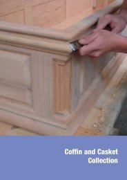
Funeralcare imagery Relevant<br />
Involving and Engaging<br />
Image guidance for specific business areas<br />
Each business has more specific reference to the<br />
type of imagery most suited to their activity.
Cropping and perspective<br />
Cropping and perspective<br />
Careful cropping and positioning can add visual<br />
interest to your chosen image. Shooting an everyday<br />
scene or object from a different perspective can also<br />
be more visually engaging.<br />
Using imagery<br />
81
82 Using imagery<br />
Illustration, when used correctly,<br />
can become an effective tool<br />
for communication. Not as literal<br />
as photography, it can talk to<br />
customers on a different level.<br />
is helping<br />
to lower CO 2 emissions and<br />
greenhouse gases.<br />
Use of illustration<br />
When photography is unsuitable or inappropriate<br />
there is a style of illustration that can be used<br />
to replace this. But how do you justify not using<br />
a photograph? Either where a photograph is<br />
inappropriate if the communication is more<br />
conceptual (i.e. representing the movement or an<br />
idea), or it can be used to illustrate diagrams and<br />
charts in a more creative manner. <strong>The</strong> four rules,<br />
however, still apply to illustration.<br />
When an illustration is to be employed it must<br />
be honest, relevant, involving and/or<br />
engaging to its audience and simple.<br />
Particular attention must be paid when using<br />
illustration for Funeralcare. For further advice and<br />
guidance contact <strong>Co</strong>-<strong>operative</strong> Brands Ltd.<br />
This treatment involves the overlaying of an image(s)<br />
and uses the core colour palette of the businesses<br />
(see colours section). <strong>The</strong> illustration is a simple,<br />
honest cut-out of the subject, or idea, being portrayed.
Business specific illustration<br />
When using illustration for one certain business<br />
only that particular business area’s colour palette<br />
(see colours section) may be used. For more<br />
details contact <strong>Co</strong>-<strong>operative</strong> Brands Ltd.<br />
pharmacist can<br />
help with your hayfever.<br />
Using imagery<br />
www.co-<strong>operative</strong>.coop<br />
83
84 Using imagery<br />
Human rights. <strong>Co</strong>rporate<br />
responsibility. Animal welfare.<br />
Genetic modification. Fair trade.<br />
Social enterprise. Global trade.<br />
Biodiversity. Harmful chemicals.<br />
<strong>The</strong> trade of arms to oppressive<br />
regimes. Responsible<br />
shareholding. Climate change has<br />
massive implications for us all,<br />
but there’s an entire spectrum of<br />
ethical issues out there that deserve<br />
our continued support.<br />
<strong>The</strong> beauty of our ethical positioning is that it is genuinely customer-led. So it will continue to<br />
reflect the views and concerns of our customers. And as they’ve shown in the past, they are<br />
an enlightened bunch, in many cases pre-empting major social changes and driving the<br />
debate so that others can get involved.<br />
To turn the cliché on its head,<br />
one word can sometimes be<br />
more powerful than a thousand<br />
images. But one statement<br />
alone can still be effective, when<br />
treated correctly.<br />
GREEN<br />
ISN’T<br />
THE ONLY<br />
ISSUE<br />
Who 11<br />
Use of type as image<br />
Using type in a more illustrative way can add impact.<br />
However some simple guidelines apply. Wherever<br />
possible, use our Helvetica Neue as the base type.<br />
While you can use scale and colour to add impact,<br />
it is preferable to keep additional graphic elements<br />
to a minimum.
Hostile<br />
to oppressive regimes<br />
Over the past 15 years we’ve declined £125<br />
million worth of lending to oppressive regimes<br />
and the companies that trade arms with them.<br />
co-<strong>operative</strong>bank.co.uk/ethics<br />
Using imagery<br />
85
86 Using imagery<br />
Value, fairness and social<br />
responsibility lie at the<br />
heart of our business.<br />
I t ’ s b e e n o u r w 18 a y 6 7 s . i n c e<br />
Security for your money,<br />
rooted in our principles.<br />
F r o m b a n k i n g t o i n s u r a n c e t o i n v e s t m e n t s , w e t a k e<br />
a responsible approach to our customers’ money.<br />
I t ’ s b e e n o u r w 18 a y 6 7 s .<br />
i n c e<br />
When photography is unsuitable<br />
or inappropriate there is a<br />
library of symbols available for<br />
limited use.<br />
Use of illustration and other graphical elements<br />
and symbols<br />
When photography is unsuitable or inappropriate for example,<br />
if a theme would be difficult to show photographically, there<br />
is a library of symbols available for limited use. It may be an<br />
instance where practicality dictates, such as a metal plaque,<br />
or in editorial use, such as icons. <strong>The</strong>se symbols are available<br />
from <strong>Co</strong>-<strong>operative</strong> Brands Ltd.
Using imagery<br />
87
88<br />
believes strongly in the power<br />
of words. Choosing the right ones, displaying<br />
them in the correct style, is vital to communicating<br />
our Brand Essence: changing business for good.<br />
In any media that is central to everything we write.<br />
<strong>The</strong> <strong>Co</strong>-<strong>operative</strong> is different, we are unique and<br />
proud enough to look and sound individual.
<strong>Co</strong>mmunicating the brand<br />
We create a clear, identifying style of our own<br />
by specifying typography that is consistent.<br />
Extensive use of Helvetica Neue Light<br />
<strong>Co</strong>ndensed gives an honest and straightforward<br />
look. We reflect that look in the manner that<br />
we talk. Our tone of voice should be real,<br />
powerful and inspiring, reassuring and<br />
supportive. Our business is about being clear<br />
and accessible, therefore we present clean and<br />
legible messages.<br />
What <strong>The</strong> <strong>Co</strong>-<strong>operative</strong> is not about are gimmicks,<br />
tricks or deception. We never use jargon. <strong>The</strong><br />
tone of our messages changes across each<br />
of the businesses, individual voices to match<br />
different products and services. But every<br />
message is laid out in one consistent style,<br />
recognisably our own and wherever possible<br />
leading with our logotype.<br />
89
90 <strong>Co</strong>mmunicating the brand<br />
<strong>Co</strong>mmunicating the brand through brand statements<br />
This is wrong:<br />
At its head office <strong>The</strong> <strong>Co</strong>-<strong>operative</strong> collects all its<br />
own waste paper and takes the waste away. <strong>The</strong>n,<br />
the paper is recycled and turned into own-brand<br />
toilet rolls. <strong>The</strong> toilet rolls are sold in our shops.<br />
This is right:<br />
recycles waste paper from our<br />
head office into own-brand toilet rolls, which are<br />
sold in our shops.
This is wrong:<br />
<strong>Co</strong>mmunicating the brand<br />
Out of principle <strong>The</strong> <strong>Co</strong>-<strong>operative</strong> would never test<br />
its own-brand Health and Beauty products to the<br />
detriment of animal welfare.<br />
This is right:<br />
does not test its own Health and<br />
Beauty products on animals.<br />
91
92 <strong>Co</strong>mmunicating the brand<br />
This is wrong: This is right:<br />
good with money<br />
<strong>The</strong> créme<br />
de la créme!<br />
Voted No.1 on the high street<br />
for customer satisfaction<br />
by BBC Watchdog 1 , <strong>The</strong> Times 2 , Which? Money 3<br />
See why - open a new Current Account Plus<br />
with linked savings<br />
Current Account Plus<br />
Call in today<br />
co-<strong>operative</strong>bank.co.uk<br />
voted number one on the<br />
high street for customer satisfaction<br />
by BBC Watchdog 1 , <strong>The</strong> Times 2 , Which? Money 3<br />
Pick of the bunch<br />
See why – open a new Current Account Plus<br />
with linked savings. Call in today or visit<br />
co-<strong>operative</strong>bank.co.uk<br />
Part of <strong>The</strong> co-<strong>operative</strong> financial services
This is wrong: This is right:<br />
Bee in your<br />
bonnet?<br />
If there’s something you think we should be doing<br />
better, please tell us. How our customers feel about<br />
what we do and how we do it is very important to us.<br />
So don’t keep it to yourself – good or bad, we’d like<br />
to hear from you.<br />
co-<strong>operative</strong>.coop/feedback<br />
Getting the message right<br />
Being certain of what it is you would like to say is<br />
a vital part of communicating. This applies when<br />
talking about our brands.<br />
Tell us what<br />
you think<br />
co-<strong>operative</strong>.coop/feedback<br />
<strong>Co</strong>mmunicating the brand<br />
likes to know what its customers<br />
feel about the things it does and how it does them.<br />
It’s very important to us.<br />
93
Masterbrand is the core visual<br />
language used, when referring to our individual<br />
businesses as a collective. <strong>The</strong> Masterbrand allows<br />
us to talk about the whole of <strong>The</strong> <strong>Co</strong>-<strong>operative</strong>,<br />
including our individual businesses, in a singular<br />
tone of voice.
Masterbrand is expressed not only by<br />
<strong>The</strong> <strong>Co</strong>-<strong>operative</strong> logo but also by the<br />
components below.<br />
Masterbrand<br />
Masterbrand components<br />
and examples.<br />
* Mandatory element<br />
1<br />
2<br />
1 Logotype*<br />
2 Strapline<br />
3 Sign-off (Print)<br />
4 Sign-off (Motion graphics)<br />
5 <strong>Co</strong>mmunication examples<br />
6 Good For Everyone Productions<br />
Masterbrand<br />
95
96 Masterbrand<br />
3<br />
<strong>The</strong> family of businesses print sign-off<br />
This sign-off has been designed as a simple visual<br />
reminder to customers of the range of our<br />
<strong>Co</strong>-<strong>operative</strong> businesses.<br />
<strong>The</strong> preferred versions of the sign-off are<br />
Masterbrand Blue on white, or white reversed out<br />
of Masterbrand Blue.<br />
Although versions are shown here using the business<br />
colours, these should be used carefully to avoid visual<br />
clutter. Further guidance on variations of the business<br />
listings can be obtained from the <strong>Co</strong>-<strong>operative</strong> Brand Ltd.
1 Logotype<br />
2 Logotype and strapline<br />
3 Sign off<br />
Masterbrand components and family of businesses sign-off<br />
Our communications generally lead in with our logotype (1) with the<br />
copy running on. You can then choose to incorporate the logotype<br />
with the strapline (2) (as example 3B overleaf), in which case ‘good for<br />
everyone’ does not have to be repeated in the sign-off panel (3).<br />
Alternatively the logotype and strapline can be incorporated into the<br />
sign-off panel (as 3A overleaf).<br />
Masterbrand<br />
97
98 Masterbrand<br />
3 A<br />
3 B<br />
family fun day<br />
Saturday 12th May,<br />
Park Lane, Newton<br />
family fun day<br />
Saturday 12th May,<br />
Park Lane, Newton<br />
A and B Sign-off for print applications<br />
www.co-<strong>operative</strong>.coop<br />
www.co-<strong>operative</strong>.coop<br />
Examples showing alternative family of<br />
businesses sign-off. (3A) incorporating<br />
the logotype and strapline into the<br />
sign-off panel. An alternative sign-off<br />
(3B) featuring the logotype and strap<br />
line in the bottom right hand corner.
4 Sign-off for animated applications i.e. online.<br />
4<br />
Masterbrand<br />
99
100<br />
5<br />
Masterbrand<br />
wind farm in Cambridgeshire<br />
(on our own farmland) generates enough power<br />
for 9,000 homes.<br />
proudly sponsors<br />
the National League.<br />
5 <strong>Co</strong>mmunication examples<br />
www.co-<strong>operative</strong>.coop<br />
www.co-<strong>operative</strong>.coop
6<br />
6 Good For Everyone Productions: an animated sequence used for accreditations.<br />
Masterbrand<br />
101
is not about making<br />
big profits for shareholders, but creating<br />
value for our members. So it’s fitting that<br />
Membership is part of our visual identity.
Membership<br />
Membership is a very important and valuable<br />
part of <strong>The</strong> <strong>Co</strong>-<strong>operative</strong>.<br />
Membership led communications are very easily<br />
identifiable – the warm yellow gives clear<br />
standout in busy environments. <strong>The</strong>ir look and<br />
feel is very clean and to the point about the<br />
benefits membership brings.<br />
103
104<br />
1<br />
Membership<br />
Membership<br />
Membership components<br />
and examples<br />
* Mandatory element<br />
° Mandatory element when points<br />
can be awarded.<br />
4 colour version logotype & bee 1 line<br />
1 Logotype*<br />
2 Window vinyls (brand messages)°<br />
3 Membership Manifesto imagery<br />
4 <strong>Co</strong>mmunication examples
2<br />
Membership<br />
105
106 Membership<br />
3 Membership Manifesto imagery
4 <strong>Co</strong>mmunication examples of imagery<br />
Owned by our members - About us<br />
2.2. Being a member<br />
Our members are the sort of people who like to<br />
know that their hard-earned cash is being used<br />
honestly and that a percentage of it goes back<br />
into our communities. <strong>The</strong>y tell us what is<br />
important to them, and then we listen and act<br />
on it. That’s how we provide customers with what<br />
they really want from our businesses and help<br />
local communities to help themselves.<br />
Anyone can become a member as long as they<br />
believe in what we stand for and shop with at<br />
least one of our businesses. All you have to do<br />
is invest £1, which we’ll collect from your first<br />
share of the profits (as a member we will send<br />
you a share of the profits twice a year dependent<br />
on how much you have spent with our<br />
family of businesses).<br />
You can save money with many of our special<br />
offers and have access to the members’ website,<br />
where there are plenty of ways to get involved,<br />
from helping your community to helping to<br />
change the world.<br />
Take our ‘Are you<br />
<strong>Co</strong>-<strong>operative</strong>?’ test at<br />
www.co-<strong>operative</strong>.co.uk<br />
/test to see if you’re<br />
a potential member.<br />
Traditionally, member meetings have been<br />
limited by where they take place. Fortunately,<br />
the internet has made it easier for you to<br />
share your concerns and opinions with other<br />
members from all over the UK. Our members’<br />
website has a number of features to help you<br />
share your views and concerns. You can:<br />
• post comments and opinions<br />
throughout the site<br />
• suggest and take part in online<br />
discussions<br />
• rate our products<br />
• vote in our opinion polls<br />
Log onto www.co-<strong>operative</strong>.co.uk to take part.<br />
Membership<br />
Owned by our members - About us<br />
107
108<br />
Membership<br />
Membership communications<br />
showcasing the specific branding.<br />
4 <strong>Co</strong>mmunication examples<br />
We’ve paid out £38m<br />
to our members.<br />
Did you cash in?<br />
Join us at www.co-<strong>operative</strong>.coop
4 <strong>Co</strong>mmunication examples<br />
membership is organising a free one day<br />
interactive workshop focusing on citizenship issues for<br />
4 colour version logotype & bee 1 line<br />
children and young people.<br />
Sustainability, anti-bullying,<br />
financial literacy. Let’s tackle<br />
it together.<br />
Join us for a free one day conference<br />
focusing on citizenship issues.<br />
Interactive workshops will explore the themes<br />
of sustainability, anti-bullying strategies and<br />
financial literacy.<br />
All workshops are suitable for anyone working<br />
with children or young people.<br />
22 November<br />
Renaissance Hotel<br />
Derby/Nottingham,<br />
Carter Lane East,<br />
South Normanton,<br />
Derbyshire.<br />
For further details please contact the membership team on:<br />
Call 01908 361500 Email membership.central&eastern@co-op.co.uk Web www.co-<strong>operative</strong>.co.uk/membership<br />
Membership<br />
109
. By carefully<br />
working with our visual identity, and following<br />
the rules in this book it should be rewarding for<br />
everyone. <strong>The</strong>re is enough flexibility built into<br />
our brand to let each business express its own<br />
personality, whilst also being part of a family, who<br />
share the same goals and aspirations.
In the following pages you’ll see some examples<br />
of good brand communications. <strong>The</strong>y illustrate<br />
how the visual identity works across five of the<br />
businesses, placing the look in-store across<br />
a wide range of applications.<br />
<strong>The</strong>se examples show how distinctive our brand<br />
appears when managed properly. <strong>The</strong>y are<br />
also here to instil the scope that is available,<br />
to encourage creativity within the guidelines.<br />
Fully detailed in-depth guidelines for each of<br />
the businesses are available from <strong>Co</strong>-<strong>operative</strong><br />
Brands Ltd. brand@co-<strong>operative</strong>.coop<br />
Business examples<br />
logotype<br />
<strong>The</strong> <strong>Co</strong>-<strong>operative</strong> logotype must not be altered<br />
in any way or used in any application contrary<br />
to the visual identity guidelines.<br />
Businesses must ensure that:<br />
1 <strong>The</strong> appropriate business fascia and projecting<br />
signage is installed according to the<br />
specifications provided by <strong>Co</strong>-<strong>operative</strong><br />
Brands Ltd.<br />
2 <strong>The</strong> exterior of all businesses must actively<br />
demonstrate the brand components through<br />
the use of brand messages, based on the<br />
recommendations in the visual identity guidelines.<br />
3 Society identification is provided in an appropriate<br />
style based on the recommendations in the<br />
visual identity guidelines.<br />
4 Any internal or external use of <strong>The</strong> <strong>Co</strong>-<strong>operative</strong><br />
logotype must be based on the recommendations<br />
in the visual identity guidelines, or following<br />
agreement with <strong>Co</strong>-<strong>operative</strong> Brands Ltd.<br />
111
112 Business examples<br />
Fully detailed in-depth guidelines for each of the businesses are<br />
available from <strong>Co</strong>-<strong>operative</strong> Brands Ltd. brand@co-<strong>operative</strong>.coop
Fully detailed in-depth guidelines for each of the businesses are<br />
available from <strong>Co</strong>-<strong>operative</strong> Brands Ltd. brand@co-<strong>operative</strong>.coop<br />
Business examples<br />
113
114 Business examples<br />
Fully detailed in-depth guidelines for each of the businesses are<br />
available from <strong>Co</strong>-<strong>operative</strong> Brands Ltd. brand@co-<strong>operative</strong>.coop
Business examples<br />
Fully detailed in-depth guidelines for each of the businesses are<br />
available from <strong>Co</strong>-<strong>operative</strong> Brands Ltd. brand@co-<strong>operative</strong>.coop<br />
115
116 Business examples<br />
Fully detailed in-depth guidelines for each of the businesses are<br />
available from <strong>Co</strong>-<strong>operative</strong> Brands Ltd. brand@co-<strong>operative</strong>.coop
Fully detailed in-depth guidelines for each of the businesses are<br />
available from <strong>Co</strong>-<strong>operative</strong> Brands Ltd. brand@co-<strong>operative</strong>.coop<br />
Business examples<br />
117
and has to be consistently<br />
applied to everything we produce and stationery<br />
is no different, there is a format that works across<br />
all businesses.
<strong>The</strong> stationery designs enable individual<br />
businesses and societies to communicate in a<br />
consistent manner. <strong>The</strong>y are based on a visual<br />
architecture that gives due prominence to the<br />
various components on every stationery item.<br />
Templates are available from <strong>Co</strong>-<strong>operative</strong><br />
Brands Ltd. brand@co-<strong>operative</strong>.coop<br />
Stationery<br />
119
120 Stationery<br />
1<br />
<strong>The</strong> <strong>Co</strong>-<strong>operative</strong> Group<br />
1st Floor<br />
234 Defacto House<br />
Est Lefto<br />
Sapien Aliquent<br />
XX1 2YY<br />
Telephone: Telephone:01234 01234 567 890<br />
Facsimile: Facsimile:01234 01234 567 890<br />
www.loremipsum.co.uk<br />
1 General layout<br />
Society name/trading name/<br />
independent body is set<br />
in 14pt Helvetica Neue Light<br />
<strong>Co</strong>ndensed on a 15pt linefeed.<br />
Ranged left 25mm from the<br />
edge of the letterhead. On an x<br />
height of 7.5mm. Prints 100%<br />
black. Department/region is set<br />
in 14pt Helvetica Neue Light<br />
<strong>Co</strong>ndensed on a 15pt linefeed.<br />
Ranged left 25mm from the<br />
edge of the letterhead. On an<br />
x height of 7.5mm. Prints 40%<br />
black. Address details are set<br />
in 9pt Helvetica Neue Light<br />
<strong>Co</strong>ndensed on a 10pt linefeed.<br />
Ranged left 25mm from the<br />
edge of the letterhead, on a cap<br />
height of 14.5mm.<br />
2 Independent body/<br />
trading name is set in 14pt<br />
Helvetica Neue Light<br />
<strong>Co</strong>ndensed on a 15pt linefeed.<br />
Ranged left 25mm from the<br />
edge of the letterhead.<br />
On an x height of 7.5mm.<br />
Prints 40% black.<br />
3 Department/region<br />
is set in 14pt Helvetica Neue<br />
Light <strong>Co</strong>ndensed on a 15pt<br />
linefeed. Prints 40% black.<br />
4 Subsidiary<br />
Society accreditation is set<br />
in 14pt Helvetica Neue Light<br />
<strong>Co</strong>ndensed on a 15pt linefeed.<br />
Ranged left 25mm from the<br />
edge of the letterhead. On an x<br />
height of 7.5mm or a cap height<br />
of 13mm if appearing beneath<br />
a name. Prints 100% black.
2<br />
<strong>The</strong> Southern <strong>Co</strong>-<strong>operative</strong><br />
1st Floor<br />
234 Defacto House<br />
Est Lefto<br />
Sapien Aliquent<br />
XX1 2YY<br />
<strong>Co</strong>-<strong>operative</strong>s UK<br />
1st Floor<br />
234 Defacto House<br />
Est Lefto<br />
Sapien Aliquent<br />
XX1 2YY<br />
Telephone: 01234 567 890<br />
Facsimile: 01234 567 890<br />
www.loremipsum.co.uk<br />
<strong>The</strong> Southern <strong>Co</strong>-<strong>operative</strong> Marketing<br />
1st Floor<br />
234 Defacto House<br />
Est Lefto<br />
Sapien Aliquent<br />
XX1 2YY<br />
<strong>The</strong> Scottish <strong>Co</strong>-<strong>operative</strong><br />
Part of <strong>The</strong> <strong>Co</strong>-<strong>operative</strong> Group<br />
1st Floor<br />
234 Defacto House<br />
Est Lefto<br />
Sapien Aliquent<br />
XX1 2YY<br />
Telephone:01234 567 890<br />
Facsimile:01234 567 890<br />
www.loremipsum.co.uk<br />
Telephone:01234 567 890<br />
Facsimile:01234 567 890<br />
www.loremipsum.co.uk<br />
Telephone: 01234 567 890<br />
Facsimile:01234 567 890<br />
www.loremipsum.co.uk<br />
Registered Office:Any Name Ltd, Any Street,Any Town, XX1 2YY Reg No.12345 Registered in Any <strong>Co</strong>untry.<br />
Printed on 100% recycled paper from post consumer waste using a totally chlorine-free process 1st Floor<br />
234 Defacto House<br />
Est Lefto<br />
Sapien Aliquent<br />
XX1 2YY<br />
3<br />
2 <strong>The</strong> <strong>Co</strong>-<strong>operative</strong> Group Human Resources 3<br />
1st Floor<br />
234 Defacto House<br />
Est Lefto<br />
Sapien Aliquent<br />
XX1 2YY<br />
<strong>Co</strong>-<strong>operative</strong>s UK<br />
1st Floor<br />
234 Defacto House<br />
Est Lefto<br />
Sapien Aliquent<br />
XX1 2YY<br />
Telephone:01234 567 890<br />
Facsimile: 01234 567 890<br />
www.loremipsum.co.uk<br />
4 Sunwin Services Group<br />
Part of the <strong>Co</strong>-<strong>operative</strong> Group<br />
1st Floor<br />
234 Defacto House<br />
Est Lefto<br />
Sapien Aliquent<br />
XX1 2YY<br />
Telephone:01234 567 890<br />
Facsimile:01234 567 890<br />
www.loremipsum.co.uk<br />
<strong>The</strong> Southern <strong>Co</strong>-<strong>operative</strong> Marketing<br />
Telephone:01234 567 890<br />
Facsimile:01234 567 890<br />
www.loremipsum.co.uk<br />
Telephone: 01234 567 890<br />
Facsimile:01234 567 890<br />
www.loremipsum.co.uk<br />
<strong>The</strong> <strong>Co</strong>-<strong>operative</strong> Group Human Resources<br />
1st Floor<br />
234 Defacto House<br />
Est Lefto<br />
Sapien Aliquent<br />
XX1 2YY<br />
<strong>Co</strong>-<strong>operative</strong>s UK<br />
1st Floor<br />
234 Defacto House<br />
Est Lefto<br />
Sapien Aliquent<br />
XX1 2YY<br />
Telephone:01234 567 890<br />
Facsimile: 01234 567 890<br />
www.loremipsum.co.uk<br />
<strong>The</strong> Southern <strong>Co</strong>-<strong>operative</strong> Marketing<br />
1st Floor<br />
234 Defacto House<br />
Est Lefto<br />
Sapien Aliquent<br />
XX1 2YY<br />
<strong>The</strong> Scottish <strong>Co</strong>-<strong>operative</strong><br />
Part of <strong>The</strong> <strong>Co</strong>-<strong>operative</strong> Group<br />
1st Floor<br />
234 Defacto House<br />
Est Lefto<br />
Sapien Aliquent<br />
XX1 2YY<br />
Telephone:01234 567 890<br />
Facsimile:01234 567 890<br />
www.loremipsum.co.uk<br />
Telephone:01234 567 890<br />
Facsimile:01234 567 890<br />
www.loremipsum.co.uk<br />
Telephone: 01234 567 890<br />
Facsimile:01234 567 890<br />
www.loremipsum.co.uk<br />
Stationery<br />
121
122 Stationery<br />
1<br />
Part of <strong>The</strong> <strong>Co</strong>-<strong>operative</strong> Group<br />
1st Floor<br />
234 Defacto House<br />
Est Lefto<br />
Sapien Aliquent<br />
XX1 2YY<br />
Telephone: 01234 567 890<br />
Facsimile: 01234 567 890<br />
www.loremipsum.co.uk<br />
1 General Layout<br />
<strong>The</strong> Business Descriptor<br />
logotype measures 57mm<br />
in length and is positioned<br />
145.5mm from the edge of<br />
the letterhead. On an x height<br />
of 7.5mm. <strong>The</strong> <strong>Co</strong>-<strong>operative</strong><br />
Group Endorsement is set<br />
in 9pt Helvetica Neue Light<br />
<strong>Co</strong>ndensed. Ranged left 25mm<br />
from the edge of the letterhead.<br />
On an x height of 7.5mm<br />
or a cap height of 13mm if<br />
appearing beneath a name.<br />
Prints 100% black.<br />
2 Independent body/<br />
trading name is set in 14pt<br />
Helvetica Neue Light<br />
<strong>Co</strong>ndensed on a 15pt linefeed.<br />
Ranged left 25mm from the<br />
edge of the letterhead.<br />
On an x height of 7.5mm.<br />
Prints 40% black.<br />
3 Department/region<br />
is set in 14pt Helvetica Neue<br />
Light <strong>Co</strong>ndensed on a 15pt<br />
linefeed. Prints 40% black.<br />
4 Society accreditation<br />
Society accreditation is set<br />
in 14pt Helvetica Neue Light<br />
<strong>Co</strong>ndensed on a 15pt linefeed.<br />
Ranged left 25mm from the<br />
edge of the letterhead. On an x<br />
height of 7.5mm or a cap height<br />
of 13mm if appearing beneath<br />
a name. Prints 100% black.
2<br />
Part of <strong>The</strong> <strong>Co</strong>-<strong>operative</strong> Group<br />
1st Floor<br />
234 Defacto House<br />
Est Lefto<br />
Sapien Aliquent<br />
XX1 2YY<br />
Telephone: 01234 567 890<br />
Facsimile: 01234 567 890<br />
www.loremipsum.co.uk<br />
<strong>The</strong> <strong>Co</strong>-<strong>operative</strong> Retail Trading Group<br />
1st Floor<br />
234 Defacto House<br />
Est Lefto<br />
Sapien Aliquent<br />
XX1 2YY<br />
<strong>The</strong> <strong>Co</strong>-<strong>operative</strong> Retail Trading Group Northern Region<br />
1st Floor<br />
234 Defacto House<br />
Est Lefto<br />
Sapien Aliquent<br />
XX1 2YY<br />
<strong>The</strong> Scottish <strong>Co</strong>-<strong>operative</strong><br />
Part of <strong>The</strong> <strong>Co</strong>-<strong>operative</strong> Group<br />
1st Floor<br />
234 Defacto House<br />
Est Lefto<br />
Sapien Aliquent<br />
XX1 2YY<br />
3<br />
Telephone: 01234 567 890<br />
Facsimile: 01234 567 890<br />
www.loremipsum.co.uk<br />
Range Development<br />
Part of <strong>The</strong> <strong>Co</strong>-<strong>operative</strong> Group<br />
1st Floor<br />
234 Defacto House<br />
Est Lefto<br />
Sapien Aliquent<br />
XX1 2YY<br />
Telephone: 01234 567 890<br />
Facsimile: 01234 567 890<br />
www.loremipsum.co.uk<br />
Telephone: 01234 567 890<br />
Facsimile: 01234 567 890<br />
www.loremipsum.co.uk<br />
Telephone: 01234 567 890<br />
Facsimile: 01234 567 890<br />
www.loremipsum.co.uk<br />
<strong>The</strong> <strong>Co</strong>-<strong>operative</strong> Retail Trading Group<br />
1st Floor<br />
234 Defacto House<br />
Est Lefto<br />
Sapien Aliquent<br />
XX1 2YY<br />
<strong>The</strong> <strong>Co</strong>-<strong>operative</strong> Retail Trading Group Northern Region<br />
1st Floor<br />
234 Defacto House<br />
Est Lefto<br />
Sapien Aliquent<br />
XX1 2YY<br />
<strong>The</strong> Scottish <strong>Co</strong>-<strong>operative</strong><br />
Part of <strong>The</strong> <strong>Co</strong>-<strong>operative</strong> Group<br />
1st Floor<br />
234 Defacto House<br />
Range Development<br />
Part of <strong>The</strong> <strong>Co</strong>-<strong>operative</strong> Group<br />
1st Floor<br />
234 Defacto House<br />
Est Lefto<br />
Sapien Aliquent<br />
XX1 2YY<br />
Telephone: 01234 567 890<br />
Facsimile: 01234 567 890<br />
www.loremipsum.co.uk<br />
Telephone: 01234 567 890<br />
Facsimile: 01234 567 890<br />
www.loremipsum.co.uk<br />
Telephone: 01234 567 890<br />
Facsimile: 01234 567 890<br />
Telephone: 01234 567 890<br />
Facsimile: 01234 567 890<br />
www.loremipsum.co.uk<br />
<strong>The</strong> <strong>Co</strong>-<strong>operative</strong> Retail Trading Group<br />
1st Floor<br />
234 Defacto House<br />
Est Lefto<br />
Sapien Aliquent<br />
XX1 2YY<br />
<strong>The</strong> <strong>Co</strong>-<strong>operative</strong> Retail Trading Group Northern Region<br />
1st Floor<br />
234 Defacto House<br />
Est Lefto<br />
Sapien Aliquent<br />
XX1 2YY<br />
<strong>The</strong> Scottish <strong>Co</strong>-<strong>operative</strong><br />
Part of <strong>The</strong> <strong>Co</strong>-<strong>operative</strong> Group<br />
1st Floor<br />
234 Defacto House<br />
Est Lefto<br />
Sapien Aliquent<br />
XX1 2YY<br />
Telephone: 01234 567 890<br />
Facsimile: 01234 567 890<br />
www.loremipsum.co.uk<br />
Telephone: 01234 567 890<br />
Facsimile: 01234 567 890<br />
www.loremipsum.co.uk<br />
4 <strong>The</strong> Range Southern Development <strong>Co</strong>-<strong>operative</strong><br />
Part of <strong>The</strong> <strong>Co</strong>-<strong>operative</strong> Group<br />
1st Floor<br />
234 Defacto House<br />
Est Lefto<br />
Sapien Aliquent<br />
XX1 2YY<br />
Telephone: 01234 567 890<br />
Facsimile: 01234 567 890<br />
www.loremipsum.co.uk<br />
3<br />
Telephone: 01234 567 890<br />
Facsimile: 01234 567 890<br />
www.loremipsum.co.uk<br />
<strong>The</strong> <strong>Co</strong>-<strong>operative</strong> Retail Trading Group<br />
1st Floor<br />
234 Defacto House<br />
Est Lefto<br />
Sapien Aliquent<br />
XX1 2YY<br />
Telephone: 01234 567 890<br />
Facsimile: 01234 567 890<br />
www.loremipsum.co.uk<br />
Stationery<br />
123
Where it is important to identify a <strong>Co</strong>-<strong>operative</strong><br />
society we have a series of society accreditation<br />
solutions to help.
Society accreditations<br />
<strong>The</strong> design adopted for retail fascias (example A overleaf),<br />
irrespective of business, features just three elements: the<br />
Masterbrand, the business descriptor and the business colour.<br />
No other elements are allowed to appear within the fascias<br />
without the approval of <strong>Co</strong>-<strong>operative</strong> Brands Ltd.<br />
It is recognised that society accreditation is important. <strong>The</strong>refore,<br />
to enable individual societies to identify their ownership<br />
of a business, there are solutions to society accreditation in place.<br />
For more information please contact <strong>Co</strong>-<strong>operative</strong> Brands Ltd.<br />
125
126 Society accreditations<br />
Example A<br />
Society accreditation above the door<br />
Example B<br />
Society accreditation inside the door
Example C<br />
Society accreditation in a glass panel<br />
Example D<br />
Society accreditation on the building<br />
Society accreditations<br />
127
128 Society accreditations<br />
<strong>The</strong> Midcounties <strong>Co</strong>-<strong>operative</strong><br />
provides all of your five a day foods.<br />
Window vinyls<br />
As an alternative to the door menu, or in addition<br />
to, societies can delegate one of their window<br />
vinyls to a society-specific message featuring their<br />
name. This could also be done on exterior<br />
display panels. For more information contact<br />
<strong>Co</strong>-<strong>operative</strong> Brands Ltd.
Society accreditations<br />
129
130<br />
Society accreditations<br />
What do we ask of a Society?<br />
Use this guide as a blueprint. It’s here to help implement our<br />
brand, consistently, across your business.<br />
Being accurate in the detailing is essential. Practical advice<br />
is readily available from <strong>Co</strong>-<strong>operative</strong> Brands Ltd. If you are using<br />
the <strong>Co</strong>re Elements regularly, check that this guide has not been<br />
updated by <strong>Co</strong>-<strong>operative</strong> Brands Ltd.<br />
Remember the licence agreement. It says that the <strong>Co</strong>re Elements<br />
must be implemented as published.<br />
Here are some points that describe the mandatory content within<br />
the licence agreement.
logotype<br />
<strong>The</strong> <strong>Co</strong>-<strong>operative</strong> logotype must not be altered in any way or<br />
used in any application contrary to the visual identity guidelines.<br />
Societies must ensure that:<br />
1 <strong>The</strong> appropriate business fascia and projecting signage<br />
is installed according to the specifications provided by<br />
<strong>Co</strong>-<strong>operative</strong> Brands Ltd.<br />
2 <strong>The</strong> exterior of all businesses must actively demonstrate the<br />
brand components through the use of brand messages,<br />
based on the recommendations in the visual identity guidelines.<br />
3 Society identification is provided in an appropriate style based<br />
on the recommendations in the visual identity guidelines.<br />
4 Any internal or external use of <strong>The</strong> <strong>Co</strong>-<strong>operative</strong> logotype must<br />
be based on the recommendations in the visual identity<br />
guidelines, or following agreement with <strong>Co</strong>-<strong>operative</strong> Brands Ltd.<br />
Society accreditations<br />
131
.<br />
Thank you for taking time to understand our <strong>Visual</strong><br />
<strong>Identity</strong> <strong>Standards</strong>. We hope you now have the<br />
brand knowledge you need, but there is always help<br />
if you’re unsure from <strong>Co</strong>-<strong>operative</strong> Brands Ltd.<br />
brand@co-<strong>operative</strong>.coop
<strong>Co</strong>ntact 133
134 Notes
Notes<br />
135
This brochure is printed on Revive 100, which is produced from 100% recovered fibre.<br />
<strong>The</strong> paper is produced at a mill that has been awarded the ISOI400I certificate for environmental management.<br />
This brochure is 100% recyclable and biodegradable. Printed by an FSC certified printer using vegetable based inks.