Stanford 10 Longitudinal Data Analysis Tutorial.pdf - Alex
Stanford 10 Longitudinal Data Analysis Tutorial.pdf - Alex
Stanford 10 Longitudinal Data Analysis Tutorial.pdf - Alex

Create successful ePaper yourself
Turn your PDF publications into a flip-book with our unique Google optimized e-Paper software.
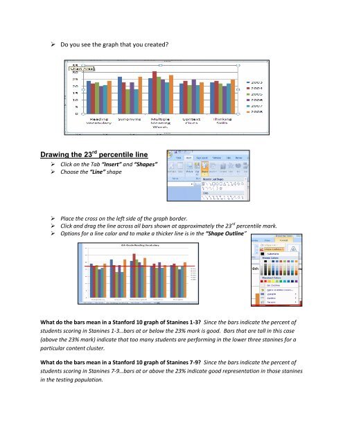
Do you see the graph that you created?<br />
Drawing the 23 rd percentile line<br />
Click on the Tab “Insert” and “Shapes”<br />
Choose the “Line” shape<br />
Place the cross on the left side of the graph border.<br />
Click and drag the line across all bars shown at approximately the 23 rd percentile mark.<br />
Options for a line color and to make a thicker line is in the “Shape Outline”<br />
What do the bars mean in a <strong>Stanford</strong> <strong>10</strong> graph of Stanines 1-3? Since the bars indicate the percent of<br />
students scoring in Stanines 1-3…bars at or below the 23% mark is good. Bars that are tall in this case<br />
(above the 23% mark) indicate that too many students are performing in the lower three stanines for a<br />
particular content cluster.<br />
What do the bars mean in a <strong>Stanford</strong> <strong>10</strong> graph of Stanines 7-9? Since the bars indicate the percent of<br />
students scoring in Stanines 7-9…bars at or above the 23% indicate good representation in those stanines<br />
in the testing population.