Chapter 10 Working with Graphs and Charts - dFPUG-Portal
Chapter 10 Working with Graphs and Charts - dFPUG-Portal
Chapter 10 Working with Graphs and Charts - dFPUG-Portal

You also want an ePaper? Increase the reach of your titles
YUMPU automatically turns print PDFs into web optimized ePapers that Google loves.
<strong>Chapter</strong> <strong>10</strong>: <strong>Working</strong> <strong>with</strong> <strong>Graphs</strong> <strong>and</strong> <strong>Charts</strong> 163<br />
<strong>Chapter</strong> <strong>10</strong><br />
<strong>Working</strong> <strong>with</strong> <strong>Graphs</strong> <strong>and</strong> <strong>Charts</strong><br />
Most people underst<strong>and</strong> information better when presented as a graph or chart than<br />
when they look at the raw data. Calc has the ability to graph data in a variety of ways <strong>and</strong><br />
offers a wizard-type interface to guide you.<br />
For some reason, spreadsheet programs tend to use the term “chart” for what most people call<br />
a “graph,” a pictorial representation of data. This chapter uses the two terms interchangeably.<br />
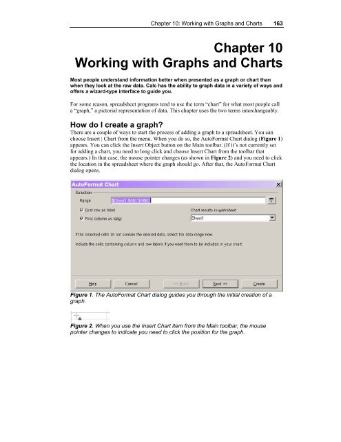
How do I create a graph?<br />
There are a couple of ways to start the process of adding a graph to a spreadsheet. You can<br />
choose Insert | Chart from the menu. When you do so, the AutoFormat Chart dialog (Figure 1)<br />
appears. You can click the Insert Object button on the Main toolbar. (If it’s not currently set<br />
for adding a chart, you need to long click <strong>and</strong> choose Insert Chart from the toolbar that<br />
appears.) In that case, the mouse pointer changes (as shown in Figure 2) <strong>and</strong> you need to click<br />
the location in the spreadsheet where the graph should go. After that, the AutoFormat Chart<br />
dialog opens.<br />
Figure 1. The AutoFormat Chart dialog guides you through the initial creation of a<br />
graph.<br />
Figure 2. When you use the Insert Chart item from the Main toolbar, the mouse<br />
pointer changes to indicate you need to click the position for the graph.
164 OOo Switch: 501 Things You Wanted to Know<br />
If data is highlighted when you begin graphing, Calc assumes that’s the data to graph (the<br />
data range). If no cells are selected when you begin graphing, Calc makes an intelligent guess<br />
as to what constitutes the data to be graphed. You can override Calc’s assumption in either<br />
case by typing a range into the dialog, or by pointing to the right range. (As in other dialogs,<br />
use the Shrink button to get the dialog out of the way.) By default, each selected column<br />
constitutes a data series in the graph.<br />
The two check boxes in Figure 1 indicate whether the first row <strong>and</strong> first column of the<br />
data being graphed contain labels for use in the graph <strong>and</strong> the legend. Again, Calc makes a<br />
pretty good guess based on what it finds.<br />
The drop-down list lets you specify the destination for the graph. You can put it on any<br />
existing sheet of the workbook, or create a new sheet. The graph is placed at the cursor<br />
position on the specified sheet. A graph is a free-floating object, so you can move it on the<br />
worksheet once it’s created.<br />
Once the settings for data, labels, <strong>and</strong> destination are correct, click Next to go to the next<br />
page (Figure 3), where you specify the type of graph to create. See “What kinds of graphs can<br />
I create?” later in this chapter for specifics. On this page <strong>and</strong> all subsequent pages of this<br />
dialog, you can indicate whether the data you want to graph is in columns or rows.<br />
Figure 3. The second page of the AutoFormat Chart dialog lets you choose the type<br />
of graph to create.<br />
The diagram on the left shows a preview of the graph. As you change the type of graph,<br />
the diagram changes. Select the check box to include legends <strong>and</strong> labels in the preview. Note<br />
that when you do so, the preview won’t necessarily show all data items. For performance<br />
reasons, the number of data items shown is limited.<br />
When you’re happy <strong>with</strong> your choices on this page, click Next to move to the third page<br />
(Figure 4) where you choose from among variants for the chosen graph type. Depending on<br />
the type of graph chosen, you may also be able to indicate whether to include grid lines for the<br />
X, Y, <strong>and</strong>/or Z axis.
<strong>Chapter</strong> <strong>10</strong>: <strong>Working</strong> <strong>with</strong> <strong>Graphs</strong> <strong>and</strong> <strong>Charts</strong> 165<br />
Figure 4. Once you select a graph type, you can specify details for the type of graph.<br />
Again, click Next when you have the choices you want on this page.<br />
The final page of the dialog (Figure 5) lets you specify various titles <strong>and</strong> indicate whether<br />
the graph has a legend, an area that maps colors to the information they represent. You get one<br />
last chance to switch between columns <strong>and</strong> rows for your data, as well.<br />
Figure 5. The fourth page of the dialog deals principally <strong>with</strong> the textual components<br />
of the graph, titles <strong>and</strong> legends.<br />
When all the settings are as you want them, click Create to generate the graph. Figure 6<br />
shows some of the data being graphed, while Figure 7 shows the graph created in the previous<br />
figures. As you can see, this graph needs some work before it’s really usable. (Actually, the<br />
choice of stacked bars for this particular data makes the graph fairly meaningless.)
166 OOo Switch: 501 Things You Wanted to Know<br />
Figure 6. When this data is graphed in a stacked bar chart (which isn’t really<br />
meaningful in this case), the state names in column A become labels on the X axis<br />
<strong>and</strong> the titles in Row 1 are used in the legend.<br />
Figure 6. The first attempt at a graph may need some tweaking.<br />
Fortunately, you’re not stuck <strong>with</strong> the graph as you originally build it. You have<br />
considerable flexibility in modifying a graph to get just what you want. See “How do I change<br />
a graph?” later in this chapter for details.
<strong>Chapter</strong> <strong>10</strong>: <strong>Working</strong> <strong>with</strong> <strong>Graphs</strong> <strong>and</strong> <strong>Charts</strong> 167<br />
What kinds of graphs can I make?<br />
Although Calc offers fewer types of graphs than Microsoft Excel, there’s still quite a variety.<br />
The list contains both two-dimensional <strong>and</strong> three-dimensional options. Almost every type of<br />
chart has several variants. Table 1 lists the chart types <strong>and</strong> their variants.<br />
Table 1. Calc’s graphing engine includes a wide variety of graph types.<br />
Graph<br />
type<br />
Lines<br />
Areas<br />
Columns<br />
Bars<br />
Pies<br />
XY chart<br />
Net<br />
Stock<br />
chart<br />
3D Lines<br />
3D Areas<br />
3D Bars<br />
3D<br />
columns<br />
Description Variants<br />
Uses a different-colored line or<br />
curve for each data series.<br />
Uses an independent line for<br />
each data series, filling the area<br />
under the line <strong>with</strong> color.<br />
Creates a vertical bar chart using<br />
a different-colored set of bars for<br />
each data series.<br />
Creates a horizontal bar chart<br />
using a different-colored set of<br />
bars for each data series.<br />
Creates a pie chart. Most variants<br />
can only use one data series.<br />
Plots one data series against<br />
another.<br />
Circular graph <strong>with</strong> a separate Y<br />
axis for each item on the X axis.<br />
Points <strong>with</strong>in a data series are<br />
connected to form a polygon.<br />
Shows change from one data<br />
series to the next for each X<br />
value.<br />
Shows each data series as a<br />
different-colored 3D surface.<br />
Shows each data series as a<br />
different-colored solid<br />
Creates a 3D horizontal bar chart<br />
<strong>with</strong> different-colored bars for<br />
each data series.<br />
Creates a 3D vertical bar chart<br />
<strong>with</strong> different-colored bars for<br />
each data series.<br />
Normal, Stacked, Percent, Symbols, Stacked <strong>with</strong><br />
symbols, Percent <strong>with</strong> symbols, Cubic Spline. Cubic<br />
Spline <strong>with</strong> symbols, B-Spline, B-Spline <strong>with</strong> symbols<br />
Normal, Stacked, Percent<br />
Normal, Stacked, Percent, Lines <strong>and</strong> columns, Lines <strong>and</strong><br />
stacked columns<br />
Normal, Stacked, Percent<br />
Normal, Rings, Offset (two variations)<br />
Symbols only, Lines <strong>with</strong> symbols, Lines only, Cubic<br />
Spline, Cubic Spline <strong>with</strong> symbols, B-Spline, B-Spline <strong>with</strong><br />
symbols<br />
Normal, Stacked, Percent, Symbols, Stacked <strong>with</strong><br />
symbols, Percent <strong>with</strong> symbols<br />
Four variations using different graphical representations<br />
of the change.<br />
Deep<br />
Stacked, Percent, Deep<br />
Normal, Stacked, Percent, Deep, Tubes, Tubes stacked,<br />
Tubes percent, Tubes deep, Horizontal pyramids,<br />
Horizontal pyramids stacked, Horizontal pyramids<br />
percent, Horizontal pyramids deep, Horizontal cones,<br />
Horizontal cones stacked, Horizontal cones percent,<br />
Horizontal cones deep<br />
The best way to get a h<strong>and</strong>le on what the various types of graphs do is to take a simple<br />
data set <strong>with</strong> a couple of data series <strong>and</strong> run through the options.
168 OOo Switch: 501 Things You Wanted to Know<br />
How do I change a graph?<br />
Once you create a graph, you can change almost anything about it from its position on the<br />
spreadsheet to its type to the data it’s based on. In many cases, the hardest part is getting<br />
access to what you want to change.<br />
When you click a graph, the entire graph is selected as an object. Green sizing h<strong>and</strong>les<br />
appear at the four corners <strong>and</strong> in the middle of each side. The shortcut menu for the selected<br />
graph contains items related to the size <strong>and</strong> position of the graph. With one exception<br />
(discussed later in this chapter), none of the shortcut menu items reflect the content of the<br />
graph. The Drawing Object toolbar replaces the Spreadsheet Object toolbar. The remainder of<br />
this chapter refers to this single click action as “selecting the graph.”<br />
Double-click a graph to get “inside” so you can work <strong>with</strong> the content. When you doubleclick,<br />
a gray border appears (as in Figure 7) to indicate you’re editing the graph. The shortcut<br />
menu includes a variety of items for changing the content of the graph, such as the labels on<br />
the axes <strong>and</strong> the legend. The Main toolbar changes to include a variety of options<br />
for editing the graph. The rest of this chapter refers to this double-click action as “editing<br />
the graph.”<br />
Figure 7. When you double-click a graph, a gray border appears <strong>and</strong> you can edit the<br />
components of the graph.<br />
Once the gray border displays, you can click various components of the graph, such as the<br />
legend, the axes, or the actual graphed data (the “chart wall”) to select that component. The<br />
shortcut menu includes items for modifying that component. This action is called “selecting<br />
the ” in the following discussion, where “” refers to a particular<br />
component of the graph.
<strong>Chapter</strong> <strong>10</strong>: <strong>Working</strong> <strong>with</strong> <strong>Graphs</strong> <strong>and</strong> <strong>Charts</strong> 169<br />
You can also double-click textual components (such as titles) once you’re editing the<br />
graph. This enables direct editing of the contents rather than the appearance of the component.<br />
The following discussion refers to this action as “editing the .”<br />
Once you select or edit a component of the graph, you can’t return directly to editing the<br />
graph as a whole. When you click elsewhere <strong>with</strong>in the graph, the graph as a whole is selected<br />
(although the gray border persists indicating editing mode). You need to click outside the<br />
graph area <strong>and</strong> double-click the graph again to return to editing the graph.<br />
To stop editing a graph or its components, click outside the graph area in the spreadsheet.<br />
The following sections describe the various techniques for changing the components of<br />
a graph.<br />
How do I move a graph?<br />
To move a graph <strong>with</strong>in the worksheet, select it <strong>and</strong> drag it to the new location. You can also<br />
move a graph by selecting it, cutting it, <strong>and</strong> then pasting it at the new location. Finally, you can<br />
move a graph by selecting it <strong>and</strong> choosing Position <strong>and</strong> Size from the shortcut menu or Format<br />
| Position <strong>and</strong> Size from the menu. On the Position tab, specify the X <strong>and</strong> Y coordinates where<br />
the upper left corner of the graph is placed.<br />
How do I change the size of a graph?<br />
To resize a graph, select it <strong>and</strong> put the mouse over one of the green sizing h<strong>and</strong>les. Click <strong>and</strong><br />
drag to the new size. Alternatively, the Position tab of the Position <strong>and</strong> Size dialog (Format |<br />
Position <strong>and</strong> Size from the menu or Position <strong>and</strong> Size from the shortcut menu), lets you<br />
specify the exact size you want.<br />
How do I change the type of graph?<br />
Double-click to edit the graph. Next, choose Format | Chart Type from the menu, Chart Type<br />
from the shortcut menu, or Edit Chart Type from the Main toolbar. The Chart Type dialog<br />
(Figure 8) opens, showing the current type. Choose the chart type <strong>and</strong> variant you want <strong>and</strong><br />
click OK.
170 OOo Switch: 501 Things You Wanted to Know<br />
Figure 8. Use the Chart Type dialog to choose a different type of graph or variant of<br />
the type you originally chose.<br />
How do I change the data in a graph?<br />
The data for the graph is the one content item changed by selecting the graph rather than<br />
editing the graph. The shortcut menu when you select the graph includes Modify Data Range.<br />
When you choose it, the Modify chart data range window appears. It’s the first page of the<br />
AutoFormat Chart dialog <strong>with</strong> the destination drop-down list disabled. You can type in or<br />
point to the desired range. When you press the Create button, the chart updates.<br />
How do I change a graph’s main title?<br />
The main title appears centered at the top of the graph. To change the text of the title, edit the<br />
title by double-clicking first on the graph, <strong>and</strong> then on the title. The title takes on a special<br />
border (Figure 9) to show that it’s editable. Edit the text to provide the new title.<br />
Figure 9. When you double-click a title, the border indicates the text is editable.
<strong>Chapter</strong> <strong>10</strong>: <strong>Working</strong> <strong>with</strong> <strong>Graphs</strong> <strong>and</strong> <strong>Charts</strong> 171<br />
To modify the appearance of the main title, select the title <strong>and</strong> choose Object Properties<br />
from the shortcut menu or Format | Object Properties from the menu. The Title dialog<br />
(Figure <strong>10</strong>) appears. You can add a border to the title, change the font, font size, font style,<br />
<strong>and</strong> much more.<br />
Figure <strong>10</strong>. The Title dialog lets you modify the appearance of the title, including<br />
changing the font <strong>and</strong> style, adding a background color, border, or rotating the title.<br />
When the title is selected, you can move it around <strong>with</strong>in the graph by dragging it or <strong>with</strong><br />
the keyboard arrows. For example, you might move the title to the left side of the graph <strong>and</strong><br />
switch to vertical text.<br />
How do I change the axis titles?<br />
Changing the title that appears for the X, Y, or Z axis is the same as editing the main title.<br />
To modify the title text, double-click the graph, double-click the title to edit, <strong>and</strong> edit the text.<br />
To modify the appearance, select the title <strong>and</strong> open the title dialog from the menu or<br />
shortcut menu.<br />
Is there an easier way to change the text for multiple titles?<br />
If you need to change the text of more than one title, double-clicking each <strong>and</strong> editing can get<br />
tedious. Instead, you can choose edit the graph <strong>and</strong> choose Insert | Title from the menu to open<br />
the Titles dialog (Figure 11). For each title you want to include, select the appropriate check<br />
box <strong>and</strong> type the text you want.
172 OOo Switch: 501 Things You Wanted to Know<br />
Figure 11. The titles dialog lets you change the text of all titles in one shot.<br />
How do I turn off all titles?<br />
The Titles dialog (shown in Figure 11) offers one way to turn off all titles—just clear each<br />
check box. However, you can also turn off titles using the Main toolbar. When you edit the<br />
graph, the toolbar includes a Titles On/Off button <strong>and</strong> an Axes Title On/Off button. Be aware<br />
that turning on titles using the toolbar is equivalent to selecting all of the relevant check boxes<br />
in the Titles dialog. For example, in the graph in Figure 7, if you click the Titles On/Off button<br />
twice, when the main title reappears, so does a subtitle <strong>with</strong> the text “subtitle.”<br />
How do I change the legend?<br />
The legend of a graph tells what the various colors <strong>and</strong>/or symbols st<strong>and</strong> for. The text of the<br />
legend is automatically generated (based on the row or column labels <strong>and</strong> the type of graph)<br />
<strong>and</strong> can’t be changed. (Neither can the symbols used for each data range.) However, the<br />
appearance <strong>and</strong> position of the legend can.<br />
To change the appearance of the legend, select the legend <strong>and</strong> choose Object Properties<br />
from the shortcut menu or Format | Object Properties from the menu. The Legend dialog<br />
appears; it’s similar to the Title dialog shown in Figure <strong>10</strong>. However, the last tab of the<br />
Legend dialog (Figure 12) specifies the position of the legend in the graph. By default, Calc<br />
places legends to the right of the graphed data.
<strong>Chapter</strong> <strong>10</strong>: <strong>Working</strong> <strong>with</strong> <strong>Graphs</strong> <strong>and</strong> <strong>Charts</strong> 173<br />
Figure 12. The Position tab of the Legend dialog lets you specify the location of the<br />
legend <strong>with</strong>in the graph area.<br />
You can also specify the position of the legend, as well as whether or not it should appear,<br />
by choosing Insert | Legend from the menu when editing the graph. A cut-down version of the<br />
Legend dialog (Figure 13) appears. The Display check box determines whether the legend is<br />
shown. The Position option buttons determine its position.<br />
Figure 13. This version of the Legend dialog appears when you choose Insert |<br />
Legend from the menu.<br />
When the legend is selected, you position it by dragging or <strong>with</strong> the keyboard. Also, when<br />
you edit the graph, the Main toolbar includes a Legend On/Off button. Note that turning the<br />
legend off does not resize or reposition the chart itself. The area previously occupied by the<br />
legend is left empty.
174 OOo Switch: 501 Things You Wanted to Know<br />
How do I change the axes?<br />
You can control a number of features of the X, Y, <strong>and</strong> Z axes, including whether or not they<br />
are displayed, the style <strong>and</strong> color of the line, whether descriptive labels are shown, <strong>and</strong> the<br />
scale used for the axis. As <strong>with</strong> the other graph features, there are different ways to control the<br />
various aspects of the axes.<br />
While editing the graph, the Format menu <strong>and</strong> the shortcut menu contain an Axis item<br />
<strong>with</strong> a submenu listing the various axes <strong>and</strong> a special All Axes item. Choose any of these items<br />
to open the Axis dialog (Figure 14), where you control the appearance of the axes themselves,<br />
<strong>and</strong> the labels along the axes. The title for this dialog varies according to the menu choice used<br />
to access it. (You can also open this dialog for a particular axis by positioning the mouse over<br />
the axis <strong>and</strong> double-clicking. Use the tooltip to determine when the mouse is positioned<br />
correctly.)<br />
Figure 14. The Axis dialog controls both the appearance of the axis line, <strong>and</strong> the<br />
appearance of the labels on that axis.<br />
Change Style to Invisible on the Line tab to prevent a line from being drawn for the axis.<br />
The tabs available in the Axis dialog vary depending on the axis. If the axis is numeric, it<br />
includes Scale <strong>and</strong> Numbers tabs. The Numbers tab controls the format used for the numeric<br />
labels <strong>and</strong> is based on the Numbers tab of the Format Cells dialog (discussed in <strong>Chapter</strong> 8,<br />
“Creating Simple Spreadsheets”). The Scale tab (Figure 15) lets you control the starting <strong>and</strong><br />
ending values on the axis, the interval between points shown, <strong>and</strong> more. Generally, Calc does<br />
a pretty good job of setting these based on the data, but there are times when you need more<br />
control. You can also use this tab to change an axis to use a logarithmic scale for those<br />
situations where the data warrants it.
<strong>Chapter</strong> <strong>10</strong>: <strong>Working</strong> <strong>with</strong> <strong>Graphs</strong> <strong>and</strong> <strong>Charts</strong> 175<br />
Figure 15. The Scale tab of the Axis dialog controls the range of values <strong>and</strong> the size<br />
of intervals along the axis.<br />
The Characters, Font Effects, <strong>and</strong> Label tabs (Figure 16) of the Axis dialog affect the<br />
labels that appear next to or below the axis line. On the Label tab, you can turn labels off, or<br />
you can modify the way they appear, for example, staggering them to make them fit better.<br />
Another thing to try if axis labels don’t fit is rotating them, also available on the Label tab.<br />
Figure 16. Use the Label tab of the Axis dialog to turn axis labels on <strong>and</strong> off, to rotate<br />
them, or to reposition labels to fit better.
176 OOo Switch: 501 Things You Wanted to Know<br />
Choose Insert | Axes from the menu to open the Axes dialog (Figure 17) that lets you<br />
determine which axes display at any time.<br />
Figure 17. The Axes dialog lets you turn axes on <strong>and</strong> off.<br />
The Show/Hide Axis Description(s) button available on the Main toolbar when editing the<br />
graph turns axis labels on <strong>and</strong> off. As <strong>with</strong> the other buttons in this section, this is all or<br />
nothing rather than affecting a single axis.<br />
How do I control grid lines in my graph?<br />
When you create a graph, Calc adds the grid lines it thinks make sense. For example, a<br />
column chart (vertical bar chart) has horizontal grid lines while a bar chart (horizontal bar<br />
chart) has vertical grid lines. You can control both whether grid lines show <strong>and</strong> what those<br />
grid lines look like.<br />
When editing the graph, the Main toolbar contains toggle buttons for both horizontal <strong>and</strong><br />
vertical grid lines. You can also choose Insert | Grids to open the Grids dialog (Figure 18) to<br />
choose which grid lines display.<br />
Figure 18. Use the Grids dialog to indicate what grid lines display.<br />
Once the grid lines you want are displayed, you can control their color <strong>and</strong> style using the<br />
Grid dialog (Figure 19). To access it, use the Grid item on the shortcut menu or the Format<br />
menu. Choosing this item opens a submenu where you choose the grid lines you want to<br />
modify or choose All Axis Grids to modify all grid lines at once. You can also open this dialog<br />
by double-clicking in the chart when the tooltip indicates you’re over grid lines.
<strong>Chapter</strong> <strong>10</strong>: <strong>Working</strong> <strong>with</strong> <strong>Graphs</strong> <strong>and</strong> <strong>Charts</strong> 177<br />
Choosing All Axis Grids affects only those grid lines currently turned on.<br />
It doesn’t turn on any grid lines.<br />
Figure 19. Use the Grid dialog to set the color <strong>and</strong> style of grid lines.<br />
How do I give a graph a colored background?<br />
There are actually three different backgrounds involved in a single graph. The term “chart<br />
area” refers to the whole graph, including the graphed data, the legend, the axis labels, <strong>and</strong> so<br />
forth. The term “chart wall” refers to the area behind the graphed data. For 3D graphs, the<br />
“chart floor” is the area at the bottom of the graph. You can set the background for any or all<br />
of these.<br />
To modify the chart area, edit the graph <strong>and</strong> choose Format | Chart Wall from the menu or<br />
Chart Wall from the shortcut menu, or double-click the background. In all three cases, the<br />
Chart Area dialog opens. Use the Area tab (Figure 20) to set the background color.
178 OOo Switch: 501 Things You Wanted to Know<br />
Figure 20. Use the Chart Area dialog to set the background color for the graph as a<br />
whole, including the legends, labels, titles, <strong>and</strong> so on.<br />
To change the color of the Chart Wall, choose Format | Chart Wall from the menu or<br />
Chart Wall from the shortcut menu, or double-click in the graph when the tooltip says “Chart<br />
Wall.” The Chart Wall dialog opens; it’s identical to the Chart Area dialog, but the choices<br />
you make here affect only the area behind the graph.<br />
Editing the Chart Floor is analogous to editing the Chart Wall. Choose Format | Chart<br />
Floor from the menu or Chart Floor from the shortcut menu, or double-click the Chart Floor to<br />
open the Chart Floor dialog, which looks the same as the Chart Area <strong>and</strong> Chart Wall dialogs.<br />
The Chart Floor item appears only when you work on a 3D graph.<br />
How do I change the colors used to represent data?<br />
To modify the appearance of a data series, select the data series by clicking it while editing the<br />
graph. The exact approach needed varies <strong>with</strong> the type of graph, but typically a single click<br />
when the tooltip indicates you’re at a data point does the trick.<br />
Once you select the data series, choose Format | Object Properties from the menu or<br />
Object Properties from the shortcut menu to open the Data Series dialog (Figure 21). Use the<br />
Area tab to control the color for the data series.
<strong>Chapter</strong> <strong>10</strong>: <strong>Working</strong> <strong>with</strong> <strong>Graphs</strong> <strong>and</strong> <strong>Charts</strong> 179<br />
Figure 21. The Area tab of the Data Series dialog controls the color for a particular<br />
data series.<br />
You can also control individual data points. To select a data point, click it while the data<br />
series containing it is selected. Next, choose Format | Object Properties or Object Properties<br />
from the shortcut menu to open the Data Point dialog, which is similar to the Data Series<br />
dialog. To change the color of the data point, use the Area tab.<br />
How do I display the value for a data item?<br />
In some graphs, it’s useful to show the data not just as a point or bar, but to display the actual<br />
value that point or bar represents, using what’s called a data label. Data labels are controlled<br />
at the data series <strong>and</strong> data point level. To turn on data labels for a data series or data point,<br />
select the series or point (as described in the preceding section) <strong>and</strong> use the Data Labels tab<br />
(Figure 22) of the corresponding dialog.
180 OOo Switch: 501 Things You Wanted to Know<br />
Figure 22. Use the Data Labels tab of the Data Series or Data Point dialog to<br />
determine whether the data value displays along <strong>with</strong> the graphical representation.<br />
You can show the actual data value or the label for the value. For example, in a bar chart,<br />
you’re likely to show the data value, but in an XY graph, you’re more likely to use the data<br />
label, which doesn’t appear anywhere else in the graph.<br />
The Characters <strong>and</strong> Font Effects tabs of the Data Series <strong>and</strong> Data Point dialogs affect<br />
whatever data labels you turn on.<br />
Can I look at 3D graphs from another angle?<br />
When you use the 3D graph types, you can rotate the graph so you can see it differently. To do<br />
this, double-click the graph <strong>and</strong> select the graphed data by clicking it. The mouse pointer<br />
changes to a horseshoe shape, <strong>and</strong> you click <strong>and</strong> drag to rotate the graph.<br />
When you click, the outline of a cube appears showing you the object you’re rotating.<br />
Figure 23 shows a graph ready to be rotated. Figure 24 shows the same graph after dragging<br />
down <strong>and</strong> to the right.
<strong>Chapter</strong> <strong>10</strong>: <strong>Working</strong> <strong>with</strong> <strong>Graphs</strong> <strong>and</strong> <strong>Charts</strong> 181<br />
Figure 23. You can rotate a 3D graph. The horseshoe cursor <strong>and</strong> the outline of a<br />
cube indicate the graph is ready to be rotated.<br />
Figure 24. After rotating down <strong>and</strong> to the right, you’re seeing this graph from above.
182 OOo Switch: 501 Things You Wanted to Know<br />
You can also control rotation by choosing Format | Position <strong>and</strong> Size from the menu<br />
or Position <strong>and</strong> Size from the shortcut menu when the graph data is selected. The Rotation<br />
tab (Figure 25) of the Position <strong>and</strong> Size dialog lets you specify the center of rotation <strong>and</strong><br />
the angle. The default center of rotation appears in Figures 23 <strong>and</strong> 24 as a circle <strong>with</strong><br />
compass points.<br />
Figure 25. The Rotation tab of the Position <strong>and</strong> Size dialog lets you specify the center<br />
of rotation <strong>and</strong> the amount of rotation.<br />
There’s one more way to control rotation. Choose Format | 3D View from the menu to<br />
open the 3D View dialog. You can set rotation about each axis independently.<br />
Figure 26. The 3D View dialog lets you rotate a graph around any axis or all three.<br />
Summary<br />
Calc gives you tremendous control over the appearance of graphs. This chapter explores many<br />
of the options, but the best way to underst<strong>and</strong> them is to spend some time experimenting.<br />
Updates <strong>and</strong> corrections to this chapter can be found on Hentzenwerke’s web site,<br />
www.hentzenwerke.com. Click “Catalog” <strong>and</strong> navigate to the page for this book.