pdf 1 - exhibitions international
pdf 1 - exhibitions international
pdf 1 - exhibitions international

You also want an ePaper? Increase the reach of your titles
YUMPU automatically turns print PDFs into web optimized ePapers that Google loves.
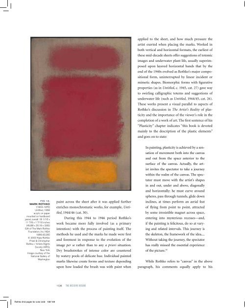
fig 18.<br />
Mark rothko<br />
(1903-1970)<br />
Untitled, 1968<br />
acrylic on paper<br />
mounted on hardboard<br />
panel, overall 18 1/16 x<br />
11 7/8 x 1 7/16 inches<br />
(45.88 x 30.16 x 3.65)<br />
Gift of The Mark Rothko<br />
Foundation, Inc. NGA<br />
1986.43.265<br />
© 2003 Kate Rothko<br />
Prizel & Christopher<br />
Rothko / Artists Rights<br />
Society (ARS),<br />
New York<br />
Image courtesy of the<br />
National Gallery of<br />
Washington<br />
paint across the sheet after it was applied further<br />
enriches monochromatic works, for example, Untitled,<br />
1944/46 (cat. 30).<br />
During this 1944 to 1946 period Rothko’s<br />
work became more fully involved (as a primary<br />
intention) with the process of painting itself. The<br />
methods he used and the marks he made were first<br />
and foremost in response to the evolution of the<br />
image per se rather than to any a priori situation.<br />
Dry brushstrokes of intense color are countered<br />
by watery pools of delicate hue. Individual painted<br />
marks likewise create forms and texture depending<br />
upon how loaded the brush was with paint when<br />
applied to the sheet, and how much pressure the<br />
artist exerted when placing the marks. Worked in<br />
both vertical and horizontal formats, the earliest of<br />
these mid-decade sheets offer suggestions of totemic<br />
images and underwater plant life, usually superimposed<br />
upon layered horizontal bands that by the<br />
end of the 1940s evolved as Rothko’s major compositional<br />
form, uninterrupted by linear incident or<br />
mimetic shapes. Biomorphic forms with figurative<br />
properties (as in Untitled, c. 1945, cat. 27) gave way<br />
to swirling calligraphic totems and suggestions of<br />
underwater life (such as Untitled, 1944/45, cat. 26).<br />
These works present a visual parallel to aspects of<br />
Rothko’s discussion in The Artist’s Reality of plasticity<br />
and the importance of the viewer’s role in the<br />
completion of a work of art. The first sentence of his<br />
“Plasticity” chapter indicates “this book is devoted<br />
mainly to the description of the plastic elements”<br />
and goes on to state:<br />
In painting, plasticity is achieved by a sensation<br />
of movement both into the canvas<br />
and out from the space anterior to the<br />
surface of the canvas. Actually, the artist<br />
invites the spectator to take a journey<br />
within the realm of the canvas. The spectator<br />
must move with the artist’s shapes<br />
in and out, under and above, diagonally<br />
and horizontally; he must curve around<br />
spheres, pass through tunnels, glide down<br />
inclines, at times perform an aerial feat<br />
of flying from point to point, attracted<br />
by some irresistible magnet across space,<br />
entering into mysterious recesses—and,<br />
if the painting is felicitous, do so at varying<br />
and related intervals. This journey is<br />
the skeleton, the framework of the idea....<br />
Without taking the journey, the spectator<br />
has really missed the essential experience<br />
of the picture. 10<br />
While Rothko refers to “canvas” in the above<br />
paragraph, his comments equally apply to his<br />
paintings on paper from these years, which tend to<br />
employ multiple media although transparent watercolor<br />
is primary among the layered hues. Opaque<br />
watercolor touches follow sparingly, and thus function<br />
as focal points within the fields, setting up<br />
a rich contrast to Rothko’s magical line, directly<br />
drawn at first in both black and color inks, but<br />
incised as scraffito increasingly as the ideas evolve,<br />
functioning with authority as rhythm, pattern, edge,<br />
direction, interruption. The ambition of these middecade<br />
watercolors expanded his approach to layering<br />
veils of paint that eventually claimed primacy in<br />
his work.<br />
Central to Rothko’s paintings on paper is the<br />
white of the sheet as it glows through the transparent<br />
and translucent washes the artist applied in diverse<br />
directions, using many different sizes of brushes, and<br />
varying his hand pressure, together to create spatial<br />
diversity within the field. Additionally, opaque white<br />
used independently and in admixtures of various<br />
hues adds density that transparent watercolor generally<br />
defies. As paintings conservator Dana Cranmer<br />
has observed, “during this period, a remarkable symbiosis<br />
occurred between the watercolors and the oils.<br />
Rothko approached the canvas support much as he<br />
did the white paper support of the watercolor.” 11 As<br />
part of his process of applying paint, Rothko increasingly<br />
incorporated rubbing and blotting methods<br />
that provided subtle gradations to the hues. On paper<br />
these actions alter the manufactured surfaces of the<br />
sheets and, thus, the ways in which they subsequently<br />
respond to and carry the paint. Rothko rubbed or<br />
incised with such vehemence at times that he broke<br />
through the sheet entirely.<br />
In early 1946, Rothko’s first exhibition since<br />
1933 comprising solely works on paper was held at<br />
the Mortimer Brandt Gallery in Manhattan. Eighteen<br />
of his mid-1940s watercolors were on view,<br />
many of which were highly enough admired to be<br />
sold during the course of the show. Starting the<br />
following year and for much of the rest of his life,<br />
Rothko’s attention was more focused on canvas than<br />
on paper. But on paper as well as on canvas, thinly<br />
applied layers of paint create zones of color; and<br />
works on the two substrates differ from the other<br />
primarily because of differences in these surfaces<br />
and the responsiveness of materials to their very different<br />
properties, and not in his handling of them.<br />
Size is perhaps the one major delineator—his classic<br />
canvases reach dimensions impossible even with the<br />
largest rolls of paper available at that time (fig. 18). 12<br />
The importance of paper to Rothko’s oeuvre<br />
lasted well beyond the 1940s. What have come to be<br />
viewed as his classic compositions—two, three, or<br />
108 the Decisive DecaDe chapter 109<br />
fig 19.<br />
Mark rothko<br />
(1903-1970)<br />
Untitled, 1969<br />
acrylic on paper, sheet:<br />
71 ¾ x 42 7/16 inches<br />
(182.3 x 107.8)<br />
Gift of The Mark Rothko<br />
Foundation, Inc. NGA<br />
1986.43.278<br />
© 2003 Kate Rothko<br />
Prizel & Christopher<br />
Rothko / Artists Rights<br />
Society (ARS),<br />
New York<br />
Image courtesy of the<br />
National Gallery of<br />
Washington<br />
Rothko 2nd pages for color.indd 108-109 3/2/12 5:22 PM


![01 -[BE/INT-2] 2 KOL +UITGEV+ - exhibitions international](https://img.yumpu.com/19621858/1/184x260/01-be-int-2-2-kol-uitgev-exhibitions-international.jpg?quality=85)