

High-res version (60 mb) - Libre Graphics magazine
High-res version (60 mb) - Libre Graphics magazine
High-res version (60 mb) - Libre Graphics magazine

You also want an ePaper? Increase the reach of your titles
YUMPU automatically turns print PDFs into web optimized ePapers that Google loves.
<br />
<br />
<br />
<br />
[...]<br />
<br />
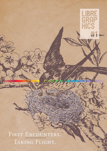
Silver Bird's Nest illustration created from a picture by Flickr user<br />
PerpetualPlum<br />
http://www.flickr.com/photos/perpetualplum/3598355084/#/<br />
Rainbow gradient found on a post by user Erroneus on<br />
InkscapeForum.com<br />
http://www.inkscapeforum.com/viewtopic.php?f=5&t=5470
Index<br />
4<br />
6<br />
7<br />
9<br />
10<br />
12<br />
14<br />
16<br />
18<br />
22<br />
23<br />
30<br />
34<br />
37<br />
43<br />
51<br />
54<br />
57<br />
Masthead<br />
Editor's Letters<br />
Production Colophon<br />
New Releases<br />
Freed Fonts, Strong Web Dave Crossland<br />
This is the first day of my life Eric Schrijver<br />
F/LOSS in the classroom Ludivine Loiseau<br />
The unicorn tutorial ginger coons<br />
Pierre Marchand talks Fontmatrix, <strong>res</strong>ponsiveness and user<br />
engagement<br />
Showcase<br />
Laura C. Hewitt<br />
Pete Meadows<br />
John LeMasney<br />
Applying F/LOSS as a final user and<br />
not dying in the attempt Lila Pagola<br />
Visual literacy: knowing through images Eric Schrijver<br />
Interview with Ben Laenen of DejaVu<br />
Resource List<br />
Glossary and <strong>res</strong>ources<br />
LIBRE GRAPHICS MAGAZINE 1.1 3
4<br />
MASTHEAD<br />
LIBRE GRAPHICS MAGAZINE 1.1<br />
Masthead<br />
Editorial Team<br />
Ana Carvalho ana@manufacturaindependente.org<br />
ginger coons ginger@adaptstudio.ca<br />
Ricardo Lafuente ricardo@manufacturaindependente.org<br />
Publisher<br />
Studio XX http://www.studioxx.org<br />
Community Board<br />
Dave Crossland<br />
Louis Desjardins<br />
Aymeric Mansoux<br />
Alexandre Prokoudine<br />
Femke Snelting<br />
Contributors<br />
Margaret Burnett, Dave Crossland, Laura C. Hewitt, John<br />
LeMasney, Ludivine Loiseau (and her class), Pete Meadows,<br />
Lila Pagola, Eric Schrijver.<br />
Printed in Montréal by Mardigrafe on recycled paper.<br />
Licensed under a Creative Commons Attribution-Share Alike<br />
license (CC-BY-SA). All content should be attributed to its<br />
individual author. All content without a stated author can be<br />
credited to <strong>Libre</strong> <strong>Graphics</strong> Magazine.<br />
Write us at<br />
enquiries@libregraphicsmag.com<br />
http://libregraphicsmag.com<br />
A Reader's Guide to <strong>Libre</strong> <strong>Graphics</strong> Magazine<br />
In this <strong>magazine</strong>, you may find concepts, words, ideas and<br />
things that are new to you. Good. That means your horizons are<br />
expanding. The problem with that, of course, is that sometimes,<br />
things with steep learning curves are less fun than those<br />
without.<br />
That's why we're trying to flatten the learning curve. If, while<br />
reading <strong>Libre</strong> <strong>Graphics</strong> Magazine, you encounter an unfamiliar<br />
word, project name, whatever it may be, chances are good<br />
there's an explanation.<br />
At the back of this <strong>magazine</strong>, you'll find a glossary and <strong>res</strong>ource<br />
list. The glossary aims to define words that are unique to the world<br />
of<strong>Libre</strong> <strong>Graphics</strong>. The <strong>res</strong>ource list provides valuable information<br />
about tools, licenses, whatever items we may be mentioning.<br />
Practically, this means that if, for example, you're reading an<br />
article about DejaVu (see pages 51 to 53), you can always flip to<br />
the back of the <strong>magazine</strong>, look up DejaVu in the <strong>res</strong>ource list<br />
and become quickly informed about it. This provides some<br />
instant gratification, giving you the <strong>res</strong>ources you need to<br />
understand, in a moment, just what we're talking about.<br />
We hope you like our system.<br />
Images under a CC Attribution Share-Alike license<br />
Photo of ginger coons by herself.<br />
Photo of Dave Crossland by Mary Crossland.<br />
Photo of Eric Schrijver by himself.<br />
Photos of VTF type specimens in "Notebook" section by ginger coons.<br />
Type specimen in "F/LOSS in the classroom" by Ludivine Loiseau.<br />
Illustrations in "The unicorn tutorial" by ginger coons.<br />
Images in "Applying F/LOSS as a final user and not dying in the attempt" by Lila Pagola.<br />
Photo of Ben Laenen by Dave Crossland.<br />
All images in the "Showcase" section can be attributed to the creators mentioned therein.<br />
All are licensed CC BY-SA.<br />
Fontmatrix screenshot from Resources section by Wikipedia user Gürkan Sengün.<br />
http://en.wikipedia.org/wiki/File:Screenshot_Fontmatrix.png<br />
Inkscape screenshot from Resources section by Ana Carvalho.<br />
Images under other licenses<br />
Photos and images of OSP DLF/Nancy in "Notebook" section by Open Source Publishing.<br />
Free Art License.<br />
DejaVu specimen page adapted from a specimen by Benjamin D. Esham. Public Domain.<br />
http://dejavu-fonts.org/wiki/File:DejaVu_specimen.png<br />
Blender screenshot from Resources section by Wikipedia user DingTo. GNU General<br />
Public License. http://en.wikipedia.org/wiki/File:Blender3D_2.4.5-screen.jpg<br />
FontForge screenshot from Resources section by George Williams from the tutorial<br />
'FontForge, An Outline Font Editor'. http://fontforge.sourceforge.net/overview.html<br />
Assumed to be covered by a <strong>version</strong> of the Modified BSD license. Anyone in doubt should<br />
direct themselves to: http://fontforge.sourceforge.net/license.html<br />
GIMP screenshot from Resources section by Wikipedia user IngerAlHaosului. GNU<br />
General Public License. http://en.wikipedia.org/wiki/File:Gimpscreen.png<br />
Scribus screenshot from Resources section by Wikipedia user Kocio. GNU General Public<br />
License. http://en.wikipedia.org/wiki/File:Scribus-1 .3-Linux.png<br />
General<br />
Advertisements, with the exception of those rep<strong>res</strong>enting //<strong>Libre</strong> <strong>Graphics</strong> Magazine//, are<br />
not necessarily covered by the blanket CC BY-SA license. It is best to check with the<br />
projects they rep<strong>res</strong>ent before reusing them.
6<br />
EDITOR'S LETTER<br />
LIBRE GRAPHICS MAGAZINE 1.1<br />
First times are seen as momentous events in our lives. The first<br />
time away from home, first job, first kiss, all are seen as seminal<br />
events, meant to be packed up and reme<strong>mb</strong>ered, fondly or not.<br />
The first, narratively, carries a heavier weight in our memories<br />
than so many subsequent events. After the first time, you start<br />
getting used to it, you become proficient, the magic and<br />
mystery start to wear off.<br />
This issue, we're talking about firsts. We're talking about first<br />
experiences, first efforts, first anythings, about the liberation of<br />
letting go and trying something new, and the terror that<br />
sometimes comes with it. Firsts are about taking flight, about<br />
leaving behind the things you know and e<strong>mb</strong>racing something<br />
else.<br />
That's where our second theme, Taking Flight, comes in. Taking<br />
flight, leaving behind, in a physical and a metaphorical sense,<br />
carries with it that sense of liberation and trepidation, that<br />
change of perspective. Lifting off of our metaphorical ground<br />
and looking down from above packs the power to change our<br />
perspective, to let us a little bit out of ourselves. In the same<br />
way that seeing your own city from above can completely<br />
change your conception of it, seeing your own possibility and<br />
creative process from above has the power to make you stop<br />
and think again about the elements of process, style or<br />
workflow that you take for granted.<br />
If, at first...<br />
ginger coons<br />
Taken together, the ideas of First Encounters and Taking Flight<br />
are all about discovering the new, the momentous, the big and<br />
the unexpected that you never even thought you possessed.<br />
These things, in your own head, in your own possibility,<br />
unlocked if only you give them a chance and break from the<br />
norm.<br />
That's why, this month, we're talking about firsts and flights,<br />
about the magic, the mystery, the revelation of doing something<br />
new and discovering what you never even suspected you<br />
possessed. We've got articles about first experiences in design,<br />
with tools and even more theoretical firsts, too.<br />
We hope that you, picking up <strong>Libre</strong> <strong>Graphics</strong> Magazine for the<br />
first time, see it that way, too. We hope you'll join us on a<br />
journey which promises to be an inte<strong>res</strong>ting, hopefully long,<br />
and maybe just a little bumpy.<br />
All of this, we think, may just encourage you to think about<br />
collecting a few more of those all-important firsts for yourself.<br />
ginger coons is a me<strong>mb</strong>er of the <strong>Libre</strong> <strong>Graphics</strong> Magazine editorial team.
Software<br />
In the process of bringing this first issue into being, our work<br />
was made easier by the excellent F/LOSS design tools available.<br />
Scribus 1.3.8 was used to typeset and arrange all the <strong>magazine</strong><br />
content into a final layout for print.<br />
Inkscape 0.48 was the tool of choice to create the <strong>magazine</strong><br />
cover, as well as the "Have your say", calendar and UpStage ads.<br />
GIMP 2.7.2 helped us to retouch and edit columnist photos and<br />
most of the bitmap illustrations, as well as converting some PDF<br />
files into bitmap for inclusion in the layout.<br />
Pdftk 1.41, a tool for merging several PDFs into one (among<br />
many, many other uses), helped us streamline our workflow<br />
and produce the layout using smaller Scribus files instead of a<br />
big, heavy one.<br />
Git 1.7.0.4 was the <strong>version</strong> control system that we used to share<br />
work between ourselves, as well as providing it for anyone<br />
inte<strong>res</strong>ted in taking a peek into the process. Gitorious was our<br />
service of choice when it came to publishing the <strong>magazine</strong><br />
repository. We also used gitg and git-cola to provide a<br />
graphical interface for the Git repository.<br />
A spreadsheet for sorting through submissions was created in<br />
OpenOffice.org Calc.<br />
Finally, all plain-text editing was done inside Gedit and vim.<br />
Fonts<br />
Production Colophon<br />
Ana Carvalho & Ricardo Lafuente<br />
Linux Libertine body text<br />
Linux Biolinum footnotes and captions<br />
PropCourier Sans titles<br />
LIBRE GRAPHICS MAGAZINE 1.1 7<br />
PRODUCTION COLOPHON<br />
Linux Libertine and Linux Biolinum are two beautiful and<br />
well-crafted typefaces by the Libertine Open Fonts Project.<br />
PropCourier Sans is the official custom typeface for <strong>Libre</strong><br />
<strong>Graphics</strong> Magazine. It is a friendly fork of Open Source<br />
Publishing's NotCourier Sans, a monospaced typeface which<br />
sports the statement "We are not here to be polite." PropCourier<br />
Sans is the proportional <strong>version</strong> of NotCourier; it is an ongoing<br />
effort that will be worked on and updated on each issue of <strong>Libre</strong><br />
<strong>Graphics</strong> Magazine, following the "Release early, release often"<br />
principle. You'll find some inaccuracies and inconsistencies in<br />
the current <strong>version</strong>, but we'd rather just use what we can have<br />
now instead of going for a finished and polished typeface -whatever<br />
"finished and polished" might mean. We decided that<br />
we would prefer being honest than being right, hence<br />
PropCourier's tagline: "We are not here to be correct."<br />
Finds<br />
If you flip over to page 18, you'll find a text illustration based on<br />
a photo of Pierre Marchand. This effect was achieved with a<br />
Python script written by Alexandre Truppel who is 14 years<br />
old, and is attending tenth grade of school in Portugal.<br />
Alex popped up in Hacklaviva (a hackerspace in Porto,<br />
Portugal) during a Python meet-up. It didn't take long for<br />
everyone to be amazed by his coding-fu, complete with his own<br />
full-fledged GUIs. When we asked Alex if we could use his<br />
programs to create illustrations for the <strong>magazine</strong>, we got a<br />
positive <strong>res</strong>ponse, along with some heartening remarks: "I never<br />
thought my programs could be used for anything else besides<br />
random fun. I did the program as a challenge to learn more<br />
Python and to work with images. Then I used it to make some<br />
gifts for my family."<br />
Ana Carvalho and Ricardo Lafuente make up Manufactura Independente, a design<br />
<strong>res</strong>earch studio based in Porto, Portugal. Their design practice orbits around the principles<br />
of free software and free culture.<br />
http://manufacturaindependente.org
8<br />
LIBRE GRAPHICS MAGAZINE 1.1<br />
Notebook<br />
Where<br />
Make Art 2010 in Poitiers, France.<br />
What<br />
Art and design festival focusing on exciting uses of<br />
Free/<strong>Libre</strong> Open Source Software.<br />
Who<br />
P<strong>res</strong>ented by GOTO10, who are also well known for<br />
producing the Puredyne distro of GNU/LINUX.
Prettiest<br />
Type specimens from VTF foundry. They're funny,<br />
they're well designed and there's a truly exhaustive<br />
selection of dingbats and stars. Without a doubt, the most<br />
exciting bits of paper I've seen in a while.<br />
Most Collaborative<br />
Nancy, the dingbats font from Open Source Publishing.<br />
Visitors to the exhibition space were invited to create<br />
their own interpretation of hundreds of characters, from<br />
squa<strong>res</strong> to arrows to nu<strong>mb</strong>ers in circles. Resulted in an<br />
imp<strong>res</strong>sive array of different styles and levels of<br />
interpretation.<br />
Least Expected<br />
LIBRE GRAPHICS MAGAZINE 1.1 9<br />
One visitor who, upon seeing the gender breakdown of<br />
artists in the room, promptly asked why there were so<br />
few women. And then wanted to talk about it. For an<br />
hour. Good debate all 'round.<br />
Most Immersive<br />
Electroacoustic concerts held in the planetarium.<br />
Relaxing end to a long day, with some truly neat visuals.
New Releases<br />
Sozi<br />
http://sozi.baierouge.fr/wiki/doku.php<br />
Sintel<br />
http://www.sintel.org<br />
Blender 2.55b<br />
http://www.blender.org<br />
SparkleShare 0.2b1<br />
http://sparkleshare.org<br />
Hugin 2010.2.0<br />
http://hugin.sourceforge.net<br />
Inkscape 0.48<br />
Essentials for Web<br />
Designers (book)<br />
https://www.packtpub.com/inkscape-0-48essentials-for-web-designers/book<br />
LIBRE GRAPHICS MAGAZINE 1.1 11<br />
NEW RELEASES<br />
An SVG based p<strong>res</strong>entation program,<br />
allowing users to create on a movable<br />
canvas. Say goodbye to slides.<br />
Another year, another Blender<br />
Foundation project. Sintel is a short film<br />
showing Blender at its best and most<br />
beautiful.<br />
A major new release of Blender. Road<br />
tested on production of Sintel.<br />
Makes <strong>version</strong> control painless. Allows<br />
for folder based workflow, but with the<br />
added power of full-on <strong>version</strong> control.<br />
Hugin, our favourite panorma stitching<br />
program, has a pack of new featu<strong>res</strong>,<br />
including masking and a mosaic mode.<br />
An overview of Inkscape 0.48, geared<br />
specifically towards the needs of web<br />
designers.
12<br />
TYPE DESIGN<br />
LIBRE GRAPHICS MAGAZINE 1.1<br />
Fonts are essential to the design of every web page, and true<br />
web fonts are about to bring the typographic sophistication of<br />
print to the web in force.<br />
It’s taken a while. In 1998, Internet Explorer 4 implemented the<br />
feature with a DRM font format, E<strong>mb</strong>edded OpenType (EOT),<br />
because it was part of CSS2. Despite that fact, it was ignored for<br />
years by other browsers until CSS co-founder Håkon Wium Lie<br />
championed it 10 years later. Slowly all the other big browsers<br />
began to support regular TrueType fonts, and <strong>res</strong>isted p<strong>res</strong>sure<br />
to implement a standardised DRM format. Today SVG Fonts are<br />
used in iPhones, Internet Explorer 9 supports TrueType fonts,<br />
and <strong>Libre</strong> tools do EOT con<strong>version</strong>s. Web fonts work<br />
everywhere.<br />
In May, Google launched the first font service providing only<br />
<strong>Libre</strong> fonts. The blog for the service<br />
(http://googlewebfonts.blogspot.com) recently revealed some<br />
details about its growth – nearly 500,000 domains showing web<br />
fonts to 17 million people a day.<br />
In 2011, CSS3 will take web fonts beyond the simple font linking<br />
feature of 1998. Designers will finally be able to use the full<br />
power of OpenType fonts directly in webpages. This can be<br />
tested today with Firefox 4 beta releases.<br />
The web is about to become as typographically powerful as the<br />
latest proprietary desktop publishing applications. This means<br />
that web designers should now take time to learn about how<br />
typefaces vary and what those variations mean for readers –<br />
there will be a lot of libre fonts to choose from, and we should<br />
choose fonts wisely.<br />
Three kinds of font classification schemes are useful to guide<br />
designers in their choices.<br />
1. Simple Categories. These are are deceptively simple. The<br />
deception is their “Other" categories. CSS itself has a very<br />
simple scheme (Serif, Sans-Serif, Fantasy, Mono) and this is<br />
Freed Fonts, Strong Web<br />
Dave Crossland<br />
useful because everyone can reme<strong>mb</strong>er its groups. Contrast that<br />
with the ‘IBM Family’ scheme which uses a long list of<br />
historical gen<strong>res</strong> and many “Miscellaneous" caverns.<br />
2. Parametric systems. Common forms of the elements of the<br />
Latin alphabet are described and related. The <strong>res</strong>ult allows users<br />
to drill down into a font collection interactively: “Letters that<br />
wide, serifs this thick, an axis of contrast at that angle."<br />
PANOSE’s second <strong>version</strong> was a sophisticated example that has<br />
sadly disappeared thanks to an acquisition by and merger with<br />
Hewlett Packard.<br />
3. Tagging. Just as we tag photographs in centralised<br />
proprietary photo storage services, font can be tagged. I imagine<br />
that eventually a de-centralised federated font classification<br />
network service will be made, perhaps building on the <strong>Libre</strong>licensed<br />
Typedia.org project. While the first two have their<br />
place in learning how fonts are different, tagging is for me the<br />
most useful classification technique when deciding on a font.<br />
The words people tag with are often not the words used by<br />
other schemes. Instead, people relate to fonts with what Ovink<br />
described in 1938 as atmosphere values: "Those properties by<br />
which [a font] excites feelings within the reader."<br />
The web is about to become as<br />
typographically powerful as<br />
the latest proprietary<br />
desktop publishing<br />
applications.
Curiously, Ovink found in his <strong>res</strong>earch that general readers<br />
can't tell the difference in atmosphere values of two typefaces<br />
which are very similar. I might suggest that this means<br />
designing new type is, for practical purposes, entirely pointless.<br />
Most importantly, he concluded that picking the "wrong" font is<br />
a "missed... opportunity to intensify the force of imp<strong>res</strong>sion of<br />
the text in a considerable degree."<br />
To web designers choosing web fonts, watch out.<br />
Dave Crossland believes anyone can learn to design great fonts. He is a type designer<br />
fascinated by the potential of software freedom for graphic design, and runs workshops on<br />
type design around the world.<br />
http://understandingfonts.com<br />
LIBRE GRAPHICS MAGAZINE 1.1 13<br />
TYPE DESIGN<br />
Today, web fonts are most useful at large<br />
sizes where the rendering problems associated<br />
with hinting do not occur, where images of<br />
text are common. Since the beginning of the<br />
web, a lot of large-size text on webpages has<br />
not been typeset in overly-familiar system<br />
fonts. Instead, headlines are frozen into static<br />
images. This can be only just accessible at<br />
best. Today, the accessibility of the web<br />
impacts everyone because it defines our<br />
ability to machine-translate the webs of other<br />
language cultu<strong>res</strong>.
14<br />
SCHRIJVER<br />
LIBRE GRAPHICS MAGAZINE 1.1<br />
The Dutch computer scientist Edgar Dijkstra believed in first<br />
times. He thought it a contemporary charade to give programs<br />
<strong>version</strong> nu<strong>mb</strong>ers. Since it's possible for a program to be correct,<br />
better to get them right the first time around. I don’t agree with<br />
Edgar Dijkstra. I believe I will achieve my first proper column<br />
after five or six tries.<br />
There is a second first time, when you finally manage to rise<br />
above the preconceptions and ideas you started your project<br />
with. Then your project can start to work for you.<br />
The rumour that Bill Joy wrote the vi editor in one night is<br />
persistent, even though he denies it himself. Anything awesome<br />
has a gestation period. But we just happen to love believing in<br />
spontaneous creation.<br />
As to <strong>Libre</strong> <strong>Graphics</strong>, it is at the nexus of many exciting<br />
developments. <strong>Libre</strong> <strong>Graphics</strong> lies at the intersection of art and<br />
technology, science and the humanities. And I am quite sure we<br />
will see a nu<strong>mb</strong>er of wonderful projects take flight.<br />
Applying F/LOSS principles to art and design might help us<br />
improve visual literacy, just as F/LOSS improves computer<br />
literacy. Applying F/LOSS principles to art and design might<br />
help us better understand the knowledge p<strong>res</strong>ent in the creative<br />
process.<br />
Not just that, I think it might help us understand what it means<br />
to share. Getting artists to share will be difficult, initially.<br />
Scientists have built an economy where giving things away will<br />
increase their reputation, as well as the chances of getting and<br />
keeping jobs. Artists, on the other hand, traditionally try to earn<br />
money by selling their work.<br />
Even if the production methods of art have changed radically,<br />
the art market is still built on scarcity. Galleries will produce a<br />
limited nu<strong>mb</strong>er of copies of a video or photograph even if this<br />
medium potentially allows for unlimited copying and<br />
redistribution.<br />
With all the talk of sharing that comes from the world of<br />
This is the first day<br />
of my life<br />
Eric Schrijver<br />
F/LOSS, I have never heard much about just how freaking scary<br />
it can be to share. Sharing means giving up control. Letting go<br />
of control can be very, very difficult.<br />
Of course, it is potentially beautiful, too. Recognizing that my<br />
understanding is limited, allowing someone else to find<br />
something in my work that I had never seen before can be<br />
beautiful and fulfilling. Yet, having someone reinterpret my<br />
artwork is not the same as someone coming up with a clever<br />
new use for a sorting algorithm. My art deals with people and<br />
emotions. That is why there is the possibility for such a<br />
reinterpretation to hurt me.<br />
(There’s always the option to keep something for myself.<br />
Assuming current copyright law, good health and some<br />
cooperation from my progeny, it will subsequently take about<br />
130 years before it lapses into the public domain.)<br />
Anyway.<br />
Anything awesome has a<br />
gestation period. But we<br />
just happen to love<br />
believing in spontaneous<br />
creation.<br />
Whenever something wonderful takes off, it feels like a<br />
beginning. But I don’t want to take the idea of beginning too<br />
literally. It’s more like the experience opens up new possibilities.
At the same time, it seems to make up for the hardship<br />
experienced up to this point.<br />
Madonna also treats the first time as a metaphor. She references<br />
the prototypical first time in "Like a Virgin." Yet it’s not about<br />
the first time, it’s about when it’s like the first time. Open<br />
source developers work like Madonna. Projects are well<br />
underway before they reach 1.00. This is not the first release,<br />
this is the first release that works like the developer wanted it to<br />
initially. What the first attempt should have been like but<br />
necessarily couldn’t.<br />
In fact, many projects never even reach 1.00. Most things never<br />
happen. When David Bowie shook the scene with his Ziggy<br />
Stardust character, he'd already had a trial run with a band<br />
called Arnold Corns, for which he styled a fashion designer to<br />
be the lead singer.<br />
Release early release often is a Torvalds maxim. In F/LOSS, next<br />
to the projects that take flight, we get to see all the other<br />
projects as well, the entire primordial soup. We don’t just get<br />
Ziggy Stardust, we get Arnold Corns too.<br />
It’s a mess, frankly. This might not work for the Dijkstras of this<br />
world. F/LOSS encourages a mindset of bringing together<br />
disparate sources to make something new. This is why artists<br />
could potentially feel at home. There’s never a clean slate when<br />
you make a work of art or design. We are informed by our<br />
personal history, we are informed by all the other works we<br />
know. Bowie, on Ziggy, said “it just seemed perfectly natural<br />
for me at the time to put together all these odds and ends of art<br />
and culture that I really adore.” Never mind that everything<br />
always comes from somewhere, when it starts to work together,<br />
it feels like something new. It feels like you’ve just begun.<br />
Eric Schrijver (Amsterdam, 1 984) is a visual artist who makes installations and<br />
performances. Eric teaches Design for new media at the Royal Academy of Art in The<br />
Hague. He is inspired by open source and programming culture.<br />
http://ericschrijver.nl<br />
LIBRE GRAPHICS MAGAZINE 1.1 15<br />
SCHRIJVER<br />
I have never heard much about<br />
just how freaking scary it can<br />
be to share. Sharing means<br />
giving up control.
16<br />
DISPATCHES<br />
LIBRE GRAPHICS MAGAZINE 1.1<br />
F/LOSS in the classroom<br />
Ludivine Loiseau<br />
The École de Recherche Graphique in Brussels has a history of introducing F/LOSS tools to its<br />
students. But in the autumn, 2010 semester, it went all out. Ludi OSP taught the first instance<br />
of a class solely devoted to F/LOSS-based design tools and tactics. Collected below are reactions<br />
and recollections from the class, translated into English.<br />
Session 1 - Septe<strong>mb</strong>er 24<br />
according to Jérémy and Jiacinto<br />
The goal of this session was to explain the principles behind<br />
F/LOSS software (GIMP and others). These programs are<br />
conceived by programmers who have decided to develop, on<br />
Linux (to start). Freeware: These softwa<strong>res</strong> are free to use and<br />
let the possibility open, for users capable of programming, to<br />
modify the code of the software and, by connection, its<br />
functions. Knowing that the license for a similar Adobe<br />
program might be 700€ and that it takes more than one program<br />
to make a work flow, freeware is something of obvious inte<strong>res</strong>t.<br />
! freeware ≠ open source → libre and open source do not mean<br />
monetarily free<br />
The goal of our first project is to create an alphabet made up of<br />
photos. Choose a theme, take photos of objects which fit the<br />
theme. Each object has to start with a specific letter of the<br />
alphabet.<br />
The photos are then modified using GIMP, followed by Inkscape<br />
to turn a bitmap-based image ( JPG, tiff, PSD in GIMP ) into a<br />
vector-based image (the drawing is written by the computer in<br />
the form of coordinates and points, making it infinitely scalable,<br />
allowing scale changes without quality loss). Once in a vector<br />
format ( .ai in Adobe Illustrator ) the image can now be used as<br />
a font after some manipulation with FontForge.<br />
Onto the job, kids!<br />
SESSION 2 - OCTOBER 1<br />
according to Edwin and Flore<br />
In this session, we familiarized ourselves with pixels in order to<br />
better understand that digital image matrix (acquiring, creating,<br />
processing or storing in binary form). We also learned about the<br />
existence of a multitude of image formats like .tiff (for high<br />
quality, lossless images) or .jpg (images comp<strong>res</strong>sed with an<br />
algorithm which simplifies pixels of similar colours). We also<br />
deepened our use of GIMP, working directly on our laptops. Not<br />
only that, but we had an introduction to vectorising images<br />
which allowed us to visualize the next step in our alphabetbuilding<br />
process.<br />
SESSION 3 - OCTOBER 15<br />
according to Viola and Gwenael<br />
Some notions on ASCII art: images are replaced by text → 128<br />
characters monospace, which means that all letters have the<br />
same pitch. If the image is crowded, all it takes is to change the<br />
typeface.<br />
Vectorisation with Inkscape: vector-based formats are made up<br />
of mathematical coordinates, not pixels. It's possible to have<br />
access to the source code of vectors in an image and also to<br />
change, at will, the source code.<br />
SESSION 4 - OCTOBER 22<br />
according to Adrien<br />
We took a look at the command line - which provides a space<br />
for executing actions by typing text in a window provided for<br />
that purpose. This allows us to carry out actions in batches, like<br />
reducing the size of multiple images by inputting a single line,<br />
modifying a whole text, executing actions in multiple programs<br />
at once... Once we have that figured out, it could prove to be<br />
very useful and advantageous.<br />
Next, we had an intro to FontForge, a program for creating<br />
fonts. We learned how to import images to make a font, modify<br />
them...<br />
http://www.erg.be/erg<br />
http://www.ludi.be/erg/doku.php?id=notes_de_cours
LIBRE GRAPHICS MAGAZINE 1.1 17<br />
DISPATCHES
18<br />
FIRST TIME<br />
LIBRE GRAPHICS MAGAZINE 1.1<br />
The unicorn tutorial<br />
ginger coons<br />
On vectors, nodes and the power of simple<br />
examples<br />
I reme<strong>mb</strong>er my first introduction to nodes and vector-based<br />
illustration. When I was about seven years old, my father, who<br />
was a high school tech teacher at the time, sat me down in front<br />
of Corel Draw 3. Up until that day, I had seen the program as a<br />
repository of clip art, not knowing what I could actually do with<br />
it. He loaded a clip art horse. Everything changed when he<br />
showed me the node selection tool. The previously clean line<br />
drawing suddenly had a mass of dots all along its outline. He<br />
explained that these were nodes, the points defining the shape<br />
of the horse.<br />
And then the magical bit: he had me select the node at the apex<br />
of the horse's ear. When I clicked and dragged that node, the<br />
horse changed. The ear elongated, following my mouse. He<br />
instructed me to move the node a little distance and then drop<br />
it. The horse was no longer a horse. Elongating that ear had<br />
turned it into a unicorn.<br />
Since then, I've learned more about how nodes really work and<br />
what can be done with them. But that lesson still sticks in my<br />
head. It was an incredibly powerful introduction. It started a (so<br />
far) life-long love of vectors. A love of all their extensibility,<br />
elegance and possibility.<br />
So I p<strong>res</strong>ent to you a horse. More accurately, it's just an outline<br />
of a horse, no shading, nothing fancy. It's a horse with two<br />
pointy ears, one of which has a little node at the apex. You can<br />
find the SVG file on our website. If you want, you can<br />
download it, open it up with Inkscape or whatever vector<br />
manipulation program you use, and turn it into a unicorn. To<br />
me, it's the most powerful, understandable first introduction to<br />
nodes and their possibilities.
LIBRE GRAPHICS MAGAZINE 1.1 19<br />
FIRST TIME
Pierre Marchand talks<br />
Fontmatrix, <strong>res</strong>ponsiveness<br />
and user engagement<br />
Dave Crossland interviews Pierre Marchand<br />
Pierre Marchand is the creator of Fontmatrix,<br />
the leading F/LOSS font management<br />
program.<br />
Dave Crossland: You were working as a graphic designer [when<br />
you started working on Fontmatrix].<br />
Pierre Marchand: I pretended to be a graphic designer. But I<br />
wasn't really a graphic designer. I started because I had this<br />
little, little, little agency and no clients. So I started to play a bit<br />
with programming. There was this program to compose text by<br />
hand. And there was, in this program, a font chooser. You could<br />
choose a font file and it was not enough for me. So I was<br />
looking for a font manager, didn't find one. Because I was<br />
working a lot with FreeType it was quite trivial for me to just<br />
have something to display fonts. All in all, it was really for my<br />
own needs.<br />
What happened next? I posted on the Scribus mailing list. I<br />
wrote a little font viewer manager. And what happened next?<br />
Still no clients. Still time to program. At this point, nobody but<br />
regular Scribus users were following the list and you start to do<br />
something and Wow! people are inte<strong>res</strong>ted in the project and<br />
come with some user feedback. And there's a lot of raising your<br />
self esteem. It works well for that. And so I did continue,<br />
because in my regular work, it was completely the reverse. No<br />
clients at all and no client, no client. So I had just enough<br />
money to live and with coding, you need nothing more than a<br />
computer. Coming from being nobody to being someone. So it<br />
was very inte<strong>res</strong>ting for me... And when you're doing<br />
something inte<strong>res</strong>ting, people come to you, they listen to you<br />
and you can discuss things you have no occasion to do face to<br />
face. So it was the first push to work on Fontmatrix. My own<br />
needs and after that, the good reception by people.<br />
There were people contributing in terms of ideas...<br />
A lot. From being very reactive. If someone tells you that he<br />
would like something like a new feature and one hour later,<br />
there's the feature in the Sub<strong>version</strong> repository, they're happy.<br />
And they come back again and again and say "I would like that<br />
LIBRE GRAPHICS MAGAZINE 1.1 21<br />
THE INTERVIEW
22<br />
THE INTERVIEW<br />
LIBRE GRAPHICS MAGAZINE 1.1<br />
and that..." It's very useful for the developer because you can't<br />
have all the ideas. You're just alone and you have your own<br />
ideas, but that's just a subset of what's possible. So it's really<br />
inte<strong>res</strong>ting to have a lot of user input. And because you are very<br />
reactive and you're ready to just stop doing your stuff and work<br />
on what people want, they are happy and they come back again.<br />
So it's a...<br />
Cycle.<br />
You were working on it, kind of in your spare time, while you<br />
were doing freelance graphic design work.<br />
It was not exactly my spare time. It was my main time.<br />
Because you were filling out the extra hours in the day that<br />
weren't being filled by clients. And you were building the tools<br />
that you needed for yourself as a designer.<br />
It wasn't even exactly that. When I finished school, after that, I<br />
spent ten years working on my art work, etc. And I stopped<br />
because of things, life. But I was very frustrated about stopping.<br />
And when I started working on Free Software, writing Free<br />
Software, for me, it was a means to come back. To come back to<br />
something creative. The more I work on Free Software, the<br />
more I write code, the more I think that there is really creative<br />
work there.<br />
In programming?<br />
Yeah. Not like code as art. I don't like that. It's not exactly that.<br />
But the practice of writing code can give you something like the<br />
practice of doing art work. But the <strong>res</strong>ult is not the same. You<br />
have to go a bit further to make it a real art work. And it's what<br />
I can do with OSP nowadays. And Constant. I take my<br />
handcraft of writing code and I turn it into something artistic.<br />
But it's another work.<br />
You need to start somewhere. When you start by writing Free<br />
Software, you are writing the place to do this work. Free<br />
Software gives you access to the machine, the culture, the<br />
coding. You can't do real art work with computers without<br />
going Free Software. Because if you try to do that by using<br />
Microsoft APIs to write, you're still a user. You don't own the<br />
machine. The machines own you. It's the same for Fontmatrix.<br />
Even if now, I'm more productive at working on Fontmatrix,<br />
really focused on user integration and interactions, still, the way<br />
I do it is looking for new ideas and finding something like a<br />
compromise between my way of coding, which is a bit weird<br />
[I]f you... us[e]<br />
Microsoft APIs to<br />
write, you're still<br />
a user. You don't<br />
own the machine.<br />
The machines own<br />
you.
sometimes, and the way the users can be part of the project. To<br />
form a community. Because I need this community to continue<br />
to work...<br />
To motivate you.<br />
Yeah. And to make it meaningful. I mean, if there's nobody to<br />
use your software, there's no point in publishing it.<br />
How do you think the Free Software community, the Free<br />
Software programming community, can engage people who<br />
work professionally on those kinds of jobs? There are user<br />
interface designers, interaction designers, who do that kind of<br />
work professionally.<br />
Hmm. The huge work was really to change my mind. About the<br />
software I was writing. To try to think as a user. In the state it<br />
was, I heard users complaining "I can't do this, I can't do that<br />
with the software." And I was just answering, each time, "Yes,<br />
you can do that. You have to go to this menu and this sub-menu<br />
and click there and it's possible. It's possible this way or this<br />
way." To make it usable by these people, you have to just<br />
change that into when you hear something like that, to think<br />
"Okay, so the menu is not in the right place. They can't find it.<br />
So I will change my software to make it accessible for users." So<br />
I started like that.<br />
Because it's a Qt application, it's cross-platform, right? So it's<br />
going to be useful for users on Windows and Mac OS.<br />
Useful not as a font manager. They have font managers. But it<br />
will be useful to make them Free.<br />
What do you mean?<br />
I mean that they have enough font managers on Mac OS X and<br />
Windows platforms. They don't need FontMatrix as badly as on<br />
Linux, where there's nothing at all.<br />
But the value of FontMatrix as a font manager comes from its<br />
Free Software touch. I mean that if you want to run Free<br />
Software on your platform, whatever it is, you need Free<br />
Software. So if you're on Mac and you have a feeling it will be<br />
great because you've tried Inkscape and it was cool and you've<br />
tried FontForge and it was cool and you want to continue to use<br />
Free Software, maybe you need a font manager. So you're<br />
seeking a Free font manager and there's nothing. But hopefully,<br />
LIBRE GRAPHICS MAGAZINE 1.1 23<br />
THE INTERVIEW<br />
there will be FontMatrix in a state of development ready for<br />
daily use.<br />
But as a font manager, what it will bring for these users is really<br />
the freedom and the community, the direct access to developers.<br />
But as a font manager itself, it won't be more than Suitcase or<br />
something. In the first case. After that, as people can come with<br />
new ideas, we can imagine that it will bring something really<br />
new, because it's really fitted to their needs. But in the first<br />
place, it'll just be a font manager, as a font manager for all those<br />
users. And if they're used to using font managers like Linotype<br />
Font Explorer, etc., they won't be amazed by it. It will be just<br />
another font manager. And the real value will come from the<br />
freedom of the software.
By virtue of being called a showcase, we assume that you<br />
already know quite a bit about this section. Many design and<br />
art publications prominently feature work in their excitingly<br />
glossy pages.<br />
The difference, of course, between our showcase and those<br />
others is that we do care about the process and tool chain<br />
behind the works we show. For that reason, every work<br />
featured in this section has been created using F/LOSS<br />
graphics programs. Sometimes, those F/LOSS tools are among<br />
other techniques. Sometimes, they are the only tool in use.<br />
Our goal, in the showcase, is to show you just how stunning<br />
F/LOSS graphics can be. We hope you'll agree that the works<br />
on these pages are exciting, well crafted and very much worth<br />
pulling out and sticking to your walls.
26<br />
SHOWCASE<br />
LIBRE GRAPHICS MAGAZINE 1.1<br />
Laura C. Hewitt<br />
CAMOUFLAGE AND<br />
MIMICRY ILLUMINATED DRAWING<br />
Statement<br />
When I was a little kid and heard adults mention "illuminated<br />
manuscripts", I visualized an enormous dark archive,<br />
reminiscent of cathedrals and the basement vaults of libraries,<br />
full of rich images that were softly glowing. I was disappointed<br />
to discover that it just meant books with weird little pictu<strong>res</strong> in<br />
the margins, however intriguing those books might be. Still,<br />
decades later, when someone mentions illuminated manuscripts,<br />
the first image that comes to mind is my childhood vision and I<br />
have to consciously reme<strong>mb</strong>er that it's illustrated texts, always<br />
with a sense of disappointment.<br />
Flight and Pursuit is the adult creation of my childhood vision. I<br />
have co<strong>mb</strong>ined work from my adult artistic practice and<br />
inte<strong>res</strong>ts with the fairy tales, myths and dreams of childhood to<br />
create the imagery. It is an adult narrative of my flight from and<br />
pursuit of technology; my love/hate relationship with<br />
computers, motorcycles, microwaves, compound bows, my<br />
hearing aids, clocks...the entire paraphenalia of technological<br />
apparatus. Co<strong>mb</strong>ined with pre-Internet childhood imagery, it<br />
becomes an exp<strong>res</strong>sion of my flight through, and pursuit of,<br />
time and memory.<br />
42 x 1 8". Watercolor,<br />
aquarelle pencil and pastel<br />
on paper stretched over<br />
what more or less amounts<br />
to a fancy lightbox. From a<br />
series of illuminated<br />
drawings I call Flight and<br />
Pursuit.
30<br />
LIBRE GRAPHICS MAGAZINE 1.1<br />
WARFLY 1<br />
There is an Asian story that butterflies carry the souls of the<br />
dead to heaven. Early Native Americans believed that part of<br />
the human soul was captured in photographs. Co<strong>mb</strong>ining these<br />
two ideas, I used media war images to create butterflies after<br />
having a dream in which human created patterns became so<br />
pervasive that butterflies started mimicking them. Could war<br />
images be turned into something beautiful? Dangerous thought.<br />
This is one of many butterflies I have designed using computer<br />
graphics then hand painting and drawing on the computer<br />
print. The butterfly's pattern is a digitally enhanced war image.<br />
1 2 x 1 4". Watercolor and<br />
computer print of war<br />
image.
Pete Meadows<br />
Pete Meadows is a Montreal-based<br />
illustrator and musician. His illustration<br />
process heavily featu<strong>res</strong> GIMP, which he<br />
uses to create the angular, but organic<br />
line quality and transparancy that you<br />
see on these pages.<br />
Bearbot 1<br />
Bearbot 2<br />
Bishops 1<br />
Mini buddy meets Gargantuar 1<br />
Kitty Bot 2<br />
LIBRE GRAPHICS MAGAZINE 1.1 33<br />
SHOWCASE
36<br />
SHOWCASE<br />
LIBRE GRAPHICS MAGAZINE 1.1<br />
John LeMasney<br />
John LeMasney is a designer, artist, writer, poet, technologist,<br />
open web advocate and open source evangelist.<br />
John started his project 365Sketches in January 2010. His goal<br />
was to produce one sketch per day using only Inkscape. He<br />
would then publish it in his blog http://365sketches.org, set up<br />
in Wordp<strong>res</strong>s, under a CC-BY-SA license. The underlying<br />
purpose of John's daily exercise was to improve his skills using<br />
Inkscape but, as he told us, the <strong>res</strong>ult was deeper than that. In<br />
his own words:<br />
I've created a daily reminder<br />
for myself and others of the<br />
power of open source. I've<br />
gathered a community of<br />
about 200 people who watch<br />
the project, about 20 real<br />
fans, and I've gotten a lot<br />
of design and consulting work.<br />
I've also made quite a few<br />
friends. I feel like I'm doing my<br />
part to help develop,<br />
advocate and advertise<br />
Inkscape.<br />
John's plans are to go on with the project, drawing upon<br />
different tools: in 2011, GIMP would be the tool of choice,<br />
whereas Blender might be slated for 2012. In the following<br />
pages, you can see a small sample of John's work. To look<br />
through the whole project, do visit his blog.
38<br />
LIBRE GRAPHICS MAGAZINE 1.1
LIBRE GRAPHICS MAGAZINE 1.1 39
Applying F/LOSS as a final user<br />
and not dying in the attempt<br />
Lila Pagola<br />
The artistic community of Córdoba first noticed F/LOSS in August 2003. There was an<br />
introductory talk about the philosophy of free software, given by Grulic, the local<br />
F/LOSS group. The talk was part of an art and technology event, the main topic of<br />
which was local initiatives merging technology and artistic practices.<br />
That talk was a breath of f<strong>res</strong>h air for our little world which was exploring how net.art<br />
initiatives were going mainstream. For most people, the information in the talk<br />
remained just some ideas, with no effect on daily software tool use.<br />
In 2004 many of us began some touristic trips to GNU/Linux. We discovered there<br />
were barriers of knowledge and practice preventing us from adopting it permanently.<br />
In March 2005, after an inspirational workshop given by Constant and Studio XX in<br />
Buenos Ai<strong>res</strong>, the idea of creating a special project to help artists test and migrate to<br />
free software emerged.<br />
The first step was a dedicated install party in May 2005. On that occasion, we provided<br />
and helped to install Mandrake GNU/Linux with some customised software packages<br />
specially selected by us and added to the distribution by Grulic. We also hosted some<br />
short demos by artists with software such as Blender, Audacity, and GIMP in order to<br />
p<strong>res</strong>ent the general characteristics, possibilities, limitations and defining traits of these<br />
programs.<br />
Knowing the importance of further support in the first experience, this step was<br />
continued and documented in a shared wiki, a mailing list and later, a blog. From the<br />
original 20 participants, less than half continued the regular use of free software. Some<br />
had serious problems with specific hardware support, such as video capture cards and<br />
professional sound cards. Others never got used to new interfaces, with the loss of<br />
expertise that comes with them. The commitment shown by Grulic, which created a<br />
kind of direct line to us, in order to solve problems and discuss doubts, was<br />
remarkable.<br />
The Nómade project's other line of work was producing complete graphic design<br />
pieces with free software. Most of them were completed thanks to the good faith of the<br />
Vía <strong>Libre</strong> foundation, an NGO devoted to spreading free software philosophy, as well<br />
as other local F/LOSS and free culture organisations in Argentina. So far, we've<br />
designed several books, posters, booklets and other pieces.<br />
LIBRE GRAPHICS MAGAZINE 1.1 41<br />
FEATURE<br />
ABOUT THIS TEXT<br />
This text is an adaptation of a<br />
talk p<strong>res</strong>ented at LGM 2010 in<br />
Brussels, Belgium. It sha<strong>res</strong> the<br />
experience of some pieces of<br />
design (books, booklets, and<br />
brochu<strong>res</strong>) completely made<br />
with F/LOSS by a team working<br />
in Córdoba, Argentina from<br />
2005 to p<strong>res</strong>ent (with many<br />
changes), called Nómade<br />
project.<br />
The project emerged in a<br />
moment of growing inte<strong>res</strong>t in<br />
the Free Software philosophy<br />
among digital artists. Its main<br />
purposes are being an “interface<br />
between artists and [F]ree<br />
[S]oftware” and building actual<br />
ways to close the gap between<br />
theory and practice while<br />
providing support to “newbies”<br />
from the creative field. In other<br />
words, a proposal for evolving<br />
from affinity and theoretical<br />
discussions, to becoming users.<br />
The project developed this basic<br />
idea through two lines of action:<br />
the first one was creating a<br />
platform for helping a special<br />
group of guest digital artists<br />
from different fields (musicians,<br />
animators, graphic designers,<br />
web designers, etc.) to<br />
encounter, test and migrate to<br />
F/LOSS alternatives while doing<br />
their routine tasks. The second<br />
was producing graphic design<br />
completely with free software.
42<br />
LIBRE GRAPHICS MAGAZINE 1.1<br />
The Context<br />
The use of software in graphic design has a short history. It feels<br />
as if software appeared in the late eighties and began to be<br />
massively used in the early nineties.<br />
Of course, there were only one or two very well known brands.<br />
Later, when the first successful graphical user interfaces<br />
appeared for the PC, they came with lots of new software for<br />
drawing, post-production images, painting (maybe you<br />
reme<strong>mb</strong>er the amazing /Painter/). We furiously installed and<br />
tested these programs. Artists and designers were living in<br />
heroic times, installing from 10 or more floppies, over the course<br />
of almost an hour. And we were so proud of our machines with<br />
65,000 colours.<br />
Those were times of intense experimentation. We experienced<br />
daily discoveries and improvements, as well as heavy battles for<br />
standards. In the late 90s, some stability was achieved. That<br />
stability meant the end of some experimentation, the definition<br />
of right ways of doing things, and also the standardisation of<br />
some options - those related to apps and file formats, for<br />
instance. These became not just the preferable or the better<br />
formats, but the only usable ones.<br />
This was the case until F/LOSS arrived on the design horizon.<br />
For many designers, F/LOSS was not much more than a<br />
curiosity, meant for amateurs, or even a solution for young and<br />
poor beginners.<br />
This context has had, until now, two main contributors:<br />
education and the market. In Argentina, education is the<br />
determinant for further professional practice. As in other fields,<br />
the first pedagogical approaches to digital tools were very<br />
instrumental. Whole lessons -and even syllabi- were built<br />
around a specific software, with absurdly detailed “step by step”<br />
guides for a tool in constant change. Of course, the tool chosen<br />
was “the only one,” well known and preferred in the actual<br />
market.<br />
Why choose F/LOSS in that context?<br />
For the Nómade project, the option for free software is about<br />
aligning poetics and politics, form and content. It is a way of<br />
being consistent with the topics communicated by the pieces we<br />
design. We use free software and culture as actions against<br />
monopolies, patents, DRM, etc.<br />
At the same time, the experience became a live example of<br />
viable alternatives to prohibitive and/or illegal software for
graphic design. We began the discussion around which software<br />
we use in professional practice and which software we teach in<br />
design schools.<br />
Choosing F/LOSS was also a way to escape the p<strong>res</strong>sure of<br />
productivity and market determining times, regimes and “right”<br />
ways of doing. It rep<strong>res</strong>ents a possibility of reinstalling<br />
experimentation as procedure and criticism on the politics<br />
behind tools. Of course, the F/LOSS model promotes the debate<br />
about circulation of culture and authorship.<br />
One Work-flow<br />
By the end of 2006, when we began the first big project -the<br />
book Artificial monopolies on intangible goods. We made a bet.<br />
None of us actually knew if we would be able to finish the book<br />
using only F/LOSS, or how acceptable the <strong>res</strong>ults would be.<br />
There were some critical known aspects to explore, such as<br />
4-colour output and colour management and others to test, like<br />
the actual compatibility of the generated output files in a<br />
common production process. With the first book, we gained<br />
experience about how to manage a better work-flow for<br />
preventing mistakes and countless reviews.<br />
The first problem appeared around fonts and their installation.<br />
Because we were newbies in Ubuntu, but used to installing and<br />
uninstalling fonts visually, it was tough to venture into the<br />
command line.<br />
In my personal case, as a former QuarkXp<strong>res</strong>s user, I began to<br />
work with Scribus. After using it for some hours, the workflows<br />
became clear in their rough aspects. Maybe the most<br />
critical was the problem of footnotes. Having started from<br />
original texts in OpenOffice, with styles and notes at the bottom<br />
of the page, we quickly discovered incompatibilities between<br />
the two programs. Styles were imported by Scribus in a very<br />
messy way and when we saved the original .odt files as plain<br />
text, we lost parts of sentences. In order to solve this, the<br />
original texts were formatted again, setting notes at the end of<br />
the text, as a way to easily separate them from the main text.<br />
After that, footnotes were designed manually.<br />
The next challenge was dealing with the Random Access<br />
Memory (RAM) that Scribus consumes with files bigger than 30<br />
pages. The book had 130 pages. Our plan was to include all<br />
content in only one file for ease in using functions such as the<br />
dynamic table of contents, the same master pages, etc. But we<br />
quickly discovered, after passing 40 or 50 pages, that the text<br />
editor began to work very slowly. So, we decided to divide the<br />
book into five sections and put it all together, for the web<br />
<strong>version</strong> of the book, with pdftk.<br />
For the third book, the editors decided to use a wiki<br />
(https://wiki.vialibre.org.ar/moinmoin/vialibre/Publicaciones/Vo<br />
toElectronico) instead of originals in .odt. It was a better<br />
solution with regard to text styles and footnote management,<br />
but it generated a new problem: while on a wiki, changes were<br />
made directly there during a much longer period.<br />
Printing process issues<br />
LIBRE GRAPHICS MAGAZINE 1.1 43<br />
FEATURE<br />
We considered it a great advantage to have a friend in charge of<br />
the printing process, as we were inte<strong>res</strong>ted in experimenting<br />
with new ways of doing this work. His patience and help were<br />
invaluable: he was a kind of bridge with people in pre-p<strong>res</strong>s and<br />
a backup for problems that, of course, occurred.<br />
The first book was also an a<strong>mb</strong>itious design. Pages were printed<br />
in two colours, and the originals for each colour were made<br />
directly by the printer from the Scribus file, opened in a<br />
Microsoft Windows system (although the book was designed<br />
under Ubuntu). Then we discovered the first problem: some<br />
fonts were interpreted by MS Windows with a slight difference<br />
in metrics, and some parts of the design were misplaced. So, we<br />
had to check and manually correct every page again.<br />
The cover was done with Inkscape, GIMP and converted to<br />
CMYK mode with Krita. The first challenge here was to create a<br />
file with vectorial quality for drawings and typos and without<br />
colour differences between the raster images. Here, we faced<br />
some problems around the PDF output made from Inkscape,<br />
including a raster image with an alpha channel. We had to<br />
change the strategy, integrating all the vectorial background,<br />
except illustrations with raster images, eliminating the<br />
transparency.<br />
The next question to solve was to find out which output would<br />
be best accepted by the pre-p<strong>res</strong>s company. We exported EPS,<br />
PDF and even an Adobe Illustrator files in order to deal with<br />
any incompatibility. The first time, the EPS was the “winner”<br />
because the people in pre-p<strong>res</strong>s preferred to open our original<br />
and manually set the <strong>res</strong>olution of vectors.
44 LIBRE GRAPHICS MAGAZINE 1.1<br />
FEATURE
From this first experience, we have repeated the process with a<br />
few variations. The second book was designed in Córdoba, but<br />
printed in Costa Rica by someone who didn't even know what<br />
software we were using. We decided not to tell the printer<br />
because of distance, and because we didn't talk directly to him,<br />
but only to our client.<br />
From doing to teaching<br />
This practical experience, using free software for design under<br />
normal conditions of production, has been a useful point for<br />
introducing the same software in design and photography<br />
classrooms. Actual designs done are a kind of backup for<br />
overcoming the first reaction of students and colleagues<br />
confronting the possibility of using free software in the actual<br />
field of visual communication.<br />
However,there are some barriers that are important to consider<br />
when discussing the option of free software in learning design.<br />
In Argentina, pirated software is very easy and cheap to get and<br />
install, even - or especially - in public institutions. Faced with<br />
this reality, it is difficult to focus the discussion only on ethics<br />
or ideological positions. These theoretical debates tend to have<br />
no effect on the actual practices of students, teachers or<br />
professionals.<br />
In the case of the photography school at which I work, free<br />
software was installed in 2005 in a very forced way, due to<br />
licensing problems. When this happened, the minimal<br />
discussion teachers were able to have around the tools we use<br />
(and teach) led us to this unacceptable analogy: using just one<br />
brand and <strong>version</strong> of software in digital photography classes is<br />
like teaching about exposure techniques with just one brand<br />
and model of camera. For the camera, this would be considered<br />
clearly unacceptable and non-ethical for both teachers and<br />
students. However, using just one brand and <strong>version</strong> of software<br />
is a common practice and even one preferred by many.<br />
So, ideological positions plus proofs of efficiency are needed for<br />
opening the debate, but are not enough. Tools are not neutral,<br />
and probably will be always a field of political negotiation in<br />
terms of distribution, possibilities of improvement and<br />
customisation.<br />
On the one hand, we need to go back to the attitude of the early<br />
times of intense experimentation, when designers explored,<br />
tested and rated software without any external p<strong>res</strong>su<strong>res</strong> (such<br />
as using certain software because it is a synonym for<br />
“professional”).<br />
LIBRE GRAPHICS MAGAZINE 1.1 45<br />
FEATURE<br />
And, on the other hand, scholar communities should deeply<br />
analyse their practices on software teaching and learning. Both<br />
teachers and students should promote critical approaches and<br />
capabilities to adaptation and flexibility in who learns, instead<br />
of creating captive users with no social awareness.<br />
How can final users collaborate with developers?<br />
Perhaps the most critical point is how to build bridges between<br />
users (students and designers) and developers so we can<br />
balance and improve the tools for everyone. Most people don't<br />
know that communities around applications exist, and that it's<br />
possible to participate. This is the very first task necessary<br />
among teachers and students.<br />
But I believe designers and students should be involved in a<br />
more direct way. They should be stimulated to test, compare,<br />
discuss, and modify developments, and probably the best person<br />
to do that is the teacher. In many cases, it's just a matter of time<br />
and dissemination of information: as in other great initiatives of<br />
free culture, often the point is not disagreement or lack of<br />
inte<strong>res</strong>t, it's just ignorance on why and how to do it. Concrete<br />
environments and ways of participation where the added skills<br />
of everyone can make the difference.<br />
http://www.nomade.org.ar/sitio
Visual literacy:<br />
knowing through images<br />
Eric Schrijver<br />
The experience of our own time is mediated through images, but we tend to rep<strong>res</strong>ent<br />
the past in a verbal-discursive way 1 . That means the model of the history book, with<br />
its emphasis on words and stories. In its attempts at establishing a reliable reputation,<br />
a <strong>res</strong>ource like Wikipedia exhibits an extremely conservative take on rep<strong>res</strong>enting<br />
knowledge 2 : an image that goes along with an article is never more than an<br />
illustration in the literal sense of the word.<br />
This why all the images we know of child labour show unhappy children: these<br />
pictu<strong>res</strong> have been selected to fit to our story of the condemnation and subsequent<br />
abolition of child labour.<br />
But when browsing through contemporary image archives, you will find most images<br />
show smiling children. This makes perfect sense: a photographer's visit is a special and<br />
exciting occasion.<br />
It's the shock we get when confronted with these images that suddenly makes it<br />
possible for us to relate to our past. By freeing the image from its iconic role, we can<br />
stop seeing what's depicted as nothing but logical steps in a larger story. We can<br />
identify, both with the children who are depicted and with the photographer taking<br />
the picture.<br />
LIBRE GRAPHICS MAGAZINE 1.1 47<br />
VISUAL FEATURE<br />
1 . Wikipedia, the deeply<br />
conservative and<br />
traditional encyclopedia,<br />
All The Modern Things, 2008<br />
http://brianna.modernthings.<br />
org/article/1 47/wikipedia-<br />
the-deeply-conservative-and-<br />
traditional-encyclopedia<br />
2. Interactieve p<strong>res</strong>entatie<br />
handschriften<br />
Museum Meermanno-<br />
Westreenianum, 2003<br />
http://collecties.meermanno.<br />
nl/handschriften/.
48<br />
VISUAL FEATURE<br />
LIBRE GRAPHICS MAGAZINE 1.1<br />
In the pictu<strong>res</strong> taken for the American National Child Labor Comittee, most depicted<br />
children look happy.
Our archives house many photographs of Hitler, and he smiles in most of them.<br />
LIBRE GRAPHICS MAGAZINE 1.1 49<br />
VISUAL FEATURE
50<br />
VISUAL FEATURE<br />
LIBRE GRAPHICS MAGAZINE 1.1
LIBRE GRAPHICS MAGAZINE 1.1 51<br />
VISUAL FEATURE
52<br />
VISUAL FEATURE<br />
LIBRE GRAPHICS MAGAZINE 1.1<br />
When you see his picture on the back of a book, Mark Twain is a long dead writer.<br />
When you see the whole series, you see he was a super star. 3<br />
3. Inspired by spreads<br />
from Fantastic Man<br />
http://www.fantasticman<br />
<strong>magazine</strong>.com
Forms we employ<br />
for ironic effect did<br />
not start out that<br />
way.<br />
All these are<br />
examples of how<br />
‘reading’ the<br />
images from the<br />
past can show us<br />
how our own<br />
perception and<br />
norms have<br />
changed since<br />
then, allowing us<br />
to better<br />
understand both<br />
past and p<strong>res</strong>ent.<br />
Grotesk typefaces like<br />
Helvetica did not<br />
start out with the<br />
‘neutrality’ imparted<br />
on them by the Swiss<br />
design school—they<br />
were whimsical<br />
display fonts.<br />
LIBRE GRAPHICS MAGAZINE 1.1 53<br />
VISUAL FEATURE
Interview with Ben Laenen of DejaVu<br />
ginger coons interviews Ben Laenen<br />
Ben Laenen is a maintainer and developer of<br />
DejaVu, the widely used but not often<br />
mentioned interface font.<br />
Ben Laenen: My first action on DejaVu was drawing Greek<br />
glyphs which was actually a huge project in retrospect. I was<br />
naive at the time. I thought "oh, let's draw a lot of glyphs<br />
quickly and it'll work out." But actually, [the DejaVu<br />
community] weren't that harsh on me so the first glyphs<br />
immediately got in.<br />
ginger coons: For all of this, you use FontForge, right?<br />
Yes.<br />
Your first experience with FontForge: how was it?<br />
I know what you want me to say: It's ugly! That's basically the<br />
first thing everyone thinks when they open FontForge. It's not<br />
really appealing to many people. Afterwards, we learned from<br />
George Williams [developer of FontForge] that he doesn't really<br />
care about the looks of FontForge. I think the bad looks are<br />
[meant] to scare away people who aren't really serious about it.<br />
So you have to be serious about it or you won't go on with it.<br />
Had you been using DejaVu beforehand?<br />
I can't reme<strong>mb</strong>er about that, actually, if I used it. I think I was<br />
using Bitstream Vera at the time. And I wanted to have Greek<br />
glyphs in that style, but there weren't any. So I was Googling<br />
around, and then came upon DejaVu. I mean, at the time, the<br />
default font for most Linux distributions was Bitstream Vera,<br />
because DejaVu wasn't big yet. So, Googling around, I found<br />
DejaVu, that they were a project making new glyphs for<br />
Bitstream Vera, so I entered into it and...<br />
So wait. Why did you want to do Greek in the first place? What<br />
did you need the Greek for?<br />
I've always loved Greek. I did Greek at school, old Greek, but I<br />
wanted to learn a little bit of new Greek. I just find it a nice<br />
alphabet. And I was trying to learn it a bit by moving the<br />
interface of my computer. Instead of English, which I'm used to,<br />
I wanted to have it all in Greek one day. Just try it out, see if it<br />
could work.<br />
Have you managed that yet?<br />
LIBRE GRAPHICS MAGAZINE 1.1 55<br />
FEATURE<br />
I actually managed to do that for a few months, then I said<br />
"Let's go back to English again."<br />
Were you using Deja Vu for your system font when you did<br />
that?<br />
Not at the start. I had to first draw the glyphs, of course. But<br />
after a few months, then I switched my interface to Greek.<br />
Your interface was in Greek...<br />
Using my own font. Actually, drawing a font was something<br />
that goes many years before that. But nothing came from it,<br />
really.<br />
What was that?<br />
I was just thinking about it today. Actually, a font should be<br />
quite easy. You just draw one glyph and then you can use it in<br />
the entire text, the same glyph. That's my first idea of making a<br />
font. But I wasn't really serious the first years.<br />
So how long ago was that?<br />
I think ten years.<br />
Ten years before you started on Deja Vu?<br />
Yeah.<br />
So you've been thinking about it for a long time.<br />
Yeah. It used to be at a time when you had bitmap fonts.<br />
That was pretty easy, you just click some pixels and then you<br />
have a font, pretty easy.<br />
Did you ever do one of those, or no?<br />
Not really. If you really go back in time, I was using QBasic.<br />
I think that's more than ten years. I actually made a program
56<br />
FEATURE<br />
LIBRE GRAPHICS MAGAZINE 1.1<br />
which drew its own glyphs and I had to, in QBasic, really make<br />
arrays of all the letters to put on the screen.<br />
That's dedication.<br />
I even had sort of vectorised fonts by drawing the lines, but just<br />
by coordinates.<br />
Like choppy vectors.<br />
Basically, just glyphs were drawn as polygons, not filled in but<br />
just straight lines. And that made a letter.<br />
Fifteen years ago, or more, that's not bad.<br />
Yeah, and a very old computer. It wasn't very fast, either.<br />
Early 90s, right?<br />
I think yeah. But I mean that's nostalgia. I think it's a recurring<br />
theme, actually. If you really go back to it. And now... When<br />
Deja Vu came in, the real fonts business really started for me.<br />
What's the uptake been on Deja Vu since five years ago, when<br />
you started on it?<br />
Well, the first years were pretty intense because lots of glyphs<br />
were added at the time. We became default font in a lot of<br />
distributions [of GNU/Linux]. So the first years were pretty<br />
busy. Had a lot of contact with the maintainers from<br />
distributions, who really pushed it. So that made DejaVu the<br />
default font. The last few years, it's slowed down a bit. We are<br />
stabilising.<br />
How long had Deja Vu been going before you started on it?<br />
I think a year or so. It started with Štěpán Roh... He's from [the<br />
Czech Republic] so he needed a few more glyphs that weren't in<br />
Bitstream Vera. So he started with that. It was pretty slow<br />
before [Denis Jacquerye and I] entered the project but I came<br />
with Greek, Denis came with a lot of glyphs needed for African<br />
languages which included the International Phonetic Alphabet,<br />
for example. [The International Phonetic Alphabet is] not really<br />
all needed, but it came with it, almost. Afterwards, Cyrillic,<br />
I think Cyrillic came into it. Later, Arabic and Armenian...<br />
We have Georgian, which was made by a former Prime<br />
Minister of Georgia.<br />
What?! Really?<br />
Who lives in exile in Finland.<br />
And he made the Georgian set for DejaVu?<br />
Yeah.<br />
That's incredible.<br />
That's one of our weirdest contributors. Besarion Gugushvili.<br />
If the previous system font in most distros was Bitstream Vera,<br />
or Bitstream Vera Sans...<br />
Bitstream Vera Sans was the font used in the interface.<br />
So, if it didn't have all these international glyphs, have you guys<br />
made localisation an easier thing?<br />
This is why people from distributions were pushing to get<br />
DejaVu instead of Bitstream Vera. Because if you couldn't even<br />
use Bitstream Vera in most eastern European countries, then<br />
you have a big problem if you want to see Linux taking off over<br />
there. And there weren't really a lot of alternatives. We were<br />
the first real font that could be used on screen as an interface<br />
font which had those glyphs. So there wasn't really much<br />
choice.<br />
Have any competitors to DejaVu sprung up?<br />
Not really. There were a lot of Vera derivatives which were<br />
trying to do the same. Štěpán Roh was actually quite clever<br />
because he basically ported all those glyphs from the other fonts<br />
and tried to get them in DejaVu. So we ended up with the most<br />
complete set of glyphs. And we became a little community<br />
around the font, which also helped. The other derivatives were<br />
missing the community. It was basically one person doing the<br />
work.<br />
Have your work habits, your toolchain, your workflow, your<br />
process, changed at all in the last five years of working on Deja<br />
Vu?<br />
We're still using FontForge and the build scripts have changed a<br />
little, but that's not really important. I mean, it just made it a<br />
little bit easier for us. Instead of using a Python script you could<br />
just use a makefile. Doesn't really make it a lot easier. It's a little<br />
bit easier for maintenance.<br />
So you're basically doing the same thing that you did, workwise,<br />
five years ago, when you started?<br />
Making the font itself... Basically, you become better at it, of<br />
course. But the tools are the same.<br />
From your first faux-vector type in Basic up until now, you've<br />
come a very long way.<br />
Yeah. I didn't know anything about fonts at the time. I didn't<br />
look into trying to guess what font formats there were at the<br />
time. I just said "Hey, I want letters" and decided to make<br />
something. I had a lot of time to program all day. But that<br />
doesn't work if you have to do it properly. No one will use that<br />
font.
The DejaVu font family<br />
http://dejavu-fonts.org<br />
LIBRE GRAPHICS MAGAZINE 1.1 57
58<br />
FEATURE<br />
LIBRE GRAPHICS MAGAZINE 1.1<br />
So are there any secrets hiding in Deja Vu?<br />
No. Unfortunately not. There's one nice glyph which tells you<br />
the point size of the rendering. Say it's displaying the nu<strong>mb</strong>er<br />
eight and you make the font bigger, it'll display ten or fifteen.<br />
Hinting magic. It helps a lot in debugging. Everyone defines<br />
their own point size. But their point size isn't the same as our<br />
point size. So just pick that glyph and it tells us what nu<strong>mb</strong>er it<br />
is. Then we know what we have to debug.<br />
Most people don't notice the fonts. The font is good if no one<br />
notices it. When I drew the Arabic glyphs, for example,<br />
suddenly everyone noticed. So we knew it wasn't really that<br />
good.<br />
If someone wants to contribute or make an improvement, what<br />
do they do?<br />
They'd usually ask about it on the mailing list. But most people<br />
enter the project by just making a few glyphs beforehand and<br />
then just showing it in one go to us on the mailing list. A few<br />
weeks ago, someone came with ancient Italic glyphs. Italic, used<br />
2000 years ago in Italy.<br />
So have you incorporated Ancient Italic?<br />
Not yet. He first made his alphabet and then put a patch on the<br />
mailing list, so we have to review that patch. Then we say "Oh,<br />
this can be improved" and he'll just work on it again.<br />
I just said 'Hey, I<br />
want letters' and<br />
decided to make<br />
something.
Resource List<br />
BLENDER<br />
A powerful F/LOSS 3D animation<br />
application for GNU/Linux, Mac OS X<br />
and Microsoft Windows.<br />
FONTFORGE<br />
A F/LOSS font editor for GNU/Linux,<br />
Mac OS X and Microsoft Windows.<br />
LIBRE GRAPHICS MAGAZINE 1.1 59<br />
RESOURCE LIST
<strong>60</strong><br />
RESOURCE LIST<br />
LIBRE GRAPHICS MAGAZINE 1.1<br />
FONTMATRIX<br />
A F/LOSS font management and<br />
selection tool for GNU/Linux, Mac OS X<br />
and Microsoft Windows.<br />
GIMP<br />
A raster based image editor for<br />
GNU/Linux, Mac OS X and Microsoft<br />
Windows..
INKSCAPE<br />
A vector graphics editor for GNU/Linux,<br />
Mac OS X and Microsoft Windows.<br />
SCRIBUS<br />
A desktop publishing software for<br />
GNU/Linux, Mac OS X and Microsoft<br />
Windows.<br />
LIBRE GRAPHICS MAGAZINE 1.1 61<br />
RESOURCE LIST
62<br />
GLOSSARY AND RESOURCES<br />
LIBRE GRAPHICS MAGAZINE 1.1<br />
Glossary and <strong>res</strong>ources 1.1<br />
Audacity:<br />
A F/LOSS sound editing application for<br />
GNU/Linux, Mac OS X and Microsoft<br />
Windows.<br />
Bitstream Vera:<br />
A typeface released under a permissive<br />
license, allowing modification.<br />
Blender:<br />
A powerful F/LOSS 3D animation<br />
application for GNU/Linux, Mac OS X<br />
and Microsoft Windows.<br />
Command line:<br />
A text only user interface, allowing users<br />
to input commands without the<br />
intervention of cursors and graphical<br />
user interfaces.<br />
Constant:<br />
An arts organization based in Brussels,<br />
Belgium. The parent organization of<br />
Open Source Publishing.<br />
Distro/Distribution:<br />
A specific configuration or "flavour" on<br />
GNU/Linux, often designed with a<br />
particular purpose in mind.<br />
DRM (Digital Rights<br />
Management):<br />
Technologies (of whatever sort) which<br />
prevent users from making certain uses<br />
of the larger technologies to which the<br />
DRM is applied.<br />
FontForge:<br />
A F/LOSS font editor for GNU/Linux,<br />
Mac OS X and Microsoft Windows.<br />
Fontmatrix:<br />
A F/LOSS font management and<br />
selection tool for GNU/Linux, Mac OS X<br />
and Microsoft Windows.<br />
Free:<br />
As in freedom, or often, that which is or<br />
is of Free Software.<br />
Free Software:<br />
A term describing software which is<br />
made available under licenses permitting<br />
users to not only run it, but to examine<br />
its code, redistribute it and modify it.<br />
GIMP:<br />
A raster based image editor for<br />
GNU/Linux, Mac OS X and Microsoft<br />
Windows.<br />
Inkscape:<br />
A vector graphics editor for GNU/Linux,<br />
Mac OS X and Microsoft Windows.<br />
Mailing list:<br />
An email based forum through which<br />
subscribers may receive announcements,<br />
view or participate in discussion.<br />
Mandrake:<br />
A distribution of GNU/Linux. Now<br />
known as Mandriva.<br />
OSP (Open Source<br />
Publishing):<br />
A graphic design collective which is<br />
dedicated to producing high quality work<br />
using F/LOSS tools.<br />
PANOSE:<br />
A typeface classification system first<br />
developed in the 1980s.<br />
Qt:<br />
Pronounced "cute." A F/LOSS<br />
development framework which functions<br />
across platforms and provides a common<br />
set of visual elements.<br />
Repository:<br />
A stored collection of software packages,<br />
from which those packages may be<br />
dowloaded and installed.<br />
Sub<strong>version</strong>:<br />
A F/LOSS <strong>version</strong> control system for<br />
GNU/Linux, Mac OS X and Microsoft<br />
Windows.<br />
Torvalds:<br />
Linus Torvalds, the originator of Linux.<br />
Ubuntu:<br />
A particularly popular distribution of<br />
GNU/Linux, produced by Canonical Ltd.<br />
Version control:<br />
A means of managing changes (and<br />
allowing re<strong>version</strong>) to a commonly held<br />
body of work, most often a software<br />
project.<br />
vi:<br />
A F/LOSS text editor developed in the<br />
1970s and still in use. Available for<br />
GNU/Linux, Mac OS X and Microsoft<br />
Windows.
<strong>Libre</strong> <strong>Graphics</strong> Magazine 1.1<br />
Nove<strong>mb</strong>er 2010<br />
ISSN: 1925-1416