Ink Color Chart - Liquitex
Ink Color Chart - Liquitex
Ink Color Chart - Liquitex

Create successful ePaper yourself
Turn your PDF publications into a flip-book with our unique Google optimized e-Paper software.
Dp<br />
Dip Pen<br />
St<br />
Stamping<br />
Fa<br />
Fabric Painting<br />
Br<br />
Brush<br />
In<br />
<strong>Ink</strong> Brayer<br />
Bo<br />
Book Arts<br />
Te<br />
Technical Pen<br />
Sc<br />
Screen Printing<br />
Ca<br />
Calligraphy<br />
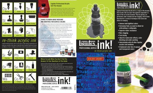
re-think acrylic ink<br />
<strong>Liquitex</strong> Professional Acryic inks! can be used in a wide variety of applications for<br />
maximum versatility. Used alone or mixed with other <strong>Liquitex</strong> Professional Acrylics<br />
and Mediums, there is virtually no limit to the number of application possibilities.<br />
Si<br />
Stippling<br />
Dr<br />
Drybrush<br />
Wa<br />
Watercolor<br />
Ph<br />
Photo Tinting<br />
Se<br />
Stenciling<br />
Co<br />
Collage<br />
Ai<br />
Airbrush<br />
Po<br />
Pouring<br />
Da<br />
Drafting<br />
*A note regarding the use of <strong>Liquitex</strong> Professional Acrylic inks! and technical pens:<br />
Because <strong>Liquitex</strong> Professional Acrylic ink! is vastly superior in water resistance to other<br />
acrylic inks, care should be taken when using technical and dip pens. Extended periods of<br />
time in a technical pen can lead to drying in the pen nib. <strong>Liquitex</strong> Professional Acrylic inks!<br />
should not be used with fountain pens.<br />
THINGS TO KNOW ABOUT MEDIUMS<br />
AND ADDITIVES FOR ACRYLIC COLORS<br />
1. Mediums and additives help you do an almost infinite variety of different things<br />
with acrylics. From traditional painting applications on canvas and panel to water<br />
color on paper, to high-peak impasto, to glazing, to unique textural effects, acrylics<br />
can do it all. There’s no better color for contemporary techniques such as<br />
image-transfer, for structural applications, and collage. Using these products with<br />
<strong>Liquitex</strong> Professional Acrylic inks! provides even more creative variety.<br />
2. Mediums are made with acrylic resin for adjusting paint in different ways. They can<br />
be used to add texture, adjust the flow, and alter the working properties of the color.<br />
Because they include acrylic resin, mediums maintain or add to the stability of the<br />
paint film, and can be used in any amount desired.<br />
3. Additives are used to adjust the chemistry of acrylics, and do not include a<br />
significant proportion of acrylic resin. The last part of that sentence is important<br />
because it means that additives should be used only in the amount needed to achieve<br />
the desired effect; adding too much can affect the stability of the<br />
acrylic film. As with all products, the directions should<br />
be read before use.<br />
4. Mediums and gels are superior adhesives. They<br />
can be used in collage as well as to extend the<br />
color. And they can be over-painted for<br />
building structures.<br />
Where To Look When You Don’t Find The<br />
Answers To Your Questions In This Guide<br />
Check one of these really great resources. They’re each indexed, and can help you find<br />
detailed answers for just about anything relating to acrylic.<br />
1. The <strong>Liquitex</strong> Acrylic Book: This reference provides artists with essential information<br />
about the working properties and application of acrylic colors. It can be downloaded<br />
for free from www.liquitex.com. It is also available where <strong>Liquitex</strong> acrylics are sold,<br />
or by calling 1(888)4ACRYLIC.<br />
2. www.liquitex.com: Great technical information along with features about artists and<br />
students using acrylic colors in an inspiring variety of ways.<br />
3. Call us. The <strong>Liquitex</strong> Technical Help Line is available at 1(888)4ACRYLIC.<br />
PROFESSIONAL ACRYLIC<br />
WWW.LIQUITEX.COM 1-888-4-ACRYLIC<br />
© 2008 <strong>Liquitex</strong> Artists Materials<br />
P.O. Box 246, Piscataway, NJ 08855 U.S.A.<br />
<strong>Liquitex</strong> Professional Acrylic<br />
ink! Pen Cleaner<br />
<strong>Liquitex</strong> Professional Acrylic ink! Pen Cleaner is ideal for cleaning<br />
Acrylic ink! from paint brushes, technical and dip pens and<br />
airbrush parts. Simply rinse them with a small amount of Acrylic<br />
ink! Pen Cleaner to remove ink! Should some ink! dry on your<br />
brushes or nibs, soak the items in <strong>Liquitex</strong> Professional Acrylic<br />
ink! Pen Cleaner for a few minutes and then rinse with water.<br />
0<br />
re-think acrylic ink<br />
COLOR CHART<br />
9 4 3 7 6 9 7 6 6 5 6<br />
L94260<br />
PROFESSIONAL ACRYLIC<br />
PROFESSIONAL ACRYLIC<br />
<strong>Liquitex</strong> Professional Acrylic ink! is a range of 30 extremely<br />
fluid acrylics that use super fine pigments suspended in a<br />
state-of-the-art acrylic emulsion. They dry quickly, are<br />
permanent, water resistant and non-clogging, which makes<br />
them ideal for a variety of techniques from watercolor<br />
effects to stamping.<br />
• Intense bold lightfast colors<br />
• Extremely fluid, no need to dilute for<br />
airbrushing or calligraphy<br />
• Superior water resistance<br />
• Non-clogging<br />
• Fast drying<br />
• Ideal for watercolor effects, color<br />
blocking and under painting<br />
• Intermixable with all other liquitex<br />
acrylics and mediums<br />
• A balanced color line of opaque<br />
and transparent colors
114<br />
Quinacridone Magenta<br />
lightfastness I / transparent<br />
292<br />
Naphthol Crimson<br />
lightfastness II / transparent<br />
321<br />
Pyrrole Red<br />
lightfastness NR / opaque<br />
620<br />
Vivid Red Orange<br />
lightfastness I / transparent<br />
THE PROFESSIONAL COLOR RANGES<br />
SB SOFT BODY<br />
A professional quality,<br />
highly pigmented acrylic<br />
formulated for smooth,<br />
even flow.<br />
PROFESSIONAL ACRYLIC<br />
335<br />
Red Oxide<br />
lightfastness I / opaque<br />
129<br />
Transparent Burnt Sienna<br />
lightfastness I / transparent<br />
color spectrum<br />
130<br />
Transparent Burnt Umber<br />
lightfastness I / transparent<br />
333<br />
Transparent Raw Umber<br />
lightfastness I / transparent<br />
332<br />
Transparent Raw Sienna<br />
lightfastness I / transparent<br />
HB HEAVY BODY<br />
A professional quality,<br />
highly pigmented acrylic<br />
formulated for easy brushability<br />
and for thicker applications.<br />
30ML<br />
414<br />
Yellow Orange Azo<br />
lightfastness I / transparent<br />
416<br />
Yellow Oxide<br />
lightfastness I / opaque<br />
412<br />
Yellow Medium Azo<br />
lightfastness I / transparent<br />
159<br />
Cadmium Yellow Light Hue<br />
lightfastness I / translucent<br />
740<br />
Vivid Lime Green<br />
lightfastness I / opaque<br />
315<br />
Sap Green Permanent<br />
lightfastness I / translucent<br />
319<br />
Phthalocyanine Green (YS)<br />
lightfastness I / transparent<br />
SHB SUPER HEAVY BODY<br />
A professional quality, highly<br />
pigmented acrylic formulated<br />
for very thick, high-peak<br />
application with exceptionally<br />
low shrinkage.<br />
150ML<br />
317<br />
Phthalocyanine Green (BS)<br />
lightfastness I / transparent<br />
337<br />
Carbon Black<br />
lightfastness I / opaque<br />
561<br />
Turquoise Deep<br />
lightfastness I / translucent<br />
599<br />
Neutral Grey Value 5<br />
lightfastness I / opaque<br />
USING THIS COLOR CHART AND WHAT IT TELLS YOU<br />
470<br />
Cerulean Blue Hue<br />
lightfastness I / opaque<br />
432<br />
Titanium White<br />
lightfastness I / opaque<br />
All pigments bring different characteristics to the ink!, and this color chart is<br />
designed to help you choose colors based upon their unique pigment ‘personality.’<br />
Some pigments tend to be brighter, some more opaque, and some stain the surface.<br />
All of these characteristics add to the creative experience and can be used to<br />
enhance the image. If you know what to look for, these characteristics can be ‘read’<br />
from this ink! <strong>Color</strong> <strong>Chart</strong>.<br />
COLOR CHARACTERISTICS: First, check out the ‘masstone’ and the ‘undertone’ of<br />
each color chip. The masstone is where the color is applied thickly, at its most<br />
opaque. The undertone is where the color is spread more thinly and transparent.<br />
Some characteristics will show up in the undertone that aren’t readily apparent in<br />
the masstone.<br />
OPACITY: Look for relative opacity and transparency. Each color on the chart is<br />
noted with an ‘O’ (for opaque), a ‘TL’ (for translucent or semi-opaque), or a ‘TP’ (for<br />
320<br />
Prussian Blue Hue<br />
lightfastness I / translucent<br />
234<br />
Iridescent Bright Gold<br />
lightfastness I / opaque<br />
316<br />
Phthalocyanine Blue (GS)<br />
lightfastness I / transparent<br />
230<br />
Iridescent Rich Copper<br />
lightfastness I / opaque<br />
115<br />
Deep Violet<br />
lightfastness II / translucent<br />
236<br />
Iridescent Bright Silver<br />
lightfastness I / opaque<br />
transparent). Some pigments are rock-solid (like the cadmiums) and allow little or<br />
no light to pass through. These make a naturally opaque color. Some are like stained<br />
glass (like the phthalocyanines) and take on a gleaming, jewel-like quality.<br />
PERMANENCE: The permanence is listed using categories designated by the<br />
American Society for Testing and Materials (ASTM) subcommittee for artists’<br />
materials. Lightfastness is rated by using categories I, II, and III. Both I and II can<br />
be considered permanent for artists use.<br />
SINGLE OR MIXED PIGMENT: Single pigment colors (noted with an ‘S’ on the chart)<br />
are formulated to help you maximize the true and unique character of the color.<br />
Single pigment colors also tend to give brighter, cleaner mixes than mixed pigment<br />
colors. Mixed pigment colors (noted with an ‘M’ on the chart) are formulated to give<br />
you ‘ready-mixed’ colors with a brightness that can be difficult to obtain on your own.<br />
186<br />
Dioxazine Purple<br />
lightfastness II / transparent<br />
229<br />
Iridescent Rich Bronze<br />
lightfastness I / opaque<br />
PIGMENT DETAILS: The Composition and<br />
Permanence chart to the right includes<br />
precise pigment information. In addition<br />
to listing common pigment names, the<br />
color index number is provided for more<br />
specific identification.<br />
This color chart is produced within the limitations of<br />
lithographic printing and is intended as a guide only.<br />
COMPOSITION AND PERMANENCE CHART<br />
SINGLE<br />
OR MIXED<br />
COLOR # COLOR NAME LIGHTFASTNESS “I” PIGMENTS OPACITY PIGMENTS<br />
159 Cadmium Yellow Light Hue I S TL Quinophthalone Yellow (PY 138)<br />
337 Carbon Black I S O Carbon Black (PBk 7)<br />
470 Cerulean Blue Hue I M O Titanium Dioxide (PW 6), Phthalocyanine Blue (PB 15:3),<br />
Chlorinated Copper Phthalocyanine (PG 7)<br />
115 Deep Violet II M TL Quinacridone Magenta (PR 122), Carbazole Dioxozine (PV 23 RS)<br />
186 Dioxazine Purple II S TP Carbazole Dioxozine (PV 23 RS)<br />
234 Iridescent Bright Gold I M O Mica coated with iron oxide and titanium dioxide<br />
236 Iridescent Bright Silver I M O Mica coated with iron oxide and titanium dioxide<br />
229 Iridescent Rich Bronze I M O Mica coated with iron oxide and titanium dioxide<br />
230 Iridescent Rich Copper I M O Mica coated with iron oxide and titanium dioxide<br />
292 Naphthol Crimson II S TP Naphthol Carbamide (PR 170 F5RK)<br />
599 Neutral Grey Value 5 I M O Titanium Dioxide (PW 6), Carbon Black (PBk 7)<br />
317 Phthalocyanine Green (Blue Shade) I S TP Chlorinated Copper Phthalocyanine (PG 7)<br />
316 Phthalocyanine Blue (Green Shade) I S TP Phthalocyanine Blue (PB 15:3)<br />
319 Phthalocyanine Green (Yellow Shade) I S TP Chlorinated and Brominated Copper Phthalocyanine (PG 36)<br />
320 Prussian Blue Hue I M TL Phthalocyanine Blue (PB 15:3), Carbazole Dioxozine (PV 23 RS),<br />
Carbon Black (PBk 7)<br />
321 Pyrrole Red NR S O Pyrrol Red (PR 254)<br />
114 Quinacridone Magenta I S TP Quinacridone Magenta (PR 122)<br />
335 Red Oxide I S O Synthetic Iron Oxide Red (PR 101)<br />
315 Sap Green Permanent I M TL Chlorinated Copper Phthalocyanine (PG 7), Diarylide Yellow HR70 (PY 83),<br />
Carbon Black (PBk 7)<br />
432 Titanium White I S O Titanium Dioxide (PW 6)<br />
129 Transparent Burnt Sienna I S TP Synthetic Iron Oxide Red (PR 101)<br />
130 Transparent Burnt Umber I M TP Synthetic Iron Oxide Red (PR 101), Carbon Black (PBk 7)<br />
332 Transparent Raw Sienna I S TP Synthetic Iron Oxide Yellow (PY 42)<br />
333 Transparent Raw Umber I M TP Synthetic Iron Oxide Yellow (PY 42), Synthetic Iron Oxide Red (PR 101),<br />
Carbon Black (PBk 7)<br />
561 Turquoise Deep I M TL Phthalocyanine Blue (PB 15:3), Chlorinated Copper Phthalocyanine (PG 7)<br />
740 Vivid Lime Green I M O Quinophthalone Yellow (PY 138), Chlorinated Copper Phthalocyanine (PG 7)<br />
620 Vivid Red Orange I S TP Naphthol AS (PR 188)<br />
412 Yellow Medium Azo I S TP Arylide Yellow 5GX (PY 74 LF)<br />
414 Yellow Orange Azo I S TP Diarylide Yellow HR70 (PY 83)<br />
416 Yellow Oxide I S O Synthetic Iron Oxide Yellow (PY 42)<br />
NR - <strong>Color</strong>s not rated for ASTM lightfastness. Internal testing indicates this pigment to be equivalent to ASTM I and II.<br />
Some composition and pigment information may change based upon availability or improvements to the range.