Download PDF Version Revolt Magazine, Volume 1 Issue No.4
Download PDF Version Revolt Magazine, Volume 1 Issue No.4
Download PDF Version Revolt Magazine, Volume 1 Issue No.4

You also want an ePaper? Increase the reach of your titles
YUMPU automatically turns print PDFs into web optimized ePapers that Google loves.
THE<br />
GALLERY<br />
VIEW<br />
BY ROB REED<br />
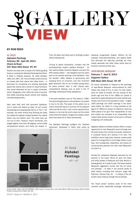
AL HELD<br />
Alphabet Paintings<br />
Fedruary 28 - April 20, 2013<br />
Cheim & Read<br />
547 West 25th Street NY, NY<br />
Tension and play were a couple of Al Held's guiding<br />
forces in creating the Alphabet Paintings that Cheim<br />
& Read in Chelsea presents. All made between<br />
1961 and 1967, the monumentally scaled acrylics<br />
on canvas take their queue from letter forms – a<br />
technique for composing and dividing abstracted<br />
space that retains also a sense of visual familiarity<br />
that would otherwise be lost in purely minimalist<br />
works. Typography, here, offers the artist a heuristic<br />
that yields surprising results without ever slipping<br />
into alienating territory.<br />
Held used both serif and sans-serif typefaces,<br />
and in works with letters as titles, he isn't merely<br />
transposing and cropping letter forms. In "The 'I,'" for<br />
example, the white vertical bars flanking the sides<br />
are indeed the spaces created between the capital<br />
letter's top and bottom serif. The white bars are<br />
not true to form, however; they're shortened, and<br />
angled slightly more than 90 degrees, which builds<br />
compositional tension and holds the shapes in.<br />
Thus, the black and white work is strikingly modern<br />
without feeling cold.<br />
Turning to letters themselves, consider that the<br />
quintessentially modern typeface Helvetica – it's<br />
now used by Apple, American Apparel, and even the<br />
MTA subway system – was designed just four years<br />
prior to the earliest painting in this exhibition, "Ivan<br />
the Terrible," 1961. Modern is synonymous with<br />
stripping forms of ornament, and with ornament<br />
goes sentiment. But for all of Held's paring down,<br />
he packs emotion back in with intense color,<br />
compositional skewing, and, at least in the "X"<br />
paintings, thwarting of linear perspective.<br />
In the back exhibition room is "The Yellow X," 1965.<br />
The second largest piece in the exhibition, its content<br />
is true to its title. The power of the yellow hue is<br />
nearly overwhelming as it bounces off the adjacent<br />
walls and fills the room. Lost in some reproductions,<br />
however, is not only the work's scale, but the center<br />
divide where the diptych merges and creates a black<br />
sliver that slices the X rather dramatically.<br />
The Alphabet Paintings prefigure the "abstract<br />
illusionism" developed in Held's later works by<br />
tweaking recognizable shapes. Without all the<br />
overlaps, three-dimensionality, and spatial depth<br />
that dominate the latter-day paintings we more<br />
closely associate with Held, these works have an<br />
eccentric iconicity all their own.<br />
JEAN-MICHEL BASQUIAT<br />
February 7 - April 6, 2013<br />
Gagosian Gallery<br />
555 West 24th Street NY, NY<br />
It's nearly impossible to respond to the paintings<br />
of Jean-Michel Basquiat unencumbered by what<br />
history has made of him, or even, for that matter,<br />
what he made of himself. Yet the voracity of the<br />
artist's ego and that of the 1980s art market is<br />
essential to appreciating how the artist worked and,<br />
frankly, how much art he was able to make – roughly<br />
1000 paintings and 2000 drawings in the seven<br />
years before his death of a drug overdose at the<br />
age of 27. (Without a stream of collectors, where do<br />
3000 pieces of art go?) This inseparability of man<br />
and market can translate to an irreducibility that<br />
makes either severe criticism of his work or effusive<br />
eulogizing a bit inadequate.<br />
Gagosian Gallery's Chelsea location offers a unique<br />
opportunity to mine Basquiat's oeuvre through over<br />
50 works drawn from private and public collections.<br />
A curatorial theme isn't obvious if it's here. The<br />
exhibition rooms' large sizes, however, create ample<br />
space for incongruities to commingle without much<br />
fuss. And incongruities, disparities, and stream-ofconsciousness<br />
pastiche are what make Basquiat's<br />
art what it is.<br />
Among the metaphors Basquiat assumed for his<br />
persona is the boxer. We've all seen the black<br />
and white posters of Basquiat and Andy Warhol in<br />
boxing gloves, as if ready to spar. The boxer asserts<br />
Basquiat's aggressive rounds with the art world,<br />
and perhaps – at least in the portrait series of<br />
black boxers, including Jack Johnson, Sugar Ray<br />
Robinson, Cassius Clay, etc. – a critique of the art<br />
world's racial makeup (though this he denied).<br />
Al Held (1928 - 2005), IVAN THE TERRIBLE, 1961. Acrylic on canvas 144 x 114 inches 365.8 x 289.6 centimeters CR# He.31324<br />
Photos courtesy Cheim & Read, New York.<br />
REVOLT<br />
The "boxer series" contains some of the most<br />
inventive works, essentially bricolage, seductively<br />
<strong>Magazine</strong> Number 4, 2013 6