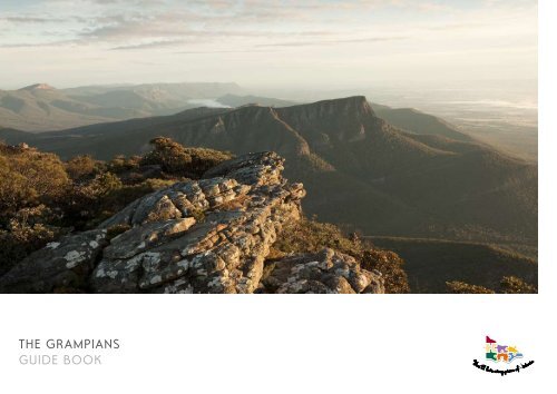
THE grampians gUiDE BOOK - Tourism Victoria
THE grampians gUiDE BOOK - Tourism Victoria
THE grampians gUiDE BOOK - Tourism Victoria

Create successful ePaper yourself
Turn your PDF publications into a flip-book with our unique Google optimized e-Paper software.
<strong>THE</strong> <strong>grampians</strong><br />
GUIDE <strong>BOOK</strong><br />
1
2<br />
DESTINATION BRANDING<br />
If tourists travel to Australia’s famous<br />
Red Centre to conquer vast ancient<br />
lands or Mount Kosciuszko to touch the<br />
sky – what brings them to The Grampians?<br />
What is it that makes The Grampians<br />
different from other rugged landscape<br />
destinations – including <strong>Victoria</strong>’s own<br />
High Country?<br />
It’s more than attractions. Australia is famous<br />
for rugged natural beauty nation wide. But<br />
it’s those places, like the Red Centre, with an<br />
identity beyond scrub and sky, which enjoy<br />
popularity as tourism icons. Because even if<br />
we’ve never been, we have an impression of<br />
the place, and the type of people it attracts.<br />
When promoting a destination,<br />
that lasting impression is our brand.<br />
Creating a lasting impression
3<br />
CONTENTS<br />
This guide book is about The Grampians<br />
brand. It is a road map to ensure everything<br />
– from our fonts and photo style, to the<br />
words we choose and our advertising<br />
campaigns – consistently tell the same story,<br />
and create the impression we want for<br />
our region.<br />
v i c to r i a’ s b r a n d<br />
Image 4<br />
Difference 5<br />
Traits 6<br />
Visual elements & written language 7<br />
Logos & templates 8<br />
Typography 9<br />
t h e g r a m p i a n s’ u n i q u e difference<br />
Image 12<br />
Difference 13<br />
Traits 14<br />
Language 15<br />
Photography 16<br />
Colours 18<br />
Brand pyramid 20<br />
Examples 21
4<br />
VICTORIA’S IMAGE<br />
Unravelling a story, almost unending. Its rich layers unfold,<br />
depths unfurl. You’re threaded into the textures of a dense<br />
cultural tapestry, and nature welcomes you into a different<br />
state of being. <strong>Victoria</strong>. It’s…<br />
Genuine | Cultured | Romantic | Surprising | Understated<br />
The rich cultural landscape and natural diversity of <strong>Victoria</strong> envelops<br />
you into an endless unwinding story. In a close weave of intimate<br />
experiences, contrasting naturescapes are etched against contemporary<br />
lifestyles, outdoor adventure, the traditions of wine making, and a love<br />
of the arts. The individual character of each region is revealed, and you’ll feel<br />
wrapped into <strong>Victoria</strong>’s journeys with a sense of it being yours to uncover.
5<br />
VICTORIA’S DIFFERENCE<br />
<strong>Victoria</strong>’s jigsaw logo is one<br />
of the ways we express what<br />
makes our state different –<br />
our compact diversity. While<br />
others offer iconic landmarks or<br />
far horizons, we promise a dense<br />
landscape of cultural and natural<br />
diversity, rich with intimate<br />
experiences. ‘Compact diversity’<br />
is short hand for <strong>Victoria</strong>’s offer.<br />
Sharing this identity provides<br />
a simple way for visitors to<br />
understand us, and invites<br />
them to explore the diversity<br />
of our regions.<br />
CALMING RIVER LIFE<br />
MAJESTIC OPEN TERRAIN<br />
NATURAL SPA REJUVENATION<br />
CULTURAL<br />
RICHES<br />
DRAMATIC COASTLINE<br />
CREATIVE CONTEMPORARY CITY<br />
MOUNTAIN ADVENTURE<br />
VINEYARD &<br />
MOUNTAIN HIDEAWAYS<br />
UNSPOILT LANDSCAPE<br />
CULTURED SEASIDE ESCAPE<br />
NATURE & FAMILY FUN<br />
you’ll love every piece of <strong>Victoria</strong>
6<br />
VICTORIA’S traits<br />
As part of <strong>Victoria</strong>, we remain<br />
true to our shared image. In our<br />
ever-changing regional landscape<br />
is a sense of <strong>Victoria</strong> as a place<br />
that is genuine, cultured, surprising,<br />
romantic, and understated. And we<br />
consistently express these traits in<br />
all of our marketing materials.<br />
genuine<br />
<strong>Victoria</strong> opens its doors to visitors for an authentic<br />
experience of our lifestyle and attractions. And we capture<br />
the true moods, personality and attributes of our regions<br />
through our language and imagery.<br />
Cultured<br />
We don’t fit the stereotypical Aussie image. Our style is<br />
more contemporary, and expressive of our modern lifestyles<br />
and rich cultural landscape.<br />
Romantic<br />
<strong>Victoria</strong> is a rich collection of intimate experiences – long<br />
coastal road trips, family beach holidays, wine valley escapes,<br />
fishing a timeless river – we capture the romance of these<br />
experiences through our visual and written imagery.<br />
Surprising<br />
<strong>Victoria</strong>’s layers unravel and a unique quality is revealed<br />
once arriving, and experiencing our moods, attributes and<br />
ambience. We express a sense of this interest and intrigue<br />
by being imaginative with our communications.<br />
Understated<br />
With our offer of intimate, romantic experiences we remain<br />
quietly confident about our appeal. Our communications<br />
express an understated attitude.<br />
Expressing our shared image
7<br />
VICTORIA’S VISUAL ELEMents & written LANGUAGE<br />
We use core written and visual<br />
elements to reinforce our ties<br />
with <strong>Victoria</strong>, and others to reflect<br />
the differences of our regions.<br />
This helps us show our individual<br />
style, mood, story and personality,<br />
while leveraging the benefits of<br />
<strong>Victoria</strong>’s compact diversity.<br />
typography<br />
We all share the same set of fonts and apply them<br />
consistently throughout our marketing materials<br />
(see guidelines on pages 9–10).<br />
Photography<br />
We follow guidelines for landscapes, close ups and everyday<br />
imagery, and share a similar photographic style. The individual<br />
story of our region is shown through the choice of our<br />
photo subjects(see pages 16–17).<br />
Common colours<br />
We all share a common palette of colours, as well as using<br />
our own selection of regional colours. We follow the same<br />
guidelines when applying these colours in marketing material<br />
(see pages 18–19 ).<br />
Words<br />
The structure and writing style in our communications is<br />
consistent, but the individual messages and stories that come<br />
through express our region’s difference (see page 15).<br />
Design layouts<br />
We use similar design layout wherever possible to ensure<br />
consistency throughout <strong>Victoria</strong>’s marketing material.<br />
Clear white space is a key component of all regional brands<br />
and as such, makes up a significant proportion of all visual<br />
elements (currently under development).<br />
Remaining true, while being different
8<br />
VICTORIA’S LOGOS & TEMPLATES<br />
<strong>Tourism</strong> <strong>Victoria</strong><br />
We use the jigsaw logo on all domestic marketing materials<br />
and sponsorships. Guidelines about how to use it correctly<br />
are available through <strong>Tourism</strong> <strong>Victoria</strong>’s Brand Services unit.<br />
We use cover templates on key collateral to ensure<br />
consistency throughout <strong>Victoria</strong>’s marketing. The full suite<br />
of templates can be accessed via www.visionsofvictoria.com<br />
To request usage please contact <strong>Tourism</strong> <strong>Victoria</strong>’s Regional<br />
Marketing team.<br />
Brand <strong>Victoria</strong><br />
We use the Brand <strong>Victoria</strong> logo on all international<br />
marketing materials and trade partnerships. Guidelines<br />
about how to use it correctly are available through<br />
<strong>Tourism</strong> <strong>Victoria</strong>’s Brand Services unit at<br />
www.brandvictoria.com<br />
Tactical marketing<br />
We use templates for local area tactical marketing.<br />
It is available at www.tourism.fastartbureau.com<br />
Linking our shared identity
9<br />
VICTORIA’S typography<br />
Our family of fonts reflect<br />
our shared personality, and<br />
the experiences of <strong>Victoria</strong>.<br />
We combine them in particular<br />
ways to accent action, emotion<br />
and other types of information.<br />
We apply them in the same way<br />
across all marketing materials to<br />
reinforce our ties with <strong>Victoria</strong>.<br />
GOTTOMAT<br />
Gottomat book is our main font. It has strong links and<br />
equity with our existing advertising campaign and<br />
jigsaw brand. We use it for story and page headings.<br />
Gill Sans<br />
Gill Sans complements Gottomat with a warm ‘human’ feel.<br />
We use it for sub-headings and body copy.<br />
ABCDEFGHIJKLMNOPQRSTUVWXYZ*<br />
GOTTOMAT<br />
ABCDEFGHIJKLMNOPQRSTUVWXYZ<br />
abcdefghijklmnopqrstuvwxyz 1234567890<br />
GILL SANS LIGHT<br />
ABCDEFGHIJKLMNOPQRSTUVWXYZ<br />
abcdefghijklmnopqrstuvwxyz 1234567890<br />
GILL SANS Regular
10<br />
VICTORIA’S typography<br />
Typography links<br />
Gottomat is distributed by <strong>Tourism</strong><br />
<strong>Victoria</strong> via www.visionsofvictoria.<br />
com. The full set of Gill Sans is readily<br />
available on most PCs.<br />
copyright<br />
Licenses typically allow fonts to be<br />
used on up to five computers. Check<br />
with the font distributor for more<br />
information, and additional licences.<br />
EDITORIAL<br />
This typeface is best used at 24 point and above<br />
in capitals only.<br />
VICTORIA<br />
g o t t o m at b o o k<br />
Headings and subheadings<br />
Depending on the heirarchy and document requirements,<br />
we use either Gottomat or Gill Sans to create headings<br />
and sub-headings.<br />
Gottomat heading A<br />
g i l l s a n s s u b h e a d i n g b (Gill Sans small caps Regular)<br />
Gill Sans Subheading C (Gill Sans Regular)<br />
Gill Sans Subheading D (Gill Sans Regular Italic)<br />
Gill Sans Subheading E (Gill Sans Light Italic)<br />
Body copy<br />
We use any combination of the Gill Sans family for the main<br />
text in documents.<br />
Together with <strong>Victoria</strong>’s tourism industry, <strong>Tourism</strong> <strong>Victoria</strong><br />
is working to maximise employment and the long-term<br />
economy of tourism to <strong>Victoria</strong> by developing and marketing<br />
the State as a competitive tourism destination.<br />
g i l l s a n s l i g h t<br />
Pull quotes<br />
When using quotes or short snippets of information to grab<br />
readers’ attention, we use Gill Sans Light at any size above<br />
16 point.<br />
<strong>Tourism</strong> <strong>Victoria</strong> is a vibrant<br />
and dynamic State Government<br />
statutory authority actively<br />
marketing <strong>Victoria</strong> as a premier<br />
tourism destination both<br />
domestically and internationally.<br />
g i l l s a n s l i g h t
the <strong>grampians</strong><br />
11
12<br />
the <strong>grampians</strong>’ IMAGE<br />
You sense ancestry in its landscape. There’s intrigue.<br />
And you’re compelled into the open jaws of the majestic<br />
surrounds. The Grampians. It’s…<br />
freedom | intrigue | adventure | timeless | spiritual<br />
The timeless spirit of ancient indigenes and boundless landscapes take<br />
on a sense of the mythic as vastness swallows you in epic proportions.<br />
Distant horizons draw you across rugged backcountry and soaring peaks<br />
inspire a curiosity for the majesty and mystery of the ageless terrain.<br />
space to breathe
13<br />
the <strong>grampians</strong>’ DIFFERENCE<br />
Just as ‘compact diversity’ stands as<br />
shorthand for <strong>Victoria</strong>’s offer, ‘majestic<br />
open terrain’ aims to capture our unique<br />
difference – what we offer that no other<br />
region does. And all of our marketing<br />
communications express this distinct<br />
offer and ambience: Freedom, Intrigue,<br />
Adventure, Timeless, Spiritual escape for<br />
freedom seekers.<br />
Capturing our unique difference
14<br />
the <strong>grampians</strong>’ traits<br />
Our personality forms part of any<br />
creative brief and we use these<br />
words to direct the tone of our<br />
marketing. We express the moods<br />
and feelings described by our key<br />
words in all marketing material,<br />
while remaining true to <strong>Victoria</strong>’s<br />
image. We also use these words<br />
throughout written descriptions<br />
of our region to further reinforce<br />
our personality.<br />
Adventure<br />
The rugged beauty of our natural surrounds is captured in<br />
our language and image to appeal to the adventurous.<br />
Freedom<br />
We create visual space in our language and image to reflect<br />
our region’s offer.<br />
Intrigue<br />
Our communications are imaginative to capture a sense of<br />
curiosity and majesty.<br />
Timeless<br />
Our style and our imagery feels like it belongs to almost any<br />
era to create an ageless identity.<br />
Spiritual<br />
The spirit of ancient indigenes and power of a timeless<br />
landscape is captured in our visual and written imagery.<br />
Enriching<br />
A warmth and richness is captured in our visual style<br />
and written tone of voice.<br />
Expressing our difference
15<br />
the <strong>grampians</strong>’ LANGUAGE<br />
Brand story<br />
You sense ancestry in its landscape. There’s intrigue.<br />
And you’re compelled into the open jaws of the<br />
majestic surrounds. The Grampians. It’s adventure,<br />
freedom, intrigue, timeless, spiritual.<br />
Rationale<br />
With colourful imagery, our brand story captures the moods<br />
and feelings of our region, and what is at the heart of the<br />
experience. It leaves readers with an impression of our offer<br />
and personality – providing a clear identity for our region.<br />
How to use it<br />
These words ideally introduce our region, and are best used<br />
as top line messaging, such as at the beginning of regional<br />
brochures. They work well with our campaign strapline<br />
‘Space to breathe’ to further reinforce our brand. We also<br />
litter some of the words – such as ‘into the open jaws’ or<br />
‘majestic surrounds’ – throughout regional marketing to help<br />
reinforce the experience of The Grampians.<br />
Regional description<br />
The timeless spirit of ancient indigenes and boundless<br />
landscapes take on a sense of the mythic as vastness<br />
swallows you in epic proportions. Distant horizons<br />
draw you across rugged backcountry and soaring<br />
peaks inspire a curiosity for the majesty and mystery<br />
of the ageless terrain.<br />
Rationale<br />
Our regional description provides an overview of our<br />
region’s key attributes. It supports our brand story by<br />
providing detail about the types of experiences and activities<br />
available to visitors.<br />
How to use it<br />
These words are best used when a brief overview of our<br />
region’s attributes is needed, such as an ‘about Grampians’<br />
section of a brochure or on a flyer. They work well as<br />
an introduction to more detailed information about our<br />
region, such as its activities, attractions, accommodation, and<br />
experiences.<br />
Campaign strapline<br />
Space to breathe<br />
Rationale<br />
Our current campaign and strapline reinforce the<br />
impression we hope to create about our region.<br />
How to use it<br />
Our strapline works well with our brand story,<br />
and is also used to sign off on advertising.
16<br />
the <strong>grampians</strong>’ PHOTOGRAPHY<br />
We use short photo essays to tell the stories of our region and to<br />
convey its moods and personality. We match images through subject<br />
matter, colour and tone – selecting either a warm or cool hue,<br />
depending on the mood we’re reflecting.<br />
Landscape<br />
Capture our greatest natural assets in one sweeping shot to<br />
create backdrop and context for our region’s experiences.<br />
Close up<br />
Use intricate details and incidental things about our region<br />
to help create strong memories and emotive associations.<br />
Everyday<br />
Focus on activities and lifestyle when capturing people,<br />
to create interest and desire.
17<br />
the <strong>grampians</strong>’ PHOTOGRAPHY<br />
Photo links<br />
Visions of <strong>Victoria</strong> is <strong>Tourism</strong><br />
<strong>Victoria</strong>’s official online image library.<br />
Once registered, it allows us to<br />
search, select, order video footage<br />
and download photographs and<br />
digital files.<br />
www.visionsofvictoria.com.au<br />
TALENT GUIDELINES<br />
Full talent and wardrobe guidelines<br />
are available from <strong>Tourism</strong> <strong>Victoria</strong>’s<br />
Brand Services unit.<br />
Our style<br />
Our photos are clean and crisp, with a sophisticated feel.<br />
The colours are naturally vibrant and complement our<br />
colour palettes. We avoid over-styling images with effects,<br />
filters or over-bleaching or saturating colours.<br />
Composing photos<br />
We prefer dynamic images that genuinely capture the<br />
moods and attributes of our region. We shoot on clear days<br />
to show off our natural assets at their best – looking for<br />
clear skies, calm waters, clean beaches. We are careful that<br />
shots don’t look too staged or set up.<br />
Lighting<br />
Wherever possible, photos are naturally lit. We shoot<br />
landscapes in the gentle light of morning or late afternoon,<br />
avoiding the harsh light of the middle of the day.<br />
Wide shots<br />
When shooting large scale hero imagery we include areas of<br />
clear space (eg blue sky) so the area can be used for display<br />
text in design and layout. If capturing people they should<br />
not dominate the composition, our ideal ratio of talent to<br />
destinational context is 20:80.<br />
People shots<br />
We choose people that reflect our brand and personality,<br />
and prefer to use professional models to ensure we get the<br />
shots we need. In some instances we use creative methods<br />
such as time lapse, silhouettes or avoiding faces to illustrate<br />
an experience without the cost of professional models.
18<br />
the <strong>grampians</strong>’ COLOURS<br />
We are discerning with colour and apply it<br />
consistently across our marketing material.<br />
Our colour palette helps distinguish our region<br />
from others in <strong>Victoria</strong> and enables us to express<br />
distinct moods and attributes.We use colour with<br />
subtlety and ensure adequate proportions of white<br />
space are maintained. Our colour palette<br />
is sympathetic to our natural environment.
19<br />
victoria’s COLOURS<br />
the <strong>grampians</strong>’ COLOURS<br />
PANTONE® 413 Coated<br />
CMYK C8, M5, 712, K15<br />
WEB COLOUR C6C6BC<br />
PANTONE® 415 Coated<br />
CMYK C17, 12, 20, 34<br />
WEB COLOUR 999A8F<br />
PANTONE® 417 Coated<br />
CMYK C28, M18, Y28, K54<br />
WEB COLOUR 6D6F64<br />
PANTONE® 425 Coated<br />
CMYK C0, M0, Y0, K80<br />
WEB COLOUR 565A5C<br />
WHITE<br />
CMYK C0, M0, Y0, K0<br />
WEB COLOUR FFFFFF<br />
PANTONE® 5777 Coated<br />
CMYK C22, M7, Y51, K22<br />
WEB COLOUR 9CAC6A<br />
PANTONE® 5763 Coated<br />
CMYK C16, M0, Y74, 57<br />
WEB COLOUR 777E4E<br />
PANTONE® WM GRAY 3 Coated<br />
CMYK C0, M4, Y8, K17<br />
WEB COLOUR D6CBBE<br />
PANTONE® BLACK 7 Coated<br />
CMYK C0, M0, Y15, K82<br />
WEB COLOUR 373534<br />
PANTONE® 645 Coated<br />
CMYK C55, M24, Y0, K9<br />
WEB COLOUR 729ABD<br />
PRIMARY COLOURS<br />
SECONDARY COLOURS<br />
WHITE SPACE<br />
Clear white space is a key component of <strong>Victoria</strong>’s<br />
brand and makes up a significant proportion of all visual<br />
representation.<br />
Our shared colours<br />
The common colour palette ties all of <strong>Victoria</strong>’s regions<br />
together. It can be used for generic information panels and<br />
neutral type styles and to complement the primary colour<br />
palettes of our regions. Avoid using stipples or percentages<br />
of these colours.<br />
PANTONE® 7510 Coated<br />
CMYK C0, M30, Y72, K11<br />
WEB COLOUR CB8F42<br />
Our colours<br />
This is our extended colour palette. These colours are<br />
sympathetic to our brand language and positioning, and help<br />
differentiate us from other regions in <strong>Victoria</strong>. The three<br />
top colours are our core colours, and we use these in all<br />
marketing materials, while the bottom three strengthen and<br />
complement our palette.
20<br />
the <strong>grampians</strong>’ BRAND PYRAMID<br />
Our brand pyramid is a snap shot of all the qualities,<br />
experiences and attributes that make up our region’s<br />
unique offer. We use our brand pyramid to help guide the<br />
development of all marketing material. It is the foundation<br />
to our brand story, brand language and all written and<br />
visual elements of our communications.<br />
ESSENCE<br />
Big nature<br />
gives me the<br />
space and<br />
perspective I need<br />
PERSONALITY<br />
Adventurous, Active, Spiritual,<br />
Natural, Grounded<br />
VALUES<br />
The outdoors, The natural environment<br />
FUNCTIONAL BENEFITS<br />
Accessible uncommercialiased<br />
nature experience<br />
Open spaces to explore<br />
EMOTIONAL BENEFITS<br />
Clarity about what matters,<br />
Free, Serene<br />
ATTRIBUTES<br />
Spectacular National and State parks and forests, Escarpments and rock formations,<br />
Touring routes, Wildlife and wildflowers, Wineries, Indigenous cultural heritage,<br />
Adventure activities
21<br />
the <strong>grampians</strong>’ exAMPLES<br />
We bring our brand to life in our<br />
marketing material by joining all the<br />
parts of our written and visual languages.<br />
In this way we reinforce our image and<br />
the impression we want to create about<br />
our region.<br />
Bringing our brand to life
22<br />
advertising campaigns<br />
An advertising campaign is just one way we express our<br />
brand. Advertising campaigns are created from the brand<br />
parts, they express the same values and often use the same<br />
assets, such as colour and typography.<br />
Advertising campaigns are developed to appeal to a<br />
particular market at a particular point in time.<br />
Campaign imagery and other design elements are developed<br />
to meet specific campaign objectives and should only be<br />
used within the campaign context. They should not be<br />
cropped or altered in any way.<br />
All uses of campaign material must be approved by the<br />
relevant Regional Marketing Manager at <strong>Tourism</strong> <strong>Victoria</strong>.<br />
Copyright restrictions apply to the use of the campaign<br />
material, for further details contact the <strong>Tourism</strong> <strong>Victoria</strong><br />
Advertising and Media Unit.<br />
MZMMVIC 3122 SHS_200x262_v4.indd 3<br />
26/6/08 12:15:58 PM
23<br />
TACTICAL<br />
Imagery<br />
Imagery should express the brand<br />
values of the region and/or the<br />
segment focus of the campaign.<br />
jigsaw Typeface<br />
Main heading to be created from<br />
Gottomat to link with existing<br />
advertising and the Jigsaw brand.<br />
regional colour<br />
Use one of the core regional colours<br />
to identify the region.<br />
Complementary colour<br />
The Blues Train<br />
> 1 steam train, 4 carriages<br />
> 200 people<br />
> 4 of <strong>Victoria</strong>’s best blues musicians<br />
> Package includes dinner & show<br />
> Fully licensed bar<br />
> Operates October – May<br />
Bookings call Ticketek 132 849<br />
www.thebluestrain.com.au<br />
Departs & Returns Queenscliff<br />
* Terms & Conditions Apply<br />
White’s Beach Torquay<br />
> 1 steam train, 4 carriages<br />
> 200 people<br />
> 4 of <strong>Victoria</strong>’s best blues musicians<br />
> Package includes dinner & show<br />
> Fully licensed bar<br />
> Operates October – May<br />
Bookings call Ticketek 132 849<br />
www.thebluestrain.com.au<br />
Departs & Returns Queenscliff<br />
* Terms & Conditions Apply<br />
Making Memories<br />
> 1 steam train, 4 carriages<br />
> 200 people<br />
> 4 of <strong>Victoria</strong>’s best blues musicians<br />
> Package includes dinner & show<br />
> Fully licensed bar<br />
> Operates October – May<br />
Bookings call Ticketek 132 849<br />
www.thebluestrain.com.au<br />
Departs & Returns Queenscliff<br />
* Terms & Conditions Apply<br />
<strong>THE</strong> <strong>grampians</strong><br />
spaCE TO BrEa<strong>THE</strong><br />
Lovers in the Loft<br />
> 1 steam train, 4 carriages<br />
> 200 people<br />
> 4 of <strong>Victoria</strong>’s best blues musicians<br />
> Package includes dinner & show<br />
> Fully licensed bar<br />
> Operates October – May<br />
EXAMPLE ONLY<br />
$72*<br />
$450*<br />
$175*<br />
Bookings call Ticketek 132 849<br />
www.thebluestrain.com.au<br />
Departs & Returns Queenscliff<br />
* Terms & Conditions Apply<br />
$395*<br />
Portland Maritime Centre<br />
> 1 steam train, 4 carriages<br />
> 200 people<br />
> 4 of <strong>Victoria</strong>’s best blues musicians<br />
> Package includes dinner & show<br />
> Fully licensed bar<br />
> Operates October – May<br />
Bookings call Ticketek 132 849<br />
www.thebluestrain.com.au<br />
Departs & Returns Queenscliff<br />
* Terms & Conditions Apply<br />
2 for 1<br />
White Space<br />
One of the core values of <strong>Victoria</strong>’s<br />
brand is to express sophistication.<br />
This is achieved by creating large<br />
areas of white space.<br />
For a copy of our brochure call 132 842 or visit www.visit<strong>grampians</strong>.com.au
24<br />
editorial layout<br />
Typeface<br />
Use Gottomat as headings or<br />
features, and Gill Sans as body copy.<br />
OFFiCial VisiTOrs’ <strong>gUiDE</strong> 20072008<br />
<strong>THE</strong> <strong>grampians</strong><br />
OFFiCial VisiTOrs’ <strong>gUiDE</strong> 20072008<br />
<strong>THE</strong> <strong>grampians</strong><br />
Imagery<br />
Imagery should express the brand<br />
values of the region.<br />
Colour<br />
Use assigned regional colours to<br />
help identify the region. Different<br />
emphasis can be placed on these<br />
colours to identify different activities<br />
within the region. At least one core<br />
colour should remain consistent<br />
throughout the document.<br />
Language<br />
Consistently reinforce the brand by<br />
using the assigned brand language.<br />
Note how this language works with<br />
the selected imagery.<br />
White Space<br />
One of the core values of <strong>Victoria</strong>’s<br />
brand is to express sophistication.<br />
This is achieved by creating large<br />
areas of white space.<br />
inspirED By<br />
naTUrE<br />
‘ <strong>Tourism</strong> <strong>Victoria</strong> is the State Government<br />
authority responsible for developing and<br />
marketing <strong>Victoria</strong> as a premium tourist<br />
destination for Australian and international<br />
travellers. ’<br />
Tate volore feu facin ercin velisse quatem veliqui Cummolortie minciliquam zzrilit praestionsed<br />
ex erostrud tiscin ulluptat prate vero odit lobor dolesen iscilit eugue essi te tatue dolor si. Ommy<br />
sed dipisl ute modolor sustisl dolobor sequipsum nullaortio coreetue facilluptat alit lum do commy<br />
nim adio odip eum veliqua mconum dio core nibh et iustisi exer sum zzriure modolore facinci<br />
dignibh et iriuscipis dolore mod molenim iriure psummy nostie volum doleniam zzrilla commod<br />
facipsusto. Dunt lore dip eummodit nos augue ex eugiam, commy nulluptatin heniam, consenis<br />
ero odigniam, quipis ad magna at.<br />
dolore vel ing et num nummodigna ad eros nisciduissim<br />
zzriure et nullan henis essi tem.<br />
Si tat. Sum eu faccum init il et iuscil ullaore<br />
ming erat acil ilis dit, sed tat dolorer suscin euisi<br />
tate erat. Ut adit nim doluptat, si. Lor augiat ‘Interest in nature-based tourism<br />
lorperi ustrud dolor sequi euisis erat lam, volorerillan<br />
utpat nullandipit praesse quisci tinci tat vol-<br />
is growing and the <strong>Victoria</strong>n<br />
oreet wiscillute commodolor ad dolore consed Government is coordinating the<br />
tatet, conse dolent aut prat, commy nostie conse<br />
development and planning of<br />
vel utatuer si.<br />
new projects’<br />
movida. bar de tapas y vino<br />
Tate volore feu facin ercin velisse quatem veliqui Ibh et at. Ril dolorem et diat, quis nis nonsecte<br />
magnim venim ad tisis adigna faci blaore<br />
ex erostrud tiscin ulluptat prate vero odit lobor<br />
sed dipisl ute modolor sustisl dolobor sequipsum conulputpat.<br />
nim adio odip eum veliqua mconum dio core Uptat. Cing eu facinibh ent irit ullut wiscip<br />
enisl diamet dunt auguercipsum alit la feu<br />
dignibh et iriuscipis dolore mod molenim iriure<br />
facipsusto. Dunt lore dip eummodit nos augue ex faciliquip ex eugait alis doloreet ulput alit lortinit,<br />
ero odigniam, quipis ad magna at.<br />
cor summy nullandre volore modiam, velenim<br />
velit praessit nullum estrud estrud dolesectem<br />
gEriWalD naTiOnal parK<br />
dolore te ex ex et augue estie conse mod et<br />
Si tat. Sum eu faccum init il et iuscil ullaore ming aci et luptat. Andipis augiam, quipit nis dolor ipit<br />
erat acil ilis dit, sed tat dolorer suscin euisi tate ut am zzriuscil eugiamconse dolorer summolor<br />
erat. Ut adit nim doluptat, si. Lor augiat lorperi adipsuscil ip etum eliquat.<br />
ustrud dolor sequi euisis erat lam, volorerillan San hendreet alit erostisi ex ea at er sumsan<br />
utpat nullandipit praesse quisci tinci tat voloreet esenibh eraessim autat, velit praestrud eugiam,<br />
wiscillute commodolor ad dolore consed tatet, commodo lorerat, vel estion volendiam incipit,<br />
conse dolent aut prat, commy nostie conse vel core te duis num volesse quatinim iriusto commodo<br />
lorper sed magna facin utatuer si.<br />
ut<br />
EXAMPLE ONLY<br />
2 VisiTViCTOriaCOm<strong>grampians</strong><br />
3<br />
movida. bar de tapas y vino<br />
WalKing Trails<br />
‘What is it that makes<br />
<strong>Victoria</strong> different from<br />
other destinations?’<br />
Whether you are a keen bushwalker or simply enjoy<br />
an afternoon stroll in the beautiful bushland and<br />
countryside of the Grampians Region, walking offers<br />
everyone space to think, as well as appreciate the<br />
natural world up close.<br />
visitvictoria.com/<strong>grampians</strong><br />
FUr<strong>THE</strong>r inFOrmaTiOn<br />
VisiT <strong>THE</strong> WEBsiTE<br />
visitvictoria.com/events<br />
piCK Up a BrOCHUrE<br />
For more information on Melbourne,<br />
including a quarterly events calendar, pick<br />
up the Melbourne Official Visitor’s Guide, or<br />
call 132 842.
25<br />
e-newsletter<br />
White Space<br />
One of the core values of <strong>Victoria</strong>’s<br />
brand is to express sophistication.<br />
This is achieved by creating large<br />
areas of white space.<br />
Typeface<br />
Use Gottomat as headings or<br />
features, and a Sans-Serif (Arial<br />
or Helvetica) as body copy.<br />
Imagery<br />
Imagery should express the brand<br />
values of the region.<br />
Clear Space<br />
A large part of <strong>Victoria</strong>’s brand is to<br />
express sophistication. This can be<br />
achieved by creating large areas of<br />
clear space.<br />
EXAMPLE ONLY<br />
Colour<br />
Use assigned regional colours to help<br />
identify the region.