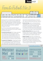
FIFTY|1 â FontFont-Release-Magazin Nr. 2 - Fontblog
FIFTY|1 â FontFont-Release-Magazin Nr. 2 - Fontblog
FIFTY|1 â FontFont-Release-Magazin Nr. 2 - Fontblog

You also want an ePaper? Increase the reach of your titles
YUMPU automatically turns print PDFs into web optimized ePapers that Google loves.
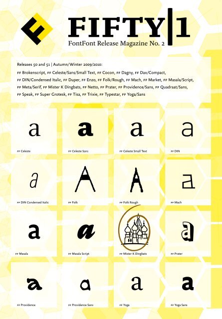
fifty|1<br />
<strong>FontFont</strong> <strong>Release</strong> <strong>Magazin</strong>e No. 2<br />
<strong>Release</strong>s 50 and 51 | Autumn/Winter 2009/2010:<br />
ff Brokenscript, ff Celeste/Sans/Small Text, ff Cocon, ff Dagny, ff Dax/Compact,<br />
ff DIN/Condensed Italic, ff Duper, ff Enzo, ff Folk/Rough, ff Mach, ff Market, ff Masala/Script,<br />
ff Meta/Serif, ff Mister K Dingbats, ff Netto, ff Prater, ff Providence/Sans, ff Quadraat/Sans,<br />
ff Speak, ff Super Grotesk, ff Tisa, ff Trixie, ff Typestar, ff Yoga/Sans<br />
a<br />
a<br />
a<br />
a<br />
ff Celeste<br />
ff Celeste Sans<br />
ff Celeste Small Text<br />
ff DIN<br />
a<br />
a<br />
a<br />
a<br />
ff DIN Condensed Italic<br />
ff Folk<br />
ff Folk Rough<br />
ff Mach<br />
a<br />
a<br />
c25O<br />
a<br />
ff Masala<br />
ff Masala Script<br />
ff Mister K Dingbats<br />
ff Prater<br />
a<br />
a<br />
a<br />
a<br />
ff Providence<br />
ff Providence Sans<br />
ff Yoga<br />
ff Yoga Sans
Designed by Alexander Roth<br />
for the <strong>FontFont</strong> Typeface Library.<br />
© February 2010 fsi FontShop International GmbH<br />
All rights reserved.
Fifty|1<br />
Ivo Gabrowitsch<br />
Wer erinnert sich noch an die Beowolf, eine Schrift,<br />
deren Buchstaben dank einer Zufallsfunktion von<br />
PostScript ständig ihr Aussehen veränderten? Erik<br />
van Blokland und Just van Rossum schufen diese<br />
»lebende Schrift« 1989. ff Beowolf wurde kurz darauf<br />
der Grundstein unserer <strong>FontFont</strong>-Bibliothek, die in<br />
diesen Tagen ihren 20. Geburtstag feiert.<br />
Tatsächlich stand die legendäre ff Beowolf bereits<br />
für die drei wichtigsten Bausteine der <strong>FontFont</strong>-<br />
Philosophie: ästhetische Qualität, technische Raffinesse<br />
und Esprit. Auch die kurz darauf erschienenen<br />
Schriften folgten diesen Motiven, zum Beispiel<br />
ff Scala, ff Meta oder ff Hands. Dabei gab es zu<br />
jener Zeit weder ein offizielles Leitbild, noch einen<br />
typografischen Leitfaden für die junge Bibliothek.<br />
Warum waren die Schriften der ersten Jahre trotzdem<br />
aus gleichem Holz geschnitzt?<br />
Ganz einfach: Die <strong>FontFont</strong>-Bibliothek war eine<br />
der ersten rein digitalen Schriftkollektionen. Die<br />
Schriftgestalter lieferten ihre Entwürfe in digitalisierter<br />
Form nach Berlin. Das war neu und machte<br />
<strong>FontFont</strong> zu einer schnell wachsenden Bibliothek,<br />
über 600 Familien sind darin mittlerweile enthalten.<br />
Auf der anderen Seite waren unsere Schriftgestalter<br />
auch Anwender, was sich in der Devise »Von Designern<br />
für Designer« niederschlug. Sie entwarfen die neuen<br />
Schriften immer auch für sich selbst, um entweder<br />
eine konkrete Aufgabe zu lösen oder eine Lücke im<br />
Angebot zu schließen. Kann es einen besseren Ansatz<br />
geben, um nützliche Schriften zu entwerfen?<br />
Es war ohne Zweifel der Designanspruch, der die<br />
<strong>FontFont</strong>s weltberühmt machte. Doch Schriften<br />
werden natürlich nicht allein von Kreativen eingesetzt.<br />
Aus diesem Grund haben wir nun die Office-<br />
<strong>FontFont</strong>s entwickelt. Mit ihnen stehen Anwendern<br />
typischer Büroapplikationen Schriften zur Verfügung,<br />
die exakt ihren Anforderungen entsprechen<br />
und dabei auf dem neuesten Stand der Technik sind.<br />
dreißig unserer wichtigsten Familien sind ab sofort<br />
als Office-Fonts verfügbar, die gesamte Bibliothek<br />
wird derzeit überarbeitet und in dieses Format übertragen.<br />
Was das Format im Detail auszeichnet, lässt<br />
sich auf den folgenden Seiten erkunden.<br />
Natürlich gibt es auch mit den <strong>Release</strong>s 50 und 51<br />
wieder neue Originale, denn unsere kreative Tradition<br />
weicht nun keinesfalls der Technik, sondern<br />
steht mit ihr mehr denn je in einer attraktiven<br />
Wechselwirkung. Im vorliegenden zweiten <strong>Release</strong><br />
<strong>Magazin</strong> <strong>FIFTY|1</strong> finden sich daher wieder gleichermaßen<br />
praktische Informationen wie inspirierende<br />
Schriftmuster.<br />
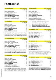
06. ff Celeste: ...................................... Pro, Offc/Offc Pro<br />
08. ff Celeste Sans: .............................. Pro, Offc/Offc Pro<br />
10. ff Celeste Small Text: .................... Pro, Offc/Offc Pro<br />
14. ff Brokenscript: ............................. Offc<br />
15. ff Cocon: ....................................... Offc/Offc Pro<br />
16. ff Dagny: ........................................ Offc/Offc Pro<br />
17. ff Dax, ff Dax Compact: ............... Offc/Offc Pro<br />
18. ff DIN Condensed Italic: .............. Neuer <strong>FontFont</strong><br />
18. ff DIN: ........................................... erw. Sprachausbau, Offc/Offc Pro<br />
22. ff Duper: ........................................ Offc/Offc Pro<br />
23. ff Enzo: .......................................... Offc<br />
24. ff Folk, ff Folk Rough: ................. OT, Offc<br />
28. ff Mach: ......................................... Neuer <strong>FontFont</strong><br />
32. ff Masala, ff Masala Script: .......... Neuer <strong>FontFont</strong><br />
36. ff Meta: .......................................... Offc/Offc Pro<br />
37. ff Meta Serif: ................................. Offc/Offc Pro<br />
38. ff Mister K Dingbats: .................... Neuer <strong>FontFont</strong><br />
42. ff Market: ....................................... Offc<br />
43. ff Netto: ......................................... Offc<br />
44. ff Prater: ........................................ OT, Offc<br />
48. ff Providence,<br />
ff Providence Sans: ........................ OT/Pro, Offc/Offc Pro<br />
52. ff Quadraat, ff Quadraat Sans: ..... Offc<br />
53. ff Speak: ......................................... Offc<br />
54. ff Super Grotesk: ........................... Offc<br />
55. ff Tisa: ............................................ Offc/Offc Pro<br />
56. ff Trixie: ......................................... Offc/Offc Pro<br />
57. ff Typestar: .................................... Offc<br />
58. ff Yoga: ........................................... Neuer <strong>FontFont</strong><br />
60. ff Yoga Sans: .................................. Neuer <strong>FontFont</strong>
Wir stellen vor: Office <strong>FontFont</strong>s<br />
Office <strong>FontFont</strong>s sind voll kompatibel mit Programmen wie Excel®, Word® and PowerPoint®.<br />
Alles ist OpenType<br />
Grafikdesigner schwören auf OpenType-<strong>FontFont</strong>s,<br />
weil sie »typografische Intelligenz« enthalten und in<br />
professionellen Programmen wie Adobe CS® oder<br />
QuarkXPress® zu Hochform auflaufen. Doch Anwendungen<br />
wie Microsoft® Office greifen auf viele Zeichen<br />
und Features dieser PostScript-flavoured (CFF)<br />
OpenType-Fonts gar nicht zu. Aus diesem Grund hat<br />
<strong>FontFont</strong> eine neue Gruppe von OpenType-Fonts<br />
eingeführt, die Office <strong>FontFont</strong>s. Ihr wichtigstes<br />
Merkmal ist die Buchstabenbeschreibung, die nicht<br />
auf der PostScript®-Technik von Adobe® basiert sondern<br />
auf TrueType. Daher nennt man sie auch True-<br />
Type-flavoured (TTF) OpenTypes.<br />
Weil die Bildschirmdarstellung im Büroalltag eine<br />
wichtige Rolle spielt, wurde die visuelle Technik der<br />
Office-<strong>FontFont</strong> noch Mal verbessert und dem Büro-<br />
Standard angepasst. Office-<strong>FontFont</strong>s sind für die<br />
ClearType®-Technik optimiert, die mit Microsoft Windows<br />
XP eingeführt wurde und seit Windows Vista als<br />
Standard-Schrift-Glättung zum Einsatz kommt.<br />
Beide OpenType-Font-Formate basieren auf Unicode<br />
und enthalten alle Schriftzeichen eines Schriftstils<br />
in einer einzigen Font-Datei. Darüber hinaus sind<br />
Office-Fonts stilverlinkt, das heißt Fett, Kursiv und<br />
Fett-Kursiv bilden eine Familie die mit einem einzigen<br />
Eintrag im Schriftmenü erscheint. Die verschiedenen<br />
Stile rufen Office-User per Tastaturbefehl<br />
oder mit einem Mausklick in ihre Stilpalette auf.
Versalziffern für Tabellen sind Standard in den Office-<br />
Fonts, weil sie für Rechnungen, Preislisten und Charts<br />
unverzichtbar sind. Werden für typografisch anspruchsvolle<br />
Bürodrucksachen proportionale Mediävalziffern<br />
oder Kapitälchen benötigt, können sie<br />
über einen Extra-Font ergänzt werden. Wegen ihrer<br />
Stilverlinkung werden Offc-Schriften als Basic-Set geliefert<br />
(Regular, Italic, Bold und Bold Italic); sind weitere<br />
Strichstärken lieferbar (zum Beispiel Light oder Black),<br />
lassen sich diese paarweise ergänzen, geradestehend<br />
plus kursiv.<br />
Wie ihre OT-Kollegen unterstützen die Offc-Font-<br />
Fonts über 58 westliche Sprachen, wie zum Beispiel<br />
Englisch, Französisch, Spanisch und die nordischen<br />
Sprachen. Offc-Pro-Fonts machen sich in noch mehr<br />
Ländern verständlich, zum Beispiel Tschechien, der<br />
Türkei, Ungarn oder den Baltischen Ländern; viel<br />
Offc-Pro-Fonts enthalten sogar die kyrillischen und<br />
griechischen Schriftzeichen.<br />
Auch wenn die Office-<strong>FontFont</strong>s die beste Wahl<br />
sind für die weit verbreiteten Büro-Anwendungen<br />
Word®, Excel® oder PowerPoint®, sind sie zu allen<br />
textverarbeitenden Programmen kompatibel, die<br />
.ttf-Dateien verarbeiten können. Endlich können<br />
Designer und Büroanwender von der Plattformunabhängigkeit<br />
und der einfachen Bedienung der Open-<br />
Type-Schriften profitieren.
ff Celeste | 1994–2007<br />
Chris Burke<br />
Now available in OpenType<br />
Pro and the new Office<br />
format (Offc/Offc Pro). The<br />
Pro versions even speak<br />
Greek and Cyrillic.<br />
θρησκευτικός γάμος<br />
Human Dignity<br />
separation of church and state<br />
СЛУЖБА БОГУ<br />
existence of immortal beings<br />
Humanistic Life Stance<br />
Θρησκευτικός Γάμος Εισαγωγή<br />
Designer Chris Burke classifies his ff Celeste as a modern<br />
humanistic face. The stroke-weight contrast is less pronounced<br />
than in traditional models such as Walbaum,<br />
making ff Celeste more suitable for current digital typesetting<br />
and offset printing techniques, where high contrast<br />
is very accurately – perhaps too accurately – maintained.<br />
The letterforms are less rationalized and modular than<br />
the starkest modern faces, but are influenced by old-style<br />
letterforms even with some vestige of a calligraphic influence<br />
to provide a more readable dynamic. The serifs tend<br />
to the triangular and the italics harmonize well with the<br />
roman in tone and width. ff Celeste is a typeface for those<br />
designers who like the idea of a Bodoni or Walbaum, but<br />
look for a robust and readable text face which tempers the<br />
sobriety of the modern with friendlier old-face features.<br />
The font family ff Celeste was initially comprised of only<br />
four members, Regular and Bold with an italic for each. As<br />
the Bold was not particularly heavy, really more of a semibold,<br />
it was felt that the family could do with some heavier<br />
members. So ff Celeste Extra Bold and Black have been<br />
provided for those occasions in which greater emphasis,<br />
impact or differentiation is desired. The Extra Bold provides<br />
effective emphasis with the Regular weight, and the<br />
Black can be paired with the existing Bold. These combinations<br />
will be useful in, for example, designing dictionaries<br />
or reference books, in which different kinds of information<br />
need to be given different tiers of emphasis. The Bold<br />
weights will also be useful in headings. In 2007 a Book<br />
weight was added.
ff Celeste<br />
a<br />
a a a<br />
Regular<br />
Italic<br />
Book<br />
Book Italic<br />
a a a a<br />
Bold<br />
Bold Italic<br />
Extra Bold<br />
Extra Bold Italic<br />
a a O ψ<br />
Black Black Italic Regular Italic<br />
M ж h g<br />
Book Book Italic Bold Bold Italic<br />
c w G s<br />
Extra Bold Extra Bold Italic Black Black Italic
ff Celeste Sans | 1994–2004<br />
Chris Burke<br />
Now available in OpenType<br />
Pro and Offc/Offc Pro.<br />
protect from evil or harmful spirits<br />
gargoyles<br />
Ancient Roman Decorative Art<br />
Gothic Building<br />
ornamental arrangements of arabesques<br />
Beautiful Chimera<br />
Chapel Giovanni da Udine<br />
ff Celeste Sans is a hybrid character, like its serif companion,<br />
ff Celeste. Chris Burke says: “The serif version is a deliberate<br />
attempt to temper the modern face (Didone) type model<br />
with old face (Garalde) elements; to mix what Swiss letterform<br />
theorists have called the static and the dynamic principles<br />
of letter construction. Allowing for historical fancy,<br />
ff Celeste Serif could be interpreted as a retrospectively<br />
transitional typeface.<br />
An approach to designing a sans serif partner for ff Celeste<br />
did not immediately make itself obvious. A straight humanist<br />
sans did not seem quite appropriate. I finally realized<br />
that my liking for the grotesque genre of sans serif typefaces<br />
presented the way forward. The somewhat anonymous,<br />
nineteenth-century grotesques can be seen to share principles<br />
with the common modern face types of that era, and<br />
some writers have even suggested that they grew from that<br />
tradition. So, in ff Celeste Sans, I tried to make a kind of<br />
grotesque, tempered by the dynamic of humanist sans. The<br />
result perhaps errs on the side of grotesque, meaning that<br />
ff Celeste Sans differs from ff Celeste Serif in some details<br />
of its articulation (aside from the obvious differences). It does<br />
not have a great deal of contrast between its thick and thin<br />
strokes, and so creates quite a different colour to ff Celeste<br />
Serif while maintaining the family resemblance. This may<br />
prove useful on occasions where a distinct yet harmonious<br />
contrast between serif and sans serif is required.”
ff Celeste Sans<br />
a<br />
a a a<br />
Regular<br />
Italic<br />
Bold<br />
Bold Italic<br />
a a a a<br />
Extra Bold<br />
Extra Bold Italic<br />
Black<br />
Black Italic<br />
Q n B z<br />
Regular Italic Bold Bold Italic<br />
d g A w<br />
Extra Bold Extra Bold Italic Black Black Italic<br />
e K u j<br />
Regular Italic Bold Bold Italic
ff Celeste Small Text | 1994<br />
Chris Burke<br />
Now available in OpenType<br />
Pro and Offc/Offc Pro.<br />
enlightenment<br />
Twenty-first century Humanism<br />
Scientific Skepticism and the Scientific Method<br />
{0123456789 · 0123456789}<br />
agnosticism<br />
a skeptical approach to questions<br />
Xenophanes of Colophon<br />
anaxagoras<br />
lord of the assembly<br />
The Small Text versions are made specifically for<br />
use in small point sizes. The designer adjusted the<br />
thickness of the strokes and the proportions of the<br />
letters, so that they are easier to read in small sizes<br />
than the original – much like in the days of lead<br />
type when it was common to cut different punches<br />
of a typeface for use in different sizes. Made originally<br />
for the text and footnotes of Chris Burke’s<br />
book “Paul Renner: The Art of Typography” (Hyphen<br />
Press, London, 1998), the family was extended for<br />
publication as a <strong>FontFont</strong>.
ff Celeste Small Text<br />
a<br />
a a a<br />
Regular<br />
Italic<br />
Bold<br />
Bold Italic<br />
G f h u<br />
Regular<br />
Italic<br />
Bold<br />
Bold Italic<br />
z j g O<br />
Regular Italic Bold Bold Italic<br />
q Y s d<br />
Regular Italic Bold Bold Italic<br />
r g e M<br />
Regular Italic Bold Bold Italic
ff Brokenscript | 1991<br />
Just van Rossum<br />
Now available in the<br />
new Office format.<br />
Johannes Gutenberg<br />
Blåcklëttêr<br />
Synonym for Barbaric<br />
Charlemagne<br />
Carolus Imperator Augustus<br />
Aberdeen Bestiary<br />
Early Example Of Textualis<br />
manuscript<br />
Alphabet of the Gothic Language<br />
A study in blackletter Textualis typefaces.<br />
There is a peace symbol included.
ff Cocon | 2001<br />
Evert Bloemsma<br />
Now available as<br />
Offc and Offc Pro.<br />
life stage of undergoing transformation<br />
Social-Networking<br />
On Caterpillars And Butterflies<br />
←↑→↓↖↗↘↙▼◀●▶▲<br />
protective covering for the pupa<br />
ExoskelET<br />
Countdown: 12.32,00:14.456<br />
Cambrian explosion of animals<br />
We all know the small spurs of the lowercase letters<br />
a, b, d, g, h, m, n, p, q, r and u. They are relics of the<br />
hand-written word where a round form is attached<br />
to a straight line. Bloemsma decided to find out<br />
what the result would be if they were left off; this<br />
proved a difficult starting point for the design of a<br />
typeface. Beginning with the lower case a, he drew<br />
a family of rounded yet rather asymmetrical forms<br />
with details reminiscent of brush-strokes. The individual<br />
letters are rather neutral, but as a group<br />
make FF Cocon a typeface of spirit and character.
ff Dagny | 2009<br />
Örjan Nordling, Göran Söderström<br />
Now available as<br />
Offc and Offc Pro.<br />
Reshuffling Of Genes (0123456789 [0123456789])<br />
random changes<br />
The Encoded Genetic Information<br />
Ravnegård fatale<br />
Charles Darwin and Alfred Wallace<br />
Natural Selection<br />
Change in the Genetic Material<br />
Mõđèŗń Ëvǿłūŧïôŋăŕŷ Şyňťħëšíş<br />
In 2002, the Swedish newspaper Dagens Nyheter (dn)<br />
changed from broadsheet to tabloid – a change that came<br />
along with a major impact on dn’s journalism, editing and<br />
design. Pangea design’s Creative Director, Örjan Nordling,<br />
had already worked with dn as a design consultant in 1996.<br />
In 2000, dn had been redesigned under the leadership of<br />
Mario Garcia. For the new design Nordling had created<br />
dn Bodoni exclusively for Dagens Nyheter. The change<br />
to tabloid called for a more compact setting and Pangea<br />
design was commissioned to produce a matching sans<br />
serif for Sweden’s largest daily newspaper. This became<br />
dn Grotesk which now has evolved into ff Dagny. For the<br />
<strong>FontFont</strong> Library several adjustments were made, the contrast<br />
in stroke thickness was reduced for better legibility in<br />
small sizes and characters were redesigned together with<br />
the <strong>FontFont</strong> TypeDepartment. The family now includes a<br />
range of consistent weights from Thin to Black making it<br />
perfect for use in body text and all kind of other applications.<br />
The name Dagny is an abbreviation of Dagens Nyheter<br />
as well as an old nordic female name meaning “new day”.
ff Dax | 1995–2000,<br />
ff Dax Compact | 2006<br />
Hans Reichel<br />
Now available as<br />
Offc and Offc Pro.<br />
Codex on the Flight of Birds<br />
dansk Smørrebrød<br />
↑↓→↔←⇧⇩⇨⇔⇦0123…20<br />
Aerodynamics<br />
Velocity Raised to the Second<br />
АВТОПИЛОТ<br />
Höchstgeschwindigkeit 1234,8 km/h<br />
Hans Reichel’s first design to be published by FSI was<br />
FF Dax Condensed (1995) which developed from the idea<br />
of combining the clarity of a narrow Futura with a “slightly<br />
roman touch” to make a space-saving but very legible typeface<br />
of timeless design. Very characteristic for the typeface<br />
are the missing spurs in the d, g, m, n, p, q, r and u.<br />
The family quickly grew to include the wider, but still<br />
narrow, FF Dax, followed by FF Dax Wide, less spacesaving<br />
than its predecessors but still on the slender side.<br />
And, in keeping with tradition, available in six weights:<br />
Light, Regular, Medium, Bold, Extra Bold and Black.<br />
FF Dax Compact is a useful extension of the FF Dax family. The main<br />
difference in comparison to the regular version is that ascenders<br />
and descenders are relatively small and the upper case letters<br />
have the same height as the lower case letters with ascenders.<br />
That makes the typeface appearing larger and more compact,<br />
although set in the same point size. The width is somewhere between<br />
FF Dax Condensed and FF Schmalhans. The FF Dax Compact is<br />
especially suitable for headlines in magazines, newspapers, for<br />
posters, flyers ... whenever a little more noise is needed.
ff DIN | 1995–2009<br />
Albert-Jan Pool<br />
ff DIN finally has a<br />
Condensed Italic. It is<br />
available in OT, Pro, Offc<br />
and Offc Pro. In addition<br />
the complete ff DIN Pro<br />
family speaks Cyrillic now!<br />
{N5−22,42 ×10³ M⅞[∆8¬∂7]}<br />
КРЫЛЬЯ<br />
Машинные запчастие<br />
Шот әкеліңізші<br />
T Minus: 9876543210<br />
Новый Эскалатор<br />
In 1994, in San Francisco, Albert-Jan Pool and Erik Spiekermann took a cab together<br />
from the ATypI conference to the airport. Spiekermann knew that Pool’s employer went<br />
bust, so he told him that if he wanted to earn some money with type design, he should<br />
have a look at fonts such as OCR and DIN. At the same time, he invited Pool to Berlin to<br />
discuss the idea in detail. One year later, <strong>FontFont</strong> published Pool’s typeface FF OCR-F,<br />
followed by the family FF DIN. Spiekermann had the skill to point out an empty space in<br />
the market. Digital DIN fonts were available at that time, however, only in two weights<br />
and solely in pure geometric shape. Pool designed a family of five weights, he added<br />
true italics and also some alternative characters, such as the “i” with a round dot and<br />
the lower case figures. With time, FF DIN Condensed was added, as well as Greek<br />
and Cyrillic versions. The shape of the new FF DIN differs from the original mostly by<br />
thinner horizontal strokes and by more fluent curves. Despite its primitive, technical<br />
look and the clear reference to the German motorway signboards, FF DIN became a<br />
phenomenon. The typeface has even pervaded book and magazine typography, and it<br />
found its place in posters of cultural institutions.
ff DIN<br />
NEW<br />
STYLES<br />
a<br />
a a a<br />
Condensed Light<br />
Condensed Light Italic<br />
Condensed<br />
Condensed Italic<br />
a a a a<br />
Condensed Medium<br />
Condensed Medium Italic<br />
Condensed Bold<br />
Condensed Bold Italic<br />
a a a a<br />
Condensed Black Condensed Black Italic Light Light Italic<br />
a a a a<br />
Regular Italic Medium Medium Italic<br />
a a a a<br />
Bold Bold Italic Black Black Italic
ff Duper | 2009<br />
Martin Wenzel<br />
Now available as<br />
Offc and Offc Pro.<br />
an organism is any living system<br />
RABAUKEN<br />
←↑→↓↖↗↘↙←↑→↓↖↗↘↙<br />
Ğęńëţïċåļľŷ Ãbłē ŧǿ Ïŋţėřbŗéëđ<br />
CELLULARE<br />
••▪▫○●<br />
Linnaean Taxonomy<br />
Martin Wenzel’s original idea from 1998 evolved into a kind of<br />
informal ff Profile in the end. The new FF Duper has a homemade<br />
touch, but provides of course all typographic qualities of a<br />
contemporary OpenType font. FF Duper consists of Regular, Bold,<br />
Regular Italic and Bold Italic weights, supports more than 60<br />
langu ages, has several figure sets and fractions and includes alternative<br />
forms for a, g and y as well as a set of arrows, bullets and<br />
ornaments. And there is a special extra: All weights contain three<br />
versions of each glyph and via an OpenType feature the three<br />
alternatives are used in succession, treating vowels and consonents<br />
separately and recognizing even spaces between words for<br />
a lively and hand-made appearance of the typed text. Preliminary<br />
versions of the typeface have already been successful in education<br />
and school projects, but there are surely more areas where<br />
FF Duper perfectly fits in.<br />
The OpenType features, including the varying alternatives, are<br />
only available in OT and Pro fonts.
ff Enzo | 2008<br />
Tobias Kvant<br />
Now available in the<br />
new Office format.<br />
Tools are the most important items<br />
Simple Machines<br />
increased dramatically in intelligence<br />
Evolution of Mankind<br />
Observation has confirmed<br />
Mechanical Advantage<br />
Cost of A Proportional Decrease<br />
opposable thumb<br />
Direction or Magnitude of A Force<br />
[(23−5*6)+12⁴−{6+√81})]<br />
FF Enzo is a vigorous sans serif consisting of five weights,<br />
ranging from Thin to Black. It was inspired by type from<br />
the past as well as from the present, giving it quite a unique<br />
look. Its short ascenders and descenders makes it a good<br />
headline face, ideal for magazines, posters and such, but<br />
it will work fine for body text as well. The family includes<br />
italics, tabular figures and four sets of small figures.
ff Folk, ff Folk Rough | 2003<br />
Maurizio Osti, Jane Patterson, Ben Shahn<br />
Now available in OpenType<br />
and the new Office format.<br />
→←◎• ThE SHaPE of COntENT (1960)<br />
SaCcO ANd VANzetTi<br />
jeRSey HOMeStEadS mUrAl<br />
SoCiAL ReaLIsM<br />
PoLitICal ConcERNS Of his tIMe<br />
SEpTeMbEr 12, 1898 – maRcH 14, 1969<br />
ff foLk Is A foNT based ON bEN shaHN’S lEt-<br />
TERing usED In hiS painTINgs and lItHOgraPhs.<br />
tHe Ben sHAHn fOLK ALpHABEt WAs OriGiNaLLy<br />
cREaTED As LETtERING In 1940 aNd REcOnsTructEd<br />
aND redesigneD BY mAurIZIo oSti And<br />
JaNe PATTeRSOn in 1995 WITH ThE CoNsent<br />
aNd APpRoVAl oF mRs. BErnaRDA SHaHn AND<br />
tHE EStAtE OF ben shaHn unDer LIcEnsE FRom<br />
VaGA (NEW YorK). shAhn oriGinallY DreW hiS<br />
aLPhABeT TaKInG InSPirAtIOn fRoM VErnACULaR<br />
SHAPEs – a “leTtering For tHE ILliTERaTe”<br />
AND he callEd IT “fOlK alPhABET” . hE FElT THaT<br />
lEtTERS ANd WORDs ShOUld hAvE ThE sAME<br />
IMporTaNCE AS imAgEs AnD dRAWINgs, aND<br />
HE COMbinEd THeM In hIs WORk. MauRIzIO OsTi<br />
HAs DESiGnEd a fAmIlY Of fontS. HE RecreAted<br />
tWO cHAraCTEr SHaPEs foR eacH lEtteR (One<br />
foR THE upPErcASe KeyMAp PoSITion AnD ONE<br />
fOR The LOWERCASe KEYmap POsitIon) that<br />
bESt cAPTuRE THe viBRaNT varIEtY preseNT<br />
In THe ORIGiNAL aRT. it IS thEreFoRe posSiBLe<br />
To CoMpOSe teXt By combINInG UpPercAse<br />
ANd loWERcase INTERChanGeablY (UPpERCasE<br />
OnLY, lowercase only, aNd upPER and LOwER-<br />
CaSe) TO AChIeVe A More persONALly ARTiSTIC<br />
effEcT. fF foLK ReGUlAr iS InSPiRED by “brInG<br />
BACk OUR SoNs FRoM fAr” (GOuAcHe And Gold<br />
LEAf; 40 x 26 incHeS); ff fOLk ROuGH by tHe<br />
GraPHIC WorK “IMmORTaL WorDs” 1958. (siLK-<br />
SCrEEn in blAck, 15 x 20 InChES). fF fOlK lIght<br />
AND Ff fOLK rouGh light havE BEen drAWN to<br />
cOMplEte The fAmILy. ben SHAhn WAS boRN<br />
In KovNo, lIThuaNIA IN 1898, and mOVed To thE<br />
UnITed StateS iN 1906. HE dIeD in 1969. at aN<br />
EARly aGE HE DEvElOPed A pAsSiOn FOR LETTe-<br />
RiNG, AnD WHiLe a lithoGRAPHEr, he DEVElOpEd<br />
A GREat UNDERstaNdING Of thIS ArtisTIc DisciPline.
ff Folk, ff Folk Rough<br />
a<br />
a a a<br />
Light<br />
Regular<br />
Rough Light<br />
Rough Regular<br />
g s B c<br />
Light<br />
Regular<br />
Rough Light<br />
Rough Regular<br />
q e n k<br />
Light Regular Rough Light Rough Regular<br />
r z w i<br />
Light Regular Rough Light Rough Regular<br />
x h t O<br />
A One Regular Rough Light Rough Regular
ff Mach | 2009<br />
Łukasz Dziedzic<br />
New <strong>FontFont</strong><br />
Ernst Mach<br />
they flying faster than sound<br />
Energy<br />
A Flow to Supersonic<br />
НЕПОБЕДИМЙ#28371<br />
Sound Barrier<br />
The very first sketches of FF Mach were drawn in 2004<br />
when a colleague who planned a new Polish magazine<br />
about culture and arts asked Łukasz Dziedzic for a<br />
logo – there was neither time nor money, so he did it<br />
quickly and for free. The logo was met with approval<br />
and Łukasz was asked for some sample covers and a<br />
few days later for the whole layout – again immediately<br />
and free of charge. Łukasz agreed with mixed<br />
feelings, thinking this might be a chance to use some<br />
of his fonts and even make a new one based on the<br />
logo and title graphics. The new font worked well but<br />
unfortunately, after the magazine failed three months<br />
later, it was never used again until Łukasz decided in<br />
2008 to redraw all the glyphs in order to remove the<br />
traces of that speedy work, and in the end he designed<br />
a complete new type family with six weights and three<br />
widths without any curve in the whole family. But there<br />
are hundreds of inventive alternates and ligatures for<br />
setting tight, interconnected wordshapes.
ff Mach<br />
NEW<br />
a<br />
a a a<br />
Condensed Thin<br />
Condensed Light<br />
Condensed<br />
Condensed Medium<br />
a a a a<br />
Condensed Bold<br />
Condensed Black<br />
Thin<br />
Light<br />
a a a a<br />
Regular Medium Bold Black<br />
a a a a<br />
Wide Thin Wide Light Wide Wide Medium<br />
a a W g<br />
Wide Bold Wide Black Condensed Thin Condensed Light
ff Masala, ff Masala Script | 2009<br />
Xavier Dupré<br />
New <strong>FontFont</strong><br />
Indian Cuisine Spices<br />
Kraft & Stella<br />
Biblical Poem Song of Solomon<br />
Cinnamon Bark<br />
№ 012345678 № 0123456789<br />
MUSTARD<br />
Nettes Essen in Nizza<br />
FF Masala is as unctuous as a curry sauce with a hint of<br />
chili to add zest. The initial idea for FF Masala was to offer<br />
a casual Sans matching FF Tartine Script. After rethinking<br />
and refining, FF Masala became a truly casual type system<br />
with three Sans weights and their Italics plus three powerful<br />
Script versions with swashes, right for logos and packaging<br />
as well as comics or children’s book covers. Despite its laidback<br />
nature, FF Masala has as much typographic prowess<br />
as any serious sans serif. Ligatures, fractions, case-sensitive<br />
forms and a full set of figure styles are included.
ff Masala,<br />
ff Masala Script<br />
NEW<br />
a<br />
a<br />
a<br />
a<br />
Regular<br />
Italic<br />
Bold<br />
Bold Italic<br />
a a a a<br />
Black<br />
Black Italic<br />
Script Regular<br />
Script Bold<br />
a<br />
t<br />
o<br />
N<br />
Script Black Regular Italic Bold<br />
b K w a<br />
Bold Italic Script Regular Script Bold Script Black<br />
A c g e<br />
Regular Italic Bold Bold Italic
ff Meta | 1991–2003<br />
Erik Spiekermann<br />
Now available as<br />
Offc and Offc Pro.<br />
System is a set of interacting or interdependent entities<br />
μετά σύστημα<br />
Çőŋvëňŧïōʼn ŏf Přǿpęrţŷ<br />
Μυ Έψιλον Ταυ Αλφα<br />
structure, defined by parts and their composition<br />
interconnectivity<br />
←↑0123456789↘↙<br />
Soft Systems Methodology<br />
Processing And Outputs of Material<br />
ff Meta was originally (1985) conceived as a typeface for<br />
use in small point sizes. Against its intended purpose,<br />
ff Meta very quickly became one of the most popular<br />
typefaces of the computer era, and has been referred<br />
to as the Helvetica of the 90s – not necessarily a compliment.<br />
It is used a lot in magazines, from the Normal<br />
weight in small point sizes for captions up to the Black<br />
version for large headlines.
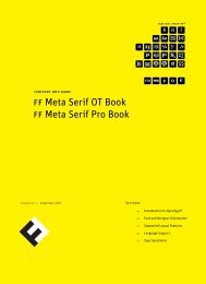
ff Meta Serif | 2007<br />
Erik Spiekermann, Christian Schwartz,<br />
Kris Sowersby<br />
Now available as<br />
Offc and Offc Pro.<br />
Arrangement of “Poetic Feet”<br />
unstressed syllable followed by a stressed syllable<br />
Aristotle’s<br />
vowel length and intonation<br />
{[(0123456789 ⋅ 0123456789)]}<br />
The Iambic Pentameter<br />
It took three years and three designers to develop<br />
ff Meta Serif: Erik Spiekermann, Christian Schwartz and<br />
Kris Sowersby. All through the nineties, Erik Spiekermann<br />
had made several attempts at designing a companion<br />
for his original ff Meta. Colleagues had frequently been<br />
asking him which serif face would best fit to ff Meta. He<br />
recommended Swift, Concorde, Minion, ff Clifford and<br />
others until he realized that he should just make his own<br />
serif Meta. At the beginning of 2005 Erik finally admitted<br />
to himself that he was stuck – all of his sketches looked<br />
like ff Meta with serifs added, not like a serif typeface<br />
that could survive on its own. He needed fresh eyes, so<br />
he got Christian involved who, in turn, asked Kris to take<br />
on some of the workload. Obviously, a serif Meta would<br />
need to fit in with the existing ff Meta family. After<br />
drawing the first weights the designers saw that there<br />
was still something wrong: the serifs were too strong so<br />
that both families didn’t really go well together in the<br />
same line, despite identical x-heights. The theoretical<br />
approach obviously hadn’t worked well enough, so they<br />
decided to trust their experience instead. They changed<br />
the metrics so that the letters are not mathematically<br />
identical, but optically the same. Now what you see is<br />
what you get. And they discarded the idea of a tighter<br />
spacing to make it appear darker. After much trying,<br />
comparing, generating fonts and printing out samples,<br />
the final formula for a new Meta was found: two percent<br />
heavier and two percent more condensed than the sans.<br />
Erik van Blokland’s sophisticated technology “Superpolator”<br />
helped to extend the family, although manual<br />
corrections were always necessary: the spirit of a typeface<br />
can still not be delegated to software.<br />
While it is a typeface that can stand up on its own in a<br />
wide range of applications, the extra benefit is its close<br />
relationship to the original ff Meta, its sans serif sister.<br />
The two families can be mixed in the same line and one<br />
can be used to accentuate the other. Using both on the<br />
same page adds variety and meaning to a text.
ff Mister K Dingbats | 2009<br />
Julia Sysmäläinen<br />
New <strong>FontFont</strong><br />
c73c38Xc03Vc25 Xc06 OVc21Vc43EOc02V<br />
Qd01d02d03d04d05d06d07d08d09Ed10d11d12<br />
o65p21Xo15QWl37Vh22f92 Op06p18Qo34Eo08<br />
c49c50c51c52c53c54c55c62Vc63c64c70<br />
a01QWa02Oa03Wa05a08a11Ea12a16Xa17<br />
f07,BE
ff Mister K Dingbats<br />
NEW<br />
t04<br />
f03<br />
h37 c28<br />
Liga-Feature + Keycode: t04<br />
f03<br />
h37<br />
c28<br />
a30<br />
c45 H c64<br />
a30<br />
c45<br />
po8<br />
c64<br />
a04 d11<br />
c30 w03<br />
a04 d11 c30 w03<br />
c25 h14 f75 d19<br />
c25 h14 f75 d19<br />
o29 p46 o59 c06<br />
o29 p46 o59 c06
ff Market | 1996<br />
H. A. Simon<br />
Now available in the<br />
new Office format.<br />
Tomatoes 3lb Bag → $2⁷⁹<br />
REDUZIERT<br />
L'épicier vendait des épices<br />
★ 160.843¥ ★<br />
½kg Hühnchenbrust für 2⁴⁵€<br />
Dönertasche<br />
FF Market was first drawn for use in promotional material for a few<br />
of H. A. Simon’s jobs. The positive reaction he received from clients<br />
and users, and the fact that it was being used in instances beyond<br />
its original intention, inspired Mr. Simon to re-draw and extend the<br />
design. As the name suggests, the typeface lends itself for use in the<br />
marketplace: advertisements, posters, stickers, packaging, point-ofsale<br />
promotions, etc. FF Market is not a high point in typography, but<br />
the right shop-window type: practical but not impersonal, neutral but<br />
noticeable. Each weight contains ligatures of international currency<br />
abbreviations as well as superior and inferior numbers for making<br />
fractions or listing cents.
ff Netto | 2008<br />
Daniel Utz<br />
Now available in the<br />
new Office format.<br />
Wayfinding in Architecture<br />
rasÀsMsNsàsEsFsGtI<br />
ORIENTATION SYSTEM<br />
rdsJsosÆsçsHsÇsitO<br />
Airport Distance: 87263519<br />
rbsòsîsjsAsósÍsïtÏ<br />
global positioning<br />
Starting from the idea to develop a no-frills typeface with<br />
as little historical ballast as possible Daniel Utz designed<br />
FF Netto: He reduced the letter forms to their characteristic<br />
basic shapes and removed all dispensable details. He adjusted<br />
the stroke weight unobtrusively, keeping the geometric construction<br />
principle and thus optimizing legibility and balance of<br />
the typeface.<br />
Besides the alphabet Daniel designed a whole lot of icons and<br />
arrows – very useful for information and orientation systems.<br />
Weights and sizes have been carefully adjusted to be perfect<br />
for combinations with the text faces. By using the border elements<br />
you have plenty of options to arrange and group the<br />
pictogrammes. Both FF Netto and FF Netto Icons come in<br />
three weights.
ff Prater | 2000<br />
Henning Wagenbreth, Steffen Sauerteig<br />
Now available in OpenType<br />
– with easy access to alternate<br />
glyphs for variation – and in<br />
the new Office format.<br />
alcohOLiC bevErAge<br />
Brewpubs and Regional Breweries<br />
The Amylolytic Process<br />
International Bitterness Units scale<br />
Saccharomyces uvarum<br />
Once the Fermentation Is Complete<br />
Urdeutsches Hefeweizen<br />
12–14 °C (53–57 °F) for cask ales to be served<br />
The fonts of the FF Prater family were designed with the spontaneity<br />
of illustrations in mind. Wagenbreth and Sauerteig have<br />
tried to digitally recreate the irregularities of handwriting<br />
through variation in line width and angle as well as letter spacing.<br />
The danger of such a lively face is that it loses its integrity<br />
if two identical “handwritten” characters are placed next to each<br />
other. For this reason the designers chose to make two versions of<br />
every character so that the user can switch between them when<br />
necessary to guarantee a handwritten look. With the OpenType<br />
version of the fonts the second alternate letter even appears<br />
automatically.
ff Prater<br />
a<br />
a a a<br />
Sans Regular<br />
Sans Bold<br />
Serif Regular<br />
Serif Bold<br />
a a a a<br />
Script Regular<br />
Block<br />
Block Background<br />
Block Fill<br />
e n G i<br />
Sans Regular Sans Bold Serif Regular Serif Bold<br />
B s k g<br />
Script Regular Block Block Background Block Fill<br />
o g h R<br />
Sans Regular Sans Bold Serif Regular Serif Bold
ff Providence, ff Providence Sans | 1994<br />
Guy Jeffrey Nelson<br />
Now available in OT/Pro<br />
and Offc/Offc Pro.<br />
ff Providence Pro even<br />
speaks Greek.<br />
0123456789 • 0123456789<br />
Early Sketches<br />
Sequential Narrative<br />
comics<br />
••••••••<br />
HÅŁfŢØŊĒ<br />
χαρακτήρας κωμικός<br />
The FF Providence family was first drawn in 1987<br />
for use in a comic book series – FF Providence Sans<br />
for the dialog, and the serif form for running narrative.<br />
In 1994 the typefaces were completed with<br />
additional dingbats, and named after the designer’s<br />
home town in Rhode Island, USA.
ff Providence,<br />
ff Providence Sans<br />
a<br />
a a a<br />
Regular<br />
Italic<br />
Bold<br />
Bold Italic<br />
a a S b<br />
Sans Regular<br />
Sans Bold<br />
Regular<br />
Italic<br />
c w j N<br />
Bold Bold Italic Sans Regular Sans Bold<br />
e M n g<br />
Regular Italic Bold Bold Italic<br />
X s i R<br />
Sans Regular Sans Bold Regular Italic
ff Quadraat, ff Quadraat Sans | 1997–2008<br />
Fred Smeijers<br />
Now available in the<br />
new Office format.<br />
1029834 Hand Lettered Inscriptions<br />
calligraphic practice<br />
Famous English Monasteries<br />
Gothic Calligraphy<br />
715–720: Lindisfarne gospels<br />
Monospaced Characters<br />
Enlightenment (1687)<br />
Originally designed for the Dutch design company with the<br />
same name (now it is called the “Lab”), ff Quadraat combines<br />
Renaissance elegance with contemporary ideas on construction<br />
and form. Over the years several versions have been<br />
designed: ff Quadraat Sans and Serif, Display and Headliner.<br />
The fonts in FF Quadraat Display are strong, but they<br />
aren’t of the loud-mouthed, fun-font variety. They strive<br />
for a sort of noticeability we don’t see much anymore. The<br />
ff Quadraat Sans follows a trend which was originated by Jan<br />
van Krimpen who designed Romulus, a classical typeface<br />
and to which he added some sans serif variations. It was not<br />
until the late eighties that this idea became more popular. The<br />
well known designs from our days are itc Stone or ff Scala<br />
for example. Both typefaces give designers the opportunity to<br />
make use of well adapted sans serif variations. ff Quadraat<br />
which started with a serif version follows this young tradition.<br />
Sans serif typefaces can look very much alike, especially<br />
in the bolder variations. This is certainly not the case with<br />
ff Quadraat Sans. ff Quadraat Sans is like its serif companion<br />
a typeface with a rather strong character of its own. Thus, it<br />
was not that easy for the designer Fred Smeijers to make a<br />
gesture as strong as its serif companion without neglecting<br />
traditional proportions. But he obviously succeeded in giving<br />
the sans version a lively and humane character. This can be<br />
most clearly seen in big word images and is still there in text<br />
sizes, although in a more discreet way. So ff Quadraat Sans<br />
has display qualities, is an efficient typeface and suitable for<br />
longer texts at the same time.
ff Speak | 2007<br />
Jan Maack<br />
Now available in the<br />
new Office format.<br />
Cylindrical Pasta of Italian Origin<br />
semolina<br />
Establishment of Pasta<br />
UNO SpaghettO<br />
National Macaroni Manufacturers<br />
{[(01234*56789)]}<br />
Bûckwhëåt<br />
Only Served With Hot Tomato Sauce<br />
FF Speak is a humanist Sans Serif. When Jan Maack was working<br />
on FF Speak, his intention was to design a typeface that<br />
could capture the tone of voices of young people talking. So<br />
he made the letter forms very vivid and smooth. When they<br />
speak, they use different intonations, according to the situation.<br />
Therefore, he made a light version for talking intimately,<br />
and the bold version for speaking out loud. Jan also added<br />
some extra ligatures and thinks his font is very legible, both in<br />
headlines and text. A unique typeface that is like a new voice<br />
you want to listen to.
ff Super Grotesk | 1999<br />
Svend Smital<br />
Now available in the<br />
new Office format.<br />
Skyscraper<br />
Skin and Bones Architecture<br />
Ludwig Mies van der Rohe<br />
STYLE<br />
Auffinden und nicht aufflammen lassen<br />
Barcelona 1929<br />
Prototype Modernist Housing<br />
The font FF Super Grotesk is based on a 1930s design by Arno<br />
Drescher which was the most widely used lead-type sans serif<br />
face in East Germany, the GDR’s equivalent of the un-available<br />
Futura. Today the typeface can only be found in old specimen<br />
books and early East German printed matter, both of which<br />
served as source material for FF Super Grotesk. The original<br />
character set has been augmented with special symbols and<br />
characters, alternatives for lowercase a and g, and Old Style<br />
figures.
ff Tisa | 2008<br />
Mitja Miklavčič<br />
Now available in<br />
Offc and Offc Pro.<br />
trunk diameters of up to 4 m<br />
lake balaton<br />
Pǿĩşőŋŏųš Āłķăľõíðŝ<br />
arils are mature in 6–9 months<br />
sumatra<br />
0°23'0" South, 101°46'0"East<br />
▸ Botanic ● Gardens ◂<br />
Especially the Longbow<br />
Slovenian designer Mitja Miklavčič drew ff Tisa to<br />
meet the technological and aesthetic requirements of<br />
modern magazine use. His primary goal was to develop<br />
a softer, more dynamic version of a nineteenth-century<br />
slab serif wood type. A large x-height and pronounced<br />
serifs make ff Tisa extremely legible in text sizes, its<br />
unique design details, including slightly exaggerated<br />
ink traps and a fairly upright italic, becoming evident<br />
in display applications. The typeface was selected by<br />
the tdc judges for a Certificate of Excellence in Type<br />
Design in 2007.
ff Trixie | 1991<br />
Erik van Blokland<br />
Now available in<br />
Offc and Offc Pro.<br />
Secret_Agent<br />
Code:018923<br />
ДРУЖБА<br />
μυστικός πράκτορας<br />
UNDERCOVER<br />
Federal•Bureau<br />
Perhaps the most used typewriter in the<br />
world. In the beginning FF Trixie was seen<br />
as silly: why make a font that makes ones<br />
expensive desktop publishing supercomputer<br />
look like an old typewriter? History has<br />
the answer: because it looks cool and it’s<br />
fun to use. Especially the capital “X” of<br />
FF Trixie Plain is famous, because it is<br />
the X files logo. Perhaps FF Trixie was<br />
designed by strange beings from outer space<br />
after all. FF Trixie is a highly detailed<br />
typeface that captures the roughness and<br />
irregularities of an old typewriter.<br />
FF Trixie has become an accurate document<br />
of one particular typewriter. All the<br />
characters have kept their faults. The<br />
characters vary in height, rotation and<br />
distance to the baseline as much as the type<br />
produced by the original machine.
ff Typestar | 1998<br />
Steffen Sauerteig<br />
Now available in the<br />
new Office format.<br />
Space Exploration<br />
TECHNOLIGIA<br />
Tëçhñó-Prøgrêssìvïšm<br />
SEMICONDUCTORS<br />
PARTICLE GENERATOR<br />
HARDWARE<br />
Code*0194783*<br />
FF Typestar from eBoy is a collection of five unaffected<br />
fonts for the working world – the classic<br />
typewriter meeting the demands of modern communication.<br />
The four basic weights offer everything<br />
necessary for office communication and the OCR<br />
variation is a monospaced alternative for more mechanical<br />
moments.
ff Yoga | 2009<br />
Xavier Dupré<br />
New <strong>FontFont</strong><br />
Energy Consumption<br />
SUBWAY<br />
Urban Population Density<br />
012:34.568,19<br />
Automobile Dependency<br />
fåhŗğãşŧféŋšťer<br />
Underground 1863<br />
The ff Yoga family is a type system conceived to work for<br />
newspapers and magazines thanks to its strong personality<br />
and good legibility. The Serif weights with their sturdy<br />
serifs are a good choice for body text, but they also serve as<br />
an original headline face with their subtly chiseled counters<br />
inspired by blackletters. ff Yoga mixes the harshness<br />
of blackletters with the balanced rhythm and round shapes<br />
of the Garalde typefaces.
ff Yoga<br />
NEW<br />
a<br />
a a a<br />
Regular<br />
Italic<br />
Bold<br />
Bold Italic<br />
x w K j<br />
Regular<br />
Italic<br />
Bold<br />
Bold Italic<br />
G n u s<br />
Regular Italic Bold Bold Italic<br />
g f e D<br />
Regular Italic Bold Bold Italic<br />
v z y O<br />
Regular Italic Bold Bold Italic
ff Yoga Sans | 2009<br />
Xavier Dupré<br />
New <strong>FontFont</strong><br />
Associated Skills and Techniques<br />
Aċçêśșìbïłiŧÿ<br />
Pedestrian Exposure<br />
0123456789 | 0123456789<br />
TRAFFIC<br />
Designated Market Areas<br />
SIGNBOARD<br />
extensions and embellishments<br />
The ff Yoga family is a type system conceived to work for<br />
newspapers and magazines thanks to its strong personality<br />
and good legibility. ff Yoga Sans is a contemporary alternative<br />
to Gill Sans and a sober companion to ff Yoga Serif.
ff Yoga Sans<br />
NEW<br />
a<br />
a<br />
a<br />
a<br />
Regular<br />
Italic<br />
Bold<br />
Bold Italic<br />
W<br />
n<br />
g<br />
p<br />
Regular<br />
Italic<br />
Bold<br />
Bold Italic<br />
c t G e<br />
Regular Italic Bold Bold Italic<br />
D k d r<br />
Regular Italic Bold Bold Italic<br />
o g S R<br />
Regular Italic Bold Bold Italic
B b C c D<br />
H h I i J<br />
N n O o<br />
T t U u<br />
N
d E e<br />
SS ß<br />
j K k L l<br />
P p Q q R r<br />
V v W w X x
<strong>FontFont</strong>s are available through fsi and its distributors.<br />
<strong>FontFont</strong> and <strong>FontFont</strong> typeface names are trademarks of<br />
fsi FontShop International GmbH.