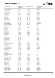
eText Typefaces - Amazon Web Services
eText Typefaces - Amazon Web Services
eText Typefaces - Amazon Web Services

Create successful ePaper yourself
Turn your PDF publications into a flip-book with our unique Google optimized e-Paper software.
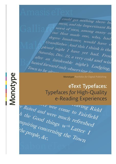
Monotype Portfolio for Digital Publishing<br />
<strong>eText</strong> <strong>Typefaces</strong>:<br />
<strong>Typefaces</strong> for High-Quality<br />
e-Reading Experiences
Reading on screen is simply a fact of life for most<br />
of us today. And for consumer devices to serve<br />
us best, the text needs to be easy and enjoyable<br />
to read no matter what screen you’re using:<br />
Times New Roman for Desktop: 9pts<br />
Ysobel <strong>eText</strong>: 9pts<br />
<strong>Typefaces</strong> for Digital Reading Environments Page 2
The Monotype Collection of<br />
<strong>eText</strong> <strong>Typefaces</strong><br />
Designed for High-Quality e-Reading Experiences<br />
We believe an enjoyable and effective e-reading experience hinges on the<br />
quality of the screen text. That’s why we’re introducing a collection of fonts<br />
optimized for digital publishing environments. The suite is comprised of some<br />
of the most widely used typefaces traditionally used for print—designed,<br />
tuned and hand-hinted to display as clearly as possible on digital displays.<br />
<strong>Typefaces</strong> in our collection, selected by our design experts in the Monotype<br />
Studio, are purposely broad enough to serve the entire e-publishing sphere—<br />
including e-books, <strong>Web</strong> content, mobile applications, digital publications and<br />
online newspapers.<br />
The fonts also take advantage of our Edge tuning technology, enabling<br />
publishers to create and deliver high-quality, readable text across various<br />
platforms, formats and devices, including E Ink® screens. The fonts look<br />
and perform best with devices that use our iType® font engine.<br />
Our <strong>eText</strong> <strong>Typefaces</strong> are part of the Monotype Portfolio for Digital Publishing—one<br />
of our value-added suites of typefaces and technologies developed<br />
to meet the needs and specific requirements of customers who are developing<br />
and delivering content for immersive reading on e-readers, tablets and<br />
other devices.<br />
Whether you’re a device<br />
manufacturer or publisher,<br />
the readability and performance<br />
of your content is your main<br />
concern. Our <strong>eText</strong> <strong>Typefaces</strong><br />
have been specially designed<br />
and tuned with that concern<br />
in mind.<br />
Purpose Built <strong>Typefaces</strong> for Your Device<br />
Device manufacturers and publishers have access to a selection of typefaces<br />
that have been hinted and tuned for optimal readability and performance for<br />
any digital reading experience.<br />
Stand Out from the Crowd<br />
Our solution gives device manufacturers and publishers access to a special<br />
collection of high-quality typeface designs that will provide their customers<br />
with the highest-quality, unique UI experience.<br />
Put Readability and Performance First<br />
Whether you’re a device manufacturer or publisher, the readability and<br />
performance of your content is your main concern. Our <strong>eText</strong> <strong>Typefaces</strong><br />
have been designed and tuned specifically with that concern in mind.<br />
<strong>Web</strong> Fonts and HTML5 Support<br />
<strong>Web</strong> fonts are an integral part of the solution for content publishers who<br />
want to deliver the best reading experiences across browsers and platforms.<br />
Monotype’s e-text <strong>Web</strong> fonts can also deliver unparalleled performance<br />
and readability for HTML5 applications including HTML5-based e-reader<br />
applications.<br />
<strong>Typefaces</strong> for Digital Reading Environments Page 3
The Classics. The New.<br />
Device System Fonts | E-book Fonts | <strong>Web</strong> Fonts | Small Text Print Fonts<br />
We’ve crafted these typefaces to retain their fidelity on the full gamut of<br />
reading devices. Our inaugural set for digital publishing not only includes<br />
redesigned classics such as Monotype Baskerville, ITC Galliard and Sabon,<br />
but also newer designs, such as Malabar and Ysobel, which had the screen<br />
in mind at their origins.<br />
Monotype typeface designers worked to impart a richer contrast, an even<br />
color, and slightly taller lowercase characters, all while ensuring that the<br />
e-text typefaces appear as unmistakable cousins of their original print<br />
designs. The designs also include small caps and old style figures for professional-quality<br />
publishing design.<br />
All typefaces in the collection have been hand-hinted to display as clearly<br />
as possible across mobile devices—from smartphones to tablets and e-readers.<br />
The fonts also take advantage of Monotype’s Edge tuning technology,<br />
enabling publishers to create and deliver high-quality, readable text across<br />
various platforms, formats and devices, including E Ink screens. The fonts<br />
look and perform best with devices that use Monotype’s iType font engine<br />
for rendering text.<br />
Amasis TM <strong>eText</strong> 4 Weights<br />
All typefaces in the collection<br />
have been hand-hinted to<br />
display as clearly as possible<br />
across mobile devices—<br />
from smartphones to tablets<br />
and e-readers.<br />
Monotype Baskerville <strong>eText</strong> TM 4 Weights<br />
PMN Caecilia ® <strong>eText</strong> 4 Weights<br />
Dante ® <strong>eText</strong> 4 Weights<br />
ITC Galliard ® <strong>eText</strong> 4 Weights<br />
Neue Helvetica ® <strong>eText</strong> 6 Weights<br />
Malabar <strong>eText</strong> TM 4 Weights<br />
Palatino ® <strong>eText</strong> 4 Weights<br />
Sabon ® <strong>eText</strong> 4 Weights<br />
Ysobel <strong>eText</strong> TM 4 Weights<br />
<strong>Typefaces</strong> for Digital Reading Environments Page 4
Creating <strong>eText</strong> Fonts<br />
Most classic text faces were made for print and are not naturally suited for<br />
screen displays. The features that were incorporated into the letterforms to<br />
aid printed output had to be reevaluated for optimum readability on screen<br />
and e-paper displays.<br />
a — Lowercase heights needed to be taller<br />
b — Hairline and serif features needed to be slightly heavier<br />
c — Inter-character spacing needed to be slightly looser<br />
d — Counters needed to be made slightly more open<br />
(lowercase “e” for example)<br />
e — Ratio of thicks to thins needed to be adjusted<br />
Not all fonts were created<br />
equally—one size doesn’t<br />
fit all.<br />
a<br />
Baskerville for Desktop<br />
Baskerville <strong>eText</strong><br />
b<br />
c<br />
d<br />
e<br />
<strong>Typefaces</strong> for Digital Reading Environments Page 5
Combining Design with Technology<br />
The new e-text fonts are designed to look and read as clearly as possible on<br />
digital displays. But that is only part of the story. Since each display has<br />
unique characteristics we add our tuning technology to adapt the design<br />
further. The e-text fonts contain information to aid the quality on an E Ink<br />
device in a way that may be different for various resolution LCD devices.<br />
In the past, the only alternative for e-reader devices without technology<br />
was to simply accept lighter, blurrier text at the smaller sizes, which forces<br />
end users to keep increasing the size until they find one that is readable.<br />
Combining technology with a good design eliminates the need for multiple<br />
versions or cuts of the outline to yield high readability for all sizes offered<br />
on the device.<br />
Baskerville <strong>eText</strong> without Technology<br />
Combining technology with<br />
a good design eliminates the<br />
need for multiple versions<br />
or cuts of the outline to yield<br />
high readability for all sizes<br />
offered on the device.<br />
Baskerville <strong>eText</strong> with Technology (Edge hinting and CSMs)<br />
Sharper Serifs Consistent Pixel Patterns Balanced Symetry<br />
Balanced Letterspacing<br />
Defined Letterforms<br />
<strong>Typefaces</strong> for Digital Reading Environments Page 6
The Advantages of Edge Rendering<br />
and Edge Tuning<br />
Edge Rendering<br />
Monotype’s Edge TrueType® renderer uses adaptive distance fields (ADF) to<br />
describe the edges of an outline. These fields are controlled by inside and<br />
outside cut-off parameters. By adjusting these values, the rendered glyph<br />
can be tuned in both thickness and sharpness. The ADF renderer fills interiors<br />
with black and traces boundaries to apply gray values according to the<br />
distance from the inside and outside contour of the character.<br />
Density<br />
Max<br />
Distance Inside Cutoff<br />
0<br />
Outside Cutoff<br />
Contour Edge<br />
By adjusting the inside and outside cut-off values we can adjust the weight<br />
of the strokes or the sharpness of the edges of each character.<br />
<strong>Typefaces</strong> for Digital Reading Environments Page 7
The Advantages of Edge Rendering<br />
and Edge Tuning<br />
Edge Tuning<br />
Edge tuning is a font adjustment using Continuous Stroke Modulation (CSM).<br />
These CSM values can be adjusted separately for each PPM (pixels per em<br />
square) by moving the inside and outside cut-off values. Once these parameters<br />
are set to their ideal quality settings for each PPM, they are stored in a<br />
proprietary TrueType table called an ADFH table. Because the values are<br />
based on Unicode encoding, each language range can be adjusted separately,<br />
even within the same PPM size (e.g. Latin adjusted separately from<br />
Chinese). Each font style requires different CSM values to optimize the<br />
characteristics of that design (e.g. Helvetica would require different CSM<br />
values than Baskerville).<br />
Continuous Stroke Modulation<br />
Density<br />
Max<br />
Sharper Edge<br />
Outside Cutoff<br />
Inside Cutoff<br />
Distance<br />
Density<br />
Max<br />
Softer Edge<br />
Outside Cutoff<br />
Inside Cutoff<br />
Distance<br />
Density<br />
Max<br />
Thinner Stroke<br />
Outside Cutoff<br />
Inside Cutoff<br />
Distance<br />
Density<br />
Max<br />
Thicker Stroke<br />
Outside Cutoff<br />
Inside Cutoff<br />
Distance<br />
<strong>Typefaces</strong> for Digital Reading Environments Page 8
<strong>eText</strong> Typeface Integration<br />
The <strong>eText</strong> <strong>Typefaces</strong> can be integrated in a number of ways:<br />
— The fonts may be embedded in consumer devices for use as system<br />
fonts that can be custom-tuned for optimal display and performance<br />
to meet specific OEM device requirements.<br />
— The fonts may be bundled within the source code of an e-book or<br />
digital publication title, enabling publishers to preserve intended<br />
design, branding and layout requirements. Displays that use either<br />
e-paper or LCD technology are supported.<br />
— The fonts may be licensed as <strong>Web</strong> fonts from Fonts.com <strong>Web</strong> Fonts<br />
for HTML-based content, enabling high-quality reading experiences<br />
across various <strong>Web</strong> browsers.<br />
Learn More<br />
For a complete showing of Monotype’s <strong>eText</strong> Typeface Collection, visit:<br />
fonts.com/search/all-fonts?searchtext=etext&SearchIn=all-fonts<br />
or contact Monotype for more information at etext@monotype.com.<br />
About Monotype<br />
Monotype is a leading global provider of typefaces, technology and expertise<br />
that enable the best user experience and ensure brand integrity. Based<br />
in Woburn, Mass., Monotype provides customers worldwide with typeface<br />
solutions for a broad range of creative applications and consumer devices.<br />
The company’s library and e-commerce sites are home to many of the most<br />
widely used typefaces—including the Helvetica®, Frutiger® and Univers®<br />
families—as well as the next generation of type designs.<br />
Monotype, iType, Palatino, Sabon, PMN Ceacilia, Neue Helvetica, Helvetica, Frutiger and Univers are<br />
trademarks of Monotype Imaging Inc. registered in the U.S. Patent and Trademark Office and may<br />
be registered in certain jurisdictions. Edge and Ysobel are trademarks of Monotype Imaging Inc. and<br />
may be registered in certain jurisdictions. Galliard is a trademark of Monotype ITC Inc. registered<br />
in the U.S. Patent and Trademark Office and may be registered in certain jurisdictions. Malabar is a<br />
trademark of Monotype GmbH and may be registered in certain jurisdictions. Monotype Baskerville<br />
and Amasis are trademarks of The Monotype Corp. and may be registered in certain jurisdictions.<br />
E Ink is a registered trademark of E Ink Corp. TrueType is a trademark of Apple Inc. registered in the<br />
U.S. Patent and Trademark Office and other countries. Unicode is a trademark of Unicode, Inc. All<br />
other trademarks are the property of their respective owners. ©2013 Monotype Imaging Holdings<br />
Inc. All rights reserved.<br />
<strong>Typefaces</strong> for Digital Reading Environments Page 9
AmasisTM <strong>eText</strong><br />
Designed for Screen by: Ron Carpenter<br />
Designed for High-Quality e-Reading Experiences, Amasis <strong>eText</strong> is ideally suited for; e-Books, <strong>Web</strong> Pages,<br />
Mobile Applications, Online Newspapers and e-Magazines<br />
ABCDEFGHIJKLMNOPQRSTUVWXYZ<br />
abcdefghijklmnopqrstvwxyz<br />
0123456789 &¢¥£€ƒ@?#<br />
([{«‹›»}])®©“¿¡.:;,?!” †*/¦|\<br />
Available Styles:<br />
Comparison of Screen vs. Print:<br />
Amasis <strong>eText</strong> Regular<br />
Amasis <strong>eText</strong> Italic<br />
Amasis <strong>eText</strong> Bold<br />
Amasis <strong>eText</strong> Bold Italic<br />
The Amasis <strong>eText</strong> fonts were created for the screen—<br />
designed and tuned for exceptional readability on<br />
tablets, e-readers, smartphones and other<br />
<strong>Web</strong>-enabled devices.<br />
Amasis <strong>eText</strong> Regular: Set at 9/12<br />
An example of a traditional desktop font, shown in<br />
comparison to a font that has been specially designed,<br />
tuned and hinted for digital displays.<br />
Times New Roman: Set at 9/12<br />
Times New Roman Regular: 90pts<br />
Amasis <strong>eText</strong> Regular: 90pts<br />
The Amasis <strong>eText</strong> fonts were created for the screen—<br />
designed and tuned for exceptional readability on tablets,<br />
e-readers, smartphones and other <strong>Web</strong>-enabled devices.<br />
Amasis <strong>eText</strong> Regular: Set at 8/12<br />
Sabon Regular: 110pts<br />
Amasis <strong>eText</strong> Regular: 110pts<br />
An example of a traditional desktop font, shown in<br />
comparison to a font that has been specially designed,<br />
tuned and hinted for digital displays.<br />
Times New Roman: Set at 8/12<br />
Garamond Regular: 110pts<br />
Amasis <strong>eText</strong> Regular: 100pts<br />
NOTE: The labeling of examples on this page are<br />
typeset in their respective font/s, using identical<br />
character specifications for the purpose<br />
of comparison.<br />
<strong>Typefaces</strong> for Digital Reading Environments Page 10
Monotype BaskervilleTM <strong>eText</strong><br />
Original Design by: John Baskerville | Interpreted for Screen by: Steve Matteson<br />
Designed for High-Quality e-Reading Experiences, Monotype Baskerville <strong>eText</strong> is ideally suited for;<br />
e-Books, <strong>Web</strong> Pages, Mobile Applications, Online Newspapers and e-Magazines<br />
ABCDEFGHIJKLMNOPQRSTUVWXYZ<br />
abcdefghijklmnopqrstvwxyz<br />
0123456789 &¢¥£€ƒ@?#<br />
([{«‹›»}])®©“¿¡.:;,?!” †*/¦|\<br />
Available Styles:<br />
Baskerville <strong>eText</strong> Regular<br />
Baskerville <strong>eText</strong> Italic<br />
Baskerville <strong>eText</strong> Bold<br />
Baskerville <strong>eText</strong> Bold Italic<br />
Comparison of Screen vs. Print:<br />
The Monotype Baskerville <strong>eText</strong> fonts<br />
have been redrawn to improve their on-screen<br />
readability—designed, tuned and hinted to<br />
display as clearly as possible—on every device.<br />
Monotype Baskerville <strong>eText</strong> Regular: Set at 9/12<br />
This example is set in a traditional desktop<br />
Baskerville— shown as a comparison to Baskerville<br />
<strong>eText</strong>, which has been redrawn for optimal readability<br />
on digital displays.<br />
Baskerville Regular: Set at 9/12<br />
Baskerville Italic:100pts<br />
Baskerville <strong>eText</strong> Italic: 100pts<br />
The Monotype Baskerville <strong>eText</strong> fonts have been<br />
redrawn to improve their on-screen readability—<br />
designed, tuned and hinted to display as clearly<br />
as possible—on every device<br />
Monotype Baskerville <strong>eText</strong> Regular: Set at 8/12<br />
Baskerville Bold: 100pts<br />
Baskerville <strong>eText</strong> Bold: 100pts<br />
NOTE: The labeling of examples on this page are<br />
typeset in their respective font/s, using identical<br />
character specifications for the purpose<br />
of comparison.<br />
This example is set in a traditional desktop Baskerville—<br />
shown as a comparison to Baskerville <strong>eText</strong>, which has been<br />
redrawn for optimal readability on digital displays.<br />
Baskerville Regular: Set at 8/12<br />
<strong>Typefaces</strong> for Digital Reading Environments Page 11
PMN Caecilia ® <strong>eText</strong><br />
Original Design by: Peter Mathias Noordzij<br />
Designed for High-Quality e-Reading Experiences, Caecilia <strong>eText</strong> is ideally suited for; e-Books, <strong>Web</strong> Pages,<br />
Mobile Applications, Online Newspapers and e-Magazines<br />
ABCDEFGHIJKLMNOPQRSTUVWXYZ<br />
abcdefghijklmnopqrstvwxyz<br />
0123456789 &¢¥£€ƒ@?#<br />
([{«‹›»}])®©“¿¡.:;,?!” †*/¦|\<br />
Available in:<br />
Caecilia <strong>eText</strong> Regular<br />
Caecilia <strong>eText</strong> Italic<br />
Caecilia <strong>eText</strong> Bold<br />
Caecilia <strong>eText</strong> Bold Italic<br />
Comparison of Screen vs. Print<br />
The Caecilia <strong>eText</strong> fonts have been redrawn to<br />
improve their on-screen readability—designed,<br />
tuned and hinted to display as clearly as<br />
possible on every device.<br />
Caecilia <strong>eText</strong> Regular; Set at 9/12<br />
This example is set in a traditional desktop<br />
Caecilia—shown as a comparison to Caecilia<br />
<strong>eText</strong> Regular, which has been redrawn for<br />
optimal readability on digital displays.<br />
Caecilia Roman; Set at 9/12<br />
Caecilia Roman: 100pts<br />
Caecilia <strong>eText</strong> Regular: 100pts<br />
The Caecilia <strong>eText</strong> fonts have been redrawn to<br />
improve their on-screen readability—designed,<br />
tuned and hinted to display as clearly as possible<br />
on every device.<br />
Caecilia <strong>eText</strong> Regular; Set at 8/12<br />
Caecilia Italic: 100pts<br />
Caecilia <strong>eText</strong> Italic: 100pts<br />
This example is set in a traditional desktop<br />
Caecilia—shown as a comparison to Caecilia <strong>eText</strong><br />
Regular, which has been redrawn for optimal<br />
readability on digital displays.<br />
Caecilia Roman; Set at 9/12<br />
NOTE: The labeling of examples on this page are<br />
typeset in their respective font/s, using identical<br />
character specifications for the purpose<br />
of comparison.<br />
<strong>Typefaces</strong> for Digital Reading Environments Page 12
Dante ® <strong>eText</strong><br />
Original Design by: Giovanni Mardersteig | Interpreted for Screen by: Steve Matteson, Jim Wasco and George Ryan<br />
Designed for High-Quality e-Reading Experiences, Dante <strong>eText</strong> is ideally suited for; e-Books, <strong>Web</strong> Pages, Mobile<br />
Applications, Online Newspapers and e-Magazines<br />
ABCDEFGHIJKLMNOPQRSTUVWXYZ<br />
abcdefghijklmnopqrstvwxyz<br />
0123456789 &¢¥£€ƒ@?#<br />
([{«‹›»}])®©“¿¡.:;,?!” †*/¦|\<br />
Available in:<br />
Dante <strong>eText</strong> Regular<br />
Dante <strong>eText</strong> Italic<br />
Dante <strong>eText</strong> Bold<br />
Dante <strong>eText</strong> Bold Italic<br />
Comparison of Screen vs. Print<br />
The Dante <strong>eText</strong> fonts have been redrawn to<br />
improve their on-screen readability—designed,<br />
tuned and hinted to display as clearly as possible<br />
on every device.<br />
Dante <strong>eText</strong> Regular; Set at 9/12<br />
This example is set in a traditional desktop Dante—<br />
shown as a comparison to Dante <strong>eText</strong> Regular,<br />
which has been redrawn for optimal readability on<br />
digital displays.<br />
Dante Roman; Set at 9/12<br />
Dante Regular: 100pts<br />
Dante <strong>eText</strong> Regular: 100pts<br />
The Dante <strong>eText</strong> fonts have been redrawn to improve<br />
their on-screen readability—designed, tuned and<br />
hinted to display as clearly as possible on every device.<br />
Dante <strong>eText</strong> Regular; Set at 8/12<br />
Dante Regular: 100pts<br />
Dante <strong>eText</strong> Regular: 100pts<br />
This example is set in a traditional desktop Dante— shown<br />
as a comparison to Dante <strong>eText</strong> Regular, which has been<br />
redrawn for optimal readability on digital displays.<br />
Dante Roman; Set at 8/12<br />
Dante Regular: 100pts<br />
Dante <strong>eText</strong> Regular: 100pts<br />
NOTE: The labeling of examples on this page are<br />
typeset in their respective font/s, using identical<br />
character specifications for the purpose<br />
of comparison.<br />
<strong>Typefaces</strong> for Digital Reading Environments Page 13
Neue Helvetica ® <strong>eText</strong><br />
Original Design by: Linotype Design Studio | Interpreted for Screen by: Akira Kobayashi<br />
Designed for High-Quality e-Reading Experiences, Neue Helvetica <strong>eText</strong> is ideally suited for; e-Books,<br />
<strong>Web</strong> Pages, Mobile Applications, Online Newspapers and e-Magazines<br />
ABCDEFGHIJKLMNOPQRSTUVWXYZ<br />
abcdefghijklmnopqrstvwxyz<br />
0123456789 &¢¥£€ƒ@?#<br />
([{«‹›»}])®©“¿¡.:;,?!” †*/¦|\<br />
Available in:<br />
Neue Helvetica <strong>eText</strong> Light<br />
Neue Helvetica <strong>eText</strong> Light Italic<br />
Neue Helvetica <strong>eText</strong> Roman<br />
Neue Helvetica <strong>eText</strong> Italic<br />
Neue Helvetica <strong>eText</strong> Medium<br />
Neue Helvetica <strong>eText</strong> Medium Italic<br />
Neue Helvetica <strong>eText</strong> Bold<br />
Neue Helvetica <strong>eText</strong> Bold Italic<br />
Comparison of Screen vs. Print<br />
The Neue Helvetica <strong>eText</strong> fonts have been<br />
redrawn to improve their on-screen<br />
readability—designed, tuned and hinted to<br />
display as clearly as possible on every device.<br />
Neue Helvetica <strong>eText</strong> Roman; Set at 9/12<br />
This example is set in a traditional desktop<br />
Neue Helvetica—shown as a comparison to Neue<br />
Helvetica <strong>eText</strong>, which has been redrawn for<br />
optimal readability on digital displays.<br />
Neue Helvetica Roman; 9/12<br />
The Neue Helvetica <strong>eText</strong> fonts have been<br />
redrawn to improve their on-screen readability—<br />
designed, tuned and hinted to display as clearly<br />
as possible on every device.<br />
Neue Helvetica <strong>eText</strong> Medium; Set 8/12<br />
Neue Helvetica Roman: 90pts<br />
Neue Helvetica <strong>eText</strong> Roman: 90pts<br />
This example is set in a traditional desktop<br />
Neue Helvetica—shown as a comparison to Neue<br />
Helvetica <strong>eText</strong>, which has been redrawn for optimal<br />
readability on digital displays.<br />
Neue Helvetica Roman; 8/12<br />
Neue Helvetica Bold: 90pts<br />
Neue Helvetica <strong>eText</strong> Bold: 90pts<br />
NOTE: The labeling of examples on this page are<br />
typeset in their respective font/s, using identical<br />
character specifications for the purpose<br />
of comparison.<br />
<strong>Typefaces</strong> for Digital Reading Environments Page 14
ITC Galliard ® <strong>eText</strong><br />
Original Design by: Matthew Carter | Interpreted for Screen by: Carl Crossgrove<br />
Designed for High-Quality e-Reading Experiences, ITC Galliard <strong>eText</strong> is ideally suited for; e-Books, <strong>Web</strong> Pages,<br />
Mobile Applications, Online Newspapers and e-Magazines<br />
ABCDEFGHIJKLMNOPQRSTUVWXYZ<br />
abcdefghijklmnopqrstvwxyz<br />
0123456789 &¢¥£€ƒ@?#<br />
([{«‹›»}])®©“¿¡.:;,?!” †*/¦|\<br />
Available in:<br />
ITC Galliard <strong>eText</strong> Regular<br />
ITC Galliard <strong>eText</strong> Italic<br />
ITC Galliard <strong>eText</strong> Bold<br />
ITC Galliard <strong>eText</strong> Bold Italic<br />
Comparison of Screen vs. Print:<br />
The ITC Galliard <strong>eText</strong> fonts have been redrawn<br />
to improve their on-screen readability—<br />
designed, tuned and hinted to display as clearly<br />
as possible—on every device.<br />
ITC Galliard <strong>eText</strong> Regular: Set at 9/12<br />
This example is set in a traditional desktop<br />
Galliard—shown as a comparison to ITC Galliard<br />
<strong>eText</strong>, which has been redrawn for optimal<br />
readability on digital displays.<br />
Galliard Regular: Set at 9/12<br />
Galliard Regular: 100pts<br />
ITC Galliard <strong>eText</strong> Regular: 100pts<br />
The ITC Galliard <strong>eText</strong> fonts have been redrawn to<br />
improve their on-screen readability—designed,<br />
tuned and hinted to display as clearly as possible—<br />
on every device.<br />
ITC Galliard <strong>eText</strong> Regular: Set at 8/12<br />
Galliard Bold Italic: 100pts<br />
ITC Galliard <strong>eText</strong> Bold Italic: 100pts<br />
NOTE: The labeling of examples on this page are<br />
typeset in their respective font/s, using identical<br />
character specifications for the purpose<br />
of comparison.<br />
This example is set in a traditional desktop Galliard—<br />
shown as a comparison to ITC Galliard <strong>eText</strong>, which has<br />
been redrawn for optimal readability on digital displays.<br />
Galliard Regular: Set at 8/12<br />
<strong>Typefaces</strong> for Digital Reading Environments Page 15
TM<br />
Malabar <strong>eText</strong><br />
Designed for the Screen by: Dan Reynolds<br />
Designed for High-Quality e-Reading Experiences, Malabar <strong>eText</strong> is ideally suited for; e-Books, <strong>Web</strong> Pages,<br />
Mobile Applications, Online Newspapers and e-Magazines<br />
ABCDEFGHIJKLMNOPQRSTUVWXYZ<br />
abcdefghijklmnopqrstvwxyz<br />
0123456789 &¢¥£€ƒ@?#<br />
([{«‹›»}])®©“¿¡.:;,?!” †*/¦|\<br />
Available Styles:<br />
Comparison of Screen vs. Print<br />
Malabar <strong>eText</strong> Regular<br />
Malabar <strong>eText</strong> Italic<br />
Malabar <strong>eText</strong> Bold<br />
Malabar <strong>eText</strong> Bold Italic<br />
The Malabar <strong>eText</strong> fonts were created for the<br />
screen—designed and tuned for exceptional<br />
readability on tablets, e-readers, smartphones<br />
and other <strong>Web</strong>-enabled devices.<br />
Malabar <strong>eText</strong> Regular: Set at 9/12<br />
An example of a traditional desktop font, shown in<br />
comparison to a font that has been specially designed,<br />
tuned and hinted for digital displays.<br />
Times New Roman: Set at 9/12<br />
Times New Roman Regular: 90pts<br />
Malabar <strong>eText</strong> Regular: 90pts<br />
The Malabar <strong>eText</strong> fonts were created for the<br />
screen—designed and tuned for exceptional<br />
readability on tablets, e-readers, smartphones<br />
and other <strong>Web</strong>-enabled devices.<br />
Malabar <strong>eText</strong> Regular: Set at 8/12<br />
Sabon Italic: 100pts<br />
Malabar <strong>eText</strong> Italic: 100pts<br />
An example of a traditional desktop font, shown in<br />
comparison to a font that has been specially designed, tuned<br />
and hinted for digital displays.<br />
Times New Roman: Set at 8/12<br />
Goudy Old Style Bold: 110pts<br />
Malabar <strong>eText</strong> Bold: 100pts<br />
NOTE: The labeling of examples on this page are<br />
typeset in their respective font/s, using identical<br />
character specifications for the purpose<br />
of comparison.<br />
<strong>Typefaces</strong> for Digital Reading Environments Page 16
Palatino ® <strong>eText</strong><br />
Original Design by: Hermann Zapf | Interpreted for Screen by: Toshi Omagari<br />
Designed for High-Quality e-Reading Experiences, Palatino <strong>eText</strong> is ideally suited for; e-Books,<br />
<strong>Web</strong> Pages, Mobile Applications, Online Newspapers and e-Magazines<br />
ABCDEFGHIJKLMNOPQRSTUVWXYZ<br />
abcdefghijklmnopqrstvwxyz<br />
0123456789 &¢¥£€ƒ@?#<br />
([{«‹›»}])®© “¿¡.:;,?!” †*/¦|\<br />
Available Styles:<br />
Palatino <strong>eText</strong> Regular<br />
Palatino <strong>eText</strong> Italic<br />
Palatino <strong>eText</strong> Bold<br />
Palatino <strong>eText</strong> Bold Italic<br />
Comparison of Screen vs. Print:<br />
The Palatino <strong>eText</strong> fonts have been redrawn<br />
to improve their on-screen readability—<br />
designed, tuned and hinted to display as<br />
clearly as possible—on every device.<br />
Palatino <strong>eText</strong> Regular: Set at 9/12<br />
This example is set in a traditional desktop<br />
Palatino—shown as a comparison to Palatino <strong>eText</strong>,<br />
which has been redrawn for optimal readability<br />
on digital displays.<br />
Palatino Regular: Set at 9/12<br />
Palatino Regular: 100pts<br />
Palatino <strong>eText</strong> Regular: 100pts<br />
The Palatino <strong>eText</strong> fonts have been redrawn to<br />
improve their on-screen readability—designed,<br />
tuned and hinted to display as clearly as<br />
possible—on every device.<br />
Palatino <strong>eText</strong> Regular: Set at 8/12<br />
Palatino Bold Italic: 100 pts<br />
Palatino <strong>eText</strong> Bold Italic: 100pts<br />
NOTE: The labeling of examples on this page are<br />
typeset in their respective font/s, using identical<br />
character specifications for the purpose<br />
of comparison.<br />
This example is set in a traditional desktop<br />
Palatino—shown as a comparison to Palatino<br />
<strong>eText</strong>, which has been redrawn for optimal<br />
readability on digital displays.<br />
Palatino Regular: Set at 8/12<br />
<strong>Typefaces</strong> for Digital Reading Environments Page 17
Sabon ® <strong>eText</strong><br />
Original Design by: Jan Tschichold | Interpreted for Screen by: Steve Matteson<br />
Designed for High-Quality e-Reading Experiences, Sabon <strong>eText</strong> is ideally suited for; e-Books, <strong>Web</strong> Pages,<br />
Mobile Applications, Online Newspapers and e-Magazines<br />
ABCDEFGHIJKLMNOPQRSTUVWXYZ<br />
abcdefghijklmnopqrstvwxyz<br />
0123456789 &¢¥£€ƒ@?#<br />
([{«‹›»}])®©“¿¡.:;,?!” †*/¦|\<br />
Available Styles:<br />
Comparison of Screen vs. Print:<br />
Sabon <strong>eText</strong> Regular<br />
Sabon <strong>eText</strong> Italic<br />
Sabon <strong>eText</strong> Bold<br />
Sabon <strong>eText</strong> Bold Italic<br />
The Sabon <strong>eText</strong> fonts have been redrawn to<br />
improve their on-screen readability—designed,<br />
tuned and hinted to display as clearly as<br />
possible—on every device.<br />
Sabon <strong>eText</strong> Regular: Set at 9/12<br />
This example is set in a traditional desktop Sabon–<br />
shown as a comparison to Sabon <strong>eText</strong>, which<br />
has been redrawn for optimal readability on<br />
digital displays.<br />
Sabon Regular: Set at 9/12<br />
Sabon Regular: 90pts<br />
Sabon <strong>eText</strong> Regular: 90pts<br />
The Sabon <strong>eText</strong> fonts have been redrawn to improve<br />
their on-screen readability—designed, tuned and<br />
hinted to display as clearly as possible—<br />
on every device.<br />
Sabon <strong>eText</strong> Regular: Set at 8/12<br />
Sabon Bold: 100pts<br />
Sabon <strong>eText</strong> Bold: 100pts<br />
NOTE: The labeling of examples on this page are<br />
typeset in their respective font/s, using identical<br />
character specifications for the purpose<br />
of comparison.<br />
This example is set in a traditional desktop Sabon—shown<br />
as a comparison to Sabon <strong>eText</strong>, which has been redrawn<br />
for optimal readability on digital displays.<br />
Sabon Regular: Set at 8/12<br />
<strong>Typefaces</strong> for Digital Reading Environments Page 18
YsobelTM <strong>eText</strong><br />
Original Design by: Robin Nicholas | Interpreted for Screen by: Steve Matteson<br />
Designed for High-Quality e-Reading Experiences, Ysobel <strong>eText</strong> is ideally suited for; e-Books, <strong>Web</strong> Pages,<br />
Mobile Applications, Online Newspapers and e-Magazines<br />
ABCDEFGHIJKLMNOPQRSTUVWXYZ<br />
abcdefghijklmnopqrstvwxyz<br />
0123456789 &¢¥£€ƒ@?#<br />
([{«‹›»}])®©“¿¡.:;,?!” †*/¦|\<br />
Available Styles:<br />
Comparison of Screen vs. Print:<br />
Ysobel <strong>eText</strong> Regular<br />
Ysobel <strong>eText</strong> Italic<br />
Ysobel <strong>eText</strong> Bold<br />
Ysobel <strong>eText</strong> Bold Italic<br />
The Ysobel <strong>eText</strong> fonts were created for the<br />
screen—designed and tuned for exceptional<br />
readability on tablets, e-readers, smartphones<br />
and other <strong>Web</strong>-enabled devices.<br />
Ysobel <strong>eText</strong> Regular: Set at 9/12<br />
An example of a traditional desktop font, shown in<br />
comparison to a font that has been specially designed,<br />
tuned and hinted for digital displays.<br />
Times New Roman: Set at 9/12<br />
Times New Roman Regular: 90pts<br />
Ysobel <strong>eText</strong> Regular: 90pts<br />
The Ysobel <strong>eText</strong> fonts were created for the screen—<br />
designed and tuned for exceptional readability<br />
on tablets, e-readers, smartphones and other<br />
<strong>Web</strong>-enabled devices.<br />
Ysobel <strong>eText</strong> Regular: Set at 8/12<br />
Garamond Regular: 100pts<br />
Ysobel <strong>eText</strong> Regular: 100pts<br />
Shown: An example of a traditional desktop font, shown in<br />
comparison to a font that has been specially designed, tuned<br />
and hinted for digital displays.<br />
Times New Roman: Set at 8/12<br />
Century Schoolbook Italic: 100pts<br />
Ysobel <strong>eText</strong> Italic: 100 pts<br />
NOTE: The labeling of examples on this page are<br />
typeset in their respective font/s, using identical<br />
character specifications for the purpose<br />
of comparison.<br />
<strong>Typefaces</strong> for Digital Reading Environments Page 19