Graphs - Oklahoma 4-H
Graphs - Oklahoma 4-H
Graphs - Oklahoma 4-H

You also want an ePaper? Increase the reach of your titles
YUMPU automatically turns print PDFs into web optimized ePapers that Google loves.
<strong>Graphs</strong><br />
<strong>Graphs</strong> display data as an easy-to-understand visual reference. Sometimes the translation of data into text<br />
becomes confusing. <strong>Graphs</strong> make it easier to understand complex information or view the results of an experiment.<br />
SETTING UP A GRAPH<br />
A bar or line graph requires a set of crossed lines or a grid. It becomes a “graph” when labels or details are<br />
given to the lines.<br />
• Label the Axes: The reference lines on a graph are called axes. They are the horizontal (x) and vertical (y)<br />
lines that cross. If they have numbers, the lowest number is usually at the place where the axes cross. The<br />
data collected will determine how the axes are labeled.<br />
• Choose the Scale: The numbers running along a side of the graph are the scale. The difference between<br />
numbers from one grid line to another is the interval. The interval will depend on the range of the data and<br />
the number of lines on the graph paper.<br />
—An interval of 1 will make the graph tall and skinny.<br />
—An interval of 100 will make the graph shorter and wider.<br />
• Range: The range (difference between the highest and lowest numbers in the sample) will determine the<br />
interval. It is generally best to set the intervals at 1,10, 20, 100, etc.—base 10 numbers.<br />
COMPARING GRAPHS<br />
<strong>Graphs</strong> that illustrate how data compare are: single-bar graphs, double-bar graphs, pictographs, and circle<br />
graphs. These graphs can illustrate the same kind of data at different times or places, different sets of data at<br />
the same time or place, or different kinds of data that make up 100 percent of one group of data.<br />
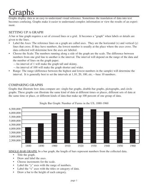
Single Bar Graph: Number of Farms in the US, 1880-1960<br />
6,500,000<br />
6,000,000<br />
5,500,000<br />
5,000,000<br />
4,500,000<br />
4,000,000<br />
3,500,000<br />
3,000,000<br />
2,500,000<br />
1880 1890 1900 1910 1920 1930 1940 1950 1960<br />
SINGLE-BAR GRAPH: In a bar graph, the length of bars represent numbers from the collected data.<br />
• Title the graph.<br />
• Draw and label the axes.<br />
• Choose increments for the scale.<br />
• Label the “y” axes with the range of numbers.<br />
• Label the “x” axes with the titles or category of data.<br />
• Draw a bar to the height of each category.<br />
page 1
DOUBLE-BAR GRAPH: A double-bar graph compares sets of data. This graph saves space and time by combining<br />
the information on one graph.<br />
• Follow the same instructions as for the single-bar graph.<br />
• Include both sets of data for each category.<br />
• Include a “key” next to the graph to explain the two or more sets of data displayed.<br />
(acres)<br />
440<br />
435<br />
430<br />
425<br />
420<br />
415<br />
410<br />
405<br />
400<br />
1998<br />
<strong>Oklahoma</strong><br />
US<br />
Double Bar Graph: Average Farm Size: <strong>Oklahoma</strong> and US, 1998-2002<br />
1999 2000 2001 2002<br />
Source: Farms, Land in Farms and Livestock Operations, February 2007, Agricultural Statistics Board, NASS, USDA,<br />
http://usda.mannlib.cornell.edu/usda/current/FarmLandIn/FarmLandIn-02-02-2007.pdf<br />
PICTOGRAPH: A pictograph is a visual tool which appeals to the eye while organizing data to be compared.<br />
• Title the graph.<br />
• Draw and label the axes.<br />
• Choose a symbol for the data.<br />
• Draw a key.<br />
• Draw the appropriate number of symbols next to each item.<br />
2000<br />
Pictograph: Sheep in <strong>Oklahoma</strong>, 2000-2005<br />
2001<br />
2002<br />
2003<br />
2004<br />
2005 = 10,000 head<br />
Source: <strong>Oklahoma</strong> Agricultural Statistics, 2006, USDA, <strong>Oklahoma</strong> Department of Agriculture, Food and Forestry, http://www.nass.usda.gov/ok/bulletin06/ok_annual_bulletin_2006.pdf<br />
Produced by <strong>Oklahoma</strong> Ag in the Classroom, a program of the <strong>Oklahoma</strong> Cooperative Extension Service, the <strong>Oklahoma</strong> Department<br />
of Agriculture, Food and Forestry and the <strong>Oklahoma</strong> State Department of Education, 2007.<br />
page 2
CIRCLE GRAPH: Circle graphs or pie charts represent 100 percent of a group of data. Circle graphs can use<br />
symbols, drawings, colors or labels to denote sections.<br />
• Title the graph.<br />
• Draw a circle and mark the center.<br />
• For each symbol, color, and/or category, write a fraction that shows what part it represents.<br />
• Multiply each fraction by 360º to find out how many degrees of the circle you’ll need for each category.<br />
• Use a protractor to draw a central angle for the first category. Make sure it is the size calculated from<br />
the last step. Example 7/15 x 360º= 168º.<br />
• Draw angles for the rest of the categories.<br />
• Label each section and/or include a key.<br />
Circle Graph: <strong>Oklahoma</strong> Floriculture—Wholesale Value of Sales by Category, 2005<br />
annual bedding 31%<br />
herbaceous perennial<br />
plants 56%<br />
potted flowering<br />
plants 13%<br />
Source: <strong>Oklahoma</strong> Agricultural Statistics, 2006, USDA, <strong>Oklahoma</strong> Department of Agriculture, Food and Forestry, http://www.nass.usda.gov/ok/bulletin06/ok_annual_bulletin_2006.pdf<br />
Produced by <strong>Oklahoma</strong> Ag in the Classroom, a program of the <strong>Oklahoma</strong> Cooperative Extension Service, the <strong>Oklahoma</strong> Department<br />
of Agriculture, Food and Forestry and the <strong>Oklahoma</strong> State Department of Education, 2007.<br />
page 3
PROGRESSION OF TIME GRAPHS<br />
<strong>Graphs</strong> can show a progression of change over time. The most widely used graphs are line graphs, multipleline<br />
graph, and time lines.<br />
SINGLE-LINE GRAPH: Time measurement, like minutes, days, or years, are on the horizontal (x) axis. The<br />
vertical (y) axis will have some other measurement (people, cars, animals, etc.) Increases, decreases, or<br />
flat lines are easy to distinguish by looking at this type of graph.<br />
• Title the graph.<br />
• Draw and label the axes.<br />
• Label the years on the horizontal axis.<br />
• Choose increments for the scale on the vertical axis.<br />
• Estimate where each amount would fall on the vertical axis and place a dot at that point.<br />
• Connect the dots.<br />
Single Line Graph: Price per Dozen Eggs, <strong>Oklahoma</strong>, 1995-2005<br />
$2.00<br />
$1.00<br />
$0.00<br />
<br />
1995 1996 1997 1998 1999 2000 2001 2002 2003 2004 2005<br />
MULTIPLE-LINE GRAPH: A multiple-line graph compares two or more quantities that are increasing or<br />
decreasing over time. Each line shows one set of data.<br />
• Follow all instructions for a single-line graph.<br />
• After plotting and connecting the dots for the first set of data, continue with the next set/s, remembering to<br />
use a different color to connect the dots for each set.<br />
• Include a “key” with the graph to explain the colors of the lines.<br />
Multiple Line Graph: Price per Dozen Eggs vs. Value of Bird, <strong>Oklahoma</strong>, 1995-2005<br />
<br />
<br />
$6.00<br />
$5.00<br />
$4.00<br />
$3.00<br />
$2.00<br />
$1.00<br />
$0.00<br />
<br />
<br />
= price of a dozen eggs<br />
= value of bird<br />
<br />
<br />
<br />
<br />
<br />
<br />
1995 1996 1997 1998 1999 2000 2001 2002 2003 2004 2005<br />
<br />
<br />
<br />
<br />
<br />
Produced by <strong>Oklahoma</strong> Ag in the Classroom, a program of the <strong>Oklahoma</strong> Cooperative Extension Service, the <strong>Oklahoma</strong> Department<br />
of Agriculture, Food and Forestry and the <strong>Oklahoma</strong> State Department of Education, 2007.<br />
page 4
History of Farm Machinery and Technology in America: 1790s-1870s<br />
Invention of cotton<br />
gin (1793)<br />
Silos and deep-well<br />
drilling come into use<br />
Change from hand<br />
power to horses characterizes<br />
the first<br />
American agricultural<br />
revolution (1862-75)<br />
Self-governing windmill<br />
perfected (1854)<br />
First grain elevator<br />
(1842)<br />
McCormick<br />
reaper patented<br />
(1834)<br />
Two-horse straddlerow<br />
cultivator patented<br />
(1856)<br />
Sir John Lawes<br />
founds the commercial<br />
fertilizer industry<br />
by developing a<br />
process for making<br />
superphosphate<br />
(1843)<br />
John Deere and<br />
Leonard Andrus<br />
begin manufacturing<br />
steel plows<br />
Jethro Wood<br />
patents iron plow<br />
with interchangeable<br />
parts (1819)<br />
Glidden barbed wire<br />
patented; fencing of<br />
rangeland ends era of<br />
unrestricted, openrange<br />
grazing (1874)<br />
Steam tractors are<br />
tried out (1868)<br />
Thomas<br />
Jefferson's plow<br />
with moldboard<br />
of least resistance<br />
(1794)<br />
Mason jars, used for<br />
home canning, were<br />
invented 1858<br />
US food canning<br />
industry established<br />
(1819-25)<br />
Spring-tooth harrow<br />
for seedbed preparation<br />
appears (1869)<br />
Practical threshing<br />
machine<br />
patented. (1837)<br />
Charles Newbold<br />
patents first castiron<br />
plow (1797)<br />
1790s 1800s 1810s 1820s 1830s 1840s 1850s 1860s 1870s<br />
Time Line<br />
Source: A History of American Agriculture, 1607-<br />
2000, Economic Research Service, 2000,<br />
http://www.agclassroom.org/gan/timeline/index.htm<br />
TIME LINES: A time line is a graph. It includes a number<br />
line with numbers that are years or dates or times of day.<br />
Past and future events can be charted on a time line.<br />
Examples of future events are: a schedule for a day, week,<br />
or month.<br />
• Title the graph.<br />
• Draw a horizontal number line.<br />
• Mark the increments of times that are included in the<br />
data.<br />
• Place items where they belong on the time line.<br />
page 5
GROUPED DATA GRAPHS<br />
A Venn diagram shows which data belong together. The line plot shows whether the data is bunched or spread<br />
out. The graphs that show data groupings are often called plots. This is because there are no bars to draw or<br />
lines to connect. The information is plotted on the individual data points.<br />
LINE PLOTS: Instead of comparing data or showing trends, the information shows the spread of the data. On<br />
a line plot, the range, mode, and any outliers can be quickly identified.<br />
• Title the plot.<br />
• Draw a number line on grid paper. The scale of numbers should include the greatest value and the least<br />
value in the set of data. (range)<br />
• For each piece of data, draw an “x” above the corresponding number.<br />
<strong>Oklahoma</strong>’s Rank in the US by Commodity<br />
CROP RANK IN THE US LIVESTOCK RANK IN THE US<br />
winter wheat 2 beef cows 3<br />
grain sorghum 4 hogs 8<br />
rye 1 broiler production 10<br />
peanuts 7 calf crop 4<br />
watermelon 11 all cows 4<br />
cottonseed 12 all cattle and calves 5<br />
all cotton 13 sheep operations 15<br />
all hay 13 milk operations 13<br />
Source: <strong>Oklahoma</strong> Agricultural Statistics, 2006, USDA, <strong>Oklahoma</strong> Department of Agriculture, Food and Forestry,<br />
http://www.nass.usda.gov/ok/bulletin06/ok_annual_bulletin_2006.pdf<br />
<br />
<br />
<br />
<br />
<br />
<br />
<br />
1 2 3 4 5 6 7 8 9 10 11 12 13 15 16<br />
Line Plot: <strong>Oklahoma</strong>’s Rank in the US by Commodity<br />
HISTOGRAM: A histogram is a graph used to show the frequencies of a value or range of values within a single<br />
field (variable) of data. An example would be the duration (in minutes) for eruptions of the Old Faithful<br />
geyser in Yellowstone National Park. The mean, median, mean, and range of the set of data can be calculated<br />
since the data is related to one field only.<br />
• Title the plot.<br />
• Draw a number line on grid paper. The scale of numbers should include the greatest value and the least<br />
value in the set of data.<br />
• For each piece of data, draw an “x” above the corresponding number.<br />
• Draw bars to correct height, and show connection of data. May include a “y” axis.<br />
• Calculate the mean (average), mode (most used number in the list of data), median (center number<br />
when the data is arranged from least to greatest), and range (difference between the least and greatest<br />
number).<br />
Produced by <strong>Oklahoma</strong> Ag in the Classroom, a program of the <strong>Oklahoma</strong> Cooperative Extension Service, the <strong>Oklahoma</strong> Department<br />
of Agriculture, Food and Forestry and the <strong>Oklahoma</strong> State Department of Education, 2007.<br />
page 6
number of counties<br />
<strong>Oklahoma</strong> Women Farm Operators, by County, 2002<br />
Adair, 471 • Alfalfa, 174 • Atoka, 552 • Beaver, 387 • Beckham, 378 • Blaine, 232 • Bryan, 674 • Caddo, 506<br />
Canadian, 529 • Carter, 538 • Cherokee, 568 • Choctaw, 470 • Cimarron, 237 • Cleveland, 629 • Coal, 275<br />
Comanche, 516 • Cotton, 160 • Craig, 611 • Creek, 859 • Custer, 201 • Delaware, 673 • Dewey, 281<br />
Ellis, 281 • Garfield, 378 • Garvin, 653 • Grady, 745 • Grant, 224 • Greer, 194 • Harmon, 92 • Harper, 191<br />
Haskell, 406 • Hughes, 400 • Jackson, 257 • Jefferson, 178 • Johnston, 290 • Kay, 390 • Kingfisher, 342<br />
Kiowa, 206 • Latimer, 375 • LeFlore, 893 • Lincoln, 1,052 • Logan, 525 • Love, 297 • McClain, 474<br />
McCurtain, 873 • McIntosh, 410 • Major, 264 • Marshall, 184 • Mayes, 686 • Murray, 247 • Muskogee, 800<br />
McIntosh, 410 • Major, 264 • Marshall, 184 • Mayes, 686 • Murray, 247 • Muskogee, 800 • Noble, 306<br />
Nowata, 387 • Okfuskee, 388 • <strong>Oklahoma</strong>, 631 • Okmulgee, 555 • Osage, 628 • Ottawa, 532 • Pawnee, 405<br />
Payne, 677 • Pittsburg, 718 • Pontotoc, 605 • Pottawatomie, 778 • Pushmataha, 778 • Roger Mills, 289<br />
Rogers, 888 • Seminole, 538 • Sequoyah, 489 • Stephens, 572 • Texas, 354 • Tillman, 167 • Tulsa, 563<br />
Wagoner, 552 • Washington, 359 • Washita, 290 • Woods, 278 • Woodward, 321<br />
Source: <strong>Oklahoma</strong> Agricultural Statistics, 2006, USDA, <strong>Oklahoma</strong> Department of Agriculture, Food and Forestry,<br />
http://www.nass.usda.gov/ok/bulletin06/ok_annual_bulletin_2006.pdf<br />
8 <br />
7 <br />
6 <br />
5 <br />
4 <br />
3 <br />
2 <br />
1 <br />
100 200 300 400 500 600 700 800 900 1,000<br />
(number is approximate to the nearest 100)<br />
Histogram of <strong>Oklahoma</strong> Women Farm Operators<br />
VENN DIAGRAM: A Venn diagram is a group of<br />
intersecting circles. It can have a few as 2 circles.<br />
Each circle is named for the data in it.<br />
Data that belong in more than one circle are<br />
placed where the circles overlap. Some information<br />
may fall outside the circles.<br />
• Choose a title for the diagram.<br />
• Decide how many groups of data were collected.<br />
• Draw a circle for each group.<br />
• Place each piece of data in the proper circle.<br />
• If a piece fits in more than one circle, place<br />
it where the circles overlap.<br />
Roots<br />
carrots<br />
radishes<br />
jicama<br />
Venn Diagram: Plant Parts We Eat<br />
Roots and Leaves<br />
beets<br />
turnips<br />
Leaves<br />
lettuce<br />
spinach<br />
mustard<br />
Produced by <strong>Oklahoma</strong> Ag in the Classroom, a program of the <strong>Oklahoma</strong> Cooperative Extension Service, the <strong>Oklahoma</strong> Department<br />
of Agriculture, Food and Forestry and the <strong>Oklahoma</strong> State Department of Education, 2007.<br />
page 7
Region<br />
Field Worker<br />
dollars per hour<br />
Livestock Worker<br />
dollars per hour<br />
Northeast I 10.10 9.59 10.77<br />
Northeast II 10.34 8.56 10.55<br />
Appalachian I 8.46 9.22 9.32<br />
Appalachian II 8.64 9.07 9.77<br />
Southeast 8.00 9.04 8.83<br />
Florida 9.20 9.00 10.01<br />
Lake 10.11 9.99 11.08<br />
Cornbelt I 9.86 9.16 10.17<br />
Cornbelt II 9.60 10.46 10.63<br />
Delta 8.54 8.00 8.80<br />
Northern Plains 10.04 9.75 10.63<br />
Southern Plains 8.35 9.41 9.22<br />
Mountain I 8.79 9.01 9.35<br />
Mountain II 9.16 9.75 9.97<br />
Mountain III 8.25 8.88 9.28<br />
Pacific 9.39 9.70 10.24<br />
California 9.62 10.90 10.63<br />
Wages for Hired Farm Workers by Region<br />
Dollars Cents<br />
8 80 83<br />
9 22 28 32 35 77 97<br />
10 01 17 24 55 63 63 77<br />
11 08<br />
12 85<br />
Stem and Leaf<br />
All Workers<br />
dollars per hour<br />
Source: “Farm Labor, May 2007, Agricultural Statistics Board, NASS, USDA, http://usda.mannlib.cornell.edu/usda/current/FarmLabo/FarmLabo-05-18-2007.pdf<br />
Double Stem and Leaf: Wages for Hired Farm Workers by Region<br />
Field Workers<br />
Livestock Workers<br />
cents dollars cents<br />
79 64 54 45 35 25 00 8 00 56 88<br />
STEM-AND-LEAF PLOT: Stem-andleaf<br />
plots allow for the organization of<br />
numbers so that the numbers themselves<br />
make the display. The stem-andleaf<br />
plot summarizes the shape of a set<br />
of data (the distribution) and provides<br />
extra detail regarding individual values.<br />
The data is arranged by place value.<br />
The digits in the largest place are<br />
referred to as the stem and the digits in<br />
the smallest place are referred to as the<br />
leaf (leaves). The leaves are always displayed<br />
to the right of the stem. Stemand-leaf<br />
plots are great organizers for<br />
large amounts of information such as<br />
test scores, scores on sports teams, and<br />
series of temperatures or rainfall over a<br />
period of time. A stem-and-leaf plot is<br />
similar to a histogram but shows more<br />
information.<br />
• Choose a title for the plot.<br />
• Write the data in order from least to<br />
greatest.<br />
• Find the least and greatest values.<br />
• Choose the stems. Each digit in the<br />
tens place in the data list is a stem.<br />
• Write the stems by a vertical number line, least to greatest.<br />
• The leaves are all the ones digits in your list. Write them next<br />
to the stems that match their tens digits.<br />
• Write a key that explains how to read the stems and leaves.<br />
• If needed, calculate the range, mean, median, and mode for the<br />
set of data.<br />
DOUBLE STEM-AND-LEAF PLOT: To compare two sets of<br />
data, use a back to back plot. A comparison is now possible for<br />
two sets of test scores, sport’s teams or games, and possibly temperatures<br />
or rainfall.<br />
• Follow the same procedure for the stemand-leaf<br />
plot.<br />
• Insert the second set of data to the left of<br />
the stem. The tens column is now in the<br />
middle and the ones column is to the right<br />
and left of the stem.<br />
• Give each (leaf) column a title.<br />
86 62 60 39 20 16<br />
34 11 10 04<br />
9<br />
10<br />
00 04 07 16 22 59 70 75 99<br />
46 90<br />
Sources: A Mathematics Handbook: Math at Hand,<br />
Great Source Education Group, A Houghton Mifflin<br />
Company, 1999.<br />
“About: Mathematics,” http;//www.math.about.com; “Math in Sight,” www.mathinsight.ctl.sri.com; Landwehr, James M., and Ann<br />
E. Watkins, Exploring Data, Dale Seymour Publications, 1986; National Agricultural Statistics Service, USDA