

Complete issue 27:2 as one pdf - TUG
Complete issue 27:2 as one pdf - TUG
Complete issue 27:2 as one pdf - TUG

You also want an ePaper? Increase the reach of your titles
YUMPU automatically turns print PDFs into web optimized ePapers that Google loves.
The Communications of the TEX Users Group<br />
Volume <strong>27</strong>, Number 2, 2006<br />
<strong>TUG</strong> 2006 Conference Proceedings
TEX Users Group<br />
<strong>TUG</strong>boat (ISSN 0896-3207) is published by the<br />
TEX Users Group.<br />
Memberships and Subscriptions<br />
2006 dues for individual members are <strong>as</strong> follows:<br />
Ordinary members: $85.<br />
Students/Seniors: $45.<br />
The discounted rate of $45 is also available to<br />
citizens of countries with modest economies, <strong>as</strong><br />
detailed on our web site.<br />
Membership in the TEX Users Group is for the<br />
calendar year, and includes all <strong>issue</strong>s of <strong>TUG</strong>boat<br />
for the year in which membership begins or is<br />
renewed, <strong>as</strong> well <strong>as</strong> software distributions and other<br />
benefits. Individual membership is open only to<br />
named individuals, and carries with it such rights<br />
and responsibilities <strong>as</strong> voting in <strong>TUG</strong> elections. For<br />
membership information, visit the <strong>TUG</strong> web site.<br />
Also, (non-voting) <strong>TUG</strong>boat subscriptions are<br />
available to organizations and others wishing to<br />
receive <strong>TUG</strong>boat in a name other than that of an<br />
individual. The subscription rate is $95 per year,<br />
including air mail delivery.<br />
Institutional Membership<br />
Institutional membership is a means of showing<br />
continuing interest in and support for both TEX<br />
and the TEX Users Group, <strong>as</strong> well <strong>as</strong> providing<br />
a discounted group rate and other benefits. For<br />
further information, contact the <strong>TUG</strong> office or see<br />
our web site.<br />
TEX is a trademark of the American Mathematical<br />
Society.<br />
Copyright c○ 2006 TEX Users Group.<br />
Copyright to individual articles within this publication<br />
remains with their authors, and may not be reproduced,<br />
distributed or translated without their permission.<br />
For the editorial and other material not <strong>as</strong>cribed to<br />
a particular author, permission is granted to make and<br />
distribute verbatim copies without royalty, in any medium,<br />
provided the copyright notice and this permission notice are<br />
preserved.<br />
Permission is also granted to make, copy and distribute<br />
translations of such editorial material into another language,<br />
except that the TEX Users Group must approve translations<br />
of this permission notice itself. Lacking such approval, the<br />
original English permission notice must be included.<br />
Printed in U.S.A.<br />
Board of Directors<br />
Donald Knuth, Grand Wizard of TEX-arcana †<br />
Karl Berry, President ∗<br />
Kaja Christiansen ∗ , Vice President<br />
David Walden ∗ , Tre<strong>as</strong>urer<br />
Susan DeMeritt ∗ , Secretary<br />
Barbara Beeton<br />
Jon Breitenbucher<br />
Steve Grathwohl<br />
Jim Hefferon<br />
Klaus Höppner<br />
Ross Moore<br />
Arthur Ogawa<br />
Steve Peter<br />
Cheryl Ponchin<br />
Samuel Rhoads<br />
Philip Taylor<br />
Raymond Goucher, Founding Executive Director †<br />
Hermann Zapf, Wizard of Fonts †<br />
∗ member of executive committee<br />
†<br />
honorary<br />
See http://tug.org/board.html for p<strong>as</strong>t board<br />
members.<br />
Addresses<br />
General correspondence,<br />
payments, etc.<br />
TEX Users Group<br />
P. O. Box 2311<br />
Portland, OR 97208-2311<br />
U.S.A.<br />
Delivery services,<br />
parcels, visitors<br />
TEX Users Group<br />
1466 NW Naito Parkway<br />
Suite 3141<br />
Portland, OR 97209-2820<br />
U.S.A.<br />
Teleph<strong>one</strong><br />
+1 503 223-9994<br />
Fax<br />
+1 206 203-3960<br />
Electronic Mail<br />
(Internet)<br />
General correspondence,<br />
membership, subscriptions:<br />
office@tug.org<br />
Submissions to <strong>TUG</strong>boat,<br />
letters to the Editor:<br />
<strong>TUG</strong>boat@tug.org<br />
Technical support for<br />
TEX users:<br />
support@tug.org<br />
Contact the Board<br />
of Directors:<br />
board@tug.org<br />
World Wide Web<br />
http://www.tug.org/<br />
http://www.tug.org/<strong>TUG</strong>boat/<br />
Have a suggestion? Problems not resolved?<br />
The <strong>TUG</strong> Board wants to hear from you:<br />
Ple<strong>as</strong>e email board@tug.org.<br />
[printing date: December 2006]
<strong>TUG</strong>BOAT Volume <strong>27</strong> (2006), No. 2 <strong>TUG</strong> 2006 Conference Proceedings<br />
Table of Contents (ordered by difficulty)<br />
Introductory<br />
111 Barbara Beeton / Editorial comments<br />
• typography and <strong>TUG</strong>boat news<br />
110 Karl Berry / From the President<br />
• some <strong>TUG</strong> activities and information for 2006<br />
230 Hans Hagen, Jerzy B. Ludwichowski and Volker RW Schaa / The New Font Project: TEX Gyre<br />
• enhancing the free fonts from URW et al. to support more scripts, analogous to Latin Modern<br />
Intermediate<br />
202 Claudio Beccari / LATEX2ε, pict2e and complex numbers<br />
• extending the graphics of the pict2e package via complex number manipuulation<br />
137 Mohamed Jamal Eddine Benatia, Mohamed Elyaakoubi and Azzeddine Lazrek / Arabic text justification<br />
• survey of historical methods of Arabic text justification, and a recommended algorithm<br />
213 Morten Høgholm / Page design in LATEX3<br />
• using L ATEX3 features to e<strong>as</strong>e and generalize page layout definitions<br />
147 Youssef Jabri / The Arabi system — TEX writes in Arabic and Farsi<br />
• an Arabic package for T EX needing no preprocessor, integrated with Babel<br />
228 Jonathan Kew / Unicode and multilingual typesetting with X TEX<br />
• extended abstract demonstrating Arabic typesetting with X TEX<br />
238 F. Mounayerji and M. A. Naal / Arabic font building for LATEX<br />
• outline of procedure for building Arabic fonts from scratch<br />
112 John Owens / The installation and use of OpenType fonts in LATEX<br />
• also discusses b<strong>as</strong>ics of accessing new fonts from L ATEX<br />
241 Chris Rowley / Everything we want to know about Font Resources<br />
• brief discussion and open-ended questions on modern fonts and typesetting engines<br />
181 Apostolos Syropoulos / LATEX <strong>as</strong> a tool for the typographic reproduction of ancient texts<br />
Intermediate Plus<br />
125 Alex A.J. / Typesetting Malayalam using Ω<br />
• installation and use of a new Omega package to support Malayalam<br />
154 Mustapha Eddahibi, Azzeddine Lazrek and Khalid Sami / DadTEX — A full Arabic interface<br />
• T EX-b<strong>as</strong>ed localization of documents to Arabic<br />
197 Adrian Frischauf and Paul Libbrecht / dvi2svg: Using LATEX layout on the Web<br />
• math formul<strong>as</strong> on the Web via DVI to SVG conversion<br />
159 Hossam A.H. Fahmy / AlQalam for typesetting traditional Arabic texts<br />
• enhancements to ArabT EX for Arabic, especially for typesetting the Qur’an<br />
219 Hans Hagen / MKII–MKIV<br />
• integration of LuaT EX with ConTEXt for graphics, I/O, networking, and more<br />
121 Timothy Hall / Brackets around anything<br />
• placing braces of any size and any angle for labeling within a figure<br />
234 Karel Píška / Outline font extensions for Arabic typesetting<br />
• discussion of FontForge and MetaType1 for Arabic fonts<br />
176 Zdeněk Wagner / Babel speaks Hindi<br />
• Hindi support in Babel via devnag, and Unicode vs. Velthuis transliteration<br />
119 Peter Wilson / Glisterings<br />
• empty arguments; clear to even page; capitalizing first characters<br />
Advanced<br />
167 Yannis Haralambous / Infr<strong>as</strong>tructure for high-quality Arabic typesetting<br />
• Supporting Arabic with new features in Ω2<br />
243 Jean-Michel Hufflen / Names in BibTEX and MlBibTEX<br />
• parsing names in bibliographies in a robust and extensible way<br />
187 Elena Smirnova and Stephen M. Watt / Generating TEX from mathematical content<br />
with respect to notational settings<br />
• respecting users’ wishes for T EX output of mathematical notation<br />
Contents of other TEX journals<br />
256 MAPS: Contents of <strong>issue</strong>s 33–34 (2005–06)<br />
258 ArsTEXnica: Contents of <strong>issue</strong> 1 (2006)<br />
258 Biuletyn GUST: Contents of <strong>issue</strong>s 22–23 (2005–06)<br />
Reports and notices<br />
128 <strong>TUG</strong> 2006 conference information<br />
254 Abstracts (Beeton, Bujdosó, Feuerstack, Hagen, Hoekwater, Ludwichowski, Wierda)<br />
263 Calendar<br />
264 EuroBachoTEX 2007 announcement<br />
265 Onofrio de Bari / The 3rd Annual GuIT Meeting<br />
266 Charles Goldie / UK<strong>TUG</strong> sponsors day of LATEX<br />
266 Institutional members<br />
268 TEX consulting and production services<br />
E<br />
E
<strong>TUG</strong>BOAT<br />
Volume <strong>27</strong>, Number 2 / 2006<br />
<strong>TUG</strong> 2006 Conference Proceedings<br />
General Delivery 110 Karl Berry / From the president<br />
111 Barbara Beeton / Editorial comments<br />
<strong>TUG</strong> 2006; Chuck Bigelow goes to RIT;<br />
DEK in the news again;<br />
Corrigendum: <strong>TUG</strong>boat 21:2;<br />
Out-of-copyright books on the Web;<br />
Fonts 112 John Owens / The installation and use of OpenType fonts in LATEX<br />
Hints & Tricks 119 Peter Wilson / Glisterings: Address lists, animated books<br />
121 Timothy Hall / Brackets around anything<br />
Omega 125 Alex A.J. / Typesetting Malayalam using Ω<br />
<strong>TUG</strong> 2006 1<strong>27</strong> Conference program, delegates, and sponsors<br />
131 Taco Hoekwater / <strong>TUG</strong> 2006 report<br />
Multilingual<br />
Document<br />
Processing<br />
137 Mohamed Jamal Eddine Benatia, Mohamed Elyaakoubi and Azzeddine Lazrek /<br />
Arabic text justification<br />
147 Youssef Jabri / The Arabi system — TEX writes in Arabic and Farsi<br />
159 Hossam A.H. Fahmy / AlQalam for typesetting traditional Arabic texts<br />
154 Mustapha Eddahibi, Azzeddine Lazrek and Khalid Sami / DadTEX — A full Arabic interface<br />
167 Yannis Haralambous / Infr<strong>as</strong>tructure for high-quality Arabic typesetting<br />
176 Zdeněk Wagner / Babel speaks Hindi<br />
Philology 181 Apostolos Syropoulos / LATEX <strong>as</strong> a tool for the typographic reproduction of ancient texts<br />
Electronic<br />
Documents<br />
187 Elena Smirnova and Stephen M. Watt / Generating TEX from mathematical content<br />
with respect to notational settings<br />
197 Adrian Frischauf and Paul Libbrecht / DVI2SVG: Using LATEX layout on the Web<br />
LATEX 202 Claudio Beccari / LATEX2ε, pict2e and complex numbers<br />
213 Morten Høgholm / Page design in LATEX3<br />
Software & Tools 219 Hans Hagen / MKII–MKIV<br />
228 Jonathan Kew / Unicode and multilingual typesetting with X<br />
Fonts 230 Hans Hagen, Jerzy B. Ludwichowski and Volker RW Schaa / The New Font Project:<br />
TEX Gyre<br />
234 Karel Píška / Outline font extensions for Arabic typesetting<br />
238 F. Mounayerji, M. A. Naal / Arabic font building for LATEX<br />
241 Chris Rowley / Everything we want to know about Font Resources<br />
Bibliographies 243 Jean-Michel Hufflen / Names in BIBTEX and mlBIBTEX<br />
Abstracts 254 Abstracts (Beeton, Bujdosó, Feuerstack, Hagen, Hoekwater, Ludwichowski, Wierda)<br />
E<br />
TEX<br />
256 MAPS: Contents of <strong>issue</strong>s 33–34 (2005–06)<br />
258 ArsTEXnica: Contents of <strong>issue</strong> 1 (2006)<br />
258 Biuletyn GUST : Contents of <strong>issue</strong>s 22–23 (2005–06)<br />
News 263 Calendar<br />
264 EuroBachoTEX 2007 announcement<br />
265 Onofrio de Bari / The 3rd Annual GuIT Meeting<br />
266 Charles Goldie / UK<strong>TUG</strong> sponsors day of LATEX<br />
<strong>TUG</strong> Business 266 Institutional members<br />
267 <strong>TUG</strong> membership form<br />
Advertisements 268 TEX consulting and production services
<strong>TUG</strong> 2006 Proceedings<br />
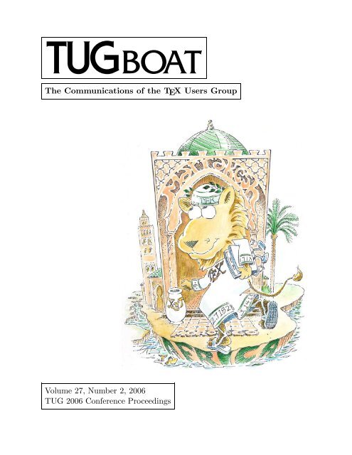
Marrakesh, Morocco<br />
November 9–11, 2006<br />
COMMUNICATIONS OF THE TEX USERS GROUP<br />
<strong>TUG</strong>BOAT EDITOR<br />
PROCEEDINGS EDITORS<br />
BARBARA BEETON<br />
AZZEDDINE LAZREK<br />
KARL BERRY<br />
VOLUME <strong>27</strong>, NUMBER 2 • 2006<br />
PORTLAND • OREGON • U.S.A.
110 <strong>TUG</strong>boat, Volume <strong>27</strong> (2006), No. 2<br />
General Delivery<br />
From the President<br />
Karl Berry<br />
As I write this at the end of November 2006, perhaps<br />
the largest outstanding project is the next edition of<br />
TEX Live; work is ongoing, and we hope it will be<br />
completed by the end of the year. If you can help<br />
build, document, test, or <strong>as</strong>sist in any other area,<br />
ple<strong>as</strong>e see http://tug.org/texlive. Meanwhile,<br />
other recent news follows.<br />
The Utopia fonts freely available (again)<br />
As old-timers may recall, Adobe made the Utopia<br />
font family freely available many years ago. Unfortunately,<br />
the precise wording of the original license<br />
w<strong>as</strong> ambiguous <strong>as</strong> to whether modified versions<br />
could be redistributed. I am happy to report<br />
that Adobe h<strong>as</strong> now clarified the wording in<br />
a slightly revised agreement with <strong>TUG</strong>; the fonts<br />
were always intended to be free (<strong>as</strong> in freedom).<br />
So Utopia will reappear in the next edition of TEX<br />
Live, and are already included in current MiKTEX<br />
and gwTEX updates. The Utopia family h<strong>as</strong> been<br />
extended by several other packages, such <strong>as</strong> vnTEX<br />
and fourier-GUT, so this is especially welcome news.<br />
Major thanks go to Terry O’Donnell at Adobe<br />
for having the patience to shepherd this through the<br />
management there. The specific wording and other<br />
details, <strong>as</strong> well <strong>as</strong> the fonts themselves (which are entirely<br />
unchanged from the original rele<strong>as</strong>e), are available<br />
at http://tug.org/fonts/utopia, and from<br />
CTAN in fonts/utopia.<br />
Colorado State University grant<br />
Another bit of good news: Colorado State University<br />
h<strong>as</strong> awarded a grant of over $40,000 for a new<br />
incarnation of <strong>pdf</strong>TEX, which will include support<br />
for Arabic typesetting and OpenType <strong>as</strong> well <strong>as</strong> the<br />
Lua embedded language.<br />
The implementation effort is being led by Taco<br />
Hoekwater, in conjunction with the MetaPost and<br />
<strong>pdf</strong>TEX teams. Professor Idris Samawi Hamid of<br />
CSU (Philosophy Department) w<strong>as</strong> the instigator of<br />
the grant, and we thank Dr. Hamid and his institution.<br />
Ple<strong>as</strong>e find more information in a separate<br />
editorial in this <strong>issue</strong>, and in the previous <strong>issue</strong> of<br />
<strong>TUG</strong>boat. Taco’s recent installment in the Interview<br />
Corner feature of the <strong>TUG</strong> web site, http://<br />
tug.org/interviews includes an overview of these<br />
projects.<br />
Further <strong>TUG</strong> joint memberships<br />
<strong>TUG</strong> now offers joint memberships with DANTE e.V.<br />
and DK-<strong>TUG</strong>; thanks to their respective memberships<br />
for supporting this, and to Klaus Höppner and<br />
Kaja Christiansen for leading the respective efforts.<br />
These new joint memberships are essentially the<br />
same <strong>as</strong> the agreements with NTG and UK-<strong>TUG</strong><br />
which go back many years. Links to the joint membership<br />
pages are at http://tug.org/join.html.<br />
We are very happy in general to be part of a new<br />
level of co-operation among all the TEX user groups.<br />
We have been working closely together both administratively,<br />
on conference planning and publications<br />
<strong>as</strong> well <strong>as</strong> these joint memberships, and technically,<br />
with the large TEX Collection rele<strong>as</strong>es, the TEX Gyre<br />
font (see the article by Hans Hagen et al. elsewhere<br />
in this <strong>issue</strong>), and other projects.<br />
Board addition and election<br />
Finally, I am happy to announce that Jon Breitenbucher<br />
h<strong>as</strong> joined the <strong>TUG</strong> board. Jon joins us<br />
from the College of Wooster in Ohio, where he h<strong>as</strong><br />
been working to spread TEX usage among students<br />
and staff. His report will soon be published in the<br />
Practical TEX 2006 proceedings <strong>issue</strong> of <strong>TUG</strong>boat.<br />
If you are interested in running for the <strong>TUG</strong><br />
board or president, 2007 will be a <strong>TUG</strong> election year.<br />
Nominations for these openings are now invited; the<br />
deadline to receive nominations is 1 February 2007.<br />
Ple<strong>as</strong>e see http://tug.org/election for information<br />
and forms. (Since a few people have <strong>as</strong>ked —<br />
barring unforeseen events, I expect to run for another<br />
term <strong>as</strong> president.)<br />
Thank you all for supporting TEX and <strong>TUG</strong>.<br />
⋄ Karl Berry<br />
president@tug.org
<strong>TUG</strong>boat, Volume <strong>27</strong> (2006), No. 2 111<br />
Editorial Comments<br />
Barbara Beeton<br />
<strong>TUG</strong> 2006<br />
<strong>TUG</strong> 2006 w<strong>as</strong> a great success, <strong>as</strong> you can read from<br />
Taco’s report later in this <strong>issue</strong>. Marrakesh w<strong>as</strong> a<br />
whole new experience for me, my first visit to the<br />
African continent; the sounds and smells were, in<br />
varying degrees, familiar (I’m always willing to try<br />
a new cuisine, and am a long-time devotee of international<br />
folk music), but the sights were new, and<br />
certainly so were the customs. I w<strong>as</strong>n’t really prepared<br />
for such a garden spot in the middle of what<br />
I expected to be semi-desert.<br />
I brought home many memories — and a determination<br />
to learn how to make mint tea. I learned<br />
that a cape I’ve owned and loved for years is indeed a<br />
genuine Tuareg garment; we saw <strong>one</strong> in the museum<br />
that w<strong>as</strong> woven to the same pattern. And I discovered,<br />
no surprise, that bargaining with merchants is<br />
something better learned when young; al<strong>as</strong>, I’m not<br />
ready to be taught that new trick.<br />
And it w<strong>as</strong> good to see so many old friends, and<br />
make some new <strong>one</strong>s <strong>as</strong> well. Although the number<br />
of participants w<strong>as</strong> not so large, the enthusi<strong>as</strong>m<br />
evoked by a spirited discussion of how to extend TEX<br />
to generate documents of superb calligraphic quality<br />
w<strong>as</strong> <strong>as</strong> high <strong>as</strong> I’ve ever encountered at a <strong>TUG</strong><br />
meeting.<br />
I’d like to extend my personal thanks publicly<br />
to Azzeddine Lazrek for his hospitality, making the<br />
experience so enjoyable for my husband and myself.<br />
Thanks, Azzeddine!<br />
Chuck Bigelow goes to RIT<br />
Charles Bigelow h<strong>as</strong> been named <strong>as</strong> the next Melbert<br />
B. Cary Professor at the Rochester Institute of<br />
Technology. This prestigious chair w<strong>as</strong> previously<br />
held by Alexander Lawson and Hermann Zapf.<br />
Chuck had been contemplating teaching again,<br />
so this opportunity came at a very auspicious time.<br />
He plans first to offer a course on the history, theory,<br />
and technology of typefaces and fonts, followed by<br />
an advanced course on newspaper typography (not<br />
only types and fonts, but also usage and the typographic<br />
image and identity of a newspaper) and<br />
later, advanced typography seminars on other topics,<br />
such <strong>as</strong> how typography contributes to the experience<br />
of super markets, chain stores, and the rest<br />
of our marketed civilization.<br />
Together with Don Knuth, Chuck established a<br />
m<strong>as</strong>ter’s program in digital typography at Stanford<br />
in 1982, and h<strong>as</strong> taught and lectured extensively.<br />
Together with Kris Holmes, he created the Lucida<br />
family, <strong>one</strong> of the first fonts that optimized typography<br />
for output on personal computers and lower<br />
resolution printers. Bigelow & Holmes are also responsible<br />
for some of the first TrueType fonts, including<br />
many of Apple’s “city” fonts.<br />
Best wishes to Chuck in his new position. And<br />
thanks to Jill Bell, who provided much of this information<br />
to the TYPO-L discussion list.<br />
DEK in the news again<br />
A delightful illustrated profile appeared in The Stanford<br />
Magazine l<strong>as</strong>t spring, recounting what Don<br />
Knuth is up to these days.<br />
Read it at http://www.stanfordalumni.org/<br />
news/magazine/2006/mayjun/features/knuth.<br />
html<br />
Corrigendum: <strong>TUG</strong>boat 21:2<br />
In an article on Thai fonts by Werner Lemberg (21:2<br />
(2000), pages 113–120), a reader fluent in Thai encountered<br />
an example that contained a serious typo.<br />
The error h<strong>as</strong> been corrected in the version posted<br />
on the <strong>TUG</strong> web site. Thanks to Werner for <strong>as</strong>sistance<br />
in patching this up.<br />
Out-of-copyright books on the Web<br />
As of the end of August, the Google Book Search<br />
makes it possible for readers to download out-ofcopyright<br />
books to be read at your own pace. The<br />
collection is diverse, including well-known cl<strong>as</strong>sics <strong>as</strong><br />
well <strong>as</strong> more obscure gems.<br />
Go to books.google.com and select the “Full<br />
view” radio button to find out what books can be<br />
downloaded. The collection continues to grow <strong>as</strong><br />
more and more of the world’s books are digitized.<br />
This site also contains many books which are<br />
still protected by copyright. These books can be<br />
searched <strong>as</strong> well, but only a few sentences surrounding<br />
your search term will be displayed, just enough<br />
to enable you to determine whether you’ve found<br />
what you’re looking for.<br />
You may also be interested in Project Gutenberg,<br />
http://www.gutenberg.org, a longstanding<br />
effort which h<strong>as</strong> made over 19,000 books with expired<br />
copyrights freely available.<br />
Happy reading.<br />
⋄ Barbara Beeton<br />
American Mathematical Society<br />
201 Charles Street<br />
Providence, RI 02904 USA<br />
bnb (at) ams dot org
112 <strong>TUG</strong>boat, Volume <strong>27</strong> (2006), No. 2<br />
Fonts<br />
The installation and use of OpenType fonts in L A TEX<br />
Abstract<br />
John D. Owens<br />
The emerging file standard in digital typography is the<br />
OpenType font standard, jointly developed by Microsoft<br />
and Adobe. OpenType fonts are natively supported by<br />
several popular operating systems and have many features<br />
and advantages that make them desirable for highquality<br />
typography. However, OpenType fonts are not<br />
natively supported by the standard TEX engine. This article<br />
is a practical guide to installing OpenType fonts for<br />
use <strong>as</strong> text fonts in L A TEX.<br />
The steps to install an OpenType font for use in L A TEX<br />
are:<br />
1. For each OpenType font file, and for each combination<br />
of attributes for that font file, generate and install<br />
font metric and encoding files.<br />
2. Next, for each font family, generate and install a font<br />
description (.fd) file that maps L A TEX font selection<br />
commands to the installed font files.<br />
3. Finally, write and install a style (.sty) file that allows<br />
the user to select the font and its options for use<br />
within TEX.<br />
We begin by discussing font background, the TEX font<br />
handling scheme, and existing font tools, then describe<br />
each of the three steps above in detail.<br />
1 Font b<strong>as</strong>ics and font families<br />
The advanced typographic features of the OpenType font<br />
format have motivated its widespread use in a variety of<br />
demanding applications. Before we dive into supporting<br />
OpenType in TEX, however, let’s take a step back and look<br />
at our eventual goal. As a TEX user, we are less interested<br />
in using just a single font with a single set of options<br />
and more interested in using a font family: a collection of<br />
compatible font variants, usually from the same typeface,<br />
that can be used together. For instance, we might want to<br />
group together a plain and an italic form of a particular<br />
typeface into a family. We might want to make small caps<br />
available in our family <strong>as</strong> well, or perhaps incorporate<br />
several different weights or optical sizes. Once we have<br />
defined our font family, we would then like to <strong>as</strong>k TEX to<br />
enable the entire family with a single command. As an example,<br />
this document is typeset in an Adobe OpenType<br />
Minion Pro font family with old-style figures, with code<br />
Editor’s note: Due to the nature of this article, it is typeset in<br />
the Adobe Minion and Adobe Myriad typefaces. We thank Adobe for<br />
permission to use these fonts in both the print and web publications.<br />
In different files Within <strong>one</strong> OpenType file<br />
weight (light, black) kerning (VAVAV vs. VAVAV)<br />
width (abc vs. abc) ligatures (fi vs. fi)<br />
optical size figure style (1234 vs. 1234)<br />
variant (e.g. italics) SMALL CAPS<br />
Table 1: Font features provided by different OpenType files (left)<br />
and within a single OpenType file (right).<br />
segments typeset in Adobe’s OpenType Myriad Pro, using<br />
the following L A TEX commands:<br />
\usepackage{minion}<br />
\usepackage[tt,sf,lining,scale=0.92]{myriad}<br />
What are the different typeface alternatives that can be<br />
part of our font family? (Gelderman provides an introduction<br />
to typeface characteristics [3].) We can group<br />
possible alternatives into several broad categories, and<br />
then indicate how OpenType handles each category.<br />
Our first four categories are weight, width, optical<br />
size, and variant. The weight of a typeface refers to the<br />
thickness of the strokes that constitute its glyphs. A font<br />
designer may also vary a typeface’s width relative to its<br />
height. The major advantage of vector font formats (such<br />
<strong>as</strong> OpenType, PostScript Type 1, and TrueType) is their<br />
ability to be scaled to any size. However, type designers<br />
have found that the most visually appealing fonts are <strong>one</strong>s<br />
that are designed for a particular size range, called an optical<br />
size. Finally, the standard upright “roman” style for<br />
fonts is not the only possible style. Font users may also<br />
desire italic or oblique or outline forms of a particular<br />
typeface, which together are termed variants. In L A TEX’s<br />
New Font Selection Scheme (NFSS), the combination of<br />
weight and width is called series and the variant is called<br />
shape; we use this terminology in Section 4.2.<br />
In OpenType, each unique combination of weight,<br />
width, optical size, and variant is <strong>as</strong>sociated with a separate<br />
font file. As an example, the Adobe Kepler typeface<br />
h<strong>as</strong> several alternatives in each of these categories.<br />
Kepler features six weights (light, regular, medium, semibold,<br />
bold, and black), each with four widths (condensed,<br />
semicondensed, regular, and extended). Most of Kepler’s<br />
combinations of weight and width feature four optical<br />
sizes (from smallest to largest, caption, regular, subhead,<br />
and display), and each weight-width-optical-size combination<br />
h<strong>as</strong> both an upright and italic variant. Thus it is little<br />
wonder that Kepler’s many combinations require 168<br />
different OpenType files. And after we catch our breath to<br />
consider all the typographical options already available to<br />
us, we dive into a single OpenType file to find still more<br />
options.<br />
In addition to the categories that require different<br />
files, the OpenType font format also allows a single font
<strong>TUG</strong>boat, Volume <strong>27</strong> (2006), No. 2 113<br />
file to specify a variety of other features. Not all of these<br />
features are currently supported in TEX, but many of them<br />
are. For instance, the kerning feature adjusts the spaces<br />
between pairs of glyphs. Enabling ligatures replaces pairs<br />
of glyphs like ‘f’ and ‘i’ with a single ‘fi’ glyph. Besides<br />
kerning and ligatures, the two cl<strong>as</strong>ses of OpenType features<br />
that we cover in this article are the choice of figure<br />
styles (for example, old-style [01234] vs. lining [01234])<br />
and SMALL CAPS.<br />
Table 1 summarizes the features provided by different<br />
OpenType files and within an OpenType file. With<br />
this overview of the many typeface alternatives that we<br />
would like to <strong>as</strong>semble into families, we can turn to how<br />
TEX interacts with fonts.<br />
2 TEX font handling<br />
In modern operating systems such <strong>as</strong> Microsoft Windows<br />
and Apple Mac OS X, applications that use Open-<br />
Type fonts can read font information directly from the<br />
OpenType file. TEX, on the other hand, stores font information<br />
in a variety of files, and the complexity of creating<br />
and installing these files is the major re<strong>as</strong>on that font handling<br />
h<strong>as</strong> traditionally been a tricky t<strong>as</strong>k in TEX.<br />
The OpenType font format can contain font data in<br />
either of two formats, Adobe PostScript Type 1 or True-<br />
Type. In this section we describe the font files that are<br />
<strong>as</strong>sociated with Type 1 and Type-1-flavored OpenType<br />
fonts. To support a Type 1 font, TEX requires the following<br />
files, each with its own function, with file locations<br />
specified by the TEX Directory Structure standard.<br />
More detailed descriptions of these formats can be found<br />
in Alan Hoenig’s TEX Unbound [5] and Chapter 7 of the<br />
second edition of The L A TEX Companion [11].<br />
TFM “TEX Font Metrics” (tfm) files describe the dimensions<br />
of each character (glyph), along with a few<br />
font-wide parameter, which together are used by<br />
TEX to perform layout.<br />
PFB For Type 1 fonts, “Printer Font Binary” (pfb) files<br />
contain Adobe PostScript Type 1 procedures that<br />
describe the shape of each glyph. These procedures<br />
are included by the output driver (for example, the<br />
dvips or <strong>pdf</strong>tex program) in the output file (for example,<br />
PostScript or PDF).<br />
VF “Virtual Font” files provide a mapping between the<br />
glyphs in the tfm files and the glyph order used by<br />
TEX (which is, in turn, specified with the encoding<br />
file, below). They are not needed for all fonts.<br />
ENC Encoding files specify an ordering of glyphs called<br />
the “font-encoding vector”. While typeset documents<br />
in English might require only the glyphs<br />
in TEX’s default “OT1” font-encoding vector (used<br />
by Computer Modern Roman, for example), other<br />
languages or scripts need more or different glyphs.<br />
In this article, we use the “LY1” encoding, an alternative<br />
to OT1 developed by Y&Y that is well-suited<br />
for Type-1-flavored fonts. (Among other advantages,<br />
the LY1 encoding maps directly to Adobe’s<br />
font encoding and thus requires no virtual fonts.)<br />
MAP Finally, the map files tie the above files together.<br />
map files (and map file formats) are specific to<br />
output drivers and <strong>as</strong>sociate tfm and Type 1 font<br />
names with pfb files, which contain the shapes of<br />
glyphs in those fonts.<br />
Only when these files have been properly installed for a<br />
particular font, and system datab<strong>as</strong>es updated, can TEX<br />
then typeset glyphs from that font in a document.<br />
Writing all these files by hand would be both tedious<br />
and error-pr<strong>one</strong>, so two excellent pieces of software have<br />
automated the font installation process.<br />
• fontinst [6], by Alan Jeffrey, Rowland McDonnell,<br />
and Lars Hellström, automates the installation of<br />
PostScript Type 1 fonts into TEX. Philipp Lehman’s<br />
font installation guide [9] is an outstanding tutorial<br />
for fontinst.<br />
However, fontinst does not offer access to Open-<br />
Type features. Also, fontinst scripts are written in<br />
TEX, and are challenging for non-experts to write<br />
and use.<br />
• Eddie Kohler’s otftotfm [8], part of his LCDF Typetools<br />
suite, creates and installs the required TEX files<br />
(tfm, pfb, vf, enc, and map) from OpenType font<br />
files. Note that otftotfm generates PostScript Type<br />
1 fonts from OpenType; ple<strong>as</strong>e ensure that the legal<br />
license for your fonts allows such a format conversion.<br />
otftotfm is a command-line tool that accepts a<br />
set of options and applies them to a single OpenType<br />
font file.<br />
Section 6 describes two tools built around otftotfm<br />
that both automate calls to otftotfm across multiple<br />
font options and also create the necessary TEX<br />
fd and sty support files.<br />
In this article, we focus on otftotfm <strong>as</strong> the underlying<br />
tool that translates OpenType fonts into a TEX-readable<br />
form. We also focus on the procedure for setting up text<br />
fonts. The setup for math fonts requires additional commands<br />
described in Chapter 7.10.7 of The L A TEX Companion<br />
[11]. The next section outlines how otftotfm installs<br />
OpenType fonts, and the remainder of the article<br />
describes how to extend otftotfm to handle multiple font<br />
files and font families and how to make the installed fonts<br />
available to TEX users.<br />
3 OpenType to TEX<br />
The first step in making OpenType fonts available to TEX<br />
users is to deposit the various font files into the TEX installation<br />
for each variant in the font family. We begin by
114 <strong>TUG</strong>boat, Volume <strong>27</strong> (2006), No. 2<br />
showing how otftotfm installs a single font, using Adobe<br />
Minion Pro’s Semibold Italic font <strong>as</strong> an example.<br />
otftotfm -a -e texnansx -fonum -fkern -fliga \<br />
MinionPro-SemiboldIt.otf \<br />
LY1-MinionPro-SemiboldIt-onum<br />
Let’s analyze this example. -a is the magic “automatic”<br />
flag, automatically installing the relevant TEX font<br />
files from Section 2 (tfm, pfb, vf, enc, and map) into their<br />
proper locations within the TEX directories. -e texnansx<br />
specifies the encoding file for the LY1 encoding. Three<br />
OpenType features (old-style numerals, kerning, and ligatures)<br />
are requested with the -f flags, and the final two<br />
arguments are the names of the OpenType input font file<br />
and the output font name. The otftotfm manual explains<br />
these options in detail, and also enumerates available<br />
OpenType features [8].<br />
Extending otftotfm to more input fonts and more<br />
variants is straightforward: simply call otftotfm for each<br />
and every combination of desired features. For complex<br />
variant combinations and fully featured font families, the<br />
number of calls to otftotfm can exceed many hundreds.<br />
The tools described in Section 6 automate this process.<br />
LCDF’s otfinfo tool [8] can identify the supported<br />
OpenType features for any OpenType font file, but which<br />
features are interesting for TEX users?<br />
• The kerning (kern) and ligature (liga) features should<br />
always be turned on if available.<br />
• OpenType fonts may support several kinds of numerals;<br />
onum (old-style numerals) and lnum (lining<br />
numerals) can both be supported in TEX and are<br />
commonly requested typographic features.<br />
• SMALL CAPS are enabled by the smcp feature.<br />
• Superior (sups) and inferior (sinf) figures are useful<br />
for footnotes, inline fractions, and scientific typesetting;<br />
sw<strong>as</strong>hes (swsh) are more DECORATIVE alternatives<br />
to standard characters.<br />
The otftotfm web page [8], in “otftotfm examples”,<br />
contains examples of more advanced OpenType features,<br />
but <strong>as</strong> we note in Section 7, more advanced features rarely<br />
have high-level support in TEX or L A TEX. In this article<br />
we concentrate on the overall installation procedure for<br />
OpenType fonts and support of more b<strong>as</strong>ic features; readers<br />
in need of more advanced features may consider the<br />
ConTEXt environment [10] or X TEX [7].<br />
After otftotfm finishes installing all font files into<br />
TEX, texh<strong>as</strong>h and updmap must be called to make TEX<br />
aware of the new installation. Now, the new fonts are<br />
available for typesetting in TEX — but how? The next section<br />
describes how to instruct TEX to use the correct font.<br />
TEX uses the “font description” file for this purpose.<br />
E<br />
4 Font description (fd) files<br />
A font description file is a TEX source file that maps installed<br />
font file names to font attributes <strong>as</strong> used in (L A )TEX.<br />
Typically, each font family is described by a single fd file.<br />
As we previously menti<strong>one</strong>d, these techniques are applicable<br />
to text fonts; math fonts require additional commands<br />
[11].<br />
Only two TEX commands are necessary in an fd file.<br />
The first declares a font family, and the second declares<br />
a specific font within that font family. We’ll look at them<br />
<strong>one</strong> at a time.<br />
4.1 \DeclareFontFamily<br />
The \DeclareFontFamily command indicates that a certain<br />
font family is available in a certain encoding scheme. The<br />
names of encoding schemes are fixed (<strong>as</strong> menti<strong>one</strong>d before,<br />
we use LY1 in this paper), but the name of the font<br />
family is arbitrary. The most well-known naming scheme<br />
is Karl Berry’s fontname scheme [1], which concatenates<br />
a unique three-letter code for each typeface with a <strong>one</strong>letter<br />
suffix that indicates the font family (Section 4.4).<br />
(This naming scheme is required when using nfssext.sty,<br />
described in the next section.)<br />
Let us continue with the Minion-Pro-with-old-stylenumerals<br />
example; Minion is abbreviated pmn, and font<br />
families <strong>as</strong>sociated with old-style numerals are designated<br />
by j (more details about what constitutes a font<br />
family are in Section 4.4). The resulting command is:<br />
\DeclareFontFamily{LY1}{pmnj}{}<br />
The third argument to \DeclareFontFamily is less often<br />
used; it can contain special options for font loading and<br />
is explained in The L A TEX Companion [11].<br />
4.2 \DeclareFontShape<br />
The \DeclareFontShape command <strong>as</strong>sociates a particular<br />
font with a particular combination of encoding, font family,<br />
series, and shape, a cl<strong>as</strong>sification which we previously<br />
discussed in Section 1. To cl<strong>as</strong>sify the particular Adobe<br />
Minion font we installed in Section 3, we invoke the following<br />
6-argument command:<br />
\DeclareFontShape{LY1}{pmnj}{sb}{it}{<br />
LY1-MinionPro-SemiboldIt-onum}{}<br />
The first four arguments are the cl<strong>as</strong>sification; the fifth<br />
argument is the font file(s) <strong>as</strong>sociated with that cl<strong>as</strong>sification;<br />
and the l<strong>as</strong>t argument is used in a similar way to<br />
the third argument of \DeclareFontFamily. This particular<br />
command <strong>as</strong>sociates the combination of LY1 encoding,<br />
Minion-with-old-style-numerals font family, semibold<br />
series (sb), and italic shape (it) with the installed<br />
font named LY1-MinionPro-SemiboldIt-onum. Note this<br />
font name is (necessarily) identical to the output name in<br />
the command we invoked in Section 3.
<strong>TUG</strong>boat, Volume <strong>27</strong> (2006), No. 2 115<br />
With only these two commands, you can specify a<br />
completely functional fd file. Three additional commands<br />
are useful, however, for a more fully featured family.<br />
Optical size variants Now, what’s the symbol before<br />
the font name (in the above \DeclareFontShape example)?<br />
It’s the size range and indicates the font sizes <strong>as</strong>sociated<br />
with that font name. is actually a special c<strong>as</strong>e<br />
of the more general notation , meaning “use this<br />
font only for point sizes greater than or equal to n and up<br />
to m”. Removal of n or m removes the bound, so indicates<br />
a match for all font sizes. With this notation, the<br />
extension to multiple font files for a particular combination<br />
at different sizes (necessary for optical size variants)<br />
is straightforward:<br />
\DeclareFontShape{LY1}{pmnj}{sb}{it}{<br />
LY1-MinionPro-SemiboldItCapt-onum<br />
LY1-MinionPro-SemiboldIt-onum<br />
LY1-MinionPro-SemiboldItSubh-onum<br />
LY1-MinionPro-SemiboldItDisp-onum}{}<br />
Font substitution What happens if you’re missing a<br />
particular variant for a font family? The sub command<br />
allows the substitution of <strong>one</strong> variant for another. For instance,<br />
few font families feature a slanted (oblique) variant,<br />
so fd files often substitute italic for slanted if slanted<br />
is requested. The following command <strong>as</strong>ks for any reference,<br />
at any size, to semibold-slanted in our font family<br />
to be satisfied instead by semibold-italic.<br />
\DeclareFontShape{LY1}{pmnj}{sb}{sl}{<br />
sub * pmnj/sb/it}{}<br />
Besides substituting italic for slanted, substituting<br />
bold for bold-extended is also common, <strong>as</strong> in the example<br />
below for the normal (n) shape.<br />
\DeclareFontShape{LY1}{pmnj}{bx}{n}{<br />
sub * pmnj/b/n}{}<br />
Scaling Finally, \DeclareFontShape permits a font to be<br />
automatically scaled through the size command,¹ which<br />
is invoked by placing the scaling factor in brackets between<br />
the size range and the filename. The example below<br />
instructs TEX to typeset Minion’s semibold italic variant<br />
at 95% of its natural size.<br />
\DeclareFontShape{LY1}{pmnj}{sb}{it}{<br />
[0.95] LY1-MinionPro-SemiboldIt-onum}{}<br />
4.3 Naming shape and series<br />
The de facto standard for the abbreviation strings <strong>as</strong>sociated<br />
with shape and series in fd files is described by L A TEX’s<br />
“New Font Selection Scheme” (NFSS) [15]. Any choice<br />
¹ This is most common when two different typefaces that do not<br />
match in size are used together in a document; in the next section we<br />
expose this capability to the document author.<br />
WEIGHT<br />
NFSS SERIES<br />
light<br />
l<br />
book<br />
m<br />
regular<br />
m<br />
medium<br />
mb<br />
demibold<br />
db<br />
semibold<br />
sb<br />
bold<br />
b<br />
black<br />
eb<br />
WIDTH<br />
NFSS SERIES<br />
condensed<br />
c<br />
narrow<br />
n<br />
semicondensed sc<br />
regular —<br />
semiextended<br />
sx<br />
extended<br />
x<br />
VARIANT<br />
NFSS SHAPE<br />
normal (upright) n<br />
italic<br />
it<br />
slanted<br />
sl<br />
oblique<br />
sl<br />
outline<br />
ol<br />
small caps<br />
sc<br />
small caps + italic si<br />
Table 2: A selection of NFSS codes for font weights, widths, and<br />
variants. From Lehman [9].<br />
for shape and series abbreviation strings, including NFSS,<br />
must work together with the font selection commands<br />
in Section 5. Philipp Lehman’s tutorial contains a fairly<br />
complete mapping between weight, width, and variant<br />
names and NFSS encodings [9]; we reproduce common<br />
encodings in Table 2.<br />
Lehman presents the following algorithms for generating<br />
the series and shape abbreviations used in \DeclareFontShape.<br />
First, the weight and width are combined<br />
to create “series”. If both weight and width are “regular”,<br />
the series is set to m; otherwise the series is set to the concatenation<br />
of the weight and width codes, ignoring “regular”<br />
if present. Creating the shape is also straightforward:<br />
if the variant is “regular”, the shape is n, otherwise the<br />
shape is the concatenation of all variant codes, with the<br />
exception of small-caps and italics. This shape is instead<br />
designated si, and font selection using si is described in<br />
Section 5.3.2.<br />
4.4 Font families<br />
Some font features do not fit into the series-shape scheme.<br />
The most common of these features is numerical figure<br />
types, which may vary <strong>as</strong> lining (1234), old-style (1234),<br />
superior (¹²³⁴), inferior (₁₂₃₄), and so on. To handle font<br />
selection with different styles of figures in TEX, typically,
116 <strong>TUG</strong>boat, Volume <strong>27</strong> (2006), No. 2<br />
each type of figures generates its own font family. To generate<br />
the name of the font family, the three-letter font designation<br />
h<strong>as</strong> a <strong>one</strong>-letter suffix appended to its 3-letter<br />
font name. Lining figures are <strong>as</strong>sociated with no suffix<br />
or with x, the “expert” suffix; old-style figures are j; superiors<br />
receive 1 and inferiors 0; and so on. Thus the Minion<br />
(pmn) font family with lining figures is pmnx; Minion<br />
with old-style figures is pmnj; and so on. Section 5.3.3<br />
shows how to perform font selection with different font<br />
families.<br />
5 Style files<br />
At this point we have installed our fonts into TEX (Section<br />
3) and categorized them by family, shape, and series<br />
(Section 4). The final step is to make those fonts available<br />
to the TEX document author <strong>as</strong> text fonts. The tools described<br />
in Section 6 automate the creation of the sty files<br />
that contain the commands in this section.<br />
5.1 Selecting a font family<br />
The default “roman” (text) font family is defined by the<br />
TEX variable \rmdefault. Redefining \rmdefault to another<br />
font family (<strong>as</strong> named by \DeclareFontFamily) resets the<br />
roman font family. For instance, the command below sets<br />
the current font family to our example font family, Adobe<br />
Minion with old-style figures.<br />
\renewcommand*{\rmdefault}{pmnj}<br />
In fact this is all we need to do to use our new font<br />
family. (Similarly, we set the default sans serif font family<br />
by setting the variable \sfdefault, and the typewriter<br />
family with \ttdefault.) However, rather than using <strong>one</strong><br />
of these commands directly in TEX files, it’s typical to instead<br />
wrap it in a style file and invoke \usepackage on<br />
that style file to perform this declaration. A minimal (but<br />
complete) style file called minion.sty for L A TEX2ε that uses<br />
the LY1 encoding follows.<br />
\NeedsTeXFormat{LaTeX2e}<br />
\ProvidesPackage{minion}[Minion Pro OSF v0.99a 9/06]<br />
\RequirePackage[LY1]{fontenc} % uses LY1 encoding<br />
\renewcommand*{\rmdefault}{pmnj}<br />
\endinput<br />
5.2 Selecting between multiple font families<br />
What if we’d like to use the same style file to support Minion<br />
font families with both old-style (pmnj) and lining<br />
(pmnx) figures? We use a package option to choose between<br />
the two font families:<br />
or<br />
\usepackage[oldstyle]{minion}<br />
\usepackage[lining]{minion}<br />
The extended style file that supports these options is:<br />
\NeedsTeXFormat{LaTeX2e}<br />
\ProvidesPackage{minion}[Minion Pro OSF v0.99b 9/06]<br />
\RequirePackage[LY1]{fontenc} % uses LY1 encoding<br />
\DeclareOption{lining}{\renewcommand*{%<br />
\rmdefault}{pmnx}}<br />
\DeclareOption{oldstyle}{\renewcommand*{%<br />
\rmdefault}{pmnj}}<br />
\ExecuteOptions{oldstyle}<br />
\ProcessOptions*<br />
\endinput<br />
5.3 Selecting font variants<br />
Now we know how to select a given font family, which<br />
may feature a large number of font weights, widths, and<br />
variants within it. Once we have selected a font family,<br />
how can we direct TEX to select from our many alternatives<br />
within that font family, such <strong>as</strong> boldface, italic,<br />
small-caps, and so on? The answer is to change the current<br />
series and shape.<br />
While the low-level TEX commands (\fontseries and<br />
\fontshape) directly change the current series and shape,<br />
L A TEX’s higher-level commands are more commonly used.<br />
Most L A TEX users know that \textbf selects boldface; L A TEX<br />
implements this internally by setting the font series to<br />
\bfdefault, which is in turn defined <strong>as</strong> bx. Similarly, \textit<br />
(italics) utilizes italics by setting the font shape to \itdefault,<br />
defined <strong>as</strong> it. And \textsc (small caps) sets the shape<br />
to \scdefault, defined <strong>as</strong> sc.<br />
We can use similar techniques to add more selection<br />
commands for more features that are not part of the<br />
L A TEX core set of commands. Philipp Lehman’s font installation<br />
guide is an excellent tutorial for this t<strong>as</strong>k [9]; it<br />
carefully constructs and explains a style file of NFSS extensions,<br />
nfssext.sty. We now take a closer look at how<br />
to support alternate weights and how nfssext.sty supports<br />
small caps with italics and switching between old-style<br />
and lining figures.<br />
5.3.1 Supporting alternate weights<br />
By default, L A TEX supports a bold (\textbf) weight command.<br />
Let’s say we feel the default bold is a little too dark,<br />
and we’d like to use semibold-condensed instead. We can<br />
accomplish this with a single line in our sty file:<br />
\renewcommand*{\bfdefault}{sbc}<br />
And now we like semibold-condensed so much, we’d like<br />
to add it <strong>as</strong> a new command, \textsb.<br />
\newcommand\sbdefault{sbc}<br />
\DeclareRobustCommand\sbseries<br />
{\not@math@alphabet\sbseries\mathsb<br />
\fontseries\sbdefault\selectfont}<br />
\DeclareTextFontCommand{\textsb}{\sbseries}<br />
For simple features, declaring a default value, a Robust-<br />
Command, and a TextFontCommand suffice to make the<br />
feature available within TEX.
<strong>TUG</strong>boat, Volume <strong>27</strong> (2006), No. 2 117<br />
5.3.2 Supporting small caps with italics<br />
Lehman points out that italics and small caps are both<br />
in the same “variant” category, so the built-in \textit and<br />
\textsc commands do not work harmoniously together.<br />
Barring changes to the core L A TEX font selection primitives,<br />
text set to both italic and small-caps would only<br />
preserve the innermost setting.<br />
nfssext.sty remedies this problem by declaring an si<br />
shape, analogous to it and sc, and its <strong>as</strong>sociated selection<br />
commands:<br />
\newcommand*{\sidefault}{si}<br />
\DeclareRobustCommand{\sishape}{%<br />
\not@math@alphabet\sishape\relax<br />
\fontshape\sidefault\selectfont}<br />
It then changes the italic and small-caps commands to<br />
check the current shape before setting the new shape.<br />
Only if the current shape is italic and the new shape is<br />
small-caps, or vice versa, does it set the new shape to si.<br />
(Recall that we <strong>as</strong>signed the si code to small-caps + italic<br />
variants in Section 4.3.)<br />
THE RESULT is properly NESTED small-cap, italic text.<br />
{\textsc{The \textit{result}} is \textit{properly<br />
\textsc{nested}} small-cap, italic text.<br />
5.3.3 Supporting old-style and lining figures<br />
Section 5.2 showed how to choose old-style or lining figures<br />
by default. However, it may be useful to have <strong>one</strong><br />
<strong>as</strong> the default and use the other via an explicit command.<br />
In nfssext.sty, the new commands \textos selects old-style<br />
figures and \textln lining figures. In this article, for instance,<br />
old-style is the default, so 1234\textln{1234} results<br />
in 12341234.<br />
Because each style of figures is <strong>as</strong>sociated with a different<br />
font family, using an alternate figure style requires<br />
changing the family. nfssext.sty accomplishes this t<strong>as</strong>k <strong>as</strong><br />
follows. Switching to lining figures for the font named<br />
abc first tries font family abcx then font family abc, using<br />
the TEX primitive \selectfont; switching to old-style figures<br />
switches to font family abcj. Fortunately this complexity<br />
is all hidden inside nfssext.sty.<br />
6 Tools<br />
For any OpenType font installation into TEX, the vital tool<br />
is otftotfm [8]. However, otftotfm only installs from a single<br />
OpenType font file with a single set of options, while<br />
users typically would like to install an entire family of<br />
OpenType font files with all available options. In addition,<br />
otftotfm does not address the problem of creating fd<br />
or sty files.<br />
To address these <strong>issue</strong>s, Marc Penninga wrote autoinst<br />
[13] and John Owens wrote otfinst [12], both of<br />
which wrap around otftotfm to install entire TEX font<br />
families. The two tools have far more similarities than<br />
differences and should suffice for most users; the authors’<br />
use of Perl (autoinst) or Python (otfinst) may make<br />
the difference for programmers familiar with <strong>one</strong> or the<br />
other.<br />
Among the features supported by both tools are:<br />
• A command-line interface that takes <strong>one</strong> or more<br />
OpenType font files <strong>as</strong> arguments;<br />
• Installation of font families with the following features<br />
if present: roman and italic text; small-caps;<br />
lining, old-style, superior, and inferior figures; and<br />
sw<strong>as</strong>hes;<br />
• nfssext.sty font selection commands;<br />
• Support of optical sizes; and<br />
• Auto-generation and installation of sty and fd files.<br />
Some of the differences are that autoinst also supports<br />
numerators, denominators, upright sw<strong>as</strong>h, and titling<br />
text, and generates ornaments, while otfinst supports<br />
a scaling option at runtime. otfinst uses fontname<br />
naming, while autoinst is more verbose in its naming<br />
scheme. Finally, otfinst uses the metadata <strong>as</strong>sociated with<br />
each OpenType font to determine the font’s characteristics,<br />
while autoinst extracts the characteristics from the<br />
font’s filename.<br />
6.1 Other tools<br />
Geoffrey W<strong>as</strong>hburn’s otftofd [16] automates the process<br />
of creating fd files from OpenType fonts. W<strong>as</strong>hburn indicates<br />
that it, like autoinst, is designed primarily for Adobe<br />
font conventions. otftofd is a shell script written in the<br />
Caml Shell and uses otftotfm.<br />
The MinionPro TEX package [2] provides extensive<br />
TEX support files for Adobe Minion, including comprehensive<br />
options for figure types, encodings, ornaments,<br />
letterspaced small caps, and calligraphic, math, blackboard,<br />
and Greek fonts. The MinionPro distribution w<strong>as</strong><br />
built using otftotfm and thus contains all TEX support<br />
files without the need for the steps described in this article.<br />
MinionPro includes a package called fontaxes that<br />
extends (and partially replaces) NFSS’s rigid cl<strong>as</strong>sification<br />
of font attributes.<br />
7 Conclusions<br />
This article h<strong>as</strong> described the steps necessary to use Open-<br />
Type fonts in TEX: use otftotfm to install TEX font metric<br />
and encoding files; build a font description file for each<br />
font family; and build a style file for convenient font selection<br />
in a document.<br />
OpenType handling in TEX is still far from ideal,<br />
however. Systems like X TEX [7] use OpenType fonts natively<br />
with truly impressive results, and native OpenType<br />
support is slated for future versions of <strong>pdf</strong>tex [4]. However,<br />
equally important are the other comp<strong>one</strong>nts of TEX<br />
that relate to font selection and invocation.<br />
E
118 <strong>TUG</strong>boat, Volume <strong>27</strong> (2006), No. 2<br />
• NFSS is insufficient to elegantly describe the wide<br />
variety of available font attributes. The combination<br />
of weight and width into series is awkward, multiple<br />
variants may combine into a single shape, and<br />
features such <strong>as</strong> figure styles are not covered at all.<br />
The ideal font selection scheme not only includes<br />
all variants of a typeface but also allows simple, orthogonal<br />
selection of any set of typeface features,<br />
and transparent substitution when features are not<br />
present. New, flexible approaches such <strong>as</strong> fontspec<br />
in X TEX [14] and MinionPro’s fontaxes are encouraging<br />
steps toward such a scheme.<br />
E<br />
• Even within NFSS the codes are not standardized.<br />
Lehman’s scheme appears to be widely used, however,<br />
which is encouraging.<br />
• Even for simple features, font selection is wholly<br />
nonstandardized and non-orthogonal. Selection of<br />
alternate widths is not possible without low-level<br />
commands, the default italic and small caps commands<br />
do not work together because L A TEX’s default<br />
handling of the “variant” category does not address<br />
multiple variants, and using non-standard but desirable<br />
selection commands such <strong>as</strong> \textln in shared<br />
files is discouraged because a default TEX installation<br />
does not support them.<br />
• Finally, while many advanced OpenType features<br />
can be supported in TEX’s font files, invoking those<br />
features with high-level commands is a much more<br />
troublesome t<strong>as</strong>k. For most features beyond the b<strong>as</strong>ic<br />
<strong>one</strong>s, TEX and L A TEX have no standardized support<br />
at the author level (or, in many c<strong>as</strong>es, no support<br />
at all). Features like ornaments, contextual alternates,<br />
and discretionary ligatures would benefit<br />
from a discussion about how they can be invoked by<br />
the programmer in a standard way.<br />
Acknowledgements Many thanks to Karl Berry for encouraging<br />
me to write this article and for his helpful<br />
suggestions along the way. Eddie Kohler’s tools greatly<br />
e<strong>as</strong>e the t<strong>as</strong>k of OpenType support in TEX, and I also<br />
thank Eddie for his prompt and thorough answers to my<br />
many questions about his tools. Karl Berry and Philipp<br />
Lehman were both quite helpful in understanding fontname<br />
and how it’s used within the TEX world. The use<br />
of Philipp’s nfssext.sty w<strong>as</strong> vital in the development of<br />
otfinst. Thom<strong>as</strong> Phinney, Geraldine Wade, and Michael<br />
Duggan provided fonts for testing, and Thom<strong>as</strong> secured<br />
permission to use Adobe fonts for the article itself. Finally,<br />
thanks also to Nelson Beebe, Stephen Hartke, Oleg<br />
Katsitadze, Eddie Kohler, Marc Penninga, Will Robertson,<br />
and Michael Zedler for their thoughtful comments<br />
on the article during the review process.<br />
References<br />
[1] Karl Berry. Filenames for fonts. <strong>TUG</strong>boat,<br />
11(4):517–520, November 1990.<br />
http://www.tug.org/fontname.<br />
[2] Achim Blumensath, Andre<strong>as</strong> Bühmann, and<br />
Michael Zedler. MinionPro, September 2005.<br />
http://www.ctan.org/tex-archive/fonts/minionpro/.<br />
[3] Maarten Gelderman. A short introduction to<br />
font characteristics. <strong>TUG</strong>boat, 20(2):96–104, June<br />
1999.<br />
[4] Taco Hoekwater. Opening up the type. <strong>TUG</strong>boat,<br />
<strong>27</strong>(1):16–17, 2006.<br />
[5] Alan Hoenig. TEX Unbound. Oxford University<br />
Press, New York, NY, 1998.<br />
[6] Alan Jeffrey, Rowland McDonnell, and Lars<br />
Hellström. fontinst: Font installation software for<br />
TEX, December 2004.<br />
http://www.tug.org/applications/fontinst/.<br />
[7] Jonathan Kew. The X TEX typesetting system,<br />
2006. http://scripts.sil.org/xetex.<br />
[8] Eddie Kohler. LCDF type software, 2006.<br />
http://www.lcdf.org/type/.<br />
[9] Philipp Lehman. The font installation guide,<br />
December 2004. http://www.ctan.org/tex-archive/<br />
info/Type1fonts/fontinstallationguide/.<br />
[10] Adam T. Lindsay. OpenType installation b<strong>as</strong>ics<br />
for ConTEXt. The PracTEX Journal, 2005(2), April<br />
2005.<br />
[11] Frank Mittelbach and Michel Goossens. The<br />
L A TEX Companion. Addison-Wesley, Boston, MA,<br />
second edition, 2004.<br />
[12] John Owens. otfinst, 2006. http://www.ctan.org/<br />
tex-archive/fonts/utilities/otfinst/.<br />
[13] Marc Penninga. fontools, 2006. http:<br />
//www.ctan.org/tex-archive/fonts/utilities/fontools/.<br />
[14] Will Robertson. Advanced font features with<br />
X TEX—the fontspec package. <strong>TUG</strong>boat,<br />
26(3):215–223, 2005.<br />
[15] L A TEX3 Project Team. L A TEX2ε font selection, June<br />
1994. http://www.ctan.org/tex-archive/macros/<br />
latex/doc/fntguide.<strong>pdf</strong>.<br />
[16] Geoffrey W<strong>as</strong>hburn. otftofd, 2005. http:<br />
//www.ctan.org/tex-archive/fonts/utilities/otftofd/.<br />
E<br />
E<br />
⋄ John D. Owens<br />
Department of Electrical and<br />
Computer Engineering<br />
University of California<br />
One Shields Avenue<br />
Davis, CA 95616 USA<br />
jowens (at) ece dot ucdavis dot edu<br />
http://www.ece.ucdavis.edu/˜jowens/
<strong>TUG</strong>boat, Volume <strong>27</strong> (2006), No. 2 119<br />
Glisterings<br />
Peter Wilson<br />
Hints & Tricks<br />
Remember still that the loftier minde<br />
That in this world doth seek to glister so,<br />
Blowne on this rock by fonde vainglorious<br />
winde,<br />
Falls headlong down to everl<strong>as</strong>ting wo.<br />
The Ship of safegarde, (1569)<br />
Barnabe Googe<br />
The aim of this column is to provide odd hints or<br />
small pieces of code that might help in solving a<br />
problem or two while hopefully not making things<br />
worse through any errors of mine.<br />
Corrections, suggestions, and contributions will<br />
always be welcome.<br />
1 Address lists<br />
Addresses are given to us to conceal our<br />
whereabouts.<br />
Reginald in Russia,<br />
Saki<br />
For many a year I have been promising my wife that<br />
I would print labels for the envelopes for our Christm<strong>as</strong><br />
cards. I even went <strong>as</strong> far <strong>as</strong> buying some software<br />
to run on an OS that went out of date in the<br />
l<strong>as</strong>t century. This year (2005) I have at l<strong>as</strong>t salved<br />
this part of my conscience with the aid of L A TEX and<br />
Boris Veytsman’s EnvLab package [1].<br />
After some experiments I created a package file,<br />
myenvlab, that gave me the setup that I wanted.<br />
I found that I had to use the EnvLab’s \SetLabel<br />
command to adjust the address spacing to match the<br />
sheets of labels that I w<strong>as</strong> planning to use. I also organised<br />
things so that each label could be framed by<br />
an \fbox and I could then print a page of addresses<br />
onto an ordinary sheet of paper to check if the spacing<br />
w<strong>as</strong> correct for the real label sheets. For further<br />
information consult the package documentation.<br />
% file myenvlab.sty<br />
\usepackage[avery5160label,<br />
noprintbarcodes,<br />
nocapaddress]{envlab}<br />
%% Subtract 0.1 inch from vertical dimensions!!<br />
\SetLabel{4.19in}{1.23in}{0.73in}{0.16in}%<br />
{0.19in}{2}{7}<br />
\newif\ifboxlabel<br />
\let\oldPrintLabel\PrintLabel<br />
\renewcommand{\PrintLabel}[1]{%<br />
\ifboxlabel<br />
\fbox{\oldPrintLabel{#1}}%<br />
\else<br />
\oldPrintLabel{#1}%<br />
\fi}<br />
\boxlabeltrue<br />
\endinput<br />
The myenvlab package could then be used in a<br />
file like the <strong>one</strong> below to print out a set of address<br />
labels, where the \add macro defined the name and<br />
address for a label.<br />
% file xm<strong>as</strong>.tex<br />
\documentcl<strong>as</strong>s[12pt]{letter}<br />
\usepackage{myenvlab}<br />
%%\boxlabelfalse<br />
\newcommand{\add}[1]{%<br />
\mbox{}\mlabel{\mbox{}}{#1}}<br />
\newcommand{\UK}{UNITED KINGDOM}<br />
\startlabels<br />
\begin{document}<br />
\add{John Doe \\<br />
98765 931st St \\ Someplace YN 12345}<br />
\add{A N Other \\<br />
The House \\ The Road \\ Town \\ \UK}<br />
% etc., etc.<br />
\end{document}<br />
Having printed out sheets of labels it occurred<br />
to me that probably other labels would be required<br />
at other times. My wife w<strong>as</strong> also talking about starting<br />
a new address book because the current <strong>one</strong> w<strong>as</strong><br />
becoming illegible due to many deletions, changes,<br />
and additions. I w<strong>as</strong> toying with the idea of subverting<br />
BibTEX into an address datab<strong>as</strong>e but fortunately<br />
hesitated before having the joy of programming with<br />
the BibTEX language. I now keep all the addresses<br />
in a file that looks like this, where I specify a macro<br />
for each name and address, and any other personal<br />
details that might be of interest:<br />
% file addresslist.tex<br />
%%% \add{name}{address}{teleph<strong>one</strong>}{email}{notes}<br />
\newcommand*{\UK}{UNITED KINGDOM}<br />
\newcommand*{\DoeJ}{\add{John Doe}%<br />
{98765 931st St \\ Someplace YN 12345}%<br />
{(981) 123--4567}%<br />
{\url{jd576@email.moc}}%<br />
{birthday 01/01/01}}<br />
\newcommand*{\OtherAN}{\add{A N Other}%<br />
{The House \\ The Road \\ Town \\ \UK}%<br />
{+44 1<strong>27</strong>3 5798 8975}%<br />
{\url{ano@ano.org}}%<br />
{dog: Fido}}<br />
% etc., etc.<br />
\endinput<br />
Using a suitable definition for \add, which in<br />
this c<strong>as</strong>e puts the various arguments into a minipage,<br />
I can print an address book by:<br />
% file addressbook.tex<br />
\documentcl<strong>as</strong>s[12pt,twocolumn]{article}
120 <strong>TUG</strong>boat, Volume <strong>27</strong> (2006), No. 2<br />
\usepackage{url}<br />
\newcommand{\add}[5]{%<br />
\begin{minipage}{\linewidth}\raggedright<br />
#1 \\ #2 \\ #3 \\ #4 \\ #5 \end{minipage}%<br />
\\[\b<strong>as</strong>elineskip]}<br />
\begin{document}<br />
\input{addresslist}<br />
\DoeJ<br />
\OtherAN<br />
% etc., etc.<br />
\end{document}<br />
With a different definition for \add, which here just<br />
uses the first two arguments, namely the name and<br />
address, I can print labels by:<br />
% file xm<strong>as</strong>.tex<br />
\documentcl<strong>as</strong>s[12pt]{letter}<br />
\usepackage{url}<br />
\usepackage{myenvlab}<br />
\newcommand{\add}[5]{%<br />
\mbox{}\mlabel{\mbox{}}{#1\\#2}}<br />
\startlabels<br />
\begin{document}<br />
\input{addresslist}<br />
\DoeJ<br />
\OtherAN<br />
% etc., etc.<br />
\end{document}<br />
Now, here, you see, it takes all the running<br />
you can do, to keep in the same place. If<br />
you want to go somewhere else, you must<br />
run at le<strong>as</strong>t twice <strong>as</strong> f<strong>as</strong>t <strong>as</strong> that.<br />
2 Animated books<br />
Through the Looking Gl<strong>as</strong>s,<br />
Lewis Carroll<br />
While sorting through some old files I found a piece<br />
written by Jeremy Gibbons for his Hey — it works!<br />
column but which w<strong>as</strong> not published before he handed<br />
his baton over to me. Jeremy kindly gave me permission<br />
to include it here.<br />
When I w<strong>as</strong> a child, my father used to make<br />
little booklets, each page with a slightly different<br />
picture; flicking through the booklet quickly makes a<br />
‘movie’. Recently James Willans from York <strong>as</strong>ked on<br />
comp.text.tex how to achieve this effect in L A TEX,<br />
and a Michael Liebling answered. Here I show a<br />
simpler version of Liebling’s approach.<br />
First you need a collection of little pictures; the<br />
following <strong>as</strong>sumes that they are all the same size.<br />
I used METAPOST to generate a running man in<br />
different positions. Here is a representative sample:<br />
The METAPOST file running.mp to create these figures<br />
is linked from the <strong>TUG</strong>boat web page http://<br />
tug.org/<strong>TUG</strong>boat/Contents/contents<strong>27</strong>-1.html.<br />
Next we compute the page number modulo the<br />
number of different pictures:<br />
\def\compute@modulus#1#2{%<br />
\@tempcnta=#2\relax<br />
\divide\@tempcnta by #1\relax<br />
\multiply\@tempcnta by #1\relax<br />
\multiply\@tempcnta by -1\relax<br />
\advance\@tempcnta by #2\relax}<br />
So for example \compute@modulus{12}{\thepage}<br />
computes the page number modulo twelve.<br />
We also work out how far to move the image on<br />
each page, dividing the difference between the text<br />
width and the image width by the number of pages:<br />
\newcount\pagecount<br />
\pagecount=100<br />
\setbox0=\hbox{%<br />
\includegraphics[scale=0.5]{running.0}}<br />
\newdimen\distance<br />
\distance\textwidth<br />
\advance\distance by -\wd0<br />
\divide\distance by \pagecount<br />
Finally, we use the plain page style, and put<br />
the right image in the right place on each page:<br />
\newdimen\offset<br />
\def\@oddfoot{%<br />
\offset=\distance<br />
\multiply\offset by \thepage<br />
\hskip\offset<br />
\compute@modulus{12}{\thepage}%<br />
\includegraphics[scale=0.5]%<br />
{running.\the\@tempcnta}%<br />
\hfil}<br />
\let\@evenfoot\@oddfoot<br />
All that remains is to generate the right number<br />
of pages:<br />
\loop<br />
\mbox{} \newpage<br />
\ifnum \pagecount>0<br />
\advance\pagecount by -1<br />
\repeat<br />
References<br />
[1] Boris Veytsman. Printing Envelopes and Labels<br />
in L A TEX 2ε: EnvLab Package User Guide, June<br />
1996. Available on CTAN in latex/macros/<br />
contrib/envlab.<br />
⋄ Peter Wilson<br />
18912 8th Ave. SW<br />
Normandy Park, WA 98166<br />
USA<br />
herries dot press (at) earthlink dot<br />
net
<strong>TUG</strong>boat, Volume <strong>27</strong> (2006), No. 2 121<br />
Brackets around anything<br />
Timothy Hall<br />
Introduction<br />
It is often the c<strong>as</strong>e when labeling terms in a figure<br />
that the label itself cannot be placed so that it<br />
refers to an unambiguous term in the figure. For<br />
example, consider the label h in Figure 1.<br />
z 1<br />
z 2<br />
h<br />
z 0<br />
Figure 1: Ambiguous label h<br />
Does the h refer to the segment between points<br />
z 0 and z 1 , or only between points z 0 and z 2 ? It<br />
would be clearer if there were a bracket explicitly<br />
delineating the term in the figure corresponding to<br />
h, such <strong>as</strong> that found in Figure 2.<br />
z 1<br />
z 2<br />
h<br />
z 0<br />
Figure 2: Clear label h<br />
The placement of a bracket around terms of interest<br />
in a figure may be accomplished through the use<br />
of the following flexible and e<strong>as</strong>y to use general<br />
purpose METAPOST 1 definition.<br />
1. def sbrack(suffix r,s,d) text c=<br />
2. save a,v;<br />
3. numeric a;<br />
4. pair v;<br />
1 Note that, except for the withcolor modifier,<br />
this definition could also be a METAFONT definition,<br />
should the need ever arise.<br />
5. a=angle(z.r-z.s);<br />
6. v=0.5[z.r,z.s]+((d*pt,0)<br />
7. rotated (a+90));<br />
8. draw z.r{dir (a+90)}<br />
9. ..{dir (a+90)}v{dir (a-90)}<br />
10. ..{dir (a-90)}z.s<br />
11. withcolor c;<br />
12. enddef;<br />
Its syntax is<br />
sbrack(#,#,size)color<br />
where the first # is the bracket’s starting point,<br />
the second # is the bracket’s ending point, and<br />
size is the distance (in standard METAPOST points)<br />
from the midpoint between the starting and ending<br />
points to the “vertex” of the bracket (the distance<br />
being me<strong>as</strong>ured perpendicular to the line segment 2<br />
between the two points). The color refers to the<br />
drawing color 3 of the bracket, and may be specified<br />
by a standard name, such <strong>as</strong> “red,” or by an RGB<br />
triple, such <strong>as</strong> (1, 0, 1) for magenta, or by any<br />
other representation recognized by the METAPOST<br />
modifier withcolor.<br />
Note that the order of the points listed in the<br />
definition is important. The sbrack utility always<br />
draws the bracket to the right <strong>as</strong> it progresses from<br />
the starting point to the ending point. So if the<br />
bracket in Figure 2 were drawn by<br />
sbrack(1,0,36)red;<br />
then the use of<br />
sbrack(0,1,36)red;<br />
would draw the bracket on the other side of the line<br />
(see Figure 3).<br />
z 1<br />
z 2<br />
h<br />
z 0<br />
Figure 3: Bracket on other side<br />
2 A line segment need not be part of the figure<br />
for the midpoint to be calculated; see Figure 5.<br />
3 For black and white printers and displays, the<br />
withcolor modifier will result <strong>as</strong> a “shade of gray”<br />
rendering of the corresponding color.
122 <strong>TUG</strong>boat, Volume <strong>27</strong> (2006), No. 2<br />
Placement of labels<br />
The label h in Figure 2 w<strong>as</strong> placed by<br />
label.lft(%<br />
btex $h$ etex,<br />
0.5[z0,z1]<br />
+((40pt,-6*sind(angle(z1-z0))*pt)<br />
rotated(angle(z1-z0)+90)));<br />
Since the vertex of the bracket w<strong>as</strong> placed 36 points<br />
from the line (in this particular c<strong>as</strong>e), this label is<br />
placed to the left of the vertex by an additional 4<br />
points (for a total of 40 points). The term involving<br />
the sine (in degrees) ensures that the label will be<br />
“pointed to” by the curvature of the path around<br />
the vertex of the bracket.<br />
The label h in Figure 3 w<strong>as</strong> placed by<br />
label.lft(%<br />
btex $h$ etex,<br />
0.5[z0,z1]<br />
+((40pt,4*sind(angle(z0-z1))*pt)<br />
rotated(angle(z0-z1)-90)));<br />
which only differs from before in the order of<br />
the points (z 0 and z 1 are interchanged), and that<br />
positive 4 is used instead of negative 6, and the<br />
rotation angle is 180 degrees from the previous form.<br />
The choice of 4 or 6 is subjective and depends on the<br />
particular circumstances where it is used 4 (and on<br />
the preferences of the user). However, the positive<br />
and negative signs, <strong>as</strong> well <strong>as</strong> the +90 degrees and<br />
−90 degrees choice in the rotation, must be used<br />
correctly depending on which side the bracket is<br />
drawn. Using the wrong values will result in (a)<br />
the label being on the opposite side <strong>as</strong> the bracket,<br />
or (b) the label being significantly misaligned, and<br />
therefore distracting.<br />
The label itself may be rotated to align consistently<br />
with the bracket itself. For example, in<br />
Figure 4, the label w<strong>as</strong> produced by<br />
label.lft(%<br />
btex $\left\|\rho\right\|$ etex,z3)<br />
rotatedabout(z3,angle(z0-z1)-90);<br />
where z 3 is the vertex of the bracket. 5 The complete<br />
METAPOST code for this example is instructional, <strong>as</strong><br />
it combines several <strong>as</strong>pects of displaying a bracketed<br />
figure.<br />
4 In the example given, the nature of the <strong>as</strong>cender<br />
on the left side of the letter “h” is the primary re<strong>as</strong>on<br />
for using 4 rather than 6.<br />
5 Note rotatedabout or rotatedaround must<br />
be used, rather than rotated.<br />
z 0<br />
z 1<br />
‖ρ‖<br />
Figure 4: TEX Label<br />
1. beginfig(4);<br />
2. pickup pencircle scaled1pt;<br />
3.<br />
4. z0=(0,0);<br />
5. z1-z0=(0.50in,-1.00in);<br />
6. z3=0.5[z1,z0]<br />
7. +((12pt,2*sind(angle(z0-z1))*pt)<br />
8. rotated(angle(z0-z1)+90));<br />
9.<br />
10. draw z0..0.5[z0,z1]..z1;<br />
11. sbrack(0,1,12)red;<br />
12.<br />
13. pickup pencircle scaled4pt;<br />
14. drawdot z0;<br />
15. drawdot z1;<br />
16.<br />
17. label.top(btex $z_0$ etex,z0);<br />
18. label.bot(btex $z_1$ etex,z1);<br />
19. label.lft(%<br />
20. btex $\left\|\rho\right\|$etex,z3)<br />
21. rotatedabout(z3,angle(z0-z1)-90);<br />
22. endfig;<br />
Straight line segments are not required for<br />
sbrack to work properly, since its definition only<br />
requires non-identical points, a spacing me<strong>as</strong>ure,<br />
and a drawing color (see Figure 5). N<strong>one</strong> of these<br />
parameters have a default value. Note that it is<br />
up to the individual user to place the brackets and<br />
labels drawn by sbrack so that they do not interfere<br />
with any other terms in the figure.<br />
Summary example<br />
Figure 6 summarizes the flexibility of the sbrack<br />
METAPOST definition. It is drawn by the following<br />
program:
<strong>TUG</strong>boat, Volume <strong>27</strong> (2006), No. 2 123<br />
z 0<br />
z 1<br />
gap<br />
Figure 5: Indicator Label<br />
r<br />
a<br />
Figure 6: Summary Example<br />
1. beginfig(6);<br />
2. path pth[];<br />
3. pickup pencircle scaled1pt;<br />
4. pth[1]=halfcircle scaled4in;<br />
5.<br />
6. z0=(0,0); z1-z0=(0,2in);<br />
7. z1’-z1=(0,0.5in); z1’’=0.5[z1,z1’];<br />
8. z2-z1’=(2in,0);<br />
9. pth[2]=quartercircle scaled1/2in<br />
10. rotated180 shifted z2;<br />
11. z2’-z2=(0,-1in); z3-z2=(0,1in);<br />
12. z4=pth[1] intersectionpoint (z0--z3);<br />
13. z5’-z2=(-1/8in,0); z5’’-z2=(0,1/8in);<br />
14. z5’’’-z2=(0,-1/8in);<br />
15. z6=pth[2] intersectiontimes (z0--z2);<br />
16. pth[3]=subpath (0,x6) of pth[2];<br />
17. pth[4]=subpath (x6,2) of pth[2];<br />
18.<br />
19. draw halfcircle scaled 4in;<br />
x<br />
h<br />
d<br />
β<br />
ψ<br />
z<br />
20. draw z1’--z2; draw z0--z1;<br />
21. draw z0--z2; draw z2--z3;<br />
22. draw z0--z3;<br />
23. draw z2--z2’ d<strong>as</strong>hed evenly scaled2;<br />
24. draw z1--z1’ d<strong>as</strong>hed evenly scaled2;<br />
25. draw z5’--(x5’,y5’’)--z5’’;<br />
26. draw z5’--(x5’,y5’’’)--z5’’’;<br />
<strong>27</strong>. draw pth[3]; draw pth[4];<br />
28. sbrack(1’,1,12)red;<br />
29. sbrack(3,4,24)green;<br />
30. sbrack(0,2,36)(1,0,1);<br />
31. sbrack(1’,2,24)(0,1,1);<br />
32. sbrack(2,3,24)red;<br />
33. sbrack(1,0,24)blue;<br />
34.<br />
35. pickup pencircle scaled4pt;<br />
36. drawdot z0; drawdot z1; drawdot z1’;<br />
37. drawdot z2; drawdot z3; drawdot z4;<br />
38.<br />
39. label.top(btex $x$ etex,<br />
40. 0.5[z1’,z2]+((40pt,<br />
41. -6*sind(angle(z1’-z2))*pt)<br />
42. rotated(angle(z1’-z2)+90)));<br />
43. label.rt(btex $d$ etex,<br />
44. 0.5[z0,z2]+((40pt,<br />
45. 4*sind(angle(z0-z2))*pt)<br />
46. rotated(angle(z0-z2)+90)));<br />
47. label.rt(btex $z$ etex,<br />
48. 0.5[z2,z3]+(24pt,0));<br />
49. label.lft(btex $r$ etex,<br />
50. 0.5[z0,z1]-(24pt,0));<br />
51. label.lft(btex $a$ etex,<br />
52. z1’’-(12pt,0));<br />
53. label.lft(btex $h$ etex,<br />
54. 0.5[z3,z4]+((24pt,<br />
55. -4*sind(angle(z3-z4))*pt)<br />
56. rotated(angle(z3-z4)+90)));<br />
57. label.lft(btex $\beta$ etex,<br />
58. point 3*x6/4 of pth[2]);<br />
59. label.bot(btex $\psi$ etex,<br />
60. point (1+x6/2) of pth[2]);<br />
61. endfig;<br />
Technical note<br />
The term d in the sbrack definition is actually not<br />
a suffix <strong>as</strong> it is labeled. It is a text argument;<br />
indeed, a numeric that is joined with *pt to form the<br />
x-value of a pair. However, the syntax of sbrack<br />
usage is simplified, i.e., made to be of shortest<br />
character length, by placing d with the suffixes,<br />
rather than <strong>as</strong> a separate text or expression. To<br />
wit:
124 <strong>TUG</strong>boat, Volume <strong>27</strong> (2006), No. 2<br />
def sbrack(suffix r,s)(text d)text c =<br />
is cumbersome, not only for the redundant use of<br />
text, but also because the syntax would then be<br />
and for<br />
sbrack(0,1)(24)red;<br />
def sbrack(suffix r,s)(text d,c) =<br />
the calling syntax would be<br />
sbrack(0,1)(24)(red);<br />
both of which require more characters than the<br />
given definition. In fact, using expr in place<br />
of text would be inappropriate, since neither d<br />
nor c should be evaluated. However, if a further<br />
development or enhancement were made to the<br />
sbrack definition to allow d to be a variable, then<br />
the use of expr, in this context, would be not only<br />
appropriate, but required.<br />
Further development and enhancements<br />
A user may, of course, change any of the parameters<br />
found in the definition of sbrack, such <strong>as</strong> changing<br />
the relative position of the vertex (perhaps 75%<br />
of the way from the starting point to the ending<br />
point).<br />
Another possibility is redefining the position<br />
of the label (relative to the vertex) to be on the<br />
opposite side of the vertex <strong>as</strong> is now given. In this<br />
way, the label would appear between the bracket<br />
and a line segment between the defining points.<br />
Yet another value-added enhancement would be<br />
for the macro to calculate a default bracket spacing<br />
value, perhaps in such a way that the bracket does<br />
not “collide” with the term it is enclosing, and does<br />
not interfere with any other terms in the figure.<br />
Some intriguing results come from adding tension<br />
statements to the curves generated by the draw<br />
command, <strong>as</strong> well <strong>as</strong> explicitly defining the control<br />
points of a curve in terms of the label position. Any<br />
such further developments and enhancements may<br />
be incorporated into the sbrack definition to meet<br />
any particular METAPOST (or METAFONT) need.<br />
⋄ Timothy Hall<br />
PQI Consulting<br />
P. O. Box 425616<br />
Cambridge, MA 02142-0012<br />
http://www.pqic.com/<strong>TUG</strong>/baa.htm
<strong>TUG</strong>boat, Volume <strong>27</strong> (2006), No. 2 125<br />
Omega<br />
Typesetting Malayalam using Ω<br />
Alex A.J.<br />
Abstract<br />
This paper explains the installation and usage of<br />
a package for typesetting the Malayalam language<br />
using the Ω system. This package supports both<br />
the Traditional (Old Lipi) and Reformed (New Lipi)<br />
Malayalam scripts and provides two font families.<br />
The ΩTPs and macros are explained in detail.<br />
Introduction<br />
Typesetting Malayalam with TEX w<strong>as</strong> first implemented<br />
by Mr. Jeroen Hellingman, who developed<br />
a package for plain TEX. In this package, Malayalam<br />
text is written in an ASCII transliteration scheme,<br />
which in turn w<strong>as</strong> converted into proper TEX source<br />
using a preprocessor written in C. He also developed<br />
a primitive METAFONT for both the Traditional and<br />
Reformed Malayalam scripts.<br />
A new and improved package for L A TEX w<strong>as</strong><br />
written by Alex A.J. in 2003. Two professional quality<br />
fonts were provided along with proper hyphenation<br />
and many other improvements. However, it<br />
still used the original preprocessor and transliteration<br />
scheme from Hellingman’s package.<br />
Using a preprocessor h<strong>as</strong> several disadvantages.<br />
First of all, there are two source files, a .mm file<br />
(the L A TEX source file with transliterated Malayalam<br />
text) and a .tex file which is produced by the preprocessor.<br />
There is no control over hyphenation; the<br />
preprocessor simply put discretionary hyphens after<br />
every character. It w<strong>as</strong> necessary to use an external<br />
editor to delete unwanted hyphens.<br />
The Ω system, developed by John Plaice and<br />
Yannis Haralambous, h<strong>as</strong> proven to be a useful solution<br />
for Indic language typesetting. It supports<br />
the Unicode standard and accepts UTF-8 encoded<br />
text <strong>as</strong> input files. Thus the use of a preprocessor is<br />
entirely avoided and Malayalam text can be directly<br />
processed by Ω.<br />
Installation and usage<br />
The package is available <strong>as</strong> a tarball and can be installed<br />
using the installation script provided with it.<br />
It can also be downloaded from CTAN. The package<br />
contains a number of ΩTPs, two font families in<br />
Type 1 format, and additional files supporting other<br />
commercial fonts etc.<br />
To typeset Malayalam text, you simply use the<br />
command \mal inside a group, and enter your text<br />
using a UTF-8 enabled editor, such <strong>as</strong> Yudit (http:<br />
//yudit.org).<br />
ΩTPs in detail<br />
This is a technical description of the ΩTPs included<br />
in this package. It <strong>as</strong>sumes some knowledge of Ω<br />
and Malayalam script.<br />
mal-uni01.otp In this short ΩTP, a ‘soft hyphen’<br />
(@"0D4F) is added to every Malayalam syllable, using<br />
lines like the following:<br />
{consonant}{depA} => \1 \2 @"0D4F ;<br />
{consonant}{depi} => \1 \2 @"0D4F ;<br />
{consonant}{depI} => \1 \2 @"0D4F ;<br />
...<br />
The current Unicode standard does not provide<br />
slots for Malayalam ‘Cillu letters’. The general<br />
practice among developers is to use ZWJ and<br />
ZWNJ to differentiate between Cillu letters and normal<br />
virama forms. The government of Kerala h<strong>as</strong><br />
proposed <strong>as</strong>signing code positions 0D7A, 0D7B, 0D7C,<br />
0D7D and 0D7E to the five Cillu letters. In this ΩTP,<br />
the ZWJ forms are mapped to the above locations<br />
using the following lines:<br />
@"0D23 {virama}{zwj} => @"0D7A @"0D4F ;<br />
@"0D28 {virama}{zwj} => @"0D7B @"0D4F ;<br />
...<br />
@"0D33 {virama}{zwj} => @"0D7E @"0D4F ;<br />
mal-uni02.otp In this (also short) ΩTP, unwanted<br />
hyphen characters are removed in several places:<br />
before anuswara, visarga, Cillu letters, and others.<br />
Hyphens at the end of words are also removed.<br />
The final stage In this stage, the Unicode locations<br />
are mapped to character positions in the actual<br />
fonts. Four ΩTPs are provided with the package enabling<br />
the use of many font families. Two of them,<br />
mal-uni2keli.otp and mal-uni2rch.otp provides<br />
typesetting in the Malayalam Reformed Script (]q-<br />
Xob do]o) using the Keli (tIfn) and Rachana (c-<br />
N\) font families. mal-uni2oldrch.otp provides<br />
Traditional Malayalam script (]kb do]o) from the<br />
Rachana family. It is explained below in detail. The<br />
final ΩTP, mal-uni2ism.otp, supports over 35 Malayalam<br />
font families from the Indic language software<br />
‘CDAC ISM Publisher’.<br />
mal-uni2rch.otp First of all, the ligature expressions<br />
(Ir½¸cº³) are identified and mapped to the<br />
corresponding glyph in the font. For example, the<br />
line:<br />
{ka}{virama}{ka} => "\" ;
126 <strong>TUG</strong>boat, Volume <strong>27</strong> (2006), No. 2<br />
identifies the sequence ‘I + m + I’ and produces<br />
the ligature ‘·’, which is glyph 183 in the Rachana<br />
font.<br />
One thing to note is that ligatures coming along<br />
with dependent vowels in which a character is placed<br />
to the left of the ligature (in the above example: t·,<br />
u·, tt·, t·n, and u·n) must have entries before<br />
the plain ligature (·).<br />
Similarly, all ligatures that are present in the<br />
font file have corresponding lines in this ΩTP.<br />
Next, the dependent vowels are mapped to appropriate<br />
locations in the font with the following:<br />
{depA} => "n" ;<br />
{depi} => "o" ;<br />
{depI} => "p" ;<br />
{depu} => "q" ;<br />
{depU} => "r" ;<br />
{deprr} => "s" ;<br />
...<br />
{consonant}{depe} => "A" @"0D4F ;<br />
{A} => "B" @"0D4F ;<br />
{i} => "C" @"0D4F ;<br />
{I} => "\" @"0D4F ;<br />
...<br />
{ka} => "I" ;<br />
{kha} => "J" ;<br />
{ga} => "K" ;<br />
{gha} => "L" ;<br />
...<br />
The fake Unicode character 0D4F, which is used<br />
<strong>as</strong> a soft hyphen, is replaced with a TEX discretionary<br />
hyphen.<br />
@"0D4F => "\-" ;<br />
Producing UTF-8 Indic TEX files<br />
One main objective of developing this package w<strong>as</strong><br />
that the user must be able to see Malayalam text <strong>as</strong><br />
the source file is prepared.<br />
Although OpenOffice supports Malayalam and<br />
produces decent UTF-8 text, the character display<br />
is very primitive; most of the dependent vowels are<br />
shown on the wrong side of the characters they are<br />
<strong>as</strong>sociated with. The same is true of the standard<br />
editor Vim.<br />
A decent solution is the Yudit editor developed<br />
by G<strong>as</strong>par Sinai. It uses OpenType fonts for displaying<br />
text and comes with many transliteration<br />
schemes for almost all Indic languages. Writing a<br />
new transliteration scheme is also very e<strong>as</strong>y. This<br />
package includes support for using Yudit to prepare<br />
Malayalam TEX source files using a ph<strong>one</strong>tic<br />
transliteration scheme.<br />
Fonts<br />
Two font families are included in this package in<br />
Type 1 format. The first <strong>one</strong> is Keli (tIfn) whose<br />
character set includes Malayalam Reformed script<br />
(New Lipi). The second <strong>one</strong>, Rachana (cN\) contains<br />
more than 900 glyphs in six font files. This<br />
font enables typesetting in the Traditional Malayalam<br />
script (Old Lipi).<br />
Conclusion<br />
Ω seems to be capable of handling all the complexities<br />
involved in typesetting Indic languages. Having<br />
UTF-8 support makes it all the e<strong>as</strong>ier for developers<br />
to write ΩTP’s for any given font. Another advantage<br />
is that any UTF-8 compatible editor can be used<br />
for creating source files.<br />
We hope this article will help developers to create<br />
support for other Indic languages.<br />
This work w<strong>as</strong> supported in part by the TEX<br />
Development Fund (http://tug.org/tc/devfund).<br />
⋄ Alex A.J.<br />
Lilly Dale<br />
Mukkolakkal, Nedumangad P.O.<br />
Thiruvananthapuram-695541<br />
India<br />
indicTeX (at) gmail.com<br />
http://sarovar.org/projects/malayalam
Wednesday<br />
November 8<br />
Thursday<br />
November 9<br />
Friday<br />
November 10<br />
Saturday<br />
November 11<br />
Sunday<br />
November 12<br />
<strong>TUG</strong> 2006 — schedule<br />
15:00 registration<br />
16:00 tour around Marrakesh monuments in open bus<br />
08:00 registration<br />
08:30 Khalid Sami, UCAM-FSSM Welcome<br />
09:00 break<br />
Morning session<br />
chair: Hans Hagen<br />
09:30 Thom<strong>as</strong> Feuerstack, Klaus Höppner ProTEXt, a complete TEX system for beginners<br />
10:10 Taco Hoekwater MetaPost developments — autumn 2006<br />
10:50 Jean-Michel Hufflen Names in BIBTEX and mlBIBTEX<br />
11:25 Gerben Wierda, Renée Van Roode TEX Live — Life with TEX<br />
12:00 lunch<br />
Afternoon session<br />
chair: Nelson H. F. Beebe<br />
14:00 Hans Hagen OpenMath and MathML in practice<br />
14:40 Jerzy B. Ludwichowski TEX producing legal documents<br />
15:20 Zdeněk Wagner Babel speaks Hindi<br />
16:00 break<br />
17:30 guided tour of Marrakesh medina/old city and Jamee El-Fna place<br />
Morning session<br />
chair: Jonathan Kew<br />
08:30 Yannis Haralambous Infr<strong>as</strong>tructure for typesetting high-quality Arabic<br />
09:15 Youssef Jabri The Arabi system — TEX writes in Arabic and Farsi<br />
10:00 break<br />
10:15 Hossam A.H. Fahmy AlQalam for typesetting traditional Arabic texts<br />
10:50 Mustapha Eddahibi,<br />
Azzeddine Lazrek, Khalid Sami<br />
DadTEX — A full Arabic interface<br />
12:00 lunch<br />
Afternoon session<br />
chair: Barbara Beeton<br />
14:40 Jonathan Kew Unicode and multilingual typesetting with X TEX<br />
15:20 Mohamed Jamal Eddine Benatia, Arabic text justification<br />
Mohamed Elyaakoubi,<br />
Azzeddine Lazrek<br />
16:00 break<br />
16:15 round table: Arabic typography moderator: Yannis Haralambous<br />
17:30 city tour of Marrakesh<br />
Morning session<br />
chair: Robin Laakso<br />
08:30 Claudio Beccari L A TEX2ε, pict2e and complex numbers<br />
09:15 Morten Høgholm Page design in L A TEX3<br />
10:00 break<br />
10:15 Hans Hagen, Jerzy Ludwichowski,<br />
Volker RW Schaa<br />
The New Font Project: TEX Gyre<br />
10:50 Karel Píška Outline font extensions for Arabic typesetting<br />
11:25 Chris Rowley, Frank Mittelbach Everything we want to know about modern<br />
font technologies<br />
12:00 lunch<br />
Afternoon session<br />
chair: Klaus Höppner<br />
14:00 Elena Smirnova, Stephen M. Watt Generating TEX from mathematical content with respect<br />
to notational settings<br />
14:40 Adrian Frischauf, Paul Libbrecht dvi2svg: Using L A TEX layout on the Web<br />
15:20 Hans Hagen LuaTEX and ConTEXt versions<br />
16:00 break<br />
16:15 Gyöngyi Bujdosó TEX, typography & art together<br />
16:30 Barbara Beeton How to create a TEX journal: A personal journey<br />
16:15 round table: Mathematics on the Web moderator: Stephen M. Watt<br />
19:00 banquet at Chez Ali<br />
08:00 Excursion to Essaouira<br />
(Speakers are in bold.)<br />
E
Sponsors<br />
<strong>TUG</strong> 2006<br />
Cadi Ayyad University CS<strong>TUG</strong> DANTE e.V. GUTenberg Faculty of Sciences<br />
Pole of Competences STIC TEX Users Group<br />
Thanks to all! Thanks also to all the speakers and participants, without whom there would<br />
be no conference. Special thanks to the FSSM Communication Service and Computer<br />
Sciences Department for providing local <strong>as</strong>sistance, and to Duane Bibby for the (<strong>as</strong> always)<br />
excellent drawing.<br />
Program committee<br />
C. Beccari, PT, Italy<br />
K. Berry, <strong>TUG</strong>, USA<br />
H. Hagen, Pragma ADE, Netherlands<br />
Y. Haralambous, ENSTB, France<br />
K. Höppner, DANTE, Germany<br />
B. Hughes, UM, Australia<br />
A. Lazrek, UCAM-FSSM, Morocco<br />
A. Lindsay, Lancs Uni, UK<br />
S. Peter, Beech Stave Press, USA<br />
J. Plaice, UNSW, Australia<br />
B. Raichle, US, Germany<br />
K. Sami, UCAM-FSSM, Morocco<br />
V. RW Schaa, DANTE, Germany<br />
C. Swanepoel, UNISA, South Africa<br />
A. Syropoulos, GTF, Greece<br />
Participants<br />
Claudio Beccari, Politecnico di Torino, Italy<br />
claudio dot beccari (at) polito dot it<br />
Nelson H. F. Beebe, University of Utah, USA<br />
beebe (at) math dot utah dot edu<br />
Barbara Beeton, American Mathematical Society,<br />
USA bnb (at) ams dot org<br />
Mohamed Jamal Eddine Benatia, Ibn Youssef<br />
School, Morocco benatiamje (at) yahoo<br />
dot fr<br />
Gyöngyi Bujdosó, University of Debrecen,<br />
Hungary bujdoso (at) inf dot unideb<br />
dot hu<br />
Marc Dehon, Ibn Ghazi School, Morocco<br />
majdi sam (at) yahoo dot fr<br />
Mustapha Eddahibi, Cadi Ayyad University,<br />
Morocco m dot eddahibi (at) ucam dot ac<br />
dot ma<br />
Mohamed Elyaakoubi, Cadi Ayyad University,<br />
Morocco m dot elyaakoubi (at) ucam dot<br />
ac dot ma<br />
Hossam A. H. Fahmy, Cairo University, Egypt<br />
hfahmy (at) arith dot stanford dot edu<br />
Organizing committee<br />
K. Berry, R. Laakso, <strong>TUG</strong>, USA<br />
M. El Adnani, A. Lazrek,<br />
K. Sami, UCAM-FSSM, Morocco<br />
Thom<strong>as</strong> Feuerstack, FernUniversität, Germany<br />
Thom<strong>as</strong> dot Feuerstack (at) FernUni-Hagen<br />
dot de<br />
Adrian Frischauf, German Research Center for<br />
Artificial Intelligence, Germany adrianf (at)<br />
activemath dot org<br />
Steve Grathwohl, Duke University Press, USA<br />
grath (at) duke dot edu<br />
Hans Hagen, Pragma ADE, The Netherlands<br />
pragma (at) wxs dot nl<br />
Yannis Haralambous, ENSTB, France<br />
yannis.haralambous (at) enst-bretagne<br />
dot fr<br />
Hartmut Henkel, Von Hoerner & Sulger, Germany<br />
hartmut henkel (at) gmx dot de<br />
Taco Hoekwater, Elvenkind BV, The Netherlands<br />
taco (at) elvenkind dot com<br />
Morten Høgholm, L A TEX3 Project, Denmark<br />
morten dot hoegholm (at) latex-project<br />
dot org<br />
Klaus Höppner, DANTE e.V., Germany<br />
(at) dante dot de<br />
klaus
Brian Housley, University of Berne, Switzerland<br />
brian dot housley (at) gccs dot ch<br />
Jean-Michel Hufflen, University of Franche-Comté,<br />
France hufflen (at) lifc dot univ-fcomte<br />
dot fr<br />
Youssef Jabri, Mohammed I University, Morocco<br />
yjabri (at) ensa dot univ-oujda dot ac<br />
dot ma<br />
Steffen Kernstock, WPT Kernstock, Germany<br />
s dot kernstock (at) kernstock dot com<br />
Jonathan Kew, SIL International, UK<br />
jonathan kew (at) sil dot org<br />
Reinhard Kotucha, Hannover, Germany<br />
reinhard dot kotucha (at) web dot de<br />
Robin Laakso, TEX Users Group, USA<br />
(at) tug dot org<br />
office<br />
Azzeddine Lazrek, Cadi Ayyad University,<br />
Morocco lazrek (at) ucam dot ac dot ma<br />
Jerzy B. Ludwichowski, Nicol<strong>as</strong> Copernicus<br />
University, Poland Jerzy.Ludwichowski<br />
(at) uni dot torun dot pl<br />
Karel Píška, Academy of Sciences, The Czech<br />
Republic piska (at) fzu dot cz<br />
Arthur Reutenauer, GUTenberg, France<br />
dot reutenauer (at) gmail dot com<br />
arthur<br />
Jon Riding, Oxford Brookes University, UK jon<br />
dot riding (at) plenumorganum dot org<br />
dot uk<br />
Renée van Roode, R & A, The Netherlands<br />
Renee dot van dot Roode (at) rna dot nl<br />
Chris Rowley, Open University, UK<br />
Rowley (at) open dot ac dot uk<br />
C dot A dot<br />
Khalid Sami, Cadi Ayyad University, Morocco<br />
k sami (at) ucam dot ac dot ma<br />
Volker RW Schaa, DANTE e.V., Germany<br />
volker (at) dante dot de<br />
Elena Smirnova, University of Western Ontario,<br />
Canada elena (at) orcca dot on dot ca<br />
Vyt<strong>as</strong> Statulevicius, VTEX Ltd., Lithuania<br />
vyt<strong>as</strong> (at) vtex dot lt<br />
Ina Talandiene, VTEX Ltd., Lithuania<br />
vtex dot lt<br />
Sigit<strong>as</strong> Tolusis, VTEX Ltd., Lithuania<br />
(at) vtex dot lt<br />
Zdeněk Wagner, Ice Beare Soft, The Czech<br />
Republic wagner (at) cesnet dot cz<br />
ina (at)<br />
sigit<strong>as</strong><br />
Stephen M. Watt, University of Western Ontario,<br />
Canada watt (at) csd dot uwo dot ca<br />
Gerben Wierda, R & A, The Netherlands<br />
Gerben.Wierda (at) rna dot nl
Conference information<br />
The TEX Users Group’s twenty-seventh annual meeting and conference is organized in<br />
collaboration with the Computer Science Department of the Faculty of Sciences Semlalia,<br />
Cadi Ayyad University, located in Marrakesh, Morocco. About thirty talks are expected<br />
to be held over three days, starting on November 9th, 2006. More than forty people are<br />
expected to attend the conference, coming from diverse places: Algeria, Canada, the Czech<br />
Republic, Denmark, Egypt, France, Germany, Greece, Hungary, Italy, Lithuania, Morocco, the<br />
Netherlands, Poland, Switzerland, Syria, the United Kingdom, and the United States.<br />
Topics<br />
After <strong>TUG</strong> 2003 in USA (Hawaii), <strong>TUG</strong> 2004 in Europe (Xanthi, Greece), <strong>TUG</strong> 2005 in<br />
Asia (Wuhan, China), <strong>TUG</strong> 2006 is, for the first time, held in North Africa (Marrakesh,<br />
Morocco). The theme of the meeting is Digital Typography & Electronic Publishing:<br />
Localization & Internationalization.<br />
Our goal is to focus on the new challenges presented by the rapidly growing desire for best<br />
localization. Indeed, processing of multilingual e-documents is now needed beyond the limits<br />
of traditional cultural are<strong>as</strong>. The TEX environment’s localization of languages using an<br />
Arabic-alphabet b<strong>as</strong>ed script are examples of such concerns. Of course, a wealth of material on<br />
various other topics and projects will also be presented. This theme gave us the opportunity to<br />
welcome contributions outside the strict scope of TEX.<br />
Talks and proceedings<br />
We tried to organize the sessions by gathering talks in similar are<strong>as</strong> of interest. Day <strong>one</strong><br />
will focus on <strong>as</strong>pects of the TEX overall environment, discussing various distributions,<br />
important programs, and applications. For the second day, we concentrate on the topic of<br />
Arabic typography and typesetting. The final day brings together topics from the web, fonts,<br />
and L A TEX.<br />
Preprints will be available at the meeting. The final proceedings will be an <strong>issue</strong> of <strong>TUG</strong>boat,<br />
<strong>as</strong> usual, and will be published shortly after the conference.<br />
The drawing<br />
Duane Bibby’s TEX lion and its small computer companion help set the context of the<br />
conference. The Lion is dressed <strong>as</strong> an Arab Calligrapher entering a dome in the island of Africa<br />
from a large Andalusian gate. The word TEX is mirrored and some Arabic Indic numbers are<br />
there to remind that the conference is held in a country which writes in Arabic.<br />
We can also notice the Koutoubia tower (1184–1199). The minaret (tower) is the most famous<br />
monument of Marrakesh. It w<strong>as</strong> used <strong>as</strong> the architectural model for the famous Giralda tower<br />
of Sevilla (Spain) and for the H<strong>as</strong>san tower of Rabat also. The tower’s name is derived from<br />
the Arabic al-Koutoubiyyin (librarians), since it w<strong>as</strong> surrounded by sellers of manuscripts and<br />
calligraphers.<br />
Of course, the palm tree adds a final grace note.<br />
Thanks<br />
First, we must thank all the members of the organizing and programme committees for their<br />
kind and helpful discussions and encouragement. We also thank Karl Berry for his work<br />
preparing the conference (he w<strong>as</strong> unfortunately unable to attend, and sends his regrets). We<br />
also owe thanks to Barbara Beeton — despite not being listed on the formal committees, she<br />
w<strong>as</strong> always present and always helpful. Finally, we thank Khalid Sami for his invaluable help.<br />
Best regards,<br />
Azzeddine Lazrek<br />
Conference chair
<strong>TUG</strong> 2006 Report<br />
Taco Hoekwater<br />
taco (at) elvenkind dot com<br />
Abstract<br />
After <strong>TUG</strong> 2003 in America (Hawaii, USA), <strong>TUG</strong> 2004 in Europe (Xanthi,<br />
Greece), <strong>TUG</strong> 2005 in Asia (Wuhan, China), <strong>TUG</strong> 2006 w<strong>as</strong> held in Africa, more<br />
precisely in Marrakesh. Processing multilingual e-documents went beyond the<br />
limits of its traditional cultural are<strong>as</strong> and new horizons in the internationalization<br />
of TEX were explored.<br />
Keywords: <strong>TUG</strong> 2006, Marrakesh, Arabic, international user meeting<br />
Introduction<br />
The TEX User Group’s <strong>27</strong>th annual meeting and<br />
conference w<strong>as</strong> organized in collaboration with the<br />
Computer Science Department of the Faculty of Sciences<br />
Semlalia, Cadi Ayyad University, located in<br />
Marrakesh, Morocco. About thirty talks were given<br />
over three days, starting on November 9th, 2006.<br />
The conference w<strong>as</strong> attended by more than forty<br />
people from all over the world.<br />
The main topic and subtitle of the conference<br />
w<strong>as</strong>: ‘Digital Typography & Electronic Publishing:<br />
Localization & Internationalization’. It follows that<br />
there w<strong>as</strong> a large focus on Arabic typography, but<br />
even so, a number of interesting presentations on<br />
altogether different subjects were given. A short day<br />
by day overview follows.<br />
Wednesday November 8, arrival<br />
Hans Hagen and I arrived (together with a few other<br />
people) at the airport of Marrakesh late in the morning,<br />
where we were picked up and chauffeur-driven<br />
to our hotel. Luckily, the hotel w<strong>as</strong> only a few hundred<br />
meters away from the conference location, but<br />
that did not stop us from taking more than an hour<br />
to walk over there.<br />
There w<strong>as</strong> no official program for this day, but<br />
because many of the international attendants arrived<br />
in the morning and early afternoon, the local<br />
organization had thoughtfully scheduled a tour<br />
of Marrakesh city by (open) double-decker bus. As<br />
luck would have it, during this tour we had the only<br />
rainfall of the entire week, so we all got wet and had<br />
to hurry inside the bus. But from then on, we had a<br />
steady plus 20 degrees Celsius and lots of sunshine,<br />
so no complaints about the weather.<br />
Thursday November 9, day 1<br />
The day started early, with the official welcoming<br />
speeches starting at half p<strong>as</strong>t eight. We were welcomed<br />
by Boumedine Tanouti of UCAM (the university<br />
itself) and Mohssine Belkoura from FSSM (the<br />
hosting faculty), and of course by <strong>TUG</strong>.<br />
The first talk of the day w<strong>as</strong> by Thom<strong>as</strong> Feuerstack<br />
and Klaus Höppner, who presented “ProTEXt,<br />
a complete TEX system for beginners”. Most Windows-using<br />
readers will have seen the ProTEXt disk<br />
in previous years’ TEX Collection. The very e<strong>as</strong>y to<br />
install and use TEX system b<strong>as</strong>ed on MiKTEX and<br />
TEXnicCenter will of course also be included this<br />
year. They are still looking for a Dutch translator<br />
for the installation manual, so if you want to help<br />
them out, ple<strong>as</strong>e send me a message.<br />
Next w<strong>as</strong> my presentation of the new developments<br />
for the upcoming MetaPost rele<strong>as</strong>e. The most<br />
important news is that MetaPost can now do font<br />
re-encoding and subset-ting. You can read about<br />
that in the previous (EuroTEX) <strong>issue</strong> of <strong>TUG</strong>boat.<br />
Jean-Michel Hufflen talked about the use of person<br />
names in his program MlBibTEX versus the traditional<br />
BibTEX. MlBibTEX (‘Ml’ stands for ‘Multilingual’)<br />
features much improved input and handling<br />
of people’s names. His quite colorful slides demonstrated<br />
a number of problematic names along with<br />
their usage in MlBibTEX.<br />
<strong>TUG</strong>boat, Volume <strong>27</strong> (2006), No. 2 — Proceedings of the 2006 Annual Meeting 131
Taco Hoekwater<br />
The Souks<br />
Hans Hagen, OpenMath<br />
The other two Dutch people present were Renée<br />
van Roode and Gerben Wierda, and together they<br />
talked about ‘TEX Live — Life with TEX’. Renée<br />
gave a very nice overview of the p<strong>as</strong>t six years that<br />
Gerben h<strong>as</strong> been working on the i-Installer and i-<br />
Packages for gwTEX. After that, Gerben took over<br />
with a more technical explanation of what the i-<br />
Installer does. It came <strong>as</strong> bit of a shock to most<br />
of us that the l<strong>as</strong>t slide w<strong>as</strong> titled ‘I Quit’. Other<br />
people will continue to work on TEX for Mac OS X,<br />
but Gerben will be sorely missed.<br />
Moroccan lunches are not be taken lightly. Or<br />
perhaps I should say: Moroccan lunches cannot be<br />
taken in lightly. The food w<strong>as</strong> excellent all through<br />
the conference, and especially so the lunches. These<br />
were served in a restaurant that w<strong>as</strong> situated behind<br />
an unadorned garden door in a residential street.<br />
Considering the outstanding quality (and quantity)<br />
of the food served there, it is no surprise that they<br />
keep it a well guarded secret!<br />
The afternoon program began with Hans Hagen<br />
telling everybody about the Mathadore project. The<br />
Dutch Mathadore project uses OpenMath to provide<br />
courseware for secondary education, and this<br />
content is typeset by ConTEXt after an intermediate<br />
conversion to MathML using an XSLT script that is<br />
part of the ConTEXt distribution.<br />
Next up, Jerzy Ludwichowski talked about how<br />
Copernicus University in Toruń uses TEX to handle<br />
the admission forms for students. These legal documents<br />
are generated automatically from the b<strong>as</strong>e<br />
data in the administrative system, handling tens of<br />
thousands of admissions each year, with a minimum<br />
of effort.<br />
The l<strong>as</strong>t talk of the day w<strong>as</strong> Zdeněk Wagner:<br />
Babel speaks Hindi. The presentation described how<br />
Yannis Haralambous<br />
the Babel module for Hindi w<strong>as</strong> made, and it showed<br />
some of the problems <strong>as</strong>sociated with typesetting<br />
Hindi. For instance, in this script letters are reordered<br />
in the output, creating the need for a preprocessor<br />
to facilitate the input.<br />
In the evening, there followed another visit to<br />
the old city of Marrakesh. We did a walk through<br />
the Souks, and returned to the hotel by means of<br />
horse and carriage.<br />
Friday November 10, day 2<br />
Friday w<strong>as</strong> completely focused on Arabic typography.<br />
The first talk w<strong>as</strong> by Yannis Haralambous. His<br />
talk, ‘Infr<strong>as</strong>tructure for high-quality Arabic typesetting’<br />
kicked off the day by unveiling the plans for<br />
Arabic typesetting support in the coming Ω 2 . He<br />
showed us the planned data structure and the algorithmic<br />
steps that will be used to produce high<br />
quality output in a large number of different languages<br />
that use the Arabic script.<br />
Youssef Jabri then talked about ‘The Arabi system<br />
— TEX writes in Arabic and Farsi’. Arabi is a<br />
132 <strong>TUG</strong>boat, Volume <strong>27</strong> (2006), No. 2 — Proceedings of the 2006 Annual Meeting
<strong>TUG</strong> 2006 Report<br />
newly arrived package that provides Arabic script<br />
support for L A TEX without the need for an external<br />
preprocessor or a special TEX extension. It adds<br />
support for the Arabic and Farsi languages to Babel,<br />
it comes with a set of suitable fonts, and it understands<br />
a number of different input encodings. Support<br />
for Tifinagh, Syriac and even Urdu is planned<br />
for the near future.<br />
Karel Píška demonstrated some interesting techniques<br />
that can be used to improve existing font<br />
technologies. The focus of ‘Outline font extensions<br />
for Arabic typesetting’ w<strong>as</strong> on using a dynamic representation<br />
of the glyph shape so <strong>as</strong> to allow runtime<br />
generation of curvilinear k<strong>as</strong>hida connections<br />
instead of the rule-b<strong>as</strong>ed fillers that are common today.<br />
After the break, Hossam Fahmy introduced us<br />
to his system that aims at typesetting the Qur’an:<br />
AlQalam (“the pen” in Arabic). The system evolved<br />
out of modifications to ArabTEX. Much work is still<br />
needed, especially in the area of fonts, but also when<br />
it comes to low-level support from the typesetting<br />
program. Nevertheless, the intermediate results are<br />
already quite impressive.<br />
Have you ever felt the need to key in L A TEX<br />
commands in your native language? Well, if you are<br />
speaking Arabic, now you can! Mustapha Eddahibi<br />
presented ‘DadTEX — A full Arabic interface’. This<br />
project makes it possible for Arabic-speaking people<br />
who are not familiar with the English language<br />
to use L A TEX. This project also involves Azzeddine<br />
Lazrek and Khalid Sami from UCAM.<br />
Next in line w<strong>as</strong> Taco Hoekwater, acting <strong>as</strong><br />
stand-in for Idris Hamid. He summarized the Oriental<br />
TEX project, its objectives and time-line. He<br />
also explained the relationship between this project,<br />
which is sponsored by Colorado State University<br />
(USA), and the <strong>pdf</strong>TEX successor LuaTEX, <strong>as</strong> well<br />
<strong>as</strong> upcoming MetaPost versions.<br />
After yet another impressive lunch, Jonathan<br />
Kew demonstrated some of the multi-lingual capabilities<br />
of X TEX. Besides a set of ‘prepared earlier’<br />
slides, he also gave an impressive live demonstration.<br />
The second part of his talk w<strong>as</strong> all about the<br />
growing Unicode math support in X TEX. This will<br />
no longer need special TEX fonts but is now able<br />
to use the new Unicode support found in the latest<br />
OpenType fonts.<br />
Mohamed Elyaakoubi presented research on the<br />
justification of Arabic text. Hyphenation of words<br />
h<strong>as</strong> been forbidden in Arabic for centuries. Various<br />
other methods of justification are used instead, like<br />
stretching intermediate connectors between letters<br />
and the use of an elaborate system of ligatures and<br />
E<br />
E<br />
Jonathan Kew<br />
Mohamed Benatia, calligraphing participants’ names<br />
alternative letter forms. The paper corresponding<br />
to this talk w<strong>as</strong> a joint effort with Azzeddine Lazrek<br />
and the calligrapher Mohamed Benatia, who kindly<br />
calligraphed the ph<strong>one</strong>tic representation of all of our<br />
names in Arabic.<br />
Officially, this w<strong>as</strong> to have been the l<strong>as</strong>t talk of<br />
the day, but to kick off the round table discussion<br />
that followed, Yannis Haralambous presented a set<br />
of slides showing all the various languages that use<br />
Arabic script and the enormous amount of variation<br />
that can be found therein. After that, the round<br />
table discussion followed. This w<strong>as</strong> attended by a<br />
fair number of local students <strong>as</strong> well <strong>as</strong> TEX-ies.<br />
Saturday November 11, day 3<br />
Claudio Beccari began the final day of talks, talking<br />
about the use of pict2e, a fairly recent addition<br />
to the L A TEX repertoire of drawing packages. The<br />
focus w<strong>as</strong> on how you can use complex numbers to<br />
simplify drawing.<br />
L A TEX3, and especially page design, w<strong>as</strong> highlighted<br />
by Morten Høgholm. Because he received<br />
<strong>TUG</strong>boat, Volume <strong>27</strong> (2006), No. 2 — Proceedings of the 2006 Annual Meeting 133
Taco Hoekwater<br />
many general questions in preceding days, he also<br />
explained quite a bit about the project infr<strong>as</strong>tructure<br />
and the internals of the upcoming L A TEX3. Although<br />
there is still no rele<strong>as</strong>e date, but the code is<br />
ready enough that interested people are requested<br />
to beta-test the new system.<br />
After the coffee break, there w<strong>as</strong> a session on<br />
fonts. It started with Jerzy Ludwichowski who presented<br />
the TEX Gyre font project.<br />
Macintosh users can be proud of the fact that<br />
the i-Installer already h<strong>as</strong> support for the first three<br />
font families that came out of this project, because<br />
in the next slot, Gerben actually built the required i-<br />
Packages <strong>as</strong> a demonstration of how to use i-Installer<br />
‘from the other side’.<br />
At this point, a presentation w<strong>as</strong> squeezed in.<br />
Yannis Haralambous made a brave attempt to replace<br />
Apostolos Syropoulos b<strong>as</strong>ed on his slides entitled<br />
‘L A TEX <strong>as</strong> a tool for the typographic reproduction<br />
of ancient texts’. For a large number of ancient<br />
scripts, this talk explained some of the problems related<br />
to the script and how well it can be typeset<br />
using current L A TEX. Yannis worked hard to compensate<br />
the missing author by showing examples he<br />
had found of the scripts in question.<br />
For ‘Everything we want to know about modern<br />
font technologies’, Chris Rowley turned his presentation<br />
into a panel session, made possible by the<br />
presence of many font experts. He had prepared<br />
some questions and after discussing them briefly, a<br />
lively discussion followed. Among the topics discussed<br />
were the fundamental differences between the<br />
typesetting of Western scripts (by p<strong>as</strong>ting together<br />
glyphs) and the Arabic script which is still strongly<br />
rooted in the calligraphic world, something not trivial<br />
to do with computers. The discussion ended with<br />
musings about the potential of using MetaPost <strong>as</strong> an<br />
integral part of TEX, enabling the use of dynamically<br />
generated fonts.<br />
Hurray, after that it w<strong>as</strong> time for lunch again!<br />
Following that, Elena Smirnova talked to us about<br />
generating TEX from mathematical content while<br />
honoring notational preferences. To this end, they<br />
convert from an extended form of Content MathML<br />
to Presentation MathML or TEX input, using a specific<br />
notation style that can be selected by the user<br />
using a simple GUI interface. The conversion application<br />
itself is controlled by an XML-b<strong>as</strong>ed catalog<br />
of possible presentations and conversions.<br />
‘dvi2svg: Using L A TEX layout on the web’ w<strong>as</strong><br />
presented by Adrian Frischauf. He convincingly demonstrated<br />
that you can create really good looking<br />
math in web pages by converting the TEX-generated<br />
DVI file into SVG, and then serving the SVG to the<br />
One of the many fant<strong>as</strong>tic lunches.<br />
web browser. The biggest (perhaps only) drawback<br />
of this approach is that right now, it needs a separate<br />
plug-in to be installed in order to view the page.<br />
The built-in support inside web browsers is not yet<br />
good enough to handle complex text native.<br />
Hans Hagen talked about the impact of Lua-<br />
TEX on ConTEXt. He gave an overview of the status<br />
quo of the LuaTEX project and gave some examples<br />
of how and where Lua comes into play.<br />
After the coffee break and the traditional group<br />
photograph, the final session started with a continuation<br />
of Gyöngyi Bujdosó’s talk from EuroTEX 2006.<br />
‘TEX, typography & art together’ focused on the<br />
typographical side of a TEX- and typographical e-<br />
learning system that is being developed in Hungary.<br />
This second half of the system revolves around a<br />
datab<strong>as</strong>e containing typefaces, paintings, page layouts,<br />
and information about their designers.<br />
More than twenty-five years of <strong>TUG</strong>boat history<br />
were summarized by Barbara Beeton in the final<br />
presentation of <strong>TUG</strong> 2006. Barbara presented<br />
a large number of examples that were scanned in<br />
from previous volumes <strong>as</strong> an aid in explaining how<br />
the current layout came to be.<br />
Several talks had dealt with the more trendy<br />
ways of coding (XML) and presenting math (web,<br />
dynamic, right-left). In the final discussion Stephen<br />
Watt challenged the audience to come up with visions<br />
and requests concerning coding and representing<br />
math <strong>as</strong> well <strong>as</strong> current and future demands of<br />
accessing math on the web. Being a member of<br />
the forums that discuss these items in relation to<br />
standards, the author triggered discussion and also<br />
invited the audience to bombard him with emails<br />
regarding the subject.<br />
That night w<strong>as</strong> the banquet, held at a special<br />
place called ‘Chez Ali’. After dinner, a special performance<br />
w<strong>as</strong> held in the center courtyard of the<br />
134 <strong>TUG</strong>boat, Volume <strong>27</strong> (2006), No. 2 — Proceedings of the 2006 Annual Meeting
<strong>TUG</strong> 2006 Report<br />
complex. At the end of that there were fireworks<br />
and a ritual burning of the TEX Users Group logo!<br />
Sunday November 12, excursion and closing<br />
Even though the l<strong>as</strong>t talk w<strong>as</strong> on Saturday, almost<br />
everybody stayed around for the excursion to Essaouira<br />
on Sunday. Perhaps in part because the banquet<br />
w<strong>as</strong> the night before, so that is a trick worth<br />
remembering. After the crowded and metropolitan<br />
Marrakesh, it w<strong>as</strong> nice to see a town that w<strong>as</strong> perhaps<br />
just <strong>as</strong> commercial, but much, much smaller in<br />
scale.<br />
When we got back to the hotel in the evening,<br />
the time had come to officially close the conference.<br />
Many words of thanks were spoken there already,<br />
but let me repeat again: a big thank you to the<br />
local organization and especially Azzeddine Lazrek.<br />
It h<strong>as</strong> been a great <strong>TUG</strong> conference!<br />
(A sampling of conference photos are below, courtesy of<br />
Hartmut Henkel and Volker Schaa. Many more are at<br />
http://bel.gsi.de/tug2006/. Ed.)<br />
Back row: Yannis Haralambous, Arthur Reutenauer, Hartmut Henkel, Mustapha Eddahibi, Jon Riding, local<br />
participant, Sigit<strong>as</strong> Tolusis, Vyt<strong>as</strong> Statulevicius, Adrian Frischauf.<br />
Second from back row: Hans Hagen, Steffen Kernstock, Morten Høgholm, Chris Rowley, Karel Píška, local<br />
participant, Steve Grathwohl, Jerzy Ludwichowski, Khalid Sami, Thom<strong>as</strong> Feuerstack, Klaus Höppner.<br />
Second from front row: Claudio Beccari, Taco Hoekwater, Ina Talandiene, Nelson H.F. Beebe, Brian Housley,<br />
Jonathan Kew, Jean-Michel Hufflen, Reinhard Kotucha, Hossam Fahmy.<br />
Front row: Youssef Jabri, Zdeněk Wagner, Stephen Watt, Elena Smirnova, Barbara Beeton, Mohamed Elyaakoubi,<br />
Gyöngyi Bujdosó, Azzeddine Lazrek.<br />
<strong>TUG</strong>boat, Volume <strong>27</strong> (2006), No. 2 — Proceedings of the 2006 Annual Meeting 135
Taco Hoekwater<br />
Other participants not in the group photo:<br />
Volker RW Schaa (first in back row),<br />
Robin Laakso (l<strong>as</strong>t in front row), Marc Dehon,<br />
Mohamed Jamal Eddine Benatia.<br />
Jemaa el-Fna, guided tour of the old city.<br />
Conversing after another fabulous lunch.<br />
Excursion to Essaouira, on the co<strong>as</strong>t.<br />
Official opening: Khalid Sami (organizing committee),<br />
Barbara Beeton (<strong>TUG</strong>), Boumedine Tanouti (UCAM<br />
vice-president), Mohssine Belkoura (FSSM Vice-doyen),<br />
and Azzeddine Lazrek (conference chair).<br />
Double-decker bus tour on arrival day.<br />
Closing remarks and thank-yous to all.<br />
136 <strong>TUG</strong>boat, Volume <strong>27</strong> (2006), No. 2 — Proceedings of the 2006 Annual Meeting
Arabic text justification<br />
Mohamed Jamal Eddine Benatia,<br />
Mohamed Elyaakoubi and Azzeddine Lazrek<br />
Department of Computer Science,<br />
Faculty of Science, University Cadi Ayyad<br />
P.O. Box 2390, Marrakesh, Morocco<br />
Ph<strong>one</strong>: +212 24 43 46 49 Fax: +212 24 43 74 09<br />
lazrek (at) ucam dot ac dot ma<br />
http://www.ucam.ac.ma/fssm/rydarab<br />
Abstract<br />
Justification of Latin script b<strong>as</strong>ed texts is carried out by handling of hyphenation<br />
and insertion of inter-word glue, which can be stretched or shrunk to some extent.<br />
Due to the cursive nature of Arabic writing, text justification in Arabic h<strong>as</strong> a quite<br />
different logic. So, the cl<strong>as</strong>sical algorithms of text justification must be completely<br />
revised. Justification in Arabic typography h<strong>as</strong> traditional processes inspired by<br />
calligraphy manuals. Words are flexible: on the <strong>one</strong> hand, a word can be resized<br />
through stretching some letters in a curvilinear way; on the other hand, it can<br />
be shrunk via ligatures so that the width of a given letter group is decre<strong>as</strong>ed.<br />
<br />
:<br />
<br />
. <br />
<br />
<br />
<br />
. <br />
<br />
<br />
. <br />
1 Justification in Latin typography<br />
A good many methods to make paragraphs on a<br />
page be visually homogeneous have been developed.<br />
The majority of these methods have already been<br />
implemented in TEX. The hyphenation and justification<br />
algorithm divides a paragraph into lines<br />
in an optimal way, <strong>as</strong> regards time complexity <strong>as</strong><br />
well <strong>as</strong> the visual result obtained [6]. The processing<br />
spreads out beyond the paragraphs, to reach the<br />
level of the page in its totality.<br />
1.1 Typographical hyphenation<br />
Typographical hyphenation is the breaking of words<br />
when they come at the end of a line and would overflow<br />
into the margin. In general, word breaking happens<br />
at syllable boundaries.<br />
In the beginning, the hyphenation of words w<strong>as</strong><br />
d<strong>one</strong> by hand. In 1983, F. M. Liang [8] published a<br />
sophisticated method to find nearly all the suitable<br />
places to insert hyphens in a Latin script b<strong>as</strong>ed written<br />
word. The method is controlled by an organized<br />
tree structure of tries, containing a list of hyphenation<br />
patterns. Combinations of letters which allow,<br />
or prohibit, the word-breaking are listed, and priorities<br />
to breakpoints in letter groups are <strong>as</strong>signed.<br />
Patterns reflect the hyphenation rules of a given language.<br />
So there will be <strong>as</strong> many pattern tree structures<br />
<strong>as</strong> there are normative languages. This is the<br />
algorithm Donald E. Knuth chose to implement in<br />
TEX.<br />
1.2 Spacing<br />
To give a line the flexibility it needs, a space or its<br />
equivalent can presumably be inserted between each<br />
pair of words. Therefore, some of these spaces are<br />
transformed into line ends. Others are transformed<br />
into variable sized spaces called glue. The glue h<strong>as</strong> a<br />
normal size that can be stretched or shrunk. When a<br />
paragraph intended to have a justified right margin<br />
<strong>TUG</strong>boat, Volume <strong>27</strong> (2006), No. 2 — Proceedings of the 2006 Annual Meeting 137
Mohamed Jamal Eddine Benatia, Mohamed Elyaakoubi and Azzeddine Lazrek<br />
Figure 1: Special morphology<br />
Figure 2: An Arabic word with k<strong>as</strong>hida<br />
is composed with TEX, the glue widths of each line<br />
are adjusted so that lines end almost at the right<br />
margin. Generally, the l<strong>as</strong>t line of a paragraph is an<br />
exception, and does not have to end at the margin.<br />
Given this, it is always an extremely difficult<br />
t<strong>as</strong>k to obtain a uniform typographical gray. The<br />
main re<strong>as</strong>on is the impossibility of ensuring an equal<br />
inter-word space in different lines. The composition<br />
accidents of rivers and alleys are uncomfortable for<br />
the reader, and irregular spaces catch his attention.<br />
A solution for such problems h<strong>as</strong> been implemented<br />
by Hàn Thê´ Thành [11]. Instead of (or <strong>as</strong><br />
well <strong>as</strong>) changing inter-word spaces to justify text<br />
lines, the widths of characters are slightly modified.<br />
So, better inter-word spacing can be obtained and<br />
space el<strong>as</strong>ticity can be limited. This width modification<br />
is implemented through horizontal scaling<br />
of fonts in <strong>pdf</strong>TEX. If it is employed parsimoniously<br />
and wisely, this method can appreciably improve appearance<br />
of the typography produced by TEX.<br />
2 Justification in Arabic typography<br />
Arabic writing is cursive in its printed form <strong>as</strong> well<br />
<strong>as</strong> in its handwritten form. The letters’ morphology<br />
changes according to their position in the word,<br />
according to the surrounding letters, and in some<br />
c<strong>as</strong>es, according to the word’s meaning (for example,<br />
ALLAH and Mohamed when it indicates the<br />
prophet’s name in Figure 1). The alternative positions<br />
then depend on the typeset words. The end<br />
of a given glyph is tied to the beginning of the following<br />
glyph, with no possible break.<br />
Remark:<br />
All figures and the table are written from right to<br />
left according to Arabic writing direction.<br />
2.1 K<strong>as</strong>hida<br />
The genuine connections between Arabic letters are<br />
curvilinear strokes that can be stretched or shrunk<br />
according to the writing context. Such curve is called<br />
k<strong>as</strong>hida, tamdid, madda, maT, taTwil, or iTalah.<br />
This variable-sized connection between letters is specific<br />
to Arabic alphabet b<strong>as</strong>ed writing. The k<strong>as</strong>hida<br />
is used in various circumstances:<br />
• emph<strong>as</strong>is: to mark an important piece of a<br />
word. The k<strong>as</strong>hida will then mark the sound<br />
elongation;<br />
• legibility: to give a better character layout on<br />
the b<strong>as</strong>eline, and to lessen the cluttering at the<br />
joint point between two successive letters of the<br />
same word;<br />
• aesthetics, to embellish the writing of a word;<br />
• justification, to justify a text line.<br />
The example in Figure 2 shows a composition of an<br />
Arabic word; the arrows indicate the k<strong>as</strong>hid<strong>as</strong>, with<br />
various degrees of extensibility.<br />
There are mandatory elongations, allowed elongations<br />
and prohibited elongations. The typographical<br />
quality of a text is determined, among other<br />
things, by the absence of mandatory elongations or<br />
the presence of prohibited elongations.<br />
In terms of Arabic text justification, the k<strong>as</strong>hida<br />
is a typographical effect that allows the lengthening<br />
of letters in some carefully selected points of the line,<br />
with determined parameters, in order to produce the<br />
left alignment of a paragraph. The good selection of<br />
characters to be stretched is called tansil.<br />
2.2 Current typesetting systems<br />
In terms of text processing tools, the curvilinear<br />
k<strong>as</strong>hida is, generally, still beyond what the majority<br />
of typesetting systems can afford. The k<strong>as</strong>hida is<br />
not a character in itself, but an elongation of some<br />
character parts while keeping rigid the body’s character.<br />
It is not a simple horizontal scaling to widen<br />
character width. Instead of performing a k<strong>as</strong>hida,<br />
the majority of typesetting systems proceed by inserting<br />
a rectilinear segment between letters; the resulting<br />
typographical quality is unple<strong>as</strong>ant. Due to<br />
the lack of adequate tools, the solution consists of<br />
inserting a glyph, that is, an element of a font. So,<br />
rather than computing (say) parameterized Bézier<br />
curves in real time, a ready-to-use character is inserted.<br />
Moreover, whenever stretching is performed<br />
by means of a parameterized glyph coming from an<br />
external dynamic font, the current font context is<br />
changed.<br />
Curvilinear extensibility of characters can be afforded<br />
by certain systems through the a priori generation<br />
of curvilinear glyphs for some predefined sizes.<br />
138 <strong>TUG</strong>boat, Volume <strong>27</strong> (2006), No. 2 — Proceedings of the 2006 Annual Meeting
Arabic text justification<br />
Figure 3: Presence of<br />
Noon-Meem ligature<br />
(Source: Holy Quran written<br />
by the calligrapher<br />
Alhaj Hafez Mohamed<br />
Amin Alrochdi, scrutinized<br />
and revised by General<br />
Directorate of Endowments,<br />
Baghdad, p. 649.)<br />
Š←,)←++&<br />
Figure 4: Absence of<br />
Noon-Meem ligature<br />
Figure 5: Contextual and aesthetic transformations<br />
Beyond these sizes, the system will choose curvilinear<br />
primitive and linear fragments. Of course, this<br />
will violate the curvilinear shape of letters and symbols<br />
composed at large sizes [3, 9, 10].<br />
A better approach consists of building a dynamic<br />
font [4, 7], through parameterizations of the<br />
composition procedure of each letter. The introduced<br />
parameters indicate the extensibility size or<br />
degree. To handle the elongations, a letter is decomposed<br />
into two parts: the static body of the letter<br />
and the dynamic part, capable of stretching.<br />
2.3 Ligatures<br />
The cursive nature of Arabic writing implies, among<br />
other things, a wide use of ligatures [5]. Indeed,<br />
Arabic writing is rich in ligatures. Some ligatures<br />
are mandatory and obey grammatical and contextual<br />
rules [5]. Others are optional and exist only<br />
for aesthetic re<strong>as</strong>ons, legibility and/or justification.<br />
Moreover, the connection of letters, in the course<br />
of writing cursively, can lead to the introduction of<br />
implicit contextual ligatures. An explicit ligature is<br />
the fusion of two, three, or even more, graphemes.<br />
Some aesthetic ligatures result in some reading<br />
ambiguity. So, precise texts such <strong>as</strong> the Holy<br />
Quran are sometimes written without such ligatures.<br />
Figure 3 shows an example of such ambiguity: the<br />
Noon-Meem ligature can be confused with the initial<br />
form of the letter Ghain. Figure 4 shows the<br />
text without the ligature.<br />
Generally, the ligature width is shorter than the<br />
width of the fused grapheme group. For example,<br />
the aesthetic ligature Š in Figure 5 is 9.65031pt<br />
wide, where<strong>as</strong> the ligature given by simple contextual<br />
substitutions ,) is rather wide (14.754pt).<br />
The control of ligature behavior, by the converdmh2<br />
↖<br />
dm$ ←− ++c+# +c<br />
d# ↙<br />
Figure 6: Various levels of ligatures<br />
sion of implicit ligatures into aesthetic <strong>one</strong>s, brings<br />
some flexibility to the word. So, it can be adapted to<br />
the available space on the line. The example in Figure<br />
6 shows three ligature levels: mandatory simple<br />
substitutions, aesthetic ligatures of second degree,<br />
and finally, aesthetic ligatures of third degree. The<br />
two l<strong>as</strong>t ligature levels provide shrinking possibilities<br />
of the same word.<br />
The use of aesthetic ligatures of second and<br />
third degree h<strong>as</strong> to take into consideration the constraints<br />
of legibility.<br />
A typesetting system should take into account<br />
three levels of recourse to ligatures. In the first<br />
level, there are only implicit contextual ligatures and<br />
mandatory grammatical ligatures of second degree.<br />
This level is recommended for textbook composition,<br />
where it is necessary to avoid any collision between<br />
characters and/or any reading ambiguity. In<br />
a second level, some aesthetic ligatures of second<br />
degree can be used. This level is recommended for<br />
composition of books for the general public. The<br />
third level, where the use of aesthetic ligatures of<br />
higher degrees is allowed and liberties in graphic expressions<br />
can be taken, is possible in special circumstances.<br />
The use (or not) of the explicit ligatures to improve<br />
the justification should take into account the<br />
graphic environment and the block regularity of the<br />
concerned text. In calligraphy, when an aesthetic<br />
ligature is used, there is no obligation to use this<br />
ligature in all text occurrences. The justification<br />
problem can be resolved by the use of k<strong>as</strong>hid<strong>as</strong> in a<br />
text containing only implicit ligatures.<br />
The use of ligatures to justify lines is not solely<br />
an Arabic writing characteristic. Adolf Wild [12],<br />
the Gutenberg museum conservator in Mainz, examined<br />
the Gutenberg Bible from a typographical point<br />
of view. At the level of lines, justification w<strong>as</strong> made<br />
via ligatures, instead of today’s variable spaces.<br />
2.4 Other practices<br />
The b<strong>as</strong>eline (satr alkitabah) is the line on which letters<br />
stand to form words and therefore phr<strong>as</strong>es. In<br />
Arabic writing, the b<strong>as</strong>eline is a virtual line. The<br />
characters <strong>as</strong> well <strong>as</strong> the words do not stay directly<br />
<strong>TUG</strong>boat, Volume <strong>27</strong> (2006), No. 2 — Proceedings of the 2006 Annual Meeting 139
Mohamed Jamal Eddine Benatia, Mohamed Elyaakoubi and Azzeddine Lazrek<br />
Figure 8: Words tangle<br />
Figure 7: Kursy in ta‘lyq style (Source: Badai‘ Alkhat<br />
Al‘arabi, p. 372, Naji Zine Eddine Alm<strong>as</strong>ref)<br />
on a static line with a fixed reference. The letters<br />
flow in an interactive way with the surrounding letters.<br />
They change not only their shape, but also<br />
their position with respect to an imaginary b<strong>as</strong>eline.<br />
Letters <strong>as</strong> well <strong>as</strong> words are free from any absolute<br />
reference. Thereby, the letters <strong>as</strong> well <strong>as</strong> the words<br />
may be tangled. According to Ibn Muqlah [1], good<br />
composition implies three types of interacting forces<br />
among letters and words:<br />
• tarsif, the junction of the conjoint letters, where<br />
each letter seeks the point of join with the preceding<br />
letter;<br />
• ta’lif, the addition of letters in isolated form,<br />
where the isolated letter seeks to fill the blank<br />
left by the typeface of their neighboring letters;<br />
• t<strong>as</strong>tir, the words’ ruling, so that they are held<br />
horizontally.<br />
From another standpoint, positioning variations of<br />
letters and words are at the origin of the chairs<br />
kursy-s [2] theory, that introduces a number of bearing<br />
lines. According to different versions of this theory,<br />
the number of these lines can vary from two to<br />
five, or even seven lines. The heights between lines<br />
vary according to authors of this theory and can not<br />
be respected in practice. Apparently, this theory is<br />
used more in style ta‘lyq, <strong>as</strong> in Figure 7. Thereby,<br />
we can wonder to what extent we can formalize this<br />
concept for a possible automation thereof.<br />
Nevertheless, we can say that for justification,<br />
calligraphers do use the tangling possibilities of letters<br />
and words, <strong>as</strong> in Figure 8, and inter-word space<br />
shortening <strong>as</strong> additional or alternative methods instead<br />
of k<strong>as</strong>hid<strong>as</strong>. The same text w<strong>as</strong> written by<br />
two calligraphers and won a prize in the IRCICA 1<br />
2004 competition. The composition in Figure 9 by<br />
M. T. Alubaidy used more spacing and entangle-<br />
1 http://www.ircica.org/<br />
Figure 9: Justification favoring the use of incre<strong>as</strong>ing<br />
spaces<br />
Figure 10: Justification favoring the use of k<strong>as</strong>hida<br />
ment, while A. Alabdo in Figure 10 favored more<br />
k<strong>as</strong>hida.<br />
Calligraphers also build on other practices for<br />
justification, such <strong>as</strong>:<br />
• word heaping; this consists of putting certain<br />
words above others — especially, the word Allah<br />
above the preceding word (see the end of the<br />
seventh line of Figure 11);<br />
140 <strong>TUG</strong>boat, Volume <strong>27</strong> (2006), No. 2 — Proceedings of the 2006 Annual Meeting
Arabic text justification<br />
Figure 11: Heaping words and hyphenating fragments<br />
Figure 12: Word hyphenation<br />
• moving the broken fragment above the hyphenated<br />
word, <strong>as</strong> in the l<strong>as</strong>t word of the fourth line<br />
in Figure 11;<br />
• word hyphenation, <strong>as</strong> in Figure 12;<br />
• word hyphenation in margin; this is an expulsion<br />
of hyphenated fragments to the line’s margin,<br />
instead of the following line, <strong>as</strong> in Figure<br />
13;<br />
• decre<strong>as</strong>ing of some words at the end of a line,<br />
<strong>as</strong> in Figures 14 and 15;<br />
• curving of the b<strong>as</strong>eline, <strong>as</strong> in Figure 16.<br />
Since the 10 th century, hyphenations at ends of<br />
lines have been strictly prohibited. This w<strong>as</strong> probably<br />
due to the cursive structure of the Arabic language,<br />
and to the possible absence of vocalization<br />
signs. There are even sentences which it is advised<br />
not to hyphenate (ex. salla ALLAH elyh w sallam).<br />
If word hyphenation w<strong>as</strong> accepted in Arabic, legibility<br />
would be considerably affected.<br />
Nowadays, only the famous caesura at hemstitch<br />
boundary is allowed. Regarded <strong>as</strong> a pause,<br />
Figure 13: Expulsion in margin of hyphenated fragment<br />
(Source: Holy Quran written by Yakout Almusta‘simy<br />
with style Ryhany and Kufy in Iran museum)<br />
Figure 14: Decre<strong>as</strong>ing of words at end of line<br />
Figure 15: Decre<strong>as</strong>ing of words at end of line (Source:<br />
Badai‘ Alkhat Al‘arabi, p. 372, Naji Zine Eddine Alm<strong>as</strong>ref)<br />
Figure 16: Curving of the b<strong>as</strong>eline<br />
<strong>TUG</strong>boat, Volume <strong>27</strong> (2006), No. 2 — Proceedings of the 2006 Annual Meeting 141
Mohamed Jamal Eddine Benatia, Mohamed Elyaakoubi and Azzeddine Lazrek<br />
Figure 17: Caesura at hemstitch boundary<br />
Figure 21: Diacritic dots positioning<br />
(Source: Holy Quran written by the calligrapher Alhaj<br />
Hafez Mohamed Amin Alrochdi, Scrutinized and revised by<br />
General Directorate of Endowments, Baghdad, p. 43.)<br />
Figure 18: Stretching Lam<br />
Figure 19: Simple Lam<br />
this does not affect legibility since the hyphenated<br />
word is still held on the same line, <strong>as</strong> shown in Figure<br />
17. There is also a stretching letter, shown in<br />
Figure 18, which is not allowed anymore, Figure 19.<br />
2.5 Diacritic/metric dot<br />
The qalam used to produce the calligraphic style<br />
N<strong>as</strong>kh is a piece of reed like a flute mouthpiece,<br />
shown in Figure 20. The reed’s head shape corresponds<br />
to the graphic style that the qalam or feather<br />
will offer. For example, in the N<strong>as</strong>kh style the shape<br />
is beveled, and in the Maghreby style it is pointed.<br />
The feather’s head in N<strong>as</strong>kh style is a flat rectangle.<br />
During the operation of writing, it h<strong>as</strong> to be maintained<br />
with an inclination angle of approximately<br />
70 ◦ with a virtual b<strong>as</strong>eline.<br />
The diacritic dot which appears <strong>as</strong> a tilted<br />
square is the typographical unit marked by the<br />
Figure 20: Qalam of Arabic calligraphy<br />
{ } = []<br />
{' # } = []<br />
{- +} = [+]<br />
{1 /} = [/]<br />
{7 3} = [3]<br />
{? ;} = [;]<br />
{G C} = [C]<br />
{O K} = [K]<br />
{r h } = [ ¯]<br />
Figure 22: Letter clusters<br />
feather in use.<br />
The system of diacritic dots plays a leading semantic<br />
role. Indeed, certain letters are characterized<br />
by the presence, number and positions of dots. The<br />
b<strong>as</strong>ic glyph x gives rise to several letters according<br />
to the number of diacritic dots which appear<br />
above or below: , , and . Similarly, the<br />
glyph # provokes several letters according to presence<br />
and position of the dot with respect to the b<strong>as</strong>ic<br />
glyph: # , ' and (noted <strong>as</strong> [] in Figure 22).<br />
In the c<strong>as</strong>e of a succession of letters carrying two diacritic<br />
dots, the dots may interfere with each other.<br />
They can thus be placed horizontally <strong>one</strong> next to the<br />
other, or vertically <strong>one</strong> above the other, according to<br />
the available space above or below the b<strong>as</strong>ic glyph,<br />
<strong>as</strong> in Figure 21, or — even better — to stretch letters<br />
for better spacing. Moreover, according to the style,<br />
the size of the diacritic sign also changes according<br />
to the stretching size, also seen in Figure 21.<br />
The importance of the diacritic dot goes beyond<br />
its ph<strong>one</strong>tic role. This dot is also the me<strong>as</strong>ure<br />
unit used for regularizing the dimensions and<br />
the metrics of glyphs. Ibn Muqlah 2 specified letter<br />
me<strong>as</strong>urements in metric dots. In order to give<br />
2 Abou Ali Ben Mohamed Ben Ali bnou Muqlat [<strong>27</strong>2–328<br />
A.H./886–940 A.D.], a native of Shiraz and a minister of the<br />
Abb<strong>as</strong>id caliph in Baghdad, w<strong>as</strong> <strong>one</strong> of the first theorists of<br />
Arabic calligraphy. His contribution to this art w<strong>as</strong> not the<br />
invention of a new script but the application of systematic<br />
rules that determine the surface area and proportions of the<br />
individual letter-shapes with respect to <strong>one</strong> another.<br />
142 <strong>TUG</strong>boat, Volume <strong>27</strong> (2006), No. 2 — Proceedings of the 2006 Annual Meeting
Arabic text justification<br />
• the initial form of the letter Ain should take the<br />
shape of finjani Ain when it is followed by an<br />
<strong>as</strong>cending letter:<br />
Figure 23: Arabic letter Alef metrics<br />
• the initial form of the letter Hah <strong>as</strong> well <strong>as</strong> the<br />
final form of the letter Meem change their morphological<br />
forms in the presence of k<strong>as</strong>hida:<br />
homogeneity to letters, he includes all the Arabic<br />
letters in a circle of six dots diameter, the Alef letter<br />
height. Figure 23 shows the metric of the Arabic<br />
letter Alef in metric dot. Of course, this notion remains<br />
relative and approximate; the dot position in<br />
the line and the position of dots among them lead<br />
to differences among calligraphers.<br />
2.6 Allographs<br />
The allographs are the various shapes that a letter<br />
can take while keeping its place in the word: isolated,<br />
initial, median or final. Letters can have additional<br />
shapes even though, grammatically, there are<br />
only four shapes. Allometry is then the study of allographs:<br />
shape, position, context, etc. Generally, the<br />
election of an allograph responds to aesthetic needs.<br />
So, this choice is left to the writer. However, the<br />
use of an allograph is sometimes desired and even<br />
recommended. The letter’s shape should change according<br />
to the letters in the neighborhood and, in<br />
some c<strong>as</strong>es, according to the presence of k<strong>as</strong>hida.<br />
Some examples:<br />
• the median form of the letter Beh should take<br />
a more acute shape if it interposes two spine<br />
letters:<br />
• the initial form of Beh can take three allograph<br />
shapes, according to its following letter:<br />
• the initial form of the letter Hah may take the<br />
shape of lawzi Hah whenever it precedes an <strong>as</strong>cending<br />
letter:<br />
• the letter Kaf changes its morphological shape<br />
in the c<strong>as</strong>e of stretching and should be changed<br />
into zinadi Kaf:<br />
3 Proposition for Arabic justification<br />
As we have seen, to perform text justification, Arabic<br />
writing provides various techniques coming from<br />
its handwriting traditions. These techniques are not<br />
b<strong>as</strong>ed on the insertion of variable spaces between<br />
words. So, unple<strong>as</strong>ant spaces are avoided and a balanced<br />
<strong>as</strong>pect can result.<br />
The present study will be restricted to a formalism<br />
of the problem of text justification in the<br />
calligraphic style N<strong>as</strong>kh. For re<strong>as</strong>ons of legibility,<br />
the N<strong>as</strong>kh style h<strong>as</strong> been adopted in typesetting<br />
since the first attempts of computerization and standardization<br />
of Arabic typography. The N<strong>as</strong>kh style<br />
stands between the difficult Thuluth style and e<strong>as</strong>y<br />
Ruq‘a style. Our choice for the N<strong>as</strong>kh style is also<br />
motivated by the fact that some calligraphic styles,<br />
such <strong>as</strong> the Ruq‘a style, do not allow the use of<br />
k<strong>as</strong>hida. Other styles, such <strong>as</strong> the kufi style, have<br />
a geometrical structure which goes beyond the rules<br />
of feather and metric dot, while still other styles use<br />
letters stretching only for aesthetic purposes. On<br />
the other hand, the N<strong>as</strong>ta‘liq and Diwani styles are<br />
more generous with number of k<strong>as</strong>hid<strong>as</strong>: a word of<br />
three letters can indeed receive two elongations.<br />
3.1 Breaking a paragraph into lines<br />
Before using ligatures or k<strong>as</strong>hida to justify lines, a<br />
system h<strong>as</strong> to first break paragraphs into lines. A<br />
legitimate place to break a sequence of words into<br />
lines is a position in a place that gives a good length.<br />
Therefore, it may be the border of the l<strong>as</strong>t word of<br />
a horizontal list which generates a width equal to or<br />
less than the value of the line width. Or the border<br />
of the l<strong>as</strong>t word of a horizontal list which generates<br />
<strong>TUG</strong>boat, Volume <strong>27</strong> (2006), No. 2 — Proceedings of the 2006 Annual Meeting 143
Mohamed Jamal Eddine Benatia, Mohamed Elyaakoubi and Azzeddine Lazrek<br />
a width higher than the value of the line width and,<br />
through the use of ligatures of second degree, the<br />
width of the list can be decre<strong>as</strong>ed to result in a value<br />
equal to or less than the line width. In general,<br />
there are several legitimate breaking places, and the<br />
badness of each possibility should be considered so<br />
that the best <strong>one</strong> can be chosen.<br />
3.2 Elongation presence<br />
In the following, we will focus on justification using<br />
k<strong>as</strong>hid<strong>as</strong>. Making a system eager to stretch a<br />
letter leads to overcoming constraints of determination<br />
of the extensibility places with the required<br />
parameters. In this context, letter stretching obeys<br />
a set of calligraphic rules. These rules can be found<br />
in [1] and/or some Arabic treatises on calligraphy<br />
and practices.<br />
The Arabic alphabet is composed of 28 letters:<br />
- + ' # ¥<br />
G ? C ; 7 3 1 /<br />
r n j h c _ [ W S O K<br />
Before giving an account of the rules in detail,<br />
let’s look first at some general rules of k<strong>as</strong>hida:<br />
• The first letter of a word composed only of two<br />
letters may not be stretched, but the second<br />
letter can be stretched;<br />
• No more than <strong>one</strong> letter in the same word can<br />
be stretched;<br />
• On a given line, generally only <strong>one</strong> word can be<br />
stretched (the alb<strong>as</strong>malah sentence in Figure 24<br />
is an exception — there, the first word is always<br />
stretched);<br />
• The use of the k<strong>as</strong>hida is recommended where<br />
there is a succession of spine letters, to remove<br />
reading ambiguity. In particular, the letter Seen<br />
should always be followed by an elongation of<br />
two metric points;<br />
• A word ending with the letter Yeh [q] 3 cannot<br />
be stretched. The presence of k<strong>as</strong>hida in this<br />
c<strong>as</strong>e generates a new letter qantara. On the<br />
other hand, it is better to stretch a word when<br />
it ends with a pronoun: final letter Heh [l ]. In<br />
this c<strong>as</strong>e, the k<strong>as</strong>hida should be placed before<br />
the l<strong>as</strong>t character.<br />
Now, let us consider the rules concerning where<br />
to use k<strong>as</strong>hid<strong>as</strong>, their number and their degree of extensibility.<br />
According to the most general rules we<br />
3 Brackets are used throughout to indicate a letter family,<br />
standing for any glyph which shares this root form, differing<br />
only in the number of dots.<br />
Figure 24: Stretching of letter Seen in alb<strong>as</strong>malah<br />
have found, it is advised to use the k<strong>as</strong>hida in the<br />
middle of the word. In words composed of four or<br />
six letters, the k<strong>as</strong>hida is to be put down on the level<br />
of the second or third letter of the word respectively.<br />
In the following, we proceed first by generalizations;<br />
we cl<strong>as</strong>sify words according to their number of letters,<br />
and enumerate occurrences where stretching is<br />
allowed.<br />
Words with two letters: It is strictly prohibited<br />
to stretch a word with two letters, except in the<br />
c<strong>as</strong>e of or . Though it represents only<br />
<strong>one</strong> letter, the initial form of the letter Seen [5]<br />
can be regarded <strong>as</strong> a succession of three glyphs:<br />
[z] [z] [y].<br />
Words with three letters: Usually, the k<strong>as</strong>hida<br />
is omitted in a word composed of three letters.<br />
Words such <strong>as</strong> and cannot<br />
be stretched. On the other hand, in the alb<strong>as</strong>malah,<br />
the word bismi d6 should always<br />
be stretched in the level of its letter Seen, <strong>as</strong><br />
in Figure 24; this elongation w<strong>as</strong> not imposed<br />
previously, <strong>as</strong> in Figure 12.<br />
According to Imad Eddine Ibn Al‘afif’s 4 opinions,<br />
<strong>one</strong> can stretch a word composed with<br />
three letters when the first letter is a K, C,<br />
[3] or []. According to Azzeftaoui, 5 <strong>one</strong> can<br />
proceed with an elongation if the l<strong>as</strong>t letter is<br />
an Alef or a Lam. If we decide to stretch such a<br />
word, the k<strong>as</strong>hida should be performed on the<br />
level of the second letter.<br />
Words with four letters: Words with four letters<br />
are the most susceptible to be stretched, and it<br />
is preferable to put down k<strong>as</strong>hida on the level<br />
of the second letter. However, <strong>one</strong> should not<br />
stretch words like: , , and bR.<br />
Words with five letters: For this c<strong>as</strong>e also, the<br />
treatises show differences. While Ibn Al‘afif forbids<br />
the use of k<strong>as</strong>hida in a word of five letters<br />
4 The opinions of ‘afif Eddine Mohamed Alhalabi Achirazi<br />
were a reference in the Alqalq<strong>as</strong>handi’s treatise of calligraphy.<br />
One of his disciples w<strong>as</strong> his son Imad Eddine Mohamed.<br />
5 Abou Mohamed Ben Ahmed Azzeftaoui w<strong>as</strong> born in 750<br />
A.H. and p<strong>as</strong>sed away in 806 A.H. He w<strong>as</strong> taught calligraphy<br />
by Chams Eddine Mohamed Ben Ali Bnou Abi Raquiba.<br />
144 <strong>TUG</strong>boat, Volume <strong>27</strong> (2006), No. 2 — Proceedings of the 2006 Annual Meeting
Arabic text justification<br />
Precede<br />
n j h c _ [ W S [K] [C] [;] [3] [/] [+] [] []<br />
¥ Isolated<br />
1 1 1 −1 +1 −1 −1 −1 1 5 []<br />
−1 −1 −1 −1 −1 −1 −1 +1 −1 −1 −1 −1 []<br />
−1 −1 2 −1 2 2 −1 −1 −1 1 2 2 1 −1 −1 2 1 3 [C][;][3]<br />
−1 −1 −1 −1 −1 +1 −1 −1 −1 −1 [K]<br />
−1 −1 −1 −1 +1 −1 −1 −1 1 1 WS<br />
−1 −1 −1 −1 −1 −1 −1 1 1 −1 −1 3 [<br />
−1 −1 −1 −1 −1 −1 3 _<br />
−1 −1 −1 −1 −1 −1 −1 1 1 1 −1 −1 c<br />
−1 −1 −1 −1 1 j<br />
Figure 25: Chart of allowed extensions, by context<br />
<strong>as</strong> such word cannot be divided into two equal<br />
parts, Ibn Khalouf affirms that elongation on<br />
the second letter of the word in this c<strong>as</strong>e is advised<br />
and necessary.<br />
Words with more than five letters: For this<br />
c<strong>as</strong>e, the general rules of letter successions in<br />
Figure 25 are the norm.<br />
3.3 Elongation places<br />
Some special care is necessary to examine historical<br />
calligraphic compositions from a typographical<br />
point of view. Many calligraphers went beyond some<br />
established rules. They used k<strong>as</strong>hid<strong>as</strong> generously<br />
when they were remunerated by the page so that<br />
they were better paid [2].<br />
The heavy use of elongations at the line end<br />
is the preferred method for Ibn Wahid. 6 For Ibn<br />
Al‘afif [1], elongation is best at the end of a line, it<br />
can be tolerated in the beginning, and it is forbidden<br />
in the middle.<br />
The propositions of the treatises on the legitimate<br />
k<strong>as</strong>hida places show differences in some details.<br />
While Ibn Al‘afif allows letter elongation in the middle<br />
of line only when absolutely necessary, Alchirazi<br />
does not have objections.<br />
In terms of justification, the heavy use of the<br />
k<strong>as</strong>hida at the end of a line by Ibn Wahid and Ibn<br />
Al‘afif is due to a particular re<strong>as</strong>on: calligraphers<br />
can estimate the elongation only when nearing the<br />
6 Charaf Eddine Mohamed Bnou Charif Bnou Youssef Azzary,<br />
known <strong>as</strong> Ibn Wahid, w<strong>as</strong> born in Dam<strong>as</strong>cus in 647 A.H.<br />
He studied in Iraq and lived in Egypt. He w<strong>as</strong> <strong>one</strong> of Yacout<br />
Almousta’simi’s disciples.<br />
limit of a line. The k<strong>as</strong>hida is triggered by the distance<br />
to the end of line.<br />
The superposition of two elongations on two<br />
consecutive lines can be seen only <strong>as</strong> a defect, even<br />
by Ibn Al‘afif. To avoid the “stairs” effect resulting<br />
from such superposition, a uniform typographical<br />
grid can be advised.<br />
3.4 Degree of extensibility<br />
The degree of extensibility of stretchable letters depends<br />
on some contextual elements:<br />
• the nature of the letter to stretch;<br />
• the position of the letter in the word;<br />
• the position of the word in the line.<br />
In order to speed up the processing, the letters will<br />
be grouped into families. The glyphs of each family<br />
undergo the same contextual treatment <strong>as</strong> well <strong>as</strong><br />
the same extensibility rules.<br />
Figure 25 gives the degree of extensibility in<br />
metric dot of each letter according to its context.<br />
For example: ”The elongation of letter Beh is authorized,<br />
if it is followed by Dal, and it is prohibited,<br />
if it follows Seen”.<br />
Let us recall that the letters {¥, [+], [/], n} are<br />
never stretchable.<br />
In some c<strong>as</strong>es, several possibilities of treatment<br />
arise. We will focus on the most widespread and<br />
simplest <strong>one</strong>s.<br />
Notice that:<br />
• in boxes, each number ı represents the interval<br />
[ı,12] in metric dots;<br />
• an empty box represents a prohibited elongation;<br />
<strong>TUG</strong>boat, Volume <strong>27</strong> (2006), No. 2 — Proceedings of the 2006 Annual Meeting 145
Mohamed Jamal Eddine Benatia, Mohamed Elyaakoubi and Azzeddine Lazrek<br />
• the plus sign means an allowed and approved<br />
elongation;<br />
• the minus sign means an allowed but not approved<br />
elongation, in a number of these c<strong>as</strong>es,<br />
<strong>one</strong> could use ligatures instead of k<strong>as</strong>hid<strong>as</strong>.<br />
3.5 Process<br />
Here is our proposed method for justifying Arabic<br />
text:<br />
• break the paragraph into lines with a specific<br />
width;<br />
• compute the badness of the individual line;<br />
• refer to the contextual table to determine all<br />
legitimate k<strong>as</strong>hida places;<br />
• establish priorities for k<strong>as</strong>hida points;<br />
• distribute the lines’ badness <strong>as</strong> parameters of<br />
k<strong>as</strong>hida;<br />
• generate curvilinear k<strong>as</strong>hida with determined<br />
parameters;<br />
• stretch letters in the selected points.<br />
4 Conclusion<br />
The justification in Arabic writing differs from other<br />
writing systems on at le<strong>as</strong>t two points. First, for<br />
centuries, hyphenation of words h<strong>as</strong> not been allowed.<br />
Second, Arabic is endowed with a particular<br />
tool for justification, the k<strong>as</strong>hida. If historical treatises<br />
on calligraphy provide us with a list of technical<br />
specifications, our work consists of checking<br />
the agreement among these treatises and the general<br />
use in current manuscripts, and then attempting<br />
to build a formalism of the degrees of the letters’<br />
extensibility according to their context.<br />
Acknowledgements:<br />
Thanks to Barbara Beeton, Karl Berry, and Khalid<br />
Sami for their editorial corrections and contributions.<br />
References<br />
[1] Abi Al-ab<strong>as</strong> Ahmed Ibn Ali Al-qanqachandi<br />
(821h/1418). Sobh al-a’cha fi sna’t al-incha.<br />
Version copied from edition Al-amiriat with<br />
corrections and a detailed indexing. Ministry<br />
for the culture and national orientation,<br />
general Egyptian institution of production,<br />
edition, impression and distribution.<br />
[2] Vlad Atan<strong>as</strong>iu. Le phénomène calligraphique à<br />
l’époque du sultanat mamluk. PhD thesis,<br />
2003.<br />
http://www.atan<strong>as</strong>iu.freesurf.fr/thesis.<br />
[3] Zeev Becker and Daniel Berry. triroff, an<br />
adaptation of the device-independent troff<br />
for formatting tri-directional text. Electronic<br />
Publishing — Origination Dissemination and<br />
Design, 2(3):119–142, October 1989.<br />
[4] Daniel M. Berry. Stretching letter and<br />
slanted-b<strong>as</strong>eline formatting for Arabic,<br />
Hebrew and Persian with ditroff/ffortid<br />
and dynamic PostScript fonts. In Software —<br />
Practice & Experience, number 29:15, pages<br />
1417–1457, 1999.<br />
[5] Yannis Haralambous. Tour du monde des<br />
ligatures. Cahiers Gutenberg, 22:69–80, 1995.<br />
[6] Yannis Haralambous. Voyage au centre de<br />
TEX : composition, paragraphage, césure.<br />
Cahiers Gutenberg, 44-45:3–53, 2004.<br />
[7] Azzeddine Lazrek. CurExt, Typesetting<br />
variable-sized curved symbols. In EuroTEX<br />
2003: 14th European TEX Conference,<br />
<strong>TUG</strong>boat 24:3, pages 323–3<strong>27</strong>, Brest, France,<br />
2003. http://www.ucam.ac.ma/fssm/<br />
rydarab/doc/communic/curext.<strong>pdf</strong>.<br />
[8] Liang, Franklin Mark. Word Hy-phen-a-tion<br />
by Com-put-er. PhD thesis, 1983.<br />
http://tug.org/docs/liang.<br />
[9] Thom<strong>as</strong> Milo. ALI-BABA and the 4.0 Unicode<br />
Characters — Towards the Ideal Arabic<br />
Working Environment, New input output<br />
concepts under Unicode. In EuroTEX 2003:<br />
14th European TEX Conference, <strong>TUG</strong>boat<br />
24:3, pages 502–511, Brest, France, 2003.<br />
[10] Johny Srouji and Daniel M. Berry. Arabic<br />
formatting with ditroff/ffortid. In<br />
Electronic Publishing — Origination<br />
Dissemination and Design, volume 5, pages<br />
163–208, 1992.<br />
[11] Hàn Thê´ Thành. Améliorer la typographie de<br />
TEX. Cahiers Gutenberg, actes du congrès<br />
GUT’99, 32, 1999.<br />
[12] Adolf Wild. La typographie de la Bible de<br />
Gutenberg. Cahiers Gutenberg, 22:5–15, 1995.<br />
146 <strong>TUG</strong>boat, Volume <strong>27</strong> (2006), No. 2 — Proceedings of the 2006 Annual Meeting
The Arabi system —<br />
TEX writes in Arabic and Farsi<br />
Youssef Jabri<br />
École Nationale des Sciences Appliquées,<br />
Oujda, Morocco<br />
yjabri (at) ensa dot univ-oujda dot ac dot ma<br />
Abstract<br />
In this paper, we will present a newly arrived package on CTAN that provides<br />
Arabic script support for TEX without the need for an external pre-processor.<br />
The Arabi package adds <strong>one</strong> of the l<strong>as</strong>t major multilingual typesetting capabilities<br />
to Babel by adding support for the Arabic and Farsi languages.<br />
Other languages using the Arabic script should also be more or less e<strong>as</strong>ily implementable.<br />
Arabi comes with many good quality free fonts, Arabic and Farsi, and may also<br />
use commercial fonts. It supports many 8-bit input encodings (namely, CP-1256,<br />
ISO-8859-6 and Unicode UTF-8) and can typeset cl<strong>as</strong>sical Arabic poetry.<br />
The package is distributed under the L A TEX Project Public License (LPPL),<br />
and h<strong>as</strong> the LPPL maintenance status “author-maintained”. It can be used freely<br />
(including commercially) to produce beautiful texts that mix Arabic, Farsi and<br />
Latin (or other) characters.<br />
<br />
<br />
. TEX « » <br />
( ) <br />
<br />
. <br />
. <br />
<br />
. <br />
. <br />
1 Introduction<br />
The development of Arabi 1 w<strong>as</strong> a response to the<br />
absence of a package that manipulates the Arabic<br />
script and fulfills the following requirements:<br />
1. L A TEX 2ε and Babel compliant, this combination<br />
format/package being the most widely used<br />
in our opinion when mixing different languages.<br />
2. The possibility of using 8-bit input text including<br />
already existing Arabic texts, on different<br />
systems.<br />
3. Able to use existing, commercial and free, beautiful<br />
Arabic fonts.<br />
1 The name of the package should not be misunderstood.<br />
It is not designed to support only the Arabic language, but all<br />
languages that use the Arabic script. Technically speaking,<br />
for Babel, they will all be considered <strong>as</strong> dialects of Arabic.<br />
4. Free (<strong>as</strong> in freedom), meaning a license like the<br />
GNU GPL or LPPL.<br />
Arabi comes with an extensive user manual; this<br />
article gives a general overview of the system.<br />
2 Typesetting Arabic with TEX: the<br />
existing possibilities<br />
TEX and the Arabic script have a long history.<br />
One might imagine that enabling TEX to write<br />
in both directions Right-to-Left (R2L) and Left-to-<br />
Right (L2R) with an Arabic font suffices to typeset<br />
Arabic with TEX.<br />
Unfortunately, although such an extended TEX<br />
may perhaps be used to typeset a R2L language like<br />
Hebrew, this is far from sufficient for a complex<br />
script like Arabic, where the shapes of the glyphs<br />
<strong>TUG</strong>boat, Volume <strong>27</strong> (2006), No. 2 — Proceedings of the 2006 Annual Meeting 147
Youssef Jabri<br />
depend on the context, and may take many forms<br />
(at le<strong>as</strong>t four forms for the majority of Arabic characters<br />
even in the simplest 2 c<strong>as</strong>es).<br />
Many early attempts have been made; they all<br />
relied on a preprocessor that does the contextual<br />
analysis (also known <strong>as</strong> the shaping algorithm).<br />
One attempt, not widely known, due to Terry<br />
Regier from the University of California, Berkeley,<br />
dating from December 1990, relied on the famous<br />
macros of D. Knuth and P. MacKay:<br />
%The lines below are from Knuth and MacKay<br />
% <strong>TUG</strong>boat vol.8, #1, page 14.<br />
\font\revrm=xbmc10 \hyphenchar\revrm=-1<br />
\catcode‘\|=\active<br />
\def|#1|{{\revrm \reflect#1\empty\tcelfer}}<br />
\def\reflect#1#2\tcelfer{\ifx#1\empty\else%<br />
\reflect#2\tcelfer#1\fi}<br />
to do the reflection, after a preprocessor h<strong>as</strong> d<strong>one</strong> a<br />
rough contextual analysis.<br />
The pi<strong>one</strong>ering work by Knuth and MacKay<br />
[11], who implemented the TEX bidirectional algorithm<br />
(which is unrelated to the Unicode Bidirectional<br />
Algorithm; the latter implicitly chooses the<br />
directions of the text) and added to TEX the four<br />
primitives (\beginL, \endL, \beginR and \endR)<br />
made things much better!<br />
Some early attempts were also carried out by<br />
Y. Haralambous, who used the new extended engine<br />
TEX--XET. This includes the non-free Al-Amal 3<br />
(1992, [6]), and the free ArabiTEX 4 (April 1995).<br />
The most widely used system at present is probably<br />
K. Lagally’s ArabTEX [13]. It is a package for<br />
writing Arabic in several languages using the Arabic<br />
script. It consists of a TEX macro package and<br />
<strong>one</strong> Arabic N<strong>as</strong>khi-like font. ArabTEX will run with<br />
Plain TEX and L A TEX; and work with any TEX engine,<br />
because it uses its own bidirectional algorithm.<br />
So, no preprocessor is needed! This makes it a little<br />
slow but with today’s computer power, this is not<br />
really a problem. Its real drawback lies in the fact<br />
that the macros apparently depend heavily on the<br />
glyphs of the font it uses, making it quite impossible<br />
to use any other fonts that may be available to<br />
the user.<br />
For courageous users, there also exist two more<br />
powerful systems<br />
• Ω by Y. Haralambous and J. Plaice, and<br />
• X TEX by J. Kew, if you have the right system<br />
and the right fonts.<br />
E<br />
2 Through typographical simplifications. Some <strong>as</strong>pects of<br />
traditional Arabic typography are described in [5].<br />
3 We did not review it, <strong>as</strong> it w<strong>as</strong> not available to the public<br />
<strong>as</strong> far <strong>as</strong> we know.<br />
4 The source and a DOS executable of the preprocessor<br />
were available through the French <strong>TUG</strong>.<br />
3 Arabic script specifics<br />
The Arabic script is <strong>one</strong> of the most widely used<br />
scripts on earth. It dominates in Arabic countries,<br />
of course, but h<strong>as</strong> a special place for all Muslims<br />
because it’s the script used to write the Koran, the<br />
holy book of Muslims.<br />
The Arabic script, like all other Semitic languages,<br />
is written from Right-to-Left.<br />
Another important <strong>as</strong>pect of the Arabic script<br />
is that no hyphenation is needed, or allowed at all.<br />
So, no hyphenation patterns are needed for any languages<br />
that uses the Arabic script. In very old Arabic<br />
documents, words could be split after a nonconnecting<br />
character, while characters that connect<br />
were never split. In modern Arabic, hyphenation is<br />
forbidden completely. This makes it more difficult<br />
to get justification when long words occur at the<br />
end of a line, but Arabic is also cursive and h<strong>as</strong> (in<br />
modern fonts mimicking the handwritten forms) a<br />
special character called k<strong>as</strong>hida or tatweel (keshideh<br />
is a Farsi word that means stretch) that may be used<br />
between adjoining characters to make the word become<br />
longer. An example is the following word:<br />
that may be written to occupy longer <br />
and longer and much more longer space<br />
.<br />
3.1 The Arabic alphabet<br />
The Arabic alphabet is c<strong>as</strong>eless, but most letters<br />
have either two or four forms. The different forms<br />
are used according to the letter’s position in the<br />
word (initial, medial, final and isolated). The alphabet<br />
is constituted in its b<strong>as</strong>ic form by<br />
• 28 consonants (29 if we count the hamza). But<br />
the number of 28 characters can exceed e<strong>as</strong>ily<br />
1000 glyphs per font if all ligatures are present!<br />
Isolated Initial Medial Final<br />
<br />
<br />
<br />
<br />
Table 1: Some characters’ contextual forms<br />
• Seven diacritical marks specifying the vowels.<br />
They are not used in typical Arabic texts but<br />
appear in poetry, textbooks for people learning<br />
the Arabic language, and some religious texts.<br />
They can be typed and then at the moment of<br />
compiling the document, can be either included<br />
or omitted according to the author’s wish! The<br />
148 <strong>TUG</strong>boat, Volume <strong>27</strong> (2006), No. 2 — Proceedings of the 2006 Annual Meeting
The Arabi system — TEX writes in Arabic and Farsi<br />
three b<strong>as</strong>ic <strong>one</strong>s are called fatha, damma and<br />
k<strong>as</strong>ra: ; the sukun is used<br />
for the absence of vowels; and there are three<br />
tanwin forms written by doubling the three b<strong>as</strong>ic<br />
<strong>one</strong>s: .<br />
The vowel marks are written somewhat like<br />
accents in the Latin script. Above, the drawn<br />
line represents the b<strong>as</strong>eline, with the vowels that<br />
appear above the line being typeset above letters,<br />
while those below the line are typeset below<br />
letters.<br />
3.2 Arabic typography<br />
This <strong>as</strong>pect of Arabic merits much investigation and<br />
so much can be said about it. But in order not to<br />
be too lengthy, we will just cite three points.<br />
In the cl<strong>as</strong>sical Arabic literature, there are no<br />
typographical styles like bold, italic, etc. Different<br />
cl<strong>as</strong>sical typefaces are used instead (req’a, n<strong>as</strong>khi,<br />
thuluth, etc.) to distinguish between different logical<br />
parts of the text. In modern literature, that<br />
depends heavily on computers made by people who<br />
are either unaware of the rules of Arabic typography<br />
or do not have enough time or m<strong>one</strong>y to develop<br />
such possibilities, we use more and more boldface<br />
and italics (slanted to the wrong side many times,<br />
unfortunately).<br />
Concerning spacing and punctuation, there is<br />
a lot of change between books published early in<br />
this century by mechanical means and some more<br />
recent <strong>one</strong>s typeset using computer programs. It<br />
seems that different editors adopted different rules.<br />
Some use English or French rules, while others insert<br />
space before and after each sign — which w<strong>as</strong> the<br />
rule in the older texts!<br />
In general, in Arabic texts, enumerated lists use<br />
the abjad system using letters, in a particular order,<br />
instead of numbers, but numbered lists are used also.<br />
4 The Arabi system<br />
The two main problems faced when typesetting Arabic<br />
with TEX are managed by Arabi <strong>as</strong> follows.<br />
1. The bi-directional capability supposes that the<br />
user h<strong>as</strong> a TEX engine providing the four primitives<br />
\beginR, \endR, \beginL and \endL. This<br />
is the c<strong>as</strong>e with the TEX--XET and ε-TEX engines.<br />
2. The contextual analysis does not need/use any<br />
pre-processor; this is d<strong>one</strong> completely in the<br />
fonts, using the (quite limited) ligature possibilities<br />
of METAFONT.<br />
This second point is the whole secret of Arabi’s compatibility<br />
with most available packages. We tried to<br />
shorten TEX coding to deal with the specifics of the<br />
Arabic script <strong>as</strong> much <strong>as</strong> we could, to avoid eventual<br />
conflicts and cl<strong>as</strong>hes with other code.<br />
The system is also compatible with all other formats,<br />
such <strong>as</strong> plain or ConTEXt. This too is because<br />
the whole contextual analysis is d<strong>one</strong> in the fonts!<br />
4.1 Input and font encodings<br />
Typesetting Arabic and Farsi texts with TEX implies<br />
the use of special input and output encodings, so we<br />
need to use the standard packages inputenc and<br />
fontenc.<br />
We use two special font encodings. For Arabic,<br />
we use LAE for Local Arabic Encoding, while for Farsi<br />
we use LFE that stands for Local Farsi Encoding.<br />
These two encoding are not final. Some character<br />
positions may change, and some empty slots will be<br />
filled with new characters.<br />
Concerning the input encoding, the user simply<br />
creates an ordinary L A TEX file, in which he can use 8-<br />
bit Arabic characters, typed visually on some system<br />
that supports the Arabic script.<br />
For now, the Arabi system supports the following<br />
input code pages:<br />
1. Arabic Windows CP-1256 for Arabic and Farsi.<br />
2. ISO-8859-6 for Arabic, not suitable for Farsi because<br />
many Farsi characters are missing.<br />
3. The multibyte Unicode UTF-8 (ISO-10646) for<br />
Arabic and Farsi.<br />
4.2 What h<strong>as</strong> been d<strong>one</strong> so far?<br />
Currently, with Arabi you can typeset correctly, while<br />
mixing the Arabic and Latin scripts, according to<br />
the context:<br />
• Footnotes, appearing on the right side of the<br />
page.<br />
• Lists, both itemized and enumerated. The standard<br />
enumerate environment uses the abjad<br />
system menti<strong>one</strong>d earlier.<br />
• Floats are typeset with the right caption form<br />
and the appropriate entry is added to the table<br />
of contents.<br />
Moreover, Arabi takes care of the bidirectional formatting<br />
of sectioning, chapters, (sub-)sections, etc.,<br />
according to the context. And the tables (of contents,<br />
figures and tables) are typeset all according<br />
to <strong>one</strong> global text direction, which is the main text<br />
direction <strong>as</strong> specified by the user. This is meant to<br />
<strong>TUG</strong>boat, Volume <strong>27</strong> (2006), No. 2 — Proceedings of the 2006 Annual Meeting 149
Youssef Jabri<br />
\documantcl<strong>as</strong>s{article}<br />
\usepackage[ cp1256 ]{inputenc}<br />
\usepackage[ arabic ,english]{babel}<br />
\begin{document}<br />
\selectlanguage{arabic}<br />
<br />
\\<br />
<br />
<br />
<br />
<br />
<br />
<br />
<br />
<br />
<br />
[\textm<strong>as</strong>h{<br />
<br />
}]<br />
<br />
\L{This is a simple example of Arabic text you may want to type}<br />
\end{document}<br />
. <br />
Figure 1: Sample Arabi input<br />
be the <strong>one</strong> that dominates your text, either an Arabic<br />
(script) document with small amounts of Latin<br />
text included, or a Latin <strong>one</strong> that contains Arabic.<br />
Arabi h<strong>as</strong> also a limited, but almost good, capability<br />
of vocalizing. Some more work needs to be<br />
d<strong>one</strong> in that direction. Things would have been certainly<br />
better if METAFONT had more powerful ligature<br />
possibilities! But if you use X TEX and have<br />
the right fonts, then things are certainly better.<br />
The package also comes with extensive, and, we<br />
hope, clear documentation.<br />
4.3 Current status<br />
At the time of this writing, Arabi is at version 1.0, and<br />
already included in some distributions like MikTEX<br />
and BakomaTEX.<br />
The latest version is always available from the<br />
CTAN archives. You should find it at<br />
CTAN:tex-archive/language/arabic/arabi<br />
E<br />
As menti<strong>one</strong>d earlier, the package is distributed<br />
under the LPPL, and h<strong>as</strong> the status “author-maintained”.<br />
It can be used freely (including commercially)<br />
to produce beautiful texts that mix Arabic<br />
with characters from other scripts.<br />
Figure 1 shows a sample Arabi input document,<br />
and figure 2 the corresponding output.<br />
4.4 Babel compliance<br />
Arabi is fully L A TEX 2ε and Babel compliant. It provides<br />
almost all the language-dependent strings for<br />
the Arabic and Farsi languages and can generate<br />
automatically the official Jalali calendar. The Farsi<br />
captions and the code for the Farsi date are from<br />
the FarsiTEX system. 5 Moreover, all Babel language<br />
switching commands apply.<br />
5 The FarsiTEX system seems unfortunately still not available<br />
with LATEX 2ε. We hope that the Farsi support offered<br />
by Arabi and the Farsi fonts from the Farsi web project that<br />
come with Arabi will be useful to all Farsi users.<br />
150 <strong>TUG</strong>boat, Volume <strong>27</strong> (2006), No. 2 — Proceedings of the 2006 Annual Meeting
The Arabi system — TEX writes in Arabic and Farsi<br />
<br />
<br />
<br />
<br />
<br />
<br />
<br />
<br />
<br />
<br />
<br />
This is a simple example of Arabic text <br />
. you may want to type<br />
Figure 2: Sample Arabi output<br />
4.5 Compatibility<br />
The Arabi package h<strong>as</strong> been tested successfully with<br />
packages such <strong>as</strong> parshape, poster, pstricks (and<br />
many of its derivatives), and, to our great surprise<br />
and ple<strong>as</strong>ure, ArabTEX. It h<strong>as</strong> been tested also on<br />
a Mac OS X system with the teTEX distribution and<br />
TeXShop (see figure 3).<br />
4.6 Arabic fonts<br />
One of the good features in Arabi is its ability to<br />
use any existing fonts that the underlying TEX engine<br />
can access. Arabi comes with a collection of<br />
Arabic and Farsi GNU fonts from, respectively, the<br />
Arabeyes and Farsi Web projects. The TFM files of<br />
some widely available commercial fonts are also included<br />
in the distribution, but the user still h<strong>as</strong> to<br />
manage telling his engine where to find the corresponding<br />
font.<br />
One remark to make here is that when preparing<br />
the vector encoding files for the different fonts,<br />
we learned that there is no standard. Even some<br />
corporations who produce and distribute applications<br />
and fonts that support the Arabic script for<br />
many years use so many names for the same glyphs<br />
that we arrived at the conclusion that <strong>one</strong> can never<br />
know what will be found when the font is opened!<br />
5 Some bells and whistles<br />
Arabi comes also with an experimental module that<br />
produces a transliteration of Arabic texts. No<br />
counterpart h<strong>as</strong> been d<strong>one</strong> for Farsi yet.<br />
When texts are in general not fully vowelized,<br />
the transliteration cannot be expected to be correct.<br />
Moreover, when writing using some 8-bit input encoding<br />
there is absolutely no way to distinguish between<br />
long vowels and the letters alif, yaa and<br />
waw. Neither, it is possible to write correctly the<br />
hamza when on ↪alif, wāw, or yā↪.<br />
To use it, just load the package translit <strong>as</strong><br />
with any other package, and type Arabic text in 8<br />
bits in a Latin context, that is, without issuing a<br />
command that switches to the Arabic language.<br />
1 ↪abw āl↩lā↪ ālm↩ry 1<br />
2 matnuN mubārakuN 2<br />
3 ḥǧ mbrwr 3<br />
Table 2: A little example of transliteration<br />
Cl<strong>as</strong>sical poetry, in both Arabic and Farsi, is<br />
formatted in two “parallel” verses that begin and<br />
end at the same positions. When verses are too<br />
short, they are written closer to the (vertical) center<br />
of the page, <strong>as</strong> in the next example. Arabi relies on<br />
the same idea 6 of spreading the keshida glyph used<br />
by ArabTEX.<br />
6 A contribution by the author to ArabTEX a long time<br />
ago. ArabTEX uses a variable width horizontal “line” while<br />
we stack the k<strong>as</strong>hida glyph the necessary number of times to<br />
get the right width!<br />
<strong>TUG</strong>boat, Volume <strong>27</strong> (2006), No. 2 — Proceedings of the 2006 Annual Meeting 151
Youssef Jabri<br />
Figure 3: Arabi running on Mac OS<br />
<br />
<br />
<br />
<br />
<br />
<br />
<br />
<br />
<br />
<br />
<br />
<br />
<br />
Figure 4: Some Arabic poetry<br />
6 The limits and the problems<br />
The main limit seems to be the capacity of the TFM<br />
format:<br />
• First in its 256-glyph limit, which certainly is<br />
not a sufficient number for a modern font, not<br />
to talk about an Arabic <strong>one</strong>!<br />
• And second in the very limiting way it handles<br />
ligatures. In a script like Arabic, threecharacter<br />
ligatures are the rule, while there are<br />
even four letter ligatures, e.g., . But if we<br />
also want to manage diacritics, which we can<br />
recall play in Arabic the role of vowels in Latin<br />
languages, things become even worse.<br />
There is also an important ε-TEX <strong>issue</strong>, that<br />
the R2L direction is not supported in Mathematics.<br />
So we have to rely on some script à la Knuth and<br />
MacKay to reverse the characters and the words.<br />
7 The future for Arabi<br />
Concerning the future developments of Arabi. In<br />
these early times, we focus on keeping it alive and<br />
152 <strong>TUG</strong>boat, Volume <strong>27</strong> (2006), No. 2 — Proceedings of the 2006 Annual Meeting
The Arabi system — TEX writes in Arabic and Farsi<br />
bringing it to maturity by correcting any bug that<br />
appears and completing the already existing functions,<br />
<strong>as</strong> no <strong>one</strong> is perfect. Let us cite the poet<br />
al-mutanabbi : <br />
<br />
<br />
Ple<strong>as</strong>e do not hesitate to forward suggestions,<br />
questions, or comments on Arabi. Thanks for your<br />
interest.<br />
References<br />
[1] B. Esfahbod and R. Pournader. FarsiTEX and<br />
the Iranian TEX community. <strong>TUG</strong>boat 23(1),<br />
41–45, 2002.<br />
[2] J. Braams. Babel, a multilingual style-option<br />
system for use with L A TEX’s standard<br />
document styles. <strong>TUG</strong>boat 12(2), 291–301,<br />
1992.<br />
[3] J. Braams. An update on the Babel system.<br />
<strong>TUG</strong>boat 14(1), 60–61, 1993.<br />
[4] Michel Goossens and Frank Mittelbach, with<br />
Johannes Braams, David Carlisle, and Chris<br />
Rowley. The L A TEX Companion.<br />
Addison-Wesley, 2nd edition, 2004.<br />
[5] Y. Haralambous. Towards the revival of<br />
traditional Arabic typography . . . through<br />
TEX. Proceedings of the EuroTEX’92<br />
conference, Prague, 1992.<br />
[6] Y. Haralambous. Typesetting the Holy Qur’ān<br />
with TEX. Proceedings of the 2nd<br />
International Conference on Multilingual<br />
Computing (Latin and Arabic script),<br />
Durham, 1992.<br />
[7] A. Hoenig. TEX Unbound: Strategies for<br />
Fonts, Graphics, and More. Oxford University<br />
Press, 1998.<br />
[8] D.E. Knuth. The TEXbook. Addison-Wesley,<br />
Reading, MA, USA, 1986.<br />
[9] D.E. Knuth. The METAFONTbook.<br />
Addison-Wesley, Reading, MA, USA, 1986.<br />
[10] D.E. Knuth. Virtual Fonts: More fun for grand<br />
wizards. <strong>TUG</strong>boat 11(1), 13–23, April 1990.<br />
[11] D.E. Knuth and P. MacKay. Mixing<br />
right-to-left texts with left-to-right texts.<br />
<strong>TUG</strong>boat 8(1), 14–25, April 1987.<br />
[12] A. Lakhdar-Ghazal. Caractères arabes<br />
diacritiques selon l’ASV-CODAR (pour<br />
imprimer les langues arabes). Institut<br />
d’Études et de Recherches pour l’Arabisation,<br />
Rabat, 1993.<br />
[13] K. Lagally. ArabTEX — Typesetting Arabic<br />
with vowels and ligatures. Proceedings of the<br />
EuroTEX92 conference, Prague, 1992<br />
[14] K. Lagally. ArabTEX Arabic and Hebrew,<br />
(Draft) User Manual Version 4.00. March 11,<br />
2004.<br />
[15] L. Lamport. L A TEX: A Document Preparation<br />
System: User’s Guide and Reference Manual.<br />
Addison-Wesley, Reading, MA, USA, second<br />
edition, 1994.<br />
[16] P. MacKay. Typesetting problem scripts.<br />
BYTE 11(2), 201–218, 1986.<br />
[17] The FarsiTEX Project.<br />
http://www.farsitex.org/<br />
[18] The FarsiWeb Project.<br />
http://www.farsiweb.info/<br />
[19] Institute of Standards and Industrial Research<br />
of Iran. http://www.isiri.com<br />
[20] Microsoft. Free download of the Arabic font<br />
pack, arafonts.exe.<br />
http://office.microsoft.com/arabicregion/<br />
Downloads/2000/arafonts.<strong>as</strong>px<br />
[21] X TEX web site and mailing list.<br />
http://scripts.sil.org/xetex<br />
[22] The Unicode standard.<br />
http://www.unicode.org/<br />
E<br />
<strong>TUG</strong>boat, Volume <strong>27</strong> (2006), No. 2 — Proceedings of the 2006 Annual Meeting 153
DadTEX — A full Arabic interface<br />
Mustapha Eddahibi, Azzeddine Lazrek and Khalid Sami<br />
Department of Computer Science,<br />
Faculty of Science, University Cadi Ayyad<br />
P.O. Box 2390, Marrakesh, Morocco<br />
Ph<strong>one</strong>: +212 24 43 46 49 Fax: +212 24 43 74 09<br />
lazrek (at) ucam dot ac dot ma<br />
http://www.ucam.ac.ma/fssm/rydarab<br />
Abstract<br />
This paper presents a TEX-b<strong>as</strong>ed way to localize L A TEX documents for natural<br />
languages with a script b<strong>as</strong>ed on the Arabic alphabet. So, native speakers of<br />
such natural languages who do not know English can use and understand L A TEX.<br />
- <br />
. :<br />
. <br />
<br />
<br />
.<br />
1 Introduction<br />
Although the typesetting system TEX w<strong>as</strong> originally<br />
designed especially for composition of mathematical<br />
documents, it h<strong>as</strong> become a very fine system for<br />
typesetting documents in many other fields. The<br />
Arabic alphabet–b<strong>as</strong>ed scripts are some of the linguistic<br />
contexts where the use of TEX h<strong>as</strong> been progressively<br />
adapted. Many projects, including Arab-<br />
TEX 1 [4], MlTEX, 2 Omega 3 [3], ε-TEX, 4 Aleph, and<br />
others, <strong>as</strong> multilingual systems, have been interested<br />
in typesetting documents containing simple Arabic<br />
text. The system RyDArab 5 h<strong>as</strong> been dedicated to<br />
the composition of mathematical expressions in various<br />
notations used in Arabic, depending on the cultural<br />
context.<br />
At first, TEX w<strong>as</strong> intended for document composition<br />
in English. It w<strong>as</strong> b<strong>as</strong>ed on the ASCII<br />
1 ArabTEX is a multilingual computer typesetting system<br />
developed by Klaus Lagally: http://www.informatik.<br />
uni-stuttgart.de/ifi/bs/research/arab_e.html<br />
2 MlTEX w<strong>as</strong> developed by Michael Ferguson<br />
3 Omega is a 16-bit enhanced version of TEX developed by<br />
John Plaice and Yannis Haralambous: http://omega.enstb.<br />
org/<br />
4 ε-TEX is an extended TEX including the features of<br />
TEX--XET, developed <strong>as</strong> part of the NT S project by Peter<br />
Breitenlohner under the aegis of DANTE e.V. during 1992:<br />
http://www.ctan.org/tex-archive/systems/e-tex/<br />
5 RyDArab is a system for typesetting mathematics in<br />
an Arabic notation: http://www.ucam.ac.ma/fssm/rydarab/<br />
system/zip/rydarab.zip<br />
encoding. To allow direct data entry for particular<br />
letters of Latin languages, a set of packages<br />
(inputenc, Babel, 6 . . . ) have been proposed. The<br />
application encTEX 7 [5], compatible with the standard<br />
8-bit TEX, allows the encoding of input/output<br />
in UTF-8.<br />
Initially, Arabic document composition w<strong>as</strong> performed<br />
through Arabic/Latin transliterations. That<br />
is, the input of Arabic text w<strong>as</strong> d<strong>one</strong> with Latin<br />
characters corresponding to Arabic alphabet glyphs.<br />
The glyph transliterations are accompanied by the<br />
application of a set of contextual operations to find<br />
suitable glyphs. This is necessary because, besides<br />
its right-to-left writing direction, Arabic writing is<br />
cursive and letters have several shapes according<br />
to their positions in the word: initial, median, final,<br />
isolated (e.g.,<br />
). The Omega and<br />
ArabTEX systems were interested in direct Arabic<br />
text input; i.e., text is directly typed in an Arabic<br />
text editor. This operation is performed using<br />
transliteration tables to translate Arabic text from<br />
the text editor encoding to the encoding used by the<br />
typesetting system.<br />
6 Babel provides multilingual support for TEX. It’s developed<br />
by Johannes L. Braams: http://www.ctan.org/<br />
tex-archive/macros/latex/required/babel/babel.<strong>pdf</strong><br />
7 encTEX allows full UTF-8 processing in standard 8-bit<br />
TEX. It’s developed by Petr Olšák: http://www.olsak.net/<br />
enctex.html<br />
154 <strong>TUG</strong>boat, Volume <strong>27</strong> (2006), No. 2 — Proceedings of the 2006 Annual Meeting
DadTEX — A full Arabic interface<br />
Until now, however, there is no system that<br />
allows composing Arabic documents completely in<br />
Arabic. So, the development of a mechanism completely<br />
b<strong>as</strong>ed on TEX to do so w<strong>as</strong> an open question.<br />
Therefore, we developed an interface, called<br />
DadTEX, 8 that allows creation of L A TEX documents<br />
in Arabic. The goal w<strong>as</strong> to allow Arabic users, who<br />
don’t know English, to compose L A TEX documents<br />
containing only Arabic letters, with the addition of<br />
control characters like \, $, . . . and of course with<br />
Latin text for bilingual documents.<br />
Mathematical documents in an Arabic notation,<br />
composed with RyDArab and CurExt, 9 can<br />
so be typeset directly. In order to save the semantic<br />
meaning of mathematical commands and environments,<br />
it w<strong>as</strong> natural to translate the RyDArab<br />
and CurExt macros. Of course, those translations<br />
are not enough. In TEX, besides the commands for<br />
mathematical objects, there are many commands<br />
that specify the mathematical content of the text,<br />
such <strong>as</strong> the theorem environment.<br />
With these translations, Arabic users now hope<br />
that <strong>one</strong> need not use commands like \chapter, in<br />
a standard article. Clearly, if commands are also localized,<br />
it will be e<strong>as</strong>y to understand their meaning;<br />
further, customization of command names allows<br />
TEX to be tailored to local pedagogical approaches.<br />
Also, using English b<strong>as</strong>ed commands with Arabic<br />
text is a source of ambiguity. Some problems<br />
with TEX source editing with bidirectional lines are:<br />
Text selection: selections can be made either in logical<br />
or visual mode. Selections in logical mode<br />
are accompanied by discontinuities which is a<br />
direct consequence of bidirectionality and that<br />
leave the user feeling uncomfortable, while visual<br />
mode selections lead to content ambiguity.<br />
Character positions: in a bidirectional line, the end<br />
and beginning of a run of Arabic text are visually<br />
in the same place.<br />
Semantic ambiguity: characters without explicit<br />
direction inherit the direction of the preceding<br />
text. This misleads the reader of the source<br />
about the meaning of the expression. E.g., the<br />
command \catcode‘\ =11 will be displayed<br />
<strong>as</strong> the incorrect \catcode‘\11= .<br />
With DadTEX, 10 such problems can be avoided by<br />
using only Arabic text and minimizing bidirectional<br />
text in source documents.<br />
The RyDArab system h<strong>as</strong> already made some<br />
steps in the way of TEX localization, by adding commands<br />
for automatic date generation with Arabic<br />
month names and Arabic numbers. Further steps to<br />
be d<strong>one</strong> in this field include exploiting the linguistic<br />
and regional properties from the system settings<br />
and getting notational preferences (such <strong>as</strong> units,<br />
currency, . . . ).<br />
2 DadTEX system<br />
2.1 Process<br />
At the beginning of this work, we thought of creating<br />
an application to convert Arabic text in a source<br />
document into its transliterated version using the<br />
same correspondences <strong>as</strong> those used in the transliterations.<br />
The program would read the source text<br />
character by character and translate each element<br />
into its equivalent. When a control character is met,<br />
the program would operate differently, by seeking in<br />
a commands dictionary the equivalent of this command.<br />
This mechanism is similar to the <strong>one</strong> used in<br />
FarsiTEX 11 [1]. FarsiTEX translates Persian text<br />
to transliterated text via an application program<br />
ftx2tex. Commands are written with Latin characters<br />
but are rendered from right to left. For example,<br />
\begin{document} is written <strong>as</strong> {document}begin\.<br />
This method, b<strong>as</strong>ed on the use of an application<br />
to translate a localized source file, presents several<br />
drawbacks. For instance, it is not direct; it<br />
generates a supplementary file to be processed instead<br />
of the original source file. So, the compilation<br />
time is incre<strong>as</strong>ed. Likewise, additional memory<br />
and free space are required. Therefore, the method<br />
adopted in DadTEX is b<strong>as</strong>ed on a direct use of TEX<br />
through translation of commands into Arabic. The<br />
source file is compiled directly. This makes it possible<br />
to avoid the use of a supplemental application<br />
that could eventually limit the use of DadTEX across<br />
platforms.<br />
Such command name translation is not sufficient<br />
when using some systems, such <strong>as</strong> RyDArab.<br />
8 Dad is an Arabic letter. Its sound doesn’t exist in many<br />
languages, showing the Arabic language’s ph<strong>one</strong>tic precision.<br />
In the Arabic literature, the Arabic language is often called<br />
the Dad language.<br />
9 CurExt is a variable-sized curved symbols typesetting<br />
system: http://www.ucam.ac.ma/fssm/rydarab/<br />
system/zip/curext.zip<br />
10 DadTEX is developed within the framework of global<br />
project “Al-khawarizmy”, acting in the general field of localization<br />
of e-documents and tools: http://www.ucam.ac.ma/<br />
fssm/rydarab/system/zip/dadtex.zip<br />
11 FarsiTEX is a Persian/English bidirectional typesetting<br />
system: http://www.farsitex.org/<br />
<strong>TUG</strong>boat, Volume <strong>27</strong> (2006), No. 2 — Proceedings of the 2006 Annual Meeting 155
Mustapha Eddahibi, Azzeddine Lazrek and Khalid Sami<br />
Indeed, RyDArab is b<strong>as</strong>ed on transliteration of individual<br />
letter-b<strong>as</strong>ed alphabetical symbols [2]. Therefore,<br />
it becomes necessary to redefine the correspondences<br />
using Arabic characters. This operation h<strong>as</strong><br />
to take into account the particular encoding used.<br />
Various systems of numbers are used in Arabic<br />
alphabet-b<strong>as</strong>ed writings: the Arabic numbers notation<br />
system called Arabic or occidental numbers,<br />
used in North African Arabic countries; Arabic-Indic<br />
numbers, used in Middle E<strong>as</strong>tern Arabic countries;<br />
and Persian numbers, used in Iran. In TEX, numbers<br />
are used to control document comp<strong>one</strong>nt sizes,<br />
an action’s frequency, etc. In this work, only the<br />
syntactic <strong>as</strong>pect of numbers will be discussed, the<br />
semantic would be in the scope of a future DadTEX<br />
version.<br />
The method used in DadTEX is not specific<br />
to Arabic language, or languages with an Arabic<br />
alphabet–b<strong>as</strong>ed script. It can be generalized on <strong>one</strong><br />
hand to any right-to-left writing system, and on the<br />
other hand to any non-ASCII encoded documents.<br />
This system would alleviate the learning burden imposed<br />
on non-English speaking people.<br />
2.2 Structure<br />
For purposes of simplification, the first version of<br />
DadTEX is intended to be used with ArabTEX or<br />
Omega. Documents using DadTEX should be encoded<br />
either in the ISO-8859-6 encoding system for<br />
ArabTEX or UTF-8 for Omega. Other encoding systems<br />
can be used, <strong>as</strong> long <strong>as</strong> they are compatible<br />
with ArabTEX or Omega.<br />
DadTEX is composed of four files:<br />
dadalpha.tex: here, ISO-8859-6 Arabic characters<br />
are declared <strong>as</strong> letters using the primitive<br />
\catcode. In TEX, command names are composed<br />
of a control character \ followed by characters<br />
with category code equal to 11.<br />
dadbody.tex: a set of commands used in document<br />
bodies are declared.<br />
dadpreamb.sty: a set of commands used in document<br />
preambles are declared. The encoding<br />
system in use is defined here.<br />
dadadapt.tex: DadTEX users can add their own<br />
commands. It is like a dictionary containing vocabulary<br />
that can be augmented whenever new<br />
keywords are established. Putting them in a<br />
separate dictionary allows for flexible translation.<br />
DadTEX is platform independent; it can be used<br />
in both Windows and Linux. It is extensible, i.e.,<br />
the user can add new commands. It is also flexible;<br />
all command names can be modified. The core of<br />
Figure 1: Arabic document source using ArabTEX<br />
TEX and L A TEX are not modified. In fact, DadTEX<br />
operates like an interface between the Arabic script<br />
user and the typesetting system. The mechanism<br />
used makes it possible to translate command names<br />
for all TEX packages available without limitations.<br />
Figures 1–4 show examples of a TEX document<br />
both with and without DadTEX.<br />
2.3 In action<br />
Besides the DadTEX system, an adapted text editor,<br />
named DadN<strong>as</strong>s, 12 h<strong>as</strong> been developed to simplify<br />
typing of document source, calling TEX commands<br />
and running applications.<br />
In spite of the Arabic interface for composition<br />
of TEX documents, some problems related to the<br />
debugger and to error messages remain. Error messages<br />
from the TEX core or from loaded packages are<br />
still displayed in English. Since DadTEX is b<strong>as</strong>ed on<br />
12 http://www.ucam.ac.ma/fssm/rydarab/system/zip/<br />
dadn<strong>as</strong>s.zip<br />
156 <strong>TUG</strong>boat, Volume <strong>27</strong> (2006), No. 2 — Proceedings of the 2006 Annual Meeting
DadTEX — A full Arabic interface<br />
translation of command names only, error messages<br />
are always the same.<br />
Figure 2: Output document in DVI<br />
Figure 3: Normal equivalent of the document source<br />
Figure 4: Simple Arabic document source using<br />
Omega<br />
2.4 Encoding<br />
DadTEX can be used with any encoding system capable<br />
of representing the Arabic alphabet, <strong>as</strong> long<br />
<strong>as</strong> the encoding is supported by the packages in use.<br />
In this version, we used ISO-8859-6 instead of UTF-<br />
8 because the ArabTEX system still h<strong>as</strong> some problems<br />
when it is used with UTF-8. The encoding system<br />
recommended 13 to represent Arabic text under<br />
Unix is ISO-8859-6.<br />
In ISO-8859-6, Arabic characters are encoded<br />
in <strong>one</strong> byte. It is thus e<strong>as</strong>y to set their category<br />
code into 11.<br />
The <strong>as</strong>signment is d<strong>one</strong> by using a<br />
text editor that supports ISO-8859-6 encoding (e.g.,<br />
\catcode‘\ =11). If the encoding used to encode<br />
Arabic text is UTF-8, then Arabic characters are<br />
presented using two bytes, and the use of a text<br />
editor that supports UTF-8 will lead to errors, because<br />
\catcode is intended to be used with only<br />
<strong>one</strong>-byte characters. For example, instead of using<br />
the command <strong>as</strong> follows \catcode‘\ =11, characters<br />
should be divided into two visible bytes (Ø and<br />
§ in the c<strong>as</strong>e of the Alef) using an ASCII text editor.<br />
Thus, we use the following: \catcode‘\Ø=11<br />
and \catcode‘\§=11. However, in the c<strong>as</strong>e of the<br />
Omega system, the hexadecimal code can be used<br />
directly: \catcode‘^^^^06<strong>27</strong>=11.<br />
Currently available multilingual TEX typesetting<br />
systems require declaring a text’s linguistic environment.<br />
For example, the Arabic text begins<br />
with the command \begin{arab} and ends with<br />
\end{arab}. This way allows TEX to use the suitable<br />
font and change the writing direction. This<br />
is in contr<strong>as</strong>t with browsers, where no specific declaration<br />
of the language is required, thanks to an<br />
advanced level of use of Unicode’s bidirectionality<br />
algorithm, and to the possibility of using available<br />
fonts instead of being tied to only <strong>one</strong> font. This<br />
is due to the multilingual nature of TrueType fonts.<br />
Indeed, all Unicode characters can be presented in<br />
a single TrueType font.<br />
2.5 Document structure<br />
The structure of DadTEX documents is similar to<br />
that used in L A TEX.<br />
The document starts with the Arabic command<br />
, equivalent to \documentcl<strong>as</strong>s with<br />
the translation of the cl<strong>as</strong>s name (e.g., article to<br />
13 “Arabization of graphical user interfaces”, by Franck<br />
Portaneri and Fethi Amara:<br />
http://www.langbox.com/staff/ar<strong>as</strong>tub.html<br />
<strong>TUG</strong>boat, Volume <strong>27</strong> (2006), No. 2 — Proceedings of the 2006 Annual Meeting 157
Mustapha Eddahibi, Azzeddine Lazrek and Khalid Sami<br />
). These cl<strong>as</strong>ses and options specify the b<strong>as</strong>ic<br />
structure for a document.<br />
Next, we can find commands like ,<br />
equivalent to the command \usepackage, which instructs<br />
L A TEX to load some external commands gathered<br />
in a package.<br />
One can possibly use other commands that will<br />
be applied before \begin{document}, for example,<br />
commands that act on the document layout.<br />
The command<br />
is the Arabic translation<br />
of the command \begin{document} which<br />
marks the end of the preamble and declares, <strong>as</strong> its<br />
name indicates, that the document starts here.<br />
The DadTEX system is not intended to be limited<br />
to Arabic script composition packages; all TEX<br />
commands can be translated. Indeed, a document<br />
can simultaneously contain text in Arabic and in<br />
other languages. For this re<strong>as</strong>on, the beginning of<br />
the document is distinguished from the beginning of<br />
the Arabic environment. The command<br />
is used to declare the beginning of the Arabic environment.<br />
For each command (\begin) there<br />
is a corresponding (\end) command that indicates<br />
the end of the environment.<br />
For the Omega-b<strong>as</strong>ed DadTEX version, the first<br />
line of the document is not the Arabic equivalent of<br />
the command \documentcl<strong>as</strong>s. Instead, the Arabic<br />
source begins with the command ,<br />
equivalent to the commands that change ΩCP list,<br />
which will allow to conversion of the input document<br />
encoding into that used by the font, e.g., OT1<br />
or T1. However, there are still some technical problems<br />
with using Omega and DadTEX with RyDArab<br />
to compose Arabic mathematical expressions.<br />
2.6 Compilation<br />
Instead of directly compiling the source document<br />
composed by the user, we use the combination of<br />
following compilation options:<br />
latex \RequirePackage{adapt}<br />
\input myfile.tex -job-name myfile<br />
3 Conclusion<br />
DadTEX allows the TEX user who does not know English<br />
to use command names and parameters written<br />
in his mother tongue. So, TEX can be more userfriendly<br />
and understandable and, therefore, more<br />
widely used among Arabic-speaking people. Conversely,<br />
such users can thus be more concerned with<br />
and interested in TEX development.<br />
In a future version of DadTEX, it will be very<br />
interesting to add support for the Arabi system [6].<br />
Indeed, compared to ArabTEX, Arabi can be used<br />
with other packages with fewer restrictions.<br />
Acknowledgements:<br />
Thanks to Barbara Beeton and Karl Berry for their<br />
editorial corrections and contributions.<br />
References<br />
[1] Behdad Esfahbod and Roozbeh Pournader.<br />
FarsiTEX and the Iranian TEX Community.<br />
<strong>TUG</strong>boat 23:1, pages 41–45, Proceedings of the<br />
2002 <strong>TUG</strong> Annual Meeting, Trivandrum, India,<br />
2002.<br />
[2] Mostafa Banouni, Azzeddine Lazrek<br />
et Khalid Sami. Une translittération<br />
arabe/roman pour un e-document. In 5e<br />
Colloque International sur le Document<br />
Électronique, pages 123–137, Conférence<br />
Fédérative sur le Document, Hammamet,<br />
Tunisi, 2002.<br />
[3] Yannis Haralambous and John Plaice.<br />
Multilingual Typesetting with Ω, a C<strong>as</strong>e Study:<br />
Arabic. In Proceedings of the International<br />
Symposium on Multilingual Information<br />
Processing, pages 137–154, Tsukuba, 1997.<br />
[4] Klaus Lagally. ArabTEX — Typesetting Arabic<br />
with vowels and ligatures. In EuroTEX’92,<br />
Brno, Czechoslovakia, 1992.<br />
[5] Petr Olšák. Second Version of encTEX: UTF-8<br />
Support. <strong>TUG</strong>boat 24:3, pages 499–501,<br />
Proceedings of the EuroTEX 2003 Meeting,<br />
Brest, France, 2003.<br />
[6] Youssef Jabri. The Arabi system — TEX writes<br />
in Arabic and Farsi. In this volume,<br />
pp. 147–153.<br />
158 <strong>TUG</strong>boat, Volume <strong>27</strong> (2006), No. 2 — Proceedings of the 2006 Annual Meeting
§<br />
<br />
<br />
§<br />
¡<br />
<br />
AlQalam for typesetting traditional Arabic texts ∗<br />
Hossam A. H. Fahmy<br />
Electronics and Communications Department,<br />
Faculty of Engineering, Cairo University, Egypt<br />
hfahmy (at) arith dot stanford dot edu<br />
Abstract<br />
AlQalam (“the pen” in Arabic) is our freely available system intended for typesetting<br />
the Qur’an, other traditional texts, and any publications in the languages<br />
using the Arabic script. From a typographical point of view, the Qur’an is <strong>one</strong><br />
of the most demanding texts. However, there is a long historical record of excellent<br />
quality materials (manuscripts and recent printings) to guide the work on a<br />
system to typeset it. Such a system, once complete, can e<strong>as</strong>ily typeset any work<br />
using the Arabic script, including those with mixed languages.<br />
1 Characteristics of Arabic typography<br />
The Arabic alphabet h<strong>as</strong> been adopted for use by<br />
many languages in Africa and Asia, including Arabic,<br />
Dari, Farsi, Jawi, K<strong>as</strong>hmiri, P<strong>as</strong>hto, Punjabi,<br />
Sindhi, Urdu, and Uyghur. The Arabic script is<br />
also used for a number of other languages either to<br />
present how the language used to be written historically<br />
(<strong>as</strong> for Turkish) or how some write it in an<br />
unofficial manner (<strong>as</strong> for Hausa in western Africa).<br />
Similar to the Latin alphabet, with its adoption<br />
by several languages, the Arabic alphabet h<strong>as</strong><br />
acquired new symbols to represent the sounds that<br />
do not exist in Arabic. In contr<strong>as</strong>t to the Latin<br />
alphabet that h<strong>as</strong> dots only on the ‘i’ and ‘j’, the<br />
Arabic alphabet uses dots extensively, both above<br />
and below the letter shapes, to distinguish the different<br />
characters. This explicit distinction between<br />
the different letters in written text using dots w<strong>as</strong> in<br />
itself an addition to the original script, which had no<br />
dots. In the original Arabic script, the distinction<br />
between<br />
¢£ ¤¥ (house) and ¡ ¦ ¢ ¤¥ (girl) when represented<br />
¡ ¢ ¤ <strong>as</strong> w<strong>as</strong> understood from the context. In<br />
¡<br />
general, the symbols developed for other languages<br />
follow the same idea <strong>as</strong> Arabic and use more dots (up<br />
to four) and special marks on the original shapes of<br />
the Arabic letters.<br />
Arabic being a semitic language, usually only<br />
the consonants are written in a word. The equivalent<br />
of short vowel sounds are written <strong>as</strong> additional<br />
marks on top of the letters. Obviously, the different<br />
languages have different vowels and need different<br />
symbols to mark them. In addition to that, since the<br />
geographical area covered by the Arabic script historically<br />
is quite v<strong>as</strong>t, different regions of the world<br />
∗ A project under the author’s supervision. This paper<br />
combines the material presented at two conferences: Euro-<br />
TEX 2006 and <strong>TUG</strong> 2006.<br />
developed different symbols. The result that we see<br />
today is a plethora of additional marks developed<br />
historically.<br />
A beginner learns that Arabic is written from<br />
right to left and must practice writing each letter<br />
and its connection rules to other letters. Because of<br />
this cursive nature, any letter may connect to the<br />
previous and following letters. Hence, a beginner<br />
learns the general four b<strong>as</strong>ic forms of a letter: at<br />
the start of a word, at the middle, at the end, and<br />
isolated.<br />
The simplest example of this rule is the<br />
equivalent of ‘b’ in Arabic: § ¥¨¡©¥ ¥ ¤¥ . A reader<br />
with a sensitive eye will notice that the four shapes<br />
of the same letter differ in their width, height above<br />
the line, and depth below it. The same structural<br />
shape is used for the equivalent of ¤ ‘t’ (<br />
<br />
),<br />
and ‘th’ ¡ ¤ ( ). The equivalent of ‘n’ and<br />
‘y’ share the same shapes <strong>as</strong> ‘b’ in the initial and<br />
medial forms <br />
¦ ¤ ( £ ¤£ and ) but not in the final ¦<br />
or<br />
the isolated ¦ forms (<br />
and ££ ). In many writ-<br />
¦ <br />
ing styles, both traditional calligraphic scripts and<br />
typographical fonts, the final and isolated forms of<br />
‘y’ are written without dots <strong>as</strong> ( ).<br />
In traditional Arabic writing styles (but with<br />
the exception of thuluth, riqā‘, and tawqī‘ [12]), the<br />
letters and their siblings with dots or marks<br />
do not connect to the following letter but only to the<br />
preceding <strong>one</strong>.<br />
The cursive nature of the Arabic script adds another<br />
characteristic: many letters combine together<br />
to produce new shapes <strong>as</strong> ¥ in ¥ becoming .<br />
In the Latin script this phenomena occurs infrequently<br />
and when it happens, a ligature is used to<br />
improve the appearance of the problematic letter<br />
combinations such <strong>as</strong> ‘ff’ and ‘ffl’. In Arabic typography,<br />
on the other hand, the presence of combined<br />
letters is abundant but optional in many c<strong>as</strong>es.<br />
<strong>TUG</strong>boat, Volume <strong>27</strong> (2006), No. 2 — Proceedings of the 2006 Annual Meeting 159
Hossam A. H. Fahmy<br />
Haralambous [1] gives a long list (still not exhaustive)<br />
of possible ‘ligatures’ in Arabic. While speaking<br />
about the history of Arabic typography, Milo [8]<br />
explains that “each letter can have a different appearance<br />
in any combination, something that can<br />
only be crudely imitated with ligatures”. According<br />
to Milo [8], most modern books present the connected<br />
letter groups “<strong>as</strong> ‘ligatures’ and ‘artistic expressions’<br />
without so much <strong>as</strong> a hint at traditional<br />
morphographic rules”.<br />
In 1990, MacKay [7] discussed<br />
the range of context evaluation in Arabic and<br />
concluded that clusters of four, five, six, and sometimes<br />
more letters may combine into a unique shape.<br />
MacKay then proposed the use of virtual fonts with<br />
TEX <strong>as</strong> an adequate solution.<br />
Another feature in the Arabic script is its reliance<br />
on subtle changes to the letter shape to aid<br />
the reader in identifying the beginning and end of<br />
each letter within a combination. The letter h<strong>as</strong><br />
three “teeth” (vertical pen strokes) similar to the<br />
teeth in ¤¥ and ¤ . When is connected to ¤¥ , the tail<br />
of the may be elongated to alert the reader to the<br />
correct grouping of the teeth. Furthermore, the two<br />
words ¡ ¥ and ¡£¢<br />
¤<br />
present different heights for the<br />
teeth of the ¤¥ and ¤ to help the reader <strong>as</strong> well. This<br />
difference in width and height is a type of encoding<br />
to prevent a misreading of the word and to aid the<br />
trained eye in quickly catching the letter combination.<br />
That encoding helps in other c<strong>as</strong>es <strong>as</strong> well. If<br />
for any re<strong>as</strong>on the dots fade away, a reader faced<br />
with ¡£¢ ¤<br />
can guess its correct origin. This encoding<br />
to emph<strong>as</strong>ize the different letters by raising some<br />
teeth is essential in words such ¡ ¦ ¢ £ ¢¥ ¤ <strong>as</strong> ¡ ¥ ¢¥ ¢ ¤<br />
and .<br />
However, the raising of the teeth is only possible by<br />
investigating the group of letters. So the height of<br />
the tooth ¦ for ¡ ¦ ¢ £ ¢¥ ¤ in ¡ ¦ ¢¥ ¤ and is not a feature of<br />
the individual letter but of the whole combination.<br />
The same goes for the height of the dot on top<br />
¥<br />
of<br />
.<br />
that same letter <strong>as</strong> ¥ ¦ ¦ ¢ in ¦ ¦ or<br />
In traditional (manual) writing, the “skeleton”<br />
of the letter combination is written first, then the<br />
dots and the other marks are provided. So, a writer<br />
probably progresses from the skeleton to the dotted<br />
to the vocalized form <strong>as</strong> → ¦ ¦ ¥<br />
→ ¦¦ ¥ <br />
¥ ©<br />
. ¨§¦<br />
In the Arabic script, a good calligrapher justifies<br />
the lines mainly by using optional ligatures or<br />
wider forms of some letters and not by stretching<br />
the spaces between the words, <strong>as</strong> is d<strong>one</strong> with the<br />
Latin script. The use of optional ligatures and wider<br />
forms is the preferred method in high quality works.<br />
Another method is to add an elongation to the tail<br />
of some letters by using the taṭwīl or k<strong>as</strong>hīdah symbol<br />
‘ ’ such <strong>as</strong> ¡©¥ ¥ instead of ¡¥ ¢¥ . This second<br />
method h<strong>as</strong> been widely abused in newspapers and<br />
low quality materials using mechanical typewriters.<br />
The Arabic script h<strong>as</strong> a large number of writing<br />
styles that were developed historically to accommodate<br />
the different languages and different purposes.<br />
Latin scripts use bold, italic, or larger fonts for section<br />
headings and for emph<strong>as</strong>is. Traditional Arabic<br />
writings vary the typeface instead. The printings<br />
of the Qur’an <strong>as</strong> well <strong>as</strong> of most books almost always<br />
use the n<strong>as</strong>kh typeface for the main body. The<br />
headings, the introductory materials, and the back<br />
materials frequently use other typefaces such <strong>as</strong> the<br />
thuluth, ta‘līq, and ruq‘ah.<br />
To summarize, the Arabic script h<strong>as</strong> its own<br />
unique requirements for typesetting:<br />
1. Arabic is written from right to left.<br />
2. Characters in general have four different forms<br />
(initial, medial, final, and isolated).<br />
3. These forms are of different width, height, and<br />
depth.<br />
4. The shape of a specific form depends on its<br />
context. For example, the height of the teeth<br />
(the vertical stroke at the start of the character)<br />
changes to help the reader to distinguish<br />
this character from its neighbors.<br />
5. There are additional marks (mostly for short<br />
vowels) that are put on top or below the character.<br />
6. The horizontal and vertical location of the dots<br />
and marks on the characters is not always at<br />
the same position but depends on the character<br />
and its context.<br />
7. Almost any letter of the script may enter into<br />
a ligature and those ligatures may be up to six<br />
letters long.<br />
8. Ligatures and variable width forms of the letters<br />
are used to justify the lines.<br />
9. Several typefaces are needed for special materials<br />
in a work of good quality.<br />
With all of these <strong>issue</strong>s, to find a suitable position<br />
for the dots and marks on the letter combinations<br />
is sometimes a real challenge even for a human,<br />
let al<strong>one</strong> a machine.<br />
2 Automated typesetting of Arabic<br />
The Arabic script does not enjoy the same luxury<br />
that Latin script h<strong>as</strong> when it comes to automated<br />
typesetting on computers. Milo correctly <strong>as</strong>serts [8]<br />
that the use of individual letters <strong>as</strong> the building<br />
160 <strong>TUG</strong>boat, Volume <strong>27</strong> (2006), No. 2 — Proceedings of the 2006 Annual Meeting
AlQalam for typesetting traditional Arabic texts<br />
block is not suitable for Arabic. Both MacKay [7]<br />
and Milo [9] argue that a layered approach is a better<br />
solution. In such a layered approach, some b<strong>as</strong>ic<br />
elements are provided in the font to represent the<br />
skeleton of some letter combinations, an individual<br />
letter’s skeleton, or even a part of a letter. These<br />
elements are combined first to give the correct skeleton<br />
of the word with all the needed shaping for the<br />
teeth or other style requirements. On top of that<br />
skeleton, a second layer for the dots is added. Then,<br />
the vowel marks and any other marks come in subsequent<br />
layers. Milo [10] developed a system with a<br />
layered approach for his company, DecoType. It is a<br />
proprietary system used by a number of commercial<br />
software tools. Due to its proprietary nature, the<br />
full details and the extent of the capabilities of this<br />
system are not widely known.<br />
Our goal is to provide a freely available system<br />
capable of typesetting the Qur’an, other traditional<br />
texts, and any publications in the languages using<br />
the Arabic script. From a typographical point of<br />
view, the Qur’an is <strong>one</strong> of the most demanding texts.<br />
However, there is a long historical record of excellent<br />
quality materials (manuscripts and recent printings)<br />
to guide the work on a system to typeset it. Such a<br />
system, once complete, can e<strong>as</strong>ily typeset any work<br />
using the Arabic script including those with mixed<br />
languages.<br />
Knuth and MacKay [4] were the first to present<br />
a working solution for including right-to-left text<br />
(for Arabic and Hebrew) in the TEX family. Their<br />
proposed TEX-XET system is an extension of TEX<br />
that produces an extended DVI file. The enhanced<br />
mode of ε-TEX allows bidirectional text processing<br />
and produces regular DVI files, but ε-TEX does not<br />
provide any Arabic fonts or any specific functionalities<br />
that e<strong>as</strong>e the typesetting of Arabic books.<br />
Within the TEX extensions, both Ω [3] and Arab-<br />
TEX [5, 6] have been used for Arabic and have met<br />
some of the b<strong>as</strong>ic requirements to varying degrees.<br />
With the historical trend to extend TEX, Ω<br />
evolved <strong>as</strong> an implementation allowing multilingual<br />
text processing. As an offshoot of the work on Ω,<br />
the Al-Amal system [1] w<strong>as</strong> an early attempt to<br />
typeset the Qur’an specifically. Unfortunately, it is<br />
not freely available and its output (<strong>as</strong> shown in the<br />
example published in the paper describing it) falls<br />
short of the desires of a native reader.<br />
Due to its various attractive features, Ω w<strong>as</strong> the<br />
first choice to achieve our goal. However, the result<br />
of our early experiments with the available Arabic<br />
font provided with Ω and with the system itself were<br />
not satisfactory. Ω in its current state does not e<strong>as</strong>ily<br />
lend itself to the layered approach described earlier.<br />
The modification of Ω is not an e<strong>as</strong>y t<strong>as</strong>k since<br />
it is a very large system and such a modification<br />
means the creation of a new system that is not compatible<br />
with the existing b<strong>as</strong>e of TEX. The newer<br />
developments to Ω [2] — once they are stable, widely<br />
available, and documented — should be a great help<br />
in implementing the layered approach necessary for<br />
typesetting high quality texts in Arabic.<br />
Lagally in ArabTEX [6] preferred to stay within<br />
the stable TEX standard and perform all the necessary<br />
processing with TEX macros. That decision<br />
allowed ArabTEX to be portable to any TEX implementation.<br />
However, ArabTEX had to compromise<br />
on the <strong>issue</strong> of line breaking. Although not a simple<br />
program, ArabTEX is confined to a number of style<br />
files each performing a specific t<strong>as</strong>k. ArabTEX implements<br />
a layered approach where each character<br />
is represented by a skeleton and additional modifiers<br />
(dots and vowels). For high quality work, the<br />
font provided with ArabTEX still needs improvements<br />
but it is an acceptable start. ArabTEX uses<br />
the L A TEX license and hence we changed the name<br />
of our work to AlQalam (‘the pen’ in Arabic).<br />
3 Implementation<br />
As a start, AlQalam grows out of modifications to<br />
ArabTEX [5, 6]. Hence, it inherits ArabTEX’s good<br />
features:<br />
• All the necessary processing is d<strong>one</strong> with TEX<br />
macros which allows it to be portable to any<br />
TEX implementation.<br />
• Although still in need of many improvements,<br />
the font provided with ArabTEX is the best<br />
available within the TEX family.<br />
• The shapes of the letters change with their<br />
context (teeth are raised and automatic detection<br />
of many ligatures).<br />
• A layered approach is used.<br />
Although the use of TEX macros brings the virtue<br />
of portability it also brings severe limitations:<br />
• ArabTEX had to compromise on the <strong>issue</strong> of<br />
line breaking and justification. For right-toleft<br />
text, ArabTEX is forced to handle the line<br />
breaking itself, using a slow and complicated<br />
algorithm, thus byp<strong>as</strong>sing <strong>one</strong> of the best parts<br />
of TEX for the Latin script.<br />
• ArabTEX analyzes the character combinations<br />
to decide on ligatures using TEX macros <strong>as</strong><br />
well. This analysis using macros is<br />
– less efficient than the ligature tables used<br />
for the Latin script in METAFONT; and<br />
<strong>TUG</strong>boat, Volume <strong>27</strong> (2006), No. 2 — Proceedings of the 2006 Annual Meeting 161
©<br />
¡<br />
©<br />
+<br />
<br />
+<br />
Hossam A. H. Fahmy<br />
– limits the extent of the search for alternative<br />
letter combinations. In Arabic, four,<br />
five, six, and sometimes more letters may<br />
combine into a unique shape [7].<br />
4 Specific needs of the Qur’an<br />
Our goal of typesetting the Qur’an and traditional<br />
texts implies a few more challenging requirements<br />
in addition to those for general Arabic typesetting.<br />
To <strong>as</strong>sist the reader in recitation, several indicators<br />
for vowels, joints, text structure, and pausing locations<br />
have historically been added to the text of the<br />
Qur’an. We present here a few symbols.<br />
Signs of pause ¦<br />
§¦¥§©¨ :<br />
¦ 2 ( Hafs<br />
Warsh<br />
3 <br />
<br />
• The sign: the reader may continue but<br />
it is better to pause.<br />
The • sign: it is allowed to pause but it is<br />
better to continue.<br />
• waqf jā’iz sign : equally good to<br />
pause or continue.<br />
¢¤£ <br />
Additional diacritics :<br />
• Ra’s khā’ corresponds to sukūn.<br />
¦ £ ¥ ¢<br />
Qālūn<br />
Al-dūrī * <br />
Figure 1: The first two lines of surat al-ra‘d: an example<br />
from the four printed narrations.<br />
• The ‘ madda ’ appears in the Qur’an on<br />
many letters such <strong>as</strong><br />
<br />
in .<br />
• The ‘ small ’<br />
§<br />
in<br />
.& . ('<br />
<br />
©¦<br />
"<br />
© ) § §<br />
§ , - § ¢<br />
* ¦<br />
¤¥<br />
§<br />
<br />
§ §<br />
#" $ © !<br />
¦ § ¤£<br />
Furthermore, there are different “narrations” of<br />
the Qur’an that differ in the pronunciation in some<br />
locations and hence lead to a plethora of additional<br />
%& and ‘' ’ in<br />
marks needed. The v<strong>as</strong>t majority of the printed<br />
copies of the Qur’an are in the narration known <strong>as</strong><br />
Hafs. Only three other narrations (with their special<br />
marks for the special pronunciations) are printed in<br />
the whole Muslim world. The remaining narrations<br />
(sixteen remaining for a total of twenty) are still in<br />
manuscript form.<br />
Fig. 1 shows an example of the four narrations<br />
that exist in print. To make the comparison e<strong>as</strong>ier,<br />
we present the same two lines from the four narrations<br />
written by the same calligrapher. A simple<br />
look at the first word (top right in each example)<br />
reveals some of the different symbols needed. Those<br />
additional symbols fit well in a layered approach but<br />
would be quite difficult to accommodate otherwise.<br />
/10 The symbol appearing on the first word of the<br />
topmost narration is a pausing sign.<br />
The use of transliteration for a purely Arabic<br />
document that is several hundred pages long is obviously<br />
neither practical nor desirable. Hence, the<br />
default <strong>as</strong>sumption for AlQalam is an input file with<br />
the characters coded in Unicode. Bi-directional editors<br />
such <strong>as</strong> emacs and gedit (we used both) are<br />
good options. Editors have their own limitations<br />
though. If a symbol h<strong>as</strong> a Unicode point <strong>as</strong>sociated<br />
with it but there is no key combination mapped to<br />
that symbol or no glyph in the editor’s font to represent<br />
it, another facility must be used. In a c<strong>as</strong>e<br />
such <strong>as</strong> the user might supply the Unicode value<br />
<strong>as</strong> ^^db^^96. AlQalam interprets this code <strong>as</strong> belonging<br />
to the “signs of pause” category, then raises<br />
it to its correct position such <strong>as</strong> 4<br />
©<br />
5 § in<br />
- . The improvement<br />
of the input method is <strong>one</strong> of the major<br />
steps in future developments.<br />
Another feature of typesetting the Qur’an is<br />
the use of colors. In some printings, certain letters,<br />
marks, or sometimes complete words take a different<br />
color usually to remind the reader of a pronunciation<br />
rule. Educational texts for young children also<br />
often use color encoding schemes to stress new reading<br />
concepts and to help train their eyes in picking<br />
up the distinctive features of the script. A complete<br />
system for dealing with the Arabic text should be<br />
able to color a piece of a letter combination or some<br />
specific marks.<br />
"<br />
£ <br />
162 <strong>TUG</strong>boat, Volume <strong>27</strong> (2006), No. 2 — Proceedings of the 2006 Annual Meeting
§<br />
+ ©<br />
§<br />
¢<br />
§<br />
+<br />
§<br />
§<br />
§<br />
<br />
+<br />
+<br />
<br />
§<br />
+<br />
§<br />
§<br />
§<br />
§<br />
§<br />
§<br />
<br />
<br />
<br />
+<br />
§<br />
¢<br />
+<br />
§<br />
,)<br />
+<br />
4<br />
?<br />
I<br />
§<br />
+<br />
§<br />
§<br />
I<br />
AlQalam for typesetting traditional Arabic texts<br />
5 New features in AlQalam<br />
The first version of AlQalam, which became available<br />
by the end of 2005 and w<strong>as</strong> presented at Euro-<br />
TEX 2006, introduced many additional symbols to<br />
the font to enable the typesetting of quotations from<br />
the Qur’an. It also added an additional layer in<br />
typesetting Arabic text for the pausing marks of the<br />
Qur’an. Three features must exist in this layer:<br />
• the correct vertical and horizontal positioning<br />
of those marks on the underlying word;<br />
• the ability to stack some marks on top of each<br />
other; and<br />
• the scalability of those marks when the size of<br />
the underlying text is scaled.<br />
The first version of AlQalam implemented the concept<br />
of the additional layer but w<strong>as</strong> deficient in regards<br />
to the three features just menti<strong>one</strong>d.<br />
high enough so that an overlap occurs, the pausing<br />
mark is raised further. It is important to note that<br />
AlQalam now allows more than <strong>one</strong> mark to appear<br />
on top of a word. The new algorithm is not linked<br />
to the diacritic mark, <strong>as</strong> in the second method menti<strong>one</strong>d<br />
above, but can handle any underlying text,<br />
be it a diacritic mark or another pausing mark. The<br />
new algorithm thus yields:<br />
for the c<strong>as</strong>e of a single mark and<br />
© ¥¥ § 4<br />
§<br />
¡ ©<br />
5 §<br />
¤ § <br />
"<br />
¡ ¥<br />
<br />
§ " £§<br />
§<br />
¨ 4§ -<br />
<br />
" ¢<br />
§ ¨ § <br />
§ <br />
" 4¥ § 2<br />
§¦ § ©<br />
"<br />
§<br />
¤<br />
¡"<br />
©§<br />
¤¥ ¥<br />
%<br />
for the c<strong>as</strong>e of multiple marks.<br />
As for the third new feature of scaling, if the<br />
user writes<br />
\RL{\vsmaller §<br />
§ ¨ § <br />
¥§¦<br />
<br />
¤*§<br />
§ ¢<br />
§ " §<br />
§<br />
^^db^^96 \larger<br />
^^db^^96 \larger<br />
5.1 Positioning the marks<br />
The different pausing marks vary in their sizes and<br />
shapes. They are raised on top of words that vary<br />
in their heights <strong>as</strong> well. The second sample from the<br />
top in Fig. 1 h<strong>as</strong> four words followed by the same<br />
pausing sign . Its vertical position in<br />
§<br />
§ ¨ §<br />
<br />
§ ¨ §<br />
§ ¨ §<br />
<br />
^^db^^96 \larger §<br />
<br />
^^db^^96 \larger §<br />
<br />
^^db^^96 \larger §<br />
<br />
} <br />
the output is<br />
"<br />
2 "<br />
2<br />
" 2<br />
§<br />
§ ¨ §<br />
<br />
§ ¨ § <br />
"<br />
2 "<br />
2<br />
^^db^^96 \larger<br />
<br />
^^db^^96 \larger<br />
<br />
2 "<br />
2 "<br />
¨ §<br />
2 "<br />
¨ §<br />
is different because of the underlying text.<br />
Two primitive algorithms existed in the initial<br />
version of AlQalam.<br />
¡¡ ¥<br />
§ " £§<br />
¦<br />
and<br />
©<br />
5 §<br />
¡<br />
¤ § <br />
1. Raise the pausing sign at a predefined height<br />
from the b<strong>as</strong>eline regardless of the height of<br />
the underlying text. The worst c<strong>as</strong>e is when a<br />
sign with a descender <strong>as</strong>§ such comes on top<br />
of a diacritic mark on a high letter. With a<br />
fixed height we get:<br />
using this first method.<br />
§ ¨ § ¥ § <br />
2 "<br />
§¦ § ¤<br />
© ¥¥ § ©<br />
"<br />
§<br />
§<br />
<br />
¨ →<br />
"<br />
§ ¨ § <br />
2 "<br />
<br />
§¦ § ¤<br />
<br />
© ¥¥ § ©<br />
2. Raise the pausing sign by a fixed height above<br />
the diacritics on top of the character. This<br />
second method results in<br />
5 §<br />
¤ § § <br />
"<br />
§ ¨ § ¥ § <br />
2 "<br />
§¦ § ¤ " ©<br />
"<br />
§<br />
©§<br />
¤¥ ¥<br />
→<br />
where h<strong>as</strong> a varying vertical position.<br />
©<br />
5 §<br />
¡<br />
¤ §<br />
¡§ <br />
"<br />
¥ §<br />
"<br />
§ ¨ § <br />
§<br />
" <br />
¡¥ § 2<br />
§<br />
§¦ § ©<br />
"<br />
§<br />
<br />
¤<br />
¡"<br />
©§<br />
<br />
¨<br />
<br />
¤¥ ¥<br />
Human calligraphers, in contr<strong>as</strong>t, use neither of<br />
these methods. In the current implementation, we<br />
attempt to come closer to what is d<strong>one</strong> in the best of<br />
the art. Calligraphers never lower the pausing marks<br />
below certain limits. Hence, AlQalam now starts by<br />
raising any pausing sign a minimum height depending<br />
on the current font size. If the underlying text is<br />
LM<br />
which is e<strong>as</strong>ily achieved, since the height at which<br />
the pausing mark is positi<strong>one</strong>d depends on the font<br />
size.<br />
It is obviously not desirable to type sequences<br />
such <strong>as</strong> ^^db^^96 throughout the input file. An editor<br />
capable of understanding user-defined shortcuts<br />
may be used to e<strong>as</strong>e this t<strong>as</strong>k. The user can just<br />
type the shortcut key and the editor puts the correct<br />
UTF-8 code into the file. Furthermore, to help<br />
all users, we also <strong>as</strong>signed some shortcuts for marks<br />
that appear frequently in the Qur’an, such <strong>as</strong> the<br />
! " #<br />
* )<br />
.0/<br />
4§<br />
§<br />
<br />
1<br />
1 56 3<br />
< > < @A =<br />
dagger<br />
¢ NO alif for which the user types ‘!’ instead of<br />
‘^^d9^^b0’. Our system now translates the ‘!’ and<br />
the other shortcuts on the fly to the corresponding<br />
UTF-8 code before processing the file. Here are the<br />
shortcuts currently enabled in AlQalam:<br />
JK<br />
HF JK GF<br />
type ← mark type ← mark type ← mark<br />
3 ← 2 ←<br />
6 Q ←<br />
!<br />
¢<br />
←<br />
1 ←<br />
4NPO N9O<br />
5 ← RN9O 4 ← SNPO NPO<br />
9 TNPO ← 8 NUO ← 7 ← N9O U<br />
. ← NVO 0 ← NPO NPO<br />
^ W ← * X ← + Y ←<br />
¥¤<br />
GF HFLM EF BDC;EF<br />
<br />
<br />
&(' )<br />
<br />
$ %<br />
- <br />
¨ §<br />
2 "<br />
798;:<<br />
<br />
2 1<br />
<strong>TUG</strong>boat, Volume <strong>27</strong> (2006), No. 2 — Proceedings of the 2006 Annual Meeting 163
+¦ §<br />
:<br />
¢<br />
¢<br />
¢<br />
<br />
<br />
§ <br />
<br />
§<br />
§<br />
§<br />
+<br />
+<br />
§ 5<br />
§<br />
§<br />
§<br />
§<br />
§<br />
§<br />
+<br />
+<br />
§<br />
+<br />
+<br />
§<br />
+<br />
+<br />
§<br />
§ §§<br />
+<br />
+<br />
4<br />
E<br />
D<br />
§ ¡<br />
£<br />
%§<br />
%§<br />
%§<br />
%§<br />
¡<br />
¡<br />
¡<br />
¦ ¤ ¦<br />
§<br />
§<br />
§<br />
+<br />
¦ ¤ ¦<br />
¦ ¤ ¦<br />
§<br />
§<br />
¦ §<br />
§§<br />
+<br />
+<br />
¤ ¦<br />
©<br />
©<br />
©<br />
©<br />
+<br />
+<br />
+<br />
+<br />
D1<br />
+ §<br />
§ *§<br />
1K<br />
L<br />
§ <br />
+<br />
§<br />
¢<br />
¢<br />
¢<br />
¢<br />
D<br />
K<br />
%<br />
%<br />
¦ ©<br />
%<br />
¢ ¤£ § ¡<br />
+¦<br />
+¦<br />
+¦<br />
¤ £<br />
¤ £<br />
¤ £<br />
¤ £<br />
§ " ¢<br />
§<br />
§<br />
§<br />
§<br />
¡<br />
§<br />
<br />
<br />
<br />
¨<br />
%<br />
§<br />
D<br />
X<br />
1<br />
1<br />
D<br />
H<br />
4<br />
4C<br />
Z<br />
D<br />
D<br />
<br />
C<br />
R D<br />
Hossam A. H. Fahmy<br />
+¦ §<br />
£§<br />
+¦ §<br />
£§<br />
+¦ §<br />
£§<br />
§"<br />
§"<br />
§"<br />
§ <br />
£ §¦ ¤¥ <br />
§<br />
§ <br />
£ §¦ ¤¥ <br />
§<br />
§ <br />
£ §¦ ¤¥ <br />
§<br />
+ 5 § <br />
© § + -<br />
"<br />
¦ ¤¥<br />
§ " §§<br />
¢ § § ¨ § ¢ - § ¢ §<br />
§<br />
§<br />
¤<br />
"<br />
£ ¢<br />
§ £<br />
¨© <br />
Hafs<br />
<br />
%<br />
©<br />
5 § § § +<br />
<br />
¡<br />
§ " §§<br />
§<br />
¢ § § ¨ § ¢ § §<br />
©<br />
5 §<br />
¡<br />
¤<br />
£ ¢<br />
§ + ¤¥ §<br />
"<br />
§<br />
¢£ ¢<br />
§<br />
¦ ¤¥<br />
¢ ¤<br />
§<br />
<br />
*§<br />
<br />
¦<br />
%<br />
*§<br />
+<br />
-<br />
§<br />
¡ ¥<br />
<br />
§<br />
§ <br />
" £ © §§<br />
9£§ "<br />
§¦ ¦ -<br />
© , -¥¤ Y §¦ £ ©¦ ¡<br />
§ £<br />
§<br />
§<br />
<br />
¦ © § *§<br />
¦<br />
! <br />
*§<br />
§ <br />
¡¡¥ <br />
§<br />
§<br />
" ¥¤ P£§<br />
§ ¡ §¦ ¦ §"¤ Y<br />
¡§¦ £ ©¦ §<br />
$ % '& ( ) * !<br />
Warsh<br />
§ ¨ § <br />
¢ ¤<br />
§§<br />
¦ <br />
§ ¡ §¦ §<br />
" §<br />
§ ¢<br />
§ £<br />
¥¤<br />
§<br />
<br />
¦ © § *§<br />
, ¤<br />
¦ § <br />
¡¡¥<br />
%<br />
*§<br />
© ¡ ¢ ¤£ § -<br />
§<br />
¤£§¦ §3 §¥ §<br />
¢ ¤£ § ¡<br />
¦ ©<br />
§<br />
© ¤£#¦ §3 §¥ § §§£<br />
P£§ "<br />
¦ §"¤ Y<br />
¡§¦ £ ©¦<br />
<br />
$ % +-,#. % * !<br />
Qālūn<br />
0¤<br />
%<br />
<br />
, ¤<br />
¤ ¡ ¢ ¤£ § <br />
§ ¦ © § <br />
" £ © §§<br />
¤£#¦ §3 §¥ §<br />
§ " ¢<br />
§ § <br />
- §<br />
¨%<br />
<br />
¥"<br />
§ " ¢<br />
§<br />
<br />
¨§ § §<br />
¤<br />
§ §<br />
V+<br />
¥"<br />
§ % <br />
%<br />
§ "<br />
¡§ ¢<br />
§<br />
<br />
¨§ § §<br />
¤<br />
§ §<br />
+ <br />
¥"<br />
§ % <br />
%<br />
command \hightrue within the Arabic script environment.<br />
The current algorithm handles the small dagger<br />
alif according to its context. It is considered a<br />
separate character that appears on its own in c<strong>as</strong>es<br />
such<br />
1<br />
S I B I V 7 =8<br />
<strong>as</strong> . On the other hand, it is<br />
considered a mark on top of the underlying character<br />
1<br />
G 4 E<br />
in c<strong>as</strong>es such<br />
4W I B<br />
1<br />
XT1<br />
<strong>as</strong><br />
P Q R1 I1<br />
?T81 Q1<br />
I1 Q1 3 1<br />
U<br />
=8 1<br />
\ 7 =8 I Y6<br />
is a mark, its positioning on the character is similar<br />
to that of the short vowels.<br />
The contextual analysis for the dagger alif is<br />
conceptually simple, although a bit elaborate to program<br />
using TEX macros. The dagger alif is a mark<br />
modifying the underlying character if it is<br />
I B<br />
1<br />
[<br />
1<br />
4W<br />
1<br />
B<br />
1<br />
N<br />
• on the 5 ‘final’ <strong>as</strong> I N<br />
1<br />
B<br />
1<br />
in<br />
R =8<br />
. If the dagger alif<br />
4X6<br />
followed by a connected pronoun <strong>as</strong> in<br />
4?, or<br />
_<br />
1K<br />
B 6<br />
R =8<br />
, even if it is<br />
4X6<br />
I B<br />
1<br />
]<br />
^ I<br />
H >1<br />
^ I<br />
¡ ¥<br />
<br />
§<br />
• on a which is pronounced <strong>as</strong> an <strong>as</strong> in<br />
8 I B<br />
1<br />
?@ D A 1<br />
[<br />
1<br />
B<br />
or<br />
4W I<br />
\ 7 =8<br />
.<br />
?1<br />
5 1<br />
§<br />
£§<br />
¢<br />
+ ©<br />
¤ § + ¤¥ <br />
"<br />
¦<br />
§ "<br />
¦<br />
¥¤<br />
§<br />
P£§ "<br />
§<br />
?1<br />
V<br />
¤¥<br />
§"<br />
£ §¦<br />
¤ <br />
Al-dūrī 2130<br />
4<br />
!/10<br />
§<br />
¢£ ¢<br />
*§<br />
Y §¦ §"¤<br />
§§<br />
"<br />
5 )-6 . 7 ! <br />
Figure 2: The same first two lines of surat al-ra‘d <strong>as</strong> in<br />
Fig. 1, typeset with AlQalam.<br />
Fig. 2 shows the same quotes presented in Fig. 1<br />
<strong>as</strong> typeset by the current version of AlQalam. This<br />
example reveals a few more new features. The interword<br />
spacing in high quality Arabic typography<br />
is much smaller than in Latin-b<strong>as</strong>ed typography. In<br />
some c<strong>as</strong>es it is even completely absent. The reader<br />
relies on the fact that letters at the end of a word<br />
have a different shape in order to separate the words.<br />
A minimal spacing within a right-to-left environment<br />
is the default now, compare:<br />
£ ¤¥ <br />
to<br />
<br />
£ ¤¥ <br />
§ ¥¨ £ 8 ¦ ¥£ ¤¥<br />
§ ¥¨ £ 8 ¦ ¥£ ¤¥<br />
<br />
<br />
¥¨ <br />
§ ¥ ¦ ¥¨<br />
§ ¥ ¦<br />
¥¢ ¨ £ ¡<br />
¥<br />
¢<br />
¥¢ ¨ £ ¡<br />
¥<br />
¢<br />
¦ *#9 §<br />
*!9<br />
The command \newspacefalse w<strong>as</strong> used in the second<br />
c<strong>as</strong>e to retain a large spacing <strong>as</strong> in ArabTEX and<br />
regular Latin script.<br />
The earlier version of AlQalam allows hamzatalw<strong>as</strong>l<br />
(-) to appear only at the start of a word. However,<br />
in the Qur’anic text, it may appear in a medial<br />
form <strong>as</strong> in<br />
1 A8B-C<br />
§ ¦<br />
§ §<br />
§<br />
5.2 Coloring<br />
The coloring scheme h<strong>as</strong> been improved <strong>as</strong> well. In<br />
Fig. 2, the color of ` every ¦ or that h<strong>as</strong> a shaddah<br />
on top of it is different, to indicate its special<br />
pronunciation in the Qur’an. The user chooses<br />
the color by \colmnshadd{colorname} (a few other<br />
commands for various rules were also added). The<br />
<strong>issue</strong> of coloring while maintaining the contextual<br />
analysis to decide on the correct form (initial, medial,<br />
final, or isolated) of the letter is not e<strong>as</strong>ily d<strong>one</strong>.<br />
In the Latin script, it is e<strong>as</strong>y to get ‘text’ via<br />
‘te\textcolor{blue}{x}t’ — <strong>as</strong> long <strong>as</strong> no special<br />
ligatures or kerning are needed between the ‘x’ and<br />
the ‘e’ or ‘t’. However, in Arabic script the command<br />
sequence in the middle of the word breaks the<br />
contextual analysis and the ligature formation.<br />
In our c<strong>as</strong>e, since the coloring rules are known<br />
a priori, we code them in the system. Thus, after all<br />
the contextual analysis to decide on the appropriate<br />
letter form and the ligatures is d<strong>one</strong>, but before the<br />
complete word is fed to the output, we intervene<br />
and check for the existence of the requested letter<br />
sequence. If a part of the word matches the pattern,<br />
we color it. Such a hard-coded “programmatic” way<br />
is not suitable for arbitary coloring that the user<br />
may wish to introduce into regular text outside of<br />
Qur’anic quotations.<br />
§<br />
¢ ¤<br />
¢ §<br />
¨ §<br />
§ ¡ §¦ ¦ §<br />
© § ¦<br />
£ ©¦<br />
, ¤<br />
¤£ ¦ §3 §¥+¦<br />
>1<br />
§<br />
£ ©<br />
217 =8<br />
V ¤<br />
¥"<br />
H1I<br />
6:F C<br />
46<br />
N M<br />
E<br />
which is now possible in the current version.<br />
Another new feature concerns the positioning<br />
of diacritic marks on top of the letters.<br />
1 ;6< =>?@<br />
J =><br />
Compare<br />
"<br />
% to ¢¥¨ "% . The first is the default, while<br />
the second with the raised mark is achieved by the<br />
¢¥¨<br />
5.3 Other improvements<br />
A large number of glyphs in the current font are<br />
improvements of what ArabTEX or the first version<br />
of AlQalam provided. ArabTEX uses a circular pen<br />
for the diacritic marks. We found that a rotated<br />
4?=81 51<br />
G1<br />
7 =81 O11<br />
164 <strong>TUG</strong>boat, Volume <strong>27</strong> (2006), No. 2 — Proceedings of the 2006 Annual Meeting
K<br />
H<br />
<br />
1K<br />
D1<br />
K<br />
1<br />
1<br />
K Q K 1K<br />
<br />
D<br />
S<br />
4<br />
<<br />
K<br />
C<br />
X<br />
D<br />
D1<br />
Q<br />
<br />
1<br />
K<br />
4<br />
C<br />
4<br />
D<br />
<br />
1<br />
<br />
<br />
1K<br />
K K<br />
R 1K<br />
><br />
K<br />
D<br />
K<br />
1 4 1<br />
E<br />
D<br />
<br />
K<br />
1K<br />
T¨<br />
:<br />
1<br />
<br />
K<br />
E<br />
T?<br />
` c B<br />
` B<br />
8<br />
&<br />
AlQalam for typesetting traditional Arabic texts<br />
Figure 3: Effect of changing the pen and improving the<br />
shape on the “shaddah”.<br />
4 B I V 7<br />
=8£¢ E<br />
6 U @<br />
1<br />
H<br />
1<br />
B C ] I <br />
6 ¡681 U1 I1 Q1 3 1 1<br />
16 2 17 =8 C ¡1 D8 11<br />
O1<br />
<br />
7 =8<br />
1K<br />
1 1<br />
I<br />
J >1 81K<br />
T ?@ 1<br />
K<br />
6 <br />
6 S @<br />
¦7<br />
G<br />
=8£<br />
1<br />
78 1 M¡1<br />
C<br />
L1<br />
18 1 ]1<br />
4?1<br />
Y6<br />
1K<br />
=8 C ¤ @216K<br />
Y¥ C T N Z<br />
C@ 6 V<br />
1<br />
O §<br />
C C 4?>1<br />
<br />
1 1K<br />
E B C Y¥ C B <br />
7 =8 ]11 ¦718E C ¡1 D18 © O11<br />
[16 56K 4 >1<br />
X<br />
C:<br />
<br />
6 1<br />
?T1<br />
<br />
;T 6 1<br />
6 S 6 L<br />
1<br />
O<br />
118 C 2 C X1K<br />
<br />
1<br />
> L ! #"<br />
_<br />
6 2 C ¨ => L 6 9 C : 6K<br />
;<br />
1<br />
<br />
1<br />
B<br />
1<br />
D:F 6 9 :16 ;T78<br />
16]4 516 71<br />
L 81K<br />
O I Q1<br />
¢ ; @ 1 I ?@ 6K<br />
J =8= ><br />
<br />
H B<br />
X78C 4W1 A13<br />
C R Q<br />
? 2<br />
4X1 D1 S @<br />
1 Q1<br />
B C .@ @ <br />
+ * &<br />
'.- ,<br />
17 =8 $F!%&'(MI)*<br />
G /F0M<br />
132<br />
1<br />
1 I4F<br />
2 1 6<br />
Figure 4: Marginal notes indicating partitions and<br />
prostrations.<br />
square pen gives a much more satisfying output, <strong>as</strong><br />
shown on the right side of Fig. 3.<br />
To mimic the printed versions of the Qur’an,<br />
we define a \sura command (“sura” is a chapter of<br />
the Qur’an) that produces:<br />
and<br />
C D E FGIHE JLKMKON NPN B<br />
Q RE FG£HE Jed NPNPN B<br />
Q ESRE FG!T R E UWV HYX BZ E []\ D X ^ NPN_N B<br />
f E<br />
gih jlkm E<br />
X BZ E [n\ D X ^ NPNoN H<br />
E aG b E C<br />
c<br />
when given the number of the sura (100 in the first<br />
c<strong>as</strong>e and 112 in the second). AlQalam provides default<br />
values for the remaining information to be displayed<br />
(number of verses and whether the sura w<strong>as</strong><br />
revealed in Makkah or Madinah) if they are not supplied<br />
by the user.<br />
Fig. 4 shows verses with marginal notes indicating<br />
the partitioning and the location of a prostration,<br />
<strong>as</strong> is customary in printings of the Qur’an.<br />
The counter of the partition and the corresponding<br />
note are produced automatically when the user<br />
writes * in the file. The indicator and the note for<br />
the prostration are similarly produced by ^ in the<br />
input file.<br />
6 Future work<br />
E aG b E C<br />
Much more work is needed on the fonts to produce<br />
new typefaces and to enhance the current <strong>one</strong>.<br />
The production of multi-letter ligatures with a layered<br />
approach where the dots, vowels, and additional<br />
marks are stacked on the b<strong>as</strong>ic structure is<br />
still an open <strong>issue</strong>. It might even require changes to<br />
the way TEX and METAFONT (or other font generation<br />
tools) handle ligature tables.<br />
5 6' 7F<br />
The use of TEX macros for programming h<strong>as</strong> its<br />
merits and problems <strong>as</strong> discussed earlier. We think<br />
that we have brought AlQalam quite close to the<br />
limits of such an approach. To handle line breaking<br />
and justification correctly, a much more fundamental<br />
change in TEX itself is needed. After describing<br />
the line breaking algorithm of TEX [11], Pl<strong>as</strong>s and<br />
Knuth propose a refinement where the badness function<br />
for the lines depends on the number of varyingwidth<br />
letters in the paragraph. Neither TEX nor its<br />
descendants have implemented this refinement. In<br />
the c<strong>as</strong>e of the Arabic script, it will not be just the<br />
varying-width letters but also the optional ligatures<br />
that may be formed or broken to change the length<br />
of the text on the line. We hope that <strong>one</strong> of the<br />
current projects to extend TEX (ε-TEX, Ω, X TEX,<br />
Oriental TEX, . . . ) will include this change to the<br />
badness calculation. Much experimentation using<br />
several different languages will be needed to come<br />
up with the most suitable algorithm.<br />
Another <strong>issue</strong> that requires more work is the<br />
contextual analysis to decide on the glyphs used.<br />
This analysis is not only within a word; it must<br />
sometimes look at two consecutive words. The following<br />
example shows why such an inter-word analysis<br />
is needed. In general in Arabic, a silent ‘n’ sound<br />
is pronounced normally before<br />
¦ qsrtq 9 ¢ p<br />
and goes through some form of vocal <strong>as</strong>similation<br />
into the sound of the following letter otherwise. If<br />
the silent ‘n’ sound is at the end of a word in the form<br />
of a tanwin (for example), and the following word<br />
starts by a letter into which the ‘n’ <strong>as</strong>similates,<br />
NPO<br />
the<br />
if the<br />
tanwin will be changed NuO<br />
u<br />
NPO ¦ NPO from N§<br />
NPO v© to<br />
or NUO U NPO TNPO to otherwise. The<br />
following letter is § ¥<br />
first letter of that following word gets a shaddah on<br />
it in the c<strong>as</strong>e of a full <strong>as</strong>similation and does not get<br />
the shaddah for the incomplete <strong>as</strong>similation.<br />
For a program, these rules mean that we must<br />
do our analysis across any intervening spaces or command<br />
sequences, including counters for the verses<br />
and indicators of prostration or partitions that might<br />
come between consecutive words. The inter-word<br />
analysis is needed in many c<strong>as</strong>es, not just for the ‘n’<br />
sound, and it h<strong>as</strong> some implications on the coloring<br />
rules <strong>as</strong> well.<br />
As might be expected, our first attempts to<br />
achieve that endeavor using TEX macros proved to<br />
be quite laborious and are not yet fruitful. Currently,<br />
the user chooses the appropriate shape from<br />
the font manually. Once more we hope that the<br />
future TEX extensions can come to our help by providing<br />
e<strong>as</strong>ier means to program such an analysis.<br />
vO v§<br />
E<br />
<strong>TUG</strong>boat, Volume <strong>27</strong> (2006), No. 2 — Proceedings of the 2006 Annual Meeting 165
Hossam A. H. Fahmy<br />
7 Conclusions<br />
In this article, we provided a summary of the traditional<br />
Arabic typesetting requirements <strong>as</strong> well <strong>as</strong><br />
the first steps of a system to fulfill them. From these<br />
requirements, it appears that a layered approach is<br />
mandatory for high quality typography. We hope<br />
that future changes to TEX and METAFONT will<br />
enable us to achieve better ligature formation, line<br />
justification, and contextual analysis. To the best<br />
of our knowledge, there is no other software system<br />
available to serve the requirements of the different<br />
Qur’anic narrations.<br />
References<br />
[1] Yannis Haralambous. Typesetting the holy<br />
Qur’an with TEX. In Multi-lingual computing:<br />
Arabic and Roman Script: 3rd International<br />
conference, Durham, UK, December 1992.<br />
[2] Yannis Haralambous and Gábor Bella. Omega<br />
becomes a sign processor. In EuroTEX 2005:<br />
Proceedings of the 15 th Annual Meeting of the<br />
European TEX Users, Pont-à-Mousson, France,<br />
pages 8–19, March 2005.<br />
[3] Yannis Haralambous and John Plaice. Multilingual<br />
typesetting with Ω, a c<strong>as</strong>e study: Arabic.<br />
In Proceedings of the International Symposium<br />
on Multilingual Information Processing,<br />
Tsukuba, pages 63–80, March 1997.<br />
[4] Donald E. Knuth and Pierre A. MacKay. Mixing<br />
right-to-left texts with left-to-right texts.<br />
<strong>TUG</strong>boat, 8(1):14–25, 1987.<br />
[5] Klaus Lagally. ArabTEX: A system for typesetting<br />
Arabic. In Multi-lingual computing: Arabic<br />
and Roman Script: 3rd International conference,<br />
page 9.4.1, Durham, UK, December 1992.<br />
[6] Klaus Lagally. ArabTEX — Typesetting Arabic<br />
with vowels and ligatures. In Jiří Zlatuška, editor,<br />
EuroTEX 92: Proceedings of the 7th European<br />
TEX Conference, pages 153–172, Brno,<br />
Czechoslovakia, September 1992. M<strong>as</strong>arykova<br />
Universita.<br />
[7] Pierre A. MacKay. The internationalization<br />
of TEX with special reference to Arabic. Proceedings<br />
of the IEEE International Conference<br />
on Systems, Man and Cybernetics, pages 481–<br />
484, November 1990. IEEE catalog number<br />
90CH2930-6.<br />
[8] Thom<strong>as</strong> Milo. Arabic script and typography:<br />
A brief historical overview. In John D. Berry,<br />
editor, Language Culture Type: International<br />
Type Design in the Age of Unicode, pages 112–<br />
1<strong>27</strong>. Graphis, November 2002.<br />
[9] Thom<strong>as</strong> Milo. Authentic Arabic: A c<strong>as</strong>e study.<br />
right-to-left font structure, font design, and typography.<br />
Manuscripta Orientalia, 8(1):49–61,<br />
March 2002.<br />
[10] Thom<strong>as</strong> Milo. ALI-BABA and the 4.0 Unicode<br />
characters. <strong>TUG</strong>boat, 24(3):502–511, 2003.<br />
[11] Michael F. Pl<strong>as</strong>s and Donald E. Knuth. Breaking<br />
paragraphs into lines. In Donald E. Knuth,<br />
editor, Digital Typography, pages 67–155. CSLI<br />
Publications, Stanford, California.<br />
[12] £¢¡¥ ¦ £<br />
<br />
¤<br />
¥¨ ¦<br />
Mohamed Zakariya. ¤%. Al-Computer,<br />
Communications and Electronics Magazine<br />
53, October 2005.<br />
¥ £ ¦ ¤ §<br />
¥£ ¦<br />
% <br />
§ ¦ ¥ ¥<br />
¤ ¦ <br />
¤£ £ ¥¨ £ , 22(8):48–<br />
166 <strong>TUG</strong>boat, Volume <strong>27</strong> (2006), No. 2 — Proceedings of the 2006 Annual Meeting
Infr<strong>as</strong>tructure for high-quality Arabic typesetting<br />
Yannis Haralambous<br />
Département Informatique, ENST Bretagne<br />
CS 83 818, 29 238 BREST Cedex 3<br />
France<br />
yannis dot haralambous (at) enst d<strong>as</strong>h bretagne dot fr<br />
1 Introduction<br />
This paper presents what we consider to be the<br />
ideal 1 (or at le<strong>as</strong>t a first step towards the ideal)<br />
infr<strong>as</strong>tructure for typesetting in the Arabic script.<br />
This infr<strong>as</strong>tructure is b<strong>as</strong>ed on four tools which have<br />
partly been presented elsewhere:<br />
1. the concept of texteme;<br />
2. OpenType (or AAT) fonts. In fact in this paper<br />
we will talk about “super-OpenType” which<br />
consists in using static OpenType substitutions<br />
and positionings in dynamic typesetting;<br />
3. Ω 2 modules: transformations applied to the<br />
horizontal node list before entering the main<br />
loop;<br />
4. an extended version of TEX’s line-breaking<br />
graph for dynamic typesetting.<br />
Textemes have been presented in [12] and [13].<br />
They are atomic units of text extending the notion<br />
of character. A texteme is a collection of key-value<br />
pairs, some of which are mandatory (but may have<br />
an empty value) and others optional or freely definable<br />
by the user. Mandatory keys are “character”<br />
(a Unicode position), “font” (a font identifier)<br />
and “glyph” (a glyph identifier in the given font).<br />
The latter two keys are, in some sense, the common<br />
part between textemes and TEX’s “character<br />
nodes” (quoted because in fact a “character node”<br />
contains only glyph-related information). Hence, a<br />
first application of textemes is to add character data<br />
to “character nodes”. In fact there are other types<br />
of information which we also add to textemes:<br />
• hyphenation: instead of using discretionary<br />
nodes, we add hyphenation-related information<br />
into textemes;<br />
• color;<br />
• horizontal and vertical offset of glyph (leaving<br />
the abstract box “width × (depth + height)”<br />
unchanged);<br />
1 The author h<strong>as</strong> written several papers on the typesetting<br />
of Arabic: [6, 7, 8, 9, 10, 15, 16], and h<strong>as</strong> developed<br />
Arabic systems using three different methods: a preprocessor<br />
(1990), intelligent ligatures (ArabiTEX, using TEX--XET,<br />
1992) and Ω 1 Translation Processes (Ω 1 distribution and Al-<br />
Āmal, 1994). The system described in this paper will be the<br />
fourth (and hopefully the l<strong>as</strong>t) Arabic system developed by<br />
the author.<br />
• metadata;<br />
• etc.<br />
We will see how — due to the internal structure<br />
of the Arabic writing system — the concept of texteme<br />
happens to be particularly useful for text in the<br />
Arabic script.<br />
There is no need to present OpenType and<br />
AAT fonts; the reader can consult [20] or the corresponding<br />
Web pages at Microsoft and Apple.<br />
Ω 2 modules have been presented in [14]. The<br />
well-known technique of Ω 1 Translation Processes<br />
(ΩTPs) is applied at a later stage of text processing<br />
inside Ω 2 : just before the end_graf procedure,<br />
which is called when the complete list of nodes of a<br />
paragraph h<strong>as</strong> been stored in memory, before we enter<br />
into the line breaking engine which will examine<br />
this list of nodes and insert active nodes at potential<br />
line breaks.<br />
Ω 2 will output the horizontal list of nodes, in<br />
XML. Since we are using textemes, this horizontal<br />
list contains both traditional types of nodes <strong>as</strong><br />
well <strong>as</strong> texteme nodes. External processes will then<br />
transform these XML data and the result is again<br />
read by Ω 2 and replaces the original horizontal list.<br />
Besides the nodes of the horizontal list, Ω 2 also<br />
includes in the XML data global information such <strong>as</strong><br />
font name mapping, the current language, etc.<br />
In the next section we will describe the fourth<br />
tool, namely the extended TEX graph.<br />
2 Dynamic typesetting and<br />
an extended graph<br />
When TEX processes a horizontal list, inserts active<br />
nodes for potential breakpoints, calculates badnesses<br />
for each arc of the graph and finally finds<br />
the shortest path (where we consider badness <strong>as</strong> a<br />
“distance”), glyphs do not change:<br />
• if glyphs are given by “character nodes” then<br />
they are static;<br />
• if they are given by discretionary nodes, then<br />
we have two possibilities: when there is no line<br />
break we have a single node list (possibly containing<br />
<strong>one</strong> or more glyphs) and when there is<br />
a break we have two entirely different lists, the<br />
“pre-break” and the “post-break”. The choice<br />
<strong>TUG</strong>boat, Volume <strong>27</strong> (2006), No. 2 — Proceedings of the 2006 Annual Meeting 167
Yannis Haralambous<br />
depends entirely on the fact whether we break<br />
or not;<br />
• if they are given by ligature nodes, once again<br />
we have two possibilities: when the ligature is<br />
not broken then we have a single static glyph.<br />
When the ligature is broken we return to “characters”<br />
(or at le<strong>as</strong>t to something which is a bit<br />
closer to the concept of character, even though<br />
it is not exactly a character) and apply the main<br />
loop again to the two parts (before and after<br />
the break), which sometimes results in new ligatures.<br />
But once again each node list obtained<br />
that way is unique.<br />
In all three c<strong>as</strong>es glyphs either do not change<br />
or their change depends only on a line break close<br />
to them.<br />
Dynamic typesetting is a method of typesetting<br />
where glyphs can change during the process<br />
of line breaking, for re<strong>as</strong>ons which may depend on<br />
macrotypographic properties such <strong>as</strong> justification of<br />
the line or of the entire paragraph, or more global<br />
phenomena like glyphs on subsequent lines touching<br />
each other or to avoid rivers, etc.<br />
Dynamic typography w<strong>as</strong> applied by Gutenberg<br />
in his Bibles. He w<strong>as</strong> systematically applying ligatures<br />
to optimize justification on the line level. It<br />
is very useful for writing systems using words but<br />
not allowing hyphenation, like Hebrew (where some<br />
letters have large versions without semantic overload,<br />
these letters have been used mostly at the end<br />
of lines, when printers realized that they are facing<br />
justification problems) or Arabic.<br />
To perform dynamic typesetting with Ω 2 we<br />
are extending the graph of badnesses so that we<br />
can have many arcs between two given nodes, each<br />
<strong>one</strong> corresponding to a given width (“width” in the<br />
sense of glue, that is a triple — ideal width, maximal<br />
stretch, maximal shrink) and to its badness.<br />
Using an extended graph means applying the<br />
same principle of optimized typesetting on the paragraph<br />
level to paragraphs where glyphs (or glyph<br />
groups) have alternative forms (in the c<strong>as</strong>e of groups<br />
we call them “ligatures”). Performing the calculation<br />
of shortest path on such a graph means that the solution<br />
will be the best possible paragraph, chosen<br />
among all possible combinations of alternate forms<br />
of glyphs.<br />
Al<strong>as</strong>, such a calculation can explode combinatorially.<br />
Imagine a paragraph of ten lines, each containing<br />
60 glyphs, that is 600 glyphs in total. Imagine<br />
each glyph having two variant forms, that is a<br />
total of three choices for each glyph. No ligatures.<br />
That would already make 3 600 ≈ 1.87·10 286 possible<br />
combinations of glyphs, enough for running Ω 2 until<br />
the next big bang and beyond, for only ten lines of<br />
text . . . a perspective which would delight Dougl<strong>as</strong><br />
Adams if he w<strong>as</strong> still with us.<br />
This is why dynamic typesetting requires a<br />
strategy. Even if choices of glyph variants are mutually<br />
independent, <strong>one</strong> h<strong>as</strong> to define rules to limit<br />
the number of glyph combinations.<br />
For example, a realistic strategy could be the<br />
following:<br />
1. cl<strong>as</strong>sify glyphs into N width cl<strong>as</strong>ses (the higher<br />
N the finer the result will be, but the more<br />
calculations we will have to do);<br />
2. whenever we have to choose between glyphs in<br />
the same cl<strong>as</strong>s, make a single choice, in a random<br />
manner;<br />
3. if we have many choices for which the sum of the<br />
widths of cl<strong>as</strong>ses is relatively constant, choose<br />
a single <strong>one</strong>, randomly.<br />
In other words, we restrict the number of choices<br />
to those that give us different widths on the word<br />
level. Whenever we have different glyph combinations<br />
producing the same global width, we use a<br />
random generator to choose a single combination.<br />
This strategy is useful when there is no semantic<br />
overload. One can imagine refined versions where<br />
the combination chosen is not entirely random but<br />
is b<strong>as</strong>ed on more-or-less strict criteria (for example:<br />
use ligatures preferably at the end of words, or do<br />
not use specific variants in the same word, etc.).<br />
The strategy we have described is b<strong>as</strong>ed solely<br />
on width criteria. But when many different glyph<br />
versions are designed the chances that some of them<br />
are in conflict (for example, may touch each other)<br />
heavily incre<strong>as</strong>es. Due again to combinatorial re<strong>as</strong>ons,<br />
we can’t expect the font designer to anticipate<br />
all possible conflicts between glyphs. We need a tool<br />
which will test each combination (for example, test<br />
whether glyphs are touching) and eventually add an<br />
additional penalty to the corresponding arc of the<br />
graph.<br />
This tool can work on an interline level so that<br />
the calculation of global badness is more complex<br />
than just summing up the badnesses of individual<br />
arcs. The extended TEX graph used by Ω 2 will use<br />
binary arithmetic on flags to add additional badnesses<br />
to given path choices.<br />
Up to now, very few fonts exist with extremely many<br />
variants (<strong>one</strong> of which is, for example, Zapfino which<br />
h<strong>as</strong> ten different ‘d’ letters) and in the c<strong>as</strong>e of calligraphic<br />
fonts the document’s author (who becomes<br />
a “calligrapher”) will probably be more interested<br />
in (manually) choosing a beautiful combination of<br />
168 <strong>TUG</strong>boat, Volume <strong>27</strong> (2006), No. 2 — Proceedings of the 2006 Annual Meeting
Infr<strong>as</strong>tructure for high-quality Arabic typesetting<br />
glyphs than in having the absolutely best justification<br />
by leaving the choice of glyphs to the machine.<br />
The c<strong>as</strong>e of Arabic is different: ligatures are<br />
much more common (especially in traditional writing<br />
styles) and calligraphers have a long tradition of<br />
using them in the frame of a justification-oriented<br />
strategy (see [3]). This is why the extended graph<br />
of TEX will prove especially useful for the Arabic<br />
script.<br />
In the following we describe the infr<strong>as</strong>tructure<br />
necessary for each step of Arabic text processing.<br />
3 Infr<strong>as</strong>tructure for Arabic text processing<br />
3.1 Preliminaries: Dynamicity of<br />
Arabic script<br />
Arabic text justification can be obtained by (in order<br />
of priority):<br />
• using blank spaces of variable width (<strong>as</strong> in other<br />
scripts);<br />
• enabling or disabling ligatures;<br />
• choosing between alternative forms of glyphs;<br />
• inserting “keshideh” connections between letters<br />
(in systems like [3] and [4] which can produce<br />
curvilinear connections; when the “keshideh” is<br />
simply a straight line segment, its esthetic value<br />
is very doubtful).<br />
Article [3] mentions some additional justification<br />
methods (curvilinear b<strong>as</strong>eline, typesetting the<br />
l<strong>as</strong>t words <strong>as</strong> interlinear annotations, etc.), which,<br />
in our humble opinion, are less suited for the visual<br />
paradigm of printed text and fall into the category<br />
of manuscript constructions.<br />
3.2 Preliminaries: Texteme properties<br />
The Arabic script functions in such a way that a lot<br />
of information is unwritten and h<strong>as</strong> to be known in<br />
advance by the reader:<br />
• Some letters are systematically connected and<br />
hence can take up to four different forms according<br />
to their immediate context (in Urdu<br />
script we have up to nine contextual forms).<br />
The form of a glyph can be calculated by contextual<br />
analysis, but in some c<strong>as</strong>es this calculation<br />
must be overridden: for example, <strong>as</strong> we<br />
see in fig. 1, an initial letter meem is used<br />
<strong>as</strong> an abbreviation for mou’annith (= female).<br />
This contradicts contextual rules: that<br />
meem normally should be isolated. Unicode<br />
provides a solution for this c<strong>as</strong>e: to use a zerowidth<br />
joiner character just after the meem.<br />
We consider Unicode’s solution to be particularly<br />
clumsy: a “character” is (according, once<br />
again, to Unicode) the “abstract representation<br />
Figure 1: Abbreviations taken from a French-Arabic<br />
dictionary [1]. Notice on line 5 letter meem in initial<br />
form instead of isolated form which should normally<br />
be used since it is not followed by any other letter. The<br />
same happens with letter heh on line 11.<br />
of a smallest comp<strong>one</strong>nt of written language”<br />
and this can hardly be said for the zero-width<br />
joiner <strong>as</strong> used here. Furthermore, when doing<br />
copy-and-p<strong>as</strong>te operations <strong>one</strong> should be sure<br />
to copy that invisible character, otherwise the<br />
meem will change form. Instead, Ω 2 inserts<br />
Arabic contextual form inside the texteme, <strong>as</strong><br />
a texteme property.<br />
In operating systems there is a dedicated library<br />
(Uniscribe for Windows, Pango for Linux,<br />
ATSUI for Apple) which performs contextual<br />
analysis and then transmits the result to an<br />
OpenType font. This is why OpenType provides<br />
a property for each contextual form (init<br />
for initial, medi for medial, fina for final, isol<br />
for isolated). In our c<strong>as</strong>e, the texteme properties<br />
play the rôle of OpenType property activators.<br />
• Short vowels, although not always written, can<br />
be very useful for NLP (Natural Language<br />
Processing) applications (indexing, automatic<br />
translation, summarizing, etc.). People like<br />
Ahmed Lakhdar Ghazal in proposing a simplification<br />
of the Arabic script ([10], [18]) consider<br />
n<strong>one</strong>theless that vowels should always be explicitly<br />
written in Arabic, to avoid ambiguities.<br />
<strong>TUG</strong>boat, Volume <strong>27</strong> (2006), No. 2 — Proceedings of the 2006 Annual Meeting 169
Yannis Haralambous<br />
Tools like Sakhr’s Diacritizer [19] or other tools<br />
described in [17] can provide the missing vowels.<br />
One can imagine an Ω 2 module b<strong>as</strong>ed on <strong>one</strong> of<br />
these technologies for adding textemes for the<br />
missing vowels (all vowels are represented by<br />
Unicode characters) with a “hidden” property<br />
activated.<br />
Some people may consider full vowelization<br />
<strong>as</strong> archaic. It is true that the average Arabic<br />
reader does not need vowels to understand a<br />
text, except for rare c<strong>as</strong>es (foreign words, etc.),<br />
in which it remains customary to use vowels. By<br />
using “visually hidden” textemes we can provide<br />
linguistically rich text without changing the visual<br />
image of the text and hence people’s reading<br />
practices.<br />
• Most words of Semitic languages are b<strong>as</strong>ed on<br />
three-letter stems called roots. To analyze a<br />
word morphologically it is mostly sufficient to<br />
find its root and to consider the vowels which<br />
are added to the three letters and eventual prefixes<br />
and postfixes. In particular, being in possession<br />
of these data is the ideal condition for<br />
proper indexing of Arabic and the first step for<br />
pertinent automatic translation.<br />
Removing prefixes from Arabic words is necessary<br />
even for alphabetical sorting: it would<br />
be silly to sort liradzul under letter ‘l’ since it<br />
means in fact “for (li-) a man (radzul)” and the<br />
lemma should be radzul.<br />
Once again the solution is provided by textemes:<br />
using an NLP tool <strong>one</strong> can attach properties<br />
such <strong>as</strong> “first/second/third letter of semitic<br />
root”, “prefix”, “postfix”, etc., to textemes. The<br />
sorter/indexer can then use them to operate<br />
properly.<br />
• In some c<strong>as</strong>es we are not sure about some of<br />
the information described above: ancient Arabic<br />
texts have no dots on letters (so that, for<br />
example, letters beh, teh, theh, noon and (in initial<br />
and medial form) yeh are written in exactly<br />
the same way), and even fewer short vowels or<br />
other diacritics. Reading such a text requires<br />
significant human interpretation (<strong>as</strong> in all ancient<br />
languages, but even more because of this<br />
particular <strong>as</strong>pect of Arabic script).<br />
Let us suppose that a scholar considers that a<br />
given letter of his manuscript h<strong>as</strong> a 70% chance<br />
of being intended by its author <strong>as</strong> a beh, a<br />
29.999% chance of being a teh and a chance in<br />
a million to be a theh. How can we insert this<br />
information into the text itself? Once again, we<br />
can use texteme properties. The same method<br />
can be applied for missing vowels. And <strong>one</strong><br />
could develop various visual strategies for representing<br />
such textemes (color, hypertext links<br />
with pop up windows, etc.).<br />
• Let us leave the semantic area <strong>as</strong>ide and delve<br />
again into purely visual <strong>issue</strong>s. Arabic letters<br />
can be connected by curvilinear segments called<br />
keshideh. But the amount of keshideh authorized<br />
between two letters is specified by rules<br />
(see [5], [9] and [16]). A special texteme property<br />
can be used to store the amount of keshideh<br />
allowed (for example, a floating number between<br />
0 and 1 or a glue field) after a given texteme.<br />
Let us note the fact that keshideh h<strong>as</strong> sometimes<br />
a semantic overload: it can be used to emph<strong>as</strong>ize<br />
or to show metric properties of verses<br />
in poetry. In that c<strong>as</strong>e the glue field of the<br />
keshideh property will have a non-zero ideal<br />
value with shrink and stretch values.<br />
This property is important for post-processing:<br />
not only do we need a curvilinear stroke<br />
but the glyphs surrounding the keshideh in<br />
some c<strong>as</strong>es get modified so that they smoothly<br />
fit together.<br />
L<strong>as</strong>t but not le<strong>as</strong>t there is another <strong>as</strong>pect of<br />
keshideh: in some c<strong>as</strong>es they may carry short<br />
vowels or diacritics. Indeed there is a Unicode<br />
character for keshideh: arabic tatweel. This<br />
Unicode character can be used <strong>as</strong> the b<strong>as</strong>e character<br />
for short vowels or diacritics (which are all<br />
combining characters). In that c<strong>as</strong>e we will still<br />
use curvilinear keshideh but, again, with a nonzero<br />
ideal width so that there is room enough<br />
to place the diacritic.<br />
We have presented several c<strong>as</strong>es where injecting<br />
extra information into Arabic textemes can prove<br />
useful for Ω 2 processing or for other t<strong>as</strong>ks (sorting,<br />
indexing, etc.). The other advantage of textemes is<br />
that this information will remain in the textual data<br />
and will be available to any subsequent operation.<br />
In any c<strong>as</strong>e during step 1 of the process we need<br />
to calculate Arabic contextual forms. This is described<br />
next.<br />
3.3 Step 1: Hyphenation<br />
It h<strong>as</strong> been said over and over again that Arabic<br />
is not hyphenated. This is true when we refer to<br />
Arabic language, but false when we refer to Arabic<br />
script. Indeed, there is <strong>one</strong> language written in Arabic<br />
script, namely Uighur, which uses hyphenation<br />
just like any European language. Uighur may use<br />
the Arabic script but is not a Semitic language and<br />
170 <strong>TUG</strong>boat, Volume <strong>27</strong> (2006), No. 2 — Proceedings of the 2006 Annual Meeting
Infr<strong>as</strong>tructure for high-quality Arabic typesetting<br />
buffer and will obstruct contextual analysis. For example,<br />
if we want to colorize a part of an Arabic<br />
word we would normally use a \textcolor command,<br />
but this would enter in conflict with contextual<br />
analysis and the colorized letter would be<br />
typeset always in isolated form.<br />
Performing contextual analysis on the level of<br />
nodes of the horizontal list allows us to obtain a<br />
much more reliable result.<br />
Figure 2: A text in Uighur (Universal Declaration of<br />
Human Rights).<br />
hence does not use implicit short vowels: all vowels<br />
are explicitly written and <strong>one</strong> can e<strong>as</strong>ily identify<br />
syllables and hyphenate words between them. 2<br />
Uighur is indeed hyphenated but if we add soft<br />
hyphen characters we risk obstruction of contextual<br />
analysis, which is the next step. It is e<strong>as</strong>ier to add<br />
potential breakpoints <strong>as</strong> texteme properties, <strong>as</strong> is<br />
d<strong>one</strong> for other languages.<br />
3.4 Step 2: Contextual analysis<br />
This is the step where the forms of Arabic letters are<br />
calculated b<strong>as</strong>ed on the context. In the (rather rare)<br />
c<strong>as</strong>e where the user may want to manually specify<br />
a contextual form he/she just needs to set the corresponding<br />
texteme feature and to lock it, so that<br />
the contextual analysis module will not be able to<br />
change it.<br />
Contextual analysis should be d<strong>one</strong> on the module<br />
level rather than on the ΩTP level because ΩTPs<br />
transform only the contents of a buffer, so that any<br />
command inserted into an Arabic word will end the<br />
2 It seems that <strong>one</strong> of the re<strong>as</strong>ons why hyphenation is not<br />
desirable for Ivrit (although used by Israeli newspapers) is<br />
the fact that the absence of short vowels may lead to bad hyphenations,<br />
a problem which could be solved by vowelization.<br />
3.5 Step 2 ′ : Hamza rules<br />
One of the major contributions of ArabTEX (by<br />
Klaus Lagally) to Arabic text processing w<strong>as</strong> the<br />
fact that it considers Arabic script from a grammatical<br />
point of view, while Unicode is bound, by its<br />
tenth general principle, to follow legacy encodings<br />
like ASMO, which in turn have been b<strong>as</strong>ed on the<br />
character set of Arabic typewriters.<br />
There is <strong>one</strong> c<strong>as</strong>e where the difference between<br />
ArabTEX and Unicode is flagrant: the use of<br />
hamza. This letter represents the glottal stop and<br />
can be represented in four possible ways: <strong>as</strong> an isolated<br />
letter (arabic letter hamza), or carried by<br />
alef (arabic letter alef with hamza), by yeh<br />
(arabic letter yeh with hamza), or by waw<br />
(arabic letter waw with hamza). Four Unicode<br />
characters for what is in fact a single letter.<br />
The rules of visual representation of hamza are<br />
quite strict:<br />
1. at word begin: hamza is carried by alef ;<br />
2. inside a word:<br />
(a) if the hamza is preceded or followed by a<br />
vowel /i/ (short or long), it is carried by<br />
yeh,<br />
(b) otherwise, if it is preceded or followed by a<br />
vowel /u/ (short or long), it is carried by<br />
waw,<br />
(c) if it is preceded by yeh and followed by<br />
short vowel /a/, it is carried by yeh (with<br />
some isolated exceptions where it is carried<br />
by alef ),<br />
(d) if rules (a), (b), (c) do not apply and it is<br />
preceded or followed by a short vowel /a/<br />
it is carried by alef,<br />
(e) if rules (a)–(d) do not apply and it is preceded<br />
by a long vowel /a/ it is written<br />
without carrier;<br />
3. at word end: if it is preceded by a short vowel<br />
/i/, /a/ or /u/ then it is carried by the corresponding<br />
long vowel; if it is preceded by a long<br />
vowel or a consonant, then it is written without<br />
carrier.<br />
<strong>TUG</strong>boat, Volume <strong>27</strong> (2006), No. 2 — Proceedings of the 2006 Annual Meeting 171
Yannis Haralambous<br />
ArabTEX indeed takes an abstract representation<br />
of hamza <strong>as</strong> input and calculates the visual representation<br />
according to the rules (and exceptions)<br />
above. A “hamza module” for Ω 2 could serve either<br />
to facilitate input of Arabic text (but in that c<strong>as</strong>e<br />
<strong>one</strong> should develop the corresponding GUI) or <strong>as</strong> a<br />
“spelling checker” for the specific grammatical <strong>issue</strong>.<br />
3.6 Step 3: Bidi algorithm<br />
The bidi algorithm is part of the Unicode specification.<br />
It deals with the visual representation of mixed<br />
RL (right-to-left) and LR (left-to-right) text. For example,<br />
if we consider capitals to be Arabic, when<br />
typesetting the sentence “My friend said <br />
!”<br />
must the exclamation mark be placed to the right or<br />
to the left of <br />
? In other words: is this exclamation<br />
mark part of the Arabic sentence “ <br />
” or<br />
part of the English sentence “My friend said [. . . ]!”?<br />
In the first c<strong>as</strong>e (“Arabic exclamation mark”) the exclamation<br />
mark is placed “after” <br />
, and “after”<br />
in Arabic means “to the left of it”. In the other c<strong>as</strong>e<br />
it is placed to the right of <br />
.<br />
The problem here is that the exclamation mark<br />
h<strong>as</strong> no explicit directionality: it may be equally well<br />
considered <strong>as</strong> being RL or LR. The bidi algorithm<br />
gives a canonical default solution to this problem<br />
and more generally to the way of rendering a paragraph<br />
containing LR, RL <strong>as</strong> well <strong>as</strong> neutral (with<br />
respect to directionality) characters.<br />
One may <strong>as</strong>k: “why does Unicode care about<br />
rendering <strong>issue</strong>s?” The re<strong>as</strong>on is that <strong>one</strong> does not<br />
always want the canonical solution. To change the<br />
order in which blocks of the paragraph are displayed,<br />
<strong>one</strong> can use special Unicode characters RLE, LRE,<br />
RLO, LRO, PDF, RLM, LRM. This may sound complicated<br />
but in the everyday life of an Arabic language<br />
keyboard user, whenever a paragraph does<br />
not look like he/she expected it, he/she only needs<br />
to insert a character or two among these to obtain<br />
the correct rendering. The bidi algorithm is applied<br />
on-the-fly by WYSIWYG systems.<br />
What happens when such a text is processed by<br />
Ω 2 ? The latter just needs to perform the same calculations<br />
<strong>as</strong> to obtain the same results <strong>as</strong> the WYSI-<br />
WYG system. To do this, <strong>one</strong> needs to consider the<br />
paragraph <strong>as</strong> a whole. And this is only possible on<br />
the level of the horizontal list. This is why a separate<br />
bidi module must be applied, and this is step 3<br />
of the process.<br />
3.7 Step 4: OpenType and<br />
super-OpenType features<br />
In an Arabic rendering process OpenType tables can<br />
fulfill five functions:<br />
1. Supply the glyph corresponding to the pair<br />
(character, contextual form), the form being<br />
provided <strong>as</strong> an OpenType feature [GSUB table,<br />
lookup of type 1 “single substitution”];<br />
2. Supply grammatical (lam-alif ) and esthetic ligatures<br />
[GSUB table, lookup of type 4 “ligature”];<br />
3. Supply alternative forms for glyphs [GSUB table,<br />
lookup of type 3 “variant selection”];<br />
4. Kerning between single or ligatured glyphs<br />
[GPOS table, lookup of type 2 “positioning of<br />
a pair of glyphs”];<br />
5. Place short vowels and other diacritics on isolated<br />
glyphs or on ligature comp<strong>one</strong>nts [GPOS<br />
table, lookups of types 4 “diacritical marks”<br />
and 5 “diacritical marks on ligatures”].<br />
One could imagine some of these features being<br />
contextual, with or without backtrack and lookahead.<br />
One could also imagine an Arabic OpenType<br />
font using the lookup of type 3 “cursive attachment”<br />
of the GPOS table.<br />
Clearly these lookups handle most of the complexity<br />
of Arabic script. In Ω 2 , the GSUB and GPOS<br />
tables of the font are read by corresponding modules,<br />
which will transform the horizontal list of textemes<br />
accordingly.<br />
More precisely, on a first parse of the font we<br />
store the glyphs which start a context or match<br />
a lookup, <strong>as</strong> well <strong>as</strong> the maximum length of context<br />
(with backtrack and lookahead) for each glyph.<br />
Then, when going through the horizontal list of textemes,<br />
for each glyph of a texteme we test whether<br />
it is part of a context and then check the following<br />
glyphs up to the maximum length for that glyph.<br />
According to OpenType rules we must stop at<br />
the first lookup which matches the longest string.<br />
What we call “super-OpenType” is the fact that<br />
we take not only the longest string but also all substrings<br />
starting by the same glyph, and also that we<br />
process all possible lookup matches and not only the<br />
first in the list. By doing this we store all possible<br />
OpenType transformations so that they produce distinct<br />
arcs in the TEX paragraph builder graph. This<br />
behaviour is only valid when we are doing dynamic<br />
typesetting.<br />
For example, <strong>one</strong> can imagine four glyphs<br />
g 1 g 2 g 3 g 4 forming a ligature (like the Arabic word<br />
“muhammad”). In a standard OpenType process,<br />
the application would find this ligature and stop.<br />
In super-OpenType we also store all possible “subligatures”<br />
in our texteme: g 1 g 2 g 3 , g 1 g 2 , g 3 g 4 , etc. <strong>as</strong><br />
well <strong>as</strong> single unligatured glyphs g 1 , g 2 , g 3 , g 4 . Every<br />
choice of ligatures and/or single glyphs results<br />
in a different badness calculation for the given line,<br />
and hence is a different arc of our (extended) graph.<br />
172 <strong>TUG</strong>boat, Volume <strong>27</strong> (2006), No. 2 — Proceedings of the 2006 Annual Meeting
Infr<strong>as</strong>tructure for high-quality Arabic typesetting<br />
The reader may wonder how we deal with hyphenation<br />
(although there is only <strong>one</strong> Arabic script language<br />
which is hyphenated: Uighur). As hyphenation<br />
is performed before OpenType transformations,<br />
we already have “alternative horizontal lists”<br />
(also called “bifurcations”): with and without line<br />
break. We can consider this a split of the horizontal<br />
list into two parts: <strong>one</strong> goes unaltered, and<br />
the other contains the hyphen and a special texteme<br />
property representing a line break. The OpenType<br />
modules go through both parts and apply the necessary<br />
transformations, eventually involving the glyph<br />
of the hyphen and special end-of-line or begin-of-line<br />
features ([11]).<br />
Figure 3: The lam-alif ligature <strong>as</strong> two glyphs.<br />
Let us note en p<strong>as</strong>sant an important problem of Arabic<br />
fonts: ligatures lam-alif are always drawn <strong>as</strong> a<br />
single glyph. This is justified by the fact that the<br />
two letters are always connected, but can be quite<br />
problematic when we want to color <strong>one</strong> of the two<br />
letters. We suggest using the following approach: instead<br />
of implementing lam-alif <strong>as</strong> a single glyph obtained<br />
by a type 4 lookup, divide the ligature glyph<br />
in two parts and implement them <strong>as</strong> variants of the<br />
corresponding glyphs, obtained by type 1 lookups<br />
(“single substitutions”). In that way they can be<br />
colorized separately, but otherwise the visual result<br />
is the same.<br />
This problem occurs only for the lam-alif ligature<br />
since in all other c<strong>as</strong>es we deal with esthetic<br />
(and hence non-mandatory) ligatures and <strong>one</strong> can<br />
simply break the ligature into single and separately<br />
colorizable glyphs.<br />
3.8 Step 5: Fine-tuning<br />
An OpenType font designer is, after all, just a human<br />
being, and cannot possibly anticipate all possible<br />
combinations of glyphs, ligatures, short vowels,<br />
diacritics. To face this problem, and knowing that<br />
automatic positioning of Arabic short vowels and<br />
diacritics h<strong>as</strong> been studied extensively [2], <strong>one</strong> can<br />
adopt at le<strong>as</strong>t two approaches:<br />
1. Develop a system which will either refine the<br />
font tables whenever a conflict appears in a<br />
word (for example two letters touching each<br />
other, or a diacritic touching a letter, or a diacritic<br />
set in such a way that it is not clear<br />
to which letter it belongs) or simply break the<br />
corresponding ligature and return to a nonligatured<br />
state (where no conflicts occur);<br />
2. Develop a system checking the default (Open-<br />
Type) positioning and correcting it accordingly<br />
(by slightly moving some of the visual comp<strong>one</strong>nts).<br />
This solution is especially interesting<br />
when <strong>one</strong> does not have the rights to modify<br />
the font.<br />
This step deals with the latter solution: correcting<br />
a posteriori the positioning of Arabic letters,<br />
short vowels and diacritics, obtained by OpenType<br />
transformations. This involves heavy, but well understood,<br />
calculations b<strong>as</strong>ed on glyph outlines: obtain<br />
the glyph outlines, place them at given horizontal<br />
and vertical offsets, and check whether they<br />
touch or even come closer than a given ε to each<br />
other (with a lot of special c<strong>as</strong>es depending on optical<br />
effects).<br />
Another solution would be to take pixel images<br />
of the various glyphs emboldened (so that we also<br />
catch glyphs getting close without touching), <strong>as</strong>semble<br />
them using the corresponding horizontal and vertical<br />
offsets, and find pixels belonging to more than<br />
<strong>one</strong> glyph.<br />
As always in such c<strong>as</strong>es, a tool <strong>as</strong> the <strong>one</strong><br />
described would need serious optimizations to run<br />
without slowing down the whole typesetting process.<br />
One could imagine a cache mechanism for storing<br />
words that present such problems so that the system<br />
does not need to do redundant calculations.<br />
There are several ways to proceed for solving<br />
this problem. What we wish to point out is the fact<br />
that in an infr<strong>as</strong>tructure <strong>as</strong> the <strong>one</strong> described here, it<br />
is possible to take control of glyphs after they have<br />
been transformed by OpenType rules. 3<br />
3.9 Step 6: Extended graph and strategies<br />
We arrive now at the paragraph builder. After having<br />
g<strong>one</strong> through the five steps described above,<br />
3 At this level we recommend operating only on the glyph<br />
level. Indeed it would be unwise to change character values<br />
of textemes, but, at the very end, this is up to the user to<br />
decide: he/she h<strong>as</strong> full control over the textemes before they<br />
are transmitted to the paragraph builder.<br />
<strong>TUG</strong>boat, Volume <strong>27</strong> (2006), No. 2 — Proceedings of the 2006 Annual Meeting 173
Yannis Haralambous<br />
we have a horizontal list with, occ<strong>as</strong>ionally, variant<br />
glyphs, some of which are logically connected (for<br />
example, when we have a line break). This means<br />
that we have several ways of wandering across the<br />
horizontal list, according to our choices of variant<br />
glyphs and/or line breaks. As in standard TEX we<br />
start defining active nodes and calculate the badness<br />
of (potential) lines brought to the same width.<br />
But in the extended graph we have many graph arcs<br />
sharing the same departure and arrival nodes: <strong>as</strong><br />
many <strong>as</strong> there are combinations of variant glyphs<br />
and activated/de-activated ligatures.<br />
The extended graph is larger than the ordinary<br />
TEX graph, but the process of calculating the shortest<br />
path is the same. Nevertheless we may have<br />
to include logical expressions b<strong>as</strong>ed on flags corresponding<br />
to arcs so that a given path through the<br />
graph may accumulate an extra penalty because<br />
of interline phenomena (lines touching each other,<br />
rivers, etc.).<br />
As already menti<strong>one</strong>d in the introduction, when<br />
a font provides a large number of glyph variants,<br />
the badness calculation will suffer from combinatorial<br />
explosion. To avoid this we need to implement<br />
a strategy before entering into the extended graph.<br />
The goal of the strategy is to significantly decre<strong>as</strong>e<br />
the number of arcs between two given nodes, and<br />
nevertheless obtain the smallest possible badness.<br />
This is possible since the badness of a line depends<br />
only on widths of glyphs and not on the glyphs<br />
themselves. Which means that if we consider cl<strong>as</strong>ses<br />
of glyphs of the same width we obtain the same result<br />
and hence need to perform our calculations only<br />
on the cl<strong>as</strong>s level. Once the optimal cl<strong>as</strong>ses have<br />
been found, <strong>one</strong> can simply choose glyphs randomly<br />
in the same cl<strong>as</strong>s.<br />
But even when using cl<strong>as</strong>ses of glyphs <strong>one</strong> can<br />
obtain the same badness by ordering them differently.<br />
For example, a word can be typeset by using a<br />
“wide” cl<strong>as</strong>s followed by a “narrow” <strong>one</strong>, or the other<br />
way around: the global width will be the same, and<br />
so will be the badness. The next step of the strategy<br />
would be to choose patterns of cl<strong>as</strong>ses or at le<strong>as</strong>t<br />
eliminate arcs b<strong>as</strong>ed on the same glyph cl<strong>as</strong>ses but<br />
in different orders.<br />
Let us not forget that besides the combinatorics<br />
of “rigid” widths provided by variant glyphs, we also<br />
have glue, obtained by blank spaces <strong>as</strong> well <strong>as</strong> by<br />
keshideh. The precision of cl<strong>as</strong>ses of glyph widths<br />
must be set in inverse relation to the amount of glue<br />
we can use. The more keshideh and interword glue<br />
we will use the less precision we need since differences<br />
in width between the glyph cl<strong>as</strong>s and the glyph<br />
actually used will be absorbed by glue.<br />
3.10 Step 7: Post-processing<br />
Multiple m<strong>as</strong>ter tables have been defined for Open-<br />
Type and then dismissed, <strong>as</strong> the Multiple M<strong>as</strong>ter<br />
format is now officially obsolete. AAT variation tables<br />
have been used only in a single experimental<br />
font (Skia). Graphite does provide continuous variation<br />
of glyphs. In <strong>one</strong> word: there is nowadays no<br />
glyph variation in font formats.<br />
How do we deal then with keshideh and other<br />
glyph variations which have to be continuous?<br />
A possible solution would be to use a postprocessor:<br />
a dvips module which will convert glue<br />
(flagged <strong>as</strong> “keshideh glue”) into beautiful curvilinear<br />
strokes and replace the glyphs surrounding the<br />
keshideh by appropriate variants.<br />
One could imagine a continuous stroke generator<br />
for generating keshideh but also a large set of<br />
predesigned keshideh and surrounding glyphs. The<br />
latter solution h<strong>as</strong> the advantage of using hints, that<br />
can be useful at low resolutions, and should accelerate<br />
processing.<br />
3.11 Final result<br />
At the end we obtain textemes containing all the<br />
information accumulated through these seven steps,<br />
<strong>as</strong> well <strong>as</strong> the initial information: Unicode characters,<br />
contextual forms, semitic roots, full vowelization,<br />
etc.<br />
References<br />
[1] Mounged de poche. Dar el-Machreq, 1991.<br />
[2] Gábor Bella. An automatic mark positioning<br />
system for Arabic and Hebrew scripts. M<strong>as</strong>ter’s<br />
thesis, ENST Bretagne, October 2003.<br />
[3] Mohamed Jamal Eddine Benatia, Mohamed<br />
Elyaakoubi, and Azzeddine Lazrek. Arabic text<br />
justification. <strong>TUG</strong>boat, <strong>27</strong>(2):137–146, 2006.<br />
[4] Daniel M. Berry. Stretching letter and slantedb<strong>as</strong>eline<br />
formatting for Arabic, Hebrew and<br />
Persian with ditroff/ffortid and dynamic Post-<br />
Script fonts. Software Practice and Experience,<br />
29(15):1417–1457, 1999.<br />
[5] Carl Faulmann. D<strong>as</strong> Buch der Schrift enthaltend<br />
die Schriftzeichen und Alphabete aller<br />
Zeiten und aller Völker des Erdkreises. Druck<br />
und Verlag der kaiserlich-königlichen Hof- und<br />
Staatsdruckerei, Wien, 1880.<br />
[6] Yannis Haralambous. Arabic, Persian and<br />
Ottoman TEX for Mac and PC. <strong>TUG</strong>boat,<br />
11(4):520–524, 1990.<br />
[7] Yannis Haralambous. Towards the revival of<br />
traditional Arabic typography. In Proceedings<br />
of the 7th European TEX Conference, Prague,<br />
pages 293–305, 1992.<br />
174 <strong>TUG</strong>boat, Volume <strong>27</strong> (2006), No. 2 — Proceedings of the 2006 Annual Meeting
Infr<strong>as</strong>tructure for high-quality Arabic typesetting<br />
[8] Yannis Haralambous. Typesetting the Holy<br />
Qur’ān with TEX. In Proceedings of the 3rd International<br />
Conference and Exhibition on Multilingual<br />
Computing, Durham 1992, 1992.<br />
[9] Yannis Haralambous. The traditional Arabic<br />
typec<strong>as</strong>e extended to the Unicode set of glyphs.<br />
Electronic Publishing—Origination, Dissemination,<br />
and Design, 8(2/3):111–123, 1995.<br />
[10] Yannis Haralambous. Simplification of the<br />
Arabic script: Two different approaches and<br />
their implementations. In Electronic Publishing,<br />
Artistic Imaging and Digital Typography,<br />
volume 1375 of Springer Lecture Notes in Computer<br />
Science, pages 138–156. Springer, 1998.<br />
[11] Yannis Haralambous. New hyphenation techniques<br />
in Ω 2 . <strong>TUG</strong>boat, <strong>27</strong>(1):98–103, 2006.<br />
[12] Yannis Haralambous and Gábor Bella. Injecting<br />
information into atomic units of text. In<br />
Proceedings of the ACM Symposium on Document<br />
Engineering, Bristol, 2005.<br />
[13] Yannis Haralambous and Gábor Bella. Omega<br />
becomes a sign processor. EuroTEX 2005, pages<br />
99–110, 2005.<br />
[14] Yannis Haralambous and Gábor Bella. Openbelly<br />
surgery in Ω 2 . <strong>TUG</strong>boat, <strong>27</strong>(1):91–97,<br />
2006.<br />
[15] Yannis Haralambous and John Plaice. First applications<br />
of Ω: Adobe Poetica, Arabic, Greek,<br />
Khmer. <strong>TUG</strong>boat, 15(3):344–352, 1994.<br />
[16] Yannis Haralambous and John Plaice. Multilingual<br />
typesetting with Ω, a c<strong>as</strong>e study: Arabic.<br />
In Proceedings of the International Symposium<br />
on Multilingual Information Processing,<br />
Tsukuba 1997, pages 137–154. ETL Japan,<br />
1997.<br />
[17] Ruhi Sarikaya Imed Zitouni, Jerey S. Sorensen.<br />
Maximum entropy b<strong>as</strong>ed restoration of Arabic<br />
diacritics. In Proceedings of the 21st International<br />
Conference on Computational Linguistics<br />
and 44th Annual Meeting of the ACL, Sydney,<br />
pages 577–584, 2006.<br />
[18] Ahmed Lakhdar-Ghazal. Pour apprendre et<br />
maîtriser la langue arabe. Éditions La Porte,<br />
1991.<br />
[19] Sakhr. Diacritizer. http://www.sakhr.com/<br />
Sakhr_e/Technology/Diacritization.htm.<br />
[20] Yannis Haralambous (translated into English<br />
by Scott Horne). Fonts & Encodings.<br />
O’Reilly & Associates, 2007.<br />
<strong>TUG</strong>boat, Volume <strong>27</strong> (2006), No. 2 — Proceedings of the 2006 Annual Meeting 175
Babel speaks Hindi<br />
Zdeněk Wagner<br />
Vinohradská 114<br />
13000 Prague 3<br />
Czech Republic<br />
zdenek dot wagner (at) gmail dot com<br />
http://icebearsoft.euweb.cz<br />
Abstract<br />
Babel provides a unified interface for creation of multilingual documents. Unfortunately<br />
no Indic languages are currently supported, so typesetting in Indic<br />
languages is b<strong>as</strong>ed on specialised packages. The most advanced of these<br />
is Velthuis Devanāgarī for TEX, because it already provides Hindi values for<br />
language-dependent strings <strong>as</strong> well <strong>as</strong> a macro for a European-style date. A<br />
language definition file for plugging Hindi into Babel h<strong>as</strong> therefore been recently<br />
developed.<br />
The second part of the paper explains differences between Unicode and<br />
Velthuis transliteration. This is important for understanding the tool that can<br />
convert Hindi and Sanskrit documents from MS Word and OpenOffice.org into<br />
TEX via an XSLT 2.0 processor and a Perl script, <strong>as</strong> well <strong>as</strong> a method of making<br />
the PDF files searchable.<br />
Finally the paper discusses some possibilities of further development: the<br />
advantages offered by X TEX and the forthcoming integration of Lua into <strong>pdf</strong>TEX.<br />
E<br />
1 Introduction<br />
Packages for typesetting in various Indic languages<br />
in both plain TEX and L A TEX have been available<br />
from CTAN for a long time. The authors of these<br />
packages have made substantial efforts to support<br />
the Indic scripts, which present difficulties that cannot<br />
be solved by TEX itself. For example, although<br />
generation of conjuncts and placing dependent vowels<br />
(matr<strong>as</strong>) to subscripts and superscripts could be<br />
handled <strong>as</strong> ligatures in TFM files, the form of a conjunct<br />
depends also on language. While conjuncts kt<br />
(kta) and nn (nna) are used in Sanskrit and traditional<br />
Hindi, they are nowadays often replaced with<br />
the half forms and , respectively. Such matters<br />
can be solved only by using a preprocessor bound to<br />
a (L A )TEX macro package.<br />
The existing packages are used by indologists<br />
from all over the world <strong>as</strong> well <strong>as</strong> by people from India.<br />
It is therefore unfortunate that the packages<br />
support only the script and lack features to support<br />
the language. An exception is the Velthuis Devanāgarī<br />
for TEX package [1]. Since version 2.13, it<br />
contains definitions for language-dependent strings<br />
<strong>as</strong> well <strong>as</strong> a European-style date, and macros for<br />
switching between them and an English version. It<br />
therefore provides a kind of a mini-Babel. The further<br />
natural development step w<strong>as</strong> to prepare a language<br />
definition file which will integrate Hindi into<br />
the Babel system.<br />
2 Birth of the Language Definition File<br />
The aim of our work w<strong>as</strong> to enable transparent use<br />
of Hindi in multilingual documents by means of the<br />
standard Babel invocation:<br />
\usepackage[hindi]{babel}<br />
Preparing a language definition file for Babel is<br />
not a difficult t<strong>as</strong>k. It involves defining languagedependent<br />
macros such <strong>as</strong> \chaptername, and the<br />
date macro \today. These definitions were already<br />
present in the Devanāgarī package and they even<br />
properly handled switching between the Bombay,<br />
Calcutta and Nepali variants of the Devanāgarī fonts.<br />
However, placing them into the language definition<br />
file is not enough. Rendering these words in the Devanāgarī<br />
font requires a lot of special macros. Moreover,<br />
<strong>as</strong> menti<strong>one</strong>d previously, the Hindi text cannot<br />
be fed directly to TEX — preprocessing is mandatory.<br />
It therefore seemed useless to copy the macros<br />
from the Devanāgarī package to the language definition<br />
file and follow the same development in two<br />
different places. It w<strong>as</strong> therefore decided just to<br />
load devanagari.sty and redefine its options <strong>as</strong> language<br />
attributes. As a matter of fact, the language<br />
176 <strong>TUG</strong>boat, Volume <strong>27</strong> (2006), No. 2 — Proceedings of the 2006 Annual Meeting
Babel speaks Hindi<br />
definition file itself without the fonts and the preprocessor<br />
would not work at all. Thus the requirement<br />
to have the Devanāgarī package installed does not<br />
pose a real limitation.<br />
The devanagari.sty package already contains<br />
captions and date macros for English. These definitions<br />
must not be removed because they are already<br />
documented and their removal might damage legacy<br />
documents. On the other hand these definitions collide<br />
with the Babel core.<br />
The package w<strong>as</strong> therefore modified so that the<br />
macros are declared by means of \providecommand<br />
and the definition delayed via \AtBeginDocument.<br />
The macros are thus guaranteed to exist and the<br />
Babel definitions have higher preference no matter<br />
in which order the files are loaded. The language<br />
definition file checks the package version and will<br />
complain if an old version of devanagari.sty is installed.<br />
As already menti<strong>one</strong>d, it is not sufficient to activate<br />
the Hindi language either <strong>as</strong> the main language<br />
or by any of the Babel language switching<br />
environments. The text must be enclosed within a<br />
{\dn ...} group, or the preprocessor will not find<br />
it.<br />
3 Unicode vs. Velthuis transliteration<br />
Devanāgarī originates in an ancient Brāhmī script,<br />
and is an abugida. Each consonant (vyanjana) also<br />
represents an inherent following vowel — a in the<br />
c<strong>as</strong>e of Devanāgarī. Other vowels are added <strong>as</strong> diacritics<br />
in the vicinity of the consonant. Groups of<br />
consonants often form conjuncts, with only a minority<br />
of them written using a virama sign. Initial form<br />
of vowels have a different shape than vowel diacritics<br />
(matr<strong>as</strong>).<br />
Unicode is b<strong>as</strong>ed on characters. The inherent<br />
a is not encoded. Thus U+0915 represents the к<br />
(ka) syllable (akshara). The syllable к (ki) is represented<br />
by the two Unicode characters U+0915 and<br />
U+093F. Reversing the order of glyphs in displayed<br />
output is left to the rendering engine [2].<br />
Independent vowels (initial forms) have distinct<br />
codes, e. g. the code of i (i) is U+0907. The three<br />
characters U+0915 U+094D U+0924 denote a Sanskrit<br />
conjunct kt (kta). However, such a glyph may<br />
not be present in modern Hindi fonts. The rendering<br />
engine will then display . In order to force<br />
the rendering engine to display the latter form even<br />
though the Sanskrit ligature is present in the font,<br />
zero-width-joiner must be inserted. The Unicode<br />
encoding will then be U+0915 U+904D U+200D<br />
U+0924.<br />
In contr<strong>as</strong>t, the transliteration scheme developed<br />
by Frans Velthuis tries to be <strong>as</strong> close to scholarly<br />
practice <strong>as</strong> possible. Devanāgarī is traditionally<br />
transliterated into the Roman alphabet where long<br />
vowel, retroflex consonants, etc., are marked with<br />
diacritics [10]. The practice varies slightly between<br />
different textbooks and dictionaries. The Velthuis<br />
transliteration is a 7-bit encoding so the text can be<br />
input on a standard US keyboard. Transliteration<br />
is b<strong>as</strong>ed on pronunciation, although in Hindi a short<br />
a in the middle of words, <strong>as</strong> well <strong>as</strong> at the end of<br />
words, is very often not pronounced. The inherent<br />
a in the middle of the word must always be written<br />
but the final short a can be omitted. Thus к<br />
must be input <strong>as</strong> karanaa while can be written<br />
just ghar.<br />
Important <strong>as</strong>pects of the differences between<br />
these two approaches will be shown in the following<br />
subsections.<br />
3.1 Conversion into the Velthuis<br />
transliteration<br />
Book production is often a collaborative work of author(s),<br />
editor(s), and a compositor. The authors<br />
rarely supply the texts in TEX; they commonly use<br />
other text editors, mostly MS Word. The first t<strong>as</strong>k<br />
is therefore conversion of the supplied manuscript<br />
into TEX. Almost all markup must be removed and<br />
replaced in order to achieve a particular graphical<br />
design.<br />
We have found it is advantageous to open the<br />
manuscript in OpenOffice.org, and then save in its<br />
native format, which is XML. Although various tools<br />
are freely available, they still retain too much of<br />
the author’s markup. Use of TEXML will also require<br />
much work which can hardly be reused in other<br />
books. Since the OpenOffice.org file format is XML,<br />
conversion can be performed by XSLT. A simple<br />
stylesheet can remove nearly all markup, keeping<br />
just boldface, italics and footnotes.<br />
Another difficulty is that some Unicode characters<br />
are not directly available in TEX. Fortunately,<br />
Saxon 8.x [5], which implements XSLT 2.0, offers<br />
character maps, which allow replacement of such<br />
characters with TEX control sequences. However,<br />
this is not enough for the texts in the Devanāgarī<br />
script. If we just convert Unicode characters to corresponding<br />
Roman letters, all inherent a’s would be<br />
lost.<br />
Although the result of the XSLT transformation<br />
can be fed into TEX, some postprocessing is recommended.<br />
Sometimes bold text is entered such that<br />
each character is emboldened separately. Merging<br />
<strong>TUG</strong>boat, Volume <strong>27</strong> (2006), No. 2 — Proceedings of the 2006 Annual Meeting 177
Zdeněk Wagner<br />
these into a single \textbf command is more e<strong>as</strong>ily<br />
d<strong>one</strong> later in a Perl script than directly in the<br />
stylesheet. Also, the whole OpenOffice.org document<br />
is output on a single line. We need to edit<br />
the resulting file in order to wrap it to a re<strong>as</strong>onable<br />
width. Without any programming, this can be d<strong>one</strong><br />
by the Perl Text::Wrap module.<br />
In addition to such formatting <strong>issue</strong>s, we also<br />
split the main job of conversion between XSLT and<br />
Perl. First of all, long vowels can be encoded in<br />
the Velthuis transliteration either by doubling or<br />
by upperc<strong>as</strong>ing. The stylesheet always uses upperc<strong>as</strong>e<br />
for long vowels in order to prevent ambiguities.<br />
For instance, ки will be converted into kaI because<br />
kaii will be rendered <strong>as</strong> кi, which is wrong. Empty<br />
braces would also solve the problem, but using upperc<strong>as</strong>e<br />
is e<strong>as</strong>ier. The independent vowels are transformed<br />
directly into the corresponding letter(s) in<br />
the Velthuis transliteration. The dependent vowels<br />
(matr<strong>as</strong>) are preceded with an equal sign. The consonants<br />
are followed by equal signs and the virama<br />
is transformed into an underscore.<br />
Afterwards the Perl script takes its turn. In<br />
the input, each paragraph appears on a single line<br />
to be processed. The first t<strong>as</strong>k is to form conjuncts.<br />
This will work for Sanskrit words <strong>as</strong> well <strong>as</strong> modern<br />
Hindi, where some ligatures are not used, e. g.<br />
in a . The virama will be added by the preprocessor.<br />
Conjuncts are created by<br />
while (s/(\{\\dn [^}]*)=_/$1/) {}<br />
In the next step matr<strong>as</strong> are handled. Double<br />
equal signs are simply removed and l<strong>one</strong> equal signs<br />
denote missing inherent a’s to be added. This is<br />
achieved by the following lines.<br />
while<br />
(s/(\{\\dn [^}]*)==([aAiIuU.eo])/$1$2/) {}<br />
while (s/(\{\\dn [^}]*)=/$1a/) {}<br />
Next, we remove the final inherent a unless we<br />
are converting a Sanskrit document.<br />
while (!$opt_sanskrit &&<br />
s/(\{\\dn [^}]*)a([^.a-zA-Z])/$1$2/) {}<br />
Finally the line is wrapped.<br />
eval {<br />
print wrap(’’, ’’, $_); 1;<br />
} or do {<br />
warn "Warning: $@"; print;<br />
};<br />
3.2 Searchable PDF files<br />
PDF files play an important role <strong>as</strong> online documents.<br />
Although the chapter and section names<br />
may be placed into outlines and related parts may<br />
be found by hyperlinks, it is also desirable to be<br />
able to search for words and sentences. Here, Indic<br />
scripts present a big problem. PDF, similar to<br />
PostScript, deals with glyphs, but the field in the<br />
search dialogue accepts Unicode characters. Files<br />
generated by the Devanāgarī package are therefore<br />
unsearchable. X TEX [13] can use OpenType fonts,<br />
but it turns out that a PDF file created by X TEX<br />
is not searchable either, although the situation is<br />
not simple. X TEX can use several engines for PDF<br />
creation and the results differ. OpenOffice.org is<br />
slightly more successful because all simple words<br />
which do not contain conjuncts are searchable.<br />
The key problem stems from the distinction between<br />
glyphs and characters. Mappings between<br />
glyphs and characters can be inserted into so-called<br />
‘ToUnicode’ maps. This feature is already implemented<br />
in the cmap.sty package. An experimental<br />
ToUnicode map w<strong>as</strong> therefore developed for the<br />
Velthuis Devanāgarī package. Since <strong>pdf</strong>TEX inserts<br />
these maps according to the font encoding, each Indic<br />
script will require its own encoding name for<br />
L A TEX. Currently Devanāgarī, Bengali, and Gurmukhi<br />
use encoding U, and all of them rely on preprocessors<br />
with analogous functionality. In the present<br />
experimental project, encoding X0900 w<strong>as</strong> used<br />
in order to refer to the corresponding Unicode block.<br />
The dvng fonts contain single characters, ligatures<br />
and pieces which are glued together by TEX<br />
macros. Single characters and ligatures are directly<br />
mapped to Unicode characters. Half forms of the<br />
consonants are mapped to the corresponding characters<br />
followed by a virama. Vattu is added to a<br />
full consonant, therefore it is mapped to the (ra)<br />
consonant preceded by virama. This makes words<br />
with conjuncts searchable.<br />
Unfortunately it is not possible to solve all problems.<br />
Since PDF works with glyphs, i-matr<strong>as</strong> always<br />
precede the consonants. When searchng such words,<br />
it is necessary to type them into the search field <strong>as</strong><br />
they appear, i. e. to write the i-matra in front of<br />
the consonant. Acrobat Reader is also confused by<br />
placing vowel diacritics below or above consonants<br />
<strong>as</strong> well <strong>as</strong> by vattus. An extra word boundary is<br />
created. Thus when searching for к , two words<br />
к must be typed into the search field. The<br />
word i must be entered in a way impossible in<br />
the Velthuis transliteration, namely <strong>as</strong> two words <br />
i. Unicode allows starting a word with a dependent<br />
vowel which is, of course, incorrect. This misfeature<br />
enables making such words searchable. Extra<br />
word boundaries are not formed if the akshara is<br />
drawn <strong>as</strong> a glyph in the dvng font. The words к<br />
and can be searched for <strong>as</strong> such. More detailed<br />
E<br />
E<br />
E<br />
178 <strong>TUG</strong>boat, Volume <strong>27</strong> (2006), No. 2 — Proceedings of the 2006 Annual Meeting
Babel speaks Hindi<br />
information is present in the documentation of the<br />
experimental ToUnicode map [12].<br />
The ToUnicode map is also used when copying<br />
and p<strong>as</strong>ting the text from a PDF file to another<br />
application. It is no surprise that we get into the<br />
same problems. The p<strong>as</strong>ted text will contain extra<br />
spaces after vattu and both short and long u-matr<strong>as</strong>.<br />
Words with i-matr<strong>as</strong> will look visually correct but<br />
their Unicode representation will be wrong. If a<br />
word such <strong>as</strong> is copied and p<strong>as</strong>ted from PDF<br />
and then sent to a sorting algorithm, it will appear<br />
in a nonsensical place, because the program will see<br />
a word starting with i-matra which is not allowed<br />
by Hindi orthography.<br />
4 Future development<br />
The greatest disadvantage of contemporary Velthuis<br />
Devanāgarī for TEX is the necessity of using the preprocessor.<br />
It does not seem so uncomfortable if a<br />
single language document is being prepared. However,<br />
if a trilingual document in Hindi, Bengali and<br />
Panjabi is being typeset, the source file h<strong>as</strong> to be run<br />
through three preprocessors in series. The devnag<br />
preprocessor can handle a few Bengali or Panjabi<br />
words within a Hindi paragraph using angle brackets<br />
but not all preprocessors are that advanced. The<br />
necessity of using the preprocessor brings about difficulties<br />
with index creation which have not been<br />
solved yet. Replacing the preprocessor with another<br />
mechanism is thus an important step forward.<br />
The first idea w<strong>as</strong> to reimplement the preprocessor<br />
in encTEX [6]. It hooks into TEX’s mouth<br />
and converts input characters to arbitrary tokens<br />
according to the conversion table. Conversion can<br />
be switched on and off by changing the value of<br />
\mubytein. The conversion table can also modify<br />
the file output of \write according to value of<br />
\mubyteout. However, since the conversion acts<br />
upon characters in the TEX’s mouth, it is not possible<br />
to distinguish between characters within words<br />
and characters within control sequences. Reimplementation<br />
of the preprocessor in encTEX would thus<br />
be very difficult and the resulting code inefficient.<br />
More promising is integration of the Lua scripting<br />
language [3] into <strong>pdf</strong>TEX. The preprocessor can<br />
be reimplemented in Lua and moreover new features<br />
can be added. It will be possible to read texts both<br />
in the Velthuis encoding and in Unicode. It will<br />
also be possible to process documents already run<br />
through the preprocessor so that compatibility will<br />
not be lost. When and if Lua is integrated into<br />
X TEX, it will be possible to choose between dvng<br />
and OpenType fonts. Having hooks to TEX’s mouth<br />
E<br />
<strong>as</strong> well <strong>as</strong> output in Lua, it will be e<strong>as</strong>ier to implement<br />
indexing software in Indic languages.<br />
5 Requirements for multilingual<br />
environment<br />
Multilingual support is required not only in TEX,<br />
but also in the whole operating system. First, it<br />
is necessary to display the Unicode characters correctly.<br />
Groups of consonants with viram<strong>as</strong> must be<br />
properly combined into conjuncts and matr<strong>as</strong> moved<br />
to the correct place. It is achieved in Linux by <strong>one</strong> of<br />
the following libraries: ICU [4] and Pango [8]. However,<br />
these libraries are not yet used by all programs.<br />
Even Firefox does not use Pango by default, it must<br />
first be activated by setting MOZ_PANGO_ENABLE=1.<br />
MS Internet Explorer displays Hindi texts correctly.<br />
The text must also be prepared using Unicode.<br />
There remain problems with editors under Linux.<br />
OpenOffice.org, gEdit, and (XML editor)<br />
[7] work well; yudit is also said to work, but I have<br />
not tried it. Support for Indic scripts in other editors<br />
is still missing.<br />
Input in Indic scripts must, of course, be accepted<br />
in all applications and displayed correctly.<br />
This is a problem with Adobe Acrobat Reader under<br />
Windows. I did not manage to enter anything<br />
into the search dialogue directly from the Hindi keyboard<br />
in a usable way (it displayed something but<br />
did not search). It is possible to copy and p<strong>as</strong>te<br />
the text from another application but it is displayed<br />
in Unicode sequences. A comparison of Linux and<br />
Windows versions is shown in Figure 1. The Linux<br />
version is more comfortable for users but both search<br />
equally well.<br />
The search facility and copying texts from PDF<br />
require modification in the CMap encoding. Currently<br />
1:1 and 1:many mappings are available. In<br />
order to be able to reverse the order of glyphs and<br />
handle two part vowels in Dravidian languages, a<br />
many:many mapping is needed. For better understanding,<br />
a few Devanāgarī and Malayālam sylables<br />
are shown in Table 1.<br />
Table 1: Selected Devanāgarī and Malayālam syllables.<br />
Meaning Devanāgarī Malayālam<br />
<br />
ma <br />
maa <br />
mi <br />
mii <br />
me <br />
mo <br />
<strong>TUG</strong>boat, Volume <strong>27</strong> (2006), No. 2 — Proceedings of the 2006 Annual Meeting 179
Zdeněk Wagner<br />
Figure 1: Comparison of search for i (input <strong>as</strong> <br />
Windows XP (right).<br />
i) in Adobe Acrobat Reader 7 in Linux (left) and<br />
6 Conclusion<br />
The paper describes how the Babel module for Hindi<br />
w<strong>as</strong> made. It further presents thoughts concerning<br />
the use of Indic texts <strong>as</strong> online documents. Tools for<br />
conversion from MS Word and OpenOffice.org into<br />
TEX and for making PDF files with Devanāgarī texts<br />
searchable are presented. These tools are available<br />
from the author’s web page [11].<br />
7 Acknowledgement<br />
The author would like to acknowledge the work<br />
of other developers of the Velthuis Devanāgarī for<br />
TEX, <strong>as</strong> the package is the b<strong>as</strong>e for this project, <strong>as</strong><br />
well <strong>as</strong> Karel Píška for converting the Indic fonts<br />
to the Type 1 format [9]. Special thanks belong<br />
to Anshuman Pandey for translating the languagedependent<br />
strings into Hindi, and John Smith and<br />
Arnošt Štědrý for providing test files created by<br />
X TEX. The author would also like to acknowledge<br />
Alexandr Babič for running the test under Ubuntu<br />
and Petr Tomášek for explanation of topics related<br />
to font rendering in X. Finally, the author would like<br />
to acknowledge financial support of his attendance<br />
of the <strong>TUG</strong> 2006 conference by C S <strong>TUG</strong> and TEX<br />
Users Group.<br />
E<br />
References<br />
[1] Devanāgarī for TEX.<br />
http://devnag.sarovar.org/.<br />
[2] Joan Aliprand et al. The Unicode Standard,<br />
chapter South Asian Scripts. The Unicode<br />
Consortium, 2003. http://www.unicode.<br />
org/faq/indic.html#5.<br />
[3] Hans Hagen. LuaTEX: Howling to the<br />
moon. <strong>TUG</strong>boat, 26(2):152–157, 2005.<br />
http://www.tug.org/<strong>TUG</strong>boat/Contents/<br />
contents26-2.html.<br />
[4] International comp<strong>one</strong>nts for Unicode.<br />
http://icu.sourceforge.net/.<br />
[5] Michael Kay. Saxon, the XSLT and XQuery<br />
processor. http://saxon.sourceforge.net/.<br />
[6] Petr Olšák. encTEX.<br />
http://www.olsak.net/enctex.html.<br />
[7] XML editor.<br />
http://www.oxygenxml.com/.<br />
[8] Pango. http://www.pango.org/.<br />
[9] Karel Píška. Indic Type 1 fonts for TEX.<br />
CTAN:fonts/ps-type1/indic.<br />
[10] Transliteration pages. http://homepage.<br />
ntlworld.com/st<strong>one</strong>-catend/translit.htm.<br />
[11] Zdeněk Wagner. My free software.<br />
http://icebearsoft.euweb.cz/sw.php.<br />
[12] Zdeněk Wagner. Searchable PDF with<br />
Devanāgarī texts. http://icebearsoft.<br />
euweb.cz/dvng<strong>pdf</strong>/.<br />
[13] The X TEX typesetting system.<br />
http://scripts.sil.org/xetex.<br />
E<br />
180 <strong>TUG</strong>boat, Volume <strong>27</strong> (2006), No. 2 — Proceedings of the 2006 Annual Meeting
L A TEX <strong>as</strong> a tool for the typographic reproduction of ancient texts<br />
Apostolos Syropoulos<br />
Greek TEX Friends Group<br />
366, 28th October Str.<br />
GR-671 00 Xanthi, Greece<br />
Abstract<br />
Modern digital typography makes it possible to reliably reproduce ancient texts.<br />
In the TEX world, <strong>one</strong> usually employs a macro package and <strong>one</strong> or more Post-<br />
Script fonts in order to accomplish his/her t<strong>as</strong>k. Here we briefly describe some<br />
tools that have not been described in the literature and then we give our own response<br />
to the important question regarding the suitability of the L A TEX tools that<br />
are available for the reproduction of ancient texts. More generally, we are also<br />
concerned about the suitability of our typesetting enginees to handle demanding<br />
typographic problems. Naturally, an answer cannot be definitive, nevertheless,<br />
we conclude that the tools and typesetting engines have provisions to handle all<br />
possible forms of ancient documents.<br />
1 Introduction<br />
The reproduction of ancient texts is an important <strong>issue</strong>,<br />
mainly because by digitally reproducing ancient<br />
documents we can preserve our cultural heritage. Indeed,<br />
digital typography is about culture and art <strong>as</strong><br />
much it is about science and technology. And it is<br />
not surprising that many TEX experts have devoted<br />
much time and energy to develop a number of tools<br />
for the typesetting of ancient scripts. For instance,<br />
Peter Wilson and the present author have created a<br />
number of such tools, which are partially described<br />
in [1, 2, 3]. Obviously, these tools cannot cover all<br />
possible c<strong>as</strong>es, but are good enough for most t<strong>as</strong>ks.<br />
However, the really important question is whether<br />
tools such <strong>as</strong> these can be used to digitally reproduce<br />
any ancient document. Naturally, an answer to this<br />
question cannot be definitive, nevertheless, <strong>as</strong> it will<br />
be demonstrated later on, it seems that these tools<br />
can be used to reproduce any ancient document.<br />
The purpose of this article is not only to show<br />
that modern typesetting tools can be used to reproduce<br />
many ancient documents, but also to describe<br />
a number of tools that have not been described in<br />
the literature so far. For this re<strong>as</strong>on, we will describe<br />
the tools developed to typeset the symbols of<br />
the disk of Phaistos, the symbols of the Linear A<br />
script, the symbols of the Epi-Olmec script, and the<br />
staves used in medieval Iceland. In addition, we will<br />
briefly discuss our project to provide support for the<br />
Cretan hieroglyphics.<br />
In the next section we will review the typesetting<br />
tools for various scripts that have not been<br />
described in the literature. Then we will discuss<br />
whether these tools solve the problem they have<br />
been designed to tackle. We conclude with a short<br />
discussion regarding our future projects.<br />
2 From ancient Greece through ancient<br />
Meso-America to medieval Iceland<br />
The great island of Crete w<strong>as</strong> the site of the Minoan<br />
civilisation. On this island Cretans developed their<br />
various writing systems, including Linear A and Linear<br />
B. Before these scripts gained widespread use<br />
and acceptance, a hieroglyphic script w<strong>as</strong> in use. To<br />
the best of our knowledge, this script h<strong>as</strong> not been<br />
deciphered yet. Also, on the famous Disk of Phaistos<br />
is inscribed a text in an undeciphered script. Wilson<br />
h<strong>as</strong> created a font and a L A TEX package to typeset<br />
Linear B documents, whilst the present author developed<br />
a font and a L A TEX package that can be used<br />
to typeset Linear A tablets.<br />
2.1 The Disk of Phaistos<br />
The present author and Stratos Doumanis have created<br />
a font and an accompanying L A TEX package,<br />
named phaistos, that can be used to digitally reproduce<br />
both sides of the Disk of Phaistos. The<br />
package provides access to the glyphs of the Phaistos<br />
font, via commands of the form \PHxxxx. The<br />
xxxx part of the name follows the “Phaistos Con-<br />
Script Unicode Standard” (http://www.evertype.<br />
com/standards/csur/phaistos.html. The list of<br />
glyph access commands is shown in Table 1.<br />
2.2 Linear A<br />
The package LinearA provides access to the fonts<br />
LinearA and LinearACmplxSigns, which contain both<br />
the simple and compound symbols of the Linear A<br />
<strong>TUG</strong>boat, Volume <strong>27</strong> (2006), No. 2 — Proceedings of the 2006 Annual Meeting 181
Apostolos Syropoulos<br />
\PHpedestrian = A<br />
\PHplumedHead = B<br />
\PHtattooedHead = C<br />
\PHcaptive = D<br />
\PHchild = E<br />
\PHwoman = F<br />
\PHhelmet = G<br />
\PHgaunlet = H<br />
\PHtiara = I<br />
\PHarrow = J<br />
\PHbow = K<br />
\PHshield = L<br />
\PHclub = M<br />
\PHmanacles = N<br />
\PHmattock = O<br />
\PHsaw = P<br />
\PHlid = Q<br />
\PHboomerang = R<br />
\PHbeehive = X<br />
\PHship = Y<br />
\PHhorn = Z<br />
\PHhide = a<br />
\PHbullLeg = b<br />
\PHcat = c<br />
\PHram = d<br />
\PHcarpentryPlane = S\PHeagle = e<br />
\PHdolium = T<br />
\PHdove = f<br />
\PHtunny = g<br />
\PHcomb = U<br />
\PHbee = h<br />
\PHsling = V<br />
\PHplaneTree = i<br />
\PHcolumn = W<br />
\PHvine = j<br />
\PHpapyrus = k<br />
\PHrosette = l<br />
\PHlily = m<br />
\PHoxBack = n<br />
\PHflute = o<br />
\PHgrater = p<br />
\PHstrainer = q<br />
\PHsmallAxe = r<br />
\PHwavyBand = s<br />
Table 1: Glyph access commands provided by the phaistos package.<br />
script. The term compound symbol denotes a symbol<br />
that consists of two or more simple symbols.<br />
For example, the compound symbol is composed<br />
of the symbols and . The two fonts contain 389<br />
glyphs and since there are no “official” names for the<br />
various glyphs, the glyph access commands have the<br />
following general form: \LinearALLLL, where LLLL<br />
is a roman numeral. For example, this Linear A<br />
text:<br />
<br />
w<strong>as</strong> typeset with the following commands:<br />
\LinearAXXIX{\LinearAXLIII}{\LinearAXXXIV}%<br />
\LinearALXVIII{\LinearALX}{\LinearAIV}%<br />
{\LinearAXXII}%<br />
Each command is defined using the \xspace command,<br />
and thus we need to surround the various<br />
commands with curly braces to avoid the production<br />
of extra white space. If a user does not want to<br />
refer to individual glyphs and worry about spacing,<br />
he/she can employ the following redefinition after<br />
the command that includes the LinearA package:<br />
\let\xspace\relax<br />
In Table 2 the reader can see the glyph access commands<br />
provided for the simple symbols of the Linear<br />
A script. Of course it would be nice to have this<br />
<strong>as</strong> a package option, and it is planned for inclusion<br />
in a future rele<strong>as</strong>e.<br />
2.3 Epi-Olmec<br />
The epiolmec package provides the necessary commands<br />
to typeset Epi-Olmec texts and numerals.<br />
The various glyph access commands are shown in<br />
Table 3. The Epi-Olmec people of Meso-America<br />
used the vigesimal numbering system (i.e., a b<strong>as</strong>e 20<br />
numbering system). The package provides two commands<br />
to generate Epi-Olmec numerals, which are<br />
identical to the numerals employed by the Mayan<br />
people. Specifically, the command \vigesimal typesets<br />
a number on a horizontal line, while the command<br />
\StackedVigesimal typesets the same numeral<br />
on a vertical line, which is the historical way<br />
that the Epi-Olmec people wrote numbers.<br />
For example, the command \vigesimal{2006}<br />
produces the symbols ¨˝, while the command<br />
\StackedVigesimal{2006} produces:<br />
2.4 Icelandic<br />
¨<br />
<br />
˝<br />
The package icelandic provides access to the font<br />
icelandic. This font contains the Icelandic runes <strong>as</strong><br />
well <strong>as</strong> most of the Icelandic sorcery and witchcraft<br />
staves. The letters can be accessed by simply typing<br />
the lowerc<strong>as</strong>e Latin equivalent (see Table 4).<br />
For example, the following text: w<strong>as</strong> typeset<br />
with the input ‘island’:<br />
ᛁᛋᛚᚨᚾᛑ<br />
To typeset the staves, <strong>one</strong> uses commands similar<br />
to those provided by the LinearA package (see<br />
Table 5).<br />
182 <strong>TUG</strong>boat, Volume <strong>27</strong> (2006), No. 2 — Proceedings of the 2006 Annual Meeting
L A TEX <strong>as</strong> a tool for the typographic reproduction of ancient texts<br />
\LinearAI = <br />
\LinearAII = <br />
\LinearAIII = <br />
\LinearAIV = <br />
\LinearAV = <br />
\LinearAVI = <br />
\LinearAVII = <br />
\LinearAVIII = <br />
\LinearAIX = <br />
\LinearAX = <br />
\LinearAXI = <br />
\LinearAXII = <br />
\LinearAXIII = <br />
\LinearAXIV = <br />
\LinearAXV = <br />
\LinearAXVI = <br />
\LinearAXVII = <br />
\LinearAXVIII = <br />
\LinearAXIX = <br />
\LinearAXX = <br />
\LinearAXXI = <br />
\LinearAXXII = <br />
\LinearAXXIII = <br />
\LinearAXXIV = <br />
\LinearAXXV = <br />
\LinearAXXVI = <br />
\LinearAXXVII = <br />
\LinearAXXVIII = <br />
\LinearAXXIX = <br />
\LinearAXXX = <br />
\LinearAXXXI = <br />
\LinearAXXXII = <br />
\LinearAXXXIII = <br />
\LinearAXXXIV = <br />
\LinearAXXXV = <br />
\LinearAXXXVI = <br />
\LinearAXXXVII = <br />
\LinearAXXXVIII = <br />
\LinearAXXXIX = <br />
\LinearAXL = <br />
\LinearAXLI = <br />
\LinearAXLII = <br />
\LinearAXLIII = <br />
\LinearAXLIV = <br />
\LinearAXLV = <br />
\LinearAXLVI = <br />
\LinearAXLVII = <br />
\LinearAXLVIII = <br />
\LinearAXLIX = <br />
\LinearAL = <br />
\LinearALI = <br />
\LinearALII = <br />
\LinearALIII = <br />
\LinearALIV = <br />
\LinearALV = <br />
\LinearALVI = <br />
\LinearALVII = <br />
\LinearALVIII = <br />
\LinearALIX = <br />
\LinearALX = <br />
\LinearALXI = <br />
\LinearALXII = <br />
\LinearALXIII = <br />
\LinearALXIV = <br />
\LinearALXV = <br />
\LinearALXVI = <br />
\LinearALXVII = <br />
\LinearALXVIII = <br />
\LinearALXIX = <br />
\LinearALXX = <br />
\LinearALXXI = <br />
\LinearALXXII = <br />
\LinearALXXIII = <br />
\LinearALXXIV = <br />
\LinearALXXV = <br />
\LinearALXXVI = <br />
\LinearALXXVII = <br />
\LinearALXXVIII = <br />
\LinearALXXIX = <br />
\LinearALXXX = <br />
\LinearALXXXI = <br />
\LinearALXXXII = <br />
\LinearALXXXIII = <br />
\LinearALXXXIV = <br />
\LinearALXXXV = <br />
\LinearALXXXVI = <br />
\LinearALXXXVII = <br />
\LinearALXXXVIII = <br />
\LinearALXXXIX = <br />
\LinearALXXXX = <br />
\LinearAXCI = <br />
\LinearAXCII = <br />
\LinearAXCIII = <br />
\LinearAXCIV = <br />
\LinearAXCV = <br />
\LinearAXCVI = <br />
\LinearAXCVII = <br />
\LinearAXCVIII = <br />
\LinearAXCIX = <br />
\LinearAC = <br />
\LinearACI = <br />
\LinearACII = <br />
\LinearACIII = <br />
\LinearACIV = <br />
\LinearACV = <br />
\LinearACVI = <br />
\LinearACVII = <br />
\LinearACVIII = <br />
\LinearACIX = <br />
\LinearACX = <br />
\LinearACXI = <br />
\LinearACXII = <br />
\LinearACXIII = <br />
\LinearACXIV = <br />
\LinearACXV = <br />
\LinearACXVI = <br />
\LinearACXVII = <br />
\LinearACXVIII = <br />
\LinearACXIX = <br />
\LinearACXX = <br />
\LinearACXXI = <br />
\LinearACXXII = <br />
\LinearACXXIII = <br />
\LinearACXXIV = <br />
\LinearACXXV = <br />
\LinearACXXVI = <br />
\LinearACXXVII = <br />
\LinearACXXVIII = <br />
\LinearACXXIX = <br />
\LinearACXXX = <br />
\LinearACXXXI = <br />
\LinearACXXXII = <br />
\LinearACXXXIII = <br />
\LinearACXXXIV = <br />
\LinearACXXXV = <br />
\LinearACXXXVI = <br />
\LinearACXXXVII = <br />
\LinearACXXXVIII = <br />
\LinearACXXXIX = <br />
\LinearACXL = <br />
\LinearACXLI = <br />
\LinearACXLII = <br />
\LinearACXLIII = <br />
\LinearACXLIV = <br />
\LinearACXLV = <br />
\LinearACXLVI = <br />
\LinearACXLVII = <br />
\LinearACXLVIII = <br />
\LinearACXLIX = <br />
\LinearACL = <br />
\LinearACLI = <br />
\LinearACLII = <br />
\LinearACLIII = <br />
\LinearACLIV = <br />
\LinearACLV = <br />
\LinearACLVI = <br />
\LinearACLVII = <br />
\LinearACLVIII = <br />
\LinearACLIX = <br />
\LinearACLX = <br />
\LinearACLXI = <br />
\LinearACLXII = <br />
\LinearACLXIII = <br />
\LinearACLXIV = <br />
\LinearACLXV = <br />
\LinearACLXVI = <br />
\LinearACLXVII = <br />
\LinearACLXVIII = <br />
\LinearACLXIX = <br />
\LinearACLXX = <br />
\LinearACLXXI = <br />
\LinearACLXXII = <br />
\LinearACLXXIII = <br />
\LinearACLXXIV = <br />
\LinearACLXXV = <br />
\LinearACLXXVI = <br />
\LinearACLXXVII = <br />
\LinearACLXXVIII = <br />
Table 2: Glyph access commands for the simple symbols provided by the linearA package.<br />
<strong>TUG</strong>boat, Volume <strong>27</strong> (2006), No. 2 — Proceedings of the 2006 Annual Meeting 183
Apostolos Syropoulos<br />
\EOi = <br />
\EOii = <br />
\EOiii = <br />
\EOiv = <br />
\EOv = ¨<br />
\EOvi = ˝<br />
\EOvii = ˚<br />
\EOviii = ˇ<br />
\EOix = ˘<br />
\EOx = ¯<br />
\EOxi = ˙<br />
\EOxii = ¸<br />
\EOxiii = ˛<br />
\EOxiv = ‚<br />
\EOxv = ‹<br />
\EOxvi = ›<br />
\EOxvii = “<br />
\EOxviii = ”<br />
\EOxix = „<br />
\EOxx = «<br />
\EOzero = <br />
\EOSpan = <br />
\EOJI = <br />
\EOvarji = <br />
\EOvarki = <br />
\EOpi = 0<br />
\EOpe = 1<br />
\EOpuu = 2<br />
\EOpa = 3<br />
\EOvarpa = 4<br />
\EOpu = 5<br />
\EOpo = 6<br />
\EOti = 7<br />
\EOte = 8<br />
\EOtuu = 9<br />
\EOta = :<br />
\EOtu = ;<br />
\EOto = <<br />
\EOtzi = =<br />
\EOtze = ><br />
\EOtzuu = ?<br />
\EOtza = @<br />
\EOvartza = A<br />
\EOtzu = B<br />
\EOki = C<br />
\EOke = D<br />
\EOkuu = E<br />
\EOvarkuu = F<br />
\EOku = G<br />
\EOko = H<br />
\EOSi = I<br />
\EOvarSi = J<br />
\EOSuu = K<br />
\EOSa = L<br />
\EOSu = M<br />
\EOSo = N<br />
\EOsi = O<br />
\EOvarsi = P<br />
\EOsuu = Q<br />
\EOsa = R<br />
\EOsu = S<br />
\EOji = T<br />
\EOje = U<br />
\EOja = V<br />
\EOvarja = W<br />
\EOju = X<br />
\EOjo = Y<br />
\EOmi = Z<br />
\EOme = [<br />
\EOmuu = \<br />
\EOma = ]<br />
\EOni = ^<br />
\EOvarni = _<br />
\EOne = ‘<br />
\EOnuu = a<br />
\EOna = b<br />
\EOnu = c<br />
\EOwi = d<br />
\EOwe = e<br />
\EOwuu = f<br />
\EOvarwuu = g<br />
\EOwa = h<br />
\EOwo = i<br />
\EOye = j<br />
\EOyuu = k<br />
\EOya = l<br />
\EOkak = m<br />
\EOpak = n<br />
\EOpuuk = o<br />
\EOyaj = p<br />
\EOScorpius = q<br />
\EODealWith = r<br />
\EOYear = s<br />
\EOBeardM<strong>as</strong>k = t<br />
\EOBlood = u<br />
\EOBundle = v<br />
\EOChop = w<br />
\EOCloth = x<br />
\EOSaw = y<br />
\EOGuise = z<br />
\EOofficerI = {<br />
\EOofficerII = |<br />
\EOofficerIII = }<br />
\EOofficerIV = ~<br />
\EOKing = Ă<br />
\EOloinCloth = Ą<br />
\EOlongLipII = Ć<br />
\EOLose = Č<br />
\EOmexNew = Ď<br />
\EOMiddle = Ě<br />
\EOPlant = Ę<br />
\EOPlay = Ğ<br />
\EOPrince = Ĺ<br />
\EOSky = Ľ<br />
\EOskyPillar = Ł<br />
\EOSprinkle = Ń<br />
\EOstarWarrior = Ň<br />
\EOTitleII = Ŋ<br />
\EOtuki = Ő<br />
\EOtzetze = Ŕ<br />
\EOChronI = Ř<br />
\EOPatron = Ś<br />
\EOandThen = Ş<br />
\EOAppear = Ť<br />
\EODeer = Ț<br />
\EOeat = Ű<br />
\EOPatronII = Ů<br />
\EOPierce = Ÿ<br />
\EOkij = Ź<br />
\EOstar = Ž<br />
\EOsnake = Ż<br />
\EOtime = IJ<br />
\EOtukpa = İ<br />
\EOflint = đ<br />
\EOafter = §<br />
\EOvarBeardM<strong>as</strong>k = ă<br />
\EOBedeck = ą<br />
\EObrace = ć<br />
\EOflower = č<br />
\EOGod = ď<br />
\EOMountain = ě<br />
\EOgovernor = ę<br />
\EOHallow = ¡<br />
\EOjaguar = ĺ<br />
\EOSini = ľ<br />
\EOknottedCloth = ł<br />
\EOknottedClothStraps = ń<br />
\EOLord = ň<br />
\EOmacaw = ŋ<br />
\EOmonster = ő<br />
\EOmacawI = ŕ<br />
\EOskyAnimal = ś<br />
\EOnow = š<br />
\EOTitleIV = ş<br />
\EOpenis = ť<br />
\EOpriest = ț<br />
\EOstep = ű<br />
\EOsing = ů<br />
\EOskin = ÿ<br />
\EOStarWarrior = ź<br />
\EOsun = ž<br />
\EOthr<strong>one</strong> = ż<br />
\EOTime = ij<br />
\EOHallow = ¡<br />
\EOTitle = £<br />
\EOturtle = À<br />
\EOundef = ´<br />
\EOGoUp = Â<br />
\EOLetBlood = Ã<br />
\EORain = Ä<br />
\EOset = <br />
\EOvarYear = <br />
\EOFold = <br />
\EOsacrifice = <br />
\EObuilding = <br />
Table 3: Glyph access commands provided by the epiolmec package.<br />
184 <strong>TUG</strong>boat, Volume <strong>27</strong> (2006), No. 2 — Proceedings of the 2006 Annual Meeting
L A TEX <strong>as</strong> a tool for the typographic reproduction of ancient texts<br />
Unicode name<br />
runic letter ansuz a<br />
runic letter berkanan beorc rjarkan b<br />
runic letter iwaz eoh<br />
runic letter d<br />
runic letter e<br />
runic letter fehu feoh fe f<br />
runic letter gebo gyfu g<br />
runic letter haglaz h<br />
runic letter isaz is iss i<br />
runic letter thurisaz thurs thorn<br />
runic letter kauna<br />
runic letter laukaz lagu logr l<br />
runic letter mannaz man m<br />
runic letter naudiz nyd naud n<br />
runic letter othalan ethel o<br />
runic letter pertho peorth p<br />
runic letter ingwaz<br />
runic letter raido rad reid r<br />
runic letter sigel long-branch-sol s<br />
runic letter tiwaz tir tyr t<br />
runic letter uruz ur u<br />
Access<br />
character<br />
Table 4: Runic letters supported by the staves package.<br />
3 Are our tools good enough?<br />
The suitability of any tool, in general, is a tantalizing<br />
question that every designer should consider<br />
when creating his/her tools.<br />
In our c<strong>as</strong>e, we need to know whether our tools<br />
can be used to reproduce any ancient document they<br />
were intended to be able to reproduce. The various<br />
scripts presented so far are not especially complicated,<br />
and <strong>one</strong> can safely say that the tools can reliably<br />
reproduce documents writen in these scripts.<br />
However, there are much more esoteric writing<br />
systems, such <strong>as</strong> the Mayan writing system, that<br />
seem quite challenging. The Mayan writing system<br />
is a two-dimensional system, in the sense that there<br />
is a main sign surrounded by other signs. The main<br />
sign is larger than the other signs, which are affixes.<br />
There are four kinds of affixes: prefixes, which are<br />
placed to the left of the main sign, superfixes, which<br />
are placed above the main sign, subfixes, which are<br />
placed below the main sign, and postfixes, which<br />
are placed at the right of the main sign. Affixes<br />
can also be fused within the main glyph and are<br />
called infixes. So this is a v<strong>as</strong>tly more complicated<br />
writing system, and it would be quite challenging to<br />
develop a tool for mechanically typesetting Mayan<br />
documents from sources in some Latinized transliterated<br />
form. It would seem this is a typographic job<br />
particularly well-suited for advanced typesetting engines<br />
such <strong>as</strong> Ω, ℵ, and/or X TEX. 1<br />
1 Ω is the l<strong>as</strong>t letter of the Greek alphabet, while ℵ is<br />
the first letter of the Hebrew alphabet, which makes me<br />
E<br />
a<br />
b<br />
c<br />
d<br />
e<br />
f<br />
g<br />
h<br />
i<br />
j<br />
k<br />
l<br />
m<br />
n<br />
o<br />
p<br />
q<br />
r<br />
s<br />
t<br />
u<br />
On the other hand, to merely literally reproduce<br />
a Mayan script, <strong>one</strong> could use the picture enviroment<br />
or define some other environment/command<br />
to build these complicated compounds. Of course,<br />
this is an unintelligent solution. An appealing solution<br />
would be quite difficult to implement.<br />
So where are we? The answer is that we need<br />
advanced typesetting engines to be able to typeset<br />
complicated writing systems e<strong>as</strong>ily. So far, it seems<br />
that most c<strong>as</strong>es can be handled by existing tools,<br />
but it is necessary to make sure that these tools are<br />
reliable and give always the expected results. This<br />
is quite fe<strong>as</strong>ible, but demands a clear design and<br />
<strong>one</strong> that will not be b<strong>as</strong>ed on previous programming<br />
approaches and design principles..<br />
4 Epilog<br />
We have presented work that we have d<strong>one</strong> over<br />
the l<strong>as</strong>t few years in the field of digital typography.<br />
Specifically, we presented the tools we developed to<br />
typeset ancient documents. This work and other<br />
similar projects prompted us to ponder about the<br />
suitability of our typesetting engines <strong>as</strong> typographic<br />
tools capable to handle any ancient script. We concluded<br />
that an unintelligent design is possible for<br />
any imaginable writing system, but the recreation<br />
of an ancient document from “raw” data is something<br />
that demands very sophisticated typesetting<br />
engines. Thus, we need to examine all writing systems<br />
and to adapt our tools so <strong>as</strong> to be able to handle<br />
all possible c<strong>as</strong>es. This will prompt researchers<br />
and developers to work toward the creation of new<br />
tools and/or the improvement of existing tools.<br />
Acknowledgements<br />
I would like to thank the <strong>TUG</strong>boat reviewers for<br />
their comments and suggestions.<br />
References<br />
[1] Apostolos Syropoulos. Replicating Archaic<br />
Documents: A Typographic Challenge.<br />
<strong>TUG</strong>boat, 24(3):319–322, 2003.<br />
[2] Apostolos Syropoulos, Antonis Tsolomitis,<br />
and Nick Sofroniou. Digital Typography Using<br />
L A TEX. Springer Professional Computing.<br />
Springer-Verlag, New York, 2003.<br />
[3] Peter Wilson. The alphabet tree. <strong>TUG</strong>boat,<br />
26(3):199–214, 2005.<br />
think that Ω w<strong>as</strong> supposed to be the ultimate typesetting<br />
engine, but ℵ showed that probably there is still a long way<br />
to the end. . . A belief that w<strong>as</strong> verified with the emergence of<br />
X TEX!<br />
E<br />
<strong>TUG</strong>boat, Volume <strong>27</strong> (2006), No. 2 — Proceedings of the 2006 Annual Meeting 185
Apostolos Syropoulos<br />
Glyph accesss commands provided by the staves package<br />
\staveI = <br />
\staveII = <br />
\staveIII = <br />
\staveIV = <br />
\staveV = <br />
\staveVI = <br />
\staveVII = <br />
\staveVIII = <br />
\staveIX = <br />
\staveX = <br />
\staveXI = <br />
\staveXII = <br />
\staveXIII = <br />
\staveXIV = <br />
\staveXV = <br />
\staveXVI = <br />
\staveXVII = <br />
\staveXVIII = <br />
\staveXIX = <br />
\staveXX = <br />
\staveXXI = <br />
\staveXXII = <br />
\staveXXIII = <br />
\staveXXIV = <br />
\staveXXV = <br />
\staveXXVI = <br />
\staveXXVII = <br />
\staveXXVIII = <br />
\staveXXIX = <br />
\staveXXX = <br />
\staveXXXI = <br />
\staveXXXII = <br />
\staveXXXIII = <br />
\staveXXXIV = <br />
\staveXXXV = <br />
\staveXXXVI = <br />
\staveXXXVII = <br />
\staveXXXVIII = <br />
\staveXXXIX = <br />
\staveXL = <br />
\staveXLI = <br />
\staveXLII = <br />
\staveXLIII = <br />
\staveXLIV = <br />
\staveXLV = <br />
\staveXLVI = <br />
\staveXLVII = <br />
\staveXLVIII = <br />
\staveXLIX = <br />
\staveL = <br />
\staveLI = <br />
\staveLII = <br />
\staveLIII = <br />
\staveLIV = <br />
\staveLV = <br />
\staveLVI = <br />
\staveLVII = <br />
\staveLVIII = <br />
\staveLIX = <br />
\staveLX = <br />
\staveLXI = <br />
\staveLXII = <br />
\staveLXIII = <br />
\staveLXIV = <br />
\staveLXV = <br />
\staveLXVI = <br />
\staveLXVII = <br />
\staveLXVIII = <br />
a = ᚨ<br />
b = ᛒ<br />
c = ᛇ<br />
d = ᛑ<br />
e = ᛂ<br />
f = ᚠ<br />
g = ᚷ<br />
h = h<br />
i = ᛁ<br />
j = ᚦ<br />
k = ᚲ<br />
l = ᛚ<br />
m = ᛗ<br />
n = ᚾ<br />
o = ᛟ<br />
p = ᛈ<br />
q = ᛜ<br />
r = ᚱ<br />
s = ᛋ<br />
t = ᛏ<br />
u = ᚢ<br />
Table 5: Glyph access commands provided by the staves package.<br />
186 <strong>TUG</strong>boat, Volume <strong>27</strong> (2006), No. 2 — Proceedings of the 2006 Annual Meeting
Generating TEX from mathematical content<br />
with respect to notational settings<br />
Elena Smirnova<br />
Ontario Research Centre for Computer Algebra<br />
The University of Western Ontario<br />
London, ON, N6A 5B7, Canada<br />
elena (at) orcca dot on dot ca<br />
http://www.orcca.on.ca/MathML/elena.html<br />
Stephen M. Watt<br />
Department of Computer Science<br />
The University of Western Ontario<br />
London, ON, N6A 5B7, Canada<br />
watt (at) csd dot uwo dot ca<br />
http://www.csd.uwo.ca/~watt.html<br />
Abstract<br />
We describe how to obtain client-preferred notations in TEX generated from the<br />
output of mathematical software environments. Our approach is b<strong>as</strong>ed on the<br />
fact that most packages can produce MathML or other XML-b<strong>as</strong>ed formats for<br />
mathematical content. Generating TEX from these allows notational choices to<br />
be applied during the translation process. The particular choices of notation<br />
can be made either at the time TEX is generated or later, by the use of TEX<br />
macros. We show how this approach may be applied to the generation of TEX<br />
from both presentationally- and conceptually-oriented mathematical content and<br />
how MathML may be used in the process. Our implementation conserves the<br />
implicit high-level semantics of macro use in both TEX and MathML. Since the<br />
expressions generated by mathematical software may be quite lengthy, we also<br />
discuss <strong>issue</strong>s that arise in line-breaking.<br />
1 Introduction<br />
Most mathematical software systems allow <strong>one</strong> to<br />
export expressions in TEX format. For many mathematical<br />
ide<strong>as</strong> there are several choices of notation,<br />
and typically the TEX formulae generated by software<br />
systems use the notational conventions selected<br />
by the system designers. These choices might be<br />
quite different from what would be selected by the<br />
client of the package, if a choice were offered.<br />
We are interested in the problem of generating<br />
TEX that respects the notational conventions that<br />
are preferred by the client. To see the difference<br />
between a default and a customized rendering of an<br />
expression, compare the formulae of Figure 1a and<br />
Figure 1b. In most c<strong>as</strong>es it is not possible for a<br />
user to obtain TEX output that uses their preferred<br />
notation. If the user of a computer algebra system<br />
or other mathematical software package wishes to<br />
publish the results of a computation, he or she must<br />
either accept the presentation offered by the system,<br />
or rewrite the TEX content. In this paper we present<br />
(a) Default rendering by Maple<br />
(b) Customized rendering via Mozilla<br />
Figure 1: Two renderings of the same expression.<br />
an alternative approach, b<strong>as</strong>ed on adding notation<br />
preferences to mathematical TEX converters.<br />
<strong>TUG</strong>boat, Volume <strong>27</strong> (2006), No. 2 — Proceedings of the 2006 Annual Meeting 187
Elena Smirnova and Stephen M. Watt<br />
This paper is organized <strong>as</strong> follows: Section 2<br />
describes how presentation of mathematical content<br />
can be customized using a Notation Selection Tool.<br />
Section 3 describes a MathML to TEX translator<br />
that is used in multi-stage conversion. Section 4 provides<br />
some details of how line breaking is achieved<br />
in the generated TEX. Section 5 presents our conclusions<br />
and outlines some possible directions for future<br />
work in this area.<br />
Figure 2: Three ways to generate TEX from a<br />
mathematical software system<br />
There are several ways in which TEX for mathematical<br />
expressions may be generated from a software<br />
package such <strong>as</strong> Maple [1], Mathematica [2],<br />
Axiom [3], Aldor [4], etc. One approach is to make<br />
a direct translation to TEX from the internal expression<br />
representation of the software system. Exporting<br />
it to TEX directly from the system will then<br />
produce package-specific presentation of this content<br />
(Figure 2, arrow 1). Another approach may be<br />
taken if the mathematical object h<strong>as</strong> been created in<br />
a web-oriented mathematical environment, such <strong>as</strong><br />
with the MONET web-services [5, 6]. In this situation<br />
the expression will most likely be encoded using<br />
some XML-b<strong>as</strong>ed standard, such <strong>as</strong> OpenMath [7] or<br />
Content MathML [8]. These formats are supported<br />
by most computer algebra systems <strong>as</strong> well <strong>as</strong> many<br />
web browsers and other packages. The objective of<br />
this paper is to demonstrate a flexible technique to<br />
generate of TEX presentation from these XML-b<strong>as</strong>ed,<br />
semantically-oriented formats.<br />
We explore two manners of producing TEX from<br />
XML formats: The first is to do so directly from<br />
mathematical content, taking into account notational<br />
settings (Figure 2, arrow 2). The second approach<br />
is to use a two-stage conversion (Figure 2,<br />
arrow 3). In this c<strong>as</strong>e, MathML — combined with<br />
elements using some extended set of tags — is first<br />
generated from the mathematical content. This extended<br />
MathML is then translated into TEX with<br />
corresponding TEX macros. In this c<strong>as</strong>e, high-level<br />
mathematical constructs may be mapped directly to<br />
TEX macros. This ensures that the semantics of the<br />
original expression are conserved in the output TEX<br />
content.<br />
2 Generating presentation from content<br />
using notational preferences<br />
Any<strong>one</strong> with more than a p<strong>as</strong>sing familiarity with<br />
the subject understands that there is no universal<br />
notation for mathematics. There are mathematical<br />
concepts for which there are several different notations,<br />
and there are notations for which there are<br />
several different mathematical concepts. Figure 3<br />
shows how the choice of different notation can affect<br />
the appearance of mathematical content. This<br />
choice of notation is certainly the major determining<br />
factor in how an expression will appear.<br />
2.1 A notation selection tool<br />
In earlier work we described a Notation Selection<br />
Tool [9, 10] designed to control conversion of mathematical<br />
expressions in XML format. The original<br />
purpose of this tool w<strong>as</strong> to provide a graphical user<br />
interface (Figure 4) for notation selection. The tool<br />
generates an XSLT stylesheet used to transform Content<br />
MathML to Presentation MathML using the desired<br />
notational conventions. The stylesheet and the<br />
generated Presentation MathML are determined by<br />
the user’s choice of notation settings.<br />
2.2 Extending the tool for direct<br />
conversion to TEX<br />
In the present work we use a key feature of the Notation<br />
Selection Tool: Its extensible design allows <strong>one</strong><br />
to add new translation directions without modifying<br />
the software implementation. In particular, we<br />
can add direct conversion of OpenMath and Content<br />
MathML to TEX.<br />
We described in [9] how the Notation Selection<br />
Tool is initialized by a configuration file. This file<br />
is the only comp<strong>one</strong>nt in the design that provides<br />
information about the mathematical concepts that<br />
the converter can handle. It also stores the transformation<br />
rules to be applied for the selected notations.<br />
Because all knowledge of the MathML conversion<br />
is contained in this configuration file, it may<br />
also be used to specify conversions involving other<br />
XML formats for input and other XML or text formats<br />
for output. Updating the configuration file<br />
188 <strong>TUG</strong>boat, Volume <strong>27</strong> (2006), No. 2 — Proceedings of the 2006 Annual Meeting
Generating TEX from mathematical content with respect to notational settings<br />
Figure 3: Generating different notations for the same mathematical content<br />
with new conversion rules, such <strong>as</strong> with OpenMath<br />
<strong>as</strong> source and TEX <strong>as</strong> target, allows the Notation<br />
Selection Tool to perform new conversions according<br />
to desired rules:<br />
<br />
CALCULUS <br />
<br />
<br />
PARTIAL DERIVATIVE <br />
<br />
OpenMath encoding for mathematical<br />
concept PARTIAL DERIVATIVE<br />
<br />
<br />
<br />
<br />
<br />
1 <br />
<br />
<br />
XSLT template for OpenMath<br />
to L A TEX for this notation<br />
<br />
...<br />
<br />
<br />
...<br />
<br />
<br />
...<br />
<br />
<br />
If the user selects the notation D x for partial differentiation<br />
and f ′ for ordinary differentiation, then,<br />
instead of obtaining the default output, the Maple<br />
expression shown in Figure 1a will be converted to<br />
$${{\left(\mathop{exp}{\left({x+3}\right)}\right)}^\prime}\,<br />
{{({{\left({x+3}\right)}^{1/3}})}^{\prime\prime\prime}}\,<br />
{{\mathrm D}_{xxxyy}\left({{x^y}+{y^x}+{x^3}}\right)}$$,<br />
which renders <strong>as</strong><br />
(exp (x + 3)) ′ ((x + 3) 1/3 ) ′′′ D xxxyy<br />
(<br />
x y + y x + x 3) .<br />
The configuration file may define more than<br />
<strong>one</strong> output format, for example both L A TEX and<br />
MathML. In this c<strong>as</strong>e, the conversion rules are selected<br />
according to the target format specified by<br />
the user (see Figure 4). This approach is a special<br />
c<strong>as</strong>e of that described in [11] for the conversion of<br />
mathematical documents into multiple forms.<br />
2.3 The notation selection tool <strong>as</strong> a<br />
front-end in multi-stage conversion<br />
We have discussed extension of the Notation Selection<br />
Tool by modifying the configuration file to<br />
provide new conversions directly to TEX. We can,<br />
instead, do the translation in a series of stages to<br />
incre<strong>as</strong>e flexibility.<br />
We can use the Notation Selection Tool <strong>as</strong> an<br />
intermediate translation stage generating MathML.<br />
This MathML can then be further processed to produce<br />
TEX. This multi-stage mode of generating TEX<br />
from Content MathML or OpenMath can be specified<br />
by a menu selection in the Notation Selection<br />
Tool. In this mode, the Notation Selection Tool first<br />
generates MathML and then p<strong>as</strong>ses it to our configurable<br />
MathML to TEX converter [12].<br />
This multi-stage process allows the Notation<br />
Selection Tool to generate extended markup (i.e.<br />
MathML and other XML) that may then later be<br />
transformed. To do this, the desired extended markup<br />
is placed in the output rules of the configuration<br />
file. This extended markup can use new tags to capture<br />
the semantics of new mathematical concepts<br />
or complex combinations of OpenMath or MathML<br />
constructs. For example, <strong>one</strong> might use a new XML<br />
<strong>TUG</strong>boat, Volume <strong>27</strong> (2006), No. 2 — Proceedings of the 2006 Annual Meeting 189
Elena Smirnova and Stephen M. Watt<br />
Figure 4: The Notation Selection Tool, stand-al<strong>one</strong> application interface<br />
element to capture the semantics of binomial coefficients<br />
or continued fractions, which do not appear<br />
in standard MathML. In such a c<strong>as</strong>e, a new transformation<br />
rule can be added directly to the configuration<br />
file of the Notation Selection Tool:<br />
<br />
<br />
<br />
<br />
<br />
<br />
<br />
<br />
<br />
The output of the XSLT transformation in the<br />
above example will contain Presentation MathML<br />
extended with the new tag mmlx:binomial. The<br />
prefix “mmlx” is defined at the beginning of the generated<br />
XML, and indicates that this element belongs<br />
to a different namespace than the standard<br />
MathML elements. The resulting element can be<br />
either expanded immediately after the conversion<br />
to obtain a combination of appropriate presentation<br />
markup and semantic annotation (possibly using a<br />
element). Alternatively, it may be carried<br />
on to the next step of the translation to TEX,<br />
<strong>as</strong> described in the next section.<br />
3 MathML to TEX conversion<br />
In earlier work we have explored the question of conversion<br />
between TEX and MathML, using a set of<br />
bidirectional transformation rules [13, 14, 15]. Here<br />
we summarize the <strong>as</strong>pects of the converter that are<br />
used in notation selection for TEX via MathML.<br />
3.1 Modes of conversion<br />
In [15] we presented a MathML to TEX translator<br />
that converts expressions in MathML representation<br />
to equivalent TEX expressions. The translator supports<br />
conversion at three different levels of content<br />
granularity: (1) entire files, (2) individual expressions<br />
and (3) separate objects. The l<strong>as</strong>t option allows<br />
the user to manipulate stand-al<strong>one</strong> MathML<br />
and TEX-objects obtained from sources other than<br />
the usual MathML or TEX documents.<br />
To perform the file-level conversion, the translator<br />
processes an entire MathML file and produces<br />
a complete TEX document. The converter can also<br />
handle other XML files containing MathML and replace<br />
the MathML elements with their TEX equivalents,<br />
embedded <strong>as</strong> CDATA sections, <strong>as</strong> shown on Figure<br />
5. This option is useful when our converter is<br />
used <strong>as</strong> a pre-processor for HTML to L A TEX translators<br />
such <strong>as</strong> html2latex [16]. Thus, from a sequence<br />
190 <strong>TUG</strong>boat, Volume <strong>27</strong> (2006), No. 2 — Proceedings of the 2006 Annual Meeting
Generating TEX from mathematical content with respect to notational settings<br />
of two translations we can produce TEX documents<br />
from HTML web pages containing mathematics.<br />
3.2 Implementation<br />
Even though the most natural choice for implementing<br />
a converter for XML-b<strong>as</strong>ed languages such <strong>as</strong><br />
MathML is via XSLT stylesheets, we have taken another<br />
approach. The main argument against using<br />
XSLT for this converter w<strong>as</strong> our desire to provide<br />
a symmetric path for the inverse conversion<br />
from TEX to MathML. We chose to organize both<br />
of the translators b<strong>as</strong>ed on bidirectional mappings<br />
between MathML and TEX constructs. Mapping<br />
rules describe the correspondence between TEX and<br />
MathML patterns in the following format:<br />
<br />
<br />
<br />
<br />
<br />
<br />
<br />
<br />
<br />
<br />
<br />
Templates, such <strong>as</strong> the above, are organized<br />
into mapping files. The same file can be used both<br />
for converting from TEX to MathML and vice versa.<br />
The converter tools are implemented in Java and<br />
read <strong>one</strong> or more mapping files <strong>as</strong> they are initialized.<br />
The converter may be run <strong>as</strong> a stand-al<strong>one</strong><br />
application (Figure 6) or <strong>as</strong> a web service [12]. The<br />
same configuration file is used to control a transformer<br />
in the reverse direction [17], from TEX to<br />
MathML. While it is the core Java program that<br />
is carrying out the actual conversion, its behavior is<br />
defined by the selection of mapping files.<br />
This approach provides the converter with the<br />
desired flexibility: n<strong>one</strong> of the conversion rules are<br />
hard-coded and any of them may be updated by<br />
editing the corresponding templates in the mapping<br />
files. The consistency between the two directions of<br />
conversion is preserved, since any of the mapping<br />
files can be used by either of the converters.<br />
New mappings can be added in a similar way.<br />
Whenever a new pattern, such <strong>as</strong> a TEX macro or<br />
XML template, is introduced, a new template can be<br />
added to a mapping file. This immediately enables<br />
the conversion using a new transformation rule.<br />
3.3 Conserving high-level semantics in<br />
translation<br />
In [13] and in Section 2.3 we have described how<br />
new mathematical constructs can be described with<br />
TEX macros or XSLT template definitions.<br />
Macros are usually used <strong>as</strong> abbreviations for<br />
lengthy expressions, expressions that are particularly<br />
notable, or that appear more than once. These<br />
expressions typically have some meaning that makes<br />
them natural choices for expression by macros.<br />
When converting a mathematical document between<br />
formats, we wish to conserve whatever implicit<br />
semantics is captured by the macro markup.<br />
Expanding macros and then converting loses this<br />
information.<br />
In [13] and [18] we showed that rather than expanding<br />
all macros to low-level formatting instructions,<br />
in many c<strong>as</strong>es it is possible to map highlevel<br />
markup in <strong>one</strong> setting to corresponding markup<br />
in another, thus conserving implied semantics. We<br />
may arrange that each TEX style or cl<strong>as</strong>s file have<br />
a counterpart XSLT stylesheet for use with Presentation<br />
MathML, and each TEX macro have a corresponding<br />
XSLT template definition.<br />
We now give a complete example: Suppose we<br />
are working with documents that involve the Lambert<br />
“W” function of two arguments k and z, denoted<br />
W k (z). It would be possible to denote this<br />
explicitly <strong>as</strong> W_k(x) everywhere in a TEX document,<br />
and <strong>as</strong> corresponding presentation markup in<br />
a MathML document. We prefer, however, to define<br />
a TEX macro, such <strong>as</strong><br />
\newcommand{\LambertW}[2]{W_{#1}\left( {#2} \right)}<br />
and a corresponding XSLT template<br />
<br />
<br />
<br />
W <br />
<br />
<br />
<br />
<br />
We also add a direct mapping rule for \LambertW<br />
and to <strong>one</strong> of the translator mapping<br />
files:<br />
<br />
<br />
<br />
<br />
<br />
<br />
<br />
<br />
<br />
<br />
<br />
Using this mapping, a MathML expression<br />
<br />
1 <br />
z <br />
<br />
<strong>TUG</strong>boat, Volume <strong>27</strong> (2006), No. 2 — Proceedings of the 2006 Annual Meeting 191
Elena Smirnova and Stephen M. Watt<br />
<br />
<br />
XHTML + MathML <br />
<br />
<br />
⇐ Expression 1<br />
<br />
x<br />
2<br />
<br />
+<br />
1<br />
<br />
<br />
<br />
⇐ Expression 2<br />
<br />
A <br />
i <br />
j <br />
<br />
<br />
<br />
<br />
<br />
<br />
<br />
HTML + MathML <br />
<br />
<br />
⇐ Expression 1<br />
<br />
<br />
<br />
<br />
⇐ Expression 2<br />
<br />
<br />
<br />
<br />
<br />
Figure 5: Example of conversion from XHTML with MathML to TEX<br />
will be translated to TEX <strong>as</strong> \LambertW{1}{z} instead<br />
of W_1\left(z\right).<br />
This approach, converting from MathML to<br />
TEX driven by high-level rules, allows a concept-level<br />
translation of user-defined macros. This preserves<br />
mathematical semantics implied by the markup of<br />
the original expression and, most importantly for<br />
the present paper, allows user-preferred notations<br />
to be given by alternative definitions of the target<br />
TEX macros.<br />
4 Automated line breaking<br />
A secondary benefit of using a non-XSLT approach<br />
for conversion from MathML to TEX is that it makes<br />
automated line breaking of long expressions e<strong>as</strong>ier.<br />
4.1 Motivation<br />
In general, automated line-breaking of mathematical<br />
expressions is a complex problem and h<strong>as</strong> been<br />
studied by designers of computer algebra systems for<br />
some three decades [19]. MathML browsers, such <strong>as</strong><br />
Amaya, MathPlayer and those of the Netscape family,<br />
either have their own mechanism for line breaking<br />
in mathematical formulae, or provide a scrolling<br />
region for long expressions. TEX, however, does not<br />
natively support either of these options. Therefore<br />
long TEX formulae generated from MathML may not<br />
fit in the text area of the document. Very often composing<br />
a mathematical paper with long formulae will<br />
give results <strong>as</strong> shown in Figure 7.<br />
Manual line breaking in TEX formulae is viable<br />
only when the size of the expression is relatively<br />
small. However, when MathML content is generated<br />
<strong>as</strong> output from a mathematical software package, or<br />
when numerous documents are to be converted, this<br />
approach is not sufficient. One solution would be to<br />
use the breqn package [20] to display generated TEX<br />
formulae. There are a number of re<strong>as</strong>ons, however,<br />
why we have elected to provide line-breaking <strong>as</strong> part<br />
of the TEX generation:<br />
• Generated TEX formulae can be very large, so<br />
a number of line breaking (and page breaking)<br />
<strong>issue</strong>s arise that do not arise with hand-written<br />
equations. In particular, breqn fails to separate<br />
factors of long products with implied multiplication.<br />
We can handle these situations better<br />
than a human-oriented package such <strong>as</strong> breqn.<br />
• Generated TEX formulae can be idiosyncratic,<br />
so providing our own line breaking of equations<br />
gives finer control.<br />
• As part of the TEX generation we have already<br />
performed much of the analysis that is required<br />
for line breaking.<br />
• As a purely practical consideration, not all TEX<br />
environments support the breqn package.<br />
192 <strong>TUG</strong>boat, Volume <strong>27</strong> (2006), No. 2 — Proceedings of the 2006 Annual Meeting
Generating TEX from mathematical content with respect to notational settings<br />
Figure 6: The MathML to TEX converter, stand-al<strong>one</strong> application interface<br />
4.2 Algorithm overview<br />
The subject of line-breaking for mathematical formulae<br />
is complex, and a full description of our approach<br />
is beyond the scope of this paper. For the<br />
purpose of this article, we highlight only some of the<br />
important <strong>as</strong>pects.<br />
In a manner similar to the total-fit approach to<br />
line breaking implemented for TEX paragraphs by<br />
Knuth and Pl<strong>as</strong>s [21], our algorithm searches for all<br />
possible breakpoints in a formula and tries to find<br />
the combination of line breaks that will produce the<br />
best global arrangement.<br />
In addition to splitting linear text, the method<br />
must take into account the two-dimensional nature<br />
of mathematical content and also consider the implicit<br />
semantics of expressions.<br />
This leads to a number of constraints. For example,<br />
script sub-expressions may not be separated<br />
from their b<strong>as</strong>e expressions. Another common c<strong>as</strong>e<br />
is that of juxtaposition: Immediate function arguments<br />
should not be separated from the name of the<br />
function, e.g. we must avoid<br />
p(x − y, z) sin<br />
(2x + 1) ,<br />
but implicit multiplication can be split between the<br />
factors<br />
p(x − y, z)×<br />
sin(2x + 1) .<br />
Juxtaposition is difficult to distinguish, since function<br />
application and implicit multiplication often<br />
have no explicit indication which operation is intended<br />
(even though MathML provides invisible operators<br />
for this purpose).<br />
In general, every possible breakpoint is <strong>as</strong>signed<br />
a “penalty” value, so for example, signs and relations,<br />
such <strong>as</strong> =, ⇒, etc., <strong>as</strong> well <strong>as</strong> + and − are usually<br />
given priority over division and multiplication.<br />
Preference is given to breaking a formula closer to<br />
the root of the expression tree than within a branch.<br />
This means that a product of sums will preferentially<br />
break at the multiplications, unless the other<br />
penalties make this an overwhelmingly bad choice.<br />
4.3 Customization<br />
In the previous example we saw that when multiplication<br />
is expressed implicitly, line breaking may<br />
force the addition of an explicit multiplication sign.<br />
This may be represented by a central dot ·, times ×,<br />
<strong>TUG</strong>boat, Volume <strong>27</strong> (2006), No. 2 — Proceedings of the 2006 Annual Meeting 193
Elena Smirnova and Stephen M. Watt<br />
Figure 7: TEX article without line breaking in long formulae.<br />
<strong>as</strong>terisk ∗ or other operator ⊗, ⊙, .... Our package<br />
allows the user to specify which is preferred.<br />
Likewise, the positioning of the operator at a<br />
line break can be set to the upper line, the lower<br />
line, or repeated on both lines (see Figure 8). In<br />
addition various indentation styles may be desired<br />
for the multiple lines. These options reflect different<br />
notational and cultural preferences, and can be<br />
customized by the user of the converter through the<br />
GUI interface or command line.<br />
4.4 Line breaking in sub-expressions<br />
As well <strong>as</strong> allowing a formula to fit within a given<br />
page or column width, the line breaking algorithm<br />
also handles situations where certain sub-expressions<br />
are too large for conventional line-breaking. These<br />
situations include long scripts (compare Figures 9<br />
and 10), in fraction numerators and denominators<br />
(Figure 11), and expressions under radicals (Figure<br />
12).<br />
The sizes of the bounding boxes for the folded<br />
sub-expressions are normally calculated automatically,<br />
b<strong>as</strong>ed on an optimal fit in the text area. If<br />
desired, they may instead be specified by the user.<br />
For example, for sub-scripts this is specified <strong>as</strong> a<br />
maximum ratio of the script width to the width of<br />
the b<strong>as</strong>e expression.<br />
x 1 − y 2 + z 3 +<br />
α − β 2 + γ 3 +<br />
f(1) + g(2)<br />
(a) Before break<br />
x 1 − y 2 + z 3<br />
+α − β 2 + γ 3<br />
+f(1) + g(2)<br />
(b) After break<br />
x 1 − y 2 + z 3 +<br />
+α − β 2 + γ 3 +<br />
+f(1) + g(2)<br />
(c) Before and after break<br />
Figure 8: Operator placement at line breaks<br />
For large expressions, line breaking is a true<br />
two-dimensional problem involving box composition.<br />
In this setting, the height and width of individual<br />
terms depend on the choices made in displaying<br />
its sub-expressions. Examples of such nested line<br />
breaking are shown in Figures 10, 11 and 12.<br />
As a practical implementation detail, we use<br />
the array environment to organize multi-line output<br />
in mathematical expressions. This is shown in<br />
194 <strong>TUG</strong>boat, Volume <strong>27</strong> (2006), No. 2 — Proceedings of the 2006 Annual Meeting
Generating TEX from mathematical content with respect to notational settings<br />
∑<br />
(i,j)∈{(α,β) | ax α +bx β =m, m∈R + , α≠β, gcd(a,b)=1}<br />
f(...<br />
Figure 9: Expression without line breaking does not fit<br />
in a text column<br />
(i,j)∈<br />
{<br />
(α,β)<br />
∣<br />
∑<br />
} f(i)g−1 (j)φ(i + j, i − j)<br />
ax α + bx β = m,<br />
m ∈ R + , α ≠ β,<br />
gcd(a, b) = 1<br />
Figure 10: Adding line breaking in subscript allows the<br />
whole expression to fit in a column<br />
10<br />
<strong>27</strong> y2 e (x+3) 3√ (x + 3) W 0 (1.5 + 2.5 ı)×<br />
⎛<br />
x (y−3) ln (x) 2 y 3 + 6 x (y−3) ln (x) y 2 +<br />
6 x (y−3) y − 3 x (y−3) ln (x) 2 y 2 −<br />
12 x (y−3) ln (x) y − 6 x (y−3) +<br />
2 x (y−3) ln (x) 2 y + 4 x (y−3) ln (x) +<br />
y<br />
⎜<br />
(x−2) x 2 ln (y) 3 − y (x−2) x ln (y) 3 +<br />
⎝ 6 y (x−2) x ln (y) 2 + 6 y (x−2) ln (y) −<br />
3 y (x−2) ln (y) 2 − 14 y (x−2) x ln (y)<br />
(x + 3) 3<br />
Figure 11: Line breaking in long fractions<br />
(x + y) 2 − 6 =<br />
√7<br />
⎞<br />
⎟<br />
⎠<br />
(x + y) 14 − 42 (x + y) 12 +<br />
756 (x + y) 10 − 7560 (x + y) 8 +<br />
45360 (x + y) 6 − 163296 ×<br />
(x + y) 4 + 326592 (x + y) 2 − 6 7<br />
Figure 12: Line breaking in long sub-radical<br />
expressions<br />
the code fragment of Figure 13. Note the command<br />
\displaystyle preceding every new line. This ensures<br />
rendering of fractions and scripts in display<br />
mode. To see the effect, compare the appearance of<br />
the formula with fractions of Figure 14a and Figure<br />
14b.<br />
4.5 Open questions<br />
One of the challenges in line breaking is to distinguish<br />
implicit multiplication and application of unspecified<br />
or user-defined functions. We may <strong>as</strong>sume<br />
function application in the c<strong>as</strong>es of explicit markup<br />
or known functions, such <strong>as</strong> \mathop{tg} \alpha or<br />
\tan x. In general, however, we need either good<br />
heuristics, non-trivial semantic analysis, or explicit<br />
$$<br />
\begin{array}{l}<br />
\displaystyle A\,\frac{x+y}{3}+{14\,t}^{3}-\\<br />
\displaystyle B\,\frac{a-b}{4}+{12\,t}^{4}+\\<br />
\displaystyle C\,\frac{m+n}{5}+{10\,t}^{5}<br />
\end{array}<br />
$$<br />
Figure 13: Encoding of multi-line constructions<br />
A x+y<br />
(a+b) 3<br />
B<br />
a−b<br />
(x−y)<br />
+ 12n 14<br />
3<br />
(a) In-line style<br />
+ 14m 12 −<br />
A<br />
x + y<br />
(a + b) 3 + 14m12 −<br />
B<br />
a − b<br />
(x − y) 3 + 12n14<br />
(b) Display style<br />
Figure 14: Array elements (a) without and (b) with<br />
explicit display style.<br />
user markup.<br />
Another challenge, this time from the aesthetic<br />
point of view, is how to arrange mixed expressions,<br />
such <strong>as</strong> shown in Figure 12, where we decide to<br />
maintain a single b<strong>as</strong>eline for the overall expression<br />
and to align sub-expressions in place, instead<br />
of moving them to separate lines and splitting them<br />
there.<br />
The final <strong>issue</strong> we mention is the question of<br />
page breaking in the c<strong>as</strong>e of multi-page content.<br />
This situation frequently arises with output of computer<br />
algebra systems. We have implemented an approach<br />
that takes page size into account, but there<br />
remain a large number of questions with respect to<br />
handling of subexpressions and layout choices.<br />
5 Conclusions and future work<br />
We have explored an alternative approach to generating<br />
TEX expressions from mathematical content<br />
when the content is presented in a conceptually oriented<br />
format.<br />
The main idea of our approach is to maintain<br />
the mathematical markup at a high level, either<br />
in TEX or MathML, allowing extended markup for<br />
new mathematical concepts. This allows higherlevel<br />
transformations among the formats and allows<br />
late binding of user-specified notational choices.<br />
We have shown how the rendering of mathematical<br />
content with TEX can be customized with<br />
our Notation Selection Tool. For this, we considered<br />
<strong>TUG</strong>boat, Volume <strong>27</strong> (2006), No. 2 — Proceedings of the 2006 Annual Meeting 195
Elena Smirnova and Stephen M. Watt<br />
two methods of conversion to TEX: One <strong>as</strong> a direct<br />
translation using features of the Notation Selection<br />
Tool. The second method w<strong>as</strong> to use MathML extended<br />
with new elements. We showed that the second<br />
approach offers a more fine-grained control over<br />
the conversion process. It allows implicit semantics<br />
of mathematical expressions to be mapped from<br />
MathML template definitions to TEX macros. Additionally,<br />
it allows a line breaking implementation<br />
suitable for large, generated mathematical expressions.<br />
We continue to explore certain open problems<br />
in the conversion between MathML and TEX. These<br />
include the automatic generation of templates for<br />
mapping rules and XSLT templates for notation conversions.<br />
We also wish to further investigate enhanced<br />
expression breaking methods in the presence<br />
of selectable notations. In particular, we intend<br />
to explore generating line-breaking hints for a late<br />
stage line breaker (i.e. <strong>one</strong> that operates after notation<br />
specialization). Another point of interest for<br />
our group in the MathML to TEX conversion area<br />
is in automated generation of TEX style files from<br />
XML c<strong>as</strong>cading style sheets [22].<br />
References<br />
[1] Maple User Manual, Maplesoft, a division of<br />
Waterloo Maple Inc., 2005.<br />
[2] Mathematica, Wolfram Research, Inc., 2004,<br />
http://www.wolfram.com.<br />
[3] Richard D. Jenks and Robert Sutor, AXIOM: the<br />
scientific computation system, Springer-Verlag,<br />
New York, 1992.<br />
[4] S.M. Watt, Aldor, pp. 265–<strong>27</strong>0, in Handbook of<br />
Computer Algebra J. Grabmeier, E. Kaltofen,<br />
V. Weispfenning (editors) , Springer Verlag,<br />
Heidelberg, 2003.<br />
[5] Mathematics on the Net, Symbolic Services,<br />
2003, http://www.orcca.on.ca/MONET/.<br />
[6] Mike Dewar, Elena Smirnova and Stephen M.<br />
Watt, XML in Mathematical Web Services, Proc.<br />
XML 2005 Conference — Syntax to Semantics,<br />
Nov 14–18, 2005, Atlanta GA, USA, http:<br />
//www.idealliance.org/proceedings/xml05/.<br />
[7] S. Buswell, O. Caprotti, D.P. Carlisle, M.C.<br />
Dewar, M. Gaetano, M. Kohlh<strong>as</strong>e, et al., The<br />
OpenMath Standard 2.0, 2004,<br />
http://www.openmath.org/cocoon/openmath/<br />
standard/om20/index.html.<br />
[8] R. Ausbrooks et al. Mathematical Markup<br />
Language (MathML) Version 2.0 (Second<br />
Edition), World Wide Web Consortium<br />
Recommendation, 21 October 2003,<br />
http://www.w3.org/TR/2003/<br />
REC-MathML2-20031021.<br />
[9] Elena Smirnova and Stephen M. Watt,<br />
Notation Selection in Mathematical Computing<br />
Environments, pp. 339–355, Proc. Transgressive<br />
Computing 2006: A conference in honor of<br />
Jean Della Dora (TC 2006), April 24–26 2006,<br />
Granada, Spain.<br />
[10] The notation selection on-line tool, 2002,<br />
http://www.orcca.on.ca/MathML/<br />
NotationSelectionTool/.<br />
[11] William Naylor and Stephen M. Watt,<br />
Meta-Stylesheets for the Conversion of<br />
Mathematical Documents into Multiple Forms,<br />
Annals of Mathematics and Artificial Intelligence,<br />
Vol. 38, pp. 3–25, 2003.<br />
[12] MathML to TEX on-line converter, 2001,<br />
http://www.orcca.on.ca/mathml/texmml/<br />
textomml.html.<br />
[13] Stephen M. Watt, Exploiting Implicit<br />
Mathematical Semantics in Conversion<br />
between TEX and MathML, Proc. Internet<br />
Accessible Mathematical Communication,<br />
(IAMC 2002), July 2002, Lille, France, http:<br />
//www.symbolicnet.org/conferences/iamc02.<br />
[14] S.M. Watt, Conserving Implicit Mathematical<br />
Semantics in Conversion between TEX and<br />
MathML, <strong>TUG</strong>boat, Vol. 23, No. 1, p. 108, 2002,<br />
http://www.tug.org/<strong>TUG</strong>boat/Articles/tb23-1/<br />
watt.<strong>pdf</strong>.<br />
[15] E. Smirnova and S.M. Watt, MathML to TEX<br />
Conversion: Conserving High-Level Semantics<br />
in Translation, International Conference on<br />
MathML and Math on the Web (MathML<br />
2002), June 28–30 2002, Chicago, USA, 2002,<br />
http://www.mathmlconference.org/2002/<br />
presentations/smirnova/.<br />
[16] HTML to L A TEX converter, http://www.rpi.<br />
edu/~sofkam/html2latex/1.0/common/doc/<br />
html2latex.html,<br />
[17] TEX to MathML on-line converter,<br />
http://www.orcca.on.ca/mathml/texmml/<br />
mmltotex.html, 2001.<br />
[18] Igor Rodionov and Stephen M. Watt, Content<br />
Faithful Stylesheets for MathML, Ontario<br />
Research Centre for Computer Algebra,<br />
University of Western Ontario, Research Report<br />
TR-00-14, 2000.<br />
[19] John Keith Foderaro, Typesetting MACSYMA<br />
equations, Proc. 2nd. MACSYMA User’s<br />
Conference, June 1979.<br />
[20] Michael Downes, Breaking equations, <strong>TUG</strong>boat,<br />
Volume 18, No. 3, Proceedings of the 1997<br />
Annual Meeting, 1997, http://www.tug.org/<br />
<strong>TUG</strong>boat/Articles/tb18-3/tb56down.<strong>pdf</strong>.<br />
[21] D.E. Knuth and M.F. Pl<strong>as</strong>s, Breaking paragraphs<br />
into lines, Software — Practice and Experience,<br />
1981.<br />
[22] C<strong>as</strong>cading Style Sheets, www.w3.org/Style/CSS/.<br />
196 <strong>TUG</strong>boat, Volume <strong>27</strong> (2006), No. 2 — Proceedings of the 2006 Annual Meeting
dvi2svg: Using L A TEX layout on the Web<br />
Adrian Frischauf and Paul Libbrecht<br />
German Research Center for Artificial Intelligence<br />
Stuhlsatzenhausweg 3<br />
66123 Saarbrücken<br />
Germany<br />
adrianf (at) activemath dot org, paul (at) activemath dot org<br />
http://www.activemath.org/~adrianf<br />
Abstract<br />
The problem of presenting mathematical formul<strong>as</strong> on the Web is non-trivial.<br />
Current systems offer only partial answers to such requirements <strong>as</strong> the guaranteed<br />
layout on the client side or the availability of font glyphs. We describe dvi2svg,<br />
a system to convert TEX’s output into Scalable Vector Graphics. This approach<br />
responds to the requirements above and several others. We also present how it<br />
h<strong>as</strong> been put to use in ActiveMath, a learning environment on the Web which<br />
presents mathematical documents personalized to each learner.<br />
1 Different approaches to supporting<br />
mathematics on the Web<br />
Cl<strong>as</strong>sically, learning content is presented on the Web<br />
using the HTML format. This format, however, is<br />
unable to provide rich graphical constructs that are<br />
needed to render normal mathematical expressions.<br />
HTML’s layout capabilities are limited, unable to<br />
fully render such constructs <strong>as</strong> the square-root or a<br />
fraction with proper b<strong>as</strong>eline alignment. Mathematical<br />
formul<strong>as</strong> also often use characters which may be<br />
unavailable on some operating systems while HTML<br />
offers no method to ensure that a given font glyph<br />
will be available.<br />
Using images for formul<strong>as</strong> solves these two <strong>issue</strong>s<br />
but introduces several other problems. The resulting<br />
formula h<strong>as</strong> no way to align properly inside<br />
a line of text, is not scalable, and does not adapt to<br />
changing text size. Moreover the separate parts of<br />
the formula can not be addressed <strong>as</strong> different objects<br />
by interactive scripts running on the client.<br />
Presentation MathML [3] h<strong>as</strong> the potential to<br />
realize a full featured mathematical presentation but<br />
current browser support h<strong>as</strong> several drawbacks. As<br />
with HTML, the font glyphs have to be available to<br />
display the special characters correctly.<br />
Another possibility for the delivery of mathematical<br />
content over the Web is to use PDF documents.<br />
This h<strong>as</strong> no problem with fonts or layout but<br />
the PDF document does not allow much interactivity.<br />
As an “E-Paper” it is an offline resource and<br />
not an online presentation format.<br />
Our dvi2svg implementation h<strong>as</strong> thus tried to<br />
answer the following requirements:<br />
• provide layout quality <strong>as</strong> high <strong>as</strong> that of L A TEX,<br />
for text, formul<strong>as</strong>, and mixtures of both;<br />
• deliver the content with guaranteed availability<br />
of font glyphs when presented to the client;<br />
• present the content on a platform which can be<br />
dynamically scripted.<br />
Moreover, we wished to integrate such a solution in<br />
the ActiveMath learning environment which combines<br />
and caches individual paragraphs before being<br />
personalized and delivered to the clients.<br />
The specification of clients for the Scalable Vector<br />
Graphics provides an answer to all these requirements<br />
and w<strong>as</strong> chosen for this re<strong>as</strong>on.<br />
2 The Scalable Vector Graphics format<br />
The SVG file format [4] is an XML [1] language for<br />
describing two-dimensional vector graphics. It w<strong>as</strong><br />
<strong>issue</strong>d <strong>as</strong> a recommendation by the W3C in 2003.<br />
This format allows for e<strong>as</strong>y editing by hand, <strong>as</strong> well<br />
<strong>as</strong> e<strong>as</strong>y generation, because of the many libraries<br />
available for manipulating XML. SVG allows font<br />
glyphs to be embedded within the document presented,<br />
and supports and specifies document object<br />
model access through a scripting API. Because of its<br />
graphical nature, the SVG format is able to display<br />
a complete layout faithfully even though it is unable<br />
to compute the layout itself. We thus put to use the<br />
well-known quality of L A TEX layout to create a document<br />
rendered using the modern SVG specification.<br />
3 DVI2SVG<br />
dvi2svg is a converter for DVI files, the format output<br />
by TEX and L A TEX. It is written in Java and<br />
processes streams of DVI tokens. It parses the DVI<br />
<strong>TUG</strong>boat, Volume <strong>27</strong> (2006), No. 2 — Proceedings of the 2006 Annual Meeting 197
Adrian Frischauf and Paul Libbrecht<br />
input file and generates events, each event representing<br />
a command of the input file and holding the<br />
current state of the page (position, font, etc.). The<br />
Writer interprets the commands and produces the<br />
vector graphics XML.<br />
The DVI format, in contr<strong>as</strong>t to SVG, is a document<br />
format with multiple pages. For each page<br />
of the input, dvi2svg produces a separate SVG file.<br />
Each of these pages contains a header with the font<br />
definitions for this specific page. Since the fonts tend<br />
to be large, only the font glyphs used in the page<br />
are actually included. Especially with fonts used for<br />
the formul<strong>as</strong>, partial glyph embedding saves a large<br />
amount of space, since typically only a few characters<br />
of each math font are used in a page.<br />
dvi2svg makes use of the cl<strong>as</strong>sical TEX fonts<br />
<strong>as</strong> translated to SVG by Michel Goossens [5], whose<br />
script converts entire fonts into their SVG glyph<br />
equivalents.<br />
The TEX character encoding is used within this<br />
conversion. This poses a problem since the TEX<br />
fonts contain character codes which are invalid in<br />
an XML document. The ‘’ (the Sigma character<br />
Σ) is an example of such. The solution used<br />
is to map the TEX character codes to the Unicode<br />
private area above 0xE000. No special characters<br />
which break the document occur. The resulting<br />
SVG source document is not human readable and<br />
is also unusable for Web-robots. This <strong>issue</strong> is only<br />
temporary, <strong>as</strong> implementations such <strong>as</strong> the Hermes<br />
translator 1 show that it is possible to extract good<br />
Unicode text from DVI output.<br />
As a command-line tool, dvi2svg can be used<br />
to process static DVI files and publish scientific documents<br />
in SVG on the Web.<br />
3.1 Support for additional L A TEX packages<br />
In addition to the b<strong>as</strong>ic DVI commands, dvi2svg<br />
also supports additional features. L A TEX packages<br />
such <strong>as</strong> color, hyperref or graphicx use special<br />
commands to enrich a document. They are also<br />
translated to SVG.<br />
A TEX command such <strong>as</strong> \special{abc} is copied<br />
<strong>as</strong> ASCII text into the DVI file <strong>as</strong> a special event.<br />
dvi2svg defines a custom language which it is able<br />
to interpret. Since SVG is an XML format, the language<br />
of the specials is closely related to that. Such<br />
a special command in the DVI file looks like:<br />
svg: rect @x=0 @y=0 @width=10 @height=10 /rect<br />
This is transformed into an XML fragment:<br />
<br />
1 Hermes is a translator from LATEX to XHTML+MathML,<br />
see http://hermes.roua.org/.<br />
It is thus possible for an author with little<br />
knowledge of SVG to enrich the document with the<br />
graphics and interactivity that the SVG format supports.<br />
Using this protocol, drivers for the color and<br />
graphicx packages have been designed for dvi2svg.<br />
By compiling L A TEX documents to DVI using these<br />
drivers, pictures, text in colors, rotated texts, etc.,<br />
can be embedded using the same macros <strong>as</strong> those<br />
used, for example, for PDF documents. The supported<br />
image file formats include SVG, GIF, JPEG,<br />
and PNG.<br />
The creation of links with the hyperref package<br />
is also supported. Since dvi2svg produces <strong>one</strong><br />
file per input page, in-document links will be translated<br />
into links to the SVG file for the corresponding<br />
page.<br />
4 Integration with ActiveMath<br />
ActiveMath is a Web-b<strong>as</strong>ed intelligent learning environment<br />
[8]. It presents mathematical documents<br />
transformed from OMDoc [6], an XML language for<br />
semantically representing mathematical documents.<br />
The mathematical formul<strong>as</strong> in OMDoc are encoded<br />
in OpenMath [2].<br />
The presentation engine of ActiveMath [10] h<strong>as</strong><br />
been designed to support the dynamic generation of<br />
content presentation from OMDoc fragments such <strong>as</strong><br />
definitions or examples. It generates documents in<br />
different output formats such <strong>as</strong> HTML, XHTML +<br />
MathML, SVG, and PDF.<br />
It first extracts the OMDoc fragments, injects<br />
related objects, and applies an XSLT transformation:<br />
this is d<strong>one</strong> exactly once per fragment and per<br />
language, and is cached. Once queries from learners<br />
arrive, this cached result is interpreted to inject<br />
personalization parameters:<br />
• special mathematical notations are chosen depending<br />
on the context and user;<br />
• fragments are presented in an order that may<br />
be particular to the learner (the learner can<br />
edit his own books, and have them created by<br />
a course generator [9]);<br />
• exercise links have to be generated with user<br />
information;<br />
• traces of the learner-model are output within<br />
the presentation, which helps the learner’s motivation<br />
and tracking of his progress.<br />
The resulting SVG fragments are <strong>as</strong>sembled using<br />
stream combination and the high-performance<br />
198 <strong>TUG</strong>boat, Volume <strong>27</strong> (2006), No. 2 — Proceedings of the 2006 Annual Meeting
dvi2svg: Using L A TEX layout on the Web<br />
template engine Velocity. 2 This architecture realizes<br />
an effective simultaneous delivery to cl<strong>as</strong>srooms<br />
of learners.<br />
The resulting presentation is enriched with interactivity:<br />
for example, at the time of fragment<br />
extraction, each mathematical symbol used semantically<br />
in the OMDoc source is annotated with its<br />
title. The XSLT transformation outputs the necessary<br />
\special commands so that scripting code<br />
on the client brings up a tooltip-like layer above<br />
the presented symbol. Potentially, other interactive<br />
features made possible by the semantic nature<br />
of the source could be provided, for example, the<br />
formula sub-term highlighting, context menus, and<br />
drag-and-drop presented in [7].<br />
4.1 Example conversion<br />
We present the processing steps into SVG and see<br />
where caching is possible and where personalization<br />
happens. In the first step, the sources are fetched<br />
from the datab<strong>as</strong>e. Such a source might look like:<br />
<br />
<br />
<br />
Definition of SVG<br />
<br />
<br />
<br />
SVG stands for Scalable Vector Graphics<br />
and is a Web graphics format.<br />
<br />
<br />
<br />
<br />
<br />
<br />
<br />
<br />
<br />
<br />
<br />
<br />
Then, using XSLT, this source is transformed<br />
into the following L A TEX fragments:<br />
...<br />
\begin{fragment}<br />
\section*{Definition of SVG}<br />
SVG stands for Scalable Vector Graphics<br />
and is a Web graphics format.<br />
$\frac{1}{\sqrt{2}}$<br />
\end{fragment}<br />
...<br />
Such a fragment is translated to SVG <strong>as</strong> follows.<br />
For readability, the private Unicode-range text parts<br />
2 See http://jakarta.apache.org/velocity/<br />
were replaced by their ASCII representation. In this<br />
SVG document <strong>one</strong> can see the fine control over the<br />
horizontal positioning of each glyph (in the precise<br />
x values), <strong>one</strong> of the major ingredients of L A TEX’s<br />
layout’s quality.<br />
<br />
<br />
<br />
Definition of SVG<br />
<br />
<br />
SVG stands for Scalable<br />
Vector Graphics and is a Web<br />
graphics format.<br />
<br />
<br />
<br />
1<br />
<br />
<br />
<br />
�xE017;<br />
<br />
<br />
2<br />
<br />
<br />
These fragments are embedded into a document<br />
and are then processed into DVI using L A TEX. The<br />
conversion to SVG files using dvi2svg is invoked.<br />
Similar to caching of HTML fragments (for serving<br />
HTML to clients), the SVG fragments are now<br />
cached.<br />
In the l<strong>as</strong>t step, the SVG fragments are <strong>as</strong>sembled<br />
to build a page using Velocity. The Velocity<br />
<strong>TUG</strong>boat, Volume <strong>27</strong> (2006), No. 2 — Proceedings of the 2006 Annual Meeting 199
Adrian Frischauf and Paul Libbrecht<br />
Figure 1: An ActiveMath page using SVG.<br />
page provides an SVG skeleton, includes the fonts,<br />
and embeds the other SVG fragments. This step not<br />
only collects all the items for the page but also determines<br />
the final appearance of the page and the<br />
personalized appearance of the items. In the situation<br />
shown in Figure 1, for example, yellow shaded<br />
rounded rectangles are put around each item.<br />
5 Conclusion<br />
We have presented the dvi2svg processor and how<br />
it h<strong>as</strong> been integrated into ActiveMath.<br />
Compared to other approaches of putting mathematics<br />
on the Web, dvi2svg appears to offer interesting<br />
promises:<br />
• Compared to PDF-b<strong>as</strong>ed solutions, dvi2svg offers<br />
richer interactivity, being b<strong>as</strong>ed on standard<br />
scripting features.<br />
• Compared to other solutions to convert TEXb<strong>as</strong>ed<br />
files to HTML or MathML, dvi2svg ensures<br />
available fonts and the highest quality of<br />
layout provided by the cl<strong>as</strong>sical (L A )TEX algorithms.<br />
• compared to approaches which make use of the<br />
Fl<strong>as</strong>h player, 3 dvi2svg is more open due to using<br />
its XML format; moreover, fragments are<br />
e<strong>as</strong>ier to combine. A feature of the Fl<strong>as</strong>h player<br />
format that we have not yet found in SVG, however,<br />
is the ability to embed an SVG document<br />
within another SVG document and preserve all<br />
3 The Fl<strong>as</strong>h player presents animated vector graphics using<br />
a widespread plugin; see http://www.macromedia.com.<br />
interactivity in the embedded document; this<br />
could have avoided the repeated delivery of the<br />
SVG fonts for TEX.<br />
SVG appears to be a real opportunity for Webb<strong>as</strong>ed<br />
presentation of TEX documents for the future.<br />
For now, some drawbacks remain: mainly that SVG<br />
players which have to be installed before <strong>one</strong> can use<br />
any SVG abilities; SVG support is emerging in developer<br />
versions of the Mozilla and Safari browsers, 4<br />
but this support is incomplete; in particular, it is<br />
lacking the ability to render embedded fonts, a fundamental<br />
ingredient of the dvi2svg approach and<br />
the only way to ensure that all font glyphs will be<br />
available on the client.<br />
At present, the Java-b<strong>as</strong>ed SVG viewer Batik 5<br />
and the latest version of the Adobe SVG plugin, 6<br />
which is available only for Windows, are the only<br />
players which work well with dvi2svg.<br />
We hope to see a renewal of the Adobe family<br />
of plugins following the merger of the two competing<br />
vector graphics leaders: Adobe and MacroMedia<br />
could bring the widely available Fl<strong>as</strong>h vector graphics<br />
plugins to fully support the SVG format.<br />
References<br />
[1] T. Bray, J. Paoli, and C. M. Sperberg-<br />
McQueen. Extensible Markup Language<br />
(XML). W3C Recommendation<br />
PR-xml-971208, World Wide Web<br />
Consortium, December 1997.<br />
http://www.w3.org/TR/PR-xml.html.<br />
[2] Stephen Buswell, Olga Caprotti, David<br />
Carlisle, Mike Dewar, Marc Gaëtano,<br />
and Michael Kohlh<strong>as</strong>e. The OpenMath<br />
standard, version 2.0. Technical report, The<br />
OpenMath Society, June 2004. Available from<br />
http://www.openmath.org/.<br />
[3] D. Carlisle, P. Ion, R. Miner, and<br />
N. Poppelier. Mathematical markup<br />
language, version 2.0, 2001.<br />
http://www.w3.org/TR/MathML2/.<br />
[4] Jon Ferraiolo, Jun Fujisawa, and Dean<br />
Jackson. Scalable vector graphics (SVG)<br />
1.1 specification. Technical report, World<br />
Wide Web Consortium, 2003. Available from<br />
http://www.w3.org/TR/SVG11/.<br />
4 For the current status, see http://www.mozilla.<br />
org/projects/svg/status.html and http://webkit.org/<br />
projects/svg/status.xml.<br />
5 The Batik SVG toolkit is available at http://xml.<br />
apache.org/batik; it is a Java library which supports downloaded<br />
fonts but with limited performance.<br />
6 The Adobe SVG plugin is available at http://www.<br />
adobe.com/svg.<br />
200 <strong>TUG</strong>boat, Volume <strong>27</strong> (2006), No. 2 — Proceedings of the 2006 Annual Meeting
dvi2svg: Using L A TEX layout on the Web<br />
[5] Michel Goossens and Vesa Sivunen. L A TEX,<br />
SVG, fonts. <strong>TUG</strong>boat, 22(4):269–281, 2001.<br />
Available from http://tug.org/<strong>TUG</strong>boat/<br />
Articles/tb22-4/tb72goos.<strong>pdf</strong>.<br />
[6] M. Kohlh<strong>as</strong>e. OMDoc: Towards an<br />
OpenMath representation of mathematical<br />
documents. Seki Report SR-00-02,<br />
Fachbereich Informatik, Universität<br />
des Saarlandes, 2000. See also http:<br />
//www.mathweb.org/omdoc.<br />
[7] Paul Libbrecht and Dominik Jednoralski.<br />
Drag and drop of formulae from a browser.<br />
In Proceedings of MathUI’06, August 2006.<br />
Available from http://www.activemath.org/<br />
~paul/MathUI06/.<br />
[8] E. Melis, G. Goguadze, M. Homik,<br />
P. Libbrecht, C. Ullrich, and S. Winterstein.<br />
Semantic-aware comp<strong>one</strong>nts and services of<br />
ActiveMath. British Journal of Educational<br />
Technology, 37(3):405–423, May 2006.<br />
[9] C. Ullrich. Tutorial planning: Adapting<br />
course generation to today’s needs. In<br />
M. Grandb<strong>as</strong>tien, editor, Young Researcher<br />
Track Proceedings of 12th International<br />
Conference on Artificial Intelligence in<br />
Education, pages 155–160, Amsterdam, The<br />
Netherlands, 2005.<br />
[10] C. Ullrich, P. Libbrecht, S. Winterstein,<br />
and M. Mühlenbrock. A flexible and<br />
efficient presentation-architecture for<br />
adaptive hypermedia: Description and<br />
technical evaluation. In Kinshuk, C. Looi,<br />
E. Sutinen, D. Sampson, I. Aedo, L. Uden,<br />
and E. Kähkönen, editors, Proceedings of<br />
the 4th IEEE International Conference on<br />
Advanced Learning Technologies (ICALT<br />
2004), Joensuu, Finland, pages 21–25, 2004.<br />
<strong>TUG</strong>boat, Volume <strong>27</strong> (2006), No. 2 — Proceedings of the 2006 Annual Meeting 201
L A TEX 2ε, pict2e and complex numbers<br />
Claudio Beccari<br />
Politecnico di Torino<br />
Turin, Italy<br />
claudio dot beccari (at) polito dot it<br />
Abstract<br />
In 2003 the endless list of L A TEX packages w<strong>as</strong> enriched by the package pict2e,<br />
intended to substitute for the dummy <strong>one</strong> that h<strong>as</strong> accompanied every L A TEX distribution<br />
since 1994. This package implements everything <strong>as</strong> stated by Lamport<br />
in the second edition of his L A TEX manual (for L A TEX 2ε). But if you explore the<br />
inner workings of the new pict2e, you discover the new package h<strong>as</strong> some unexpected<br />
potential applications, especially if complex number arithmetic operations<br />
are included in it.<br />
1 Introduction<br />
The original package pict2e which accompanied the<br />
first rele<strong>as</strong>e of L A TEX 2ε in 1994 w<strong>as</strong> just a dummy<br />
package that would simply type out an info message<br />
that the real package w<strong>as</strong> not yet available. Nevertheless,<br />
the L A TEX manual by Leslie Lamport [2]<br />
already described the features of this expected package;<br />
its primary function w<strong>as</strong> to relieve the strong<br />
limitations of the picture environment, mainly due<br />
to the fact that graphic objects were realized by<br />
means of special fonts which necessarily contained<br />
a limited number of “graphic” glyphs.<br />
Any<strong>one</strong> who h<strong>as</strong> used the original picture environment<br />
in L A TEX may have looked forward to the<br />
new pict2e package, so <strong>as</strong> to be able to draw the<br />
usual graphics available with other drawing facilities,<br />
even those that are an integral part of commercial<br />
and/or open source text processors.<br />
The new pict2e [1] relieves all the limitations<br />
of the old picture environment, in particular: the<br />
small set of possible inclinations of segments and<br />
vectors; the limited number of radii for drawing circles;<br />
the rigidity in drawing ovals, whose corners suffered<br />
from the limited number of quarter circle arcs;<br />
the shortest length of segments and vectors limited<br />
to 10pt except for horizontal and vertical <strong>one</strong>s; the<br />
line thickness limited to two values due to the very<br />
limited number of special picture fonts; only second<br />
order Bézier curves which were made up of small<br />
dots partially superimposed on <strong>one</strong> another.<br />
The new pict2e resorts to the output driver facilities,<br />
in the sense that it is dvips or <strong>pdf</strong>(la)tex 1<br />
that takes care of drawing straight and curved lines,<br />
filled and unfilled contours, arrow tips, and the like,<br />
1 Some other drivers are partially or totally supported.<br />
with all the facilities offered by the powerful Post-<br />
Script language, even in its simplified form <strong>as</strong> used<br />
in PDF documents.<br />
Figure 1 shows an example of a set of lines with<br />
slopes of 10 ◦ , 20 ◦ , . . . , 80 ◦ . The following picture<br />
code reflects the usual syntax, with the only exception<br />
that line slopes are three digit integers, instead<br />
of the relatively prime <strong>one</strong> digit integers limited to<br />
a magnitude of 6 <strong>as</strong> in the “old” picture environment.<br />
The coefficients of the line slopes are simply<br />
obtained by rounding to the closest integers the sines<br />
and cosines of the angular slopes multiplied by 1000.<br />
\unitlength=1mm<br />
\begin{picture}(70,70)<br />
...<br />
\put(0,0){\line(985,174){68.95}}<br />
\put(0,0){\line(940,342){65.80}}<br />
\put(0,0){\line(866,500){60.62}}<br />
...<br />
\put(0,0){\line(342,940){23.94}}<br />
\put(0,0){\line(174,985){12.18}}<br />
\end{picture}<br />
Depending on the output driver, pict2e inserts<br />
the necessary \special commands with the appropriate<br />
syntax, so that when running <strong>pdf</strong>latex the<br />
output PDF file contains the drawings that are directly<br />
visible with the PDF viewer. When running<br />
latex, the DVI file generally 2 must be processed<br />
with dvips to get a PostScript file where the drawings<br />
are directly visible with the PostScript viewer,<br />
and/or the PostScript file may be processed with<br />
ps2<strong>pdf</strong> to get a self-contained PDF file.<br />
2 Several DVI file previewers can interpret the PostScript<br />
\specials, but this is not universally true.<br />
202 <strong>TUG</strong>boat, Volume <strong>27</strong> (2006), No. 2 — Proceedings of the 2006 Annual Meeting
L A TEX 2ε, pict2e and complex numbers<br />
y<br />
+1<br />
sin φ<br />
0<br />
2 4 6<br />
φ<br />
−1<br />
Figure 2: A sine wave<br />
Figure 1: Line segments with angular slopes that are<br />
multiples of 10 ◦ , drawn with pict2e<br />
x<br />
When dealing with pict2e, I believe the latex<br />
+ dvips + ps2<strong>pdf</strong> procedure is less interesting than<br />
the direct production of a PDF file by means of<br />
<strong>pdf</strong>latex, because in the former c<strong>as</strong>e the author<br />
may alternatively use the well-known and more powerful<br />
PSTricks [3].<br />
I would like to encourage any L A TEX users who<br />
may be unaware of the availability of pict2e to<br />
download the package from CTAN, if necessary, and<br />
experiment with the new features. In particular, I<br />
would like to draw to the attention of Linux users<br />
that TEX distributions coming with some Linux systems<br />
are quite out-of-date with respect to CTAN.<br />
My own Linux-b<strong>as</strong>ed distribution (2005/08/15), for<br />
example, contains only <strong>issue</strong> 14 of latexnews.dvi<br />
dated 2001/06/01, while my updated MiKTEX distribution<br />
contains <strong>issue</strong> 16 dated 2003/12/01. The<br />
new pict2e w<strong>as</strong> announced in <strong>issue</strong> 15, also dated<br />
2003/12/01. The current version (<strong>as</strong> of September<br />
2006) of pict2e w<strong>as</strong> updated 2004/08/06. The<br />
current version is available in current and future distributions<br />
of MiKTEX and TEX Live.<br />
In the following sections I will give some examples<br />
of pict2e usage, and then describe some<br />
enhancements of the package, how to use some internal<br />
commands and how to build powerful new<br />
commands to draw arbitrary curves by means of<br />
third order Bézier curves. I will also need to describe<br />
some elementary properties of complex numbers and<br />
therefore how to implement complex number arithmetic<br />
by means of L A TEX and the underlying TEX<br />
macros and primitives.<br />
Figure 3: A curve containing a cusp<br />
2 Examples<br />
Our first example is an accurate sine wave, <strong>as</strong> in<br />
figure 2. This can be created <strong>as</strong> follows:<br />
\Curve(0,0)%<br />
0 deg<br />
(1.570796,1)% 90 deg<br />
(4.712389,-1)% <strong>27</strong>0 deg<br />
(6.283185,0)% 360 deg<br />
where the parentheses contain the curve node coordinates<br />
and the angle brackets contain the direction<br />
coefficients of the curve tangents at each node.<br />
A diagram with a cusp is shown in figure 3; the<br />
code used is the following:<br />
\Curve(2.5,0)(5,3.5)%<br />
(2.5,3.5)[-.5,1]%<br />
(0,3.5)(2.5,0)<br />
Another example is given in figure 4 where the<br />
\polyline macro, described later, is used. The code<br />
for generating the heptagon and star vertices is the<br />
following:<br />
\begin{picture}(5,5)(-2.5,-2.5)<br />
\DividE 360pt by 7pt to\Seventh<br />
\DirFromAngle\Seventh to\Dir<br />
\CopyVect 0,2.5 to\V<strong>one</strong><br />
\MultVect\V<strong>one</strong> by\Dir to\Vtwo<br />
\MultVect\Vtwo by\Dir to\Vthree<br />
\MultVect\Vthree by\Dir to\Vfour<br />
\MultVect\Vfour by\Dir to\Vfive<br />
\MultVect\Vfive by\Dir to\Vsix<br />
\MultVect\Vsix by\Dir to\Vseven<br />
<strong>TUG</strong>boat, Volume <strong>27</strong> (2006), No. 2 — Proceedings of the 2006 Annual Meeting 203
Claudio Beccari<br />
Figure 4: Heptagon and seven pointed star<br />
\polyline(\V<strong>one</strong>)(\Vtwo)(\Vthree)(\Vfour)%<br />
(\Vfive)(\Vsix)(\Vseven)(\V<strong>one</strong>)<br />
\thicklines<br />
\polyline(\V<strong>one</strong>)(\Vfour)(\Vseven)%<br />
(\Vthree)(\Vsix)(\Vtwo)(\Vfive)(\V<strong>one</strong>)<br />
\end{picture}<br />
3 Extensions to the pict2e package<br />
The pict2e package, according to the description<br />
in [2], retains the limitation that the slope parameters<br />
of the picture segments are represented with<br />
integer numbers. According to the authors, Rolf<br />
Niepr<strong>as</strong>chk and Hubert Gäßlein, this limitation is<br />
due to the specific division routine used, <strong>as</strong> well <strong>as</strong><br />
fulfilling the line and vector specifications specified<br />
by Lamport.<br />
In a previous paper [4] I complained about the<br />
fact that even ε-TEX does not implement real floating<br />
number calculations and I invited developers to<br />
extend ε-TEX functionality in that direction.<br />
Meanwhile, the L A TEX programmer must rely on<br />
“poor man” methods. The only TEX object that is<br />
representable with a fractional number in the input<br />
flow is the scale factor used for scaling lengths: when<br />
you type<br />
\newlength{\dimA} \newlength{\dimB}<br />
\setlength{\dimA}{33.25pt}<br />
\setlength{\dimB}{1.44\dimA}<br />
\showthe\dimB<br />
you expect to see on the log file (and on the screen)<br />
that the dimension register \dimB contains the value<br />
of 47.88pt. Actually the log file will exhibit the<br />
value of 47.88008pt because of conversion, rounding<br />
and truncation errors during the whole process.<br />
Here is where the floating point arithmetic would<br />
be handy. . . in the future. But notice that 47.88 is<br />
the arithmetic product of the fractional me<strong>as</strong>ure in<br />
points of the register \dimA multiplied by the fractional<br />
number 1.44. Multiplication is then relatively<br />
an e<strong>as</strong>y t<strong>as</strong>k provided we can convert back and forth<br />
fractional numbers and dimensions.<br />
The trick is e<strong>as</strong>y, and despite being cl<strong>as</strong>sified <strong>as</strong><br />
“dirty” in The TEXbook [5, page 375], it h<strong>as</strong> been<br />
used by almost every<strong>one</strong> needing to use this poor<br />
man approach to fractional number multiplication.<br />
Division is trickier because it can produce overflows<br />
(like multiplication), the division by zero error,<br />
and it does not have any relation to scale factors, the<br />
only objects that TEX can use <strong>as</strong> multipliers.<br />
Integer division is generally unusable and so the<br />
routine Gäßlein and Niepr<strong>as</strong>chk used accepts integer<br />
dividend and divisor transformed into lengths, but<br />
yields a length whose me<strong>as</strong>ure in points is the required<br />
fractional quotient.<br />
At the time pict2e became available I had been<br />
using a division routine for several years; it w<strong>as</strong> part<br />
of a package of mine that w<strong>as</strong> never published. The<br />
good point is that I had been using that package for<br />
years and that routine always worked reliably, although<br />
no controls were actually performed to avoid<br />
overflows or divisions by zero (they could be possibly<br />
be d<strong>one</strong> before calling the routine). This routine<br />
actually divides two lengths and yields their ratio <strong>as</strong><br />
a fractional signed decimal number. The code may<br />
be seen in figure 5.<br />
TEX programming w<strong>as</strong> used together with some<br />
plain TEX macros that are also available in the kernel<br />
of L A TEX. I chose to use the delimited argument<br />
facility of TEX, which is not available in L A TEX,<br />
because coding becomes more readable; the funny<br />
choice of the name with initial and final capitals<br />
h<strong>as</strong> a long and insignificant history, but I did not<br />
want to change it here, for the sake of avoiding contradictions.<br />
For the same re<strong>as</strong>on I did not translate<br />
\segno into, say, \Sign, but I suppose that its<br />
meaning is understandable by everybody. In practice<br />
\DividE implements a long division between the<br />
numerator and denominator lengths translated into<br />
scaled points (this is what TEX does when a counter<br />
is <strong>as</strong>signed a length value) stored into two numerical<br />
counters; at every iteration the remainder is multiplied<br />
by ten and the single digit new quotient \q is<br />
appended to the overall quotient \Q.<br />
The only test I added to this l<strong>as</strong>t version of the<br />
routine is to <strong>as</strong>sign a positive maximum TEX value<br />
to the quotient in c<strong>as</strong>e of division by zero, so that<br />
the best TEX approximation to infinity is used.<br />
With this division routine at hand, we can extend<br />
the slope argument of segments to any re<strong>as</strong>onable<br />
fractional number; the \line of pict2e may<br />
be changed to the code in figure 6.<br />
Some comments are in order because some of<br />
204 <strong>TUG</strong>boat, Volume <strong>27</strong> (2006), No. 2 — Proceedings of the 2006 Annual Meeting
L A TEX 2ε, pict2e and complex numbers<br />
\def\DividE#1by#2to#3{%<br />
\begingroup<br />
\dimendef\Numer=254\relax \dimendef\Denom=252\relax<br />
\countdef\Num 254\relax \countdef\Den 252\relax \countdef\I=250\relax<br />
\Numer #1\relax \Denom #2\relax<br />
\ifdim\Denom\z@ \do{\DividEDec\advance\I\m@ne}%<br />
\fi<br />
\xdef#3{\segno\Q}\endgroup<br />
}%<br />
\def\DividEDec{\Numer=10\Numer \Num=\Numer \divide\Num\Den<br />
\edef\q{\number\Num}\edef\Q{\Q\q}\advance\Numer -\q\Denom}%<br />
Figure 5: Another division routine for fractional values<br />
the code may seem redundant. The \line macro<br />
behaves <strong>as</strong> in the original pict2e, except that the<br />
“only” argument #1 actually h<strong>as</strong> the usual format<br />
of two fractional or integer numbers separated by<br />
a comma; this is the form I will give to the representation<br />
of complex numbers; the \line macro<br />
does not actually need this machinery, but since the<br />
necessary macros are already there, why not?<br />
The \DirOfVect macro takes the two direction<br />
comma-separated coefficients p<strong>as</strong>sed in argument<br />
#1, interprets them <strong>as</strong> the horizontal and vertical<br />
comp<strong>one</strong>nts of a vector and determines the directing<br />
cosines, or, if you prefer, normalizes these<br />
two vector comp<strong>one</strong>nts to the length of the vector itself,<br />
so that they are both fractional numbers whose<br />
magnitude does not exceed unity. This is good for<br />
the following operations and division calculations.<br />
The rest of the macro is very similar to the original<br />
<strong>one</strong>. But it may be observed that the above normalization<br />
does not depend on the integer or fractional<br />
nature of the directional coefficients; it even<br />
neglects the fact that their magnitude may be larger<br />
than 1000, which is the l<strong>as</strong>t constraint remaining in<br />
the original pict2e \line macro.<br />
Of course these coefficients should not be too<br />
large, even though the length of the vector computation<br />
implies some powers of two and a square root;<br />
computations are made in such a way <strong>as</strong> to extract<br />
from the root the largest of the two comp<strong>one</strong>nts,<br />
so that a number not exceeding unity gets squared<br />
and the radicand never exceeds 2. The \ModOfVect<br />
macro actually executes this square root and I have<br />
never observed any deficiency in its calculations.<br />
This extension suggests another <strong>one</strong>; since the<br />
direction coefficients may be of any re<strong>as</strong>onable magnitude,<br />
why should we maintain the picture syntax<br />
for defining lines, where along with the direction<br />
coefficients it is necessary to specify the horizontal<br />
projection of the segment? Why not define the<br />
line with its absolute horizontal and vertical comp<strong>one</strong>nts?<br />
Everything would be much cleaner and<br />
the execution time would be much shorter. Thus, I<br />
defined an alternative line description, <strong>as</strong> follows:<br />
\def\Line(#1,#2){%<br />
\pIIe@moveto\z@\z@<br />
\pIIe@lineto{#1\unitlength}%<br />
{#2\unitlength}%<br />
\pIIe@strokeGraph}%<br />
where the arguments p<strong>as</strong>sed to the macro represent<br />
the actual comp<strong>one</strong>nts of the segment, and no length<br />
is specified. With \put you put the segment origin<br />
<strong>as</strong> usual and the \Line macro does the rest.<br />
The “moveto”, “lineto” and “stroke” keywords<br />
are those used in PostScript and in many descriptive<br />
graphic languages; these are some of the new<br />
keywords introduced by pict2e and they may induce<br />
a small revolution in considering graphics with<br />
L A TEX.<br />
For example it is possible to define a macro for<br />
tracing a polygonal line joining an arbitrary number<br />
<strong>TUG</strong>boat, Volume <strong>27</strong> (2006), No. 2 — Proceedings of the 2006 Annual Meeting 205
Claudio Beccari<br />
\def\line(#1)#2{\begingroup<br />
\@linelen #2\unitlength<br />
\ifdim\@linelen
L A TEX 2ε, pict2e and complex numbers<br />
of nodes <strong>as</strong> such, <strong>as</strong> in \polyline here: 3<br />
\def\polyline(#1){\beveljoin<br />
\GetCoord(#1)\d@mX\d@mY<br />
\pIIe@moveto{\d@mX\unitlength}%<br />
{\d@mY\unitlength}%<br />
\p@lyline}%<br />
\def\p@@lyline(#1){%<br />
\GetCoord(#1)\d@mX\d@mY<br />
\pIIe@lineto{\d@mX\unitlength}%<br />
{\d@mY\unitlength}%<br />
\p@lyline}%<br />
\let \lp@r( \let\rp@r)<br />
\def\p@lyline{%<br />
\@ifnextchar\lp@r{\p@@lyline}%<br />
{\pIIe@strokeGraph\ignorespaces}%<br />
}%<br />
This simple macro \polyline would be rather difficult<br />
to realize without the moveto, lineto and<br />
stroke keywords.<br />
A final small improvement consists in setting<br />
the shape of the line terminators; by default they are<br />
square caps but when tracing thick lines that meet<br />
at the same point it is better to set them round. See<br />
figure 7 for a comparison. The following code gives<br />
access to these settings:<br />
\ifc<strong>as</strong>e\pIIe@mode\relax<br />
\or %PostScript<br />
\def\roundcap{\special{ps:: 1 setlinecap}}%<br />
\def\squarecap{\special{ps:: 0 setlinecap}}%<br />
\def\roundjoin{\special{ps:: 1 setlinejoin}}%<br />
\def\beveljoin{\special{ps:: 2 setlinejoin}}%<br />
\or %<strong>pdf</strong><br />
\def\roundcap{\<strong>pdf</strong>literal{1 J}}%<br />
\def\squarecap{\<strong>pdf</strong>literal{0 J}}%<br />
\def\roundjoin{\<strong>pdf</strong>literal{1 j}}%<br />
\def\beveljoin{\<strong>pdf</strong>literal{2 j}}%<br />
\fi<br />
I prefer to have the round cap version <strong>as</strong> the default<br />
setting, but this is a question of personal t<strong>as</strong>te. Apparently<br />
these settings, set up by means of the special<br />
programming language of the destination file,<br />
are global <strong>one</strong>s so it is necessary to countermand<br />
them once the default h<strong>as</strong> to be restored; it is not<br />
possible to rely on groups in the usual TEX way. I<br />
also have the impression that at each closing of a picture<br />
environment any setting is lost; I do not know<br />
the PostScript language well enough to understand<br />
if some internal pict2e command executes this reset,<br />
but after all it is no trouble to reset the preferred<br />
settings at the beginning of each picture.<br />
3 Of course with delimited arguments it is not possible to<br />
use the LATEX macro definition commands.<br />
y<br />
Figure 7: Square and round caps<br />
x<br />
It happens that the line terminator choice does<br />
not work with the original pict2e \line definition<br />
when the drawn segments are purely horizontal or<br />
vertical, while it does work with my redefinition, <strong>as</strong><br />
can be seen in figure 7. After all the original pict2e<br />
definition of \line mimics the original “L A TEX 2.09”<br />
<strong>one</strong>, where it w<strong>as</strong> important to avoid drawing lines<br />
by means of the special graphic fonts when horizontal<br />
and vertical lines could be more e<strong>as</strong>ily and<br />
efficiently drawn with the low level DVI commands<br />
TEX uses for vertical and horizontal rules. When<br />
lines are drawn with the device driver facilities it is<br />
no longer necessary to make horizontal and vertical<br />
lines special c<strong>as</strong>es.<br />
I should remark that several other graphic packages<br />
are available; among them the curves package<br />
by Ian Maclaine [6] certainly is the first <strong>one</strong> that<br />
might benefit from these new facilities introduced<br />
by pict2e. There is also the package bundle pgf by<br />
Till Tantau [7]; PGF stands for “portable graphic<br />
format” and its intention is to provide L A TEX with a<br />
portable set of macros providing nearly <strong>as</strong> much <strong>as</strong><br />
PSTricks, even when running <strong>pdf</strong>latex. The latter<br />
program is at the b<strong>as</strong>e of the excellent presentation<br />
document cl<strong>as</strong>s beamer and is certainly worth using<br />
because of its fine properties. In the event, I did not<br />
extend pgf because I found some difficulties in writing<br />
some macros, such <strong>as</strong> to relocate output to specified<br />
coordinates. Moreover I believe that pict2e,<br />
although much simpler then pgf, is part of L A TEX,<br />
not a major extension <strong>as</strong> pgf is. 4<br />
4 Complex numbers<br />
As h<strong>as</strong> partially been seen, drawing implies treating<br />
directions; in particular, it is necessary to manipulate<br />
vectors and their directions. METAFONT<br />
[8], the program for drawing fonts written by Knuth<br />
himself, treats all these objects with complex numbers.<br />
Knuth hardly ever cites complex numbers in<br />
4 With pict2e I had no difficulties rewriting the macros<br />
of a package of mine for drawing electronic circuits; I w<strong>as</strong> not<br />
able to do the same with pgf; of course the <strong>one</strong> to blame is<br />
just myself.<br />
y<br />
x<br />
<strong>TUG</strong>boat, Volume <strong>27</strong> (2006), No. 2 — Proceedings of the 2006 Annual Meeting 207
Claudio Beccari<br />
The METAFONTbook, but all the inner and outer<br />
workings are d<strong>one</strong> by means of pairs that are nothing<br />
else but complex numbers. The manipulation of<br />
directions and angles is always d<strong>one</strong> in an alternating<br />
change from Cartesian to polar representation of<br />
complex numbers; here and there some of the operations<br />
available on pairs are explicit complex number<br />
operations.<br />
Most people don’t know or don’t like complex<br />
numbers; perhaps this is due to the fact that they<br />
contain imaginary quantities, something far away<br />
from the everyday reality of numbers.<br />
Mathematicians, on their side, usually do little<br />
to e<strong>as</strong>e students’ learning of complex numbers, and<br />
with their love for abstraction and generalization<br />
they sometimes miss conveying the message that<br />
these entities are nothing more than “scale-rotate”<br />
operators: they simply scale an object up and down<br />
and rotate it around a pivoting point. Almost everybody<br />
is familiar with these operators, from using<br />
<strong>one</strong> of the many interactive drawing programs, even<br />
relatively simple <strong>one</strong>s.<br />
To see this, take a vector ⃗v drawn from the<br />
origin of a Cartesian plane defined with axes x and y;<br />
if you project the above vector on the x axis you get<br />
the horizontal comp<strong>one</strong>nt ⃗v x , while if you project it<br />
on the y axis you get the vertical comp<strong>one</strong>nt ⃗v y . If<br />
you define two unit vectors, ⃗u x parallel to the x axis<br />
and pointing to incre<strong>as</strong>ing x values, and similarly ⃗u y<br />
for the y axis, you can separate in every comp<strong>one</strong>nt<br />
the information of its magnitude from that of its<br />
direction and you can write<br />
⃗v = ⃗v x + ⃗v y = v x ⃗u x + v y ⃗u y<br />
Now let us emph<strong>as</strong>ize the link the vector ⃗v h<strong>as</strong><br />
with the unit direction along the x axis by writing<br />
⃗v = [v x + (⃗u y /⃗u x )v y ]⃗u x<br />
so that we may interpret the contents of the square<br />
brackets <strong>as</strong> the operator that acts on the unit x<br />
vector, by scaling it according to the magnitude of<br />
⃗v, and by rotating it by a certain angle, the angle<br />
of ⃗v with respect to the x axis. The contents of<br />
the square brackets have the same characteristics <strong>as</strong><br />
those we anticipated for complex numbers.<br />
The ratio ⃗u y /⃗u x is generally given the name of<br />
‘i’ by the mathematicians and ‘j’ by most technologists.<br />
5 Its application h<strong>as</strong> the geometric meaning of<br />
changing the unit vector ⃗u x to the unit vector ⃗u y ,<br />
i.e. rotating the unit vector ⃗u x 90 ◦ counterclockwise.<br />
If we apply twice in a row the 90 ◦ rotation operator<br />
‘i’ to the unit vector ⃗u x , producing a total<br />
5 Notice that this mathematical operator is not a variable<br />
and therefore according to international standards must be<br />
written with an upright font.<br />
rotation of 180 ◦ , we get the renowned expression<br />
i ⃗u y = i(i ⃗u x ) = i 2 ⃗u x = −1⃗u x<br />
that is<br />
i 2 = −1 or i = √ −1<br />
which induced XVI century mathematicians to call<br />
‘i’ the imaginary unit.<br />
If we further process the above results, we get<br />
(<br />
vx<br />
v x + (⃗u y /⃗u x )v y = v x + i v y = |⃗v|<br />
|⃗v| + i v )<br />
y<br />
|⃗v|<br />
where<br />
√<br />
|⃗v| = vx 2 + vy<br />
2<br />
We recognize that if the original vector ⃗v is inclined<br />
by an angle θ counterclockwise with respect<br />
to the x axis, then the two above fractions represent<br />
the cosine and sine of such an angle<br />
v x<br />
|⃗v|<br />
v y<br />
= cos θ<br />
= sin θ<br />
|⃗v|<br />
The scaling factor of the operator acting on the unit<br />
x vector is |⃗v| and the direction of the x unit vector<br />
is changed by the angle θ counterclockwise. The<br />
operator is actually a scale-rotate operator, i.e. a<br />
complex number.<br />
If we apply two scale-rotate operators in a row<br />
to the unit x vector, we make the following observations:<br />
1. the two scaling factors behave <strong>as</strong> two multipliers<br />
and are commutative;<br />
2. the two rotation angles add up and are commutative;<br />
3. the total effect produced by the two operators<br />
is therefore equivalent to that of a single operator<br />
whose magnitude is the product of the two<br />
magnitudes and whose angle is the sum of the<br />
two angles.<br />
In order to represent such effects with the operation<br />
of multiplication it is advisable to use magnitudes<br />
<strong>as</strong> regular factors, and to use angles <strong>as</strong> exp<strong>one</strong>nts of<br />
a suitable b<strong>as</strong>e; the mathematicians tell us that a<br />
scale-rotate operator of magnitude a and of angle θ<br />
can be represented <strong>as</strong><br />
a(cos θ + i sin θ) = a e i θ<br />
which is called Euler’s formula. There are many<br />
serious re<strong>as</strong>ons for choosing ‘e’ <strong>as</strong> the b<strong>as</strong>e and for<br />
representing the exp<strong>one</strong>nt <strong>as</strong> an imaginary quantity,<br />
but we are not concerned here with them; we simply<br />
note that given two scale-rotate operators a exp(i θ)<br />
and b exp(i φ) their total effect is (ab) exp[i(θ + φ)].<br />
This observation together with Euler’s formula<br />
lets us understand the meaning of division by a complex<br />
number, i.e. a scale-rotate operator; in fact, the<br />
208 <strong>TUG</strong>boat, Volume <strong>27</strong> (2006), No. 2 — Proceedings of the 2006 Annual Meeting
L A TEX 2ε, pict2e and complex numbers<br />
division is nothing but the inverse operator of a multiplication,<br />
and this can be expressed <strong>as</strong><br />
[<br />
a e i θ] −1 1 =<br />
a e− i θ<br />
where we observe that the scaling factor is simply<br />
the reciprocal of the multiplicative <strong>one</strong>, while the rotation<br />
term is just in the opposite direction relative<br />
to the multiplicative <strong>one</strong>.<br />
The scale-rotate interpretation of complex numbers<br />
also lets us understand very e<strong>as</strong>ily the meaning<br />
of addition and subtraction of such entities — which<br />
end up being the same <strong>as</strong> addition and subtraction<br />
of vectors. Moreover the vector notation becomes<br />
redundant, since the scale-rotate operators always<br />
act on the unit x vector, which can thus be taken<br />
for granted and omitted from the complex number<br />
expressions. These expressions therefore maintain<br />
the meaning of vector operations and of complex<br />
number relationships.<br />
For our present purposes, let us emph<strong>as</strong>ize that<br />
exp(i θ) h<strong>as</strong> unit magnitude, and therefore contains<br />
only the information on the direction. Furthermore,<br />
exp(− i θ) represents a rotation in the opposite direction;<br />
if we have the means of multiplying by such<br />
factors we can change the direction of any vector the<br />
way we like, either counterclockwise or clockwise.<br />
For TEX arithmetic it is better to use simple<br />
multiplications without exp<strong>one</strong>ntials, but Euler’s<br />
formula lets us change back ad forth from the exp<strong>one</strong>ntial<br />
form to the Cartesian <strong>one</strong>; the exp<strong>one</strong>ntial<br />
form gives us an e<strong>as</strong>y interpretation of the rotating<br />
effects while the Cartesian form gives us an e<strong>as</strong>y<br />
mechanism for executing the complex multiplication<br />
and therefore the required rotation.<br />
5 Complex number TEX macros<br />
I am not going to include here the code for every<br />
complex number operation [9]; let me just list the<br />
macro names of the operations I wanted to realize,<br />
with some explanations to clarify detail.<br />
Notice that I decided to maintain most if not<br />
all fractional numbers in control sequences. I also<br />
use control sequences to p<strong>as</strong>s complex values to the<br />
macros, so that in order to operate on the complex<br />
number parts a macro (\GetCoord) is needed to separate<br />
them, and another (\MakeVectorFrom) to re<strong>as</strong>semble<br />
them.<br />
Most macros have delimited arguments, with<br />
the main command is followed by the sequence of arguments<br />
separated by keywords; rarely, arguments<br />
must be enclosed in the traditional curly braces, <strong>as</strong><br />
normally necessary in L A TEX. For example in order<br />
to extract the magnitude (modulus) and the<br />
direction from a given vector the macro name is<br />
\ModAndDirOfVect but the various arguments are<br />
separated by the words to and and so that a typical<br />
call might be<br />
\ModAndDirOfVect\VectorA to\ModA and\DirA<br />
In this context the word “vector” is synonymous<br />
with complex number or scale-rotate operator; the<br />
word “direction” refers to a complex number with<br />
unit magnitude so that the scaling factor is unity.<br />
In the following list of macros the parameters<br />
#1, #2,. . . are the arguments p<strong>as</strong>sed to the various<br />
macros. The macro names are <strong>as</strong>sumed to be self<br />
explanatory.<br />
\SinOf#1to#2<br />
\CosOf#1to#2<br />
\TanOf#1to#2<br />
\MakeVectorFrom#1#2to#3<br />
\CopyVect#1to#2<br />
\ModOfVect#1to#2<br />
\DirOfVect#1to#2<br />
\ModAndDirOfVect#1to#2and#3<br />
\GetCoord(#1)#2#3<br />
\DistanceAndDirOfVect#1minus#2to#3and#4<br />
\XpartOfVect#1to#2<br />
\YpartOfVect#1to#2<br />
\DirFromAngle#1to#2<br />
\ScaleVect#1by#2to#3<br />
\ConjVect#1to#2<br />
\AddVect#1and#2to#3<br />
\SubVect#1from#2to#3<br />
\MultVect#1by#2to#3<br />
\MultVect#1by*#2to#3<br />
\DivVect#1by#2to#3<br />
The list ends with the usual four arithmetic operations<br />
performed on any mathematical entity; the<br />
variant of the multiplication that contains an <strong>as</strong>terisk<br />
performs the multiplication of the first operand<br />
by the complex conjugate of the second operand; the<br />
complex conjugate of a complex number is just the<br />
scale-rotate operator where the rotation direction<br />
h<strong>as</strong> been reversed.<br />
The above list starts with the usual trigonometric<br />
functions. Actually, I stated earlier that arithmetic<br />
in TEX should be d<strong>one</strong> with numbers and directions;<br />
angles, that are so expressive in Euler’s<br />
formula, should be avoided. Nevertheless, at some<br />
point it’s necessary to convert angles to their sines<br />
and cosines, but switching back and forth from the<br />
Euler representation to the Cartesian <strong>one</strong> implies<br />
the computation of both direct and inverse trigonometric<br />
functions. TEX can do both operations (with<br />
acceptable approximations) but it slows down quite<br />
a bit with frequent transformations. I implemented<br />
the computation of the direct trigonometric functions<br />
of angles in degrees, not in radians, by means<br />
of the continued fraction expansion of the half angle<br />
<strong>TUG</strong>boat, Volume <strong>27</strong> (2006), No. 2 — Proceedings of the 2006 Annual Meeting 209
Claudio Beccari<br />
tangent and the parametric formul<strong>as</strong>:<br />
2 tan x<br />
sin θ =<br />
1 + tan 2 x<br />
cos θ = 1 − tan2 x<br />
1 + tan 2 x<br />
2 tan x<br />
tan θ =<br />
1 − tan 2 x<br />
where<br />
1<br />
tan x =<br />
1<br />
x − 1<br />
3<br />
x − 1<br />
5<br />
x − 1<br />
7<br />
x − · · ·<br />
and x = θ/114.591559 is the half angle in degrees<br />
converted to radians.<br />
This iterative formula for the tangent is quite<br />
f<strong>as</strong>t and its precision is remarkable if we consider<br />
the modest performance of TEX calculations with<br />
fractional numbers. I decided to stop the continued<br />
fraction with the term containing the coefficient ‘11’;<br />
probably it is a little too much for TEX capabilities<br />
but I prefer to perform <strong>one</strong> extra cycle than to miss<br />
the target.<br />
Unfortunately I could not find similar f<strong>as</strong>t algorithms<br />
for the inverse trigonometric functions; I decided<br />
to avoid using such inverse functions. META-<br />
FONT implements both algorithms, but METAFONT<br />
is not TEX: the former w<strong>as</strong> designed to perform fractional<br />
number calculations (although represented in<br />
fixed radix notation) while the latter w<strong>as</strong> designed<br />
for efficiently typesetting text, with calculations reduced<br />
to integer operations with some simple tricks<br />
to cope with the necessity of fractional “factors”.<br />
The macro \DirFromAngle is the only <strong>one</strong> that<br />
uses trigonometric functions; further on, just direction<br />
vectors are used.<br />
6 Circular arcs<br />
pict2e implements only the drawing commands<br />
specified by Lamport in [2]; it can draw full circles<br />
or quarter circles but it cannot draw arcs of<br />
any other specified angle amplitude. Or better: it<br />
cannot draw them because of the lack of user commands,<br />
but it h<strong>as</strong> all the potentialities.<br />
Suppose we want to draw an arc by specifying<br />
its center, its starting point and its angle amplitude.<br />
The center and the starting point may be absolute<br />
coordinates in the picture environment space or<br />
may be relative to the position specified with a \put.<br />
With pict2e we can resort to third order Bézier<br />
curves <strong>as</strong> it is d<strong>one</strong> in METAFONT; if the third order<br />
curve is not misused, it can approximate up to a half<br />
P 2<br />
Q 2<br />
θ<br />
A<br />
B<br />
θ<br />
O<br />
Figure 8: Circular arc elements<br />
circle with remarkable precision. The problem is to<br />
find the arc end point and the correct control points<br />
of the Bézier curve.<br />
With reference to figure 8 it is a simple exercise,<br />
given the center O, the starting point P 1 , and the<br />
arc angle 2θ, to determine the coordinates of the end<br />
arc point P 2 and the two control points Q 1 and Q 2 .<br />
For the end point P 2 it suffices to take the vector<br />
−−−−→ P 1 − O and rotate it about the center point by<br />
the given angle 2θ; this operation is simplified by<br />
the complex number arithmetic described above.<br />
A little trickier is the determination of the<br />
control points. It is evident that they lie on the<br />
segments perpendicular to the vectors −−−−→ P 1 − O and<br />
−−−−→<br />
P 2 − O, but how long are the vectors −−−−−→ Q 1 − P 1 and<br />
−−−−−→<br />
Q 2 − P 2 ? To answer, it is necessary to know the<br />
cubic Bézier equation:<br />
Q 1<br />
P = P 1 (1 − t) 3 + 3Q 1 t(1 − t) 2 + 3Q 2 t 2 (1 − t) + P 2 t 3<br />
that can be found (using other symbols) in The<br />
METAFONTbook.<br />
P is the generic point on the curve; the start<br />
and end points and the control points form the coefficients<br />
of the equation; t is a parameter that runs<br />
from 0 to 1 while P moves from P 1 to P 2 . The<br />
above equation in reality represents the pair of equations<br />
obtained when the point coordinates are substituted;<br />
therefore it represents the pair of parametric<br />
equations that describe the curve in the usual xy<br />
Cartesian plane.<br />
If we move the origin of the coordinates to point<br />
B of figure 8 and exploit the obvious symmetry, the<br />
similar triangles, the Bézier equation, and the fact<br />
that point A must be distant from O just <strong>as</strong> P 1 and<br />
P 2 , it turns out that the length K of the required<br />
P 1<br />
210 <strong>TUG</strong>boat, Volume <strong>27</strong> (2006), No. 2 — Proceedings of the 2006 Annual Meeting
L A TEX 2ε, pict2e and complex numbers<br />
vectors is<br />
K = 4 1 − cos θ<br />
R<br />
3 sin θ<br />
where R is the arc radius, the length of the vector<br />
−−−−→<br />
P 1 − O. Again, with the complex number operations<br />
we have at our disposal, it is straightforward<br />
to exploit the information we have to trace the cubic<br />
Bézier curve from P 1 to P 2 ; the result is indistinguishable<br />
from a true circle when the total arc angle<br />
does not exceed 90 ◦ and is not noticeable with the<br />
naked eye when the total arc angle does not exceed<br />
180 ◦ .<br />
Therefore a good \Arc macro should check the<br />
amount of the total arc angle and possibly split the<br />
total arc into sub-arcs n<strong>one</strong> of which exceeds a half<br />
circle, or, even better, a quarter circle. This is why<br />
in actual computations it is much better to me<strong>as</strong>ure<br />
angles in sexagesimal degrees than in radians; with<br />
radians the reduction of angles by amounts corresponding<br />
to quarter or half circles intrinsically requires<br />
approximation due to the irrational nature of<br />
π; TEX introduces its own approximation errors, so<br />
let us not contribute with further <strong>one</strong>s.<br />
7 General curves<br />
The abovementi<strong>one</strong>d package curves [6] by Ian<br />
Maclaine offers the user the possibility of tracing<br />
arbitrary curves by stating just the curve nodes;<br />
METAFONT is entirely built on this possibility, although<br />
it uses much finer mathematics and it offers<br />
the user the opportunity to optionally specify node<br />
tangents and arc tensions.<br />
From the user’s point of view these differences<br />
are great by themselves, but there is another important<br />
difference: curves uses quadratic Bézier<br />
curves, while METAFONT uses cubic <strong>one</strong>s. This produces<br />
dramatic differences when the curve nodes imply<br />
the presence of inflection points. In this c<strong>as</strong>e the<br />
algorithm devised by Maclaine more often than not<br />
produces anomalous loops; such loops are very rare<br />
with cubic Bézier curves — it is necessary to work<br />
hard just to find examples of such loops.<br />
Of course Maclaine had to sacrifice some graphical<br />
functionality in favor of simpler mathematics,<br />
which, <strong>as</strong> we know, is not TEX’s best feature.<br />
I tried to devise a chain of macros that trace <strong>one</strong><br />
cubic Bézier arc at a time, and p<strong>as</strong>s <strong>one</strong> another the<br />
end point tangent directions. These macros are<br />
\StartCurveAt#1WithDir#2<br />
\CurveTo#1WithDir#2<br />
\CurveFinish<br />
where the first argument is a point coordinate pair<br />
(a complex number) and the second argument is a<br />
direction (a complex number with unit magnitude).<br />
The first macro initializes the process and memorizes<br />
the first point direction; the second macro gives<br />
the destination program the necessary information<br />
on the arc nodes and control points, and the third<br />
macro eventually strokes the curve with the syntax<br />
of the destination program.<br />
The first macro b<strong>as</strong>ically uses the moveto keyword,<br />
the second macro curveto, and the final<br />
macro stroke; we have already partially seen these<br />
keywords while discussing lines and polylines. The<br />
first and second macros also normalize the directions<br />
given, so the end user does not need to make<br />
preliminary calculations in order to normalize the<br />
direction magnitude. They also memorize the specified<br />
and normalized direction for the benefit of the<br />
next \CurveTo call.<br />
The \CurveTo macro is the <strong>one</strong> that h<strong>as</strong> to do<br />
the main work in determining the position of the<br />
control points. Obviously it must start by checking<br />
the trivial situations where the directions form<br />
zero or 180 ◦ angles with the arc chord; it must also<br />
distinguish the situations where the tangents form<br />
90 ◦ angles with the chord. It must behave correctly<br />
even if the end nodes and the directions imply an inflection<br />
point. But in most c<strong>as</strong>es it h<strong>as</strong> to deal with<br />
normal situations where the control point directions<br />
relative to the respective end points are given but<br />
the distances of the control points from the nodes<br />
must be determined.<br />
There is a great margin for arbitrary decisions.<br />
I decided to divide the chord in two parts that are<br />
more or less proportional to the projection of the<br />
directions on the chord and to determine the distance<br />
K of each control point from its neighboring<br />
node with the same formula <strong>as</strong> for circular arcs. The<br />
chord fraction is treated <strong>as</strong> half the chord of a circular<br />
arc and the corresponding radius is determined<br />
so <strong>as</strong> to use the menti<strong>one</strong>d formula. This choice is<br />
totally arbitrary but, <strong>as</strong> it is e<strong>as</strong>ily understandable,<br />
it is a re<strong>as</strong>onable <strong>one</strong>.<br />
This d<strong>one</strong>, the usual complex number arithmetic<br />
can be used to locate the position of the control<br />
point and to give the internal command for instructing<br />
the destination program how to draw the<br />
desired curve. In figure 2 there is a simple example<br />
of a sine curve that h<strong>as</strong> been drawn with three arcs:<br />
from the origin to the maximum, from this point to<br />
the minimum, and l<strong>as</strong>tly from the minimum to the<br />
end of the cycle.<br />
Actually the three above macros are the ingredients<br />
of the general macro \Curve that operates on<br />
an arbitrary number of couples of nodes and directions:<br />
<strong>TUG</strong>boat, Volume <strong>27</strong> (2006), No. 2 — Proceedings of the 2006 Annual Meeting 211
Claudio Beccari<br />
\Curve(〈P 0 〉)(〈P 1 〉)...<br />
(〈P n 〉)<br />
whose code is the following:<br />
\def\Curve(#1){%<br />
\StartCurveAt#1WithDir{#2}%<br />
\@ifnextchar\lp@r\@Curve{%<br />
\PackageWarning{curve2e}{%<br />
Curve specifications must contain at le<strong>as</strong>t<br />
two nodes!\Messagebreak<br />
Ple<strong>as</strong>e, control your Curve<br />
specifications\MessageBreak}}}<br />
\def\@Curve(#1){%<br />
\CurveTo#1WithDir{#2}%<br />
\@ifnextchar\lp@r\@Curve{%<br />
\@ifnextchar[\@ChangeDir\CurveFinish}}<br />
\def\@ChangeDir[#1]{\ChangeDir\@Curve}<br />
For each node it is necessary to specify the direction<br />
of the tangent to that node, but these tangent<br />
direction coefficients need not be normalized. They<br />
are normally given within angle brackets. If there<br />
is a cusp, the tangent changes abruptly so that a<br />
new direction must be specified before continuing<br />
to draw the curve; this “optional” change in direction<br />
is indicated with a direction enclosed in square<br />
brackets; see the code implementing the heart shape<br />
in figure 3.<br />
In the light of that example it is not a burden<br />
to specify all the directions at each node, although<br />
a simpler syntax such <strong>as</strong> that used in METAFONT<br />
would be desirable.<br />
8 Conclusion<br />
I wanted to illustrate the use of fractional number<br />
TEX arithmetic applied to complex numbers. These<br />
are formidable tools for graphics applications and<br />
the necessary macros are actually within the range<br />
of every TEXnician; there is no need to be a guru.<br />
I hope the ide<strong>as</strong> I gave here may be exploited<br />
better than I can do for extending the existing<br />
graphic packages so <strong>as</strong> to get the best from the<br />
pict2e package. This package in particular may<br />
benefit from some simple extensions, or may incorporate<br />
the user macros for drawing circular arcs and<br />
arbitrary curves, possibly even with the filling capabilities<br />
that are being offered by other programs.<br />
There might even be some expert programmer<br />
who feels challenged to write a user graphical interface<br />
that exploits the suggested extensions.<br />
The pict2e package may still have minor<br />
glitches, 6 but even right now it opens many possibilities<br />
that were unthinkable when the standard<br />
L A TEX 2.09 picture environment provided the only<br />
native graphics for L A TEXers. They eventually had to<br />
give up and move to other dedicated programs; these<br />
are fine, but they do not necessarily produce completely<br />
compatible code and generally, with some<br />
remarkable exceptions (such <strong>as</strong> pgf), require special<br />
treatment in order to insert the same fonts used in<br />
the main text.<br />
I hope the features described here will be included<br />
in future rele<strong>as</strong>es of the menti<strong>one</strong>d packages.<br />
Until that time, I have made a package curve2e<br />
available from CTAN [9] for any<strong>one</strong> who wishes to<br />
make use of them.<br />
References<br />
[1] Gäßlein H. and Niepr<strong>as</strong>chk R., The pict2e<br />
package, PDF document attached to the “new”<br />
pict2e bundle; the bundle may be downloaded<br />
from CTAN.<br />
[2] Lamport L., L A TEX: A Document Preparation<br />
System. Addison Wesley Publishing Co., Reading,<br />
M<strong>as</strong>sachusetts, 1994.<br />
[3] van Zandt T., PSTricks, CTAN. See also<br />
http://www.tug.org/PSTricks for further documentation<br />
and examples.<br />
[4] Beccari C., Floating point numbers and Metafont,<br />
MetaPost, TEX, and PostScript Type 1<br />
fonts, <strong>TUG</strong>boat 23:3/4, 2002, pp. 261-269.<br />
[5] Knuth D.E., Computers & Typesetting volume<br />
A: The TEXbook, Addison Wesley Publishing<br />
Co., Reading, M<strong>as</strong>sachusetts, Millennium Edition.<br />
[6] Maclaine I., curves and curvesls, CTAN.<br />
[7] Tantau T., User’s Guide to the PGF Package,<br />
included in the pgf bundle downloadable from<br />
CTAN.<br />
[8] Knuth D.E., Computers & Typesetting volume<br />
C: The METAFONTbook, Addison Wesley Publishing<br />
Co., Reading, M<strong>as</strong>sachusetts, Millennium<br />
Edition.<br />
[9] Beccari C., curve2e, CTAN.<br />
6 With the version I have at hand, pict2e traces vectors<br />
a little bit thicker than segments, although the line thickness<br />
is maintained constant; with my redefinition of \vector this<br />
glitch appears to be corrected.<br />
212 <strong>TUG</strong>boat, Volume <strong>27</strong> (2006), No. 2 — Proceedings of the 2006 Annual Meeting
Page design in L A TEX3<br />
Morten Høgholm<br />
L A TEX3 Project<br />
morten dot hoegholm (at) latex d<strong>as</strong>h project dot org<br />
Abstract<br />
Choosing a page layout in L A TEX is e<strong>as</strong>y for the user with the help of packages<br />
like geometry and typearea. However, users face various problems when wishing to<br />
change the layout parameters mid-document — something which happens quite<br />
often: title pages, rotated pages (with rotated header and footer), special pages<br />
or spreads including large images, and other situations where manual fiddling is<br />
a difficult and error pr<strong>one</strong> process.<br />
This article describes an interface for defining, storing, and retrieving complete<br />
page layouts. It will take a look under the hood to see how the data<br />
structures and programming constructs provided by the L A TEX3 kernel e<strong>as</strong>e the<br />
programming t<strong>as</strong>k.<br />
1 Introduction<br />
Setting and understanding the page layout parameters<br />
in standard L A TEX is not the e<strong>as</strong>iest of t<strong>as</strong>ks.<br />
There is no interface at all so it must be d<strong>one</strong> by<br />
setting all parameters manually and then hope you<br />
got them right. The packages geometry and typearea<br />
both provide an interface for changing the parameters<br />
for the entire document but there are situations<br />
where <strong>one</strong> may wish to use a different layout for just<br />
a few pages of the document:<br />
• Title and back pages, where content is often<br />
centered on the physical page.<br />
• Rotated pages, where some users want to also<br />
rotate header and footer.<br />
• Page spreads containing material crossing page<br />
borders.<br />
Additionally, the ubiquitousness of PDF documents<br />
on the Internet h<strong>as</strong> opened up a new window of opportunity:<br />
changing page size mid-document.<br />
2 The current solutions<br />
Before trying to figure out a way to deal with page<br />
layout in L A TEX3, it is probably a good idea to take<br />
a closer look at the existing solutions within the<br />
L A TEX 2ε framework.<br />
2.1 The b<strong>as</strong>e distribution<br />
The L A TEX kernel doesn’t really have much of an interface<br />
when it comes to modifying the layout. The<br />
only way to change anything is to set the dimensions<br />
by hand by means of commands such <strong>as</strong><br />
\setlength\paperheight{29.7cm}<br />
\setlength\paperwidth{21cm}<br />
Using the “raw” L A TEX commands like this is not<br />
an ideal interface for a designer. The layout package<br />
from the tools bundle alleviates this a bit by drawing<br />
the layout for you so that you can check if it looks <strong>as</strong><br />
intended. This way you may also discover conflicting<br />
settings, <strong>as</strong> the kernel does not check this itself.<br />
Should <strong>one</strong> wish to change some parameters<br />
temporarily mid-document their values must either<br />
be stored or the changes d<strong>one</strong> locally. However, the<br />
parameters are global (in the sense that they are set<br />
at the top level in the document preamble) and it<br />
is bad practice to do local changes to global parameters.<br />
In short: there are no technical hindrances<br />
for the adventurous user to change the parameters<br />
at will but it is at best a tedious and error pr<strong>one</strong><br />
procedure.<br />
Another problem is that recto and verso pages<br />
are exactly the same except for \evensidemargin<br />
and \oddsidemargin. As a consequence, certain<br />
types of designs become much harder to do in L A TEX<br />
than you’d expect. For example, defining a page<br />
layout where every odd page is six lines shorter (because,<br />
say, this is reserved for supplementary text) is<br />
slightly difficult because <strong>one</strong> h<strong>as</strong> to manually change<br />
the text height from page to page.<br />
2.2 The geometry and typearea packages<br />
The most popular package for changing the page<br />
layout is the geometry package [4]. It provides an<br />
e<strong>as</strong>ier interface, <strong>one</strong> using a 〈key〉 = 〈value〉 syntax<br />
whereby the designer/user is shielded from the direct<br />
form of the L A TEX parameters. The syntax is<br />
almost self-explanatory:<br />
<strong>TUG</strong>boat, Volume <strong>27</strong> (2006), No. 2 — Proceedings of the 2006 Annual Meeting 213
Morten Høgholm<br />
\usepackage{geometry}<br />
\geometry{<br />
paper = a4paper ,<br />
textwidth = 6in ,<br />
lines = 42<br />
}<br />
Not surprisingly this makes the textwidth 6 in and<br />
puts 42 lines of text on A4 paper. geometry does<br />
not try to enforce typographic rules of thumb on<br />
the user except for choosing margin ratios suitable<br />
for printed books. Other than that, the user is responsible<br />
for everything.<br />
A different approach is taken by the typearea<br />
package from the koma-script bundle [3]. B<strong>as</strong>ed on<br />
the document font, it tries to produce a textwidth<br />
of about 60–70 characters and then defines the layout<br />
in accordance with good typographic practice,<br />
such <strong>as</strong> a 1:2 relationship between top and bottom<br />
margin.<br />
For a more in-depth discussion of both geometry<br />
and typearea, see [2]. Common to both packages<br />
is that they work only for the entire document:<br />
All settings must be d<strong>one</strong> in the preamble and thus<br />
we have not yet solved <strong>one</strong> of our initial problems:<br />
changing the parameters mid-document.<br />
3 A new solution<br />
In order to come up with a solution to the problems,<br />
let’s take a step back and look at what sort of are<strong>as</strong><br />
may appear on a page.<br />
3.1 The parts of a page<br />
Instead of defining recto and verso pages we will define<br />
<strong>one</strong> standard page description so that all different<br />
page types have the same set of parameters, each<br />
parameter corresponding to a letter <strong>as</strong> shown in Figure<br />
1. The indices w, h, and s denote width, height,<br />
and separation respectively. The central thing on<br />
the page is the textblock T itself. The textblock<br />
is surrounded on all sides by header, footer, left<br />
area and right area. The left and right are<strong>as</strong> are<br />
where margin notes may be positi<strong>one</strong>d or <strong>as</strong> seen<br />
in some designs where the designer uses the right<br />
margin to place captions, section headings etc. and<br />
outside these are<strong>as</strong> are the actual margins. Finally<br />
the final paper size is often different from the stock<br />
size so we must take this into account too. We can<br />
notice several relationships:<br />
S w = t L + t R + p w<br />
S h = t T + t B + p h<br />
p w = m L + L w + L s + T w + R w + R s + m R<br />
p h = m T + H h + H s + T h + F s + F h + m B<br />
These relationships are similar to what can be found<br />
in geometry and e<strong>as</strong>e the t<strong>as</strong>k of autocompletion and<br />
error checking.<br />
The output routine will have to know which<br />
values to use and the e<strong>as</strong>iest way is probably to use<br />
a set of global parameters with names such <strong>as</strong><br />
\g_page_std_textheight_dim<br />
\g_page_std_textwidth_dim<br />
etc. For those unfamiliar with the L A TEX3 naming<br />
conventions, these are global dimension registers belonging<br />
to the page module and going by the name<br />
std_〈parameter〉. In a similar manner we will make<br />
each page type have an identical set of parameters,<br />
except these go by names like<br />
\l_page_〈type 〉_textheight_dim<br />
\l_page_〈type 〉_textwidth_dim<br />
etc., i.e., they are local parameters and then the<br />
shipout routine can handle setting the global parameters<br />
to the value of the local <strong>one</strong>s. Defining<br />
a complete set of parameters for each page type<br />
uses quite a number of dimension registers but since<br />
L A TEX3 uses ε-TEX (or better) we are not tied to solutions<br />
working within the tightly confined space of<br />
the Knuthian TEX engine.<br />
Since we have decided that all page types share<br />
the same parameters, we must also solve the problem<br />
of storing and retrieving parameter values since<br />
they must change between, for instance, recto and<br />
verso pages. For this t<strong>as</strong>k we turn our attention to<br />
some of the tools provided by the L A TEX3 kernel.<br />
3.2 Tools<br />
TEX comes with only a few kinds of registers and<br />
anything dealing with lists must be d<strong>one</strong> in macros.<br />
The tools for list processing in the L A TEX 2ε kernel<br />
are restricted to token lists and comma separated<br />
lists, and even then there are only mapping functions.<br />
The L A TEX3 kernel alleviates this by both extending<br />
the list of data structures with sequences<br />
and property lists <strong>as</strong> well <strong>as</strong> providing a complete<br />
set of tools for each data type: mapping, push/pop<br />
operations, etc. For the problem at hand we will use<br />
property lists.<br />
3.2.1 Property lists<br />
A property list is a list structure consisting of a series<br />
of keys, each with its own information field, of the<br />
form<br />
\〈key 1 〉{〈info 1 〉}<br />
\〈key 2 〉{〈info 2 〉} ...<br />
For example, a small test file for the cross referencing<br />
module of L A TEX3 contains a property list<br />
\g_xref_mylabel_plist which expands to<br />
214 <strong>TUG</strong>boat, Volume <strong>27</strong> (2006), No. 2 — Proceedings of the 2006 Annual Meeting
Page design in L A TEX3<br />
✻t T<br />
❄<br />
✻<br />
m T<br />
✻<br />
✻<br />
❄<br />
✻H h Header<br />
❄<br />
✻H s<br />
✛ t ❄<br />
L✲<br />
✛ ✛ ✻<br />
L w<br />
✲✛<br />
L ✛ ✻<br />
T ✲ ✛ ✻<br />
s<br />
✲<br />
w<br />
✛R s<br />
✲ R w<br />
✲ ✛ t R<br />
m L<br />
✲<br />
✛m R<br />
✲ ✲<br />
L h L<br />
R h R<br />
❄<br />
❄<br />
T h<br />
S h p h<br />
✛<br />
S w<br />
✲<br />
✛<br />
p w<br />
✲<br />
❄<br />
✻F s<br />
❄<br />
✻F h Footer<br />
❄<br />
✻<br />
m B<br />
❄<br />
✻t B<br />
❄<br />
Figure 1: The parts of a page: S is stock size, p is paper size, t are trims, m is margin, T is the text block, L and<br />
R are marginal note are<strong>as</strong>, and F and H are footer and header resp.<br />
❄<br />
❄<br />
<strong>TUG</strong>boat, Volume <strong>27</strong> (2006), No. 2 — Proceedings of the 2006 Annual Meeting 215
Morten Høgholm<br />
\xref_name_key {This is a name}<br />
\xref_valuepage_key {1}<br />
\xref_page_key {i}<br />
Property lists are a natural way to store series/collections<br />
of information. One such application could<br />
be the babel language strings or, <strong>as</strong> we shall see, an<br />
array of length registers with saved values.<br />
For our purposes we will store the property lists<br />
with names like \g_page_recto_plist with the following<br />
contents:<br />
\l_page_recto_textheight_dim<br />
{\l_page_recto_textheight_dim}<br />
\l_page_recto_textwidth_dim<br />
{\l_page_recto_textwidth_dim}<br />
...<br />
The re<strong>as</strong>on is that we can have some application setting<br />
these parameters locally and then we can use<br />
the extended list processing tools of the L A TEX3 kernel<br />
to map a function on each info-pair and extract<br />
the data. Here’s a small example of how this is d<strong>one</strong>:<br />
\tlp_gset:Nx \g_page_recto_tlp {<br />
\prop_map_function:NN<br />
\g_page_recto_plist<br />
\page_extract_dimensions:Nn<br />
}<br />
\def_new:NNn\page_extract_dimensions:Nn 2{<br />
\exp_not:N\dim_set:Nn #1{\dim_use:N #2}<br />
}<br />
\tlp_gset:Nx does an \xdef on its second argument<br />
and stores it in the global token list pointer<br />
\g_page_recto_tlp. \prop_map_function:NN is<br />
an expandable mapping operation which places its<br />
second argument in front of each info-pair of the<br />
property list, which is given <strong>as</strong> the first argument. In<br />
our example this argument is the auxiliary function<br />
\page_extract_dimensions:Nn which is called to<br />
get the current value of the parameter and preparing<br />
it to be set. The end result is a macro containing<br />
\dim_set:Nn\l_page_recto_textheight_dim<br />
{536.0pt}<br />
\dim_set:Nn\l_page_recto_textwidth_dim<br />
{310.0pt}<br />
...<br />
At the time of the shipout this list is run and then<br />
we also run a simple<br />
\dim_gset:Nn<br />
\g_page_std_textheight_dim<br />
{\l_page_recto_textheight_dim}<br />
\dim_gset:Nn<br />
\g_page_std_textwidth_dim<br />
{\l_page_recto_textwidth_dim}<br />
...<br />
Note that all of this does not touch the original property<br />
list, so a number of operations can be performed<br />
by mapping functions onto it. For example, <strong>one</strong><br />
could reset all parameters to some special value (typically<br />
negative) and then a second mapping function<br />
could check if all parameters have indeed been set.<br />
3.2.2 Templates<br />
L A TEX3 provides the concept of templates, which are,<br />
in short, parameterized functions. As arguments, a<br />
template takes a list of named parameters given in<br />
the well-known ‘keyval’ syntax plus additional arguments,<br />
which are often user input. The template<br />
converts the named parameters into macro or register<br />
<strong>as</strong>signments and uses these when running the<br />
actual code in the template. While a template can<br />
be used directly, <strong>one</strong> often defines various named<br />
instances of a template, which is the template function<br />
run with a specific set of parameters. Defining<br />
and using an instance instead of running the entire<br />
template at runtime is f<strong>as</strong>ter in terms of execution<br />
time but also h<strong>as</strong> the advantage that <strong>one</strong> can store<br />
several different versions of a template and then use<br />
specific instances depending on the needs at hand.<br />
As a small example, let’s imagine a template<br />
type for producing split level fractions such <strong>as</strong> 3 / 7 .<br />
The template type receives three arguments from<br />
the user:<br />
1. Numerator.<br />
2. Separator. In c<strong>as</strong>e of \NoValue, i.e., no argument,<br />
use a default symbol instead.<br />
3. Denominator.<br />
So for this template type <strong>one</strong> can define several different<br />
templates depending on the needs of the user<br />
and the font in question. With fonts not containing<br />
superior and inferior numbers <strong>one</strong> will have to manually<br />
raise and lower the characters where<strong>as</strong> more<br />
advanced font sets such <strong>as</strong> Minion Pro contain these<br />
characters and then <strong>one</strong> can use a much simpler template,<br />
which b<strong>as</strong>ically just inserts the user input <strong>as</strong>is.<br />
Figure 2 shows a complete example of a simple<br />
template and a possible user interface to the template<br />
using xparse, while Figure 3 shows the resulting<br />
output. The template defined in this example<br />
uses \textfractionsolidus <strong>as</strong> the default separator<br />
symbol.<br />
In the example you can see how <strong>one</strong> can run the<br />
template directly, how to define instances and how<br />
to use instances <strong>as</strong> part of defining document syntax<br />
with xparse. An interesting observation is that using<br />
the solidus from Times works rather well with Computer<br />
Modern instead of the unusually large solidus<br />
found there.<br />
216 <strong>TUG</strong>boat, Volume <strong>27</strong> (2006), No. 2 — Proceedings of the 2006 Annual Meeting
Page design in L A TEX3<br />
\documentcl<strong>as</strong>s[12pt]{article}<br />
\usepackage{template,xparse,textcomp,l3box}<br />
\CodeStart<br />
\dim_new:N \l_splitfrac_size_dim<br />
\dim_new:N \l_splitfrac_pre_kern_dim<br />
\dim_new:N \l_splitfrac_post_kern_dim<br />
\box_new:N \l_splitfrac_tmpa_box<br />
\DeclareTemplateType{splitfrac}{3}<br />
\DeclareTemplate{splitfrac}{text}{3}{<br />
numerator-format = f1 [#1] \splitfrac_numerator_format:n ,<br />
denominator-format = f1 [#1] \splitfrac_denominator_format:n ,<br />
separator-format = f1 [#1] \splitfrac_separator_format:n ,<br />
numerator-scale = n [.6] \l_splitfrac_scale_tlp ,<br />
separator-symbol<br />
= n [\textfractionsolidus]<br />
\l_splitfrac_separator_symbol_tlp,<br />
separator-font = n [\DelayEvaluation{\f@family}] \l_splitfrac_separator_font_tlp ,<br />
separator-pre-kern = l [\DelayEvaluation{-.1em}] \l_splitfrac_pre_kern_dim ,<br />
separator-post-kern = l [\DelayEvaluation{-.15em}] \l_splitfrac_post_kern_dim<br />
}<br />
{<br />
\DoParameterAssignments<br />
\sbox\l_splitfrac_tmpa_box{<br />
\splitfrac_separator_format:n {<br />
\fontfamily{\l_splitfrac_separator_font_tlp }\selectfont<br />
\IfNoValueTF{#2}{\l_splitfrac_separator_symbol_tlp}{#2}<br />
} }<br />
\mbox{<br />
\dim_set:Nn\l_splitfrac_size_dim {<br />
\l_splitfrac_scale_tlp \dim_eval:n{\f@size pt} }<br />
\raisebox{\box_ht:N \l_splitfrac_tmpa_box -\height }{<br />
\splitfrac_numerator_format:n {<br />
\fontsize{\l_splitfrac_size_dim }{\b<strong>as</strong>elineskip}\selectfont<br />
#1 } }<br />
\kern\l_splitfrac_pre_kern_dim<br />
\box_use:N \l_splitfrac_tmpa_box<br />
\kern\l_splitfrac_post_kern_dim<br />
\raisebox{-\box_dp:N \l_splitfrac_tmpa_box}{<br />
\splitfrac_denominator_format:n {<br />
\fontsize{\l_splitfrac_size_dim }{\b<strong>as</strong>elineskip}\selectfont<br />
#3 } } }<br />
}<br />
\DeclareDocumentCommand\splitfrac{mom}{<br />
\IfExistsInstanceTF{splitfrac}{\f@family}<br />
{\UseInstance{splitfrac}{\f@family}}<br />
{\UseTemplate{splitfrac}{text}{}}<br />
{#1}{#2}{#3}<br />
}<br />
\CodeStop<br />
\begin{document}<br />
\UseTemplate{splitfrac}{text}{}{34}{\NoValue}{15},<br />
\fontfamily{ptm}\selectfont\text<strong>one</strong>half,<br />
\UseTemplate{splitfrac}{text}{<br />
separator-pre-kern=0pt,<br />
separator-post-kern=0pt}{1}{\NoValue}{2},<br />
\DeclareInstance{splitfrac}{ptm}{text}{<br />
separator-pre-kern=0pt,<br />
separator-post-kern=0pt}<br />
\UseInstance{splitfrac}{ptm}{1}{\NoValue}{2},<br />
\splitfrac{34}{56},<br />
\normalfont<br />
\splitfrac{34}{56},<br />
\UseTemplate{splitfrac}{text}{<br />
separator-font=ptm,<br />
separator-pre-kern=0pt,<br />
separator-post-kern=0pt}{34}{\NoValue}{15}<br />
\end{document}<br />
Figure 2: Example document for split level fractions using templates.<br />
<strong>TUG</strong>boat, Volume <strong>27</strong> (2006), No. 2 — Proceedings of the 2006 Annual Meeting 217
Morten Høgholm<br />
34<br />
⁄ 15<br />
, ½, 1 ⁄2, 1 ⁄2, 34 ⁄56, 34 ⁄ 56<br />
, 34 ⁄15<br />
Figure 3: Output from running the example document<br />
shown in Figure 2.<br />
Templates are an integral part of the design <strong>as</strong>pect<br />
in L A TEX3 and worth a closer look; see the documentation<br />
in [1]. We will not discuss them further<br />
here, but this brief introduction should be enough<br />
to give you an idea of the potential. At this point<br />
it should come <strong>as</strong> no surprise that our present page<br />
layout parameters are well suited for templates.<br />
3.3 Putting the pieces together<br />
We’ve now presented the tools and are ready to define<br />
templates for setting the page layouts. A template<br />
for setting all parameters is likely to be very<br />
large, so we’ll just show a minimal example. We<br />
define a template type pagelayout which takes <strong>one</strong><br />
argument: the name for the page type. Next we<br />
declare the template minimal which h<strong>as</strong> two keys:<br />
textheight and textwidth with default values of<br />
8 in and 6.5 in respectively (same <strong>as</strong> in the standard<br />
L A TEX cl<strong>as</strong>s file minimal). The template then sets the<br />
local parameters for the page type and stores them<br />
in the token list pointer <strong>as</strong> shown Section 3.2.1. This<br />
simple template setup looks like this:<br />
\DeclareTemplateType{pagelayout}{1}<br />
\DeclareTemplate{pagelayout}{minimal}{1}{<br />
textheight = l [8in]<br />
\g_page_std_textheight_dim ,<br />
textwidth<br />
= l [6.5in]<br />
\g_page_std_textwidth_dim ,<br />
}{<br />
\DoParameterAssignments<br />
\dim_set:cn {l_page_#1_textheight_dim}<br />
{\g_page_std_textheight_dim}<br />
\dim_set:cn {l_page_#1_textwidth_dim}<br />
{\g_page_std_textwidth_dim}<br />
\page_store_page_dimensions:n {#1}<br />
}<br />
Using the template is fairly straightforward. The<br />
defaults are used unless you use a key in which c<strong>as</strong>e<br />
the new value is used. For demonstration purposes,<br />
we will make the recto and verso layouts different in<br />
height; the recto is <strong>one</strong> inch longer than the verso.<br />
\UseTemplate{pagelayout}{minimal}<br />
{ textheight= 9in } {minimal-recto}<br />
\UseTemplate{pagelayout}<br />
{minimal}{}{minimal-verso}<br />
\UsePageLayout{2}<br />
{minimal-recto,minimal-verso}<br />
The \UsePageLayout command instructs L A TEX to<br />
switch between two different parameter sets which<br />
are then given <strong>as</strong> a comma separated list in the second<br />
argument. The command takes effect on the<br />
following page so it can also be used mid-document.<br />
The attentive reader may have noticed that the<br />
interface presented above does not allow for defining<br />
two page layouts at a time with common margin<br />
ratios etc., <strong>as</strong> would usually be required. This will be<br />
supported, but it requires a different template type,<br />
taking two arguments. Alternatively, a package like<br />
geometry in its L A TEX3 incarnation could e<strong>as</strong>ily stick<br />
to the same user interface <strong>as</strong> it h<strong>as</strong> now and simply<br />
p<strong>as</strong>s the information on to two templates at a time<br />
if two-sided documents are produced.<br />
4 Concluding remarks<br />
The interface for page layouts described in this article<br />
exists only <strong>as</strong> an unrele<strong>as</strong>ed prototype at the<br />
time of writing. There is still a bit of work to do<br />
on it, especially in the area of integrating it with<br />
the experimental output routine xor. Currently xor<br />
stands at 5000+ lines so this is something which h<strong>as</strong><br />
to be d<strong>one</strong> very carefully! When this is d<strong>one</strong> it will<br />
be possible to specify page layouts on a per-page<br />
b<strong>as</strong>is, which is especially useful for float pages.<br />
Other than that we will produce various different<br />
templates plus provide tools for autocompletetion<br />
and error checking. When ready for rele<strong>as</strong>e it<br />
will be put in our publically available Subversion<br />
(SVN) repository which can be reached by pointing<br />
your SVN client to<br />
http://www.latex-project.org/svnroot/<br />
experimental/trunk/<br />
References<br />
[1] Various authors. L A TEX project web site<br />
directory for experimental code.<br />
http://www.latex-project.org/svnroot/<br />
experimental/trunk.<br />
[2] Frank Mittelbach, Michel Goossens, Johannes<br />
Braams, David Carlisle, Chris Rowley,<br />
Christine Detig, and Joachim Schrod.<br />
The L A TEX Companion. Tools and Techniques<br />
for Computer Typesetting. Addison-Wesley,<br />
Reading, MA, USA, second edition, 2004.<br />
[3] Frank Neukam, Markus Kohm, Axel Kielhorn,<br />
and Jens-Uwe Morawski. The KOMA-Script<br />
Bundle, March 2005.<br />
[4] Hideo Umeki. The geometry package, July<br />
2002.<br />
218 <strong>TUG</strong>boat, Volume <strong>27</strong> (2006), No. 2 — Proceedings of the 2006 Annual Meeting
MKII–MKIV<br />
Hans Hagen<br />
H<strong>as</strong>selt, The Netherlands<br />
http://luatex.org<br />
http://pragma-ade.com<br />
pragma (at) wxs dot nl<br />
Abstract<br />
Some time ago the <strong>pdf</strong>TEX development team set a road map for the next generation<br />
of <strong>pdf</strong>TEX. It w<strong>as</strong> decided that within a re<strong>as</strong>onable timeframe <strong>pdf</strong>TEX<br />
would go 24/32 bit and support OpenType fonts. At the same time, after some<br />
preliminary experiments, it w<strong>as</strong> decided that it made sense to embed the Lua<br />
scripting engine into TEX.<br />
Currently, Taco Hoekwater and I spend a lot of time exploring the possibilities<br />
of a TEX engine enhanced in this way. Downward compatibility <strong>as</strong> well <strong>as</strong><br />
the traditional stability are very important conditions in this proces. Because<br />
we’re both actively involved in the development of ConTEXt and both know the<br />
internals quite well, we can e<strong>as</strong>ily test Lua b<strong>as</strong>ed alternatives and explore possible<br />
routes and needed extensions.<br />
This paper presents some possible features of LuaTEX (some may go, some<br />
may change, others will be added). I will discuss how they may influence the way<br />
ConTEXt will be organized in the future <strong>as</strong> well <strong>as</strong> how code development may<br />
change in nature and influence users. I will also demonstrate some of the features<br />
of that LuaTEX currently offers.<br />
1 Introduction<br />
The development of LuaTEX started with a few<br />
email exchanges between me and Hartmut Henkel.<br />
I had played a bit with Lua in SCITE and somehow<br />
felt that it would fit into TEX quite well. Hartmut<br />
made me a version of <strong>pdf</strong>TEX which provided<br />
a \lua command. After exploring this road a bit<br />
Taco Hoekwater took over and we quickly reached<br />
a point where the <strong>pdf</strong>TEX development team could<br />
agree on following this road to the future.<br />
The development w<strong>as</strong> boosted by a substantial<br />
grant from Colorado State University in the context<br />
of Professor Idris Samawi Hamid’s Oriental TEX<br />
Project. This project aims at bringing features into<br />
TEX that will permits ConTEXt to do high quality<br />
Arab typesetting. Due to this grant Taco could<br />
spend substantial time on development, which in<br />
turn meant that I could start playing with more advanced<br />
features.<br />
This document is not so much a manual <strong>as</strong> a<br />
report on the state of affairs. Things may evolve<br />
and the way things are d<strong>one</strong> may change, but it felt<br />
right to keep track of the process.<br />
2 From Mark II to Mark IV<br />
In 2005 the development of LuaTEX started, a further<br />
development of <strong>pdf</strong>TEX and a precursor to <strong>pdf</strong>-<br />
TEX version 2. This TEX variant will provide:<br />
• 21–32 bit internals plus a code cleanup<br />
• flexible support for OpenType fonts<br />
• an internal UTF data flow<br />
• the bidirectional typesetting of Aleph<br />
• Lua callbacks to relevant TEX internals<br />
• some extensions to TEX (for instance math)<br />
• efficient communication with MetaPost<br />
In the tradition of TEX this successor will be downward<br />
compatible in essential ways and in the end,<br />
there is still <strong>pdf</strong>TEX version 1 <strong>as</strong> fall back.<br />
In the mean time we have seen another Unicode<br />
variant show up: X TEX, which is under active development,<br />
uses external libraries, provides access to<br />
the fonts on the operating system, etc.<br />
From the beginning, ConTEXt always worked<br />
with all engines. This w<strong>as</strong> achieved by conditional<br />
code blocks: depending on what engine w<strong>as</strong> used,<br />
different code w<strong>as</strong> put in the format and/or used<br />
E<br />
<strong>TUG</strong>boat, Volume <strong>27</strong> (2006), No. 2 — Proceedings of the 2006 Annual Meeting 219
Hans Hagen<br />
at runtime. Users normally were unaware of this.<br />
Examples of engines are ε-TEX, Aleph, and X TEX.<br />
Because nowadays all engines provide the ε-TEX features,<br />
in August 2006 we decided to consider those<br />
features to be present and drop providing the standard<br />
TEX compatible variants. This is a small effort<br />
because all code that is sensitive for optimization<br />
already h<strong>as</strong> ε-TEX code branches for many years.<br />
However, with the arrival of LuaTEX, we need<br />
a more dr<strong>as</strong>tic approach. Quite a lot existing code<br />
can go away, to be replaced by different solutions.<br />
Where TEX code ends up in the format file, along<br />
with its state, Lua code will be initiated at run time,<br />
after a Lua instance is started. ConTEXt reserves its<br />
own instance of Lua.<br />
Most of this will go unnoticed for the users because<br />
the user interface will not change. For developers<br />
however, we need to provide a mechanism to<br />
deal with these <strong>issue</strong>s. This is why, for the first time<br />
in ConTEXt’s history, we will officially use a kind<br />
of version tag. When we changed the low level interface<br />
from Dutch to English we jokingly talked of<br />
version 2. So, it makes sense to follow this lead.<br />
• ConTEXt Mark I At that moment we still<br />
had a low level Dutch interface, invisible for<br />
users but not for developers.<br />
• ConTEXt Mark II We now have a low level<br />
English interface, which we hoped (and indeed<br />
saw happen) would trigger more development<br />
by users.<br />
• ConTEXt Mark IV This is the next generation<br />
of ConTEXt, with parts re-implemented.<br />
At some points, it’s a dr<strong>as</strong>tic system overhaul.<br />
Keep in mind that the functionality does not change,<br />
although in some places, for instance fonts, Mark IV<br />
may provide additional functionality. Most users<br />
will not notice the difference (maybe apart from<br />
performance and convenience) since at the user interface<br />
level nothing changes (most of it deals with<br />
typesetting, not low level details).<br />
The hole in the numbering permits us to provide<br />
a Mark III version <strong>as</strong> well. Once X TEX is stable,<br />
we may use that slot for X TEX specific implementations.<br />
As of August 2006 the banner h<strong>as</strong> been adapted<br />
to this distinction:<br />
ver: 2006.09.06 22:46 MK II fmt: 2006.9.6<br />
ver: 2006.09.06 22:47 MK IV fmt: 2006.9.6<br />
E<br />
E<br />
E<br />
This numbering system is reflected at the file<br />
level in such a way that we can keep developing the<br />
way we do, i.e. no files all over the place, in subdirectories,<br />
etc.<br />
Most of the system’s core files are not affected,<br />
but some may be, like those dealing with fonts, input<br />
and output encodings, file handling, etc. Those files<br />
may come with different suffixes:<br />
• somefile.tex: the main file, implementing<br />
the interface and common code<br />
• somefile.mkii: mostly existing code, suitable<br />
for good old TEX (ε-TEX, <strong>pdf</strong>TEX,<br />
Aleph).<br />
• somefile.mkiv: code optimized for use with<br />
LuaTEX, which could follow completely different<br />
approaches<br />
• somefile.lua: Lua code, loaded at format<br />
generation time and/or runtime<br />
As said, some day somefile.mkiii code may show<br />
up. Which variant is loaded is determined automatically<br />
at format generation time and/or at run time.<br />
3 How Lua fits in<br />
Introduction<br />
Here I will discuss a few of the experiments that<br />
drove the development of LuaTEX. It describes the<br />
state of affairs around the time that we were preparing<br />
for <strong>TUG</strong> 2006. This development w<strong>as</strong> rather demanding<br />
for Taco and me but also much fun. We<br />
were in a kind of permanent Skype chat session, with<br />
binaries flowing in <strong>one</strong> direction and TEX and Lua<br />
code the other way. By gradually replacing (even<br />
critical) comp<strong>one</strong>nts of ConTEXt we had a real test<br />
bed and torture tests helped us to explore and debug<br />
at the same time. Because Taco uses Linux<br />
<strong>as</strong> platform and I mostly use Windows, we could<br />
investigate platform dependent <strong>issue</strong>s conveniently.<br />
While reading this text, keep in mind that this is<br />
just the beginning of the game.<br />
I will not provide sample code here. When possible,<br />
the Mark IV code transparently replaces Mark II<br />
code and users will seldom notices that something<br />
happens in different way. Of course the potential<br />
is there and future extensions may be unique to<br />
Mark IV.<br />
Compatibility<br />
The first experiments, already conducted with the<br />
220 <strong>TUG</strong>boat, Volume <strong>27</strong> (2006), No. 2 — Proceedings of the 2006 Annual Meeting
MKII–MKIV<br />
experimental versions involved runtime conversion<br />
of <strong>one</strong> type of input into another. An example of this<br />
is the (TI) calculator math input handler that converts<br />
a rather natural math sequence into TEX and<br />
feeds that back into TEX. This mechanism eventually<br />
will evolve into a configurable math input handler.<br />
Such applications are unique to Mark IV code<br />
and will not be backported to Mark II. The question<br />
is where downward compatibility will become<br />
a problem. We don’t expect many problems, apart<br />
from occ<strong>as</strong>ional bugs that result from splitting the<br />
code b<strong>as</strong>e, mostly because new features will not affect<br />
older functionality. Because we have to reorganize<br />
the code b<strong>as</strong>e a bit, we also use this opportunity<br />
to start making a variant of ConTEXt which consists<br />
of building blocks: MetaTEX. This is less interesting<br />
for the average user, but may be of interest for those<br />
using ConTEXt in workflows where only part of the<br />
functionality is needed.<br />
MetaPost<br />
Of course, when I experiment with such new things,<br />
I cannot let MetaPost leave untouched. And so, in<br />
this early stage of LuaTEX development I decided to<br />
play with two MetaPost related features: conversion<br />
and runtime processing.<br />
Conversion from MetaPost output to PDF is currently<br />
d<strong>one</strong> in pure TEX code. Apart from convenience,<br />
this h<strong>as</strong> the advantage that we can let TEX<br />
take care of font inclusions. The tricky part of this<br />
conversion is that MetaPost output h<strong>as</strong> some weird<br />
<strong>as</strong>pects, like dvips specific linewidth snapping. Another<br />
n<strong>as</strong>ty element in the conversion is that we need<br />
to transform paths when pens are used. Anyhow,<br />
the converter h<strong>as</strong> reached a rather stable state by<br />
now.<br />
One of the ide<strong>as</strong> with MetaPost version 1 + is<br />
that we will have an alternative output mode. From<br />
the perspective of LuaTEX it makes sense to have<br />
a Lua output mode. Whatever converter we use,<br />
it needs to deal with Metafun specials. These are<br />
responsible for special features like transparency,<br />
graphic inclusion, shading, and more. Currently we<br />
misuse colors to signal such features, but the new<br />
pre/post path hooks permit more advanced implementations.<br />
Experimenting with such new features<br />
is e<strong>as</strong>ier in Lua than in TEX.<br />
The Mark IV converter is a multi-p<strong>as</strong>s converter.<br />
First we clean up the MetaPost output, then convert<br />
the PostScript code into Lua calls. We <strong>as</strong>sume<br />
that this Lua code can eventually be output directly<br />
from MetaPost. We then evaluate this converted<br />
Lua blob, resulting in TEX commands. Example:<br />
1.2 setlinejoin<br />
turned into:<br />
mp.setlinejoin(1.2)<br />
becoming:<br />
\PDFcode{1.2 j}<br />
which is, when the <strong>pdf</strong>TEX driver is active, equivalent<br />
to:<br />
\<strong>pdf</strong>literal{1.2 j}<br />
Of course, when paths are involved, more things<br />
happen behind the scenes, but in the end an<br />
mp.path enters the Lua machinery.<br />
When the Mark IV converter reached a stable<br />
state, tests demonstrated then the code w<strong>as</strong> up to<br />
20% slower that the pure TEX alternative on average<br />
graphics, and but f<strong>as</strong>ter when many complex path<br />
transformations (due to penshapes) need to be d<strong>one</strong>.<br />
This slowdown w<strong>as</strong> due to the cleanup (using expressions)<br />
and intermediate conversion. Because Taco<br />
both develops LuaTEX and maintains and extends<br />
MetaPost, we conducted experiments that combine<br />
features of these programs. As a result of this, shortcuts<br />
found their way into the MetaPost output.<br />
o␣e␣p␣s<br />
Figure 1<br />
Our converter test figure.<br />
Cleaning up the MetaPost output using Lua expressions<br />
takes relatively much time. However, starting<br />
with version 0.970 MetaPost uses a preamble, which<br />
permits not only short commands, but also gets rid<br />
of the weird linewidth and filldraw related Post-<br />
Script constructs. The moderately complex graphic<br />
that we use for testing (figure 1) takes over 16 seconds<br />
when converted 250 times. When we enable<br />
shortcuts we can avoid part of the cleanup and runtime<br />
goes down to under 7.5 seconds. This is significantly<br />
f<strong>as</strong>ter than the Mark II code. We did experiments<br />
with simulated Lua output from MetaPost<br />
and then the Mark IV converter really flies. The<br />
<strong>TUG</strong>boat, Volume <strong>27</strong> (2006), No. 2 — Proceedings of the 2006 Annual Meeting 221
Hans Hagen<br />
values on Taco’s system are given in parentheses:<br />
prologues/ 1/0 1/1 2/02/1<br />
mpprocset<br />
Mark II 8.5 ( 5.7) 8.0 (5.5) 8.8 8.5<br />
Mark IV 16.1 (10.6) 7.2 (4.5) 16.3 7.4<br />
The main re<strong>as</strong>on for the huge difference in the<br />
Mark IV times is that we do a rigorous cleanup of the<br />
older MetaPost output in order to avoid the messy<br />
(but f<strong>as</strong>t) code that we use in the Mark II converter.<br />
Think of:<br />
0 0.5 dtransform truncate idtransform<br />
setlinewidth pop<br />
closepath gsave fill grestore stroke<br />
In the Mark II converter, we push every number<br />
or keyword on a stack and use keywords <strong>as</strong> trigger<br />
points. In the Mark IV code we convert the stack<br />
b<strong>as</strong>ed PostScript calls to Lua function calls. The<br />
top-level 0...pop and closepath...stroke expressions<br />
are each converted to single calls first. When<br />
prologues is set to 2, such lines no longer show<br />
up and are replaced by simple calls accompanied by<br />
definitions in the preamble. Not only that, instead<br />
of verbose keywords, <strong>one</strong> or two character shortcuts<br />
are used. This means that the Mark II code can be<br />
f<strong>as</strong>ter when procsets are used because shorter strings<br />
end up in the stack and comparison happens f<strong>as</strong>ter.<br />
On the other hand, when no procsets are used, the<br />
runtime is longer because of the larger preamble.<br />
Because the converter is used outside ConTEXt<br />
<strong>as</strong> well, we support all combinations in order not to<br />
get error messages, but the converter is supposed to<br />
work with the following settings:<br />
prologues := 1 ;<br />
mpprocset := 1 ;<br />
We don’t need to set prologues to 2 (font encodings<br />
in file) or 3 (also font resources in file). So,<br />
in the end, the comparison in speed comes down to<br />
8.0 seconds for Mark II code and 7.2 seconds for the<br />
Mark IV code when using the latest greatest Meta-<br />
Post. When we simulate Lua output from MetaPost,<br />
we end up with 4.2 seconds runtime and when Meta-<br />
Post could produce the converter’s TEX commands,<br />
we need only 0.3 seconds for embedding the 250 instances.<br />
This includes TEX taking care of handling<br />
the specials, some of which demand building moderately<br />
complex PDF data structures.<br />
But, conversion is not the only factor in convenient<br />
MetaPost usage. First of all, runtime Meta-<br />
Post processing takes time. The actual time spent<br />
on handling embedded MetaPost graphics is also dependent<br />
on the speed of starting up MetaPost, which<br />
in turn depends on the size of the TEX trees used:<br />
the bigger these are, the more time KPSE spends<br />
on loading the ls-R datab<strong>as</strong>es. Eventually this bottleneck<br />
may go away when we have MetaPost <strong>as</strong> a<br />
library. (In ConTEXt <strong>one</strong> can also run MetaPost between<br />
runs. Which method is f<strong>as</strong>ter depends on the<br />
amount and complexity of the graphics.)<br />
Another factor in dealing with MetaPost, is the<br />
usage of text in a graphic (btex, textext, etc.).<br />
Taco Hoekwater, Fabrice Popineau and I did some<br />
experiments with a persistent MetaPost session in<br />
the background in order to simulate a library. The<br />
results look very promising: the overhead of embedded<br />
MetaPost graphics goes to nearly zero, especially<br />
when we also let the parent TEX job handle<br />
the typesetting of texts. A side effect of these experiments<br />
w<strong>as</strong> a new mechanism in ConTEXt (and<br />
Metafun) where TEX did all typesetting of labels,<br />
and MetaPost only worked with an abstract representation<br />
of the result. This way we can completely<br />
avoid nested TEX runs (the <strong>one</strong>s triggered by Meta-<br />
Post). This also works ok in Mark II mode.<br />
Using a persistent MetaPost run and piping data<br />
into it is not the final solution if only because the<br />
terminal log becomes messed up too much, and also<br />
because intercepting errors becomes very messy. In<br />
the end we need a proper library approach, but the<br />
experiments demonstrated that we needed to go this<br />
way: handling hundreds of complex graphics that<br />
hold typeset paragraphs (being slanted and rotated<br />
and more by MetaPost), took mere seconds compared<br />
to minutes when using independent MetaPost<br />
runs for each job.<br />
Characters<br />
Because LuaTEX is UTF b<strong>as</strong>ed, we need a different<br />
way to deal with input encoding. For this purpose<br />
there are callbacks that intercept the input and convert<br />
it <strong>as</strong> needed. For ConTEXt this means that the<br />
regime-related modules get Lua-b<strong>as</strong>ed counterparts.<br />
As a prelude to advanced character manipulations,<br />
we already load extensive Unicode and conversion<br />
tables, with the benefit of being able to handle c<strong>as</strong>e<br />
handling with Lua.<br />
The character tables are derived from Unicode<br />
tables and Mark II ConTEXt data files, and generated<br />
using mtxtools. The main character table is<br />
222 <strong>TUG</strong>boat, Volume <strong>27</strong> (2006), No. 2 — Proceedings of the 2006 Annual Meeting
MKII–MKIV<br />
pretty large, and this made us experiment a bit with<br />
efficiency. It w<strong>as</strong> in this stage that we realized that<br />
it made sense to use precompiled Lua code (using<br />
luac). During format generation we let ConTEXt<br />
keep track of used Lua files and compile them on<br />
the fly. For a production run, the compiled files<br />
were loaded instead.<br />
Because at that stage LuaTEX w<strong>as</strong> already a<br />
merge between <strong>pdf</strong>TEX and Aleph, we had to deal<br />
with pretty large format files. Thus, on 2006-09-18<br />
the ConTEXt format with the English user interface<br />
amounted to:<br />
luatex <strong>pdf</strong>tex xetex aleph<br />
9 552 042 7 068 643 8 374 996 7 942 044<br />
One re<strong>as</strong>on for the large size of the format file is<br />
that the memory footprint of a 32-bit TEX is larger<br />
than that of good old TEX, even with some of the<br />
clever memory allocation techniques used in Lua-<br />
TEX. After some experiments where size and speed<br />
were me<strong>as</strong>ured Taco decided to compress the format<br />
using level 3 zip compression. This brilliant move<br />
lead to the following sizes on 2006-10-23:<br />
luatex <strong>pdf</strong>tex xetex aleph<br />
3 135 568 7 095 775 8 405 764 7 973 940<br />
The first zipped versions were smaller (around 2.3<br />
meg), but in the meantime we moved the Lua code<br />
into the format and the character related tables take<br />
some space.<br />
Debugging<br />
In the process of experimenting with callbacks I<br />
played a bit with handling TEX error information.<br />
An option is to generate an HTML page instead of<br />
the usual blob of text on the terminal.<br />
Playing with such features gives us an impression<br />
of what kind of access we need to TEX’s internals. It<br />
also formed a starting point for conversion routines<br />
and a mechanism for embedding Lua code in HTML<br />
pages generated by ConTEXt.<br />
File I/O<br />
Replacing TEX’s input and output handling is nontrival.<br />
Not only is the code quite interwoven in the<br />
Web2C source, but there is also the KPSE library to<br />
deal with. This means that quite a few callbacks are<br />
needed to handle the different types of files. Also,<br />
there is output to the log and terminal to deal with.<br />
Getting this d<strong>one</strong> took us quite some time and<br />
testing and debugging w<strong>as</strong> good for some headaches.<br />
The mechanisms changed a few times, and TEX and<br />
Lua code w<strong>as</strong> thrown away <strong>as</strong> soon <strong>as</strong> better solutions<br />
came around. Because we were testing on real<br />
documents, using a fully loaded ConTEXt we could<br />
converge to a stable version after a while.<br />
Getting this I/O stuff d<strong>one</strong> is tightly related to<br />
generating the format and starting up LuaTEX. If<br />
you want to overload the file searching and I/O handling,<br />
you need overload <strong>as</strong> soon <strong>as</strong> possible. Because<br />
LuaTEX is also supposed to work with the<br />
existing KPSE library, we still have that <strong>as</strong> fallback,<br />
but in principle <strong>one</strong> could think of a KPSE free version,<br />
in which c<strong>as</strong>e the default file searching is limited<br />
to the local path and memory initialization also<br />
reverts to the hard coded defaults. A complication<br />
is that the soure code h<strong>as</strong> KPSE calls and references<br />
to KPSE variables all over the place, so occ<strong>as</strong>ionally<br />
we run into interesting bugs.<br />
Anyhow, while Taco hacked his way around the<br />
code, I converted my existing Ruby b<strong>as</strong>ed KPSE<br />
variant into Lua and started working from that<br />
point. The advantage of having our own I/O handler<br />
is that we can go beyond KPSE. For instance, since<br />
LuaTEX h<strong>as</strong>, among a few others, the zip libraries<br />
linked in, we can read from zip files, and keep all<br />
TEX related files in TDS compliant zip files <strong>as</strong> well.<br />
This means that <strong>one</strong> can say:<br />
\input zip::somezipfile::somefile.tex<br />
\input zip://some.zip/subdir/somefile.tex<br />
and use similar references to access files. Of course<br />
we had to make sure that KPSE like searching in<br />
the TDS (standardized TEX trees) works smoothly.<br />
There are plans to link the curl library into LuaTEX,<br />
so that we can go beyond this and access network<br />
repositories.<br />
Of course, in order to be more or less KPSE<br />
and Web2C compliant, we also need to support this<br />
paranoid file handling, so we provide mechanisms for<br />
that <strong>as</strong> well. In addition, we provide ways to create<br />
sandboxes for system calls.<br />
Getting to intercept all log output (well, most<br />
log output) w<strong>as</strong> a problem in itself. For this I used<br />
a (preliminary) XML b<strong>as</strong>ed log format, which will<br />
make log parsing e<strong>as</strong>ier. Because we have full control<br />
over file searching, opening and closing, we can<br />
also provide more information about what files are<br />
loaded. For instance we can now e<strong>as</strong>ily trace what<br />
TFM files TEX reads.<br />
Implementing additional methods for locating<br />
<strong>TUG</strong>boat, Volume <strong>27</strong> (2006), No. 2 — Proceedings of the 2006 Annual Meeting 223
Hans Hagen<br />
and opening files is not that complex because the<br />
library that ships with ConTEXt is already prepared<br />
for this. For instance, implementing support for:<br />
\input http://example.net/somefile.tex<br />
involved just a few lines of code, most of which deals<br />
with caching the files. Because we overload the<br />
whole I/O handling, this means that the following<br />
works ok:<br />
\placefigure<br />
{http handling}<br />
{\externalfigure<br />
[http://www.pragma-ade.com/show-gra.<strong>pdf</strong>]<br />
[page=1,width=\textwidth]}<br />
Other protocols, like FTP, are also supported, so <strong>one</strong><br />
can say:<br />
\typefile {ftp://anonymous:@ctan.org/\<br />
tex-archive/systems/knuth/lib/plain.tex}<br />
On the agenda is playing with datab<strong>as</strong>es, but by<br />
the time that we enter that stage linking the curl<br />
libraries into LuaTEX should have taken place.<br />
pretty printing, all these mechanism were handled<br />
at once. It proved to be a pretty good test c<strong>as</strong>e for<br />
writing Lua results back to TEX, because anything<br />
you can imagine can and will interfere (line endings,<br />
catcode changes, looking ahead for arguments, etc).<br />
This is <strong>one</strong> of the are<strong>as</strong> where Mark IV code will<br />
make things look more clean and understandable,<br />
especially because we could move all kind of postprocessing<br />
(needed for pretty printing, i.e. syntax<br />
highlighting) to Lua.<br />
Pretty printing 1000 small (<strong>one</strong> line) buffers and<br />
5000 simple \type commands perform <strong>as</strong> follows:<br />
TEX normal TEX pretty Lua normal Lua pretty<br />
buffer 2.5 (2.35) 4.5 (3.05) 2.2 (1.8) 2.5 (2.0)<br />
inline 7.7 (4.90) 11.5 (7.25) 9.1 (6.3) 10.9 (7.5)<br />
Between braces the runtime on Taco’s more modern<br />
machine is shown. It’s not that e<strong>as</strong>y to draw conclusions<br />
from this because TEX uses files for buffers<br />
and with Lua we store buffers in memory. For inline<br />
verbatim, Lua calls bring some overhead, but with<br />
more complex content, this becomes less noticeable.<br />
Also, the Lua code is probably less optimized than<br />
the TEX code, and we don’t know yet what benefits<br />
a Just In Time Lua compiler will bring.<br />
Verbatim<br />
The advance of LuaTEX also permitted us to play<br />
with a long standing wish for catcode tables, a mechanism<br />
to quickly switch between different ways of<br />
treating input characters. An example of a place<br />
where such changes take place is verbatim (and, in<br />
ConTEXt, when dealing with XML input).<br />
We had already encountered the phenomena that<br />
when piping back results from Lua to TEX, we<br />
needed to take care of catcodes so that TEX would<br />
see the input <strong>as</strong> we wished. Earlier experiments<br />
with applying \scantokens to a result and thereby<br />
interpreting the result conforming the current catcode<br />
regime w<strong>as</strong> not sufficient or at le<strong>as</strong>t not handy<br />
enough, especially in the perspective of fully expandable<br />
Lua results. To be h<strong>one</strong>st, \scantokens w<strong>as</strong><br />
rather useless for this purposes due to its pseudo file<br />
nature and its end-of-file handling but in LuaTEX<br />
we now have a convenient \scantextokens which<br />
h<strong>as</strong> no side effects.<br />
Once catcode tables were in place, and the relevant<br />
ConTEXt code adapted, I could start playing<br />
with <strong>one</strong> of the trickier parts of TEX programming:<br />
typesetting TEX using TEX, or verbatim. Because<br />
in ConTEXt verbatim is also related to buffering and<br />
XML<br />
One interesting result is that the first experiments<br />
with XML processing don’t show the expected gain<br />
in speed. This is due to the fact that the ConTEXt<br />
XML parser is highly optimized. However, if we want<br />
to load a whole XML file, for instance the formal<br />
ConTEXt interface specification cont-en.xml, then<br />
we can bring down loading time (<strong>as</strong> well <strong>as</strong> TEX<br />
memory usage) down from multiple seconds to a<br />
blink of an eye. Experiments with internal mappings<br />
and manipulations demonstrated that we may not so<br />
much need an alternative for the current parser, but<br />
can add additional, special purpose <strong>one</strong>s.<br />
We may consider linking XSLTPROC into Lua-<br />
TEX, but this is yet undecided. After all, the problem<br />
of typesetting does not really change, so we may<br />
<strong>as</strong> well keep the process of manipulating and typesetting<br />
separated.<br />
Multip<strong>as</strong>s data<br />
Those who know ConTEXt a bit will know that it<br />
may need multiple p<strong>as</strong>ses to typeset a document.<br />
ConTEXt not only keeps track of index entries, list<br />
entries, cross references, but also optimizes some of<br />
224 <strong>TUG</strong>boat, Volume <strong>27</strong> (2006), No. 2 — Proceedings of the 2006 Annual Meeting
MKII–MKIV<br />
the output b<strong>as</strong>ed on information gathered in previous<br />
p<strong>as</strong>ses. Especially so-called “two-p<strong>as</strong>s data” and<br />
positional information put some demands on memory<br />
and runtime. Two-p<strong>as</strong>s data is collapsed in lists<br />
because otherwise we would run out of memory (at<br />
le<strong>as</strong>t this w<strong>as</strong> true years ago when these mechanisms<br />
were introduced). Positional information is stored<br />
in h<strong>as</strong>hes and h<strong>as</strong> always put a bit of a burden on<br />
the size of a so-called utility file (ConTEXt stores all<br />
information in <strong>one</strong> auxiliary file).<br />
These two datatypes were the first we moved to<br />
a Lua auxiliary file and eventually all information<br />
will move there. The advantage is that we can use<br />
efficient h<strong>as</strong>hes (without limitations) and only need<br />
to run over the file once. And Lua is incredibly f<strong>as</strong>t<br />
in loading the tables where we keep track of these<br />
things. For instance, a test file storing and reading<br />
10 000 complex positions takes 3.2 seconds runtime<br />
with LuaTEX but 8.7 seconds with traditional <strong>pdf</strong>-<br />
TEX. Imagine what this will save when dealing with<br />
huge files (400 page 300 Meg files) that need three or<br />
more p<strong>as</strong>ses to be typeset. And, now we can without<br />
problems bump position tracking to the millionth<br />
decimal place.<br />
4 Initialization revised<br />
Initializing LuaTEX in such a way that it does what<br />
you want it to do your way can be tricky. This h<strong>as</strong> to<br />
do with the fact that if we want to overload certain<br />
features (using callbacks) we need to do that before<br />
the originals start doing their work. For instance,<br />
if we want to install our own file handling, we must<br />
make sure that the built-in file searching does not<br />
get initialized. This is particularly important when<br />
the built in search engine is b<strong>as</strong>ed on the KPSE library.<br />
In that c<strong>as</strong>e the first serious file access will<br />
result in loading the ls-R filename datab<strong>as</strong>es, which<br />
will take an amount of time more or less linear with<br />
the size of the TEX trees. Among the re<strong>as</strong>ons why<br />
we want to replace KPSE are the facts that we want<br />
to access zip files, do more specific file searches, use<br />
HTTP, FTP and whatever comes around, integrate<br />
ConTEXt specific methods, etc.<br />
Although modern operating systems will cache<br />
files in memory, creating the internal data structures<br />
(h<strong>as</strong>hes) from the rather dumb files take some<br />
time. On the machine where I w<strong>as</strong> developing the<br />
first experimental LuaTEX code, we’re talking about<br />
0.3 seconds for <strong>pdf</strong>TEX. One would expect a Lua<br />
b<strong>as</strong>ed alternative to be slower, but it is not. This<br />
may be due to the different implementation, but<br />
for sure the more efficient file cache plays a role<br />
<strong>as</strong> well. So, by completely disabling KPSE, we can<br />
have more advanced I/O related features (like reading<br />
from zip files) at about the same speed (or even<br />
f<strong>as</strong>ter). In due time we will also support progname<br />
(and format) specific caches, which speeds up loading.<br />
In c<strong>as</strong>e <strong>one</strong> wonders why we bother about a<br />
mere few hundreds of milliseconds: imagine frequent<br />
runs from an editor or sub-runs during a job. In such<br />
situation every speed up matters.<br />
So, back to initialization: how do we initialize<br />
LuaTEX. The method described here is developed<br />
for ConTEXt but is not limited to this macro package;<br />
when <strong>one</strong> tells TEXexec to generate formats using<br />
the --luatex directive, it will generate the Con-<br />
TEXt formats <strong>as</strong> well <strong>as</strong> mpto<strong>pdf</strong> using this engine.<br />
For practical re<strong>as</strong>ons, the Lua b<strong>as</strong>ed I/O handler<br />
is KPSE compliant. This means that the normal<br />
texmf.cnf and ls-R files can be used. However,<br />
their content is converted in a more Lua friendly<br />
way. Although this can be d<strong>one</strong> at runtime, it makes<br />
more sense to do this in advance using the luatools<br />
utility. The files involved are:<br />
input raw input runtime input /<br />
fallback<br />
ls-R files.luc /<br />
files.lua<br />
texmf.lua temxf.cnf configuration.luc /<br />
configuration.lua<br />
In due time luatools will generate the directory listing<br />
itself (for this some extra libraries need to be<br />
linked in). The configuration file(s) eventually will<br />
move to a Lua table format, and when a texmf.lua<br />
file is present, that <strong>one</strong> will be used.<br />
luatools --generate<br />
This command will generate the relevant datab<strong>as</strong>es.<br />
Optionally you can provide --minimize<br />
which will generate a leaner datab<strong>as</strong>e, which in turn<br />
will bring down loading time to (on my machine)<br />
about 0.1 sec instead of 0.2 seconds. The --sort<br />
option will give nicer intermediate (.lua) files that<br />
are more handy for debugging.<br />
When d<strong>one</strong>, you can use luatools roughly like<br />
kpsewhich, for instance to locate files:<br />
luatools texnansi-lmr10.tfm<br />
luatools --all tufte.tex<br />
You can also inspect its internal state, for instance:<br />
<strong>TUG</strong>boat, Volume <strong>27</strong> (2006), No. 2 — Proceedings of the 2006 Annual Meeting 225
Hans Hagen<br />
luatools --variables --pattern=TEXMF<br />
luatools --expansions --pattern=context<br />
This will show you the (expanded) variables from<br />
the configuration files. Normally you don’t need to<br />
go that deep into the belly.<br />
The luatools script can also generate a format<br />
and run LuaTEX. For ConTEXt this is normally d<strong>one</strong><br />
with the TEXexec wrapper, for instance:<br />
texexec --make --all --luatex<br />
When dealing with this process we need to keep<br />
several things in mind:<br />
• LuaTEX needs a Lua startup file in both ini<br />
and runtime mode<br />
• these files may be the same but may also be<br />
different<br />
• here we use the same files but a compiled <strong>one</strong><br />
in runtime mode<br />
• we cannot yet use a file location mechanism<br />
A .luc file is a precompiled Lua chunk. In order to<br />
guard consistency between Lua code and tex code,<br />
ConTEXt will preload all Lua code and store them in<br />
the bytecode table provided by LuaTEX. How this is<br />
d<strong>one</strong> is another story. Contrary to these tables, the<br />
initialization code can not be put into the format,<br />
if only because at that stage we still need to set up<br />
memory and other parameters.<br />
In our c<strong>as</strong>e, especially because we want to overload<br />
the I/O handler, we want to store the startup<br />
file in the same path <strong>as</strong> the format file. This means<br />
that scripts that deal with format generation also<br />
need to take care of (relocating) the startup file.<br />
Normally we will use TEXexec but we can also use<br />
luatools.<br />
Say that we want to make a plain format. We<br />
can call luatools <strong>as</strong> follows:<br />
luatools --ini plain<br />
This will give us (in the current path):<br />
120,808 plain.fmt<br />
2,650 plain.log<br />
80,767 plain.lua<br />
64,807 plain.luc<br />
From now on, only the plain.fmt and plain.luc<br />
file are important. Processing a file<br />
test \end<br />
can be d<strong>one</strong> with:<br />
luatools --fmt=./plain.fmt test<br />
This returns:<br />
This is luaTeX, Version 3.141592-0.1-alpha-<br />
20061018 (Web2C 7.5.5)<br />
(./test.tex [1] )<br />
Output written on test.dvi (1 page, 260 bytes).<br />
Transcript written on test.log.<br />
which looks rather familiar. Keep in mind that at<br />
this stage we still run good old Plain TEX. In due<br />
time we will provide a few files that will making<br />
work with Lua more convenient in Plain TEX, but<br />
at this moment you can already use, for instance,<br />
\directlua.<br />
In c<strong>as</strong>e you wonder how this is related to Con-<br />
TEXt, well only to the extent that it uses a couple<br />
of rather generic ConTEXt related Lua files.<br />
ConTEXt users can best use TEXexec which will<br />
relocate the format related files to the regular engine<br />
path. In luatools terms we have two choices:<br />
luatools --ini cont-en<br />
luatools --ini --compile cont-en<br />
The first c<strong>as</strong>e uses context.lua <strong>as</strong> the startup<br />
file. This Lua file creates the cont-en.luc runtime<br />
file. In the second c<strong>as</strong>e, luatools will create a conten.lua<br />
file and compile that <strong>one</strong>. An even more<br />
specific call would be:<br />
luatools --ini --compile \<br />
--luafile=foo.lua cont-en<br />
luatools --ini --compile \<br />
--lualibs=foo1.lua,foo2.lua cont-en<br />
This call does not make much sense for ConTEXt.<br />
Keep in mind that luatools does not set up user<br />
specific configurations, for instance the --all switch<br />
in TEXexec will set up all patterns.<br />
I know that it sounds a bit messy, but till we have<br />
a more clear picture of where LuaTEX is heading<br />
this is the way to proceed. The average ConTEXt<br />
user won’t notice those details, because TEXexec will<br />
take care of things.<br />
Currently we follow the TDS and Web2C conventions,<br />
but in the future we may follow different or<br />
additional approaches. This may <strong>as</strong> well be driven<br />
226 <strong>TUG</strong>boat, Volume <strong>27</strong> (2006), No. 2 — Proceedings of the 2006 Annual Meeting
MKII–MKIV<br />
by more complex I/O models. For the moment extensions<br />
still fit in. For instance, in order to support<br />
access to remote resources and related caching, we<br />
have added to the configuration file the variable:<br />
TEXMFCACHE = $TMP;$TEMP;$TMPDIR;$HOME;\<br />
$TEXMFVAR;$VARTEXMF;.<br />
5 An example: CalcMath<br />
introduction<br />
For a long time TEX’s way of coding math h<strong>as</strong> dominated<br />
the typesetting world. However, this kind<br />
of coding is not that well suited for non-academics,<br />
such <strong>as</strong> schoolchildren. Often kids do know how to<br />
key in math because they use advanced calculators.<br />
So, when a couple of years ago we were implementing<br />
a workflow where kids could fill in their math<br />
workbooks (with exercises) on-line, it made sense to<br />
support so-called “Tex<strong>as</strong> Instruments” math input.<br />
Because we had to parse the form data anyway, we<br />
could use [[ and ]] <strong>as</strong> math delimiters instead of $.<br />
The conversion took place right after the form w<strong>as</strong><br />
received by the web server.<br />
By combining Lua with TEX, we can do the conversion<br />
from calculator math to TEX immediately,<br />
without auxiliary programs or complex parsing using<br />
TEX macros.<br />
TEX<br />
In a ConTEXt source <strong>one</strong> can use the \calcmath<br />
command, <strong>as</strong> in:<br />
The strange formula<br />
\calcmath{sqrt(sin^2(x)+cos^2(x))}<br />
boils down to ...<br />
One needs to load the module first, using:<br />
\usemodule[calcmath]<br />
Because the amount of code involved is rather<br />
small, eventually we may decide to add this support<br />
to the Mark IV kernel.<br />
XML<br />
Coding math in TEX is rather efficient. In XML<br />
<strong>one</strong> needs way more code. Presentation MathML<br />
provides a few b<strong>as</strong>ic constructs and boils down to<br />
combining those building blocks. Content MathML<br />
is better, especially from the perspective of applications<br />
that need to interpret the formul<strong>as</strong>. It permits<br />
for instance the ConTEXt content MathML handler<br />
to adapt the rendering to cultural driven needs. The<br />
OpenMath way of coding is like content MathML,<br />
but more verbose with fewer tags. Calculator math<br />
is more restrictive than TEX math and less verbose<br />
than any of the XML variants. It looks like this:<br />
sqrt(sin^2(x)+cos^2(x)) test<br />
And in display mode:<br />
sqrt(sin^2(x)+cos^2(x)) test<br />
Speed<br />
This script (which you can find in the ConTEXt distribution<br />
<strong>as</strong> soon <strong>as</strong> the Mark IV code variants are<br />
added) is the first real TEX related Lua code that<br />
I’ve written; before this I had only written some<br />
wrapping and spell checking code for the SCITE editor.<br />
It also made a nice demo for a couple of talks<br />
that I held at usergroup meetings. The script h<strong>as</strong><br />
a lot of expressions. These convert <strong>one</strong> string into<br />
another. They are less powerful than regular expressions,<br />
but pretty f<strong>as</strong>t and adequate. The feature I<br />
miss most is alternation like (l|st)uck but it’s a<br />
small price to pay. As the Lua manual explains:<br />
adding a POSIX compliant regexp parser would take<br />
more lines of code than Lua currently does.<br />
On my machine, running this first version took<br />
3.5 seconds for typesetting 2500 times the previously<br />
shown square root of sine and cosine. Of this, 2.1<br />
seconds were spent on typesetting and 1.4 seconds<br />
on converting. After optimizing the code, 0.8 seconds<br />
were used for conversion. A stand al<strong>one</strong> Lua<br />
takes .65 seconds, which includes loading the interpreter.<br />
On a test of 25 000 sample conversions,<br />
we could gain some 20% conversion time using the<br />
LuaJIT just in time compiler.<br />
<strong>TUG</strong>boat, Volume <strong>27</strong> (2006), No. 2 — Proceedings of the 2006 Annual Meeting 2<strong>27</strong>
Unicode and multilingual typesetting with X TEX<br />
Jonathan Kew<br />
SIL International<br />
Horsleys Green<br />
High Wycombe HP14 3XL<br />
England<br />
jonathan_kew (at) sil dot org<br />
E<br />
This extended abstract demonstrates how extending<br />
TEX to natively handle the Unicode character<br />
set greatly simplifies the t<strong>as</strong>k of multilingual<br />
and multi-script typesetting. Because all characters<br />
of all the world’s scripts are included in a single standard,<br />
it is not necessary to convert external encodings<br />
to a special internal representation, or to manage<br />
multiple input encodings for different languages,<br />
and any combination of scripts and languages can be<br />
freely mixed in a single document — even in a single<br />
line of text. The X TEX extension of TEX makes it<br />
simple to use Unicode throughout, from input text<br />
to hyphenation tables and font access.<br />
In addition to adopting Unicode <strong>as</strong> the standard<br />
character encoding, X TEX h<strong>as</strong> built-in support<br />
for modern font technologies (TrueType, Open-<br />
Type, AAT), including glyph layout behavior defined<br />
in font tables. This means that complex scripts<br />
such <strong>as</strong> Indic and Arabic can be typeset with no<br />
special font setup and configuration. For example,<br />
using an off-the-shelf Arabic font, whether from a<br />
major vendor or a free font developer, involves no<br />
complex conversion processes or the creation of an<br />
“alphabet soup” of .tfm, .vf, .ocp, .map, .enc,<br />
.fd, etc. files; just drop the .otf or .ttf file into<br />
the computer’s Fonts directory, and select the typeface<br />
in a TEX document.<br />
Including Arabic in a L A TEX document can then<br />
be <strong>as</strong> simple <strong>as</strong> declaring the font to be used:<br />
\usepackage{fontspec}<br />
\newfontinstance{\arfont}[Script=Arabic]<br />
{Scheherazade}<br />
% for in-line Arabic we need R-L control<br />
\newenvironment{ar}<br />
{\beginR\arfont}{\endR}<br />
E<br />
To include ا ا in a document, we can just<br />
enter \begin{ar} ... \end{ar} in the source text,<br />
with Unicode Arabic text within the ar environment<br />
(not shown here because cmtt does not include Arabic<br />
characters).<br />
For extended p<strong>as</strong>sages of Arabic, <strong>one</strong> additional<br />
factor needs to be taken into account: the overall<br />
paragraph direction should be made right-to-left, so<br />
E<br />
إن ا اق وات ااردة ا ٕ ان،<br />
دون أي ، ا أو ان أو ا أو ا أو ا أو اأي<br />
ا أو أي رأي آ، أو أ ا أو ٕ ا أو اوة أو اد أو أي<br />
و آ، دون أ ال واء.<br />
وً م ن ك أي أ ا ا أو ا<br />
أو او أو ا ا إ اد اء ن ا ا أو ا<br />
ً أو ا أو اا أو د ٔي <br />
اد.<br />
Figure 1: Arabic text typeset by X TEX using the minimal<br />
declarations shown in the text<br />
that the paragraph indent and alignment of the l<strong>as</strong>t<br />
line behave <strong>as</strong> expected:<br />
% simple environment for R-L paragraphs<br />
\newenvironment{ArabicPar}<br />
{\everypar={\setbox0\l<strong>as</strong>tbox \beginR<br />
\box0 \arfont}}{}<br />
This environment allows Arabic paragraphs to<br />
be properly laid out, <strong>as</strong> in figure 1.<br />
Because X TEX uses Unicode text and fonts,<br />
rather than a complex collection of macros to provide<br />
the script support, it is trivial to include other<br />
scripts such <strong>as</strong> Japanese, Devanagari, or many others<br />
in the same document. All we need is an appropriate<br />
Unicode font that covers the required character<br />
repertoire:<br />
E<br />
E<br />
% Japanese, with proper line-breaking<br />
\newfontinstance{\japfont}<br />
{Hiragino Kaku Gothic Pro}<br />
\newenvironment{Japanese}<br />
{\XeTeXlinebreaklocale "jp"<br />
\XeTeXlinebreakskip0pt plus 1pt<br />
\japfont}{}<br />
% Hindi<br />
\newfontinstance{\devfont}{Devanagari MT}<br />
\newenvironment{Hindi}<br />
{\devfont}{}<br />
With these declarations, we can set Japanese<br />
and Hindi just <strong>as</strong> e<strong>as</strong>ily <strong>as</strong> Arabic. Figure 2 shows<br />
two examples using fonts included <strong>as</strong> standard with<br />
228 <strong>TUG</strong>boat, Volume <strong>27</strong> (2006), No. 2 — Proceedings of the 2006 Annual Meeting
Unicode and multilingual typesetting with X TEX<br />
E<br />
<br />
<br />
<br />
<br />
<br />
<br />
<br />
<br />
<br />
<br />
सभी को इस घोषणा सिनहत सभी अधकार और<br />
आज़ाद को ात कर का हक़ और इस माम जात, वण,<br />
लग, भाषा, धम, राजनीत या अय वचार-णाली, कसी श<br />
या समाज वषश जम, सपि या कसी कार की अय<br />
मयदा आद कारण दभाव का वचार न कया जागा।<br />
इस अतरत, चा कोीई श या श वतद हो,<br />
सरित हो, या वशासन रहत हो या परिमत भसा वाला<br />
हो, उस श या श की राजनतक, ीय या अतरीय<br />
िथत आधार पर वह नवास त कोई फ़रक़ न रहा<br />
जाएगा।<br />
Figure 2: Japanese and Hindi text set by X TEX<br />
E<br />
⎧ ⎫<br />
⎪⎨<br />
α = f(z) { }<br />
⎪⎬ x = α 2 α = f(z)<br />
β = f(z 2 − β<br />
)<br />
β = f(z ) x = α − β<br />
<br />
⎪⎩ ⎪⎭ y = 2γ<br />
γ = f(z 3 )<br />
γ = f(z y = 2γ<br />
)<br />
∞∑ (<br />
p 1 (n) = lim 1 − cos 2m (ν! n π/n) ) <br />
p <br />
(n) = lim 1 − cos (ν! π∕n)<br />
→<br />
m→∞<br />
ν=0<br />
Figure 3: Math displays in Computer Modern (with custom encodings and multiple fonts) and Cambria Math (a<br />
single Unicode font, with no .tfm, etc.), typeset from the same source text<br />
<br />
Mac OS X; similar results are obtained with Open-<br />
Type fonts available on Windows, GNU/Linux, and<br />
other systems.<br />
A more thorough implementation of script and<br />
language switching should of course also change hyphenation<br />
patterns, quote-mark styles, and other typographic<br />
niceties according to the language in use.<br />
These minimal examples show how e<strong>as</strong>ily multilingual<br />
fonts can be used; producing high-quality typography<br />
in varying scripts may require additional<br />
refinements.<br />
Ongoing work on X TEX includes some experimental<br />
features to support the use of OpenType<br />
math fonts, which can contain a huge collection of<br />
E<br />
math alphabets (italic, bold, blackboard, fraktur,<br />
script, etc.) and symbols, all encoded according to<br />
the Unicode standard. Forthcoming Microsoft products<br />
will include the Cambria Math font, and other<br />
projects such <strong>as</strong> the STIX fonts can be expected<br />
to support the same OpenType standard for math<br />
metrics. X TEX aims to be able to use such fonts<br />
directly, without needing to create custom-encoded<br />
subfonts, .tfm files, etc., and the current status of<br />
these features will be demonstrated. A couple of examples<br />
from The TEXbook are shown in figure 3, in<br />
both the original Computer Modern and Unicodecompliant<br />
Cambria Math fonts.<br />
E<br />
<strong>TUG</strong>boat, Volume <strong>27</strong> (2006), No. 2 — Proceedings of the 2006 Annual Meeting 229
The New Font Project: TEX Gyre<br />
Hans Hagen<br />
Pragma ADE, Holland<br />
pragma (at) wxs dot nl<br />
Jerzy B. Ludwichowski<br />
Nichol<strong>as</strong> Copernicus University, Toruń, Poland<br />
Jerzy.Ludwichowski (at) uni dot torun dot pl<br />
Volker RW Schaa<br />
GSI, Darmstadt, Germany<br />
v.r.w.schaa (at) gsi dot de<br />
http://www.gust.org.pl/e-foundry/tex-gyre<br />
Abstract<br />
In this short presentation, we will introduce a new project: the “LM-ization”<br />
of the free fonts that come with TEX distributions. We will discuss the project<br />
objectives, timeline and cross-LUG funding <strong>as</strong>pects.<br />
1 Introduction<br />
The New Font Project is a brainchild of Hans Hagen,<br />
triggered mainly by the very good reception<br />
of the Latin Modern (LM) font project by the TEX<br />
community. After consulting other LUG leaders,<br />
Bogus̷law Jackowski and Janusz M. Nowacki, aka<br />
“GUST type.foundry”, were <strong>as</strong>ked to formulate the<br />
project.<br />
The next section contains its outline, <strong>as</strong> prepared<br />
by Bogus̷law Jackowski and Janusz M. Nowacki.<br />
The remaining sections were written by us.<br />
2 Project outline<br />
Our aim is to prepare a family of fonts, equipped<br />
with a broad repertoire of Latin diacritical characters,<br />
b<strong>as</strong>ed on the freely available good quality fonts.<br />
We think of an “LM-ization” of freely available fonts,<br />
i.e., providing about <strong>as</strong> many diacritical characters<br />
per font <strong>as</strong> we prepared for the Latin Modern font<br />
package (ca. 400 characters) which would cover all<br />
European languages <strong>as</strong> well <strong>as</strong> some non-European<br />
<strong>one</strong>s (Vietnamese, Navajo).<br />
Since the provided character sets would be so<br />
close, such “LM-ized” fonts would work with all the<br />
TEX packages that the LM fonts work with, which<br />
would e<strong>as</strong>e their integration. The result would be<br />
distributed, like the LM fonts, in the form of Post-<br />
Script Type 1 fonts, OpenType fonts, MetaType1<br />
sources and the supporting TEX machinery.<br />
We would like to emph<strong>as</strong>ize that the preparing<br />
of fonts in the OpenType format is an important<br />
<strong>as</strong>pect of the project. OpenType fonts are becoming<br />
more and more popular, they are Unicode-b<strong>as</strong>ed,<br />
can be used on various platforms and claim to be a<br />
replacement for Type 1 and TrueType fonts. Moreover,<br />
Type 1 fonts were declared obsolete by Adobe<br />
a few years ago.<br />
Since TFM format is restricted to 256 distinct<br />
character widths, it will still be necessary to prepare<br />
multiple metric and encoding files for each font. We<br />
look forward to an extended TFM format which will<br />
lift this restriction and, in conjunction with Open-<br />
Type, simplify delivery and usage of fonts in TEX.<br />
We especially look forward to <strong>as</strong>sistance from<br />
<strong>pdf</strong>TEX users, because the <strong>pdf</strong>TEX team is working<br />
on the implementation on the support for OpenType<br />
fonts.<br />
An important consideration from Hans Hagen:<br />
“In the end, even Ghostscript will benefit, so I can<br />
even imagine those fonts ending up in the Ghostscript<br />
distribution.”<br />
The idea of preparing such font families w<strong>as</strong><br />
suggested by the <strong>pdf</strong>TEX development team. Their<br />
proposal triggered a lively discussion by an informal<br />
group of representatives of several TEX user<br />
groups — notably Karl Berry (<strong>TUG</strong>), Hans Hagen<br />
(NTG), Jerzy Ludwichowski (GUST), Volker RW<br />
Schaa (DANTE) — who suggested that we should<br />
approach this project <strong>as</strong> a research, technical and<br />
implementation team, and promised their help in<br />
taking care of promotion, integration, supervising<br />
and financing.<br />
230 <strong>TUG</strong>boat, Volume <strong>27</strong> (2006), No. 2 — Proceedings of the 2006 Annual Meeting
The New Font Project: TEX Gyre<br />
The amount of time needed to carry out the<br />
t<strong>as</strong>k depends on the number of fonts to be included<br />
in the collection, but it can be safely estimated that<br />
a 4-font family (regular, italic, bold, and bold italic)<br />
can be prepared within 1–2 months, depending on<br />
the state of original material), which, for the collection<br />
of fonts menti<strong>one</strong>d below, would mean that<br />
the project can be accomplished within about two<br />
years. Assuming that the launch of the project could<br />
be made in the middle of 2006, the conclusion of the<br />
first stage of the project might be expected by the<br />
end of 2008.<br />
The following fonts are presently considered<br />
worthy of enhancement:<br />
1. The collection of 33 b<strong>as</strong>ic PostScript fonts, donated<br />
by URW++ and distributed with Ghostscript,<br />
consisting of eight 4-font families:<br />
• URW Gothic (i.e., Avant Garde)<br />
• URW Bookman<br />
• Century Schoolbook<br />
• Nimbus Sans (i.e., Helvetica)<br />
• Nimbus Sans Condensed (i.e., Helvetica<br />
condensed)<br />
• Nimbus Roman (i.e., Times)<br />
• Nimbus Mono (i.e., Courier)<br />
• URW Palladio (i.e., Palatino)<br />
and <strong>one</strong> single-font “family”:<br />
• URW Chancery (i.e., Zapf Chancery)<br />
(Symbol and Zapf Dingbats fonts are left out.)<br />
2. Donated by Bitstream (4-font families):<br />
• Charter<br />
• Vera<br />
3. Donated by Adobe (4-font family):<br />
• Utopia<br />
4. Other families donated by URW++:<br />
• Letter Gothic<br />
• URW Garamond<br />
Perhaps other interesting free fonts will emerge in<br />
the future.<br />
As to the budget — for the fonts listed above —<br />
there are altogether thirteen 4-font families and the<br />
1-font URW Chancery. We would be satisfied if we<br />
could get a support of 1,500 EUR per a 4-font family<br />
and 500 EUR per a 1-font family. In the c<strong>as</strong>e of the<br />
fonts listed above this adds up to 20,000 EUR. We<br />
propose that the funding is made step-wise, i.e., the<br />
payments are made after the rele<strong>as</strong>e of an enhanced<br />
family of fonts.<br />
Obviously, there is scope for a second stage: the<br />
fonts can be further developed, <strong>as</strong> <strong>one</strong> can think for<br />
example of adding cap-small-caps, old style digits,<br />
proportional digits, and more. Once the first stage<br />
of the project is finished, we could embark on further<br />
enhancements. This would be somewhat simpler,<br />
but still a laborious t<strong>as</strong>k; we estimate the effort to<br />
be about 60–70% of the first stage.<br />
3 Funding<br />
The project can be divided into three stages:<br />
• stage 1: combining existing fonts into LM compatible<br />
layouts and identifying gaps<br />
• stage 2: filling in the gaps<br />
• stage 3: math companion fonts<br />
For these the estimated fundings needed are:<br />
• stage 1: around 20,000 EUR<br />
• stage 2: around 15,000 EUR<br />
• stage 3: unknown<br />
The exact figure for the second stage depends<br />
on what is needed and missing. We imagine the<br />
project to be extended with additional stages in order<br />
to bring more scripts into Open Type and/or to<br />
clean up other fonts <strong>as</strong> well.<br />
The current financial state of the project:<br />
• <strong>TUG</strong> India: 2,000 USD for the first year of the<br />
project and — if possible — a contribution for<br />
the next year.<br />
• CS<strong>TUG</strong>: 500 EUR per year for the project duration,<br />
and expenses directly connected with implementing<br />
good Czech and Slovak support.<br />
• NTG: 20% of the project costs, i.e., 4,000 EUR<br />
for the first stage.<br />
• DANTE: 7,500 EUR this year; additional funding<br />
will be proposed at the September user<br />
group meeting.<br />
• GUST: local infr<strong>as</strong>tructure and expenses of font<br />
developers.<br />
• <strong>TUG</strong>: positive but the amount is yet unknown,<br />
depends on contributions to the project fund,<br />
more info later this year.<br />
Since the first stage runs this year and next year<br />
(start: May 2006) and since payments will take place<br />
after delivery of each completed font family, we can<br />
safely conclude that project expenses in 2006 can be<br />
covered and given the above we can also be confident<br />
that the rest of the first stage is secured.<br />
The second stage is partly secured <strong>as</strong> well. We<br />
will try to broaden funding <strong>as</strong> soon and <strong>as</strong> much <strong>as</strong><br />
possible. It would be good if this project can also<br />
take care of the needs of Indian, Greek, Cyrillic,<br />
Hebrew and Arab scripts, but we’ll have to see . . .<br />
The suite of fonts will be officially presented on<br />
a special font CD for members of user groups.<br />
<strong>TUG</strong>boat, Volume <strong>27</strong> (2006), No. 2 — Proceedings of the 2006 Annual Meeting 231
Hans Hagen, Jerzy B. Ludwichowski and Volker RW Schaa<br />
Figure 1: The TEX Gyre logotype<br />
4 Co-ordination<br />
This will d<strong>one</strong> by DANTE e.V. in close co-operation<br />
with (at le<strong>as</strong>t) NTG, GUST, and <strong>TUG</strong>.<br />
5 Late-breaking news: the name of<br />
the game<br />
Nowhere above is explained the mysterious “TEX<br />
Gyre” which appears in the title. After this paper,<br />
consisting of the preceding sections, w<strong>as</strong> presented<br />
at the BachoTEX 2006 conference, a discussion on<br />
how to name the collection of the New Font Project<br />
fonts w<strong>as</strong> started by Bogus̷law Jackowski. A collective<br />
name for the project itself <strong>as</strong> well <strong>as</strong> names for<br />
the individual font families were looked for. In another<br />
lively mail exchange among the above people<br />
and others, between 23 rd May 2006 and 5 th June<br />
2006, the final proposal w<strong>as</strong> hammered out.<br />
Some of the collective names proposed: TEX-<br />
Modern, TEXSurge, TEXFountain, TEXSuper, TEX<br />
Font Foundry, TEXelent, not to mention stranger<br />
concoctions for individual families like TEXOnitalap<br />
(Palatino reversed) or — for Bookman reversed —<br />
TEXMankoob. A minimalist proposal of TEXF prevailed<br />
for a while, then TEX Fountain Collection<br />
fought against TEX Fount and even TEXFun w<strong>as</strong><br />
proposed until TEX Gyre w<strong>as</strong> coined by Karl Berry.<br />
This w<strong>as</strong> liked by Bogus̷law: it nicely plays with<br />
the logotype he used in his presentations of the LM<br />
project, Figure 1. It is meant to symbolize the neverending<br />
striving for perfection <strong>as</strong> well <strong>as</strong> the “LMization”<br />
of the families.<br />
The reader might not have previously encountered<br />
the word “gyre”. For ple<strong>as</strong>ure, here are a few<br />
dictionary explanations and examples of use in literature<br />
and on the web.<br />
• the Collins Dictionary of the English Language<br />
defines “gyre” <strong>as</strong>:<br />
– a circular or spiral movement or path<br />
– a ring, circle, or spiral<br />
• the Webster’s Third New International Dictionary,<br />
Unabridged, says the following:<br />
– to cause to turn around: revolve, spin,<br />
whirl; to move in a circle or spiral<br />
– circular motion by a moving body: revolution;<br />
a circular or spiral form: ring,<br />
vortex<br />
– in Scottish: a malignant spirit or spook<br />
• more entertaining nearby terms from Webster’s:<br />
– gyre carline, in Scottish: witch, hag<br />
– gyrencephalate: a group of higher mammals:<br />
having the surface of the brain convoluted<br />
• Wikipedia (http://en.wikipedia.org/wiki/<br />
Gyre) reports this:<br />
– a gyre is any manner of swirling vortex<br />
– W. B. Yeats uses the word in many of his<br />
poems, including “The Second Coming”<br />
– Lewis Carroll used the word <strong>as</strong> a verb in<br />
the opening stanza of his poem “Jabberwocky”:<br />
’Tw<strong>as</strong> brillig, and the slithy toves<br />
Did gyre and gimble in the wabe;<br />
All mimsy were the borogoves,<br />
And the mome raths outgrabe.<br />
defining it <strong>as</strong> “to go round and round like<br />
a gyroscope”<br />
• “The Widening Gyre”, home of slistuk, the UK<br />
survival listserver (http://dnausers.d-n-a.<br />
net/dnetIULU), describes itself <strong>as</strong> “A site for<br />
the preparedness minded”<br />
• Gyre, The Old Sow Whirlpool (http://www.<br />
oldsowwhirlpool.com), the biggest whirlpool<br />
in the Western Hemisphere, of over 70 meters<br />
in diameter, on the border of Canada and the<br />
United States, on the e<strong>as</strong>t co<strong>as</strong>t of North America.<br />
We will spare the reader’s patience by not presenting<br />
the details of the discussion leading to the<br />
names of the individual font families. The general<br />
motivation when trying to find the names w<strong>as</strong> that<br />
people dealing with fonts are likely to be familiar<br />
232 <strong>TUG</strong>boat, Volume <strong>27</strong> (2006), No. 2 — Proceedings of the 2006 Annual Meeting
The New Font Project: TEX Gyre<br />
with the original PostScript names, so names resembling<br />
the original <strong>one</strong>s were desired.<br />
We first tried to find the shortest English nouns<br />
that have some relationship to the original Post-<br />
Script names, with possibly positive or neutral connotations,<br />
but this proved futile. In the end, Latin<br />
words were adopted. The result is presented in the<br />
following table (check the meanings at, e.g., http:<br />
//archives.nd.edu/latgramm.htm).<br />
Original URW name<br />
URW Gothic L<br />
URW Bookman L<br />
Nimbus Mono L<br />
Nimbus Sans L<br />
URW Palladio L<br />
Nimbus Roman No9 L<br />
Century Schoolbook L<br />
URW Chancery L<br />
PostScript name<br />
OpenType name<br />
TFM name root *<br />
TeXGyreAdventor<br />
TeX Gyre Adventor<br />
qag<br />
TeXGyreBonum<br />
TeX Gyre Bonum<br />
qbk<br />
TeXGyreCursor<br />
TeX Gyre Cursor<br />
qcr<br />
TeXGyreHeros<br />
TeX Gyre Heros<br />
qhv<br />
TeXGyrePagella<br />
TeX Gyre Pagella<br />
qpl<br />
TeXGyreTermes<br />
TeX Gyre Termes<br />
qtm<br />
TeXGyreSchola<br />
TeX Gyre Schola<br />
qcs<br />
TeXGyreChorus<br />
TeX Gyre Chorus<br />
qzc<br />
* For example, TFM files for the members of the<br />
Pagella family are named qplr.tfm, qplri.tfm,<br />
qplb.tfm, qplbi.tfm for the regular, italic, bold<br />
and bold italic faces, respectively. Encodings will be<br />
specified <strong>as</strong> a prefix such <strong>as</strong> ec-, <strong>as</strong> in Latin Modern.<br />
The families listed in items 2, 3 and 4 of Section<br />
2 have not yet been given TEX Gyre names. We<br />
are going to continue in the same spirit.<br />
At the time of this writing (November, 2006),<br />
the Pagella and Termes families are at version 1.00,<br />
the Bonum family is at version 0.995 and should very<br />
soon be fully rele<strong>as</strong>ed, i.e., arrive at version 1.00.<br />
They can be found at http://www.gust.org.pl/<br />
e-foundry/tex-gyre. There is more to the fonts<br />
than w<strong>as</strong> promised in Section 2:<br />
• over 1100 glyphs are available, including Cyrillic<br />
(though this w<strong>as</strong> just carried over from the<br />
original without more ado);<br />
• the complete Greek alphabet (for technical purposes<br />
rather than typesetting in Greek) is included<br />
— comments are welcome;<br />
• cap-small-caps and old style digits are provided;<br />
this w<strong>as</strong> initially planned for the second stage<br />
of the project.<br />
Watch that space and enjoy!<br />
P.S. X TEX (http://scripts.sil.org/xetex), an<br />
addition to the TEX family developed relatively recently<br />
by Jonathan Kew, shows that the decision<br />
to provide TEX Gyre OpenType font versions w<strong>as</strong><br />
a good <strong>one</strong>: X TEX already uses the OTF version<br />
of the LM fonts. Now also the OTF TEX Gyre fonts<br />
bring the advantages of this format to the TEX world<br />
. . .<br />
E<br />
E<br />
Jackowocky<br />
’Tw<strong>as</strong> brillig and the slithy Poles<br />
Did gyre and gimble in the wabe<br />
All mimsy were the borogoves<br />
And the mome raths outgrabe<br />
With apologies to Lewis Carroll (and Poland!)<br />
— Chris Rowley<br />
<strong>TUG</strong>boat, Volume <strong>27</strong> (2006), No. 2 — Proceedings of the 2006 Annual Meeting 233
Outline font extensions for Arabic typesetting<br />
Karel Píška<br />
Institute of Physics, Academy of Sciences<br />
182 21 Prague, Czech Republic<br />
piska (at) fzu dot cz<br />
Abstract<br />
The contribution demonstrates applications of the programs FontForge (by<br />
George Williams) and MetaType1 (by Bogus̷law Jackowski et al.) for development<br />
and maintenance of outline versions of Arabic fonts and shows tools for<br />
glyph transformations. Generating of stretchable glyphs is also discussed. Building<br />
of Type 1 fonts for Arabic typesetting with MetaType1 (“LM-ization”) is<br />
under development process.<br />
1 Introduction<br />
The current text describes selected “technical techniques”<br />
of creating, modifying and maintaining outline<br />
fonts for use with Arabic typography.<br />
We start with some font adaptations and modifications<br />
using FontForge for relatively simple glyph<br />
transformations. Executing more complex changes<br />
would be inefficient.<br />
The next examples demonstrate representation<br />
of glyphs in MetaType1 (in fact, it is METAPOST),<br />
font modifications and some results of Type 1 fonts<br />
dynamically generated by MetaType1.<br />
2 Font transformations with FontForge<br />
The open source font editor FontForge [15], developed<br />
by George Williams, contains many commands<br />
for the creation and modification of fonts in numerous<br />
standard formats. Along with its interactive<br />
facilities, FontForge h<strong>as</strong> a scripting language which<br />
allows automatic batch processing. Thus, existing<br />
fonts, e.g., Computer Modern Type 1 mathematical<br />
fonts, can be adapted into fonts oriented to<br />
Arabic presentation by executing appropriate glyph<br />
transformation commands. The example in fig. 1<br />
demonstrates how to flip (reverse, mirror) a symbol<br />
to achieve the effect described in the paper on<br />
‘Dynamic Arabic Mathematical Fonts’ ([11], fig. 1)<br />
in our Type 1 representation. The original symbol<br />
(left) h<strong>as</strong> been flipped horizontally (middle) and<br />
then vertically (right):<br />
#!/usr/local/bin/fontforge<br />
Open("cmex10.pfb");<br />
Select("summationtext");<br />
HFlip(CharInfo("Width")/2); VFlip();<br />
CorrectDirection();<br />
SetFontNames("amcmex10",\<br />
"ArabicComputerModern",\<br />
Figure 1: Flip twice or rotate.<br />
"ArabicMathCMEX10");<br />
Generate("amcmex10.pfb","",0x240000);<br />
# no flex hints, hints, round,<br />
# no afm, no tfm<br />
The identical transformation could be d<strong>one</strong> by rotation:<br />
Select("summationtext");<br />
Rotate(180);<br />
3 Font development with MetaType1<br />
MetaType1 [6], developed by Bogus̷law Jackowski,<br />
Janusz M. Nowacki, and Piotr Strzelczyk, is a META-<br />
POST-b<strong>as</strong>ed package for producing, auditing, enhancing<br />
and otherwise handling outline PostScript<br />
fonts in the Type 1 format. One part of the package<br />
is a converter from Type 1 to MetaType1 source. A<br />
practical approach to maintaining a font with Meta-<br />
Type1 is to start from an existing Type 1 font or<br />
from a font just converted into Type 1 (e.g., from<br />
METAFONT sources). In the present c<strong>as</strong>e for Arabic<br />
we can and want to use <strong>as</strong> a b<strong>as</strong>e (for further<br />
modifications, extensions, etc.) the xnsh14 font in<br />
the N<strong>as</strong>khi style available from the ArabTEX distribution<br />
[9].<br />
The most important ide<strong>as</strong> of the MetaType1<br />
package are:<br />
234 <strong>TUG</strong>boat, Volume <strong>27</strong> (2006), No. 2 — Proceedings of the 2006 Annual Meeting
Outline font extensions for Arabic typesetting<br />
• programmable font description in source form,<br />
(the language is METAPOST with extensions for<br />
font support);<br />
• the glyphs are defined in their outline representation<br />
(the recommended approach);<br />
• very simple definition of composite glyphs, especially<br />
glyphs with accents, which is significant<br />
for all Latin fonts;<br />
• automatic generation of glyph and metric files<br />
(pfb, afm, tfm, pfm) from scratch;<br />
• the glyphs are (may be and must be) denoted<br />
by (PostScript) names, therefore the number of<br />
glyphs is not limited, although the Type 1, tfm<br />
output and encodings are restricted (no more<br />
than 256 encoded characters available);<br />
• the glyph definitions also contain metric data:<br />
dimensions (width, height, depth, italic correction),<br />
ligatures, kerning pairs and other information,<br />
to allow for e<strong>as</strong>ier further conversion<br />
into OpenType or Type 3.<br />
These features have been applied during the development<br />
of the Latin Modern collection [7] and<br />
other fonts produced by the authors. Similar “LMization”<br />
could be executed for Arabic because there<br />
is no fundamental difference between Latin accents<br />
and Arabic diacritic marks.<br />
The following example and fig. 2 illustrate producing<br />
composite Arabic glyphs with MetaType1.<br />
def mark_down(text glyh_acc_,glyh_,acc_) =<br />
standard_introduce(glyh_acc_);<br />
beginglyph(glyh_acc_);<br />
use_glyph(glyh_);<br />
use_glyph(acc_) % offset of the accent =<br />
(round((wd.uni_name(glyh_)-wd.uni_name(acc_))/2),<br />
dp.uni_name(glyh_)-ht.uni_name(acc_));<br />
% recalculation of metrics<br />
wd.uni_name(glyh_acc_)=wd.uni_name(glyh_);<br />
ht.uni_name(glyh_acc_)=ht.uni_name(glyh_);<br />
dp.uni_name(glyh_acc_)=dp.uni_name(glyh_)<br />
-ht.uni_name(acc_)+dp.uni_name(acc_);<br />
fix_hsbw(wd.uni_name(glyh_acc_),0,0);<br />
endglyph;<br />
enddef;<br />
mark_down("bah")("bah_s")("<strong>one</strong>_dot_down");<br />
mark_down("pah")("bah_s")("three_dots_down");<br />
% definition of "mark_up" macro is similar<br />
mark_up("tah")("bah_s")("two_dots_up");<br />
The next example shows an excerpt from the<br />
Type 1 representation in the readable form dis<strong>as</strong>sembled<br />
by t1dis<strong>as</strong>m from the t1utils package. The<br />
dot mark in nun is omitted.<br />
/nun.fin {<br />
0 433 hsbw<br />
-<strong>27</strong>8 70 hstem<br />
0 71 hstem<br />
0 35 vstem<br />
Figure 2: Composite glyphs: b — p — t.<br />
[...]<br />
} ND<br />
356 36 vstem<br />
451 67 rmoveto<br />
-11 4 rlineto<br />
-<strong>27</strong> 0 -19 13 -22 22 rrcurveto<br />
-11 4 rlineto<br />
-24 -67 rlineto<br />
13 -38 6 -40 0 -40 rrcurveto<br />
0 -13 -1 -12 -2 -13 rrcurveto<br />
-49 -84 -78 -11 -34 0 rrcurveto<br />
closepath<br />
endchar<br />
The result of conversion into the METAPOST/<br />
MetaType1 representation (in an absolute coordinate<br />
system!) is:<br />
beginglyph(_nun.fin);<br />
save p; path p[];<br />
z0 0=(451,67);<br />
z0 1=(440,71); z0 1a=(413,71); z0 2b=(394,84);<br />
z0 2=(372,106);<br />
z0 3=(361,110);<br />
z0 4=(337,43); z0 4a=(350,5); z0 5b=(356,-35);<br />
z0 5=(356,-75); z0 5a=(356,-88); z0 6b=(355,-100);<br />
z0 6=(353,-113); z0 6a=(304,-197); z0 7b=(226,-208);<br />
[...]<br />
z0 21=(426,0);<br />
p0=compose_path.z0(21); Fill p0;<br />
fix_hstem(71)(p0) candidate_list(y)(0, 71);<br />
[...]<br />
standard_exact_hsbw("nun.fin");<br />
endglyph;<br />
And my subsequent conversion of the path definition<br />
into relative coordinates, <strong>as</strong> it will be necessary<br />
to eliminate the dependence on absolute coordinate<br />
values:<br />
def nunf_z(suffix nz) =<br />
z.nz 0=(451,67);<br />
z.nz 1=z.nz 0+(-11,4);<br />
z.nz 1a=z.nz 1+(-28,0); z.nz 2b=z.nz 1a+(-17,12);<br />
z.nz 2=z.nz 2b+(-23,23);<br />
[...]<br />
z.nz 7=z.nz 7b+(-34,0);<br />
z.nz 7a=z.nz 7+(-61,0);<br />
z.nz 8b=z.nz 7a+(-70,35);<br />
[...]<br />
z.nz 15=z.nz 15b+(111,0);<br />
z.nz 15a=z.nz 15+(111,0);<br />
<strong>TUG</strong>boat, Volume <strong>27</strong> (2006), No. 2 — Proceedings of the 2006 Annual Meeting 235
Karel Píška<br />
[...]<br />
z.nz 22=z.nz 0;<br />
enddef;<br />
This path h<strong>as</strong> been slightly modified and will be<br />
further adapted in an extended stretchable definition<br />
of the letter nun in the final position (without<br />
the dot) — see later.<br />
The METAPOST macro definitions may define<br />
glyphs or their parts, and we can use them to describe<br />
glyphs already present in a font or to compose<br />
modified or new glyphs.<br />
The transformations we saw in fig. 1 can be expressed<br />
in METAPOST to produce the same results:<br />
numeric l,d; l:=wd._summationtext;<br />
d=dp._summationtext;<br />
% Horizontal Flip:<br />
p0=compose_path.z0(22)<br />
reflectedabout((l/2,0),(l/2,1));<br />
correct_path_directions(p0)(p);<br />
% Horizontal and Vertical Flip:<br />
p1=compose_path.z0(22)<br />
reflectedabout((l/2,0),(l/2,1))<br />
reflectedabout((0,d/2),(1,d/2));<br />
correct_path_directions(p1)(p);<br />
% Rotation<br />
p2=compose_path.z0(22)<br />
rotated 180 shifted (l,d);<br />
4 Glyph stretching with MetaType1<br />
Azzeddine Lazrek et al., in the papers about typesetting<br />
Arabic (RyDArab [12] and CurExt packages<br />
[10] and dynamic fonts [11]), describe the use of dynamic<br />
Type 3 fonts and corresponding tfm, map and<br />
enc files for generating final PostScript documents<br />
with (L A )TEX and dvips. The supported version of<br />
MetaType1 supports producing only Type 1 fonts,<br />
and Type 1 (and also metric) files cannot be dynamic.<br />
But tfm (<strong>as</strong> the RyDArab system does) and<br />
Type 1 can be generated dynamically. As the next<br />
consecutive step after generating metrics we can produce<br />
(dynamically with MetaType1) the Type 1 font<br />
corresponding to the equivalent Type 3 font and substituting<br />
it.<br />
The variable-width k<strong>as</strong>hida is demonstrated in<br />
fig. 3. The Type 3 commands from [11] were rewritten<br />
into METAPOST macros giving the similar commands<br />
in Type 1 where, of course, each glyph should<br />
have its own charstring definition. Glyphs, like metrics,<br />
can be generated on the fly for a given width.<br />
Figure 3: Stretchable k<strong>as</strong>hida in Type 1.<br />
Figure 4: Stretchable glyph with an hrule filler.<br />
Fig. 4 shows a primitive glyph elongation where<br />
only a horizontal rule <strong>as</strong> the filler is inserted and<br />
the right and left part of the glyph nun in the final<br />
position (without dot) are shifted.<br />
The following METAPOST commands and fig. 5<br />
demonstrate a more sophisticated elongation algorithm:<br />
the parameter addwx changes control points<br />
and control vectors. The solution w<strong>as</strong> inspired by<br />
methods described by Daniel M. Berry [1]. Here we<br />
have decided to preserve glyph heights and also their<br />
right and left parts. Probably more complex outline<br />
contour curves could be defined.<br />
def nunf_z(suffix nz)(expr addwx) =<br />
addwxa:=round(addwx/2);<br />
z.nz 0=(451,67)+(addwx,0);<br />
z.nz 1=z.nz 0+(-11,4);<br />
z.nz 1a=z.nz 1+(-28,0); z.nz 2b=z.nz 1a+(-17,12);<br />
[...]<br />
z.nz 7=z.nz 7b+(-34,0)-(addwxa,0);<br />
z.nz 7a=z.nz 7+(-61,0)-(addwxa,0);<br />
z.nz 8b=z.nz 7a+(-70,35);<br />
[...]<br />
z.nz 15=z.nz 15b+(111,0)+(addwxa,0);<br />
z.nz 15a=z.nz 15+(111,0)+(addwxa,0);<br />
[...]<br />
z.nz 22=z.nz 0;<br />
enddef;<br />
def nun_fin_v(suffix code)(expr addx) =<br />
standard_introduce("nun.fin_v" & decimal(code));<br />
wd._nun.fin_v.code:=wd._nun.fin+addx;<br />
ht._nun.fin_v.code:=ht._nun.fin;<br />
dp._nun.fin_v.code:=dp._nun.fin;<br />
beginglyph(_nun.fin_v.code);<br />
save p; path p[];<br />
nunf_z(0)(addx); p0=compose_path.z0(21);<br />
Fill p0;<br />
standard_exact_hsbw("nun.fin_v" & decimal(code));<br />
endglyph;<br />
enddef;<br />
nun_fin_v(300)(+300);<br />
Figure 5: Stretchable glyph.<br />
236 <strong>TUG</strong>boat, Volume <strong>27</strong> (2006), No. 2 — Proceedings of the 2006 Annual Meeting
Outline font extensions for Arabic typesetting<br />
D. Berry [1] and A. Lazrek [11] propose to use<br />
PostScript Type 3 fonts and W. Bzyl [2, 3] reintroduced<br />
Type 3 fonts and showed how to extend the<br />
MetaType1 package to produce Type 3 (but it did<br />
not find the support in recent MetaType1 distributions).<br />
For me the future of Type 3 fonts is not clear,<br />
screen rendering algorithms for Type 3 are worse<br />
than for other font formats, probably nobody is going<br />
to improve them, and I do not include Type 3<br />
in my contribution.<br />
5 Conclusion<br />
I have no detailed information about commercial<br />
and copyrighted products of Thom<strong>as</strong> Milo [13] (and<br />
I do not have these products). I expect the development<br />
and use of Arabic fonts will be discussed with<br />
authors of packages for multilingual typesetting including<br />
Arabic: Y. Haralambous [14], H. Fahmy [4],<br />
K. Lagally [9], J. Kew [8], A. Lazrek, and others. I<br />
have no support for integrating dynamically generated<br />
or stretchable fonts into TEX. Some new line<br />
breaking and justification algorithms could be developed,<br />
for example, to spread the word box to a<br />
specified width and then to generate dynamically<br />
the appropriate glyph instance by demand on the fly<br />
to composite a compound “ligature”. Or to produce<br />
glyphs only in a restricted set of point sizes and apply<br />
some variant of a micro-typographic alignment<br />
or justification <strong>as</strong> in <strong>pdf</strong>TEX [5].<br />
This approach uses “small” (max. 256 glyphs)<br />
tfm and pfb files. We could convert them into Open-<br />
Type (<strong>as</strong> the LM fonts have been converted). But<br />
I do not know: “Could we integrate Type 3 into<br />
OpenType?” or “Is it possible to create dynamic<br />
OpenType?”<br />
A limitation to <strong>one</strong> direction, the current trend<br />
towards a single, huge and static outline OpenType<br />
font file (for each typeface in important point sizes),<br />
may not be wise. It’s unlikely this will be the final<br />
termination point of font development, and thus will<br />
not be the best solution in the future development<br />
of computer font technology.<br />
References<br />
[1] Daniel M. Berry. Stretching Letter and Slantedb<strong>as</strong>eline<br />
Formatting for Arabic, Hebrew, and<br />
Persian with ditroff/ffortid and Dynamic Post-<br />
Script Fonts. Software—Practice & Experience,<br />
29(15), 1417–1457, 1999.<br />
[2] W̷lodzimierz Bzyl. Reintroducing Type 3 fonts<br />
to the world of TEX. Proceedings of the<br />
XII European TEX Conference, pp. 219–243,<br />
Kerkrade, the Netherlands, 23–<strong>27</strong> September<br />
2001, 2001.<br />
[3] W̷lodzimierz Bzyl. The Tao of Fonts, <strong>TUG</strong>boat<br />
23(1):<strong>27</strong>–40, 2002.<br />
[4] Hossam A. H. Fahmy. AlQalam for typesetting<br />
traditional Arabic texts. In this volume,<br />
pp. 159–166.<br />
[5] Hàn Thê´ Thành. Micro-typographic extensions<br />
to the TEX typesetting system. <strong>TUG</strong>boat 21(4),<br />
317–434, 2000.<br />
[6] Bogus̷law Jackowski, Janusz M. Nowacki, Piotr<br />
Strzelczyk. Programming PostScript Type 1<br />
Fonts Using MetaType1: Auditing, Enhancing,<br />
Creating. EuroTEX 2003 Proceedings, <strong>TUG</strong>boat<br />
24(3):575–581, 2003; ftp://bop.eps.gda.pl/<br />
pub/metatype1.<br />
[7] Bogus̷law Jackowski, Janusz M. Nowacki. Enhancing<br />
Computer Modern with accents, accents,<br />
accents. <strong>TUG</strong>boat 24(1):64–74, 2003;<br />
CTAN:/fonts/lm.<br />
[8] Jonathan Kew. X TEX, the Multilingual Lion:<br />
TEX meets Unicode and smart font technologies.<br />
<strong>TUG</strong> 2005 Conference Proceedings, <strong>TUG</strong>boat<br />
26(2):115–124, 2005.<br />
E<br />
[9] Klaus Lagally. ArabTEX — Typesetting Arabic<br />
with vowels and ligatures. EuroTEX 92: Proceedings<br />
of the 7th European TEX Conference,<br />
ed. J. Zlatuška, pp. 152–172, Brno, Czechoslovakia,<br />
1992.<br />
[10] Azzeddine Lazrek. CurExt, typesetting<br />
variable-sized curved symbols. EuroTEX 2003<br />
Proceedings, <strong>TUG</strong>boat 24(3):323–3<strong>27</strong>, 2003.<br />
[11] Mostafa Banouni, Mohamed Elyaakoubi, and<br />
Azzeddine Lazrek. Dynamic Arabic mathematical<br />
fonts. Preprints for the 2004 Annual Meeting,<br />
Xanthi, Greece, pp. 48–53, 2004.<br />
[12] Azzeddine Lazrek. RyDArab — Typesetting<br />
Arabic mathematical expressions. <strong>TUG</strong>boat<br />
25(2):141–149, 2004.<br />
[13] Thom<strong>as</strong> Milo. ALI-BABA and the 4.0 Unicode<br />
characters — Towards the ideal Arabic working<br />
environment. EuroTEX 2003 Proceedings,<br />
<strong>TUG</strong>boat 24(3):502–511, 2003.<br />
[14] Yannis Haralambous and John Plaice. Multilingual<br />
Typesetting with Ω, a C<strong>as</strong>e Study: Arabic.<br />
Proceedings of the International Symposium on<br />
Multilingual Information Processing, pp. 137–<br />
154, Tsukuba, 1997.<br />
[15] George Williams. Font creation with Font-<br />
Forge. EuroTEX 2003 Proceedings, <strong>TUG</strong>boat<br />
24(3):531–544, 2003; http://fontforge.<br />
sourceforge.net.<br />
<strong>TUG</strong>boat, Volume <strong>27</strong> (2006), No. 2 — Proceedings of the 2006 Annual Meeting 237
Arabic font building for L A TEX<br />
F. Mounayerji, M. A. Naal<br />
Department of Computer Engineering<br />
University of Aleppo, Syria<br />
Fares_Mounayerji (at) hotmail dot com<br />
Abstract<br />
This contribution aims to describe a new solution for building arabic font for<br />
L A TEX. We focus on the font generation for Arabic calligraphy. This solution is<br />
b<strong>as</strong>ed on the determination of control points that gives precise METAFONT code<br />
for the given Arabic font glyph. Using the METAFONT compiler, the new font is<br />
compiled and finally installed on a L A TEX distribution.<br />
1 Introduction<br />
The Arabic language is <strong>one</strong> of the ten most commonly<br />
used languages worldwide. Over 300,000,000<br />
people living in the Arab world use this language in<br />
everyday and official writing. This creates an important<br />
potential for Arabic text editor users.<br />
L A TEX is an elegant and advantageous typesetting<br />
program and is strongly recommended for scientific<br />
writing. Its capabilities and especially its mathematical<br />
capabilities are well known.<br />
L A TEX uses a logical structure or WYMIWYG<br />
(What You Mean Is What You Get) concept instead<br />
of WYSIWYG (What You See Is What You<br />
Get), which makes L A TEX unique in its approach<br />
for building texts, and building structure-oriented<br />
rather than formatting-oriented text, which reduces<br />
errors and incre<strong>as</strong>es concentration on the idea of the<br />
text.<br />
There is a growing interest in globalizing L A TEX<br />
by supporting the most important languages all over<br />
the world, and <strong>as</strong> we know, the Arabic language is<br />
important and widely used, which generates a need<br />
for even more extensive support than that of the existing<br />
ArabTEX and other Arabic support packages.<br />
We also need to give the Arabic user of L A TEX more<br />
options, such <strong>as</strong> font selection, font adding, special<br />
Arabic effects, etc.<br />
Because of all the previous factors menti<strong>one</strong>d,<br />
we see the importance to expand the support for this<br />
important language.<br />
2 L A TEX Principles<br />
2.1 What is L A TEX?<br />
L A TEX is a programming language used to build large<br />
text documents (e.g., books, articles, theses) presentations,<br />
etc. We can also use the term L A TEX for a<br />
Figure 1: Simplified L A TEX system structure<br />
L A TEX compiler. Figure 1 shows a simplified view of<br />
the structure of L A TEX processing.<br />
2.2 What is a L A TEX distribution?<br />
A (L A )TEX distribution is a set of folders and files<br />
containing a (L A )TEX compiler, in addition to supporting<br />
tools such <strong>as</strong> a previewer, METAFONT compiler,<br />
and much more. Some L A TEX distribution is<br />
needed to run L A TEX on a given machine; optionally,<br />
a front-end like TEXnicCenter or WinEdt can<br />
also be used. L A TEX is free and open source software,<br />
which h<strong>as</strong> led to an enormous number of distributions,<br />
but only a few of them are recognized<br />
worldwide, such <strong>as</strong> MiKTEX on Microsoft Windows,<br />
238 <strong>TUG</strong>boat, Volume <strong>27</strong> (2006), No. 2 — Proceedings of the 2006 Annual Meeting
Arabic font building for L A TEX<br />
MacTEX on Mac OS X, and teTEX which is usually<br />
installed by default on Linux platforms.<br />
Standard distributions follow the TDS (TEX Directory<br />
Structure) conventions, which describe how<br />
to organize a distribution’s files and folders, and in<br />
relation to our main subject of font files, the TDS<br />
specifies where to put the font files such <strong>as</strong> .pk, .tfm<br />
and .mf.<br />
2.3 METAFONT<br />
METAFONT is a font building programing language<br />
used to build fonts for (L A )TEX. It h<strong>as</strong> a special syntax<br />
to do this, depending on the control points of<br />
the letter and their ordering. A line is drawn p<strong>as</strong>sing<br />
between the control points, sometimes a straight<br />
line, and sometimes a curved line [5].<br />
3 The solution<br />
Because of the importance of the Arabic language,<br />
Arabic fonts are important too. Every user should<br />
have the ability to design the font that he wants to<br />
use with his distribution of L A TEX. To achieve this<br />
goal we built a solution that permits any character,<br />
or actually any shape, to be processed in different<br />
stages in order to achieve the font <strong>as</strong> the user wants<br />
it to be. The main stages in achieving this goal are:<br />
• drawing the font on paper,<br />
• scanning the font <strong>as</strong> an image,<br />
• analyzing the image,<br />
• finding the relations between control points,<br />
• and generating the METAFONTcode.<br />
We will talk about each of these stages in detail in<br />
the following sections.<br />
3.1 Drawing the font on paper<br />
This step is drawing the Arabic character like , <br />
or any other characters on paper, respecting Arabic<br />
calligraphy. We don’t need to draw the doublestruck<br />
letter forms because there is an algorithm to<br />
extract it from the standard form. 1<br />
3.2 Scanning the font<br />
This will be a simple procedure of scanning the font<br />
in order to enter it into the computer machine, and<br />
deal with it <strong>as</strong> a simple colored image. 2 We also<br />
include applying some changes to the image to be<br />
ready for the next step.<br />
1 It is worth mentioning that we can build our font <strong>as</strong> a<br />
dynamic font [2] by using the k<strong>as</strong>hida, a curvilinear variable<br />
lengthening of letters along the b<strong>as</strong>eline.<br />
2 Usually black and white, with the font being black and<br />
the background white.<br />
First stage Transform the image into a grayscale<br />
image, and then into a black and white image.<br />
Next stage Applying certain algorithms in order<br />
to prepare the image for determining the control<br />
points, such <strong>as</strong> the contour algorithm for<br />
the double-struck letter, and the skeleton algorithm<br />
for the standard form, <strong>as</strong> we can see<br />
in Figure 2.<br />
Figure 2: Standard, skeleton and contour<br />
3.3 Analyzing the image<br />
This step will deal with the output image of the<br />
previous step, and it will be responsible for two main<br />
objectives:<br />
• Determining the control points of the letter <strong>as</strong><br />
precisely <strong>as</strong> possible. Since these points will be<br />
used later to build the METAFONT code, this<br />
procedure is the main work here. We will scan<br />
the image line by line until we find a black<br />
point; this point will be the start of the letter<br />
(generally but not always — the font could<br />
be composed of lines and curves, separated or<br />
connected). After that, we will move on those<br />
curves and lines point by point, and during<br />
this p<strong>as</strong>s we will save the information that we<br />
get about them in matrices, in order to be used<br />
in a later stage for building the font <strong>as</strong> it appears<br />
in the image.<br />
• Determining the path between those points is<br />
very important here because we will lose the<br />
original shape of the letter without knowing<br />
the exact path between its control points. 3<br />
Figure 3 shows how we handle the standard c<strong>as</strong>e<br />
by using the skeleton algorithm, and Figure 4 shows<br />
how we handle the contour c<strong>as</strong>e or the double-struck<br />
character.<br />
3.4 Finding the relations between the<br />
control points<br />
This is an important step for simplifying the META-<br />
FONT code, because many relations between the control<br />
points could be found. Simplifying will make the<br />
3 The control points cannot be repeated but the path<br />
points can be repeated.<br />
<strong>TUG</strong>boat, Volume <strong>27</strong> (2006), No. 2 — Proceedings of the 2006 Annual Meeting 239
F. Mounayerji, M. A. Naal<br />
Figure 3: Standard, skeleton and control points<br />
Figure 4: Double-struck and control points<br />
work for building the METAFONT file e<strong>as</strong>ier, and the<br />
result more professional. Those relations can vary<br />
from two points or more which have the same x or y,<br />
to two points have a point which fall between them<br />
in three c<strong>as</strong>es:<br />
• x 3 = (x 1 + x 2 )/2<br />
• y 3 = (y 1 + y 2 )/2<br />
• z 3 = (z 1 + z 2 )/2<br />
3.5 Generating the METAFONT code<br />
This step will include transforming the results of<br />
the previous steps into code readable by the META-<br />
FONT compiler. First of all we need to transform<br />
the Cartesian coordinates of the solution environment<br />
into the Cartesian coordinates of the META-<br />
FONTcompiler. Secondly we will have to transform<br />
the points of the path into the METAFONT form.<br />
And finally add the METAFONT instructions that<br />
will draw the lines between the previous points.<br />
3.6 Installing the new font<br />
This step actually depends on the particular (L A )TEX<br />
distribution, but we can specify the main stages in<br />
a general way [1]. Assuming that the METAFONT<br />
file is arab.mf:<br />
• From the command line, run<br />
mf ’\mode=ljfour; mode_setup; input arab.mf’<br />
• The output files will be arab.tfm and<br />
arab.600gf (or similar). 4<br />
• Now you still need to pack the gf file into a<br />
usable format. You do so with this command:<br />
gftopk arab.600gf arab.pk<br />
• And that’s it! Your font is now available to<br />
every L A TEX document whose source is in the<br />
same directory <strong>as</strong> the font files. I mean here<br />
both file with the extensions .pk and .tfm.<br />
We can also install it permanently, which is a<br />
process that depends on the distribution [3].<br />
References<br />
[1] Christophe Grandsire, The METAFONT tutorial,<br />
Version 0.33.<br />
[2] Mostafa Banouni, Mohamed Elyaakoubi and<br />
Azzeddine Lazrek, Dynamic Arabic Mathematical<br />
Fonts. Preprints for the 2004 Annual Meeting,<br />
Xanthi, Greece, pp. 48–53, 2004.<br />
[3] <strong>TUG</strong> Working Group on a TEX Directory Structure<br />
(TWG-TDS), A Directory Structure for<br />
TEX Files, version 1.1, June 23, 2004.<br />
[4] Azzeddine Lazrek, N<strong>as</strong>X Arabic literal symbols<br />
font, May 2, 2004.<br />
[5] Peter Flynn, Formatting information: A beginner’s<br />
introduction to typesetting with L A TEX,<br />
2005.<br />
[6] The UK TEX FAQ, Your 396 Questions Answered,<br />
version 3.15a, date 2005/11/29.<br />
[7] Jeff Clark, L A TEX Tutorial, revised February 26,<br />
2002.<br />
[8] Klaus Lagally, ArabTEX, Typesetting Arabic and<br />
Hebrew, User Manual, Version 4.002, March 11,<br />
2004.<br />
4 The number 600 indicates that the precision is 600 dpi<br />
(dots per inch).<br />
240 <strong>TUG</strong>boat, Volume <strong>27</strong> (2006), No. 2 — Proceedings of the 2006 Annual Meeting
Everything we want to know about Font Resources<br />
Chris Rowley<br />
Open University, UK<br />
c dot a dot rowley (at) open dot ac dot uk<br />
Abstract<br />
A brief discussion of Font Resources: subsystems that know how to ‘visualize’<br />
a string of (Unicode) characters. We mention existing Font Resources, desired<br />
capabilities for L A TEX, and questions for further study.<br />
1 Introduction<br />
This article is b<strong>as</strong>ed on my introduction to a discussion<br />
of font resources and their use that took<br />
place towards the end of the <strong>TUG</strong> 2006 conference.<br />
By that time, a lot of useful detailed information<br />
(much of it correct!) about modern font resources<br />
had been provided, both formally and informally,<br />
to me by many delegates (whilst others, naturally,<br />
<strong>as</strong>sumed that we all knew everything before they<br />
started talking).<br />
I therefore decided to focus on more general<br />
ide<strong>as</strong> about the philosophy behind the new technology<br />
and how this fits with the cl<strong>as</strong>sical approach of<br />
TEX-b<strong>as</strong>ed typesetters.<br />
The bibliography points to a few of the many<br />
relevant web resources.<br />
2 L A TEX-related work<br />
There are many specific questions to be <strong>as</strong>ked and<br />
decisions to be made before building a L A TEX [4]<br />
system for automated selection from the available<br />
choices offered by modern font resources, due to the<br />
large range of variants within what w<strong>as</strong> once a single<br />
font. We shall also need to extend the font-changing<br />
commands; work on glyph selection in math mode<br />
h<strong>as</strong> been started already. Most of these ide<strong>as</strong> are<br />
being pi<strong>one</strong>ered by Will Robertson in his work with<br />
X TEX [8], particularly the fontspec [3] package.<br />
E<br />
3 What is a Font Resource ?<br />
For current purposes I shall use the following informal<br />
answer. A Font Resource is a subsystem that<br />
‘knows how to visualize a string of (Unicode) characters’.<br />
Note that this is not quite the same <strong>as</strong> saying<br />
that a font resource is itself capable of rendering the<br />
character string; thus, for example, a TEX .tfm file<br />
is a Font Resource although it contains only metric<br />
information, not rendering information.<br />
So is that all a Font Resource can do? And<br />
must it be able to visualise any text string? These<br />
are two questions that do not need precise answers,<br />
I pose them only to get you thinking!<br />
An important extra property of any Font Resource<br />
that can be really useful to a typesetter (either<br />
human or software) is flexibility and the major<br />
advantage of modern fonts is that they have a lot<br />
more abilities than cl<strong>as</strong>sical fonts. Equally important<br />
for flexible Font Resources is that they should<br />
be self-aware: they need to know about these abilities<br />
and how much flexibility they provide.<br />
4 What can we <strong>as</strong>k of a Font Resource ?<br />
A flexible Font Resource needs to be self-aware so<br />
that the font selection system of a typesetter (such<br />
<strong>as</strong> L A TEX’s NFSS) can <strong>as</strong>k it about its abilities. Typical<br />
modern fonts can be queried in this way by typesetting<br />
software such <strong>as</strong> X TEX (although the interface<br />
is not very intuitive), so it will be possible to<br />
extend the NFSS to exploit their added flexibility.<br />
5 Exemplary types of Font Resource<br />
This is not a cl<strong>as</strong>sification of types of Font Resource<br />
but merely some more-or-less mythical examples of<br />
the range of possibilities that are now, or maybe<br />
soon, available.<br />
simple just stacks aligned glyphs in <strong>one</strong> writing direction<br />
(maybe ‘returns the advance width’)<br />
TEX tfm . . . adds (a fixed set of)<br />
• kerns<br />
• ligatures (mandatory, aesthetic, Knuthian)<br />
• italic corrections<br />
AAT/OpenType . . . adds (the possibility of)<br />
• (importantly) script plus language<br />
• (usefully) choice of ligatures<br />
• (for fun fonts) choice of sw<strong>as</strong>hes, etc.<br />
• . . . many other things (see Apple Advanced<br />
Typography [1] and the Microsoft/Adobe<br />
version [5])<br />
FreeType 2 . . . use various font resource types [2]<br />
Ω 2 . . . adds many more features (see the article by<br />
Yannis Haralambous in these proceedings)<br />
ParaType . . . adds line-breaking and justification<br />
(perhaps?)<br />
E<br />
<strong>TUG</strong>boat, Volume <strong>27</strong> (2006), No. 2 — Proceedings of the 2006 Annual Meeting 241
Chris Rowley<br />
6 The discussion<br />
At this point some well-known gurus were dragged<br />
onto the platform to answer questions and provoke<br />
further discussion. We started off with some rhetorical<br />
questions that allowed the panelists to remove<br />
many of my misunderstandings. Particular thanks<br />
are due to Yannis Haralambous, Taco Hoekwater,<br />
Jonathan Kew & Arthur Reutenauer.<br />
The questions:<br />
• What is a Font Resource?<br />
• Should there be a clear interface between Font<br />
Resource and the Typesetter?<br />
The discussion ranged far and wide, drifting<br />
into political <strong>as</strong> well <strong>as</strong> technical are<strong>as</strong>. Here are<br />
some highlights.<br />
• Clarification of the various parts of current font<br />
technology and their relationship to <strong>as</strong>pects of<br />
micro-formatting — including paragraph making!<br />
• Font Resources may do a lot . . . and the typesetter<br />
may need control too; but there is no<br />
clear division between them.<br />
• Currently, middleware is important for typesetting,<br />
especially for complex scripts: examples<br />
are Pango [6] and Uniscribe [7].<br />
• Important: a modern typesetter should be<br />
able to use whatever Font Resources are available<br />
and not need specialised formats such <strong>as</strong><br />
.tfm files.<br />
7 The questions continue<br />
Here are some further questions which are still open.<br />
I hope they will stimulate further discoveries leading<br />
to articles in <strong>TUG</strong>boat.<br />
7.1 Questions for a Font Resource<br />
• What can be <strong>as</strong>ked about a visualisation?<br />
• What can be <strong>as</strong>ked about the abilities?<br />
• How practical is it to query the tables in a modern<br />
Font Resource?<br />
– Is it inefficient?<br />
– Can all information be extracted?<br />
7.2 Handling deficiencies in<br />
a Font Resource<br />
How should a typesetting system best handle a modern<br />
font resource that does not explicitly provide<br />
all the information required by a typesetter (such<br />
<strong>as</strong> accurate vertical metrics or italic corrections)?<br />
Some possibilities, <strong>as</strong>suming that the extra information<br />
can be calculated or found elsewhere:<br />
• Add to existing tables using standard methods:<br />
do these exist?<br />
• Add extra tables in the Font Resource: is this<br />
fe<strong>as</strong>ible?<br />
• Produce external tables that enhance/override<br />
internals: is this fe<strong>as</strong>ible?<br />
Such activities also raise legal and moral questions<br />
about the licencing terms of modern font resources:<br />
should there be a distinction between the<br />
rendering information (the glyphs themselves), the<br />
metric information and the ‘use information’ (i.e.,<br />
whether to use ligatures and other features).<br />
Finally some questions for (or demands of) font<br />
designers:<br />
• What tables are needed for high quality typesetting?<br />
• How should the glyphs, metrics and other information<br />
be enhanced/extended/corrected?<br />
References<br />
[1] http://www.apple.com/macosx/features/<br />
fontbook<br />
[2] http://www.freetype.org<br />
[3] http://www.ctan.org/tex-archive/<br />
macros/xetex/latex/fontspec<br />
[4] http://www.latex-project.org<br />
[5] http://www.adobe.com/uk/type/opentype<br />
[6] http://www.pango.org<br />
[7] http://www.microsoft.com/typography/<br />
developers/uniscribe<br />
[8] http://scripts.sil.org/xetex<br />
242 <strong>TUG</strong>boat, Volume <strong>27</strong> (2006), No. 2 — Proceedings of the 2006 Annual Meeting
Names in BibTEX and MlBibTEX<br />
Jean-Michel Hufflen<br />
LIFC (FRE CNRS 2661)<br />
University of Franche-Comté<br />
16, route de Gray<br />
25030 Besançon Cedex<br />
France<br />
hufflen (at) lifc.univ-fcomte.fr<br />
http://lifc.univ-fcomte.fr/~hufflen<br />
Abstract<br />
Within the bibliographical entries managed by BibTEX, the bibliography processor<br />
usually <strong>as</strong>sociated with L A TEX, person and organisation names are specified<br />
with a rough syntax, whose details are not very well known. Likewise, the features<br />
related to formatting names within bibliography styles are often viewed <strong>as</strong> obscure.<br />
We explain these points in detail, giving some c<strong>as</strong>es difficult or impossible<br />
to handle with BibTEX. Then we show how these problems can be solved within<br />
MlBibTEX, our reimplementation of BibTEX focusing on multilingual features<br />
and using an extension of XSLT <strong>as</strong> the language for bibliography styles.<br />
Keywords BibTEX, MlBibTEX, Bibliographies, bibliography styles, specifying<br />
and formatting person names.<br />
1 Introduction<br />
Specifying meta-information related to persons is a<br />
difficult problem within datab<strong>as</strong>es from a general<br />
point of view. It is well known that the parts constituting<br />
the name of a person are insufficient to<br />
characterise only <strong>one</strong> person. However, we do not go<br />
thoroughly into this point and only focus on names<br />
we can find within bibliographical datab<strong>as</strong>es. Managing<br />
this information is crucial: it may be used for<br />
searching bibliographical datab<strong>as</strong>es, and many bibliography<br />
styles sort references w.r.t. alphabetical<br />
order of authors or editors.<br />
When users typeset documents with the L A TEX<br />
word processor [15], searching bibliographical datab<strong>as</strong>es<br />
for citations and <strong>as</strong>sembling references into a<br />
‘Bibliography’ section, put at the end of a printed<br />
document, is usually d<strong>one</strong> with the BibTEX bibliography<br />
processor [20]. Formats for names are<br />
defined <strong>as</strong> part of bibliography styles: first names<br />
may be abbreviated or put in extenso, they can be<br />
written before or after the l<strong>as</strong>t name, . . . BibTEX<br />
uses a rough syntax for specifying authors’ and editors’<br />
names within bibliographical entries. This<br />
syntax is suitable for simple c<strong>as</strong>es, and powerful<br />
since it includes many interesting and useful features,<br />
sometimes not well known due to their complexity.<br />
In addition, some of these features are documented<br />
only partially, <strong>as</strong> far <strong>as</strong> we know, although<br />
many details are given in the second edition of the<br />
L A TEX Companion [16, § 13.2.2]. Likewise, the primitive<br />
format.name$ function, which formats names<br />
within BibTEX’s bibliography styles [19] is powerful<br />
but uses quite complicated patterns, documented<br />
only partially. In fact, only a small fraction of its<br />
expressive power is used in practice.<br />
So we begin by describing BibTEX’s syntax for<br />
names, with its advantages and limitations. We<br />
also show how names are formatted, <strong>as</strong> precisely <strong>as</strong><br />
possible. Then we explain how these points have<br />
been improved within MlBibTEX (for ‘MultiLingual<br />
BibTEX) [7], our reimplementation focusing on multilingual<br />
<strong>as</strong>pects. L<strong>as</strong>t, we discuss <strong>as</strong>pects of internationalization.<br />
Reading this article requires good knowledge of<br />
BibTEX <strong>as</strong> an end-user, and a bit of experience with<br />
bibliography styles, that is, a good knowledge of the<br />
notions described in [16, § 13.6]. We will recapitulate<br />
more technical points, however.<br />
2 How names are processed by BibTEX<br />
2.1 Names’ comp<strong>one</strong>nts<br />
Inside AUTHOR and EDITOR fields, BibTEX allows the<br />
specification of successive names, separated by the<br />
‘and’ keyword, <strong>as</strong> shown in Figure 1. A large list<br />
of names that is not typed in extenso is ended with<br />
‘and others’:<br />
{Karl-Heinz Scheer and Clark Darlton and<br />
others}<br />
<strong>TUG</strong>boat, Volume <strong>27</strong> (2006), No. 2 — Proceedings of the 2006 Annual Meeting 243
Jean-Michel Hufflen<br />
@BOOK{feist-wurts1991,<br />
AUTHOR = {Raymond E. Feist and<br />
Janny Wurts},<br />
TITLE = {Servant of the Empire},<br />
PUBLISHER = {Grafton Books},<br />
ADDRESS = {London},<br />
YEAR = 1991}<br />
Figure 1: Example of a BibTEX bibliographical entry.<br />
A name consists of four comp<strong>one</strong>nts: First (for<br />
a first name), von (for a particle), L<strong>as</strong>t (for a l<strong>as</strong>t<br />
name), and Junior (for a suffix), and recognizes<br />
them in the following possible syntaxes [20, § 4]:<br />
(i) First von L<strong>as</strong>t<br />
(ii) von L<strong>as</strong>t, First<br />
(iii) von L<strong>as</strong>t, Junior, First<br />
As suggested by the word capitalisation used within<br />
this terminology — originating from BibTEX — the<br />
words belonging to the von field are supposed to<br />
begin with a lowerc<strong>as</strong>e character, where<strong>as</strong> the words<br />
belonging to the First and L<strong>as</strong>t fields are supposed<br />
to begin with an upperc<strong>as</strong>e character, e.g.:<br />
Catherine Crook<br />
} {{ }<br />
First<br />
de<br />
}{{}<br />
von<br />
Camp<br />
} {{ }<br />
L<strong>as</strong>t<br />
The rule common to these three syntaxes: if there<br />
is only <strong>one</strong> word, it is taken <strong>as</strong> the L<strong>as</strong>t part, even if<br />
this word does not begin with an upperc<strong>as</strong>e letter,<br />
e.g.:<br />
{-}ky<br />
} {{ }<br />
L<strong>as</strong>t<br />
If we consider the (i) syntax, two other rules are<br />
used when a name is split into its comp<strong>one</strong>nts:<br />
• the von part takes <strong>as</strong> many words <strong>as</strong> possible,<br />
provided that its first and l<strong>as</strong>t words begin with<br />
a lowerc<strong>as</strong>e letter, e.g.: 1<br />
Jean<br />
} {{ }<br />
First<br />
de la Fontaine du<br />
} {{ }<br />
von<br />
Bois Joli<br />
} {{ }<br />
L<strong>as</strong>t<br />
let us notice that the First part can be empty,<br />
where<strong>as</strong> the L<strong>as</strong>t part cannot:<br />
jean de la fontaine du bois<br />
} {{ }<br />
von<br />
joli<br />
} {{ }<br />
L<strong>as</strong>t<br />
• if all the words begin with an upperc<strong>as</strong>e letter,<br />
the l<strong>as</strong>t word is the L<strong>as</strong>t comp<strong>one</strong>nt, and the<br />
First part groups the other words, e.g.:<br />
1 Only the following name is imaginary (although it is<br />
derived from a French poet’s name). All the others — some<br />
being pseudonyms — name real persons, even if some look<br />
strange. That is, the problems raised by BibTEX in the examples<br />
we give may arise in real situations.<br />
Kim Stanley<br />
} {{ }<br />
First<br />
Robinson<br />
} {{ }<br />
L<strong>as</strong>t<br />
If we consider the (ii) or (iii) syntaxes, the von part<br />
takes <strong>as</strong> many words <strong>as</strong> possible, provided that only<br />
its l<strong>as</strong>t word begins with a lowerc<strong>as</strong>e letter, e.g.:<br />
De la Fontaine du<br />
} {{ }<br />
von<br />
2.2 Using braces<br />
Bois<br />
} {{<br />
Joli<br />
}<br />
,<br />
}<br />
Jean<br />
{{ }<br />
L<strong>as</strong>t First<br />
If the first letter of a word is surrounded by braces, 2<br />
it is supposed to be upperc<strong>as</strong>e, unless it follows a<br />
TEX command and is lowerc<strong>as</strong>e. Here are some examples:<br />
• Alfred Elton {van}<br />
} {{ }<br />
First<br />
Vogt<br />
} {{ }<br />
L<strong>as</strong>t<br />
• Alfred<br />
} {{<br />
Elton<br />
}<br />
{\relax van} Vogt<br />
} {{ } } {{ }<br />
First<br />
van L<strong>as</strong>t<br />
(\relax is a dummy command [14, Ch. 24]),<br />
• Alfred Elton {\relax Van} Vogt<br />
} {{ } } {{ }<br />
First<br />
L<strong>as</strong>t<br />
Remark 1 Non-letter characters are ignored when<br />
BIBTEX determines whether the first letter of a word<br />
is lower- or upperc<strong>as</strong>e. That is why it considers<br />
‘{-}ky’ (see above) to begin with a lowerc<strong>as</strong>e letter,<br />
ignoring the hyphen sign between braces.<br />
As menti<strong>one</strong>d in [16, § 13.2.2], enclosing some<br />
characters between braces serves four purposes:<br />
• treating accented letters — accented by means<br />
of TEX commands — <strong>as</strong> single letters:<br />
Christian Vil{\‘{a}}<br />
• treating multiple words <strong>as</strong> <strong>one</strong>, especially when<br />
a comp<strong>one</strong>nt (L<strong>as</strong>t) consists of a single word by<br />
default:<br />
Michael<br />
} {{ }<br />
First<br />
{Marshall Smith}<br />
} {{ }<br />
L<strong>as</strong>t<br />
this feature being commonly used for specifying<br />
an organisation name, which consists of only a<br />
L<strong>as</strong>t part:<br />
EDITOR =<br />
{{Science Fiction and Fant<strong>as</strong>y<br />
Writers of America, Inc.}}<br />
• treating ‘and’ <strong>as</strong> an ordinary word 3 (see the example<br />
above);<br />
• delimiting substrings which should not change<br />
c<strong>as</strong>e when the change.c<strong>as</strong>e$ function [16, Table<br />
13.8] is applied. 4<br />
2 In the following, we do not consider the braces that<br />
might delimit the value of a BibTEX field. ‘Braces’ should<br />
be understood <strong>as</strong> ‘additional braces’ in such a c<strong>as</strong>e.<br />
3 ‘and’ is viewed <strong>as</strong> a keyword only at the topmost level,<br />
not surrounded by additional braces.<br />
4 . . . although this use is rare within AUTHOR or EDITOR<br />
fields. See more details in Figure 3.<br />
244 <strong>TUG</strong>boat, Volume <strong>27</strong> (2006), No. 2 — Proceedings of the 2006 Annual Meeting
Names in BibTEX and MlBibTEX<br />
"Charles" text.length$ pushes #7 % ‘#’ begins a number.<br />
"{Ch}arles" text.length$ ...... #7<br />
"{\relax Ch}arles" text.length$ ...... #6<br />
"{ \relax Ch}arles" text.length$ ...... #15 % Space after ‘{’.<br />
"Charles" #1 #1 substring$ ...... "C"<br />
"{Ch}arles" #1 #1 substring$ ...... "{" % Unbalanced brace!<br />
"{\relax Ch}arles" #1 #2 substring$ ...... "{\"<br />
"B{\’a}rt{\’o}k" #-2 #3 substring$ ...... "’o}"<br />
"Charles" #1 text.prefix$ ...... "C"<br />
"{Ch}arles" #1 text.prefix$ ...... "{C}"<br />
"}{Ch}arles" #1 text.prefix$ ...... "}{C}"<br />
"{\relax Ch}arles" #1 text.prefix$ ...... "{\relax Ch}"<br />
"{ \relax Ch}arles" #8 text.prefix$ ...... "{ \relax }"<br />
"{ \relax Ch}arles" #3 text.prefix$ ...... "{ \r}" % Truncate command name!<br />
Figure 2: Examples of functions dealing with strings in bst.<br />
2.3 Words vs tokens<br />
In the above subsections, ‘word’ h<strong>as</strong> been used in<br />
the common sense, that is, ‘an independent unit of<br />
the vocabulary of a language’ [18], so that adjacent<br />
words are syntactically separated by space characters<br />
or punctuation signs. In fact, if we wish to characterise<br />
this notion in the sense of successive tokens<br />
handled by BibTEX inside a string representing a<br />
name, the separators are whitespace characters 5 —<br />
space, tabulation, line feed, form feed, and carriage<br />
return — unbreakable space characters, specified by<br />
‘~’ <strong>as</strong> in TEX, and the hyphen sign ‘-’. Such a choice<br />
allows BibTEX to process all the comp<strong>one</strong>nts of a<br />
first name more e<strong>as</strong>ily when it is abbreviated, even<br />
if these tokens are separated by hyphen signs, <strong>as</strong> in<br />
French:<br />
Jean-Pierre Andrevon<br />
However this design choice causes strange behaviour<br />
to happen in some particular c<strong>as</strong>es:<br />
Jean-Claude<br />
} {{<br />
Smit<br />
}<br />
-<br />
}{{}<br />
le -B{\’e}n{\’e}dicte<br />
} {{ }<br />
First<br />
von<br />
L<strong>as</strong>t<br />
where<strong>as</strong> this name h<strong>as</strong> only First and L<strong>as</strong>t parts, <strong>as</strong><br />
suggested by the single space character. Of course,<br />
this name should be specified by:<br />
Jean-Claude<br />
} {{ }<br />
First<br />
{Smit-le-B{\’e}n{\’e}dicte}<br />
} {{ }<br />
L<strong>as</strong>t<br />
More precisely, BibTEX retains only the first separator<br />
between two tokens, omitting any additional<br />
separators from the output:<br />
Edgar␣␣Rice =⇒ Edgar␣Rice<br />
Edgar␣~Rice =⇒ Edgar␣Rice<br />
Edgar~␣Rice =⇒ Edgar~Rice<br />
Karl-␣Heinz =⇒ Karl-Heinz<br />
5 This terminology originates from the Scheme programming<br />
language [11, § 6.3.4]: such characters are recognised by<br />
the char-whitespace? function of this language.<br />
It also omits any separator before the first token.<br />
Remark 2 That is why we put the hyphen sign between<br />
braces in ‘{-}ky’ (see above). If the braces<br />
are removed, the hyphen disappears.<br />
Now let us <strong>as</strong>sume that there is no von part.<br />
• If the L<strong>as</strong>t part follows the ‘~’ sign, the ‘~’ is<br />
omitted:<br />
Kenneth<br />
} {{ }<br />
~Robeson<br />
} {{ }<br />
First L<strong>as</strong>t<br />
• If the L<strong>as</strong>t part follows the ‘-’ character, the<br />
word before belongs to this part, too:<br />
Louis-Albert<br />
} {{ }<br />
L<strong>as</strong>t<br />
2.4 Applying a bibliography style<br />
In general, we can see that strings are not handled<br />
homogeneously in bst, the language used to write<br />
BibTEX’s bibliography styles [19]. Let us consider<br />
the three following bst functions:<br />
S text.length$<br />
S I text.prefix$<br />
S I 1 I 2 substring$<br />
where S is a string and I, I 1 , I 2 are integers. The<br />
bst language is b<strong>as</strong>ed on handling a stack, so the<br />
arguments are p<strong>as</strong>sed to a function by putting their<br />
values before the function name. 6 These three functions<br />
respectively push (return) the length of S; the<br />
first I characters of S; and I 2 characters of S, starting<br />
at position I 1 if I 1 > 0, or ending at this position<br />
if I 1 < 0, in which c<strong>as</strong>e positions are counted<br />
backward from the end of the string.<br />
Braces do not count when the text.length$<br />
function is called, but they do for the substring$<br />
function, <strong>as</strong> shown by the examples of Figure 2. We<br />
6 MlBibTEX’s compatibility mode allows users to see how<br />
this stack works [9].<br />
<strong>TUG</strong>boat, Volume <strong>27</strong> (2006), No. 2 — Proceedings of the 2006 Annual Meeting 245
Jean-Michel Hufflen<br />
"frank"<br />
=⇒ "FRANK"<br />
"{frank}"<br />
=⇒ "{frank}"<br />
"{\relax frank}" =⇒ "{\relax FRANK}"<br />
"{\relax {frank}}" =⇒ "{\relax {FRANK}}"<br />
"{\relax {{frank}}}" =⇒ "{\relax {{FRANK}}}"<br />
"{\a frank \b f}" =⇒ "{\a FRANK \b F}"<br />
"{ \relax frank}" =⇒ "{ \RELAX FRANK}"<br />
"{{\relax frank}}" =⇒ "{{\relax frank}}"<br />
Figure 3: ... "u" c<strong>as</strong>e.change$ results.<br />
also see that the substring$ function may push a<br />
string where braces are unbalanced. Braces do not<br />
count for the text.prefix$ function, either, and we<br />
can observe strange behaviour:<br />
• if an unbalanced left or right brace is encountered,<br />
it is put into the string pushed,<br />
• right braces closing unbalanced left braces are<br />
added at the end of the string pushed.<br />
The substring$ function counts each character, in<br />
the sense that any typed character is relevant, including<br />
enclosed braces and characters surrounded<br />
by braces. Other functions — text.length$ and<br />
text.prefix$ — consider that if a left brace is immediately<br />
followed by a ‘\’ character, the complete<br />
group between the left enclosing brace and the corresponding<br />
right <strong>one</strong> is viewed <strong>as</strong> <strong>one</strong> single character.<br />
Such a group is called special character within<br />
BibTEX’s terminology [16, pp. 768–769]. This distinction<br />
between special characters and other groups<br />
surrounded by braces explains some results shown in<br />
Figure 2. Anyway, let us notice that this distinction<br />
is recognised by the change.c<strong>as</strong>e$ function:<br />
S S 0 change.c<strong>as</strong>e$<br />
— where S is a string — converts S to lowerc<strong>as</strong>e<br />
(resp. upperc<strong>as</strong>e) if S 0 is the string "l" (resp. "u"),<br />
and pushes the result. If S 0 is "t", S is converted to<br />
lowerc<strong>as</strong>e except for the first character or the first<br />
group if S begins with a left brace. As shown by the<br />
examples given in Figure 3, the non-command parts<br />
of a special character are processed like ordinary<br />
characters — even if some subparts are surrounded<br />
by braces — where<strong>as</strong> all the other groups surrounded<br />
by braces are left unchanged by the change.c<strong>as</strong>e$<br />
function. That recalls what is written in [16, p. 768]<br />
about protecting some upperc<strong>as</strong>e letters . . . provided<br />
that the first character after a left brace is<br />
not a ‘\’ character.<br />
Let us now go back to the operations returning<br />
subparts of a string. We see that this data structure<br />
is handled with difficulty in the bst language,<br />
except for simple strings. If we consider values of<br />
the AUTHOR and EDITOR fields, the usual way to deal<br />
"Frank Frazetta" =⇒ "Frazetta, +Frank:"<br />
"{-}ky" =⇒ "{-}ky, :"<br />
Figure 4: ... "{ll}, {+ff}:" format.name$ results.<br />
with them is the format.name$ function, used <strong>as</strong><br />
follows:<br />
S 1 I S 2 format.name$<br />
where S 1 , S 2 are strings and I is a natural number.<br />
This function formats the Ith name of S 1 according<br />
to the pattern given by S 2 , and pushes the result.<br />
The pattern is written <strong>as</strong> follows:<br />
• if characters are not enclosed by braces, they<br />
are unconditionally inserted into the result;<br />
• at the first level:<br />
– if braces enclose other characters than letters,<br />
they also are unconditionally inserted<br />
into the result;<br />
– if braces enclose letters other than ‘f’, ‘j’,<br />
‘l’, ‘v’ (for ‘First’, ‘Junior’, ‘L<strong>as</strong>t’, ‘von’),<br />
it is an error; 7<br />
– a single letter (‘f’, etc.) inserts an abbreviation<br />
of the corresponding part (see below),<br />
while a doubled letter (‘ff’) inserts<br />
the complete part.<br />
Examples are given in Figure 4.<br />
Let us say that ‘f’ or ‘ff’, ‘j’ or ‘jj’, . . . are<br />
called subpatterns. 8 Each part is processed <strong>as</strong> follows:<br />
• if this part is absent within the person name,<br />
the complete specification surrounded by braces<br />
is ignored;<br />
• if this part is not empty:<br />
– all the characters before the subpattern<br />
are inserted before the corresponding part;<br />
– if the subpattern is immediately followed<br />
by a group surrounded by braces, this l<strong>as</strong>t<br />
group — which may be empty — replaces<br />
the separator between two adjacent tokens<br />
of the corresponding part;<br />
– the other characters following the subpattern<br />
are inserted after the corresponding<br />
part.<br />
If ‘~’ characters are put at the end of characters<br />
following a subpattern or a separator replacement:<br />
• <strong>one</strong> ‘~’ causes a space character (‘␣’) to be inserted<br />
after the name’s part,<br />
7 If an error occurs, such a bst function pushes a dummy<br />
value: an empty string in this c<strong>as</strong>e.<br />
8 This terminology is used within the source files of<br />
MlBibTEX’s compatibility mode.<br />
246 <strong>TUG</strong>boat, Volume <strong>27</strong> (2006), No. 2 — Proceedings of the 2006 Annual Meeting
Names in BibTEX and MlBibTEX<br />
l<strong>as</strong>t => Le Clerc De La Herverie<br />
first => Jean-Michel-Georges-Albert<br />
"{ll}" =⇒ Le~Clerc De La~Herverie "{f}" =⇒ J.-M.-G.-A<br />
"{ll/}" =⇒ Le~Clerc De La~Herverie/ "{f/}" =⇒ J.-M.-G.-A/<br />
"{ll/,}" =⇒ Le~Clerc De La~Herverie/, "{f/,}" =⇒ J.-M.-G.-A/,<br />
"{ll{/},}" =⇒ Le/Clerc/De/La/Herverie, "{f{/},}" =⇒ J/M/G/A,<br />
"{ll{},}" =⇒ LeClercDeLaHerverie, "{f{},}" =⇒ JMGA,<br />
"{ll~}" =⇒ Le~Clerc␣De␣La~Herverie␣ "{f~}" =⇒ J.-M.-G.-A<br />
"{ll~~}" =⇒ Le~Clerc De La~Herverie~ "{f~~}" =⇒ J.-M.-G.-A~<br />
"{ll{~}~}" =⇒ Le~Clerc~De~La~Herverie␣ "{f{~}~}" =⇒ J~M~G~A␣<br />
"{ll{~}~~}" =⇒ Le~Clerc~De~La~Herverie~ "{f{~}~~}" =⇒ J~M~G~A~<br />
"{ll{/},~}" =⇒ Le/Clerc/De/La/Herverie,␣ "{f{/},~}" =⇒ J/M/G/A,␣<br />
"{ll{/}~,~}" =⇒ Le/Clerc/De/La/Herverie~,␣ "{f{/}~,~}" =⇒ J/M/G/A~,␣<br />
"{ll{/}~~,~~}" =⇒ Le/Clerc/De/La/Herverie~~,~<br />
"{f{/}~~,~~}" =⇒ J/M/G/A~~,~<br />
l<strong>as</strong>t => Zeb Chillicothe Mantey<br />
l<strong>as</strong>t => Cousin De Grainville<br />
"{ll}" =⇒ Zeb~Chillicothe~Mantey "{ll}" =⇒ Cousin De~Grainville<br />
Figure 5: Examples of using patterns with the format.name$ function of BibTEX.<br />
• if there are several ‘~’ characters, the first is<br />
dropped, while the others are inserted after the<br />
name’s part.<br />
At other places, tilde characters are inserted like ordinary<br />
characters. 9<br />
Let us <strong>as</strong>sume that there are several tokens for<br />
a name’s part. By default — without separator redefinition<br />
— a ‘~’ character is inserted:<br />
• always between the next-to-l<strong>as</strong>t and l<strong>as</strong>t tokens,<br />
• between the first and second tokens: if there are<br />
three or more tokens, and the first token is <strong>one</strong><br />
or two letters long, a special character or period<br />
belonging to an abbreviated word is counted <strong>as</strong><br />
<strong>one</strong> letter.<br />
All these c<strong>as</strong>es are summarised in the examples given<br />
in Figure 5.<br />
A token is abbreviated by retaining only its first<br />
letter. So, other characters inserted before this first<br />
letter may be dropped. When BibTEX abbreviates a<br />
name part, it recognises special characters, <strong>as</strong> shown<br />
in Figure 6. But it does not insert braces for other<br />
groups surrounded by braces, <strong>as</strong> the text.prefix$<br />
function would do: compare the examples given in<br />
Figures 2 & 6 for the string {Ch}arles. L<strong>as</strong>t, let us<br />
mention that by default — without separator redefinition<br />
— this first letter is followed by a period character<br />
and the separator — a space, ‘~’ or ‘-’ character<br />
— put after this token. This mark after the first<br />
letter is not appended after the abbreviation of the<br />
l<strong>as</strong>t token. Some of these rules might seem strange<br />
if we think of them only in relation to abbreviating<br />
first names, but let us recall that some styles<br />
9 Let us notice that, in contr<strong>as</strong>t, any occurrence of the<br />
space character is processed w.r.t. a ‘standard way’.<br />
use initials of the von and L<strong>as</strong>t parts <strong>as</strong> labels of<br />
bibliographical references. For example, the alpha<br />
bibliography style uses the {v{}}{l{}} pattern to<br />
generate these labels.<br />
2.5 Criticism<br />
The functions provided by BibTEX work fine in most<br />
practical c<strong>as</strong>es, in the sense that most BibTEX endusers<br />
accept the results of the standard bibliography<br />
styles. However, the c<strong>as</strong>es not ‘naturally’ included<br />
in this framework are difficult to handle. A simple<br />
example is given by abbreviations. Let us consider<br />
the two following names:<br />
Edgar Rice Burroughs<br />
Jon L White<br />
The {f.} subpattern would cause a period to be<br />
appended after ‘R’ in ‘E. R. Burroughs’, but incorrectly<br />
abbreviates the second example to ‘J. L.<br />
White’. 10 The {f} subpattern correctly puts ‘J. L<br />
White’ in the second c<strong>as</strong>e, but then a period is missing<br />
after Edgar Rice Burroughs’ middle name. In<br />
addition, it is difficult to specify a particular abbreviation<br />
for a middle name only. For example,<br />
Nichol<strong>as</strong> deBelleville Katzenbach’s middle name is<br />
correctly abbreviated to ‘deB.’.<br />
From a general point of view, some workarounds<br />
exist, but may be viewed <strong>as</strong> hacks. Often they consist<br />
in inserting L A TEX commands into fields’ values.<br />
For example:<br />
• a command deferring the right c<strong>as</strong>e [16, p. 767]:<br />
Maria {\MakeUpperc<strong>as</strong>e{d}e La} Cruz<br />
} {{ }<br />
von<br />
10 Anyway, [2, § 14.4] recommends the systematic use of<br />
a final period. But such a sign is supposed to replace some<br />
letters omitted.<br />
<strong>TUG</strong>boat, Volume <strong>27</strong> (2006), No. 2 — Proceedings of the 2006 Annual Meeting 247
Jean-Michel Hufflen<br />
Charles<br />
=⇒ C<br />
{Ch}arles =⇒ C<br />
{\relax Ch}arles =⇒ {\relax Ch}<br />
{-}ky<br />
=⇒ k<br />
Figure 6: Abbreviating first names in bst.<br />
so BibTEX interprets ‘{de...}’ <strong>as</strong> the beginning<br />
of the von part, because the ‘d’ letter is<br />
lowerc<strong>as</strong>e, even though L A TEX will typeset ‘De’<br />
when the command is processed;<br />
• inserting a dummy accent command [13, § 251]:<br />
{\relax Ph}ilippe Djian<br />
in order for this French first name to be abbreviated<br />
to ‘Ph.’ because French digraphs — ‘ch’<br />
is a digraph for ‘[M]’ — should not be reduced.<br />
Other ‘tricks’ are more subtle. For example,<br />
standard bibliography styles put a space character<br />
between the von and L<strong>as</strong>t part. That is suitable for<br />
most c<strong>as</strong>es, e.g., ‘Lyon Sprague de Camp’, but not<br />
when the particle ends with an elision, e.g., ‘Guy<br />
d’Antin’. Testing whether or not the von part ends<br />
with an apostrophe character (“ ’ ”) is tedious, because<br />
the bst language does not provide a natural<br />
way to store part of a name in a variable. In addition,<br />
let us not forget that there may be several<br />
names inside an AUTHOR or EDITOR field, which complicates<br />
the search of the accurate indices. One solution<br />
is:<br />
Guy d’\unskip Antin<br />
— see [14, Ch. 24] about the \unskip command —<br />
but this is not fully satisfactory: it works only if<br />
we are sure that the text.prefix$ function is not<br />
applied to the von part for a prefix length greater<br />
than 2. Likewise, the change.c<strong>as</strong>e$ function should<br />
not be used (cf. supra). Protecting this \unskip<br />
command by braces:<br />
Guy d’{\unskip} Antin<br />
would solve these problems but annihilate the effect<br />
of this command. The insertion of an \aftergroup<br />
command [14, Ex. 24.7], deferring some tokens until<br />
the end of a group is processed:<br />
Guy d’{\aftergroup\unskip} Antin<br />
is useless because the offending space character follows<br />
the brace closing the group with \aftergroup.<br />
And this space, not surrounded by braces, is needed<br />
when BibTEX separates the von and L<strong>as</strong>t parts. The<br />
best solution — cf. [14, Ch. 24] — is:<br />
Guy d’{\aftergroup\ignorespaces} Antin<br />
in the sense that it works in most c<strong>as</strong>es, provided<br />
that the abbreviated first name is not to be followed<br />
by a delimiter, <strong>as</strong> in ‘[Guy d’]Antin’.<br />
<br />
<br />
<br />
<br />
Lyon Sprague<br />
<br />
de<br />
Camp<br />
<br />
<br />
<br />
<br />
<br />
David<br />
Drake<br />
<br />
<br />
<br />
Figure 7:<br />
MlBibTEX.<br />
The internal representation of names in<br />
As menti<strong>one</strong>d above, the format.name$ function<br />
allows good control of separators between the<br />
tokens belonging to a same part. However, some<br />
limitations exist. For example, let us consider:<br />
Ursula Kroeber {Le~Guin}<br />
By default — that is, using the {ff} pattern — an<br />
unbreakable space character will be inserted between<br />
the ‘actual’ first name (‘Ursula’) and the middle<br />
name (’Kroeber’). If we would like to allow a linebreak<br />
after the first name because the bibliography<br />
will be typeset on a small text width, we can do that<br />
by the ‘{ff{ }}’ pattern. But such a redefinition is<br />
impossible for the two tokens of the l<strong>as</strong>t name (‘Le<br />
Guin’), surrounded by braces. In such a c<strong>as</strong>e, the<br />
name may be specified by:<br />
Le Guin, Ursula Kroeber<br />
but braces are needed for an organisation name:<br />
AUTHOR = {{Hidalgo~Trading~Company}}<br />
and redefining the separator between words becomes<br />
impossible by means of the format.name$ function<br />
since BibTEX considers there to be only <strong>one</strong> token.<br />
We can program this operation with the functions<br />
substring$ and * — concatenation of two strings<br />
[16, Table 13.8] — but it is very tedious.<br />
From our point of view, the use of additional<br />
braces belongs to BibTEX’s ‘philosophy’, but is complicated<br />
in the sense that some functions process<br />
braced groups opening a TEX command differently<br />
from other groups surrounded by braces. Often this<br />
design choice is good — for example, it allows the<br />
change.c<strong>as</strong>e$ function to change the c<strong>as</strong>e of accented<br />
letters typed by means of TEX commands —<br />
248 <strong>TUG</strong>boat, Volume <strong>27</strong> (2006), No. 2 — Proceedings of the 2006 Annual Meeting
Names in BibTEX and MlBibTEX<br />
<br />
<br />
<br />
<br />
<br />
<br />
<br />
<br />
Figure 8: Putting a particle’s name down.<br />
but other operations are difficult to perform. The<br />
insertion of (L A )TEX commands seems to us to be<br />
just a workaround. It works since BibTEX is used<br />
in conjunction with L A TEX. That w<strong>as</strong> true when<br />
BibTEX came out, 11 but is not always the c<strong>as</strong>e nowadays.<br />
BibTEX may be used to generate bibliographies<br />
displayed on Web pages written in HTML, 12<br />
by means of a converter like BibTEX2HTML [3]. Another<br />
example, closer to L A TEX, is Hans Hagen’s format<br />
ConTEXt [4]. Using L A TEX commands within<br />
values <strong>as</strong>sociated with BibTEX fields can cause trouble<br />
when these programs run (some examples concerning<br />
ConTEXt and solutions are given in [10]).<br />
3 How names are processed by MlBibTEX<br />
3.1 Implementation <strong>issue</strong>s<br />
We suggest that the comp<strong>one</strong>nts of a name should be<br />
directly accessible by means of different placeholders<br />
within the functions of a bibliography style. As<br />
explained in [7], parsing bibliographical entries from<br />
a .bib file results in an XML 13 tree in MlBibTEX. 14<br />
The organisation of our elements is a revision and<br />
extension of the DTD 15 given in [6], influenced by<br />
BibTEX. Concerning names, fields related to authors<br />
and editors are split into subtrees, <strong>as</strong> shown<br />
in the example of Figure 7. In fact, this figure is a<br />
‘pretty-printing’ of such a tree: in reality, the contents<br />
of text nodes — e.g., first, von, l<strong>as</strong>t — are<br />
‘space-normalised’, that is, stripped of leading and<br />
trailing whitespace characters, multiple consecutive<br />
occurrences of whitespace characters being replaced<br />
by a single space character. Likewise, most of the<br />
blank nodes 16 pictured in Figure 7 do not exist in<br />
11 Initially, BibTEX w<strong>as</strong> designed to work with Scribe [22].<br />
12 HyperText Markup Language. See [17] for an introduction.<br />
13 EXtensible Markup Language. See [21] for an introduction.<br />
14 More precisely, an XML tree represented in Scheme using<br />
the conventions of SXML (Scheme implementation of XML)<br />
[12].<br />
15 Document Type Definition. A DTD defines a document<br />
markup model [21, Ch. 5].<br />
16 Anonymous text nodes whose contents are only whitespace<br />
characters; two examples can be found around the and<br />
the ‘actual’ representation. Besides, this representation<br />
uses Latin 1 encoding, 17 and some special characters<br />
of L A TEX are processed; for example, the ‘~’<br />
character is replaced by an unbreakable space character<br />
(numbered 160 in Latin 1). In addition, some<br />
L A TEX commands are expanded; for example, accent<br />
commands applied to suitable letters are replaced<br />
by the corresponding accented letters included in<br />
Latin 1 [9].<br />
Bibliography styles are written using the nbst 18<br />
language, close to XSLT, 19 a language of transformations<br />
used for XML texts. This nbst language is<br />
described in [7].<br />
An example written using nbst is given in Figure<br />
8. If the von part of a name exists, this template<br />
is invoked, the contents of this von part is written<br />
down. This part is followed by a space character,<br />
unless its l<strong>as</strong>t character is an apostrophe. This template<br />
allows the two examples given above — ‘Lyon<br />
Sprague de Camp’ and ‘Guy d’Antin’ — to be displayed<br />
nicely. Of course, this is an ad hoc solution,<br />
but it shows that we get the full expressive power of<br />
a programming language. In addition, we can call<br />
functions written in Scheme — the implementation<br />
language of MlBibTEX — for difficult c<strong>as</strong>es [7, 8].<br />
3.2 Syntactic <strong>issue</strong>s<br />
MlBibTEX can process any .bib file designed for ‘old’<br />
BibTEX, except that square brackets are syntactic<br />
delimiters used for multilingual features [7]. So,<br />
most of the ‘tricks’ used within ‘old’ .bib files should<br />
work. In addition, MlBibTEX allows more explicit<br />
syntax for the comp<strong>one</strong>nts of a person name and the<br />
abbreviation of a first name, when needed:<br />
first => ..., von => ..., l<strong>as</strong>t => ...,<br />
junior => ..., abbr => ...<br />
tag in Figure 7. In XML, all characters are preserved [21,<br />
p. 38].<br />
17 Future versions of MlBibTEX should be able to deal with<br />
Unicode characters [24].<br />
18 New Bibliography STyles.<br />
19 EXtensible Stylesheet Language Transformations. See<br />
[21, Ch. 6] for <strong>as</strong>hort introduction.<br />
<strong>TUG</strong>boat, Volume <strong>27</strong> (2006), No. 2 — Proceedings of the 2006 Annual Meeting 249
Jean-Michel Hufflen<br />
The order of the keywords is irrelevant and some<br />
may be absent, provided that the l<strong>as</strong>t name is specified.<br />
For example:<br />
first => Kim Stanley, l<strong>as</strong>t => Robinson<br />
where the von field is empty, and the abbreviation of<br />
the first name is standard, that is, ‘K.~S.’ Let us notice<br />
that in MlBibTEX, the period character ending<br />
an abbreviation belongs to it by default. In addition,<br />
this new syntax can be used with ‘old’ bibliography<br />
styles, written in bst, <strong>as</strong> we show in Appendix A.<br />
You can mix the ‘old’ and ‘new’ syntaxes, in<br />
which c<strong>as</strong>e a name is parsed like (i) if no comma<br />
occurs before a keyword, like (ii) (resp. (iii)) if the<br />
number of comm<strong>as</strong> not followed with a keyword is<br />
<strong>one</strong> (resp. two) and the keywords give additional<br />
information. Let us give some examples:<br />
Robinson, first => Kim Stanley<br />
is allowed, because ‘Robinson’ is parsed <strong>as</strong> the L<strong>as</strong>t<br />
part, so ‘Kim Stanley’ is allowed to be the First<br />
part. But:<br />
Kim Stanley, l<strong>as</strong>t => Robinson WRONG!<br />
is an incorrect specification, because ‘Stanley’ is<br />
supposed to be the L<strong>as</strong>t part, so this part cannot be<br />
redefined to ‘Robinson’.<br />
In practice, mixing the old and new syntaxes is<br />
useful when we have just to give a specific abbreviation<br />
for a first name:<br />
Lyon Sprague de Camp, abbr => L. Sprague<br />
Roughly speaking, this syntax is close to Ada’s for<br />
p<strong>as</strong>sing values inside a subprogram call [23, § 6.4].<br />
Other keywords can be used for both an organisation<br />
name and a key for sorting:<br />
EDITOR = {org => \<strong>TUG</strong> 2006,<br />
sortingkey => <strong>TUG</strong>2006}<br />
As in BibTEX, co-authors are connected with<br />
the ‘and’ keyword. After the different co-authors,<br />
MlBibTEX allows the addition of collaborators, introduced<br />
by the ‘with’ keyword: 20<br />
Clive Cussler with Paul Kemprecos<br />
The format for several co-authors and collaborators:<br />
... and ... and ... with ... with ...<br />
In the present article’s bibliography, reference [16]<br />
gives an example of how such an entry using several<br />
co-authors and collaborators is formatted. As in<br />
BibTEX, the ‘others’ keyword can be used when<br />
additional names are left unspecified: ‘and others’<br />
(resp. ‘with others’) for additional unspecified coauthors<br />
(resp. collaborators).<br />
20 . . . at the topmost level only. See Footnote 3, p. 244.<br />
Multilingual switches with a default 21 are allowed<br />
for names, which is useful for names originating<br />
in languages using other alphabets:<br />
AUTHOR =<br />
{[Сергей Сергеевич Прокофьев] * russian<br />
[Sergey Sergeyevich Prokofiev]}<br />
4 Internationalization of names<br />
MlBibTEX allows names to be displayed according<br />
the cultural background of a language. For example,<br />
accurate templates of the nbst language [8] allow<br />
names of Hungarian people:<br />
AUTHOR = {[Béla Bartók] : magyar}<br />
to be displayed like ‘Bartók Béla’ — that is, the l<strong>as</strong>t<br />
name at first, followed by the first name — where<strong>as</strong><br />
other names (English, French, . . . ) are displayed<br />
<strong>as</strong> usual, that is, the first name followed by the<br />
l<strong>as</strong>t name. However, the specification of any person<br />
name h<strong>as</strong> to be dispatched into the four comp<strong>one</strong>nts<br />
inherited from BibTEX. This is not a problem related<br />
to parsing, because the new keywords allow us<br />
to specify each comp<strong>one</strong>nt separately. In practice,<br />
some c<strong>as</strong>es are solved by extending the First part in<br />
order to include:<br />
• a middle name for American people:<br />
Ursula K. Le Guin<br />
• a patronym (father’s first name) for a Russian<br />
name, here ‘Sergey, Sergey’s son’:<br />
Сергей Сергеевич Прокофьев<br />
Other c<strong>as</strong>es may more difficult to handle. Here are<br />
some exotic examples given in [<strong>27</strong>]:<br />
• an Assyrian name consisted of a personal name,<br />
the father’s name, and the grandfather’s name,<br />
• in South India, a personal name may be preceded<br />
by the father’s name, usually written<br />
<strong>as</strong> an initial, and possibly replaced or supplemented<br />
by the birthplace or mother’s house<br />
name, e.g. ‘Trivandrum R. S. Mani’. 22<br />
We plan to go thoroughly into this notion when<br />
the document model of the bibliographies handled<br />
by MlBibTEX is revised by using schem<strong>as</strong>. For small<br />
examples of using the XML Schema standard for<br />
describing an organisation for names, [25, pp. 91–<br />
107] can be consulted. DocBook, an XML system<br />
for writing structured documents [26], proposes a<br />
more open approach: some optional elements are<br />
21 This means that something is always produced, even if<br />
no information is available in the reference’s language. In<br />
other words, this kind of switch never yields nothing. See [7]<br />
for more details.<br />
22 In such a c<strong>as</strong>e, periods are sometimes omitted.<br />
250 <strong>TUG</strong>boat, Volume <strong>27</strong> (2006), No. 2 — Proceedings of the 2006 Annual Meeting
Names in BibTEX and MlBibTEX<br />
<br />
Sir<br />
Arthur<br />
Conan Doyle<br />
<br />
<br />
Edgar<br />
Burroughs<br />
Rice<br />
<br />
<br />
J.-H.<br />
Rosny<br />
<br />
<br />
aîné<br />
<br />
<br />
Figure 9: Names specified using DocBook.<br />
defined — e.g., honorific (see Figure 9) — including<br />
a hold-all element, othername, for information<br />
that does not fit in other categories. This element —<br />
which may be repeated — h<strong>as</strong> a role attribute that<br />
cl<strong>as</strong>sifies the different kinds of these ‘other’ names.<br />
However, official documents do not make precise the<br />
possible values for this attribute: so names’ taxonomy<br />
is not really fixed in DocBook, except for cl<strong>as</strong>sic<br />
c<strong>as</strong>es, for example, ‘mi’ for ‘middle names’, <strong>as</strong> given<br />
in [26, p. 149]. Figure 9 shows a DocBook example,<br />
including language information. This information is<br />
not only a single identifier, like an option of the babel<br />
package, but allows the specification of variants of a<br />
language. It consists of a two-letter language code<br />
using lowerc<strong>as</strong>e letters, optionally followed by a twoletter<br />
country code using upperc<strong>as</strong>e letters [1]: ‘fr’<br />
is for the French language, ‘BE’ for Belgium. Such elements<br />
are not limited to a bibliography: <strong>as</strong> another<br />
example, the specification of an author’s article also<br />
uses them [26, p. 143].<br />
Another formalism belonging to the XML family<br />
widely used for bibliographical metadata is the<br />
Dublin Core, 23 but here the contents of the elements<br />
representing people’s names are just strings; such elements<br />
are not structured by means of subelements<br />
<strong>as</strong> in DocBook. For example, an entity primarily responsible<br />
for making the content of a resource may<br />
be a person name and is specified by the dc:creator<br />
element. BibTEX-like syntax is used in practice, <strong>as</strong><br />
shown in Figure 10; [<strong>27</strong>] gives some guidelines.<br />
23 The Dublin Core metadata standard is a simple yet effective<br />
element set for describing a wide range of networked<br />
resources. See [5] for more details.<br />
Kay, Guy Gavriel<br />
<br />
<br />
Pierre Pelot<br />
<br />
Figure 10: Examples with the Dublin Core.<br />
5 Further development and conclusion<br />
As menti<strong>one</strong>d above, MlBibTEX includes a compatibility<br />
mode, so it can apply ‘old’ bibliography styles,<br />
written using bst. 24 To put this implementation of<br />
bst into action, of course, we studied the behaviour<br />
of this language’s functions precisely, preparing very<br />
many tests. That is why we hope that, in particular,<br />
we know precisely how BibTEX deals with names.<br />
This t<strong>as</strong>k of reverse engineering showed us that it<br />
w<strong>as</strong> designed in order for current format operations<br />
to be specified concisely. The price paid is complicated<br />
specification of general c<strong>as</strong>es.<br />
Due to the huge number of BibTEX datab<strong>as</strong>e<br />
files written by end-users, a successor of BibTEX h<strong>as</strong><br />
to ensure compatibility with existing .bib files. So<br />
we have to pay attention whenever we introduce new<br />
syntactic sugar: could existing files be processed <strong>as</strong><br />
previously? Another question is: could we add more<br />
and more syntactic sugar to a formalism without<br />
damaging it? Redefining a new <strong>one</strong> might be better<br />
. . .<br />
We think that the work on the new features of<br />
MlBibTEX should be d<strong>one</strong> b<strong>as</strong>ed on a specification<br />
in XML, and some improvements can be given syntactic<br />
sugar, usable within .bib files. For example,<br />
we plan to add a space-after attribute to the von<br />
element:<br />
d'<br />
and specify empty space after a particle by an additional<br />
comma in AUTHOR and EDITOR fields:<br />
{first => Guy, von => d’„ l<strong>as</strong>t => Antin}<br />
or — when the von part is specified l<strong>as</strong>t — :<br />
{first => Gilles, l<strong>as</strong>t => Argyre,<br />
von => d’,}<br />
On the contrary, future features related to person<br />
names whose structure is to be studied will be<br />
added only to the XML document model of bibliographies,<br />
when it is ready. We think that BibTEX<br />
h<strong>as</strong> not been much used for such names, so there<br />
should be no need for additional syntactic sugar and<br />
24 See [9] for an overview of the functions of this mode.<br />
<strong>TUG</strong>boat, Volume <strong>27</strong> (2006), No. 2 — Proceedings of the 2006 Annual Meeting 251
Jean-Michel Hufflen<br />
first => J.-H., l<strong>as</strong>t => Rosny, junior => jeune and<br />
first => Pierre Alexis, l<strong>as</strong>t => Ponson du Terrail and<br />
first => Eric, von => Van, l<strong>as</strong>t => Lustbader<br />
((*name*)<br />
"Rosny, jeune, J.-H. and Ponson du Terrail, Pierre Alexis and Van Lustbader, Eric" .<br />
#(#((14 . 19) (7 . 12) (0 . 5) #f) ; The order is First, Junior, L<strong>as</strong>t, von. The First part of the first<br />
; element starts at position 14 and ends just before position 19. This<br />
; element does not have a von part.<br />
#((43 . 56) #f (24 . 41) #f)<br />
#((76 . 80) #f (65 . 74) (61 . 64))))<br />
Figure 11: How MlBibTEX’s names are sent to original BibTEX’s functions.<br />
MlBibTEX should be able to get such information by<br />
parsing XML files.<br />
6 Acknowledgements<br />
Many end-users told me that they had difficulty understanding<br />
names’ specification within BibTEX. I<br />
w<strong>as</strong> thinking of them when I w<strong>as</strong> writing this article<br />
and I hope they will enjoy reading it <strong>as</strong> much <strong>as</strong> I<br />
enjoyed writing it. Many thanks to Karl Berry and<br />
Barbara Beeton, both of whom proofread a first version,<br />
suggested some improvements and additional<br />
examples.<br />
A<br />
MlBibTEX’s names within<br />
compatibility mode<br />
As menti<strong>one</strong>d above, MlBibTEX allows users to run<br />
‘old’ bibliography styles of BibTEX [19], by means<br />
of a compatibility mode, sketched in [9]. This compatibility<br />
mode, programmed in Scheme, actually<br />
uses a stack and allows users to learn the bst language<br />
e<strong>as</strong>ily, since they can run a bst program step<br />
by step. The data used within the result of parsing<br />
.bib files are serialised w.r.t. types used within the<br />
bst language’s functions, that is, strings, integers,<br />
and literals [16, Table 13.8]. Each function belonging<br />
to the bst library is implemented by a Scheme<br />
function.<br />
If you push a string and would like to give it to<br />
the Scheme function implementing format.name$,<br />
only the conventions of BibTEX will be put into<br />
action. If the value of an AUTHOR or EDITOR h<strong>as</strong><br />
been processed by MlBibTEX’s parser and h<strong>as</strong> to be<br />
p<strong>as</strong>sed to the compatibility mode, the transmitted<br />
value is a list consisting of a string S, followed by a<br />
vector, 25 whose size is the number of the names of<br />
S. Let us consider a name belonging to S, for each<br />
part of it — First, Junior, L<strong>as</strong>t, von, w.r.t. this order<br />
— a pair of indices shows where this part begins<br />
25 Vectors of Scheme are analogous to arrays of ‘cl<strong>as</strong>sical’<br />
programming languages.<br />
and ends. This part is replaced by the false value —<br />
#f — if it does not exist. Unless a name only consists<br />
of a L<strong>as</strong>t part, the possible syntaxes for the string<br />
S are either (ii) or (iii) — cf. § 2.1.<br />
An example is given in Figure 11: given three<br />
person names specified by means of keywords, we<br />
show the three elements of the corresponding structure<br />
p<strong>as</strong>sed to the compatibility mode. Index pairs<br />
are organised into vectors: <strong>one</strong> vector for the parts<br />
of each, these three vectors being elements of a vector<br />
of vectors. If such a list, beginning with the<br />
‘*name*’ marker, is popped by function other than<br />
b-bst-format.name$ and b-bst-num.names$, the<br />
implementations of format.name$ and num.names$,<br />
only the string is retained.<br />
This design choice allows us to have BibTEX’s<br />
behaviour by default if these two functions are given<br />
only a string. But if end-users take advantage of the<br />
keyword specification of name parts, we do not need<br />
workarounds within the strings p<strong>as</strong>sed to these two<br />
functions. We do not have to use additional braces<br />
or dummy L A TEX commands. Besides, our indices<br />
are coherent with the way used by Scheme for selecting<br />
substrings: they are characters beginning with<br />
a first inclusive index and ending with a second exclusive<br />
index. For example, let s be the long string<br />
given in Figure 11: the expression (substring s<br />
14 19) evaluates to the string "J.-H.".<br />
L<strong>as</strong>t, the names of collaborators, introduced after<br />
an occurrence of the ‘with’ keyword (cf. § 3.2),<br />
are ruled out. Finally, let us remark that these<br />
names would be processed improperly by BibTEX’s<br />
bibliography styles.<br />
References<br />
[1] Harald Tveit Alvestrand: Request for<br />
Comments: 1766. Tags for the Identification<br />
of Languages. UNINETT, Network Working<br />
Group. March 1995. http://www.cis.<br />
ohio-state.edu/cgi-bin/rfc/rfc1766.<br />
html.<br />
252 <strong>TUG</strong>boat, Volume <strong>27</strong> (2006), No. 2 — Proceedings of the 2006 Annual Meeting
Names in BibTEX and MlBibTEX<br />
[2] The Chicago Manual of Style. The University<br />
of Chicago Press. The 14th edition of a<br />
manual of style revised and expanded. 1993.<br />
[3] Jean-Christophe Filliâtre and Claude<br />
Marché: The BibTEX2HTML Home Page.<br />
June 2006. http://www.lri.fr/~filliatr/<br />
bibtex2html/.<br />
[4] Hans Hagen: ConTEXt, the Manual.<br />
November 2001. http://www.pragma-ade.<br />
com/general/manuals/cont-enp.<strong>pdf</strong>.<br />
[5] Diane Hillman: Using Dublin Core.<br />
November 2005. http://dublincore.org/<br />
documents/usageguide/.<br />
[6] Jean-Michel Hufflen: “Multilingual Features<br />
for Bibliography Programs: From XML to<br />
MlBibTEX”. In: EuroTEX 2002, pp. 46–59.<br />
Bachotek, Poland. April 2002.<br />
[7] Jean-Michel Hufflen: “MlBibTEX’s Version<br />
1.3”. <strong>TUG</strong>boat, Vol. 24, no. 2, pp. 249–262.<br />
July 2003.<br />
[8] Jean-Michel Hufflen: “Bibliography Styles<br />
E<strong>as</strong>ier with MlBibTEX”. In: Proc. EuroTEX<br />
2005, pp. 179–192. Pont-à Mousson, France.<br />
March 2005.<br />
[9] Jean-Michel Hufflen: “BibTEX, MlBibTEX<br />
and Bibliography Styles”. Biuletyn GUST,<br />
Vol. 23, pp. 76–80. In BachoTEX 2006<br />
conference. April 2006.<br />
[10] Jean-Michel Hufflen: “MlBibTEX Meets<br />
ConTEXt”. In: EuroTEX 2006 conference,<br />
preprints, pp. 71–76. Debrecen, Hungary. July<br />
2006.<br />
[11] Richard Kelsey, William D. Clinger,<br />
Jonathan A. Rees, Harold Abelson,<br />
Norman I. Adams iv, David H. Bartley,<br />
Gary Brooks, R. Kent Dybvig, Daniel P.<br />
Friedman, Robert Halstead, Chris<br />
Hanson, Christopher T. Haynes,<br />
Eugene Edmund Kohlbecker, Jr, Donald<br />
Oxley, Kent M. Pitman, Guillermo J.<br />
Roz<strong>as</strong>, Guy Lewis Steele, Jr, Gerald Jay<br />
Sussman and Mitchell Wand: “Revised 5<br />
Report on the Algorithmic Language<br />
Scheme”. HOSC, Vol. 11, no. 1, pp. 7–105.<br />
August 1998.<br />
[12] Oleg E. Kiselyov: XML and Scheme.<br />
September 2005. http://okmij.org/ftp/<br />
Scheme/xml.html.<br />
[13] Marie-Paule Kluth : FAQ L A TEX française<br />
pour débutants et confirmés. Vuibert<br />
Informatique, Paris. Également disponible sur<br />
CTAN:help/LaTeX-FAQ-francaise/. Janvier<br />
1999.<br />
[14] Donald Ervin Knuth: Computers<br />
& Typesetting. Vol. A: The TEXbook.<br />
Addison-Wesley Publishing Company,<br />
Reading, M<strong>as</strong>sachusetts. 1984.<br />
[15] Leslie Lamport: L A TEX: A Document<br />
Preparation System. User’s Guide and<br />
Reference Manual. Addison-Wesley Publishing<br />
Company, Reading, M<strong>as</strong>sachusetts. 1994.<br />
[16] Frank Mittelbach and Michel Goossens,<br />
with Johannes Braams, David Carlisle,<br />
Chris A. Rowley, Christine Detig and<br />
Joachim Schrod: The L A TEX Companion.<br />
2nd edition. Addison-Wesley Publishing<br />
Company, Reading, M<strong>as</strong>sachusetts. August<br />
2004.<br />
[17] Chuck Musciano and Bill Kennedy: HTML<br />
& XHTML: The Definitive Guide. 5th edition.<br />
O’Reilly & Associates, Inc. August 2002.<br />
[18] Oxford Advanced Learner’s Dictionary of<br />
Current English. Oxford University Press.<br />
1989.<br />
[19] Oren Pat<strong>as</strong>hnik: Designing BibTEX<br />
Styles. February 1988. Part of the BibTEX<br />
distribution.<br />
[20] Oren Pat<strong>as</strong>hnik: BibTEXing. February 1988.<br />
Part of the BibTEX distribution.<br />
[21] Erik T. Ray: Learning XML. O’Reilly<br />
& Associates, Inc. January 2001.<br />
[22] Brian Keith Reid: SCRIBE Document<br />
Production System User Manual. Technical<br />
Report, Unilogic, Ltd. 1984.<br />
[23] S. Tucker Taft and Robert A. Duff, eds.:<br />
Ada 95 Reference Manual. Language and<br />
Standard Libraries. No. 1246 in LNCS.<br />
Springer-Verlag. International Standard<br />
ISO/IEC 8652:1995(E). 1995.<br />
[24] The Unicode Consortium: The Unicode<br />
Standard Version 4.0. Addison-Wesley.<br />
August 2003.<br />
[25] Eric van der Vlist: XML Schema. O’Reilly<br />
& Associates, Inc. June 2002.<br />
[26] Norman Walsh and Leonard Muellner:<br />
DocBook: The Definitive Guide. O’Reilly<br />
& Associates, Inc. October 1999.<br />
[<strong>27</strong>] Andrew Waugh: Representing People’s<br />
Names in Dublin Core. February 1998.<br />
http://dublincore.org/documents/<br />
name-representation/.<br />
<strong>TUG</strong>boat, Volume <strong>27</strong> (2006), No. 2 — Proceedings of the 2006 Annual Meeting 253
Abstracts<br />
How to Create a TEX Journal:<br />
A Personal Journey<br />
Barbara Beeton<br />
When <strong>TUG</strong> w<strong>as</strong> first formed, the Internet w<strong>as</strong> not<br />
generally available; the logical channel for communication<br />
with and among <strong>TUG</strong>’s members w<strong>as</strong> on<br />
paper. So <strong>TUG</strong>boat came into being.<br />
As TEX h<strong>as</strong> matured, the needs of the community<br />
have evolved, but paper is still a logical medium<br />
for showc<strong>as</strong>ing a typesetting tool.<br />
This talk will introduce high- and low-lights in<br />
the history of <strong>TUG</strong>boat, some re<strong>as</strong>ons for choosing<br />
its particular format and mode of presentation,<br />
several experiments, and lots of my personal experiences<br />
<strong>as</strong> editor.<br />
(This w<strong>as</strong> the keynote address at the Practical TEX 2006<br />
conference, and the full paper will be published in that<br />
proceedings. Ed.)<br />
TEX, typography & art together<br />
Gyöngyi Bujdosó<br />
In my previous talk presented at EuroTEX 2006, the<br />
TEX side of a TEX and typographical e-learning system<br />
w<strong>as</strong> presented.<br />
In this talk the main <strong>as</strong>pects of the other, typography-related,<br />
part of the system will be shown.<br />
The design of this part contains topics that can be<br />
of <strong>as</strong>sistance to TEX users in designing their documents<br />
by presenting various fonts, page layouts and<br />
illustrations. The presentations of the type designers,<br />
typographers and artists of the sample creations<br />
will also be discussed.<br />
ProTEXt, a complete TEX system for<br />
beginners<br />
Thom<strong>as</strong> Feuerstack and Klaus Höppner<br />
One of TEX’s largest strengths is the high modularity<br />
and flexibility of the program and related tools.<br />
Besides the processor itself, every TEXnican may use<br />
the editors, post processor programs, etc. he prefers<br />
most. On the other hand, for beginners or only interested<br />
persons this advantage can lead to difficulties,<br />
especially in times, where users have gotten accustomed<br />
at “complete environments”.<br />
To come to the details: While the overall information<br />
technology scene is regarded <strong>as</strong> f<strong>as</strong>t moving,<br />
the principle of working with data remains essentially<br />
unchanged. People still “feed” programs<br />
with sources and expect transformed data <strong>as</strong> a result<br />
— the difference is in the bandwidth of the programs<br />
they use. When I started working with TEX<br />
in the early 1980s, I used IBM’s xedit for input,<br />
which w<strong>as</strong> the same editor I used for all other programs,<br />
i. e. SAS or PL/1 sources. Nowadays all those<br />
former “programs” have incre<strong>as</strong>ed to suites, which<br />
means they are shipped with their own editor, postprocessing<br />
routines, etc., while TEX is still an exception,<br />
because of its traditional delivery of core<br />
functionality.<br />
At this point you may imagine the difficulties a<br />
newbie will run into when planning to use TEX. Expecting<br />
a single and simple installation, like other<br />
tools, he will soon find himself confronted with the<br />
fact that he h<strong>as</strong> to take care for several tools in addition<br />
to TEX — most of which he h<strong>as</strong> never imagined<br />
might be needed. Asking “the experts” which procedures<br />
are best to follow, may in the worst c<strong>as</strong>e<br />
even incre<strong>as</strong>e confusion.<br />
According to our experiences, leading beginners<br />
to a new system will hopefully end in success, if we<br />
take heed of the following simple advice:<br />
• A beginner prefers a system which is big enough<br />
to satisfy his needs, and which is likewise small<br />
enough so that he doesn’t lose a general overview.<br />
For example, he normally doesn’t want<br />
to w<strong>as</strong>te time in choosing the best editor, especially<br />
when he can’t estimate the result.<br />
• A newbie expects an complete system instead of<br />
single comp<strong>one</strong>nts, especially when he can’t see<br />
the connection between them. If this isn’t possible<br />
(like with TEX), collect the smallest size of<br />
comp<strong>one</strong>nts needsed to achieve a first success,<br />
and give him a simple and short overview/introduction<br />
of the relationship which these modules<br />
have to each other.<br />
• In addition to the l<strong>as</strong>t point, it is nice when you<br />
can start with the newest tools, but this is not a<br />
requirement. In other words: in only the rarest<br />
c<strong>as</strong>es will you start your driving career with a<br />
brand new Mercedes Benz, and most likely you<br />
won’t regard this <strong>as</strong> a disadvantage.<br />
To come to the end, in our mind the best solution<br />
for the problem menti<strong>one</strong>d above would be<br />
a se<strong>as</strong>onable single-installation comparable to the<br />
suites described above.<br />
In the meantime, ProTEXt w<strong>as</strong> introduced to<br />
enable even beginners to e<strong>as</strong>ily setup a complete<br />
254 <strong>TUG</strong>boat, Volume <strong>27</strong> (2006), No. 2 — Proceedings of the 2006 Annual Meeting
Abstracts<br />
running system, eliminating <strong>one</strong> of the main obstacles<br />
in using TEX. We will present the current status<br />
of the project, experiences from the previous rele<strong>as</strong>es<br />
and recent or planned changes.<br />
OpenMath and MathML in practice<br />
Hans Hagen<br />
The Dutch Mathadore project is an experiment that<br />
h<strong>as</strong> <strong>as</strong> main objective to provide content that can<br />
be used for math courses in secondary education <strong>as</strong><br />
well <strong>as</strong> supplementary courses in permanent education.<br />
The content is highly interactive and this made<br />
the team decide for OpenMath. This choice is also<br />
driven by the fact that the University of Eindhoven<br />
is on of the participants.<br />
In this talk I will discuss the role that TEX plays<br />
in this game. I will present the way we deal with<br />
OpenMath, intermediate MathML and the final representation<br />
on paper. I will also discuss the way<br />
authors are dealing with the input, what problems<br />
they encounter and how they need to deal with the<br />
lack of control in XML b<strong>as</strong>ed environments.<br />
MetaPost developments — autumn 2006<br />
Taco Hoekwater<br />
The new rele<strong>as</strong>e of MetaPost includes some new features<br />
<strong>as</strong> well <strong>as</strong> a number of bug fixes. The new functionality<br />
includes: the possibility of using a template<br />
for the naming of output files; support for CMYK<br />
and greyscale color models; per-object PostScript<br />
specials; the option to generate Encapsulated Post-<br />
Script files adhering to Adobe’s Document Structuring<br />
Conventions; the ability to embed re-encoded<br />
and/or subsetted fonts; and support for the GNU<br />
implementation of troff (groff).<br />
(This talk w<strong>as</strong> also presented at EuroTEX 2006, and<br />
therefore the full paper w<strong>as</strong> already published in that<br />
proceedings, <strong>TUG</strong>boat <strong>27</strong>:1. The paper is also available<br />
online at http://tug.org/metapost/articles. Ed.)<br />
TEX producing legal documents<br />
Jerzy Ludwichowski<br />
A subsystem for producing legally binding documents<br />
for the admission system of the Nicol<strong>as</strong> Copernicus<br />
University, Toruń, Poland, will be presented.<br />
The documents are generated b<strong>as</strong>ed on data that<br />
comes from the system’s datab<strong>as</strong>e. It will be shown<br />
how using the simplest means helps to achieve results<br />
which look almost impossible to those uninitiated<br />
to TEX.<br />
The presentation will give the motivation for<br />
using plain TEX and L A TEX <strong>as</strong> the b<strong>as</strong>e for the production<br />
of the documents, difficulties encountered<br />
and solved, the general design and the (not very advanced)<br />
TEX mechanisms used.<br />
The approach used is a standard <strong>one</strong>, used before<br />
and publicly described an uncountable number<br />
of times. N<strong>one</strong>theless, it should be interesting<br />
for the conference participants who are not expert<br />
TEXnicians.<br />
TEX Live — Life with TEX<br />
Gerben C. Th. Wierda and<br />
Renée M. E. van Roode<br />
When Mac OS X first appeared, people soon started<br />
to work on getting TEX to run on it. Being a Unix<br />
system with PDF <strong>as</strong> the screen language, soon front<br />
ends appeared that made use of a (hidden) standard<br />
Unix TEX (with <strong>pdf</strong>TEX) in the background and the<br />
built-in ability of Mac OS X to handle PDF. teTEX<br />
w<strong>as</strong> an obvious choice <strong>as</strong> a downloadable distribution.<br />
Soon, the process of downloading, compiling<br />
and installing w<strong>as</strong> d<strong>one</strong> on behalf of users and the<br />
first TEX installers (b<strong>as</strong>ed on a precompiled teTEX)<br />
appeared.<br />
Over time, <strong>one</strong> of these became popular. This<br />
redistribution of TEX first w<strong>as</strong> a redistribution of<br />
teTEX (precompiled with b<strong>as</strong>ic configuration options<br />
like paper size), then it quickly became a mix of<br />
TEX Live <strong>as</strong> the b<strong>as</strong>is for the programs (because<br />
it w<strong>as</strong> richer than teTEX) and teTEX for the b<strong>as</strong>ic<br />
texmf tree (because it w<strong>as</strong> well maintained and a<br />
near perfect starter set).<br />
Now that teTEX <strong>as</strong> a separate distribution is<br />
no longer maintained it h<strong>as</strong> become time to migrate<br />
this Mac OS X redistribution (which for want of a<br />
better name we will call gwTEX) to something that<br />
is b<strong>as</strong>ed on a subset of TEX Live. The talk will focus<br />
on this migration and what w<strong>as</strong> learned about TEX<br />
along the way.<br />
The presentation will end with a short accompanying<br />
guest talk entitled “Life with TEX”.<br />
<strong>TUG</strong>boat, Volume <strong>27</strong> (2006), No. 2 — Proceedings of the 2006 Annual Meeting 255
256 <strong>TUG</strong>boat, Volume <strong>27</strong> (2006), No. 2<br />
MAPS 33 (Fall 2005), 34 (Spring 2006)<br />
MAPS is the publication of NTG, the Dutch language<br />
TEX user group. Their web site is http:<br />
//www.ntg.nl.<br />
MAPS 33, Fall 2005<br />
Wybo Dekker, Redacti<strong>one</strong>el [From the editor];<br />
p. 1<br />
Overview of the <strong>issue</strong>’s contents.<br />
Maarten Sneep, Wachten op een Ca-t<strong>as</strong>-tro-fe<br />
[Waiting for a Cata-strophe]; pp. 2–3<br />
Opinion on the new Dutch spelling rules.<br />
Dennis van Dok, Jewel c<strong>as</strong>e listings for MP3<br />
CD-ROMs; pp. 4–13<br />
Making jewel c<strong>as</strong>e listings for MP3 CD-ROMs is<br />
a particular challenge, since up to about ten times<br />
<strong>as</strong> much information h<strong>as</strong> to be on them <strong>as</strong> on jewel<br />
c<strong>as</strong>es for regular audio discs. Here TEX’s abilities to<br />
adjust entire paragraphs, <strong>as</strong> opposed to just single<br />
lines, shine.<br />
Siep Kro<strong>one</strong>nberg, Font installation the shallow<br />
way; pp. 14–18<br />
[Printed in <strong>TUG</strong>boat <strong>27</strong>:1.]<br />
Idris Samawi Hamid, Installing expert fonts:<br />
Minion Pro; pp. 19–35<br />
Installing fonts for ConTEXt can be an intimidating<br />
business. In this <strong>issue</strong> we take on a real<br />
monster: a collection of Adobe Minion Pro expert<br />
fonts. We hope our installation of this collection will<br />
provide an illustrative example for ConTEXt users,<br />
and help to e<strong>as</strong>e the pain of installing new fonts (if<br />
you can install Minion Pro, Myriad Pro and Poetica,<br />
you can install just about anything!).<br />
Hans Hagen, Hyphenation patterns; pp. 36–40<br />
[Printed in <strong>TUG</strong>boat 26:3.]<br />
Taco Hoekwater, What do you do with<br />
ConTEXt?; pp. 41–45<br />
User responses to the question: “What do you<br />
do with ConTEXt?”.<br />
Piet van Oostrum, Een uittreksel uit recente<br />
bijdragen in het CTAN archief [An extract<br />
from recent contributions to the CTAN archive];<br />
pp. 46–51<br />
This article describes a number of recent contributions<br />
to the CTAN archive (and possibly other<br />
Internet sources). The selection is b<strong>as</strong>ed upon what<br />
I find interesting myself and what I think will be<br />
interesting for others. It is not a complete overview.<br />
Neither are the summaries to be considered <strong>as</strong> manuals.<br />
Look on it <strong>as</strong> a kind of menu to whet your<br />
appetite.<br />
This installment focuses on graphical packages<br />
(amongst others PGF/TikZ, pst-<strong>pdf</strong>), some graphical<br />
programs (fig2vect, L A TEXPiX, sketch, and some<br />
conversion programs) and special applications like<br />
chemistry, music and sudoku.<br />
Jan van de Craats, Color separation; pp. 52–53<br />
The book B<strong>as</strong>isboek wiskunde (B<strong>as</strong>ic Mathematics)<br />
by Jan van de Craats and Rob Bosch w<strong>as</strong><br />
typeset in L A TEX and submitted for printing <strong>as</strong> <strong>one</strong><br />
big PDF file. In this book <strong>one</strong> extra color (blue) w<strong>as</strong><br />
used for titles, headings, footings, important formul<strong>as</strong>,<br />
figures and also <strong>as</strong> a background color for certain<br />
pages or parts of text. Jan van de Craats, who did<br />
the typesetting, reports on a trick for obtaining color<br />
separation without flaws.<br />
Hendri Adriaens, Powerdot — making<br />
presentations with L A TEX; pp. 54–58<br />
This article describes some technical details of<br />
the powerdot cl<strong>as</strong>s which w<strong>as</strong> developed during the<br />
summer holidays of 2005.<br />
Siep Kro<strong>one</strong>nberg, Managing a network TEX<br />
installation under Windows; pp. 59–64<br />
[Printed in <strong>TUG</strong>boat <strong>27</strong>:1.]<br />
Ovidiu Gheorghies, An Introduction to<br />
MetaUML—Exquisite UML Diagrams in MetaPost;<br />
pp. 65–86<br />
MetaUML is a GNU GPL MetaPost library for<br />
typesetting exquisite UML (Unified Modeling Language)<br />
diagrams. MetaUML offers a highly customizable,<br />
object-oriented API, designed with e<strong>as</strong>e<br />
of use in mind. This paper presents usage examples<br />
<strong>as</strong> well <strong>as</strong> a description of MetaUML infr<strong>as</strong>tructure.<br />
This infr<strong>as</strong>tructure may prove useful for general<br />
MetaPost typesetting, providing object-oriented<br />
replacements and enhancements to the functionality<br />
offered by the boxes package.<br />
MAPS 34, Spring 2006<br />
Taco Hoekwater & Wybo Dekker, Editorial;<br />
p. 1<br />
Taco Hoekwater, Een laatste dingetje . . . [One<br />
l<strong>as</strong>t thing . . . ]; p. 2<br />
Hans Hagen, What tools do ConTEXt users<br />
have?; pp. 3–7<br />
[Printed in <strong>TUG</strong>boat <strong>27</strong>:1.]
<strong>TUG</strong>boat, Volume <strong>27</strong> (2006), No. 2 257<br />
Taco Hoekwater & Hans Hagen,<br />
Announcement: ConTEXt user meeting 2007;<br />
p. 8<br />
Hans Hagen, MKII–MKIV; pp. 9–21<br />
[Printed in this <strong>issue</strong> of <strong>TUG</strong>boat, pp. 256= 219<br />
256–2<strong>27</strong>.]<br />
Aditya Mahajan, Display Math in ConTEXt;<br />
pp. 22–34<br />
This article explains how to do various kinds<br />
of alignments in ConTEXt. A visual output is presented,<br />
and it is then shown how that effect can be<br />
achieved in L A TEX and ConTEXt. We hope that article<br />
will make the transition from L A TEX with the<br />
‘amsmath’ package to ConTEXt e<strong>as</strong>ier.<br />
Taco Hoekwater, MetaPost developments;<br />
pp. 35–37<br />
[Printed in <strong>TUG</strong>boat <strong>27</strong>:1.]<br />
Jerzy Ludwichowski, Announcement:<br />
EuroBachoTEX 2007; p. 38<br />
Bogus̷law Jackowski, Appendix G illuminated;<br />
pp. 39–46<br />
[Printed in <strong>TUG</strong>boat <strong>27</strong>:1.]<br />
Hans Hagen & Jerzy Ludwichowski &<br />
Volker Schaa, The New Font Project: TEX<br />
Gyre; pp. 47–50<br />
[Printed in this <strong>issue</strong> of <strong>TUG</strong>boat, pp. 256= 230<br />
256–233.]<br />
Taco Hoekwater & Hans Hagen, The making<br />
of a (TEX) font; pp. 51–54<br />
[Printed in <strong>TUG</strong>boat <strong>27</strong>:1.]<br />
Paul Lemmens, Je proefschrift in L A TEX zetten<br />
[Typesetting your thesis in L A TEX]; pp. 55–64<br />
In this article I will describe how I typeset my<br />
thesis in L A TEX. I will mention my work environment,<br />
the extra packages I used, the (local) tricks I<br />
applied inside the source document, the problems I<br />
found, and the solutions for those.<br />
Hans van der Meer, Random bit generator in<br />
TEX; pp. 65–67<br />
A random bit generator code in TEX macros<br />
makes it possible to integrate random numbers and<br />
decisions in the production of documents.<br />
Pawe̷l Jackowski, Enjoy TEX pearls diving!;<br />
pp. 68–77<br />
The BachoTEX 2006 conference continued the<br />
Pearls of TEX Programming open session, introduced<br />
in 2005, during which volunteers present<br />
TEX-related tricks and short answers.<br />
Siep Kro<strong>one</strong>nberg, Eps<strong>pdf</strong>; pp. 78–80<br />
This article introduces eps<strong>pdf</strong>, a converter between<br />
EPS, PostScript and PDF which can be run either<br />
via a graphical interface or from the commandline.<br />
Frans Goddijn, David Walden interview;<br />
pp. 81–84<br />
There’s a tre<strong>as</strong>ure of a url (http://tug.org/<br />
interviews/) on the <strong>TUG</strong> site, where Dave Walden<br />
h<strong>as</strong> collected a number of excellent interviews with<br />
key people of the TEX community — a lively “Who’s<br />
Who” for any<strong>one</strong> who h<strong>as</strong> met some TEX luminaries<br />
or seen them in action during conferences. The<br />
interviews go way beyond the obvious <strong>as</strong> Dave invites<br />
his guests to respond to his lucid questions.<br />
The result is a growing collection of significantly<br />
detailed portraits of the people who have made the<br />
TEX landscape the way it is today. Even if you’ve<br />
known <strong>one</strong> of the featured people for years, you’re<br />
certain to discover something interesting about this<br />
person that you’ve never been aware of. Although<br />
there is an excellent interview with Dave himself<br />
(http://tug.org/interviews/interview-files/<br />
dave-walden.html) on the site, conducted by Karl<br />
Berry, we decided to interview Dave for MAPS, exploring<br />
some subjects that were menti<strong>one</strong>d in his<br />
online conversation with Berry. You might want to<br />
read that interview first to have context for some of<br />
the questions and answers in this interview.<br />
Wybo Dekker, The ‘isodoc’ cl<strong>as</strong>s; pp. 85–101<br />
The ‘isodoc’ cl<strong>as</strong>s can be used for the preparation<br />
of letters, invoices, and, in the future, similar<br />
documents. Documents are set up with options,<br />
thus making the cl<strong>as</strong>s e<strong>as</strong>ily adaptable to user wishes<br />
and extensible to other document types.<br />
Geert C.H.M. Verhaag, Creating a Dust-cover<br />
in ConTEXt; pp. 102–104<br />
This short article describes how to set up a<br />
dust-cover for a book, using the standard features<br />
available in ConTEXt.<br />
Taco Hoekwater, <strong>TUG</strong> 2006 report;<br />
pp. 105–108<br />
[Printed in this <strong>issue</strong> of <strong>TUG</strong>boat, pp. 256= 131<br />
256–136.]<br />
[Received from Wybo Dekker and<br />
Taco Hoekwater]
258 <strong>TUG</strong>boat, Volume <strong>27</strong> (2006), No. 2<br />
ArsTEXnica<br />
Contents of <strong>issue</strong> 1<br />
(April 2006)<br />
Editor’s note: ArsTEXnica is the journal of g u It,<br />
the Italian TEX user group. The journal’s web site<br />
is http://www.guit.sssup.it/arstexnica.<br />
M<strong>as</strong>similiano Dominici, Editoriale [From the<br />
editor]; p. 3<br />
Brief exposition of the journal’s purposes with<br />
an overview of the <strong>issue</strong>’s contents.<br />
Gianluca Pignalberi, Intervista a Donald<br />
Knuth [Interview with Donald Knuth]; pp. 5–7<br />
The Italian translation of the interview with<br />
Donald Ervin Knuth, which first appeared in Free<br />
Software Magazine no. 7, and w<strong>as</strong> republished in<br />
<strong>TUG</strong>boat volume 26, number 6.<br />
[Translation by the author]<br />
Claudio Beccari, I registri token: questi<br />
sconosciuti [The token registers: these mysteries];<br />
pp. 8–13<br />
In this tutorial I show how to use some of TEX’s<br />
primitive commands and objects, not directly accessible<br />
from L A TEX, to define useful macros to be used<br />
with (<strong>pdf</strong>)L A TEX. These are tokens and token registers,<br />
that are seldom, not to say never, treated in<br />
L A TEX manuals. [Translation by G. Pignalberi]<br />
Enrico Gregorio, Ridefinire i comandi primitivi<br />
TEX e applicazioni a L A TEX [Redefining TEX’s<br />
primitive commands and applications in L A TEX];<br />
pp. 14–19<br />
L A TEX’s typesetting is b<strong>as</strong>ed on several primitive<br />
commands directly implemented inside the TEX<br />
program. It is possible, if you know what you are<br />
doing, to redefine such commands. I will discuss<br />
some examples of this kind, which will give ide<strong>as</strong> for<br />
other command redefinitions.<br />
[Translation by the author]<br />
M<strong>as</strong>simo C<strong>as</strong>chili, Semplici figure con<br />
l’ambiente picture [Simple figures using the picture<br />
environment]; pp. 20–28<br />
A short guide on how to use picture, the L A TEX<br />
standard environment for creating simple but effective<br />
figures.<br />
[Translation by G. Pignalberi]<br />
Gustavo Cevolani, Norme tipografiche per<br />
l’italiano in L A TEX [The typographic rules of the<br />
Italian language, <strong>as</strong> applied to L A TEX]; pp. 29–42<br />
This article briefly describes the Italian language’s<br />
main typesetting rules, to be followed when<br />
typesetting general purpose articles, theses and<br />
books. For each rule discussed, it shows how to apply<br />
the rule in L A TEX. Perhaps the article could be<br />
useful to users of other typesetting programs also.<br />
[Translation by G. Pignalberi]<br />
Biuletyn GUST 22 (2005), 23 (2006)<br />
Editor’s note: Biuletyn GUST is the publication of<br />
GUST, the Polish language TEX user group. Their<br />
web site is http://www.gust.org.pl.<br />
Biuletyn GUST 22, 2005<br />
Paweł Jackowski, Ciekawe pętle i iteracje na<br />
drugą nóżkę [Interesting loops and iterations];<br />
pp. 3–6<br />
Tom<strong>as</strong>z Łuczak, SlaX-TL — budowa, rozwój<br />
i wykorzystanie w praktyce [SlaX-TL — structure,<br />
development and usage]; pp. 7–11<br />
Wojciech Myszka, L A TEX a logotyp Politechniki<br />
Wrocławskiej [L A TEX and the Wrocław University<br />
of Technology logotype]; pp. 12–16<br />
The authorities of the Wrocław University of<br />
Technology (WUT) h<strong>as</strong> published Guidelines for Use<br />
of the University logotype. The guide contains not<br />
only the history and very formal description of the<br />
WUT’s logo but also examples of acceptable and<br />
unacceptable use and templates. The question for<br />
L A TEX users are: ‘how to use TEX tools for preparing<br />
templates of documents following the guide?’; ‘how<br />
to use Pant<strong>one</strong> (spot) colors and prepare material<br />
for printers?’; ‘how to choose and prepare optimal<br />
L A TEX slide environments following PowerPoint templates?’;<br />
and ‘how to mimic all these Office tools?’<br />
The author h<strong>as</strong> prepared a web environment using<br />
(<strong>pdf</strong>)L A TEX for generating stati<strong>one</strong>ry (business<br />
cards, letterhead, envelope). Some questions still remain<br />
open — for example, an elegant way to change<br />
page layout between the first and next pages.<br />
Jean-Michel Hufflen, MlBibTEX in Scheme;<br />
pp. 17–22<br />
We present the main functions of MlBibTEX’s<br />
implementation using Scheme. In particular, that<br />
allows us to see how the modules are organised and<br />
how to run the different parts of MlBibTEX step<br />
by step. Let us recall that MlBibTEX deals with<br />
several data formats (syntaxes w.r.t. TEX, bibliography<br />
files, XML) and we show how such coexistence<br />
is managed.
<strong>TUG</strong>boat, Volume <strong>27</strong> (2006), No. 2 259<br />
Jean-Michel Hufflen, TEX’s language within<br />
the history of programming languages; pp. 23–32<br />
We connect some representative statements of<br />
TEX’s language to analogous features belonging to<br />
other programming languages, from a historical point<br />
of view. Some features that look strange now are explained<br />
e<strong>as</strong>ily if we consider the era when TEX w<strong>as</strong><br />
created. By comparing programming in TEX with<br />
other paradigms, we also show what TEX can do<br />
e<strong>as</strong>ily and what is tedious for it.<br />
Bogusław Jackowski and Janusz M.<br />
Nowacki, Latin Modern fonts: how less means<br />
more; pp. 33–39<br />
This article concerns the latest rele<strong>as</strong>e of the<br />
Latin Modern family of fonts. At present the LM<br />
family consists of 57 fonts, each containing 665 glyphs<br />
on the average, mainly diacritics. For the first time<br />
source files for the glyphs were rele<strong>as</strong>ed <strong>as</strong> well (the<br />
LM fonts were developed with the MetaType1 system,<br />
which is b<strong>as</strong>ed on MetaPost).<br />
Tom<strong>as</strong>z Barb<strong>as</strong>zewski, Oprogramowanie<br />
otwarte. Dlaczego cz<strong>as</strong>em nam nie idzie? [Why<br />
it is sometimes hard to succeed with open source<br />
software]; pp. 40–45<br />
Krzysztof Leszczyński, Świat parserów [The<br />
world of parsers]; pp. 46–52<br />
Andrzej Tom<strong>as</strong>zewski, Sto pociech i dwieście<br />
utrapień z realizacją pomysłów redaktora<br />
[Implementing editor’s ide<strong>as</strong> — lots of fun,<br />
sometimes even more trouble]; pp. 53–54<br />
Piotr Bolek, IPC w TEXu [IPC in TEX];<br />
pp. 55–58<br />
Taco Hoekwater, METAPOST developments;<br />
pp. 59–63<br />
The METAPOST system (by John Hobby) implements<br />
a picture-drawing language very much like<br />
that of METAFONT except that it outputs Encapsulated<br />
PostScript files instead of run-length-encoded<br />
bitmaps. METAPOST is a powerful language for producing<br />
figures for documents to be printed on Post-<br />
Script printers, either directly or embedded in TEX<br />
documents. It includes facilities for directly integrating<br />
TEX text and mathematics with graphics.<br />
Jean-Michel Hufflen, Introduction to XSLT;<br />
p. 64<br />
We propose a didactic demonstration of XSLT,<br />
the language of transformations used for XML texts.<br />
We use the xsltproc program, built via the libxml2<br />
library. Both are written using the C programming<br />
language and are parts of the Gnome project. Both<br />
are running on Windows and Linux, but our demonstration<br />
is performed on the latter.<br />
David K<strong>as</strong>trup, The bigfoot bundle for critical<br />
editions; pp. 65–70<br />
The L A TEX package bigfoot and supporting packages<br />
solve many of today’s problems occurring in the<br />
contexts of single and multiple blocks of footnotes,<br />
and more. The main application is with philological<br />
works and publications, but simpler problems can be<br />
solved painlessly <strong>as</strong> well without exercising all of the<br />
package’s complexities. For other problems not yet<br />
tackled in this area, a solid framework is provided.<br />
David K<strong>as</strong>trup, Designing an implementation<br />
language for a TEX successor; p. 71<br />
Managing the complexity of TEX’s codeb<strong>as</strong>e is<br />
an arduous t<strong>as</strong>k, so arduous that few mortals can<br />
hope to manage the underlying complexity. Its original<br />
author’s computational roots date back to a<br />
time where the maturity and expressive power of<br />
existing programming languages w<strong>as</strong> such that he<br />
chose to employ the <strong>as</strong>sembly language of a fictional<br />
processor for the examples in his seminal work The<br />
Art of Computer Programming. In a similar vein,<br />
TEX is written in a stripped-down subset of a nowextinct<br />
P<strong>as</strong>cal dialect. Current adaptations of the<br />
code b<strong>as</strong>e include more or less literal translations<br />
into Java (NT S and exTEX), C++ (the Omega-2.0<br />
codeb<strong>as</strong>e), mechanically generated C (Web2C) and<br />
a few others. In practically all currently available<br />
c<strong>as</strong>es, the data structures and control flow and overall<br />
program structure mimic the original program to<br />
a degree that again requires the resourcefulness of a<br />
highly skilled programmer to manage its complexity.<br />
As a result, almost all of those projects have turned<br />
out to be b<strong>as</strong>ically single-person projects, and few<br />
projects have shown significant progress beyond providing<br />
an imitation of TEX. It is the persu<strong>as</strong>ion of<br />
the author that progressing significantly beyond the<br />
state of the art <strong>as</strong> represented by TEX will require<br />
the expressiveness and e<strong>as</strong>e of use of a tailor-made<br />
implementation and extension language. Even a language<br />
<strong>as</strong> thwarted <strong>as</strong> Emacs Lisp h<strong>as</strong>, due to its<br />
conciseness, rapid prototyping nature, extensibility<br />
and custom data types and its coevolution with the<br />
Emacs editor itself, enabled progress and add-ons<br />
reaching far beyond the original state <strong>as</strong> conceived<br />
by its original authors. This talk tries to answer<br />
the question what b<strong>as</strong>ic features an implementation<br />
platform and language for future typesetting needs<br />
should possess.
260 <strong>TUG</strong>boat, Volume <strong>27</strong> (2006), No. 2<br />
Barbara Beeton, Karl Berry, David<br />
Carlisle, Taco Hoekwater, David<br />
K<strong>as</strong>trup, Bogusław Jackowski, Krzysztof<br />
Leszczyński, Frank Mittelbach, Petr<br />
Olšák, Bernd Raichle, Martin Schroeder,<br />
Philip Taylor, Pearls of TEX programming;<br />
pp. 72–79<br />
Published in <strong>TUG</strong>boat 26:3.<br />
Biuletyn GUST 23, 2006<br />
Jonathan Kew, The X TEX project: typesetting<br />
for the rest of the world; pp. 3–8<br />
This paper will introduce the X TEX project, an<br />
extension of TEX that integrates its typesetting capabilities<br />
with the Unicode text encoding standard,<br />
supporting all the world’s scripts, and with modern<br />
font technologies provided by today’s operating<br />
systems and text layout services.<br />
X TEX offers the potential to be “TEX for the<br />
rest of the world” in several senses, <strong>as</strong> will be discussed<br />
and demonstrated. Much of the intimidating<br />
complexity of managing a TEX installation — in<br />
particular, the process of installing and using new<br />
fonts — is eliminated by X TEX’s integration with<br />
the host operating system’s font management. This<br />
greatly reduces the “barrier to entry” into the TEX<br />
world for many non-technical users, and provides a<br />
richer and more flexible typographic environment.<br />
Because X TEX is b<strong>as</strong>ed on Unicode, the universal<br />
character encoding standard, and uses Open-<br />
Type and AAT layout features in modern fonts to<br />
support complex non-Latin writing systems, it can<br />
work with Asian, Middle E<strong>as</strong>tern, and other traditionally<br />
“difficult” languages just <strong>as</strong> readily <strong>as</strong> with<br />
European languages.<br />
X TEX w<strong>as</strong> initially designed and implemented<br />
for Mac OS X, leveraging some key technologies available<br />
on that platform. However, this meant it w<strong>as</strong><br />
available only to a fairly small minority of potential<br />
users. However, with the introduction of X TEX for<br />
Linux, the benefits of X TEX become available to a<br />
new and wider community of users.<br />
E<br />
E<br />
E<br />
E<br />
E<br />
E<br />
E<br />
E<br />
Bogusław Jackowski and Janusz M.<br />
Nowacki, Rodzina fontów Latin Modern [The<br />
Latin Modern font family]; pp. 9–12<br />
The Latin Modern family of fonts is a collection<br />
of fonts, b<strong>as</strong>ed on Donald E. Knuth’s Computer<br />
Modern family. At present, Latin Modern fonts are<br />
rele<strong>as</strong>ed in the PostScript Type 1 and OpenType<br />
formats; METAPOST (MetaType1) sources are also<br />
available.<br />
The main feature of the Latin Modern fonts is<br />
its rich collection of diacritical characters, covering<br />
all European Latin scripts <strong>as</strong> well <strong>as</strong> some other languages<br />
that use Latin alphabets, e.g., Vietnamese.<br />
The aim of the Latin Modern project w<strong>as</strong> to replace<br />
(but only <strong>as</strong> the default) a plethora of various<br />
relatives of the Computer Modern fonts, such <strong>as</strong> the<br />
CS, PL and VN fonts.<br />
We hope that the presentation will convince at<br />
le<strong>as</strong>t Polish TEX users that the LM fonts are a good<br />
replacement for the PL fonts at le<strong>as</strong>t in MeX and<br />
only <strong>as</strong> the default.<br />
Hans Hagen and Jerzy B. Ludwichowski<br />
and Volker RW Schaa, The new font project;<br />
pp. 13–14<br />
In this short presentation, we will introduce a<br />
new project: the LM-ization of the free fonts that<br />
come with TEX distributions. We will discuss the<br />
project objectives, timeline and cross-LUG funding<br />
<strong>as</strong>pects.<br />
Jerzy B. Ludwichowski, GUST font licenses;<br />
pp. 15–18<br />
For some time the problem of font licenses w<strong>as</strong><br />
discussed at the BachoTEX conferences and in various<br />
mail exchanges. The approach presented here<br />
tries to address the following <strong>issue</strong>s: first, making<br />
sure that fonts developed for the TEX world, where<br />
backwards compatibility is very important, will not<br />
be broken by “uncontrolled” modifications and second,<br />
addressing the <strong>issue</strong> of the notion of font source<br />
code files. As a result, two GUST font licenses were<br />
formulated.<br />
Petr Olšák, OFS — A macro package to manage<br />
your fonts; pp. 19–30<br />
OFS (Olsak’s Font System) gives you a possibility<br />
to keep track of your fonts; especially if you have<br />
many fonts. It provides tools for making font catalogues,<br />
a comfortable user environment for font selection<br />
etc. The OFS w<strong>as</strong> presented at EuroTEX 2003<br />
(Brest, France) but many new features were implemented<br />
in 2004. This article presents the latest version<br />
of this package.<br />
Taco Hoekwater, METAPOST: terminally ill or<br />
just playing dead?; pp. 31–34<br />
In recent years, there is evidence of a renewed<br />
interest in the use of METAPOST for various drawing<br />
t<strong>as</strong>ks. Simultaneously, it seems that just about<br />
every METAPOST user runs into some kind of limitation<br />
that makes the use of METAPOST far from<br />
ideal for the proposed t<strong>as</strong>k.<br />
The diagnosis we have to make is whether these<br />
symptoms indicate a fatal dise<strong>as</strong>e in the program, or<br />
if they are only idiosyncr<strong>as</strong>ies and scratches that can<br />
be cured with some therapy and a few band-aids.
<strong>TUG</strong>boat, Volume <strong>27</strong> (2006), No. 2 261<br />
Halina Wątróbska and Ryszard Kubiak, Od<br />
XML-a do TEX-a, używając Emacsa i H<strong>as</strong>kella<br />
[From XML to TEX, using Emacs and H<strong>as</strong>kell];<br />
pp. 35–39<br />
A bi-language Old Church Russian-Polish dictionary<br />
is being created at the University of Gdańsk.<br />
The dictionary is b<strong>as</strong>ed on a relic of Old Slavonic<br />
writing, called Izbornik of the XIII century. All word<br />
forms from the relic are translated into Polish.<br />
The whole dictionary w<strong>as</strong> written in an XML<br />
notation. Specific features of the XML tagging applied<br />
<strong>as</strong> well <strong>as</strong> a collection of H<strong>as</strong>kell programs for<br />
processing the material of the dictionary are discussed<br />
in the article. The programs <strong>as</strong>sist in building<br />
of the dictionary using Emacs, serve to analyse its<br />
various <strong>as</strong>pects and to convert it to the language of<br />
TEX.<br />
Bogusław Jackowski and Marcin Woliński,<br />
Prolegomena do fenomenologii parametrycznego<br />
behawioru TEX-a [Prolegomena to the<br />
phenomenology of the parametric behaviour<br />
of TEX]; pp. 40–42<br />
TEX users certainly encouter situations where<br />
TEX surprises them. Of course, TEX wizards may<br />
never be surprised, but they are not addressed by<br />
our presentation. Our aim is to show a few such surprising<br />
— at le<strong>as</strong>t at the first glance — c<strong>as</strong>es, without<br />
detailed analysis. It is worthy of knowing that such<br />
things may happen in the realm of TEX.<br />
Michał Wronka, Wersjonowanie dokumentów<br />
TEX-owych w pracy samodzielnej i grupowej<br />
[Versioning of TeX documents in individual and<br />
group work]; pp. 43–46<br />
Using version control in TEX typesetting gives<br />
users a new range of possibilities. Tracking changes<br />
in documents to begin with, followed by synchronization<br />
across multiple machines, coordination of<br />
group work and managing simultaneous versions. In<br />
this article, I show how to adapt Subversion for use<br />
in typesetting with TEX.<br />
Joanna Ryćko, Typografia dla początkujących;<br />
pp. 47–52<br />
As we all know, hours and hours can be spent<br />
talking and listening about typography. But on this<br />
occ<strong>as</strong>ion I will only write about absolute b<strong>as</strong>ics of<br />
the subject and this also in a telegraphic manner.<br />
The aim of the article is to show how to construct<br />
simple and typographically correct documents with<br />
L A TEX.<br />
Joanna Ryćko, Minimalny przykład [How to<br />
report (L A )TEX problems: a minimal example and<br />
other rules]; pp. 53–57<br />
This is a Polish translation of the German text<br />
written by Christian Faulhammer. It shows how to<br />
prepare a minimal example, which can be sent to<br />
a newsgroup while <strong>as</strong>king a question about L A TEX.<br />
The original text in German and its English translation<br />
can be found at http://www.minimalbeispiel.<br />
de.<br />
Wojciech Myszka, Jak przeżyć w nieprzyjaznym<br />
środowisku WYSIWYG [How to survive in a<br />
hostile WYSIWYG environment]; pp. 58–62<br />
Hans Hagen, LuaTEX: Howling to the moon;<br />
pp. 63–68<br />
Occ<strong>as</strong>ionally we reach the boundaries of TEX<br />
and programming then becomes rather cumbersome.<br />
This is partly due to the limitations of the typesetting<br />
engine, but more important is that a macro<br />
language is not always best suited for the t<strong>as</strong>k at<br />
hand.<br />
Jean-Michel Hufflen, Advanced techniques in<br />
XSLT; pp. 69–75<br />
This talk focus on some advanced techniques<br />
used within XSLT, such <strong>as</strong> sort procedures, keys,<br />
interface with identifier management, and priority<br />
rules among templates matching an XML node. We<br />
recall how these features work and propose some examples,<br />
some being related to bibliography styles. A<br />
short comparison between XSLT and nbst, the language<br />
used within BibTEX for bibliography styles,<br />
is given, too.<br />
Jean-Michel Hufflen, BibTEX, mlBibTEX and<br />
bibliography styles; pp. 76–80<br />
The first part of this talk about BibTEX will focus<br />
on some difficult points related to syntax of bibliography<br />
files, e.g., the specification of person and<br />
organisation names. In addition, we show how some<br />
successors of BibTEX (BibTEX8, Bibulus, mlBibTEX)<br />
improve them. In a second part, we explain how bibliography<br />
styles are built. Some demonstrations of<br />
the BibTEX program are given <strong>as</strong> part of this talk,<br />
and some technical points could be made clearer by<br />
using functions belonging to mlBibTEX.<br />
Gabriela Grusza, BibTEX jako narzędzie<br />
automatyzujące pracę z bibliografią [BibTEX <strong>as</strong> a<br />
tool for automating t<strong>as</strong>ks around bibliographies];<br />
pp. 81–87<br />
This article is designed for TEX beginners. It<br />
presents b<strong>as</strong>es of BibTEX usage including its advantages.<br />
Some of attention is given to bib styles with
262 <strong>TUG</strong>boat, Volume <strong>27</strong> (2006), No. 2<br />
extended discussion about jurabib package and program<br />
makebst. Besides, some tools that simplify the<br />
creation of the file containing the bibliographic data<br />
(Emacs, JabRef, Tkbibtex) are introduced.<br />
Tom<strong>as</strong>z Łuczak, TEX w biurze i jego<br />
wykorzystanie również przez nie-TEXników<br />
[TEX in the office, and for non-TEXies]; pp. 88–90<br />
It is possible to deploy TEX in an office for<br />
preparing typical documents by employees who have<br />
not even have heard of TEX.<br />
A simple and functional user interface allows for<br />
a wider use of L A TEX documents in daily correspondence,<br />
offers or contracts. Batch processing allows<br />
combining with other programs (<strong>as</strong> printing support<br />
through <strong>pdf</strong>) and wrapping with different interfaces<br />
(GUI <strong>as</strong> a stand-al<strong>one</strong> application or a browser interface,<br />
both using TEX in the background).<br />
Besides dedicated programs I will also mention<br />
the LyX editor which allows for an e<strong>as</strong>y transition<br />
from the WYSIWYG world to the world of pretty<br />
documents. When describing the TEX-nical part of<br />
these solutions I will also present some observations<br />
regarding the “soft” part of the deployment (the employees<br />
attitude towards TEX), i.e., why it became<br />
a success.<br />
Robert Bialik, L A TEX w środowisku naukowym.<br />
Spostrzeżenia, uwagi i propozycje [L A TEX in the<br />
research community]; pp. 91–92<br />
How to convince people to use the TEX environment?!<br />
“Arguments versus habits” — a few words<br />
about introducing TEX to academics. During the<br />
presentation, results of an “academics attitude towards<br />
TEX” survey will be presented.<br />
Jacek Kmiecik and Marek Wójtowicz, Z<br />
TEX-em w tle [With TEX in the background];<br />
pp. 93–95<br />
Wojciech Birula, Czy TEX polubi CATy? [TEX<br />
and computer aided translation]; pp. 96–97<br />
The article briefly describes some problems encountered<br />
while trying to use CAT programs in the<br />
process of translating TEX files. The author’s experience<br />
concerns mainly L A TEX, however presented<br />
problems are similar for other TEX formats.<br />
Maciej Jan Głowacki, LiTeX: łatwość<br />
pierwszego kroku [LiTeX: a TEX micro-distribution];<br />
pp. 98–98<br />
LiTeX is a new project aimed at reducing the<br />
size and ensuring e<strong>as</strong>e of use of the TEX system<br />
in the Linux system environment for PC machines<br />
(i586). The set of packages w<strong>as</strong> designed primarily<br />
with TEX beginners, typesetting in the Polish<br />
language, in mind: it contains amongst others the<br />
newest versions of all the Polish and polonized fonts<br />
which are available with a license allowing free usage<br />
and copying. A complete and clear Polish language<br />
documentation constitutes an integral part of<br />
the distribution. LiTeX works completely independently<br />
of other TEX installations, e.g., it does not<br />
use the TDS. Instead, it is firmly set within the<br />
Linux Standard B<strong>as</strong>e.<br />
Piotr Bolek and Jakub Kulesza, Gentoo —<br />
powrót do źródeł [Gentoo Linux: back to sources];<br />
pp. 99–103<br />
Gentoo Linux is a good and useful source-b<strong>as</strong>ed<br />
Linux distribution. The presentation will cover the<br />
following topics: The history of Gentoo Linux and<br />
the history of open source and the Linux system;<br />
facts and numbers, popularity and aplications of<br />
Gentoo Linux; the re<strong>as</strong>ons of growing popularity<br />
of Gentoo Linux; advantages and flaws of Gentoo<br />
Linux; Gentoo and TEX.<br />
Jean-Michel Hufflen, Writing structured and<br />
semantics-oriented documents: TEX vs. XML;<br />
pp. 104–108<br />
Using XML-like syntax for documents gives them<br />
a tree structure, inducing a notion of structured document.<br />
Defining domain-dependent tags introduces<br />
a notion of semantics-oriented writing. These two<br />
points result in a new view about document production.<br />
In fact, they have already existed within TEX,<br />
but in another shape. This article aims to point out<br />
these notions and the differences between them. It<br />
ends with some proposals about the evolution of the<br />
tools belonging to TEX’s world.<br />
Przemysław Scherwentke, Te nieszczęsne<br />
wiszące litery [Those wretched at-end-of-line<br />
conjunctives]; pp. 109–110<br />
A set of macros to automate some Polish typesettig<br />
rules is presented. In particular, the problem<br />
of single characters at the end of a line is solved.<br />
Jerzy B. Ludwichowski, Bogusław<br />
Lichoński, Tom<strong>as</strong>z Przechlewski and<br />
Stanisław Wawrykiewicz, Edukacyjny portal<br />
GUSTu [The open educational GUST portal];<br />
pp. 111–112<br />
Hans Hagen, Taco Hoekwater, Bogusław<br />
Jackowski, Paweł Jackowski, Frank<br />
Mittelbach, Bernd Raichle, Piotr<br />
Strzelczyk, Enjoy TEX Pearls diving!;<br />
pp. 113–121<br />
This year’s perils of TEX programming will be<br />
presented by a team led by Paweł Jackowski.<br />
[Received from Tom<strong>as</strong>z Przechlewski]
<strong>TUG</strong>boat, Volume <strong>27</strong> (2006), No. 2 263<br />
Calendar<br />
2006<br />
Dec 4 – 7<br />
Dec 8 –<br />
Jan 24<br />
2007<br />
Jan 12<br />
Feb 1<br />
Mar 7 – 9<br />
Feb 9 –<br />
Mar 18<br />
Mar 24 – 25<br />
, Boston, M<strong>as</strong>sachusetts.<br />
For information, visit<br />
http://2006.xmlconference.org/.<br />
Guild of Book Workers 100th Anniversary<br />
Exhibition: A traveling juried exhibition<br />
of books by members of the Guild of<br />
Book Workers. Special Collections,<br />
Michigan State University Libraries,<br />
E<strong>as</strong>t Lansing, Michigan. Sites<br />
and dates are listed at http://<br />
palimpsest.stanford.edu/byorg/gbw.<br />
Type Directors Club typography and<br />
typeface design competitions, deadline<br />
for entries. For information, visit<br />
http://www.tdc.org/calls.<br />
<strong>TUG</strong> Election: Deadline for<br />
nominations<br />
For information and forms, visit<br />
http://www.tug.org/election.<br />
DANTE 2007, 36 th meeting, Westfälische<br />
Wilhelms-Universität, Münster,<br />
Germany. For information, visit<br />
http://www.dante.de/dante2007.<br />
Guild of Book Workers 100th Anniversary<br />
Exhibition: A traveling juried exhibition<br />
of books by members of the Guild<br />
of Book Workers. Utah Museum of<br />
Fine Arts, Salt Lake City, Utah. Sites<br />
and dates are listed at http://<br />
palimpsest.stanford.edu/byorg/gbw.<br />
First international ConTEXt User<br />
Meeting, Epen, The Netherlands.<br />
For information, visit<br />
http://context.aanhet.net/epen2007.<br />
Apr 9 –<br />
May 20<br />
Apr 28 –<br />
May 2<br />
<strong>TUG</strong> 2007<br />
Practicing TEX,<br />
San Diego, California.<br />
Jul 17<br />
Jul 18 – 20<br />
Aug 5 – 9<br />
Guild of Book Workers 100th<br />
Anniversary Exhibition: A traveling<br />
juried exhibition of books by<br />
members of the Guild of Book<br />
Workers. Branford P. Millar Library,<br />
Portland State University, Oregon.<br />
Sites and dates are listed at http://<br />
palimpsest.stanford.edu/byorg/gbw.<br />
17 th EuroTEX Conference +<br />
15 th BachoTEX Conference =<br />
EuroBachoTEX 2007, Bachotek,<br />
Poland. For information, visit<br />
http://www.gust.org.pl/BachoTeX/<br />
EuroBachoTeX2007.<br />
Workshops (free for attendees).<br />
The 28 th annual meeting of the TEX<br />
Users Group. For information, visit<br />
http://www.tug.org/tug2007.<br />
SIGGRAPH 2007, San Diego,<br />
California. For information, visit<br />
http://www.siggraph.org/s2007/.<br />
Aug 6 – 10 Extreme Markup Languages 2007,<br />
Montréal, Québec. For information, visit<br />
http://www.extrememarkup.com/extreme/.<br />
Aug 28 – 31<br />
Sep<br />
ACM Symposium on Document<br />
Engineering, University of Manitoba,<br />
Winnipeg, Canada. For information, visit<br />
http://www.documentengineering.org/.<br />
Association Typographique Internationale<br />
(ATypI) annual conference, Brighton,<br />
UK. For information, visit<br />
http://www.atypi.org/.<br />
Status <strong>as</strong> of 25 November 2006<br />
For additional information on <strong>TUG</strong>-sponsored events listed here, contact the <strong>TUG</strong> office<br />
(+1 503 223-9994, fax: +1 206 203-3960, e-mail: office@tug.org). For events sponsored<br />
by other organizations, ple<strong>as</strong>e use the contact address provided.<br />
An updated version of this calendar is online at http://www.tug.org/calendar/.<br />
Additional type-related events are listed in the Typophile calendar, at<br />
http://www.icalx.com/html/typophile/month.php?cal=Typophile.
Invitation to EuroTEX 2007<br />
EuroTEX 2007, April 28th until May 2nd, 2007, will be organized<br />
jointly by CS <strong>TUG</strong>, the Czechoslovak TEX Users Group and GUST,<br />
the Polish TEX Users Group, at Bachotek, near Brodnica, in the<br />
north-e<strong>as</strong>t of Poland. This is the place where the annual GUST<br />
BachoTEX conferences are organized yearly since 1992. EuroTEX<br />
2007 will also be the XV BachoTEX, hence you might find it referred<br />
to <strong>as</strong> the EuroBachoTEX 2007 conference.<br />
We are trying to make it e<strong>as</strong>ier for you to get there: if justified by<br />
the number of p<strong>as</strong>engers, two EuroTEX busses might be organized:<br />
<strong>one</strong> coming from the south, from the Czech Republic or perhaps<br />
even from Hungary, and <strong>one</strong> from the west, from Holland. For<br />
details watch the conference site.<br />
The preliminary motto of the conference is<br />
TEX: Paths to the Future<br />
It seems to be justified by the recent developments which address<br />
the current shortcomings of our beloved system. These developments<br />
will be presented during the conference and should make<br />
it very interesting. In no particular order, they are:<br />
• new <strong>pdf</strong>TEX rele<strong>as</strong>e,<br />
• METAPOST v. 1.1,<br />
• a batch of new font familes from the new project called TEX Gyre,<br />
• a working version of Omega 2,<br />
• LuaTEX,<br />
• X TEX, and<br />
• many more.<br />
E<br />
Watch the conference site:<br />
http://www.gust.org.pl/BachoTeX/EuroBachoTeX2007<br />
where you also can find a Google Maps pointer to the conference<br />
location. The site is going to be updated <strong>as</strong> new information becomes<br />
available.<br />
Ple<strong>as</strong>e consider to contribute papers to make EuroBachoTEX 2007<br />
even more interesting. Dates for abstracts and paper submissions<br />
will be published soon at the conference web page.<br />
And, of course: put this event into your calendar and then come<br />
and join the TEXies from around Europe and the world. You can<br />
not afford to miss it!<br />
Jerzy Ludwichowski<br />
(for the Organizing Committee)
<strong>TUG</strong>boat, Volume <strong>27</strong> (2006), No. 2 265<br />
(These reports were written for The PracTEX Journal<br />
<strong>issue</strong> 2006-4; we thank the authors and editors for allowing<br />
their inclusion here also. The online version at<br />
http://tug.org/pracjourn also includes photos, which<br />
we regretfully had to omit. Ed.)<br />
The 3rd Annual g u It (Italian TEX Users)<br />
Meeting<br />
— Onofrio de Bari, g u It vice president<br />
• The g u It06 site, with additional information<br />
and photos: http://www.guit.sssup.it/<br />
GuITmeeting/2006/2006.en.php.<br />
• A podc<strong>as</strong>t of the conference, provided by<br />
Kaveh Bazargan of River Valley Technologies:<br />
http://web.mac.com/kaveh1000/iWeb/GUIT_<br />
2006/Podc<strong>as</strong>t/Podc<strong>as</strong>t.html.<br />
The third annual meeting of g u It, the Italian TEX<br />
User Group, w<strong>as</strong> held on 21st October 2006 in Pisa,<br />
Italy. Because of all the activities since g u It w<strong>as</strong> founded<br />
in 2004, we are ple<strong>as</strong>ed to see ourselves rapidly reaching<br />
the level of interest that other European national<br />
user groups receive in their countries. The founding of<br />
g u It with a charter, the publication of our journal, Ars<br />
TEXnica, and the annual meetings are the result of very<br />
intense but gratifying work. In particular, we are very<br />
happy to receive many requests from Italian users to join<br />
g u It and help with our efforts.<br />
The annual meeting is always a special day, giving<br />
g u It members the chance to abandon their ”net anonymity”<br />
and to meet each other in person to discuss L A TEX,<br />
its use and its future, both in Italy and internationally.<br />
The talks at this year’s meeting covered a wide range of<br />
topics, and were chosen to appeal to all levels of users.<br />
The conference started with an introductory speech<br />
by Lance Carnes, editor of The PracTEX Journal, about<br />
PracTEX and what it means for regular TEX users.<br />
Next w<strong>as</strong> Enrico Gregorio who spoke about category<br />
codes; in particular, he described an application he<br />
developed for entering math expressions by redefining<br />
L A TEX category codes and commands.<br />
Gustavo Cevolani introduced a review of several<br />
methods to create booklets using L A TEX packages. Some<br />
methods were custom-developed for a specific purpose,<br />
while others were adaptations of existing methods to obtain<br />
the desired result.<br />
A paper on L A TEX tables by Lapo Mori, who could<br />
not attend in person, w<strong>as</strong> presented by Maurizio Himmelman.<br />
He gave a detailed description of the problems<br />
that can arise when creating tables, and solutions supplied<br />
by numerous packages to solve these <strong>issue</strong>s.<br />
Kaveh Bazargan, of River Valley Technologies, gave<br />
a talk about mimicking the vertical grid spacing common<br />
in traditional typesetting with L A TEX. This w<strong>as</strong><br />
a very interesting subject, presented with ”eye-candy”<br />
slides which caught every<strong>one</strong>’s attention.<br />
The morning session ended with a talk by Jean-<br />
Michel Hufflen who talked about MlBibTEX, a reimplementation<br />
of BibTEX. The goal of this project is to<br />
improve BibTEX to work better in a multilingual environment.<br />
In the afternoon it w<strong>as</strong> time for me to give my talk,<br />
about GNU Emacs. I tried my best to make people aware<br />
of b<strong>as</strong>ic GNU Emacs editing features for L A TEX, and continued<br />
by analyzing features of sophisticated TEX and<br />
L A TEX environments such <strong>as</strong> AUCTeX and preview-latex.<br />
Salvatore Palma presented the use of L A TEX to produce<br />
interactive mathematics tests for high schools. His<br />
results are impressive, and this subject will be developed<br />
further in the future.<br />
The final three talks were about critical editions<br />
using L A TEX. In the first talk Jeronimo Leàl presented<br />
a course given to university students about critical editions.<br />
The next two presentations were about the Maurolico<br />
Project, oriented to critical editions of the works<br />
of the Italian mathematician, Francisco Maurolico. Pier<br />
Daniele Napolitani, head of the project, and M<strong>as</strong>similiano<br />
Dominici supplied a general introduction to MauroTEX<br />
(the language built for the project) and a review<br />
of its features and developments. Roberta Tucci described<br />
her experience using MauroTEX for the critical<br />
edition of a single mathematical work.<br />
L<strong>as</strong>tly, g u It president Maurizio Himmelmann closed<br />
the meeting with some brief remarks and thanked the<br />
speakers and organizers.<br />
The level of attendance at the meeting w<strong>as</strong> extremely<br />
satisfying. During the day about eighty people<br />
attended the conference. Thirty attendees were from<br />
outside Tuscany, who came by car, train or plane to attend<br />
the event; among them were Claudio Beccari (<strong>one</strong><br />
of the first TEX users in Italy), Gianluca Gorni, and<br />
many others who will forgive me if I don’t mention their<br />
names here.<br />
As vice president of g u It, I am very ple<strong>as</strong>ed to say<br />
that the scientific level of this year’s meeting w<strong>as</strong> extremely<br />
high. Most of all, speaking for all g u It members,<br />
I want to say thanks to Lance Carnes, editor of The<br />
PracTEX Journal and Kaveh Bazargan of River Valley<br />
Technologies. Their contributions to the meeting were<br />
invaluable, not only for their presentations but also for<br />
their personal interest in our evolving user group.<br />
I cannot omit, of course, to say thanks to the Sant’<br />
Anna School of Advanced Studies who provided the meeting<br />
facilities, and in particular to Prof. Giulio Bottazzi<br />
of the Laboratory of Economics and Management, without<br />
whose support this meeting would not have been<br />
possible.<br />
L<strong>as</strong>t but not le<strong>as</strong>t, <strong>as</strong> is often said in such c<strong>as</strong>es, a<br />
big “thank you” to the g u It staff and to the attendees.<br />
We have received and still receive emails of congratulation<br />
which encourage us greatly in what we are trying<br />
to do for the Italian and international TEX community.<br />
Our hope is to make g u It an organization which will improve<br />
and grow in coming years.
266 <strong>TUG</strong>boat, Volume <strong>27</strong> (2006), No. 2<br />
UK<strong>TUG</strong> sponsors day of L A TEX<br />
— Charles Goldie, UK<strong>TUG</strong> Committee Member<br />
• L A TEX Workshop slides and handouts:<br />
http://uk.tug.org/events/workshops/<br />
living-and-working-with-latex<br />
The UK TEX Users’ Group (UK<strong>TUG</strong>) held a workshop<br />
“Living and Working with L A TEX” on October 20,<br />
2006. This w<strong>as</strong> something of a renewal event for the<br />
Group, which in recent years h<strong>as</strong> found it hard to find<br />
volunteer energy enough to mount any major event. The<br />
breakthrough came with the realisation that it would<br />
make sense to outsource the practical <strong>as</strong>pects of the day,<br />
leaving the volunteer organisers to concentrate on where<br />
knowledge of the TEX world w<strong>as</strong> needed, namely deciding<br />
on a theme and recruiting presenters relevant to<br />
it. The outcome w<strong>as</strong> a meeting run <strong>as</strong> far <strong>as</strong> practical<br />
matters were concerned by the London Mathematical<br />
Society, at its new conference facility in central London.<br />
The workshop focussed on using L A TEX to write<br />
technical documents, theses, books and articles. A major<br />
theme w<strong>as</strong> using L A TEX better, for example to make it<br />
e<strong>as</strong>ier to collaborate and to re-use and revise documents.<br />
Centrepieces of the day were three major presentations:<br />
• Peter Flynn: “Sorry, Professor, the dog ate my<br />
thesis: how to expect the unexpected when using<br />
L A TEX”,<br />
• Nicola Talbot: “Writing a thesis in L A TEX: hints,<br />
tips and advice”,<br />
• Jonathan Fine: “Avoiding problems, solving problems,<br />
<strong>as</strong>king for help”.<br />
About 55 attended, essentially filling the room used<br />
for the plenary sessions. Groups on particular topics<br />
formed naturally in breakout sessions in between the<br />
presentations. Participants seemed to be a mixture of<br />
relative newcomers and experienced TEX-setters. Most<br />
found that what they gained from the workshop w<strong>as</strong><br />
commensurate with their input: <strong>as</strong>king a question or<br />
making a point forces you to formulate your thoughts<br />
clearly; then back come reactions, help, collateral information<br />
and the identification of others with similar<br />
concerns.<br />
Presentations and background materials are on the<br />
web under http://uk.tug.org/events/. UK<strong>TUG</strong> expresses<br />
its heartfelt thanks to the three presenters for<br />
their contribution to the success of the day. The Group<br />
w<strong>as</strong> encouraged by the outcome, and hopes to mount a<br />
further event or events on a similar model in the future.<br />
Institutional<br />
Members<br />
Aalborg University, Department<br />
of Mathematical Sciences,<br />
Aalborg, Denmark<br />
American Mathematical Society,<br />
Providence, Rhode Island<br />
Banca d’Italia, Roma, Italy<br />
Center for Computing Science,<br />
Bowie, Maryland<br />
Certicom Corp.,<br />
Mississauga, Ontario Canada<br />
CNRS - IDRIS, Orsay, France<br />
CS<strong>TUG</strong>, Praha, Czech Republic<br />
Florida State University,<br />
School of Computational Science<br />
and Information Technology,<br />
Tallah<strong>as</strong>see, Florida<br />
IBM Corporation,<br />
T J Watson Research Center,<br />
Yorktown, New York<br />
Institute for Defense Analyses,<br />
Center for Communications<br />
Research, Princeton, New Jersey<br />
MacKichan Software,<br />
W<strong>as</strong>hington/New Mexico, USA<br />
Marquette University,<br />
Department of Mathematics,<br />
Statistics and Computer Science,<br />
Milwaukee, Wisconsin<br />
M<strong>as</strong>aryk University, Faculty of<br />
Informatics, Brno, Czechoslovakia<br />
Moravian College, Department<br />
of Mathematics and Computer<br />
Science, Bethlehem, Pennsylvania<br />
New York University,<br />
Academic Computing Facility,<br />
New York, New York<br />
Princeton University,<br />
Department of Mathematics,<br />
Princeton, New Jersey<br />
Springer-Verlag Heidelberg,<br />
Heidelberg, Germany<br />
Stanford Linear Accelerator Center<br />
(SLAC), Stanford, California<br />
Stanford University,<br />
Computer Science Department,<br />
Stanford, California<br />
Stockholm University, Department<br />
of Mathematics, Stockholm, Sweden<br />
United States Environmental<br />
Protection Agency,<br />
Narragansett, Rhode Island<br />
University College, Cork,<br />
Computer Centre, Cork, Ireland<br />
University of Delaware,<br />
Computing and Network Services,<br />
Newark, Delaware<br />
Université Laval,<br />
Ste-Foy, Québec, Canada<br />
University of Oslo,<br />
Institute of Informatics,<br />
Blindern, Oslo, Norway<br />
Vanderbilt University,<br />
N<strong>as</strong>hville, Tennessee
TEX Users Group<br />
Membership Form<br />
2006<br />
Promoting the use<br />
of TEX throughout<br />
the world.<br />
mailing address:<br />
P. O. Box 2311<br />
Portland, OR 97208-2311<br />
USA<br />
shipping address:<br />
1466 NW Naito PKWY, Suite 3141<br />
Portland, OR 97209-2820 USA<br />
ph<strong>one</strong>: +1 503-223-9994<br />
fax: +1 206-203-3960<br />
email:<br />
office@tug.org<br />
web: http://www.tug.org<br />
President<br />
Karl Berry<br />
Vice-President Kaja Christiansen<br />
Tre<strong>as</strong>urer David Walden<br />
Secretary Susan DeMeritt<br />
Executive Director<br />
Robin Laakso<br />
<strong>TUG</strong> membership rates are listed below. Ple<strong>as</strong>e check the appropriate boxes and<br />
mail the completed form with payment (in US dollars) to the mailing address at<br />
left. If paying by credit/debit card, you may alternatively fax the form to the<br />
number at left or join online at http://tug.org/join.html. The web page also<br />
provides more information than we have room for here.<br />
Status (check <strong>one</strong>) New member Renewing member<br />
Automatic membership renewal in future years<br />
Using the same payment information; just contact office to cancel.<br />
Early bird membership for 2006<br />
After May 31, dues are $85.<br />
Special membership for 2006<br />
You may join at this special rate ($55 after May 31) if you are a<br />
senior (62+), student, new graduate, or from a country with a<br />
modest economy. Ple<strong>as</strong>e circle accordingly.<br />
Rate<br />
$75<br />
$45<br />
Subscription for 2006 (non-voting) $95<br />
Institutional membership for 2006<br />
$500<br />
Includes up to eight individual memberships.<br />
Don’t ship any physical benefits (<strong>TUG</strong>boat, software) deduct $20<br />
<strong>TUG</strong>boat and software distributions are available electronically.<br />
Send l<strong>as</strong>t year’s TEX Collection 2005 right away<br />
n/a<br />
Instead of this year’s TEX Collection 2006.<br />
Send CTAN 2006 on CD (shipped on DVD to every<strong>one</strong>) $15<br />
Purch<strong>as</strong>e l<strong>as</strong>t year’s materials<br />
<strong>TUG</strong>boat volume for 2005 (3 <strong>issue</strong>s) $20<br />
TEX Collection 2005<br />
$20<br />
2 CD’s & 1 DVD with proTEXt, MacTEX, TEX Live, CTAN.<br />
CTAN 2005 CD-ROMs $15<br />
Voluntary donations<br />
General <strong>TUG</strong> contribution<br />
Bursary Fund contribution<br />
TEX Development Fund contribution<br />
CTAN contribution<br />
L A TEX 3 contribution<br />
Total $<br />
Amount<br />
Tax deduction: The membership fee less $35 is generally deductible, at le<strong>as</strong>t in the US.<br />
Multi-year orders: To join for more than <strong>one</strong> year at this year’s rate, just multiply.<br />
Payment (check <strong>one</strong>) Payment enclosed Visa/M<strong>as</strong>terCard/AmEx<br />
Account Number:<br />
Signature:<br />
Exp. date:<br />
Privacy: <strong>TUG</strong> uses your personal information only to send products, publications, notices, and (for voting members)<br />
official ballots. <strong>TUG</strong> does not sell or otherwise provide its membership list to any<strong>one</strong>.<br />
Electronic notices will generally reach you much earlier than printed <strong>one</strong>s. However, you may choose not to receive<br />
any email from <strong>TUG</strong>, if you prefer.<br />
Do not send me any <strong>TUG</strong> notices via email.<br />
Name<br />
Department<br />
Institution<br />
Address<br />
City<br />
Postal code<br />
Email address<br />
Ph<strong>one</strong><br />
Position<br />
State/Province<br />
Country<br />
Fax<br />
Affiliation
268 <strong>TUG</strong>boat, Volume <strong>27</strong> (2006), No. 2<br />
TEX Consultants<br />
The information here comes from the consultants<br />
themselves. We do not include information we<br />
know to be false, but we cannot check out any of<br />
the information; we are transmitting it to you <strong>as</strong> it<br />
w<strong>as</strong> given to us and do not promise it is correct.<br />
Also, this is not an official endorsement of the<br />
people listed here. We provide this list to enable<br />
you to contact service providers and decide for<br />
yourself whether to hire <strong>one</strong>.<br />
<strong>TUG</strong> also provides an online list of consultants<br />
at http://tug.org/consultants.html. If<br />
you’d like to be listed, ple<strong>as</strong>e fill out the form at<br />
https://www.tug.org/consultants/listing.html<br />
or email us at consult-admin@tug.org. To<br />
place a larger ad in <strong>TUG</strong>boat, ple<strong>as</strong>e see<br />
http://tug.org/<strong>TUG</strong>boat/advertising.html.<br />
Kinch, Richard J.<br />
7890 Pebble Beach Ct<br />
Lake Worth, FL 33467<br />
561-966-8400<br />
Email: kinch (at) truetex.com<br />
Publishes TrueTEX, a commercial implementation<br />
of TEX and L A TEX. Custom development for<br />
TEX-related software and fonts.<br />
Martinez, Mercè Aicart<br />
C/Tarragona 102 4 o 2 a<br />
08015 Barcelona, Spain<br />
+34 9322678<strong>27</strong><br />
Email: m.aicart (at) menta.net<br />
Web: www.edilatex.com/index_eng.html<br />
We provide, at re<strong>as</strong>onable low cost, TEX and<br />
L A TEX typesetting services to authors or publishers<br />
world-wide. We have been in business since the<br />
beginning of 1990.<br />
MCR Inc.<br />
731 Beta Drive #G<br />
Mayfield Village, OH 44143<br />
(440) 484-3010; fax: (440) 484-3020<br />
Email: sales (at) mcr-inc.com<br />
Web: www.mcr-inc.com<br />
Contract typesetting/printing services.<br />
MicroPress Inc.<br />
68-30 Harrow Street<br />
Forest Hills, NY 11375<br />
+1 718-575-1816; fax: +1 718-575-8038<br />
Email: support (at) micropress-inc.com<br />
Web: www.micropress-inc.com<br />
Makers of VTEX, fully integrated TEX system<br />
running on Windows. VTEX system is capable of<br />
<strong>one</strong>-p<strong>as</strong>s output of PDF, PS, SVG and HTML;<br />
VTEX IDE includes Visual Tools for writing<br />
equations, function plots and other enhancements<br />
and a large number of fonts, many not available<br />
elsewhere. Makers of many new and unique<br />
mathematical font families for use with TEX, see<br />
http://www.micropress-inc.com/fonts. Makers<br />
of microIMP, a fully WYSIWYG L A TEX-b<strong>as</strong>ed<br />
Word Processor. microIMP supports TEX and<br />
AMSTEX math, lists, tables, slides, trees, graphics<br />
inclusion, many languages and much else — all<br />
without any need for knowing TEX commands, see<br />
http://www.microimp.com. See our web page for<br />
other products and services. Serving TEX users<br />
since 1989.<br />
Peter, Steve<br />
310 Hana Road<br />
Edison, NJ 08817<br />
+1 (732) 287-5392<br />
Email: speter (at) dandy.net<br />
Specializing in foreign language, linguistic, and<br />
technical typesetting using TEX, L A TEX, and<br />
ConTEXt, I have typeset books for Oxford<br />
University Press, Routledge, and Kluwer, and have<br />
helped numerous authors turn rough manuscripts,<br />
some with dozens of languages, into beautiful<br />
camera-ready copy. I have extensive experience in<br />
editing, proofreading, and writing documentation.<br />
I also tweak and design fonts. I have an MA in<br />
Linguistics from Harvard University and live in the<br />
New York metro area.<br />
Veytsman, Boris<br />
2239 Double Eagle Ct.<br />
Reston, VA 20191<br />
(703) 860-0013<br />
Email: borisv (at) lk.net<br />
Web: http://users.lk.net/~borisv<br />
TEX/L A TEX consulting. Integration with<br />
datab<strong>as</strong>es, full automated document preparation<br />
systems, conversions and more.
<strong>TUG</strong>BOAT Volume <strong>27</strong>, Number 2 — <strong>TUG</strong> 2006 Conference Proceedings 2006


