Download - TwoMorrows
Download - TwoMorrows
Download - TwoMorrows

You also want an ePaper? Increase the reach of your titles
YUMPU automatically turns print PDFs into web optimized ePapers that Google loves.
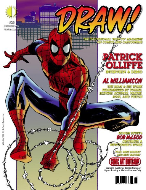
#23<br />
SUMMER 2012<br />
$<br />
7.95 In The US<br />
THE PROFESSIONAL “HOW-TO” MAGAZINE<br />
ON COMICS AND CARTOONING<br />
PATRICK<br />
OLLIFFE<br />
INTERVIEW & DEMO<br />
AL WILLIAMSON<br />
THE MAN & HIS WORK<br />
REMEMBERED BY TORRES,<br />
BLEVINS, SCHULTZ, YEATES,<br />
ROSS, AND VEITCH<br />
Spider-Man TM & ©2012 Marvel Characters, Inc.<br />
ROUGH STUFF’s<br />
BOB McLEOD<br />
CRITIQUES A<br />
NEWCOMER’S WORK<br />
PLUS: MIKE MANLEY<br />
AND BRET BLEVINS’<br />
Contains nudity for demonstration of<br />
figure drawing • Mature Readers Only<br />
0 2<br />
1 82658 27764 2
THE PROFESSIONAL<br />
“HOW-TO” MAGAZINE ON<br />
COMICS & CARTOONING<br />
WWW.DRAW-MAGAZINE.BLOGSPOT.COM<br />
SUMMER 2012<br />
VOL. 1, No. 23<br />
Editor-in-Chief • Michael Manley<br />
Designer • Eric Nolen-Weathington<br />
Publisher • John Morrow<br />
Logo Design • John Costanza<br />
Copy-Editing • Eric Nolen-<br />
Weathington<br />
Front Cover • Pat Olliffe<br />
3<br />
TABLE OF CONTENTS<br />
PAT OLLIFFE<br />
Mike Manley interviews the artist about<br />
his career and working with Al Williamson<br />
DRAW! Summer 2012, Vol. 1, No. 23 was<br />
produced by Action Planet, Inc. and<br />
published by <strong>TwoMorrows</strong> Publishing.<br />
Michael Manley, Editor. John Morrow, Publisher.<br />
Editorial address: DRAW! Magazine, c/o Michael<br />
Manley, 430 Spruce Ave., Upper Darby, PA 19082.<br />
Subscription Address: <strong>TwoMorrows</strong> Publishing,<br />
10407 Bedfordtown Dr., Raleigh, NC 27614.<br />
DRAW! and its logo are trademarks of Action Planet,<br />
Inc. All contributions herein are copyright 2012 by<br />
their respective contributors.<br />
Action Planet, Inc. and <strong>TwoMorrows</strong> Publishing<br />
accept no responsibility for unsolicited submissions.<br />
All artwork herein is copyright the year of production,<br />
its creator (if work-for-hire, the entity which<br />
contracted said artwork); the characters featured<br />
in said artwork are trademarks or registered trademarks<br />
of their respective owners; and said artwork<br />
or other trademarked material is printed in these<br />
pages with the consent of the copyright holder<br />
and/or for journalistic, educational, or historical<br />
purposes with no infringement intended or implied.<br />
22<br />
26<br />
rough critique<br />
Bob McLeod gives practical advice and<br />
tips on how to improve your work<br />
The crusty Critic<br />
Jamar Nicholas reviews the tools of the trade.<br />
This month: Manga Studio EX 4.<br />
This entire issue is ©2012 Action Planet, Inc. and<br />
<strong>TwoMorrows</strong> Publishing and may not be reprinted<br />
or retransmitted without written permission of<br />
the copyright holders. ISSN 1932-6882. Printed in<br />
Canada. FIRST PRINTING.<br />
If you’re viewing a Digital<br />
Edition of this publication,<br />
PLEASE READ THIS:<br />
This is copyrighted material, NOT intended<br />
for downloading anywhere except our<br />
website. If you downloaded it from another<br />
website or torrent, go ahead and read it,<br />
and if you decide to keep it, DO THE<br />
RIGHT THING and buy a legal download,<br />
or a printed copy (which entitles you to the<br />
free Digital Edition) at our website or your<br />
local comic book shop. Otherwise, DELETE<br />
IT FROM YOUR COMPUTER and DO<br />
NOT SHARE IT WITH FRIENDS OR<br />
POST IT ANYWHERE. If you enjoy our<br />
publications enough to download them,<br />
please pay for them so we can keep<br />
producing ones like this. Our digital<br />
editions should ONLY be downloaded at<br />
www.twomorrows.com<br />
31<br />
48<br />
comic art bootcamp<br />
This month’s installment:<br />
Rules of Appeal: Aesthetics & Design<br />
al williamson<br />
Jorge “George” Khoury looks back at the life<br />
and career of a comic book legend<br />
DRAW! SUMMER 2012 1
Spinning Tales<br />
with<br />
PAT<br />
OLLIFFE<br />
From the traditional to the tra-digital, artist Pat Olliffe has<br />
spun a web of pages through a diverse career that has covered<br />
everything from Spider-Girl and digital Spider-Man comics<br />
for Marvel to the new 52 Aftermath: The Four Horsemen with<br />
Keith Giffen.<br />
DRAW!: One of the reasons why I wanted to interview you<br />
for this issue of DRAW! is because there’s also going to be a<br />
big article by Jorge Khoury on Al Williamson.<br />
PAT OLLIFFE: Oh, great!<br />
DRAW!: And since we both loved Al and worked with him,<br />
I thought it would be a good thing to interview you for this<br />
issue and get some of your experiences working with him.<br />
PO: Yeah, that would be great. This is no disrespect to other inkers<br />
that I’ve worked with, but to play around with some crosshatching<br />
and some linework that, as you’re drawing, you’re<br />
thinking, “Oh my God, Al Williamson is going to ink this.” It<br />
was just more than I could ever hope for. It was great stuff.<br />
Interview conducted by<br />
Mike Manley<br />
and transcribed by<br />
Steven Tice<br />
DRAW!: So when you were working with Al, did you guys<br />
talk on the phone? How did your relationship work as a team?<br />
Because you guys worked together for quite a while, right?<br />
PO: Yes. I think, all told, we worked together for over seven<br />
years. He was the inker I worked with most in my career.<br />
Basically, we just talked on the phone. Back in those days,<br />
email wasn’t an option, so we would just talk on the phone<br />
on occasion. I have to admit, especially early on I was intimidated<br />
a bit, I guess, as nice a guy and as gregarious a<br />
guy as he could be, you’re still, especially initially, somewhat<br />
intimidated. So our phone conversations, especially initially,<br />
didn’t last too long because I didn’t know what the hell to say.<br />
[laughter] But as time went by, we would occasionally chat<br />
on the phone, talk about the pages. He was always very complimentary,<br />
which was very nice to hear, and he always was<br />
somewhat unsure about his approach. He was always really<br />
critical of his own work, and wasn’t sure how the pages were<br />
looking. And they always looked good to me. So, it was those<br />
kind of conversations. And we talked a little bit about art and<br />
DRAW! SUMMER 2012 3
(left) Pat’s thumbnails<br />
for pages seven and<br />
eight of Spider-Man<br />
Annual #37’s “Untold<br />
Tales” back-up story.<br />
(opposite page)<br />
Finished art for page<br />
seven of Spider-Man<br />
Annual #37’s “Untold<br />
Tales” back-up story.<br />
Spider-Man and all related<br />
characters and ©<br />
Marvel Characters, Inc.<br />
that kind of stuff. That’s mostly how it ended up working.<br />
We eventually had some great phone conversations over the<br />
course of the years.<br />
DRAW!: What would you say would be a couple of the best<br />
things you think you learned the most from working with a<br />
guy like Al?<br />
PO: You tend to learn things, at least I did, in just how he<br />
would talk about different parts of his career, or early on in his<br />
career. He was obviously still a fan of the genre that he grew<br />
up in. You know what I mean?<br />
DRAW!: Oh yeah. I mean, clearly, he still was; he was still<br />
like the twelve-year-old his entire life. He still had that love<br />
and passion for the material.<br />
PO: Right, exactly. So for someone to be involved in this<br />
business that long and to still retain that kind of attitude, I<br />
think, in terms of just an overall approach, I thought that was<br />
pretty impressive. As you know, this industry can kind of<br />
knock that little inner flame around quite a bit, but he was<br />
able to keep it going to a certain extent, and so I think Al was<br />
a nice little lesson to learn.<br />
Plus, the thing that I think I learned from Al when I would<br />
look at the pages, and look how he handled the inks—there’s<br />
an inking process that seems to have been really prevalent in<br />
comics over the 25 years that I’ve been working in the industry,<br />
that just seems to be a tighter, more-polished ink line. And<br />
I think that’s fine. That look has quite a value to it, and I’ve<br />
worked with guys that have a slick look to them, and it gives<br />
your work a different kind of an overall veneer, and I think<br />
that can be pretty good for certain projects. But looking at the<br />
linework and the ink lines that Al was laying down, he really<br />
just seemed to be so organic, and it just kind of flowed. It was<br />
almost like he was just drawing with the ink in terms of how<br />
he was aware of line weight, aware of creating foreground,<br />
background, and midground. But it wasn’t; how he was going<br />
to ink a certain line wasn’t all-encompassing for him. He was<br />
inking it as he would ink his own work, as an illustrator would<br />
ink his own work. That kind of almost organic approach. I<br />
would look at these pages, and when I would think about it<br />
in terms of my own inks, I remember thinking to myself that<br />
I’ve got to let go a little bit. I mean, I’ve got to just let the lines<br />
flow a little bit. That tends to be a little bit closer to my own<br />
personal ink style. So I think that was another thing, just kind<br />
of looking over the pages and going, “He’s just letting it go.”<br />
I mean, he’s just drawing with it, so it was kind of cool.<br />
DRAW!: When you would get the pages back, when Marvel<br />
would return the pages to you, would you ever go back and<br />
look at your Xeroxes of your pencils compared to how Al<br />
interpreted with the inks?<br />
PO: Yeah. Oh, definitely, definitely. And Al was trying to stay<br />
pretty close, structurally, with what I had. I thought that was<br />
kind of nice. I mean, he’s Al Williamson, and I’m not, and<br />
he was nice enough not to try to keep me in there, It didn’t<br />
seem like he was going to go in and redraw a bunch of stuff or<br />
4 DRAW! SUMMER 2012
DRAW!: Yeah, he would ink it, then he would cut it back in<br />
with a pen, and then he would cut it back in with white, and<br />
then he’d go back over the white, or he’d cut into it with a<br />
razor. I have some originals of his, and they’re pretty beat up<br />
in places because he would really work on that.<br />
PO: Yeah, and I remember an instructor of mine at the art<br />
school said, “Don’t worry about being too precious with the<br />
original piece because, as long as it reproduces cleanly and<br />
it does what you want it to do, you’re fine. People can kind<br />
of get too hung up on this. Now, in our work it’s different<br />
because you do have an original art market. And it dictates<br />
how clean you want your boards to be. But I always thought<br />
about that in terms of Zaffino just kind of attacking the board.<br />
Even though the thing looks like hell when he’s done with it,<br />
the fact that it reproduces and achieves what he wanted it to<br />
achieve on the printed page, that’s all you need.<br />
ART SCHOOL<br />
DRAW!: Where did you go to school?<br />
PO: I went to the Art Institute of Pittsburgh.<br />
DRAW!: And what did you go there to study?<br />
PO: Basically, I went there to draw comics. I mean, I was a<br />
comics fan when I was a kid, and I knew that’s what I wanted<br />
to do. In junior high school and high school, I had done a little<br />
bit of grunt work for a little animation company in Pittsburgh,<br />
and Ron Frenz did some work occasionally for them as well.<br />
So, I knew Ron had gone to the Art Institute at Pittsburgh,<br />
Paul Gulacy had gone to the Art Institute of Pittsburgh, so I<br />
felt, “Well, that should be a pretty good place to go.”<br />
I went to the Art Institute with the idea that I was going to<br />
become a comic artist. When I was there, I talked to other kids<br />
and other students, and you start to see a larger illustration<br />
world. So I left the Art Institute thinking, “Well, do I want to<br />
do commercial illustration, or do I want to do comics?” And<br />
comics kind of bit first, so I said, “Okay, let’s pursue this.”<br />
But I did go there initially just to be a comics artist.<br />
DRAW!: And they had classes specifically in comic art?<br />
PO: Well, no, actually, they didn’t. It was a general commercial<br />
art/visual communications program, but, like I said, Gulacy<br />
and Frenz came through that school. But, no, they didn’t<br />
have a cartooning class that really addressed comic books specifically.<br />
It was more just a general cartooning kind of thing.<br />
Essentially it was a general commercial art school that taught<br />
certain basics that you could then apply that to comics art.<br />
DRAW!: Was it a two-year school, like an associate’s degree?<br />
PO: That’s correct, yeah.<br />
DRAW!: Did you go straight out of high school?<br />
PO: Yeah, right out of high school I started there.<br />
DRAW!: How did you go about breaking in? Did you go to<br />
the local conventions?<br />
PO: I was just sending out samples to editors and got my box<br />
(above) Thumbnail layout for Booster Gold #40, page 12.<br />
(opposite page) Pencils for Booster Gold #40, page 12.<br />
Booster Gold and © DC Comics.<br />
of rejection letters. There was a handful of guys in art school<br />
that were all interested in drawing comics. There was a guy<br />
that had graduated ahead of us—I didn’t really know him that<br />
well, but he had started to get work at this little black-andwhite<br />
comic book company in California called Malibu Comics,<br />
which was just starting out. I guess they had a project<br />
for him, and he couldn’t do it or something. I don’t know.<br />
Through a friend of mine, I became aware that they were<br />
looking for an artist. So, I sent them some samples, and they<br />
hired me to do Stealth Force. I got that first gig about a month<br />
before I graduated art school.<br />
DRAW!: Well, that must have felt pretty good, getting a gig<br />
right before you graduate.<br />
PO: Yeah, it was. Fortunately, my mother was kind enough to<br />
let me live and work in the basement because I didn’t make<br />
a damn thing. But it was great. It was really nice to get a job<br />
before I even graduated in ’87, and I thought, “Well, here you<br />
go.” I started getting work at Malibu and Eternity, in that late<br />
’80s black-and-white comic book glut—there were black-andwhite<br />
comics everywhere. I was getting work through them,<br />
but still getting my rejection letters from Marvel and DC.<br />
16 DRAW! SUMMER 2012
DRAW!: Y’know, it’s funny. I realized a<br />
little while ago—because we’ve known<br />
each other for a couple of years—I actually<br />
inked a few pages on a Nomad that<br />
you did. [Pat laughs] I think there was<br />
deadline problem, and I inked some on<br />
a weekend. I forget who he was fighting.<br />
That was when he was going around<br />
dressed up like the Lone Ranger or<br />
something like that?<br />
PO: Well, yeah, he had the eyeglasses. I<br />
did it when he had the eyeglasses, the long<br />
hair, and the trench coat. I took over for<br />
Clarke Hawbaker. And he would carry a<br />
little baby around with him all the time.<br />
DRAW!: Yes! I inked some pages of<br />
one of those, “Hey, can you do three<br />
pages over the weekend?” kind of jobs.<br />
PO: [laughs] Yeah, that’s about right.<br />
That’s funny. I didn’t know that. That’s<br />
pretty cool.<br />
I had met Ron Frenz through the animation studio here in<br />
Pittsburgh. I stayed in touch, and I sent him some samples.<br />
They sat on the shelf for a little bit, and then, I think it was<br />
around ’90, Marvel needed somebody to do some “Tales of<br />
Asgard” stories, and it was through Ron showing my stuff to<br />
Ralph Macchio that I got my first gig at Marvel. From there,<br />
my first regular gig at Marvel was because Glenn Herdling<br />
walked into the office of Ralph Macchio and said, “Hey, do<br />
you know anybody to help us out on this Nomad book?” And<br />
he said, “How about this guy?” So he showed him my stuff,<br />
Glenn liked it enough, and they hired me to do Nomad, and<br />
that was my first regular gig.<br />
DRAW!: I don’t even know if that really<br />
happens now. I mean, I ended up<br />
helping Bill Reinhold and Jerry Ordway<br />
in the last few years. But that used to be<br />
the kind of way people would get a job<br />
is you’d be hanging around, and somebody<br />
would say, “Hey, we need four<br />
pages inked—stat!”<br />
PO: And that’s really how the last few<br />
years went before I got the Dark Horse<br />
Samson gig, after Spider-Man Digital<br />
and The Atom. I spent a good deal of the<br />
last year or so doing exactly that. I helped<br />
out on Sigil from Marvel just doing a<br />
few pages here and there to help Leonard<br />
Kirk, who was the penciler. He had<br />
some other issues; I don’t know if he had<br />
a problem at the studio or something like<br />
that, but he needed a hand, so I just came<br />
in and did a couple pages here and there.<br />
And I was starting to just do more of that<br />
kind of Mr. Fixit stuff. “Hey, can you do four pages, five pages?”<br />
As it was happening, I was thinking, “Yeah, it might not<br />
be a good idea to continue to do this kind of stuff too much.”<br />
But, yeah, they have so many deadline problems that I actually<br />
for a while thought that maybe that would be my new cottage<br />
industry, that, since nobody seems to be able to hit a deadline<br />
well, I’ll just make a paycheck by just standing around. “Okay,<br />
whenever the deadline is in the weeds, give me a buzz, and I’ll<br />
help you out.” But that’s no way to make a career.<br />
DRAW!: No, you don’t always want to be the fireman.<br />
PO: Right, right.<br />
DRAW! SUMMER 2012 17
find the person who’s in charge of a particular show, or the showrunner,<br />
or the person in Human Resources. You get so-and-so’s<br />
email from such-and-such, and you just email the person and ask<br />
them. I mean, in the beginning, when you were living in Pittsburgh,<br />
you were kind of like me; you were in the Midwest. So<br />
the idea of being able to just hop on the subway and run into the<br />
office didn’t exist. I was in Michigan. You didn’t live in New<br />
York. If you lived in New York, you could just go, like, haunt the<br />
office until somebody gave you something.<br />
PO: Right, exactly, exactly.<br />
DRAW!: But now people can actually do that over the Internet.<br />
I mean, there are people that are getting jobs over the Internet,<br />
and are never even going in to the office. There are people that<br />
are working together that have never even met each other,<br />
PO: It’s been years since I’ve been to either the Marvel or<br />
DC offices. All the relationships that I have are either work<br />
relationships or online relationships. But I think you’re right,<br />
the Internet kind of closes that gap a little bit and creates a<br />
smaller environment.<br />
Tech and Gear<br />
DRAW!: We should talk the technical specs. What kind of<br />
computer rig do you have? What kind of set-up do you have?<br />
PO: I just have a PC running Windows 7, Photoshop CS3, and I<br />
just picked up a little Wacom tablet. That’s basically it. It’s pretty<br />
simple at this point. And I have to admit, the Wacom tablet, I’m<br />
not technically proficient enough at it yet to really make use of it<br />
other than doing layouts, but it’s been a fun tool to play around<br />
with. I stood in Best Buy for I don’t know how long deciding<br />
whether to get the small, medium, or large version. [Mike laughs]<br />
And there was nobody in the store I could ask because they don’t<br />
know what the hell I’m talking about. They’re aware of what<br />
it is, but, y’know, I am trying to draw comic book layouts with<br />
these things. So, true to my nature, I picked the middle version.<br />
DRAW!: I have a big one for my old G4 upstairs that I still<br />
use, and then I have a little one for my laptop.<br />
PO: On Judge Parker, are you doing traditional layouts, or<br />
are you doing digital layouts and pencils and traditional inks?<br />
DRAW!: On Judge Parker it’s still traditional as far as drawing<br />
and inking. The only digital part is the coloring and the lettering.<br />
Everything else is done traditionally, and, as long as I can work<br />
that way, I’m very happy to continue to do it that way. It’s much<br />
more relaxing. I mean, the other thing about technology, as you<br />
know, is that you’re always having to update it. Or something<br />
breaks, or you’re trying to print something, or you’re trying to<br />
send something… it crashes and you lose everything!<br />
PO: Oh, yeah, I just had that. Not long after I got the Wacom<br />
tablet, suddenly my computer wouldn’t recognize the tablet<br />
driver, and I had to uninstall it and reinstall it. And I was like,<br />
“For #*$!!’s sake.”<br />
DRAW!: So what about paper, pens, inks? Do you have any<br />
preferences?<br />
PO: Oh, the only other thing that I forgot to mention is I have<br />
a Brother all-in-one printer so I can print out the boards. It’s<br />
an 11" x 17" bed, so I can scan my pages, and I can print out<br />
stuff; it’s a Brother MS36490CW. It seems to be the workhorse<br />
a lot of guys are using, and that has served me well.<br />
DRAW!: And that wasn’t too expensive, right?<br />
PO: No, it wasn’t. It’s been a few years. I got it during some<br />
kind of a sale, and, like I said, I don’t remember how much it<br />
was, but it was really, really reasonable. Before that I had a<br />
smaller scanner, 8-1/2" x 11", and you’re trying to stitch together<br />
pages, and it was a pain in the ass. This way you can just scan<br />
in everything you need, and then you can print out bluelines.<br />
That’s how I approached the Disney stuff. It’s traditional pencil<br />
thumbnails on 8-1/2" x 11" sheet of paper. I have two page<br />
layouts per page on that 8-1/2" x 11" sheet, and then I just print<br />
them out in blueline on board, so that’s come in pretty handy.<br />
DRAW!: And then you just ink it or tighten it up from there?<br />
PO: I would ink it up for comics if I was doing that, but for<br />
the Disney stuff I just tighten it up in pencil and send it off.<br />
The funny thing is, as I’m learning to do that kind of stuff, it<br />
suddenly feels like everybody has their own formula for how to<br />
print bluelines. [Mike laughs] “Well, how do you do it? I set the<br />
hue for one thing, saturation for another, lightness for another.”<br />
And you talk to somebody else, “No, no, no. I do it this way.”<br />
I’m thinking, “What?” Sometimes it’s more like blue, some it’s<br />
slightly green, so anyway….<br />
DRAW! SUMMER 2012 19
DRAW!: Who were you using?<br />
PO: I was using the Design drawing pencils.<br />
DRAW!: Was that by Letraset or Tria? I think the Design<br />
markers are gone.<br />
PO: Yeah, it’s from Design: Design Drawing Pencil, Series<br />
3800 and 00. That’s what I’ve been using for a while, but now<br />
all of the pencil lines are super-soft. I don’t know what is going<br />
on there. But I usually stick with the HB pencil, standard<br />
kneaded erase or the Pink Pearl eraser, and then any boards<br />
that I get. It’s interesting that the tighter my pencils have gotten<br />
over the years, the smoother board I prefer to work on. If I<br />
can get a smoother paper, I prefer it. The more toothy it gets,<br />
the slower I pencil, so I try to get a plate finish of some kind,<br />
whatever the companies tend to office. Although, on the Dark<br />
Horse stuff, if that work was going to go on too much longer,<br />
I was going to start buying my own board. I don’t know what<br />
you thought of that paper, but that was a little too rough.<br />
Pat inked by Al Williamson. The opening splash of Spider-Girl #14.<br />
Spider-Girl and © Marvel Characters, Inc.<br />
DRAW!: I always found that when I did it, I would adjust<br />
each page based upon how dark or light the pencils were. Because<br />
some people would pencil lighter and there would be<br />
parts that would be very faint, so you would have to darken<br />
that, or darken that part of the panel, so that you could actually<br />
even see the art when printed in blue.<br />
PO: Right, exactly. There was a time when I was trying to make<br />
sure the pencils, the blueline was light enough, even though the<br />
blue on the board is fine because you’ll remove it when it gets<br />
scanned, but I still wanted it a little bit cleaner. And I remember<br />
trying to print them out as light as I could print them, and as I’m<br />
penciling them, I’m thinking, “Man, I’m getting a headache.”<br />
And I realize that I printed them out too light. I’m straining to<br />
see these tiny little lines. “Okay, that’s not working.”<br />
DRAW!: Do you like a hard lead or soft lead pencil?<br />
PO: I tend to be, as my Wacom tablet choice indicates, kind<br />
of the in middle. I use an HB pencil, sometimes a 2B pencil—<br />
an HB is what I usually use. And, unfortunately, I have been<br />
having a little pencil problem lately because the pencil that<br />
I’ve been using for a while, I don’t know if they changed their<br />
lead, all their HB pencils are all drawing like 4Bs, and I’ve<br />
been trying to change pencil makers and that kind of thing.<br />
DRAW!: In my case, since I was doing layouts and scanning<br />
and sending them, I was penciling the layouts on the Canson<br />
Fanboy Paper. And Bill was printing them out at his end and<br />
doing whatever he needed to do before he inked it. What do<br />
you ink with?<br />
PO: I use a Hunt 102, usually Higgins Black Magic. If I can<br />
get my hands on Pelican ink, I like that better. Higgins tends<br />
to be not dense enough, so I sometimes will try to combine a<br />
couple of inks. But most of the Samson stuff was inked with<br />
the Faber-Castell Pitt pens, and occasionally what I would do is<br />
I would use the Faber-Castell Pitt pens, the S and the F, which<br />
are really small, and then the brush pens. If I couldn’t get the<br />
effect I wanted—there were a couple places where I couldn’t<br />
achieve the crosshatched look I wanted—then I would use the<br />
crow quill, the Hunt 102, to get that kind of crosshatchy look.<br />
And another thing, because I wanted it to be a little different<br />
look than some of the stuff that I’ve inked in the past, and<br />
in the past I’ve only used a crow quill and a brush, I wanted to<br />
change the tools up a little bit to see if that would allow me a<br />
slightly different look to the work that I was doing. And the other<br />
change of approach that I did with Samson was that, kind of by<br />
accident, and I’ve heard since then that other artists have done<br />
this, is that once I penciled the page, my first step would be to<br />
just pull out the brush pen and just blast in as much black as I<br />
could. I’d draw as much of the page as I could with large shapes,<br />
just kind of draw with the brush, and then go to the penwork<br />
afterwards. And that’s backwards from the way I had previously<br />
worked all my career. When I’d inked my own stuff before, it<br />
would be linework first, brush second, and that kind of thing, fill<br />
in your blacks. But this time I wanted a different approach, and,<br />
if nothing else, just to make it kind of an experiment for me. And<br />
I thought that worked really well. That was a lot of fun.<br />
DRAW!: I think that’s an interesting approach. I’ve done<br />
that too. I think actually, in a way, that’s almost a much more<br />
painterly approach because what you’re doing is you’re dealing<br />
with the big shapes first, and then you’re working to the<br />
20 DRAW! SUMMER 2012
constructive<br />
ANALYSIS&<br />
CRITICISM<br />
of a newcomer’s work<br />
by<br />
BOB McLEOD<br />
In this column, I try my best to help a young<br />
artist move up to the next level and hopefully<br />
break into comics. I’ve penciled many<br />
jobs for Marvel and DC, and I teach sequential<br />
art at the Penn. College of Art & Design,<br />
so hopefully I know what I’m talking about.<br />
This issue’s Spider-Man sample page was<br />
submitted by Brandon Hendricks. Brandon’s<br />
obviously worked hard to get to this level, and<br />
he shows some real potential, but some basic<br />
problems common to many beginners are<br />
holding him back. I notice more and more<br />
in today’s comics that the basic principles of<br />
visual storytelling that I learned back in the<br />
’70s when I started drawing comics are often<br />
no longer valued, or perhaps a lot of current<br />
artists simple don’t know them. So it may be<br />
argued that some of my comments are irrelevant<br />
to success as a professional comic artist,<br />
but I’m still going to attempt to convey what<br />
I believe to be the best way to draw comics. If<br />
you think you can get by without being able<br />
to tell a clear story visually, or without learning<br />
basic anatomy or perspective or composition,<br />
then good luck to you. But I still think the<br />
fundamentals are important.<br />
Although comic art is, or should be, primarily<br />
more about storytelling than drawing,<br />
good comic art requires a basic level of<br />
competency at figure drawing. And I use the<br />
term “figure drawing” rather than “anatomy”<br />
deliberately. It’s not all that important to put<br />
all of the muscles in the right place (although<br />
it’s certainly desirable), and many published<br />
artists don’t, but it is very important to be<br />
able to pose the figures dynamically rather<br />
than awkwardly. And in my opinion the basic<br />
structure should also be sound, meaning for<br />
example that the arms should extend from<br />
Electro, Spider-Man and © Marvel Characters, Inc.<br />
22 DRAW! SUMMER 2012
figURE 1<br />
figURE 2<br />
Figure 1: You don’t have to know all the muscles in the leg, but they<br />
aren’t that hard to learn.<br />
figure 2: Arch the back, add the foot, and learn to draw hands.<br />
Spider-Man and © Marvel Characters, Inc.<br />
the socket rather than stick out from the rib cage, and the legs<br />
should extend from the hips, not the waist. Unfortunately,<br />
there are innumerable examples of popular published artists<br />
where this isn’t the case, but I still think it should be.<br />
A good artist should also know where to place things in a<br />
panel to create a sound composition. Moving the point of view<br />
(or “camera angle” as it’s commonly called) around is important,<br />
but even more important is simply creating a good, interesting<br />
picture with a strong composition. The problem with so<br />
many beginners is that they want to draw comics so much that<br />
they try to draw a page full of pictures before they’ve learned<br />
how to draw even a single picture correctly. Whenever you’re<br />
drawing a panel, you’re obviously choosing to show an edited<br />
view of the scene, so how you edit that scene is critical. The<br />
proper way to begin is to place the center of interest, then any<br />
other primary focal points, then design a background to balance<br />
against them if a background is necessary. Drawing a<br />
background in every panel can make a page look crowded and<br />
claustrophobic, with no “eye relief,” so you can often leave out<br />
the background on close-ups and medium shots.<br />
Brandon is doing a lot of things well here. He’s moving the<br />
camera around, choosing good angles, using a lot of dynamic<br />
diagonals, balancing his blacks, showing good action, drawing<br />
pretty good proportions, and adding a lot of well-done backgrounds.<br />
He’s obviously working hard and putting in a good<br />
amount of effort, and he’s studied anatomy and perspective. I<br />
think he’s on the cusp of being ready to get work. But it’s often<br />
that last ten yards that holds people back. More than a few artists<br />
have come this far and given up before they ever managed<br />
to get published. What can he do to move forward from here?<br />
In panel one, Brandon chose a good standard viewpoint:<br />
an over-the-shoulder shot of Electro with Spidey in the distance.<br />
But he’s shoving Electro off to the side unnecessarily,<br />
his arm is at an awkward angle, and the hand is a bit too small.<br />
Perspective affects our bodies just as much as it affects backgrounds.<br />
If the distance from his head to his hand affects their<br />
relative sizes that radically, then the distance from Spidey’s<br />
foot to his head would affect their relative sizes just as much.<br />
Brandon’s also having Electro look at Spidey out of the corner<br />
of his eye because he doesn’t want to just show the back of<br />
his head. But we can face him toward Spidey quite a bit more<br />
and still get his face in. Also, it’s not a good idea to draw detached<br />
body parts because the viewer can get confused about<br />
to whom they belong. And Electro’s right hand here simply<br />
can’t be attached to his body at that angle. It would require<br />
his elbow to be too far from his shoulder. Do comic artists do<br />
this all the time? Sure, but it’s still a bad idea. If you’re going<br />
to do it, at least go ahead and draw the whole arm outside the<br />
panel to see how it would look, then erase it.<br />
Heads and hands are usually the primary focal points, so<br />
it’s important to keep them unobstructed like Spidey’s are<br />
here. Marvel’s ex-editor-in-chief Jim Shooter’s first rule in<br />
all things regarding comic art was clarity. So all that black<br />
stuff next to Electro’s left hand is confusing clutter that should<br />
be removed. And I don’t see any reason to crop Spidey, the<br />
center of interest. As long as there’s room, why not bring him<br />
down into the panel, as I’ve done? Brandon’s got him in a<br />
nice, spidery pose, but his structure is off. His right arm and<br />
shoulder are dislocated, and his left forearm simply can’t be<br />
there and still be attached to his body. His right foot is also<br />
incorrectly attached to his leg. I know it’s Spider-Man, and<br />
trying to use correct anatomy with his extreme poses can often<br />
be counterproductive, but I think you need to be a bit more<br />
in control of where you bend the rules, rather than breaking<br />
them out of ignorance. Studying the skeleton and understanding<br />
its limits really pays off when drawing figures.<br />
In panel two, Spidey looks squeezed into the panel, with<br />
his leg and arm seemingly posed to avoid going off panel. It’s<br />
DRAW! SUMMER 2012 23
UNDER REVIEW<br />
MANGA STUDIO EX 4<br />
Salutations once again to all and sundry! Back again,<br />
your loyal maestro of markers, your swami of Strathmore,<br />
the artistic surveyor of supplies with the eagle<br />
eyes, the Crusty Critic, here again to help you navigate the<br />
mine field of art tools. So heed my advice, and you will keep<br />
from blowing off your leg, or even worse—blowing your<br />
deadline!<br />
We are now firmly<br />
entrenched in the digital<br />
age, where nothing is<br />
spared from the e-hands<br />
of fate—erm, technology.<br />
The recent uptick of<br />
affordable art and design<br />
have been great to artists<br />
in some amazing ways—<br />
the advances of art tech<br />
have shaved off hours,<br />
even days of time it took<br />
to get something done.<br />
Imagine in 2012 having<br />
to drive to the copy store<br />
to have the clerk shrink<br />
down your 11" x 17" art<br />
board so you could then<br />
fax it to your editor in<br />
another state to get advice<br />
on a page that needs reworking, going home to wait to hear<br />
back, then returning with more of the same? That’s days (or<br />
more) of back-and-forth that can now be done in minutes due<br />
to email, and cartoonists having smart all-in-one copier hubs<br />
in their studios. How about having to build travel time into a<br />
job’s schedule so that you could gather all of your art into a<br />
FedEx box and then send it to the publisher so they got the art<br />
before the deadline (hoping it doesn’t get lost or damaged)?<br />
A quick Dropbox or MegaUpload transfer has even taken the<br />
place of FTP (File Transfer Protocol) in a lot of studios. Wotta<br />
world!<br />
The muss and fuss of making comics has gotten even<br />
easier due to the Adobe Suites: Photoshop, mainly for clean-up<br />
and coloring, and Illustrator for lettering comics. There have<br />
been great books written about the digital process and comicmaking,<br />
notably the great, but quickly aging Digital Prepress<br />
for Comic Books (by Kevin Tinsley, Stickman Press) and<br />
more recently The DC Comics Guide to Digitally Drawing<br />
26 DRAW! SUMMER 2012
(opposite page) Screen display of the layout palette options.<br />
(above) G.I. Joe artist, Will Rosado, demonstrates his step-by-step process when using<br />
Manga Studio EX 4.<br />
G.I. Joe and © Hasbro.<br />
Comics (by Freddie E. Williams II, Watson-Guptill), which I<br />
hope to review in a later article, that has uncovered and shone<br />
light over the mystery and guesswork of creating comics on<br />
your computer.<br />
A contender to the mighty Photoshop has appeared on the<br />
horizon, and will be the focus of my review: Manga Studio by<br />
SmithMicro Software.<br />
This program has been around for a few iterations already,<br />
and from all of the cartoonist circles I fraternize with, not a<br />
lot of people had the inclination or time to tinker with the<br />
older versions of this. Cartoonists are a superstitious lot, and<br />
once they find something that works in their digital workflow,<br />
they’re not in a hurry to change it. There’s a never-ending<br />
quest to find a best, shiniest way to invent (and draw!) the<br />
wheel, and once you find a method that works, you don’t<br />
want to mess with it. I also believe the name of the software<br />
freezes out a lot of American cartoonists who don’t want to<br />
buy something that’s not marketed for them. Manga Studio<br />
doesn’t sound like something a cartoonist interested in drawing<br />
for Marvel would want to buy, does it?<br />
But enter Manga Studio EX 4, and everything changed.<br />
There is another SmithMicro box on the shelves called Manga<br />
Studio Debut 4, but your Crusty Critic has put it at arm’s<br />
length because it is a crippled, cheaper version of EX 4, and<br />
there are so many things disabled in that version that it’s not<br />
worth reviewing. Let’s begin, shall we?<br />
DRAW! SUMMER 2012 27
Rules of Appeal:<br />
Aesthetics<br />
&DESIGN<br />
Aesthetics is the study of artistic phenomena, such as<br />
painting, music, literature, dance, and sculpture and is<br />
usually used in reference to the visual arts.<br />
For hundreds of years, the best philosophers, artists, and<br />
critics have discussed, created, critiqued, and debated one another<br />
to determine the most important, attractive, effective,<br />
and esthetically pleasing elements in the design of artistic<br />
works and objects from fashion to toasters to automobiles and<br />
everything from film and print to painting. In comics we can<br />
look at something like the design of not only a page, a panel,<br />
or a costume, but also, more importantly, how those elements<br />
and objects are designed and how they work together to make<br />
a page or cover really go POW!<br />
Design, which is a combination and arrangement of visual<br />
elements such as line, shape, proportion, form, color, and<br />
pattern, is the way we build an image. Artists—in our case<br />
illustrators, comic artists, cartoonists, and animators—achieve<br />
a good design though the manipulations of these elements in<br />
the “design process,” the rough sketch or layouts where they<br />
manipulate line and shape and the silhouette of those shapes.<br />
Here we prove our design and work out all of the bugs.<br />
Line is considered the main design element, our chief tool<br />
in the way we separate, cut, or create divisions or space on the<br />
picture plane. Or, to put it simply, the way we draw space and<br />
objects in that space.<br />
Of the visual attributes, aestheticians believe silhouette to<br />
be most important because it “frames” an object in its surroundings.<br />
Line also interacts with color to emphasize or deemphasize<br />
silhouette and shape. (DeLong, 1987)<br />
The interaction of line and color is the most important<br />
determinant of “significant form”—a visual image—that people<br />
find attractive. (Bell, 1914)<br />
The qualities that create an appealing image vary with individual<br />
taste, personal experience and awareness of aesthetics,<br />
but the technical principles discussed here are basic and<br />
universal—they physically construct the artwork. It’s useful<br />
to consider a drawing or painting as a journey for the viewer’s<br />
DRAW! SUMMER 2012 31
eye—a literal, physical journey directing the eye through,<br />
around, over, into, and across the contents of the image. The<br />
artist is in complete control of this journey, and dictates the<br />
ease or difficulty of the viewer’s experience by the choices<br />
made and the arrangement of the marks, shapes, tones, and<br />
colors used.<br />
Speed seems to be a crucial element—the pace, fast or<br />
slow, that the moving eye navigates through the image. This<br />
tempo can (and usually should) vary throughout the experience,<br />
but an image that can be apprehended quickly without<br />
confusion, and yet reward a longer, slower continued perusal<br />
with deeper and more subtle content will always appeal to the<br />
widest spectrum of viewers.<br />
Most of the examples shown in this article are unfinished,<br />
revealing the process of finding, improving, and refining the<br />
design that best suits the intent. Often this vital (and frequently<br />
hard-won) essence is hidden to the untrained eye of the<br />
casual viewer, but it is this careful planning and discovery<br />
beneath the final rendering that creates the satisfying response<br />
we are calling appeal or attraction.<br />
Paul Power’s<br />
East Meets West<br />
The first rough reveals a clear idea of my intention,<br />
and the basic rhythm, strong overall pyramid shape,<br />
balance of masses, and general energy of the action is<br />
good, but the forward position of Om's left arm, though<br />
explaining the thrust of the big cat’s pull, creates a<br />
lumpen silhouette on that side of his body. The second<br />
attempt solves most of the problems—I’ve moved his<br />
left arm clear of his body, thrust his right arm back,<br />
brought him forward, and added a more jaunty, confident<br />
attitude to his stride. By the time I was ready to<br />
render the finished piece (in a faux J. C. Leyendecker's<br />
style, as assigned), the buildings seemed intrusive and<br />
distracting, so I strengthened the silhouette by replacing<br />
them with a bleached cow skull and bit of cactus<br />
which explains the western location more elegantly<br />
than the storefronts.<br />
32 DRAW! SUMMER 2012
HOOK<br />
This fantasy piece is designed to read very quickly, with slashing<br />
diagonals thrusting at each other in very simple, strong silhouetted<br />
poses. You can see in the sketchbook roughs that the basic<br />
shape relationships were clearly conceived from the outset. I refined<br />
proportions and anatomy in the charcoal block-in, and decided<br />
what the woman is holding by her left hand. At this early<br />
stage of painting, I am further solidifying masses and structure.<br />
DRAW! SUMMER 2012 33
MONSTER MEN<br />
The digital scribble was a memory doodle of a<br />
Frank Frazetta frontis piece ink sketch printed<br />
in an Ace paperback of Edgar Rice Burroughs’<br />
Monster Men. I followed the general layout<br />
of my doodle, but changed the feeling of<br />
the scene by adjusting the pose, and subsequently<br />
the figure’s rhythm and attitude. I<br />
decided I wanted to shift the emotion from<br />
an impression of direct angry menace to one<br />
of less certainty—more tentative. This makes<br />
the monster more pathetic, possibly even a<br />
bit sympathetic. Subtle changes can create<br />
significant shifts in effect.<br />
38 DRAW! SUMMER 2012
MOON MAID<br />
In this Burroughs scene from The<br />
Moon Maid, I had a clear idea of the<br />
action from the first sketch—aside<br />
from adjusting the centaur-like creature’s<br />
anatomy to suggest something<br />
slightly more otherworldly<br />
and alien rather than a normal earth<br />
horse physiognomy, very little was<br />
modified in the pencil and underpainting<br />
stages. The placement of<br />
the bat-toads are specifically designed<br />
to subliminally suggest the<br />
arcing rhythm of the beast’s gallop.<br />
DRAW! SUMMER 2012 39
Al Williamson<br />
The<br />
Maestro<br />
by Jorge “George” Khoury<br />
photo by Greg Preston<br />
Flash Gordon and © King Features Syndicate, Inc.<br />
It is impossible to not gaze your eyes upon his beautiful artwork<br />
without being captivated by the stunning draftsmanship and sheer<br />
devotion behind it. From his vivid doodles to the impeccable<br />
sequential storytelling, his lifetime pursuit of perfection can be seen in<br />
every precise line he put down. With his elegant techniques and sensibilities,<br />
he never exaggerated his human figures and yet showed movement<br />
effortlessly. A master of positive and negative space, mood and<br />
atmosphere, this consummate craftsman did it all with gusto and dominance<br />
in his compositions. All of these hallmarks were the calling card<br />
of the late Al Williamson, one of the most important artistic talents the<br />
comics arts will ever know.<br />
Alfonso “Al” Williamson was born on March 21, 1931, in New<br />
York City. His Colombian father was part of an affluent family in his<br />
home country; his mother, a native of Pennsylvania, was a telephone<br />
operator in Manhattan. By 1933, young Al, along with his mother,<br />
had immigrated to Colombia to rejoin his father. Between the crumbling<br />
relationship of his parents and his own loneliness, his childhood<br />
years in Bogota were not easy, but it was there that his great<br />
48 DRAW! SUMMER 2012
(left) A sample page Al worked up circa 1947-48 in an attempt to<br />
get work from Fiction House.<br />
(above) A 1950 portfolio illustration.<br />
Artwork © Estate of Al Williamson.<br />
love affair for comics and cinema began, introducing him to<br />
fantastical worlds and creativity. In 1940, during the Golden<br />
Age of comics, he traded his skates for a stack of Pacquins (a<br />
Spanish-language comics magazine) and never looked back<br />
as he searched for more comics wherever he travelled. Riding<br />
on his enthusiasm, he began to fill up notebooks of drawings<br />
emulating his favorite strips, like Flash Gordon, his favorite<br />
hero in the funny books and cinema.<br />
After the break-up of his parents, Williamson and his mother,<br />
Sally, returned to the States in 1943, originally to San Francisco<br />
and a year later back to his hometown of New York City.<br />
In Manhattan the youngster—one of the first true fanboys of<br />
the comics medium—found himself in the heart of the comics<br />
industry, and he visited the syndicates themselves in search<br />
of more comics or anything else comics-related he could get<br />
his hands on be it actual original art, clippings, tear-sheets,<br />
or proofs. All he wanted was to study the art techniques and<br />
production process of his favorite creators up close. It wasn’t<br />
very long before Williamson started taking art classes taught<br />
by legendary Tarzan artist Burne Hogarth and befriending<br />
fellow students like Wally Wood and Roy Krenkel. By 17<br />
he broke into the industry doing a few spot illustrations for<br />
Famous Funnies.<br />
As comic fans and artists tend to do, Williamson soon<br />
became great friends with other kindred spirits like Frank<br />
Frazetta, Angelo Torres, George Woodbridge, and future<br />
Mad editor Nick Meglin—all in the infancy of their respective<br />
careers. Together these young men pushed one another to<br />
better themselves, and they collaborated on many artistic assignments<br />
in those early days. At the height of legendary EC<br />
Comics line, Williamson was a Wunderkind cutting his teeth<br />
on now-classic comics like Tales from the Crypt, The Vault of<br />
Horror, Weird Fantasy, and Weird Science amongst others.<br />
Only in his early 20s, EC Comics allowed him to cement his<br />
name and show the world that he was an artist with incredible<br />
range, who could draw science fiction as well as any crime<br />
story without missing a beat.<br />
After 1954 the years were lean for all comics professionals—and<br />
EC in particular—due to the public outcry and wave<br />
of censorship triggered by a Senate hearing investigating the<br />
link between juvenile delinquency and comics. During this<br />
unglamorous period, Williamson worked for nearly every<br />
publisher in New York, and for low page rates—primarily at<br />
Atlas Comics, but also other outfits like ACG, Charlton, Dell,<br />
and Harvey. On this rugged road, sometimes the work was<br />
done quickly and suffered for it, but he persevered because<br />
he had a solid foundation and, frankly, only the best artists<br />
survived this comics crash.<br />
Into the 1960s Williamson continued perfecting his craft<br />
and made a pivotal move to work as an assistant to artist John<br />
Prentice on the newspaper strip Rip Kirby, an Alex Raymond<br />
creation. Working and following Prentice’s lead, Williamson<br />
began to develop a sense of self-discipline and professionalism<br />
that he felt he was lacking next to the all-business approach<br />
of the older Prentice. Here he began understanding<br />
how to effectively use perspective and blacks in his layouts<br />
and inking. He now had all the tools to make even the most<br />
mundane of civilian scenarios look compelling and interesting.<br />
By the end of the experience, he would ghost art not only<br />
DRAW! SUMMER 2012 49
(left) Illustrations by the dynamic duo of Al Williamson and Frank Frazetta!<br />
(above) Frazetta pitched in to help Al with the inking on this 1950 John Wayne story.<br />
© respective owners.<br />
house. I thought, “What the hell did I get myself into?” But we<br />
went in, and finally they restored the power, and Sid said, “Can<br />
you help me with this?” I think he was working on a story for<br />
Timely or some other company. And I said, “Sure,” and he<br />
started passing me pages, and I started working, and I realized<br />
this was going to take all night. I had never been up all night<br />
working on a job in my life. But we ended up staying up until<br />
morning working on these, and getting these jobs finished.<br />
And then he said, “Oh, Frank is coming over this morning<br />
to bring some pages he was helping me on.” And I said,<br />
“Frank who?” He said, “Frank Frazetta. He’s been working<br />
on one of my jobs, trying to get it finished for me.” Sure<br />
enough, at about 7:30 or 8:00 in the morning, Frank shows<br />
up. So I met Frank first, before I met Al, and we started talking<br />
and yakking it up and everything else, and I was familiar<br />
with his work, but not that much. But we hit it off right away.<br />
He found out that we like to play baseball. Turns out he’s a<br />
baseball fanatic. He actually played a lot of ball when he was<br />
young. We took it out to his car and opened the trunk, and<br />
he had about ten baseball gloves, and bats, and balls, and all<br />
kinds of stuff in there, and we just flipped out. We said, “We<br />
gotta go down and play ball.” And he said, “First, I have to<br />
deliver the work. Let’s go over and pick up Williamson, and<br />
we’ll all go into the city.”<br />
So that’s what we did. We drove down to near Pratt Institute,<br />
where Al lived, and that’s when I met him. We picked<br />
him up that same morning. I met both these guys. We picked<br />
up Al, we went into the city and delivered Sid’s work, or we<br />
left him in town or whatever, then we drove back to Brooklyn<br />
and we pulled up to the nearest schoolyard we could find and<br />
we knocked the ball around for a couple of hours. And Al and<br />
I just hit it off right away. I found out that he spoke Spanish,<br />
and that he grew up in Columbia in South America. His father<br />
was Colombian. From then on, we just went out together. We<br />
54 DRAW! SUMMER 2012
started hanging around. We loved movies, we grew up watching<br />
movies in chapters down there, and I grew up in Puerto<br />
Rico, so we had a lot in common. And I was thrilled to death<br />
to actually see the EC stuff, because we were all very familiar<br />
with the EC work being done in school. Everybody wanted to<br />
work for EC some day, so here I was with Al and his sciencefiction<br />
work, which I loved. He was probably my favorite artist<br />
up there. We just became close friends.<br />
SCHULTZ: Well, I guess you would say a second generation<br />
came along that had a love for the stuff. I think the first<br />
generation more or less saw it as a business, and a lot of those<br />
cartoonists, working in the comic book industry anyway, they<br />
didn’t see comic books themselves as anything great. They<br />
were looking to graduate into being illustrators. And even in<br />
the comic strips, there wasn’t a great appreciation for the value<br />
of the stuff beyond that initial, you get it in the paper, you<br />
hit your deadlines, you get it published, you get it printed, and<br />
they didn’t see—there were no collections on the horizons,<br />
then, or anything. But he was that second generation that did<br />
see that stuff that he was seeing in the papers inspired him,<br />
and if he could get better copies of it for himself, wow, that<br />
was excellent.<br />
LATINO<br />
TORRES: He was born in Colombia, in Bogota. He spent<br />
quite a few years down there as a kid, before his mother<br />
brought him back to the States. And I grew up in Puerto Rico.<br />
I didn’t come to this country until I was about 13 or 14... His<br />
father was Colombian. But [his mother] spoke Spanish, and<br />
she was just a sweet old lady, and she just loved to have us<br />
over. One day while I was there, Roy Krenkel dropped in,<br />
and I met Roy then. And this was tremendous. Roy had also<br />
been to the Visual Arts when Hogarth opened that school, so<br />
it turned out that they both used to drop by my school just to<br />
bust chops, just to go up to my room, and say hello to Burne<br />
Hogarth, and sit in the back of the class with me. It was just<br />
a great, great friendship. And eventually I broke into comics<br />
on my own. EC was having problems then, and even though,<br />
at the time I met Al, it was just the biggest thing going, I<br />
mean, Bill [Gaines] was putting out the two science-fiction<br />
books, and the horror stuff, and of course Harvey Kurtzman<br />
was still putting out the war stuff. EC was a wonderful place.<br />
We used to go up there just to hang out, and there was always<br />
somebody up there. John Severin used to be up there, Marie<br />
Severin worked up there, Johnny Craig used to work up there,<br />
too. So it was great, and we were always welcome. Bill never<br />
said, “Get out of here, we have work to do.” He always welcomed<br />
the guys. And we were just art students, for heaven’s<br />
sake. And we were always welcome up there. Of course, Nick<br />
eventually went on to become one of the Mad editors later.<br />
But Al and I just became very close friends. We lived right<br />
near each other. We hung out, we went to the beach, we went<br />
to the movies. We used to get in my car and drive up to 42nd<br />
Street around midnight and find a movie. It was just a great<br />
friendship. And, of course, Frank, too. And Frank was mostly<br />
playing baseball and running around Brooklyn. That was a tie<br />
Angelo inked Al on this story for Piracy #2—<br />
one of their collaborations while working for EC.<br />
© William M. Gaines Agent, Inc.<br />
there with Frank. We used to play ball every weekend. I’d go<br />
out there and play softball with Frank and Nick and the people<br />
out there. So it just became a great clique of artists, but it had<br />
other interests besides just drawing and doing comic books.<br />
We had a lot of other things in common, so it really worked<br />
out nicely.<br />
EC COMICS<br />
TORRES: Actually, the first Mad magazine came out after I<br />
left the service, I think it was ’54. So I was aware of all this,<br />
though I never in my life saw myself drawing for Mad. But I<br />
wanted to work for EC someday, and of course I end up doing<br />
so a little bit with Al, and then later on my own. I just wanted<br />
to break in, and while at Visual Arts, I won two scholarships<br />
while I was there. One of them allowed me to get myself a<br />
car so I could run around with the Frazetta crowd out there in<br />
Brooklyn and play ball and all of that. But mostly it steered<br />
me in that direction. But I won a scholarship my first year,<br />
and I won a six-month the second year, and then I won a contest<br />
that Stan Lee gave at the school. He gave out scripts to<br />
all the artists, and the winner would finish the story, and he<br />
would print it—which turned out to be me. I did the job, and<br />
Stan picked that one, and he offered me another script, and I<br />
DRAW! SUMMER 2012 55
IF YOU ENJOYED THIS PREVIEW,<br />
CLICK THE LINK TO ORDER THIS<br />
ISSUE IN PRINT OR DIGITAL FORMAT!<br />
DRAW! #23<br />
PATRICK OLLIFFE interview and demo, career of AL<br />
WILLIAMSON examined by ANGELO TORRES, BRET BLEVINS,<br />
MARK SCHULTZ, TOM YEATES, ALEX ROSS, RICK VEITCH,<br />
and others, MIKE MANLEY and BRET BLEVINS’ “Comic Art<br />
Bootcamp”, a “Rough Critique” of a newcomer’s work by BOB<br />
McLEOD, art supply reviews by “Crusty Critic” JAMAR<br />
NICHOLAS, and more!<br />
(84-page magazine with COLOR) $7.95<br />
(Digital Edition) $2.95<br />
http://twomorrows.com/index.php?main_page=product_info&products_id=1028<br />
© William M. Gaines Agent, Inc.<br />
56 DRAW! SUMMER 2012