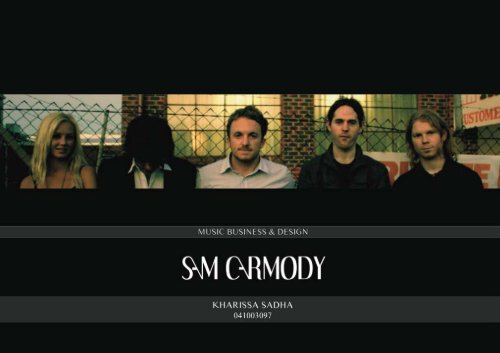
KHARISSA SADHA and SAM CARMODY - Brendan Hibbert Design
KHARISSA SADHA and SAM CARMODY - Brendan Hibbert Design
KHARISSA SADHA and SAM CARMODY - Brendan Hibbert Design

Create successful ePaper yourself
Turn your PDF publications into a flip-book with our unique Google optimized e-Paper software.
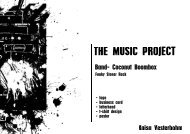
THE BAND<br />
Genre: Alternative/ Indie.<br />
Target Market: Young Triple J listeners (18-24 years<br />
old). Aim to exp<strong>and</strong> into reginonal areas as well<br />
as wineries <strong>and</strong> older more intelligent listeners.<br />
Has a very folk <strong>and</strong><br />
surfing feel to the b<strong>and</strong>.<br />
Manager: Mark Neal
FIRST MEETING & EMAIL<br />
“Music: Mellow-sitback music.<br />
Theme: Maritime - but want to steer clear of the Josh Pyke <strong>and</strong> Bob Evans comparissons.<br />
Colour: Dull - Navy & other maritime colours.<br />
Simple is better. a symbol could be cool, but it would have to fit with the music <strong>and</strong> i we have no<br />
idea what to go for. i have attached a song for you to listen to. maybe it can inspire ideas.<br />
Could you do a poster for the single launch; dates are<br />
Wed April 13 - Solo appearance at The Moon, Northbridge<br />
Sat April 16 - SINGLE RELEASE at the Indi Bar, Scarborough. with special guests Minute 36 <strong>and</strong> The Deep<br />
River Collective<br />
Sat April 30 - The White Star Hotel, Albany<br />
Sun May 1 - Calamari’s, Albany<br />
There may be other dates added. could you also do a poster with just the Sat April 30, can be same design<br />
We also need some posters for the EP launch in June. EP is called “Eyes Under A Gun”<br />
Cheers<br />
Image draws similarities to Paul Dempsey, Oh Mercy <strong>and</strong> The National.
WHAT THEY’VE GOT..
SKETCHES
LOGO<br />
DEVELOPMENT<br />
LOGO DEVELOPMENT
FIRST DESIGN
Hi Kharissa, heres what Sam had to say.<br />
“I guess a general comment would be that the art maybe feels a little too<br />
‘Josh Pyke’ or Bob Evans or something. It has a kind of mellow, sea-faring,<br />
friendly-songman vibe to it. These probably aren’t incorrect assessments<br />
of what I’m doing, but I would hope that my music is a little more complex <strong>and</strong><br />
moody than that at times, <strong>and</strong> I would love for that to be reflected in the artwork.<br />
The first one I thought was cool if maybe a little too ‘tricked-up’ with the<br />
photo. I reckon you could almost lose the photo altogether <strong>and</strong> keep the thing<br />
clean <strong>and</strong> crisp. I didn’t mind the design of the font but I would like to see<br />
maybe another version. I’ve pasted the Oh Mercy typeface below as an idea<br />
of other font types that I like. “<br />
We need a single cover done. do you think you could do up a draft for us. we really<br />
like your work <strong>and</strong> out of the others yours was our favourite. if you could<br />
work on that, we would appreciatte it.<br />
Cheers<br />
Mark
PHOTOGRAPHS<br />
I decided to go to the beach <strong>and</strong> took some photos for inspiration..
LOGO DEVELOPMENT &<br />
POSTER DESIGN<br />
I refine the logo using similar font as the ‘OH<br />
MERCY’that Mark sent to me before <strong>and</strong> started developing<br />
a new idea for the single launch poster.
POSTER DESIGN<br />
THUMBNAILS
POSTER DESIGN<br />
THUMBNAILS
BUSINESS CARD<br />
DESIGN THUMBNAILS
SINGLE COVER<br />
DESIGN<br />
THUMBNAILS
LOGO<br />
FINAL DESIGN
SINGLE LAUNCH<br />
POSTER FINAL DESIGN
BUSINESS CARD<br />
FINAL DESIGN
SINGLE COVER<br />
FINAL DESIGN
THANK YOU<br />
<strong>KHARISSA</strong> <strong>SADHA</strong><br />
E: kharissasadha@yahoo.com<br />
M: 0422789211