Spacing Letterforms - Julian Bittiner
Spacing Letterforms - Julian Bittiner
Spacing Letterforms - Julian Bittiner

You also want an ePaper? Increase the reach of your titles
YUMPU automatically turns print PDFs into web optimized ePapers that Google loves.
spacing letterforms<br />
Assignment 1B<br />
Introduction to letterforms<br />
The successful spacing of letters is a combination of learned optical judgement<br />
(‘developing an eye’) and logical systematization. However the ‘eye’ should<br />
always be the final arbiter.<br />
Carefully space the letters and words provided on the work sheet in the order<br />
indicated below using Walter Tracy’s methodology as a guide:<br />
letters with a straight upright stroke:<br />
BDEFHIJKLMNPRU bdhijklmnpqru<br />
letters with a round stroke:<br />
CDGOPQ bcdeopq<br />
triangular letters:<br />
AVWXY vwxy<br />
the odd ones:<br />
STZ afgstz<br />
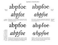
For spacing serif lowercase letters, use the n as a basis. Measure the width<br />
between the two vertical strokes, then assign half that width as the space on<br />
the left side of the letter, and slightly less on the right side (to account for<br />
the arched corner that adds space). Set four ns with this spacing so that the<br />
distance between all the vertical strokes is even ( nnnn ). Adjust as necesary,<br />
then assign these spaces to the vertical strokes of the other letters per the<br />
table on the reverse (e.g. the left side of b, the right side of d, etc.).<br />
•<br />
Art 264 01<br />
Mon & Wed 3:30–5.20<br />
Green Hall, Room 210<br />
class wiki-page<br />
http://art.yale.edu/264F12<br />
instructor<br />
<strong>Julian</strong> <strong>Bittiner</strong><br />
julian.bittiner@yale.edu<br />
teacher’s assistant<br />
Jessica Svendsen<br />
jessica.svendsen@yale.edu<br />
Next tackle the o. Place two copies between two pairs of correctly spaced<br />
ns ( nonon ). Also test another combination ( nnoonn ). When the spacing<br />
looks even, subtract the space belonging to the n; the remainder is the correct<br />
spacing for the o. The rest of the letters can now be spaced relative to the n<br />
and the o.<br />
For spacing uppercase serifs, use the H and O as a basis and follow the same<br />
logic as above.<br />
(Note that the space between any letters should never be greater than the<br />
space inside the lowercase n or the capital H).<br />
Due: Wednesday, September 12<br />
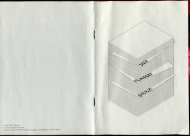
A View of<br />
Type Design<br />
Walter Tracy
Source: Walter Tracy, Letters of Credit (Boston: David R. Godine, 2003), 74–75.