Visual Merchandising - North Central Regional Center for Rural ...
Visual Merchandising - North Central Regional Center for Rural ...
Visual Merchandising - North Central Regional Center for Rural ...

You also want an ePaper? Increase the reach of your titles
YUMPU automatically turns print PDFs into web optimized ePapers that Google loves.
Combining color choice with traffic patterns can sell<br />
more items. The color a retailer wants featured should be<br />
positioned on the wall where it can be easily seen, drawing<br />
customers into a department or store. Other colors can<br />
fan out on either side and complement the feature color.<br />
Background colors should be selected which will show off<br />
the merchandise at its best. Generally, neutral colors<br />
selected are white, blue, gray, beige and black.<br />
27<br />
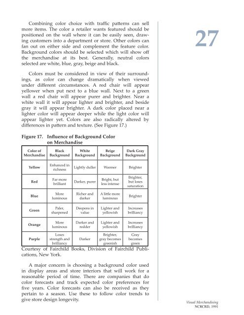
Colors must be considered in view of their surroundings,<br />
as color can change dramatically when viewed<br />
under different circumstances. A red chair will appear<br />
yellower when put next to a blue wall. Next to a green<br />
wall a red chair will appear purer and brighter. Near a<br />
white wall it will appear lighter and brighter, and beside<br />
gray it will appear brighter. A dark color placed near a<br />
lighter color will appear deeper while the light color will<br />
appear lighter yet. Colors are also radically altered by<br />
differences in pattern and texture. (See Figure 17.)<br />
Figure 17. Influence of Background Color<br />
on Merchandise<br />
Color of<br />
Merchandise<br />
Black<br />
Background<br />
White<br />
Background<br />
Beige<br />
Background<br />
Dark Gray<br />
Background<br />
Yellow<br />
Enhanced in<br />
richness<br />
Lightly duller Warmer Brighter<br />
Red<br />
Far more<br />
brilliant<br />
Darker, purer<br />
Bright, but<br />
less intense<br />
Brighter,<br />
but loses<br />
saturation<br />
Blue<br />
More<br />
luminous<br />
Richer and<br />
darker<br />
A little more<br />
luminous<br />
Brighter<br />
Green<br />
Paler,<br />
sharpened<br />
Deepens in<br />
value<br />
Lighter and<br />
yellowish<br />
Increases<br />
brilliancy<br />
Orange<br />
More<br />
luminous<br />
Darker and<br />
redder<br />
Lighter and<br />
yellowish<br />
Increases<br />
brilliancy<br />
Purple<br />
Loses<br />
strength and<br />
brilliancy<br />
Darker<br />
Brighter,<br />
gray becomes<br />
greenish<br />
Gray<br />
becomes<br />
green<br />
Courtesy of Fairchild Books, Division of Fairchild Publications,<br />
New York.<br />
A major concern is choosing a background color used<br />
in display areas and store interiors that will work <strong>for</strong> a<br />
reasonable period of time. There are companies that do<br />
color <strong>for</strong>ecasts and track expected color preferences <strong>for</strong><br />
five years. Color <strong>for</strong>ecasts can also be received as they<br />
pertain to a season. Use these to follow color trends to<br />
give store design longevity.<br />
<strong>Visual</strong> <strong>Merchandising</strong><br />
NCRCRD, 1991