COA Branding Guidelines - College of the Atlantic
COA Branding Guidelines - College of the Atlantic
COA Branding Guidelines - College of the Atlantic

You also want an ePaper? Increase the reach of your titles
YUMPU automatically turns print PDFs into web optimized ePapers that Google loves.
<strong>COA</strong> Logo<br />
Use<br />
All <strong>College</strong> <strong>of</strong> <strong>the</strong> <strong>Atlantic</strong> printed and digital materials intended for external use, or that may be passed<br />
externally from <strong>the</strong> college, must use <strong>the</strong> <strong>COA</strong> logo.<br />
• The logo should be displayed in a prominent location, but can be a secondary element.<br />
• Use high-resolution, legible digital artwork <strong>of</strong> <strong>the</strong> logo.<br />
• When a logo is reduced or enlarged, <strong>the</strong> proportion <strong>of</strong> all <strong>the</strong> elements in <strong>the</strong> logo must remain <strong>the</strong> same.<br />
Elements<br />
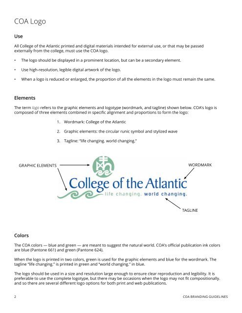
The term logo refers to <strong>the</strong> graphic elements and logotype (wordmark, and tagline) shown below. <strong>COA</strong>’s logo is<br />
composed <strong>of</strong> three elements combined in specific alignment and proportions to form <strong>the</strong> logo:<br />
1. Wordmark: <strong>College</strong> <strong>of</strong> <strong>the</strong> <strong>Atlantic</strong><br />
2. Graphic elements: <strong>the</strong> circular runic symbol and stylized wave<br />
3. Tagline: “life changing. world changing.”<br />
GRAPHIC ELEMENTS<br />
WORDMARK<br />
TAGLINE<br />
Colors<br />
The <strong>COA</strong> colors — blue and green — are meant to suggest <strong>the</strong> natural world. <strong>COA</strong>’s <strong>of</strong>ficial publication ink colors<br />
are blue (Pantone 661) and green (Pantone 624).<br />
When <strong>the</strong> logo is printed in two colors, green is used for <strong>the</strong> graphic elements and blue for <strong>the</strong> wordmark. The<br />
tagline “life changing.” is printed in green and “world changing.” in blue.<br />
The logo should be used in a size and resolution large enough to ensure clear reproduction and legibility. It is<br />
preferable to use <strong>the</strong> complete logotype, but <strong>the</strong>re may be occasions when <strong>the</strong> logo may not fit compositionally.<br />
and so <strong>the</strong>re are several different logo options for both print and web publications.<br />
2 <strong>COA</strong> BRANDING GUIDELINES