

Towards-Effective-Decision-Making-Through-Data-Visualization-Six-World-Class-Enterprises-Show-The-Way
Towards-Effective-Decision-Making-Through-Data-Visualization-Six-World-Class-Enterprises-Show-The-Way
Towards-Effective-Decision-Making-Through-Data-Visualization-Six-World-Class-Enterprises-Show-The-Way

You also want an ePaper? Increase the reach of your titles
YUMPU automatically turns print PDFs into web optimized ePapers that Google loves.
<strong>Towards</strong> <strong>Effective</strong> <strong>Decision</strong>-<strong>Making</strong> <strong>Through</strong> <strong>Data</strong> <strong>Visualization</strong>: <strong>Six</strong> <strong>World</strong>-<strong>Class</strong> <strong>Enterprises</strong> <strong>Show</strong> <strong>The</strong> <strong>Way</strong><br />
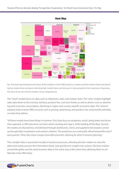
Fig: <strong>The</strong> heat map simultaneously shows all the markets in which P&G products compete and their relative share (red indicating<br />
low market share and green indicating high market share), and also puts in clear perspective the importance of growing<br />
the share of any one of those markets. Source: blogs.hbr.org<br />
<strong>The</strong> “what” models focus on data such as shipments, sales, and market share. <strong>The</strong> “why” models highlight<br />
sales data down to the country, territory, product line, and store levels, as well as drivers such as advertising<br />
and consumer consumption, factoring in region and country-specific economic data. <strong>The</strong> “actions”<br />
analyses look at levers P&G can pull, such as pricing, advertising, and product mix, and provide estimates<br />
on what they deliver.<br />
“All these models have three things in common. First, they focus on exceptions, what’s doing better and worse<br />
than expected, so P&G executives can learn what’s working and copy it, while heading off the flops. Second,<br />
the models are all predictive, and delivered through dashboards, charts, and supplemental analytics served<br />
up through data visualization and analysis software. <strong>The</strong> predictions are continually refined toward the end of<br />
each quarter. Third, they show a range of possible outcomes, allowing for what-if scenario planning.”<br />
This complex data is presented visually in business processes, allowing decision makers to view the<br />
data more easily, process the information faster, and quickly turn insights into actions. <strong>Decision</strong> makers<br />
around the globe see the same business data in the same way at the same time, allowing them to collaborate<br />
more effectively.<br />
FusionCharts 12