

Towards-Effective-Decision-Making-Through-Data-Visualization-Six-World-Class-Enterprises-Show-The-Way
Towards-Effective-Decision-Making-Through-Data-Visualization-Six-World-Class-Enterprises-Show-The-Way
Towards-Effective-Decision-Making-Through-Data-Visualization-Six-World-Class-Enterprises-Show-The-Way

You also want an ePaper? Increase the reach of your titles
YUMPU automatically turns print PDFs into web optimized ePapers that Google loves.
<strong>Towards</strong> <strong>Effective</strong> <strong>Decision</strong>-<strong>Making</strong> <strong>Through</strong> <strong>Data</strong> <strong>Visualization</strong>: <strong>Six</strong> <strong>World</strong>-<strong>Class</strong> <strong>Enterprises</strong> <strong>Show</strong> <strong>The</strong> <strong>Way</strong><br />
Ambrose presents a global view of all the MapReduce jobs derived from workflows after planning and<br />
optimization. As jobs are submitted for execution on the Hadoop cluster, Ambrose updates its visualization<br />
to reflect the latest job status.<br />
Ambrose provides the following in a web UI:<br />
A workflow progress bar depicting percent completion of the entire workflow<br />
A table view of all workflow jobs, along with their current state<br />
A graph diagram which depicts job dependencies and metrics<br />
a) Visual weighting of jobs based on resource consumption<br />
b) Visual weighting of job dependencies based on data volume<br />
Script view with line highlighting<br />
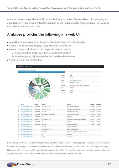
Fig: In this screenshot, we see the Ambrose UI for a workflow compiled from a single Pig script. <strong>The</strong> circular chord diagram in<br />
the upper left highlights dependencies between jobs. As a job’s status changes, the color of its arc in the diagram changes.<br />
Statistics for the job most recently started are displayed to the right of the chord diagram. Summary information and status of<br />
all jobs is displayed in the table beneath these two views. Image Source: blog.twitter.com<br />
FusionCharts 22