

responsive-and-fast-implementing-high-performance-responsive-design
responsive-and-fast-implementing-high-performance-responsive-design
responsive-and-fast-implementing-high-performance-responsive-design

You also want an ePaper? Increase the reach of your titles
YUMPU automatically turns print PDFs into web optimized ePapers that Google loves.
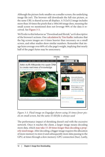
Although the picture looks smaller on a smaller screen, the underlying<br />
image file isn’t. The browser still downloads the full-size picture, as<br />
the same URL is shared across all displays. A 512x512 image includes<br />
more than 10 times the pixels that a 160x160 image does, meaning the<br />
small screen we mentioned does not leverage 90% of the data it received.<br />
See Figure 3-3.<br />
We’ll refer to this behavior as “Download <strong>and</strong> Shrink,” as it’s descriptive<br />
of the browser’s actions. One calculation by Tim Kadlec indicates that<br />
the big screen images are 4 times heavier than necessary on a small<br />
screen, <strong>and</strong> other studies show similar numbers. Remember that image<br />
bytes average over 60% of a the page’s weight, implying that nearly<br />
half of the page’s bytes may be unncessary.<br />
Figure 3-3. Fluid image on Engadget shown using 35 times fewer pixels<br />
on small screen, but the same 55 KB file is always used<br />
The <strong>performance</strong> impact of shrinking doesn’t end with the excessive<br />
network. Once it reaches the client, a larger image means decoding<br />
more data, which may take 15-20 times longer than decoding a properly<br />
sized image. After decoding, a bigger image requires the allocation<br />
of more memory to store it <strong>and</strong> subsequently more data passing to the<br />
GPU, at times through a slow memory-GPU connection (bus). Lastly,<br />
12 | Chapter 3: Image Over-Downloading
 Change language