

responsive-and-fast-implementing-high-performance-responsive-design
responsive-and-fast-implementing-high-performance-responsive-design
responsive-and-fast-implementing-high-performance-responsive-design

You also want an ePaper? Increase the reach of your titles
YUMPU automatically turns print PDFs into web optimized ePapers that Google loves.
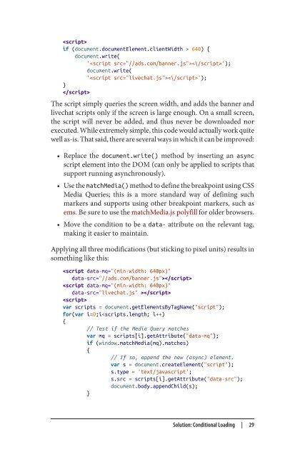
if (document.documentElement.clientWidth > 640) {<br />
document.write(<br />
'');<br />
document.write(<br />
'');<br />
}<br />
<br />
The script simply queries the screen width, <strong>and</strong> adds the banner <strong>and</strong><br />
livechat scripts only if the screen is large enough. On a small screen,<br />
the script will never be added, <strong>and</strong> thus never be downloaded nor<br />
executed. While extremely simple, this code would actually work quite<br />
well as-is. That said, there are several ways in which it can be improved:<br />
• Replace the document.write() method by inserting an async<br />
script element into the DOM (can only be applied to scripts that<br />
support running asynchronously).<br />
• Use the matchMedia() method to define the breakpoint using CSS<br />
Media Queries; this is a more st<strong>and</strong>ard way of defining such<br />
markers <strong>and</strong> supports using other breakpoint markers, such as<br />
ems. Be sure to use the matchMedia.js polyfill for older browsers.<br />
• Move the condition to be a data- attribute on the relevant tag,<br />
making it easier to maintain.<br />
Applying all three modifications (but sticking to pixel units) results in<br />
something like this:<br />
<br />
<br />
<br />
var scripts = document.getElementsByTagName("script");<br />
for(var i=0;i
 Change language