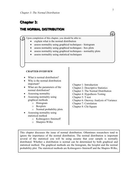
CHAPTER 3: THE NORMAL DISTRIBUTION
CHAPTER 3: THE NORMAL DISTRIBUTION
CHAPTER 3: THE NORMAL DISTRIBUTION

You also want an ePaper? Increase the reach of your titles
YUMPU automatically turns print PDFs into web optimized ePapers that Google loves.
Chapter 3: The Normal Distribution<br />
1<br />
Chaptter 3::<br />
<strong>THE</strong> <strong>NORMAL</strong> DIISTRIIBUTIION<br />
Upon completion of this chapter, you should be able to:<br />
explain what is the normal distribution<br />
assess normality using graphical techniques - histogram<br />
assess normality using graphical techniques - box plots<br />
assess normality using graphical techniques - normality plots<br />
assess normality using statistical techniques<br />
<strong>CHAPTER</strong> OVERVIEW<br />
<br />
<br />
<br />
<br />
<br />
<br />
What is normal distribution<br />
Why is the normal distribution<br />
important<br />
What are the parameters of the<br />
normal distribution<br />
Assessing normality<br />
Assessing normality using<br />
graphical methods<br />
o Histogram<br />
o Boxplots<br />
o Normal probability plots<br />
Assessing normality using<br />
statistical method<br />
o Kolmogorov-Smirnoff<br />
o Sharpiro-Wilks<br />
Chapter 1: Introduction<br />
Chapter 2: Descriptive Statistics<br />
Chapter 3: The Normal Distribution<br />
Chapter 4: Hypothesis Testing<br />
Chapter 5: T-test<br />
Chapter 6: Oneway Analysis of Variance<br />
Chapter 7: Correlation<br />
Chapter 8: Chi-Square<br />
This chapter discusses the issue of normal distribution. Oftentimes researchers tend to<br />
ignore the importance of the normal distribution. The normal distribution is important<br />
several of the statistical you will be using assume that your sample is normally<br />
distributed. Whether a distribution is normal can be determined by both graphical and<br />
statistical method. The graphical methods are the histogram, the boxplot and the normal<br />
probability plot. The statistical methods are Kolmogorov-Smirnoff and the Shapiro-Wilks,
Chapter 3: The Normal Distribution<br />
2<br />
WHAT IS <strong>THE</strong> <strong>NORMAL</strong> <strong>DISTRIBUTION</strong><br />
Now that you know what is the mean and standard deviation of a set of scores,<br />
we can examine the concept of a normal distribution. The normal curve was<br />
developed mathematically in 1733 by DeMoivre as an appropximation to the binomial<br />
distribution. Laplace used the normal curve in 1783 to describe the distribution of<br />
errors. However, it was Gauss who popularised the normal curve when he used it to<br />
analyse astronomical data in 1809 and it became known as the Gaussian distribution.<br />
The term normal distribution refers to a particular way in which scores or<br />
observations will tend to pile up or distribute around a particular value rather than be<br />
scattered all over. The normal distribution which is bell-shaped is based on a<br />
mathematical equation (which we will not get into!).<br />
While some argue that in the real world, scores or observations are seldom<br />
normally distributed, others argue that in the general population, many variables such<br />
as height, weight, IQ scores, reading ability, job satisfaction, blood pressure turn out<br />
to have distributions that are bell-shaped or normal.<br />
WHY IS <strong>THE</strong> <strong>NORMAL</strong> <strong>DISTRIBUTION</strong> IMPORTANT<br />
The normal distribution is important for the following reasons:<br />
Many physical, biological and social phenomena or variables are normally<br />
distributed. However, some variables are only approximately normally<br />
distributed.<br />
Many kinds of statistical tests (such as the t-test, ANOVA) are derived from a<br />
normal distribution. In other words, most of these statistical tests argue that<br />
they work best when the sample tested is distributed normally.<br />
FORTUNATELY, these statistical tests work very well even if the distribution is<br />
only approximately normally distributed. Some tests work well even with very wide<br />
deviations from normality. They are described as 'robust' tests that are able to tolerate<br />
the lack of a normal distribution.<br />
WHAT ARE <strong>THE</strong> PARAMETERS OF <strong>THE</strong> <strong>NORMAL</strong> CURVE<br />
A normal distribution (or normal curve) is completely determined by the mean and<br />
standard deviation. i.e. two normally distributed variables having the same mean and<br />
standard deviation must have the same distribution. We often identify a normal curve<br />
by stating the corresponding mean and standard deviation and calling those the<br />
parameters of the normal curve.<br />
A normal distribution is symmetric and centred at the mean of the variable,<br />
and its spread depends on the standard deviation of the variable. The larger the<br />
standard deviation, the flatter and more spread out is the distribution.
Chapter 3: The Normal Distribution<br />
3<br />
A) ILLUSTRATION OF <strong>THE</strong> <strong>NORMAL</strong> <strong>DISTRIBUTION</strong> OR <strong>THE</strong><br />
<strong>NORMAL</strong> CURVE<br />
55 70 85 100 115 130 145<br />
Figure 3.1 Graph showing a normal distribution of IQ scores among<br />
adolescents<br />
See Figure 3.1 which is a graph showing a normal distribution of IQ scores among a<br />
sample of adolescents.<br />
Mean is 100<br />
Standard Deviation is 15.<br />
As you can see, the distribution is symmetric. If you folded the graph in the centre,<br />
the two sides would match, i.e. they are identical.<br />
B) MEAN. MODE AND MEDIAN and <strong>THE</strong> <strong>NORMAL</strong> CURVE<br />
The centre of the distribution is the mean. The mean of a normal distribution is<br />
also the most frequently occurring value (i.e. the mode), and it is also the value that<br />
divides the distribution of scores into two equal parts (i.e. the median). In any normal<br />
distribution, the mean, median and the mode all have the same value (i.e. 100 in the<br />
example above).
Chapter 3: The Normal Distribution<br />
4<br />
C) <strong>THE</strong> THREE-STANDARD-DEVIATIONS RULE<br />
The normal distribution shows the area under the curve. The Three-standarddeviations<br />
rule, when applied to a variable states that almost all the possible<br />
observations or scores of the variable lie within three standard deviations to either<br />
side of the mean. The normal curve is close to (but does not touch) the horizontal axis<br />
outside the range of the three standard deviations to either side of the mean. Based on<br />
the graph above, you will notice that with a mean of 100 and a standard deviation of<br />
15;<br />
68% of all IQ scores fall between 85 (i.e. one standard deviation less then the<br />
mean which is 100 - 15 = 85) and 115. (i.e. one standard deviation more than<br />
the mean which is 100 + 15 = 115).<br />
95% of all IQ scores fall between 70 (i.e. two standard deviations less then the<br />
mean which is 100 - 30 = 70) and 130. (i.e. two standard deviations more than<br />
the mean which is 100 + 30 = 130.<br />
99% of all IQ scores fall between 55 (i.e. three standard deviations less then<br />
the mean which is 100 - 45 = 55) and 145. (i.e. three standard deviations more<br />
than the mean which is 100 + 45 = 145.<br />
A normal distribution can have any mean and standard deviation. But the percentage<br />
of cases or individuals falling within one, two or three standard deviations from the<br />
mean is always the same. The shape of a normal distribution does not change. Means<br />
and standard deviations will differ from variable to variable. But the percentage of<br />
cases or individuals falling within specific intervals is always the same in a true<br />
normal distribution.<br />
LEARNING ACTIVITY<br />
1. Precisely what is meant by the statement that a<br />
population is normally distributed<br />
2. Two normally distributed variables have the same<br />
means and the same standard deviations. What can<br />
you say about their distributions Explain your<br />
answer.<br />
3. Which normal distribution has a wider spread: the<br />
one with mean 1 and standard deviation 2 or the<br />
one with mean 2 and standard deviation 1 Explain<br />
you answer.<br />
4. The mean of a normal distribution has no effect on<br />
its shape. Explain.<br />
5. What are the parameters for a normal curve
Chapter 3: The Normal Distribution<br />
5<br />
D) INFERENTIAL STATISTICS AND <strong>NORMAL</strong>ITY<br />
Often in statistics one would like to assume that the sample under<br />
investigation has a normal distribution or an approximate normal distribution.<br />
However, such an assumption should be supported in some way some technique. As<br />
mentioned earlier, the use of several inferential statistics such as the t-test and<br />
ANOVA require that the distribution of the variables analysed are normally<br />
distributed or at least approximately normally distributed. However, as discussed in<br />
Chapter 1, if a simple random sample is taken from a population, the distribution of<br />
the observed values of a variable in the sample will approximate the distribution of<br />
the population. Generally, the larger the sample, the better the approximation tends to<br />
be. In other words, if the population is normally distributed, the sample of observed<br />
values would also be normally distributed if the sample is randomly selected and it is<br />
large enough.<br />
ASSESSING <strong>NORMAL</strong>ITY<br />
Assessing normality means determining whether the sample of students,<br />
teachers, parents or principals you are studying are normally distributed. When you<br />
draw a sample from a population that is normally distributed, it does not mean that<br />
your sample will necessarily have a distribution that is exactly normal. Samples vary,<br />
so the distribution of each sample may also vary. However, if a sample is reasonably<br />
large and it comes froma normal population, its distribution should look more or less<br />
normal.<br />
For example, when you administer a questionnaire to a group of school<br />
principals, you want to be sure that your sample of 250 principals is normally<br />
distributed. WHY The assumption of normality is a prerequisite for many inferential<br />
statistical techniques and there are two main ways of determining the normality of<br />
distribution.<br />
a) Using graphical methods (such as histograms, stem-and-lead plots and<br />
boxplots)<br />
b) Using statistical procedures.(such as the Kolmogorov-Smirnov<br />
statistic and the Shapiro-Wilks statistics)
Chapter 3: The Normal Distribution<br />
6<br />
SPSS Procedures for Assessing Normality:<br />
There are several procedures to obtain the different graphs and statistics to assess<br />
normality, But the EXPLORE procedure is the most convenient when both graphs<br />
and statistics are required.<br />
Select the Analyse menu<br />
Click on Descriptive Statistics and then Explore ....to open the Explore dialogue<br />
box<br />
Select the variable you require and click on the button to move this variable into<br />
the Dependent List: box<br />
Click on the Plots...command pushbutton to obtain the Explore: Plots sub dialogue<br />
box<br />
Click on the Histogram check box and the Normality plots with tests check box,<br />
and ensure that the Factor levels together radio button is selected in the Boxplots<br />
display<br />
Click on Continue<br />
In the Display box, ensure that Both is activated<br />
Click on the Options...command pushbutton to open the Explore: Options subdialogue<br />
box<br />
In the Missing Values box, click on the Exclude cases pairwise (if not selected by<br />
default)<br />
Click on Continue and then OK.<br />
ASSESSING <strong>NORMAL</strong>ITY USING GRAPHICAL METHOD<br />
A) The HISTOGRAM<br />
<br />
<br />
<br />
See Figure the Graph which is a histogram showing the distribution of<br />
scores obtained on a Scientific Literacy Test administered to a sample of<br />
students.<br />
The values on the vertical axis indicate the frequency or number of cases.<br />
The values on the horizontal axis are midpoints of value ranges. For<br />
example, the first bar is 20 and the second bar is 30, indicating that each<br />
bar covers a range of 10.<br />
Superimposed on the histogram is the normal curve. Simply looking at the<br />
bars indicates that the distribution has the rough shape of a normal<br />
distribution. The superimposed curve, however shows that there are some<br />
deviations. The question is whether this deviation is small enough to say<br />
that the distribution is approximately normal.
Chapter 3: The Normal Distribution<br />
7<br />
50<br />
Frequency<br />
60<br />
50<br />
40<br />
30<br />
20 30 40 50 60 70 80 90 100<br />
Figure 3.2 Graph showing the distribution of scores on Scientific Literacy among<br />
a group of students<br />
a) Some Key Characteristics of Distribution Using the Histogram<br />
(i) Skewness<br />
Skewness is the degree of departure from symmetry of a distribution. A normal<br />
distribution is symmetrical. A non-symmetrical distribution is described as being<br />
either negatively or positively skewed. A distribution is skewed if one of its tail is<br />
longer than the other or the tail pulled to either the left or right.<br />
Skewness 1.5<br />
Figure 3.3 Graph<br />
showing a positive skew
Chapter 3: The Normal Distribution<br />
8<br />
Refer to Figure 3.3 which shows the distribution of the scores obtained by students on<br />
a test. There is a positive skew because it has a longer tail in the positive direction or<br />
the long tail is on the right side (towards the high values on the horizontal axis).<br />
What does it mean It means that more students were getting low scores in the<br />
test which indicates that the test was too difficult. Alternatively, it could mean that the<br />
questions were not clear or the teaching methods and materials did not bring about the<br />
desired learning outcomes.<br />
Skewness - 1.5<br />
Figure 3.4 Graph<br />
showing a negative skew<br />
Refer to Figure 3.4 which shows the distribution of the scores obtained by students on<br />
a test. There is a negative skew because it has a longer tail in the negative direction<br />
or to the left (towards the lower values on the horizontal axis).<br />
What does it mean It means that more students were getting high scores on<br />
the test which may indicate that either the test was too easy or the teaching methods<br />
and materials were successful in bringing about the desired learning outcomes.<br />
(ii) Interpreting the Statistics for Skewness<br />
Besides graphical methods, you can also determine skewness by examining<br />
the statistics reported. A normal distribution has a skewness of 0. See the Table 3.1<br />
which reports the skewness statistics for three independent groups. A positive value<br />
indicated a positive skew while a negative value reflects a negative skew.<br />
Among the three groups, Group 3 is not as normally distributed compared to<br />
the other two groups. Its skewness value of -1.200 which is greater than 1<br />
which indicates that the distribution is non-symmetrical [Rule of thumb - > 1<br />
indicates a non-symmetrical distribution].<br />
The distribution of Group 2 with a skewness value of .235 is closer to being<br />
normal (i.e. 0) followed by Group 1 with a skewness value of .973.
Chapter 3: The Normal Distribution<br />
9<br />
SPSS Output:<br />
GROUP 1 Skewness .973<br />
GROUP 2 Skewness +.235<br />
GROUP 3 Skewness - 1.200<br />
Table 3.1 Skewness reported for three groups of students<br />
(iii) Kurtosis:<br />
Kurtosis indicates the degree of "flatness" or "peakedness" in a distribution relative to<br />
the shape of normal distribution.<br />
High kurtosis<br />
Low kurtosis<br />
Figure 3.5 Graphs showing high and low kurtosis<br />
Refer to Figure 3.5 which shows:<br />
Low Kurtosis: Data with low kurtosis tend to have a flat top near the mean rather<br />
than a sharp peak.<br />
High Kurtosis: Data with high kurtosis tend to have a distinct peak near the mean<br />
and a sharp decline rather rapidly with a heavy tail.
Chapter 3: The Normal Distribution<br />
10<br />
Figure 3.6 Names assigned to different types of kurtosis<br />
See Figure 3.6 which show the names assigned to different levels of kurtosis:<br />
A normal distribution has a kurtosis of 0 and is called mesokurtic (Graph A).<br />
[Strictly speaking a mesokurtic distribution has a value of 3 but in line with<br />
the practice used in SPSS packages, the adjusted version is 0].<br />
If a distribution is peaked (tall and skinny), its kurtosis value is greater than 0<br />
and it is said to be leptokurtic (Graph B) and has a positive kurtosis.<br />
<br />
If, on the other hand, the kurtosis is flat, its value is less than 0, or platykurtic<br />
(Graph C) and has a negative kurtosis.<br />
(iv) Interpreting the Statistics for Kurtosis<br />
Besides graphical methods, you can also determine skewness by examining the<br />
statistics reported. A normal distribution has a kurtosis of 0. See the Table 3.2 which<br />
reports the kurtosis statistics for three independent groups.
Chapter 3: The Normal Distribution<br />
11<br />
SPSS Output:<br />
GROUP 1 Kurtosis .500<br />
GROUP 2 Kurtosis -1.58<br />
GROUP 3 Kurtosis 1.65<br />
Table 3.2 Kurtosis reported for three groups of students<br />
<br />
<br />
<br />
Group 1 which a kurtosis value of 0.500 (positive value) is more normally<br />
distributed than the other two groups because it is closer to 0.<br />
Group 2 with a kurtosis value of -1.58 has a distribution that is more flattened<br />
and not as normally distributed compare to Group 1.<br />
Group 3 with a kurtosis value + 1.65 has a distribution that is more peaked and<br />
not as normally distributed compared to Group 1.<br />
B) The BOXPLOT<br />
The boxplot also provides information about the distribution of scores. Unlike<br />
the histogram which plots actual values, the boxplot summarises the distribution using<br />
the median, the 25th and 75th percentiles, and extreme scores in the distribution. See<br />
Figure 3.7 which shows a boxplot for the same set of data on scientific literacy<br />
discussed earlier. Note that the lower boundary of the box is the 25th percentile and<br />
the upper boundary is the 75th percentile.<br />
The BOX<br />
The box has hinges that form the outer boundaries of the box. The hinges are<br />
the scores that cut of the top and bottom 25% of the data. Thus, 50% of the scores fall<br />
within the hinges. The thick horizontal line through the box represents the median in<br />
the case of a normal distribution the line runs through the centre of the box.<br />
If the median is closer to the top of the box, then the distribution is negatively<br />
skewed. If it is closer to the bottom of the box, then it is positively skewed.<br />
Whiskers<br />
The smallest and largest observed values within the distribution are represented by the<br />
horizontal lines at either end of the box, commonly referred as whiskers.<br />
The two whiskers indicate the spread of the scores.
Chapter 3: The Normal Distribution<br />
12<br />
Hinges<br />
The largest observed<br />
value within the<br />
distribution is<br />
represented by the<br />
horizontal line at the end<br />
of the box, referred to as<br />
whisker.<br />
75 percentile<br />
‘wisker’<br />
MEDIAN<br />
25 percentile<br />
‘wisker’<br />
The median is presented<br />
by a horizontal line<br />
through the centre of the<br />
box<br />
Hinges<br />
The smallest observed value<br />
within the distribution is<br />
represented by the horizontal<br />
line at the end of the box,<br />
referred to as wisker.<br />
Figure 3.7 Boxplot showing the distribution of scores on Scientific Literacy<br />
among a group of students<br />
Scores that fall outside the upper and lower whiskers are classed as extreme<br />
scores or outliers. If the distribution has any extreme scores, i.e. 3 or more box lengths<br />
from the upper or lower hinge; these will be represented by a circle (o).<br />
Outliers tell us that we should see why it is so extreme. Could it be that you<br />
may have made an error in data entry.<br />
Why is it important to identify outliers This is because many of the<br />
statistical techniques used involve calculation of means. The mean is sensitive to<br />
extreme scores and it is important to be aware whether you data contain such extreme<br />
scores if you are to draw conclusions from the statistical analysis conducted.
Chapter 3: The Normal Distribution<br />
13<br />
C) The <strong>NORMAL</strong> PROBABILITY PLOT<br />
Besides the histogram and the box plot, another frequently used graphical<br />
technique of determining normality is the "Normal Probability Plot" or "Normal<br />
Q-Q Plot". The idea behind a normal probability plot is simple. It compares the<br />
observed values of the variable to the observations expected for a normally distributed<br />
variable. More precisely, a normal probability plot is a plot of the observed values of<br />
the variable versus the normal scores (the observations expected for a variable having<br />
the standard normal distribution).<br />
In a normal probability plot, each observed or value (score) obtained is paired<br />
with its theoretical normal distribution forming a linear pattern. If the sample is from<br />
a normal distribution, then the observed values or scores fall more or less in a straight<br />
line. The normal probability plot is formed by:<br />
Vertical axis: Expected normal values<br />
Horizontal axis: Observed values<br />
SPSS Procedures<br />
1. Select the Analyze menu.<br />
2. Click on Descriptive Statistics and then Explore .....to pen the Explore<br />
dialogue box<br />
3. Select the variable you require (i.e. mathematics score) and click on button to<br />
move this variable to the Dependent List: box<br />
4. Click on the Plots....command pushbutton to obtain the Explore: Plots<br />
subdialogue box<br />
5. Click on the Histogram check box and the Normality plots with tests check<br />
box and ensure that the Factor levels together radio button is selected in the<br />
Boxplots display<br />
6. Click on Continue<br />
7. In the Display box, ensure that Both is activated<br />
8. Click on the Options....command pushbutton to open the Explore: Options<br />
sub-dialogue box.<br />
9. In the Missing Values box, click on the Exclude cases pairwise radio button.<br />
If this option is not selected then, by default, any variable with missing data will<br />
be excluded from the analysis. That is, plots and statistics will generated only for<br />
cases with complete data.<br />
10.Click on Continue and then OK<br />
Note that these commands will give you the 'Histogram', 'Stem-and-leaf plots',<br />
'Boxplots' and Normality Plots.
Chapter 3: The Normal Distribution<br />
14<br />
Outlier<br />
Outlier<br />
Figure 3.8 Normal Probability Plot showing the distribution of scores on<br />
Scientific Literacy among a group of students<br />
Figure 3.8 Normal Probability Plot showing the distribution of scores on<br />
Scientific Literacy among a group of students<br />
When you use a normal probability plot to assess the normality of a variable, you<br />
must remember that the decision of whether the distribution is roughly linear and is<br />
normal is a subjective one. Figure 3.8 is an example of a normal probability plot.<br />
Though none of the value fall exactly on the line, most of the points are very close to<br />
the line.<br />
Value that are above the line represent units for which the observation is larger<br />
than its normal score.<br />
Value that are below the line represent units for which the observation is<br />
smaller than its normal score.
Chapter 3: The Normal Distribution<br />
15<br />
Note that there is one value that falls well outside the overall pattern of the plot. It is<br />
called an outlier and you will have to remove the outlier from the sample data and<br />
redraw the normal probability plot.<br />
Even with the outlier, the values are close to the line and you can conclude<br />
that the distribution will look like a bell-shaped curve. If the normal scores plot<br />
departs only slightly from having all of its dots on the line, then the distribution of the<br />
data departs only slightly from a bell-shaped curve. If one or more of the dots departs<br />
substantially from the line, then the distribution of the data is substantially different<br />
from a bell-shape.<br />
Outliers:<br />
Refer to the normal probability plot above. Note that there are possible outliers<br />
which are values lying off the hypothetical straight line.<br />
Outliers are anomalous values in the data which may be due to recording<br />
errors, which may be correctable, or they may be due to the sample not being entirely<br />
from the same population.
Chapter 3: The Normal Distribution<br />
16<br />
Skewness to the left:<br />
Refer to the normal probability plot above. Both ends of the normality plot fall below<br />
the straight line passing through the main body of the values of the probability plot,<br />
then the population distribution from which the data were sampled may be skewed to<br />
the left.<br />
Skewness to the right:<br />
If both ends of the normality plot bend above the straight line passing through the<br />
values of the probability plot, then the population distribution from which the data<br />
were sampled may be skewed to the right.
Chapter 3: The Normal Distribution<br />
17<br />
LEARNING ACTIVITY<br />
Refer to the output of a Normal Probability Plot above for<br />
the distribution of mathematics scores by eight students:<br />
a) Comment on the distribution of scores<br />
b) Would you consider the distribution normal<br />
c) Are there outliers<br />
ASSESSING <strong>NORMAL</strong>ITY USING STATISTICAL TECHNIQUES<br />
The graphical methods discussed present qualitative information about the<br />
distribution of data that may not be apparent from statistical tests. Histograms, box
Chapter 3: The Normal Distribution<br />
18<br />
plots and normal probability plots are graphical methods are useful for determining<br />
whether data follow a normal curve. Extreme deviations from normality are often<br />
readily identified from graphical methods. However, in many instances the decision is<br />
not straightforward. Using graphical methods to decide whether a data set is normally<br />
distributed involves making a subjective decision; formal test procedures are usually<br />
necessary to test the assumption of normality.<br />
In general, both statistical tests and graphical plots should be used to<br />
determine normality. However, the assumption of normality should not be rejected on<br />
the basis of a statistical test alone. In particular, when the sample is large, available,<br />
statistical tests for normality can be sensitive to very small (i.e., negligible) deviations<br />
in normality. Therefore, if the sample is very large, a statistical test may reject the<br />
assumption of normality when the data set, as shown using graphical methods, is<br />
essentially normal and the deviation from normality too small to be of practical<br />
significance.<br />
a) KOLMOGOROV-SMIRNOV TEST<br />
You could use the Kolmogorov-Smirnov statistic Z test evaluates statistically<br />
whether the difference between the observed distribution and a theoretical normal<br />
distribution is small enough to be just due to chance. If it could be due to chance you<br />
would treat the distribution as being normal. If the distribution between the actual<br />
distribution and the theoretical normal distribution is larger than is likely to be due to<br />
chance (sampling error) then you would treat the actual distribution as not being<br />
normal.<br />
In terms of hypothesis testing, the Kolmogorov-Smirnov test is based on Ho: that the<br />
data are normally distributed. The test is used for samples which have more than 50<br />
subjects.<br />
Ho: µ1 = µ2 OR Ha: µ1 ≠ µ2<br />
<br />
<br />
If the Kolmogorov-Smirnov Z test yields a significance level of less () than<br />
0.05, it means that the distribution is normal.<br />
Kolmogrorov-Smirnov (a)<br />
Statistic df Sig.<br />
SCORE .21 1598 .000*<br />
* This is lower bound of the true signifcance<br />
(a) Lilliefors Significance Correction
Chapter 3: The Normal Distribution<br />
19<br />
B) SHAPIRO - WILKS TEST<br />
Another powerful and most commonly employed tests for normality is the W<br />
test by Shapiro and Wilks, also called the Shapiro-Wilks test. It is an effective method<br />
for testing whether a data set has been drawn from a normal distribution.<br />
If the normal probability plot is approximately linear (the data follow a normal<br />
curve), the test statistic will be relatively high.<br />
If the normal probability plot has curvature that is evidence of non-normality<br />
in the tails of a distribution, the test statistic will be relatively low.<br />
In terms of hypothesis testing, the Shapiro-Wilks test is based on the hypothesis (Ho:)<br />
that the data are normally distributed. The test is used for samples which have less<br />
than 50 subjects.<br />
Ho: µ1 = µ2 OR Ha: µ1 ≠ µ2<br />
<br />
<br />
Reject the assumption of normality if the test of significance reports a p-value<br />
of less () than 0.05.<br />
SPSS Output<br />
Tests of Normality<br />
Shapiro-Wilks<br />
Independent variable group Statistic df Sig.<br />
Group 1 .912 22 .055<br />
Group 2 . .166 14 .442<br />
Group 3 .900 16 .084<br />
Table 3.3 showing the Shapiro-Wilks statistic for assessing normality<br />
See Table 3.3. The Shapiro-Wilks normality tests indicate that the scores are normally<br />
distributed in each of the three groups. All the p-values reported are more than 0.05<br />
and hence you DO NOT REJECT the null hypothesis.
Chapter 3: The Normal Distribution<br />
20<br />
NOTE:<br />
It should be noted that with large samples even a very small deviation from normality<br />
can yield low significance levels, so a judgement still has to made as to whether the<br />
departure from normality is large enough to matter.<br />
WHAT TO DO IF <strong>THE</strong> <strong>DISTRIBUTION</strong> IS NOT <strong>NORMAL</strong><br />
You have TWO choices if the distribution is not normal and they are:<br />
Use a Nonparametric Statistic Instead<br />
Transform the Variable to Make to Normal<br />
a) Use a Nonparametric Statistic<br />
In many cases, if the distribution is not normal an alternative statistic will be<br />
available, especially for bivariate analyses such as correlation or comparisons of<br />
means. These alternatives which do not require normal distributions are called<br />
nonparametric or distribution-free statistics. Some of these alternatives are shown<br />
below:<br />
Purpose of Parametric Non-Parametric<br />
Analysis Statistics Statistics<br />
---------------------------------------------------------------------------------<br />
Differences between<br />
- Mann-Whitney U test<br />
two independent t-test - Kolmogorov-Smirnov<br />
two means<br />
sample Z test<br />
Differences between t-test - Wilcoxon's matched<br />
two dependent means<br />
pairs test<br />
Differences between more Oneway - Kurskal-Wallis analysis<br />
than two means ANOVA of ranks<br />
Differences between more Repeated - Friedman's two-way<br />
than two means that is measures analysis of variance<br />
repeated ANOVA - Cochran Q test<br />
Relationship between Pearson r - Spearman Rho<br />
variables<br />
- Kendall's tau<br />
- Chi-square
Chapter 3: The Normal Distribution<br />
21<br />
b) Transform the Variable to Make it Normal<br />
The shape of a distribution can be changed by expressing it in different way<br />
statistically. This is referred to as transforming the distribution, Different types of<br />
transformations can be applied to "normalise" the distribution. The type of<br />
transformation selected depends on the manner to which the distribution departs from<br />
normality. [We will not discuss transformation in this course]<br />
Kolmogorov-Smirnov (a)<br />
Statistic df Sig.<br />
SCORE 0.57 999 .200*<br />
* This is lower bound of the true significance<br />
(a) Lilliefors Significance Correction<br />
LEARNING ACTIVITY<br />
Examine the SPSS output above and determine if the sample<br />
is normally distributed.<br />
-----0000------