Matplotlib Gallery Improvements
Matplotlib Gallery Improvements
Matplotlib Gallery Improvements
Create successful ePaper yourself
Turn your PDF publications into a flip-book with our unique Google optimized e-Paper software.
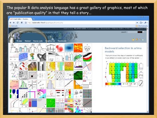
The popular R data analysis language has a great gallery of graphics, most of which<br />
are "publication quality" in that they tell a story...
The matplotlib gallery shows off beautiful graphics, but it has become a hodgepodge<br />
of "graphical element" examples mixed in with publication-quality ones....
Graphics like these show off matplotlib functionality but are supposed to be "quick<br />
hits", not full-featured examples...
Examples like these are "publication-quality" in that they<br />
Are visually dense with information<br />
Tell a story (axes labels, titles/subtitles, sensible tick labels, legends, etc)<br />
Give someone new to matplotlib a complete example to work from<br />
Both basic and complete examples are needed, but we should separate them out for<br />
easier navigation and education for new users...
Goal: Create second matplotlib<br />
gallery
Separate out the basic, "graphical element" examples in the<br />
current gallery and make that into a "building-blocks" gallery<br />
Gather current full-featured examples for a second,<br />
"publication quality" gallery<br />
Highlight the cool stuff you can do in Python and how<br />
beautiful it looks in matplotlib<br />
Provide more one-stop examples for new users to quickly<br />
see how to create the graphics they need<br />
Call to Action: Get more publication quality graphics from the<br />
community (you)<br />
1. Find one great graphic you've made<br />
2. Make it a stand-alone example<br />
Mock up or hard code data<br />
Add comments<br />
3. Contact me, I'll try and figure out how to organize<br />
josh.hemann@roguewave.com


