Light Italic - Fontblog
Light Italic - Fontblog
Light Italic - Fontblog
Create successful ePaper yourself
Turn your PDF publications into a flip-book with our unique Google optimized e-Paper software.
hy<br />
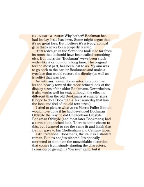
One might wonder: Why bother Bookman has<br />
had its day. It’s a has-been. Some might argue that<br />
it’s no great loss. But I believe it’s a typographical<br />
gem that’s never been properly revived.<br />
ITC’s redesign in the Seventies took it so far from<br />
its roots that it should have been called something<br />
else. But that’s the “Bookman” we’ve been stuck<br />
with—like it or not—for a long time. The original,<br />
for the most part, has been lost to us. My aim was<br />
to go back to the earlier Bookmans and make a<br />
typeface that would restore the dignity (as well as<br />
frivolity) that was lost.<br />
As with any revival, it’s an interpretation. I’ve<br />
leaned heavily toward the more refined look of the<br />
display sizes of the older Bookmans. Nevertheless,<br />
it also works well for text, although the effect is<br />
different than the old Bookmans at smaller sizes.<br />
(I hope to do a Bookmania Text someday that has<br />
the look and feel of the old text sizes.)<br />
I tried to picture what ATF’s Morris Fuller Benton<br />
would have done if he had developed Bookman<br />
Oldstyle the way he did Cheltenham Oldstyle.<br />
Bookman Oldstyle (and most later Bookmans) had<br />
a certain unpolished look. There is some charm to<br />
this, but I wanted to see the same fit and finish that<br />
Benton gave to his Cheltenham and Century faces.<br />
Like traditional Bookmans, the italic is a slanted<br />
roman. But it’s not just slanted. It’s optically<br />
corrected to eliminate the unavoidable distortion<br />
that comes from simply slanting the characters.<br />
I considered giving it a “cursive” italic, but it<br />
wouldn’t look like Bookman if I did, so I kept the<br />
slanted roman. It does have the advantage of being<br />
easier to read than cursive italics.<br />
What would a Bookman revival be without the<br />
swashes I looked at all the different ones that<br />
were added over the years and decided to do an<br />
anthology of the best. I added a few of my own<br />
ideas, but tried to keep them as much in the spirit<br />
of Bookman swashes as I could.<br />
One thing that has been lacking in previous<br />
Bookmans is typographic “niceties.” With this in<br />
mind, I added small caps, old style figures, tabular<br />
and proportional figures, swash ligatures, and—<br />
why not—swash small caps.<br />
The range of weights in the earlier Bookmans<br />
varied a lot. The earliest ones had just a “regular”<br />
weight. Sometimes a boldface was added. Some in<br />
the film font era had more weights. The ITC version<br />
had four. Bookmania is similarly weighted, but with<br />
one more on the light end for a total of five weights:<br />
<strong>Light</strong>, Regular, Semibold, Bold, and Black.<br />
Some characters differ between roman and<br />
italic: g, g, &, &, $, $. I’ve included the counterpart<br />
variation as an option in each style. There are also<br />
a few lowercase alternates to give Bookmania<br />
a more contemporary-looking italic. Finally,<br />
I added coMMoNcAsE cAps, which are seen<br />
in some type revivals in the Sixties, inspired by<br />
Bradbury Thompson’s AlphAbEt 26.<br />
All features (even the swashes) are included in<br />
all weights and styles.


