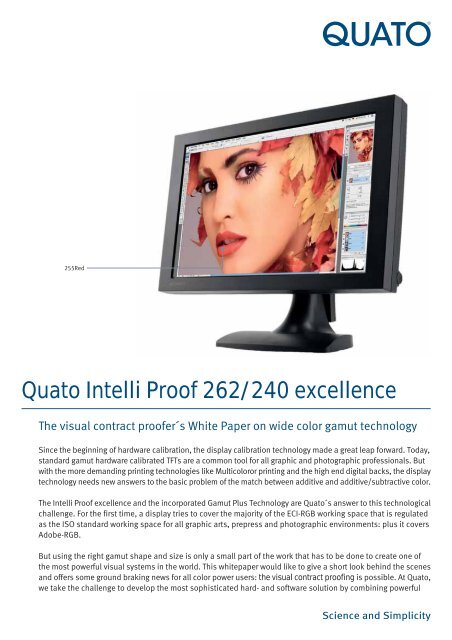
Quato Intelli Proof 262/240 excellence - La Tienda del CAD
Quato Intelli Proof 262/240 excellence - La Tienda del CAD
Quato Intelli Proof 262/240 excellence - La Tienda del CAD

Create successful ePaper yourself
Turn your PDF publications into a flip-book with our unique Google optimized e-Paper software.
255Red<br />
<strong>Quato</strong> <strong>Intelli</strong> <strong>Proof</strong> <strong>262</strong>/<strong>240</strong> <strong>excellence</strong><br />
The visual contract proofer´s White Paper on wide color gamut technology<br />
Since the beginning of hardware calibration, the display calibration technology made a great leap forward. Today,<br />
standard gamut hardware calibrated TFTs are a common tool for all graphic and photographic professionals. But<br />
with the more demanding printing technologies like Multicoloror printing and the high end digital backs, the display<br />
technology needs new answers to the basic problem of the match between additive and additive/subtractive color.<br />
The <strong>Intelli</strong> <strong>Proof</strong> <strong>excellence</strong> and the incorporated Gamut Plus Technology are <strong>Quato</strong>´s answer to this technological<br />
challenge. For the first time, a display tries to cover the majority of the ECI-RGB working space that is regulated<br />
as the ISO standard working space for all graphic arts, prepress and photographic environments: plus it covers<br />
Adobe-RGB.<br />
But using the right gamut shape and size is only a small part of the work that has to be done to create one of<br />
the most powerful visual systems in the world. This whitepaper would like to give a short look behind the scenes<br />
and offers some ground braking news for all color power users: the visual contract proofing is possible. At <strong>Quato</strong>,<br />
we take the challenge to develop the most sophisticated hard- and software solution by combining powerful
<strong>Quato</strong>´s Gamut Plus Technology<br />
The Backlight<br />
Today´s display technologies make<br />
- in most cases - use of a CCFLbacklight<br />
(Cold Cathode<br />
Fluerescent Light) that illuminates<br />
the TFT-screen. The CCFL-tubes<br />
contain special types of phospors<br />
to create a white light.<br />
The majority of the TFTs can show<br />
up to 75% of the NTSC color space.<br />
While this color space is large<br />
enough from its volume to include<br />
the printing standards, its size and<br />
position is not suited to reproduce<br />
all colors of the print on the screen.<br />
That´s because, we have different<br />
color mo<strong>del</strong>s [additive color (RGB)<br />
and subtractive color (CMY)] and a<br />
geographically suboptimal<br />
position. To include the printing<br />
standards, the gamut of the RGBdevice<br />
has to be increased a lot.<br />
Expanding the Gamut<br />
The best way to expand the gamut<br />
size is by changing the spectra of<br />
the backlight. By combining color<br />
science and chemical science, it´s<br />
possible to create a phosphor set<br />
that has a different spectra and a<br />
better representation of the red and<br />
green areas.<br />
In the chromatic and spectral<br />
diagram, the difference is clear to<br />
be seen: red and green have moved<br />
in the spectra and thus, the gamut<br />
size increased. The result is a much<br />
higher brillance of red and green.<br />
Optimizing the Gamut<br />
Increasing the gamut may not help<br />
to increase the coverage of an<br />
subtractive output device. The<br />
match between the display´s gamut<br />
and the output device´s gamut is<br />
the main goal. The volume of the<br />
black outlined monitor [illustration]<br />
gamut is bigger than the red<br />
outlined monitor gamut. However,<br />
the coverage of the red one, in<br />
respect to the output device´s<br />
gamut, is much better. Therefore,<br />
one has to differ between the<br />
gamut quantity (raw volume) and<br />
the gamut quality (the real<br />
congruency to an output device).<br />
This means that a display with a<br />
smaller but optimized gamut might<br />
be better suited for softproofing<br />
than a display with a larger but<br />
suboptimal shaped gamut.<br />
ECI-RGB vs. Adobe-RGB optimizing<br />
The working space discussion<br />
In today´s workflows, there are two<br />
working space RGBs very much<br />
common: Adobe-RGB and ECI-RGB.<br />
Adobe RGB is refered to be a good<br />
solution for overall work, but it´s<br />
not optimized for reproducing<br />
printed colors or softproofing.<br />
That´s because it uses 6.500K for<br />
the Whitepoint and a Gamma of<br />
2.2. The standard of color<br />
management is D50 (5.000K) and<br />
the dot gain curve of a standard<br />
offset print does not match gamma<br />
2.2. Once more, the shape of the<br />
gamut shows that Adobe-RGB<br />
nearly cuts off the cyan of the<br />
standard offset printing. ECI-RGB<br />
is more and more accepted to be<br />
the standard RGB working space<br />
and is submitted as ISO standard.<br />
It was built to include all printing<br />
technology standards and to<br />
exclude colors that cannot be<br />
reproduced even in RGB.<br />
Additionally, it uses a whitepoint of<br />
D50 and a Gamma of 1.8 (v1) or L* (v2),<br />
so it better matches the printing<br />
technologies with the standardized dot<br />
gain curves and the regulation for<br />
environmental light.<br />
ECI-RGB<br />
ISOcoated /dark grey)<br />
Adobe-RGB<br />
The gamut shape differs between Adobe-<br />
RGB (red oulined) and ECI-RGB - especially in<br />
the red/orange and blue/green area. Plus,<br />
Adobe-RGB cuts off the printer´s cyan.<br />
The right way to go<br />
As ECI-RGB allows to reproduce the<br />
printing standards and includes the<br />
majority of the RGB-devices, it is a good<br />
solution for a media-independent<br />
workflow. Thus, a display, that covers<br />
both, Adobe-RGB and ECI-RGB would<br />
be the best solution. The <strong>Intelli</strong> <strong>Proof</strong><br />
<strong>excellence</strong> was designed with this in<br />
mind.<br />
ISOcoated v2<br />
ECI-RGB<br />
Adobe-RGB<br />
<strong>Intelli</strong> <strong>Proof</strong> <strong>262</strong> <strong>excellence</strong>
The <strong>Intelli</strong> <strong>Proof</strong> <strong>240</strong> and <strong>262</strong> <strong>excellence</strong> Gamut<br />
The Backlight development<br />
The backlight development in the<br />
past 3 years has made a great leap<br />
forwards. From edge-lighting to<br />
direct-lighting, from 72% NTSC to<br />
more than 100% now, the CCFLtechology<br />
today offers what was<br />
imagined only with a LED-backlight<br />
in the past.<br />
ISOcoated v2<br />
ECI-RGB<br />
Adobe-RGB<br />
<strong>Intelli</strong> <strong>Proof</strong> <strong>262</strong> <strong>excellence</strong><br />
<strong>Quato</strong>´s first Wide Gamut TFT, the<br />
<strong>Intelli</strong> <strong>Proof</strong> 230 <strong>excellence</strong> was a<br />
well balanced ECI-RGB and Adobe-<br />
RGB optimized. This offered a quite<br />
good match to both color spaces,<br />
but showed a less than optimal<br />
sRGB coeverage.<br />
The successor, the <strong>Intelli</strong> <strong>Proof</strong> 260<br />
<strong>excellence</strong> was a compromise<br />
between sRGB, Adobe-RGB and<br />
ECI-RGB. Due to the limited gamut<br />
size of 92%, the 260 <strong>excellence</strong><br />
wasn´t able to match ECI-RGB as<br />
good as the original 230<br />
<strong>excellence</strong>. On the other hand, the<br />
<strong>Intelli</strong> <strong>Proof</strong> 213 <strong>excellence</strong> was<br />
purely optimized for Adobe-RGB<br />
and sRGB to offer especially<br />
photographers a perfect color<br />
correction display.<br />
With the new <strong>Intelli</strong> <strong>Proof</strong> <strong>240</strong> and<br />
<strong>262</strong> <strong>excellence</strong>, the gamut volume<br />
increased to 103%. This extended<br />
wide gamut gives the real chance<br />
to get an even better color<br />
matching to the three common<br />
color spaces. Both new units offer<br />
therefore a nearby 100% Adobe-<br />
RGB match and the ECI-RGB match<br />
is high enough to pass the UGRA<br />
recommendation of 90%.<br />
Gamut mythology Part 1:<br />
match vs. volume<br />
The discrepancy between gamut<br />
volume (quantity) and the real<br />
match (quality) is because it´s very<br />
hard to reach the same primary<br />
colors as NTSC/ECI with today´s<br />
technology - might it be CCFL or<br />
LED. Therefore the volume that is<br />
expressed in marketing material<br />
does not really tell anything,<br />
because it´s very likely that only<br />
the raw volume is mentioned. Only<br />
the match or gamut quality really<br />
counts. In the table on the right,<br />
one can see that the <strong>Intelli</strong> <strong>Proof</strong><br />
<strong>262</strong> <strong>excellence</strong>, for example, has<br />
a large gamut volume of 103%<br />
NTSC, but the real match to NTSC<br />
(ECI uses the same primary colors)<br />
is 94% only. Thus, following the<br />
standard procedure, we can claim<br />
Gamut projection of the new IP <strong>262</strong> excel and 3D snapshot<br />
that the display has 100% ECI and<br />
100% Adobe-RGB gamut. But, in<br />
reality it´s only 94% for ECI and<br />
99% for Adobe-RGB, respectivly.<br />
Gamut mythology Part 2:<br />
1931 vs. 1976<br />
The standard gamut volume is<br />
correlated to the CIE1931 formula.<br />
Sometimes, competitors now use<br />
the CIE1976 formula to express the<br />
gamut volume and claim to have a<br />
larger gamut size than competitors.<br />
It´s good to be seen on the right,<br />
that with CIE1976, the gamut size<br />
increases a lot and makes it hard<br />
to compare units to each other. The<br />
mentioned 103% of the <strong>Intelli</strong> <strong>Proof</strong><br />
<strong>262</strong> <strong>excellence</strong> increases - thanks<br />
to CIE1976 - to nearby 120%. But,<br />
that´s basically the same trick that<br />
Gamut quantity versus Gamut quality<br />
is used in some monitor calibration<br />
software, where DeltaE 94 instead<br />
of DeltaE 76 is used to make the<br />
calibration look more precisely than<br />
it really is.<br />
Gamut mythology Part 3:<br />
Projection vs. 3D or slicing<br />
A gamut projection always shows<br />
the largest dimensions of a gamut,<br />
no matter the absolute L*a*b*<br />
luminance of the colors. But, what<br />
looks like a 100% match, can be a<br />
noticeable deviation. Thus, only a<br />
Gamut slicing or a 3D mo<strong>del</strong> can<br />
really show how good two devices<br />
or reference working space and<br />
device match to each other. It´s<br />
hard to get an idea of the 3D-Gamut<br />
on printed paper - thus, the<br />
projection is a compromise.<br />
Display Gamut quantity Gamut quantity Gamut quality<br />
CIE1931 (volume) CIE1976 (volume) (real match)<br />
ECI Adobe sRGB ECI Adobe sRGB ECI Adobe sRGB ISOcoated v2<br />
IP 213 excel 89% 93% 125% 99% 97% 113% 85% 91% 100% 88%<br />
IP 230 excel 92% 95% 129% 90% 89% 103% 91% 91% 94% 100%<br />
IP 260 excel 93% 97% 131% 106% 105% 122% 88% 93% 99% 99%<br />
IP <strong>240</strong> excel 102% 107% 144% 119% 117% 137% 93% 98% 100% 100%<br />
IP <strong>262</strong> excel 102% 108% 145% 119% 117% 136% 94% 98% 100% 100%
Thinking Workflow<br />
Looking at PrePress<br />
Using a wide gamut display has<br />
some advantages for prepress,<br />
graphic design and printing. Only<br />
a wide gamut display reaches a<br />
level of color reproduction and<br />
precision that can be compared to<br />
contract proofing (based on<br />
standard offset printing).<br />
A standard gamut unit reaches, for<br />
example, for subtractive Cyan a<br />
<strong>del</strong>taE value of 15, while an <strong>Intelli</strong><br />
<strong>Proof</strong> <strong>excellence</strong> can reduce this<br />
error to about 5. This is also a big<br />
advantage for Remote <strong>Proof</strong>ing<br />
applications that need to have the<br />
best possible color reproduction.<br />
When looking at non standardized<br />
printing technologies like HighBody<br />
(printing with higher densities) or<br />
Multicolor printing (more than 4<br />
Looking at Photography<br />
While not suited for printing and<br />
prepress, most photographers rely on<br />
Adobe-RGB, because it´s the standard<br />
working space of all professional D-SLR<br />
cameras and comes preinstalled with<br />
the number one image editor: Adobe<br />
Photoshop.<br />
Another reason for the use of Adobe-<br />
RGB or sRGB is the output on digital<br />
labs that internally use sRGB for the<br />
image development. But, the gamut of<br />
the mini labs is much smaller than<br />
sRGB or Adobe-RGB. So it makes no<br />
difference if one uses ECI-RGB instead.<br />
But also for DSLR users, it´s not a<br />
problem to change from the camera´s<br />
embedded Adobe or sRGB to ECI-RGB.<br />
The major Raw-converter softwares<br />
support the setup of an individual RGB<br />
working space in the<br />
The CCDs and color algorithms in digital<br />
cameras have quite different color<br />
gamuts. Interestingly, Adobe RGB is not<br />
able to reproduce the camera´s gamut<br />
- especially in the red area. ECI-RGB´s<br />
overall match to the camera´s color<br />
abilities is much better.<br />
ECI-RGB<br />
Frontier PD<br />
Frontier sRGB<br />
<strong>Intelli</strong> <strong>Proof</strong> <strong>excellence</strong><br />
<strong>Intelli</strong> <strong>Proof</strong> 230 (dark grey)<br />
ISOcoated Offset<br />
Pantone Hexachrome<br />
colors), a wide gamut display will<br />
have an even higher benefit.<br />
Compared to a standard <strong>Intelli</strong> <strong>Proof</strong><br />
display, the gamut of the wide gamut<br />
unit is big enough to include the<br />
majority of Pantone Hexachrome.<br />
The same applies to HighBody<br />
printing, where the gamut<br />
increases up to 20% and therefore<br />
exceeds the abilities of a standard<br />
gamut display by far.<br />
Especially when using spot colors<br />
in packaging, a wide gamut unit<br />
can help to improve the output<br />
Additionally, the standard<br />
communication whitepoint for the ICC<br />
color management is D50. Soft box<br />
lighting and flashes generally also use<br />
5.000K. Even more, the photo is only<br />
one part of the workflow and at the end<br />
of this workflow is the printed image.<br />
This print matches Gamma 1.8 - 5.000K<br />
much better. Using a corresponding<br />
RGB working space enables the user<br />
to get the most out of the workflow and<br />
to avoid problems from image<br />
converting.<br />
The high-end photography has already<br />
moved on that path as digital backs<br />
and their software wi<strong>del</strong>y support ECI-<br />
RGB as the RGB working space. The<br />
image from the camera comes without<br />
a specific profile (but sometimes with<br />
an embedded camera profile) and the<br />
RGB-working space can be applied<br />
during the development of the image<br />
in the camera software. This gives full<br />
control over the colors and the results.<br />
ECI-RGB<br />
Adobe-RGB<br />
DSLR<br />
Digital back<br />
But Adobe-RGB is not only used in<br />
conjunction to a camera. It´s also used<br />
in conjunction to photographic inkjet<br />
printers. Interestingly, no inkjet printer<br />
- even the 12 color ones not - can<br />
reproduce the Adobe-RGB gamut.<br />
Furthermore, Adobe-RGB cuts off the<br />
Cyan of the printer´s gamut. ECI-RGB<br />
offers - once again - a better coverage<br />
of the color gamut.<br />
The conclusion is to think about the<br />
workflow and to use ECI-RGB plus an<br />
ECI-RGB optimized wide gamut display<br />
like the <strong>Intelli</strong> <strong>Proof</strong> <strong>excellence</strong>.<br />
simulation quality. A Pantone<br />
Rubin Red coated has only barely<br />
visible 5.5 <strong>del</strong>taE on a wide gamut<br />
unit compared to eye-tracking 13.0<br />
<strong>del</strong>taE on a standard gamut unit.<br />
ECI-RGB<br />
Adobe-RGB<br />
12 color Inkjet<br />
8 color inkjet
Calibration Technologies<br />
There are many different ways to<br />
calibrate and profile a display. If one<br />
can adjust the monitor’s hardware<br />
automatically we can call it hardwarecalibration.<br />
If no adjustments are<br />
possible or only the luminance and<br />
the whitepoint can be controlled we<br />
will call it software-calibration. The<br />
gamut is only slightly affected by this<br />
type of calibration, even if some<br />
people argue this way. But, the more<br />
precise the calibration and the<br />
profiling process are, the better the<br />
color performance and the simulation<br />
of in-gamut and out of gamut colors<br />
will be. If the color profile on the other<br />
hand has to balance the monitor’s<br />
drawbacks too much, then the overall<br />
quality will decrease.<br />
Visual calibration<br />
Without the assistance of a measuring<br />
device, a monitor can only be adjusted<br />
by using the human eye. Apple´s<br />
Colorsync and Adobe´s Gamma allow<br />
the user to adjust based on visual test<br />
patterns. So this is fairly precise. The<br />
whitepoint can also be adjusted, but<br />
the software never knows the state of<br />
the monitor.<br />
Software calibration<br />
A monitor without adjustments can<br />
set the luminance in most cases, but<br />
doesn’t have any control over its<br />
internal RGB-values. In this case, the<br />
profile has to do a lot of math and<br />
every deviation from the reference<br />
has to be corrected by the ICC-profile.<br />
Such a display for example has about<br />
7.000 Kelvin and a gamma of 2.2.<br />
For prepress appliances the profile<br />
has to reduce whitepoint by up to<br />
2.000 K and gamma by 0.4. This<br />
leads into a loss of about 20 shades<br />
per channel. This loss is visually<br />
recognizeable and the usage for<br />
softproofing and color critical<br />
applications is not recommended<br />
Hardware-assisted OSD-calibration<br />
Some TFTs allow to adjust RGB- and<br />
luminance. Depending on the<br />
monitor’s type and manufacturer<br />
more or less 100 steps are available<br />
to tweak the colors. With 100 steps<br />
it’s impossible to reach exactly the<br />
calibration target. The remaining<br />
deviations will be corrected by the<br />
profile with only a little loss. But don’t<br />
forget the gamma. On such a display<br />
one will lose around 19 shades per<br />
channel by doing the gamma-math.<br />
This loss can be avoided with a<br />
display that supports gammaadjustments,<br />
but the gamma in only<br />
valid for the 50% gray.<br />
The <strong>Quato</strong> <strong>Intelli</strong> Color series allows<br />
users to setup the whitepoint based<br />
on Gamma 1.8, 2.2 and L*. The<br />
resulting deviations still have to be<br />
adapted by the profile in the end and<br />
slight deviations will show some effect<br />
on graybalance and fi<strong>del</strong>ity.<br />
Factory-based hardware-calibration<br />
In this case, the display has a precise<br />
factory calibration LUT and a user<br />
calibration LUT. If the user calibrates<br />
to values near the factory LUT, then a<br />
calibration process doesn’t have to<br />
tweak the user LUT too much. But<br />
there is always a difference between<br />
a factory and a user calibration due<br />
to the measurement devices used.<br />
The more the user differs from the<br />
factory calibration, the more the<br />
precision decreases, as the calibration<br />
data is calculated and not measured.<br />
This ensures basic color performance<br />
and is not suited for highend work.<br />
Individual hardware-calibration<br />
In this case the gamma and white<br />
point will be adjusted individually and<br />
with up 14 bit precision inside the<br />
monitor’s LUT. The hardwarecalibration<br />
sets up the complete range<br />
of tonal values in hardware based on<br />
actual measurements. So there is no<br />
adjustment on the graphic card’s LUT,<br />
keeping the full dynamics. This kind<br />
of individual calibration takes longer<br />
than the Factory-based hardwarecalibration<br />
but is much more precise.<br />
<strong>Intelli</strong> <strong>Proof</strong> <strong>262</strong>/<strong>240</strong> <strong>excellence</strong> calibration technology in depth<br />
16 bit per channel<br />
Calibration<br />
Processing Unit<br />
USB Interface<br />
16 bit Color<br />
Management<br />
Routines<br />
feed back channel<br />
16 bit per channel<br />
16 bit on 16 bit basis<br />
Gamma Correction<br />
Whitepoint<br />
Color Correction<br />
16 bit Red LUT<br />
16 bit Green LUT<br />
16 bit Blue LUT<br />
Stabilized Luminance<br />
Image<br />
Enhancement<br />
Unit with 30bit<br />
Frame Modulation<br />
Luminance Circuit<br />
45min<br />
Luminance<br />
Uniformity Circuit<br />
A<br />
30 bit color output
The <strong>Intelli</strong> <strong>Proof</strong> display in depth<br />
The <strong>Intelli</strong> <strong>Proof</strong> / iColor Display calibration<br />
technology is based on the individual<br />
calibration of the monitor’s LUT with up<br />
to 42 bit precision and the exact control<br />
of the backlight to ensure a stable<br />
luminance.<br />
Instead of a manual adjustment with<br />
its sub optimal precision of only up<br />
to 256 steps, the iColor Display<br />
software controls the <strong>Intelli</strong> <strong>Proof</strong>’s<br />
internal Calibration Processing Unit<br />
(CPU) and the internal LUT (Color<br />
Correction Table) with up to 16 bit<br />
resolution by a dedicated USBconnection.<br />
To increase the precision<br />
even more, the software computes<br />
all values with an absolut precision<br />
of 16 bit (65.536 steps).<br />
This can be compared to what was<br />
done during high quality drum<br />
scanning. The reprograph scanned<br />
the image in 16 bit resolution and<br />
made all corrections with 16 bit<br />
resolution. <strong>La</strong>ter, a perfect 8 bit image<br />
was created. Using an 8 bit image<br />
and doing all the correction would<br />
result in a big loss and visible effects.<br />
Therefore the <strong>Intelli</strong> <strong>Proof</strong> uses a scale<br />
down from 16 bit software precision<br />
to 14 bit calibration and 10 bit output.<br />
16bit<br />
8bit<br />
Changing the levels on the 16bit image shows<br />
no deviations, while changes on the 8bit image<br />
show a lot of gaps in the histogram. The gaps will<br />
result in visible loss of detail and color fi<strong>del</strong>ity.<br />
This highest precision approach<br />
eliminates the differences between<br />
the monitor’s calibration and the<br />
calibration target. The whitepoint<br />
reaches a precision of less than 0.5<br />
<strong>del</strong>taE from target to reference.<br />
Reaching a whitepoint of 5.000K for<br />
The vector is 5.000K<br />
example, is not the same as matching<br />
the black body curve (the real target),<br />
as the whitepoint is only correctly<br />
matched, if it matches the black body<br />
curve and not the 5.000K vector.<br />
Other than with a software calibrated<br />
display, the gradation (Gamma, L*)<br />
and the whitepoint are exactly<br />
matched for the whole dynamic range<br />
from L=0 to L=100. This ensures that<br />
colors and grays can be reproduced<br />
at any level without visual deviations<br />
from the target. The graybalance<br />
shows only an average deviation of<br />
less than 1 <strong>del</strong>taE - that´s far below<br />
the human eye´s recognition.<br />
The linear curve on the left side shows the<br />
perfect match of the <strong>Intelli</strong> <strong>Proof</strong> to the target<br />
gradation. The left shows a software calibration.<br />
The display’s image processing unit<br />
(IPU) converts any 8 bit signal from<br />
the digital graphics card to 10 bit.<br />
As the human eye needs more than<br />
256 shades of gray to have the<br />
perception of a smooth blending<br />
from one color to the other, this 10bit<br />
output is needed to reproduce ultra<br />
smooth gradiants and high dynamic<br />
images without loosing detail.<br />
255<br />
254<br />
253<br />
252<br />
251<br />
.<br />
.<br />
.<br />
.<br />
.<br />
.<br />
.<br />
.<br />
.<br />
.<br />
.<br />
.<br />
.<br />
.<br />
.<br />
.<br />
.<br />
.<br />
.<br />
.<br />
.<br />
.<br />
.<br />
.<br />
.<br />
.<br />
.<br />
.<br />
.<br />
.<br />
.<br />
.<br />
.<br />
.<br />
.<br />
.<br />
.<br />
.<br />
.<br />
.<br />
.<br />
.<br />
.<br />
.<br />
.<br />
.<br />
.<br />
.<br />
.<br />
.<br />
.<br />
.<br />
.<br />
.<br />
.<br />
.<br />
.<br />
.<br />
.<br />
.<br />
4<br />
3<br />
2<br />
1<br />
0<br />
8bit Resolution<br />
10bit Resolution<br />
1024<br />
1023<br />
1022<br />
1021<br />
1020<br />
.<br />
.<br />
.<br />
.<br />
.<br />
.<br />
.<br />
.<br />
.<br />
.<br />
.<br />
.<br />
.<br />
.<br />
.<br />
.<br />
.<br />
.<br />
.<br />
.<br />
.<br />
.<br />
.<br />
.<br />
.<br />
.<br />
.<br />
.<br />
.<br />
.<br />
.<br />
.<br />
.<br />
.<br />
.<br />
.<br />
.<br />
.<br />
.<br />
.<br />
.<br />
.<br />
.<br />
.<br />
.<br />
.<br />
.<br />
.<br />
.<br />
.<br />
.<br />
.<br />
.<br />
.<br />
.<br />
.<br />
.<br />
.<br />
.<br />
.<br />
4<br />
3<br />
2<br />
1<br />
0<br />
Gradations (tonal response)<br />
In the past, Gamma 1.8 was referred<br />
to be the Macintosh Gamma and<br />
Gamma 2.2 was refered to be the<br />
standard PC Gamma. The Gamma is<br />
not related to a specific platform but to<br />
a specific workflow and working space.<br />
Gamma 1.8 for example is mostly used<br />
in the printing and graphic arts, as it<br />
matches the ISO compliant dot gain<br />
curve very well, while Gamma 2.2 has<br />
a different balance between black and<br />
white and therefore a shifted mid gray.<br />
A color mode change from 1.8 Gamma<br />
RGB to CMYK (ISOcoated) will result in<br />
no visible loss of the gradation. Doing<br />
this with a Gamma 2.2 RGB will result<br />
in a visible loss.<br />
If one decides to use ECI-RGB as the<br />
working space, one has to calibrate the<br />
monitor with the same setup. A<br />
mismatch between working space and<br />
monitor profile results always in a<br />
The gradiants shows the balance between black and white and where the mid gray is located. From top<br />
to bottom: ISOcoated, Gamma 1.8, L* and Gamma 2.2. It´s good to be seen, that Gamma 1.8 matches the<br />
mid gray much better than L* or Gamma 2.2. That´s why the Gamma 1.8 based ECI-RGB is prefered.<br />
visible loss. For example: if the monitor<br />
is calibrated with Gamma 1.8 and 5.000<br />
K and Adobe-RGB is used as a working<br />
space, the shown image will have a<br />
loss of about 40 shades per channel.<br />
That´s a definitive visual loss and can<br />
best be traced by using a uniform<br />
graybalance from black to white.<br />
However, it´s not possible to generalize<br />
the use of ECI-RGB for every working<br />
environment. It´s the individual<br />
workflow that rules. But following a<br />
media neutral path with an RGB<br />
working space that includes all possible<br />
output devices is a clever choice to<br />
avoid the most common problems.
The <strong>Intelli</strong> <strong>Proof</strong> display´s uniformity<br />
Today´s displays suffer from several nonuniformity<br />
issues. While a luminance<br />
change from the center to the corners<br />
might be acceptable, a color shift from<br />
left to right is most likely to be<br />
unacceptable.<br />
While direct backlight sources - instead<br />
of edge-lighting - can significantly reduce<br />
the luminance non-uniformity, the color<br />
shift can not be compensated. Due to<br />
this limitation of backlight technology,<br />
<strong>Quato</strong> has developed the ADC-circuit<br />
(Area Dimming Control) that separates<br />
the display into 25 independent areas<br />
and individually corrects the deviations<br />
of every single display.<br />
The sophisticated ADC-circuit´s<br />
correction LUT uses a factory based<br />
measurement and smoothes<br />
automatically every of the 25 areas to<br />
its neighbouring area to avoid the<br />
occurance of a checkerboard<br />
phenomenon.<br />
Before uniformity compensation<br />
After uniformity compensation<br />
Additionally, the sensors in the back of<br />
the display track temperature, luminance<br />
and whitepoint and keep the display<br />
adjusted to the calibration parameters<br />
and give a real-time feedback to the ADCcontroller<br />
to keep the uniformity.<br />
Whitepoint stability improvement<br />
The <strong>Quato</strong> ADC Circuit Board<br />
256mb DDR II-Ram<br />
ADC uniformity correction ASIC<br />
LVDS-out to the panel<br />
Color stability improvement<br />
As a result, the display easily reaches the<br />
uniformity requirements of ISO12646-<br />
2008. Additionally, the whitepoint is<br />
stabilized and the optical drift is reduced.<br />
However, slight clouds of non uniformity<br />
(called mura) cannot be fully avoided.<br />
But, the difference to CRT and standard<br />
TFT displays is visually striking and makes<br />
the <strong>Intelli</strong> <strong>Proof</strong> <strong>excellence</strong> <strong>240</strong>/<strong>262</strong> a<br />
perfect solution for high end work.<br />
LVDS-in from mainboard<br />
32mb Flash for uniformity correction LUT
Panel Technology<br />
The panel technology is another key for a perfect color representation. The <strong>Intelli</strong> <strong>Proof</strong> <strong>excellence</strong> is based on advanced S-IPS panel<br />
technology that offers much more stable viewing conditions than competing unit based on S-PVA panels. IPS is the only available panel<br />
technology on the market that offers a wide viewing angle without visible hue shifts. While the luminance of a color drops, the hue<br />
basically stays the same. With S-PVA or A-MVA panels, the luminance will stay more or less the same while the hue changes heavily. A<br />
white image for example, will look simply darker when viewed from the side with S-IPS, while a S-PVA will get a color change to yellow.<br />
Illustration of IPS vs. VA optical results<br />
Panel Technology - a look behind the scenes<br />
An LCD panel is made of different<br />
parts. Between the polarizer on the<br />
back and the polarizer on the front,<br />
there is the glass substrate covering<br />
the liquid crystal cells and the RGB<br />
color filter to the front. The polarizer<br />
in the back has the same orientation<br />
than the back part of liquid crystal<br />
while the front polarizer is aligned to<br />
the front part of the liquid crystal.<br />
The polarized light will be bent by<br />
the liquid crystals and passed<br />
through the cell. The result is that<br />
the light passes the crystal and<br />
leaves the cell at the opposite side.<br />
The liquid crystal looks bright.<br />
Depending on the intensity of the<br />
light that passes the Red, Green and<br />
Blue filters with their correlated liquid<br />
crystal package on the back (the subpixel),<br />
the different colors occur in<br />
an additive way (Red + Green + Blue<br />
result in white).<br />
A word about Contrast and<br />
Brightness (Lumiance)<br />
The contrast and luminance values<br />
on a data sheet do not tell anything<br />
real. For example a 1000:1 contrast<br />
is not used in any real world application. If the monitor is calibrated to the ISO12646 recommendation of 160cd/m 2 and has a<br />
blackpoint of 0.5cd/m 2 , a contrast ratio of 1:320 is achieved (160/0.5=320). This is the real net or working contrast - no matter<br />
what values are printed on the data sheet. In addition, a viewing angle of 178° only tells that the contrast does not go lower than<br />
1:10 when the image is observed at 89° from the side. But this does not tell anything about how the colors change. And the color<br />
change is what really counts. The specifications of a S-IPS panel for example show the same 178° viewing angle like a A-MVA<br />
or S-PVA panel. But the color - or better: hue - change is obvious. The color difference between 0° and 30° for a pure red is DeltaE<br />
4 for the S-IPS and DeltaE 8 for the S-PVA. Given that the human eye can distinguish from DeltaE 3-5 on, a visible difference.
Panel Technology - the different panel types<br />
TN Technology<br />
TN-Technology<br />
TN is the oldest and still most wi<strong>del</strong>y<br />
used LCD technology. Thanks to its<br />
rather simple structure and ease of<br />
manufacturing, it is the cheapest LCD<br />
technology available today and is<br />
wi<strong>del</strong>y used for home and office<br />
computer applications. TN cells have<br />
the ability to quickly switch from dark<br />
to bright and vice versa. They also<br />
have some drawbacks. As can be<br />
observed, the crystals at the edge<br />
will not fully transition into a vertical<br />
state when an electric signal is<br />
applied. In addition, the optical<br />
properties of the TN liquid crystals<br />
vary greatly relative to the viewing<br />
angle under which an observer looks<br />
at the screen. Heavy color and hue<br />
shifts and a poor contrast are the<br />
result.<br />
VA Technology (A-MVA/S-PVA)<br />
VA-Technology<br />
Multidomain Vertical Alignment and<br />
Patterned Vertical Alignment are<br />
acompromise between TN and IPS<br />
technology as the technology<br />
resulted in fast response times,<br />
relatively good viewing angles.<br />
When one observes from the top to a<br />
cell that is switched half on, the<br />
crystals are oriented at 45 degrees and<br />
the cell will look gray. On the other<br />
hand, observed from the left, with a<br />
parallel viewing angle to the crystals,<br />
the cell will look dark. The cell is split<br />
into 2 halves (domains) in which the<br />
crystals are oriented slightly differently,<br />
in such a way that for an observer the<br />
two halves work complementary. If one<br />
looks at the screen from a different<br />
angle, one domain will look dimmer<br />
but this will be compensated with the<br />
second domain that looks equally<br />
brighter.That´s the reason why VApanels<br />
show a much higher color shift<br />
at different viewing angles than IPSpanels,<br />
but offer high contrast ratios.<br />
IPS Technology (AS-IPS/S-IPS)<br />
IPS-Technology<br />
In an IPS LCD display, the long axis<br />
of the crystals is always oriented<br />
parallel to the glass panels. When an<br />
electrical signal is applied, the<br />
crystals rotate horizontally, i.e. in the<br />
same plane. The IPS panel needs 2<br />
electrodes to create the proper<br />
electrical field so that the liquid<br />
crystals can rotate in a horizontal<br />
plane. As an immediate result, the<br />
aperture of each cell becomes<br />
smaller as each electrode blocks<br />
some of the light coming from the<br />
backlight. A small aperture means<br />
that less polarized light can pass<br />
from the back to the front of the
Panel Technology - the different panel types<br />
display. This drawback becomes<br />
more significant with increasing<br />
resolution (smaller cells) as the<br />
relative size of the two electrodes<br />
will block a relatively larger part of<br />
the light. A display using an IPS panel<br />
will therefore have a lower brightness<br />
than a TN panel when using the<br />
same backlight. As the electrodes<br />
also reflect some of the light, also<br />
the contrast ratio of IPS panels will<br />
be somewhat lower. The major<br />
advantage of IPS technology is the<br />
ability to preserve high contrast and<br />
color values under different viewing<br />
angles. For image editing, contrast<br />
preservation is a must as there is a<br />
need to distinguish subtle differences<br />
from a broad viewing angle. And as<br />
color becomes more and more<br />
important, accurate and repeatable<br />
color reproduction under different<br />
viewing angles also becomes<br />
mandatory.<br />
The new <strong>Intelli</strong> <strong>Proof</strong> <strong>262</strong> and <strong>240</strong><br />
<strong>excellence</strong> use an advanced S-IPS<br />
panel that incorporates some<br />
advantages of the hightest end<br />
medical IPS-Pro development to offer<br />
high contrasts with low color shifting<br />
and even exceeds TN/VA in respect<br />
of luminance. Thanks to the<br />
increased transmittance of the new<br />
subpixel structure, the new direct<br />
backlight offers a high maximum<br />
luminance of 400 cd/m 2 and reduces<br />
the overall power consumption. It<br />
has therefore enough headroom for<br />
brightness aging over the time when<br />
using the ISO 12646 luminance<br />
recommendation.<br />
When comparing the new advanced<br />
S-IPS panel with a comparable 24”<br />
hardware calibrated wide gamut S-<br />
PVA unit, the known limitations of S-<br />
PVA are easy to observe. While both<br />
displays look quite good from the<br />
front, the side view shows the heavy<br />
color shift of S-PVA. White or neutral<br />
gray areas get a reddish-yellowish<br />
cast, while the S-IPS panel simply<br />
gets darker without showing a severe<br />
color shift. This can be seen on both<br />
images, the color and the black and<br />
white one on the right.<br />
On the color image, especially the<br />
gray and color balance strip on the<br />
right shows a severe color shift to<br />
yellow while the image shows an<br />
overall visible shift to yellow.<br />
S-IPS pixel-structure advanced S-IPS pixel-structure<br />
(derived from IPS-Pro)<br />
S-PVA / A-MVA pixel-structure TN pixel-structure<br />
Direct color comparison between <strong>Quato</strong> IP <strong>240</strong> excel and 24” S-PVA based display<br />
S-IPS<br />
S-PVA<br />
S-IPS<br />
S-PVA<br />
On the grayscale image, the gray<br />
balance strip on the right shows the<br />
same severe yellow tint while the<br />
main image has an even more visible<br />
yellow cast.
iColor Display software in depth<br />
IColor Display establishes a complete<br />
new way ro calibrate a display. Its<br />
straight forward and intuitive user<br />
interface makes the calibration<br />
process a snip; even for beginners<br />
and semi trained personal. When<br />
starting up iColor Display, the user<br />
can decide how the calibration<br />
should be performed: from automatic<br />
hardware calibration for <strong>Intelli</strong> <strong>Proof</strong><br />
Displays to simple profiling for<br />
notebook displays.<br />
Base calibration<br />
After the user sets the values for<br />
white point, gamma and<br />
luminance, the necessary<br />
calibration procedures are<br />
automatic without any interaction<br />
from the user. After the calibration,<br />
the user saves the profile and the<br />
complete process is completed.<br />
iColor Display supports Gamma, L*<br />
and a real sRGB mode. The<br />
whitepoint can be defined in Kelvin<br />
and x/y or XYZ. Furthermore a<br />
measured D50 L*a*b* paper white<br />
can also be used for the whitepoint<br />
setup to match the screen to a<br />
printng paper without active<br />
softproofing.<br />
The human eye recognizes colors<br />
not always the same way<br />
colorimeters or spectrometers do.<br />
Due to that, iColor Display allows<br />
the user to adjust the whitepoint<br />
to match two displays to each other<br />
or to match a screen´s whitepoint<br />
to the reflective paper in a D50<br />
viewing booth.<br />
As the world’s first dedicated<br />
display calibration software, iColor<br />
Display allows you to save the<br />
profile in three different ways<br />
without the need of a recalibration.<br />
One can choose between a RGBoptimized<br />
or a perceptivly<br />
optimized matrix- and a LUT-profile.<br />
As only Adobe Photoshop iCS3 and<br />
4 are able to work correctly with<br />
LUT-profiles it’s not recommended<br />
to use this kind of profile with older<br />
applications. Instead a matrixprofile<br />
will do the job. Additionally,<br />
five chromatic adaptions are<br />
available to adapt the tonal<br />
response to the human eye with<br />
whitepoints other than D50.<br />
The results and settings of an<br />
already made calibration can be<br />
easily transferred back into the<br />
display to switch between two<br />
environments without a complete<br />
recalibration.<br />
Testing and evaluation<br />
A set of testing- and evaluationfunctions<br />
are available to ensure<br />
the best results. The primaries<br />
(Red/Green/Blue) and secondaries<br />
(Cyan/Magenta/Yellow) are used<br />
to show the precision inside the<br />
display’s gamut in <strong>del</strong>taE. A greyramp<br />
is also included. For more<br />
experienced users, the basic<br />
values are also available as XYZvalues.<br />
The deviation calculation<br />
method uses <strong>del</strong>taE 76 and 94.<br />
The ugra Display Analysis and<br />
Certification Tool is built into the<br />
iColor Display software and<br />
certifies a monitor for proofing with<br />
different printing environments.<br />
After all optimizing and evaluation,<br />
an a/b-diagram shows the gamut<br />
of the display in projection or<br />
slicing view in comparison to two<br />
additional profiles. Possible<br />
deviations can be seen before<br />
anything gets wrong.<br />
TFTs do not require a calibration once<br />
a week, a monthly recalibration is<br />
enough. This means the smallest<br />
possible interuption of the working<br />
process.<br />
As a novelty, the iColor Display<br />
software includes a site-license. Even<br />
non <strong>Quato</strong> monitors can be<br />
calibrated with the same allgorithm<br />
as the <strong>Intelli</strong> <strong>Proof</strong> series. This<br />
ensures a highly predictable color<br />
workflow for all types of displays. To<br />
perform a calibration or profiling of<br />
third party display, simply choose<br />
the appropriate calibration task.<br />
iColor Display 3 supports a variety<br />
of colorimeters and spectrometers:<br />
- Eye-one pro / photo / publish<br />
- Eye-One display 1 / 2<br />
- Datacolor Spyder 2 / 3<br />
- X-Rite DTP94 / Monaco Optix XR<br />
For the specific tasks of a wide gamut<br />
unit calibration, only the Eye-One<br />
spectrophotometer from Rev. D on<br />
and the <strong>Quato</strong> branded DTP 94<br />
should be used. Keeping in mind,<br />
that Eye-One spectrophotometers<br />
are not perfectly suited for TFTs as<br />
they cannot measure dark emmissive<br />
shades with high accurancy, a<br />
colorimeter is still better suited to<br />
produce perfect results.<br />
iColor supports Windows XP 32 /<br />
Vista 32/64 and X 10.2 or later<br />
(except LE series: 10.5.2 minumum).
Calibration results and built-in certification<br />
Aside from the precision of a<br />
calibration, the gamut is also a key<br />
feature for excellent soft proofing<br />
results. The <strong>Intelli</strong> <strong>Proof</strong>’s wide color<br />
gamut advanced S-IPS panel covers<br />
the ISOcoated reference offset<br />
printing gamut at around 100%<br />
according to the ugra Display And<br />
Certification Analysis. The slight<br />
absolute difference to ISO12647<br />
standard offset print makes the<br />
monitor a perfect companion for<br />
remote proof solution and for high<br />
quality soft proofing of standard<br />
Offset and higher Gamut printing<br />
technologies.<br />
But there is always one problem with<br />
calibrated monitors: Is the display<br />
really color-correct Does it reproduce<br />
colors correctly How precise will a<br />
softproof be In order to give some<br />
help through these daily problems,<br />
the <strong>Quato</strong> iColor Display software<br />
includes the certification routines of<br />
both, SWOP ® and ugra/fogra for full<br />
color control.<br />
The ugra Display Analysis And<br />
Certification Tool (ugra-DACT) is<br />
based on the color patches of the<br />
wi<strong>del</strong>y accepted ugra/fogra Media<br />
Wedge. In addition to the 48 Media<br />
Wedge patches, the ugra-DACT will<br />
also measure the calibration and the<br />
gray balance precision. Based on the<br />
gamut size, the software will use<br />
categories like Multicolor, coated,<br />
uncoated and newspaper printing to<br />
evaluate the display´s performance.<br />
Therefore this approach does not<br />
only measure and certify the results,<br />
it also gives recommendations for a<br />
reasonable use of that specific<br />
display. That´s a complete new<br />
approach and separates the UDACT<br />
idea from other certification tasks.<br />
The in-line SWOP ® certification,<br />
together with the integrated spot<br />
color measurement helps to check<br />
the complete workflow. To certify the<br />
calibration, the <strong>Quato</strong> SWOP ® wedge<br />
will be opened in Adobe Photoshop ®<br />
with its embedded profile. iColor then<br />
assists the user to measure all the<br />
patches in Adobe Photoshop ® and<br />
check if the color setup and the<br />
calibration match. So the SWOP ®<br />
certification does not only certify the<br />
calibration, it certifies the color<br />
workflow.<br />
The <strong>Intelli</strong> <strong>Proof</strong> displays can be<br />
actively certified all around the world.<br />
And if other standards should be<br />
applied, it´s no problem to extend<br />
the certification approach.<br />
ugra UDACT certification<br />
SWOP certification<br />
ugra/fogra Mediawedge<br />
The <strong>Quato</strong> SWOP wedge
Sample certification results<br />
The results of the UGRA Display Analysis and Certification Tool show that the <strong>Intelli</strong> <strong>Proof</strong> <strong>excellence</strong> reaches both, a very neutral gray balance and a very high profile<br />
quality. Additionally, the unit nearly reaches an exact match to the black body curve with only 0.5 <strong>del</strong>taE and a very dark black point of 0.2 nits. Further more, the display<br />
reaches a Softproof quality that is nearby equal to what you get out of contract proofer and can therefore be called a “visual contract proofing system”.
A few steps to the perfect image<br />
Color management is not new. In fact<br />
it’s as old the human being realised<br />
the colors of nature and tried to<br />
reproduce them. The human eye is<br />
the basis of all our colored emotions<br />
and the computer display is the<br />
centre of all decision regarding color.<br />
Due to the extension of the display’s<br />
gamut the display will step by step<br />
be an add-on to the classic hardcopy<br />
proof – a soft proof will be the future<br />
way to judge color reproduction.<br />
Keeping that in mind, one can<br />
wonder why so many workstation use<br />
old and blurred CRTs that have never<br />
been calibrated. Of course, the<br />
monitor is only one piece in the color<br />
management puzzle, but it’s the most<br />
important visual one.<br />
Before any discussion about and<br />
decision for new hardware, one<br />
should double check the working<br />
environment since color is not color.<br />
The human eye only allows us a<br />
relative and subjective recognition<br />
of colors. Every human being has a<br />
different sense of a specific color.<br />
Just think about tomato red – does<br />
your neighbour also have the same<br />
color in mind. Definitely not. But it’s<br />
not only our eye and brain that<br />
influences color recognition. It’s also<br />
the environment. The wrong<br />
surrounding light makes the<br />
definition of color pretty much<br />
impossible. Thanks to the ISO 3664<br />
regulation one might know the right<br />
lighting conditions: a proofing and<br />
imaging workstation must uses D50<br />
lighting. It’s quite easy to achieve<br />
D50 light in every bureau by using<br />
GTI or JUST daylight fluorescent<br />
tubes. With only a few steps one can<br />
have perfect lighting conditions if<br />
one can keep direct sunlight out of<br />
the office. For example the Pantone<br />
Color 169 CVC viewed under D50<br />
standard light has no visible<br />
difference to the reference. The same<br />
color viewed with the normal office<br />
lighting of about 2.800 Kelvin differs<br />
up to 12.4 <strong>del</strong>taE. Keep in mind that<br />
– generally speaking – above 3 <strong>del</strong>taE<br />
the human eye recognizes differences<br />
between two colors. With greys is<br />
even lower from 0.5 <strong>del</strong>taE on.<br />
To make it a bit more complicated,<br />
the gamut of one device and another<br />
device is also not the same. Displays,<br />
cameras and scanners are working<br />
with the additive RGB color space.<br />
Printers usually work with the<br />
subtractive CMYK color space.<br />
No device reproduces colors correctly<br />
out of the box. So this is absolutely<br />
necessary to perfrom a calibration to<br />
have a valid color reproduction. To<br />
make the conversion from RGB to<br />
CMYK easier, the color management<br />
is based on the device independent<br />
L*a*b* color space. This kind of<br />
conversion ensures the best matching<br />
of colors that share the source and<br />
the target color space. Colors that do<br />
not match have to be converted into<br />
a shade that is inside the gamut (color<br />
space) and looks near the original.<br />
Color management could not be lossfree<br />
by definition, but it warrants a<br />
clear definition of what will happen<br />
with the colors during the conversion<br />
from one color space to another.<br />
Unfortunately a monitor looks<br />
different at 5.000K than a viewing<br />
booth that uses D50 lights according<br />
to the ISO12647 and ISO 3664<br />
standards. Extensive tests at the RIT<br />
lead into the result, that if a monitor<br />
should match a D50 viewing booth,<br />
it needs to be calibrated to a more<br />
colder (blueish) whitepoint and the<br />
viweing box has to be dimmed down<br />
to the luminance of the screen.<br />
Basically, the booth´s luminance in<br />
Lux has to be divided by Pi to get the<br />
equivalent in can<strong>del</strong>a per<br />
squaremeter. Thus, for 150 cd/m 2 ,<br />
the box has to be reduced to 450 Lux.<br />
The native corresponding whitepoint<br />
for paper type 1 at D50 for the human<br />
eye on a transmissive device like a<br />
The native whitepoint<br />
TFT is between 5.600k to 6.000k.<br />
As D50 is the standard of color<br />
communication that all ICC aware<br />
applications use, the display´s<br />
higher whitepoint has to be<br />
downscaled to the D50 basis. This<br />
is called the chromatic adaption. A<br />
linear downscale does not match the<br />
human eye´s tonal response curves,<br />
so a different mo<strong>del</strong> has bo be taken<br />
into account. That´s where chromatic<br />
Notice the difference<br />
adaptions like Bradford or vonKries<br />
step in. <strong>Quato</strong> offers the user five<br />
different chromatic adaption<br />
methods to optimise the display´s<br />
color performance to the color<br />
recognition of the human eye when<br />
using non D50 lighting and display<br />
whitepoint. Especially iColor<br />
display´s reference technology - that<br />
calibrates all monitors to one, user<br />
defined setup - helps to integrate<br />
<strong>Intelli</strong> <strong>Proof</strong> displays into remote<br />
proof and special proof enviroments.<br />
With the integrated UGRA and SWOP<br />
display certification, iColor display<br />
additionally helps to ensure a perfect<br />
colormanagement workflow. For the<br />
first time ver, users can certify if the<br />
display is recommended for soft<br />
proofing and remote proofing.<br />
Color deviation<br />
with standard lighting<br />
Color deviation with<br />
D50 lighting<br />
For a perfect workflow it’s not only<br />
necessary to use well balanced<br />
equipment but also all software<br />
application have to speak the same<br />
language. Combined with<br />
individually profiled and calibrated<br />
input and output devices this<br />
ensures a trouble free color managed<br />
workflow which is the only way to<br />
reach a perfect color reproduction.
Some background and calibration recommendations<br />
The process stability of every digital<br />
or analogue tool highly depends on<br />
the ability to finally trace the results<br />
as beeing inside the specifications.<br />
As a result, almost everything in the<br />
digital workflow is standardized,<br />
except the display. There is a ISO<br />
regulation for environmental lighting<br />
conditions that defines D50 as the<br />
standard for proofing and<br />
comparisons between colors and<br />
prints. The ISO 12647 defines the<br />
printing technologies and the<br />
allowed deviations from the<br />
specifications to print in an<br />
acceptable way.<br />
Of course, there are some regulations<br />
like ISO 13406 (display technology)<br />
and ISO 12646 (requirements for soft<br />
proofing displays). The first is only<br />
accepted regarding the pixel error<br />
class. The latter is for manufacturers<br />
only. So both don´t have a real<br />
impact on today´s work.<br />
Regarding the pixel error class, <strong>Quato</strong><br />
decided not to follow the ISO 13406-<br />
2, because a 21.3” display with 1.92<br />
million pixels can have more than 10<br />
defective pixels and this is nothing<br />
one would accept. Therefore <strong>Quato</strong><br />
<strong>Intelli</strong> <strong>Proof</strong> Displays use selected<br />
panels and offer a much higher level<br />
of quality. <strong>Intelli</strong> <strong>Proof</strong> <strong>240</strong>/<strong>262</strong><br />
displays are granted not to have any<br />
defective pixels in the center area of<br />
the screen. In the outer parts of the<br />
screen, a maximum of two defective<br />
pixels is allowed.<br />
The viewing angle dependencies,<br />
specified in ISO 13406, do not really<br />
meet the user´s demand. A viewing<br />
angle of 178° only specifies, that the<br />
contrast is not fallen below 1:10 when<br />
looking from this position on the<br />
screen. It does not tell anything<br />
about the color stablility. For<br />
example, the <strong>Intelli</strong> <strong>Proof</strong>´s panel has<br />
a shift in the luminance instead a<br />
shift in the color when looking at<br />
higher viewing angles on the screen.<br />
The white image still appears to be<br />
white and colors only decrease in<br />
luminance. That matches the human<br />
eye, as this is more critical on<br />
chromatic shifts than on luminance<br />
shifts. In <strong>del</strong>taE, the <strong>Intelli</strong> <strong>Proof</strong> has<br />
a deviation of <strong>del</strong>taE 2 at 20°, while<br />
some other hardware calibrated TFTs<br />
reach deviations of up to <strong>del</strong>taE 12<br />
at the same viewing angle.<br />
The contrast ratio is also irritating as<br />
the real world contrast is much lower<br />
than factory measurement maximum<br />
contrast ratios like 1000:1. When<br />
using a the recommendations for<br />
calibration a display may has a white<br />
luminance of 150 cd/m 2 and a black<br />
luminance of 0.5 cd/m 2 . This results<br />
in a contrast ration of 300:1. The<br />
difference between realworld and<br />
factory is obvious and shows that<br />
only the net contrast rules.<br />
The ISO 12646 does not only cover<br />
the minimum requirements for<br />
softproofing displays, it also covers<br />
the viewing conditions according to<br />
ISO 3664. In contrast to UDACT and<br />
SWOP, the ISO 12646 cannot be<br />
certified at the user side - this has to<br />
be done in a laboratory and is valid<br />
for a series of monitors and not for<br />
the individual one.<br />
The ugra/fogra Display Analysis and<br />
Certification Tool implements some<br />
of the elements of this upcoming<br />
regulation and establishes them on<br />
the desktop. Todays color judgement<br />
is focussed on primaries, but there<br />
are discussions in almost every<br />
normative institute to extend the<br />
focus also to the graybalance. The<br />
reason is obvious, as it is possible<br />
to have good primaries and a bad<br />
gray balance. Is the gray balance<br />
acceptable, than the primaries are<br />
in most cases also acceptable. This<br />
focus shift is the reason why iColor<br />
Display is performing an extensive<br />
iterative gray balance calibration.<br />
gray balance dependencies<br />
But the certification does not help to<br />
setup the display´s calibration<br />
preference in the right way. If one<br />
takes the final process into account<br />
(almost every image is a least<br />
printed) and selects the<br />
recommended ECI-RGB working<br />
space, then gamma 1.8 makes much<br />
more sense as the image does not<br />
know on which system it runs, so<br />
harmonizing the setup is a good<br />
thing, too.<br />
The next thing to define is the<br />
luminance. ISO 3664 defines at least<br />
1800 Lux as the environmental light<br />
intensity. A display´s luminance is<br />
defined in can<strong>del</strong>a per squaremeter<br />
(cd/m . ). To get LUX into a relation<br />
with can<strong>del</strong>a, it must be devided by<br />
Pi. So 1800 Lux is around 600 cd/m2.<br />
No proofing display can support this<br />
high luminance and so most of the<br />
viewing booth include an electronic<br />
dimmer to set the viewing booth<br />
down to around 450 cd/m 2 .<br />
Additionally, ISO 3664 defines 32<br />
Lux for the softproofing and<br />
comparison to a printed image. 32<br />
Lux is only given in a very dark room.<br />
In most environments, it´s<br />
impossible to reduce the external<br />
lights to such a value.<br />
The ISO 12646 draft defines a<br />
minimum luminance of 120 cd/m 2 .<br />
The right luminance depends on the<br />
environmental lighting conditions.<br />
The brighter the light, the higher the<br />
luminance. Changing the luminance<br />
regularly due to changes in the<br />
lighting conditions is not suited.<br />
Stable and defined lighting is a must<br />
for a softproof workflow.<br />
To summarize of all the three<br />
mentioned basics for calibration, one<br />
should use a Gamma of 1.8 for ECI<br />
1.0 or L* for ECI 2.0. The Whitepoint<br />
should be around 5.800 K when<br />
comparing printed images with the<br />
softproof under D50 light and the<br />
luminance should be at least 120<br />
cd/m2.<br />
Gamma: 1.8 or L*<br />
Whitepoint: 5.800 k<br />
Luminance: at least 120 cd/m 2<br />
Thinking Workflow means, that<br />
the final result of all work is a print.<br />
The colormanagement dialogue from Adobe<br />
Photoshop ® that shows the recommended<br />
setup for the use of <strong>Intelli</strong> <strong>Proof</strong> displays.
<strong>Quato</strong>graphic Technology GmbH<br />
Hansestrasse 47b<br />
38112 Braunschweig<br />
Germany<br />
fon: +49-(0)531-281381<br />
fax: +49-(0)531-2813898<br />
url:<br />
www.quato.de<br />
mail: info@quato.de