THE COLOURS AT MARTINI HOSPITAL IN GRONINGEN
THE COLOURS AT MARTINI HOSPITAL IN GRONINGEN
THE COLOURS AT MARTINI HOSPITAL IN GRONINGEN
- No tags were found...

You also want an ePaper? Increase the reach of your titles
YUMPU automatically turns print PDFs into web optimized ePapers that Google loves.
FE<strong>AT</strong>URE DESIGN<br />
017<br />
<strong>IN</strong> SHORT<br />
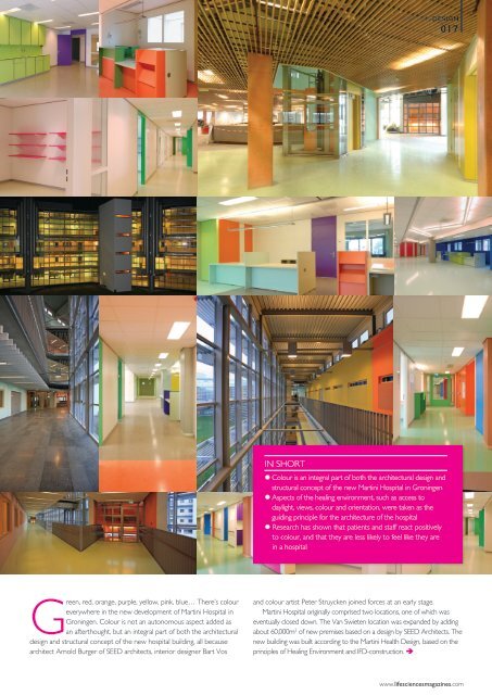
• Colour is an integral part of both the architectural design and<br />
structural concept of the new Martini Hospital in Groningen<br />
• Aspects of the healing environment, such as access to<br />
daylight, views, colour and orientation, were taken as the<br />
guiding principle for the architecture of the hospital<br />
• Research has shown that patients and staff react positively<br />
to colour, and that they are less likely to feel like they are<br />
in a hospital<br />
Green, red, orange, purple, yellow, pink, blue… There’s colour<br />
everywhere in the new development of Martini Hospital in<br />
Groningen. Colour is not an autonomous aspect added as<br />
an afterthought, but an integral part of both the architectural<br />
design and structural concept of the new hospital building, all because<br />
architect Arnold Burger of SEED architects, interior designer Bart Vos<br />
and colour artist Peter Struycken joined forces at an early stage.<br />
Martini Hospital originally comprised two locations, one of which was<br />
eventually closed down. The Van Swieten location was expanded by adding<br />
about 60,000m 2 of new premises based on a design by SEED Architects. The<br />
new building was built according to the Martini Health Design, based on the<br />
principles of Healing Environment and IFD-construction. <br />
www.lifesciencesmagazines.com