THE COLOURS AT MARTINI HOSPITAL IN GRONINGEN
THE COLOURS AT MARTINI HOSPITAL IN GRONINGEN
THE COLOURS AT MARTINI HOSPITAL IN GRONINGEN
- No tags were found...

Create successful ePaper yourself
Turn your PDF publications into a flip-book with our unique Google optimized e-Paper software.
<strong>THE</strong> <strong>COLOURS</strong> <strong>AT</strong> <strong>MART<strong>IN</strong>I</strong><br />
<strong>HOSPITAL</strong> <strong>IN</strong> GRON<strong>IN</strong>GEN<br />
By: Corinne Molenaar, Vos Interior, Groningen, Netherlands<br />
016<br />
<strong>HOSPITAL</strong> BUILD & <strong>IN</strong>FRASTRUCTURE MAGAZ<strong>IN</strong>E ISSUE 1 2013
FE<strong>AT</strong>URE DESIGN<br />
017<br />
<strong>IN</strong> SHORT<br />
• Colour is an integral part of both the architectural design and<br />
structural concept of the new Martini Hospital in Groningen<br />
• Aspects of the healing environment, such as access to<br />
daylight, views, colour and orientation, were taken as the<br />
guiding principle for the architecture of the hospital<br />
• Research has shown that patients and staff react positively<br />
to colour, and that they are less likely to feel like they are<br />
in a hospital<br />
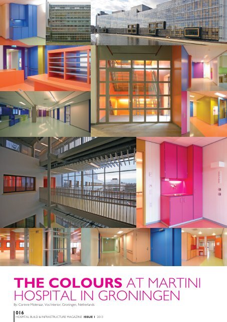
Green, red, orange, purple, yellow, pink, blue… There’s colour<br />
everywhere in the new development of Martini Hospital in<br />
Groningen. Colour is not an autonomous aspect added as<br />
an afterthought, but an integral part of both the architectural<br />
design and structural concept of the new hospital building, all because<br />
architect Arnold Burger of SEED architects, interior designer Bart Vos<br />
and colour artist Peter Struycken joined forces at an early stage.<br />
Martini Hospital originally comprised two locations, one of which was<br />
eventually closed down. The Van Swieten location was expanded by adding<br />
about 60,000m 2 of new premises based on a design by SEED Architects. The<br />
new building was built according to the Martini Health Design, based on the<br />
principles of Healing Environment and IFD-construction. <br />
www.lifesciencesmagazines.com
A healing environment is an environment in which people can<br />
feel comfortable. This environment benefits the healing process and<br />
people’s sense of wellbeing and it lessens stress. Characteristics of<br />
a healing environment are the use of (a lot of) daylight, colour, and<br />
natural elements. This gives the hospital a warm and humane feel.<br />
As the healthcare sector will be faced with significant changes<br />
in years to come, while the basic needs and preferences of people<br />
essentially remain the same, the new development of Martini Hospital<br />
required a flexible building. The underlying philosophy of the building<br />
is independent from the care-concept, which is sure to change in time.<br />
The organisation of the hospital was deliberately not set in concrete at<br />
that time, but instead it was decided that a building would be designed<br />
based on universal human values. This meant that there would be<br />
fewer fixed functions.<br />
As a result, aspects of the healing environment, such as access to<br />
daylight, views and orientation, were taken as the guiding principle for<br />
the architecture of the building. The measure of depth of the basic<br />
volumes was reduced to 16 metres, whereas a depth of 25-30 metres<br />
is customary for hospitals. This resulted in relatively shallow, light<br />
rooms with 30% extra daylight on average. And, consequently, there<br />
was access to daylight from both sides of the corridor between wards,<br />
where doors are usually open. There were also large windows that<br />
almost reach the floor and can be opened.<br />
IFD<br />
For the layout and furnishing of Martini Hospital, Arnold Burger and<br />
Bart Vos designed a complete modular-system concept including<br />
everything from walls to desks and cupboards. The concept is called<br />
IFD, which stands for Industrial, Flexible, and Demountable.<br />
Demountable modular walls are used with a small module-size of<br />
30 cm. The technical pipes and cables can be integrated into the walls<br />
so that any required combination and layout is possible, even in the<br />
arrangement with windows. The walls have different colours, so that it<br />
will always be possible to create rooms with different colour schemes,<br />
i.e. with a different atmosphere.<br />
The modular furniture system designed by Vos is similarly<br />
interchangeable. Purpose-made, standardised elements are assembled<br />
on site, always in a different way depending on the requirements. As<br />
the technical elements integrated into the basic modules are detachable,<br />
a change of functions can be realised without having to break anything<br />
away. It is possible, for instance, to build the desk that you need at a<br />
certain stage, and later conveniently add to it, or disassemble the desk so<br />
as to use it in a different place or in a different form. The flexible modular<br />
furniture system too, has been designed in colour.<br />
COLOUR<br />
Colour plays an important part in the healing environment. Martini Hospital<br />
contacted the well-known Dutch colour artist Peter Struycken to develop<br />
a special colour palette for the new building. Struycken has composed a<br />
palette with 47 colours that can all be combined (see figure 1).<br />
If both the walls and the furniture can have colours, then this results<br />
in a range of options for the architectural design and the layout to<br />
reinforce each other.<br />
For the actual application of colours in the new building, Burger and<br />
Vos selected 19 colours from the palette of 47, five of which were<br />
relatively neutral colours for the walls and floors. So there are plenty of<br />
colours left for future use.<br />
For the application of colours, a matrix was developed. This is a set<br />
of rules by which colours are distributed in the available space. When<br />
the colours were applied, the matrix was the guiding principle, rather<br />
than the space itself. By not thinking in terms of colour-groups, nor in<br />
FIGURE 1: Dutch colour artist Peter Struycken to developed<br />
a special colour palette with 47 colours for the new building<br />
terms of specific wards, but rather in terms of the hospital as a whole,<br />
each ward was now treated the same, and discussions about colour<br />
were avoided. The hospital floors were coloured wing by wing, rather<br />
than on a room by room basis. Within one room, a specific colour-field<br />
on a wall or floor could therefore unexpectedly change into a different<br />
colour. This way, it was possible to create varied rooms, whereby no<br />
two rooms in the building were the same.<br />
The colours of the fixed elements in the building create<br />
connections, as can be seen, for instance, in the way in which the<br />
columns accompany the change of colours on the floor.<br />
The colour palette with its independently combinable colours supports<br />
the idea of disassembly and re-use of interior elements such as walls,<br />
doors, and fixed furniture. After a new layout has been made, the coloured<br />
elements will always match, whether they are walls or pieces of furniture.<br />
Based on the matrix, the colours have been rolled out through the entire<br />
building and have been translated onto the exterior as well. Indeed, their<br />
application starts in the car park. At nighttime, the interplay of interior<br />
colours can be viewed through the windows from the outside as well.<br />
At Martini Hospital, a colour ambiance has thus been created that<br />
makes short shrift of the clinical image of hospitals. Due to the changing<br />
colours, the relatively long corridors provide constantly changing stimuli,<br />
and this makes the building exciting without evoking restlessness. The<br />
colours provide a focal point for visitors and staff, and have a positive<br />
effect on the healing process. Meanwhile, research has shown that<br />
patients and staff react positively to the colours, and that they are less<br />
likely to feel they are in a hospital.<br />
Throughout the project, Burger and Vos have aimed to create a<br />
harmonious whole. It has resulted in a balanced interplay between the<br />
building and its layout, colours, materials and furniture. An environment<br />
has been created to which clearly a lot of care has been given and which<br />
helps to improve the wellbeing of all those who work or stay there.<br />
Images credited to Derk Jan de Dries and Rob Hoekstra<br />
018<br />
<strong>HOSPITAL</strong> BUILD & <strong>IN</strong>FRASTRUCTURE MAGAZ<strong>IN</strong>E ISSUE 1 2013