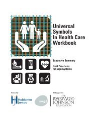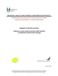
Universal Symbols In Health Care Workbook - Hablamos Juntos
Universal Symbols In Health Care Workbook - Hablamos Juntos
Universal Symbols In Health Care Workbook - Hablamos Juntos

You also want an ePaper? Increase the reach of your titles
YUMPU automatically turns print PDFs into web optimized ePapers that Google loves.
<strong>Universal</strong><br />
<strong>Symbols</strong><br />
<strong>In</strong> <strong>Health</strong> <strong>Care</strong><br />
<strong>Workbook</strong><br />
Executive Summary<br />
Best Practices<br />
for Sign Systems<br />
Produced by<br />
With support from
CREDITS<br />
This <strong>Workbook</strong> would not be possible without the following<br />
organizations, professionals and contributors:<br />
OVERALL PROJECT UNDERWRITERS AND ADMINISTRATORS<br />
The Robert Wood Johnson Foundation; <strong>Hablamos</strong> <strong>Juntos</strong> National<br />
Program Office<br />
CONTENTS<br />
Executive Summary 1:1-1:8<br />
Best Practises for Sign Systems 2:1-2:15<br />
Summary of Recommendations 2:16-2:18<br />
UNIVERSAL SYMBOLS DESIGN AND TESTING<br />
Managing Design Firm JRC Design, Jamie Cowgill, Jim Bolek<br />
Design Team Jack Biesek, Biesek Design; Gladys Brenner, AB Design,<br />
<strong>In</strong>c.; Meg Faye, FayeWorks Design, LLC; Jamie Cowgill, Jim Bolek,<br />
JRC Design; Kate Keating, Kate Keating Associates, <strong>In</strong>c.<br />
Symbol Testing Consultant Wendy T. Olmstead, Ivy Tech Community<br />
College<br />
SYMBOLS WAYFINDING TESTING<br />
Technical Advisory Committee Craig Berger, SEGD; John Bosio, Hillier;<br />
Dan Clements, Karlsberger Companies; Ken Ethridge AIA RIBA, iZone;<br />
David Gibson, Two Twelve Associates; Lance Wyman, Lance Wyman<br />
Ltd; Roger Whitehouse RIBA FSEGD, Whitehouse & Company<br />
Wayfinding Test Design Phil Garvey; Pennsylvania State Visual<br />
Communications Research <strong>In</strong>stitute; Craig Berger, SEGD<br />
PILOT TESTING SITES<br />
Somerville Hospital, Somerville, Massachusetts; Saint Francis Medical<br />
Center, Grand Island, Nebraska; Grady Memorial Hospital, Atlanta,<br />
Georgia; Kaiser Permanente, San Francisco Medical Center, San<br />
Francisco California<br />
MANUFACTURERS AND FABRICATORS OF TEST SIGNS<br />
Alcan Composites USA <strong>In</strong>c; APCO; Poblocki Sign Company; Design<br />
Communications, <strong>In</strong>c.<br />
WORKBOOK<br />
Writer and Editor Craig Berger, SEGD<br />
Layout JRC Design
EXECUTIVE SUMMARY<br />
One of the most important issues facing health care executives today is the<br />
demand for health services from an increasing number of patients with Limited<br />
English Proficiency (LEP). The design community is challenged to develop<br />
design tools and methodologies that will enable those with LEP and limited<br />
literacy access to health services. <strong>Universal</strong> symbols are an effective design<br />
tool to help visitors navigate health facilities. This summary will cover the<br />
importance of universal symbols and the benefits they provide to hospitals<br />
and health care facilities including:<br />
• <strong>Universal</strong> symbols are proven to be more effective and efficient than<br />
other wayfinding methods.<br />
• Patients find symbols easier to see and understand.<br />
• <strong>Universal</strong> symbols can be flexible and simple to implement, yet<br />
can be integrated into complex and far reaching sign, print and<br />
internet programs.<br />
What are <strong>Universal</strong> <strong>Symbols</strong><br />
Long before the existence of written language, pictographs (word pictures)<br />
served as a means of communication. As societies grew and written languages<br />
developed, pictographs were employed to provide information to people who<br />
were largely illiterate. However, pictographs mainly served an informal function<br />
until the second half of the 20th century, when air travel and expanding world<br />
immigration increased, causing universal symbols to increasingly serve as an<br />
international communications tool.<br />
Designer and researcher, Jim Bolek, describes universal symbols as a language<br />
that is “read” when a picture or symbol is connected with the viewer’s concept<br />
of its meaning. Some symbols, such as an airplane or train, can be universally<br />
understood while other symbols, such as a cross or money, are subject to the<br />
viewer’s interpretation, which is highly influenced by that individual’s culture<br />
and background. However, either type of symbol can become universally<br />
understood after being widely used over time.<br />
U N I V E R S A L S Y M B O L S I N H E A L T H C A R E | E X E C U T I V E S U M M A R Y<br />
1:1
Why <strong>Universal</strong> <strong>Symbols</strong> in Hospitals<br />
<strong>In</strong> hospitals, universal symbols on signs are rare, although alternatives such<br />
as the use of identification signs incorporating a combination of text, letters,<br />
numbers and symbols, and the use of hospital specific landmarks is quite<br />
common. Although hospital symbols have been developed in countries from <strong>In</strong>dia<br />
to Australia to Argentina, it was not until recently that universal health care<br />
symbols have become an important option for wayfinding in North America due to<br />
changing American demographics and new health care developments.<br />
Terminal 4 at John F. Kennedy<br />
<strong>In</strong>ternational Airport.<br />
Chermayeff and Geismar<br />
Several American trends make a case for symbols based wayfinding in health care:<br />
• <strong>In</strong>creased immigration from around the world has dramatically enlarged<br />
the population with Limited English Proficiency (LEP). The Census 2000<br />
Supplementary Survey estimates that over 44 million Americans over the<br />
age of 5 speak a language other than English at home, and that language<br />
is Spanish for 62% of those 44 million.<br />
• Through common use in transportation, parks, and institutional buildings,<br />
universal symbols and pictograms have become familiar sights. Since their<br />
development in the early and mid-1970s, universal symbols have been<br />
used in over 90% of American international airports and most significantly<br />
in large immigrant hubs like New York’s John F. Kennedy Airport.<br />
• Resurgent attention to federal and state laws requiring<br />
health facilities to make signage available in the language<br />
of their patients as a result of a Presidential Executive<br />
Order 13663, “Improving Access to Services for Persons<br />
with Limited English Proficiency” and National Standards<br />
for Culturally and Linguistically Appropriate Services in<br />
<strong>Health</strong> <strong>Care</strong> adopted by the United States Department of<br />
<strong>Health</strong> and Human Services.<br />
• Hospitals are increasingly hiring health interpreters to meet the language<br />
needs of their LEP patients.<br />
• Some hospitals and health care management companies have developed<br />
approaches to assessing wayfinding systems. These testing projects,<br />
Photo by Chermayeff and Geismar<br />
1:2 E X E C U T I V E S U M M A R Y | U N I V E R S A L S Y M B O L S I N H E A L T H C A R E
promoted by organizations like the Center for <strong>Health</strong>care Design, have<br />
measured the positive effects of efficient and comprehensive wayfinding<br />
systems to the corporate bottom line through decreased staff time used<br />
in directing visitors and greater visitor satisfaction.<br />
The Current Options for Hospital Multilingual Signs and Wayfinding Solutions<br />
Hospitals currently use many means to direct patients and visitors through their<br />
complex facilities, such as:<br />
• Multilingual word signs that contain two or<br />
more languages. Multilingual word signs, often<br />
with English in larger and bolder print, are<br />
frequently used for non-English language groups.<br />
These can be complex to design and maintain,<br />
posing challenges for designers working to<br />
adhere to Americans with Disabilities Act (ADA)<br />
guidelines while ensuring the signs are correctly<br />
translated in multiple languages.<br />
• Words, numbers, landmarks, and unique symbols.<br />
Designers have ingeniously and successfully<br />
used words, numbers, and floor lines to create<br />
symbols for wayfinding systems that can respond<br />
to the language needs of LEP patients. These systems, when used<br />
with print, directory, or kiosk backup can be successful within specific<br />
environments. The unique nature of these systems requires significant<br />
public education that is not transferable beyond an individual hospital.<br />
• <strong>In</strong>terpreters. <strong>In</strong>terpreters can help guide LEP patients through facilities<br />
or provide instructional support at kiosks, but are impractical and<br />
expensive solutions.<br />
(Top) A hospital directional<br />
sign in both English and<br />
Spanish. Note the diminished<br />
size of the Spanish text.<br />
(Left) Boston Children’s<br />
Hospital Identification Sign<br />
using unique symbols.<br />
TwoTwelve Design<br />
Associates<br />
(Right) Kaiser Permanente<br />
Number symbol sign.<br />
Kate Keating Design<br />
Photos by (Top) Craig Berger, (Left) Kevin Burke, (Right) Kate Keating Design<br />
U N I V E R S A L S Y M B O L S I N H E A L T H C A R E | E X E C U T I V E S U M M A R Y<br />
1:3
(Left) Signs with multiple<br />
languages can be difficult to<br />
design, correct and change.<br />
(Middle, Right) <strong>Universal</strong><br />
symbols are easier to make<br />
ADA accessible.<br />
The Advantages of <strong>Universal</strong> <strong>Health</strong> <strong>Care</strong> <strong>Symbols</strong><br />
<strong>Universal</strong> symbols have a variety of advantages that make them very attractive<br />
in health care settings:<br />
• <strong>Universal</strong> symbols are much easier to implement and maintain than<br />
multilingual signs. They can be designed without troublesome translation<br />
processes and can be updated and changed with few mistakes.<br />
Translation approaches that utilize software often lead to errors when<br />
unusual accent markings or non-Latin letter based languages are used.<br />
• <strong>Universal</strong> symbols are more easily noticed and comprehended compared<br />
to multilingual word signs.<br />
• <strong>Universal</strong> symbols are simpler to integrate into American with<br />
Disabilities Act Guidelines because signs can be user-friendly to the<br />
visually impaired due to consistency in size and clarity of configuration.<br />
• <strong>Universal</strong> symbols can be equally successful in simple identification<br />
signs and complex wayfinding systems. <strong>Universal</strong> symbols can also be<br />
used in combination with numbers and letters to make those systems<br />
more effective.<br />
How Were The <strong>Universal</strong> <strong>Health</strong> <strong>Care</strong> <strong>Symbols</strong> Developed<br />
The development of universal symbols required an extensive design and research<br />
process. Funded by The Robert Wood Johnson Foundation and overseen by the<br />
National Program Office of <strong>Hablamos</strong> <strong>Juntos</strong>, the 28 health care symbols were<br />
Photos by (Left) Craig Berger, (Middle) Ronald Shakespear, (Right) Craig Berger<br />
1:4 E X E C U T I V E S U M M A R Y | U N I V E R S A L S Y M B O L S I N H E A L T H C A R E
developed by a design team of leading health facility designers led by JRC<br />
Design and tested by Wendy T. Olmstead, a top symbols researcher, using testing<br />
methods adopted by the <strong>In</strong>ternational Organization for Standardization (ISO).<br />
Existing symbols, along with newly designed symbols (approximately 600<br />
total), were collected and evaluated by the design team. For each referent,<br />
five to six symbols were chosen to be used in the first round of testing. The<br />
symbols were tested across four language groups: English,<br />
Spanish, <strong>In</strong>do-European, and Asian, in ten states. Based<br />
upon each round’s results, symbols were either rejected or<br />
accepted and refined for further testing. With an iterative<br />
symbol design and testing process, consisting of three<br />
rounds of testing and nearly three hundred test subjects,<br />
the health care symbols set represents one of the most<br />
comprehensive symbols design efforts ever undertaken.<br />
Symbol development and<br />
testing.<br />
A few of the lessons learned in the symbol design testing<br />
process included focusing on a limited number of distinct<br />
symbols that could be recognized instead of a large group<br />
of symbols similar in appearance. It was also learned that<br />
while some symbols, representing easy to understand<br />
destinations, could be read with few problems, others<br />
were difficult to comprehend. This is endemic of a lack of<br />
understanding of the meaning of certain hospital functions<br />
by the general population, and brought to light the need to use symbols for<br />
tough-to-comprehend destinations as educational tools.<br />
Once developed, a team led by the Society for Environmental Graphic Design<br />
(SEGD) and the Pennsylvania State University evaluated the symbols by placing<br />
them on signs and in print formats in diverse health care settings. They<br />
conducted wayfinding exercises with four language groups to compare navigation<br />
with symbols versus navigation with multilingual word signs. This testing enabled<br />
the design team to assess the symbols‘ appropriateness among different cultural<br />
Photos by (Top) Craig Berger, (Bottom) Phil Garvey<br />
U N I V E R S A L S Y M B O L S I N H E A L T H C A R E | E X E C U T I V E S U M M A R Y<br />
1:5
17 SYMBOLS TESTING >87<br />
Surgery, Billing Department,<br />
<strong>In</strong>tensive <strong>Care</strong> Unit, Family<br />
Practice Clinic, Social Services<br />
Cardiology, Radiology, OB<br />
Clinic, Immunizations,<br />
Waiting Room<br />
Chapel, Ambulance Entrance,<br />
Pharmacy, Laboratory,<br />
Medical Records<br />
Pediatrics, Emergency<br />
11 SYMBOLS TESTING ≤87<br />
Oncology, <strong>In</strong>ternal Medicine,<br />
Diabetes Center, <strong>Care</strong> Staff<br />
Area, Mammography<br />
<strong>In</strong>terpretive Services,<br />
Registration, OB/GYN,<br />
Physical Therapy, Outpatient<br />
<strong>In</strong>fectious Diseases<br />
groups and the effectiveness of universal symbols in the health care environment.<br />
Furthermore, focus groups with facility staff enhanced the understanding of<br />
how symbols could best be implemented in hospital settings. The design and<br />
management recommendations included in this workbook are based on the<br />
lessons learned from the observations made during the wayfinding testing<br />
process in the pilot hospitals, matched to examples of best practices found in<br />
different facilities around the world. The final universal health care symbols are<br />
the product of many contributors and are a testament to a unique and extensive<br />
open testing process.<br />
1:6 E X E C U T I V E S U M M A R Y | U N I V E R S A L S Y M B O L S I N H E A L T H C A R E
<strong>Universal</strong> <strong>Symbols</strong> are Effective in Hospitals<br />
The overall conclusion of this work is that universal health care symbols are<br />
effective in hospitals for the following reasons:<br />
• Seventeen of the 28 symbols were found to be “most meaningful” by<br />
at least 88% of the tested multilingual population group. These symbols<br />
represent commonly understood destinations like Radiology and Pediatrics.<br />
• The 11 remaining symbols did not meet the threshold of 88% acceptance.<br />
These symbols tended to represent concepts like Oncology and Outpatient.<br />
Recognition of these symbols and the meaning behind them will improve<br />
with further use and public education.<br />
• During testing, participants walked one foot per second faster to find<br />
their destination when guided by symbols than when guided by<br />
multilingual word signs.<br />
• <strong>In</strong> a test of 86 study participants, only one person felt that word signs<br />
were superior to symbol signs, 19 felt symbol and word signs were equally<br />
effective while 66 stated that symbol signs were more effective.<br />
• <strong>In</strong> a test of 85 study participants, 70 felt that using symbol print support<br />
increased their ease in finding a destination.<br />
• <strong>In</strong> focus groups of hospital staff, 41 of 49 participants felt that symbols<br />
would facilitate dispensing hospital directions.<br />
Identifying destinations with<br />
symbols is a simple first step<br />
to developing and effective<br />
wayfinding system.<br />
<strong>Universal</strong> <strong>Health</strong> <strong>Care</strong> Symbol <strong>In</strong>gredients for Best Practices<br />
<strong>Universal</strong> symbols are an exciting design innovation that can improve the health<br />
care environment. For successful implementation, there is no need to create complex<br />
systems when four important elements are considered:<br />
• Sign Location Identification. The first and most important task in using<br />
symbols in a hospital is to properly identify visible locations for placement.<br />
• <strong>In</strong>corporate Wayfinding. A wayfinding program using universal symbols can<br />
be combined with existing wayfinding systems. <strong>Symbols</strong> can be used with<br />
text or with other symbol support including numbers and letters. There<br />
can be endless successful creative solutions to designing the optimal<br />
wayfinding system.<br />
Photo by Craig Berger<br />
U N I V E R S A L S Y M B O L S I N H E A L T H C A R E | E X E C U T I V E S U M M A R Y<br />
1:7
Massachusetts General<br />
Hospital has a print<br />
program that connects to a<br />
symbol system in multiple<br />
languages.<br />
TwoTwelve Design<br />
Associates<br />
• Print and <strong>In</strong>terpretive Media Support. Print support, including handouts<br />
and maps, are an ideal opportunity to deepen the understanding of the<br />
symbols and customize information to respond to diverse languages and<br />
population groups.<br />
• Establish Staff and Volunteer Support. <strong>Symbols</strong> are an easy tool for<br />
teaching hospital staff and volunteers direction giving skills.<br />
FOR MORE INFORMATION<br />
More workbook information<br />
will be available as well<br />
as additional tools at<br />
hablamosjuntos.org or<br />
segd.org.<br />
<strong>Universal</strong> <strong>Health</strong> <strong>Care</strong> <strong>Symbols</strong> Can Be Part of a Successful <strong>Health</strong> <strong>Care</strong><br />
Wayfinding System<br />
For hospital executives and administrators, universal symbols can be a simpler<br />
and more flexible way to create a culture of communication and wayfinding<br />
among the entire hospital staff, stretching from the facilities staff and<br />
strategists to the doctors and nurses, interpreters, and volunteers. For architects<br />
and designers of wayfinding systems, universal symbols can be the cornerstone<br />
of creative and unique solutions for a wide variety of health care facilities,<br />
while minimizing errors in the implementation and ongoing maintenance of sign<br />
systems. For everyone who works in health care environments, universal symbols<br />
can be the key ingredient in satisfying their core health care mission of providing<br />
access and help to all in need.<br />
Photo by Kevin Burke<br />
1:8 E X E C U T I V E S U M M A R Y | U N I V E R S A L S Y M B O L S I N H E A L T H C A R E
BEST PRACTICES FOR SYMBOLS IN WAYFINDING<br />
Wayfinding is a term that many people associate only with signs, but<br />
wayfinding is an overall design philosophy that aids a diverse population to<br />
arrive at a destination with ease and comfort. <strong>Universal</strong> symbols can be a key<br />
factor in successfully increasing hospital efficiency and visitor satisfaction,<br />
and are an essential part of any effective wayfinding strategy.<br />
Start Simple but Think “Big Picture”<br />
A wayfinding strategy does not need to be implemented completely at one<br />
time. A program can start by identifying key destinations using symbols,<br />
and then expand into more complex signs systems and print support.<br />
Simultaneously, it is important to ensure that a long range plan is kept in<br />
mind, so that symbols will be an integral part of all design decision making.<br />
Hiring a Qualified Design Firm<br />
When it comes to developing a complete new wayfinding sign system in a<br />
hospital, it is important to hire a qualified design firm that specializes in<br />
planning, design, and implementation of wayfinding sign systems. Most of these<br />
firms will have experience working with universal symbols on other projects,<br />
but it is crucial to specify the use of universal health care symbols when<br />
selecting a designer for a wayfinding hospital sign project. <strong>Universal</strong> health care<br />
symbols must play a central role at the onset of the planning process.<br />
Steps to Developing a <strong>Universal</strong> <strong>Health</strong> <strong>Care</strong> Symbol Based Wayfinding System<br />
Even though it is important to work with a qualified design firm when working<br />
on a wayfinding project, it is also important to understand all of the parts<br />
involved with creating a complete system. Many of these parts extend beyond<br />
creating a sign system, and include architectural and interior elements, print<br />
and interactive media, and staff and volunteer training programs. Hospital<br />
executives and facilities managers must have an understanding and assume<br />
active management of all these parts in order to develop a successful and<br />
complete system.<br />
Best Practices for <strong>Symbols</strong><br />
in Wayfinding<br />
<strong>In</strong>troduction<br />
Part 1 The Levels of<br />
<strong>Universal</strong> <strong>Health</strong><br />
<strong>Care</strong> <strong>Symbols</strong><br />
Part 2 Wayfinding Concepts<br />
Using <strong>Universal</strong><br />
<strong>Health</strong> <strong>Care</strong> <strong>Symbols</strong><br />
Part 3 The Types and<br />
Locations of<br />
Symbol Signs<br />
Part 4 <strong>Symbols</strong> and Text<br />
on Signs<br />
Part 5 Symbol Signs<br />
and ADA<br />
Part 6 Reducing Clutter<br />
Part 7 Lighting and Color<br />
of Symbol Signs<br />
Part 8 <strong>Symbols</strong> with<br />
Print and<br />
<strong>In</strong>teractive Media<br />
Part 9 Staff and Volunteer<br />
Training with<br />
<strong>Symbols</strong><br />
Summary of<br />
Recommendations<br />
U N I V E R S A L S Y M B O L S I N H E A L T H C A R E | W O R K B O O K<br />
2:1
Part 1: The Levels of <strong>Universal</strong> <strong>Health</strong> <strong>Care</strong> <strong>Symbols</strong><br />
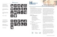
(Top) <strong>Universal</strong> <strong>Health</strong> <strong>Care</strong><br />
<strong>Symbols</strong>. (Clockwise)<br />
Pharmacy, Laboratory,<br />
Cardiology, Medical Records.<br />
(Middle) Examples of<br />
support symbols. (Clockwise)<br />
Elevators, Restaurant,<br />
Telephone, Women’s Room.<br />
(Bottom) Examples of<br />
tertiary symbols. (Clockwise)<br />
No Parking, Steep Grade,<br />
Roadside Bench, Road Left or<br />
Forward.<br />
It is important to begin any design project using symbols by understanding the<br />
types of universal symbols available, and where they can be most effectively<br />
used in a health care facility.<br />
<strong>Universal</strong> <strong>Health</strong> <strong>Care</strong> <strong>Symbols</strong> are graphic representations of language that can<br />
be understood by most people or easily learned. <strong>In</strong> addition to the 28 universal<br />
symbols designed for hospital functions, there are a number of other symbols<br />
that can be used in medical facilities.<br />
Primary Activity Based <strong>Symbols</strong><br />
These symbols are for people using specific hospital functions and include<br />
the 28 universal health care symbols profiled in this workbook. These symbols<br />
represent activities common to health facilities/or health environments. These<br />
symbols are readily connected to their associated hospital activity by diverse<br />
populations. Sometimes additional support, including printed text, is needed<br />
to communicate the meaning, especially for specialized hospital functions like<br />
a diabetes clinic or cancer (oncology) lab.<br />
Secondary Support <strong>Symbols</strong><br />
These symbols are for hospital functions that are universal to most buildings<br />
and are easily recognized. Common secondary support symbols are those<br />
used for elevators, restrooms, and cafeterias. These symbols need very little<br />
additional support to be understood. The Federal Highway Administration has a<br />
symbol set (available on www.aiga.org) designed for airports and train stations<br />
that are also commonly used in hospitals and other public buildings.<br />
Tertiary Exterior <strong>Symbols</strong><br />
These symbols are part of the landscape outside of the hospital and direct<br />
drivers and pedestrians around the building’s exterior. These external symbols<br />
connect the building to parking and other information. The symbols are easily<br />
read by drivers and pedestrians, need little or no additional support to be<br />
understood, and are common sights in most cities.<br />
2:2 W O R K B O O K | U N I V E R S A L S Y M B O L S I N H E A L T H C A R E
Part 2: Wayfinding Concepts Using <strong>Universal</strong> <strong>Health</strong> <strong>Care</strong> <strong>Symbols</strong><br />
Effective wayfinding systems are based on two basic concepts: visibility<br />
and consistency. The signs must be easily visible for people, consistent in<br />
height, and placed in easily observable locations. It is difficult for many<br />
hospitals to achieve this goal because they are often developed over a period<br />
of time and consist of several connected buildings with few landmarks and<br />
visual references. <strong>In</strong> this environment, successful design is based on having<br />
a multitude of wayfinding elements in consistent locations and at sizes that<br />
make them easily visible.<br />
Wayfinding with <strong>Universal</strong> <strong>Health</strong> <strong>Care</strong> <strong>Symbols</strong> on One Floor<br />
Hospitals often contain many of their functions on one floor. These sprawling<br />
complexes often have confusing floor plans and need large numbers of<br />
overhead and wall directional signs to assist visitors.<br />
It is important to space symbols at consistent distances<br />
on long corridors. <strong>Symbols</strong> are easier to see than text<br />
over longer distances, allowing for greater distances<br />
between wayfinding signs. When small symbols (3-6<br />
inches) are used, signs should be placed close together<br />
(less than 50 feet apart). If larger symbols (8 inches<br />
and larger) are used, much longer distances are possible.<br />
Other factors affecting the number and frequency of<br />
signs needed include lighting and clutter. It is important<br />
to test symbol signs for legibility in the specific hospital<br />
environment in order to determine optimal visibility.<br />
Sign information should be placed in consistent places at every decision point.<br />
Whenever signs are placed in a corridor or at a corner, the sign information<br />
must be at exactly the same height and in the same location, i.e., symbols that<br />
occur on the left side of a sign must stay on the left side on every sign.<br />
<strong>In</strong> wayfinding tests it was<br />
evident that large symbols<br />
can be visible from a much<br />
longer distance than text.<br />
Numbers, letters, and physical landmarks augment universal symbols and<br />
Photo by Craig Berger<br />
U N I V E R S A L S Y M B O L S I N H E A L T H C A R E | W O R K B O O K<br />
2:3
permit them greater flexibility. Using additional physical and graphic<br />
information is also important on campuses and interconnected buildings.<br />
(Left) Building unit<br />
information supports<br />
universal symbols.<br />
New York City Hospital<br />
Corporation, Hillier Group<br />
(Middle) LaGuardia Airport<br />
has easy to read symbols on<br />
directory signs.<br />
Chermayeff and Geismar<br />
(Right) Lankenau Hospital<br />
has well identified symbol<br />
information on elevator doors.<br />
AGS<br />
Wayfinding with <strong>Universal</strong> <strong>Health</strong> <strong>Care</strong> <strong>Symbols</strong> across Many Floors<br />
<strong>In</strong> multi-floor hospitals, directories are needed to inform visitors about what<br />
exists on other floors in the building. Testing has shown that directories are<br />
very difficult for many people to find and use. The following recommendations<br />
can increase the visibility and usability of directories with symbols:<br />
• <strong>Symbols</strong> on directories must be of a legible size. It is recommended<br />
that symbols be at least 3/8 inch in height on directories.<br />
• Directories must be strategically located. Directories need to be seen<br />
in order to be used. Directories should be large and placed in the most<br />
prominent location possible, and should also be placed in a consistent<br />
location on each floor.<br />
• Backup information and identification. Many visitors have difficulty<br />
using directories to locate elevators and staircases. Identifying these<br />
areas with symbols or color information on directories can help create<br />
a link between the elevator and the directory.<br />
Photos by (Left) John Bosio, (Middle) Chermayeff and Geismar, (Right) AGS<br />
2:4 W O R K B O O K | U N I V E R S A L S Y M B O L S I N H E A L T H C A R E
Part 3: The Types and Locations of Symbol Signs<br />
Effective wayfinding depends on the consistent location of specific sign types.<br />
Appropriately designing and installing signs in a hospital can be difficult due<br />
to the many specific issues unique to hospitals, such as:<br />
• Ceilings that are often low and at varying heights.<br />
• Hallways that are narrow and often of varying widths.<br />
• Lighting that is inconsistent.<br />
• Large numbers of people, equipment, and information that make<br />
visibility difficult.<br />
Hospital Wayfinding Sign Types: Identification Signs<br />
To place identification signs correctly, it is important to consider two<br />
population groups: the visually impaired and the blind. Each group has<br />
distinctly different needs that require two different types of signs:<br />
• For both the sighted and visually impaired, an overhead sign<br />
perpendicular to the destination entrance is preferable for visibility<br />
from a distance. <strong>In</strong> testing, people saw identification signs<br />
perpendicular to destinations 50% farther away than parallel signs.<br />
• The Americans with Disabilities Act mandates that Grade II Braille<br />
be used on identification signs. These signs are to be parallel to<br />
the wall surface and be centered 60 inches above the finished floor.<br />
Identification signs must always be at the same height to be effective.<br />
It is important to use both parallel and perpendicular signs to identify<br />
important locations like departments and functions. Redundant identification<br />
information assures visibility by all population groups.<br />
Directional Signs<br />
Since ceilings in hospitals are often low or of varying heights, it is important<br />
to develop creative approaches when dealing with universal symbols. There<br />
are a variety of approaches that can be successfully implemented. These<br />
directional signs include:<br />
Using two signs for<br />
important destinations are<br />
better than one.<br />
Kaiser Permanente, Kate<br />
Keating Associates, <strong>In</strong>c.<br />
Photo by Kate Keating Associates, <strong>In</strong>c.<br />
U N I V E R S A L S Y M B O L S I N H E A L T H C A R E | W O R K B O O K<br />
2:5
(Above Left) Airport<br />
wayfinding signs are at<br />
consistent heights without<br />
regard to ceiling height.<br />
Lester B. Pearson<br />
<strong>In</strong>ternational Airport,<br />
Toronto, Pentagram<br />
(Above Right) Overhead<br />
signs at low heights have<br />
little room for complex<br />
information.<br />
Boston Children’s Hospital,<br />
Two Twelve Design<br />
Associates<br />
(Bottom) Kiosk signs<br />
should have easily visible<br />
landmarks to attract<br />
attention.<br />
Christiana <strong>Health</strong>care,<br />
Mitchell Associates<br />
Overhead Signs<br />
Overhead signs are commonly used when allowed by ceiling heights.<br />
Because overhead signs must be at least seven feet off the ground,<br />
existing conditions must be carefully assessed. For symbols to be effective,<br />
two approaches are possible:<br />
• For high ceiling (9 feet and above). Large, complex signs with<br />
symbols and text can be placed on overhead signs. It is important<br />
with atrium spaces and varying ceiling heights that signs are<br />
placed at the same height.<br />
• For low ceilings (9 feet and below). With less than 2 feet of<br />
clearance, symbol information should be very simple with only<br />
three or four of the most important destinations placed on the<br />
signs and little other additional information. It is important to<br />
combine overhead signs with redundant wall signs and maps if the<br />
signs require more information.<br />
Wall, Pillar, and Kiosk Mounted Directional Signs<br />
<strong>In</strong> many cases ceilings may be too low (8 feet and below) to install<br />
wayfinding signs. <strong>In</strong> these cases, signs can be mounted on walls or pillars.<br />
The bottom of wall mounted signs should be high enough off the ground<br />
to be easily visible above the clutter of the hospital hallways. If the signs<br />
are placed lower or are freestanding kiosks, they should have a prominent<br />
landmark or symbol.<br />
Photos by (Top Left) Peter Mauss/Esto, (Top Right) Kevin Burke, (Right) Mitchell Associates<br />
2:6 W O R K B O O K | U N I V E R S A L S Y M B O L S I N H E A L T H C A R E
Part 4: <strong>Symbols</strong> and Text on Signs<br />
The key to success in designing with universal symbols in hospitals is<br />
remembering that the symbols are not intended to replace text, but should<br />
be integrated with the text on signs. There are a large number of successful<br />
solutions possible for combining text and symbols on signs. These solutions<br />
usually fall into two categories:<br />
Dominant <strong>Symbols</strong>, Secondary Text<br />
<strong>In</strong> this approach, the universal symbols are much larger than the text on<br />
the signs, making the symbol the first and most visible design element<br />
to be seen by the visitor. Text becomes only a secondary source of<br />
information and is not visible until the visitor is only a few feet away.<br />
The text reinforces the meaning of the symbol while allowing the symbol<br />
to be the dominant wayfinding approach. This method works well in<br />
environments with a high percentage of non-English and low-literacy<br />
visitors by placing the focus on the graphic. To be effective, these signs<br />
need considerable backup information that includes print graphics, maps,<br />
and other identification to support the system. The Buenos Aires Hospital<br />
system by Ronald Shakespear is a good example of the dominant symbol<br />
approach. Text is much smaller than the symbols and only in one language,<br />
but sign size allows for the placement of more information and the symbol<br />
to be seen from great distances.<br />
(Top) Buenos Aires Hospital<br />
System.<br />
Ronald Shakespear<br />
(Bottom) The Laredo<br />
Hospital uses wall mounted<br />
directional signs with<br />
symbols of equal height.<br />
Lebowitz Gould<br />
Balance of Text and <strong>Symbols</strong><br />
<strong>In</strong> facilities where English speakers comprise a large percentage of the<br />
visitors or in which there may be a desire for two languages on the signs,<br />
larger text can be used and balanced with the symbols as support. For<br />
these signs to be effective, it is important that the print is of adequate<br />
size to be seen from a distance three inches for overhead signs for interior<br />
environments) and that the symbols are close to being the same size as the<br />
text height. It is also important that the symbols be placed on consistent<br />
locations on the signs to be visible across multiple signs.<br />
Photos by (Top) Ronald Shakespear, (Bottom) Lebowitz Gould<br />
U N I V E R S A L S Y M B O L S I N H E A L T H C A R E | W O R K B O O K<br />
2:7
Part 5: Symbol Signs and ADA<br />
There are a number of building codes and regulations pertaining to health<br />
care signs. The most important of these regulations is the Americans with<br />
Disabilities Act (ADA). The ADA is civil rights legislation developed by the<br />
Department of Justice and administered by individual states. The ADA rules<br />
are the basis for sound best-practices for creating visible and effective sign<br />
systems. While state sign codes may vary slightly, these standards are the most<br />
commonly used with symbol and multilingual signs.<br />
<strong>Symbols</strong> on identification signs must be contained within<br />
a contrasting color field at least six inches in height. There<br />
is no maximum height for the symbols themselves. <strong>Symbols</strong><br />
can be very large and more than one symbol can be used<br />
on the same sign. There are no rules governing symbols on<br />
directional and directory signs.<br />
All wall mounted identification signs must have text and<br />
Braille standards readable for the blind. Text for the blind<br />
must be no less than 5/8 inch and no more than 2 inches<br />
in height, all upper case letters. All text and Braille must<br />
be separated from each other and the sign edge by at least<br />
3/8 inch.<br />
Wall mounted identification<br />
symbol sign.<br />
Corbin Design<br />
Letter heights for wall-mounted directional signs are<br />
not specified. These types of signs do not require Braille<br />
or raised letters like identification signs. However, letter height should be<br />
considered for legibility purposes. These signs must follow character proportion,<br />
sign finish, and contrast as specified in the ADA. It is also advised that symbols<br />
on wall mounted directional signs be no less than 5/8 inch in height. Text on<br />
overhead signs must be at least three inches in height.<br />
There are no ADA rules for multiple languages. The ADA rules regarding text on<br />
multilingual signs are for the English language only. It is good design practice to<br />
Photo by Danny Roberts<br />
2:8 W O R K B O O K | U N I V E R S A L S Y M B O L S I N H E A L T H C A R E
use other languages based on the same regulations.<br />
Note: The ADA is currently being reviewed and revised, with significant changes<br />
being projected for the signage portion of the Act. As of this writing (November,<br />
2005) the changes have not been enacted. This is expected to happen in mid-<br />
2006 or early 2007.<br />
(Left) Even though there is<br />
no height requirement for<br />
languages other than English<br />
it is advisable that text in<br />
other languages be as visible.<br />
Ottawa McDaniel <strong>In</strong>ternational<br />
Airport, Gottshalk and Ash<br />
(Right) Wayfinding signs<br />
where symbols are the<br />
primary wayfinding element<br />
can have smaller text.<br />
MD Andersen Cancer Center,<br />
fd2s<br />
Photo by William P. McElligott Photography, Artwork by fd2s<br />
U N I V E R S A L S Y M B O L S I N H E A L T H C A R E | W O R K B O O K<br />
2:9
Part 6: Reducing Clutter<br />
Consistently placed design<br />
elements include furniture<br />
and floor patterns.<br />
Lankenau Hospital, AGS<br />
Clutter is one of the biggest issues affecting wayfinding in hospitals today.<br />
<strong>In</strong> symbols testing, clutter ranked among the largest issues affecting<br />
people finding their destinations. Signs, planters, bulletin boards, and other<br />
information can prevent wayfinding signs from being visible while also<br />
degrading the quality of signs. Additionally, too much information on a sign can<br />
reduce the ability to recognize the required information. There are two kinds<br />
of clutter that need to be addressed when designing and placing symbol signs:<br />
clutter in the environment and clutter on individual signs.<br />
Clutter in the Environment<br />
Consistency in the health care environment is the key to<br />
legible identification signs. Not only should unnecessary<br />
information be removed, but the entire environment must<br />
be designed to avoid inconsistencies. All wall and floor<br />
coverings should be consistent in circulation areas. Even<br />
design elements like planters, paintings, sculptures, and<br />
donor walls can affect legibility if placed indiscriminately.<br />
Sign Clutter<br />
Designing wayfinding signs using symbols is a balancing<br />
act of simplicity and clutter. There are two approaches<br />
to controlling clutter: putting a large amount of<br />
information on a few signs, and spreading out information among a large<br />
number of sign and print elements.<br />
Prioritize information on complex signs<br />
Symbol signs have an advantage over text signs because of their ability<br />
to include a much larger amount of information on a single sign. Complex<br />
symbol signs can be illegible if not carefully designed. Complex symbol<br />
signs should have a clear hierarchy where the most important information<br />
is most visible from a distance and less important information further in<br />
the background. For example, in the New York City <strong>Health</strong> and Hospitals<br />
Photo by AGS<br />
2:10 W O R K B O O K | U N I V E R S A L S Y M B O L S I N H E A L T H C A R E
Corporation design guidelines, designed by Hillier, a single sign contains<br />
building unit identification, the identification of adjacent units, and parking<br />
and transportation information. These symbols are all different sizes with<br />
unit identification being most prominent, providing a hierarchy of the most<br />
important information.<br />
Simplicity should be supported across a number of signs<br />
<strong>Symbols</strong> also can be used on very simple signs, where only three or four pieces<br />
of information can be seen. For these signs to be successful there must be<br />
a great amount of backup information that includes<br />
maps, directories, landmarks, and print directions. An<br />
excellent example is the M.D. Andersen Cancer Center,<br />
designed by the firm fd2s, where very simple wayfinding<br />
signs with just a few symbols are used. These simple<br />
signs are augmented with interactive directories, maps,<br />
and landmarks. This large number of elements must be<br />
carefully managed to avoid an overload of information,<br />
but are necessary to support the complete system.<br />
(Top) Coney Island Hospital,<br />
Hillier Group<br />
(Bottom) MD Andersen<br />
Cancer supports a large<br />
number of simple symbol<br />
elements with print and<br />
graphic support.<br />
fd2s<br />
Photos by (Top) John Bosio, (Bottom) David Omer<br />
U N I V E R S A L S Y M B O L S I N H E A L T H C A R E | W O R K B O O K<br />
2:11
Part 7: Lighting and Color of Symbol Signs<br />
(Top) Massachusetts<br />
General Hospital uses signs<br />
with light backgrounds for<br />
darker hallways.<br />
Two Twelve Design<br />
Associates<br />
(Bottom) ASI-Modulex color<br />
calculator.<br />
Hospitals are different from other institutional facilities in that they serve<br />
a residential population as well as a large number of visitors. Lighting levels<br />
are often set very low in hospital facilities, and are often too low for sighted<br />
people, let alone those with vision disabilities. When using the symbols,<br />
developing color and lighting standards is crucial to creating a visible and<br />
consistent system. The following three standards are most important to consider<br />
when establishing standards:<br />
• Minimum lighting requirements are needed, especially in public areas.<br />
Lighting in hospital environments should make signs legible to most<br />
people from a distance of at least 25 feet. This requires either a higher<br />
level of overall internal lighting, or lighting the signs directly. Directly<br />
lighting the signs increases their legibility by contrasting the signs with<br />
a darker surrounding environment.<br />
• If lighting levels are low it is advised that a light background be used.<br />
Light backgrounds reflect rather than absorb light. If lighting levels are<br />
low, a reflective surface can generate light in a low lighting area. Since<br />
glare can be an issue in reading signs, light backgrounds can provide<br />
minimum glare visibility.<br />
• Color contrast on signs should be a minimum of 60% and is<br />
recommended to be 70%. Color contrast between foreground and<br />
background sign elements is also an excellent way to make signs<br />
more visible. The greater the contrast the easier it is to see the sign<br />
information. Color calculators like the one provided by ASI-Modulex at<br />
www.asi-modulex.com are ways to measure contrast between two colors.<br />
Photo by Kevin Burke<br />
2:12 W O R K B O O K | U N I V E R S A L S Y M B O L S I N H E A L T H C A R E
Part 8: <strong>Symbols</strong> with Print and <strong>In</strong>teractive Media<br />
Good environmental design and sign systems are not the only factors used in<br />
creating effective wayfinding systems. Adding symbols to print and electronic<br />
media can provide ideal additional support and reassurance for people trying to<br />
locate their destination.<br />
Elements of Print and Electronic Graphics<br />
Printed Handouts<br />
Handouts are simple and successful print pieces. <strong>In</strong> testing, handouts were<br />
(Top) Portion of handout<br />
explaining the meaning<br />
of universal symbols in<br />
Spanish. Sample handouts<br />
in multiple languages<br />
are available at www.<br />
hablamosjuntos.org or<br />
www.segd.org.<br />
found to be effective in 98% of participants relying on signs. Handouts can<br />
simply explain the meaning of the universal symbols in multiple languages<br />
while allowing the signs to perform most of the wayfinding duties. With<br />
printed handouts it is important to consider the following:<br />
(Bottom) New York<br />
Hospitals Corporation map<br />
<br />
standards.<br />
<br />
<br />
<br />
Hillier Group<br />
<br />
<br />
<br />
<br />
<br />
<br />
<br />
<br />
<br />
<br />
<br />
<br />
• Translations must be absolutely correct. Mistakes reduce trust in the<br />
entire sign system.<br />
• If using an ambiguous name, i.e., Birthing Center instead of OB Clinic,<br />
be sure that there is a clear definition along with the name.<br />
<br />
<br />
<br />
<br />
<br />
<br />
<br />
<br />
<br />
<br />
<br />
<br />
<br />
<br />
<br />
<br />
• Names and definitions used on the handouts must match information<br />
on the signs.<br />
Printed Maps<br />
<br />
<br />
<br />
<br />
<br />
<br />
<br />
<br />
<br />
<br />
<br />
<br />
<br />
<br />
<br />
<br />
<br />
<br />
<br />
<br />
Printed maps are more difficult to read than handouts. A smaller number of<br />
people can read and understand maps, especially when discerning building<br />
interiors. Some tips for effective maps using symbols include:<br />
• <strong>Universal</strong> symbols should be at least 3/8 inch in size, if possible, to be<br />
<br />
<br />
<br />
<br />
<br />
<br />
<br />
<br />
easily legible.<br />
• <strong>In</strong>terior maps should be very simple and contain limited information.<br />
Many hospitals use specialized maps meant to serve a specific use or<br />
many maps that represent individual buildings or units.<br />
Cards and Printed <strong>In</strong>structions<br />
<strong>Universal</strong> symbols can be integrated into medical paperwork and other support<br />
print material. These graphics have the advantage over maps and handouts in<br />
Artwork by (Top) JRC Design, (Bottom) Hillier Group<br />
U N I V E R S A L S Y M B O L S I N H E A L T H C A R E | W O R K B O O K<br />
2:13
that they can be highly specialized, focusing only on the functions in which<br />
visitors are interested.<br />
The <strong>In</strong>ternet and Electronic Kiosks<br />
<strong>Symbols</strong> can be highly effective when used with electronic media. The key to<br />
effectively using Web sites and electronic kiosks is attracting people to use<br />
them. There is evidence that younger people are more comfortable with using<br />
electronic media than their elders. It is important to consider electronic media<br />
as part of an overall wayfinding program and not the main support system.<br />
Electronic graphics must match print and sign graphics.<br />
(Left) <strong>In</strong>ternet directions<br />
and kiosk. MD Andersen<br />
Cancer Center.<br />
fd2s<br />
(Middle) <strong>In</strong>teractive map.<br />
Saint Vincent’s Hospital.<br />
TTSS<br />
(Right) Visitor information<br />
desk at Somerville Hospital,<br />
Somerville, Massachusetts.<br />
Locations of Print Materials<br />
Hospitals have made large investments in visitor information kiosks and<br />
help desks. Visitors gravitate to these areas, making them the best places to<br />
locate print information. Since visitors often do not arrive through a central<br />
entrance, it is important to include smaller information centers containing<br />
print information. These should be placed strategically in hospital departments<br />
throughout the building.<br />
Photo by Craig Berger<br />
2:14 W O R K B O O K | U N I V E R S A L S Y M B O L S I N H E A L T H C A R E
Part 9: Staff and Volunteer Training with <strong>Symbols</strong><br />
Signs and print graphics can be highly effective in helping people find their<br />
way in buildings and can save hospital staff and translators time in directing<br />
people. Hospital staffs need clear instructions on how to best use the signs.<br />
<strong>In</strong>formation desks must have a clear and legible sign for interpretive services.<br />
It is a legal public access requirement to have sign information about<br />
interpretive services in many languages. Putting maps and handouts next<br />
to the sign for interpretive services helps make the connection for visitors.<br />
Visitors have ready access to information to find their way on their own or they<br />
can request interpretive services if they have higher level needs.<br />
(Top) Sign in multiple<br />
languages directing visitors<br />
to interpretive services.<br />
(Bottom) A trained staff<br />
is one of the best aids for<br />
interpretive services.<br />
All hospital staff and volunteers must be trained in teaching visitors how to<br />
use the signs. Hospital staff should be given training in instructing people how<br />
to find their way to a specific destination using symbol signs and graphics.<br />
Some simple procedures will save staff time and energy when giving directions:<br />
• Training should include a walk-through of the hospital, pointing out<br />
signs, maps, locations of print graphics, and major destinations.<br />
• <strong>In</strong>structions on how to best use printed handouts when helping<br />
visitors. Circling the specific symbol on a print piece or map helps<br />
visitors easily find their destination.<br />
• Training on how to give verbal instructions using the symbols on<br />
the signs.<br />
• Training on directing visitors with interpretive needs to the nearest<br />
information desk.<br />
<strong>In</strong>terpreters can also teach people about the sign system. The interpreter<br />
should be encouraged to help orient people to the facility, pointing out<br />
destinations as they walk with visitors. <strong>In</strong>terpreters can also play a role in<br />
teaching visitors how to find destinations on their own, and should keep<br />
materials on hand that support the sign system.<br />
Photos by Craig Berger<br />
U N I V E R S A L S Y M B O L S I N H E A L T H C A R E | W O R K B O O K<br />
2:15
Summary of Recommendations<br />
Part 1: The Levels of <strong>Universal</strong> <strong>Health</strong> <strong>Care</strong> <strong>Symbols</strong><br />
• Create a hierarchy of symbol information based on destination importance.<br />
Part 2: Wayfinding Concepts Using <strong>Universal</strong> <strong>Health</strong> <strong>Care</strong> <strong>Symbols</strong><br />
• <strong>Symbols</strong> should be in the same location on every directional sign<br />
if possible.<br />
• Signs can use visible numbers, letters, and landmarks.<br />
• Signs should be placed in every location where a decision must be made.<br />
• Signs should be spaced so that successive signs are completely visible to<br />
each other.<br />
• <strong>Symbols</strong> on building directories should be at least 3/8 inch in height.<br />
• Directories should be in the same location on every floor.<br />
• Directories should be large landmarks in prominent locations.<br />
Part 3: The Types and Locations of Symbol Signs<br />
• Two identity signs should be used, the first parallel and at eye level to<br />
the destination entrance and the second perpendicular and overhead<br />
at the destination entrance.<br />
• Overhead signs must have at least 80 inches of clearance.<br />
• Wall mounted directional signs should be at least 60 inches off<br />
the ground.<br />
Part 4: <strong>Symbols</strong> and Text on Signs<br />
• Use extensive print and map support for symbol dominant signs.<br />
• Use for signs that have an equal emphasis on symbols and text.<br />
Part 5: <strong>Symbols</strong> and the Americans with Disabilities Act<br />
• Signs must centered at 60 inches off the ground.<br />
• The symbol field on identification signs must be at least 6 inches<br />
in height.<br />
• Raised text and Braille must be in English.<br />
2:16 W O R K B O O K | U N I V E R S A L S Y M B O L S I N H E A L T H C A R E
Part 6: Reducing Sign Clutter<br />
• Reduce the number of information elements not directly related to<br />
wayfinding and identification.<br />
• Use fewer signs, with a clear hierarchy of information for complex signs.<br />
• Use many sign elements that indicate specific tasks for simple signs.<br />
Part 7: Lighting and Color of Symbol Signs<br />
• Provide lighting that can make signs readable from at least 25 feet away.<br />
• Use a white or light background if lighting is low.<br />
• Sign contrast should be at least 60% between type or symbol and<br />
background colors.<br />
Part 8: <strong>Symbols</strong> with Print and <strong>In</strong>teractive Media<br />
• Multilingual handouts and cards provide the best support of symbol signs.<br />
• Maps can be effective if kept very simple.<br />
• Locate print support in multiple locations through the hospital.<br />
Part 9: Staff and Volunteer Symbol Training<br />
• Train volunteers and staff in giving directions using signs and handouts.<br />
• <strong>In</strong>terpreters should help orient people to the facility and play a role in<br />
teaching people how to use the sign system on their own.<br />
U N I V E R S A L S Y M B O L S I N H E A L T H C A R E | W O R K B O O K<br />
2:17
Final Summary<br />
This workbook is meant to serve as a resource to help health care executives,<br />
designers, and facilities managers become acquainted with universal health<br />
care symbols and how they can be integrated into wayfinding systems and<br />
management strategies.<br />
If you would like more information on developing a strategy for Limited<br />
English Proficient users in health care facilities, and how universal symbols<br />
can be involved in that strategy, visit www.hablamosjuntos.org. This Web<br />
site contains information on the efforts of <strong>Hablamos</strong> <strong>Juntos</strong> to create more<br />
accessible health care facilities using interpretive services, improved writing,<br />
wayfinding, and management.<br />
For more information on technical issues related to symbols and wayfinding<br />
in health care facilities, visit the Society for Environmental Graphic Design at<br />
www.segd.org. Their web site contains information on best practices for health<br />
care wayfinding, case studies on specific programs, and educational programs<br />
and publications on health care wayfinding. For a CD containing all document<br />
reports and a tutorial on wayfinding in health care based on previous SEGD<br />
educational programs contact SEGD at 202-638-5555 or segd@segd.org.<br />
2:18 W O R K B O O K | U N I V E R S A L S Y M B O L S I N H E A L T H C A R E
U N I V E R S A L S Y M B O L S I N H E A L T H C A R E | W O R K B O O K<br />
2:19