scatter diagram
scatter diagram
scatter diagram

Create successful ePaper yourself
Turn your PDF publications into a flip-book with our unique Google optimized e-Paper software.
<strong>scatter</strong> <strong>diagram</strong> 471<br />
'le, a sample size of 1000<br />
'200 million. That is<br />
the voting preferences<br />
rroportion p that<br />
I of time. Therefore<br />
r is the worst case and<br />
;ample-size calculator<br />
;is p turns out to be a<br />
nce interval calculator<br />
r you obtained.<br />
man brain wants to<br />
:ss tests of randomness.<br />
e rn statisticsoftware<br />
nmended. If it is<br />
J you have to use<br />
ee if bias exists in<br />
rm as possible, with<br />
it works best when<br />
uster looks pretty<br />
I to avoid problems<br />
Ld looks different<br />
t gives a more<br />
gives a less precise<br />
I cost and efficiency<br />
) overcome any<br />
rling from production<br />
3or example, if a<br />
ffect the samples.<br />
r throw a die to<br />
isions based<br />
or assistance with<br />
rling plan for quality<br />
<strong>scatter</strong> <strong>diagram</strong><br />
ffi'l"<br />
,""'-:<br />
\€//<br />
/\ '\y<br />
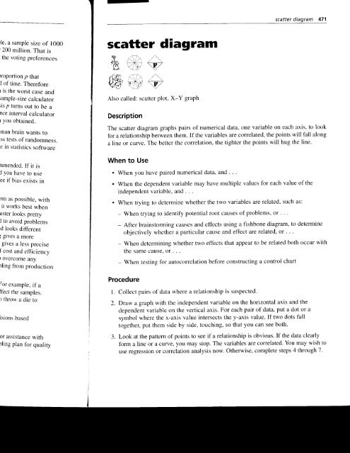
Also called: <strong>scatter</strong> plot, X-Y graph<br />
Description<br />
The <strong>scatter</strong> <strong>diagram</strong> graphs pairs of numerical data, one variable on each axis, to look<br />
for a relationship between them. If the variables are correlated, the points will fall along<br />
a line or curve. The better the correlation, the tighter the points will hug the line.<br />
When to Use<br />
. When you have paired numerical data, and . . .<br />
. When the dependent variable may have multiple values for each value of the<br />
independent variable, and . . .<br />
. When trying to determine whether the two variables are related, such as:<br />
- When trying to identify potential root causes of problems, or .<br />
- After brainstorming causes and effects using a fishbone <strong>diagram</strong>, to determine<br />
objectively whether a particular cause and effect are related, or . . .<br />
- When determining whether two effects that appear to be related both occur with<br />
the same cause. or . . .<br />
- When testing for autocorrelation before constructing a control chart<br />
Procedure<br />
l. Collect pairs of data where a relationship is suspected.<br />
2. Draw a graph with the independent variable on the horizontal axis and the<br />
dependent variable on the vertical axis. For each pair of data, put a dot or a<br />
symbol where the x-axis value intersects the y-axis value. If two dots fall<br />
together, put them side by side, touching, so that you can see both.<br />
3. Look at the pattern of points to see if a relationship is obvious. If the data clearly<br />
form a line or a curr/e, you may stop. The variables are correlated. You may wish to<br />
use regression or correlation analysis now. Otherwise, complete steps 4 through 7.
472 <strong>scatter</strong> <strong>diagram</strong><br />
4. Divide points on the graph into four quadrants. If there are X points on<br />
the graPh,<br />
. Count Xl2 points from top to bottom and draw a horizontal line'<br />
. count X/2 points from left to right and draw a vertical line'<br />
If number of points is odd, draw the line through the middle point.<br />
5. Count the points in each quadrant. Do not count points on a line'<br />
6. Add the diagonally opposite quadrants. Find the smaller sum and the total of<br />
points in all quadrants.<br />
A - points in upper left + points in lower right<br />
B - points in upper right + points in lower left<br />
Q = the smaller of A and B<br />
N=A+B<br />
7. Look up the limit for N on the trend test table (Table 5' 18)'<br />
. If Q is less than the limit, the two variables are related'<br />
Table 5.18 Trend test table<br />
N Limit N Limit<br />
1-B 0 51 -53 18<br />
Y - t l<br />
54-55 19<br />
12-14 56-57 20<br />
15-16 3 5B-60 21<br />
17-19<br />
A<br />
61-62 zz<br />
20-22 5 63-64 ZJ<br />
23-24 o r]f,-oo 24<br />
25-27 7 67-69 25<br />
28-29 B 26<br />
30-32 I 72-73 27<br />
33-34 10 74-76 28<br />
35-36 11 77-78 29<br />
37-39 2 79-80 30<br />
40-41 o 81-82 31<br />
42-43<br />
A<br />
B3-85 32<br />
44-46 5 86-87 33<br />
47-48 6 88-89 34<br />
49-50 17 90 35
<strong>scatter</strong> <strong>diagram</strong> 473<br />
e X points on<br />
ntal line.<br />
ine.<br />
lle point.<br />
a line.<br />
rm and the total of<br />
'ight<br />
left<br />
. If Q is greater than or equal to the limit, the pattern could have occurred from<br />
random chance.<br />
Example<br />
This example is part of the ZZ-400 improvement story on page 85. The ZZ-400 manufacturing<br />
team suspects a relationship between product purity (percent purity) and the<br />
amount of iron (measured in parts per million or ppm). Purity and iron are plotted<br />
against each other as a <strong>scatter</strong> <strong>diagram</strong> in Figure 5.172.<br />
There are 24 data points. Median lines are drawn so that 12 points fall on each side<br />
for both percent purity and ppm iron.<br />
To test for a relationship, they calculate:<br />
A - points in upper left + points in lower right = 8 + 9 = 17<br />
B - points in upper right + points in lower left= 4 + 3 = J<br />
Q = the smaller of A and B = the smaller of 7 and l7 = 7<br />
N=A+B=7+ll=24<br />
Then they look up the limit for N on the trend test table. For N = 24, the limit is 6.<br />
Q is greater than the limit. Therefore, the pattern could have occurred fiom random<br />
chance, and no relationship is demonstrated.<br />
Limit<br />
18<br />
19<br />
20<br />
100.0<br />
Purity vs. lron<br />
26<br />
zt<br />
28<br />
29<br />
QA<br />
- -<br />
J I<br />
32<br />
33<br />
J4<br />
35<br />
z<br />
o-<br />
S<br />
99.0<br />
98.5<br />
Figure 5.172 Scatter <strong>diagram</strong> example.<br />
98.0<br />
0 10 0.30 0.40 0.50 0.60 0.70<br />
lron (parts per million)
Considerations<br />
. ln what kind of situations might you use a <strong>scatter</strong> <strong>diagram</strong>? Here are some<br />
examples:<br />
- Variable A is the temperature of a reaction after 15 minutes. Variable B<br />
measures the color of the product. You suspect higher temperature makes<br />
the product darker. Plot temperature and color on a <strong>scatter</strong> <strong>diagram</strong>.<br />
- Variable A is the number of employees trained on new software, and variable<br />
B is the number of calls to the computer help line. You suspecthat more<br />
training reduces the number of calls. Plot number of people trained versus<br />
number of calls.<br />
- To test for autocorrelation of a measurement being monitored on a control<br />
chart, plot this pair of variables: Variable A is the measurement at a given<br />
time. Variable B is the same measurement, but at the previous time' If the<br />
<strong>scatter</strong> <strong>diagram</strong> shows correlation, do another <strong>diagram</strong> where variable B is the<br />
measurement two times previously. Keep increasing the separation between<br />
the two times until the <strong>scatter</strong> <strong>diagram</strong> shows no correlation.<br />
. Even if the <strong>scatter</strong> <strong>diagram</strong> shows a relationship, do not assume that one variable<br />
caused the other. Both may be influenced by a third variable'<br />
. When the data are plotted, the more the <strong>diagram</strong> resembles a straight line,<br />
the stronger the relationship. See Figures 5.39 through 5.42, page 198 in the<br />
crtrrelation analysis entry, for examples of the types of graphs you might see<br />
and their interpretations.<br />
. If a line is not clear, statistics (N and Q) determine whether there is reasonable<br />
certainty that a relationship exists. If the statistics say that no relationship exists,<br />
the pattern could have occurred by random chance.<br />
. If the <strong>scatter</strong> <strong>diagram</strong> shows no relationship between the variables, consider<br />
whether the data might be stratified. See stratification for more details.<br />
. If the <strong>diagram</strong> shows no relationship, consider whether the independent (x-axis)<br />
variable has been varied witlely. Sometimes a relationship is not apparent because<br />
the data don't cover a wide enough range.<br />
. Think creatively about how to use <strong>scatter</strong> <strong>diagram</strong>s to discover a root cause.<br />
. See graph for more information about graphing techniques. Also see the<br />
graph decision tree (Figure 5.68, page 216) in that section for guidance on<br />
when to use <strong>scatter</strong> <strong>diagram</strong>s and when other graphs may be more useful for<br />
your situation.<br />
. Drawing a <strong>scatter</strong> <strong>diagram</strong> is the first step in looking for a relationship between<br />
variables. See correlation anolysis and regression analysis fbr statistical methods<br />
vou can use.