Heuristic Evaluation of Team Happily Ever After - HFID
Heuristic Evaluation of Team Happily Ever After - HFID
Heuristic Evaluation of Team Happily Ever After - HFID

Create successful ePaper yourself
Turn your PDF publications into a flip-book with our unique Google optimized e-Paper software.
<strong>Heuristic</strong> <strong>Evaluation</strong> <strong>of</strong> <strong>Team</strong> <strong>Happily</strong> <strong>Ever</strong><br />
<strong>After</strong><br />
Completed by Jenn Cross, Jon Inman, Paul Mandel and Lyndsey Stadtmueller<br />
Summary <strong>of</strong> Interface Issues:<br />
Overall we thought the implementation was good and liked the idea <strong>of</strong> being able to look up dynamic maps to check<br />
that you were going the right way if you didn't have a mobile device. The most severe usability issues we<br />
encountered centered around the payment process. We believe that the lack <strong>of</strong> pricing information could discourage<br />
users from using the interface, and were concerned about the inability to cancel the entire session at the print and<br />
payment screen without going back and clearing the session oneself. The other issues we encountered were mostly<br />
concerned with the consistency <strong>of</strong> information and the way buttons are used across screens, and were largely<br />
cosmetic.<br />
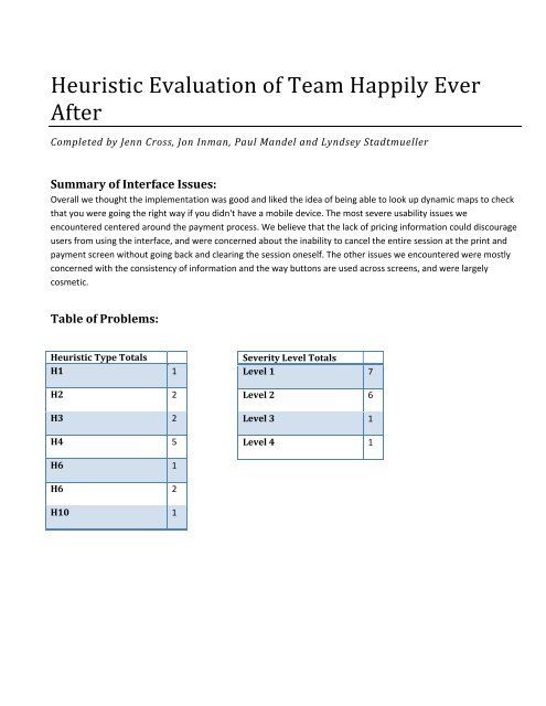
Table <strong>of</strong> Problems:<br />
<strong>Heuristic</strong> Type Totals<br />
H1 1<br />
H2 2<br />
H3 2<br />
H4 5<br />
Severity Level Totals<br />
Level 1 7<br />
Level 2 6<br />
Level 3 1<br />
Level 4 1<br />
H6 1<br />
H6 2<br />
H10 1
Complete List <strong>of</strong> Problems:<br />
# H# Severity # Evaluators Descriptions<br />
1<br />
[H1 Visibility <strong>of</strong> system<br />
status] 1 1<br />
The enter location screen does not say where "here" is.<br />
This is likely known by the user, but whether or not the<br />
machine is functioning properly and knows where it is, is<br />
uncertain.<br />
2<br />
[H2 Match between<br />
system and the real<br />
world] 4 2<br />
On the “Go Where?” search screen there is no “enter” or<br />
“search” button to initiate the search – not next to the<br />
search bar or on the on‐screen keyboard. Users without a<br />
traditional keyboard will be unable to complete or perform<br />
a search.<br />
3<br />
4<br />
[H3 User control and<br />
freedom] 4 3<br />
[H3 User control and<br />
freedom] 2 3<br />
Nowhere previous to this screen is any mention made <strong>of</strong><br />
payment. People may approach this kiosk thinking it is a<br />
free service and feel betrayed by the system, causing them<br />
to abort.<br />
There is no “escape” <strong>of</strong>fered to a user on the “Print and<br />
Pay” screen. The consistent “cancel” button is not<br />
displayed on that screen. If the user chooses to not<br />
purchase the map, they would need to "back out" <strong>of</strong> the<br />
interface.<br />
5<br />
6<br />
7<br />
[H4 Consistency and<br />
Standards] 1 1<br />
[H4 Consistency and<br />
Standards] 2 2<br />
[H4 Consistency and<br />
Standards] 1 2<br />
End address is not present on the Route Summary screen.<br />
Should be there for consistency.<br />
On the “Go Where?” search results screen, the user may<br />
expect the “back” button to return them to the original “Go<br />
Where?” screen (with the museum, etc. icons); instead this<br />
button moves the interface back to the “Enter Locations”<br />
screen<br />
On the “Go Where” search results, the user is presented<br />
with seemingly familiar arrow buttons. However, it would<br />
appear that these buttons are used for scrolling while they<br />
previously indicated a means for reorganizing the<br />
destinations. These different purposes could be confusing<br />
to the user.<br />
8<br />
[H4 Consistency and<br />
Standards] 2 4<br />
The color and location <strong>of</strong> the back button changed. This is<br />
confusing because it again creates more ambiguity as to<br />
the function <strong>of</strong> the ‘Back’ button.
9<br />
[H4 Consistency and<br />
Standards] 1 1<br />
The start destination is not provided with the four icons<br />
(arrows, pen and “do not enter”) that are given with the<br />
other destinations. While there is potential that the user<br />
will not desire to remove their starting location, it is visually<br />
unusual that this is not an option. Alternatively, the<br />
destination below the start should not have a "move up"<br />
option.<br />
10<br />
11<br />
[H6 Recognition rather<br />
than recall]&[H10 Help<br />
and documentation] 1 3<br />
[H7 Flexibility and<br />
efficiency <strong>of</strong> use] 2 1<br />
The four icons which appear next to destinations are not<br />
clearly marked with their purpose. Users will probably<br />
correctly assume that the arrows will reorder the locations<br />
but the actions <strong>of</strong> the pen and “do not enter sign” are less<br />
clear. Since the interface is language adaptive, a small text<br />
labels would be useful.<br />
If a user has only one destination in mind they still must<br />
return to the main page rather than proceeding directly to<br />
a preview and print screen. in general the process is very<br />
linear, with all back or cancel buttons returning to the main<br />
screen.<br />
12<br />
[H7 Flexibility and<br />
efficiency <strong>of</strong> use]&[H2<br />
Match between<br />
system and the real<br />
world] 2 1<br />
The user is given incomplete options on the “Pay and Print”<br />
screen. There is a potential that the user will want to print<br />
multiples <strong>of</strong> the same map or go back to print reverse<br />
directions for the return trip. The current interface would<br />
require the user to pay, repeat the process and pay again –<br />
consolidation <strong>of</strong> searches, printing and payments would<br />
increase efficiency.<br />
13<br />
14<br />
15<br />
[H10 Help and<br />
documentation] 1 2<br />
[H2 Match between<br />
system and the real<br />
world] 2 1<br />
[H9 Match Help users<br />
recognize, diagnose,<br />
and recover from<br />
errors] 2 1<br />
There is no obvious help or additional information provided<br />
by any <strong>of</strong> the interface’s screens. A completely novice user<br />
may need addition directions for the use <strong>of</strong> the interface.<br />
The icon to the right <strong>of</strong> the “location” bar (the green box<br />
listing your starting location or one <strong>of</strong> your destinations) is<br />
unlabeled and unclear. If I had to guess what it meant, I<br />
would guess ‘Edit,’ but I wouldn’t be confident enough to<br />
click on it.<br />
The aesthetics <strong>of</strong> the ‘Back’ and ‘Cancel’ buttons are the<br />
same, but they do not have the same function. This could<br />
be confusing to users who are working quickly and focusing<br />
on the visuals <strong>of</strong> the screen to provide function cues. It<br />
also creates ambiguity as to the function <strong>of</strong> both the ‘Back’
and ‘Cancel’ buttons.<br />
16<br />
17<br />
18<br />
19<br />
[H4 Consistency and<br />
standards] 2 1<br />
[H4 Consistency and<br />
Standards] 2 1<br />
[H3 User Control and<br />
Freedom] 4 1<br />
[H8 Aesthetic and<br />
Minimalist Design] 2 1<br />
The interface uses the same color motif for both ‘Start’ and<br />
‘End’ and ‘Cancel’ and ‘Print and Pay.’ This again creates<br />
ambiguity and confusion because the interface uses the<br />
same color cue for multiple functions.<br />
The ‘Payment Accepted’ dialog follows the same visual<br />
format as previous error messages. This could be<br />
confusing, because the user doesn’t want to think that their<br />
payment being accepted is an error.<br />
The interface doesn’t inform the user how much the user<br />
will have to pay. This could cause abandonment <strong>of</strong> the<br />
system because users do not know how much money to<br />
put into the system. Also, users would be unlikely to<br />
insert a credit card without prior understanding <strong>of</strong> how<br />
much the user’s credit card will be charged.<br />
The second row <strong>of</strong> ‘Address’ icons seems unnecessary.<br />
This may have been part <strong>of</strong> plans to expand the interface,<br />
but since none <strong>of</strong> them work anyway, these should have<br />
been left out <strong>of</strong> this version to avoid confusion and clutter<br />
on this screen.<br />
Suggested Revisions:<br />
<br />
<br />
<br />
<br />
<br />
Our overall impression is <strong>of</strong> Google maps in a public kiosk with a printer attached. The public kiosk aspect is a<br />
brilliant and market‐worthy idea, but keep in mind that the place searching interface is likely being compared<br />
with Google maps (or maybe mapquest) so any small flaws may be accentuated because they don’t exist in a<br />
similar current system.<br />
For the sake <strong>of</strong> consistency and faster navigation, some kind <strong>of</strong> navigation bar or menu that stayed constant<br />
throughout your interface might be helpful and prevent the issues we noted with the back button. It could<br />
update to show the state <strong>of</strong> the interface if needed, but if it didn’t change it would still give the user a level <strong>of</strong><br />
constancy that doesn’t exist right now.<br />
The payment process needs a little work, in that it should probably be obvious up front that there is payment<br />
involved, but only for printing, or have people pay by the minute they’re using it. Just something so that<br />
payment doesn’t surprise anyone. Or if there is a different plan such as a sign on the actual kiosk, let your<br />
testers know.<br />
Your current color scheme doesn’t seem ideal, especially given the large chunks <strong>of</strong> red and green on the<br />
route summary screen. More toned down colors might work better, so that the reader focuses on the task<br />
and not the association <strong>of</strong> the colors with their favorite holiday. kuler.adobe.com has many color schemes<br />
you could use.<br />
Unrelated to the interface, but certainly worth noting for future testing, most <strong>of</strong> our group had trouble<br />
getting your php code to work on Chrome, IE and Firefox. When we tried to add another destination, nothing<br />
would happen. This needs to get fixed ASAP, because it was really obnoxious to text a marginally functional<br />
prototype.<br />
Individual <strong>Heuristic</strong> <strong>Evaluation</strong>s Attached:
<strong>HFID</strong> Personal <strong>Heuristic</strong> <strong>Evaluation</strong> <strong>of</strong> <strong>Team</strong> <strong>Happily</strong> <strong>Ever</strong> <strong>After</strong><br />
Jennifer Cross<br />
1 [H4 Consistency and Standards] (Severity 1)<br />
There is a color usage discontinuity between the back and cancel buttons. On the “Go Where?” screen<br />
the “back” button appears in red (which from prior screens was reserved for the “cancel” button), in<br />
later screens the “back” button appears in blue. Users may be briefly confused by a “back/cancel”<br />
association – potentially believing that pressing back will undo certain changes. (Back button also<br />
appears as red on the “Pay and Print” screen.<br />
2 [H2 Match between system and the real world] (Severity 3)<br />
On the “Go Where?” search screen there is no “enter” or “search” button to initiate the search – not<br />
next to the search bar or on the on‐screen keyboard. Users without a traditional keyboard will be unable<br />
to complete or perform a search.<br />
3 [H4 Consistency and Standards] (Severity 2)<br />
On the “Go Where?” search results screen, the user may expect the “back” button to return them to the<br />
original “Go Where?” screen (with the museum, etc. icons); instead this button moves the interface back<br />
to the “Enter Locations” screen<br />
4 [H9 Help users recognize, diagnose, and recover from errors & H4 Consistency and Standards]<br />
(Severity 3)<br />
On the “Enter Locations” screen, if the “Here” button is accidentally selected there is no option to<br />
recover from that selection and replace the “here” with another location. Where for all similarly<br />
appearing buttons for the various destination selections, when clicked permit editing. There is no way<br />
for a user to recover from that selection without returning to the welcome screen.<br />
5 [H6 Recognition rather than recall] (Severity 2)<br />
The four icons which appear next to destinations are not clearly marked with their purpose. Users will<br />
probably correctly assume that the arrows will reorder the locations but the actions <strong>of</strong> the pen and “do<br />
not enter sign” are less clear. Since the interface is language adaptive, a small text labels would be<br />
useful.<br />
6 [H4 Consistency and Standards] (Severity 1)<br />
The start destination is not provided with the four icons (arrows, pen and “do not enter”) that are given<br />
with the other destinations. While there is potential that the user will not desire to remove their starting<br />
location, it is visually unusual that this is not an option.<br />
7 [H10 Help and documentation] (Severity 2)<br />
There is no obvious help or additional information provided by any <strong>of</strong> the interface’s screens. A<br />
completely novice user may need addition directions for the use <strong>of</strong> the interface.<br />
8 [H7 Flexibility and efficiency <strong>of</strong> use & H2 Match between system and the real world] (Severity 2)<br />
The user is given incomplete options on the “Pay and Print” screen. There is a potential that the user will<br />
want to print multiples <strong>of</strong> the same map or go back to print reverse directions for the return trip. The<br />
current interface would require the user to pay, repeat the process and pay again – consolidation <strong>of</strong><br />
searches, printing and payments would increase efficiency.<br />
9 [H3 User control and freedom] (Severity 2)
<strong>HFID</strong> Personal <strong>Heuristic</strong> <strong>Evaluation</strong> <strong>of</strong> <strong>Team</strong> <strong>Happily</strong> <strong>Ever</strong> <strong>After</strong><br />
Jennifer Cross<br />
There is no “escape” <strong>of</strong>fered to a user on the “Print and Pay” screen. The consistent “cancel” button is<br />
not displayed on that screen.<br />
10 [H4 Consistency and Standards] (Severity 2)<br />
On the “Go Where” search results, the user is presented with seemingly familiar arrow buttons.<br />
However, it would appear that these buttons are used for scrolling while they previously indicated a<br />
means for reorganizing the destinations. These different purposes could be confusing to the user.
Jon Inman<br />
<strong>HFID</strong> Individual <strong>Heuristic</strong> Analysis<br />
1. [H10 Help and Documentation] (Severity 1)<br />
Some <strong>of</strong> the icons are confusing. Hover text maybe?<br />
2. [H4 Consistency and Standards] (Severity 1)<br />
End address is not present on Route Summary screen. The address for the start location is<br />
available and should be included for the end destination for consistency.<br />
3. [H3 User control and Freedom] (Severity 0)<br />
No cancel or start over button on several screens. This was mentioned in the analysis <strong>of</strong> the<br />
paper prototype as something that needed to be implemented.<br />
4. [H4 Consistency and Standards] (Severity 1)<br />
<strong>After</strong> you select a destination it still looks like a button in the destination queue. This could be<br />
confusing to users as it prompts them to try and press it.<br />
5. [H3 User Control and Freedom] (Severity 2)<br />
Back doesn't always go back to the immediately previous screen. This is the assumption most<br />
people will probably make, and it could be disorienting when it doesn't happen.<br />
6. [H4 Consistency and Standards] (Severity 1)<br />
What do arrows on pick destination screen mean? If they're for scrolling they shouldn't be the<br />
same as the arrows that allow the user to shift a destination's position in the queue.<br />
7. [H4 Consistency and Standards] (Severity 1)<br />
Back button changes position on preview screen.<br />
8. [H1 Visibility <strong>of</strong> System Status] (Severity 3)<br />
The user is never notified how much they are charged.
Paul Mandel<br />
<strong>HFID</strong> Individual <strong>Heuristic</strong> Analysis<br />
1. [2 Match between system and the real world] (Severity 2)<br />
The icon to the right <strong>of</strong> the “location” bar (the green box listing your starting location or one <strong>of</strong> your<br />
destinations) is unlabeled and unclear. If I had to guess what it meant, I would guess ‘Edit,’ but I<br />
wouldn’t be confident enough to click on it.<br />
2. [H9 Match Help users recognize, diagnose, and recover from errors] (Severity 2)<br />
The aesthetics <strong>of</strong> the ‘Back’ and ‘Cancel’ buttons are the same, but they do not have the same function.<br />
This could be confusing to users who are working quickly and focusing on the visuals <strong>of</strong> the screen to<br />
provide function cues. It also creates ambiguity as to the function <strong>of</strong> both the ‘Back’ and ‘Cancel’<br />
buttons.<br />
3. [4 Consistency and standards] (Severity 2)<br />
The color and location <strong>of</strong> the back button changed. This is confusing because it again creates more<br />
ambiguity as to the function <strong>of</strong> the ‘Back’ button.
Paul Mandel<br />
<strong>HFID</strong> Individual <strong>Heuristic</strong> Analysis<br />
4. [H4 Consistency and standards] (Severity 2)<br />
The interface uses the same color motif for both ‘Start’ and ‘End’ and ‘Cancel’ and ‘Print and Pay.’ This<br />
again creates ambiguity and confusion because the interface uses the same color cue for multiple<br />
functions.<br />
5. [H3 User Control and Freedom] (Severity 4)<br />
The interface doesn’t inform the user how much the user will have to pay. This could cause<br />
abandonment <strong>of</strong> the system because users do not know how much money to put into the system. Also,<br />
users would be unlikely to insert a credit card without prior understanding <strong>of</strong> how much the user’s<br />
credit card will be charged.
Paul Mandel<br />
<strong>HFID</strong> Individual <strong>Heuristic</strong> Analysis<br />
6. [H4 Consistency and Standards] (Severity 2)<br />
The ‘Payment Accepted’ dialog follows the same visual format as previous error messages. This could be<br />
confusing, because the user doesn’t want to think that their payment being accepted is an error.<br />
7. [H10 Help and Documentation] (Severity 4)<br />
Nowhere previous to this screen is any mention made <strong>of</strong> payment. People may approach this kiosk<br />
thinking it is a free service and feel betrayed by the system, causing them to abort.<br />
8. [H8 Aesthetic and Minimalist Design] (Severity 2)<br />
The second row <strong>of</strong> ‘Address’ icons seems unnecessary. This may have been part <strong>of</strong> plans to expand the<br />
interface, but since none <strong>of</strong> them work anyway, these should have been left out <strong>of</strong> this version to avoid<br />
confusion and clutter on this screen.
Lyndsey Stadtmueller<br />
Individual <strong>Heuristic</strong> <strong>Evaluation</strong><br />
1. [H1 Visibility <strong>of</strong> system status] (Severity 1)<br />
a. The enter locations screen does not say where “Here” is. While the user probably knows<br />
where “Here” is, it is initially uncertain whether the kiosk is functioning correctly.<br />
2. [H3 User control and freedom] (Severity 3)<br />
a. Currently the payment screen does not display how much the map will cost. Users may<br />
also wish to know how much a map will cost before going through the process. This may<br />
be located on the kiosk itself, but it is essential in deciding whether the interaction is<br />
worth the price <strong>of</strong> printing the map.<br />
3. [H4 Consistency and standards] (Severity 1)<br />
a. The location and color <strong>of</strong> the back button is not consistent which could increase the<br />
amount <strong>of</strong> time it takes the user to find it.<br />
4. [H7 Flexibility and efficiency <strong>of</strong> use] (Severity 2)<br />
a. If a user has one destination in mind they must always select the destination and then<br />
return to the main page, rather than selecting the destination and proceeding directly to<br />
a preview and print option. In general the process seems very linear, and all back or<br />
cancel buttons return to the main screen.<br />
5. [H6 Recognition rather than recall] (Severity 1)<br />
a. The icons to the right <strong>of</strong> the destinations lack indication <strong>of</strong> what their function is.<br />
The graphic is fairly descriptive but it may not be adequate, especially if the user<br />
does not wish to click on the graphic to discover its function.<br />
6. [H9 Help and Documentation] (Severity 2)<br />
a. The interface is straightforward and does not appear to need any extensive help<br />
documentation, however an indication that there is some kind <strong>of</strong> guidance or<br />
explanation available if necessary may be comforting to some users.<br />
Overall the interface is straightforward, and doesn’t have excessive text or unnecessary detail. The<br />
search feature is also similar to the Google maps interface many people are used to. The terms used are<br />
obvious and technical terminology isn’t present. Additionally, features that aren’t yet implemented have<br />
appropriate error messages.