Elements and principles of design - MichaelAldana.com
Elements and principles of design - MichaelAldana.com
Elements and principles of design - MichaelAldana.com

Create successful ePaper yourself
Turn your PDF publications into a flip-book with our unique Google optimized e-Paper software.
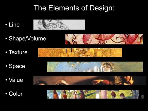
The <strong>Elements</strong> <strong>of</strong> Design:<br />
• Line<br />
• Shape/Volume<br />
• Texture<br />
• Space<br />
• Value<br />
• Color
The Principles <strong>of</strong> Design<br />
•Balance<br />
•Emphasis/Dominance<br />
•Rhythm/Movement<br />
•Unity/Harmony<br />
•Scale/Proportion
The elements <strong>and</strong> <strong>principles</strong> <strong>of</strong> <strong>design</strong><br />
work in t<strong>and</strong>em to help the creator<br />
(artist) develop a more dynamic<br />
representation <strong>of</strong> the subject matter.<br />
These tools be<strong>com</strong>e the building blocks<br />
<strong>of</strong> all great works.
Our Still Life
Line is a powerful tool.
An example <strong>of</strong> how much line can do alone: Here is an ink<br />
drawing from my sketchbook where only the same width line<br />
is used repeatedly to create shape, value <strong>and</strong> texture.
Line’s most important role has usually been<br />
to define shape (forms) <strong>and</strong> space.
Still Life by Van Gogh
It is good practice to look at master paintings <strong>and</strong> dissect them into<br />
their basic elements. Since visual art is like a language, the more you<br />
observe art, the more fluent you will be when you render art. Here<br />
you can see how I revealed the basic shapes in Van Goghs painting<br />
just as I have in our own still life.
Now that the basic shapes in our <strong>com</strong>position have<br />
been identified <strong>and</strong> rendered we may move onto<br />
other elements such as texture <strong>and</strong> value.
By adding lines for texture <strong>and</strong> hints <strong>of</strong> value to create<br />
spatial depth <strong>and</strong> the appearance <strong>of</strong> mass, the<br />
<strong>com</strong>position be<strong>com</strong>es more interesting <strong>and</strong> engaging.
With the elimination <strong>of</strong> the polka dots in the background,<br />
we can focus on the movement created by the stripes<br />
<strong>and</strong> the dominant emphasis made by the circular shape<br />
in the teapot.
The circle is a powerful dynamic form. Still life work may be<br />
broken down into basic shapes as previously shown. However,<br />
the circular forms created in a still life (our teapot) be<strong>com</strong>e<br />
dominant by nature <strong>of</strong> their shape. We can create balance by<br />
adding similar shapes throughout. Here, even with dynamic<br />
diagonal lines, the circle is still the most dominant shape.
With the addition <strong>of</strong> the smaller circles, the larger circle is<br />
less dominant . Now the tendency for the viewer is to<br />
visually move their eye throughout the <strong>com</strong>position.
With the addition <strong>of</strong> the polka dots on the fabric from<br />
behind we can see how the dominance <strong>of</strong> the teapots<br />
shape is challenged. The eye now begins to follow a<br />
path around the <strong>com</strong>position.
Color is <strong>of</strong>ten the most used element chosen to provide<br />
emphasis because color is direct. What makes it so powerful is<br />
a reaction to slight muscle movements in the eye. This can<br />
make color more powerful than shape <strong>and</strong> scale.<br />
On the left we have an example <strong>of</strong> the <strong>design</strong> principle <strong>of</strong> balance at work. The left side <strong>of</strong><br />
this painting by Miro is weighted heavily by the shapes <strong>and</strong> values. The eye doesn’t want to<br />
move the right side much. With the element <strong>of</strong> color, the red now dominates attention <strong>and</strong><br />
challenges all the shapes on the left, leaving the piece more balanced.
With the addition <strong>of</strong> a few colors the <strong>com</strong>position be<strong>com</strong>es<br />
even more dynamic <strong>and</strong> now the viewer is more likely to move<br />
their eye throughout the piece. I want to note how dominant<br />
the teapot is even with the addition <strong>of</strong> the bright color.
Here we have the basics on how to develop a still<br />
life.