_ spring - Niggli Verlag
_ spring - Niggli Verlag
_ spring - Niggli Verlag

You also want an ePaper? Increase the reach of your titles
YUMPU automatically turns print PDFs into web optimized ePapers that Google loves.
architecture design typography<br />
niggli<br />
_<br />
new publications<br />
_<br />
20<br />
14<br />
<strong>spring</strong><br />
_<br />
new publications <strong>spring</strong> 2014<br />
_<br />
1
niggli<br />
architecture design typography<br />
_<br />
Magazines 2013/2014<br />
Order our latest niggli magazine as well as our sister company BENTELI`S<br />
magazine for free at our distributors or directly with us.<br />
_<br />
Price info<br />
All prices given in this preview are in Swiss Francs and Euro, incl. the respective<br />
VAT. The prices in Swiss Francs are recommended retail prices for Switzerland.<br />
The prices in Euro are fixed retail prices for Germany, respectively<br />
recommended retail prices for Austria. All prices, descriptions and release<br />
dates are subject to alterations or errors.<br />
_<br />
new publications <strong>spring</strong> 2014<br />
_<br />
2
niggli<br />
architecture design typography<br />
_<br />
Foreword<br />
_<br />
Reduced, straightforward and clear – the new look of niggli<br />
clearly aligns itself with the basic concepts that Arthur <strong>Niggli</strong><br />
laid down with Karl Gerstner, creator of the niggli logo,<br />
in 1950. The streamlined design represents the concept<br />
of our publishing program as well. niggli publishes books<br />
on architecture, design and typography. Our publications<br />
address all teachers, students and professionals in these<br />
areas. We aim to produce books with high-quality content<br />
and good design that support and inspire our readers in their<br />
professional life. The high value we place on content is also reflected<br />
in the inspired design and careful production methods<br />
of our products. niggli has always been and continues to be a<br />
name that stands for quality, a quality that we, with your help,<br />
would like to bring to your customers, our readers.<br />
As before, our new releases are grouped into three areas:<br />
Architecture presents a variety of current positions and<br />
concepts, featuring monographs on contemporary architects<br />
and interior designers, Design meanwhile focuses on the field<br />
of furniture design and presents one of the pioneers of Swiss<br />
furniture design – Alfred Altherr junior. A useful tool in form<br />
of a handbook is the monograph by the Berlin-based office<br />
Moniteurs, offering insights into the design of orientation<br />
systems. Our new typography titles not only focus on new<br />
fonts, the 23rd issue of Slanted takes a look at contemporary<br />
design in Switzerland. Switzerland, or more specifically Swiss<br />
architecture, is also the focus of the first issue of archithese in<br />
2014, the annually published Swiss Performance.<br />
Our <strong>spring</strong> program is packed with outstanding titles that will<br />
surely find an interested audience. We would like to reach out<br />
to our colleagues in bookselling with an offer of intensified<br />
future cooperation to support you in your efforts in selling our<br />
books. Are you interested? Our sales representatives Giovanni<br />
Ravasio and Hans Frieden are happy to advise you, or you can<br />
directly contact Kirstin Meditz at the publishing house.<br />
We hope you will enjoy our new releases and look forward to<br />
our future cooperation.<br />
Andrea Wiegelmann, Publishing Director niggli, and team<br />
_<br />
new publications <strong>spring</strong> 2014<br />
_<br />
3
niggli<br />
architecture design typography<br />
_<br />
new publications <strong>spring</strong> 2014<br />
_<br />
4
niggli<br />
— The first monograph of the Zurich-based interior<br />
design office Gessaga Hindermann, who explore<br />
the limits and possibilities of the discipline in their<br />
projects<br />
— The monograph is a practical design compendium for<br />
architects, interior architects and students of both<br />
disciplines<br />
architecture design typography<br />
_<br />
Boden Wand Decke – Zur Poesie der<br />
Innenarchitektur<br />
— A handbook for the future: everything you need<br />
to know to quickly and easily make informed design,<br />
production and consumer choices<br />
_<br />
Gessaga Hindermann (ed.)<br />
Boden Wand Decke – Zur Poesie der Innenarchitektur<br />
German, approx. 272 pages, illustrated throughout<br />
20 × 28 cm, hardcover with a text booklet in Swiss binding<br />
approx. Euro (D) 49.80, Euro (A) 51.20, CHF 62.–<br />
ISBN 978-3-7212-0899-3<br />
↘ April 2014<br />
The monograph Boden Wand Decke – Zur Poesie der Innenarchitektur<br />
by the Zurich-based interior architecture office Gessaga Hindermann<br />
serves as a working tool and a source of inspiration for design professionals.<br />
It consists of two parts complementing each other – an image<br />
volume and a text booklet.<br />
The illustrated volume focuses on the latest design discourse and<br />
presents Gessaga Hindermann projects in a comprehensive image<br />
montage. The picture series also illustrate the working process and<br />
thereby emphasize the core competency of the discipline – the draft,<br />
the design itself.<br />
Six authors discuss the influence and importance of tradition and<br />
convention for the interior design process in the included text booklet.<br />
The essays pick up on central important questions in design: they discuss<br />
the connections between architecture, interior architecture and<br />
scenography as well as aspects of user friendliness and the sociology<br />
of space.<br />
The combination of a documenting image series and discursive text<br />
contributions by experts make this publication an insightful and instructive<br />
compendium that connects theory to practice, thereby offering<br />
a comprehensive depiction of design processes.<br />
With texts by Christina Sonderegger, Alois M. Müller, Jörg Boner,<br />
Sascha Stahl, Peter Schneider, Simon Libsig, Nader Taghavi, Bernadette<br />
Fülscher, Robert und Trix Haussmann and others.<br />
_<br />
In 2000, Jérôme Gessaga und Christof Hindermann,<br />
two designers and interior architects, founded<br />
the company Gessaga Hindermann GmbH in<br />
Zurich. Their aim is to develop and execute projects<br />
in the area of interior architecture, product<br />
and exhibition design. Their projects are a result<br />
of intensive research into the working processes<br />
and communication cultures of companies.<br />
www.gessaga-hindermann.ch<br />
_<br />
new publications <strong>spring</strong> 2014<br />
_<br />
5
Ed utem sunte dolu<br />
tquame hicia et exc<br />
ed utem sunte dolu<br />
niggli<br />
architecture design typography<br />
29<br />
_<br />
new publications <strong>spring</strong> 2014<br />
_<br />
6<br />
30<br />
Landesamt für Finanzen, Landshut
niggli<br />
— One of the leading offices in the field of hospital construction<br />
in Germany<br />
— Projects a.o. adidas factory outlet, Herzogenarach;<br />
fair Stuttgart; State Revenue Office, Landshut;<br />
Bavarian State Office for Health and Food Safety,<br />
Erlangen<br />
architecture design typography<br />
_<br />
wulf architekten.<br />
Rhythm and Melody<br />
wulf architekten<br />
Rhythmus und<br />
Melodie<br />
<strong>Niggli</strong><br />
German<br />
English<br />
_<br />
wulf architekten. Rhythmus und Melodie<br />
With texts by Hubertus Adam, Hans-Jürgen Breuning,<br />
Tobias Wulf, Kai Bierich and Alexander Vohl<br />
approx. 256 pages, approx. 200 illustrations and plans<br />
30 × 23 cm, half-cloth binding<br />
approx. Euro (D) 62.–, (A) 63.70, CHF 78.–<br />
German Edition: ISBN 978-3-7212-0900-6<br />
English Edition: ISBN 978-3-7212-0901-3<br />
↘ April 2014<br />
_<br />
Having worked for well-known offices such as Gottfried Böhm, Joachim<br />
Schürmann, Auer + Weber and Behnisch & Partner in the past,<br />
wulf architekten have long since developed their very own position.<br />
Inspired by a deliberate openness towards innovation, however, they<br />
constantly challenge this position. Their way of finding solutions, unhindered<br />
by preconceived ideas and concepts, is what the architects<br />
call “identity through search”; this search also means movement and<br />
change. The only, meanwhile important, constant is their humanistic<br />
approach – a distinct focus on people as a starting point for all design<br />
work. This central conviction shows in the sensuous quality and the<br />
variety of the office’s built projects. Their numerous designs for competition<br />
do not only serve to acquire new project commissions, they<br />
have far greater significance: giving shape to new ideas, approaching<br />
new topics, experimenting and testing the boundaries. In texts that establish<br />
connections between central statements of the three partners<br />
and their built projects, the publication Rhythm and Melody offers a<br />
comprehensive insight into the way wulf architekten think and work.<br />
Architecture, as already hinted at by the title, is not understood as an<br />
isolated discipline here, but as part of a multifaceted cultural context.<br />
_<br />
The Stuttgart-based office wulf architekten, founded<br />
in 1987 by Tobias Wulf (*1956), was joined by<br />
Kai Bierich (*1957) and Alexander Vohl (*1961) as<br />
partners in 1996. Among their main works are the<br />
award-winning adidas factory outlet in Herzogenaurach<br />
(2003), the Stuttgart fair grounds (2007)<br />
and the State Revenue Office in Landshut (2011).<br />
Apart from several school buildings, wulf architekten<br />
is currently planning the new building for<br />
the IHK Region Stuttgart as well as the German<br />
Center for Neurodegenerative Diseases, located<br />
on the campus of the university hospital in Bonn.<br />
Ed utem sunte do<br />
tquame hicia et e<br />
ed utem sunte do<br />
tquame hicia et e<br />
wulfarchitekten.com/<br />
_<br />
new publications <strong>spring</strong> 2014<br />
_<br />
7<br />
155
niggli<br />
— A monography on one of the most noteworthy new<br />
buildings in Switzerland<br />
— One building – three uses: Shoppingcenter,<br />
Dienstleistungsgeschoss und Wohnungen<br />
architecture design typography<br />
_<br />
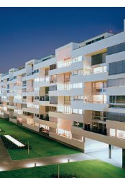
BDE Architekten –<br />
Archhöfe Winterthur<br />
— Building in an urban context<br />
BDE ArchitEktEn<br />
Archhöfe Winterthur<br />
hErAusgEgEBEn von huBErtus ADAm<br />
niggli<br />
_<br />
Hubertus Adam (ed.)<br />
BDE Architekten – Archhöfe Winterthur<br />
German, 112 pages, 160 color illustrations and plans<br />
24,2 × 28,5 cm, clothbound hardcover<br />
Euro (D) 46.–, Euro (A) 47.30, CHF 58.–<br />
ISBN 978-3-7212-0891-7<br />
↘ already available<br />
_<br />
Winterthur has undergone a structural change during the last<br />
decades from an industrial working-class town to an attractive urban<br />
agglomeration. The architectonic face of the city has meanwhile changed<br />
as well.<br />
The building of the Archhöfe played an important part in this,<br />
closing off the station square at its southern end and thereby taking up<br />
an attractive inner-city location. The eye-catching monolithic building<br />
combines shopping center, service sector and residential development<br />
under one tent-shaped roof. This makes the Archhöfe an impressive<br />
example of multifunctional architecture as well as a construction successfully<br />
planned and incorporated into a grown urban surrounding.<br />
The book presents the project in plans and pictures, an essay by architecture<br />
critic Hubertus Adam and further documentations. Its beginnings<br />
date back to a competition in 2003, when BDE Architekten, who<br />
secured the project back then, were still an up-and-coming team. Today,<br />
ten years later, they have grown to be a renowned architectural office.<br />
_<br />
BDE Architekten<br />
Founded in 2002 by Philipp Brunnschweiler,<br />
Matthias Denzler and Oliver Erb. Amadeus<br />
Dorsch joined BDE Architekten as a partner in<br />
2010. Their projects include the rectory Steinhausen<br />
(2005) and the parish hall Wiesendangen<br />
(2007) – which received the architecture award<br />
for the region Winterthur – among others. At the<br />
moment they are working on several projects,<br />
among them the bus depot Grüzefeld in Winterthur,<br />
the residential and retail development<br />
Schlossberg in Baden as well as residential buildings<br />
at the lake in Arbon and in Winterthur.<br />
www.bde.ch<br />
_<br />
new publications <strong>spring</strong> 2014<br />
_<br />
8
niggli<br />
— Pioneering concepts for a dense urban architecture<br />
— Selected works by Japanese architect Riken Yamamoto:<br />
The Circle, the project at Zurich Airport, and<br />
the local community areas<br />
architecture design typography<br />
_<br />
Riken Yamamoto.<br />
How to make a city<br />
_<br />
Architekturgalerie Luzern (ed.)<br />
Riken Yamamoto. How to make a city<br />
German/English, 32 pages<br />
27 illustrations and plans, 22 × 27,4 cm<br />
softcover with bound dust jacket<br />
Euro (D) 19.80, (A) 20.40, CHF 25.–<br />
ISBN 978-3-7212-0888-7<br />
↘ already available<br />
_<br />
The works of Japanese architect Riken Yamamoto are of outstanding<br />
importance in contemporary Japanese architecture. His aim is to<br />
always integrate the social aspects of an assignment into his architecture.<br />
The publication How to make a city focuses on Yamamoto’s longstanding<br />
involvement with the topic of the dense city. The book, published<br />
along with the exhibition of the same name at the Architecture<br />
Gallery Lucerne, picks up on several selected newer works of the office<br />
Riken Yamamoto, among them the project The Circle at Zurich Airport.<br />
This project originated from a competition in 2009, which Yamamoto<br />
won despite a large number of international submissions.<br />
The multifunctional building complex, whose inner organisation adapts<br />
medieval city structures in a modern form, is based on Yamamoto’s<br />
research project on the Local Community Area, which is also presented<br />
in the publication. It explores surprising as well as fascinating possibilities<br />
for the aesthetic and sustainable design of dense urban structures.<br />
_<br />
Riken Yamamoto (*1945) founded the architectural<br />
office Riken Yamamoto & Field Shop in<br />
1973. Projects like the Yokohama Public Housing,<br />
the Future University Hakodate or the Yokosuka<br />
Museum of Art have gained international attention.<br />
One of the recurring themes in Yamamoto’s<br />
buildings is the importance of the public space,<br />
the possibility of social interaction. From 2002 to<br />
2007 he was a professor at Kogakuin University<br />
and from 2007 to 2011 he taught at the State University<br />
Yokohama. Since 2011, Yamamoto has been<br />
a partner professor there and also holds a special<br />
chair for graduate studies in the area of constructional<br />
engineering at the University of Nihon.<br />
riken-yamamoto.co.jp/<br />
_<br />
new publications <strong>spring</strong> 2014<br />
_<br />
9
niggli<br />
— Focus “Building in the City”<br />
— With contributions by: Klaus Theo Brenner,<br />
Jörg Hartmann, Vittorio Magnago Lampugnani<br />
— The next conference will take place on the 27th to 28th<br />
of March 2014 at the Rheinterrassen in Düsseldorf<br />
architecture design typography<br />
_<br />
Konferenz zur Schönheit und<br />
Lebensfähigkeit der Stadt 4:<br />
«Die normale Stadt und ihre Häuser»<br />
CHRISTOPH MÄCKLER WOLFGANG SONNE (HG.)<br />
DIE NORMALE STADT UND IHRE HÄUSER<br />
DAS NORMALE STADTHAUS<br />
DAS NORMALE STADTQUARTIER<br />
PLANUNGS- UND ENTWICKLUNGSINSTRUMENTE<br />
NIGGLI<br />
KONFERENZ ZUR SCHÖNHEIT UND<br />
LEBENSFÄHIGKEIT DER STADT 4<br />
DEUTSCHES INSTITUT FÜR STADTBAUKUNST<br />
STADTBAUKUNST<br />
_<br />
Christoph Mäckler, Wolfgang Sonne<br />
[German Institute for Urban Design] (ed.)<br />
Konferenz zur Schönheit und Lebensfähigkeit der Stadt 4: «Die normale<br />
Stadt und ihre Häuser» (Conference on Urban Aesthetics and Quality of<br />
Life 4: The Normal City and its Houses)<br />
German, approx. 200 pages, approx. 150 illustrations<br />
21 × 25 cm, softcover with flaps<br />
approx. Euro (D) 38.–, Euro (A) 39.10, CHF 48.–<br />
ISBN 978-3-7212-0894-8<br />
↘ March 2014<br />
_<br />
Apart from the basic questions as to what constitutes a normal city,<br />
this year’s conference focused in more detail on the concept of normal<br />
urban dwellings. This topic once more brought together the different<br />
disciplines concerned with urban development, not to debate and<br />
dissociate their ideological principles but to communally work towards<br />
improving planning and building culture, using concrete examples, and<br />
thus contributing to the discipline of urban design. Architects, urban<br />
planners, engineers, sociologists, politicians, artists, citizens – they<br />
all are involved in the project of the normal urban dwelling and have<br />
answered the following questions, among others:<br />
What standards does the modern city dwelling need to fulfill? What<br />
impact should private inner-city houses have on the public space? How<br />
should they be arranged in the block and towards the street front?<br />
How can the ground level interact with the street or square? What<br />
type of facade facilitates communication between private and public<br />
space? And what type of facade creates cityscapes? Which types and<br />
traditions can we build on, which ones are less suited? What are the<br />
different client concepts available for urban construction today?<br />
Which laws, regulations or norms hinder the construction of normal<br />
city houses nowadays? And what, on the other hand, could benefit<br />
their construction? And finally, what training is required to plan and<br />
build normal urban dwellings?<br />
_<br />
The German Institute for Urban Design at the<br />
University of Technology Dortmund, under the<br />
direction of Prof. Christoph Mäckler, focuses on<br />
the research and teaching of the art of urban construction.<br />
This term encompasses two things: a<br />
focus on the artistic character of urban planning,<br />
the aesthetic design of a city; and the idea that<br />
city planning should combine different aspects,<br />
such as social, economic, ecological, technical<br />
and cultural requirements, in the design of urban<br />
areas.<br />
Authors of this issue (among others):<br />
Prof. Klaus Theo Brenner, Klaus Theo Brenner Stadtarchitektur, Berlin<br />
Prof. Dr. Andrzej Górak, Pro-rector TU Dortmund<br />
Michael Groschek, Minister for building, living, urban develoment<br />
and traffic<br />
Jörg Hartmann, actor<br />
Prof. Dr. Vittorio Magnago Lampugnani, ETH Zürich<br />
Prof. Christoph Mäckler, Deutsches Institut für Stadtbaukunst<br />
Prof. Dr. Wolfgang Sonne, Deutsches Institut für Stadtbaukunst<br />
Prof. Jörn Walter, Hansestadt Hamburg<br />
This art of uniting a multidisciplinary conception<br />
of the city into one harmonious townscape was<br />
mainly lost with the emergence of the reductionist<br />
idea of a functionalist, sociological and trafficoriented<br />
urban design, but it was still defining the<br />
young urbanism of the early 20th century, which<br />
used the term “art of urban design” for it.<br />
The aim of the Institute of Urban Design is to take<br />
up this thread and tie together the disciplines<br />
of architecture, urban and regional planning,<br />
open space design, traffic management and civil<br />
engineering that have been drifting apart over the<br />
past decades.<br />
www.stadtbaukunst.tu-dortmund.de<br />
_<br />
new publications <strong>spring</strong> 2014<br />
_<br />
10
niggli<br />
— Magazine about architecture – from architects for<br />
architects<br />
— Thematical issues six times per year<br />
— German / English / French, 22,5 × 29,5 cm<br />
Euro (D) 22.–, Euro (A) 22.60, CHF 28.–<br />
Subscription rates Switzerland:<br />
_<br />
1 year: CHF 148.–<br />
1 year student rate: CHF 115.–<br />
International subscription rates:<br />
-<br />
1 year: Euro 128.–, CHF 159.–<br />
1 year student rate: Euro 98.–, CHF 124.– plus postage<br />
_<br />
Issue 1 / February 2014: Swiss Performance<br />
The yearbook for Swiss architecture<br />
The widely acclaimed Swiss architecture and building quality never runs out of steam in archithese.<br />
For the first issue of 2014, after a year of research and observations, the editors once again collate<br />
outstanding projects that have been built in Switzerland or by Swiss architects abroad in 2013. Between<br />
new finds and the inescapable, archithese retraces the basics of Swiss architecture culture. By<br />
putting a special focus on the works of young offices the review becomes an outlook as well. What<br />
themes and ideas do they bring into the conversation? The review also includes a selection of book<br />
publications, important projects from the field of built heritage conservation and spatial planning as<br />
well as the original purpose of archithese: sharp to-the-point architecture criticism.<br />
_<br />
ISBN 978-3-7212-0895-5<br />
_<br />
ISBN 978-3-7212-0896-2<br />
_<br />
Issue 2 / April 2014: Bündnis – Alliance – Association<br />
New forms of organization in the architectural profession<br />
Every man for himself or all for one? The architect – an individualist grown lonely thanks to his<br />
own egomania? The post-individualistic age of sharing and global communication, and the reawakening<br />
of a communal spirit in the new millennium as an alternative to the seemingly unavoidable<br />
corporate structure pose new questions about the organisational structure of the profession. The<br />
evolution of architecture in the first half of the 20th century was defined by alliances, federations and<br />
architectural associations. CIAM and many other groups forged alliances on the basis of common<br />
ideas on design or politics to promote and propagate their respective approaches. Which models do<br />
we have today? And what are we lacking? What is the role of established professional associations<br />
and why are conferences as popular as ever despite growing digital networks? archithese takes a<br />
look at the structures of the architecture discipline.<br />
_<br />
ISBN 978-3-7212-0897-9<br />
_<br />
Issue 3 / Juni 2014: Neomanie – Langeweile | Hype – Boredom<br />
What is design and what influences it?<br />
Endless strive for innovation or continuation of the same old. Creative volcano, expression or restraint<br />
and strict order; a maximisation of possibilities or an integration into the cityscape? Autonomous,<br />
canonical profession or free exchange of the disciplines, searching for new impulses?<br />
The discourse surrounding hype and boredom is not simply a question of style, but has been defining<br />
the struggle for architecture and cityscape for centuries. Does mastery also mean virtuosity – or<br />
proportionality – or is it simply camouflage for a lack of ideas? Is neomania – the barely controllable<br />
creativity and obsession with innovation – the driving force of architecture or do boring constructions<br />
prove to be better in the long run?<br />
What is media’s role in all of this? The wheel of topics, themes and names seems to be turning faster<br />
and faster; one-hit wonders seem to have entered the realm of architecture and ever so often themes<br />
and personalities now disappear before any substantial examination is even possible. The “hype”, meaning<br />
artificially induced excitement about topics and protagonists, is not only a fast lane to success; it<br />
also sparks rejection and backlash. What are the costs of media’s simplification for the production and<br />
perception of architecture? Is the “slow” discipline architecture still resilient or do we already start to<br />
think in seasons, summer hits and shooting stars?<br />
_<br />
new publications <strong>spring</strong> 2014<br />
_<br />
11
niggli<br />
architecture design typography<br />
_<br />
new publications <strong>spring</strong> 2014<br />
_<br />
12
niggli<br />
— The first publication on Alfred Altherr junior –<br />
designer, architect and exhibition designer<br />
— Pioneer of modern furniture design<br />
— A defining member of the Swiss Werkbund<br />
_<br />
Design+Design (ed.)<br />
Alfred Altherr junior –<br />
Protagonist der Schweizer Wohnkultur<br />
German, 136 pages, 129 illustrations and plans<br />
21 × 27 cm, softcover<br />
Euro (D) 29.80, (A) 30.60, CHF 38.–<br />
ISBN 978-3-7212-0893-1<br />
↘ already available<br />
architecture design typography<br />
_<br />
Alfred Altherr junior –<br />
Protagnonist der<br />
Schweizer Wohnkultur<br />
_<br />
Alfred Altherr junior made his mark in the area of modern Swiss<br />
architecture as designer, architect, museum director, lecturer and exhibition<br />
designer. Joan Billing and Samuel Eberli from Design+Design<br />
reviewed and researched the comprehensive estate of this protagonist<br />
of Modernism. They paved the way for a striking publication that puts<br />
Altherr and his work back into the spotlight.<br />
Already in his early years, Altherr was able to realize his first design<br />
for a steel tube lounger at the company Embru in Rüti. He gained<br />
relevant experience during his internship with Le Corbusier and Pierre<br />
Jeanneret in Paris. Altherr played an important part as an advocate of<br />
Swiss living culture He was a co-founder of the award “Die gute Form”<br />
and founder of the first “objective furnishing design advice center” in<br />
Winterthur. His aim was to promote the new lifestyle not only to the<br />
young Swiss but also to the older generation.<br />
This publication shows that design culture is able to consolidate<br />
past and present. With texts by Alfred Altherr, Arthur Rüegg, Michael<br />
Hanak, Susanna Koeberle, Peter Lepel, Claude Lichtenstein and Juho<br />
Nyberg.<br />
_<br />
Design+Design is a platform for the cultivation<br />
of design culture, especially vintage design. They<br />
are based in Baden and regularly host the Vintage<br />
Furniture Salon, which features international<br />
gallery owners. Joan Billing and Samuel Eberli<br />
believe that originals from their different time<br />
periods exude a certain energy and soul.<br />
www.designunddesign.ch<br />
Alfred Altherr junior (1911–1972) initially trained as<br />
an architectural draftsman and attended courses<br />
on carpentry and metalworking. He went to Paris in<br />
1931 to work for Le Corbusier and dedicated himself<br />
to the study of modern and Japanese building<br />
culture. Back in Zurich, he founded his own architectural<br />
office at the age of 24 and started designing<br />
prototype buildings, houses, interior designs<br />
and standardized furniture. He realized multiple<br />
pavilions for the Swiss National Exhibition 1939 and<br />
the “Landi” bank. Later in his career he taught at<br />
the Vocational School of the Arts Zürich, worked as<br />
an editor for Bauen + Wohnen and Werk, acted as<br />
executive director of the Swiss Werkbund, was one<br />
of the founders of “Die gute Form”, director of the<br />
Trade and Crafts Museum Winterthur and founder<br />
of the objective interior design advice center, as<br />
well as director of the Vocational School of the Arts<br />
and the Applied Arts Museum Zürich.<br />
_<br />
new publications <strong>spring</strong> 2014<br />
_<br />
13
36 Werkzeuge für die Design-Revolution Werkzeuge für die Design-Revolution 37<br />
niggli<br />
architecture design typography<br />
Der Drucker ist ein Beispiel für das geplante<br />
vorzeitige End-Of-Life eines Produktes.<br />
Er enthält einige Komponenten, welche<br />
manipulierbar sind und von den Herstellern<br />
genutzt werden, den regelmäßigen Bedarf<br />
neuer Drucker aufrecht zu erhalten und so<br />
den Umsatz auf dem Markt konstant zu<br />
halten oder zu steigern. Mittels Zahnrädern<br />
zählt das Gerät mit, wieviele Seiten gedruckt<br />
werden und diese Informationen werden<br />
in unscheinbaren Chips dazu genutzt eine<br />
Auskunft über den Füllstand der Patrone<br />
zu geben. Wie der genaue Füllstand ist, ist<br />
nicht bekannt und so melden die meisten<br />
Drucker eine leere Patrone, obwohl wir mit<br />
dieser noch eine Vielzahl an Seiten drucken<br />
könnten. Nach einigen gewechselten<br />
Patronen kommt es zu weiteren Meldungen<br />
über einen verunreinigten oder defekten<br />
Druckkopf. Der dem Gerät eingeschriebene<br />
Todeszeitpunkt ist erreicht. Nach Auskunft<br />
des Service lohnt eine Reparatur nicht, da<br />
bereits für wenige Euros mehr ein neues Gerät<br />
erhältlich ist. So landen täglich technisch<br />
einwandfreie Geräte auf dem Müll.<br />
Auf den Geräten warnen grelle Hinweisschilder<br />
vor dem Öffnen des Produktes. Die<br />
Garantie erlischt sobald die erste Schraube<br />
gelöst ist - vorausgesetzt der passende im<br />
Handel schwer erhältliche Spezialschraubenzieher<br />
wurde gefunden. Hersteller haben es<br />
geschafft in uns ein Gefühl zu erzeugen, als<br />
würden wir mittels krimineller Energien ein<br />
Verbrechen begehen wenn wir nun wider allen<br />
Hinweisen und Empfehlungen versuchen<br />
an unserem erworbenen Drucker Lebensverlängernde<br />
Maßnahmen zu ergreifen. Doch<br />
wer gibt hier wem vor wie wir uns Verhalten<br />
sollen? Und ist es verwerflich die Diktate der<br />
Industrie aufzubrechen?<br />
_<br />
new publications <strong>spring</strong> 2014<br />
_<br />
14
niggli<br />
— Strategies and concepts for social, ecological and<br />
ethically sustainable design<br />
— A handbook for the future: everything you need<br />
to know to quickly and easily make informed design,<br />
production and consumer choices.<br />
Werkzeuge<br />
für die<br />
Design-<br />
Revolution<br />
Designwissen<br />
für die<br />
Zukunft<br />
IDRV – Institute<br />
of Design<br />
Research Vienna<br />
_<br />
Institute of Design Research Vienna (ed.)<br />
Texte von Harald Gründl, Christina Nägele,<br />
Marco Kellhammer, Ulrike Haele<br />
Tools for the Design Revolution.<br />
Design Knowledge for the Future<br />
approx. 160 pages, illustrated throughout<br />
16,6 × 24 cm, softcover<br />
approx. Euro (D) 29.80, Euro (A) 30.60 CHF 38.–<br />
German Edition: ISBN 978-3-7212-0902-0<br />
English Edition: ISBN 978-3-7212-0903-7<br />
↘ May 2014<br />
German<br />
English<br />
architecture design typography<br />
_<br />
Tools for the Design Revolution.<br />
Design Knowledge for the Future<br />
_<br />
The publication Tools for the Design Revolution shows the position of<br />
current designs at a critical turning point in history and offers practical<br />
guidelines and tools for sustainable design processes. The tools come<br />
in the form of strategies for sustainable design that clear the way to a<br />
social, ecological and ethically sustainable future. Letting go of traditional,<br />
established product and design ideas is getting more and more<br />
important.<br />
In the past, design used to be a service for the industry. In the future,<br />
the tools of design should be in the hands of the public. Terms like<br />
“cradle to cradle” or “open source design” stand for a changing understanding<br />
of design processes. Learning from each other, exploring<br />
experimental strategies and mindsets in combination with scientifically<br />
proven methods is the key to change.<br />
Design is more than just giving an appearance to products – it plays<br />
a vital role in changing the appearance of a society fit for the future<br />
as well as in the formulation of sustainable lifestyles based on global<br />
solidarity.<br />
Tools for the Design Revolution invites you to take part in a critical examination<br />
of topics like sustainability and your own consumer culture.<br />
_<br />
The Institute of Design Research Vienna (IDRV)<br />
was founded 2008 with the goal of making an<br />
independent, academically influenced contribution<br />
to the establishment of the new field of design<br />
studies. As a non-profit scientific organization, the<br />
IDRV was created to foster interdisciplinary and<br />
disciplinary discussions on concrete issues of the<br />
worldwide design community, especially regarding<br />
the areas of ecologically and socially sustainable<br />
design as well as design history and teaching.<br />
www.idrv.org<br />
8<br />
Harald Gründl (*1967) studied Industrial Design at<br />
the University of Applied Arts in Vienna and founded<br />
the Atelier EOOS in 1995, together with Martin<br />
Bergmann and Gernot Bohmann. Gründl completed<br />
his postgraduate studies in 2005 with The Death of<br />
Fashion, earning the title of Doctor of Philosophy.<br />
Christina Nägele (*1976) studied cultural studies<br />
and aesthetic practices at the University Hildesheim.<br />
She is a cultural scientist with a focus on curatorial,<br />
mediating and administrative work on the borderline<br />
of the fine arts, architecture, theater and media.<br />
8 Werkzeuge für die Design-Revolution Werkzeuge für die Design-Revolution 9<br />
Marco Kellhammer (*1988) studied Industrial<br />
Design at the University of Osnabrück and has<br />
been working at the IDRV since 2012, focussing on<br />
sustainable design.<br />
_<br />
new publications <strong>spring</strong> 2014<br />
_<br />
15
niggli<br />
architecture design typography<br />
nternehmen haben ihren Sitz im Aufbau Haus: Die<br />
agsgruppe“ und „Modulor“ – ein Materialanbieter,<br />
et Modulor“ weitere Dienstleister aus Kreativd<br />
Handwerk ins Haus holte. Die Themen der beiden<br />
r – Schrift und Material – bildeten den Ausgangse<br />
Gestaltung des Orientierungssystems. An seiner<br />
– so die Idee von Moniteurs – sollten Handwerker<br />
Modulor“ beteiligt sein. Das Konzept der „mate-<br />
Schrift“ präsentiert sich nun in Form von gefrästen<br />
schichteter Trägerplatte. Die einzelnen Zeilen<br />
uswechselbar und können bei Mieterwechsel gut<br />
erden. Kombiniert werden diese mit dreidimensional<br />
Kennzeichen auf der Wand. So entsteht bei aller<br />
Mieter ein übergeordnetes Erscheinungsbild, das<br />
ine eigene Identität verleiht.<br />
Aufbau Haus<br />
Leit- und Orientierungssystem<br />
Fassade und Innenbereich<br />
Auftraggeber<br />
Moritzplatz 1 Entwicklungsgesellschaft<br />
mbH<br />
Berlin 2011<br />
Auszeichnungen<br />
European Design Awards 2012<br />
reddot design award 2012<br />
Bundesdesignpreis 2012<br />
(nominiert)<br />
Architektur<br />
Clarke und Kuhn<br />
freie Architekten BDA<br />
Nutzfläche<br />
17.500 qm<br />
_<br />
new publications <strong>spring</strong> 2014<br />
_<br />
16
68<br />
Die Digitalanzeigen sind analog<br />
zum Leitsystem mit der Corporate-<br />
Schrift des Flughafens gestaltet.<br />
Alle Straßennamen im Außenbereich<br />
sind nach wichtigen<br />
Personen der Luftfahrtgeschichte<br />
benannt. Ein am<br />
Straßenschild angebrachter<br />
QR-Code ermöglicht es<br />
den Passagieren, mithilfe<br />
ihres eigenenen Smartphones<br />
Hintergrundinformationen<br />
zu diesen Personen abzurufen.<br />
niggli<br />
— Award-winning signage and orientation systems by<br />
Berlin-based office Moniteurs<br />
— The new orientation system for the airport BER<br />
Berlin Brandenburg<br />
architecture design typography<br />
_<br />
1:1 –<br />
Signage, Orientation, Identity<br />
— Signage and lettering at a 1:1 scale<br />
German<br />
English<br />
_<br />
1 : 1 – Signage, Orientation, Identity is a special book. It not only describes<br />
the projects of the last ten years and the way of working of the<br />
communications design company Moniteurs, but the projects are also<br />
graphically brought into focus: in this way the book shows Moniteurs’<br />
orientation systems on a 1:1 scale. The concepts of individual projects<br />
are presented in short, concise texts with many photographs and infographics,<br />
while an interview with the three owners of the company,<br />
Heike Nehl, Sibylle Schlaich and Isolde Frey, gives an insight into their<br />
approach.<br />
_<br />
Moniteurs (ed.)<br />
1:1 – Signage, Orientation, Identity<br />
224 pages, 144 illustrations,<br />
23 × 28,5 cm, softcover with flaps<br />
Euro (D) 49.80, (A) 51.20, CHF 62.–<br />
German Edition: ISBN 978-3-7212-0889-4<br />
English Edition: ISBN 978-3-7212-0890-0<br />
↘ already available<br />
_<br />
Founded 1994 in Berlin, the office Moniteurs is<br />
today headed by three partners – Heike Nehl,<br />
Sibylle Schlaich, and Isolde Frey. Moniteurs<br />
develops concepts for the visual communication<br />
of companies, institutes, organisations, and<br />
NGOs. They also design print and digital media<br />
as well as graphical spatial elements . Their aim is<br />
to illustrate content in an easily comprehensible<br />
form, convey dates and facts and include people<br />
and their needs when creating designs.<br />
Moniteurs 1 : 1<br />
www.moniteurs.de<br />
Flughafen Berlin Brandenburg<br />
54<br />
_<br />
new publications <strong>spring</strong> 2014<br />
_<br />
17
niggli<br />
— Slanted presents Swiss (graphic) design and typo<br />
graphy on 320 pages.<br />
— SLANTED is published twice a year and is comple<br />
ted via the blog www.slanted.de komplementiert.<br />
architecture design typography<br />
_<br />
Slanted #23 –<br />
Swiss / Suisse<br />
— Distributor for the Swiss market only!<br />
SLANTED 23<br />
SUISSE<br />
_<br />
Magma Brand Design (ed.)<br />
Slanted #23: Swiss / Suisse<br />
German/English, 320 pages, illustrated throughout<br />
16 × 24 cm, softcover<br />
CHF 25.–<br />
ISBN 978-3-7212-0898-6<br />
↘ May 2014<br />
_<br />
Also available:<br />
Slanted #18: Signage & Orientation<br />
ISBN 978-3-7212-0854-2<br />
_<br />
Slanted #19: Super Families<br />
ISBN 978-3-7212-0855-9<br />
_<br />
Slanted #20: Slab Serif<br />
ISBN 978-3-7212-0856-6<br />
_<br />
Slanted #21: Cuba<br />
ISBN 978-3-7212-0866-5<br />
_<br />
Slanted #22: Art Type<br />
ISBN 978-3-7212-0878-8<br />
Typography and Graphic Design<br />
_<br />
The Alps, chocolate, democracy and graphic design – Switzerland is<br />
known for reliability, quality and perfection, whether in the form of Emmental<br />
cheese or a Swatch precision watch. Manifesting in the history<br />
books of the western design hemisphere as the epitome of straightforwardness<br />
and an objective design vocabulary, the paradigms of “Swiss<br />
Style” still govern the creative sector today.<br />
For over fifty years, these laid-down rules have been universally<br />
accepted. But how is this prestigious heritage applied by designers<br />
today? Where and when do they emancipate themselves and what is<br />
the face of Swiss Style beyond the legacy of its founding fathers Emil<br />
Ruder, Armin Hoffmann and Josef Müller-Brockmann?<br />
On 320 pages, SLANTED takes a look at contemporary design<br />
between tradition, transgression and progressivity, and presents Swiss<br />
(graphic) design and typography by local design professionals.<br />
The issue also presents works from neighboring disciplines like illustration,<br />
photography and art in the context of contemporary creative<br />
work in general; comprehensive studio portraits and interviews offer<br />
insights into the work of newcomers and icons of Swiss graphic design.<br />
_<br />
Picture credits:<br />
Ill. top: Norm, ME, WE, 2011<br />
Poster/exhibition project Design Biennale Chengdu, China – 396<br />
Poster, designed based on 48 modules.<br />
Ill., bottom left: Olivier Lebrun, “Another Companion to Books” from<br />
The Simpsons in Alphabetical Order<br />
Blind no 34, 352 pages, 11.5 × 16.5 cm, ISBN 978-3-906213-00-2<br />
Ill. bottom right: Emma Souharce, Voyeur<br />
Blind no 36, 256 pages, 11 × 16.5 cm, ISBN 978-3-906213-04-0<br />
_<br />
new publications <strong>spring</strong> 2014<br />
_<br />
18
Diese Zeitung ist ein Organ der Niedertracht. Es ist<br />
falsch, sie zu lesen. Jemand, der zu dieser Zeitung beiträgt,<br />
ist gesellschaftlich absolut inakzeptabel. Es wäre<br />
verfehlt, zu einem ihrer Redakteure freundlich oder<br />
auch nur höflich zu sein. Man muss so unfreundlich zu<br />
ihnen sein, wie es das Gesetz gerade noch zulässt. Es<br />
sind schlechte Menschen, die Falsches tun.<br />
Brandon Text Regular — 7pt<br />
Schrift. Typeface. Brandon<br />
Gestalter. Designer. Hannes von Döhren<br />
Label. Foundry. hvdfonts.com<br />
Jahr. Year. 2010—2012<br />
Brandon Groteque ist eine Groteskfamilie mit sechs<br />
Gewichten und passender Kursivschrift. Beeinflusst<br />
von den geometrischen Grotesk-Schriften, die in<br />
den Zwanziger- und Dreißigerjahren des neunzehnten<br />
Jahrhunderts beliebt waren, basieren auch hier<br />
die Fonts auf geometrischen Formen, die zum Zwecke<br />
der besseren Lesbarkeit optisch korrigiert wurden.<br />
Brandon Grotesque hat ein funktionelles, aber<br />
warmes Schriftbild. Während die feinen und die<br />
schwarzen Gewichte sich bestens für Displaygrößen<br />
eignen, sind die leichten, normalen und mittle-<br />
Brandon Grotesque Black — 22pt<br />
Brandon Text Bold — 36pt<br />
Diskurs- und Produktionsprozess hervorgehen.<br />
Brandon Grotesque Light — 10pt<br />
Text Thin, Italic<br />
Text Light, Italic<br />
Text Regular, Italic<br />
Text Medium, Italic<br />
Text Bold, Italic<br />
Text Black, Italic<br />
ren Gewichte für längere Texte geeignet. Die geringe<br />
x-Höhe und die zurückhaltenden Formen cally corrected for better legibility. Brandon Gro-<br />
based on geometric forms that have been opti-<br />
geben der Schrift eine unaufdringliche Eleganz. tesque has a functional look with a warm touch.<br />
Brandon Grotesque ist prädestiniert für anspruchsvolle<br />
professionelle Aufgaben.<br />
performers in display sizes, the light, regular and<br />
While the thin and the black weights are great<br />
Brandon Text hat eine größere x-Höhe als die medium weights are well suited for longer texts.<br />
Grotesque Version und ist optimiert für lange Texte, The small x-height and the restrained forms lend<br />
kleinen Druck und Bildschirme. Die gesamte Brandon<br />
Serie verfügt über alternative Buchstaben, Brü-<br />
well equipped for complex, professional typogra-<br />
it a distinctive elegance. Brandon Grotesque is<br />
che und einen erweiterten Zeichensatz für ost- und phy.<br />
westeuropäische Sprachen.<br />
Brandon Text has a higher x-height than the<br />
Grotesque version and is optimized for long texts,<br />
Brandon Grotesque is a sans-serif type family of small sizes and screens. The whole Brandon series<br />
is equipped with alternate letters, fractions<br />
six weights plus matching italics. Influenced by<br />
the geometric-style sans-serif faces that were and an extended character set to support East<br />
popular during the 1920s and 30s, the fonts are European as well as West European Languages.<br />
Brandon Grotesque Medium<br />
Brandon Grotesque Text Medium Medium<br />
Brandon Text Grotesque Medium Black Italic<br />
Brandon Text Light Italic<br />
Brandon Text Grotesque Black Black Italic<br />
Brandon Grotesque Text Light Italic Regular<br />
Brandon Text Black<br />
Brandon Grotesque Regular<br />
Schrift. Typeface. HM Tilm<br />
Gestalter. Designer. Timm Häneke & Till Wiedeck<br />
Label. Foundry. tillwiedeck.com<br />
Jahr. Year. 2010<br />
Details.<br />
Als ein Kurz-Projekt wurde HM Tilm mit der selbstgesetzten<br />
zeitlichen Vorgabe von 24 Stunden als<br />
komplette Monospace-Schrift entwickelt. Der<br />
Name geht auf die Vornamen Till und Timm zurück.<br />
Die Schrift besteht aus 240 Glyphen. Ihr Hauptcharakter<br />
basiert auf der Kombination einfacher, funktionaler<br />
Formen mit außergewöhnlichen, verspielten<br />
As a short-term project HM Tilm, an entire monospace<br />
typeface, was designed within a selfset<br />
time frame of 24 hours. The name originates<br />
from the first names, Till and Timm. The character<br />
set features 240 glyphs. Its main character is<br />
defined by the combination of simple and functional<br />
shapes and unusual playful details.<br />
niggli<br />
— Contemporary type designs in text and image.<br />
— With type designs and interviews of André Baldinger,<br />
Peter Bil’ak, Veronika Burian, Verena Gerlach,<br />
André Gröger, Lars Harmsen, Karl Nawrot, Tobias<br />
Rechsteiner, Pieter von Rosmalen, Gerard Unger,<br />
Andrea Tinnes a.o.<br />
_<br />
Petra Eisele, Isabel Naegele, Annette Ludwig (ed.)<br />
Neue Schriften. New Typefaces.<br />
Positions and Perspectives<br />
German / English, 248 pages, numerous type specimens<br />
17 × 22,5 cm, Swiss brochure<br />
Euro (D) 29,80, (A) 30,60, CHF 38.–<br />
ISBN 978-3-7212-0892-4<br />
↘ already available<br />
architecture design typography<br />
_<br />
Neue Schriften. New Typefaces.<br />
Positions and Perspectives<br />
_<br />
Neue Schriften. New Typefaces. offers insight into the fascinating<br />
world of type design. Positions in contemporary type design are presented<br />
in words and pictures: key protagonists offer insights into their<br />
thinking and working, take a position on current developments under<br />
the new technical, aesthetic and socio-political conditions.<br />
While in the 1970s just a few hundred new typefaces were published,<br />
today we can choose from tens of thousands of fonts — with an<br />
upward tendency. This publication, however, shows that current type<br />
design is not subject to randomness or a fashionable hype. Seventy different<br />
type designs present an overview of current developments. For<br />
the exhibition Call for Type. New Fonts. New Typefaces. at the Gutenberg<br />
Museum in Mainz, twenty typefaces were chosen and expanded<br />
on in very personal reflections by their designers, which take the<br />
form of interviews in the book. From the rich international cosmos of<br />
typefaces, the book presents experimental type designs, based either<br />
on a spontaneous idea or the concept of an individually chosen design<br />
project; there are display fonts with a small range of styles or typefaces<br />
for books with large type families, which, often over a number of<br />
years, were developed systematically with passion, endurance and an<br />
unswerving attention to characteristic detail.<br />
Therefore this publication not only documents a high professionalism,<br />
but also a great and passionate enthusiasm as the driving force of<br />
today’s type designers.<br />
_<br />
Petra Eisele studied Art History and German<br />
Studies. Research associate for the History and<br />
Theory of Design at the Bauhaus University<br />
Weimar. She has been a professor of History and<br />
Theory of Design at the FH Mainz since 2006.<br />
Isabel Naegele studied Visual Arts at the HfG-<br />
Offenbach; in 1983 she started studying Medicine<br />
in Frankfurt a. M. Doctorate at the Goethe University.<br />
Since 1999, professor of Typography and<br />
Basics of Design at the FH Mainz<br />
.<br />
Annette Ludwig studierte Kunstgeschichte,<br />
Baugeschichte und Neuere Deutsche Literaturwissenschaft<br />
an der Universität Karlsruhe. Magister<br />
Artium und Promotion. Tätig als Kuratorin an<br />
Museen. Seit 2008 Lehrbeauftragte am Zentrum<br />
für Angewandte Kulturwissenschaft des KIT. She<br />
has been director of the Gutenberg-Museum<br />
Mainz since 2011.<br />
www.fh-mainz.de/gestaltung<br />
www.gutenberg-museum.de<br />
_<br />
new publications <strong>spring</strong> 2014<br />
HANNES VON DÖHREN<br />
ANDRÉ BALDINGER<br />
_<br />
19<br />
Bag Bag<br />
Grotesque<br />
Text<br />
58 59<br />
Journalismus im Internet ist nichts anderes<br />
als eine Dauerkonversation aller Beteiligten<br />
untereinander. Das gedruckte Medium offeriert<br />
Geschichten, die aus einem vielschichtigen<br />
Ein Mensch, der gar nichts liest, ist besser<br />
informiert als derjenige, der nur Zeitung liest.<br />
Unsere Mythologie<br />
lesen wir täglich dreimal<br />
in der Zeitung.<br />
Grotesque Thin, Italic<br />
Grotesque Light, Italic<br />
Grotesque Regular, Italic<br />
Grotesque Medium, Italic<br />
Grotesque Bold, Italic<br />
Grotesque Black, Italic<br />
Gustave Eiffel<br />
AB Eiffel-Bold<br />
AB Eiffel-Bold<br />
Eiffel-Niveau2<br />
AB Eiffel-Niveau2<br />
Eiffel-Regular<br />
Monatsschrift<br />
KOSMOS<br />
ZEIT IM BILD<br />
»Art Déco«<br />
DER STERN<br />
15. Jahrgang<br />
30 31<br />
324 M<br />
«Le plus haut bâtiment du monde»<br />
1887 à 1889<br />
Pilier Est<br />
Charles Léon Stephen Sauvestre<br />
AB Eiffel-Bold<br />
AB Eiffel-Regular<br />
Eiffel-Niveau2<br />
AB Eiffel-Bold<br />
AB Eiffel-Niveau2<br />
AB Eiffel-Bold<br />
BRANDON<br />
124 125<br />
240 Glyphen<br />
24h<br />
! " # $ % & ' ( ) * + , - . / 0 1 2 3<br />
4 5 6 7 8 9 : ; < = > ? @ A B C D E F G<br />
H I J K L M N O P Q R S T U V W X Y Z [<br />
\ ] ^ _ ` a b c d e f g h i j k l m n o<br />
p q r s t u v w x y z { | } ~ ¡ ¢ £ ¤ ¥<br />
¦ § ¨ © ª « ¬ ® ¯ ° ± ´ µ · ¸ º » ¿ À<br />
Á Â Ã Ä Å Æ Ç È É Ê Ë Ì Í Î Ï Ð Ñ Ò Ó Ô<br />
Õ Ö × Ø Ù Ú Û Ü Ý Þ ß à á â ã ä å æ ç è<br />
1440 min<br />
1Tag<br />
é ê ë ì í î ï ð ñ ò ó ô õ ö ÷ ø ù ú û ü<br />
ý þ ÿ ı Ł ł Œ œ Š š Ÿ Ž ž ƒ ˆ ˇ ˘ ˙ ˚ ˛<br />
˜ ˝ ∆ Ω µ π – — ‘ ’ ‚ “ ” „ † ‡ • … ‰ ‹<br />
› ⁄ € Ω ∂ ∆ ∏ ∑ − √ ∞ ∫ ≈ ≠ ≤ ≥ ◊ fi fl<br />
TILL WIEDECK & TIMM HÄNEKE<br />
Hohe Türme haben nicht nur aufgrund der biblischen Vorlage<br />
des Turmbaus zu Babel einen kulturellen Hintergrund, sondern<br />
gelten auch als Sinnbild für die Überwindung der Schwerkraft,<br />
als Zeichen der Herrschaft über den Raum und damit<br />
auch oft über die Menschen im Umkreis. In diesem Kontext ist<br />
der ursprüngliche Widerstand gegen den Eiffelturm als ein<br />
besonders herausragendes Beispiel der beherrschenden Macht<br />
von technischen Türmen zu sehen.<br />
AB Eiffel-Bold — 8pt<br />
Der Eiffelturm hatte über die<br />
architektonische Leistung hinaus<br />
eine starke Bedeutung für das<br />
französische Nationalbewusstsein.<br />
MONUMENTALES<br />
EINGANGSPORTAL UND<br />
AUSSICHTSTURM<br />
Schrift. Typeface. AB Eiffel<br />
Gestalter. Designer. André Baldinger<br />
Label. Foundry. abtypefoundry.com<br />
Jahr. Year. 2005—2009<br />
AB Eiffel-Bold — 30pt<br />
AB Eiffel-Niveau2 — 50pt<br />
Auslöser für die Entwicklung der Schrift war ein Gestaltungswettbewerb<br />
für eine neue Signaletik des<br />
Eiffelturms in Paris, zu dem Intégral Ruedi Baur<br />
Paris eingeladen war.<br />
Die Schrift sollte für zwei sehr unterschiedliche<br />
Einsatzbereiche konzipiert werden. Eine große<br />
Display-Variante für die Beschriftung und eine<br />
Text-Variante für die Drucksachen. Während der Recherchen<br />
wurde schnell klar, dass es nicht die Form<br />
des Turmes, sondern dessen Strukturelemente<br />
sind, welche einen interessanten Ausgangspunkt<br />
für die Schriftgestaltung bilden. Charakteristisch für<br />
die Struktur sind das Quadrat, das Doppelquadrat<br />
und eine Reihe von Verstrebungen mit verschiedenen<br />
Winkeln. Diese geometrische Formensprache<br />
war das Ausgangsmaterial für den Konstruktionsund<br />
Entwurfsprozess.<br />
The trigger for the development of this font was a<br />
design competition for a new Signality of the Eiffel<br />
Tower in Paris, to which Intégral Ruedi Baur<br />
Andererseits erfüllte Eiffel mit dem Bau<br />
seines Turms einen Menschheitstraum,<br />
nachdem rund 100 Jahre zuvor<br />
von Montgolfière bereits der Traum vom<br />
Fliegen verwirklicht worden war.<br />
AB Eiffel-Regular — 14pt<br />
was invited. The typeface was required to serve<br />
two very different purposes: a large display variant<br />
for signs, and a text variant for printed matter.<br />
During research it quickly became evident<br />
that it is less the shape of the tower as such, but<br />
rather its structure elements which offered an interesting<br />
starting point for the type design. The<br />
characteristics of the structure are the square,<br />
the double square and a series of struts at different<br />
angles. This geometric form language was the<br />
starting point for the construction and design<br />
process.<br />
AB EIFFEL<br />
HM TILM24h
niggli<br />
— How are optical illusions created?<br />
— Why do static pictures on paper suddenly start to<br />
move?<br />
_<br />
Jürg Nänni<br />
Visual Perception<br />
An interactive discovery of our visual system<br />
2nd edition, German/English, 244 pages, more than 300 illustrations,<br />
30 × 28 cm, hardcover, with CD-ROM and stereoscopic glasses (only compatible<br />
with Windows XP/Vista, Max OSX 10.3–10.5)<br />
→ New price from February 1, 2014<br />
CHF 29.80 instead of CHF 88.–, Euro (D) 24.80 instead of Euro (D) 70.–<br />
Euro (A) 25.50.– instead of Euro (A) 72.–<br />
ISBN 978-3-7212-0618-0<br />
special editions<br />
_<br />
Visual Perception<br />
_<br />
Reversible figures, illusory contours, neon effects, rotation illusions<br />
– Jürg Nänni’s book explores these and many other visual phenomena<br />
in a playful and fascinating way. An introductory chapter acquaints<br />
the reader with the basics of visual perception and lays the foundation<br />
for the following texts. Jürg Nänni takes readers on a tour through the<br />
mysterious cosmos of visual perception, using image and stereo experiments.<br />
The enclosed stereoscopic glasses offer extraordinary visual<br />
experiences, which are complemented by the interactive experiments<br />
on the CD-ROM.<br />
Visual Perception is an indispensable compendium for artists, designers<br />
and everyone interested in visual phenomena.<br />
— What are the basics of good type design?<br />
— With texts by von Philippe Apeloig, Johannes<br />
Bergerhausen, Hans Rudolf Bosshard, Luc(as) de<br />
Groot, Hans-Jürg Hunziker, Paul van der Laan,<br />
Georg Salden, Fred Smeijers, Andreas Uebele and<br />
others<br />
_<br />
Tino Graß<br />
schriftgestalten.<br />
on type and design<br />
German, 260 pages, more than 200 illustrations<br />
20,5 × 24 cm, softcover with flaps<br />
→ New price from January 1, 2014<br />
CHF 34.80 instead of CHF 78.–, Euro (D) 29.80 instead of Euro (D) 62.–<br />
Euro (A) 30.60 instead of Euro (A) 63.70<br />
ISBN 978-3-7212-0653-1<br />
_<br />
new publications <strong>spring</strong> 2014<br />
_<br />
schriftgestalten<br />
on type and design<br />
_<br />
How are fonts made? And why do we need new fonts at all? Why<br />
are some fonts good, others bad? How do you use type? And what are<br />
the basic things you need to know about good type design?<br />
The book schriftgestalten (designing type) answers these and similar<br />
questions by presenting works, drafts and experiments by influential<br />
typographers and type designers. The variety of letters and the different<br />
approaches to their work become apparent in these examples.<br />
Some of them even personally comment on their work methods from<br />
drawing the first sketches to applying a font in practice. schriftgestalten<br />
offers inspiration and exclusive insights and takes you on a journey<br />
through the vast field of typography.<br />
With texts by Philippe Apeloig, Johannes Bergerhausen, Hans<br />
Rudolf Bosshard, Luc(as) de Groot, Hans-Jürg Hunziker, Paul van der<br />
Laan, Uwe Loesch, Georg Salden, Eckehart Schumacher-Gebler, Fred<br />
Smeijers, Andreas Uebele and Kurt Weidemann.<br />
_<br />
20
niggli<br />
current titles<br />
_<br />
Archtitekturforum Biel u.a. (ed.)<br />
_<br />
Max Schlup. Architekt<br />
_<br />
German/French, 356 pages<br />
more than 300 illustrations and plans<br />
22 × 30 cm, clothbound hardcover<br />
Euro (D) 70.–, Euro (A) 72.–, CHF 88.–<br />
ISBN 978-3-7212-0786-6<br />
2nd edition<br />
_<br />
reinhardpartner Architekten und Planer (ed.)<br />
_<br />
Hans und Gret Reinhard<br />
Bauten und Projekte 1942–1986<br />
_<br />
German, 392 pages, more than 500 illustrations<br />
and plans, 22,5 × 29,5 cm<br />
Hardcover with dust jacket<br />
Euro (D) 70.–, Euro (A) 72.–, CHF 88.–<br />
ISBN 978-3-7212-0628-9<br />
_<br />
Georg Ebbing, Christoph Mäckler<br />
[German Institute for Urban Design] (ed.)<br />
_<br />
Der Eckgrundriss<br />
_<br />
German, 200 pages<br />
approx. 200 illustrations and plans, 21 × 25 cm<br />
Softcover with flaps<br />
Euro (D) 22.50, Euro (A) 23.10, CHF 28.–<br />
ISBN 978-3-7212-0824-5<br />
_<br />
Jörg Kurt Grütter<br />
_<br />
Architektur und Wahrnehmung<br />
_<br />
German/English, 280 pages<br />
approx. 400 illustrations<br />
28 × 28 cm, hardcover<br />
Euro (D) 62.–, Euro (A) 63.70, CHF 78.–<br />
ISBN 978-3-7212-0831-3<br />
_<br />
Jørg Himmelreich (ed.)<br />
_<br />
Gestaltwandel.<br />
Schauhaus Botanischer Garten<br />
Grüningen<br />
_<br />
German, 72 pages, approx. 75 illustrations and<br />
plans, 18,7 × 26,3 cm, softcover with flaps<br />
Euro (D) 25.50.–, Euro (A) 26.20, CHF 32.–<br />
ISBN 978-3-7212-0881-8<br />
_<br />
Marc Angélil, Jørg Himmelreich, Departement<br />
für Architektur der ETH Zürich (ed.)<br />
_<br />
Architecture Dialogues.<br />
Positions– Concepts –<br />
Visions<br />
_<br />
628 pages, more than 180 illustrations<br />
14 × 22 cm, softcover<br />
Euro (D) 62.–, Euro (A) 63.70, CHF 78.–<br />
German Edition: ISBN 978-3-7212-0801-6<br />
English Edition: ISBN 978-3-7212-0802-3<br />
_<br />
archithese 1’2013<br />
_<br />
Swiss Performance 13<br />
_<br />
German/English/French, 104 pages<br />
numerous illustrations and plans<br />
22,5 × 29,5 cm, softcover<br />
Euro (D) 22.–, Euro (A) 22.60, CHF 28.–<br />
ISBN 978-3-7212-0872-6<br />
_<br />
archithese 5’2013<br />
_<br />
Österreich | Austria<br />
_<br />
German/English/French, 112 pages<br />
numerous illustrations and plans<br />
22,5 × 29,5 cm, softcover<br />
Euro (D) 22.–, Euro (A) 22.60, CHF 28.–<br />
ISBN 978-3-7212-0884-9<br />
_<br />
new publications <strong>spring</strong> 2014<br />
_<br />
21
niggli<br />
current titles<br />
Nominated for the Design Prize Switzerland<br />
2011 in the Category «Research»<br />
_<br />
André Vladimir Heiz<br />
_<br />
Grundlagen der Gestaltung<br />
_<br />
4 volumes in drawer, 1434 pages<br />
illustrated throughout, 14 × 22 cm<br />
softcovers<br />
Euro (D) 133.–, Euro (A) 136.70, CHF 168.–<br />
German Edition: ISBN 978-3-7212-805-4<br />
French Edition: ISBN 978-37212-0839-9<br />
_<br />
Guido Lengwiler<br />
_<br />
Die Geschichte des Siebdrucks.<br />
Zur Entstehung des vierten<br />
Druckverfahrens<br />
_<br />
German, 486 pages<br />
more than 900 illustrations, 24,5 × 31 cm<br />
Half cloth binding<br />
Euro (D) 78.–, Euro (A) 80.20, CHF 98.–<br />
ISBN 978-3-7212-0876-4<br />
_<br />
K.D. Geissbühler<br />
_<br />
Oper im Weltformat<br />
_<br />
German, 384 pages<br />
300 illustrations, 23,5 × 30,5 cm<br />
Hardcover with dust jacket<br />
Euro (D) 78.–, Euro (A) 80.20, CHF 98.–<br />
ISBN 978-3-7212-0859-7<br />
_<br />
Ruedi Wyss (Hrsg.), Ulrich Binder (Autor)<br />
_<br />
Gestaltung der Grundlagen<br />
_<br />
German, 236 pages<br />
approx. 100 illustrations, 11 × 15 cm<br />
Softcover with flaps<br />
Euro (D) 14.–, Euro (A) 14.40, CHF 18.–<br />
ISBN 978-3-7212-0877-1<br />
Silver at the German Photo Book<br />
Prize 2013<br />
_<br />
Peter Olpe<br />
_<br />
Out of Focus.<br />
Lochkameras und ihre Bilder<br />
_<br />
German/English/French, 432 pages<br />
approx. 850 illustrations, 19,5 × 22,5 cm<br />
Softcover with attached bookplates<br />
Euro (D) 62.–, Euro (A) 63.70, CHF 78.–<br />
ISBN 978-3-7212-0851-1<br />
_<br />
Moritz Zwimpfer<br />
_<br />
Licht und Farbe. Physik<br />
Erscheinung Wahrnehmung<br />
_<br />
German, 160 pages<br />
more than 400 illustrations, 30,5 × 25,5 cm<br />
Half cloth binding<br />
Euro (D) 70.–, Euro (A) 72.–, CHF 88.–<br />
ISBN 978-3-7212-0804-7<br />
_<br />
Andreas Koop<br />
_<br />
Die Macht der Schrift.<br />
Eine angewandte Designforschung<br />
_<br />
German, 304 pages<br />
numerous illustrations, 19,5 × 25,5 cm<br />
Hardcover<br />
Euro (D) 46.–, Euro (A) 47.30, CHF 58.–<br />
ISBN 978-3-7212-0780-4<br />
_<br />
Claire und Damien Gautier<br />
_<br />
Gestaltung, Typografie etc.<br />
Ein Handbuch<br />
_<br />
German, 272 pages<br />
numerous illustrations, 23,5 × 31,5 cm<br />
Hardcover<br />
Euro (D) 70.–, Euro (A) 72.–, CHF 88.–<br />
ISBN 978-3-7212-0668-5<br />
_<br />
new publications <strong>spring</strong> 2014<br />
_<br />
22
niggli<br />
current titles<br />
_<br />
Christian Fischer, Johannes Eckert, Ilona<br />
Pfeifer, Philipp Schäfer, Andreas Uebele –<br />
FH Düsseldorf, Fachbereich Design (ed.)<br />
_<br />
Schrift und Identität.<br />
Die Gestaltung von Beschilderungen<br />
im öffentlichen Verkehr<br />
_<br />
German, 300 pages, illustrated throughout<br />
16 × 22,5 cm, hardcover<br />
Euro (D) 38.–, Euro (A) 39.10, CHF 48.–<br />
ISBN 978-3-7212-0820-7<br />
_<br />
Slanted c/o Magma Brand Design (ed.)<br />
_<br />
Yearbook of Type I<br />
_<br />
English, 464 pages<br />
numerous type specimens, 17,5 × 24,5 cm<br />
Half-linen binding<br />
Euro (D) 49.80, Euro (A) 51.20, CHF 62.–<br />
ISBN 978-3-7212-0861-0<br />
Finalist Newcomer-Preis beim<br />
German Design Award 2014<br />
_<br />
Jan Filek<br />
_<br />
Read/ability.<br />
Typografie und Lesbarkeit<br />
_<br />
German, 200 pages<br />
approx. 60 illustrations, 18,6 × 24,4 cm<br />
Softcover with bound dust jacket<br />
Euro (D) 38.–, Euro (A) 39.10, CHF 48.–<br />
ISBN 978-3-7212-0879-5<br />
_<br />
Indra Kupferschmid<br />
_<br />
Buchstaben kommen selten<br />
allein. Ein typografisches<br />
Handbuch<br />
_<br />
German, 144 pages<br />
numerous illustrations, 15 × 21 cm<br />
Softcover with spiral binding and flaps<br />
Euro (D) 34.–, Euro (A) 35.–, CHF 42.–<br />
ISBN 978-3-7212-0501-5<br />
2nd, revised edition<br />
_<br />
Hans Rudolf Bosshard<br />
_<br />
Der Typografiestreit der<br />
Moderne. Max Bill kontra Jan<br />
Tschichold<br />
_<br />
German, 120 pages<br />
more than 60 illustrations, 15 × 22 cm<br />
Clothbound hardcover with dust jacket<br />
Euro (D) 29.80, Euro (A) 30.60, CHF 38.–<br />
ISBN 978-3-7212-0833-7<br />
_<br />
Jost Hochuli<br />
_<br />
Das Detail in der Typografie<br />
_<br />
German, 68 pages<br />
12,6 × 21 cm, softcover<br />
Euro (D) 18.–, Euro (A) 18.50, CHF 22.–<br />
ISBN 978-3-7212-0547-3<br />
2nd, slightly revised edition<br />
_<br />
Emil Ruder<br />
_<br />
Typographie.<br />
Ein Gestaltungslehrbuch<br />
_<br />
German/English/French, 274 pages<br />
more than 500 examples, 22,4 × 23,3 cm<br />
Clothbound hardcover with flaps<br />
Euro (D) 78.–, Euro (A) 80.20, CHF 98.–<br />
ISBN 978-3-7212-0043-0<br />
9th edition, reprint of the original edition from<br />
1967<br />
_<br />
Josef Müller-Brockmann<br />
_<br />
Rastersysteme für die visuelle<br />
Gestaltung. Ein Handbuch<br />
für Grafiker, Typografen und<br />
Ausstellungsgestalter<br />
_<br />
German/English, 176 pages<br />
357 illustrations, 21 × 29,7 cm<br />
Hardcover<br />
Euro (D) 62.–, Euro (A) 63.70, CHF 78.–<br />
ISBN 978-3-7212-0145-1<br />
8th, revised edition<br />
_<br />
new publications <strong>spring</strong> 2014<br />
_<br />
23
niggli<br />
architecture design typography<br />
contact<br />
bspublish ag<br />
niggli <strong>Verlag</strong><br />
Steinackerstrasse 8<br />
CH-8583 Sulgen<br />
T +41 71 644 91 11<br />
F +41 71 644 91 90<br />
info@niggli.ch<br />
www.niggli.ch<br />
contact persons in the publishing house<br />
Kirstin Meditz<br />
kirstin.meditz@niggli.ch<br />
Andrea Wehrli<br />
andrea.wehrli@niggli.ch<br />
sales representatives<br />
Switzerland<br />
Giovanni Ravasio<br />
Klosbachstrasse 33<br />
CH-8032 Zürich<br />
Tel. +41 44 260 61 31<br />
Fax +41 44 260 61 32<br />
g.ravasio@bluewin.ch<br />
Germany/Austria<br />
Hans Frieden<br />
c/o G.V.V<br />
Groner Strasse 20<br />
DE-37073 Göttingen<br />
Tel. +49 551 797 73 90<br />
Fax +49 551 797 73 91<br />
g.v.v@t-online.de<br />
distributors<br />
Switzerland<br />
AVA <strong>Verlag</strong>sauslieferung AG<br />
Centralweg 16<br />
CH-8910 Affoltern am Albis<br />
Tel. +41 44 762 42 60<br />
Fax +41 44 762 42 10<br />
verlagsservice@ava.ch<br />
www.ava.ch<br />
Germany/Austria<br />
GVA Göttingen<br />
GmbH&Co.KG<br />
Postfach 2021<br />
DE-37010 Göttingen<br />
Tel. +49 551 487 177<br />
Fax +49 551 413 92<br />
bestellung@gva-verlage.de<br />
www.gva-verlage.de<br />
Netherlands<br />
Coen Sligting Bookimport<br />
Groot Nieuwland 27<br />
NL-1811 ET Alkmaar<br />
Tel. +31 72 511 92 20<br />
Fax +31 72 511 70 29<br />
sligting@xs4all.nl<br />
USA / Canada<br />
r.a.m. publications +<br />
distributions, inc.<br />
2525 Michigan Avenue,<br />
Bldg. #A2<br />
USA-Santa Monica,<br />
CA 90404<br />
Tel. +1 310 453 00 43<br />
Fax +1 310 264 48 88<br />
info@rampub.com<br />
www.rampub.com<br />
World<br />
ACC<br />
Sandy Lane<br />
Old Martlesham<br />
GB-Woodbridge, Suffolk<br />
IP12 4SD<br />
Tel. +44 1394 389 950<br />
Fax +44 1394 389 999<br />
sales@antique-acc.com<br />
France<br />
Critiques Livres<br />
Distribution SAS<br />
B.P. 93<br />
24, rue Malmaison<br />
FR-93172 Bagnolet Cedex<br />
Tel. +33 1 4360 3910<br />
Fax +33 1 4897 3706<br />
critiques.livres@wanadoo.fr<br />
_<br />
new publications <strong>spring</strong> 2014<br />
_<br />
24